5 Visualization with ggplot2
5.1 Visualization
Please see the online textbook R for Data Science chapter on visualization.
These course notes will soon contain a complementary introduction to the ggplot2 package.
5.2 Overview
A previous chapter described the Lake Mendota case study which includes continuous data dating back to the mid 1800s with the dates in which Lake Mendota froze (the surface was 50% or more covered with ice and the path from Picnic Point to Maple Bluff was not open) and when it opened again. We will explore this data while learning to make several common plots.
We begin with the lake-mendota-winters-2022.csv data set which contains a row for each winter.
This data set has been processed from the raw data using tools from packages for transforming data, dates, and strings, which we will learn in subsequent chapters.
Two key variables we will explore are year1,
the first year of the given winter,
and duration,
the total number of days that Lake Mendota was closed by ice in the given winter. (Note: the word “winter” used here specifies a single season spanning two consecutive calendar years and does not use the endpoints from the winter solstice to the spring equinox, for example.)
Our visualizations will be motivated by these two questions:
How long does Lake Mendota freeze each winter?
How has the duration that Lake Mendota freezes each winter changed over time?
5.3 Preliminaries
To follow along, this chapter assumes that you have the following directory structure where COURSE/ represents your personal course directory on your own computer.
COURSE/lectures/unit2-ggplot2/COURSE/data/
The data file should be located as follows.
COURSE/data/lake-mendota-winters-2022.csv
Create
- Download the file
week2-ggplot2.Rmdinto theunit2-ggplot2sub-folder. - Download the file
lake-mendota-winters-2022.csvinto theCOURSE/data/folder.
5.4 Read the data
The following R chunk has one line of code that will read in the data set.
Along with the code I added many comments to explain what is happening.
Each code chunk begins with three consecutive back ticks at the start of a line.
The left brace
{followed by the letterrmeans that the code should be interpreted as r code.The name
read-datais the name of the chunk.Naming chunks is helpful when trying to find errors.
- However, naming is optional; you can not include a name
- Be warned that attepting to knit an R Markdown file with duplicate chunk names results in an error.
Other knitr options could be set before the right brace
}, but are not in this example.Note that each R chunk in a file requires a unique name.
We will examine
read_csv()and other functions to read in data later in the semester.All characters from the first
#to the end of the line are comments
Note: It is okay to just execute this code without worrying about the details. We will go over reading in data in more detail in a later unit of the course.
## `mendota` is a new object.
## The `=` assigns the loaded data set to the object name `mendota`.
## You will often see `<-' instead as the assignment operator.
##   I use `=` almost all the time, but `<-` is more common.

## read_csv() is a function in the tidyverse for reading in .csv files.
## There is a base R function named read.csv(). Use read_csv() instead.
## If you use read.csv(), character variables get changed to factors
##   and variable names might get changed.

## The argument to read_csv() is a path to the file with the data
## The '..' means go up a directory
## Use a '/' after a directory

## The result of the code below is to create a data frame named mendota
##   by reading in the data in the file.
### COURSE/data/ contains the data file
### COURSE/lectures/unit2-ggplot2/ is your working directory

mendota = read_csv("../../data/lake-mendota-winters-2022.csv")
Error: '../../data/lake-mendota-winters-2022.csv' does not exist in current working directory ('/Users/larget/Github/stat-240-case-studies').- After reading the data with
read_csv(), a summary is printed to the output which:- specifies the number of rows and columns in the data set
- the delimiter from the data file which separates fields (columns), here, a comma
- the number of each type of column
- each column in the data set is a vector which we learned about last week.
- Here, there is:
- one column with character data (
chr) - three with numerical data (
dbl, which is short for “double”, which means numerical data stored in the computer as a double precision floating point number) - two columns with dates
- one column with character data (
- Note that the base R function
read.csv()also reads in the data, but is not as nice asread_csv().- For example,
read.csv()does not recognize the columns with dates as such and treats them as character vectors which will lead to problems when we want to work with them as dates.
- For example,
- If you are an experienced R user used to using
read.csv(), break the habit and useread_csv()instead.
5.4.1 Checking the Data
After reading in a data set, I often examine it by clicking on its name in the “Environment” tab in the upper right panel.
The data will then be viewable in a tab in the upper left panel.
- It is a good idea to see if the data looks like what you expected
There are other commands to examine the structure of the data more carefully.
The command
spec()is part of the tidyverse and displays how each variable is specified after reading in.- R tries to guess the type of each variable
- If wrong, you can read in the data again, specifying the type of each column
- The output from
spec()can be used to copy, paste, and edit to ensure each column’s data type is read in correctly. - For this data set, the guesses are all correct and no changes are required.
Note: once you have modified a data set,
spec()may no longer work.
cols(
  winter = col_character(),
  year1 = col_double(),
  intervals = col_double(),
  duration = col_double(),
  first_freeze = col_date(format = ""),
  last_thaw = col_date(format = ""),
  decade = col_double()
)
5.5 Exploratory Data Analysis
- After reading in a new data set, it is a good idea to explore it, especially with visualization.
- Our data set has one row for each of 166 winters and 7 variables.
- Before creating a graph to visualize what the data has to say about or primary question about the change in the duration with which the lake is closed by ice over time, we use a variety of graphs to explore the individual variables.
5.6 ggplot2
- The tidyverse package ggplot2 is based on a grammar of graphics (what the gg in ggplot2 stands for).
- Graphs are based on the following general principles:
- there is a mapping between variables in a data set and various aesthetics of the plot
- geometries determine how various aesthetics are represented in the plot
- a complicated plot may be built by adding several layers to the plot
- additional commands affect other aspects of the plot, such as scales, axes and their annotation, and so on
- The code in the ggplot2 is a language which implements the grammar of graphics.
- The advantages of having a language for graphs include:
- Flexibility: — the user has a rich language to create a variety of plots which may be customized in countless ways
- Reproducibility: — Code to create graphs may be reused.
- Scalability: — Code for a single graph may be used with iteration to create many graphs
5.7 Plots
- We will first examine a number of plots for visualizing a single quantitative variable.
- Then, we will look at scatter plots to examine relationships between two quantitative variables.
- Additional variables may be shown on a scatter plot via color, shape, size, and other aesthetics, or by breaking a plot into multiple sub-plots by the groups in a categorical variable.
5.7.1 One-variable Plots
- The variable duration is the number of days that the surface of Lake Mendota was at least 50% closed by ice each winter.
- I may use the shorthand frozen to mean the same thing informally.
- This variable can be displayed with many different types of graphs.
- Every plot we make using the ggplot2 package starts with the function
ggplot()which takes the name of a data frame as its first argument. - Then, new layers can be added to the plot.
- This almost always includes at least one geometric element, a function that begins with
geom_followed by a descriptive name. - Most plots will include multiple layers to add labels, modify previous layers, add more features to the plot, and so on.
- Note that the
+sign must be at the end of each line, not the beginning of the line. - (If not, R thinks you were done adding layers the first time there is not an
+at the end.)
Creating plots in R is typically an iterative process. Begin with a basic plot and see what it looks like. Then, refine the plot by building on additional layers. The code for complete plots that we show almost always are the result of this process of refinement. The following notes demonstrate this iteration.
5.7.1.1 Histograms
- A histogram is a bar plot for summarizing a single quantitative variable
- The number line is divided into intervals which span the range of data values
- Typically, each interval is the same width
- The height of the each is proportional to the number of values in the corresponding interval
- Some convention needs to be followed to determine where values on the boundary are counted
- Unlike a bar plot of a categorical variable, there is no space between adjacent bars
5.7.1.2 Naming Arguments
- We will use
ggplot()very often and will soon memorize that the first argument isdataand the second ismapping- We can leave off these argument names and create the same plot with

- The code chunk above contains a single command split over two lines to create the plot
- Each plot made with ggplot2 typically consists of several layers
- the commands for each later are separated by a
+sign - it is good practice to make your code more easily readable to place each layer on a separate line
- Each line except for the last ends with a
+ - R will continue to read additional lines to add to the command if the typed command so far is “left hanging” with a
+meaning more is to come.
- the commands for each later are separated by a
- The command
ggplot()is always used to create a new plot.- the first argument to
ggplot()is nameddataand is set to be the name of the data set which contains the data to be plotted - the second argument to
ggplot()is namedmapping, which describe a mapping between variables in the data set and aesthetics of the graph used to display the corresponding variable. - Aesthetics be things such as a location on the
xoryaxes, a color, a shape, a size, or more. - In this simple plot, the only variable is
durationand it is displayed in the plot by locations on the x axis by settingmappingto beaes(x = duration). - the value of
mappingis always set using the functionaes().
- the first argument to
- The next part of the command is
geom_histogram()which determines which “geometry” is used to display the corresponding variables.geom_histogram()creates a histogram
5.7.1.2.1 Refining the histogram
- There are may ways to improve the histogram:
- The bin endpoints are not nice numbers
- The bin widths are not nice numbers
- It is hard to see where one bin ends and another begins; different colors for the boundary and interior would help
- Axis labels use internal variable names, not names which would be easier for others to read and understand
- There is no title to the plot
- The next histogram changes:
- the labels with
ggtitle(),xlab(), andylab() - the widths of the bars with the
binwidthargument - the boundaries where the bars are set with the
boundaryargument - the color of the bar interiors with the
fillargument - the color of the bar outlines with the
colorargument
- the labels with
- Note: the arguments
fill,color,binwidth, andboundaryhere are not contained within a call toaes().- These are aesthetics or characteristics of the plot, but they are not mapped to variables in the data set.
- There may be other plots where we want the color or fill color to change according to different values of a variable, but here, these designations set characteristics for the entire plot.
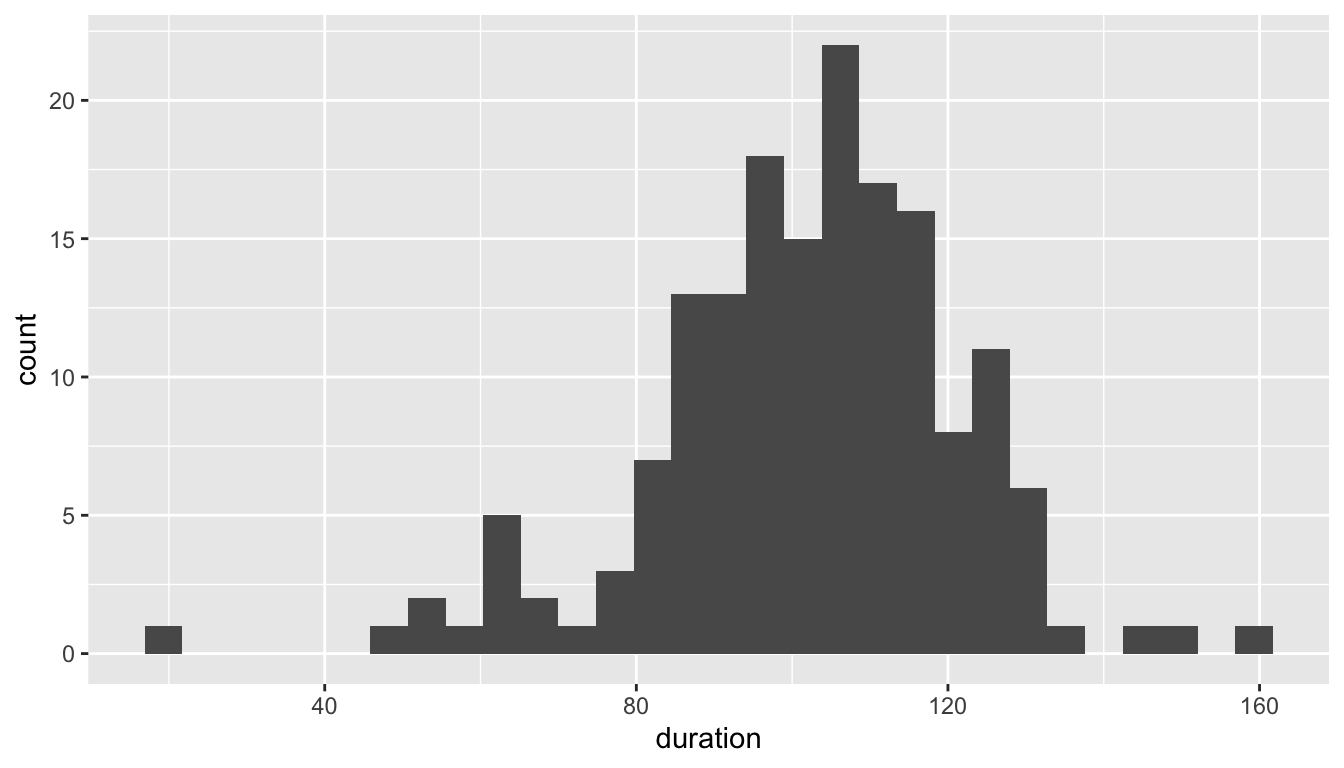
ggplot(mendota, aes(x = duration)) +
  geom_histogram(fill = "hotpink",
                 color = "black",
                 binwidth = 7,
                 boundary = 0) +
  xlab("Total days frozen") +
  ylab("Counts") +
  ggtitle("Lake Mendota Freeze Durations, 1855-2022")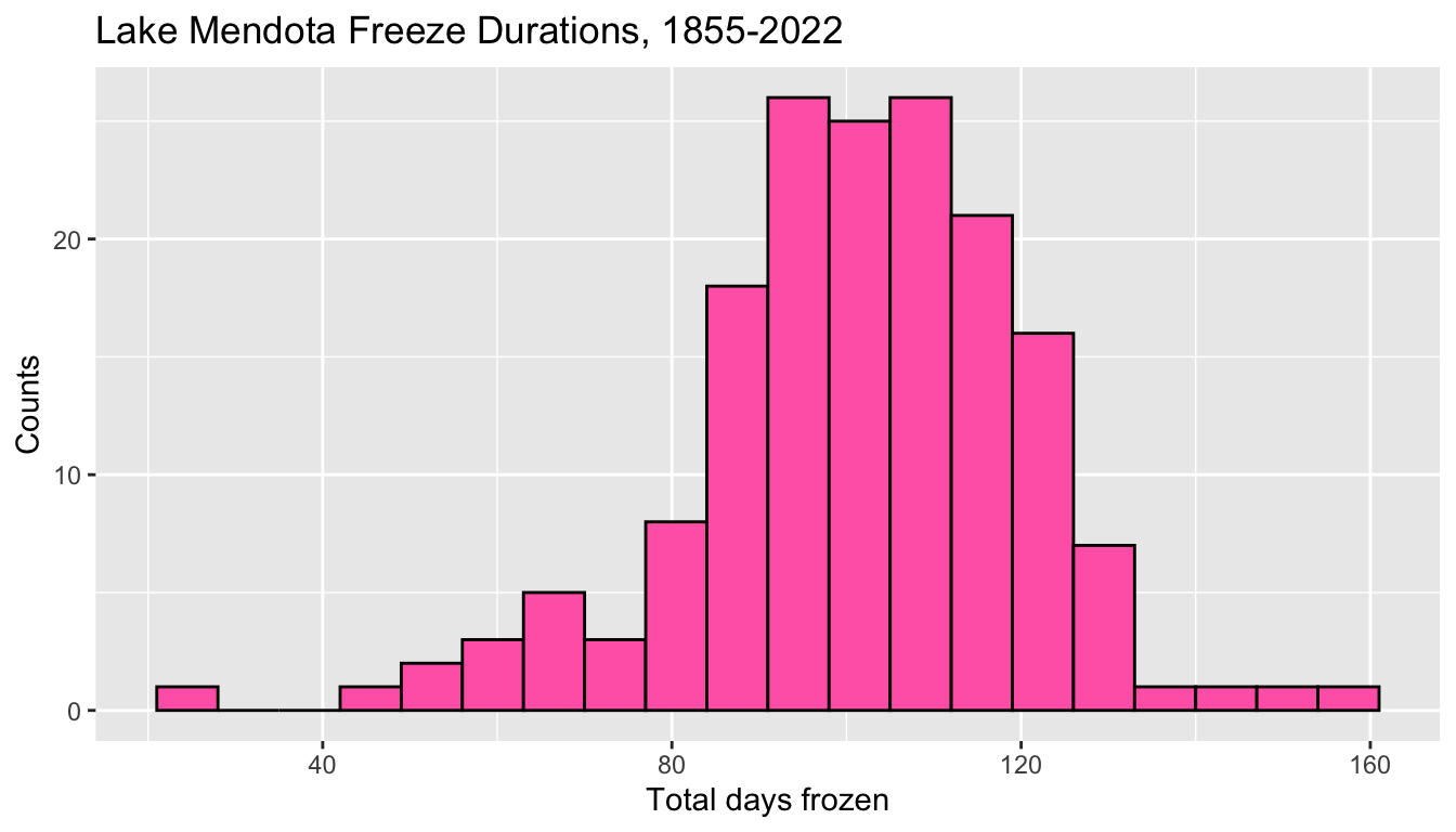
5.7.1.2.2 Bin endpoints
- The arguments
binwidth = 7andboundary = 0determine which intervals will be used in the histogram.- Possible intervals include 0 to 7, 7 to 14, 14 to 21, and so on, but also \(-7\) to 0, \(-14\) to \(-7\) and so on.
- The actual minimum and maximum data values determine which intervals appear in the plot.
- The smallest duration is 21 which is counted in the bin from 21 to 28.
- Note that if
boundary = 7had been specified, the bins would be exactly the same: pick one boundary and one bin width to determine the end points of all bins. - But, if
boundary = 10had been specified, this would have shifted all of the bin boundaries three to the right and the graph would have different bins and different counts.
- An alternative way to specify the intervals is with the
centerof one of the intervals instead of theboundarybetween two adjacent ones. - This graph centers a boundary at 0 with
binwidth = 7still.- The intervals are from \(-3.5\) to 3.5, 3.5 to 10.5, and so on.
- This histogram is identical except that the intervals are shifted
- When selecting bin edges, I often aim to avoid having actual data fall exactly on a bin boundary with prudent choices
ggplot(mendota, aes(x = duration)) +
  geom_histogram(fill = "hotpink",
                 color = "black",
                 binwidth = 7,
                 center = 0) +
  xlab("Total days frozen") +
  ylab("Counts") +
  ggtitle("Lake Mendota Freeze Durations, 1855-2022")
5.7.1.2.3 Where to specify the data and aesthetics
- Any data and aesthetics mapping set within
ggplot()carry over to all additional layers (some of which will ignore them) - A layer can modify these by using
dataormappingarguments in the command to create the layer.
5.7.1.2.4 A histogram with too few bins
- Selecting appropriate settings for the bins is not easy and it can dramatically affect the appearance of the histogram.
- The histogram below has too few bins (the bins were set to be too wide) and we cannot evaluate the shape of the distribution because it has been over-summarized.
ggplot(mendota, aes(x = duration)) +
  geom_histogram(center = 70, binwidth = 60,
                 fill='hotpink', color='black') +
  xlab("Total Days Frozen") +
  ggtitle("Lake Mendota Freeze Durations, 1855-2022",
          subtitle = "(bad plot: too few bins)")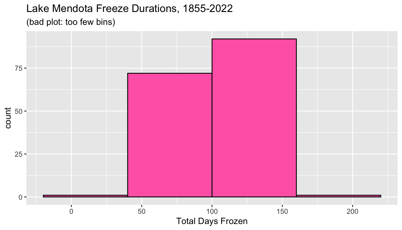
5.7.1.2.5 A histogram with too many bins
- We can also error in the direction of too many bins!
- In the histogram below, the bin width is too small and the histogram contains many spikes.
- Again we cannot easily evaluate the overall shape of the distribution because there is too much detail and not enough summarization.
ggplot(mendota, aes(x=duration)) +
  geom_histogram(center=70, binwidth=1,
                 fill='hotpink', color='black') +
  xlab("Total Days Frozen") +
  ggtitle("Lake Mendota Freeze Durations, 1855-2022",
          subtitle = "(bad plot: too many bins)")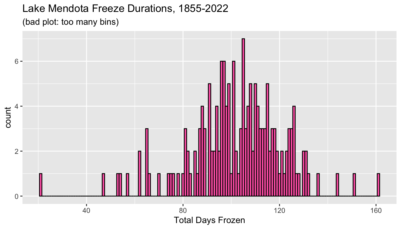
5.7.1.2.6 Another decent histogram
- There is not a single best choice of bin endpoints.
- The first plot used a width of 7 days, or one week.
- Alternatively, we may have used a round number like 10 and centered on a nice round number like 100.
ggplot(mendota, aes(x=duration)) +
  geom_histogram(center=100, binwidth=10,
                 fill='hotpink', color='black') +
  xlab("Total Days Frozen") +
  ggtitle("Lake Mendota Freeze Durations, 1855-2022",
          subtitle = "(a decent plot: binwidth = 10)")
There is rarely a single best choice of bins in a histogram, but there are many ways to make a poor choice.
5.7.1.3 Density Plots
- A histogram is just one example of a “geom” to display a single quantitative variable
- An alternative is a density plot which lessens the visual effects due to arbitrary choices to determine bin endpoints.
- A density plot may be thought of as an average of a lot of histograms
- Rather than displaying counts on the y axis, instead, the scale is modified so that the total area under the curve is one
- A density plot can be thought of as a smoothed histogram.
- We can display the same data using density plot using
geom_density().
ggplot(mendota) +
  geom_density(aes(x=duration),
               fill="hotpink",
               color="black") +
  xlab("Total days frozen") +
  ylab("Density") +
  ggtitle("Lake Mendota Freeze Durations, 1855-2022")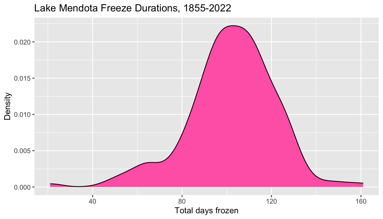
- In a density plot, the “Count” on the y axis is replaced by “Density”
- The numerical values are scaled so that the total area under the curve is equal to one.
- Density plots smooth away the harsh transitions of a histogram, but lose the capability to display the raw data counts.
- From a histogram with counts, we know how many observations are in each interval and can determine the total number of observations in the data
- A density plot only shows relative amounts of data and loses this sample size information.
- Histograms and density plots are the most common ways to display the distribution of single quantitative variables, but others exist.
- See the ggplot2 cheat sheet for more examples.
5.7.1.3.1 Interpreting a Density Plot
- A density plot provides information about what proportion of the observations are in each interval, approximately
- For example, the area in the previous plot to the left of 80 looks to be, maybe, about 10% of the total.
- I add a vertical line at 80 to help visualize this.
ggplot(mendota) +
  geom_density(aes(x=duration),
               fill="hotpink",
               color="black") +
  geom_vline(xintercept = 80, linetype = "dashed") +
  xlab("Total days frozen") +
  ylab("Density") +
  ggtitle("Lake Mendota Freeze Durations, 1855-2022")
We can count the actual number of
durationvalues which are 80 or below.In fact, exactly 17 of the 167 durations from the winters from 1855-56 to 2021-22, or about 10%, are 80 days or fewer.
5.7.1.4 Boxplots
A boxplot is a graphical depiction of some key quantiles of a distribution of numerical values.
- The minimum (smallest value)
- The first quartile (25th percentile or 0.25 quantile)
- The median (the middle value / 50th percentile / 0.5 quantile)
- The third quartile (75th percentile or 0.75 quantile)
- The maximum
Typical boxplots often also identify potential outliers which are extreme values far enough below the first quartile or above the third quartile.
This code chunk creates a vertical boxplot of
durationby mapping it to the aestheticy.See what happens if we use
xinstead?
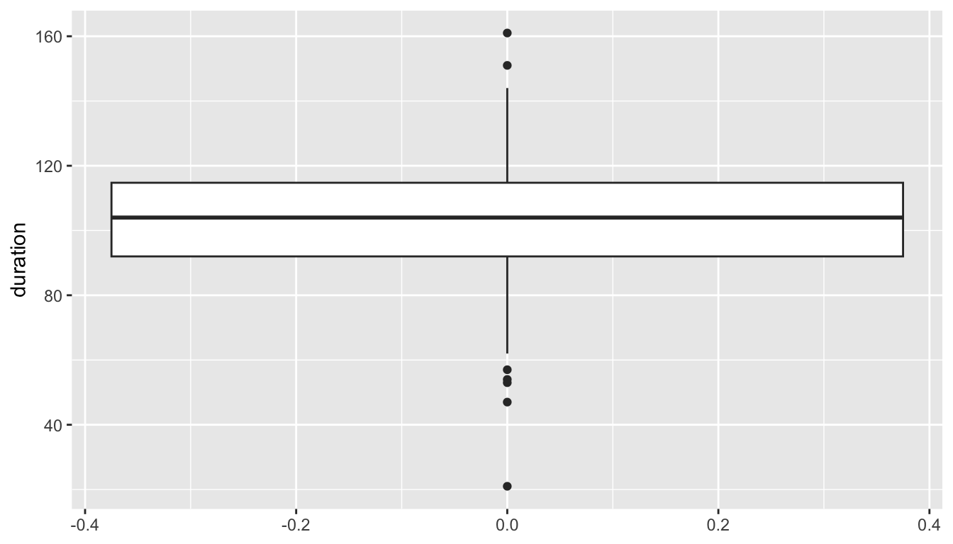
The box outlines the middle 50% of the observations
- the bottom of the box (i.e., the lower hinge) gives the 25th percentile (the first quartile, Q1)
- the middle bar give the median (the 50th percentile)
- the top of the box (i.e., the upper hinge) gives the 75th percentile (the third quartile, Q3)
The lower vertical line (i.e., the lower whisker) reaches down to the minimum value of the observations, but will not drop below Q1 - 1.5 x IQR, where IQR = Q3 - Q1 is the inter-quartile range.
Similarly, the higher vertical line (i.e., the upper whisker) reaches up to the maximum value of the observations, but will not go above Q3 + 1.5 x IQR.
Any points plotted below or above the vertical lines indicate observations that are below or above the noted ranges. These points may be considered potential outliers.
The number line on the x axis is meaningless and arbitrary.

5.7.1.5 Side-by-side box plots
- We rarely use box plots to summarize a single variable as the graphical summary from a histogram or density plot is so much more informative.
- However, boxplots can be very useful when we wish to compare multiple distributions to each other on the same numerical scale
- For example, the variable
decadepartitions each year into the decade associated with its first year. - This plot shows side by side box plots to help see how freeze durations have changed over time.
- Each boxplot is from 10 or fewer data points
- The
xvariable is set toas.character(decade)so thatdecadeis treated as categorical and not numerical.
ggplot(mendota, aes(x = as.character(decade), y = duration)) +
  geom_boxplot(fill = "papayawhip",
               color = "blue") +
  ylab("Total days closed by ice") +
  xlab("Decade") +
  ggtitle("Lake Mendota Freeze Durations, 1855-2022")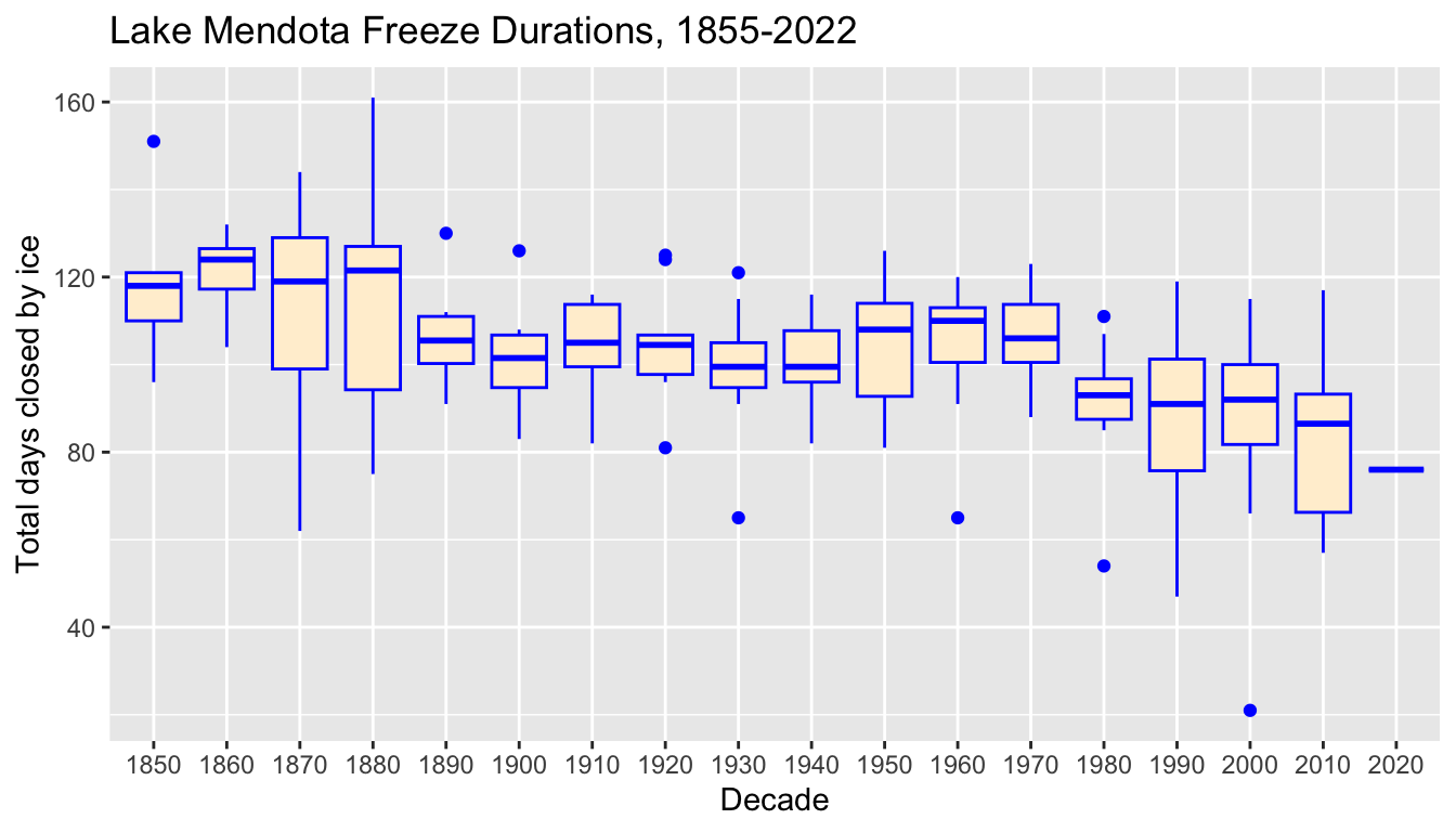
- We see that in the 1800s, a typical freeze duration was nearly 120 days whereas in more recent decades, a typical duration has decreased to under 90 days.
5.8 Lake Mendota Graphs – days frozen vs. time
- We wish to create a graph to examine the relationship between the duration which Lake Mendota is frozen versus time
- We may expect there to be a decrease over time as a result of global warming causing the average temperature in Madison to be trending warmer in the winter.
5.8.1 Question 1
How do the total number of days that Lake Mendota is closed with ice vary over time?
5.8.2 Two-variable Plots
- Earlier, we took the numerical variable
year1and turned it into a categorical variabledecade, collecting the observations by decade, and plotted the data with side-by-side box plots. - We did this primarily to demonstrate how to create side-by-side boxplots.
- However, there is a better way:
- Examine the relationship between
year1anddurationdirectly with an augmented scatter plot.
- Examine the relationship between
5.8.2.1 Scatter Plots
- A scatter plot summarizes two numerical variables by associating one with the x axis and the other with the y axis and plotting points.
- This R chunk displays a cloud of data points with
year1specifying the location on the x axis anddurationthe location on the y axis.
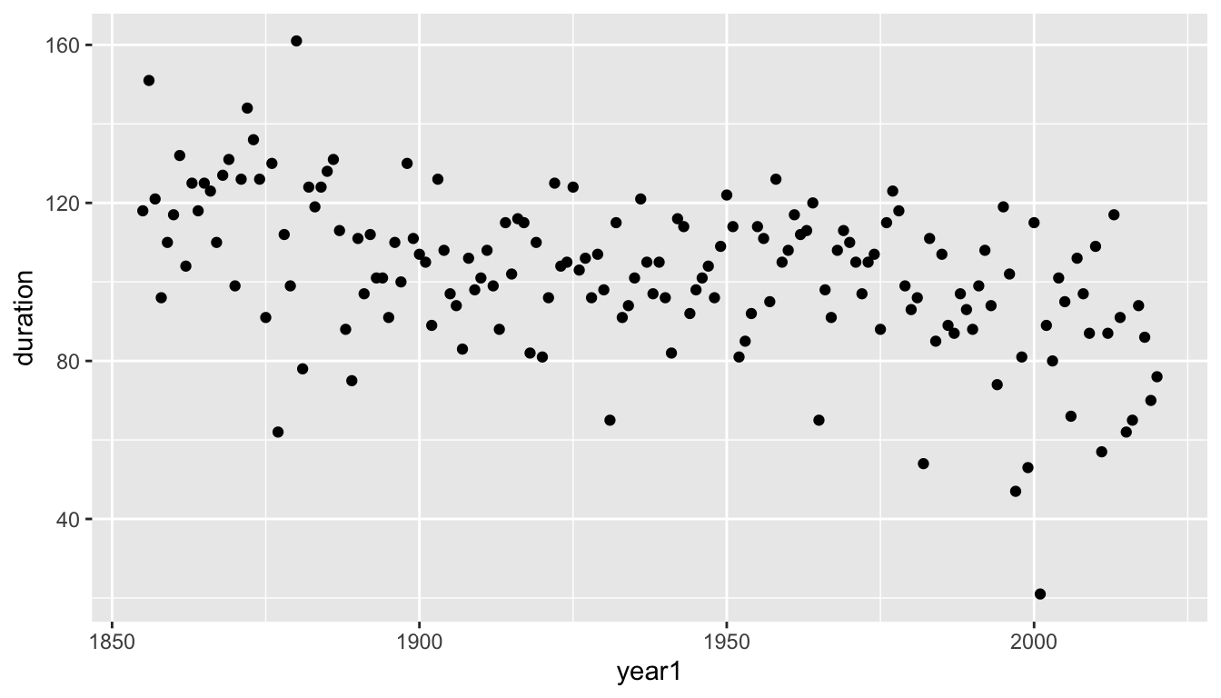
5.8.2.1.1 Observations
- We can kind of see a decreasing pattern over time, but it is difficult to trace the year-to-year changes and difficult to see the general pattern as clearly as possible separate from the year-to-year noise
- When one variable is time, it is often useful to use a “trace plot” instead of a scatter plot by changing the geometry from plotting individual points (using
geom_point()) to line segments which connect consecutive points (usinggeom_line()).
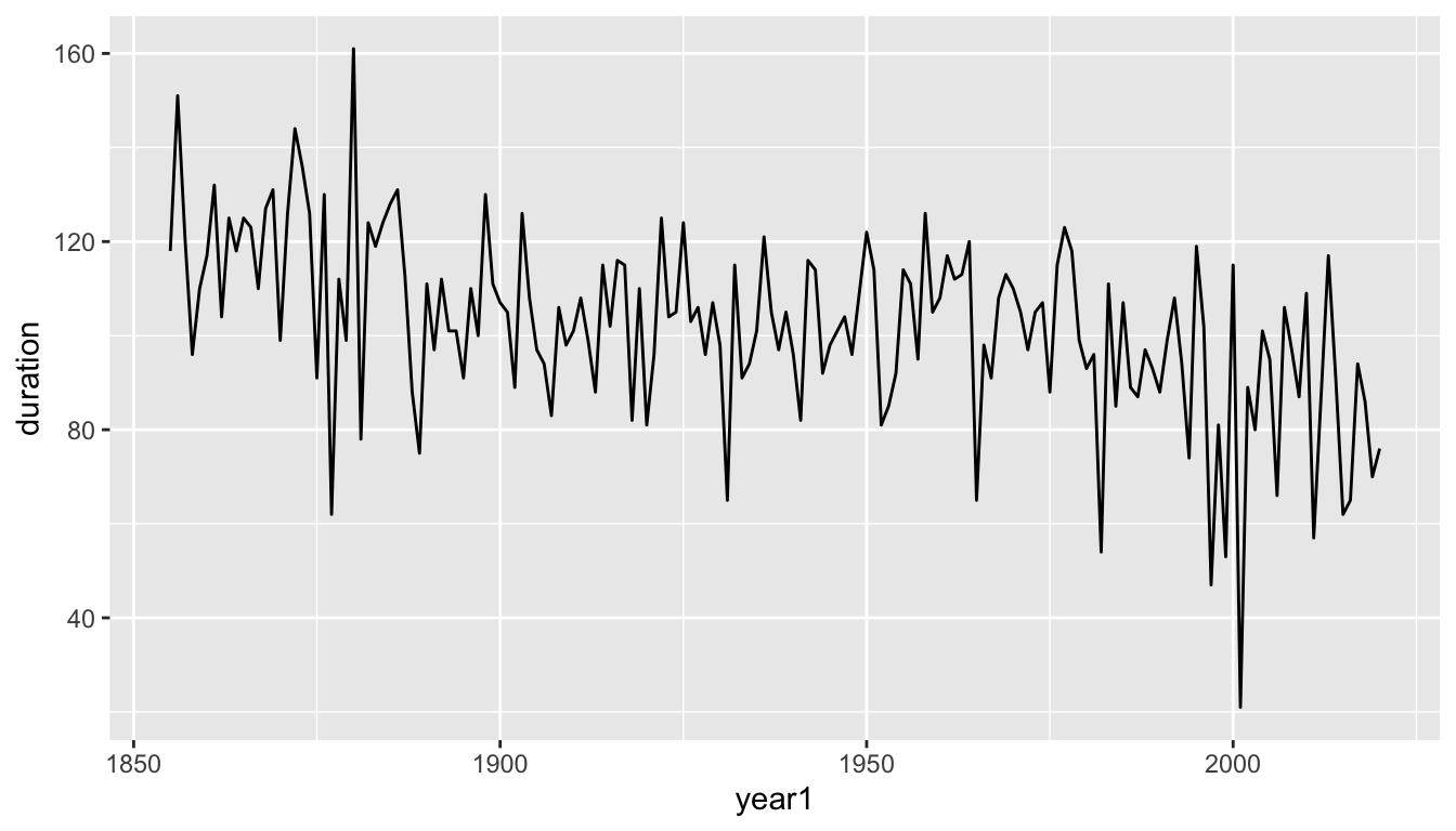
- This graph makes it easier to see that there is a decreasing trend, but that the actual pattern of decrease is quite noisy with substantial year-to-year variation.
- Another geometry,
geom_smooth(), greatly reduces the noise and replaces the actual data values with a smooth curve.
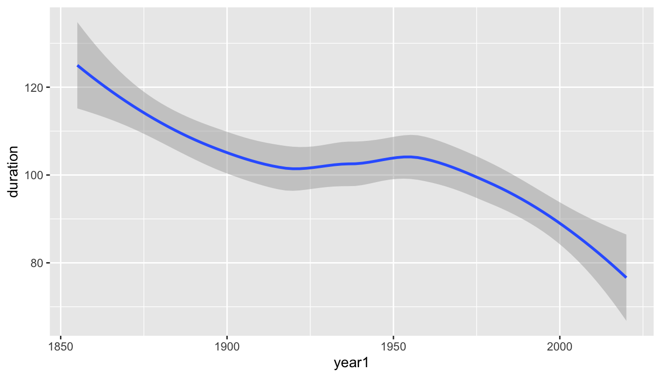
- The default graph produced with
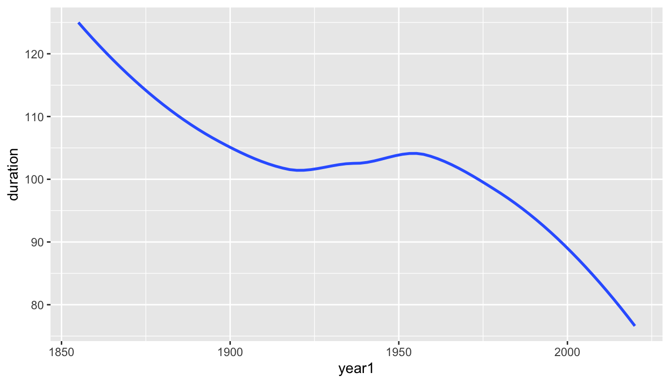
geom_smooth()draws a ribbon to represent uncertainty in the true value of the estimated trend line. - We can discard this ribbon by setting the argument
se(short for standard error which we will see later in the course) to beFALSE.
- After suppressing the year-to-year noise, we see a summarized pattern where the duration with which Lake Mendota has remained closed by ice in a typical year has decreased from over 120 days in 1850 to under 80 days at present.
- There was a steady decline from 1850 to about 1920, followed by about 30–40 years of with a slight increase on average, followed by a decline at an even faster rate from about 1960 to the present.
- Perhaps the rate of decrease is becoming steeper.
5.8.2.2 Scatter Plot with a Trend Line Added
- There is no reason to select only one of the previous plots.
- A better graphical display can be obtained by layering multiple pieces of the previous graphs together.
## note setting the aesthetics here in ggplot()
## otherwise, we would need to set the in geom_point(), geom_line(), and geom_smooth() each separately
ggplot(mendota, aes(x=year1, y=duration)) +
  geom_point() +
  geom_line() +
  geom_smooth(se=FALSE) +
  xlab("Year") +
  ylab("Total Days Frozen") +
  ggtitle("Lake Mendota Freeze Durations, 1855-2022")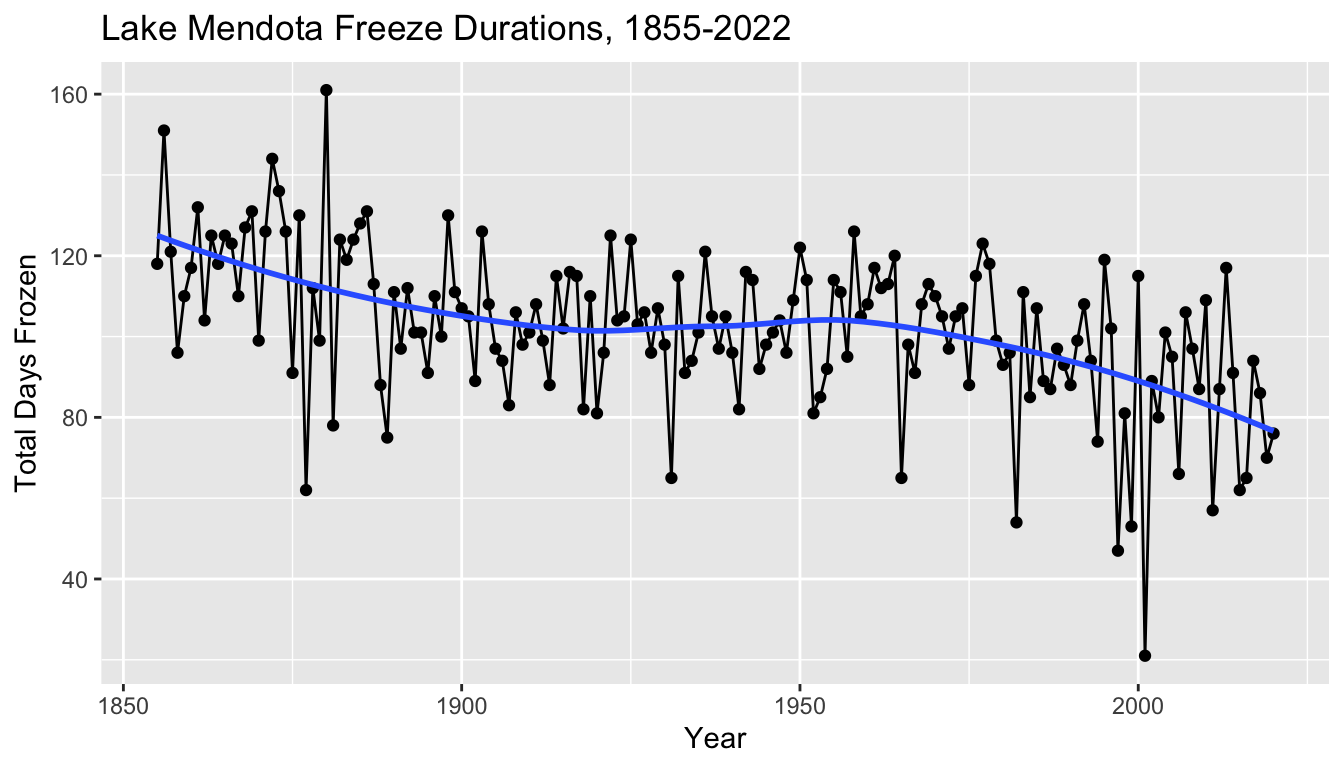
5.8.3 Observations
- There does appear to be a decrease in the freeze durations over time
- Informally, we might interpret the blue curve as a description of what the climate is doing
- ignoring year-to-year fluctuations, the typical average duration for Lake Mendota to freeze over the winter has decreased from about 120 days (or four months) in the mid 1850s to under 80 days (about 11 weeks) currently.
- The variation of the points around the blue curve may be interpreted as random “noise” caused by differences in the weather at key parts of the fall and winter seasons from year to year.
5.8.3.1 A basic model
- Later in the semester, we will investigate proposing, fitting, and interpreting statistical models to study this relationship.
- We might think of the blue curve as an estimate of some underlying “true” relationship between the expected duration of time which Lake Mendota is closed by ice versus time which is a feature of the climate as it changes over time.
- The actual data represents this trend with the “noise” of random variation due to the weather in each year.
- A statistical model describes the observed data as the sum of a mean trend over time plus random noise for each observation.
- Later in the semester we will explore these ideas of statistical modeling and statistical inference in more detail.
5.8.4 Question 2
In a typical year, how much does the actual duration for which Lake Mendota is frozen (the surface is at least 50% covered by ice) vary from its predicted value? (How far apart are the black points and the blue curve, typically, in a given year)?
To address this question, we need to augment the data set by adding a numerical variable which includes this calculation.
A block of code we suppress in these notes accomplishes this to create a variable named
residualwhich we can examine.Here are the first few rows of the augmented data set.
- The
width = Infargument makes sure that all variables are included in the printed output.
- The
# A tibble: 166 × 9
   winter  year1 intervals duration first_freeze last_thaw  decade fitted
   <chr>   <dbl>     <dbl>    <dbl> <date>       <date>      <dbl>  <dbl>
 1 1855-56  1855         1      118 1855-12-18   1856-04-14   1850   125.
 2 1856-57  1856         1      151 1856-12-06   1857-05-06   1850   124.
 3 1857-58  1857         1      121 1857-11-25   1858-03-26   1850   124.
 4 1858-59  1858         1       96 1858-12-08   1859-03-14   1850   123.
 5 1859-60  1859         1      110 1859-12-07   1860-03-26   1850   123.
 6 1860-61  1860         1      117 1860-12-14   1861-04-10   1860   122.
 7 1861-62  1861         1      132 1861-12-02   1862-04-13   1860   121.
 8 1862-63  1862         1      104 1862-12-26   1863-04-09   1860   121.
 9 1863-64  1863         1      125 1863-12-18   1864-04-21   1860   120.
10 1864-65  1864         1      118 1864-12-08   1865-04-05   1860   120.
   residual
      <dbl>
 1    -7.00
 2    26.6
 3    -2.77
 4   -27.2
 5   -12.6
 6    -4.99
 7    10.6
 8   -16.8
 9     4.71
10    -1.73
# ℹ 156 more rows
In the first recorded winter of 1855–56, Lake Mendota was closed by ice for 118 days, but the trend curve in the same winter predicted 125 days. The residual is the difference, \(-7 = 118 - 125\).
Let’s create a density plot to visualize the distribution of all of the residuals.
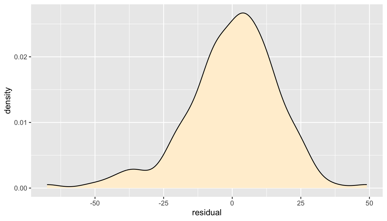
- From this plot, we see that the distribution of year to year annual variation around the trend curve is approximately bell-shaped and centered at zero, but there is some slight left skewness (the left tail is bigger than the right tail).
It is more common for a winter where the actual duration for which Lake Mendota is closed by ice is extremely lower than typical than a winter where it is abnormally longer than typical.
The scale of the plot indicates that it is not at all unusual for the actual duration Lake Mendota is closed by ice to differ from the trend line by about 2 to 3 weeks in either direction.
Most of the area under the curve is between about \(-21\) days and \(+21\) days, but there are a fair number of years which exceed these typical values.
We could also examine the distribution of the residuals around the smooth curve with a box plot.
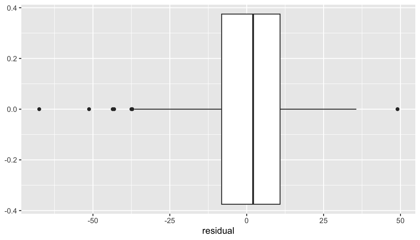
- It appears that six times in the past 167 winters, the actual duration that Lake Mendota was closed by ice was four weeks or more shorter than typical and just once did the duration exceed what was predicted by more than four weeks.
- In about half the winters, the duration is within ten days of typical.
5.8.4.1 Mean and Standard Deviation
When we learn about dplyr next week, we will develop some skills for summarizing data.
A common way to summarize a collection of numbers is the mean, or the sum divided by the number of values.
\[ \bar{x} = \frac{\sum_{x=1}^n x_i}{n} \]
- The mean (like the median) is a way to measure the center of a distribution, but they measure the center in different ways.
- The mean is the balancing point.
- The median is the middle number, half the values are at least as big and half are at least as small.
- The standard deviation measures how far apart a distribution of numbers are from one another.
\[ s = \sqrt{ \frac{\sum_{x=1}^n (x_i - \bar{x})^2}{n-1} } \]
The standard deviation is almost the square root of the mean squared deviations from the mean (almost because we divide by \(n-1\) and not \(n\)).
The standard deviation may often be interpreted as about the size of a typical deviation of an individual value from the mean.
A quantile is a value which indicates a location in a distribution by indicating the proportion of values below (and above).
- The median is the 0.50 quantile because half the value are the median or below
- 100 times a quantile is referred to as a percentile.
5.8.4.2 Numerical summaries of the residuals
- A block of code suppressed in these notes calculates the mean, standard deviation, median, and several other quantiles of the distribution of the residuals.
# A tibble: 1 × 8
mean median sd q10 q25 q50 q75 q90
<dbl> <dbl> <dbl> <dbl> <dbl> <dbl> <dbl> <dbl>
1 -0.0361 2.08 16.7 -20.0 -8.16 2.08 10.8 19.0- The mean of the distribution is close to zero.
- The median is about 2 days above zero.
- The standard deviation is 16.7 days, or about 2.4 weeks.
5.8.5 Augmenting a plot with lines
- Sometimes it is helpful to add vertical lines to a plot to help identify specific locations on the x axis.
- This next chunk of code adds vertical lines that are 1, 2, and 3 standard deviation below and above the center of zero.
ggplot(mendota, aes(x = residual)) +
geom_density(fill = "papayawhip") +
geom_hline(yintercept = 0) +
geom_vline(xintercept = c(-1,1)*16.7,
color = "red", linetype = "dotted") +
geom_vline(xintercept = c(-1,1)*2*16.7,
color = "red", linetype = "dashed") +
geom_vline(xintercept = c(-1,1)*3*16.7,
color = "red", linetype = "solid")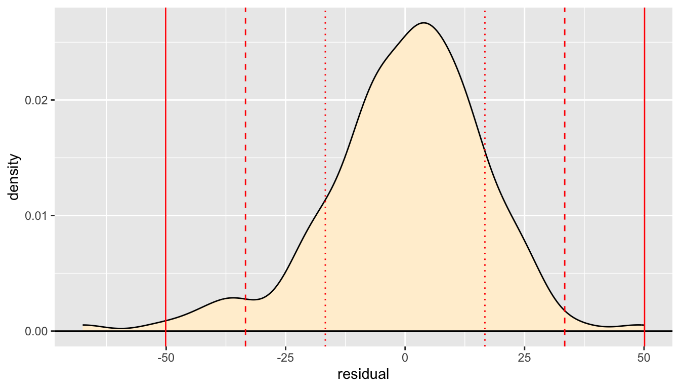
- Symmetric bell-shaped solutions have the following approximate features (which are exactly true for an ideal normal distribution).
- About 68% of the data is within one standard deviation of the mean.
- About 95% of the observations are within two standard deviations of the mean
- Nearly all of the observations are within three standard deviations of the mean
- Here, our density is not perfectly ideal and there are likely a bit fewer than 95% of the values within two standard deviations with extras in the left tail of the distribution
5.8.6 Axis Labels and Plot Titles
- Previous examples have shown how to use the commands
xlab()andylab()to modify the displayed axis labels in a plot. - We have also shown how to use
ggtitle()to add a title to a plot. - When working interactively, it is fine to not worry about axis labels and plot titles: you know what the variables are and know what you are examining in the plot.
- However, when making a plot to present to someone else (or for yourself to look at in the future), it is best practice to create meaningful axis labels and a plot title.
- In particular, when creating plots for homework assignments, projects, or as part of a take-home exam, do make sure to create informative axis labels and plot titles.
- The arguments to
xlab()andylab()are almost always just a simple text string, such as we have seen. - You can suppress a label with the empty string
"". - In more advanced code we will not cover, you can:
- modify font size and type
- use greek symbols or mathematical notation
- create labels which include variables that can change if the values do
- Usually, plot titles made with
ggtitle()are also just a simple string as an argument. - The example below also uses the argument
subtitleto add a second line to the displayed title in a smaller font.- This is especially useful when an informative title is too long for a single line.
ggplot(mendota, aes(x = residual)) +
  geom_density(fill = "papayawhip") +
  xlab("Residuals (days)") +
  ylab("") +
  ggtitle("Density Plot of Residuals from geom_smooth()",
          subtitle = "Lake Mendota Freeze data, 1855-2022")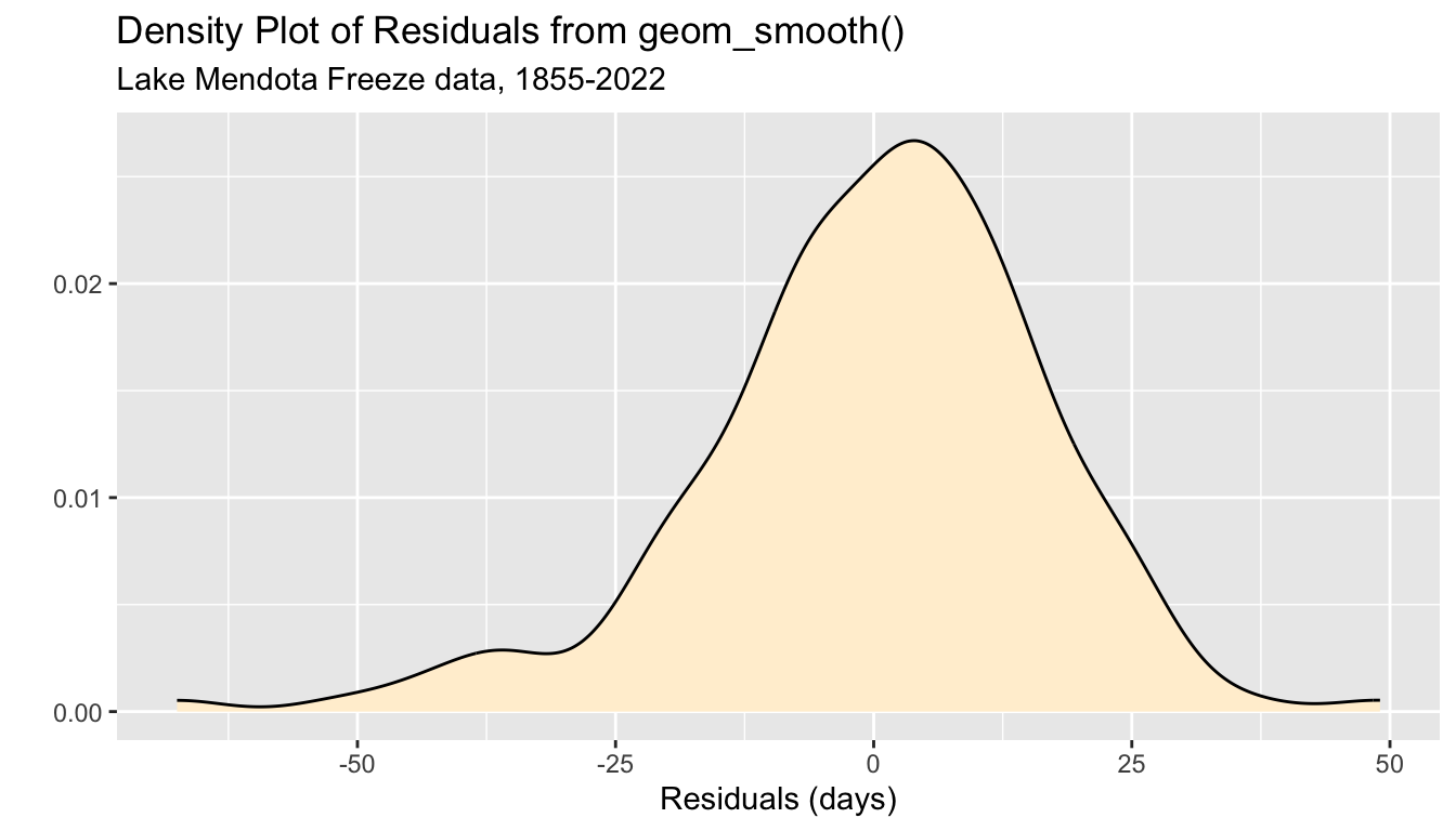
5.8.7 Question 3
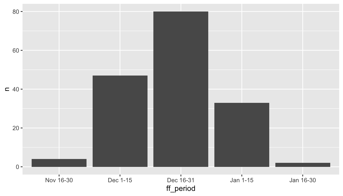
When in the winter does Lake Mendota typically close with ice the first time?
To answer this question graphically, I decided to create a new variable
ff_periodwhich categorizes the date of the first freeze into a half-month time period, from “Nov 16-30” through “Jan 16-31”- (the earliest date Lake Mendota closed with ice was November 23 during the winter of 1880-81 and the latest date Lake Mendota closed with ice was January 30 during the winter of 1931-32).
The variable
ff_after_june_30counts the number of days after June 30 the Lake Mendota first freezes in a given winter.- For example, November 30 is 153 days after June 30 each year.
A suppressed block of code adds the variables
ff_after_june_30andff_periodto themendotadata set.A new data frame
mendota_sumcontains counts of the number of winters in each period.Here are the first few rows of selected columns of each data set.
# A tibble: 5 × 4
  winter  duration first_freeze ff_period
  <chr>      <dbl> <date>       <fct>
1 1855-56      118 1855-12-18   Dec 16-31
2 1856-57      151 1856-12-06   Dec 1-15
3 1857-58      121 1857-11-25   Nov 16-30
4 1858-59       96 1858-12-08   Dec 1-15
5 1859-60      110 1859-12-07   Dec 1-15
# A tibble: 5 × 2
ff_period n
<fct> <int>
1 Nov 16-30 4
2 Dec 1-15 47
3 Dec 16-31 80
4 Jan 1-15 33
5 Jan 16-30 25.8.8 Bar Graphs
- A bar graph is a common way to display the counts of a categorical variable.
- The ggplot2 command
geom_bar()is used to create bar graphs from a data set where the heights of the bars need t be calculated. - In contrast, the ggplot2 command
geom_col()is used when there is one column for the categorical variable and another column which contains the heights of the bars.
5.8.8.1 geom_bar()
- This code creates a bar graph from the
ff_periodvariable of themendotadata set.- The bar heights are calculated by counting the number of winters in each category.

- We can add layers to improve the appearance.
ggplot(mendota, aes(x = ff_period)) +
geom_bar(color = "black", fill = "blue") +
xlab("Date of the First Freeze") +
ylab("Count") +
ggtitle("Lake Mendota First Freeze Dates",
subtitle = "1855-2022")
5.8.8.2 geom_col()
- Here a table with the summary counts
# A tibble: 5 × 2
  ff_period     n
  <fct>     <int>
1 Nov 16-30     4
2 Dec 1-15     47
3 Dec 16-31    80
4 Jan 1-15     33
5 Jan 16-30 2- Use
geom_col()and set bothxandyaesthetics.
- Again, make the graph better for presentation.
ggplot(mendota_sum, aes(x = ff_period, y = n)) +
geom_col(color = "black", fill = "blue") +
xlab("Date of the First Freeze") +
ylab("Count") +
ggtitle("Lake Mendota First Freeze Dates",
subtitle = "1855-2022")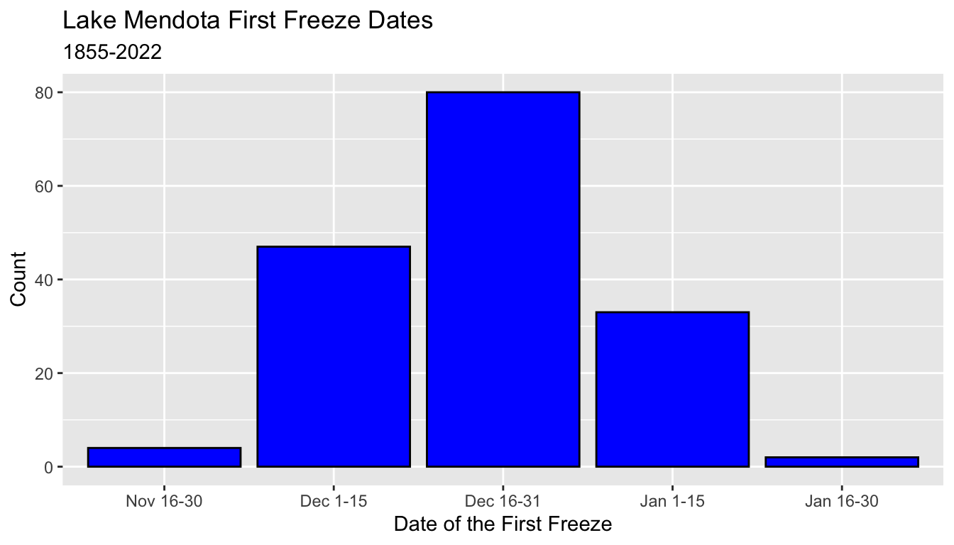
5.8.9 Facets
- Facets are a way to partition a data set according to one or two categorical variables
- Each part of the data is displayed in its own panel (facet) of a common plot.
- Typically, the axes are consistent for all facets, but this can be relaxed.
- To demonstrate faceting, we add a new categorical variable
period50to themendotadata set which divides the years into 50-year periods. - This block of code is also suppressed in these notes.
5.8.9.1 facet_wrap()
- The command
facet_wrap()partitions the data by one or more categorical variables - Each different combination of values receives it own facet.
- The computer decides how to break the collection of facets into separate rows
- Use the function
vars()to list the variable on which to facet.- The old-style syntax used a formula, such as
~period50to specify the faceting variable. - I am working on forgetting this old syntax
- The old-style syntax used a formula, such as
- Here, the four facets are broken into two rows of two
ggplot(mendota, aes(x = ff_period)) +
  geom_bar(color = "black", fill = "blue") +
  xlab("Date of the First Freeze") +
  ylab("Count") +
  ggtitle("Lake Mendota First Freeze Dates",
subtitle = "1855-2022") +
facet_wrap(vars(period50))
- You can see more examples at the
tidyverse reference page for
facet_wrap()
5.8.9.2 facet_grid()
- The command
facet_grid()is used when you want to organize the rows and/or columns of the facets by one or more variables. - This example forces the facets to use a different row for each value of
period50.
ggplot(mendota, aes(x = ff_period)) +
  geom_bar(color = "black", fill = "blue") +
  xlab("Date of the First Freeze") +
  ylab("Count") +
  ggtitle("Lake Mendota First Freeze Dates",
          subtitle = "1855-2022") +
  facet_grid(rows = vars(period50))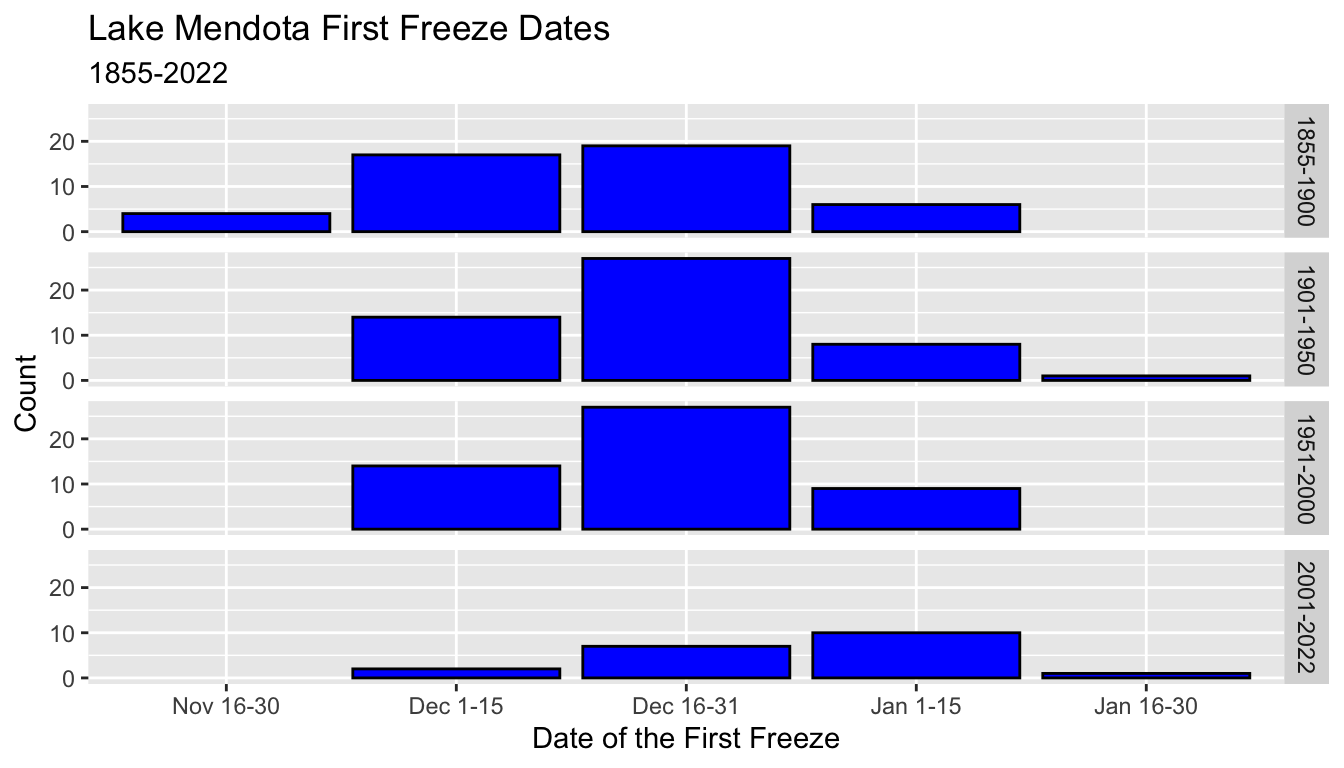
- Here, the output uses a different column for each value of
period50. - The axis labels might get crowded!
ggplot(mendota, aes(x = ff_period)) +
  geom_bar(color = "black", fill = "blue") +
  xlab("Date of the First Freeze") +
  ylab("Count") +
  ggtitle("Lake Mendota First Freeze Dates",
          subtitle = "1855-2022") +
  facet_grid(cols = vars(period50))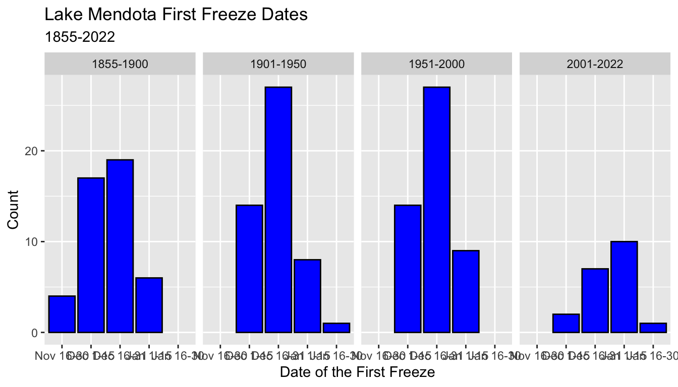
For a single variable,
facet_wrap()usually is preferable.For a different data set where breaking up by two different categorical variables,
facet_grid()can be very useful.You can see more examples at the tidyverse reference page for
facet_grid()
5.8.10 Scales
- There are a number of ways to change the scales used by the axes
- These notes will simply introduce a few examples
- We begin by creating another summary of the
mendotadata set which we namemendota_sum2by counting the number of observations within each 50-year period and first freeze 2-week category in a columnn- the column
pis the proportion of these counts within each 50-year period - the column
pctare these values as percentages
- the column
- Code to create this summary is suppressed.
# A tibble: 15 × 5
# Groups:   period50 [4]
   period50  ff_period     n      p   pct
   <chr>     <fct>     <int>  <dbl> <dbl>
 1 1855-1900 Nov 16-30     4 0.0870  8.70
 2 1855-1900 Dec 1-15     17 0.370  37.0
 3 1855-1900 Dec 16-31    19 0.413  41.3
 4 1855-1900 Jan 1-15      6 0.130  13.0
 5 1901-1950 Dec 1-15     14 0.28   28
 6 1901-1950 Dec 16-31    27 0.54   54
 7 1901-1950 Jan 1-15      8 0.16   16
 8 1901-1950 Jan 16-30     1 0.02    2
 9 1951-2000 Dec 1-15     14 0.28   28
10 1951-2000 Dec 16-31    27 0.54   54
11 1951-2000 Jan 1-15      9 0.18   18
12 2001-2022 Dec 1-15      2 0.1    10
13 2001-2022 Dec 16-31     7 0.35   35
14 2001-2022 Jan 1-15     10 0.5    50
15 2001-2022 Jan 16-30 1 0.05 5 - When we created bar graphs of the first freeze date 2-week categories by 50-year period of the counts, the overall size of the histograms was smaller in the two parts with fewer observations.
- Here we use
geom_bar()from the winter-level data as above
ggplot(mendota, aes(x = ff_period)) +
  geom_bar(color = "black", fill = "blue") +
  xlab("Date of the First Freeze") +
  ggtitle("Lake Mendota First Freeze Dates",
          subtitle = "1855-2022") +
  facet_wrap(vars(period50))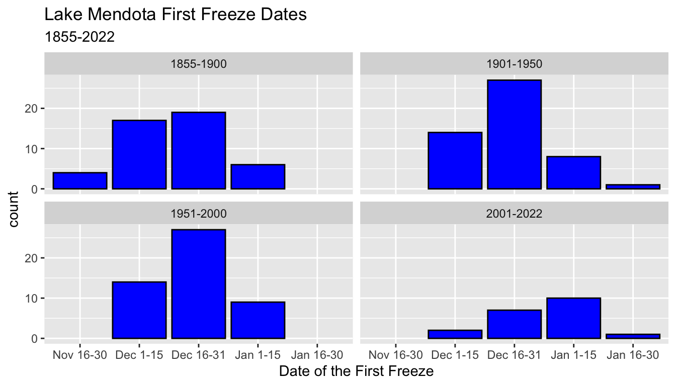
- To make it easier to compare the histograms, we may have wanted to display percentages in each group rather than the raw counts.
- Here we use the summary data and plot the percentages from
pcton the y axis - This makes it easier to compare the bar graphs ignoring the differences in the total number of observations
ggplot(mendota_sum2, aes(x = ff_period, y = pct)) +
  geom_col(color = "black", fill = "blue") +
  xlab("Date of the First Freeze") +
  ylab("Percentage") +
  ggtitle("Lake Mendota First Freeze Dates",
          subtitle = "1855-2022") +
  facet_wrap(vars(period50))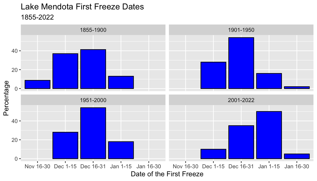
- Finally, this last graph introduces the command
scale_y_continuous()to change the labels on the y axis to percentages - Note that we use the proportions (between 0 and 1) as the data (
y = p), but that changing the labels to percentages adjusts by multiplying by 100 automatically.
ggplot(mendota_sum2, aes(x = ff_period, y = p)) +
  geom_col(color = "black", fill = "blue") +
  scale_y_continuous(labels = scales::percent) +
  xlab("Date of the First Freeze") +
  ylab("") +
  ggtitle("Lake Mendota First Freeze Dates",
          subtitle = "1855-2022") +
  facet_wrap(vars(period50))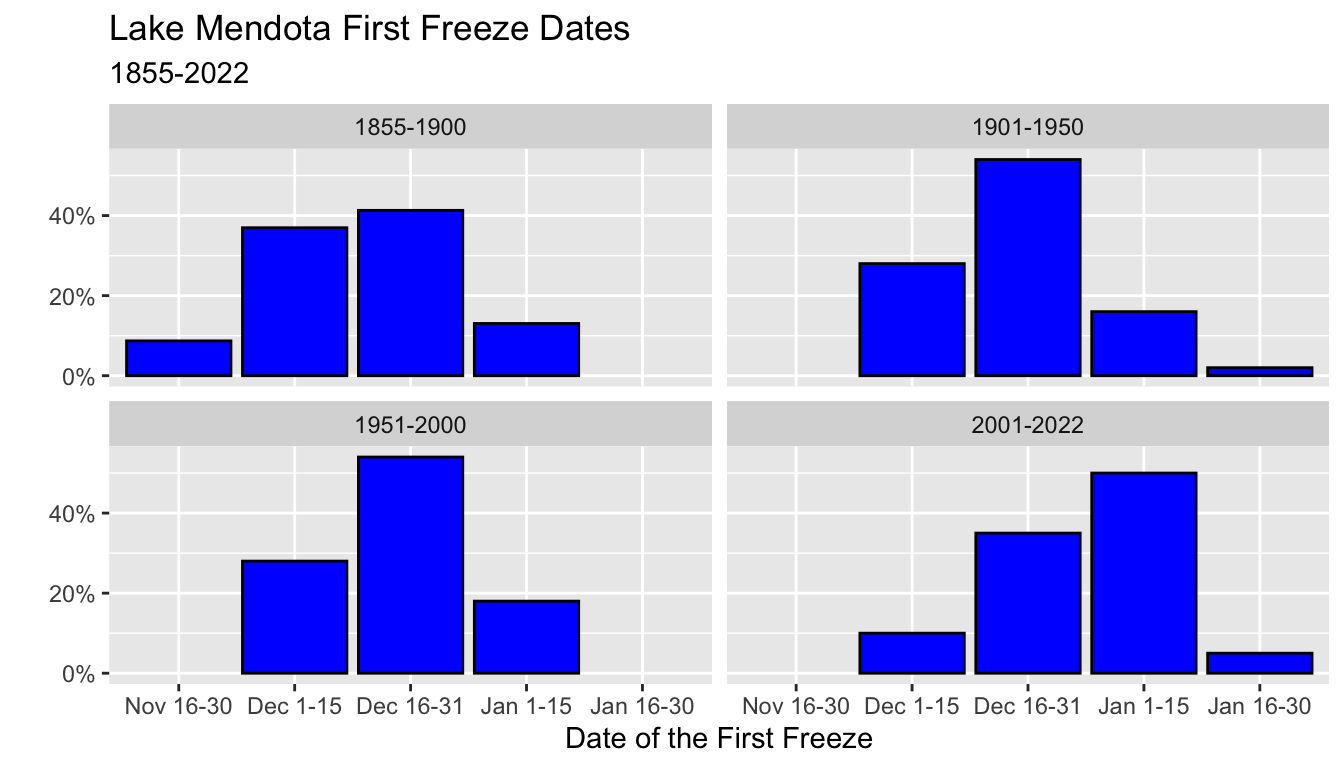
- We will see many other changes to scales in future lectures.
- Other examples of
scale_*()commands includescale_y_discrete(),scale_x_continuous(),scale_x_discrete(). - The continuous scale commands can be used to change the scales after transformations, such as using logarithmic scales
- These commands can also be used to modify where the and how the axes are labelled.
- Here is an example which replaces the
ff_after_june_30values (number of days after June 30) with the actual dates. - Note also the use of saving a
ggplot()object and then reusing it- This is handy when you want to reuse most of the commands for several plots.
## ff_after_june_30 directly
g = ggplot(mendota, aes(x = ff_after_june_30)) +
  geom_density() +
  geom_hline(yintercept = 0) +
  xlab("Days after June 30 of the First Freeze") +
  ggtitle("Lake Mendota First Freeze Dates",
          subtitle = "1855-2022")

g
## relabeled axes
## lubridate commands (ignore for now!)
dec01 = as.numeric(ymd("2022-12-01") - ymd("2022-06-30"))
dec15 = as.numeric(ymd("2022-12-15") - ymd("2022-06-30"))
jan01 = as.numeric(ymd("2023-01-01") - ymd("2022-06-30"))
jan15 = as.numeric(ymd("2023-01-15") - ymd("2022-06-30"))

g +
  scale_x_continuous(breaks = c(dec01, dec15, jan01, jan15),
                     labels = c("Dec 1", "Dec 15", "Jan 1", "Jan 15")) +
  xlab("Date of the First Freeze")
- There are also
scale_*()commands for other aesthetics such as color, fill, and size.
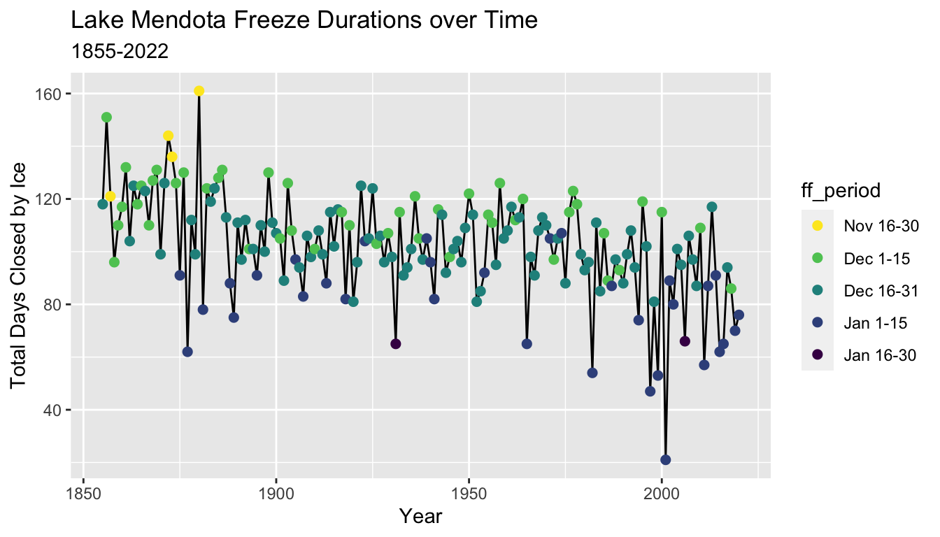
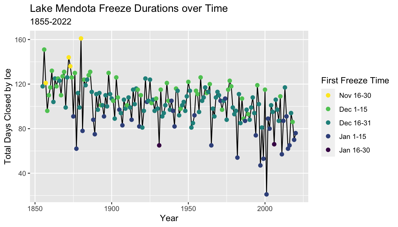
5.8.11 Adding Color
- Color is a useful aesthetic which can be used to add information from a categorical variable (and sometimes a numerical variable) to a plot.
- Here, we make a trace plot of the total duration that Lake Mendota is closed by ice versus the year, but add color to indicate the half-month period of time of the date when Lake Mendota was first closed by ice
g = ggplot(mendota, aes(x = year1, y = duration)) +
  geom_line() +
  geom_point(aes(col = ff_period), size = 2) +
  xlab("Year") +
  ylab("Total Days Closed by Ice") +
  ggtitle("Lake Mendota Freeze Durations over Time",
          subtitle = "1855-2022")

g
- The default color scheme in
ggplot2is not friendly to color blind people.- Red and green are difficult for many people to discern, and these are two colors in the default scale.
- This example uses colors from a scale named “viridis” designed to more evenly spread colors across a continuous range for which the perceptions are similar for most types of color blindness.
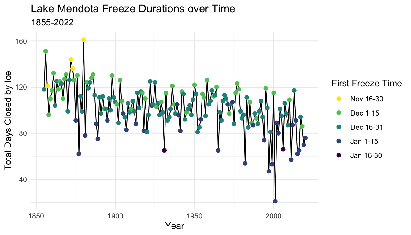
5.8.12 Guides
- We make a few other improvements to the plot
- The legend title uses the local variable name
ff_period. A better choice for presentation would be something like “First Freeze Time”. - The command
guides()allows many customization of the legends (guides) which accompany plots. - The example here changes the title of the color guide.
- More examples on modifying the guides with a plot are in the tidyverse reference guides page
5.8.13 Themes
- The default theme for plots in ggplot2 uses a gray background with white lines to display breaks
- There are many different themes to choose from
- Here is an example which switches to a black and white these with a white background and light gray break lines

- An alternative is a minimal theme which eliminates the box which outlines the plotting area.
The tidyverse list of complete themes are part of the tidyverse online reference.
More examples on modifying themes are in the tidyverse reference guides page
5.9 Summary
- Plotting is an essential component of data analysis
- We will practice the ggplot2 skills you are just now learning throughout the semester
- We will continue to learn new enhancements to the collection of ggplot2 commands as the semester continues, even while we focus on learning other aspects of data analysis
5.9.1 Basics
- Begin all plots with
ggplot()- Typically the call to
ggplot()will specify:- the data set (
datais the first argument), and - the mapping of variables to aesthetics with
aes()(mappingis the second argument)
- the data set (
- Typically the call to
5.9.2 Aesthetics
- Aesthetics such as
x,y,color,size, andshapewhich vary according to the values of variables are mapped to these variables with the functionaes()- Mappings in
ggplot()carry over to all subsequent layers - Aesthetics may be added or replaced with the mapping argument in a specific layer command
- Mappings in
5.9.3 Geoms
- There are different “geometries” which define how data is presented
- Examples we have seen so far include:
- Histograms with
geom_histogram() - Density plots with
geom_density() - Box plots with
geom_boxplot() - Scatter plots with
geom_point() - Trace plots with
geom_line() - Bar graphs with
geom_bar()when the function does the counting - Bar graphs with
geom_col()when you supply the bar heights
- Histograms with
- There are many more examples.
5.9.4 Facets
- A single plot may partition the data into parts and display each part in its own facet (panel)
- Use
facet_wrap()to display a sequence of facets in rows, letting the computer decide where to break the rows - Use
facet_grid()when you want to decide which variables vary by rows and columns in the displays
5.9.5 Color
- You can use color to add information from categorical variables (typically, but numerical sometimes too) to points, lines, or other geometries (such as fill color in box plots)
- Consider using
viridisor other color sales regularly instead of default values
5.9.6 Scales
- Functions such as
scale_y_continuous(),scale_x_discrete()andscale_color_discrete()(among many others) can maodify the defaults for how aesthetics are displayed in a plot. - We will see more during the semester
- There are many more features than we will cover this semester.
5.9.7 Guides
- Use the
guides()function to control the guides for aesthetics in a plot- We have shown how to change a title
- There are many more features which can be changed
5.9.8 Themes
- The standard theme has a gray background and white break lines
theme_bw()changes to a black and white themetheme_minimal()removes the boundary box around the plot and also uses a black and white theme- There are many, many more options and you can customize
5.9.9 ggplot2 Reference
- A comprehensive online reference for ggplot 2 is part of the tidyverse.org web site at (https://ggplot2.tidyverse.org/reference/index.html)