3 Madison Lakes
2024-01-24
3.1 Lake Mendota Freezing and Thawing
Lake Mendota is the largest of the four lakes in Madison, Wisconsin. The University of Wisconsin sits on part of its southern shore. The lake is over five miles long from east to west and about four miles wide from north to south at its widest point. The surface area of the lake is about 4000 hectares (15.5 square miles, about 10,000 acres).
Each winter, Lake Mendota freezes. Some winters, there are multiple periods where the lake freezes, thaws, and then freezes again. Due to its proximity to the University of Wisconsin, the lake has been heavily studied. Scientists have noted since the 1850s the dates each winter that the Lake Mendota (and other Madison lakes) freeze and thaw. The Wisconsin State Climatology Office in conjunction with the Nelson Institute for Environmental Studies at UW—Madison maintains these records.
3.1.1 Criteria for freezing/thawing
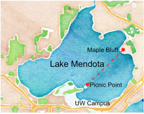
In this study, lakes are generally considered to be ice covered if more than half the surface is covered by ice and open otherwise. For a change in status (open to ice covered / ice covered to open) to be deemed official, it needs to persist until the next day. There is admittedly some subjectivity in the determinations of the dates, but this subjectivity rarely affects the determination of the date by more than one day. Due to the irregular shape of Lake Mendota and to remain consistent with historical methodology, ice cover on Lake Mendota is determined by the path between Picnic Point and Maple Bluff (see here for more information.
Determining the opening and closing dates for Lake Mendota is more of a challenge because the length and shape of the lake would require a sufficiently high vantage point that was not readily available to 19th century observers. Partly because Lake Mendota has a more irregular shoreline, an important secondary criterion applies for that lake: whether one can row a boat between Picnic Point and Maple Bluff. This rule arose from the era of E. A. Birge and Chancey Juday (according to Reid Bryson, founder of the UW Meteorology Dept., now known as the Dept. of Atmospheric and Oceanic Sciences), because they frequently were out on the lake in a rowboat, and the ice along that line determined if they could transport a case of beer over to their friends in Maple Bluff.
3.1.2 Map
The University of Wisconsin—Madison campus sits on the south shore of Lake Mendota. The red dashed line in the map below connects Picnic Point and Maple Bluff. Most photographs below are taken from Picnic Point in the direction of this line.
3.1.3 Winter of 2020-2021
During the 2020-2021 winter, Lake Mendota was officially declared as closed by ice on January 3, 2021 and it reopened again on March 20, 2021. The following images show the view from Picnic Point toward Maple Bluff before and after these dates. Fortuitously, there was snowfall on January 4 which gathered on the ice surface but melted in the open water, making it easy to observe the boundaries.
Early and Mid December
There was no ice on the surface of Lake Mendota near Picnic Point.


Early January
On January 2, the last day that Lake Mendota was observed as open, thin sheets of ice are beginning to form on the line from Picnic Point toward Maple Bluff. There was still much open water between Picnic Point and the capitol and UW campus, but ice extended several hundred feet from the southern shores of the lake and over shallow bays.

By January 5, almost the entire lake was covered with ice. A small region with an area less than 1% of the total lake surface near the region of Picnic Point was still open, as can be seen in this photo. However, much of the path between Picnic Point and Maple Bluff is ice covered.

A photo from higher up near the end of Picnic Point shows that most of the entire northern body of the lake is ice covered. Although not pictured, this part of the lake was nearly all open water on January 2.

A second photo shows the northern part of Lake Mendota from a vantage point about a quarter mile west of Picnic Point on January 5. On January 2, the ice only extended about 100-200 feet from the shore, but by January 5, the entire visible surface of the lake from this vantage point is covered with ice for miles to the far shore.

Mid March
The day before Lake Mendota was declared open, there was much open water, but there remained a sheet of ice along the shore by Maple Bluff, barely visible in the background of the photo. In the foreground, a large pile of ice which had been blown into shore the previous evening is visible.

The day after Lake Mendota was declared open, the path from Picnic Point to Maple Bluff was completely free of ice.

3.1.4 Winter of 2023-2024
In Madison, the December weather was historically warm, leading to unusually late dates for area lakes to become ice covered. Lake Mendota’s initial freeze date for the winter was January 15, the third latest in recorded history. Pictures below show Lake Mendota as observed from Observatory Hill on the UW—Madison campus on the initial freeze-over date. The top image shows Picnic Point, the bottom shows Maple Bluff. More than half the lake is ice covered, including the path between these two locations, but open water is visible in the northwest area of the lake. By the following day, the entire surface of the lake was ice covered. On the previous day, nearly the entire lake surface had open water.


3.2 Lake Mendota Questions
As we analyze the historical Lake Mendota data, we will be looking for patterns for how various aspects of freezing and thawing have changed over time. A number of potential motivating questions are the following:
- Has the total single-winter duration of ice cover of Lake Mendota changed over time; if so how?
- How has the typical date that Lake Mendota first freezes and last thaws changed over time?
- Are trends in total durations of ice cover by winter adequately explained by modeling with a straight line, or is a more complex curve discernibly better?
- By how much do individual observations (ice cover durations, initial freeze dates, final thaw dates) in a given winter tend to vary from the overall trend?
- What do we predict might happen in future years in terms of total duration of ice cover or dates of the first freeze or last thaw?
- Is there evidence of a changing climate apparent in this data?
In the rest of this chapter, we explore the first of these questions.
3.3 Lake Mendota Data
The historical Lake Mendota freezing and thawing data is available on a Wisconsin State Climatology website hosted by the Nelson Institute of Environmental Studies. As of January 2024, this data is shared in a format which is easy to download in a variety of formats. (Previous websites displayed the data, but not in an easily machine-readable format.)
As displayed on the web page, the data appears as follows.
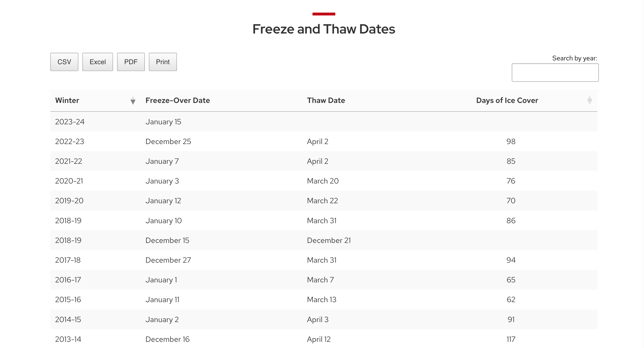
Raw data downloaded from this web page may be saved in CSV, or comma-separated-variable, format. Typically in such files, the first row contains the column headers and data is in subsequent rows. Fields (parts of the data in single columns, each column corresponding to a single variable) is separated from the others with commas. Typically, all rows contain the same variables, and so will have the same number of commas. The first few lines of the downloaded file appear like this.
"Winter","Freeze-Over Date","Thaw Date","Days of Ice Cover"
"2022-23","December 25","April 2","98"
"2021-22","January 7","April 2","85"
"2020-21","January 3","March 20","76"
"2019-20","January 12","March 22","70"
"2018-19","January 10","March 31","86"
"2018-19","December 15","December 21",""
The final lines of the data file are shown here.
"1857-58","November 25","March 26","121"
"1856-57","December 6","May 6","151"
"1855-56","December 18","April 14","118"
"1854-55","–","–",""
"1853-54","December 27","–",""
"1852-53","–","April 5",""
Note several anomalies which will need to be accounted for when analyzing this data:
- Missing data is recorded in multiple ways: missing dates with
"–"(this is not a simple dash, but is an em-dash) and missing quantitative data with"". - Dates are stored in unconventional format with a single string for the two years of the winter (such as “2022-23”) and a second string for the month and day. Months such as November and December correspond to the first year of the winter while months from January through May refer to the second year.
- All values, whether words or numbers, are surrounded by quotes, meaning all will be treated non-numerically.
- Data is displayed from most recent to earliest.
- There are some years where the freeze/thaw data is recorded on multiple rows.
For example, in the winter of 2018–2019, the surface of Lake Mendota first froze on December 15, then reopened on December 21 before freezing again on January 10 and subsequently thawing for the last time that winter season on March 31. Lake Mendota was ice covered for a total of 86 days during this winter. This total duration is the sum of two freeze durations, but is recorded on the final time interval with missing data in the days of ice cover for the earlier time interval.
3.4 Analysis
An analysis strategy for the Lake Mendota freeze and thaw data to address the question of how total ice cover duration changes over time might proceed in the following manner.
- Wrangle the data to transform it into a more useful format. The end product of this step could be a data set stored in a CSV file like the following.
winter,year1,year2,intervals,duration,first_freeze,last_thaw,decade
1855-56,1855,1856,1,118,1855-12-18,1856-04-14,1850s
1856-57,1856,1857,1,151,1856-12-06,1857-05-06,1850s
1857-58,1857,1858,1,121,1857-11-25,1858-03-26,1850s
1858-59,1858,1859,1,96,1858-12-08,1859-03-14,1850s
1859-60,1859,1860,1,110,1859-12-07,1860-03-26,1850s
...- Explore the data through visualization and numerical summaries.
We show examples of this below.
- Model the relationship between time and ice cover duration
Such a model might be represented as
\[ y = f(x) + \varepsilon \]
with a response variable \(y\) (ice cover duration in a single winter) is described by some function \(f\) of an explanatory variable \(x\) (the first year of the winter, say) plus a term which models data variation. The value \(f(x)\) for a given year represents the expected value of \(y\) in the given year. The term \(\varepsilon\) represents the difference between the observed value and what is expected and is typically modeled as chance variation.
- Evaluate the model
During model evaluation, we examine how well the data fits the underlying model and make adjustments if necessary. No model describes reality perfectly, but many models are quite useful helping to understand the truth behind the data.
In this example, we might consider models where the function \(f\) is a straight horizontal line, meaning we expect no change in annual ice cover over time, \(f\) is a straight line with a non-zero slope, meaning we expect steady, linear change in expected ice cover over time, or \(f\) is some more complicated curve, meaning that expected ice cover changes over time, but that the rate of change fluctuates over time.
- Interpret results
Interpreting model results involves making connections between elements of the model and information about the underlying setting. We may seek to quantify statistical evidence in support of various conclusions or make estimates or predictions while quantifying uncertainty.
This cycle of exploration, modeling, evaluation, and interpretation may repeat as analysis reveals additional questions or refinements to previous questions, prompting additional analysis. Finally,
- Communicate results
In this course, we will typically communicate results by creating written documents which include text, numerical summaries, and data visualizations. The goal of the communication is to help the data tell a story which reveals information about the motivating questions of interest.
We briefly demonstrate this data analysis using the Lake Mendota data as an example.
3.4.1 Wrangling the Lake Mendota Data
To address the question about how ice cover varies with time, we first need to wrangle with the data to put it into a more useful form. We want:
- a single row for each winter instead of for each freeze interval;
- a numerical variable
year1with the first year of the winter; - conventional dates for each date variable;
- more convenient variable names;
- rows arranged from oldest to most recent;
- the total duration that the lake ice covered each winter as a number.
Rather than trusting the values given, we can recalculate the length of time in days between the two dates for each freeze interval and then sum the totals by year.
To do all of these tasks, we will use tools from a variety of the tidyverse packages:
- The readr package has functions to read in data from various formats, including CSV files, recognizing different specifications of missing data.
- The dplyr package has many functions to wrangle data, modifying variables and doing various summaries and recalculations.
- The stringr package helps us to deal with string data. A string, in computer science, is an array of characters, such as “2018-19” or “December 13.
- The lubridate package has many functions to work with dates.
Each of these packages is described in the R for Data Science textbook and in a later chapter of these course notes. We will cover each of these packages with some depth during the first half of the course.
3.4.2 Lake Mendota Variables
The variables in lake-mendota-winters-2023.csv include variables:
| Variable | Description |
|---|---|
winter |
year range of the winter |
year1 |
first year of the winter |
year2 |
second year of the winter |
intervals |
the number of freeze intervals the lake is ice covered |
first_freeze |
the first date the lake surface first freezes |
last_thaw |
the first date the lake is not ice covered after the final freeze interval |
decade |
the decade (1850s, 1860s, …) of the winter |
Code to actually carryout these transformations of the raw data is presented later in these course notes. The next chapter covers data in R and discusses different types of data.
3.4.3 Visualizing Ice Cover Duration versus Time
An effective plot to show how ice cover duration changes versus time uses a trace plot which connects the durations from year to year and overlays a smooth curve which models a central tendency, allowing us to better distinguish between the overall pattern of decreasing ice coverage durations from the annual noise.

Effective graphs are a highly efficient way to capture and convey important data summaries. This data visualization displays the unmistakable trend of total annual ice cover duration decreasing substantially over time, in addition to moderate annual variation. The graph shows that the ice cover duration was typically close to about 125 days in the mid-1850s and is only about 80 days in recent years, estimated with a flexible model that does not constrain change over time to be linear.
We will begin learning to make effective graphs of data in the second week of the course and will continue to develop this skill throughout the semester.
3.4.4 Modeling Ice Cover versus Time
A statistical model for the duration of time in days that Lake Mendota is at least half covered by ice as a function of time (represented by the first year of the corresponding winter) might take the form \[ y_i = f(x_i) + \varepsilon_i, \quad \text{for $i=1,\ldots,n$} \] where \(i\) is an index for the winter, \(n\) is the number of winters in the data set, \(y_i\) is the total duration (in days) that Lake Mendota is ice covered for the \(i\)th winter, \(x_i\) is the first year of the \(i\)th winter, \(f(x)\) is the function which represents the expected duration in a given year as a characteristic of the climate in a given year, and \(\varepsilon_i\) is a random annual deviation from the trend in the \(i\)th year.
A simple model for \(f\) would be a straight line, as shown in red in the plot above. A more flexible model, shown with the smooth blue curve, perhaps is better for describing and making inferences about how typical ice cover duration of Lake Mendota has changed over time.
While we will often use sophisticated models for descriptive purposes when adding smooth curves to visualize trends, such as when adding the smooth blue curve to the previous plot, the details of such models are far beyond the scope of this course.
In the second half of the semester, we will introduce statistical modeling, estimation, prediction, and testing.
3.4.5 Model Evaluation
Residual plots, which highlight the difference between observed data values and their predicted values by some model, are useful informal ways to examine model adequacy. The plots below show residuals for the linear (red line) and more flexible (blue curve) models of the data. A residual plot versus the explanatory variable \(x\) which shows a scatter of residuals with little apparent curvature and similar residual size as \(x\) varies is informal evidence of a sufficiently accurate model of the data. In the plots below, we see some non-linear trends in the residual plot from the straight-line model.

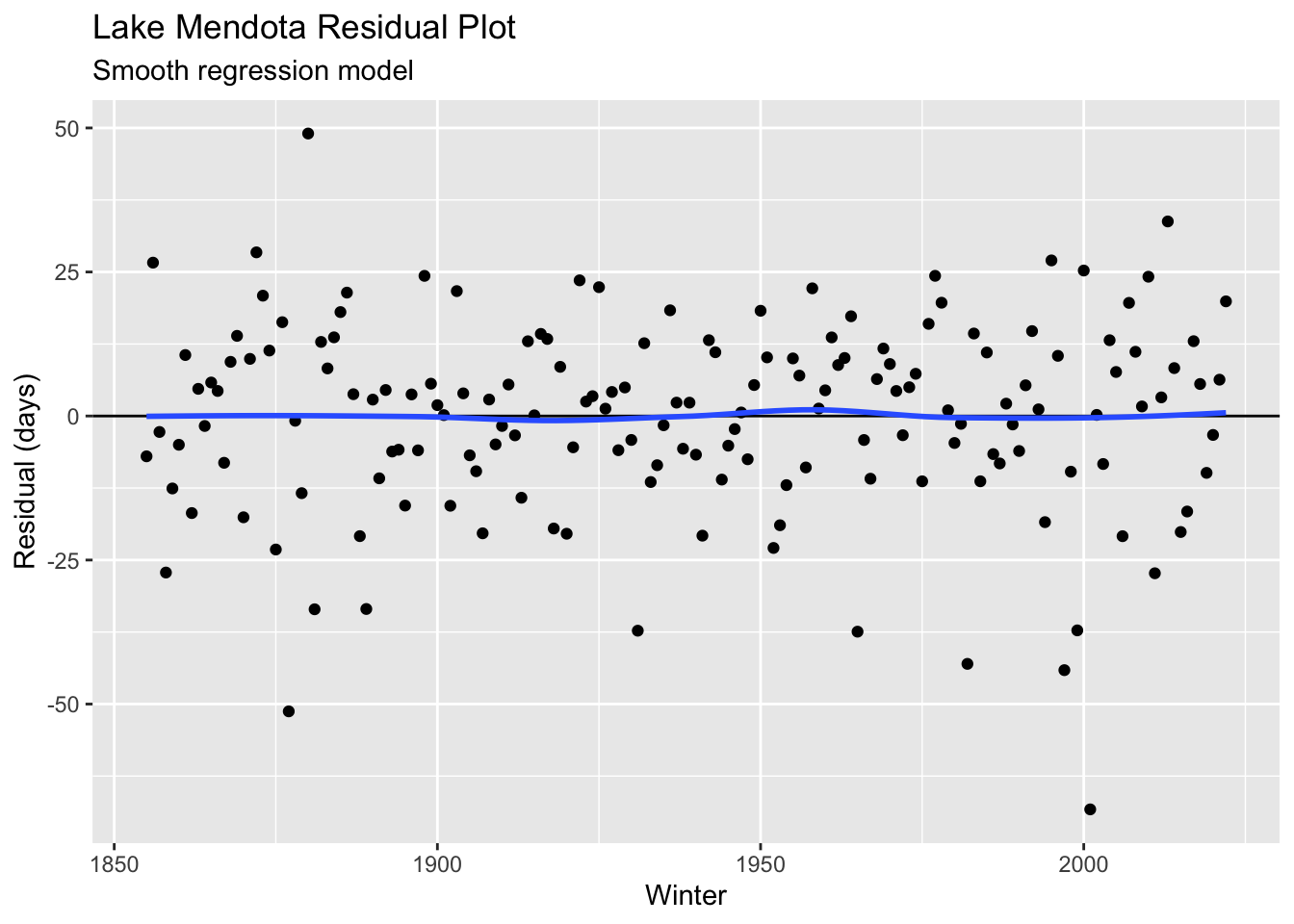
Here we see some evidence of lack of fit from a straight-line model where the model estimates tend to be too high by a few days on average in the decades near 1900 and too low for the decades near 1960. Any potential bias in the linear model is fairly small as compared to the annual fluctuation in observations and may not be that important, depending on the question of interest.
Further courses will develop more formal inference tools for evaluating and comparing models. In this course, we will only consider simple models with a single explanatory variable.
3.4.6 Interpretation
We may interpret the model in the following way: there is some smoothly changing function \(f\) which represents the expected duration of Lake Mendota ice cover as a function of year (first year of the corresponding winter) which may be considered to be a characteristic of the climate in Madison. This expected value cannot be measured directly, but rather is interpreted as an average. The actual ice cover in any given winter depends on the weather during that winter, which we model as some random weather effects. With this interpretation, an observed duration of ice cover \(y\) in the winter beginning in year \(x\) is equal to a sum of two components: \(y = f(x) + e\), where \(f(x)\) is interpreted as the climate effect in that year and \(e\) is a random deviation from the climate mean due to weather.
The graph and more formal statistical inference show unmistakable strongly supported change in climate over the time with a substantial decrease in the average ice cover of Lake Mendota over time. The size or rate of this change can be estimated. In a simple linear regression model (red line), We estimate a rate of change of \(1.9 \pm 0.5\) days per decade (95% confidence interval), on average, which corresponds to a decrease of about 32 days over the duration of the study. The more flexible model (blue curve) leads to a similar average rate of change, but with fluctuating rates. This model estimates a larger change due to change in climate of about \(125 - 80 = 45\) days. Future predictions based on these models may disagree substantially as the flexible model estimates that the current rate of reduction in expected ice cover is decreasing more rapidly than the average 1.9 days per decade over the past 170 years.
Both models estimate the size of a typical deviation between the observed ice cover in a winter and its expected value by about 17 days, or about two and a half weeks. Thus, while there is unmistakable evidence of climate change over time, the total ice cover in any given winter is difficult to predict accurately, as it is not at all unusual for the actual value to fall outside an interval which extends a couple weeks in either direction.
3.5 Data analysis workflow
A data analysis typically goes through the following steps:
- Data import: Acquire data and read it into R.
- Sometimes, the data needs transformation outside of R before reading. In this example, the raw data from the website is not stored in an easy machine-readable form, and because the entire data set was small and the specific formatting issues were so idiosyncratic, it was not worth writing code to do the transformation and I just edited the jumbled data file by hand.
- Data cleaning and transformation: Verify data accuracy and reshape if necessary.
- This step can involve a cycle of data visualization and summarization. In this example, date information needs to be extracted, and ice cover durations checked for consistency with dates. A separate summary by winter can be created from this cleaned interval data set.
- Data analysis: Turn data into information.
- Cycle through steps of data transformation, summarization, visualization, and modeling. In this example, we showed a visualization of the duration in which Lake Mendota was closed by ice versus time. Further analysis could model this relationship, examine statistical evidence supporting the observed pattern, and explore other questions such as changes in the start and ends of the time period when the lake is closed by ice.
- Communication: Report the results of the analysis.
- Create a document reporting results with graphical and numerical data summaries as supporting evidence in a document for a target audience.
The aim of the course is to develop your mastery to accomplish each of these steps. With each new case study, we will follow much of this workflow. Early in the semester, you will focus on one aspect of the workflow and we will provide the missing steps. As the semester progresses, you will put into practice skills you have developed, enhance abilities in these areas, and start to master new topics with the aim of being able to do the entire workflow independently for novel data by the end of the semester.
3.6 Next Steps
The first major topic we will tackle is data visualization. But prior to that, we will delve a bit deeper into the structure of data. Most data that we will analyze is in the form of a data frame with one row for each case (for example, a single interval of when a lake is frozen or a single winter) and one column for each variable. Variables in a data frame are vectors of data all of the same type.
The next chapter briefly introduces important statistical concepts for describing and summarizing data.