Chapter 2 Empirical distribution
2.1 Presenting empirical distribution in tables
2.1.1 Individual series (raw data)
When we present all collected information without grouping — e.g., as a column in a table or a comma-separated list — we refer to it as an individual series. Another name for this is an detailed series. It is also often described as raw data.
A detailed series can apply to both qualitative and quantitative variables.
Example:
Suppose we ask eight students about their family size (“How many children does your mother have”) and receive following answers:
| Student ID | Family size |
|---|---|
| 1 | 1 |
| 2 | 6 |
| 3 | 2 |
| 4 | 2 |
| 5 | 3 |
| 6 | 2 |
| 7 | 2 |
| 8 | 2 |
These values can also be written simply as a list:
1; 6; 2; 2; 3; 2; 2; 2
2.1.2 Discrete frequency distribution table
A frequency distribution is a grouped representation of data.
A discrete frequency distribution lists all possible values of a variable along with their frequencies (i.e., how many times each value occurred).
Such a frequency distribution can be used for both qualitative and discrete quantitative variables.
In a discrete frequency distribution, no information is lost — that is, the detailed individual series can be fully reconstructed.
Examples:
| Family size | Number of respondents |
|---|---|
| 1 | 14 |
| 2 | 59 |
| 3 | 10 |
| 4 | 6 |
| 5 | 1 |
| 6 | 1 |
| Chest circumference (in inches) | Number of observations |
|---|---|
| 33 | 3 |
| 34 | 18 |
| 35 | 81 |
| 36 | 185 |
| 37 | 420 |
| 38 | 749 |
| 39 | 1073 |
| 40 | 1079 |
| 41 | 934 |
| 42 | 658 |
| 43 | 370 |
| 44 | 92 |
| 45 | 50 |
| 46 | 21 |
| 47 | 4 |
| 48 | 1 |
2.1.3 Grouped (interval) frequency distribution table
A grouped frequency distribution represents ranges (intervals) of values together with their frequencies.
In this case, some information is lost — it is no longer possible to reconstruct the original detailed series. Grouped frequency distributions are created for quantitative variables.
A histogram can be constructed based on a grouped frequency distribution.
Example:
| Interval | Number of cases |
|---|---|
| up to 15 days | 161 328 |
| over 15 days to 1 month | 118 435 |
| over 1 to 2 months | 265 533 |
| over 2 to 3 months | 263 151 |
| over 3 to 6 months | 309 985 |
| over 6 to 12 months | 141 561 |
| over 12 months to 2 years | 68 070 |
| over 2 to 3 years | 23 978 |
| over 3 to 5 years | 11 973 |
| over 5 to 8 years | 3 911 |
| more than 8 years | 2 305 |
2.2 Visualization of qualitative variable distributions
Visualizing qualitative (categorical) variables helps summarize how observations are distributed across categories. Below are several common graphical forms: bar charts, stacked bar charts, pie charts, and other specialized plots.
2.2.1 Bar charts
Bar charts display the frequency (or proportion) of observations in each category.
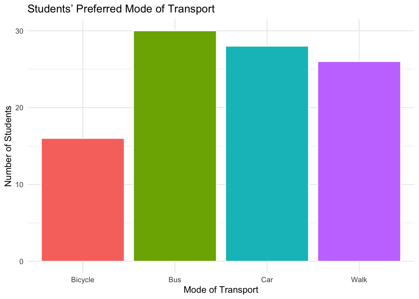
Figure 2.1: Example of a bar chart showing students’ preferred mode of transport.
2.2.2 Stacked bar charts
Stacked bar charts visualize two categorical variables at once, showing both composition and comparison.
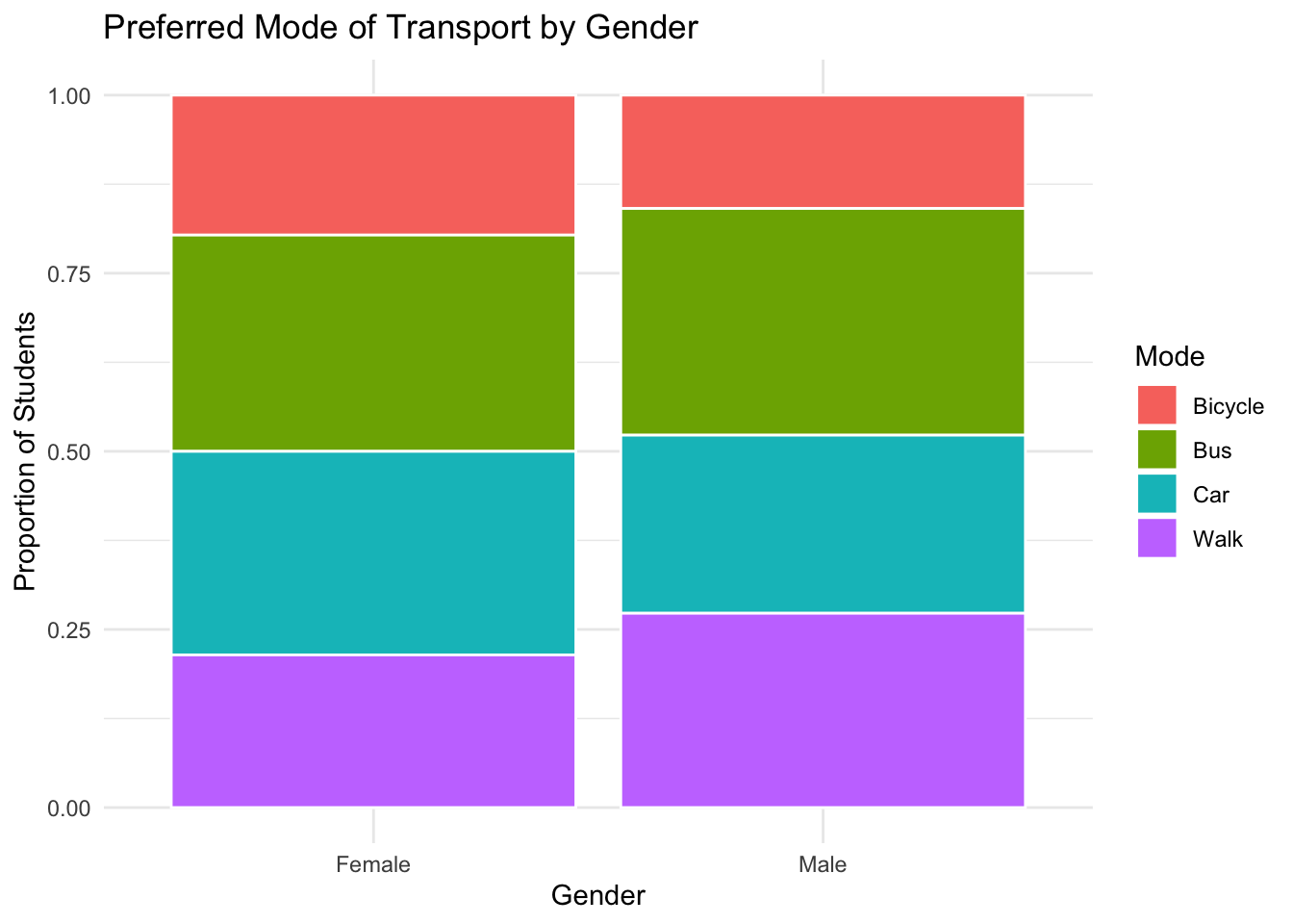
Figure 2.2: Example of a stacked bar chart.
2.2.3 Pie charts
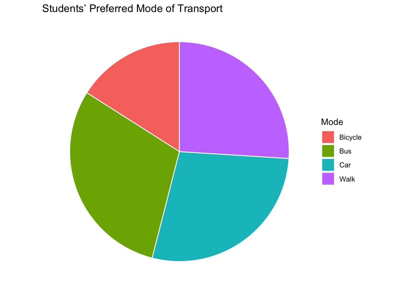
Figure 2.3: Example of a stacked bar chart.
Pie charts are generally not recommended because they make it difficult to accurately compare the sizes of categories — our eyes are much better at judging lengths (as in bar charts) than angles or areas. When there are many categories or the differences between them are small, it becomes almost impossible to interpret the proportions correctly. Bar charts, in contrast, allow for easy comparison across categories and can clearly display both frequencies and proportions. Therefore, while pie charts can be visually appealing for simple summaries with only a few categories, bar charts are usually a more effective and informative choice.
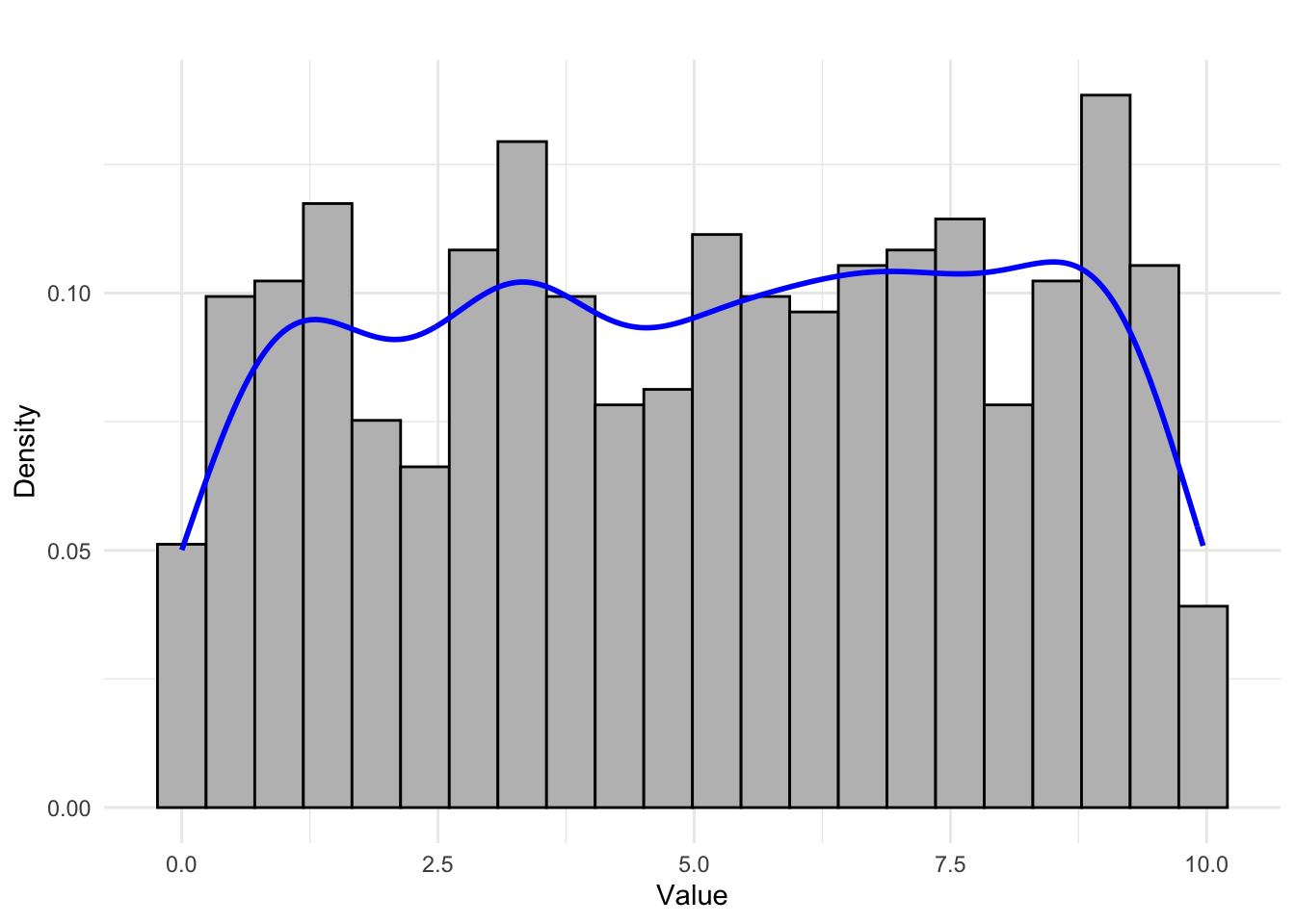
2.3 Histogram – visualisation of quantitative variable distributions
A histogram is a chart that helps visualize the shape of the distribution of a quantitative variable. Creating a histogram requires prior grouping of observations into class intervals (i.e., preparing a grouped frequency distribution).
The intervals are marked on the X-axis. For each of these intervals, the number of observations falling within the interval is determined.
Usually, the intervals (“bins”) are of equal width, although variable-width intervals are also possible.
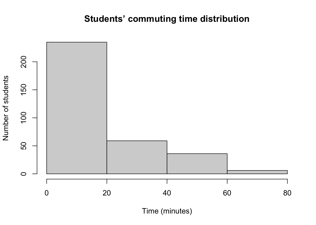
Figure 2.4: Example of a histogram with equal bins.
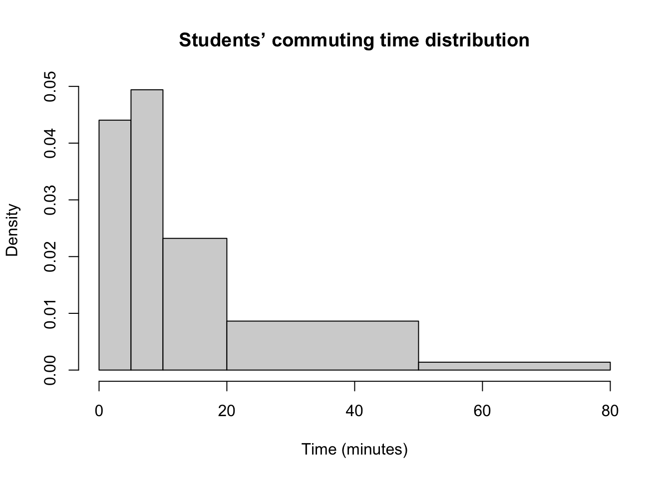
Figure 2.5: Example of a histogram with non-equal bins.
2.3.1 What is on the Y-axis?
In a histogram, the area of each rectangle is what matters — the height is secondary. The area of each bar should correspond to the number of observations in the respective interval.
In a histogram with equal-width intervals, the Y-axis may represent frequency, relative frequency, or density — because all bars have the same width, the area is directly proportional to the height.
In a histogram with unequal-width intervals, the Y-axis must represent density (i.e., relative frequency divided by the interval width). This ensures that the area of each bar remains proportional to the frequency of observations within that interval.
In histnotequalcalc we show how to arrive at density needed to plot histogram (histnotequal).
Figure 2.5 illustrates a histogram with non-equal bins. Table 2.5 presents the calculation of density values required to correctly plot such a histogram.
| Interval | Number of observations | Relative frequency | Interval width | Density |
|---|---|---|---|---|
| (0,5] | 74 | 0.2202381 | 5 | 0.0440476 |
| (5,10] | 83 | 0.2470238 | 5 | 0.0494048 |
| (10,20] | 78 | 0.2321429 | 10 | 0.0232143 |
| (20,50] | 87 | 0.2589286 | 30 | 0.0086310 |
| (50,80] | 14 | 0.0416667 | 30 | 0.0013889 |
2.3.2 Shapes of histograms
Typical histogram shapes:
- Approximately symmetric, unimodal distribution
- Right-skewed distribution
- Extremely right-skewed (highly asymmetric) distribution
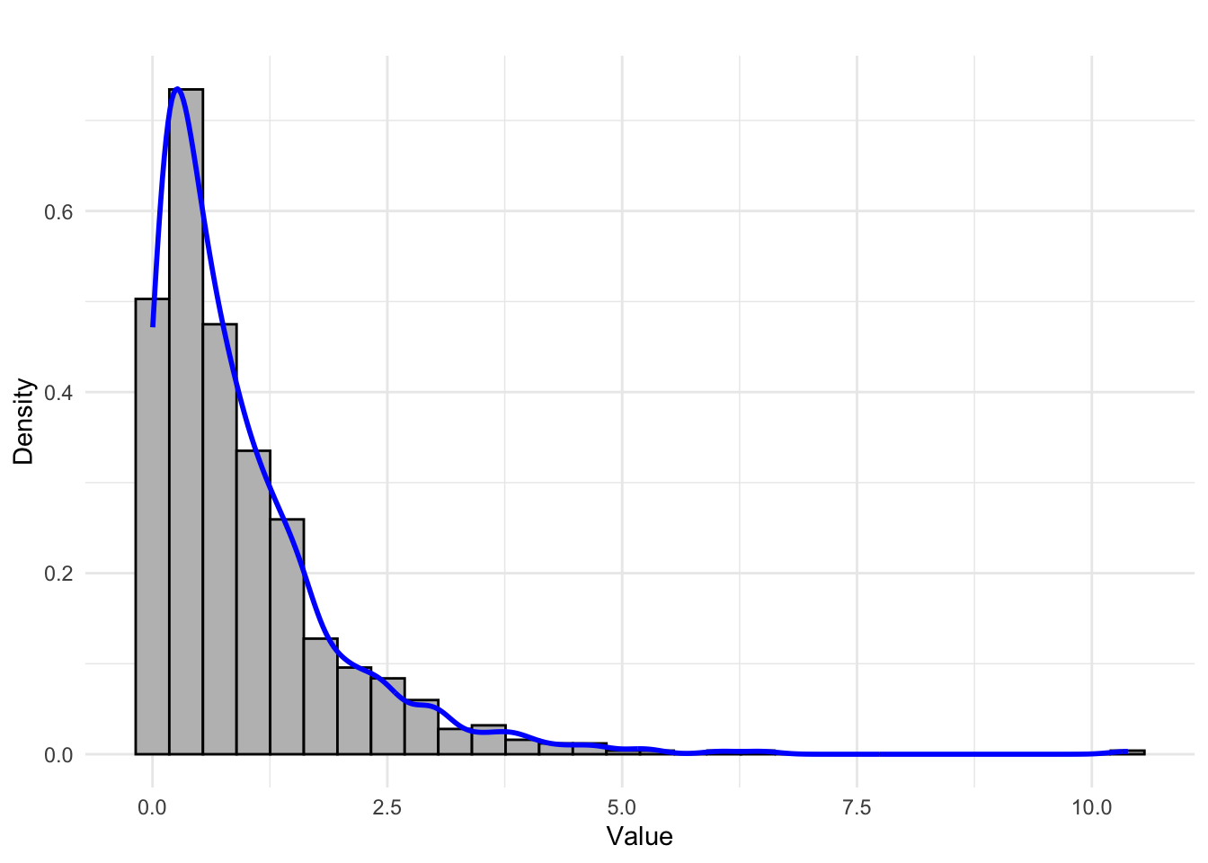
- Left-skewed distribution
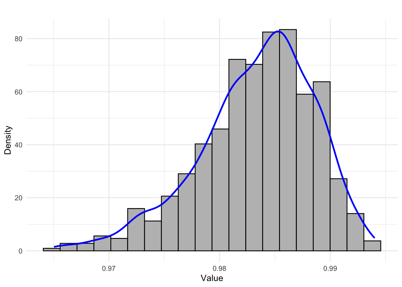
- Bimodal distribution
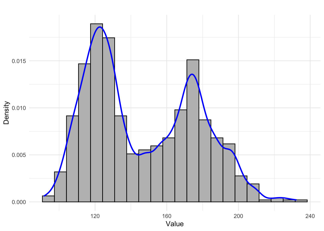
- Uniform (even) distribution
2.3.3 Number of Class Intervals
There are several rules for determining the number (or width) of class intervals.
For example:
- Square root rule
\[k=\sqrt{n}\]
Where:
\(k\) = number of bins
\(n\) = number of observations
- Sturges’ rule
\[k=1+log_2(n)\]
- Freedman-Diaconis rule
\[\text{Bin width}=\frac{2\cdot IQR}{\sqrt[3]{n}}\]
Where IQR is the interquartile range (see 4.2).
- Scott’s rule
\[\text{Bin width}=\frac{3\cdot s}{\sqrt[3]{n}}\]
Where \(s\) is the sample standard deviation.
However, the most important is the visual rule: the histogram should look good (should be “visually informative”) — the intervals should be neither too wide (too few bars) nor too narrow (too many bars).
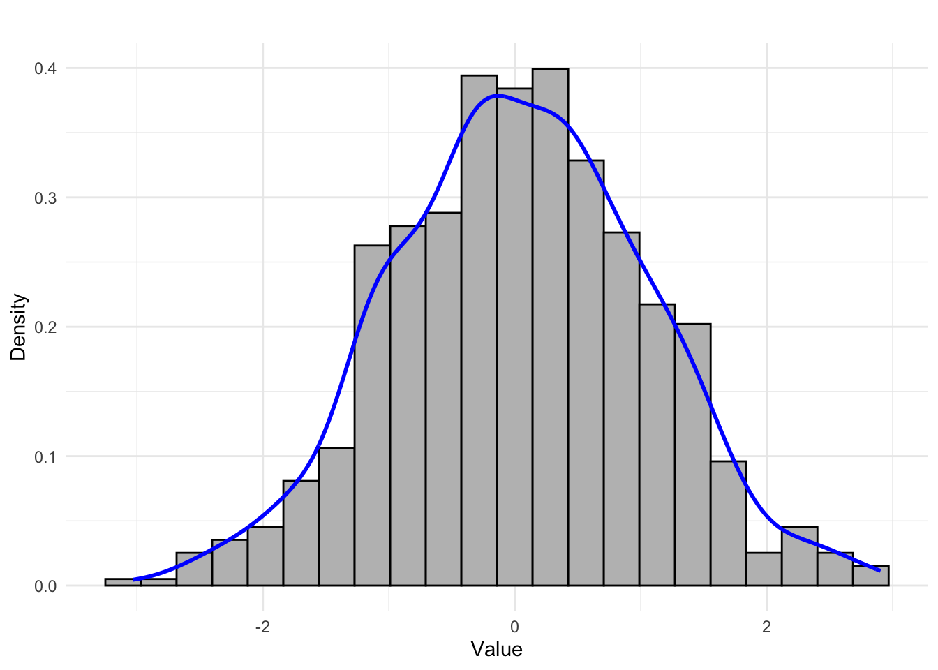
2.3.4 Kernel density estimator
A kernel density estimator is a smooth curve that estimates the probability density function of a continuous variable. Unlike histograms, which are blocky and depend on bin width and placement, kernel density plots provide a continuous and often more visually appealing representation of the distribution.
Kernel density plots are especially useful for identifying modes and skewness in the data.
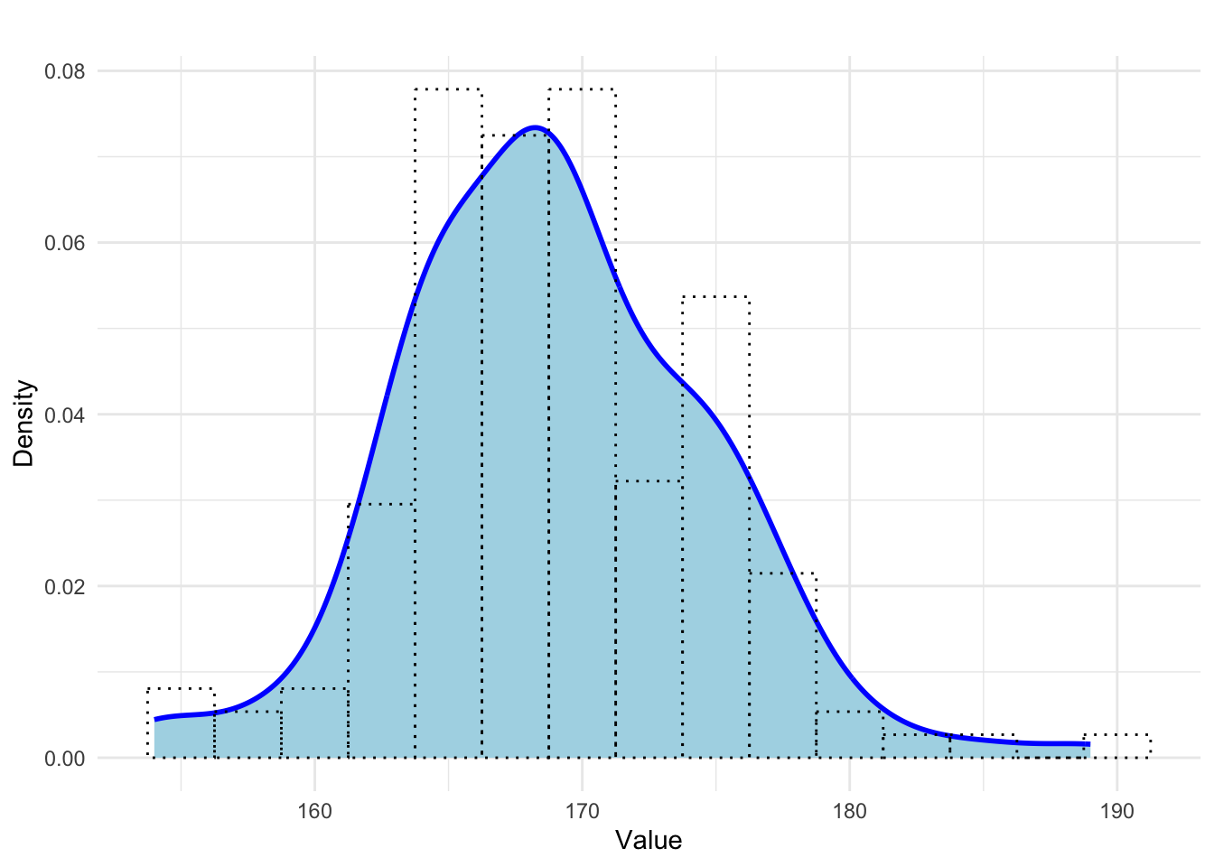
Figure 2.6: Example of a density plot illustrating height of female students in a statistics course with an overlaid histogram.
2.3.5 Violin plot
A violin plot is a type of chart most commonly used to present and compare distributions of quantitative data. A single distribution in a violin plot is shown as two identical kernel density estimators, mirrored along a vertical or horizontal axis of symmetry and joined together. The name of the plot comes from its supposed resemblance to the shape of a violin.
Violin plots are particularly useful for comparing distributions between groups.
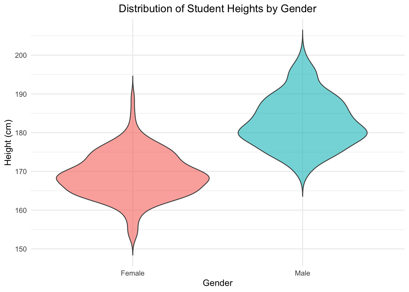
Figure 2.7: Example of a violin plot comparing height distributions of male and female students.
2.4 Empirical cumulative distribution function
The empirical cumulative distribution function (ECDF) shows the proportion of observations less than or equal to a given value.
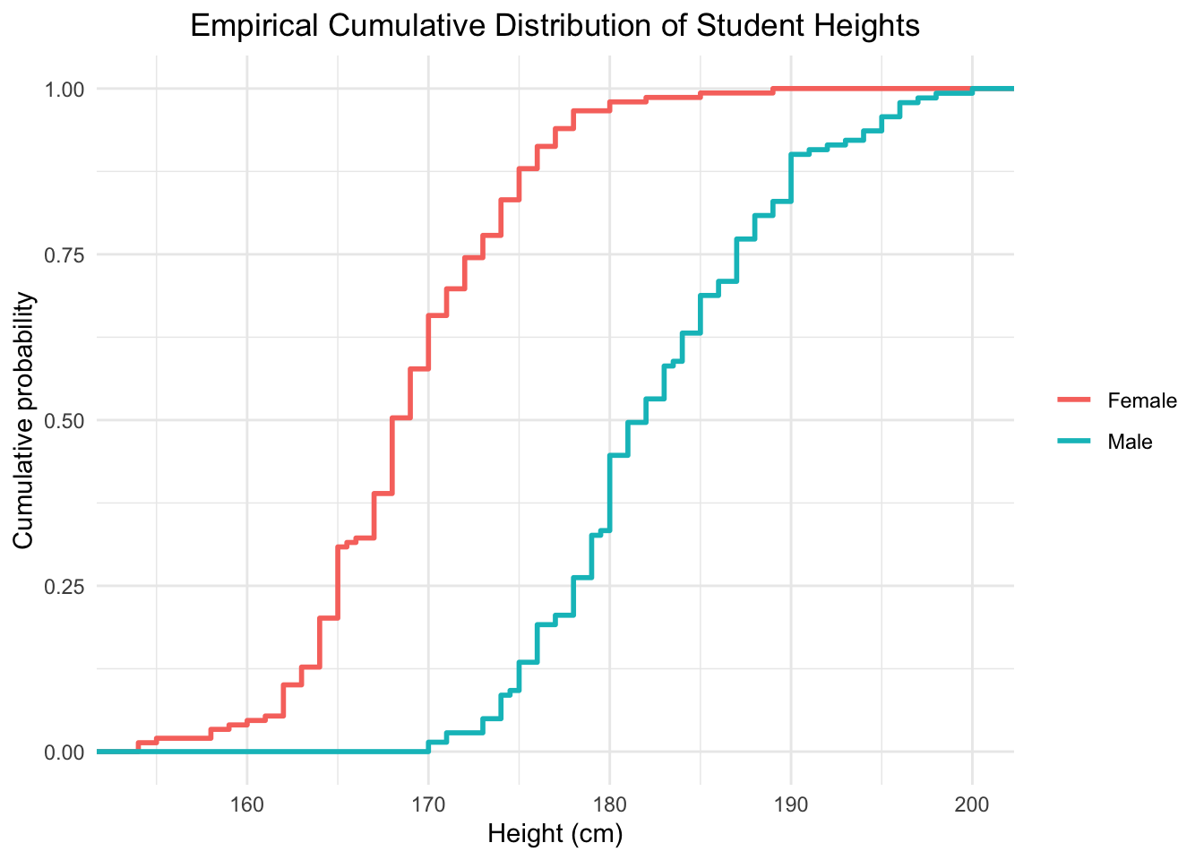
Figure 2.8: Empirical cumulative distribution functions of male and female students’ heights.
2.5 Links
Histogram — how does the number/width of class intervals affect its shape? Online simulation: https://college.cengage.com/nextbook/statistics/utts_13540/student/html/simulation2_1.html
2.6 Exercises
Exercise 2.1 Using data from SpeedRadarData.csv, create a histogram showing the speed of two-wheelers near a speed radar. What might explain the shape of the histogram? What is this distribution shape called?
Exercise 2.2 (Freedman, Pisani, and Purves 2007) This graph shows the distribution of families by income in the United States in 1973.
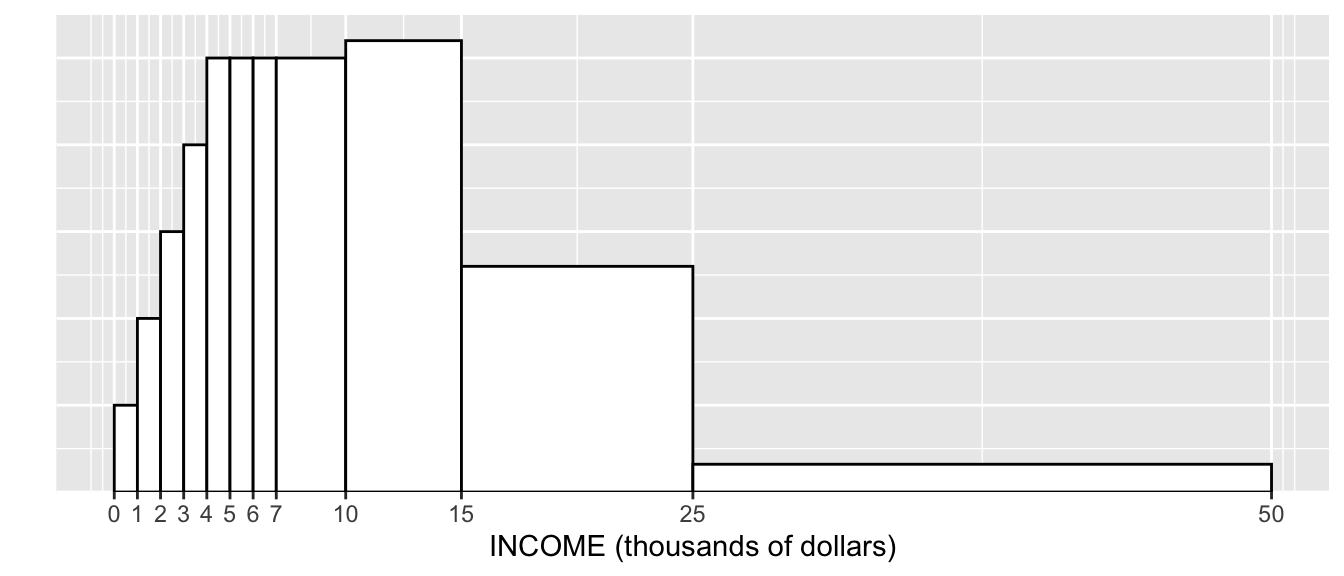
About 1% of the families in the figure had incomes between $0 and $1,000. Estimate the percentage who had incomes:
- between $1,000 and $2,000: %
- between $2,000 and $3,000: %
- between $3,000 and $4,000: %
- between $4,000 and $5,000: %
- between $4,000 and $7,000: %
- between $7,000 and $10,000: %

- A y-axis scale has been added to the histogram above. The numbers (heights of the bars) show:
- Were there more families earning between $10k and $11k or between $15k and $16k? Or were the numbers about the same? Make your best guess.
Exercise 2.3 (Freedman, Pisani, and Purves 2007) The histogram below shows the distribution of final exam scores in a certain statistics class.
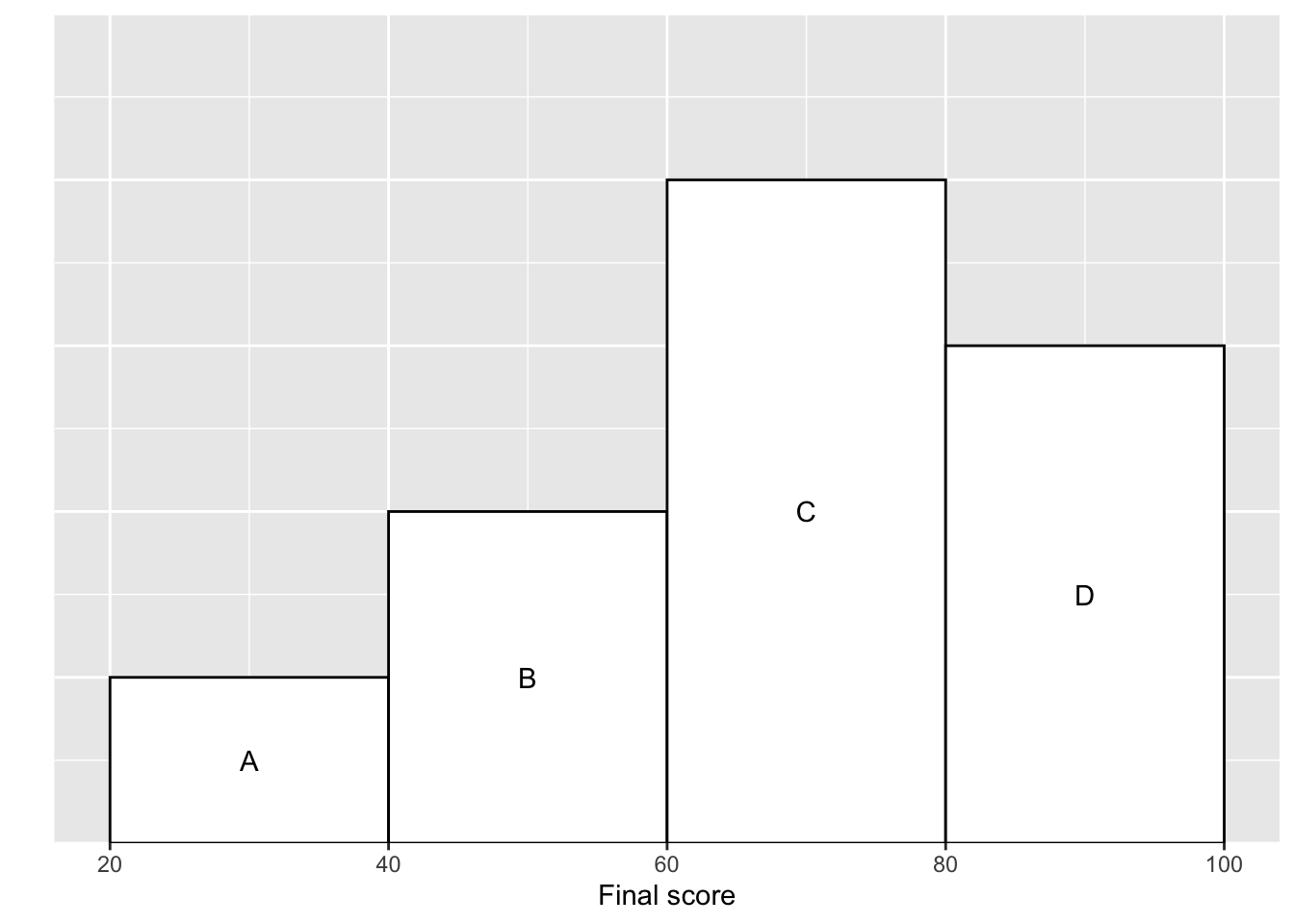
Which block represents the people who scored between 60 and 80?
Ten percent scored between 20 and 40. About what percentage scored between 40 and 60? %
About what percentage scored over 60? %
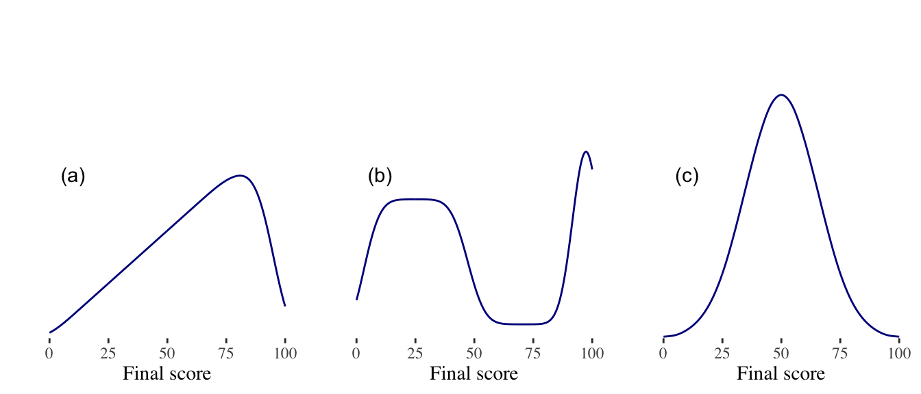
Exercise 2.4 (Freedman, Pisani, and Purves 2007) Below are sketches of histograms (or kernel density plots) for test scores in three different classes. The scores range from 0 to 100; a passing threshold was 50. For each class, was the percent who passed about 50%, well over 50%, or well under 50%?
Class (a):
Class (b):
Class (c):
One class had two quite distinct groups of students, with one group doing rather poorly on the test, and the other group doing very well. Which class was it?
In class (b), were there more people with scores in the range 30-40 or 90-100?
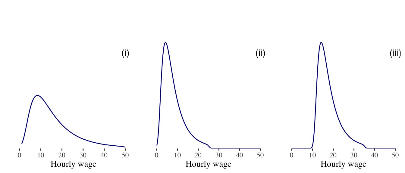
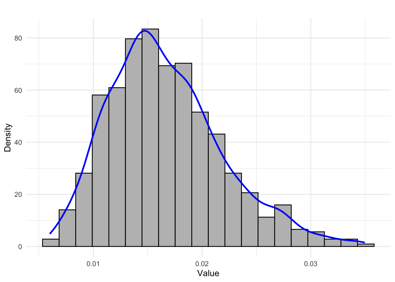
Exercise 2.5 (Freedman, Pisani, and Purves 2007) An investigator collects data on hourly wage rates for three groups of people. Those in group B earn about twice as much as those in group A. Those in group C earn about $10 an hour more that those in group A. Which kernel density plot belongs to which group? (The plots do not show wages above $50 an hour.)
Density plot (i): Density plot (ii): Density plot (iii):