Chapter 9 Simple regression
9.1 Standard deviation line on a scatter plot
Before introducing linear regression, it is helpful to draw the standard deviation (SD) line on a scatter plot (keep in mind that the SD line is not the regression line, which will be introduced later).
The SD line passes through the point of means (\(\bar{x}, \bar{y}\)) and its slope is:
\[\text{slope of SD line} = \pm \frac{s_y}{s_x} \tag{9.1} \]
The sign depends on the direction of association between the variables:
- positive slope – if the Pearson correlation coefficient is positive (higher values of (x) tend to correspond to higher values of (y),
- negative slope – if the Pearson correlation coefficient is negative.
Note that the SD line represents the direction along which linearly correlated points on the scatter plot tend to cluster.
Figure 9.1: Scatter plot showing the heights of 1,078 fathers and their adult sons in England, circa 1900 with the SD line (in orange).
Figure 9.2: Scatter plot of Z-standardized heights of fathers and sons. Note the SD line is a y=x line when x and y are Z-scores.
9.2 Conditional averages on a scatter plot
Linear regression can be viewed as a simplified way to describe how the conditional averages of one variable (\(Y\)) change as another variable (or set of variables) (\(X\)) varies. In Figure 9.3, the conditional averages of sons’ heights across intervals of fathers’ heights are illustrated. These averages provide an intuitive starting point for understanding the concept of regression, as they show the expected value of \(Y\) for different ranges of \(X\). If the conditional averages form an approximately straight line, then a linear regression model might provide a reasonable approximation of the relationship between the variables.
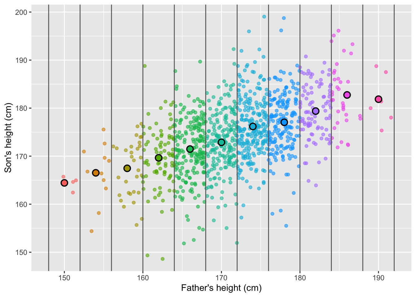
Figure 9.3: Heights of fathers and sons plotted as individual points, with group averages for sons based on fathers’ height categories highlighted.
9.3 Simple linear regression
9.3.1 Variable names
A simple linear regression is a statistical method used to describe the relationship between two quantitative variables:
one dependent variable (\(Y\)) — the outcome we want to predict or explain. Other names include “explained variable”, “response variable”, “predicted variable”, “outcome variable”, “output variable”, or “target.”
one independent variable (\(X\)) — the “predictor”, “regressor”, “explanatory”, or “input” variable.
9.3.2 Regression line on a scatter plot
A regression line represents the predicted values of \(Y\) for given values of \(X\) under the assumption of a linear relationship. It is drawn through the data points in such a way that it best fits the overall trend.
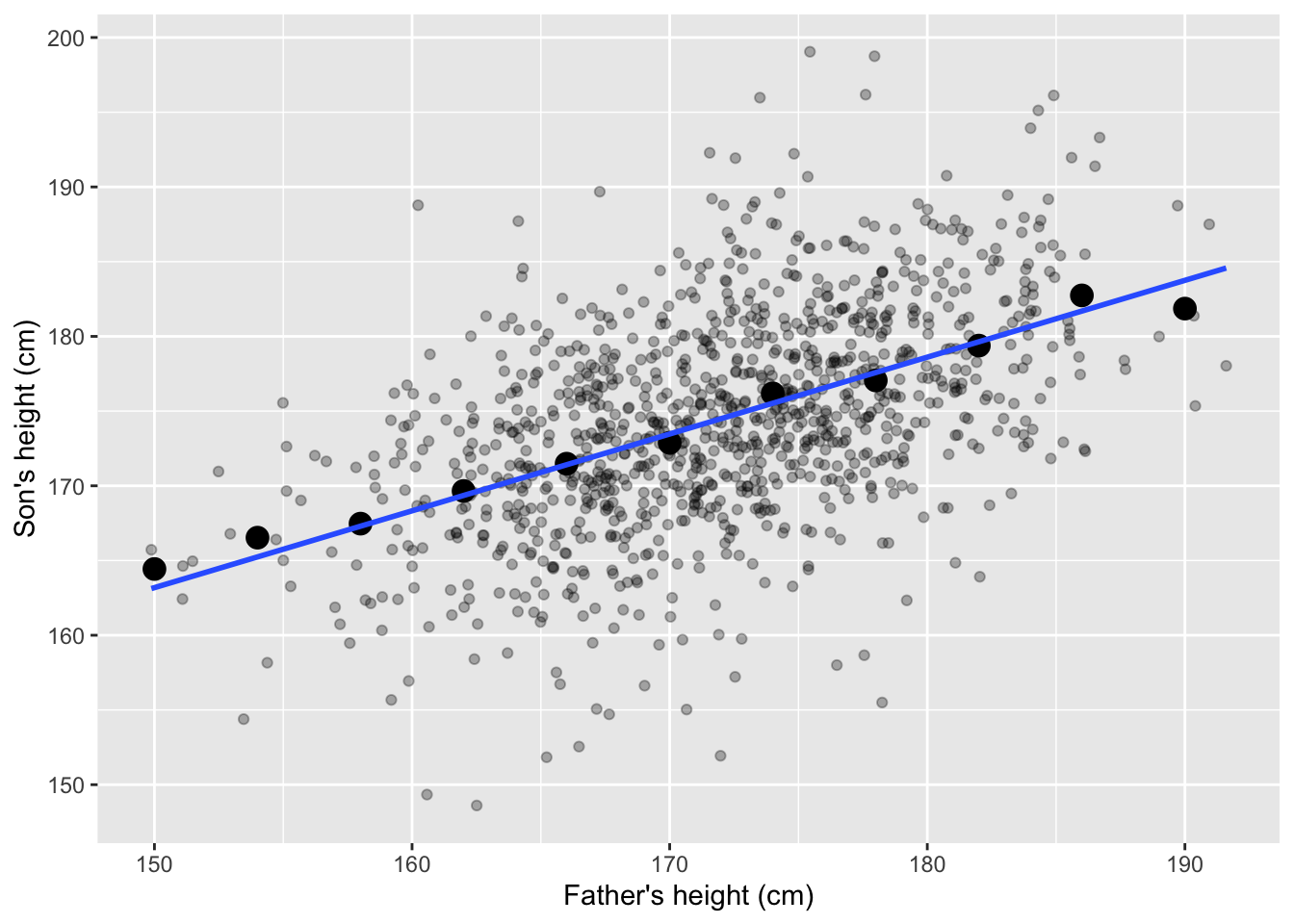
Figure 9.4: Heights of fathers and sons, group averages and the regression line.
9.3.3 Formula
The fitted regression line is expressed as:
\[\widehat{y_i} = \widehat{\beta}_0 + \widehat{\beta}_1 x_i, \tag{9.2}\]
where:
\(x_i\) is the value of the independent variable \(X\),
\(\widehat{y_i}\) is the predicted average of \(Y\) given \(X = x_i\),
\(\widehat{\beta}_0\) is the intercept of the regression line,
\(\widehat{\beta}_1\) is the slope of the regression line.
The intercept is the predicted average value of \(y\) when \(x_i=0\). In other words, it is the point where the fitted regression line crosses the \(Y\)-axis.
The slope indicates how the predicted average of \(Y\) changes for each one-unit difference in \(X\). A positive slope means \(Y\) tends to increase as \(X\) increases; a negative slope means \(Y\) tends to decrease.
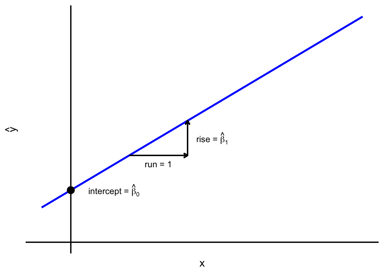
Figure 9.5: Regression line – intercept and slope.
Many equivalent formulas for the slope of the fitted regression line exist, but the most intuitive expression for the slope links it to the correlation and standard deviations of \(X\) and \(Y\):
\[\widehat{\beta}_1 = r_{xy} \frac{s_y}{s_x} \tag{9.3}\]
For every one standard deviation increase in \(X\), the predicted value of average \(Y\) changes by \(r_{xy}\) times the standard deviation of \(Y\). The formula and its practical implication are illustrated in Figure 9.6.
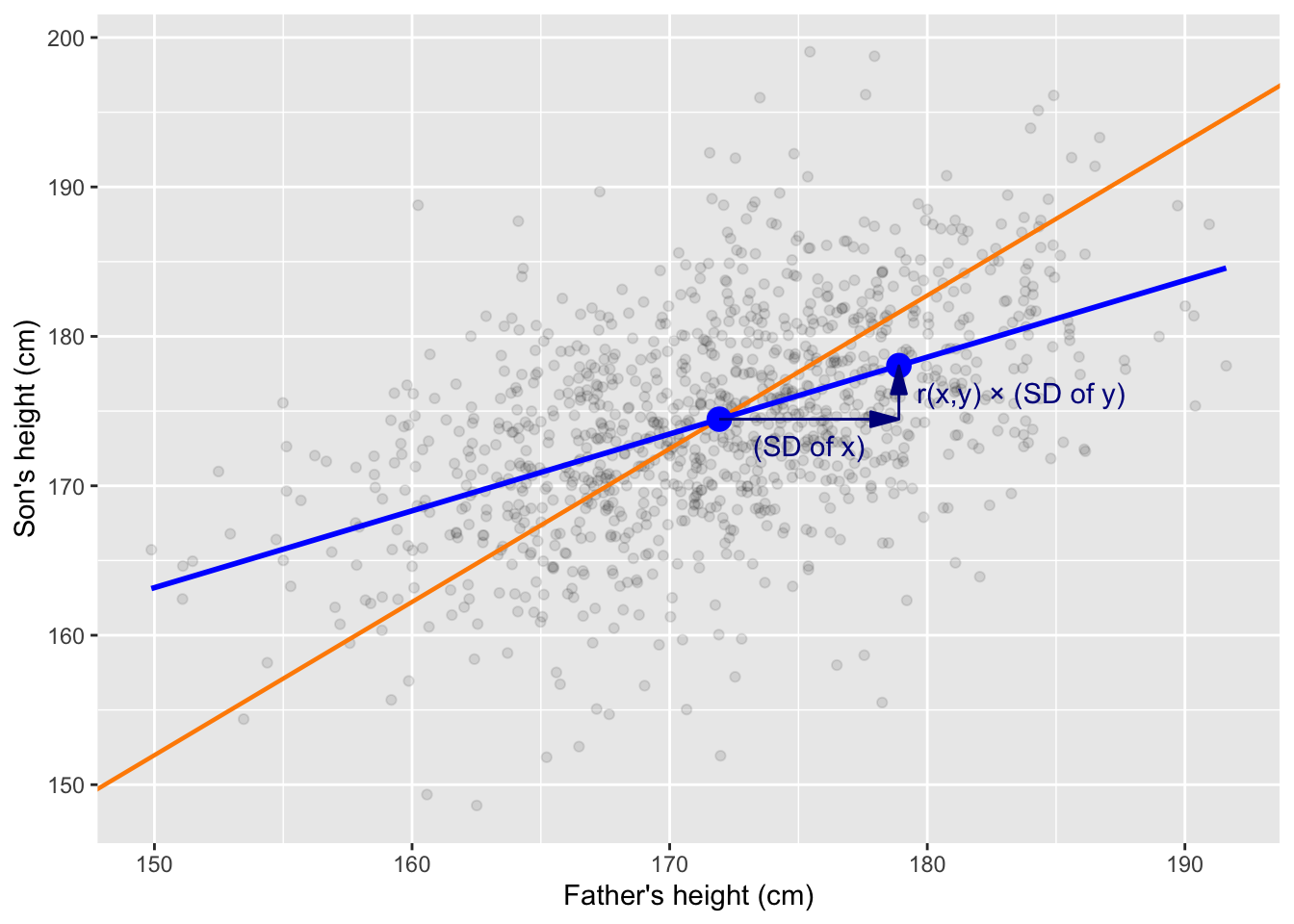
Figure 9.6: The slope of the regression line reflects the correlation between X and Y. On average, a one standard deviation increase in X corresponds to an increase of r times the standard deviation of Y. The blue line represents the regression line, illustrating the predicted relationship between X and Y. The orange line shows the SD line. The blue points mark (1) the point of averages (mean of X and Y) and (2) the predicted average value of Y when X is one standard deviation above its mean.
The fitted intercept is computed as:
\[\widehat{\beta}_0 = \bar{y} - \widehat{\beta}_1 \bar{x}. \tag{9.4}\]
Equation (9.4) ensures the regression line passes through the point of averages \((\bar{x}, \bar{y})\), just like the SD line (see 9.6).
9.3.4 Residuals and least squares
Residuals (denoted \(e_i\) or \(\widehat{\varepsilon}_i\)) are the differences between observed values and predicted values:
\[e_i = y_i - \widehat{y}_i \tag{9.5}\]
They measure the vertical distance from each data point to the regression line. Analyzing residuals helps assess the goodness of fit and detect patterns that may violate linearity assumptions of the regression model.
The least squares method finds the straight line that minimizes, the sum of squared residuals (SSR). For any line defined by \(\widehat{y}_i=b_0+b_1 x_i\), we seek the values of \(b_0\) and \(b_1\) that minimize:
\[ \sum_{i=1}^{n}(y_i - \widehat{y}_i)^2 = \sum_{i=1}^{n}(y_i - b_0 - b_1 x_i)^2 \tag{9.6}\]
The line that achieves this minimum is defined as the regression (the minimum least squares) line. This criterion makes the total squared distance between observed values (\(y_i\)) and predicted values (\(\widehat{y}_i\)) as small as possible. Squaring the residuals ensures that positive and negative deviations don’t cancel out, and it penalizes larger deviations more heavily than smaller ones.
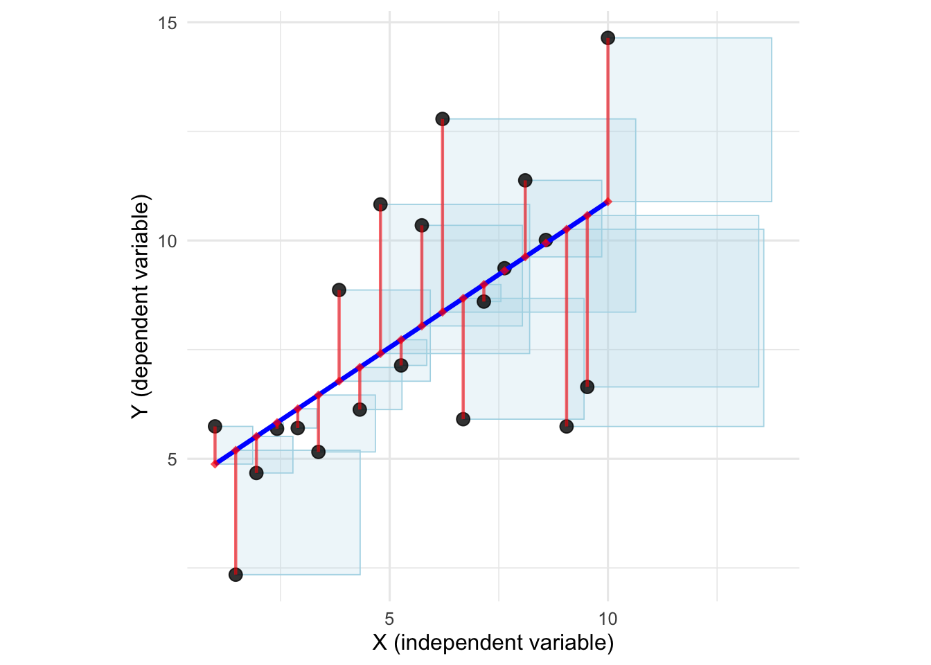
Figure 9.7: Scatter plot, regression line, residuals and squared residuals. Regression line is the straight line minimizing the total area of the squares.
9.3.5 R-squared
The coefficient of determination (\(R^2\), R-squared) is often described as the proportion of variation in \(Y\) explained by \(X\). This statement is correct, but only if we specify that this “variation” is quantified using the sum of squares. In other words, \(R^2\) measures how much of the total sum of squared deviations in \(Y\) is accounted for by the regression model.
\[R^2=1-\frac{\text{SS}_{res}}{\text{SS}_{tot}}, \tag{9.7}\]
where:
- \(\text{SS}_{res}\) is the sum of squared residuals (“residual sum of squares”):
\[\text{SS}_{res} = \sum_i{e_i^2} \tag{9.8}\]
- and \(\text{SS}_{tot}\) is the “total some of squares” (sum of squared deviations from the mean):
\[\text{SS}_{tot} = \sum_i{(y_i-\bar{y})^2} \tag{9.9}\]
For the simple linear regression R-squared is equivalent to the squared Pearson correlation coefficient:
\[R^2 = r_{xy}^2 \tag{9.10}\]
9.4 Using and interpreting regression
9.4.1 Purpose of regression models
Linear regression and similar statistical models are used to:
describe association between X and Y in the data set (and estimate this association in the data generating process),
predict the dependent variable based on the value(s) of explanatory variable(s) \(X\),
explore potential causal structures between \(X\)s and \(Y\), also in order to assess possibility of intervention.
Linear regression is a relatively straightforward tool for describing relationships in data. By fitting a linear model, we can quantify how explanatory variable is associated with the response, summarize the overall structure of the data, examine the variation that remains unexplained.
Prediction usually assumes that the data generating process for new observations is similar to that of the one that generated data set at hand. It provides a principled way to estimate unobserved values based on observed patterns. We use regression-based prediction for prognosis/forecasting, data imputation, interpolation and smoothing, anomaly detection, and in many other situations.
While regression itself does not prove causality (correlation does not imply causation, 8.3), it can suggest potential causal links if combined with domain knowledge, experimental design (e.g., randomized controlled trials), and control for confounders. In observational studies (1.1), regression can help identify associations that may be worth exploring further to understand possible causal relationships.
9.4.2 Interpretation of the fitted model
In the simple linear regression, three numbers describe the structure of the data:
the intercept (\(\widehat{\beta}_0\)),
the slope (\(\widehat{\beta}_1\)),
the “residual standard deviation” (denoted as \(s_{e}\), \(\widehat{\sigma}_\varepsilon\) or \(\text{RSD}\)).
The intercept (\(\widehat{\beta}_0\)) represents the average value of \(Y\) when \(X=0\). Sometimes this value is meaningful, but in many cases it is purely theoretical – especially when 0 lies outside the range of observed \(X\). In all cases, however, the intercept remains a necessary component of the regression equation, ensuring that the fitted line best matches the data.
The slope of the regression line (\(\widehat{\beta}_1\)) represents the average difference in the dependent variable (\(Y\)) associated with a one-unit difference in \(X\). Consider two groups, one where \(X=x\) and another where \(X=x+1\). According to the regression model, the difference between the average \(Y\) values in these two groups equals \(\widehat{\beta}_1\). Importantly, this relationship describes association, not causation. We do not claim that a one-unit increase in \(X\) causes a change in Y. The fitted line summarizes how the variables co-vary in the data without implying any underlying causal mechanism.
The slope coefficient depends on units of measurement. Changing the units of \(X\) changes the numerical value of \(\widehat{\beta}_1\) proportionally. For instance, rescaling the height (\(X\)) from centimeters to meters multiplies the slope by 100. Likewise, converting income from Polish zloty to USD scales the slope by the exchange rate. Although the numerical value of the slope changes, its substantive interpretation does not.
The residual standard deviation (in R output referred to as the “residual standard error”) in the simple linear regression is computed as:
\[ \text{RSD} = \sqrt{\frac{1}{n-2}\sum_{i=1}^n\left(y_i-\hat{y}\right)^2} \tag{9.11}\]
The residual standard deviation measures the typical size of the prediction errors in the units of the dependent variable. In other words, it tells us roughly how far the data points tend to fall from the regression line. A smaller RSD means the model fits the data more closely. A larger RSD means the model’s predictions are more variable and less precise.
Figure 9.8 illustrates the practical meaning of the RSD.
.](statistics1_files/figure-html/rsdrule-1.png)
Figure 9.8: Illustration of the 68-95 rule for residual standard deviation (RSD). See also the interactive version.
Residual standard deviation is related to R-squared:
\[ RSD = \left(s_y \sqrt{1 - R^2} \right)\sqrt{\frac{n-1}{n-2}} \]
Following approximation may be useful:
\[ RSD \approx s_y \sqrt{1 - R^2} \]
Example
Below you will find printout from a regression model in R. The data is presented in Figure 9.9. The model describes the association between height (\(X\)) and right hand span (\(Y\)) using the data collected from 381 students.
Figure 9.9: Hand span vs. height – scatter plot and regression line. The data collected from 381 students.
##
## Call:
## lm(formula = right_hand_span ~ height, data = students)
##
## Residuals:
##     Min      1Q  Median      3Q     Max
## -5.9125 -1.0503  0.0765  1.0521  4.4655
##
## Coefficients:
##              Estimate Std. Error t value            Pr(>|t|)
## (Intercept) -3.890818   1.532902  -2.538              0.0115 *
## height       0.137796   0.008718  15.807 <0.0000000000000002 ***
## ---
## Signif. codes:  0 '***' 0.001 '**' 0.01 '*' 0.05 '.' 0.1 ' ' 1
##
## Residual standard error: 1.579 on 379 degrees of freedom
##   (2 observations deleted due to missingness)
## Multiple R-squared:  0.3973, Adjusted R-squared:  0.3957
## F-statistic: 249.8 on 1 and 379 DF,  p-value: < 0.00000000000000022
The intercept \(\widehat{\beta}_0\) is -3.891 and the slope \(\widehat{\beta}_1\) is 0.138. The residual standard deviation is 1.579. The R squared is 0.397.
Technically the intercept is the predicted hand span at a height of 0 cm. Obviously, this value has no meaningful real-world interpretation. The intercept value (-3.891) is simply the point where the regression line crosses the y-axis and in this case should be treated as a mathematical artifact rather than a meaningful physical prediction.
The slope has a clear interpretation. It indicates that, according to the model, the average hand span increases by 1.38 mm for each additional centimetre of height.
The actual values of \(Y\) typically deviate from the regression line by 1.579 cm. The model explains 39.7% of the variation in \(Y\).
9.4.3 Prediction
When predicting the \(Y\) variable for new observations based on known \(X\) values, we rely on the assumption that the underlying data generating process can be approximated by a linear relationship.
In practice, a scatter plot of \(Y\) against \(X\) can be used to see whether the points form a roughly elliptical or “melon-shaped” cloud, indicating that a linear approximation is reasonable.
In linear regression, we can make point predictions of average \(Y\) given \(X\). These are the \(\widehat{y}\)-values lying on the fitted regression line.
To account for uncertainty, we can construct interval predictions. A confidence interval gives a range in which the average \(Y\) is likely to lie conditional on \(X\). Even if we assume the underlying relationship is linear, we do not know whether the fitted line is exactly the true underlying line of the data generating process.
We will also be interested in prediction intervals. Prediction interval is an interval that captures the likely range of a single (not average) new observation of \(Y\) for a given \(X\). This is wider than a confidence interval because it accounts for both the uncertainty in estimating the mean and the natural variability of individual observations.
The exact formulas for the confidence and prediction intervals are given in the statistics 2 course.
When making predictions from a linear regression model, it is important to distinguish between interpolation and extrapolation. Interpolation refers to predicting \(Y\) for values of \(X\) that lie within the range of the observed data. In this case, the model is supported by the data, and the linear approximation is usually reasonable. In contrast, extrapolation involves predicting \(Y\) for values of \(X\) that are outside the range of the sample. Here, the model must rely entirely on the assumed functional form – such as linearity – and there is no data to validate that assumption. As a result, extrapolated predictions can be highly unreliable, and both confidence and prediction intervals tend to underestimate the true uncertainty.
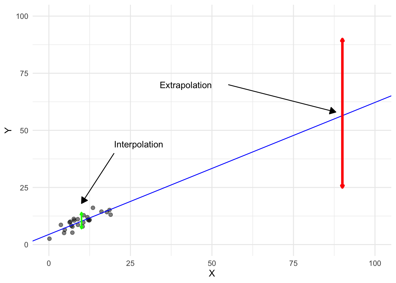
Figure 9.10: When using regression for prediction, extrapolation is much riskier than interpolation.
9.5 Regression to the mean
The term regression originates from Francis Galton’s 19th-century observation that the heights of sons tended to “regress” toward the population average rather than perfectly matching their fathers’ heights. Very tall fathers usually had tall sons, but not as tall as themselves; similarly, very short fathers had sons who were short, but closer to the mean. Galton initially believed this was a special phenomenon, later termed regression to the mean. Subsequent research revealed that this is not unique but a mathematical consequence of imperfect correlation.
Figure 9.11 illustrates this concept using Galton’s data on fathers’ and sons’ heights. The black points represent group averages, the blue line is the regression line, and the orange line shows the SD line (perfect correlation). Notice how the regression line is flatter than the SD line, reflecting the tendency toward the mean.
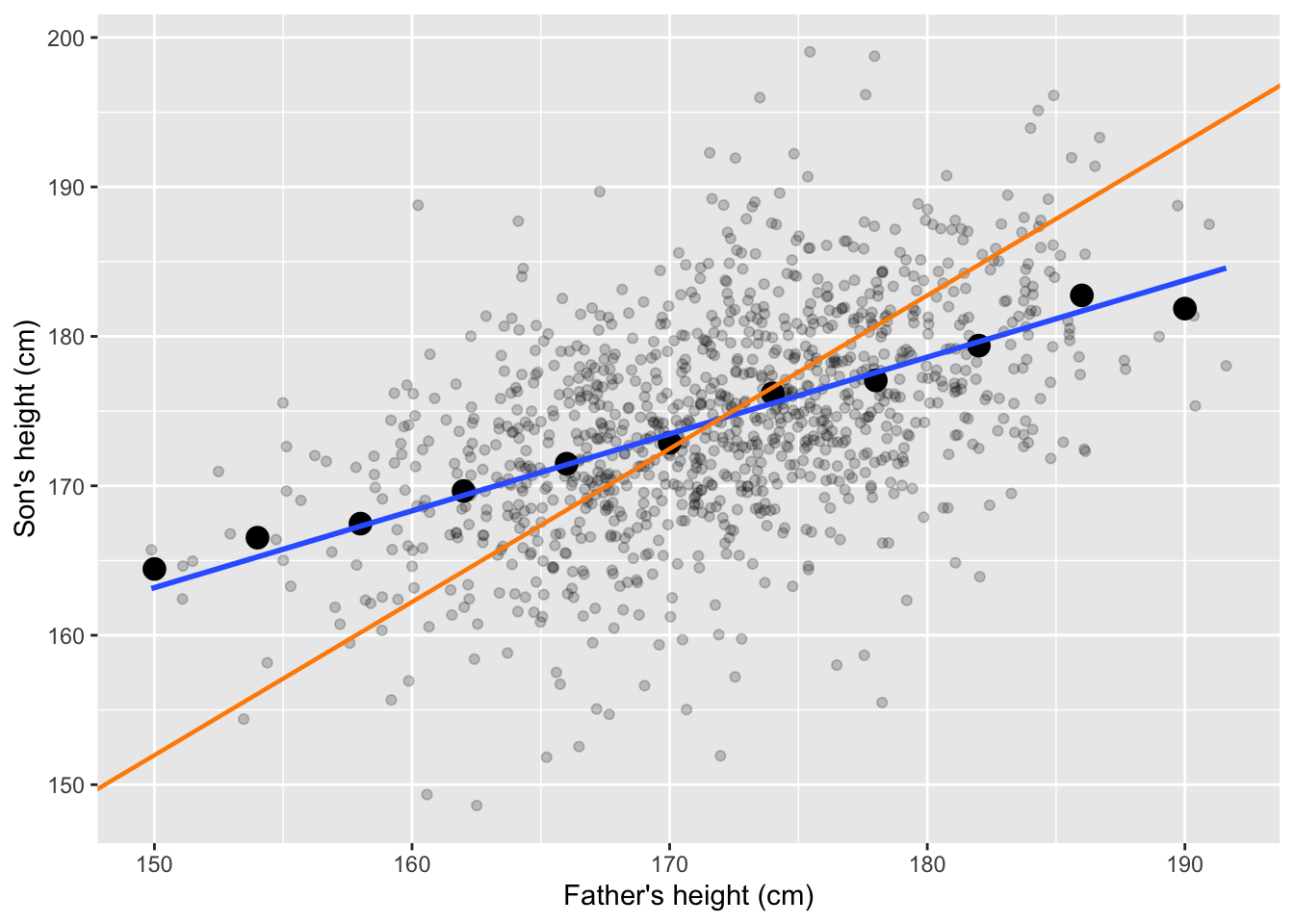
Figure 9.11: Heights of fathers and sons, group averages, the regression line (blue) and the SD line (orange).
Regression to the mean occurs in many real-world contexts beyond Galton’s height example:
Test–retest scores: Students who score extremely high or low on a test often score closer to the average on a repeated test. This happens because part of the extreme score is due to random factors (“luck”), which are unlikely to repeat.
Assortative mating with imperfect correlation: Very intelligent women tend to marry men who are intelligent, but typically less intelligent than themselves. This reflects the fact that intelligence between partners is correlated, but the correlation coefficient is not 1.
Medical measurements: Patients with extremely high blood pressure at one visit often show lower readings at the next visit, even without treatment. This is partly due to measurement variability and temporary conditions, not the underlying patients’ improvement.
9.6 Regression vs correlation
As you can see, simple linear regression is closely related to Pearson’s correlation:
Slope and correlation. The slope of the regression line depends directly on the correlation between \(X\) and \(Y\) – see equation (9.3). In fact, if both variables are standardized to z-scores, the slope equals the correlation coefficient.
The sign of the regression slope is the same as the sign of the correlation coefficient.
Coefficient of determination. The \(R^2\) value in simple linear regression is equal to the squared Pearson correlation coefficient (see (9.10)).
Correlation and regression are connected concepts, yet they differ in key ways:
Correlation is symmetric – swapping \(X\) and \(Y\) does not change the correlation. Regression, by contrast, is directional – it models one variable as dependent on the other: swapping \(X\) and \(Y\) changes the slope and intercept.
Correlation is unitless, and always lies between -1 and 1. In the case of regression units matter: the slope depends on the units of \(X\) and \(Y\).
Finally, correlation simply measures the strength and direction of a linear relationship, whereas regression goes beyond description: it provides an equation that can be used for prediction and explanation.
9.7 Variable transformation
Sometimes the relationship between two variables is not naturally linear, but variable transformations can reshape the data so that a straight-line model becomes more suitable for describing the relationship.
The most popular transformation is the (natural6) logarithm: \(x^* = \log(x)\). This transformation is especially helpful when:
the relationship between the variables is mononotonic but curvilinear and close to the power law pattern, such as the relation between height and weight of animals;
values span several orders of magnitude, like incomes ranging from hundreds to millions;
relationship follow percentage-based patterns, like price changes;
there is a rapid increase in the values of a variable, such as population growth or the spread of a viral post;
variability increases with the level of a variable, as in sales data where revenues for big stores are more variable than for small ones.
Other useful transformations include the square root (\(x^* = \sqrt{x}\)) and the reciprocal (\(x^* = 1/x\)), each of which can help straighten curved patterns or stabilize variability.
9.7.1 Prediction Using a Log–Log Linear Model
In a log–log regression, both X and Y are transformed using logarithms before fitting the model. The fitted equation has the form:
\[\widehat{\log(y_i)} = \widehat{\beta}_0 + \widehat{\beta}_1\log(x_i)\]
To make a prediction for a new value of (x), you first compute the predicted \(\log(y)\) using the model, and then convert it back to the original scale by applying the exponential function \(\exp{a}=\text{e}^a\):
\[\widehat{y_p} = \exp(\widehat{\beta}_0 + \widehat{\beta}_1\log(x_p))\]
This final step is important because the regression is performed on the log scale, but predictions are usually needed in the original units (such as kilograms or meters). In a log–log model, the slope (_1) has a simple interpretation: it represents the percentage change in average Y for a 1% difference in X.
9.8 Limitations of linear regression
Although linear regression is widely used, it has several important limitations. It assumes that the relationship between X and Y is straight (linearity), that the variability of Y is similar across all values of X (homoskedasticity), and that there are no extreme outliers dominating the results.
If these assumptions are not met, the model’s predictions and interpretations can be misleading.
Linear regression captures only one type of relationship — linear dependence — and cannot detect more complex patterns unless the model is expanded or revised.
Finally, regression describes association, not causation. Even a strong linear relationship does not prove that changes in X cause changes in Y.
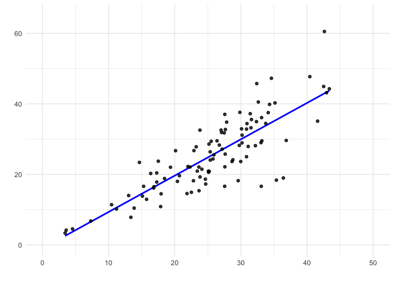
Figure 9.12: A scatter plot showing heteroskedasticity. Although a straight line fits the central trend well, the variability of the residuals changes across levels of X.
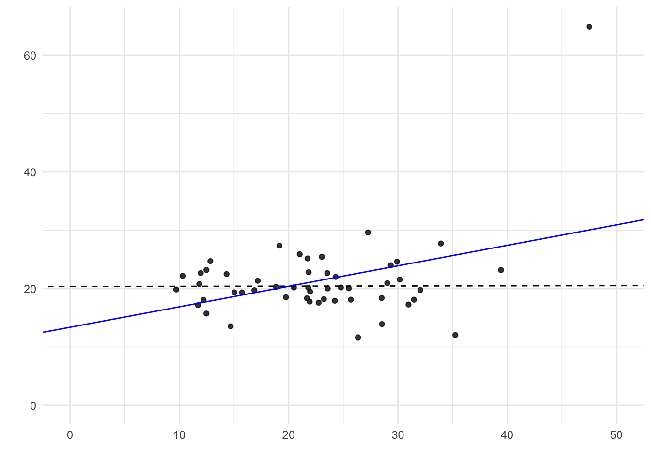
Figure 9.13: Outliers distort the regression line. A single outlier can change the fitted line and create a spurious slope.
9.9 Links
Scatter plot and regression line — web application: https://istats.shinyapps.io/ExploreLinReg/
Least squares rules – visualisation: https://college.cengage.com/nextbook/statistics/utts_13540/student/html/simulation3_1.html
Scatter plot, least squares and regression lines:
https://bankonomia.nazwa.pl/regressionclick/
Impact of outliers: https://college.cengage.com/nextbook/statistics/utts_13540/student/html/simulation3_5.html
Simple regression – yet another visualisation: https://observablehq.com/@yizhe-ang/interactive-visualization-of-linear-regression
Regression to the mean – an introduction with examples: https://fs.blog/regression-to-the-mean/
There are two regression lines: https://bankonomia.nazwa.pl/tworeglines/
9.10 Questions
9.10.1 Discussion questions
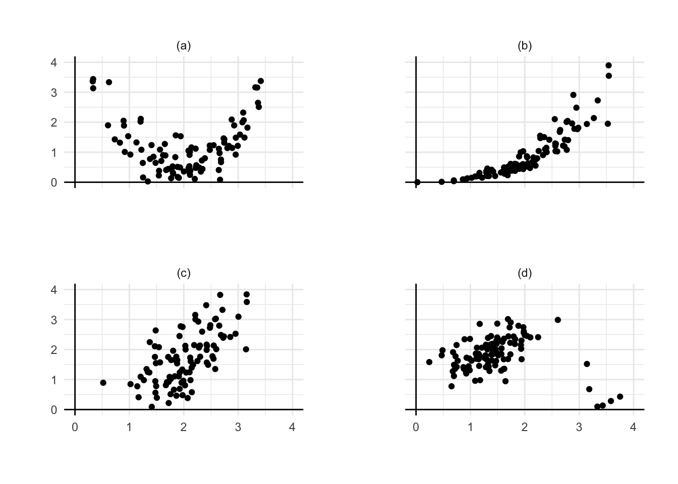
Question 9.1 Among the four plots, choose the one where a simple linear model would be most reasonable. For each of the remaining panels, describe the features that make simple regression less suitable. Discuss what could be done to address these issues in each case.
Question 9.2 In Pearson’s study, the sons of the 182-cm fathers only averaged 179 cm in height. True or false: if you take the 179-cm sons, their fathers will average about 182 cm in height. Explain briefly.
Question 9.3 For the men in Diagnoza Społeczna, the ones who were 190 cm tall averaged 92 kg in weight. True or false, and explain: the ones who weighed 92 kg must have averaged 190 cm in height.
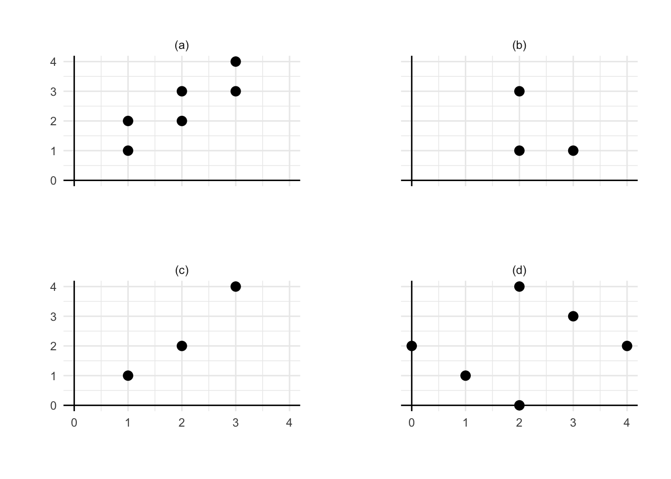
Question 9.4 In each panel, manually sketch an approximate least-squares regression line based on the displayed data.
Question 9.5 (Freedman, Pisani, and Purves 2007) In a study of the stability of IQ scores, a large group of individuals is tested once at age 18 and again at age 35. The following results are obtained:
Age 18: average score = 100, SD = 15
Age 35: average score = 100, SD = 15, r = 0.80
Estimate the average score at age 35 for all the individuals who scored 115 at age 18.
Predict the score at age 35 for an individual who scored 115 at age 18.
What is the difference between estimation of the average for the existing group and prediction?
9.10.2 Test questions
Question 9.6 In a certain group of students, exam scores average 60 points and have a standard deviation of 12, similar to the laboratory test scores. The correlation between the laboratory test scores and the exam scores is approximately 0.50. Using linear regression, estimate the mean exam score for students whose laboratory test scores were:
60 points:
72 points:
36 points:
54 points:
90 points:
Question 9.7 Following results have been obtained in the study of 1,000 married couples. Mean height of husband: 178 cm; standard deviation of husband’s height: 7 cm, mean height of wife: 167 cm, standard deviation of wife’s height: 6 cm. Correlation between wife’s height and husband’s height: ≈ 0.25.
Estimate the (average) height of wife if husband’s height is:
178 cm:
171 cm:
192 cm:
174.5 cm:
188.5 cm:
Literature
Please note that in English statistical texts, \(\text{log}\) stands for natural logarithm, \(\ln\).↩︎