Chapter 8 Correlation
Association (or “correlation,” in the broad sense) is a statistical concept that describes how two variables change together, indicating whether and how strongly they are related. Two variables are associated (correlated) when knowing the value of one provides information about the other.
8.1 Scatter plot
A scatterplot is one of the simplest and most powerful tools for exploring the relationship between two quantitative variables. It displays data points on a two-dimensional plane, where: the horizontal axis (x-axis) represents one variable, while the vertical axis (y-axis) represents the other variable.
Each point on the plot corresponds to a single observation.
Scatterplots allow us to visually assess:
Direction of association: upward trend indicates positive correlation (as X increases, Y tends to increase), while downward trend indicates negative correlation (as X increases, Y tends to decrease).
Form of relationship: linear vs nonlinear patterns.
Strength of association: points tightly clustered along a (straight) line indicate strong (linear) correlation.
Potential outliers and influential observations: these are points that deviate significantly from the overall pattern.
Figure 8.1: Scatter plot showing the heights of 1,078 fathers and their adult sons in England, circa 1900. This dataset was used by Pearson to illustrate correlation. For the purposes of this graph, the original measurements (in inches) were converted to centimeters using the formula: inches × 2.54.
Sometimes it’s helpful to use a logarithmic scale on one or both axes when making scatter plots because:
It spreads out small values when numbers cover a very wide range, so they don’t get squashed together.
It reveals patterns more clearly if the data grows or changes by percentages rather than fixed amounts.
It reduces the impact of large outliers, so they don’t dominate the plot.
However, keep in mind that:
Log scales cannot display zero or negative numbers.
They may be harder for some people to interpret compared to linear scales.
Figure 8.2: Interactive scatter plot for 62 mammal species. Toggle switches enable logarithmic scaling for both axes to better visualize the relationship across the wide range of body and brain sizes.
8.2 Pearson correlation coefficient
The Pearson correlation coefficient measures the strength of association between two quantitative variables. The correlation coefficient can take values in the range from -1 to 1 (inclusive).
Please note that if someone uses the term correlation without further clarification, it usually refers to the Pearson correlation coefficient.
A correlation equal to exactly 1 or -1 indicates a functional, linear relationship between two variables. The sign (1 or -1) depends on the sign of the slope of the function that transforms one variable into the other.
The more tightly the points are clustered around a straight line, the closer the Pearson correlation coefficient is to 1 or -1. The more “loosely” the points are clustered, the closer the coefficient is to zero.
Figure 8.3 shows example scatter plots based on simulated data for various levels of non-negative (\(\ge 0\)) correlation coefficients.
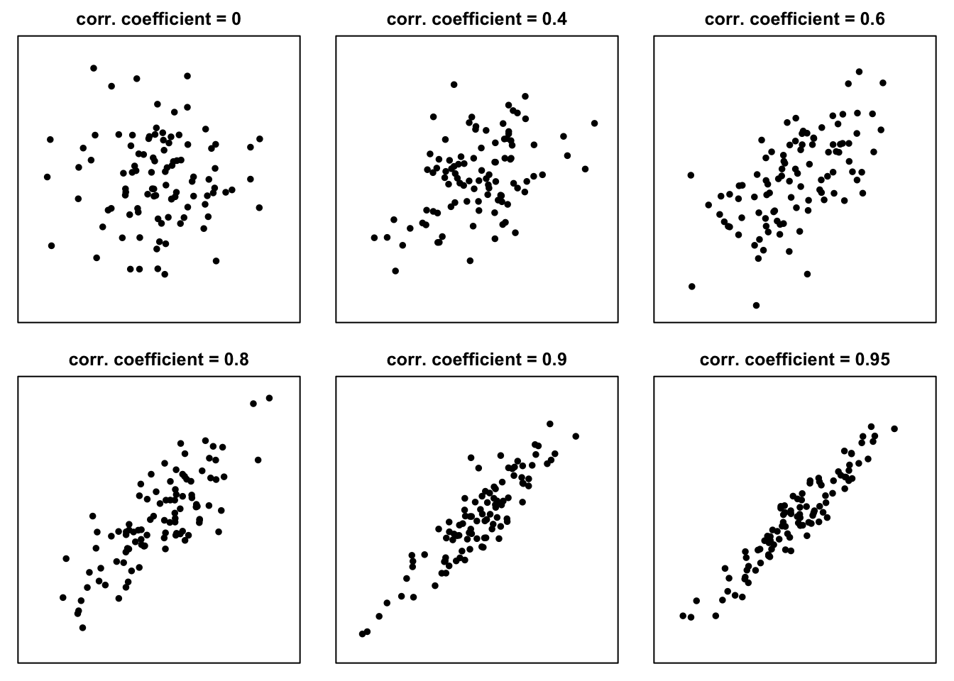
Figure 8.3: Example scatter plots for non-negative values of the correlation coefficient
In the case of negative correlation (as illustrated in Figure 8.4 the “clouds of points” slope downward:
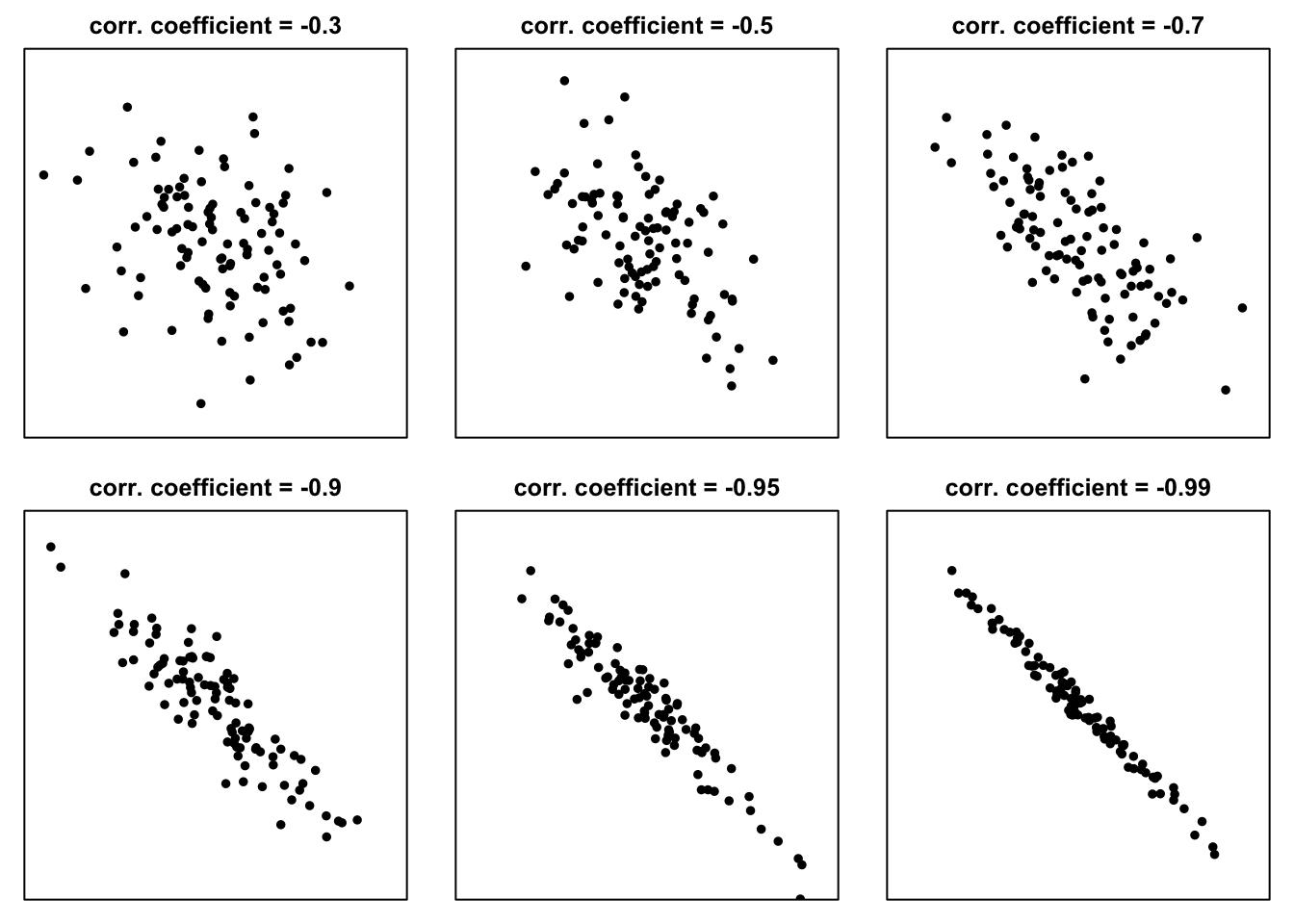
Figure 8.4: Example scatter plots for negative values of the correlation coefficient
If the points on the scatter plot are arranged as shown in Figures 8.3 and 8.4 — that is, grouped around a straight line, and in the case of lower interdependence, the shape resembles a tilted ellipse—then the joint distribution of two variables can be described using five numbers:
- the mean of variable X,
- the standard deviation of variable X,
- the mean of variable Y,
- the standard deviation of variable Y,
- and the correlation coefficient between variable X and variable Y.
8.2.1 Correlation coefficient — formula
The formula for the correlation coefficient can be written in several equivalent ways.
Using only the values of variables X and Y and their means, the Pearson correlation (denoted here as \(r(X,Y)\) or \(r_{xy}\))4 can be calculated as:
\[r(X,Y) = \frac{\sum_i{(x_i-\bar{x})(y_i-\bar{y})}}{\sqrt{\sum_i(x_i-\bar{x})^2\sum_i(y_i-\bar{y})^2}} \tag{8.1} \]
Another formula, which is much easier to remember, is the following: correlation coefficient is the average product of standardized values (z-scores, see (5.1)) of X and Y5:
\[r(X,Y) = \frac{1}{n}\sum_{i=1}^n z_{x_i} z_{y_i} = \frac{1}{n}\sum_{i=1}^n\left(\frac{x_i-\bar{x}}{\widehat{\sigma}_X}\right)\left(\frac{y_i-\bar{y}}{\widehat{\sigma}_Y}\right) \tag{8.2} \]
Correlation for a sample is often denoted by \(r\), while correlation for a population can be denoted by \(\rho\) (“rho”). If this is not clear from the context, it is worth specifying which variables the correlation refers to (e.g., by writing \(r(X,Y)\), \(r_{xy}\), \(\rho_{XY}\), etc.).
8.2.2 Pearson correlation coefficient – properties
Pearson correlation coefficient is dimensionless, does not depend on units of measurement, it is always between -1 and 1.
Pearson correlation coefficient is symmetrical:
\[r(X, Y) = r(Y, X)\]
Pearson correlation coefficient is sensitive to outliers: a single extreme value can significantly change the correlation.
Pearson correlation coefficient is invariant under linear transformations: if you transform X and/or Y by adding a constant or multiplying by a positive constant, the correlation value does not change.
Pearson correlation primarily measures the strength and direction of a linear relationship between two variables. While it can capture some aspects of nonlinear relationships, it is not designed to accurately represent them.
8.2.3 What counts as a strong correlation?
The answer depends on the field. A correlation coefficient of 0.50 may be considered strong in economics, moderate in biology, and weak in physics, where measurement is often more precise. To judge the strength of a correlation, use benchmarks from the relevant field — or rely on your developing intuition.
Sometimes, textbook benchmarks provide a useful starting point. According to Evans (1996) the absolute value of the correlation coefficient can be interpreted as follows:
0.00-0.19 – “very weak or negligible”
0.20-0.39 – “weak”
0.40-0.59 – “moderate”
0.60-0.79 – “strong”
0.80-1.0 – “very strong”
Of course, a correlation coefficient of 1 or –1 indicates a perfect linear relationship.
For the social sciences (including economics), Cohen (2016) proposed the following general guidelines:
0.10 – “small”
0.30 – “medium”
0.50 – “large”.
8.2.4 Covariance
Covariance is another measure that indicates how two variables vary together.
The formula for covariance, often called the “sample formula”, is:
\[s_{xy} = \frac{\sum_{i=1}^n \left(x_i-\bar{x}\right)\left(y_i-\bar{y}\right)}{n-1} \tag{8.3}\]
The “sigma” formula (sometimes referred to as the “population covariance”, though occasionally used for samples) is:
\[ \widehat{\sigma}_{xy} = \frac{\sum_{i=1}^n \left(x_i-\bar{x}\right)\left(y_i-\bar{y}\right)}{n} \tag{8.4} \]
The Pearson linear correlation coefficient can be interpreted (and computed) as a standardized covariance:
\[r_{xy} = \frac{s_{xy}}{s_x s_y} \tag{8.5} \]
or, using \(\sigma\) versions:
\[r_{xy} = \frac{\widehat{\sigma}_{xy}}{\widehat{\sigma}_x \widehat{\sigma}_y} \tag{8.6} \]
In these formulas, \(s_{xy}\) is the “sample” covariance (8.3), \(\widehat{\sigma}_{xy}\) is the “sigma” covariance (8.4); \(s_x\), \(s_y\), \(\widehat{\sigma}_x\), \(\widehat{\sigma}_y\) are the standard deviations (see (4.1) and (4.2)) of variables \(X\) and \(Y\).
8.3 Association and causation
When X and Y are correlated, it is possible that:
- X might cause Y directly,
- or through a mediating variable;
- Y might cause X (directly or indirectly),
- there may be a third variable, a confounder;
- the structure may be more complex
- the correlation may be completely spurious, due to chance or trends.
“Correlation does not imply causation” is a fundamental principle in statistics. Just because two variables move together does not mean that one causes the other. For example, ice cream sales and drowning incidents both increase in summer, but buying ice cream does not cause drowning — the underlying factor is the season. Confusing correlation with causation can lead to misleading conclusions, so careful analysis, controlled experiments, or additional evidence are needed before claiming a causal relationship.
8.4 Spearman rank correlation coefficient
The Spearman correlation coefficient is simply the Pearson correlation coefficient applied to the ranks of variables X and Y.
\[r_S (X, Y) =r\left(\text{Rank}(X), \text{Rank}(Y)\right) \tag{8.7} \]
This means that, to compute Spearman’s rank correlation, we first replace each value \(x_i\) and \(y_i\) with its rank, and then calculate the Pearson correlation on these ranks.
8.4.1 Converting values to ranks
In statistical practice, ranks are usually assigned in ascending order: the smallest value gets rank 1, the next gets rank 2, and so on.
When values are repeated (ties), the average of the ranks that would have been assigned is used. These are called “tied ranks.”
Example:
| x | rank(x) | y | rank(y) | |
|---|---|---|---|---|
| 6 | 3 | 5 | 1.5 | |
| 8 | 4 | 5 | 1.5 | |
| 5 | 2 | 9 | 3.0 | |
| -1 | 1 | 11 | 4.0 | |
| 10 | 5 | 14 | 6.0 | |
| 39 | 6 | 14 | 6.0 | |
| 100 | 7 | 14 | 6.0 | |
| 101 | 8 | 20 | 8.0 |
If there are no tied ranks, Spearman’s correlation can also be computed using the alternative formula:
\[ r_s = 1 - \frac{6\sum_{i=1}^n d_i^2}{n(n^2-1)} \tag{8.8} \]
where \(n\) is, as usual, the sample size (number of observations in the data set) and \(d_i\) is a difference between the ranks for \(i\)-th observation:
\[d_i = \text{Rank}(x_i) - \text{Rank}(y_i)\]
Equation (8.8) yields the same result as equation (8.7) only when there are no tied ranks. If ties are present, equation (8.8) must be used instead.
8.4.2 Properties of the Spearman correlation coefficient
The Spearman coefficient Detects whether variables move together monotonically (consistently up or consistently down). It measures strength and direction of monotonic association.
Properties:
it is suitable for ordinal data or non-linear monotonic relationships.
its range of values is from -1 to 1:
+1: perfect increasing monotonic relationship
–1: perfect decreasing monotonic relationship
0: no monotonic association
it is much more resistant (“robust”) to outliers (extreme values have limited impact), unequal spacing of data, and non-constant variance than the Pearson coefficient
monotonic transformations do not change its value.
8.5 Kendall’s Tau (\(\tau\))
Kendall’s tau (also known as Kendall rank correlation coefficient) is another measure of association that can be used for quantitative and ordinal variables.
Instead of relying on rank differences (as in the case of Spearman coefficient), Kendall’s tau is based on “rank concordance.” It considers all possible pairs of observations to determine whether the ranks of \(X\) and \(Y\) move in the same direction (concordant pairs) or in opposite directions (discordant pairs). The coefficient is computed as the standardized difference between the number of concordant and discordant pairs:
\[\tau_A = \frac{\text{# of concordant pairs} - \text{# of discordant pairs}}{ \text{# of pairs} } \tag{8.9} \]
The \(\text{# of pairs}\), “number of pairs” (\(N_0\)), includes concordant pairs, discordant pairs, as well as tied pairs, in which the value of at least one variable (\(X\) and \(Y\)) is the same for the two observations. For a data set of size \(n\) the total number of unique pairs is:
\[N_0 = \text{# of concordant pairs} + \text{# of discordant pairs} + \text{# of ties} = \\ = \frac{n(n-1)}{2} \tag{8.10}\]
Kendall’s tau ranges from –1 to 1 and, like Sperman’s coefficient measures the strength and direction of monotonic association and is well suited for ordinal data or non-linear monotonic relationships.
In R (and in many statistical packages), a corrected version of Kendall’s tau, known as Kendall’s \(\tau_B\) is used. This variant adjusts for ties occurring in either variable:
\[\tau_B = \frac{\text{number of concordant pairs} - \text{number of discordant pairs}}{ \sqrt{(N_0-N_1)(N_0-N_2)}} \tag{8.11} \]
where \(N_0 = n(n-1)/2\) is the total number of pairs,
\(N_1\) is the number of pairs tied on \(X\),
\(N_2\) is the number of pairs tied on \(Y\).
Kendall’s \(\tau_B\) was introduced to correct for ties in either variable, providing a properly scaled measure of rank association when repeated values are present.
8.6 Correlation test
A correlation test is a statistical procedure used to assess whether there is a linear association between two quantitative variables in a population (or, more generally, in an underlying data-generating process), based on sample data.
The most commonly used version is Pearson’s product-moment correlation test, which evaluates the null hypothesis that the true correlation coefficient equals zero.
Statistical software typically reports a p-value, defined here as the probability – computed assuming the null hypothesis is true (that is, assuming the correlation in the data generating process is zero) — of obtaining a sample correlation at least as extreme as the one observed (in absolute value) purely due to random sampling variation.
Example
##
##  Pearson's product-moment correlation
##
## data:  height and head_circ
## t = 2.1406, df = 47, p-value = 0.03753
## alternative hypothesis: true correlation is not equal to 0
## 95 percent confidence interval:
##  0.01839182 0.53445132
## sample estimates:
##      cor
## 0.298047
We collected data from 49 male students on their height and head circumference. We think of these numbers as the result of a process that produces data: students differ naturally in their body measurements, measurements are not perfectly precise, and the particular group of students we observed could have been slightly different.
In this dataset, the Pearson correlation between height and head circumference is \(r=0.298\). To understand whether this value could be due simply to random variation in the data, we ask the following question: If height and head circumference were not systematically related, how often would we see a correlation at least this large just by chance in similar data?
The answer to this question is the p-value. In this case, the p-value is 0.038, which means that correlations of this size or larger would appear in about 4 out of 100 similar data sets simply due to random variation. Because this happens relatively rarely, the observed correlation is unlikely to be due to chance alone and suggests that the data-generating process includes some relationship between height and head circumference.
8.7 Links
Guess-the-correlation game:
https://istats.shinyapps.io/guesscorr/
Yet another correlation game:
https://www.guessthecorrelation.com
Inverse correlation game(s):
https://college.cengage.com/nextbook/statistics/utts_13540/student/html/simulation3_3_1.html;
https://college.cengage.com/nextbook/statistics/utts_13540/student/html/simulation3_3_2.html;
https://college.cengage.com/nextbook/statistics/utts_13540/student/html/simulation3_3_3.html;
Spurious correlations:
https://www.tylervigen.com/spurious-correlations
Scatter plots and correlations – web app:
https://rpsychologist.com/correlation/
Correlation examples – web app:
https://istats.shinyapps.io/Association_Quantitative/
Additional correlation examples:
correlation between recent increase in personal income and election results in the US: https://avehtari.github.io/ROS-Examples/ElectionsEconomy/hibbs.html
correlation between population density and sex ratio (male/female ratio) in Polish regions: https://blazejkochanski.pl/post/farmer/
correlations between height, weight, age and income for married couples: https://blazejkochanski.pl/post/marital-correlations/
regional correlations in the United States: https://college.cengage.com/nextbook/statistics/utts_13540/student/html/simulation3_2.html
body size vs brain size for mammals: https://www.reddit.com/r/dataisbeautiful/comments/poq0ks/oc_brain_size_vs_body_weight_of_various_animals/#lightbox
8.8 Questions
8.8.1 Discussion questions
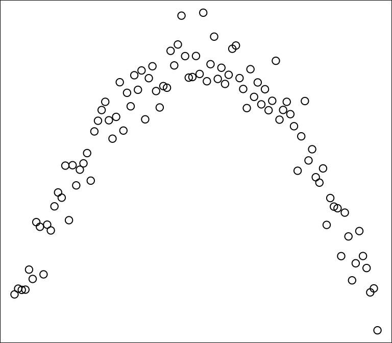
Question 8.1 (Freedman, Pisani, and Purves 2007) According to your intuition, what is the Pearson correlation coefficient for the data illustrated on this scatter plot? Is there a correlation (association) between x and y?
Question 8.2 (Freedman, Pisani, and Purves 2007) For a certain data set, correlation coefficient = 0.57. Say whether each of the following statements is true of false, and explain briefly; if you need more information, say what you need, and why.
There are no outliers.
There is a non-linear association.
Question 8.3 (Freedman, Pisani, and Purves 2007) For school children, shoe size is strongly correlated with reading skills. How is this possible?
Question 8.4 (Freedman, Pisani, and Purves 2007) The correlation between height and weight among men age 18-74 in the U.S. is about 0.40. Say whether each conclusion below follows from the data; explain your answer.
Taller men tend to be heavier.
The correlation between weight and height for men age 18-74 is about 0.40.
Heavier men tend to be taller.
If someone eats more and puts on 10 pounds, he is likely to get somewhat taller.
Question 8.5 (Freedman, Pisani, and Purves 2007) Studies find a negative correlation between hours spent watching TV and scores on reading tests. Does watching TV make people less able to read?
Question 8.6 (Freedman, Pisani, and Purves 2007) Many studies have found an association (and causation!) between cigarette smoking and heart disease. One study found an association between cofee drinking and heart disease. Should you conclude that coffee drinking causes heart disease? Or there is some other explanation?
8.8.2 Test questions
Question 8.7 A circle of diameter d has area \(\frac{1}{4}\pi d^2\). We plot a scatter diagram of area against diameter for a sample of circles.
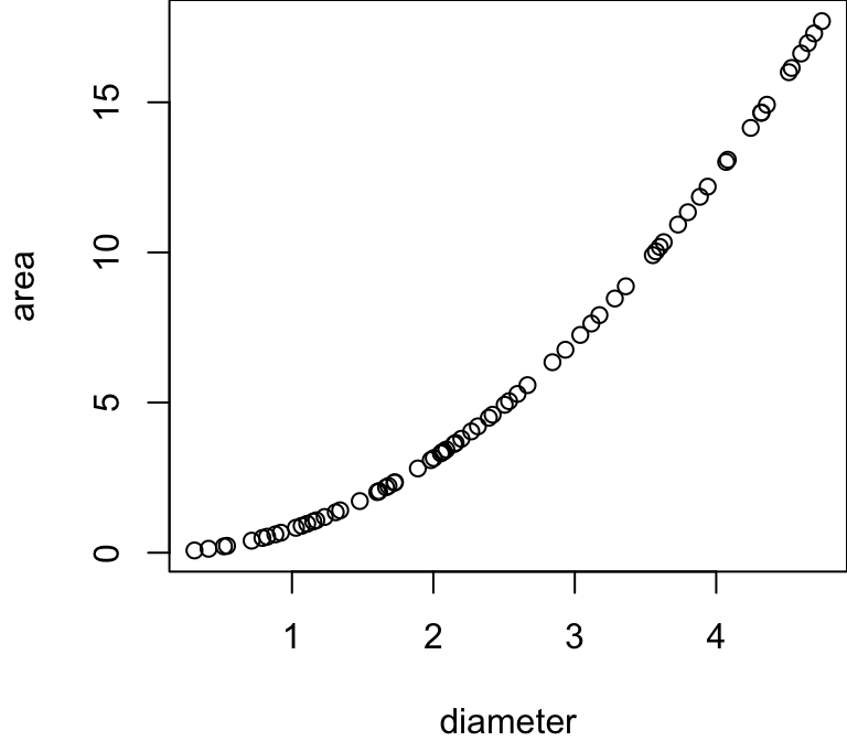
The Pearson correlation coefficient is:
The Spearman correlation coefficient is:
Question 8.8 You measure the height of children in centimeters, then convert it to inches using the formula:
\[ \text{inches} = \frac{\text{centimeters}}{2.54}\]
What is the correlation between the two measurements:
if you do not round the result in inches?
if you round the result in inches to whole numbers?
Question 8.9 Positive and negative correlations.
The correlation between the number of hours a student studies and their exam score is usually .
The correlation between outside temperature and heating costs in winter .
The correlation between shoe size and height among adults is usually .
Question 8.10 In Politechnika Gdańska,
- what is the correlation between a student’s age (calculated based on their exact birth date) and their year of birth?
- what is the correlation between a student’s age and their mother’s age?
Question 8.11 Look at the two scatterplots and try to summarise what you see.
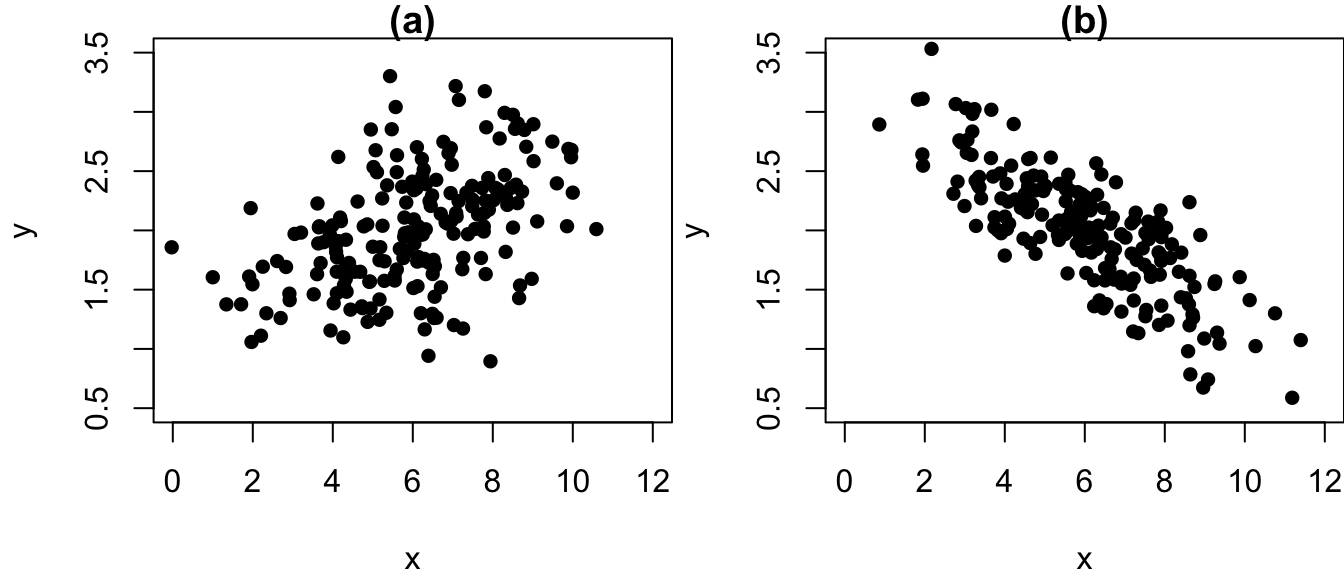
In both charts, the average of x is around
In both charts, the average of y is around
In both charts, the standard deviation of x is around
In both charts, the standard deviation of y is around
In chart (a) correlation is
In chart (b) correlation is
The correlation is stronger (in absolute terms) in chart
Question 8.12 Compute the ranks for the following data set:
| values | ranks |
|---|---|
| 30 | |
| 10 | |
| 15 | |
| 40 | |
| 60 | |
| 40 |
Question 8.13 Find the means and standard deviations (\(\sigma\)) for \(x\) and \(y\), then compute the z-scores, then use equation \(r(X,Y) = \frac{1}{n}\sum_{i=1}^n z_{x_i} z_{y_i}\) to compute the correlation coefficient.
Compare the result with the result you receive in Excel or in R (cor(c(2,10,8,16), c(1,1,5,5))).
\(\bar{x}\) =
\(\widehat{\sigma}_{x}\) =
\(\bar{y}\) =
\(\widehat{\sigma}_{y}\) =
| \(i\) | \(x_i\) | \(y_i\) | \(z_{x_i}\) | \(z_{y_i}\) | \(z_{x_i}\cdot z_{y_i}\) |
|---|---|---|---|---|---|
| 1 | 2 | 1 | |||
| 2 | 10 | 1 | |||
| 3 | 8 | 5 | |||
| 4 | 16 | 5 |
\(n\) =
\(r(X,Y) = \frac{1}{n}\sum_{i=1}^n z_{x_i} z_{y_i}\) =
8.9 Exercises
Exercise 8.1 (Grima 2010) In 2000 US presidential elections George Bush won with Al Gore thanks to winning in Florida by a margin of less than 1000 votes. In the file containing voting results by county in Florida check what was the difference between Gore and Bush in terms of the total number votes in Florida.
Examine the data from the 2000 U.S. presidential election in Florida, available in the UsingR package as the florida dataset. Prepare a scatter plot with Al Gore’s (Democratic Party) votes on the x‑axis and Pat Buchanan’s (Reform Party) votes on the y‑axis. Do you notice any outliers? Which county it was? Investigate the story behind the outlier (google it!).
Do you agree that if not for the design of the voting cards in one of the Florida counties, Gore would have become the US president in 2000? How would you estimate how many votes would Gore have received if not for the mistake made by some of the voters?
Exercise 8.2 Apply equation (8.2) to calculate the Pearson correlation coefficient for the following data set:
| \(x\) | \(y\) |
|---|---|
| 1 | 3 |
| 4 | 1 |
| 5 | 4 |
| 7 | 7 |
| 13 | 5 |
Exercise 8.3 Compute the Spearman correlation coefficient for the data set from exercise 8.2.
Exercise 8.4 Compute the Kendall \(\tau\) correlation coefficient for the data set from exercise 8.2.
Exercise 8.5 For the father/son height data:
Prepare a scatter plot.
Calculate the correlation.
Verify that the correlation remains the same when you swap the variables (i.e., r(X, Y) = r(Y, X)).
Check that the correlation does not change when you convert heights from inches to centimeters.
Investigate how rounding the values (to the nearest inch and to the nearest centimeter) affects the correlation.
Exercise 8.6 Calculate the 5-number summaries (mean of X, s.d. of X, mean of Y, s.d. of Y, correlation coefficient between X and Y) for the following pairs of x and y variables take from this dataset:
away_x and away_y
bullseye_x and bullseye_y
dircle_x and circle_y
dino_x and dino_y
Compute the 5-number summaries for each pair and compare them.
Create and inspect scatter plots for all pairs.
What does this exercise illustrate about relying solely on summary statistics?
Exercise 8.7 Explore the correlations in the wife-husband dataset.