5 Week 5: Data Wrangling with dplyr — Part 1
5.1 Overview
Week 5 marks the beginning of your journey into “Data Wrangling”. As I mentioned at the start of this module, data wrangling is likely where you as the data analyst will spend most of your time. It is the process that follows data import whereby you get your data into the right shape (a.k.a. tidying) and create summaries of your data (which often requires some transforming) so that it’s ready for visualisation and modelling.
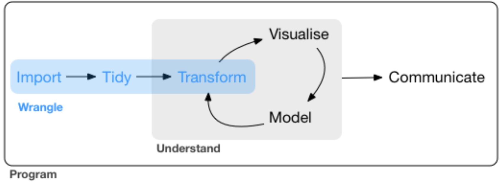
Figure 5.1: Wrangle!
Data wrangling is an essential skill for reproducible analysis. It is incredibly rare that you have research data (or indeed any other data you scrape from the internet for analysis) that is in the perfect format for analysis and/or visualisation. Often you need to remove certain parts of your data (e.g., outliers, missing values etc.), create summaries (e.g., mean performance per condition per participant)
The tidyverse is the perfect package for data wrangling because it includes a package called dplyr (pronounced “dee-plier”, so think of a pair of pliers). dplyr makes data tidying and transformation a (relative) breeze once you get familiar with its syntax. It allows you to go from a (real and rather unwieldy) data set such as this:
## # A tibble: 150,452 × 9
## id trial task response accuracy rt sequence response_rep after_…¹
## <dbl> <dbl> <chr> <chr> <dbl> <dbl> <chr> <chr> <dbl>
## 1 6871349 3 square n 1 1360 ABA switch 1
## 2 6871349 4 hexagon c 1 959 CBA switch 1
## 3 6871349 5 square n 1 915 ABA repetition 1
## 4 6871349 6 hexagon n 1 821 ABA switch 1
## 5 6871349 7 square n 1 1289 ABA repetition 1
## 6 6871349 8 hexagon j 1 834 ABA switch 1
## 7 6871349 9 square j 1 963 ABA switch 1
## 8 6871349 10 triangle c 1 762 CBA switch 1
## 9 6871349 11 hexagon n 1 888 CBA switch 1
## 10 6871349 12 triangle c 1 690 ABA repetition 1
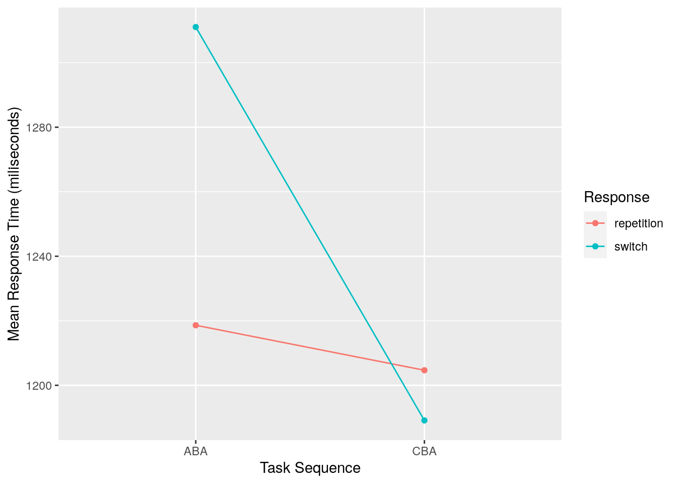
## # … with 150,442 more rows, and abbreviated variable name ¹after_error_trimto a nice tidy data frame ready for visusalisation that looks like this:
## # A tibble: 4 × 3
## # Groups:   Sequence [2]
##   Sequence Response   Mean_RT
##   <chr>    <chr>        <dbl>
## 1 ABA      repetition   1219.
## 2 ABA      switch       1311.
## 3 CBA      repetition   1205.
## 4 CBA      switch       1189.
…which can then be sent straight into a plot like this:
Here’s the entire code that took us from the original data set (which you don’t have access to, so the below code won’t work for you; I have saved the data to an object called raw_data) and wrangled it into the final data set (which I have called tidy_data) using:
tidy_data <- raw_data %>%
  filter(accuracy == 1) %>%
  select(id,
         sequence,
         response_rep,
         rt) %>%
  group_by(sequence, response_rep) %>%
  summarise(mean_rt = mean(rt))
In this week’s reading you are going to unpack what is going on in code of this nature. The functions in dplyr are quite verbose in terms of what they are doing. For example, if I were to verbalise what is going on in the above code, I would say the following:
- Take the raw_data, and
then: filterthe data so that we only see rows where there is a 1 in the accuracy column, andthen:selectonly the following columns:- id (which stores the participant identification numbers)
- sequence (which stores the levels of the independent variable called “sequence”)
- response_rep (which stores the levels of the independent variable called “response_rep)
- rt (which stores our dependent variable, response time in milliseconds)
- and
then:
group_byour independent variables sequence and response_rep, andthen:summarisethe data with a new column called mean_rt which shows the mean of our rt
In the reading this week, you are going to learn about the dplyr verbs filter, select, summarise, and group_by, as well as how to stitch all of these steps together using the so-called pipe (the %>% in the code, which is pronounced and then).
](img/week_5/pipe.jpeg)
Figure 5.2: This is not a pipe
Think. Before proceeding with this week’s reading, have a think about how you might use ggplot code to reproduce the plot above using the data contained in the tidy_data object. Note I have not provided the data, so just think in general terms how you might do it. Don’t peek at the below answer until you’ve thought about this!
\[\\[3in]\]
Answer. As you are hopefully becoming familiar with by now, the plot was created using the following code:
ggplot(data = tidy_data, aes(x = Sequence, y = Mean_RT, group = Response)) +
  geom_point(aes(colour = Response)) +
  geom_line(aes(colour = Response)) +
  labs(x = "Task Sequence",
       y = "Mean Response Time (miliseconds)")
Advanced. Actually, there are a couple of tweaks in the above plotting code which you haven’t seen yet, but we will cover in Weeks 7 & 8. Specifically, note that:
-
The
aes()part is included in the first call to theggplot()function. In previous examples we have included this in ourgeom_point()call. -
I’ve used the
labsfunction to change what is shown on the x-axis and y-axis labels. This is a really handy function to make your plot more suitable for inclusion in publications etc.
We will return to both of these when we dive a little deeper into plotting with ggplot2 later in the module.
5.2 Reading
- Chapter 10, ONLY Sections 10.1, 10.2 and 10.3.2 from R4DS
- This introduces the data structure called
tibblesin the tidyverse. Tibbles are created when you import data using theread_csv()function introduced last week, so you will rarely need to create one from scratch.
- This introduces the data structure called
- Chaper 5 from R4DS
- This is the bulk of the reading describing how to use the folllowing verbs from dplyr:
filter,arrange,select,mutate,summarise, andgroup_by. - It also introduces the pipe
%>%in Section 5.6.1.
- This is the bulk of the reading describing how to use the folllowing verbs from dplyr:
5.3 Workshop Exercises
Breaking with tradition, we are not going to repeat all of the exercises from the R4DS chapters. However, the first main exercise from Chapter 5 is quite useful, so we will start with this. Question 2 onwards were written by me.
- Using the
flightsdata from thenycflights13package, perform the following. Find all flights that:
- Had an arrival delay of two or more hours
- Flew to Houston (
IAHorHOU) - Were operated by United, American, or Delta
- Departed in summer (July, August, and September)
- Arrived more than two hours late, but didn’t leave late
- Were delayed by at least an hour, but made up over 30 minutes in flight
In the
flightsdata set, what was the flight with the longest departure delay?Create a new column that shows the amount of time each aircraft spent in the air, but show it in hours rather than minutes.
What is the mean departure delay per airline carrier? Why are you seeing lots of
NAvalues, and is there anything that can be done about it?Create a new object called
distance_delaythat contains a tibble with ONLY the columnscarrier,distance, andarr_delay.Download the
rumination_data.csvdata file from https://osf.io/z5tg2/. Import the data into an object calledrumination_data.This is the data I showed at the beginning of this chapter. It comes from a publication of mine looking at the association between cognitive inhibition (measured using the task switching paradigm) and depressive rumination tendencies. The details don’t matter though…
Create a new object that shows the mean response time (rt) for sequence conditions ABA and CBA, and for response_rep conditions switch and repetition. HINT: You need the group_by() verb / function for this.
Ooops. We should have first removed trials where the participant made an error (coded as accuracy equal to zero). Repeat the previous analysis taking this into account.
Repeat this analysis but also calculate the standard deviation of the response time in addition to the mean response time.
- Long vs. wide data