7 Week 7: Data Visualisation with ggplot2 — Part 1
7.1 Overview
In this week’s session we are taking a deeper dive into data visualisaton using the ggplot2 package (plus some supplementary packages that will helps us along the way…). We have looked a little at ggplot2, but have only used it to create scatterplots. Whilst these are often handy, they cannot be used for every type of data visualisation. Although we don’t have the time to learn how to visualise in every possible way, over the next 2 weeks I want to show you some of the fundamental principles of how ggplots are constructed; with this knowledge in hand—combined, possibly, with some Googling—you will be in an excellent position to plot pretty much anything you can think of.
Warning. Going forward we might use ggplot2 slightly differently to how we have in previous weeks. The way we did it before was fine for getting used to using the package, but doesn’t scale well to more complex plots.
In particular, we will add the mapping argument within the original ggplot call rather than within the geom_ calls.
So instead of:
ggplot(data = mpg) +
  geom_point(aes(x = displ, y = hwy))
we will use…
ggplot(data = mpg, mapping = aes(x = displ, y = hwy))
  geom_point()
You will need the following packages. Remember, if you don’t have these installed, you can use the install.packages() command.
library(tidyverse)
library(patchwork) # to patch plots together
library(gapminder) # example data
The beauty of ggplot is that it we build complex plots by creating one layer at a time. For example, consider the following gapminder data from the gapminder package. To look at this data yourself, assign this data to a new object and view it (ensuring you’ve installed & loaded the gapminder package!):
gapminder <- gapminder::gapminderThis is data on wealth and life expectancy of countries over time used by Hans Rosling in his famous TED talk. (Seriously, if you haven’t watched this I strongly recommend it. If this talk doesn’t turn you into a data-nerd, then I don’t know what will!)
Consider the following plot:
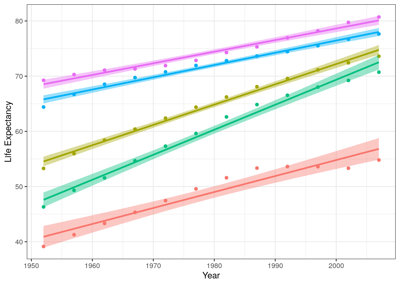
Figure 7.1: Change in life expectancy for various continents (shown as separate colours) as a function of year.
It consists of the following layers:
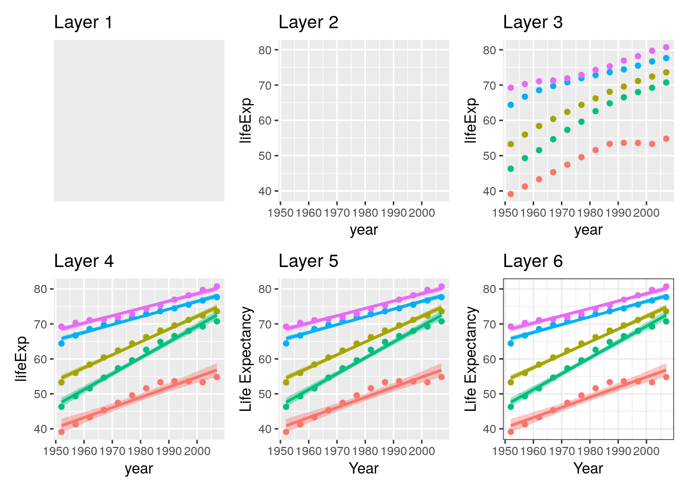
Figure 7.2: Peeling back the layers of a ggplot
- Layer 1: The plotting space.
- Layer 2: Variables are specified.
- Layer 3: Data points are added.
- Layer 4: Lines of best fit are added (linear regression lines).
- Layer 5: Axis labels are edited
- Layer 6: A theme is added to change the overall appearance of the plot.
Importantly, each of these layers are modular and therefore completely independent. They can therefore be edited entirely independently, and can be added / removed at your pleasure. For example, perhaps you want to only see the linear trend lines. That’s fine! Just don’t include layer 3!
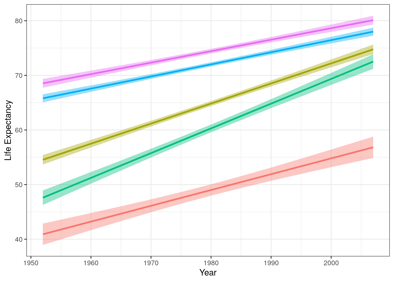
Figure 7.3: Trend lines for average life expectancy per year for different continents.
7.2 Reading
We are going to use a chapter from a different book for this week’s learning. Whilst R4DS includes some good material on plotting, I feel it is a little dry. Instead, we are going to use Chapter 3 of Applied data skills: Processing & presenting data from Emily Nordmann & Lisa DeBruine. However, please note that the order in which I recommend you work through this chapter is not linear!
- In the “Set-Up” component of Chapter 3, Section 3.1, ensure you have the packages
tidyverse,patchwork,ggthemes, andlubridateinstalled. - Chapter 3, Section 3.3 of Applied Data Skills.
- This walks you through the creation of a multi-layered plot. There is some repetition of what we have discussed in previous weeks, but this should help reinforce your learning.
- Chapter 3, Section 3.4 of Applied Data Skills.
- This section introduces some different geoms other than
geom_pointthat you are probably getting quite bored of now!
- This section introduces some different geoms other than
7.3 Workshop Exercises
Using the
gapminderdata, reproduce the plot in Layer 3 of Figure 7.2. It shows the mean life expectancy per year for each continent in the data set. Note that you might need your skills from last week, too…Extend the graph you’ve just coded in order to reproduce the plot in Layer 4 of Figure 7.2.
Extend the graph you’ve just coded in order to reproduce the plot in Layer 6 of Figure 7.2. Note this uses the
bwtheme.Ignoring “year”, produce a column plot of the mean GDP per continent in the
gapminderdata.Using the
gapminderdata, choose (and code!) a suitable plot to show the distribution of GDP per capita.Choose (and code!) a suitable plot to show the distribution of GDP per capita per continent in the
gapminderdata.How might you achieve a different presentation of the same information as contained in the plot of Question 6, but instead using the
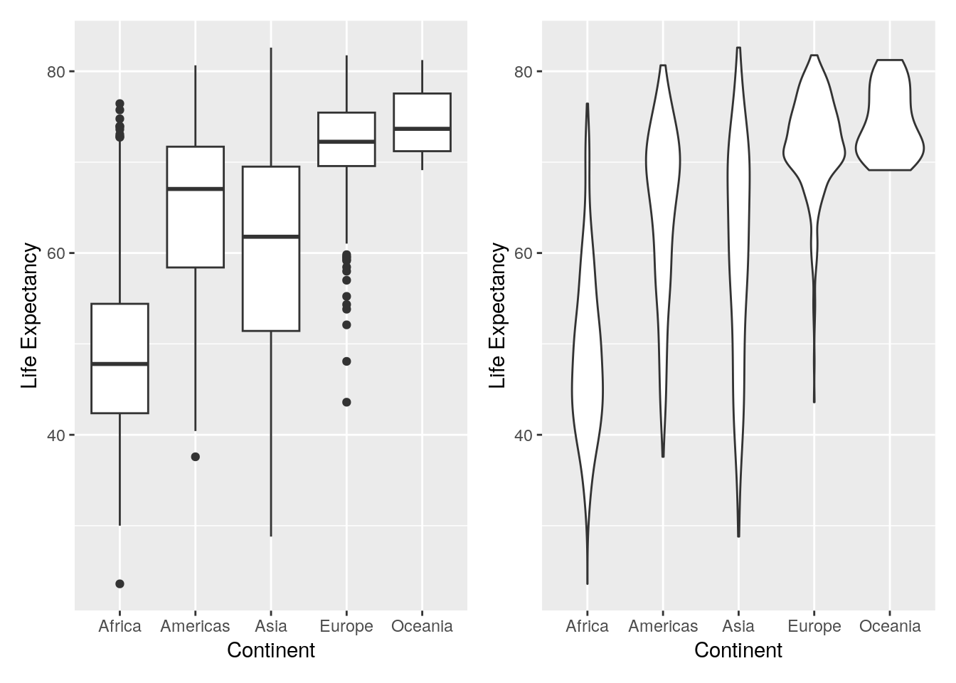
facet_wrap()layer?The below figure shows two plots displaying the same information (life expextancy distributions across continents) in two different ways (using a boxplot and a violin plot). However, the below Figure is a single image. Try to recreate this plot using the correct code, as well as using the
patchworkpackage.
- MEGA TEST! Recreate the below plot. This might require several stages, and might require a look at the help pages of patchwork, which can be found here. Note that I have included plot titles so you know what each plot is showing, but you don’t need to include these (but you can if you want!). I’ve also changed the axis labels so it looks more professional; you should do this too.