8 Week 8: Data Visualisation with ggplot2 — Part 2
8.1 Overview
This week we’re going to spend more time using ggplot2. Use this session to consolidate your understanding from last week and to try out different types of plot common to your research area. By trying out different types of plot, you will be left with a better understanding of (a) how ggplot2 works, and (b) the types of graphs you can use to visualise your own research findings.
When creating your on data visualisations, try to keep the following principles in mind:
- Keep it simple: Avoid cluttering your plot with too much information. Focus on the key message you want to convey and use only the necessary elements to communicate it.
- Use appropriate colors: Choose colors that are visually appealing and easy to distinguish, and avoid using too many colors or using colors that are difficult to differentiate. Also, be mindful of colorblindness when choosing colors.
- Label your axes: Make sure to label your x and y axes with clear, concise, and informative labels that describe the data being displayed.
- Add informative titles and captions: Use titles and captions to provide context and convey the key insights of your visualization.
- Use appropriate scales: Choose appropriate scales for your data, such as logarithmic or linear, and make sure to set the range of the axis to show the entire range of your data.
- Avoid distortion and misrepresentation: Make sure your plot accurately represents the data by avoiding distortions or misrepresentations that can occur when using inappropriate scales or by manipulating the axes.
- Utilize white space: Use white space to improve the visual appeal of your plot and make it easier to read and understand.
- Test your plot: Test your plot by showing it to others and asking for feedback. Make sure it conveys the message you intend and is easily understandable.
8.2 Reading & Workshop Exercises
Your reading and the exercises this week should be exclusively driven by your own interests and curiosity. Visit this gallery of plots made with ggplot, which also provides the code underlying each plot (click on the graph to see the code).
Find the types of graphs you typically see in your own research field, and look at the code how such graphs are made in ggplot2. As exercises, experiment with each plot you make; for example you could try different data, try customising the plot (e.g., try different themes, colours, captions, labels etc.).
One thing you should look into is how to add error bars to your plots. Error bars are often used in scientific research to show estimates of variation in the data. These aren’t always relevant to a plot, but you do see them quite frequently so it’s worth knowing how to do.
For example, as the only fixed exercise this week, try to recreate the below plot using the pepsi challenge data from Week 6 (see caption for important details). Note that the data are currently in wide format, so this needs working on first!
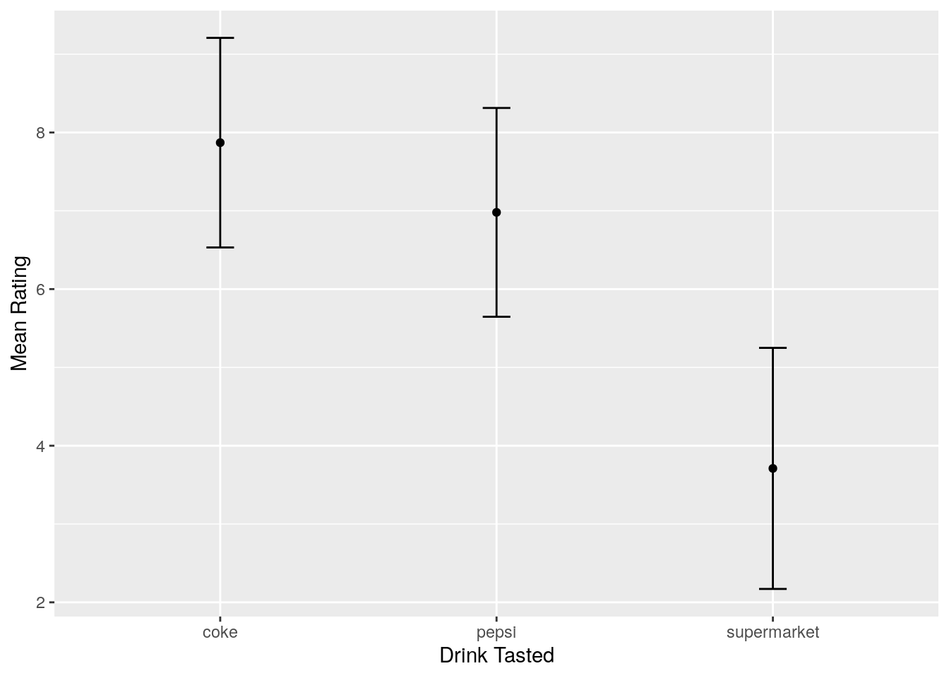
Figure 8.1: Mean ratings for each of three drinks tasted. Error bars show one standard deviation above and below the mean rating.