10 Answers to Exercises
Each chapter in this workbook presents you with a series of exercises to complete in the weekly workshops. These exercises are designed to test your own understanding of the material.
Completing these exercises requires deliberate practice, which will help you improve and eventually master your R skills. As the learning comes from the trying, I was in two minds whether to provide answers to these exercises in the workbook or not. In the end—as you can see by this Chapter—I have decided to include the answers. However, I strongly urge you to not look at these answers until you have tried your absolute best to solve the problems on your own. Trying an exercise half-heartedly and then looking at the answer will give you a false-sense of progress. Do not be caught in this trap!
And with that warning, dear reader, here are the answers to all chapter exercises:
10.2 Week 2
1. In the R console, run the code ggplot(data = mpg). What do you see? Why do you see what you see? What’s missing if you wanted to see more?
Let’s see what we see before we say why we see what we see and what’s missing if we want to see more. See?
ggplot(data = mpg)
Not a lot! Why is this? Well, we’ve provided the ggplot with some data, which creates a coordinate system to add layers to, but we have not provided it with any instructions what layers to add so nothing else is showing. Specifically, we haven’t provided a geom function (e.g., geom_point()) and we haven’t provided a mapping to that geom function which provides information about what should be represented on each axis etc.
If we wanted to see more, we would supply a geom function together with a mapping, as you saw in the chapter:
ggplot(data = mpg) +
  geom_point(aes(x = displ, y = hwy))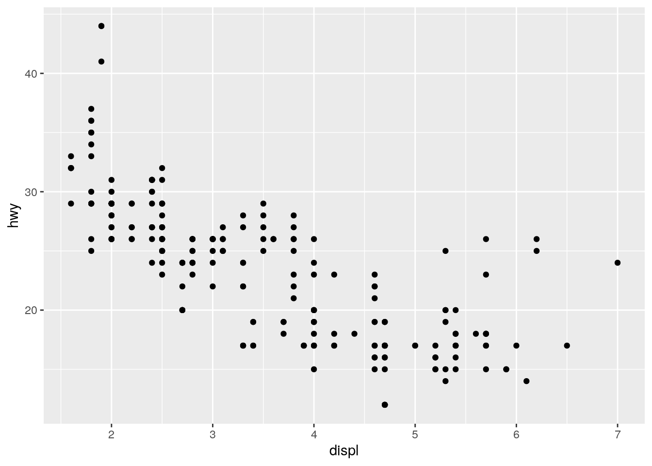
2. In the chapter you were using the data mpg that comes included in the tidyverse package. In the mpg data set, how many rows are there? How many columns are there?
There are 234 rows and 11 columns. How do we know this? If you type mpg (i.e., the name of the data) into the R console you will see the following:
## # A tibble: 234 × 11
##    manufacturer model      displ  year   cyl trans drv     cty   hwy fl    class
##    <chr>        <chr>      <dbl> <int> <int> <chr> <chr> <int> <int> <chr> <chr>
##  1 audi         a4           1.8  1999     4 auto… f        18    29 p     comp…
##  2 audi         a4           1.8  1999     4 manu… f        21    29 p     comp…
##  3 audi         a4           2    2008     4 manu… f        20    31 p     comp…
##  4 audi         a4           2    2008     4 auto… f        21    30 p     comp…
##  5 audi         a4           2.8  1999     6 auto… f        16    26 p     comp…
##  6 audi         a4           2.8  1999     6 manu… f        18    26 p     comp…
##  7 audi         a4           3.1  2008     6 auto… f        18    27 p     comp…
##  8 audi         a4 quattro   1.8  1999     4 manu… 4        18    26 p     comp…
##  9 audi         a4 quattro   1.8  1999     4 auto… 4        16    25 p     comp…
## 10 audi         a4 quattro   2    2008     4 manu… 4        20    28 p     comp…
## # … with 224 more rows
At the top you will see A tibble: 234 x 11. Don’t worry too much what a tibble is, but for now just know that it’s the tidyverse’s way to describe a data frame. Think of it like an Excel worksheet but loaded into computer memory rather than being visible on a sheet. The 234 x 11 part tells us there are 234 rows and 11 columns.
We don’t discuss functions just yet, but you will come to learn that there are two built-in functions that we can use to find out how many rows and columns there are in a data frame: nrow() and ncol() respectively:
nrow(mpg)## [1] 234ncol(mpg)## [1] 113. What does the drv variable describe? Read the help for ?mpg to find out.
If we type ?mpg into the R console we see a helper file for the data set. This has been prepared by the package author and describes the data. From this we read that drv refers to:
the type of drive train, where f = front-wheel drive, r = rear wheel drive, 4 = 4wd
4. Make a scatterplot of hwy vs. cyl. Initially place hwy on the x-axis, but try it in a separate plot with cyl on the x-axis.
For this we just need to modify the code presented to us in the R4DS chapter but add new variables to the mappings of the geom function:
ggplot(data = mpg) +
  geom_point(aes(x = hwy, y = cyl))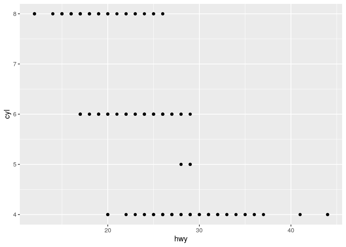
And here’s the same plot but now with cyl on the x-axis:
ggplot(data = mpg) +
  geom_point(aes(x = cyl, y = hwy))
5. What happens if you make a scatterplot of class vs drv? Why is the plot not useful?
Let’s find our what happens:
ggplot(data = mpg) +
  geom_point(aes(x = class, y = drv))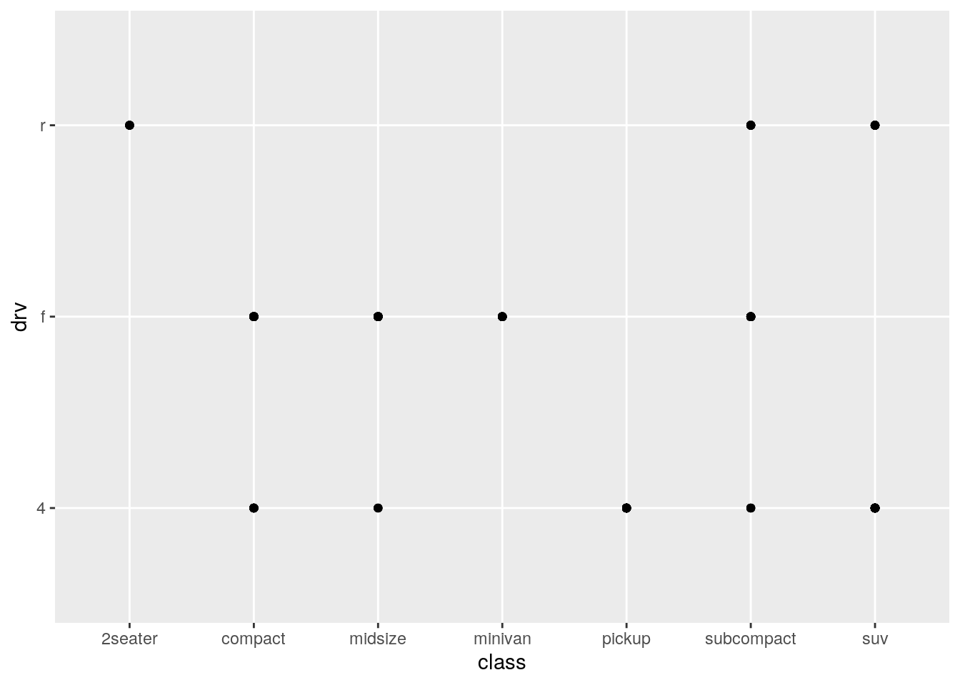
So, it produces a plot no problem. But why might this plot not be useful? If we think about what we have just asked ggplot to visualise, we have asked it to visualise the relationship between the class of a vehicle (“type” of car) and the type of drive train of the vehicle. (If you aren’t sure where I got these definitions, type ?mpg.)
This plot might not be useful because we are plotting here two categorical variables against each other. Scatterplots are best used for plotting two continuous variables against each other. Ggplot will visualise anything that you ask it to. But just because you can plot it, it doesn’t mean you always should plot it.
6. What’s gone wrong with this code? Why are the points not blue? This is quite a tricky one and foreshadows how fiddly R can be at times. The code presented to us is the following:
ggplot(data = mpg) +
  geom_point(mapping = aes(x = displ, y = hwy, colour = "blue"))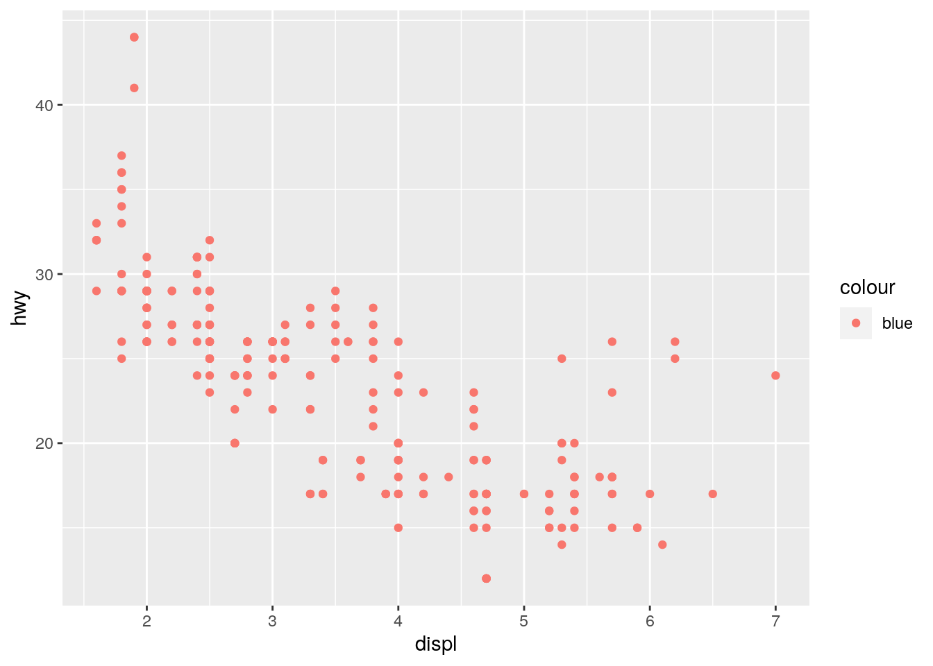
The chapter describes how we can map variables in our data—such as ‘cyl’ and ‘drv’—onto visual aesthetics such as x-coordinates, y-coordinates, colour, shape, size etc. using the aes() function.
In the above code, we are trying to make all points blue; that is, we are wishing to set the aesthetic properties of our geom_point() to blue. However, the code is trying to map colour because we have included it in the aesthetic function of the mapping.
In this case, then, ggplot is trying to find a variable in your data called “blue” in order to map that onto the “color” argument. As no such variable exists, ggplot gets confused.
If we want to set all points to blue, we need to add the colour = "blue" outside of the aes() function as follows:
ggplot(data = mpg) +
  geom_point(mapping = aes(x = displ, y = hwy), colour = "blue")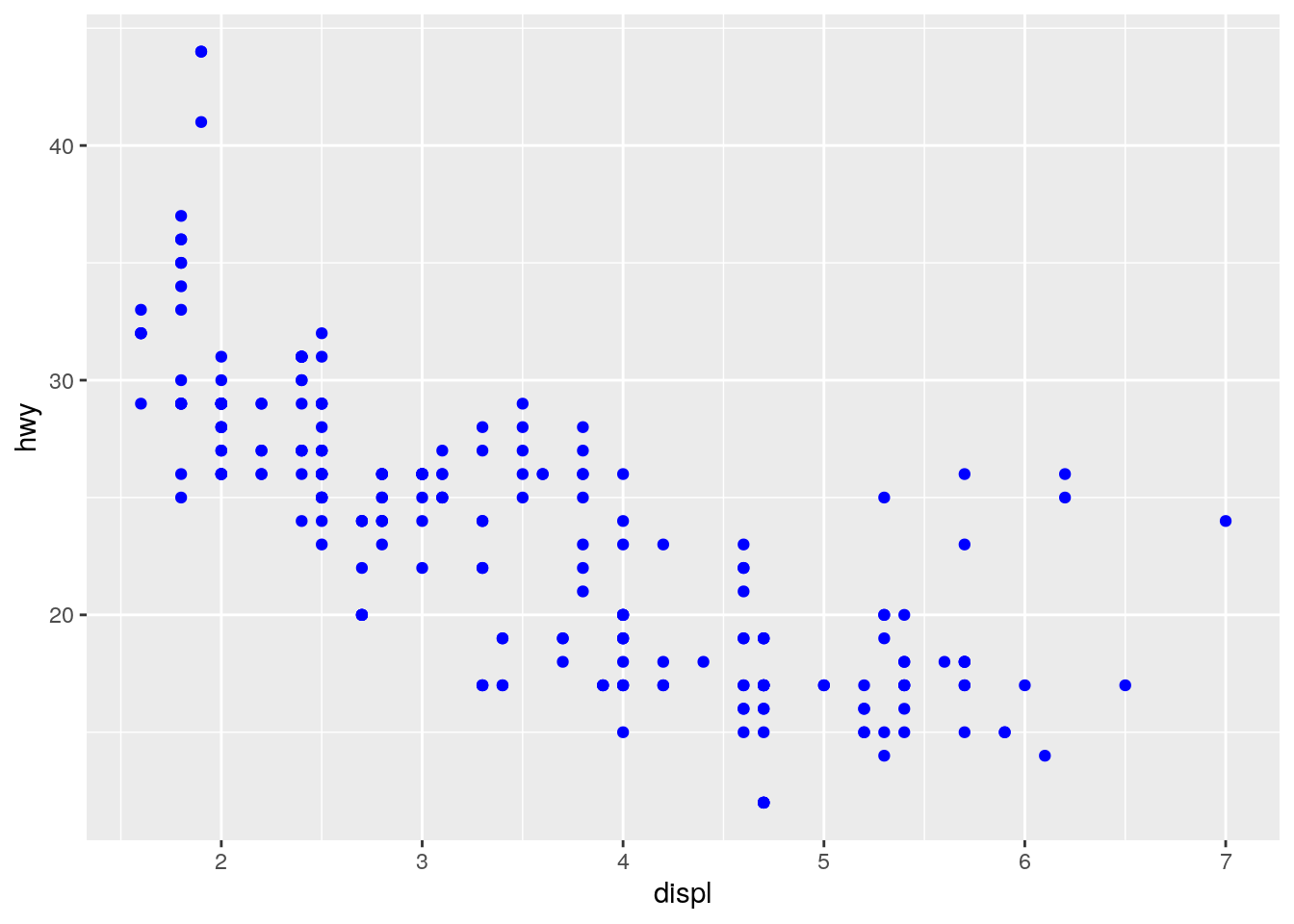
The difference in code is subtle: Here they are side by side:
# incorrect
ggplot(data = mpg) +
  geom_point(mapping = aes(x = displ, y = hwy, colour = "blue"))

# correct
ggplot(data = mpg) +
  geom_point(mapping = aes(x = displ, y = hwy), colour = "blue")
The incorrect includes “blue” in the aes() function brackets, and the correct includes “blue” outside the aes() function brackets.
If this is a little confusing, don’t worry too much right now. You will get plenty more plotting experience when we return to it a little later in the module.
7. Which variables in mpg are categorical? Which variables are continuous? (Hint: type ?mpg to read the documentation for the dataset). How can you see this information when you run mpg?
Although typing ?mpg provides a description of each variable from which you could deduce whether each is continuous or categorical, the best way to ascertain this is to look at the data itself:
mpg## # A tibble: 234 × 11
## manufacturer model displ year cyl trans drv cty hwy fl class
## <chr> <chr> <dbl> <int> <int> <chr> <chr> <int> <int> <chr> <chr>
## 1 audi a4 1.8 1999 4 auto… f 18 29 p comp…
## 2 audi a4 1.8 1999 4 manu… f 21 29 p comp…
## 3 audi a4 2 2008 4 manu… f 20 31 p comp…
## 4 audi a4 2 2008 4 auto… f 21 30 p comp…
## 5 audi a4 2.8 1999 6 auto… f 16 26 p comp…
## 6 audi a4 2.8 1999 6 manu… f 18 26 p comp…
## 7 audi a4 3.1 2008 6 auto… f 18 27 p comp…
## 8 audi a4 quattro 1.8 1999 4 manu… 4 18 26 p comp…
## 9 audi a4 quattro 1.8 1999 4 auto… 4 16 25 p comp…
## 10 audi a4 quattro 2 2008 4 manu… 4 20 28 p comp…
## # … with 224 more rowsHere we can see beneath each column name what type of variable is contained in each column (e.g., <chr>, <dbl> etc.). We will come back to discuss different types of variable next week, but for now know that:
<chr>: A character variable (e.g., text)<dbl>: A double variable (e.g., a number with a decimal point such as 1.8)<int>: An integer variable (e.g., a whole number).
From this we see that the following variables are likely categorical (because they are characters): * manufacturer, model, trans, drv, fl, and class
The following are continuous: * displ, year, cty, hwy
8. Map a continuous variable to color, size, and shape. How do these aesthetics behave differently for categorical vs. continuous variables?
Let’s keep the standard scatter plot of displ on the x-axis and hwy on the y-axis. But in addition let’s add cty (a continuous variable describing city miles per gallon of the car) to the colour aesthetic:
ggplot(data = mpg) +
  geom_point(mapping = aes(x = displ, y = hwy, color = cty))
You will see that ggplot2 cleverly notices that the colour variable is continuous and thus the colours used are continuous and the legend changes to show the continuous nature of the variable. If you compare this to the legend used when the variable passed to the colour aesthetic is categorical:
ggplot(data = mpg) +
  geom_point(mapping = aes(x = displ, y = hwy, color = class))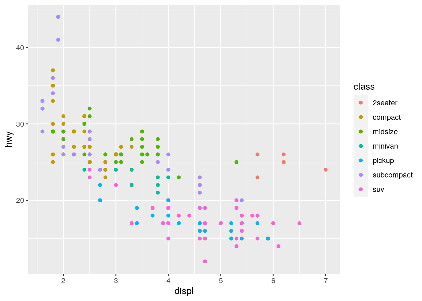
Let’s now look at the effect of passing a continous variable to the size aesthetic:
ggplot(data = mpg) +
  geom_point(mapping = aes(x = displ, y = hwy, size = cty))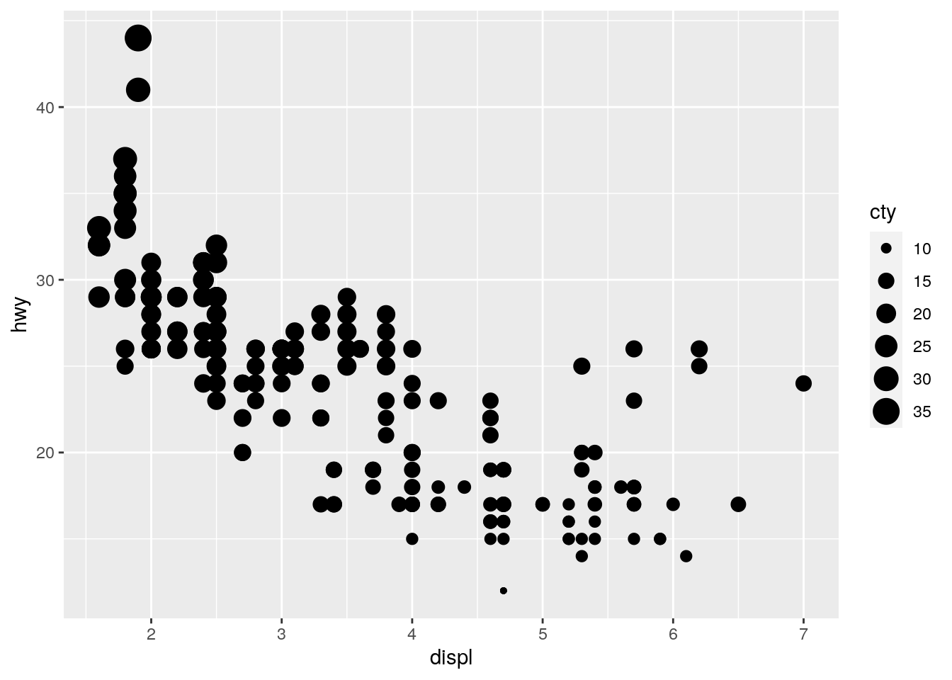
But what happens if we pass a continous variable to the shape aesthetic:
ggplot(data = mpg) +
  geom_point(mapping = aes(x = displ, y = hwy, shape = cty))
Here we get an error. Shape cannot be represented continuously like colour and size can. You can only pass a continuous variable to a continuous visual aesthetic.
9. What happens if you map the same variable to multiple aesthetics?
Let’s try by passing cty to both a size and colour aesthetic:s
ggplot(data = mpg) +
  geom_point(mapping = aes(x = displ, y = hwy, size = cty, colour = cty))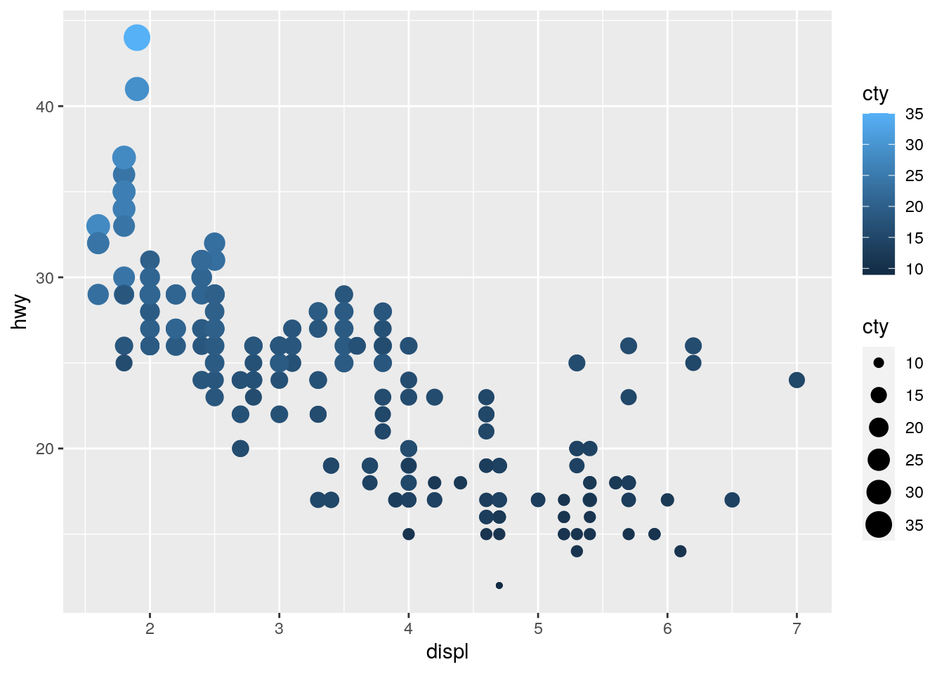
Of course we now have redundant information in the plot, but it works! Let’s try and add hwy to both a y-axis aesthetic and the colour aesthetic:
ggplot(data = mpg) +
  geom_point(mapping = aes(x = displ, y = hwy, colour = hwy))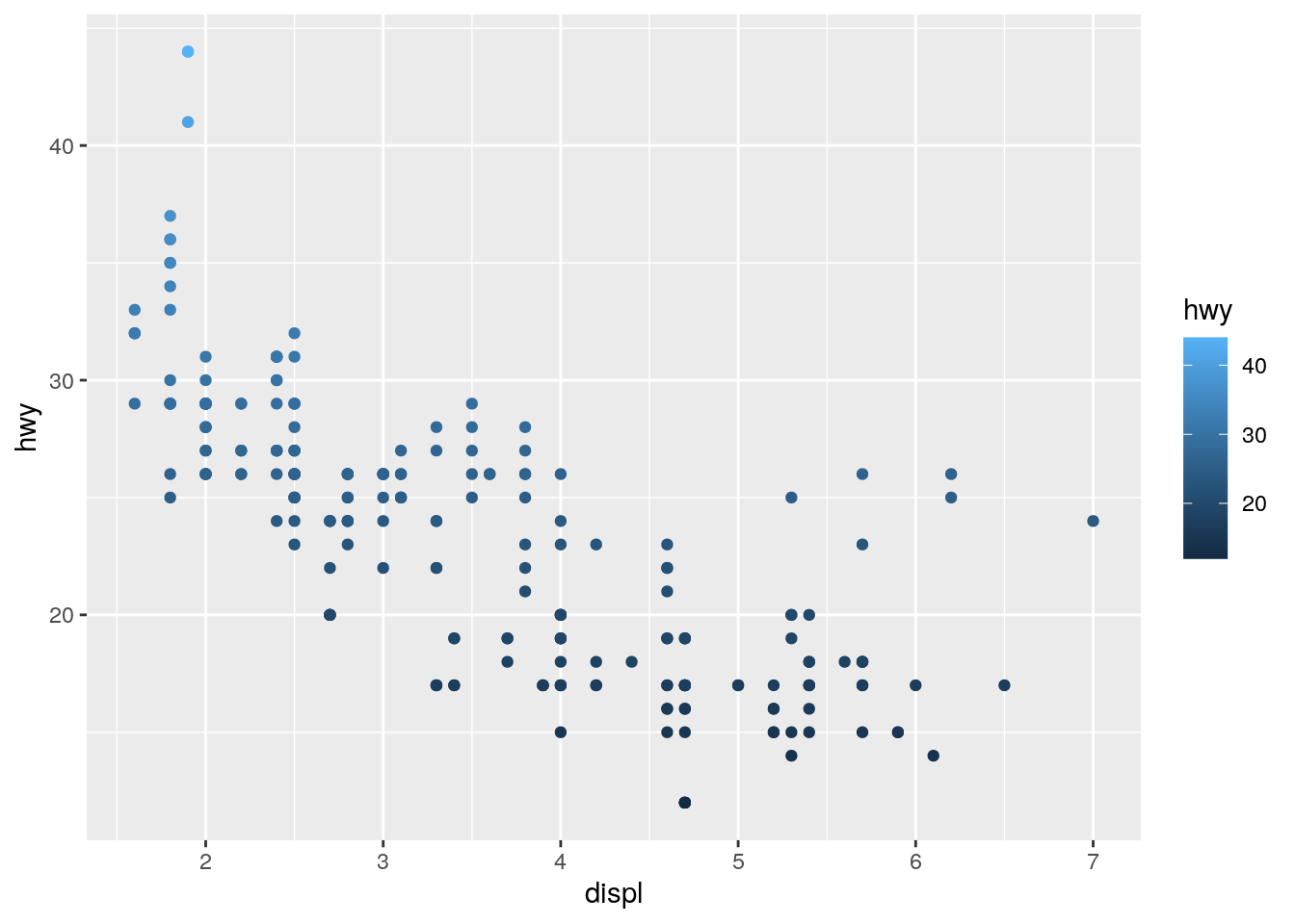
Again we have redundant information, but it works. Just because you can plot something, doesn’t mean you should!
10. What does the stroke aesthetic do? What shapes does it work with? (Hint: use ?geom_point)
The stroke argument is used to control the size of the edge/border of your points in the scatterplot. I actually think this is an unfair question for this early in your R learning journey, I would ignore it for now.
11. What happens if you map an aesthetic to something other than a variable name, like aes(colour = displ < 5)? Note, you’ll also need to specify x and y.
This is also a touch unfair because we haven’t seen the < operator yet. Here’s the full code including specification of x and y:
ggplot(data = mpg) +
  geom_point(mapping = aes(x = displ, y = hwy, colour = displ < 5))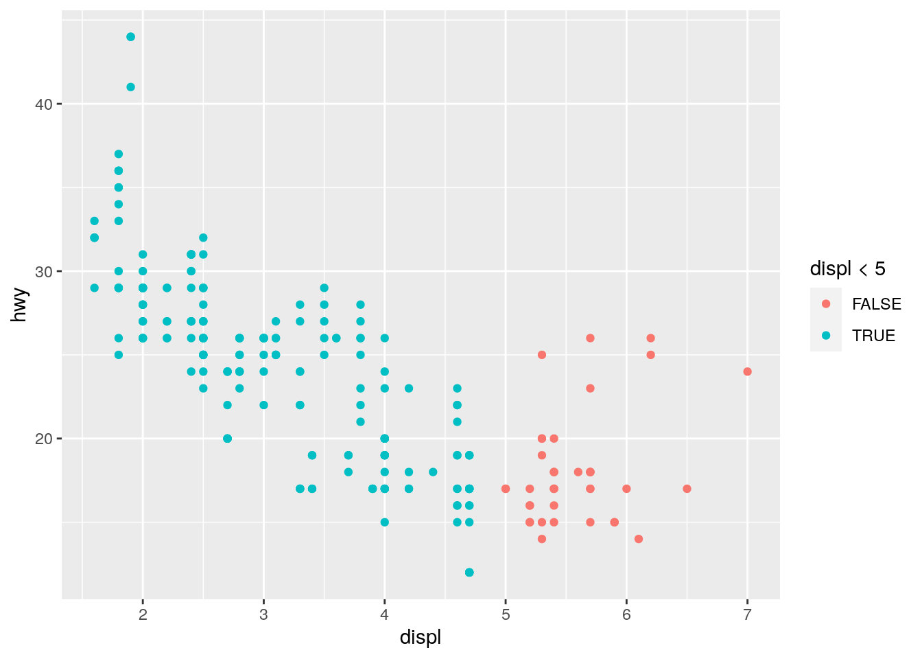
Basically, what the code is askig ggplot to do is to map onto the colour aesthetic whether the data in the displ variable is lower than 5. The colour of the points on the plot will be mapped onto a colour whether this condition is TRUE or FALSE. So, you will note that all points below 5 are coloured blue (because these data are < 5) and all those above 5 are coloured red (because these data are NOT < 5).
Although it’s a touch unfair, it’s useful to see this type of thing because it can be very useful for certain plots.
12. What is recorded in the ChickWeight data?
We can explore pre-installed data more by typing ?ChickWeight into the console. We see that the data are from an experiment on the effect of diet on early growth of chicks.
13. How many rows in this data set? How many columns?
There are 578 rows and 4 columns in this data set. We can ascertain this by ?ChickWeight into the console (most pre-installed data has a help file which will tell you the dimensions of the data).
14. Create a plot showing how a chick’s weight changes over time. For this we will create a scatterplot with time on the x-axis and weight on the y-axis:
ggplot(data = ChickWeight) +
  geom_point(mapping = aes(x = Time, y = weight))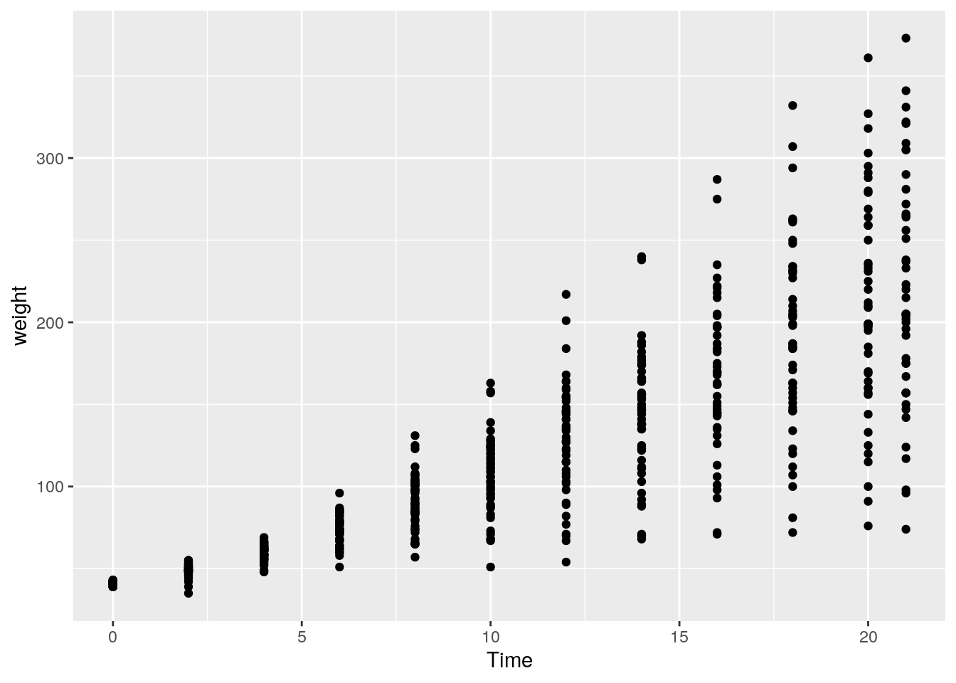
15. Create a plot showing whether the change in a chick’s weight over time is different according to the type of diet of a chick. We can explore this question by changing the colour of the point based on what diet was received:
ggplot(data = ChickWeight) +
  geom_point(mapping = aes(x = Time, y = weight, colour = Diet))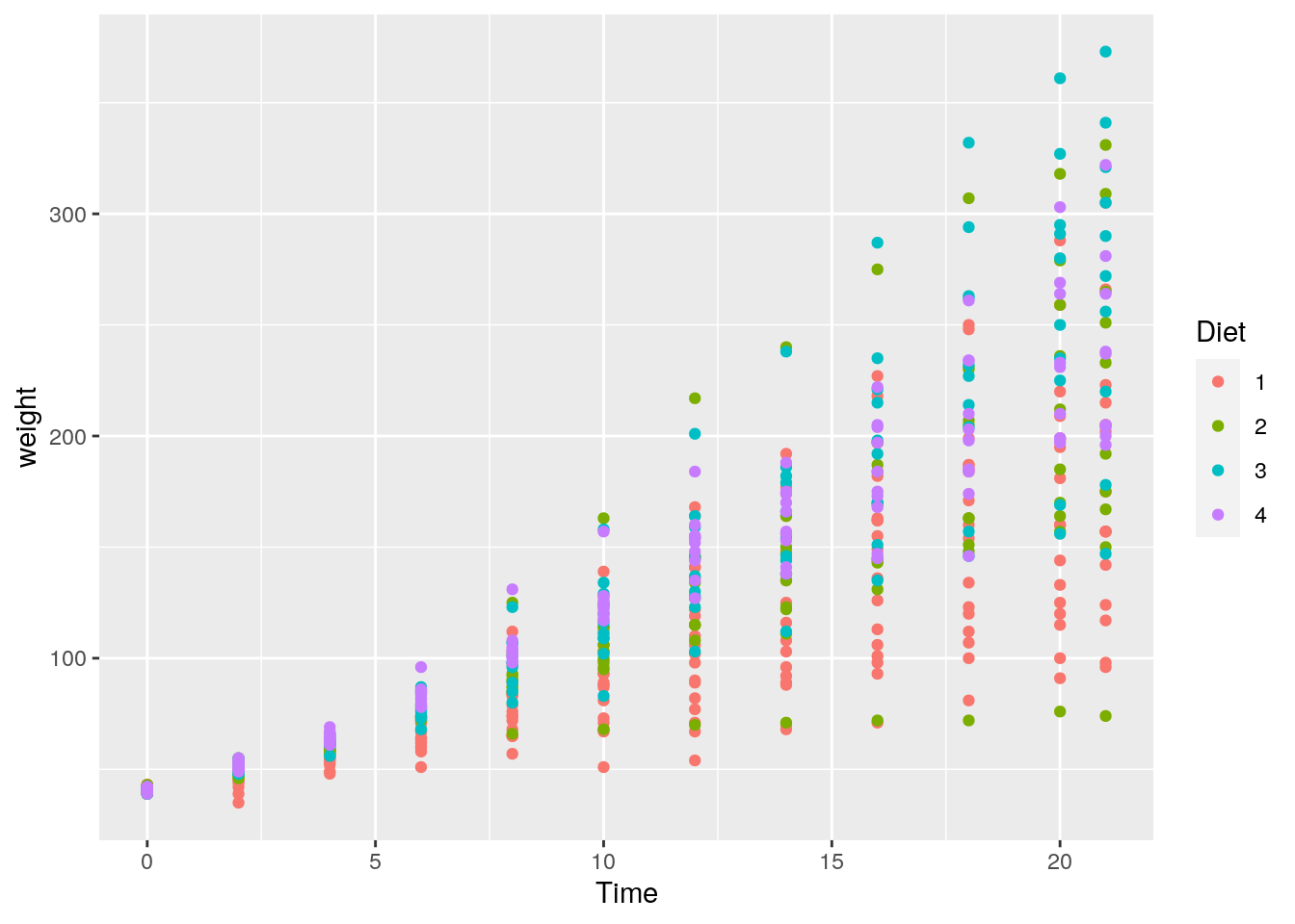
It’s hard to come to any firm conclusions here, but it looks like those chicks with a Diet = 1 appear to have a lower overall weight at later days in time (there are more red points lower on the y-axis at later points in time).
10.3 Week 3
1. Why does this code not work?
my_variable <- 10
my_var1able
OK, this is a bit of a cruel one. In the first line you declare an object / variable called my_variable, and then try to call it. However, note that it is spelled incorrectly. (There is a “1” instead of an “i”.) Typos happen, and it can often lead to frustrating errors in R.
2. Tweak each of the following R commands so that they run correctly:
library(tidyverse)

ggplot(dota = mpg) +
  geom_point(mapping = aes(x = displ, y = hwy))

fliter(mpg, cyl = 8)
filter(diamond, carat > 3)
I will take each of these in turn, adding comments to show the errors:
# The original code:
ggplot(dota = mpg) +
  geom_point(mapping = aes(x = displ, y = hwy))

# The error? "dota = mpg". Last time I checked, data is spelled with an "a" in the second position :)

# Correct code:
ggplot(data = mpg) +
  geom_point(mapping = aes(x = displ, y = hwy))
# The original code:
fliter(mpg, cyl = 8)
# The error? The function is called "filter", not "filter"
# Correct code:
filter(mpg, cyl = 8)# The original code:
filter(diamond, carat > 3)
# The error? There is no data set called "diamond". The built-in data set is pluralised: "diamonds"
# Correct code:
filter(diamonds, carat > 3)3. Press Alt + Shift + K. What happens? How can you get to the same place using the menus?
I actually use a mac for all of my computing, so I haven’t got a clue what happens when you press Alt + Shift + K. I hope it’s nothing bad 😄.
4. Does the following code work for you? Is there anything wrong with it?
my_first_variable = 12
my_second_variable = 32

my_first_variable * my_second_variable
Seems to run just fine on my machine. What about yours?
However, there is something wrong with the code which doesn’t affect its ability to run. Note that we should be using the <- symbol to assign values to objects as per our style guide:
my_first_variable <- 12
my_second_variable <- 32

my_first_variable * my_second_variable- Create an object that holds 6 evenly spaced numbers starting at 2 and ending at 12. Create this manually (i.e., don’t use any functions).
This requires just a little thought to work out the numbers, and then to recall to use the c() syntax to create a vector:
my_object <- c(2, 4, 6, 8, 10, 12)Here’s how you answer the proposed question:
my_object <- seq(6, 30, length.out = 12)- Repeat this step but now use a function to achieve the same result. (Tip: see the
seqfunction.)
As mentioned in the tip, we can use the seq function discussed in the assigned chapter of R4DS. If you can’t recall what it does, remind yourself by calling the help file: ?seq.
We see from the help file that the seq function takes the following arguments: from, to, by, and length.out:
* from: the starting value of the sequence
* to: the end value of the sequence
* by: the number to increment the sequence by
* length.out: desired length of the sequence.
From the question, we know that the seqeunce should start from 2, go up to 12, and be 6 items in length (length.out). From this, we see how our values map onto some of the arguments of the function.
If you aren’t sure what I mean by values or arguments, ask me to explain!
Here’s the result:
my_object <- seq(from = 2, to = 12, length.out = 6)- ….What was the
meanresponse time of your sample? (Tip: You may want to first create an object to hold your data…)
OK, first we will create an object that holds all of our response times. Then I will call the mean() function in R. Not sure what it does? Check the help file!
my_response_times <- c(597, 763, 614, 705, 523, 703, 858, 775, 759, 520, 505, 680)

mean(my_response_times)
## [1] 666.83338. What was the median response time of your sample?
You guessed it: There is also a median function in R. So, it’s simple:
my_response_times <- c(597, 763, 614, 705, 523, 703, 858, 775, 759, 520, 505, 680)

median(my_response_times)
## [1] 691.5- Was the mean response time of your sample smaller than the median response time of your sample? How might you check this using logical operators?
OK, so a visual inspection of the output from the above two questions clearly shows that the mean response time of the sample (666.83) was indeed smaller than the median response time of your sample (691.5). How might we have achieved this using logical operators?
We saw from the reading material for the week that we can check whether one value is lower than another using the < operator. So, we could do the following:
666.83 < 691.5## [1] TRUEwhich results in TRUE. However, this requires us to manually enter these digits, which is a potential issue for reproducibility! Therefore, another way to do it is to compare whether the result of the mean function is smaller than the result of the median function:
mean(my_response_times) < median(my_response_times)## [1] TRUEYet another way to do this would result if you had stored the outcome of your mean and median function calls into unique objects:
mean_response_times <- mean(my_response_times)
median_response_times <- median(my_response_times)

mean_response_times < median_response_times
## [1] TRUE10. Run the following code. How might you find the minimum and the maximum value in the created vector?
I wonder whether you initially tried to call functions minimum and maximum? This is what I anticipated you would do. But this would return an error because these functions don’t exist! So what do we do? We could look at all of the numbers and work out which is the minimum, but this would be a complete pain!
Instead, we can hit Google—other search engines are available—and try to find how we find the minimum value of a vector using R.
The first result shows us that the required function for minimum is min(). (I will let you search for how to find the maximum.)
So, to find the minimum we do:
random_numbers <- rnorm(n = 100, mean = 100, sd = 20)
min(random_numbers)
## [1] 50.24709Now, we likely got different results. Why is this? Well, remember that I said the rnorm function creates 100 random numbers. So, your vector will contain different numbers to mine, so we will (likely) have different minimum and maximum values!
11. Run the summary function on your random numbers. What does this function return?
Let’s see!
summary(random_numbers)## Min. 1st Qu. Median Mean 3rd Qu. Max.
## 50.25 87.69 100.54 101.71 116.13 151.53This function returns several values. To find out what each means, consult the help files for the function.
10.4 Week 4
1. Create a new script called gorilla and write code that achieves the following…
Your script should look like the following:
# Load required packages
library(tidyverse)

# Import the data
gorilla_data <- read_csv("gorilla_bmi.csv")

# Create a plot!
ggplot(data = gorilla_data) +
  geom_point(mapping = aes(y = bmi, x = steps, colour = gender))
…do you notice anything?
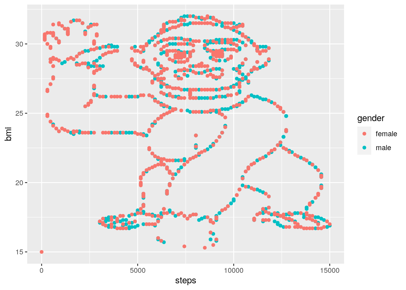
LOL.
2. Save this plot using the method described in this week’s reading.
This should be pretty straightforward. If you’re not sure, check back on the Week 4 reading to see how you can save any plot you’ve created with the click of a mouse!
3. Have a look at the help file for the ggsave function. How might you use this function to save the plot you’ve created with the following characteristics…
The ggsave function is useful for using code to save your plots. As you’ve seen, this isn’t strictly necessary, but it does add a layer of reproducibility to your analyses. Let’s look at the help file for ggsave:
?ggsave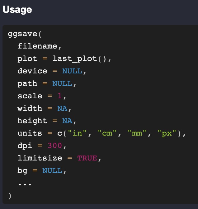
You will see that the function accepts many arguments, including (but not limited to) filename, device, width, etc. You will see that some of these arguments already have default settings. For example, the default setting for device is NULL, and the default setting for dpi is 300.
If an argument has a default setting, then you do not need to mention it when you use the function. So, for example, if we’ve already created the plot and we can see it in R Studio, we don’t need to mention any other argument except filename, because this is the only one that doesn’t have a default argument setting.
So, we could use:
ggsave(filename = "gorilla_bmi_ggsave.png")R Studio is clever, so it recognises you want to save it as a .png file, and adds this as the device automatically. The more verbose way of doing the same thing would be:
ggsave(filename = "gorilla_bmi_ggsave.png",
       device = "png")
Both of these will save the plot to your project folder (check it has worked!), but the size of the plot will be the same as it was in your R Studio viewer. This won’t always be practical, so to manually set the width and height of our plot, we need to pass desired values to the relevant width and height arguments, not forgetting to tell R that we want the units to be in “in” (short for “inches”):
ggsave(filename = "gorilla_bmi_ggsave.png",
       device = "png",
       width = 6,
       height = 5,
       units = "in")
4. …re-write the following code into a well-formatted script Here is how I’ve rewritten the code to make it more readable, using the tidyverse style guide for inspiration. Below the script I’ve added some explanations of what’s changed:
# Load required libraries -------------
library(tidyverse)

# Load data ---------------------------

# use the diamonds data from the ggplot2 package
diamond_data <- diamonds

# Wrangle data ------------------------

# filter the data to only show diamonds with "SI2" clarity
filtered_data <- filter(D, clarity == "SI2")

# Plot data ---------------------------

# plot the relationship between carat and price of the diamonds
ggplot(data = filtered_data) +
  geom_point(aes(x = carat, y = price))

# plot the relationship between carat and price of the diamonds,
# with the colour of the plots related to depth
ggplot(data = filtered_data) +
  geom_point(aes(x = carat, y = price, color = depth))
What I did, in the order in which I did it:
- First, I added “commented lines” to break the script into chunks. This is often a useful way to break up long scripts into different “chapters”. For most data analysis projects, you will have chunks for loading required libraries, importing data, wrangling the data, plotting the data, and any analysis. It’s overkill to use chunks for this small script, but it’s a good habit to get into.
- When I loaded the
diamondsdata, I used a better name for the object that I stored the data in, calling itdiamond_data. I also used the<-assignment operator rather than=. - Whilst
FilteredDatais OK for an object name, using so-called snake-case is much better, so I changed the object name tofiltered_data. plot 1isn’t a good comment as it doesn’t really describe what’s going on. I changed this to be more informative. I did the same for the second plot.- As I changed the object name that stored the data to
filtered_data, I needed to ensure I was calling this object when I usedggplot. - In the original plot code, the spacing wasn’t great. I therefore added whitespace around the
=signs. I also added a line break after the+sign. This will become more useful when we have multiple layers to plots in later weeks.
10.5 Week 5
1. Using the flights data from the nycflights13 package, perform the following. Find all flights that:
- Had an arrival delay of two or more hours
This information is contained within the arr_delay column, so we can find this information by using the filter() verb / function, along the lines of the following:
filter(flights, arr_delay >= 120)Note the use of the >= operator, which is “greater than or equal to” as the question asks us to find the flights with a delay of two OR MORE hours.
- Flew to Houston (
IAHorHOU) Here we need to use the logical OR operator (|) on thedestcolumn:
filter(flights, dest == "IAH" | dest == "HOU")- Were operated by United, American, or Delta
This information is contained within the
carriercolumn. In the help file we see that this column contains two-letter abbreviations of each airline, and to see theairlinesobject to get the names. Let’s look at that object:
airlines## # A tibble: 16 × 2
## carrier name
## <chr> <chr>
## 1 9E Endeavor Air Inc.
## 2 AA American Airlines Inc.
## 3 AS Alaska Airlines Inc.
## 4 B6 JetBlue Airways
## 5 DL Delta Air Lines Inc.
## 6 EV ExpressJet Airlines Inc.
## 7 F9 Frontier Airlines Inc.
## 8 FL AirTran Airways Corporation
## 9 HA Hawaiian Airlines Inc.
## 10 MQ Envoy Air
## 11 OO SkyWest Airlines Inc.
## 12 UA United Air Lines Inc.
## 13 US US Airways Inc.
## 14 VX Virgin America
## 15 WN Southwest Airlines Co.
## 16 YV Mesa Airlines Inc.Here we see that the abbreviations we need are UA, AA, and DL. Here is one way we can achieve the desired outcome again using the logical OR operator:
filter(flights, carrier == "UA" | carrier == "AA" | carrier == "DL")A slightly more advanced way of doing this is to use the %in% operator on a vector of carriers we want to filter for (created using the concatenation introduced earlier in the module, c()):
filter(flights, carrier %in% c("UA", "AA", "DL"))To verbalise what’s going on here, we are asking dplyr to “…filter the flights data where the carrier is equal to at least one value found in the vector”. This approach becomes useful when there are multiple things we want to filter for. Note that when we want to find data where a carrier matches one of three possibilities, we had to write the OR operator each time. This can quickly become unmanagable.
To get even more fancy, you can store the carriers you want to filter for in a new object, and then pass this object name to the %in% operator. For example, let’s filter for five airlines:
airlines_to_filter <- c("AA", "UA", "DL", "VX", "HA")
filter(flights, carrier %in% airlines_to_filter)- Departed in summer (July, August, and September)
Summer falls on the 7th, 8th, and 9th months of the year. Let’s practice with the
%in%operator again
filter(flights, month %in% c(7, 8, 9))- Arrived more than two hours late, but didn’t leave late
Slightly trickier. Here we can use the
ANDoperator&. We want to find the rows where thearr_delayis greater than two hours, but thedep_delayis zero (or negative). Both of these conditions need to be true, so we need the “AND” operator:
filter(flights, arr_delay > 120 & dep_delay <= 0)- Were delayed by at least an hour, but made up over 30 minutes in flight
The code for this is straightforward, but getting to the right answer requires a little bit of puzzle solving.
If a flight was delayed by at least an hour, then
dep_delay >= 60. If the flight didn’t make up any time in the air, then its arrival would be delayed by the same amount as its departure, meaningdep_delay == arr_delay, or alternatively,dep_delay - arr_delay == 0. If it makes up over 30 minutes in the air, then the arrival delay must be at least 30 minutes less than the departure delay, which is stated asdep_delay - arr_delay > 30.
Bringing this together we get
filter(flights, dep_delay >= 60 & dep_delay - arr_delay > 30))2. In the flights data set, what was the tailnum of the flight with the longest departure delay?
For this we can make good use of the arrange() verb / function. However, if we jump into this without much thought, we run into the wrong answer.
arrange(flights, dep_delay)## # A tibble: 336,776 × 19
## year month day dep_time sched_de…¹ dep_d…² arr_t…³ sched…⁴ arr_d…⁵ carrier
## <int> <int> <int> <int> <int> <dbl> <int> <int> <dbl> <chr>
## 1 2013 12 7 2040 2123 -43 40 2352 48 B6
## 2 2013 2 3 2022 2055 -33 2240 2338 -58 DL
## 3 2013 11 10 1408 1440 -32 1549 1559 -10 EV
## 4 2013 1 11 1900 1930 -30 2233 2243 -10 DL
## 5 2013 1 29 1703 1730 -27 1947 1957 -10 F9
## 6 2013 8 9 729 755 -26 1002 955 7 MQ
## 7 2013 10 23 1907 1932 -25 2143 2143 0 EV
## 8 2013 3 30 2030 2055 -25 2213 2250 -37 MQ
## 9 2013 3 2 1431 1455 -24 1601 1631 -30 9E
## 10 2013 5 5 934 958 -24 1225 1309 -44 B6
## # … with 336,766 more rows, 9 more variables: flight <int>, tailnum <chr>,
## # origin <chr>, dest <chr>, air_time <dbl>, distance <dbl>, hour <dbl>,
## # minute <dbl>, time_hour <dttm>, and abbreviated variable names
## # ¹sched_dep_time, ²dep_delay, ³arr_time, ⁴sched_arr_time, ⁵arr_delayHere we might conclude that the flight with tail numbers N592JB was the one with the longest departure delay. However, by default the arrange() verb / function arranges the data in ascending order (i.e., starting with the lowest value first). A dep_delay of -43 actually means this flight left 43 minutes before schedule. Therefore we want to ensure we use the desc() argument within arrange() to ensure we see the dep_delay column in descending order:
arrange(flights, desc(dep_delay))## # A tibble: 336,776 × 19
## year month day dep_time sched_de…¹ dep_d…² arr_t…³ sched…⁴ arr_d…⁵ carrier
## <int> <int> <int> <int> <int> <dbl> <int> <int> <dbl> <chr>
## 1 2013 1 9 641 900 1301 1242 1530 1272 HA
## 2 2013 6 15 1432 1935 1137 1607 2120 1127 MQ
## 3 2013 1 10 1121 1635 1126 1239 1810 1109 MQ
## 4 2013 9 20 1139 1845 1014 1457 2210 1007 AA
## 5 2013 7 22 845 1600 1005 1044 1815 989 MQ
## 6 2013 4 10 1100 1900 960 1342 2211 931 DL
## 7 2013 3 17 2321 810 911 135 1020 915 DL
## 8 2013 6 27 959 1900 899 1236 2226 850 DL
## 9 2013 7 22 2257 759 898 121 1026 895 DL
## 10 2013 12 5 756 1700 896 1058 2020 878 AA
## # … with 336,766 more rows, 9 more variables: flight <int>, tailnum <chr>,
## # origin <chr>, dest <chr>, air_time <dbl>, distance <dbl>, hour <dbl>,
## # minute <dbl>, time_hour <dttm>, and abbreviated variable names
## # ¹sched_dep_time, ²dep_delay, ³arr_time, ⁴sched_arr_time, ⁵arr_delayFlight with tail number N384HA is the longest departure delay of nearly 22 hours!
- Create a new column that shows the amount of time each aircraft spent in the air, but show it in hours rather than minutes.*
We create this using the mutate() verb / function. If we run this, though, note we can’t see the resulting column:
mutate(flights, air_time_in_hours = air_time / 60)## # A tibble: 336,776 × 20
## year month day dep_time sched_de…¹ dep_d…² arr_t…³ sched…⁴ arr_d…⁵ carrier
## <int> <int> <int> <int> <int> <dbl> <int> <int> <dbl> <chr>
## 1 2013 1 1 517 515 2 830 819 11 UA
## 2 2013 1 1 533 529 4 850 830 20 UA
## 3 2013 1 1 542 540 2 923 850 33 AA
## 4 2013 1 1 544 545 -1 1004 1022 -18 B6
## 5 2013 1 1 554 600 -6 812 837 -25 DL
## 6 2013 1 1 554 558 -4 740 728 12 UA
## 7 2013 1 1 555 600 -5 913 854 19 B6
## 8 2013 1 1 557 600 -3 709 723 -14 EV
## 9 2013 1 1 557 600 -3 838 846 -8 B6
## 10 2013 1 1 558 600 -2 753 745 8 AA
## # … with 336,766 more rows, 10 more variables: flight <int>, tailnum <chr>,
## # origin <chr>, dest <chr>, air_time <dbl>, distance <dbl>, hour <dbl>,
## # minute <dbl>, time_hour <dttm>, air_time_in_hours <dbl>, and abbreviated
## # variable names ¹sched_dep_time, ²dep_delay, ³arr_time, ⁴sched_arr_time,
## # ⁵arr_delayThis is because by default dplyr adds any newly created columns as the final column of the tibble, and because there are more columns than can be shown in the console we can use the View() function to see everything in a new window:
new_data <- mutate(flights, air_time_in_hours = air_time / 60)
View(new_data)
4. What is the mean departure delay per airline carrier?
This requires use of two dplyr verbs / functions, both group_by() and summarise(). In addition, because we want to apply two verbs, we can stitch this all together using the pipe %>%:
flights %>%
  group_by(carrier) %>%
  summarise(mean_dep_delay = mean(dep_delay))
## # A tibble: 16 × 2
## carrier mean_dep_delay
## <chr> <dbl>
## 1 9E NA
## 2 AA NA
## 3 AS NA
## 4 B6 NA
## 5 DL NA
## 6 EV NA
## 7 F9 NA
## 8 FL NA
## 9 HA 4.90
## 10 MQ NA
## 11 OO NA
## 12 UA NA
## 13 US NA
## 14 VX NA
## 15 WN NA
## 16 YV NAOK, so we appear to have run into a problem. Why is there NA showing in most of the rows? This has occurred because some flight departure delay data is missing. We can see the rows with missing data by using the filter() verb / function in conjunction with is.na(). For example, the following code asks dplyr to filter the flights data showing the rows where NA is present in the dep_delay column:
filter(flights, is.na(dep_delay))## # A tibble: 8,255 × 19
## year month day dep_time sched_de…¹ dep_d…² arr_t…³ sched…⁴ arr_d…⁵ carrier
## <int> <int> <int> <int> <int> <dbl> <int> <int> <dbl> <chr>
## 1 2013 1 1 NA 1630 NA NA 1815 NA EV
## 2 2013 1 1 NA 1935 NA NA 2240 NA AA
## 3 2013 1 1 NA 1500 NA NA 1825 NA AA
## 4 2013 1 1 NA 600 NA NA 901 NA B6
## 5 2013 1 2 NA 1540 NA NA 1747 NA EV
## 6 2013 1 2 NA 1620 NA NA 1746 NA EV
## 7 2013 1 2 NA 1355 NA NA 1459 NA EV
## 8 2013 1 2 NA 1420 NA NA 1644 NA EV
## 9 2013 1 2 NA 1321 NA NA 1536 NA EV
## 10 2013 1 2 NA 1545 NA NA 1910 NA AA
## # … with 8,245 more rows, 9 more variables: flight <int>, tailnum <chr>,
## # origin <chr>, dest <chr>, air_time <dbl>, distance <dbl>, hour <dbl>,
## # minute <dbl>, time_hour <dttm>, and abbreviated variable names
## # ¹sched_dep_time, ²dep_delay, ³arr_time, ⁴sched_arr_time, ⁵arr_delayWe see that there are 8,255 rows with missing data for departure delays. Therefore, when we asked R to calculate the mean value, these missing data points cause the calculation to be impossible.
If we look at the help file for mean(), we see that there is a na.rm argument. If we set this to TRUE, R gets rid of the NA values before calculating the mean.
Therefore, the following code works:
flights %>%
  group_by(carrier) %>%
  summarise(mean_dep_delay = mean(dep_delay, na.rm = TRUE))
## # A tibble: 16 × 2
## carrier mean_dep_delay
## <chr> <dbl>
## 1 9E 16.7
## 2 AA 8.59
## 3 AS 5.80
## 4 B6 13.0
## 5 DL 9.26
## 6 EV 20.0
## 7 F9 20.2
## 8 FL 18.7
## 9 HA 4.90
## 10 MQ 10.6
## 11 OO 12.6
## 12 UA 12.1
## 13 US 3.78
## 14 VX 12.9
## 15 WN 17.7
## 16 YV 19.05. Create a new object called distance_delay that contains a tibble with ONLY the columns carrier, distance, and arr_delay.
We use the select() verb / function for such cases. This can be done either with a pipe or without one.
# without pipe
distance_delay <- select(flights, carrier, distance, arr_delay)

# with pipe
distance_delay <- flights %>%
  select(carrier, distance, arr_delay)
6. Download the rumination_data.csv data file from https://osf.io/z5tg2/. Import the data into an object called rumination_data.
Hopefully this is pretty straightforward for you if you’re using R projects!
rumination_data <- read_csv("rumination_data.csv")7. …Wrangle the data to show the mean response time rt for sequence conditions ABA and CBA, and for response_rep conditions switch and repetition. HINT: You need the group_by() verb / function as well as another verb / function for this.
First we group_by() the columns we’re interested in (i.e., sequence and response_rep), and then summarise() the data to show the mean rt:
rumination_data %>%
  group_by(sequence, response_rep) %>%
  summarise(mean_rt = mean(rt))
## # A tibble: 4 × 3
## # Groups: sequence [2]
## sequence response_rep mean_rt
## <chr> <chr> <dbl>
## 1 ABA repetition 1225.
## 2 ABA switch 1318.
## 3 CBA repetition 1214.
## 4 CBA switch 1198.8. Ooops. We should have first removed trials where th participant made an error (coded as accuracy equal to zero). Repeat the previous analysis taking this into account.
Simple. We just add a filter() call before the previous answer:
rumination_data %>%
  filter(accuracy == 1) %>%
  group_by(sequence, response_rep) %>%
  summarise(mean_rt = mean(rt))
## # A tibble: 4 × 3
## # Groups: sequence [2]
## sequence response_rep mean_rt
## <chr> <chr> <dbl>
## 1 ABA repetition 1219.
## 2 ABA switch 1311.
## 3 CBA repetition 1205.
## 4 CBA switch 1189.9. Repeat this analysis but also calculate the standard deviation of the response time in addition to the mean response time.
You can create multiple values within a single call to summarise(), and this question gets you to explore this. In addition, I don’t inform you how to use R to calculate a standard deviation, so you might have had to do a bit of digging on the internet.
Here’s the complete solution:
rumination_data %>%
  filter(accuracy == 1) %>%
  group_by(sequence, response_rep) %>%
  summarise(mean_rt = mean(rt),
            sd_rt = sd(rt))
## # A tibble: 4 × 4
## # Groups: sequence [2]
## sequence response_rep mean_rt sd_rt
## <chr> <chr> <dbl> <dbl>
## 1 ABA repetition 1219. 842.
## 2 ABA switch 1311. 2547.
## 3 CBA repetition 1205. 1021.
## 4 CBA switch 1189. 1269.10.6 Week 6
1. (With the “pepsi_challenge.csv” data…) Wrangle this data into long format, saving the result into an object called long_data
Let’s look at the data:
pepsi_data## # A tibble: 100 × 4
## participant coke pepsi supermarket
## <int> <int> <int> <int>
## 1 1 6 7 6
## 2 2 6 8 4
## 3 3 9 8 6
## 4 4 7 7 4
## 5 5 8 5 2
## 6 6 8 4 4
## 7 7 7 6 7
## 8 8 9 6 4
## 9 9 8 7 3
## 10 10 7 10 3
## # … with 90 more rowsOK, so we want to tidy this data so that each row contains only one observation; at the moment each row contains 3, as each participant provided a rating of 3 drinks. Our variable is the type of drink tasted, and our values are the rating each participant provided the drink.
To put this data into long format, we use the following code:
long_data <- pepsi_data %>%
  pivot_longer(cols = c(coke, pepsi, supermarket),
               names_to = "drink",
               values_to = "rating")
Let’s look at the result:
long_data## # A tibble: 300 × 3
## participant drink rating
## <int> <chr> <int>
## 1 1 coke 6
## 2 1 pepsi 7
## 3 1 supermarket 6
## 4 2 coke 6
## 5 2 pepsi 8
## 6 2 supermarket 4
## 7 3 coke 9
## 8 3 pepsi 8
## 9 3 supermarket 6
## 10 4 coke 7
## # … with 290 more rows2. Although not the main focus of this week’s learning, use your skills from last week to show the mean rating per drink across participants.
Here we want to group_by the type of drink, and then summarise the data to show the mean rating:
long_data %>%
  group_by(drink) %>%
  summarise(mean_rating = mean(rating))
## # A tibble: 3 × 2
## drink mean_rating
## <chr> <dbl>
## 1 coke 7.87
## 2 pepsi 6.98
## 3 supermarket 3.713. Using pipes, go from the original data (pepsi_data) to a plot of the mean ratings per drink on a scatter plot. We merely extend the above code to add a call to ggplot, and then add a geom_point layer:
long_data %>%
  group_by(drink) %>%
  summarise(mean_rating = mean(rating)) %>%
  ggplot() +
  geom_point(aes(x = drink, y = mean_rating))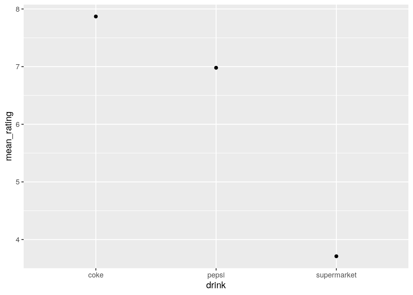
This code shows the beauty and power of the pipe: You will note that when we use the ggplot() call we do not need to specify the data file; this is because the code before has been “piped” into the ggplot call.
4. (With the “time_stimtype.csv” data…) Wrangle this data into long format, saving the result into an object called long_data
Let’s first remind ourselves the structure of the memory data in its original form
memory_data## # A tibble: 50 × 5
## participant morning_words morning_images evening_words evening_images
## <int> <dbl> <dbl> <dbl> <dbl>
## 1 1 70.6 79.1 86.2 84.6
## 2 2 74.9 94.4 74.1 82.3
## 3 3 82.9 77.5 70.8 73.2
## 4 4 96.3 69.8 99.7 78.1
## 5 5 68.1 62.8 85.3 80.0
## 6 6 95.9 64.0 68.5 67.2
## 7 7 97.8 72.6 65.2 81.2
## 8 8 86.4 80.8 79.1 63.0
## 9 9 85.2 86.5 97.0 71.1
## 10 10 62.5 76.3 84.0 68.5
## # … with 40 more rowsThis is a little bit trickier than the pepsi challenge data, where we only had one variable. In the current data we have two variables: time (morning vs. afternoon) and stimulus type (words vs. images). There are 4 observations per participant (percent correct). For the data to be tidy, each row should contain only one observation, and the columns should code for the variables in our data. Therefore, we need one column for time, and another for stimulus. The observations should be in a column called percent.
As the variable names in the wide data are separated by an underscore, we need to use the names_sep argument in the call to pivot_longer. Bringing it all together, we can use:
long_data <- memory_data %>%
  pivot_longer(cols = c(morning_words, morning_images, evening_words, evening_images),
               names_to = c("time", "stimulus"),
               names_sep = "_",
               values_to = "percent")

# show long data
long_data
Note when we were specifying the columns to pivot into a longer format, we listed each column name. Whilst this is OK for a few columns, this doesn’t scale very easily. If the columns we want to select are next to each other, we can just list the first column name and the last column name, separated by a colon (“:”) to achieve the same:
long_data <- memory_data %>%
  pivot_longer(cols = morning_words:evening_images,
               names_to = c("time", "stimulus"),
               names_sep = "_",
               values_to = "percent")
5a. What was the mean response time per participant, per level of congruency?
To answer this, we need to group by participant (id) and congruency and summarise the data to show the mean response time:
stroop_data %>%
  group_by(id, congruency) %>%
  summarise(mean_rt = mean(response_time))
## # A tibble: 60 × 3
## # Groups: id [30]
## id congruency mean_rt
## <int> <chr> <dbl>
## 1 1 congruent 614.
## 2 1 incongruent 651.
## 3 2 congruent 637.
## 4 2 incongruent 671.
## 5 3 congruent 630.
## 6 3 incongruent 678.
## 7 4 congruent 410.
## 8 4 incongruent 445.
## 9 5 congruent 469.
## 10 5 incongruent 522.
## # … with 50 more rows5b. Which participant had the slowest overall mean response time? To do this we can repeat the previous code, but then arrange the data in order of descending response time (i.e., from slowest to fastest):
stroop_data %>%
  group_by(id, congruency) %>%
  summarise(mean_rt = mean(response_time)) %>%
  arrange(desc(mean_rt))
## # A tibble: 60 × 3
## # Groups: id [30]
## id congruency mean_rt
## <int> <chr> <dbl>
## 1 9 incongruent 730.
## 2 9 congruent 714.
## 3 3 incongruent 678.
## 4 2 incongruent 671.
## 5 1 incongruent 651.
## 6 2 congruent 637.
## 7 3 congruent 630.
## 8 1 congruent 614.
## 9 7 incongruent 601.
## 10 13 incongruent 598.
## # … with 50 more rows5c. Transform the data into wide format so that for each participant there is a column showing mean response time for congruent trials and another column showing mean response time for incongruent trials. Each row should be a unique participant.
Using the pivot_wider function, we tell R that the names for the columns should come from the “congruency” column, and the name for the values should come from the “mean_rt” column:
stroop_data %>%
  group_by(id, congruency) %>%
  summarise(mean_rt = mean(response_time)) %>%
  pivot_wider(names_from = congruency,
              values_from = mean_rt)
## # A tibble: 30 × 3
## # Groups: id [30]
## id congruent incongruent
## <int> <dbl> <dbl>
## 1 1 614. 651.
## 2 2 637. 671.
## 3 3 630. 678.
## 4 4 410. 445.
## 5 5 469. 522.
## 6 6 371 390.
## 7 7 572. 601.
## 8 8 511. 507.
## 9 9 714. 730.
## 10 10 427. 463.
## # … with 20 more rows5d. Calculate the Stroop Effect for each participant in the data.
Here we make use of the mutate function which creates a new column:
stroop_data %>%
  group_by(id, congruency) %>%
  summarise(mean_rt = mean(response_time)) %>%
  pivot_wider(names_from = congruency,
              values_from = mean_rt) %>%
  mutate(stroop_effect = incongruent - congruent)
## # A tibble: 30 × 4
## # Groups: id [30]
## id congruent incongruent stroop_effect
## <int> <dbl> <dbl> <dbl>
## 1 1 614. 651. 37.5
## 2 2 637. 671. 34.1
## 3 3 630. 678. 47.9
## 4 4 410. 445. 34.2
## 5 5 469. 522. 52.6
## 6 6 371 390. 18.8
## 7 7 572. 601. 28.2
## 8 8 511. 507. -3.91
## 9 9 714. 730. 16.2
## 10 10 427. 463. 35.9
## # … with 20 more rows10.7 Week 7
1. Using the gapminder data, reproduce the plot in Layer 3 of Figure 7.2.
So this is just a fancier version of the types of scatterplots you’re likely getting bored of! However, the data needs a some wrangling, first! The plot shows the mean life expectancy per year per continent. However this data is not currently contained in the gapminder data set, so we need to use dplyr in the tidyverse to first calculate it.
If you didn’t do this first, your plot might look like the following:
ggplot(data = gapminder, aes(x = year, y = lifeExp)) +
  geom_point(aes(colour = continent))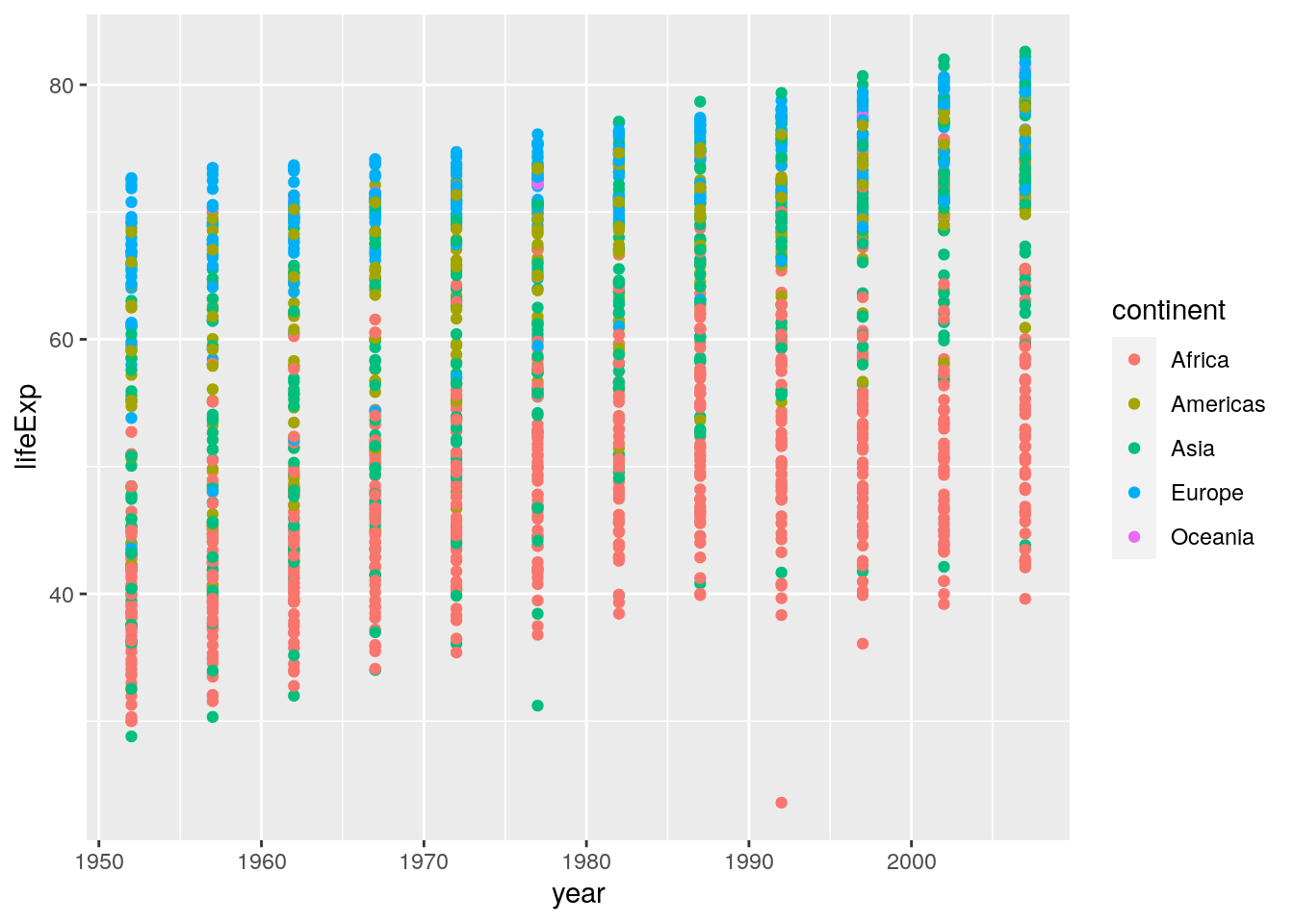
Here you see that for each year we are seeing all data points rather than the mean. So, we need to first wrangle the data”
summarised_data <- gapminder %>%
  group_by(continent, year) %>%
  summarise(lifeExp = mean(lifeExp))

summarised_data
## # A tibble: 60 × 3
## # Groups: continent [5]
## continent year lifeExp
## <fct> <int> <dbl>
## 1 Africa 1952 39.1
## 2 Africa 1957 41.3
## 3 Africa 1962 43.3
## 4 Africa 1967 45.3
## 5 Africa 1972 47.5
## 6 Africa 1977 49.6
## 7 Africa 1982 51.6
## 8 Africa 1987 53.3
## 9 Africa 1992 53.6
## 10 Africa 1997 53.6
## # … with 50 more rowsNow we can use this new data set to create our plot:
ggplot(data = summarised_data, aes(x = year, y = lifeExp)) +
  geom_point(aes(colour = continent))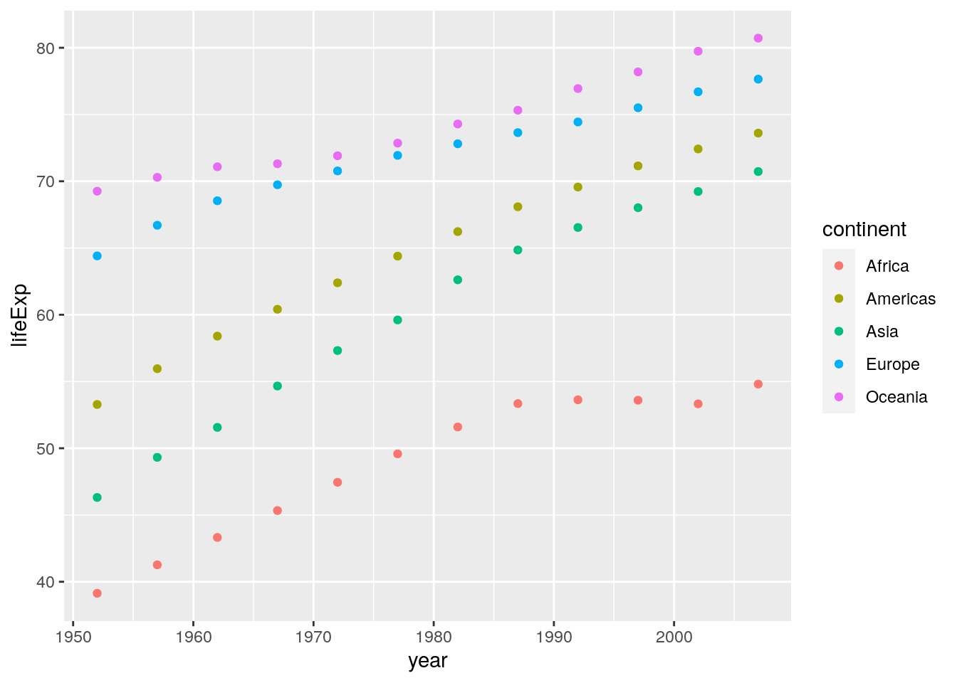
2. Extend the graph you’ve just coded in order to reproduce the plot in Layer 4 of Figure 7.2.
There is only one main difference here: Lines of best fit are added as linear regression lines. This uses the geom_smooth() geom:
ggplot(data = summarised_data, aes(x = year, y = lifeExp)) +
geom_point(aes(colour = continent)) +
geom_smooth(aes(colour = continent), method = "lm")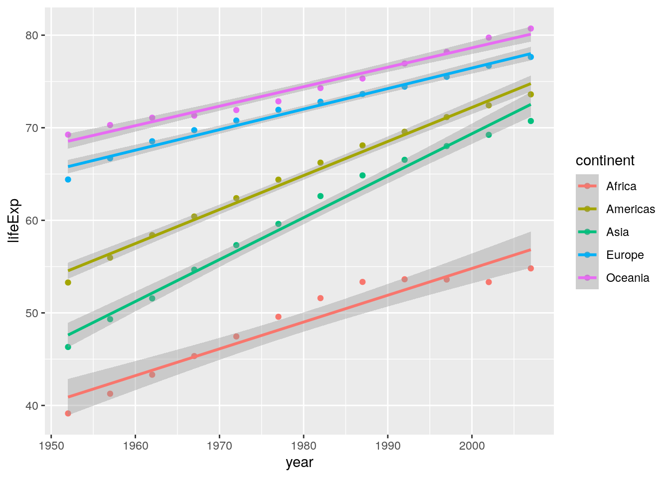 Notice if you didn’t include the
 method = "lm" argument, your lines of best fit would have used loess smoothing, which is the default for geom_smooth():
ggplot(data = summarised_data, aes(x = year, y = lifeExp)) +
  geom_point(aes(colour = continent)) +
  geom_smooth(aes(colour = continent))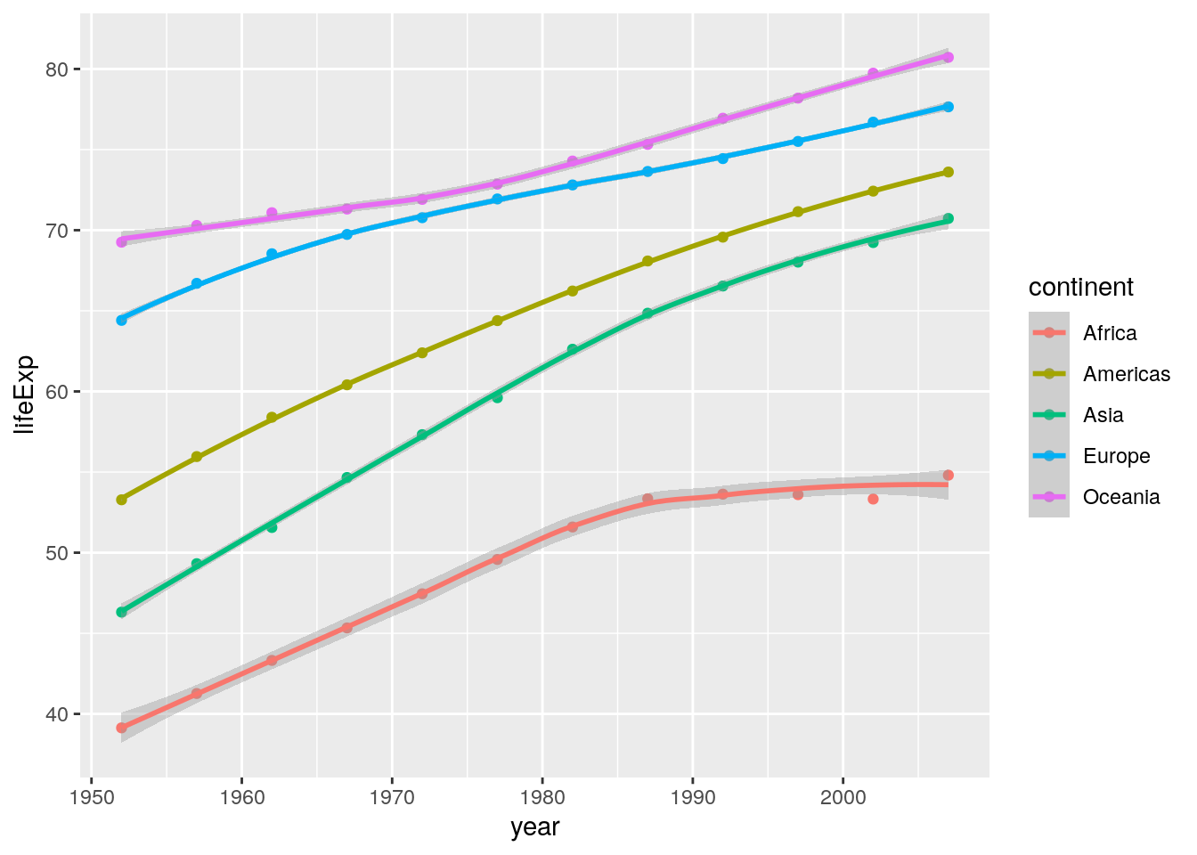
3. Extend the graph you’ve just coded in order to reproduce the plot in Layer 6 of Figure 7.2. Note this uses the bw theme.
Two additions have been made to this plot: I have labelled the x- and y-axes, and I have used a different ggplot theme. Here’s the code:
ggplot(data = summarised_data, aes(x = year, y = lifeExp)) +
  geom_point(aes(colour = continent)) +
  geom_smooth(aes(colour = continent), method = "lm") +
  labs(x = "Year",
       y = "Life Expectancy") +
  theme_bw()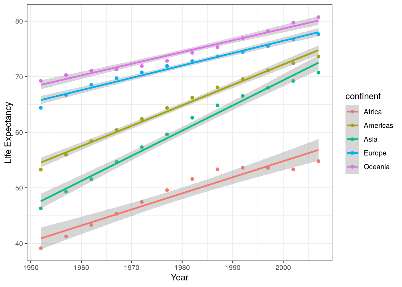
4. Ignoring “year”, produce a column plot of the mean GDP per continent in the gapminder data.
As discussed in the reading, geom_bar() can be used for basic counts of data (like frequencies etc.), but when you use geom_col() you likely need to do a little data wrangling first. Her’s the data we will use for the plot:
summarised_data <- gapminder %>%
  group_by(continent) %>%
  summarise(mean_gdp = mean(gdpPercap))

summarised_data
## # A tibble: 5 × 2
## continent mean_gdp
## <fct> <dbl>
## 1 Africa 2194.
## 2 Americas 7136.
## 3 Asia 7902.
## 4 Europe 14469.
## 5 Oceania 18622.We can then use this with ggplot:
ggplot(data = summarised_data, aes(x = continent, y = mean_gdp)) +
  geom_col()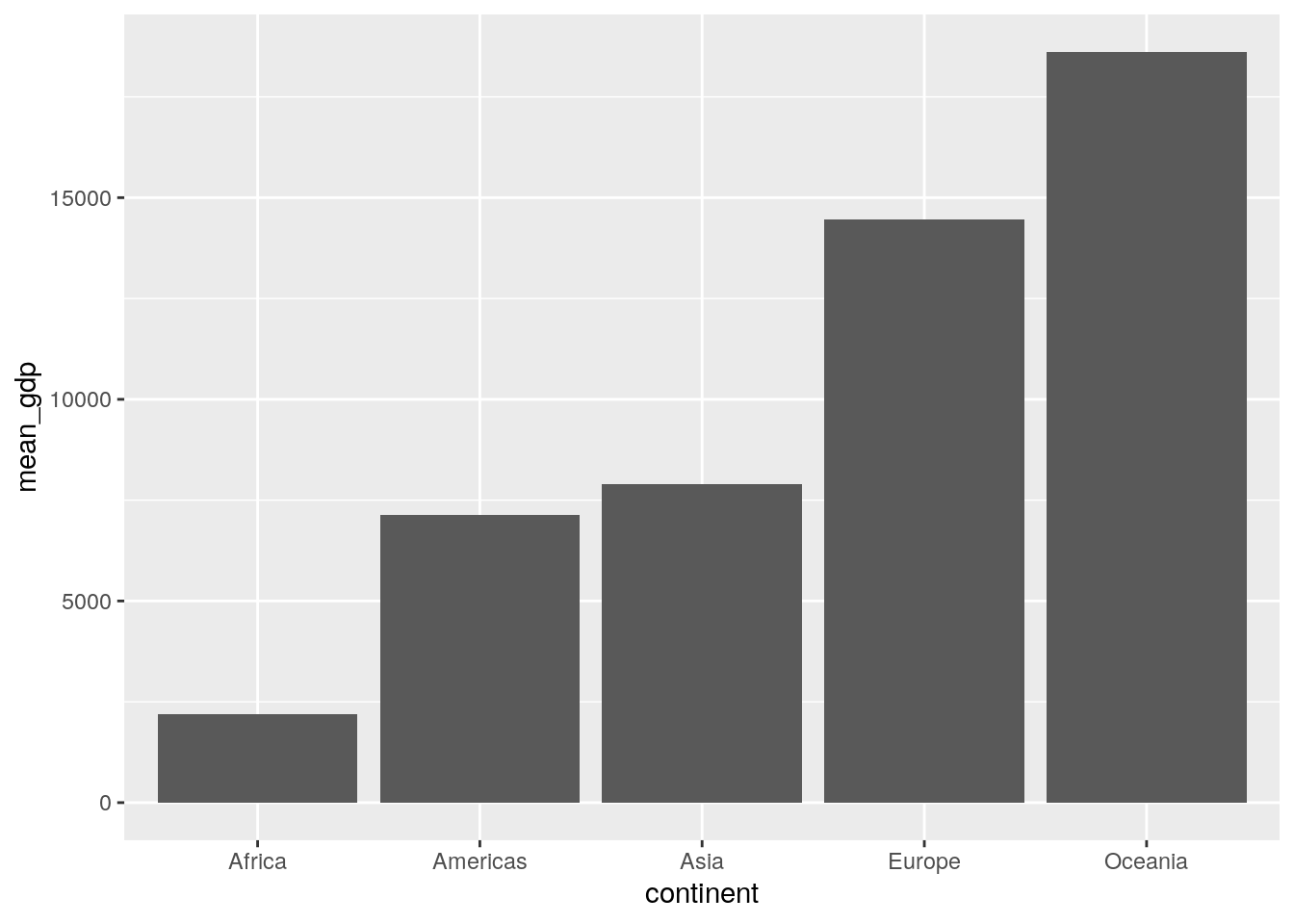
A cool little trick that is sometimes useful in column plots is to plot the categorigal variable on the y-axis instead. You can easily do this from within the aes() call, or just add coord_flip() as an extra layer to the previous plot code:
ggplot(data = summarised_data, aes(x = continent, y = mean_gdp)) +
  geom_col() +
  coord_flip()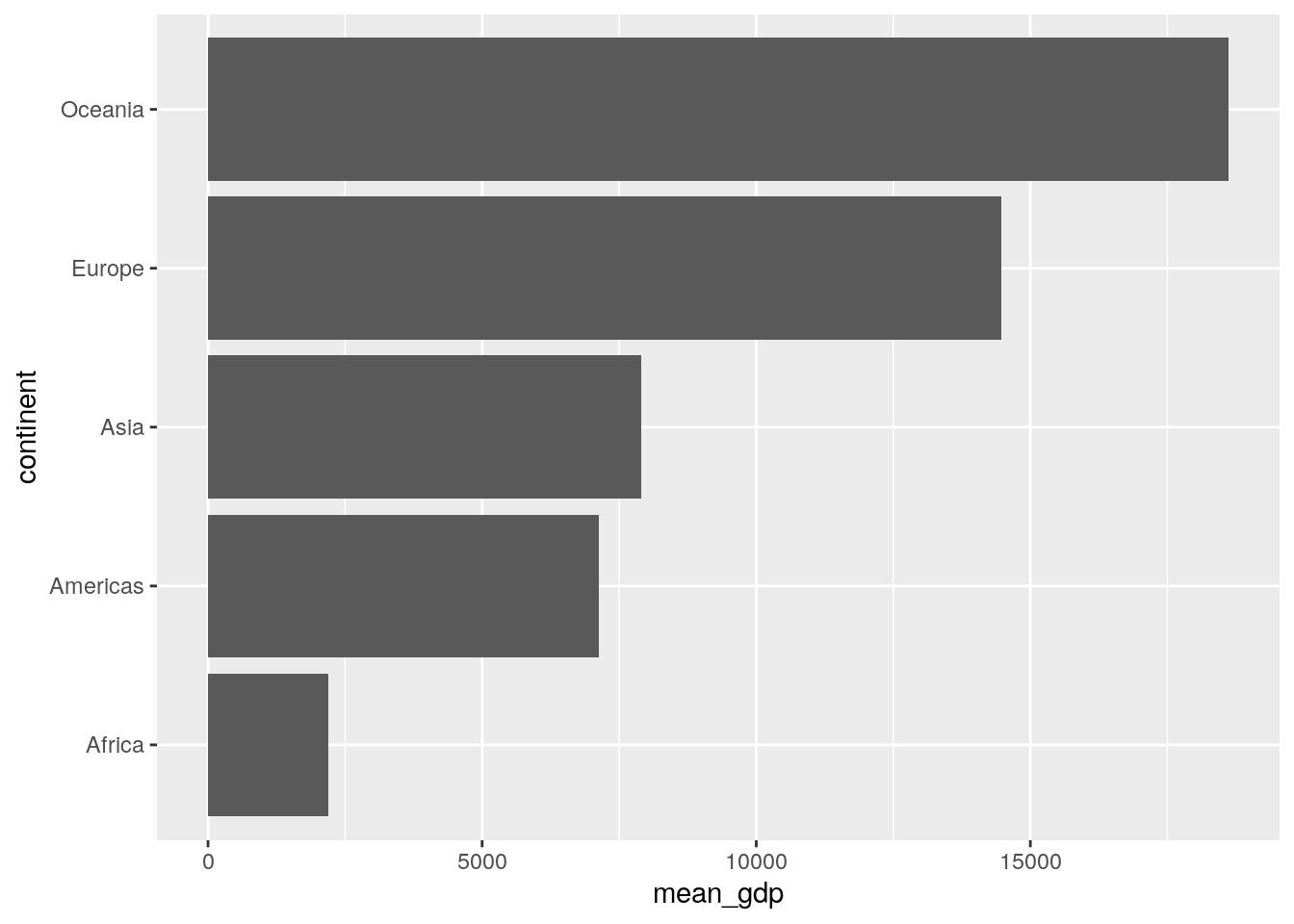
5. Using the gapminder data, choose (and code!) a suitable plot to show the distribution of GDP per capita.
A histogram is perfect for something like this. Recall from the reading that geom_histogram() only requires details about what to put on the x-axis.
ggplot(data = gapminder, aes(x = gdpPercap)) +
geom_histogram()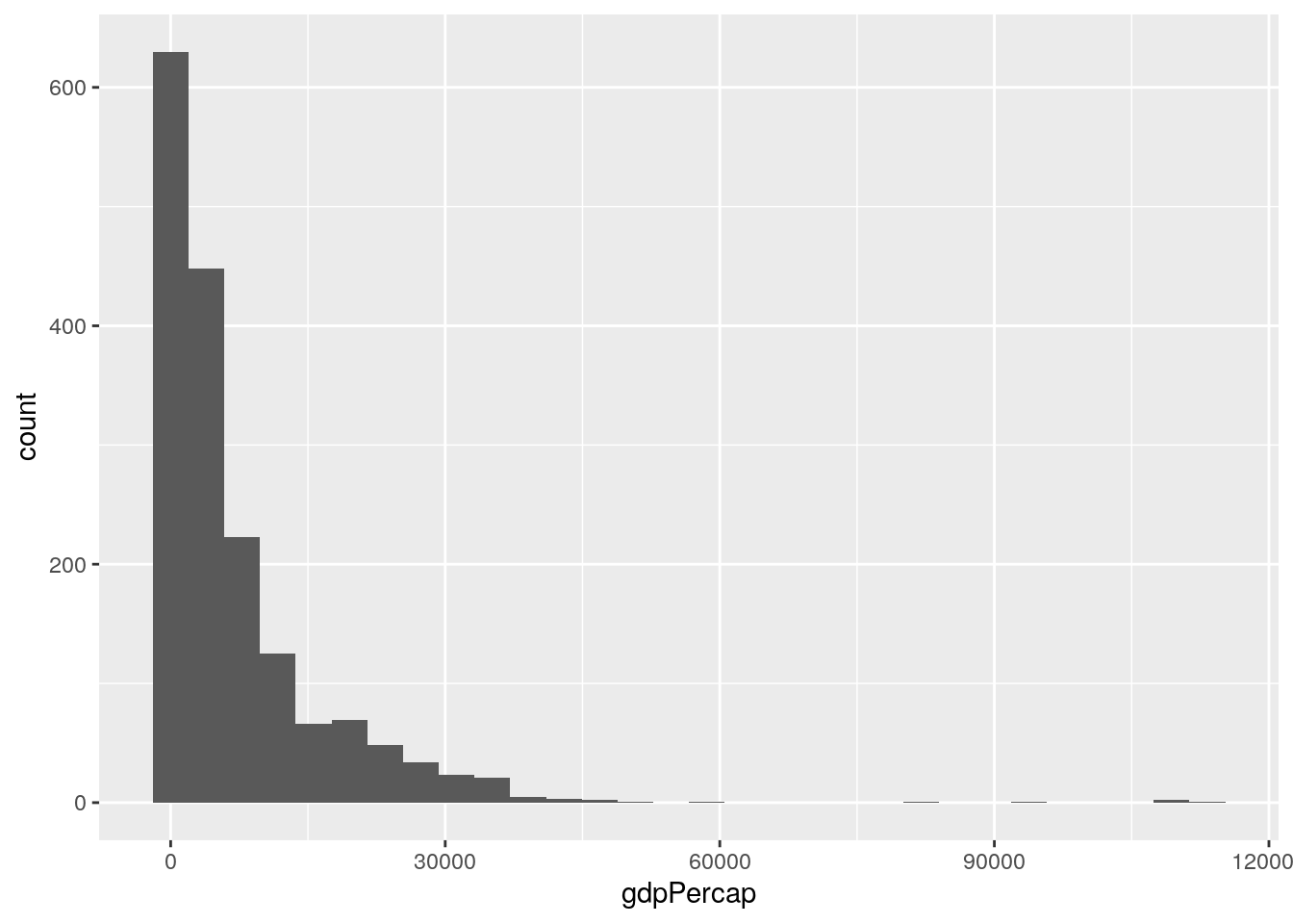 But come one…let’s make this look a little nicer - we’re professionals here now!
ggplot(data = gapminder, aes(x = gdpPercap)) +
  geom_histogram() +
  labs(x = "GPD Per Capita", y = "Frequency") +
  theme_minimal()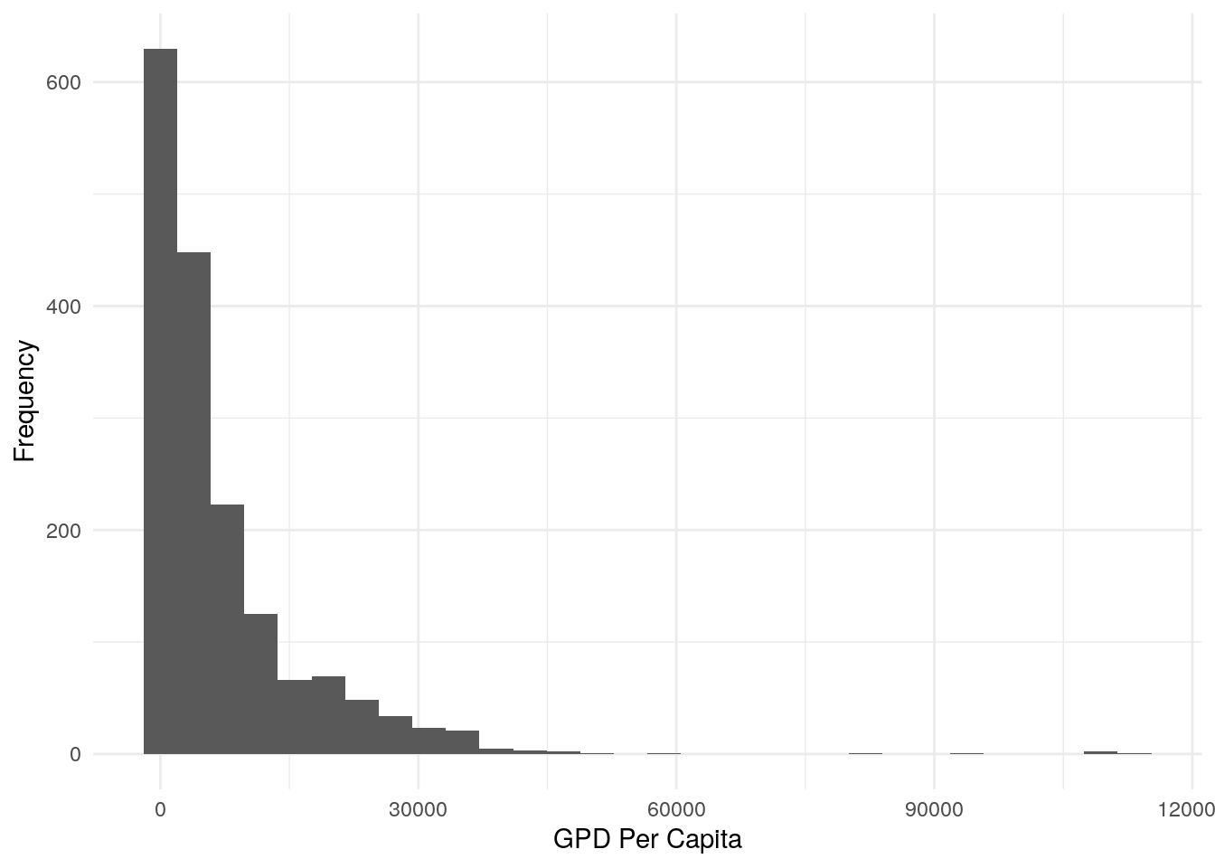
6. Choose (and code!) a suitable plot to show the distribution of GDP per capita per continent in the gapminder data.
If you haven’t read the chapter carefully, your defaul choice might be to use the colour argument in the aes() call, which produces an odd result:
ggplot(data = gapminder, aes(x = gdpPercap)) +
geom_histogram(aes(colour = continent)) 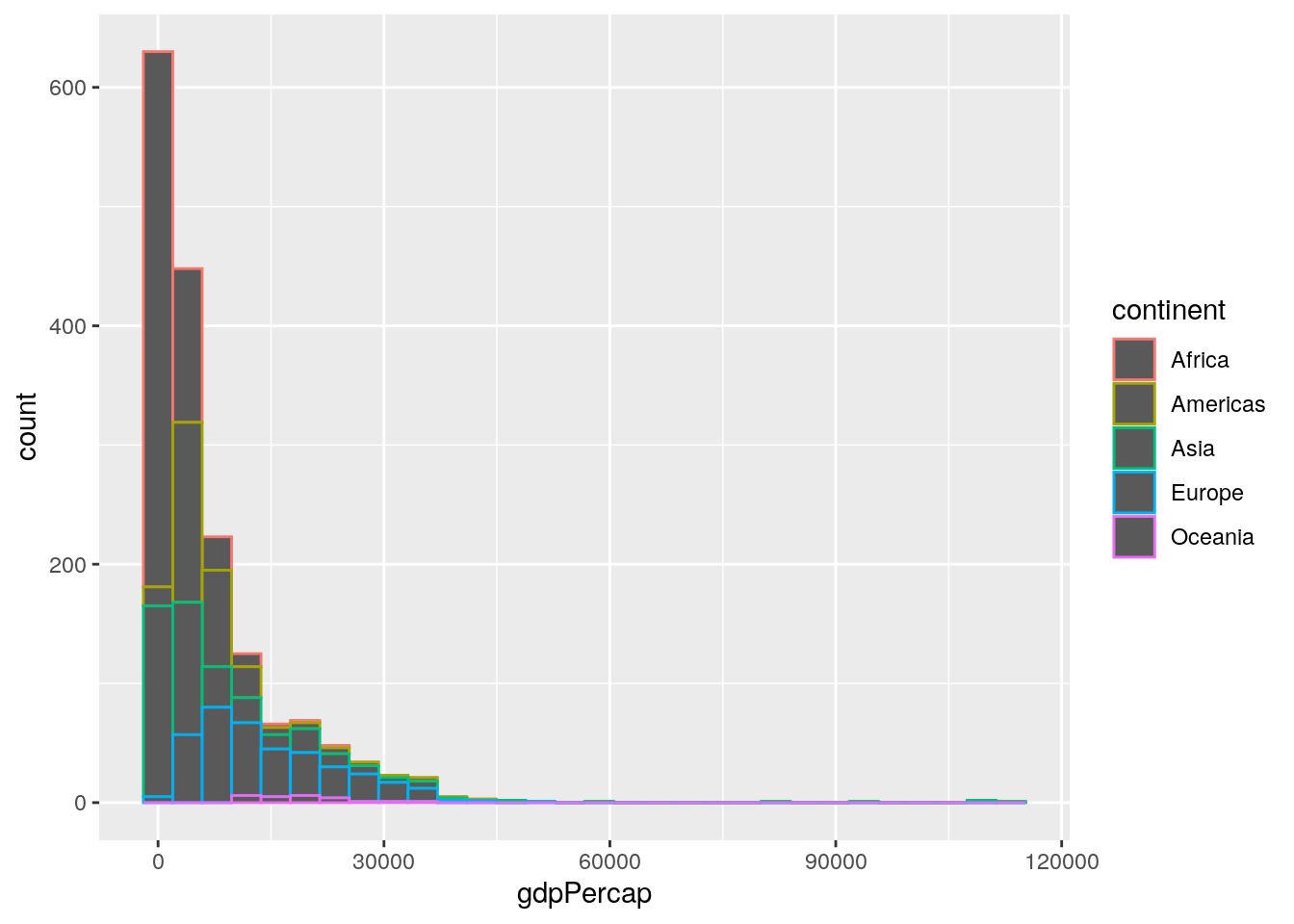
Instead, we need the fill argument:
ggplot(data = gapminder, aes(x = gdpPercap)) +
geom_histogram(aes(fill = continent)) 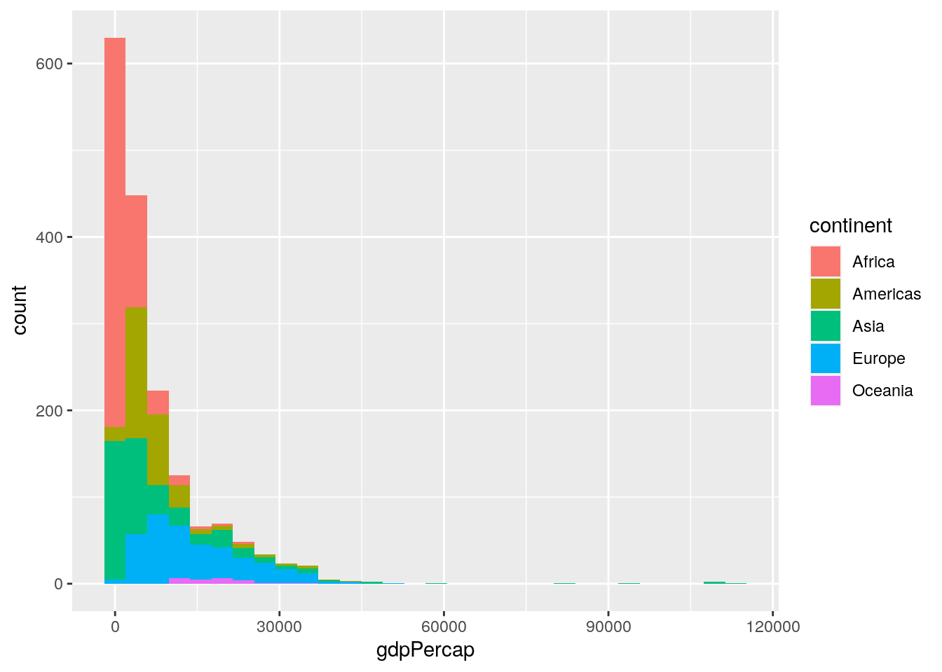
…and let’s tidy it again:
ggplot(data = gapminder, aes(x = gdpPercap)) +
  geom_histogram(aes(fill = continent),
                 colour = "black") +
  labs(x = "GDP Per Capita",
       y = "Frequency") +
  theme_minimal()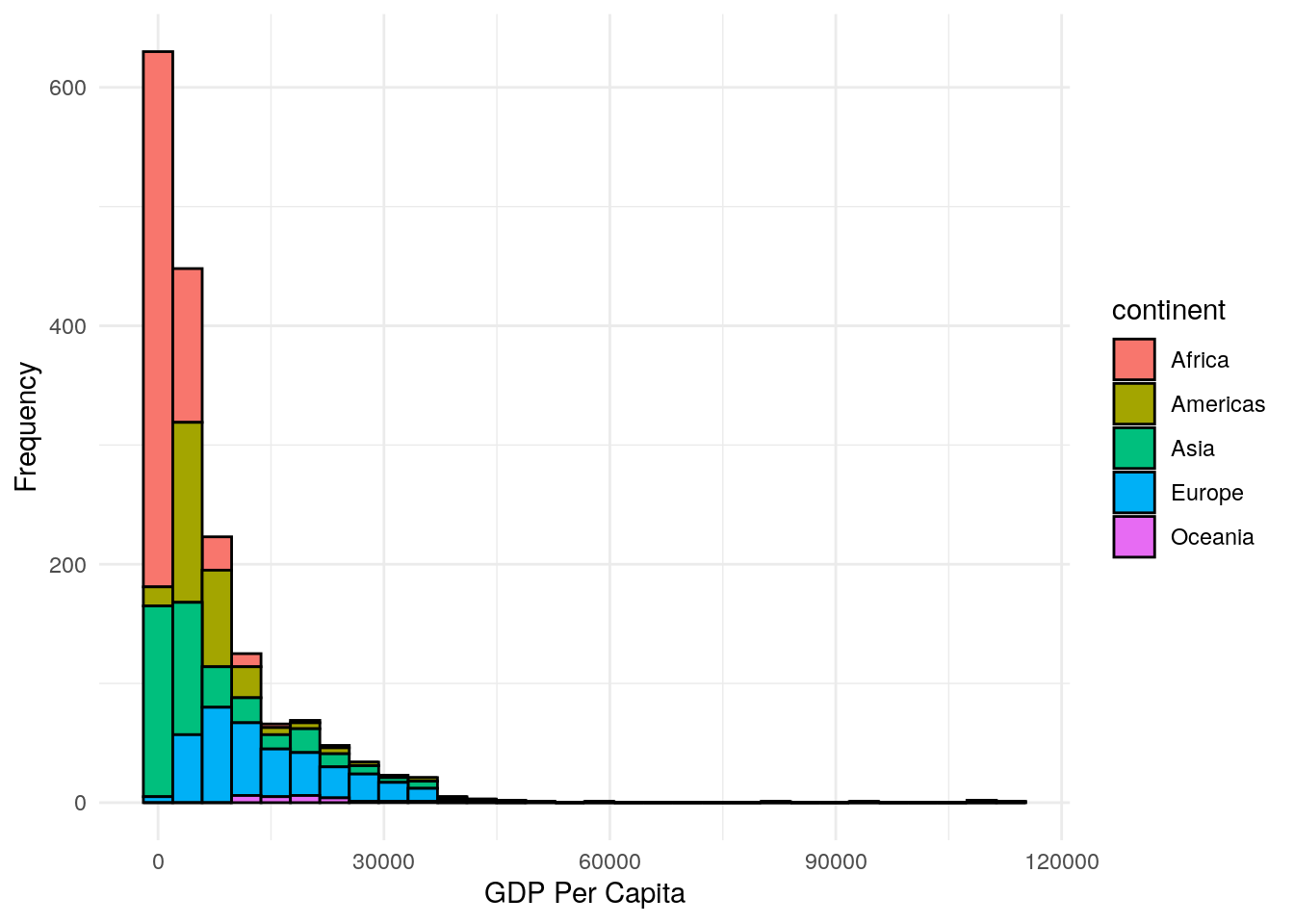
7.How might you achieve a different presentation of the same information as contained in the plot of Question 6, but instead using the facet_wrap() layer?
The facet_wrap() layer is a very powerful tool, if not a little clunky to use. Here’s how to produce the plot:
ggplot(data = gapminder, aes(x = gdpPercap)) +
geom_histogram() +
facet_wrap(~continent) +
labs(x = "GDP Per Capita", y = "Frequency") +
theme_bw()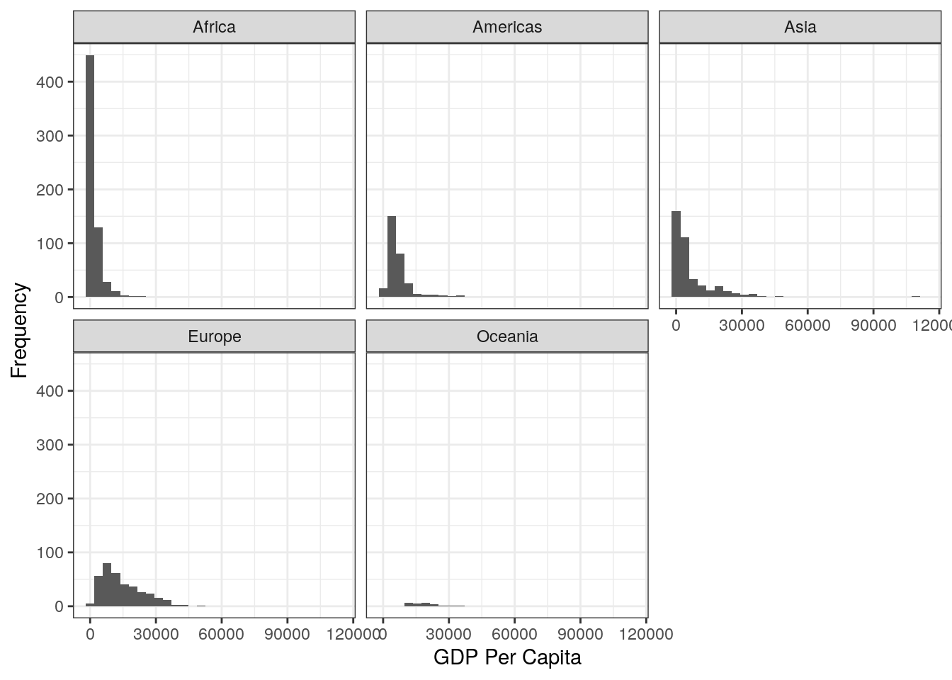 8. Try to recreate this plot using the correct code, as well as using the
 patchwork package.
You first need to save the two seaprate plots to new objects, and then use patchwork to stitch them together. Of course, we’ve made the plots look nicer by labelling the axes (hope you didn’t forget this step!).
Here’s the code:
9. MEGA TEST! Recreate the below plot. This might require several stages… When using patchwork you can create some pretty complex images by creating several sub-plots in stages, and then stitching them together at the end. Let’s break the plot down into its 3 components, and deal with each in turn. Then at the end we will stitch them together:
In Plot A, we don’t need to do any data wrangling. Here’s the code for this plot. Remember that in order to use patchwork we need to save the plot to an object, so I’ve given it an appropriate name:
#--- top plot: histogram of overall data
population_plot <- ggplot(data = gapminder, aes(x = pop)) +
  geom_histogram() +
  labs(title = "A. Histogram of all population data",
       x = "Population",
       y = "Frequency")
In Plot B, we DO need to do some wrangling because the plot shows the mean population per continent. So, we create a new data object that stores the results of this wrangling, and then we can use this data to do the plot:
#--- bottom-left plot: population by continent

# first wrangle the data
population_continent_data <- gapminder %>%
  group_by(continent) %>%
  summarise(mean_population = mean(pop))

# use this new data for the plot
population_continent_plot <- ggplot(data = population_continent_data,
                                    aes(x = continent,
                                        y = mean_population)) +
  geom_col() +
  labs(title = "B. Mean Population per Continent",
       x = "Continent",
       y = "Mean Population")
Plot C also needs some wrangling first:
#--- bottom-right plot: GDP per year per continent

# first wrangle the data
gdp_year_continent_data <- gapminder %>%
  group_by(year, continent) %>%
  summarise(mean_gdp = mean(gdpPercap))

# use this new data for the plot
gdp_year_continent_plot <- ggplot(data = gdp_year_continent_data,
                                  aes(x = year, y = mean_gdp)) +
  geom_point(aes(colour = continent)) +
  geom_smooth(aes(colour = continent)) +
  labs(title = "C. Mean GDP per Continent by Year",
       x = "Year",
       y = "Mean GDP")
In the final step, we stitch them together.
population_plot / (population_continent_plot + gdp_year_continent_plot)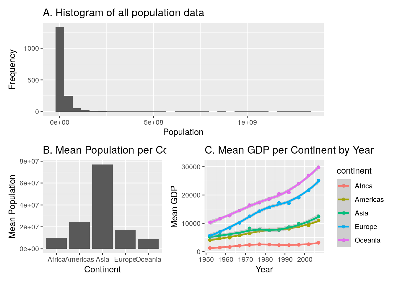
10.8 Week 8
The answers to your exercises are impossible to predict, because they will be guided by your independent interests! However, I did ask you to try and recreate the pepsi-challenge plot with error bars. Here’s how I approached it:
First, let’s look at the data:
pepsi_data## # A tibble: 100 × 4
## participant coke pepsi supermarket
## <dbl> <dbl> <dbl> <dbl>
## 1 1 6 7 6
## 2 2 6 8 4
## 3 3 9 8 6
## 4 4 7 7 4
## 5 5 8 5 2
## 6 6 8 4 4
## 7 7 7 6 7
## 8 8 9 6 4
## 9 9 8 7 3
## 10 10 7 10 3
## # … with 90 more rowsCurrently our data are in wide format, with each row representing each individual participant. First we want to get this into long format:
# organise the data
long_data <- pepsi_data %>%
  pivot_longer(cols = coke:supermarket,
               names_to = "drink",
               values_to = "score")
Now the data are in the correct format, we can plot. Let’s think what the plot shows: It shows the mean rating per drink, and the error bars show the standard deviation around each mean. Therefore, with an appropriate call to the summary() verb in tidyverse, we can get this infomration, after grouping by drink (because we want a separate mean and standard deviation per drink):
summarised_data <- long_data %>%
  group_by(drink) %>%
  summarise(mean_score = mean(score),
            sd_score = sd(score))
Now we can plot! The geom_errorbar has a ymin and ymax argument. As the error bars show one standard deviation above the mean, and one below the mean, our ymin is our mean rating minus one standard error, and our ymax is our mean rating plus one standard error. Bringing this together, our plot can be made by:
ggplot(data = summarised_data, aes(x = drink, y = mean_score)) +
  geom_point() +
  geom_errorbar(aes(ymin = mean_score - sd_score,
                    ymax = mean_score + sd_score),
                width = 0.1) +
  labs(x = "Drink Tasted", y = "Mean Rating")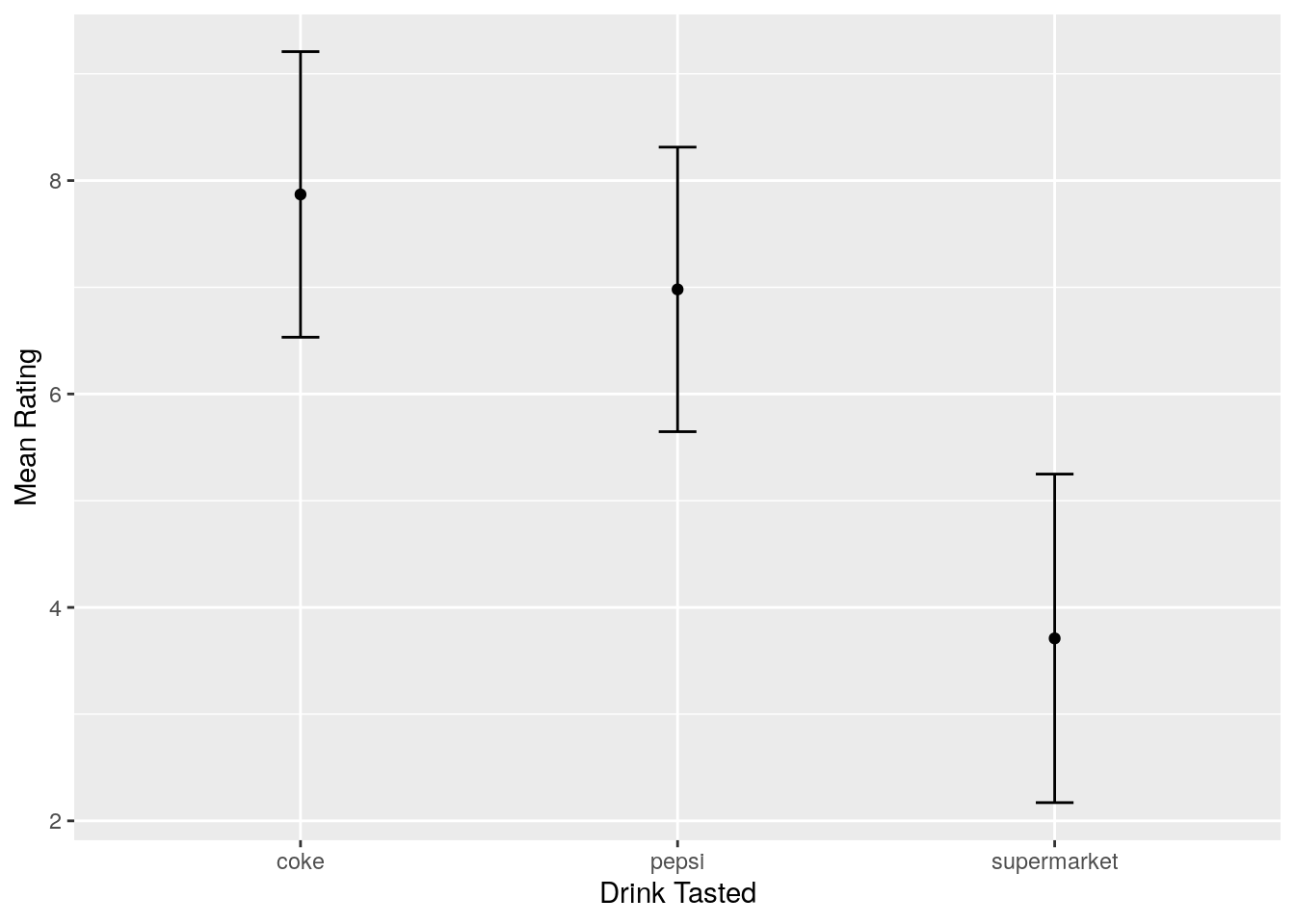
(Note the width = 0.1 argument in the geom_errorbar; the default width of the error bars is ridiculous!)