2 Week 2: Data Visualisation Introduction
2.1 Overview
So you have installed R, R Studio, and the tidyverse package. You’ve also dabbled with the odd command into the R console. In this week’s session you are going to create some data visualisations using the ggplot2 package (which is installed already because it comes bundled with the tidyverse package). We will come back to data visualisation later in the module, so this just serves as an introduction.
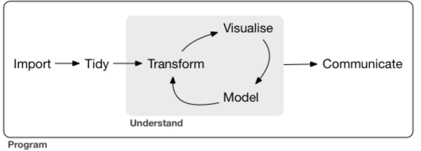
It might seem odd that we are covering data visualisation before you’ve even learned how to write any code in R. Indeed, “Visualise” comes rather late in he typical flow of a data analysis project (see Figure 2.1 below).

Figure 2.1: The flow of a significant data analysis project.
Also, to be able to plot your own data requires you knowing quite a lot more about R and how to use it. So why so early? I think it is incredibly valuable for you to try some data visualisation before anything else because you get to experience first hand some of the power of R early in your learning. You will quickly see that the plots you can produce with R are beautiful and require (relatively) little coding. By seeing the power of R’s visualisation—and how relatively little code is required—early in your learning, I hope that this will whet your appetite for more and you will become more motivated to learn the coding that makes it all possible.
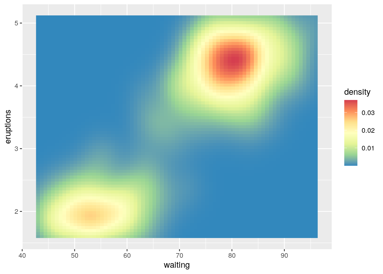
For example, consider the following plot (Figure 2.2). Don’t worry that you don’t know what it represents, just marvel at how cool it is!

Figure 2.2: Awesome plot using R.
How long might such a plot take you to create in Excel, or your other software of choice? Here is all the R code that is required to create Figure 2.2:
library(tidyverse)

ggplot(data = faithfuld, aes(x = waiting, y = eruptions)) +
  geom_raster(aes(fill = density)) +
  scale_fill_distiller(palette = "Spectral")
Pretty neat, huh? OK, let’s dive in:
2.2 Reading
- Sections 3.1 to 3.4 (inclusive) from Chapter 3 of R4DS.
- You will see the basics of ggplot2 in action
- Don’t worry about understanding everything. Practice typing the code into the R console even though you won’t understand everything you are doing.
- We will come back to the other sections in this Chapter later in the module.
FURTHER READING. It is beyond the scope of this module to dive into the theory behind what makes the ggplot2 package so powerful. However, if you want to nerd-out I strongly recommend the following (incredibly clear and readable) paper from Hadley Wickham (there’s that god again!):
- Wickham, H. (2007). A layered grammar of graphics. Journal of Computational and Graphical Statistics, 19, 3–28. https://doi.org/10.1198/jcgs.2009.07098
2.3 Workshop Exercises
2.3.1 R4DS exercises
Of course I trust that you followed the R4DS chapter’s recommendations and completed the exercises along the way. In case you didn’t, though, let’s do these now…
In the R console, run the code
ggplot(data = mpg). What do you see? Why do you see what you see? What’s missing if you wanted to see more?In the chapter you were using the data
mpgthat comes included in the tidyverse package. In thempgdata set, how many rows are there? How many columns are there?What does the
drvvariable describe? Read the help for?mpgto find out.Make a scatterplot of
hwyvs.cyl. Initially placehwyon the x-axis, but try it in a separate plot withcylon the x-axis.What happens if you make a scatterplot of class vs drv? Why is the plot not useful?
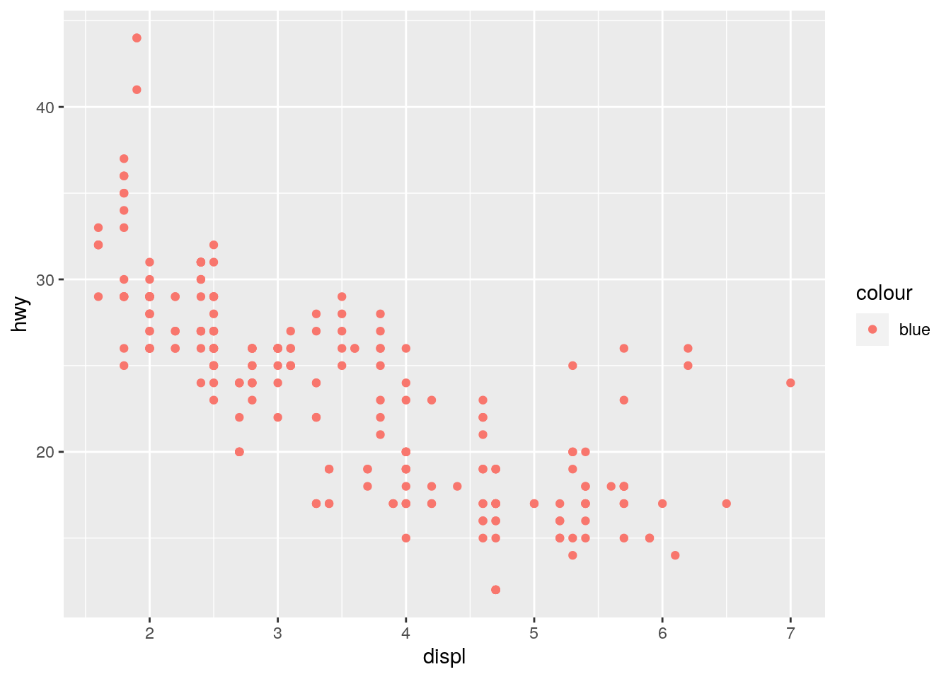
What’s gone wrong with this code? Why are the points not blue?
ggplot(data = mpg) +
  geom_point(mapping = aes(x = displ, y = hwy, color = "blue"))
Which variables in mpg are categorical? Which variables are continuous? (Hint: type ?mpg to read the documentation for the dataset). How can you see this information when you run mpg?
Map a continuous variable to color, size, and shape. How do these aesthetics behave differently for categorical vs. continuous variables?
What happens if you map the same variable to multiple aesthetics?
What does the stroke aesthetic do? What shapes does it work with? (Hint: use ?geom_point)
What happens if you map an aesthetic to something other than a variable name, like aes(colour = displ < 5)? Note, you’ll also need to specify x and y.
2.3.2 New exercises
The following exercises are new and use the ChickWeight data set which comes pre-installed with your R software.
What is recorded in the
ChickWeightdata?How many rows in this data set? How many columns?
Create a plot showing how a chick’s weight changes over time.
Create a plot showing whether the change in a chick’s weight over time is different according to the type of diet of a chick.