Chapter 6 Theme:Axis
theme() layer controls several parts of a graph:
axis (座標軸)
legend (圖例)
panel (圖面)
其他整體外觀的元素:
line: 線的設計(使用
element_line())rect: 方塊區的設計(
element_rect())text: 文字(
element_text())等等。
Here we focus on axis design.
6.1 Elements of axis
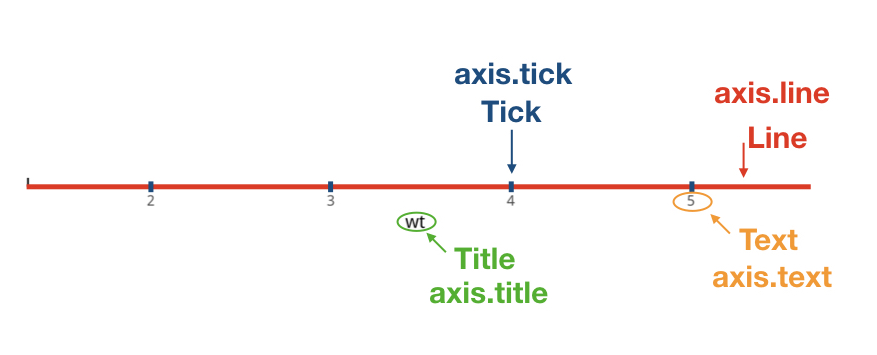
axis.xxx, where xxx includes
line(座標線)
types: axis.line / axis.line.x / axis.line.y
through:
element_line()text(刻度文字,即標示點的文字)
types: axis.text / axis.text.x / axis.text.y
through:
element_text()tick(標示點)
types: axis.tick / axis.tick.x / axis.tick.y
through:
element_line()title(座標名稱)
types: axis.title / axis.title.x / axis.title.y
through:
element_text()
6.2 Setup
library(ggplot2)
library(dplyr)
library(showtext)
font_add("QYuan","cwTeXQYuan-Medium.ttf") # 新增字體
showtext_auto(enable=TRUE)
theme_set(theme_classic())
p1 <- ggplot(mtcars, aes(wt, mpg)) +
geom_point()
p1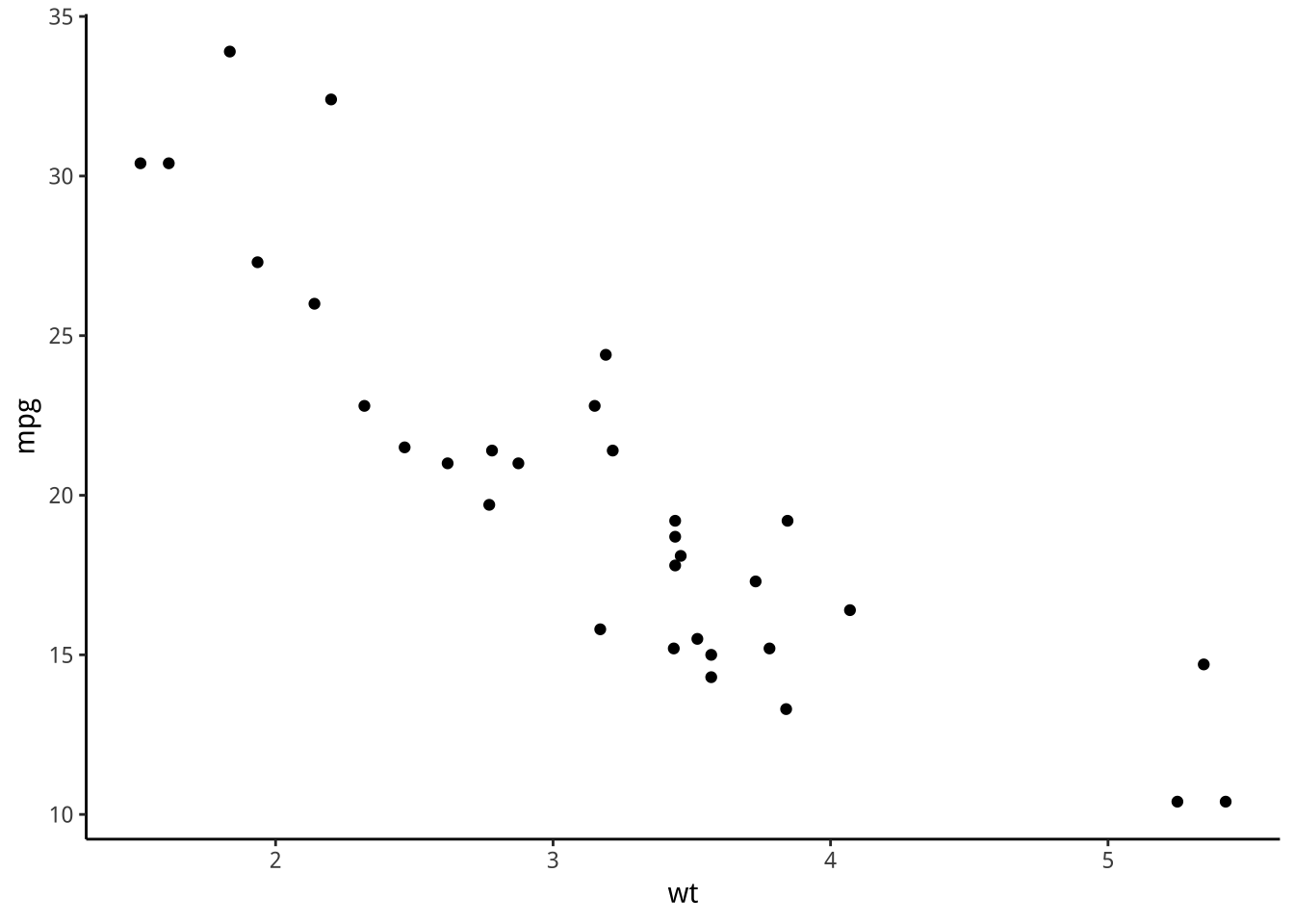
6.3 axis.line
6.3.1 element_line()
Usage: Theme elements
element_line(colour = NULL, size = NULL, linetype = NULL,
  lineend = NULL, color = NULL, arrow = NULL, inherit.blank = FALSE)
6.3.2 Panel grid lines (圖面格線)
p1+
  theme(panel.grid.major.y=element_line())->p1
p1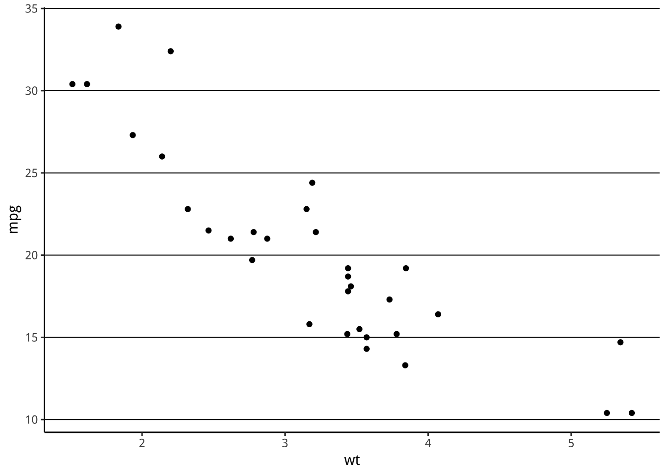
圖面格線一般會淺色,請修改它。
Y軸的10標線跟X軸線太近,你會如何改?
6.3.3 範例
p1 + theme(axis.line = element_line(size = 3, colour = "grey80"))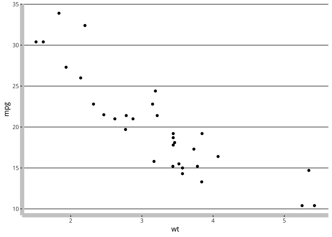
《經濟學人》常會把一軸的軸線拿掉,請完成它。
還有一個空白元素:element_blank()
6.4 axis.text
6.4.1 element_text()
Usage: Theme elements
element_text(family = NULL, face = NULL, colour = NULL, size = NULL, hjust = NULL, vjust = NULL, angle = NULL, lineheight = NULL, color = NULL, margin = NULL, debug = NULL, inherit.blank = FALSE)
face: 粗體,斜體之類設定
hjust: 0-1; 0 left-justified (標記在文字左邊); 1 right-justified (標記在文字右邊):
vjust: 0-1; 0 bottom-justified (標記在文字下方); 1 top-justified (標記在文字上方)

vjust hjust
- lineheight: 行高
6.4.2 範例
p1 + theme(axis.text = element_text(colour = "blue"), axis.text.x = element_text(hjust=1))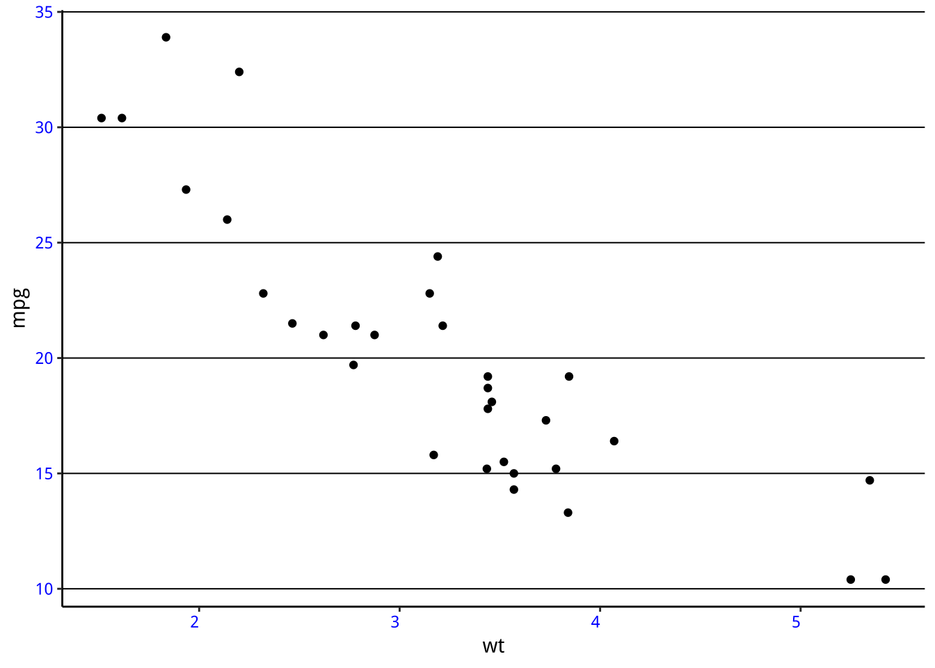
mtcars2 <- mtcars[1:15, ]
mtcars2$name <- row.names(mtcars2)

ggplot(mtcars2, aes(x = name, y = mpg, fill = name)) +
  geom_bar(stat = 'identity', position = "identity") +
  guides(fill = FALSE) +
theme(axis.text.x = element_text(angle = 90, vjust=0.5, hjust=0)) 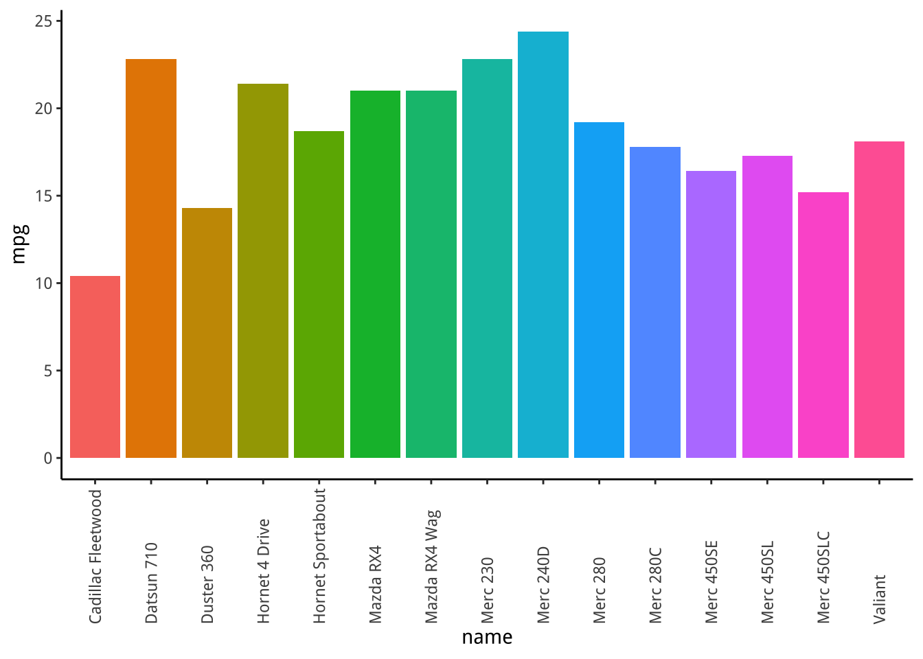
6.5 axis.tick
6.5.1 element_line()
6.5.2 範例
p1 + theme(axis.ticks = element_line(size = 2))
p1 + theme(axis.ticks.length = unit(.25, "cm"))
6.6 axis.title
6.6.1 element_text()
6.6.2 範例
p1 + theme(axis.title.y = element_text(size = rel(1.5), angle = 90))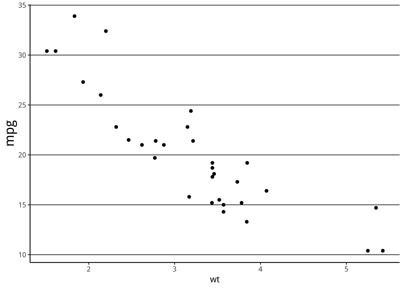
6.7 練習

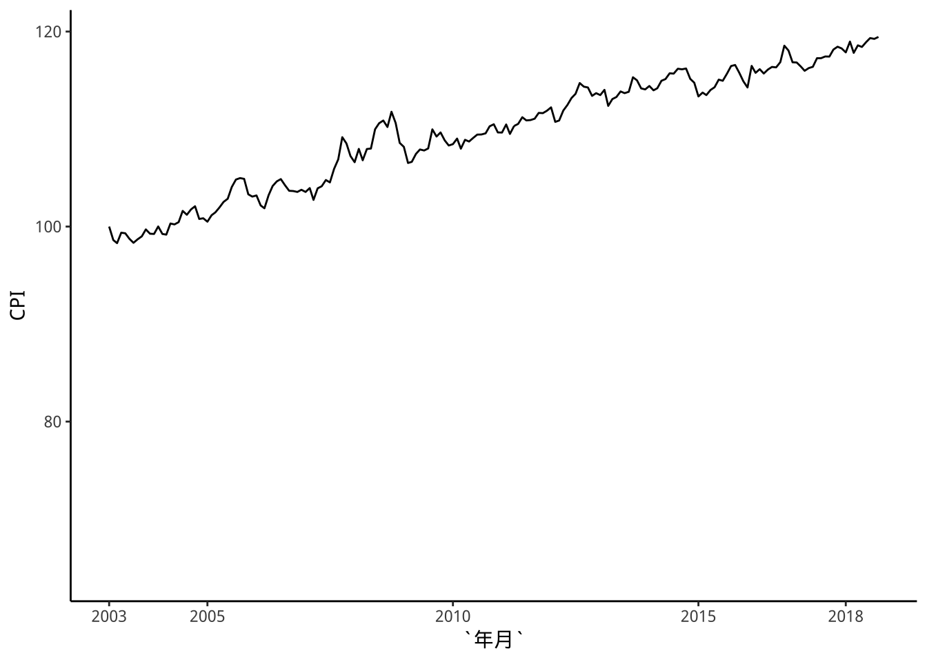
參考經濟學人的設計,修改上次的CPI趨勢圖。
改變Y軸位置可以用
scale_y_continuous(position = "right")
library(readr)
dataCPI2 <- read_csv("https://raw.githubusercontent.com/tpemartin/github-data/master/dataCPI2.csv")
dataCPI2 %>% ggplot()+
  geom_line(aes(x=年月,y=CPI)) -> basePlot2

breakDates <- c("2003-01-01",
                "2005-01-01",
                "2010-01-01",
                "2015-01-01",
                "2018-01-01")
breakDates %>% ymd() -> breakDates

breakLabels <- c("2003",
                 "2005","2010","2015",
                 "2018")

basePlot2 +
  scale_x_date(limits=c(ymd("2003-01-01"),NA),
               breaks = breakDates,
               labels = breakLabels)