Chapter 7 Annotation
Line:
這裡是指畫過整個圖面的線。
垂直線:geom_vline(xintercept,…)
水平線:geom_hline(yintercept,…)
自定斜率:geom_abline(slope,intercept,…)
Others:
- annotate(geom,…)
其中geom為字串,說明要什麼樣的標示,而…為針對該geom所需的完整設計定義。
文字:“text”, x, y, label
區塊陰影:“rect”, xmin, xmax, ymin, ymax
線段:“segment”, x, xend, y, yend
與前述的geom_vline, _hline, _abline不同,它可自訂線段長短。
“pointrange”
library(ggplot2)
library(dplyr)
library(showtext)
font_add("QYuan","cwTeXQYuan-Medium.ttf") # 新增字體
showtext_auto(enable=TRUE)
theme_set(theme_classic())
7.1 Line
geom_vline(xintercept,…)
geom_hline(yintercept,…)
geom_abline(slope,intercept,…)
由於它背後是用geom_line去畫,所以geom_line可以用的aesthetics這裡都可以用。
7.1.1 geom_vline/geom_hline
p <- ggplot(mtcars, aes(wt, mpg)) + geom_point()

# Fixed values
p + geom_vline(xintercept = 5)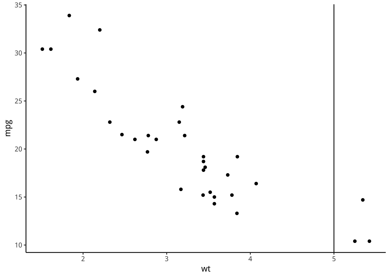
p + geom_vline(xintercept = 1:5)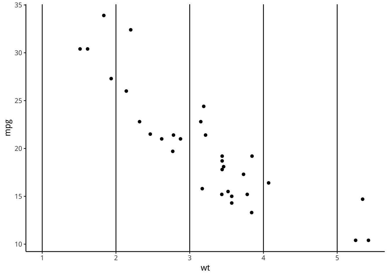
7.1.2 geom_abline
geom_abline(intercept=0,slope=1)
ab means a and b in the syntax of a line: y=a+bx.
p + geom_abline(intercept = 15,slope=5)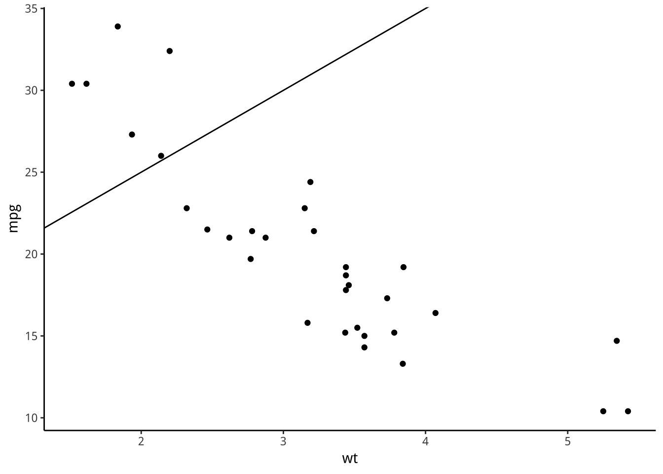
7.2 Text: 文字
p + annotate("text", x = 2:5, y = 25, label = "Some text")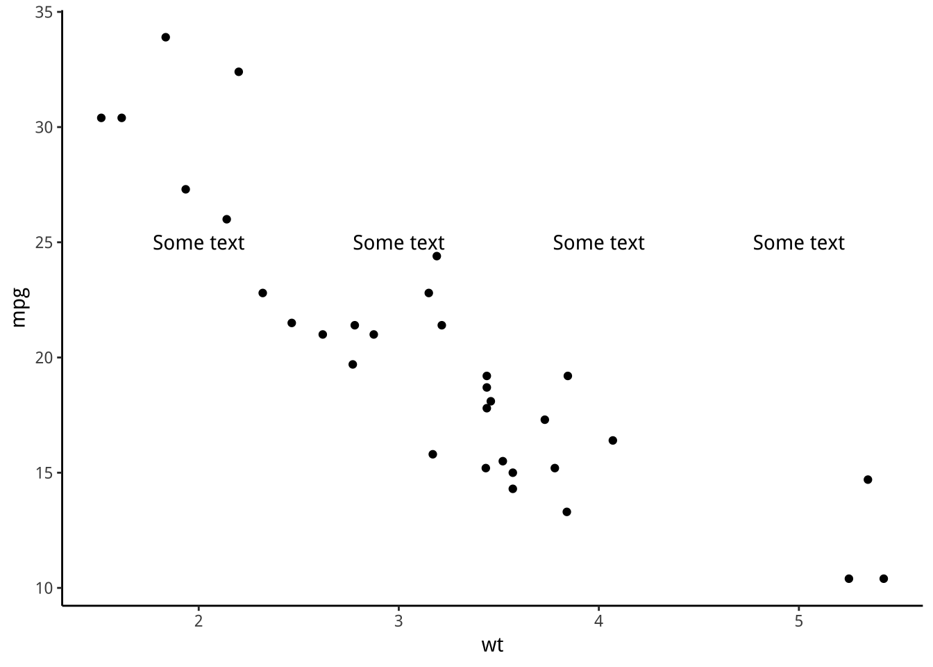
7.3 Rect: 區塊
p + annotate("rect", xmin = 3, xmax = 4.2, ymin = 12, ymax = 21,
  alpha = .2)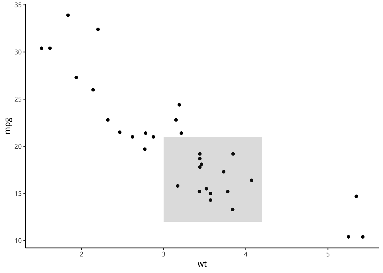
7.4 Segment:
p + annotate("segment", x = 2.5, xend = 4, y = 15, yend = 25,
  colour = "blue")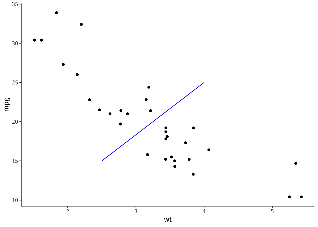
p + annotate("segment",
               x=c(2.5,3.5),y=c(9,9),
               xend=c(2.5,3.5),yend=c(11,11))+
  scale_y_continuous(
    limits = c(10,35),
    expand = c(0,0))
7.5 練習
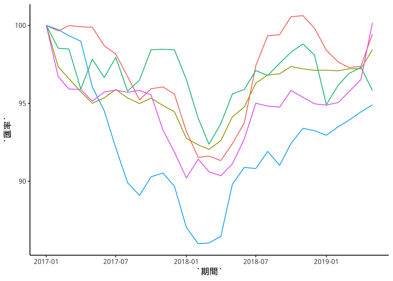
同前一章,依

設計我國與主要貿易對手通貨對美元匯率自2017年開始的走勢圖
執行以下程式引入資料:
library(lubridate)
library(dplyr)
library(tidyr)
library(readr)
# 引入資料
exData <- read_csv("https://quality.data.gov.tw/dq_download_csv.php?nid=6563&md5_url=9f65bdb6752389dc713acc27e93c1c38")

# 處理時間
exData$期間 %>% paste0("-01") %>% ymd() -> exData$期間

# 處理資料結構
exData %>% select(期間, "歐元USD/EUR","韓元KRW/USD","人民幣CNY/USD", "日圓JPY/USD", "新台幣NTD/USD") -> exData2

exData2 %>% gather(幣別, 匯率, -期間) -> exData2

# 處理變數class
exData2$幣別 %>% as.factor() -> exData2$幣別
exData2$匯率 %>% as.numeric() -> exData2$匯率

# 處理歐元
exData2$匯率[exData2$幣別=="歐元USD/EUR"]<-1/exData2$匯率[exData2$幣別=="歐元USD/EUR"]

# 以2017年1月為基期
exData2 %>% group_by(幣別) %>%
  mutate(匯率=匯率/匯率[期間==ymd("2017-01-01")]*100) %>%
  ungroup() ->
  exData3

levels(exData3$幣別)[4]<-"歐元EUR/USD"
執行以下程式完成基圖:
library(ggplot2)
p <- exData3 %>%
  filter(期間>=ymd("2017-01-01")) %>%
  ggplot()+
  geom_line(aes(x=期間,y=匯率,color=幣別))
p 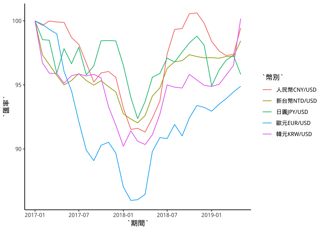
可透過+guides(...)來設定不同aes mapping的圖例。
範例 將color mapping的圖例取消。
p+guides(color="none")