4.3 Generation of a synthetic Radio Network
In our research we are very interested in different effects originating from the Radio Network specification. Therefore, we will implement many parameters that can be tuned and toggled for further research. The current choices of the parameter values are grounded on exploratory and theoretical research.
We generate a radio network, which is composed of three layers. The layers follow the pop.area.kind variable - layer 1 (Rural) spans over the Rural, Suburban and Urban tiles, layer 2 (Suburban) spans over the Suburban and Urban tiles and layer 3 (Urban) is spanned over the Urban tiles.
Important features and parameters of the generated radio network:
The layers follow a hexagon shape with cell towers located in the respective centroid of each hexagon
Towers vary in distance to each other of the same layer, i.e. how far/close are towers of the same layer located to each other: layer 1 = 27,000m; layer 2 = 7000m; layer 3 = 900m (-> the more urbanized, the closer the towers are too each other -> denser coverage). Furthermore, hexagon independent rotation in reference to the first layer is executed:
layer 2= 35 degrees;layer 3= 70 degreesEach cell tower location is jittered in order to break the symmetry. The jitter amount depends on the layer:
layer 1= 5000m,layer 2= 1000m,layer 3= 400m.Each tower contains three antennas pointing into 120 degree differing directions.
We assume a circular coverage. The layer determines the coverage diameter of an antenna:
layer 1= 15,000m;layer 2= 2500m;layer 3= 500m.Each tile of the focus area is sufficiently covered by at least one antenna and the antennas’ coverage areas are allowed to overlap.
Parameters concerning the device to cell association are specified in the next subsection.
To operationalize this, we first define some helper objects that carry the specifications of the parameters and functions that help with specifiying. Furthermore, we create a layer object, layers, that contains three independent versions of our focus area, one for each layer. Each of these data frames contains the spatial area which the layer dependent network is covering. For this we span a regular hexagonal shape grid over these areas and introduce the mentioned rotation to layer 2 and layer 3.
census.classified.final.sf <- readRDS("C:/Users/Marco/Vysoká škola ekonomická v Praze/Tony Wei Tse Hung - YAY/working objects/census.classified.final.sf.rds")
census.geo.body <- readRDS("C:/Users/Marco/Vysoká škola ekonomická v Praze/Tony Wei Tse Hung - YAY/working objects/shape.focusarea.rds")
set.seed(3)
# Three region / layer types
type <- list("Rural" = c("Rural", "Suburban", "Urban"),
"Suburban" = c("Suburban", "Urban"),
"Urban" = c("Urban"))
layer.base <- list("Rural" = census.classified.final.sf, "Suburban" = census.classified.final.sf, "Urban" = census.classified.final.sf) %>%
map2(., type, ~filter(.x, pop.area.kind %in% .y))
area.kind <- list("Rural" = "Rural", "Suburban" = "Suburban", "Urban" = "Urban")
tower.dist <- list("Rural" = 8000, "Suburban" = 5000, "Urban" = 900) # relation to radius (qm)
rotation.degree <- list("Rural" = 0, "Suburban" = 35, "Urban" = 70)
jitter <- list("Rural" = 2000, "Suburban" = 1000, "Urban" = 400)
coverage.centroid.dist <- list("Rural" = 5000, "Suburban" = 2800, "Urban" = 500) # same as radius
coverage.radius <- c("Rural" = 5000, "Suburban" = 2800, "Urban" = 500)
# Focus area
bb.focus.vec <- c(xmin = 4400000, xmax = 4500000,
ymin = 2700000, ymax = 2900000)
# functions
rotation = function(a){
r = a * pi / 180 #degrees to radians
matrix(c(cos(r), sin(r), -sin(r), cos(r)), nrow = 2, ncol = 2)
}
layer_network_generate = function(x, tower.dist, rotation.degree){
layer.geo <- x %>%
st_make_grid(cellsize = tower.dist,
square = F, # hexagon
flat_topped = T) %>% # different cell size (qm)
st_geometry()
layer.centroid <- st_centroid(layer.geo)
layer <- (layer.geo - layer.centroid) * rotation(rotation.degree) + layer.centroid # rotate by 35 degrees
return(layer)
}
# Generate layers
layers <- pmap(list(layer.base, tower.dist, rotation.degree),
~layer_network_generate(x = ..1, tower.dist = ..2, rotation.degree = ..3)) %>%
set_names(c("Layer.1", "Layer.2", "Layer.3"))We use a hexagonal structure to place towers across our focus area. This is a quite realistic setup for cell towers. Each hexagon corresponds to one tower which is originally placed in the centroid of the respective hexagon. In order to exclude symmetrical structure, we implement some randomness in the exact location of the cell towers.
# Generate 3 antennas per tower and coverage areas
coverage.areas.tower <- layers %>%
map2(., jitter, ~st_jitter(st_centroid(.x), .y)) %>%
map(~st_coordinates(.)) %>%
map(~as_tibble(.)) %>%
# map_at(c("Layer.1"), ~bind_rows(., manually.towers.rural)) %>% # only needed if additional antennas are added retrospectively
# map_at(c("Layer.2"), ~bind_rows(., manually.towers.suburban)) %>%
map(~dplyr::select(., X.tow = X, Y.tow = Y)) %>%
map2(., c("RT", "ST", "UT"), ~mutate(.x, tower.ID = paste0(.y, 1:n())))
coverage.layer1 <- coverage.areas.tower[[1]] %>% # Layer 1
st_as_sf(coords = c("X.tow", "Y.tow"), crs = 3035)
layers.plot <- layers[[1]] %>%
st_as_sf(crs = 3035) %>%
ggplot() +
geom_sf(linetype = "dotted") +
geom_sf(data = coverage.layer1, aes(color = "#4273C5"), shape = 17) +
scale_color_identity(name = "",
labels = c("Jittered tower location"),
guide = "legend") +
labs(x = NULL, y = NULL,
title = "Tower locations in Layer 1") +
theme(axis.text.x = element_text(angle = 90, hjust = 1))
layers.plot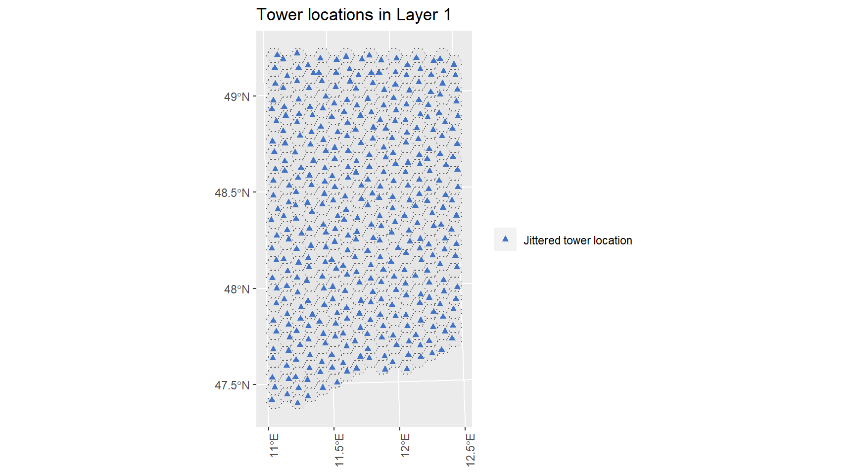
Figure 4.3: …
This example visualizes the tower locations for layer 1. The actual location deviates slightly from the centroid in order to break the symmetry of the underlying hexagonal structure. We can also see from this plot that the hexagonal grid spans over the complete focus area. Next we need to place three antennas on each tower for each layer and specify their coverage area. The setup of a tower with its corresponding antennas is in every layer the same: Three antennas per tower, pointing into 120 degree differing directions. The animated visualization exemplifies this for any generic tower.
knitr::include_graphics("https://raw.githubusercontent.com/R-ramljak/MNO_Eurostat/master/Gifs/antenna%20animation.gif")
Figure 4.4: …
We end up with a data frame of the following format:
coverage.areas.final <- coverage.areas.tower %>%
map(~slice(., rep(1:n(), each = 3))) %>%
map(~group_by(., tower.ID)) %>%
map(~mutate(., antenna.ID = paste(tower.ID, "A", 1:3, sep = "."))) %>%
map(~ungroup(.)) %>%
map(~mutate(., antenna.kind = str_sub(antenna.ID, -1))) %>%
map2(., coverage.centroid.dist, ~mutate(.x,
X.ant.help = case_when(antenna.kind == "1" ~ X.tow - .y * 0,
antenna.kind == "2" ~ X.tow + .y * 0.77,
antenna.kind == "3" ~ X.tow - .y * 0.77),
Y.ant.help = case_when(antenna.kind == "1" ~ Y.tow - .y * 1, # meter distance apart
antenna.kind == "2" ~ Y.tow + .y * 0.77,
antenna.kind == "3" ~ Y.tow + .y * 0.77))) %>%
# map(~mutate(., X.ant = X.ant.help,
# Y.ant = Y.ant.help)) %>%
map(~st_as_sf(., coords = c("X.ant.help", "Y.ant.help"))) %>%
map(~mutate(., antenna.centroid = geometry)) %>%
map2(., coverage.radius, ~st_buffer(.x, .y)) %>% # radius coverage are per antenna
map2(., coverage.radius, ~mutate(.x, coverage.radius = .y)) %>% #
map(~st_sf(., crs = 3035)) %>%
map(~st_crop(., bb.focus.vec)) %>%
map(~st_set_agr(., "aggregate")) %>% # clean up
map2_dfr(., area.kind, ~mutate(., area.kind = .y)) %>%
st_intersection(census.geo.body)## Warning: attribute variables are assumed to be spatially constant throughout all
## geometries
## Warning: attribute variables are assumed to be spatially constant throughout all
## geometries
## Warning: attribute variables are assumed to be spatially constant throughout all
## geometries
## Warning: attribute variables are assumed to be spatially constant throughout all
## geometriesrm(layer.base)
# saveRDS(coverage.areas.final, file = "C:/Users/Marco/Vysoká škola ekonomická v Praze/Tony Wei Tse Hung - YAY/working objects/coverage.areas.final.rds")
coverage.areas.final <- readRDS("C:/Users/Marco/Vysoká škola ekonomická v Praze/Tony Wei Tse Hung - YAY/working objects/coverage.areas.final.rds")
coverage.areas.final %>%
datatable()## Warning in instance$preRenderHook(instance): It seems your data is too big
## for client-side DataTables. You may consider server-side processing: https://
## rstudio.github.io/DT/server.html