8.2 Convergence Behavior
In this part, we will look at the convergence behavior over time through the actual numbers of estimated population and the residual. The residual is calculated as the true population minus the estimated population. The residual plot only contain certain number of iterations.
esample <- readRDS("~/Desktop/Eurostat/est.equal.1000iter.sample.rds") # Load in the data
esample$internal.id = as.factor(esample$internal.id) # recast the `internal id` as a factor
esample = esample %>% select(-c(u.true.y)) # take out u.true.y
esample = esample %>% select(-c(pop.area.kind.helper,u.true)) # take out other columns
length(colnames(esample)[406:1007]) # checking the length of the column names
# Generate the column names through the use of for loops
# It's important to put 0 in front or else ggplot will then graph 1000 in front of 100, for example.
iters = c()
for (x in 0:9) {
  iters = c(iters, paste("000",x,sep = ""))
}
for (x in 10:99) {
  iters = c(iters, paste("00",x,sep = ""))
}
for (x in 100:400) {
  iters = c(iters, paste("0",x,sep = ""))
}
colnames(esample)[2:402] = iters
iters2 = c()
for (x in 401:999) {
  iters2 = c(iters2, paste("0",x,sep = ""))
}
for (x in 1000:1002){
  iters2 = c(iters2, paste("",x,sep = ""))
}
colnames(esample)[406:1007] = iters2
equal = esample %>% # transform the data frame into long form
  select(-c(pop)) %>%
  pivot_longer(-c(internal.id, pop.area.kind,u.true.x), names_to = "iter", values_to = "sim")
equal$iter = as.numeric(equal$iter) # cast the `iter` variable as a numeric variable
# Plot of Estimated Population over Iterations
equal.plot = equal %>%
  ggplot(aes(x = iter, y = sim, group = internal.id)) +
  geom_line(aes(color = pop.area.kind)) +
  labs(x = "Number of Iteration", y = "Estimated Population", title = "Equal Probability Matrix") +
  theme(axis.text.x = element_text(angle = 90),legend.position = "bottom") +
  scale_color_ptol(breaks = c("Rural", "Suburban", "Urban")) +
  facet_grid(vars(pop.area.kind),scales="free") +
  scale_x_continuous(breaks=seq(0, 1000, 50))
saveRDS(equal.plot, file = "equal.plot.rds") # save the plot as RDS
# Residual Plot
esample <- readRDS("~/Desktop/Eurostat/est.equal.1000iter.sample.rds") # read in the data
esample = esample %>% select(-c(u.true.y,pop.area.kind.helper)) # take out unused columns
# Generate column names through the use of for loops
niters = c()
for (x in 0:9) {
  niters = c(niters, paste("u000",x,sep = ""))
}
for (x in 10:99) {
  niters = c(niters, paste("u00",x,sep = ""))
}
for (x in 100:400) {
  niters = c(niters, paste("u0",x,sep = ""))
}
colnames(esample)[2:402] = niters
niters2 = c()
for (x in 401:999) {
  niters2 = c(niters2, paste("u0",x,sep = ""))
}
for (x in 1000:1002){
  niters2 = c(niters2, paste("u",x,sep = ""))
}
colnames(esample)[406:1007] = niters2
# Calculate the residuals and transform the data frame into the long format.
equalr = esample %>%
  mutate(r0001 = u.true - u0001, r0002 = u.true - u0002, r0005 = u.true - u0005,
         r0010 = u.true - u0010, r0020 = u.true - u0020, r0050 = u.true - u0050,
         r0100 = u.true - u0100, r0200 = u.true - u0200, r0300 = u.true - u0300,
         r0400 = u.true - u0400, r0500 = u.true - u0500, r0600 = u.true - u0600,
         r0700 = u.true - u0700, r0800 = u.true - u0800, r0900 = u.true - u0900,
         r1000 = u.true - u1000
         ) %>%
  select(pop.area.kind,internal.id,r0001,r0002,r0005,r0010,r0020,r0050,r0100,r0200,r0300,r0400,r0500,r0600,r0700,r0800,r0900,r1000) %>%
  pivot_longer(-c(internal.id, pop.area.kind), names_to = "iter", values_to = "resid")
# Plot using ggplot
equal.resid.plot = equalr %>%
  ggplot(aes(x = iter, y = resid, group = internal.id)) +
  geom_line(aes(color = pop.area.kind)) + labs(x = "Number of Iteration", y = "Residual = Actual - Predicted", title = "Equal Probability Matrix ~ Residual") + theme(axis.text.x = element_text(angle = 90),legend.position = "bottom") + scale_color_ptol(breaks = c("Rural", "Suburban", "Urban")) +
  facet_grid(vars(pop.area.kind),scales = "free")
saveRDS(equal.resid.plot, file = "equal.resid.plot.rds") # save the plot as ggplot. 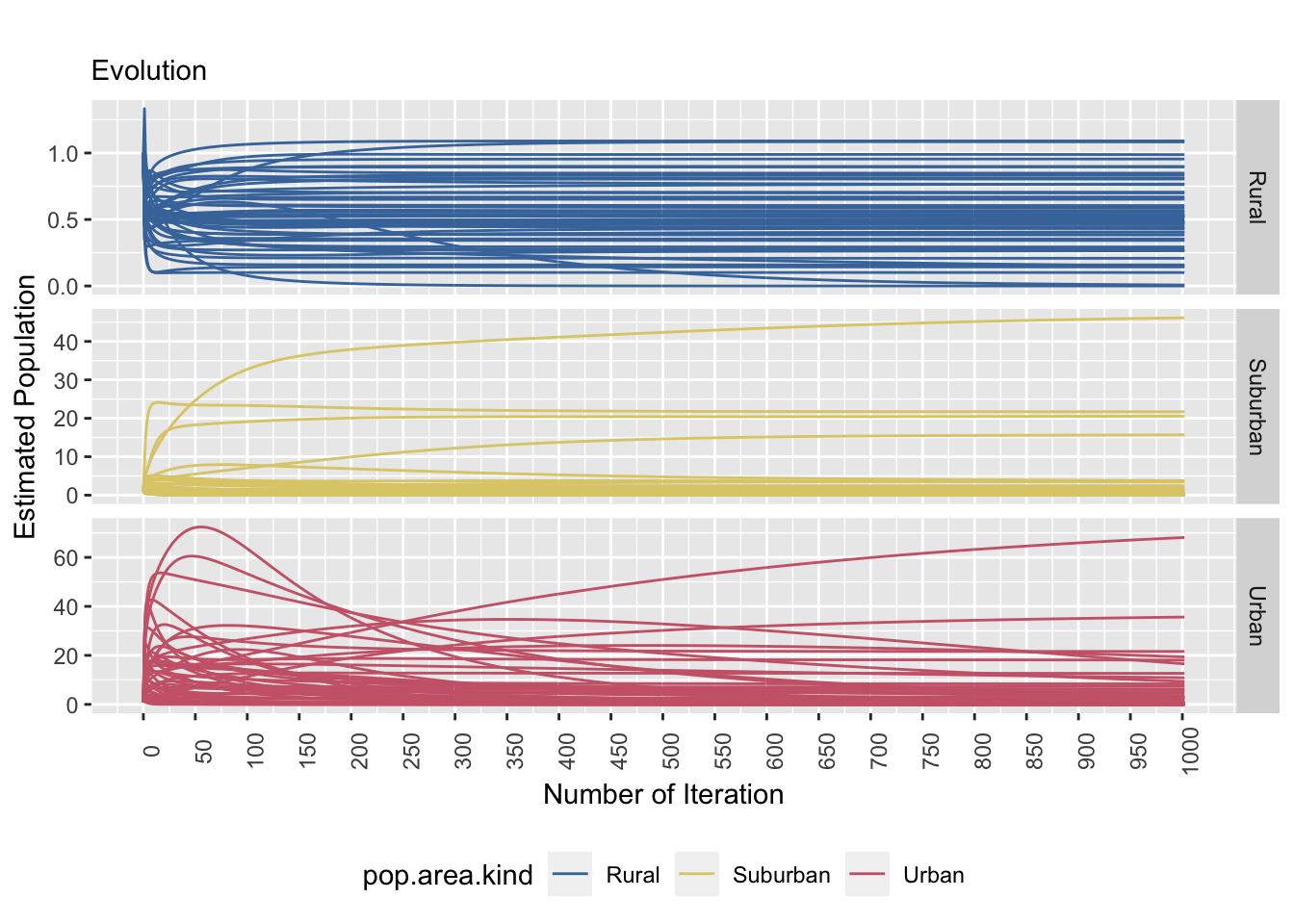
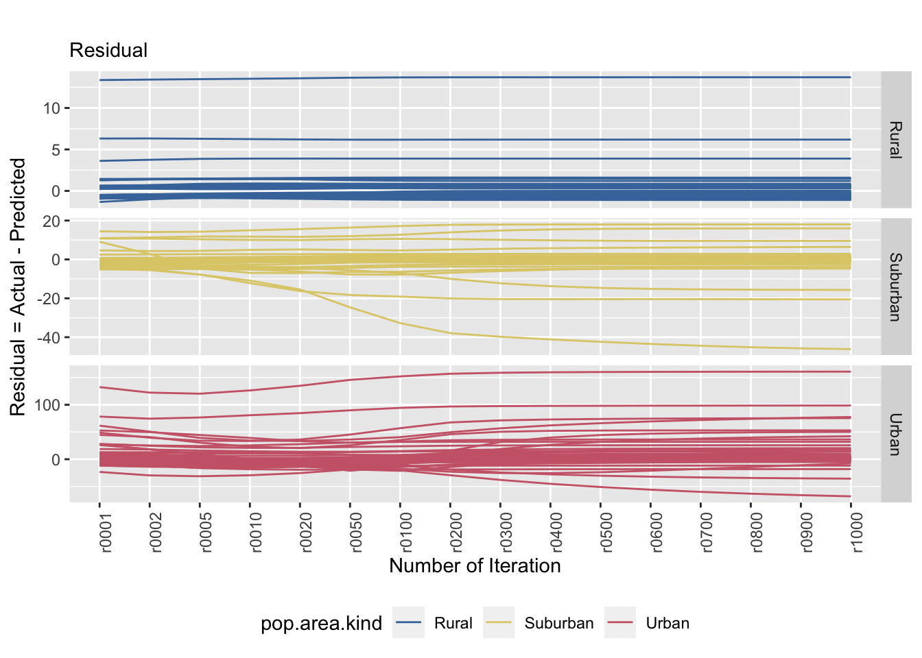
Figure 8.3: The left and right plots show a stratified sample (strata: area kind) and the tile specific estimatands’ convergence behaviour. The convergence behaviour differs between area kinds. The right plot emphasizes that the true value is not necessarily reached.
The graphs above shows how the estimated population evolve over time (left) as well as its prediction error (right). From the graph on the left, most of the estimated population stabilizes rather quickly in rural and suburban tiles. With the urban tiles, it is harder to say exactly when the convergence will occur, especially there are a bit of variation. The residual plot (right) shows the error of prediction in comparison to the actual population in that specific tile. The rural tiles shows a trend of constant error of prediction over iterations. The suburban tiles generally shows the same trend as well, but also shows that there are tiles that overestimated. The urban tiles tend to have an underestimation.
tsample <- readRDS("~/Desktop/Eurostat/est.true.1000iter.sample.rds") # read in data
tsample$internal.id = as.factor(tsample$internal.id) # cast the `internal id` variable as a factor
colnames(tsample)
colnames(tsample)[2:402] = iters # reuse the column names generated above
colnames(tsample)[405:1006] = iters2
tequal = tsample %>% # transform the data frame into long form
  pivot_longer(-c(internal.id, pop.area.kind,pop), names_to = "iter", values_to = "sim")
tequal$iter = as.numeric(tequal$iter) # cast the `iter` variable as a numeric variable
# Estimated Population over Iterations plot using ggplot
true.plot = ggplot(data = tequal, aes(x = iter, y = sim, group = internal.id)) +
  geom_line(aes(color = pop.area.kind)) + labs(x = "Number of Iteration", y = "Estimated Population",     title = "True Population Matrix") +
  theme(axis.text.x = element_text(angle = 90),legend.position = "bottom") +
  scale_color_ptol(breaks = c("Rural", "Suburban", "Urban")) +
  facet_grid(vars(pop.area.kind), scales = "free") +
  scale_x_continuous(breaks=seq(0, 1000, 50))
saveRDS(true.plot, file = "true.plot.rds") # save the plot as rds
# Residual Plot
colnames(tsample)[2:402] = niters # reused column names from above
colnames(tsample)[405:1006] = niters2
# Calculate the residuals and transform the data frame into the long format.
tequalr = tsample %>%
  mutate(r001 = pop - u0001, r002 = pop - u0002, r005 = pop - u0005,
         r010 = pop - u0010, r020 = pop - u0020, r050 = pop - u0050,
         r100 = pop - u0100, r200 = pop - u0200, r300 = pop - u0300,
         r400 = pop - u0400, r500 = pop - u0500, r600 = pop - u0600,
         r700 = pop - u0700, r800 = pop - u0800, r900 = pop - u0900,
         r1000 = pop - u1000
  ) %>%
  select(pop.area.kind,internal.id,r001,r002,r005,r010,r020,r050,r100,r200,r300,r400,r500,r600,r700,r800) %>%
  pivot_longer(-c(internal.id, pop.area.kind), names_to = "iter", values_to = "resid")
# Plot using ggplot
true.resid.plot = ggplot(data = tequalr, aes(x = iter, y = resid, group = internal.id)) +
  geom_line(aes(color = pop.area.kind)) + labs(x = "Number of Iteration", y = "Residual = Actual - Predicted", title = "True Population Matrix ~ Residual") +
  theme(axis.text.x = element_text(angle = 90),legend.position = "bottom") +
  scale_color_ptol(breaks = c("Rural", "Suburban", "Urban")) +
  facet_grid(vars(pop.area.kind),scales = "free")
saveRDS(true.resid.plot, file = "true.resid.plot.rds") # save ggplot as rds format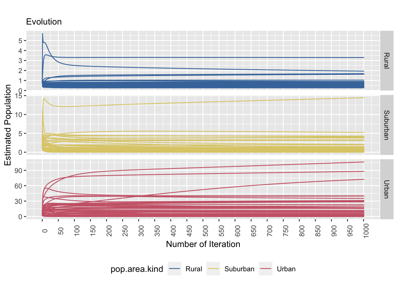
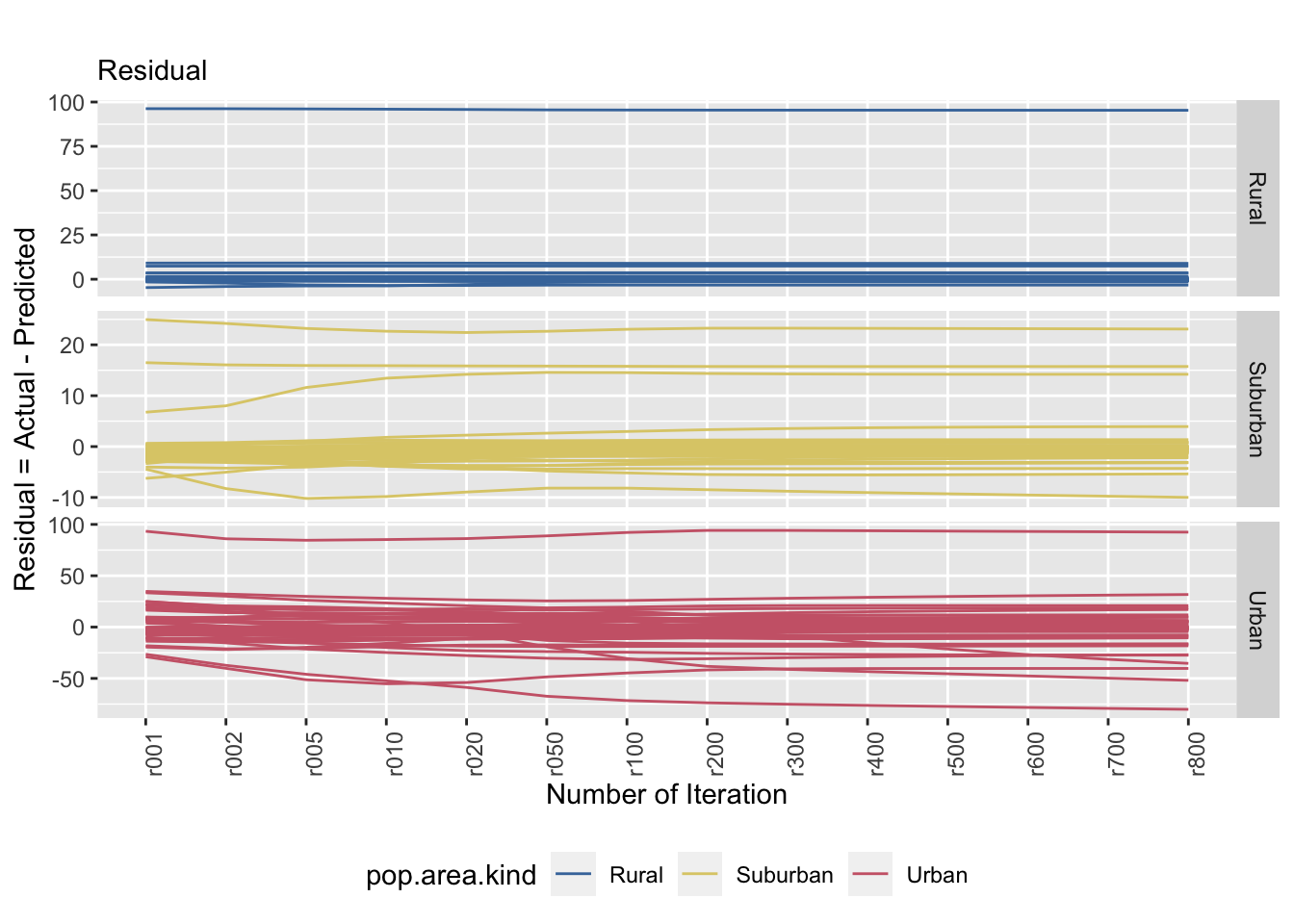
Figure 8.4: The left and right plots show a stratified sample (strata: area kind) and the tile specific estimatands’ convergence behaviour (equal probability P.matrix). The convergence behaviour differs between area kinds. The right plot emphasizes that the true value is not necessarily reached.
Using the true population matrix, the estimated population stabilizes faster over time in comparison to the equal population matrix. However, there are a few tiles that do not stabilize as fast as we hoped. This is particularly evident in the urban tiles. The residual plot (right) shows the error of prediction over time by the type of tile. There seems to be a trend of increasing prediction error as the degree of urbanization increases as well. We can see that the range of error for suburban tiles range from 30 to -10 and the range of error for urban tiles are between 100 and -75. The suburban tiles seems to underestimate and the urban tiles seems to overestimate.