Chapter 15 Simple Regression
Get Started
This chapter builds on the correlation and scatterplot techniques discussed in Chapter 14 and begins a four-chapter overview of regression analysis. It is a good idea to follow along in R, not just to learn the relevant commands, but also because we will use R to perform some important calculations in a couple of different instances. You should load the states20 and countries2 data sets as well as the libraries for the DescTools, descr, and stargazer packages.
Linear Relationships
In Chapter 14, we began to explore techniques that can be used to analyze relationships between numeric variables, focusing on scatterplots as a descriptive tool and the correlation coefficient as a measure of association. Both of these techniques are essential tools for social scientists and should be used when investigating numeric relationships, especially in the early stages of a research project. As useful as scatterplots and correlations are, they still have some limitations. For instance, suppose we wanted to predict values of y based on values of x.38
Think about the example in the last chapter, where we looked at factors that influence average life expectancy across countries. The correlation between life expectancy and fertility rate was -.84, and there was a very strong negative pattern in the scatterplot. Based on these findings, we could “predict” that generally life expectancy tends to be lower when fertility rate is high and higher when the fertility is low. However, we can’t really use this information to make specific predictions of life expectancy outcomes based on specific values of fertility rate. Is life expectancy simply -.84 times the fertility rate? No, it doesn’t work that way. Instead, with scatterplots and correlations, we are limited to saying how strongly x is related to y, and in what direction. It is important and useful to be able to say this, but it would be nice to be able to say exactly how much y increases or decreases for a given change in x.
Even when r = 1.0 (when there is a perfect relationship between x and y) we still can’t predict y based on x using the correlation coefficient itself. Is y equal to 1*x when the correlation is 1.0? No, not unless x and y are the same variable.
Consider the following two hypothetical variables:
#Create a data set named "perf" with two variables and five cases
x <- c(4,12,2,8,6,10)
y <- c(13,29,9,21,17,25)
perf<-data.frame(x,y)
#list the values of the data set
perf
x y
1 4 13
2 12 29
3 2 9
4 8 21
5 6 17
6 10 25It’s a little hard to tell just by looking at the values of these variables, but they are perfectly correlated (r=1.0). Check out the correlation coefficient in R:
#Get the correlation between x and y
cor.test(perf$x,perf$y)
    Pearson's product-moment correlation

data:  perf$x and perf$y
t = Inf, df = 4, p-value <2e-16
alternative hypothesis: true correlation is not equal to 0
95 percent confidence interval:
 1 1
sample estimates:
cor
  1
Still, despite the perfect correlation, notice that the values of x are different from those of y for all five observations, so it is unclear how to predict values of y from values of x even when r=1.0.
A scatterplot of this relationship provides a hint to how we can use x to predict y. Notice that all the data points fall along a straight line, which means that y is a perfect linear function of x. To predict y based on values of x, we need to figure out what the linear pattern is.
#Scatterplot of x and y
plot(perf$x,perf$y,
     main="An Illustration of a Perfect Positive Relationship",
     xlab="X",
     ylab="Y")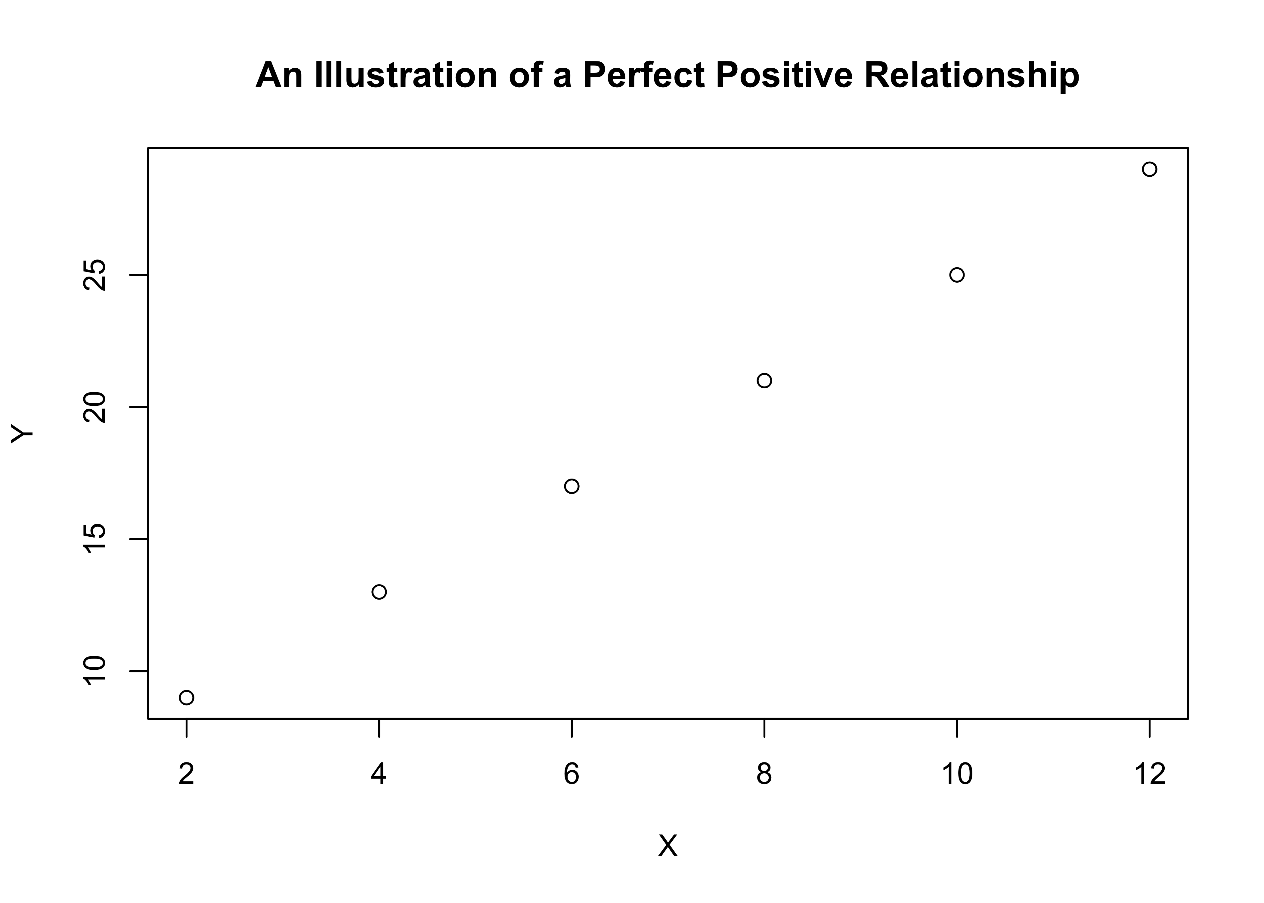
Do you see a pattern in the data points listed above that allows you to predict y outcomes based on values of x? You might have noticed in the listing of data values that each value of x divides into y at least two times, but that several of them do not divide into y three times. So, we might start out with y=2x for each data point and then see what’s left to explain. To do this, we create a new variable (predictedy) where we predict y=2x, and then use that to calculate another variable (leftover) that measures how much is left over:
#Create prediction Y=3x
perf$predictedy<-2*perf$x
#subtract "predictedy" from "y"
perf$leftover<-perf$y-perf$predictedy
#List all data
perf
x y predictedy leftover
1 4 13 8 5
2 12 29 24 5
3 2 9 4 5
4 8 21 16 5
5 6 17 12 5
6 10 25 20 5Now we see that all the predictions based on y=2x under-predicted y by the same amount, 5. In fact, from this we can see that for each value of x, y is exactly equal to 2x + 5. Go ahead and plug one of the values of x into this equation, so you can see that it perfectly predicts the value of y.
As you may already know from one of you math classes, the equation for a straight line is
\[y=mx + b\]
where \(m\) is the slope of the line (how much y changes for a unit change in x) and \(b\) is a constant. In the example above m=2 and b=5, and x and y are the independent and dependent variables, respectively.
\[y=2x+5\]
In the real-world of data analysis, perfect relationships between x and y do not usually exist, especially in the social sciences. As you know from the scatterplot examples used in Chapter 14, even with very strong relationships, most data points do not come close to lining up on a single straight line.
Ordinary Least Squares Regression
For relationships that are not perfectly predicted, the goal is to determine a linear prediction that fits the data points as well as it can, allowing for but minimizing the amount of prediction error. What we need is a methodology that estimates and fits the best possible “prediction” line to the relationship between two variables. That methodology is called Ordinary Least Squares (OLS) Regression. OLS regression provides a means of predicting y based on values of x that minimizes prediction error.
The population regression model is:
\[Y_i=\alpha+\beta x_i +\epsilon_i\] Where:
\(Y_i\) = the ouitcome on the dependent variable
\(\alpha\) = the constant (aka the intercept)
\(\beta\) = the slope (expected change in y for a unit change in x)
\(X_i\) = the outcome on the independent variable
\(\epsilon_i\) = random error component
But, of course, we usually cannot know the population values of these parameters, so we estimate an equation based on sample data:
\[{y}_i= a + bx_i+e_i\] Where:
\(y_i\) = the outcome on the dependent variable
\(a\) = the sample constant (aka the intercept)
\(b\) = the sample slope (change in y for a unit change in x)
\(x_i\) = the outcome on the independent variable
\(e_i\) = error term; actual values of y minus predicted values of y (\(y_i-\hat{y}_i\)).
The sample regression model can also be written as:
\[\hat{y}_i= a +bx_i\] Where the caret above the y signals that it is the predicted value and implies \(e_i\).
To estimate the predicted value of the dependent variable (\(\hat{y}_i\)) for any given observation, we need know the values of \(a\), \(b\), and the outcome of the independent variable for that case (\(x_i\)). We can calculate the values of \(a\) and \(b\) with the following formulas:
\[b=\frac{\sum(x_i-\bar{x})(y_i-\bar{y})}{\sum(x_i-\bar{x})^2}\] Note that the numerator is the same as the numerator for Pearson’s r and, similarly, summarizes the direction of the relationship, while the denominator reflects the variation in x. This focus on the variation in \(x\) in the denominator is necessary because we are interested in the expected (positive or negative) change in \(y\) for a unit change in \(x\). Unlike Pearson’s r, the magnitude of \(b\) is not bounded by -1 and +1. The size of \(b\) is a function of the scale of the independent and dependent variables and the strength of relationship. This is an important point, one we will revisit in Chapter 17.
Once we have obtained the value of the slope, \(b\), we can plug it into the following formula to obtain the constant, \(a\). \[a=\bar{y}-b\bar{x}\]
Hypothesis Testing and Regression Analysis
The estimates of the slope and constant in regression analysis can be used to evaluate hypotheses about of those values in the population. The logic is exactly the same as in earlier chapters: you obtain a sample estimate (\(b\)), and then estimate how likely is it that you could get a sample estimate of that magnitude from a population in which the parameter (\(\beta\)) is equal to some other value. In the case of regression analysis, the null and alternative hypotheses for the slope are:
H0: \(\beta = 0\) (There is no relationship)
H1: \(\beta \ne0\) (There is a relationship—two-tailed)
Or, since we expect a positive relationship in the current example, we use a one-tailed hypothesis:
H1: \(\beta > 0\) (There is a positive relationship)
As you will see later, the R output reports p-values for the slope estimates, based on the size of the coefficient divided by the standard error of the coefficient. As in previous chapters, the general rule of thumb is that if \(p<.05\) (less than a 5% chance of getting \(b\) from a population in which H0 is true), you can reject the null hypothesis.
Calculation Example: Presidential Vote in 2016 and 2020
Let’s work through calculating these quantities for a small data set using data on the 2016 and 2020 presidential U.S. presidential election outcomes from seven states. Presumably there is a close relationship between how states voted in 2016 and how they voted in 2020. We can use regression analysis to analyze that relationship and to “predict” values in 2020 based on values in 2016 for the seven states listed below:
#Assign votes1620 data.frame to "d" for convenience
d<-votes1620
d
state vote20 vote16
1 AL 37.1 35.6
2 FL 48.3 49.4
3 ME 54.7 51.5
4 NH 53.8 50.2
5 RI 60.6 58.3
6 UT 37.6 39.3
7 WI 50.3 49.6In this data set, vote20 is Biden’s percent of the two-party vote in 2020 and vote16 is Clinton’s percent of the two-party vote in 2016. This data set includes two very Republican states (AL and UT), one very Democratic state (RI), two states that lean Democratic (ME and NH), and two very competitive states (Fl and WI). First, let’s take a look at the relationship using a scatterplot and correlation coefficient to get a sense of how closely the 2020 outcomes mirrored those from 2016:
#Plot "vote20" by "vote16"
plot(d$vote16, d$vote20, xlab="Dem two-party % 2016",
     ylab="Dem two-party % 2020")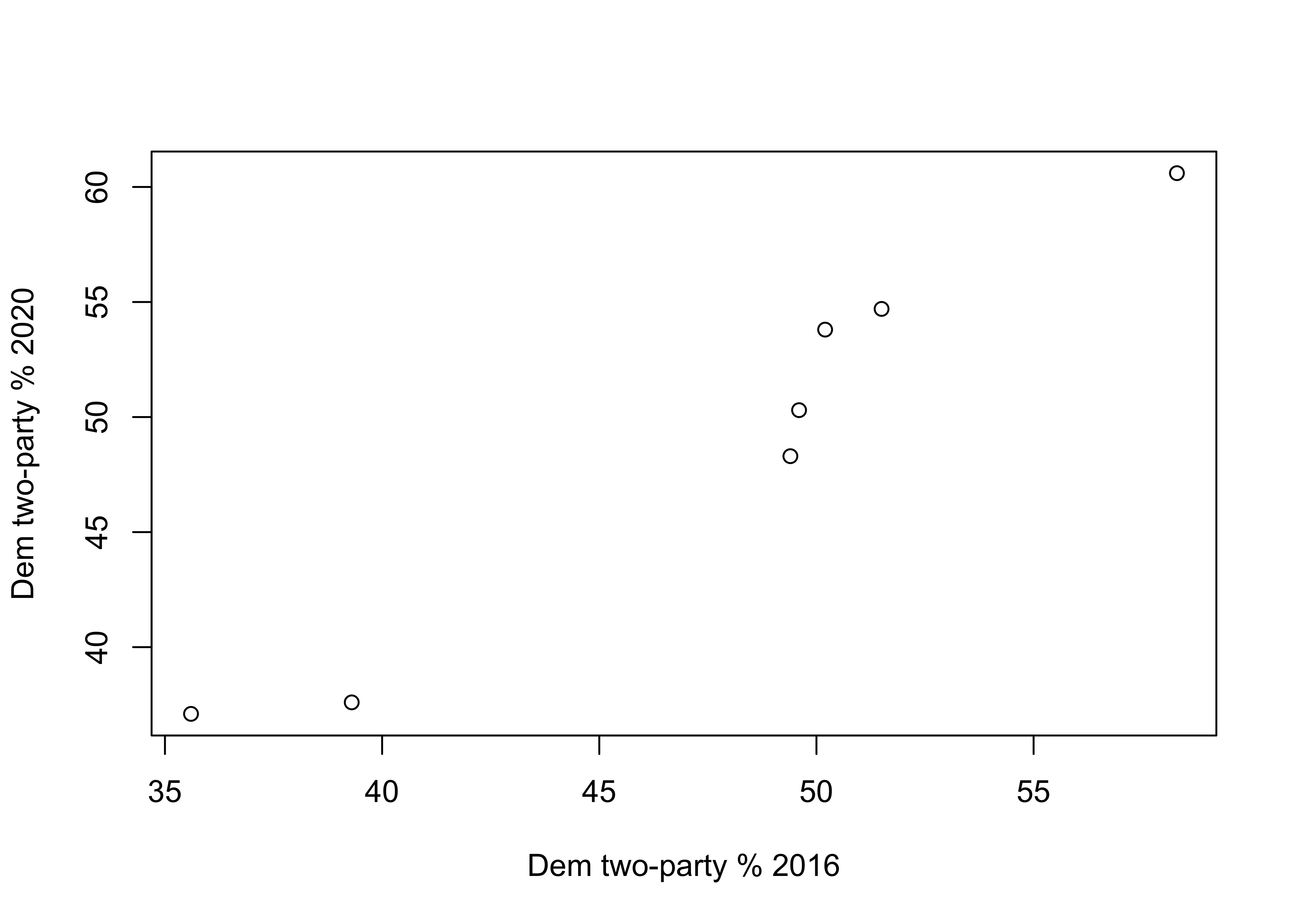
#Get correlation between "vote20" and "vote16"
cor.test(d$vote16,d$vote20)
    Pearson's product-moment correlation

data:  d$vote16 and d$vote20
t = 10.5, df = 5, p-value = 0.00014
alternative hypothesis: true correlation is not equal to 0
95 percent confidence interval:
 0.85308 0.99686
sample estimates:
    cor
0.97791
Even though the scatterplot and correlation coefficient (.978) together reveal an almost perfect correlation between these two variables, we still need a mechanism for predicting values of y based on values of x. For that, we need to calculate the regression equation.
The code chunk listed below creates everything necessary to calculate the components of the regression equation, and these components are listed in Table 15.1. Make sure you take a close look at this so you really understand where the regression numbers are coming from.
#calculate deviations of y and x from their means
d$Ydev=d$vote20-mean(d$vote20)
d$Xdev=d$vote16-mean(d$vote16)

#(deviation for y)*(deviations for x)
d$YdevXdev<-d$Ydev*d$Xdev

#squared deviations for x from its mean
d$Xdevsq=d$Xdev^2
[Table 15.1 about here]
| state | vote20 | vote16 | ydev | Xdev | Ydev | YdevXdev | Xdevsq |
|---|---|---|---|---|---|---|---|
| AL | 37.1 | 35.6 | -11.814 | -12.1 | -11.814 | 142.953 | 146.410 |
| FL | 48.3 | 49.4 | -0.614 | 1.7 | -0.614 | -1.044 | 2.890 |
| ME | 54.7 | 51.5 | 5.786 | 3.8 | 5.786 | 21.986 | 14.440 |
| NH | 53.8 | 50.2 | 4.886 | 2.5 | 4.886 | 12.214 | 6.250 |
| RI | 60.6 | 58.3 | 11.686 | 10.6 | 11.686 | 123.869 | 112.360 |
| UT | 37.6 | 39.3 | -11.314 | -8.4 | -11.314 | 95.040 | 70.560 |
| WI | 50.3 | 49.6 | 1.386 | 1.9 | 1.386 | 2.633 | 3.610 |
Now we have all of the components we need to estimate the regression equation. Note that in six of the seven states the value of \((x_i-\bar{x})(y_i-\bar{y})\) is positive, as is consistent with a strong positive relationship. The sum of this column, headed by YdevXdev, is the numerator for \(b\), and the sum of the column headed by Xdevsq is the denominator:
#Create the numerator for slope formula
numerator=sum(d$YdevXdev)
#Display value of the numerator
numerator
[1] 397.65#Create the denominator for slope formula
denominator=sum(d$Xdevsq)
#Display value of the denominator
denominator[1] 356.52#Calculate slope
b<-numerator/denominator
#Display slope
b[1] 1.1154\[b=\frac{\sum(x_i-\bar{x})(y_i-\bar{y})}{\sum(x_i-\bar{x})^2}=\frac{397.65}{356.52} =1.115\] Now that we have a value of \(b\), we can plug that into the formula for the constant:
#Get x and y means to calculate constant
mean(d$vote20)
[1] 48.914mean(d$vote16)[1] 47.7#Calculate Constant
a<-48.914 -(47.7*b)
#Display constant
a[1] -4.2889\[a=\bar{y}-b\bar{x}= -4.289\]
Which leaves us with the following linear equation:
\[\hat{y}=-4.289 + 1.115x\]
We can now predict values of y based on values of x. Predicted vote in 2020 is equal to -4.289 plus 1.115 times the value of the vote in 2016. We can also say that for every one-unit increase in the value of x (vote in 2016), the expected value of y (vote in 2020) increases by 1.115 percentage points.
We’ve used the term “predict” quite a bit in this and previous chapters. Let’s take a look at what it means in the context of regression analysis. To illustrate, let’s predict the value of the Democratic share of the two-party vote in 2020 for two states, Alabama and Wisconsin. The values of the independent variable (Democratic vote share in 2016) are 35.6 for Alabama and 49.6 for Wisconsin. To predict the 2020 outcomes, all we have to do is plug the values of the independent variable into the regression equation and calculate the outcomes:
[Table 15.2 about here]
| State | Predicted Outcome (\(\hat{y}\)) | Actual Outcome (\(y\)) | Error (\(y-\hat{y}\)) |
|---|---|---|---|
| Alabama | \(-4.289 + 1.115(35.6)= 35.41\) | 37.1 | 1.70 |
| Wisconsin | \(-4.289 + 1.115(49.6)= 51.02\) | 50.3 | -.72. |
The regression equation under-estimated the outcome for Alabama by 1.7 percentage points and over-shot Wisconsin by .72 points. These are near-misses and suggest a close fit between predicted and actual outcomes. This ability to predict outcomes of numeric variables based on outcomes of independent variable is something we get from regression analysis that we do not get from other methods we have studied. The error reported in the last column (\(y-\hat{y}\)) can be calculated across all observations and used to evaluate how well the model explains variation in the dependent variable.
How Well Does the Model Fit the Data?
Figure 15.1 plots the regression line from the equation estimated above through the seven data points. The regression line represents the predicted outcome of the dependent variable for any value of the independent variable. For instance, the value of the independent variable (2016 vote) for Utah is 39.3, where the upward point arrow intersects the x-axis. The point where the arrowhead meets the regression line is the predicted value of y (2020 vote) when x=39.3. This value is found by following the left-pointing arrow from the regression line to where it intersects the y-axis, 39.5. The closer the scatterplot markers are to the regression line, the less prediction error there is. The linear predictions will always fit some cases better than others. The key thing to remember is that the predictions generated by OLS regression are the best predictions you can get; that is, the estimates that give you the least overall error in prediction for these two variables.
[Figure 15.1 about here]
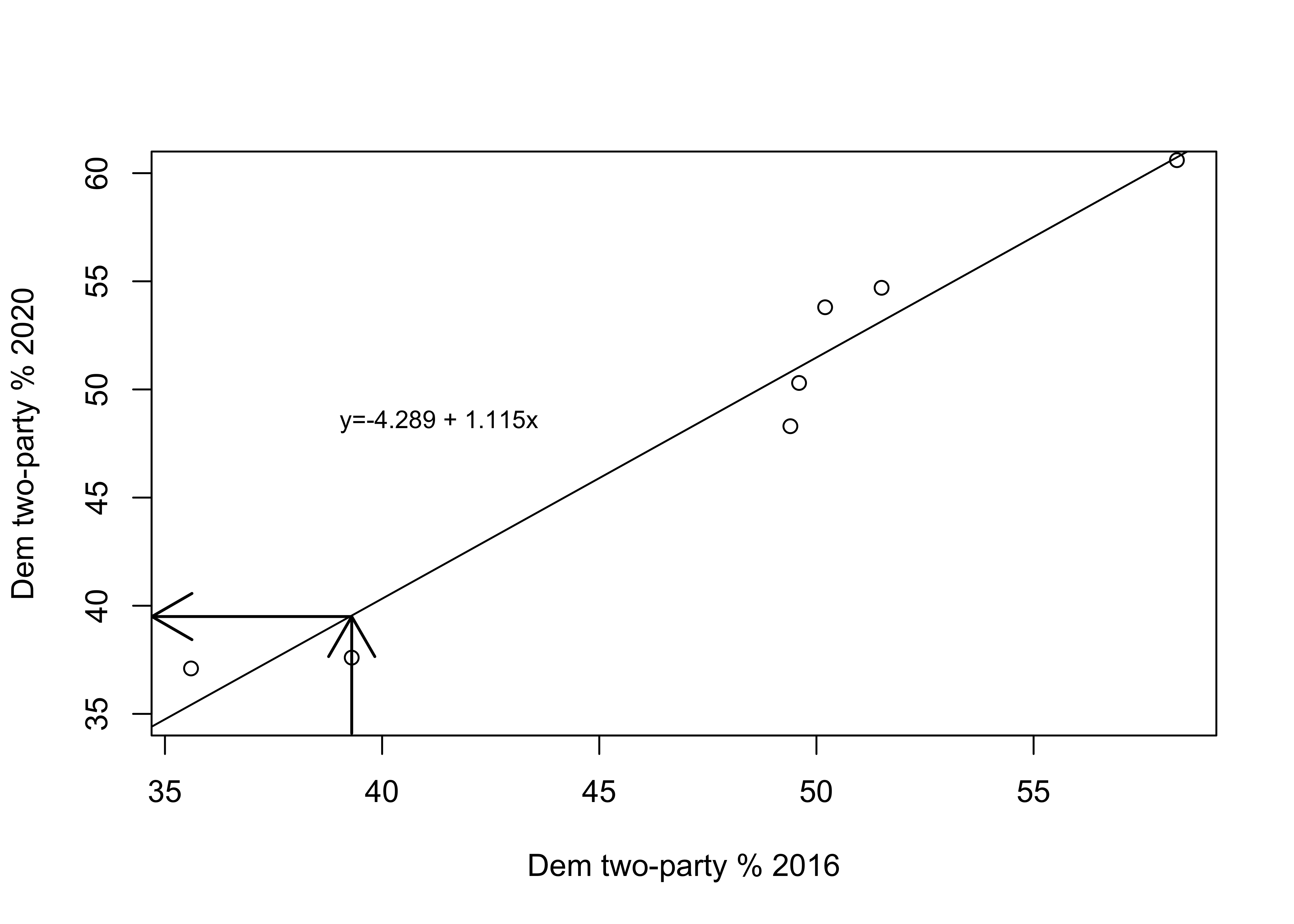
Figure 15.1: The Regession Line Superimposed in the Scatterplot
In Figure 15.2, the vertical lines between the markers and the regression line represent the error in the predictions (\(y-\hat{y}\)). These errors are referred to as residuals. As you can see, most data points are very close to the regression line, indicating that the model fits the data well. You can see this by “eyeballing” the regression plot, but it would be nice to have a more precise estimate of the overall strength of the model. An important criterion for judging the model is how well it predicts the dependent variable, overall, based on the independent variable. Conceptually, you can get a sense of this by thinking about the total amount of error in the predictions; that is, the sum of \(y-\hat{y}\) across all observations. The problem with this calculation is that you will end up with a value of zero (except when rounding error gives us something very close to zero) because the positive errors perfectly offset the negative errors. We’ve encountered this type of issue before (Chapter 6) when trying to calculate the average deviation from the mean. As we did then, we can use squared prediction errors to evaluate the amount of error in the model.
[Figure************************** 15.2 **************************about here]
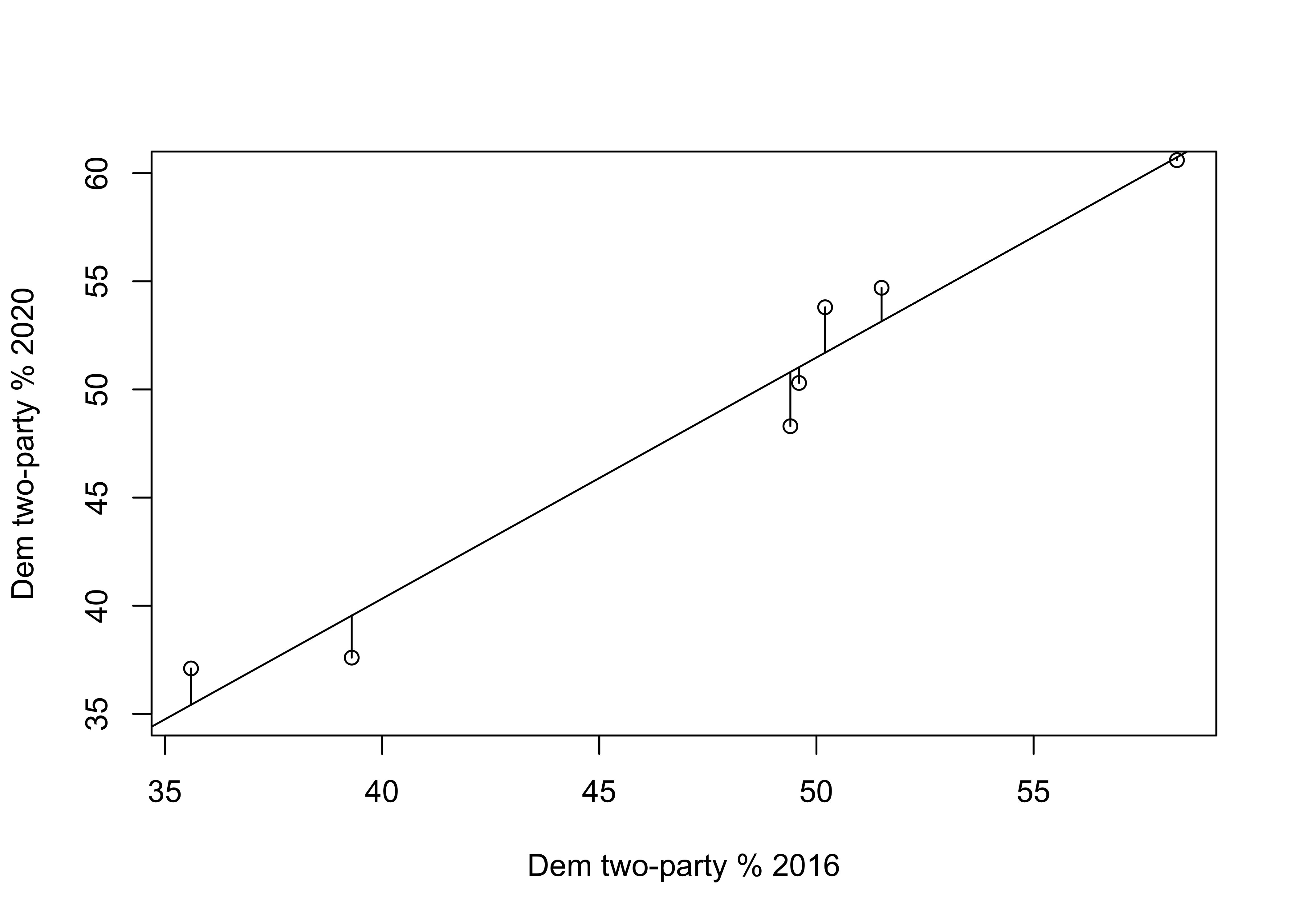
Figure 15.2: Prediction Errors (Residuals) in the Regression Model
Table 15.3 provides the actual and predicted values of y, the deviation of each predicted outcome from the actual value of y, and the squared deviations (fourth column). The sum of the squared prediction errors is 20.259. This, we refer to as total squared error (or variation) in the residuals (\(y-\hat{y}\)). The “Squares” part of Ordinary Least Squares regression refers to the fact that it produces the lowest squared error possible, given the set of variables.
[Table 15.3 about here]
| State | \(y\) | \(\hat{y}\) | \(y-\hat{y}\) | \((y-\hat{y})^2\) |
|---|---|---|---|---|
| AL | 37.1 | 35.418 | 1.682 | 2.829 |
| FL | 48.3 | 50.810 | -2.510 | 6.300 |
| ME | 54.7 | 53.153 | 1.547 | 2.393 |
| NH | 53.8 | 51.703 | 2.097 | 4.397 |
| RI | 60.6 | 60.737 | -0.137 | 0.019 |
| UT | 37.6 | 39.545 | -1.945 | 3.783 |
| WI | 50.3 | 51.033 | -0.733 | 0.537 |
| Sum | 20.259 |
Proportional Reduction in Error
So, is 20.259 a lot of error? A little error? About average? It’s hard to tell without some objective standard for comparison. One way to get a grip on the “Compared to what?” type of question is to think of this issue in terms of improvement in prediction over a model without the independent variable. In the absence of a regression equation or any information about an independent variable, the single best guess we can make for outcomes of interval and ratio level data—the guess that gives us the least amount of error—is the mean of the dependent variable. One way to think about this is to visualize what the prediction error would look like if we predicted outcomes with a regression line that was perfectly horizontal at the mean value of the dependent variable. Figure 15.3 shows how well the mean of the dependent variable “predicts” the individual outcomes.
[Figure************************** 15.3 **************************about here]
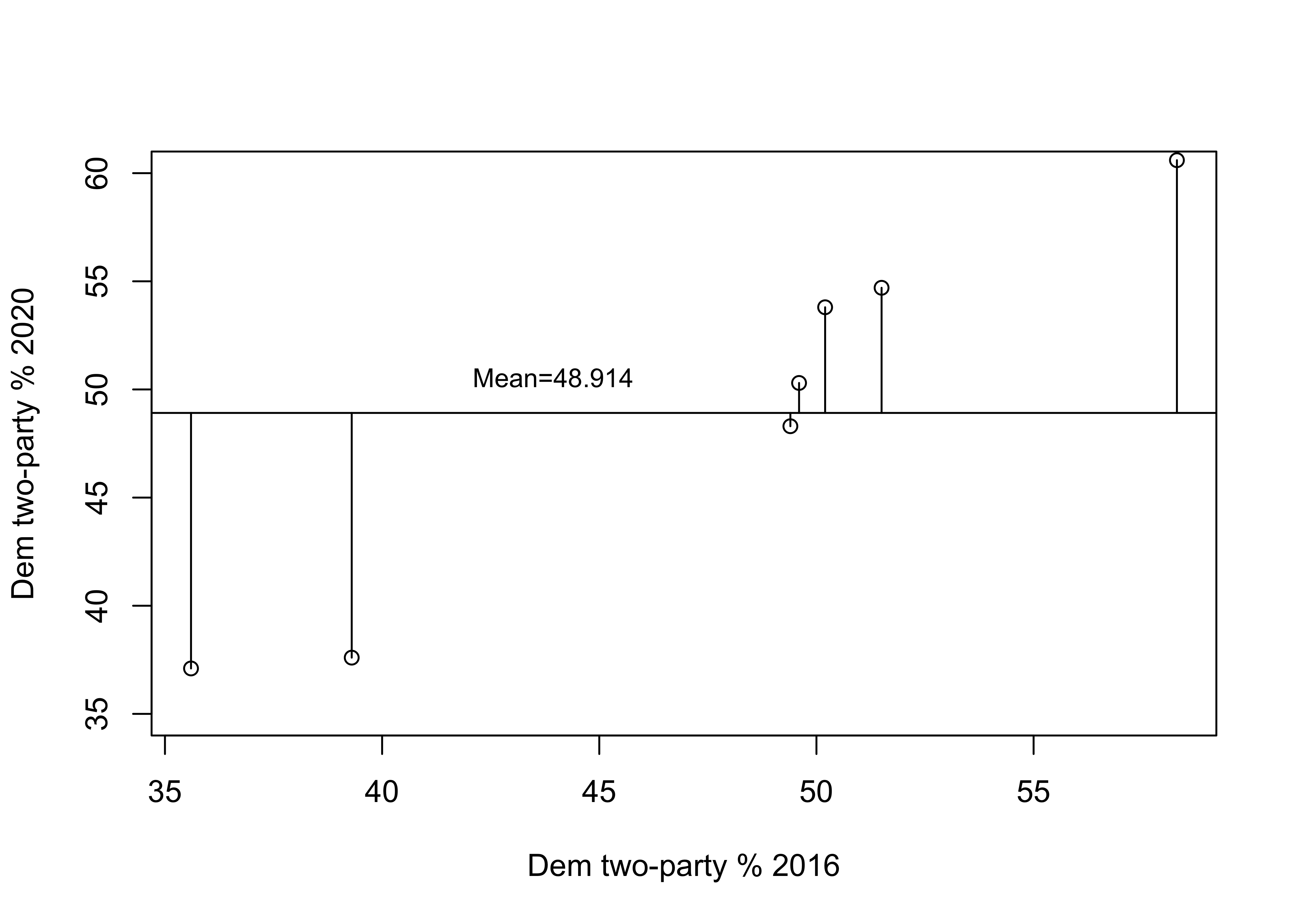
Figure 15.3: Prediction Error without a Regression Model
The horizontal line in this figure represents the mean of y (48.914) and the vertical lines between the mean and the data points represent the error in prediction if we used the mean of y as the prediction. As you can tell by comparing this to the previous figure, there is a lot more prediction error when using the mean to predict outcomes than when using the regression model. Just as we measured the total squared prediction error from using a regression model (Table 15.3), we can also measure the level of prediction error without a regression model. Table 15.4 shows the error in prediction from the mean (\(y-\bar{y}\)) and its squared value. The total squared error when predicting with the mean is 463.789, compared to 20.259 with predictions from the regression model.
[Table 15.4 about here]
| State | \(y\) | \(y-\bar{y}\) | \((y-\bar{y})^2\) |
|---|---|---|---|
| AL | 37.1 | -11.814 | 139.577 |
| FL | 48.3 | -0.614 | 0.377 |
| ME | 54.7 | 5.786 | 33.474 |
| NH | 53.8 | 4.886 | 23.870 |
| RI | 60.6 | 11.686 | 136.556 |
| UT | 37.6 | -11.314 | 128.013 |
| WI | 50.3 | 1.386 | 1.920 |
| Mean | 48.914 | Sum | 463.789 |
We can now use this information to calculate the proportional reduction in error (PRE) that we get from the regression equation. In the discussion of measures of association in Chapter 13 we calculated another PRE statistic, Lambda, based on the difference between predicting with no independent variable (Error1) and predicting on the basis of an independent variable (Error2):
\[Lambda (\lambda)=\frac{E_1-E_2}{E_1}\]
The resulting statistic, lambda, expresses reduction in error as a proportion of the original error.
We can calculate the same type of statistic for regression analysis, except we will use \(\sum({y-\bar{y})^2}\) (total error from predicting with the mean of the dependent variable) and \(\sum{(y-\hat{y})^2}\) (total error from predicting with the regression model) in place of E1 and E2, respectively. This gives us a statistic known as the coefficient of determination, or \(r^2\) (sound familiar?).
\[r^2=\frac{\sum{(y_i-\bar{y})^2}-\sum{(y_i-\hat{y})^2}}{\sum{(y_i-\bar{y})^2}}=\frac{463.789-20.259}{463.789}=\frac{443.53}{463.789}=.9563\] Okay, so let’s break this down. The original sum of squared error in the model—the error from predicting with the mean—is 463.789, while the sum of squared residuals (prediction error) based on the model with an independent variable is 20.259. The difference between the two (443.53) is difficult to interpret on its own, but when we express it as a proportion of the original error, we get .9563. This means that we see about a 95.6% reduction in error predicting the outcome of the dependent variable by using information from the independent variable, compared to using just the mean of the dependent variable. Another way to interpret this is to say that we have explained 95.6% of the error (or variation) in y by using x as the predictor.
Earlier in this chapter we found that the correlation between 2016 and 2020 votes in the states was .9779. If you square this, you get .9563, the value of r2. This is why it was noted in Chapter 14 that one of the virtues of Pearson’s r is that it can be used as a measure of proportional reduction in error. In this case, both r and r2 tell us that this is a very strong relationship. In fact, this is very close to a perfect positive relationship.
Getting Regression Results in R
Let’s confirm our calculations using R. First, we use the linear model function to tell R which variables we want to use lm(dependent~independent), and store the results in a new object named “fit”.
#Get linear model and store results in new object "fit"
fit<-lm(d$vote20 ~ d$vote16)
Then we have R summarize the contents of the new object:
#View regression results stored in 'fit'
summary(fit)
Call:
lm(formula = d$vote20 ~ d$vote16)

Residuals:
     1      2      3      4      5      6      7
 1.682 -2.510  1.547  2.097 -0.137 -1.945 -0.733

Coefficients:
            Estimate Std. Error t value Pr(>|t|)
(Intercept)   -4.289      5.142   -0.83  0.44229
d$vote16       1.115      0.107   10.46  0.00014 ***
---
Signif. codes:  0 '***' 0.001 '**' 0.01 '*' 0.05 '.' 0.1 ' ' 1

Residual standard error: 2.01 on 5 degrees of freedom
Multiple R-squared:  0.956, Adjusted R-squared:  0.948
F-statistic:  109 on 1 and 5 DF,  p-value: 0.000138
Wow. There is a lot of information here. Figure 15.4 provides an annotated guide:
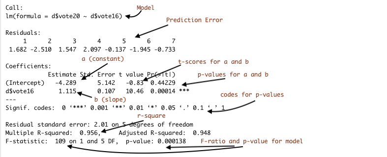
Figure 15.4: Annotated Regression Output from R
Here we see that our calculations for the constant (4.289), the slope (1.115), and the value of r2 (.9563) are the same as those produced in the regression output. You will also note here that the output includes values for t-scores and p-values that can be used for hypothesis testing. The t-score is equal to the slope divided by the standard error of the slope. In this case the t-score is 10.46 and the p-value is .00014, so we are safe rejecting the null hypothesis. Note also that the t-score and p-values for the slope are identical to the t-score and p-values from the correlation coefficient shown earlier. That is because in simple (bi-variate) regression, the results are a strict function of the correlation coefficient.
All Fifty States
We’ve probably pushed the seven-observation data example about as far as we legitimately can. Before moving on, let’s look at the relationship between 2016 and 2020 votes in all fifty states, using the states20 data set. First, the scatter plot:
#Plot 2020 results against 2016 results, all states
plot(states20$d2pty16, states20$d2pty20, xlab="Clinton % 2016",
     ylab="Biden % 2020",
     main="Democratic % Two-party Vote")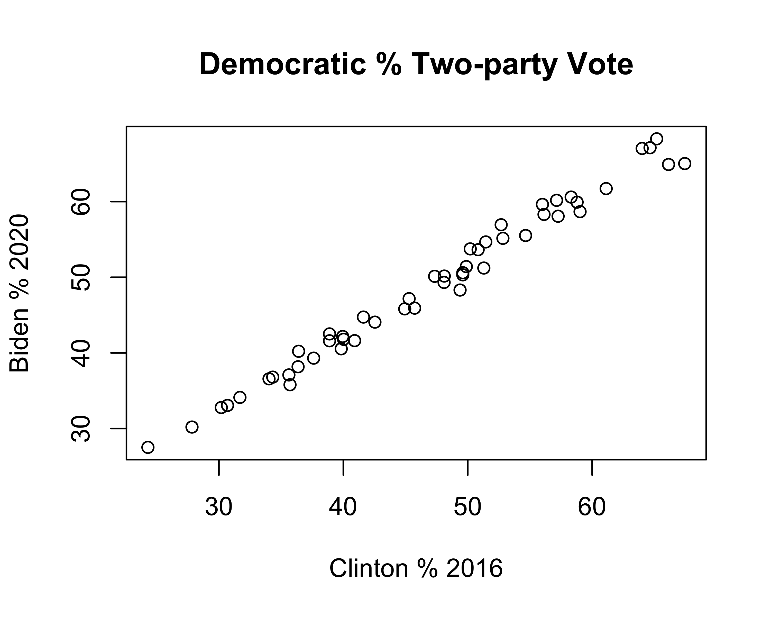
This pattern is similar to that found in the smaller sample of seven states: a strong, positive relationship. This impression is confirmed in the regression results:
#Get linear model and store results in new object 'fit50'
fit50<-lm(states20$d2pty20~states20$d2pty16)
#View regression results stored in 'fit50'
summary(fit50)
Call:
lm(formula = states20$d2pty20 ~ states20$d2pty16)

Residuals:
   Min     1Q Median     3Q    Max
-3.477 -0.703  0.009  0.982  2.665

Coefficients:
                 Estimate Std. Error t value Pr(>|t|)
(Intercept)        3.4684     0.8533    4.06  0.00018 ***
states20$d2pty16   0.9644     0.0177   54.52  < 2e-16 ***
---
Signif. codes:  0 '***' 0.001 '**' 0.01 '*' 0.05 '.' 0.1 ' ' 1

Residual standard error: 1.35 on 48 degrees of freedom
Multiple R-squared:  0.984, Adjusted R-squared:  0.984
F-statistic: 2.97e+03 on 1 and 48 DF,  p-value: <2e-16
Here we see that the model still fits the data very well (r2=.98) and that there is a significant, positive relationship between 2016 and 2020 vote. The linear equation is:
\[\hat{y}=3.468+ .964x\] The value for b (.964) means that for every one unit increase in the observed value of x (one percentage point in this case), the expected increase in y is .964 units. If it makes it easier to understand, we could express this as a linear equation with substantive labels instead of “y” and “x”:
\[\hat{\text{2020 Vote}}=3.468+ .964(\text{2016 Vote})\] To predict the 2020 outcome for any state, just plug in the value of the 2016 outcome for x, multiply that time the slope (.964), and add the value of the constant.
Understanding the Constant
Discussions of regression results typically focus on the estimate for the slope (b) because it describes how y changes in response to changes in the value of x. In most cases, the constant (a) isn’t of much substantive interest and we rarely spend much time talking about it. But the constant is very important for placing the regression line in a way that minimizes the amount of error obtained from the predictions.
Take a look at the scatterplot below, with a regression line equal to \(\hat{y}=3.468 + .964x\) plotted through the data points. To add the regression line to the plot, I use the abline function, which we’ve used before to add horizontal or vertical lines, and specify that the function should use information from the linear model to add the prediction line. Since the results of the regression model are stored in fit50, we could also write this as abline(lm(fit50)).
#Plot 2020 results against 2016 reults, all states
plot(states20$d2pty16, states20$d2pty20, xlab="Clinton % 2016",
     ylab="Biden % 2020")
#Add prediction line to the graph
abline(lm(states20$d2pty20~states20$d2pty16))
#Add a legend without a box (bty="n")
legend("right", legend="y=3.468 +.964x", bty="n", cex=.8)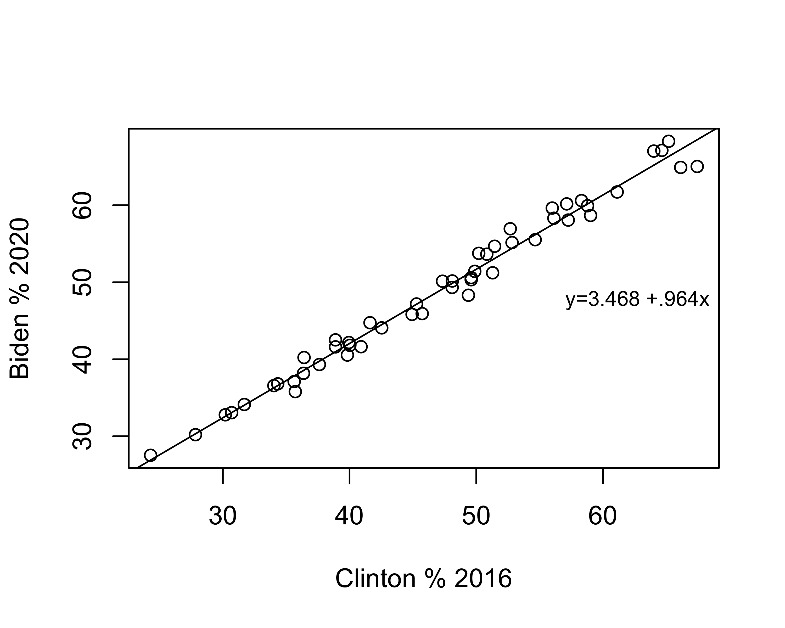
Just to reiterate, this line represents the best fitting line possible for this pair of variables. There is always some error in predicting outcomes in y, but no other linear equation will produce less error in prediction than those produced using OLS regression.
The slope (angle) of the line is equal to the value of b, and the vertical placement of the line is determined by the constant. Literally, the value of the constant is the predicted value of y when x equals zero. In many cases, such as this one, zero is not a plausible outcome for x, which is part of the reason the constant does not have a really straightforward interpretation. But that doesn’t mean it is not important. Look at the scatterplot below, in which I keep the value of b the same but use the abline function to change the constant to 1.468 instead of 3.468:
#Plot 2020 results against 2016 reults, all states
plot(states20$d2pty16, states20$d2pty20, xlab="Clinton % 2016",
     ylab="Biden % 2020")
#Add prediction line to the graph, using 1.468 as the constant
abline(a=1.468, b=.964)
legend("right", legend="y=1.468 + .964x", bty = "n", cex=.9)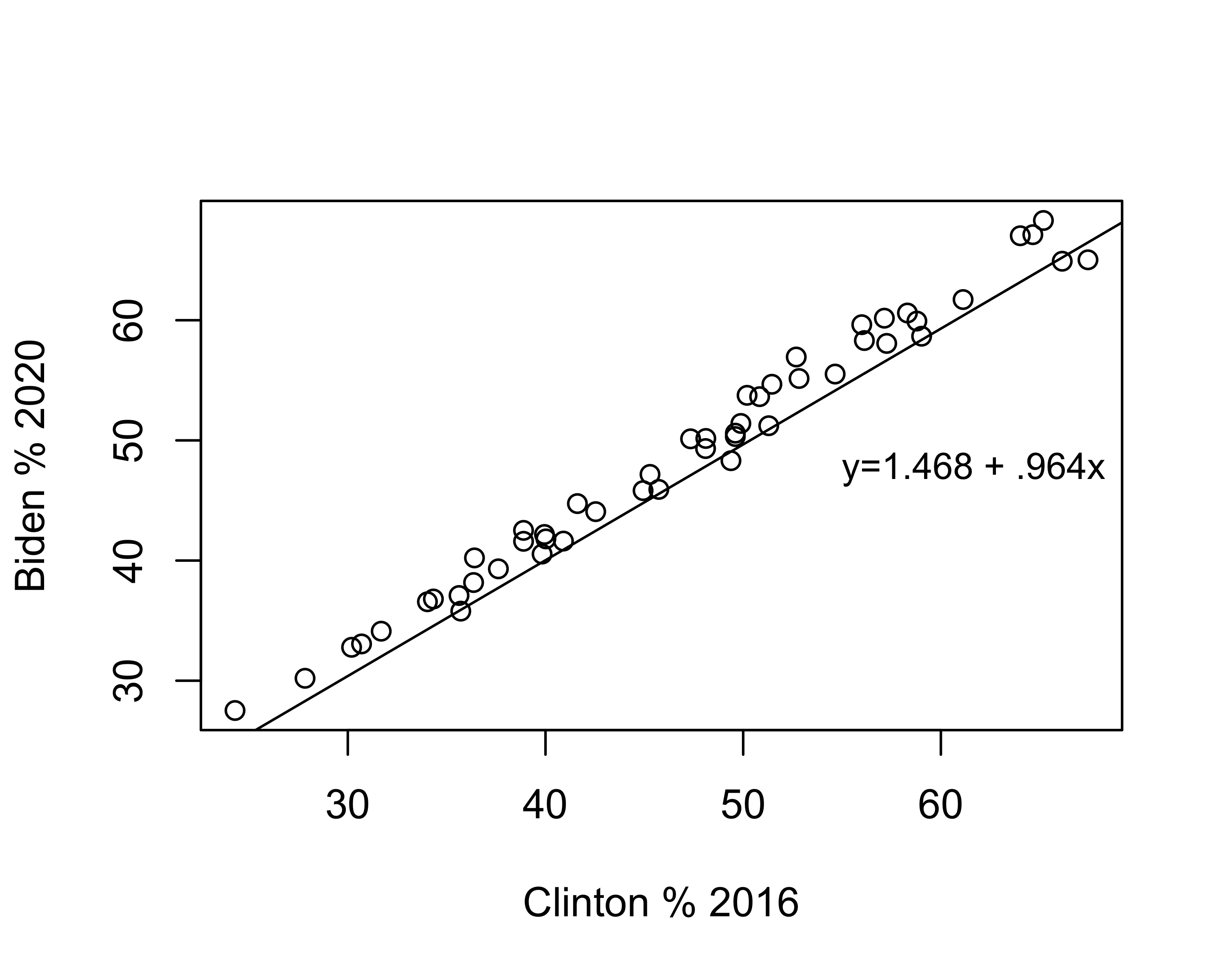
Changing the constant had no impact on the angle of the slope, but the line doesn’t fit the data nearly as well. In fact, it looks like the regression predictions underestimate the outcomes in almost every case. The point here is that although we are rarely interested in the substantive meaning of the constant, it plays a very important role in providing the best fitting regression line.
Organizing the Regression Output
Presentation of results is always an important part of the research process. You want to make sure the reader, whether your professor, a client, or your supervisor at work, has an easy time reading and absorbing the findings. Part of this depends upon the descriptions and interpretations you provide, but another important aspect is the physical presentation of the statistical results. You may have noticed the regression output in R is a bit unwieldy and could certainly serve as a barrier to understanding, especially for people who don’t work in R on a regular basis.
Fortunately, there is an R package called stargazer that can be used to produce publication quality tables that are easy to read and include most of the important information from the regression output. The first step is to run the regression model and assign the results to another object. In the regression example above, the fifty-state results were stored in fit50, so we will use that. Now, instead of using summary to view the results, we use stargazer to report the results in the form of a well-organized table. In its simplest form, you just need to tell stargazer to produce a “text” table using the information from the object that contains the results of the regression model. Let’s give it a try. In the code chunk below, I tell R to use stargazer and to take the results stored in fit50 (the regression results) and generate a table using normal text type="text". I then use dep.var.labels = to assign a label for the dependent variable, and covariate.labels = to assign a label to the independent variable.39
#Regression model of Biden vote by Clinton Vote
stargazer(fit50, type ="text",
#Label dependent variable
          dep.var.labels=c("Biden Vote, 2020"),
#Label independent variable
          covariate.labels = c("Clinton Vote, 2016"))
===============================================
                        Dependent variable:
                    ---------------------------
                         Biden Vote, 2020
-----------------------------------------------
Clinton Vote, 2016           0.964***
                              (0.018)

Constant                     3.468***
                              (0.853)

-----------------------------------------------
Observations                    50
R2                             0.984
Adjusted R2                    0.984
Residual Std. Error       1.354 (df = 48)
F Statistic          2,972.400*** (df = 1; 48)
===============================================
Note:               *p<0.1; **p<0.05; ***p<0.01
As you can see, stargazer produces a neatly organized, easy to read table, one that stands in stark contrast to the standard regression output from R. Most things in the stargazer table are self-explanatory, but there are a couple of things I want to be sure you understand. The values for the slope and the constant are listed in the column headed by a label for the dependent variable, and the standard errors for the slope and constant appear in parentheses just below the their respective values. For instance, the slope for Clinton Vote is .964 and the standard error for the slope is .018. In addition, the significance levels (p-value) for the slope and constant are denoted by asterisks, with the corresponding values listed below the table. In this case, the three asterisks denote that the p-values for both the slope and the constant are less than .01. These p-values are calculated for two-tailed tests, so they are a bit on the conservative side. Because of this, if you are testing a one-tailed hypothesis and the reported p-value is “*p<.10”, you can reject the null hypothesis since the p-value for a one-tailed test is actually less than .05 (half the value of the two-tailed p-value).
Revisiting Life Expectancy
Before moving on to multiple regression in the next chapter, let’s review important aspects of the interpretation of simple regression results by returning to the determinants of life expectancy, the focus of our scatterplot and correlation analysis in Chapter 14. In the r-chunk below, I have run three different regression models using life expectancy as the dependent variable, one for fertility rate as the independent variable, one for mean years of education, and one for the log of population. One of the upsides to stargazer is that we can present all three models in a single table
countries2$lg10pop<-log10(countries2$pop19_M)
#Run life expectancy models
fertility<-lm(countries2$lifexp~countries2$fert1520)
education<-lm(countries2$lifexp~countries2$mnschool)
pop<-lm(countries2$lifexp~countries2$lg10pop)

#Have 'stargazer' use the information in fertility', 'education',
#and 'pop' to create a table
stargazer(fertility, education, pop, type="text",
          dep.var.labels=c("Life Expectancy"),
          covariate.labels = c("Fertility Rate",
                            "Mean Years of Education",
                            "Log10 Population"),
          omit.stat=c("f")) #Drop F-stat to make room for three columns
==========================================================================
                                       Dependent variable:
                        --------------------------------------------------
                                         Life Expectancy
                              (1)              (2)              (3)
--------------------------------------------------------------------------
Fertility Rate             -4.911***
                            (0.231)

Mean Years of Education                      1.839***
                                             (0.112)

Log10 Population                                               -0.699
                                                              (0.599)

Constant                   85.946***        56.663***        73.214***
                            (0.700)          (1.036)          (0.735)

--------------------------------------------------------------------------
Observations                  185              189              191
R2                           0.711            0.591            0.007
Adjusted R2                  0.710            0.589            0.002
Residual Std. Error     4.032 (df = 183) 4.738 (df = 187) 7.423 (df = 189)
==========================================================================
Note:                                          *p<0.1; **p<0.05; ***p<0.01
First, the impact of fertility rate on life expectancy (Model 1):
These results can be expressed as a linear equation, where the predicted value of life expectancy is a function of fertility rate: \(\hat{y}= 85.946 - 4.911(fert1520)\)
There is a statistically significant, negative relationship between fertility rate and country-level life expectancy. Generally, countries with relatively high fertility rates tend to have relatively low life expectancy. More specifically, for every one-unit increase in fertility rate, country-level life expectancy decreases by 4.911 years.
This is a strong relationship. Fertility rates explains approximately 71% of the variation in life expectancy across nations.
Notice that in the summary of this model I provided a general description of the relationship as well as more specific details and statistics. I think this is good practice, as both the specific and general complement each other well.
For the impact of level of education on life expectancy (Model 2):
These results can be expressed as a linear equation, where the predicted value of life expectancy is: \(\hat{y}= 56.663 +1.839(mnschool)\)
There is a statistically significant, positive relationship between average years of education and country-level life expectancy. Generally, countries with relatively high levels of education tend to have relatively high levels of life expectancy. More specifically, for every one-unit increase in average years of education, country-level life expectancy increases by 1.839 years.
This is a fairly strong relationship. Educational attainment explains approximately 59% of the variation in life expectancy across nations.
For the impact of population size on life expectancy (Model 3):
- Population size has no impact of country-level life expectancy.
The finding for population size provides a perfect opportunity to demonstrate what a null relationship looks like. Note that the constant in the this model (73.214) is very close to the value of the mean of the dependent variable (72.639). This is because the independent variable does not offer a significantly better prediction than we get from simply using \(\bar{y}\) to predict \(y\). In fact, in bi-variate regression models in which \(b=0\), the intercept equals the mean of the dependent variable and the “slope” is a perfectly flat horizontal line at \(\bar{y}\). Check out the scatterplot below, where the solid line is the prediction based on the regression equation using the log of country population as the independent variable, and the dashed line is the predicted outcome (the mean of Y) if the slope equals exactly 0:
#Plot of 'lifexp" by 'lg10(pop)'
plot(countries2$lg10pop, countries2$lifexp, ylab=" Life Expectancy",
     xlab="Log10 of Population")
#plot regression line from 'pop' model (above)
abline(pop)
#plot a horizontal line at the mean of 'lifexp'
abline(h=mean(countries2$lifexp, na.rm=T), lty=2)
#Add legend
legend("bottomleft", legend=c("Y=73.21-.699X", "Mean of Y"),
       lty=c( 1,2), cex=.7)
As you can see, the slope of the regression line is barely different from what we would expect if b=0. This is a perfect illustration of support for the null hypothesis. The regression equation offers no significant improvement over predicting \(y\) with no regression model; that is, predicting outcomes on \(y\) with \(\bar{y}\).
Important Caveat
Ordinary least squares regression is an important and useful tool for political and social research. It provides a way of estimating relationships between variables using a linear model that allows for predicting outcomes of the dependent variable based on values of an independent variable. As you will see in the next two chapters, the regression model is easily extended to incorporate the effects of multiple independent variables at the same time. That said, it is important to mention here that the many virtues of regression analysis depend upon certain assumptions we make about the data we are using and the nature of the relationships between the dependent and independent variables. The level of confidence we can have in the results of the regression model depends on the extent to which these assumptions are satisfied. Chapter18 provides a more detailed discussion of regression assumptions, as well as suggestions for what to do if the assumptions are violated.
Adding Regression Information to Scatterplots
The R assignments for this chapter, as well as some portions of the remaining chapters rely on integrating case-specific information from scatterplots with information from regression models to learn more about cases that do and don’t fit the model well. In this section, we follow the example of the R Problems from the last chapter and use infant mortality in the states (states20$infant_mort) as the dependent variable and state per capita income (states20$PCincome2020) as the independent variable. First, let’s run a regression model and add the regression line to the scatterplot using the abline function, as shown earlier in the chapter.
#Regression model of "infant_mort" by "PCincome2020"
inf_mort<-lm(states20$infant_mort ~states20$PCincome2020)
#View results
stargazer(inf_mort, type = "text",
          dep.var.labels = "Infant Mortality",
          covariate.labels = "Per Capita Income")
===============================================
                        Dependent variable:
                    ---------------------------
                         Infant Mortality
-----------------------------------------------
Per Capita Income           -0.0001***
                             (0.00001)

Constant                     10.534***
                              (0.785)

-----------------------------------------------
Observations                    50
R2                             0.422
Adjusted R2                    0.410
Residual Std. Error       0.880 (df = 48)
F Statistic           35.019*** (df = 1; 48)
===============================================
Note:               *p<0.1; **p<0.05; ***p<0.01
Here, we see a statistically significant and negative relationship between per capita income and infant mortality and the relationship is fairly strong (r2=.422).40
The scatterplot below reinforces both of these conclusions: there is a clear negative pattern to the data, infant mortality rates tend to be higher in states with low per capita income than in states with high per capita income. The addition of the regression line is useful in many ways, including showing that while most outcomes are close to the predicted outcome, infant mortality is appreciably higher or lower in some states than we would expect based on their per capita income in those states. Note that in order to add the regression line, I just had to reference the store regression output (inf_mort) in the abline command.
#Regression model
plot(states20$PCincome2020, states20$infant_mort,
     xlab="Per Capita Income",
     ylab="# Infant Deaths per 1000 live Births")
#Add regression line using stored regression results
abline(inf_mort)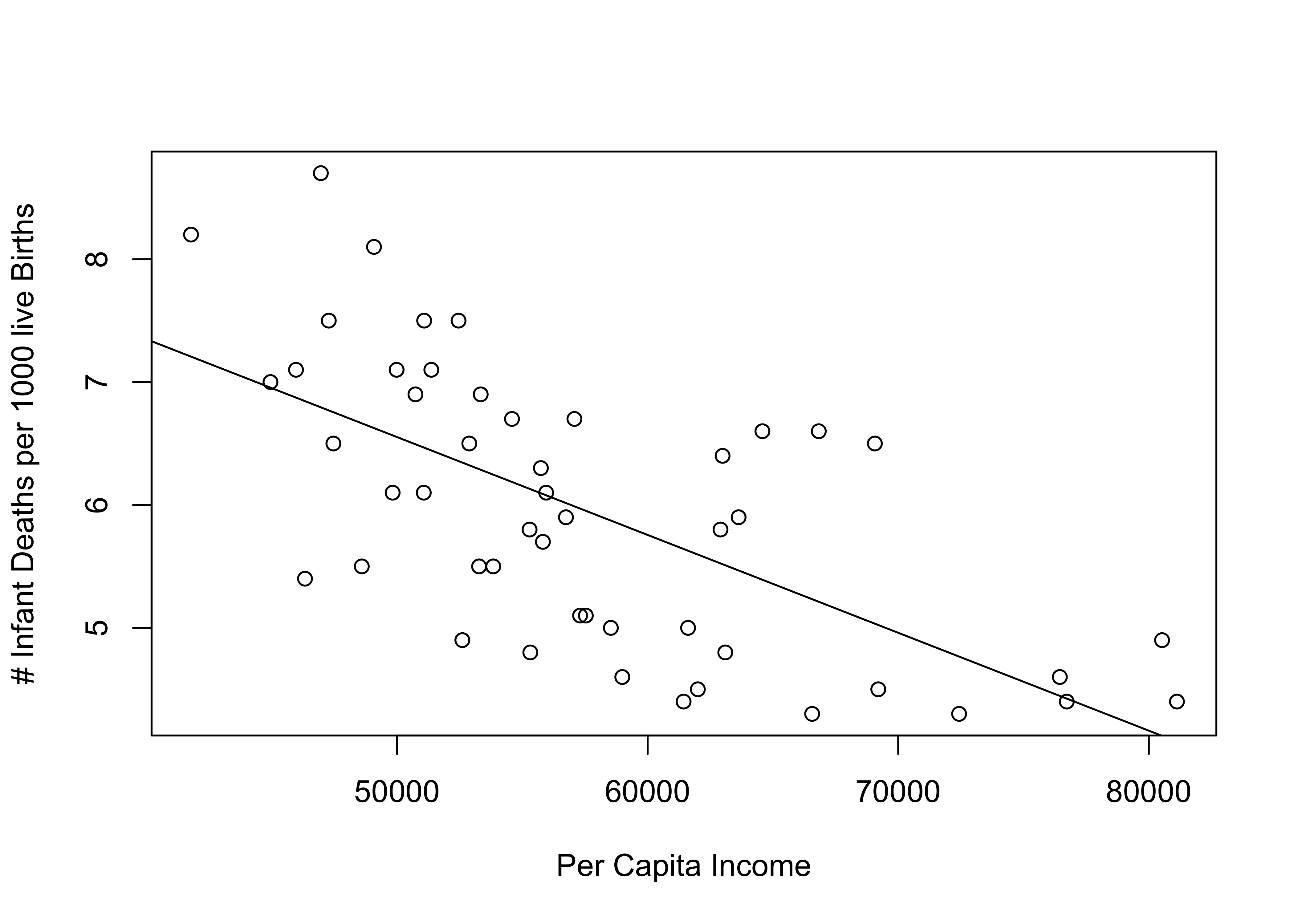
One thing we can do to make the pattern more meaningful is to replace the data points with state abbreviations. Doing this enables us to see which states are high and low on the two variables, as well as which states are relatively close to or far from the regression line. To do this, you need to reduce the size of the original markers (cex=.001 below) and instruct R to add the state abbreviations using the text function. The format for this is text(independent_variable,dependent_variable, ID_variable), where ID_variable is the variable that contains information that identifies the data points (state abbreviations, in this case).
#Scatterplot for per capita income and infant mortality
plot(states20$PCincome2020, states20$infant_mort,
     xlab="Per Capita Income",
     ylab="# Infant Deaths per 1000 live Births", cex=.001)
#Add regression line
abline(lm(inf_mort))
#Add State abbreviations
text(states20$PCincome2020,states20$infant_mort, states20$stateab, cex=.7)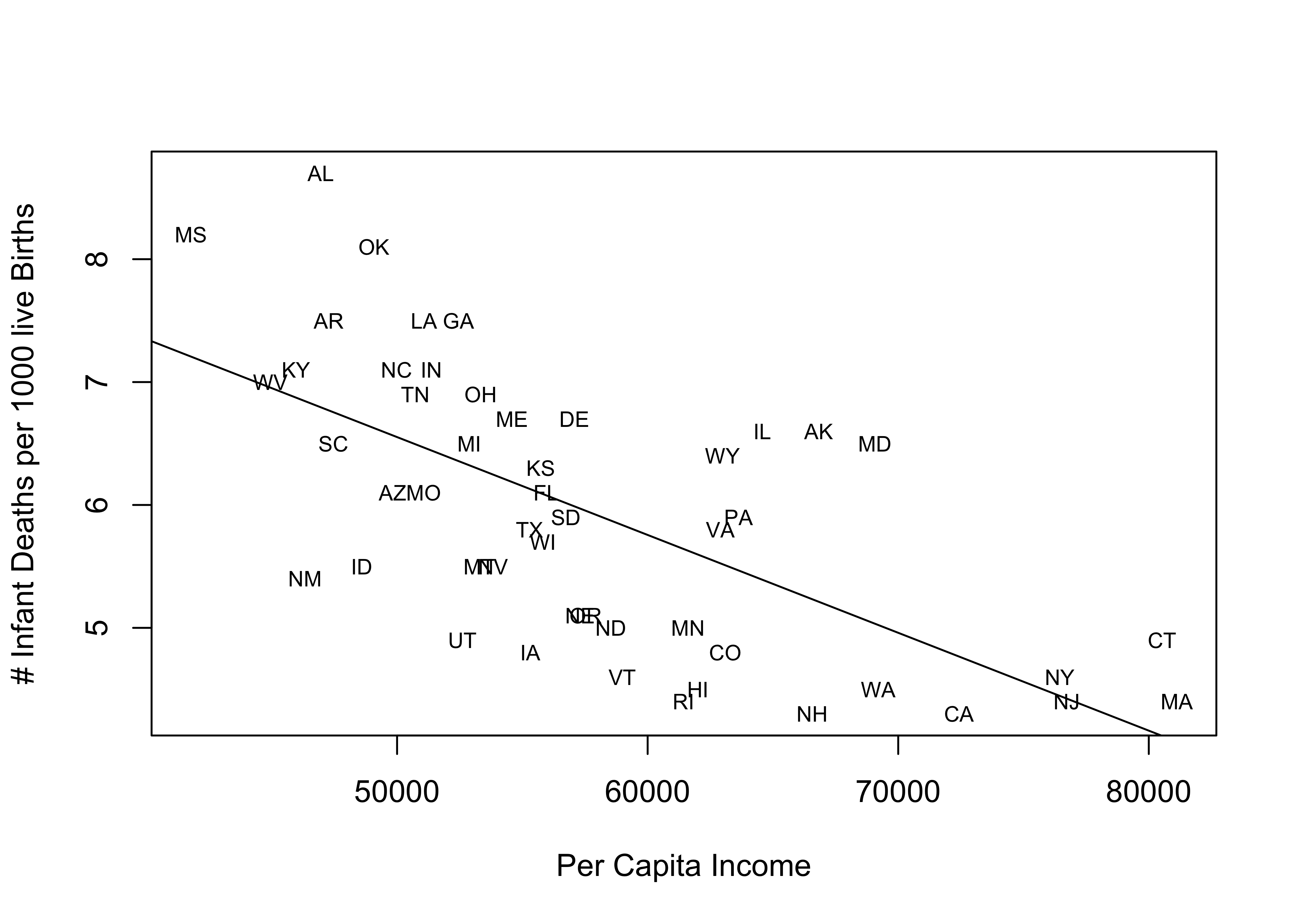
This scatterplot provides much of the same information as the previous one, but now we also get information about the outcomes for individual states. Often, this is useful for connecting with the pattern in the scatterplot, and it is also helpful because now we can see which states are well explained by the regression model and which states are not. States that stand out as having higher than expected infant mortality (farthest above the regression line), given their income level are Alabama, Oklahoma, Alaska, and Maryland. States with lower than expected infant mortality (farthest below the regression line) are New Mexico, Utah, Iowa, Vermont, and Rhode island. It is not clear if there is a pattern to these outcomes, but there might be a slight tendency for southern states to have a higher than expected level of infant mortality, once you control for income.
Next Steps
This first chapter on regression provides you with all the tools you need to move on to the next topic: using multiple regression to control for the influence of several independent variables in a single model. The jump from simple regression (covered in this chapter) to multiple regression will not be very difficult, especially because we addressed the idea of multiple influences in the discussion of partial correlations Chapter 14. Having said that, make sure you have a firm grasp of the material from this chapter to ensure smooth sailing as we move on to multiple regression. Check in with your professor if there are parts of this chapter that you find challenging.
Assignments
Concepts and Calculations
Identify the parts of this regression equation: \(\hat{y}= a + bx\)
- The independent variable is:
- The slope is:
- The constant is:
- The dependent variable is:
The regression output below is from the 2020 ANES and shows the impact of the feeling thermometer rating for conservatives on the number of LGBTQ policies supported (recall this from Chapter), which ranges from 0 to 5.
======================================================
                               Dependent variable:
                           ---------------------------
                            # LGBTQ Rights Supported
------------------------------------------------------
Conservative Feeling Therm          -0.025***
                                     (0.001)

Constant                            4.564***
                                     (0.032)

------------------------------------------------------
Observations                          6,830
R2                                    0.210
Adjusted R2                           0.210
Residual Std. Error             1.389 (df = 6828)
F Statistic                1,816.300*** (df = 1; 6828)
======================================================
Note:                      *p<0.1; **p<0.05; ***p<0.01
Interpret the coefficient for the feeling thermometer rating. Focus on direction, statistical significance, and how much the dependent variable is expected to change as the values of the independent variable change.
What are the predicted outcomes (# of LGBTQ policies supported) for three different respondents, one who gave conservatives a 0 on the feeling thermometer, one who gave them a 50, and one who rated them at 100?
Is the relationship between feelings toward conservatives and number of LGBTQ policies supported strong, weak, or something in between? Explain your answer.
The regression model below summarizes the relationship between the poverty rate and the percent (0 to 100, not 0 to 1) of households with access to the internet in a sample of 500 U.S. counties.
set.seed(1234)
#create a sample of 500 rows of data from the county20large data set
county500<-sample_n(county20large, 500)
fit<-lm(county500$internet~county500$povtyAug21)

stargazer(fit, type = "text",
          dep.var.labels = "% Internet Access",
          covariate.labels = "% Poverty")
=============================================== Dependent variable: --------------------------- % Internet Access ----------------------------------------------- % Poverty -0.866*** (0.043) Constant 89.035*** (0.760) ----------------------------------------------- Observations 500 R2 0.447 Adjusted R2 0.446 Residual Std. Error 6.710 (df = 498) F Statistic 402.130*** (df = 1; 498) =============================================== Note: *p<0.1; **p<0.05; ***p<0.01- Write out the results as a linear model (see question #1 for a generic version of the linear model)
- Interpret the coefficient for the poverty rate. Focus on direction, statistical significance, and how much the dependent variable is expected to change as the values of the independent variable change.
- Interpret the R2 statistic
- What is the predicted level of internet access for a county with a 5% poverty rate?
- What is the predicted level of internet access for a county with a 16% poverty rate?
- Is the relationship between poverty rate and internet access strong, weak, or something in between? Explain your answer.
Calculate the constant (a) for each of the regression models listed in the table below.
Slope (b) Mean of X Mean of Y Constant (a) Model 1 2.13 6.46 34.38 Model 2 .105 33.28 8.23 Model 3 -1.9 5.24 61.88 Model 4 -.413 22.25 13.38
R Problems
Use stargazer to present the results of all R models.
- I tried to use stargazer to give me a nice looking table of my regression results, but I’m having a really hard time getting it to work right. Run the model below and see if you can figure out how to get the results to look the way they should in the stargazer output. (Hint: there are three problems)
prob1<-lm(states20$PerPupilExp~states20$PCincome2020)
stargazer(prob1,
          dep.var.labels = K-12 Per Pupil Expenditures,
          covariate.labels = Per Capita Income)
Following the example used at the end of this chapter, produce a scatterplot showing the relationship between the percent of births to teen mothers (
states20$teenbirth) and infant mortalitystates20$infant_mortin the states (infant mortality is the dependent variable). Make sure you include the regression line and the state abbreviations. Identify any states that you see as outliers, i.e., that don’t follow the general trend. Is there any pattern to these states? Then, run and interpret a regression model using the same two variables. Discuss the results, focusing on the general direction and statistical significance of the relationship, as well as the expected change in infant mortality for a unit change in the teen birth rate, and interpret the R2 statistic.Repeat the same analysis from (2), except now use
states20$lowbirthwt(% of births that are technically low birth weight) as the independent variable. As always, use words. The statistics don’t speak for themselves!Run a regression model using the number of LGBTQ protections supported (
anes20$lgbtq_rights) as the dependent variable and age of the respondent (anes20$V201507x) as the independent variable.- Describe the relationship between these two variables, focusing on the value and statistical significance of the slope.
- Is the relationship between these two variables strong, weak, or somewhere in between? How do you judge this?
- Are you surprised by the strength of this relationship? Explain.
- Is age more strongly related to support for LGBTQ rights than is the feeling thermometer for conservatives? (See Problem 3 in Concepts and Calculations for the results using the conservative feeling thermometer). Explain your answer.
- Compare the predicted outcomes for three different hypothetical respondents, one who is 22 years-old, one who is 48 years-old, and one who is 74 years-old.
Use the code listed below to take a sample of 500 counties from
counties20largeand save the sample to a new object namedcounty500.
set.seed(1234)
#create a sample of 500 rows of data from the county20large data set
county500<-sample_n(county20large, 500)
Choose one of the following to use as a dependent variable: `vcrim100k`, `gundeath100k`, `uninsured`, and `cvap_turnout20` .
Choose an independent variable that you expect to be related to the dependent variable you selected. Justify your selection and be clear about your expectations. Consult the codebook for the `counties20large` data set to make sure you understand what these variables are.
Run a regression model and report the results, focusing on the slope estimate and the model fit. When answering this part of the question, make sure to provide both a general and specific summary of the results.
The term “predict” is used a lot in the next few chapters. This term is used rather loosely here and does not mean we are forecasting future outcomes. Instead, it is used here and throughout the book to refer to guessing or estimating outcomes based on information provided by different types of statistics.↩︎
You might get this warning message when you use stargazer: “length of NULL cannot be changed”. This does not affect your table so you can ignore it.↩︎
Why do I call this a fairly strong relationship? After all r2=.422 is pretty small compared to those shown earlier in the chapter. One useful way to think about the r2 statistic is to convert it to a correlation coefficient (\(\sqrt{r^2}\)), which in this case, gives us r=.65, a fairly strong correlation.↩︎