Chapter 8 Sampling and Inference
Getting Ready
This chapter explores both theoretical and practical issues related to sampling and statistical inference. The material covered here is critical to understanding hypothesis testing, which is taken up in the next chapter, but is also interesting in its own right. To follow along with the graphics and statistics used here, you need to load the county20.rda data set, as well as the DescTools library.
Statistics and Parameters
Almost always, social scientists are interested in making general statements about some social phenomenon. By general statements, I mean that we are interested in making statements that can be applied to a population of interest. For instance, I study voters and would like to make general statements that apply to all voters. Others might study funding patterns in local governments and would like to be able to generalize their findings to all local governments; or, someone who studies aversion to vaccines among a certain group would like to be able to make statements about all members of that group.
Unfortunately, gathering information on entire populations is usually not possible. Therefore, social scientists, as well as natural scientists, rely on samples drawn from the population. Hopefully, the statistics generated from these samples provide an accurate reflection of the underlying population values. We refer to the calculations we make with sample data as statistics, and we assume that those statistics are good representations of population parameters. The connection between sample statistics and population parameters is summarized in Table 8.1, using the already familiar statistics, the mean, variance, and standard deviation.
Table 8.1. Symbols and Formulas for Sample Statistics and Population Parameters.
| Measure | Sample Statistic | Formula | Population Parameter | Formula |
|---|---|---|---|---|
| Mean | \(\bar{x}\) | \(\frac{\sum_{i=1}^n x_i}{n}\) | \(\mu\) | \(\frac{\sum_{i=1}^N x_i}{N}\) |
| Variance | \(S^2\) | \(\frac{\sum_{i=1}^n({x_i}-\bar{x})^2}{n-1}\) | \(\sigma^2\) | \(\frac{\sum_{i=1}^N({x_i}-\mu)^2}{N}\) |
| Standard Deviation | \(S\) | \(\sqrt{\frac{\sum_{i=1}^n({x_i}-\bar{x})^2}{n-1}}\) | \(\sigma\) | \(\sqrt{\frac{\sum_{i=1}^N({x_i}-\mu)^2}{N}}\) |
[Table 8.1 about here]
When generalizing from a sample statistic to a population parameter, we are engaging in the process of statistical inference. We are inferring something about the population based on an estimate from a sample. For instance, we are interested in the population parameter, \(\mu\) (mu, propronounced like a French cow saying “moo”), but must settle for the sample statistic (\(\bar{x}\)), which we hope is a good approximation of \(\mu\). Or, since we know from Chapter 7 that it is also important to know how much variation there is around any given mean, we calculate the sample variance (\(S^2\)) and standard deviation (\(S\)), expecting that they are good approximations of the population values, \(\sigma^2\) (sigma squared) and \(\sigma\) (sigma).
You might have noticed that the numerator for the sample variance and standard deviation in Table 8.1 is \(n-1\) while in the population formulas it is \(N\). The reason for this is somewhat complicated, but the short version is that dividing by \(n\) tends to underestimate the variance and standard deviation in samples, so \(n-1\) is a correction for this. You should note, though that in practical terms, dividing by \(n-1\) instead of \(n\) makes little difference in large samples. For small samples, however, it can make an important difference.
Not all samples are equally useful, however, from the perspective of statistical inference. What we are looking for is a sample that is representative of the population, one that “looks like” the population. The key to a good sample, generally, is that it should be large and randomly drawn from the population. A pure random sample is hard to achieve but it is what we should strive for. The key benefit to this type of sample is that every unit in the population has an equal chance of being selected. If this is the case, then the sample should “look” a lot like the population.
Sampling Error
Even with a large, representative sample we can’t expect that a given sample statistic is going to have the same value as the population parameter. There will always be some error–this is the nature of sampling. Because we are using a sample and not the population, the sample estimates will not be the same as the population parameter. Let’s look at a decidedly non-social science illustration of this idea.
Imagine that you have 6000 colored ping pong balls (2000 yellow, 2000 red, and 2000 green), and you toss them all into a big bucket and give the bucket a good shake, so the yellow, red, and green balls are randomly dispersed in the bucket. Now, suppose you reach into the bucket and randomly pull out a sample of 600 ping pong balls. How many yellow, red, and green balls would you expect to find in your 600-ball sample? Would you expect to get exactly 200 yellow, 200 red, and 200 green balls, perfectly representing the color distribution in the full 6000-ball population? Odds are, it won’t work out that way. It is highly unlikely that you will end up with the exact same color distribution in the sample as in the population. However, if the balls are randomly selected, and there is no inherent bias (e.g., one color doesn’t weigh more than the others, or something like that) you should end up with close to one-third yellow, one-third red, and one-third green.
This is the idea behind sampling error: samples statistics, by their very nature, will differ population from parameters; but given certain characteristics (large, random samples), they should be close approximations of the population parameters. Because of this, when you see reports of statistical findings, such as the results of a public opinion poll, they are often reported along with a caveat something like “a margin of error of plus or minus two percentage points.” This is exactly where this chapter is eventually headed, measuring and taking into account the amount of sampling error when making inferences about the population.
Let’s look at how this works in the context of some real-world political data. For the rest of this chapter, we will use county-level election returns from the 2020 presidential election, found in the county20 data set, to illustrate some principles of sampling and inference.20 We will focus our attention on Biden’s percent of the two-party vote in 2020 (county20$d2pty20) , starting with a histogram and a few summary statistics below.
#Histogram of county-level Biden vote
hist(county20$d2pty20, xlab="Biden % of Two-Party Vote",
     ylab="Number of Counties",
     main="County-Level Votes for Biden in 2020 (All Counties)")
#Add vertical lines at the mean and median.
abline(v=mean(county20$d2pty20, na.rm = T),lwd=2)
abline(v=median(county20$d2pty20, na.rm = T),lwd=2, lty=2)

#"na.rm = T" is used to handle missing data,"lwd=2" tells R to
#use a thick line, and "lty=2" results in a dashed line

#Add a legend
legend("topright", legend=c("Mean","Median"), lty=1:2)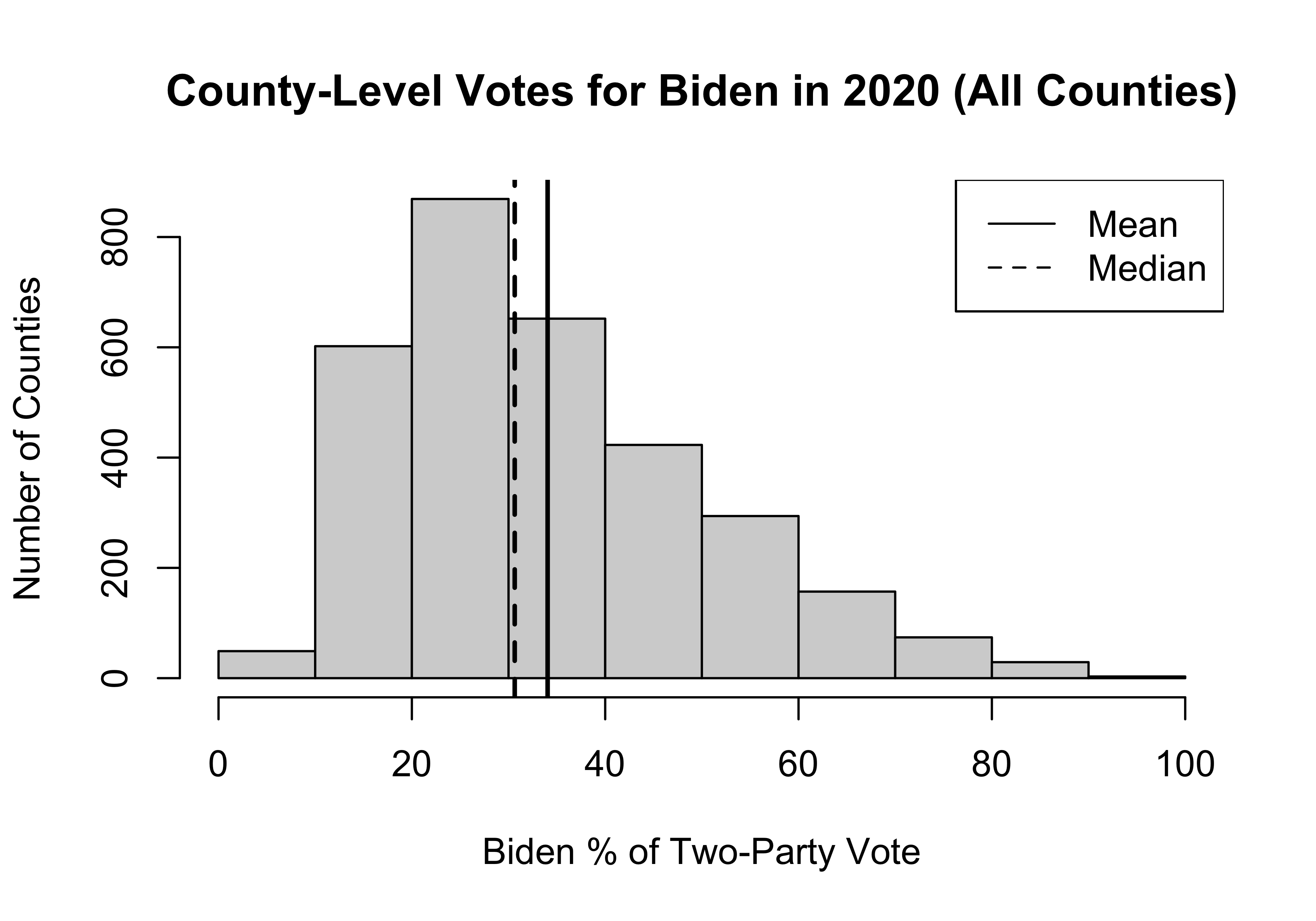
#Get summary stats and skewnesssummary(county20$d2pty20) Min. 1st Qu. Median Mean 3rd Qu. Max.
3.114 21.327 30.640 34.044 43.396 94.467 Skew(county20$d2pty20, na.rm = T)[1] 0.8091358As you can see, this variable is somewhat skewed to the right, with the mean (34.04) a bit larger than the median (30.64), producing a skewness value of .81.21 Since the histogram and statistics reported above are based on the population of counties, not a sample of counties, \(\mu=34.04\).
To get a better idea of what we mean by sampling error, let’s take a sample of 300 counties, randomly drawn from the population of counties, and calculate the mean Democratic percent of the two-party vote in those counties. The R code below shows how you can do this. One thing I want to draw your attention to here is the set.seed() function. This tells R where to start the random selection process. It is not absolutely necessary to use this, but doing so provides reproducible results. This is important in this instance because, without it, the code would produce slightly different results every time it is run (and I would have to rewrite the text reporting the results over and over).
#Tell R where to start the process of making random selections
set.seed(250)
#draw a sample of 300 counties, using "d2pty20";
#store in "d2pty_300"
d2pty300<-sample(county20$d2pty20, 300)
#Get sample stats
summary(d2pty300) Min. 1st Qu. Median Mean 3rd Qu. Max.
6.148 21.144 30.749 33.937 42.503 94.467 The new object created from this code contains, d2pty_300, contains the values of d2pty20 from 300 randomly selected counties. From this sample, we get \(\bar{x}=33.94\). As you can see, the sample mean is not equal to, but is pretty close to the population value (34.04). This is what we expect from a large, randomly drawn sample. One of the keys to understanding sampling is that if we take another sample of 500 counties and calculate another mean from that sample, not only will it not equal the population value, but it will also be different from the first sample mean, as shown below.
Let’s see:
#Different "set.seed" here because I want to show that the
#results from another sample are different.
set.seed(200)
#Draw a different sample of 300 counties
d2pty300b<-sample(county20$d2pty20, 300)
#Summary stats
summary(d2pty300b)
Min. 1st Qu. Median Mean 3rd Qu. Max.
5.459 20.807 30.401 33.461 43.911 83.990 We should not be surprised that we get a different result here (\(\bar{x}=33.46\)), since we are dealing with a different sample. Nor should we be surprised that this sample mean is close in value to the first sample mean (33.94), or that they are both close to the population value (34.04). That’s the nature of sampling.
Sampling Distributions
We could go on like this and calculate a lot of different sample means from a lot of different samples, and they would all take on different values. It is also likely that none of them would be exactly equal to the population value unless by chance, due to rounding. If we kept sampling like this, distribution of sample means we get would constitute a sampling distribution. Sampling distributions are theoretical distributions representing what would happen if we took an infinite number of large, independent samples from the population. Figure 8.1 provides an illustration of a theoretical sampling distribution, where Biden’s percent of the two-party vote in the population of counties is 34.04.
[Figure**** 8.1 ****about here]
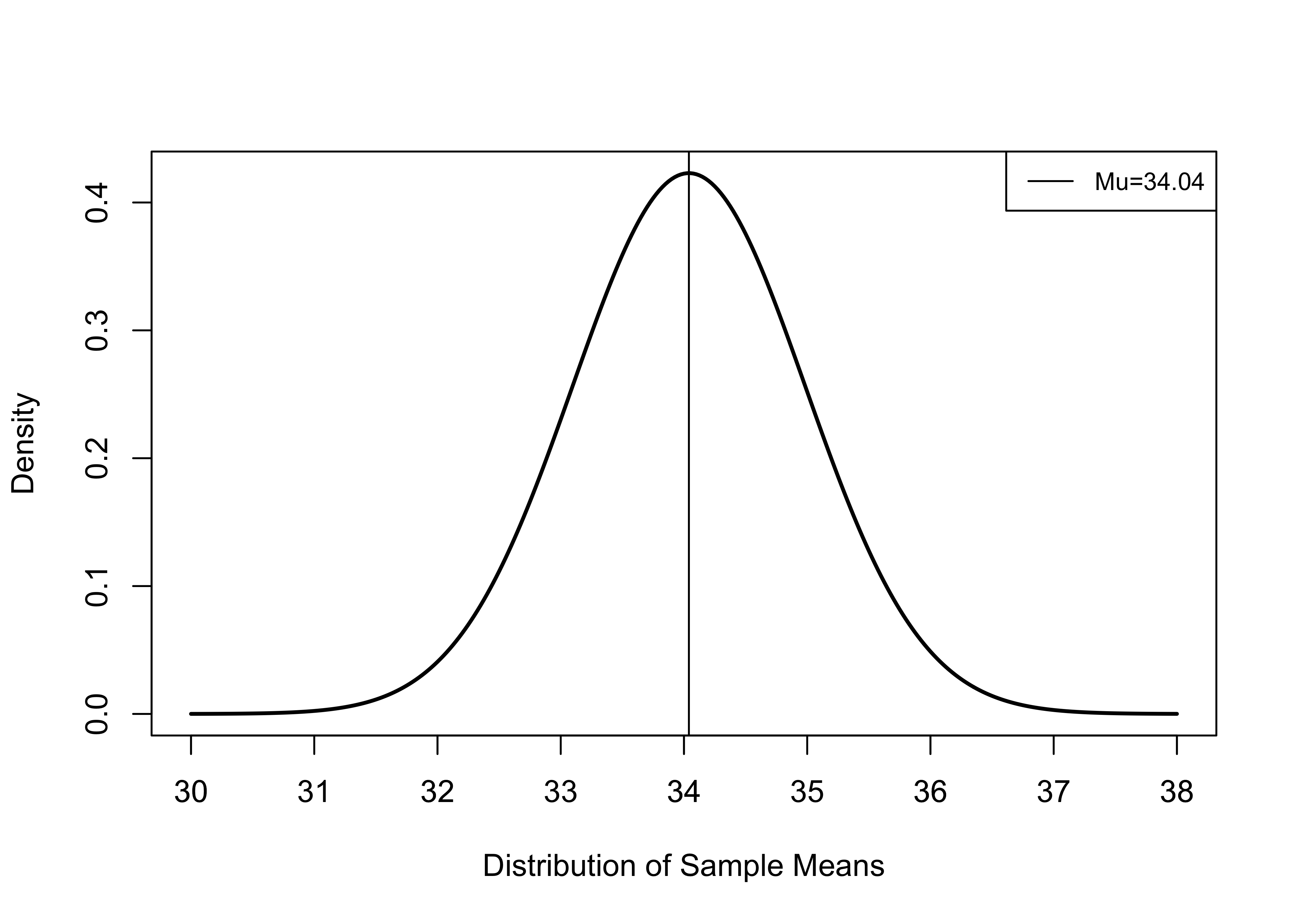
Figure 8.1: A Theoretical Sampling Distribution, mu=34.04, Sample Size=300
To be clear, this figure illustrates a theoretical distribution of sample means that would obtained if we took an infinite number of samples of 300 counties from the population of U.S. counties.
There are several things to note here: the mean of the distribution of sample means (sampling distribution) is equal to the population value (34.04); most of the sample means are relatively close to the population value, between about 32 and 36; and there there are a just few means at the high and low ends of the horizontal axis.
This theoretical distribution reflects a number of important characteristics we can expect from a sampling distribution based on repeated large, random samples from a population with a mean equal to \(\mu\) and a standard deviation equal to \(\sigma\) :
It is normally distributed.
Its mean (the mean of all sample means) equals the population value, \(\mu\).
It has a standard deviation equal to \(\frac{\sigma}{\sqrt{n}}\).
This idea, known as the Central Limit Theorem, holds as long as the sample is relatively large (n > 30). What this means is that statistics (means, proportions, standard deviations, etc.) from large, randomly drawn samples are good approximations of underlying population parameters, as most sample estimates will be relatively close in value to the population parameters.
This makes sense, right? If we take multiple large, random samples from a population, some of the sample statistics should be a bit higher than the population parameter, and some will be a bit lower. And, of course, a few will be a lot higher and a few a lot lower than the population parameter, but most of them will be clustered near the mean (this is what gives the distribution its bell shape). By its very nature, sampling produces statistics that are different from the population values, but the sample statistics should be relatively close to the population values.
It is important to note that the Central Limit Theorem holds for relatively small samples, and the shape of the sampling distribution does not depend on the distribution of the empirical variable. In other words, the variable being measured does not have to be normally distributed in order for the sampling distribution to be normally distributed. This is good, since very few empirical variables follow a normal distribution, including county20$d2pty (used here), which is positively skewed Note, however, that in cases where there are extreme outliers, this rule may not hold.
Simulating the Sampling Distribution
In reality, we don’t actually take repeated samples from the population. Think about it, if we had the population data, we would not need a sample, let alone a sampling distribution. Instead, sampling distributions are theoretical distributions with known characteristics. Still, we can take multiple samples from the population of counties to illustrate that the pattern shown in Figure 8.1 is a realistic expectation. We know from earlier that in the population, the mean county-level share of the two-party vote for Biden was 34.04% (\(\mu=34.04\)), and the distribution is somewhat skewed to the right (skewness=.81), but with no extreme outliers. We can simulate a sampling distribution by taking repeated samples from the population of counties and then observing the shape of the distribution of means from those samples. The resulting distribution should start to look like the distribution presented in Figure 8.1, especially as the number of samples increases.
To do this, I had R take fifty different samples, each of which includes 50 counties, get the mean outcome from each sample, and save those means as a new object called sample_means50. Note that this is a small number of relatively small number of samples, but we should still see the distribution trending toward normal.
Let’s look at the fifty separate samples means:
 [1] 31.24475 34.72631 34.84539 37.19550 34.83349 33.52246 35.85605 35.42220
 [9] 33.60402 32.97881 31.80286 30.33704 33.65232 33.28219 35.40609 35.97478
[17] 37.88739 34.55101 32.68982 30.96713 32.90207 37.19780 30.35538 33.33603
[25] 33.68002 29.96251 33.70846 35.77540 34.63077 35.51688 35.98887 34.35845
[33] 34.97154 38.55704 33.17959 36.86423 31.40136 30.17257 34.18038 35.64399
[41] 38.93687 30.61432 36.25869 32.81192 37.76805 33.14322 40.73194 34.50676
[49] 30.94900 35.40402
Here’s how you read this output. Each of the values represents a single mean drawn from a sample of 50 counties. The first sample drawn had a mean of 31.24 the second sample 34.73, and so on, with the 50th sample having a mean of 35.4. Most of the sample means are fairly close to the population value (34.04), and a few are more distant. Looking at the summary statistics (below), we see that, on average, these fifty sample means balance out to an overall mean of 34.3, which is very close to the population value.
   Min. 1st Qu.  Median    Mean 3rd Qu.    Max.
  29.96   32.92   34.43   34.29   35.74   40.73
Figure 8.2 uses a density plot (solid line) of this sampling distribution, displayed alongside a normal distribution (dashed line), to get a sense of how closely the distribution fits the contours of a normal distribution. As you can see, with just 50 relatively small samples, the sampling distribution is beginning to take on the shape of a normal distribution.
[Figure**** 8.2 ****about here]
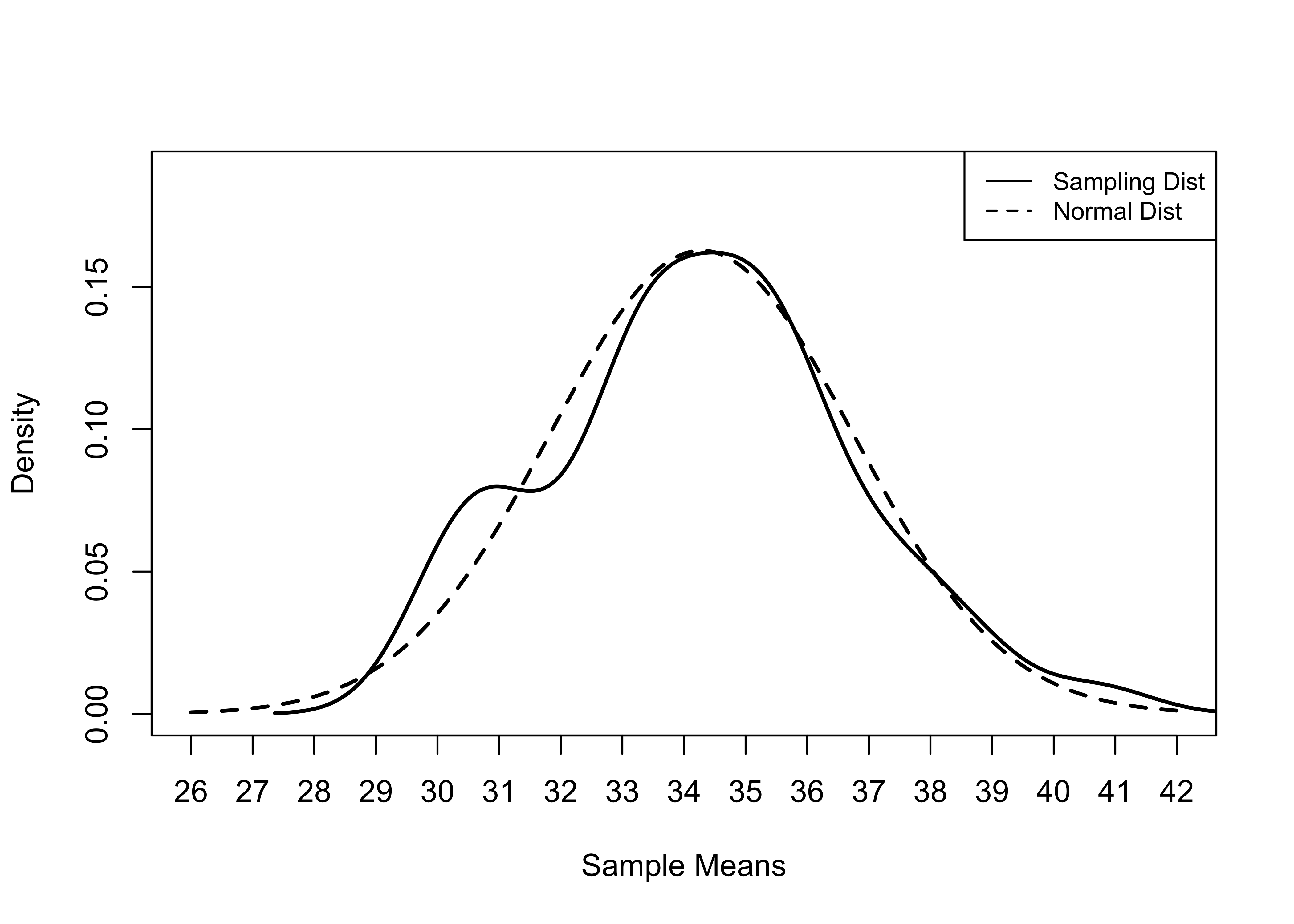
Figure 8.2: Normal Distribution and Simulated Sampling Distribution, 50 Samples of 50 Counties
So, let’s see what happens when we create another sampling distribution but increase the number of samples to 500. In theory, this sampling distribution should resemble a normal distribution more closely. In the summary statistics, we see that the mean of this sampling distribution (33.98) is slightly closer to the population value (34.04) than in the previous example. Further, if you examine the density plot shown in Figure 8.3, you will see that the sampling distribution of 500 samples of 50 counties follows the contours of a normal distribution more closely, as should be the case. If we increased the number of samples to 1000 or 2000, the sampling distributions would grow even more similar to a normal distribution.
[Figure**** 8.3 ****about here]
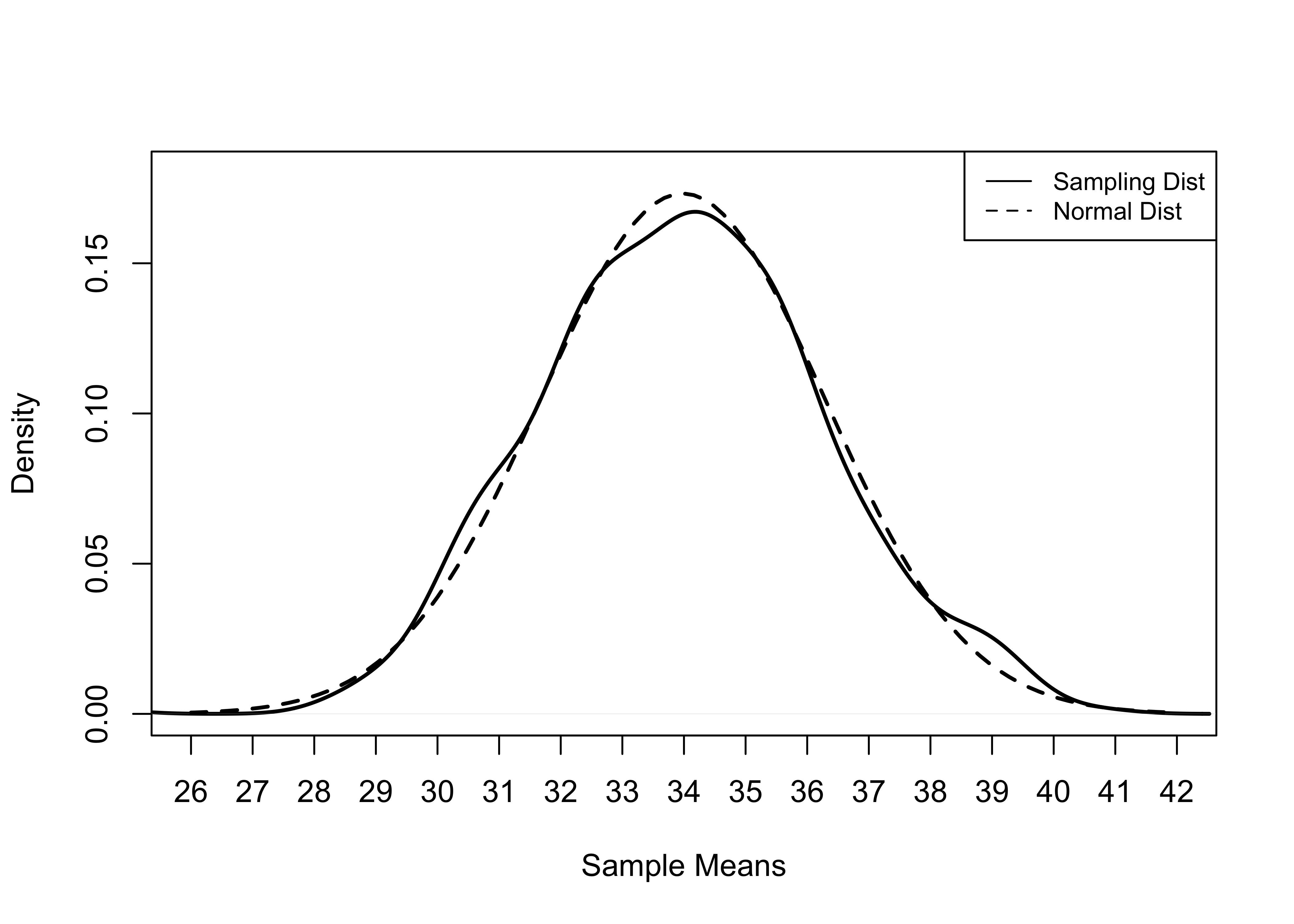
Figure 8.3: Normal Distribution and Sampling Distribution, 500 Samples of 50 Counties
Confidence Intervals
In both cases, the simulations support one of the central tenets of the Central Limit Theorem: With large, random samples, the sampling distribution will be nearly normal, and the mean of the sampling distribution equals \(\mu\). This is important because it is also means that most sample means are fairly close to the mean of the sampling distribution. In fact, because sampling distributions follow the normal distribution(, we know that approximately 68% of all sample means will be within one standard deviation of the population value. We refer to the standard deviation of a sampling distribution as the standard error. In the examples shown above, where the distributions represent collections of different sample means, this is referred to as the standard error of the mean. Remember this, the standard error is a measure of the standard deviation of the sampling distribution.
The formula for a standard error of the mean is:
\[\sigma_{\bar{x}}=\frac{\sigma}{\sqrt{N}}\]
Where \(\sigma\) is the standard deviation of the variable in the population, and \(N\) is the number of observations in the empirical sample.
Of course, this assumes that we know the population value, \(\sigma\), which we do not. Fortunately, because of the Central Limit Theorem, we do know of a good estimate of the population standard deviation, the sample standard deviation. So, we can substitute S (the sample standard deviation) for \(\sigma\):
\[S_{\bar{x}}=\frac{S}{\sqrt{n}}\] This formula is saying that the standard error of the mean is equal to the sample standard deviation divided by the square root of the sample size. Let’s go ahead and calculate the standard error for a sample of just 100 counties (this makes the whole \(\sqrt{N}\) business a lot easier). The observations for this sample are stored in a new object, d2pty100. First, just a few descriptive statistics, presented below. Of particular note here is that the mean from this sample, (32.71) is again pretty close to \(\mu\), 34.04 (Isn’t it nice how this works out?).
set.seed(251)
#draw a sample of d2pty20 from 100 counties
d2pty100<-sample(county20$d2pty20, 100)mean(d2pty100)[1] 32.7098sd(d2pty100)[1] 17.11448We can use the sample standard deviation (17.11) to calculate the standard error of the sampling distribution (based on the characteristics of this single sample of 100 counties):
se100=17.11/10
se100
[1] 1.711Of course, we can also get this more easily:
#This function is in the "DescTools" package.
MeanSE(d2pty100)
[1] 1.711448The mean from this sample is 32.71 and the standard error is 1.711. For right now, treating this as our only sample, 32.71 is our best guess for the population value. We can refer to this as the point estimate. But we know that this is probably not the population value because we would get different sample means if we took additional samples, and they can’t all be equal to the population value; but we also know that most sample means, including ours, are going to be fairly close to \(\mu\).
Now, suppose we want to use this sample information to create a range of values that we are pretty confident includes the population parameter. We know that the sampling distribution is normally distributed and that the standard error is 1.711, so we can be confident that 68% of all sample means are within one standard error of the population value. Using our sample mean as the estimate of the population value (it’s the best guess we have), we can calculate a 68% confidence interval:
\[c.i._{.68}=\bar{x}\pm z_{.68}*S_{\bar{x}}\]
Here we are saying that a 68% confidence interval ranges from the \(\bar{x}\) plus and minus the value for z that give us 68% of the area under the curve around the mean, times the standard error of the mean. In this case, the multiplication is easy because the critical value of z (the z-score for an area above and below the mean of about .68) is 1, so:
\[c.i._{.68}=32.71\pm 1*1.711\]
#Estimate lower limit of confidence interval
LL_68=32.71-1.711
LL_68
[1] 30.999#Estimate upper limit of confidence interval
UL_68=32.71+1.711
UL_68[1] 34.421\[c.i._{.68}=30.999\quad\text{to}\quad34.421\]
The lower limit of the confidence interval (LL) is about 31 and the upper limit (UL) is 34.42, a narrow range of just 3.42 that does happen to include the population value, 34.04.
You can also use the MeanCI function to get a confidence interval around a sample mean:
#You need to specify the standard deviation and level of confidence
MeanCI(d2pty100, sd=17.11, conf.level = .68, na.rm=T)
mean lwr.ci upr.ci
32.70980 31.00828 34.41132 As you can see, the results are very close to those we calculated, with the differences no doubt due to rounding error.
So, rather than just assuming that the \(\mu\)=32.71 based on just one sample mean, we can incorporate a bit of uncertainty that acknowledges the existence of sampling error. We can be 68% confident that this confidence interval includes the \(\mu\). In this case, since we know that the population value is 34.04, we can see that the confidence interval does incorporate the population value. But, usually, we do not know the population values (that’s why we use samples!) and we have to trust that the confidence interval includes the \(\mu\). How much can we trust that this is the case? That depends on the confidence level specified in the setting up the confidence interval. In this case, we can say that we are 68% certain that this confidence interval included the population value.
A good way to think of this is that if we were to calculate 68% confidence intervals across hundreds of samples, 68% of those intervals would include the population value. I demonstrate this idea below, in Figure 8.4, where I plot 50 different 68% confidence intervals around estimates of the Democratic percentage of the two-party vote, based on fifty samples of 100 counties. The expectation is that at least 34 (%68) of the intervals will include the value of \(\mu\) and up to 16 (32%) intervals might not include \(\mu\). The circles represent the point estimates, and the capped vertical lines represent the width limits of the confidence intervals:
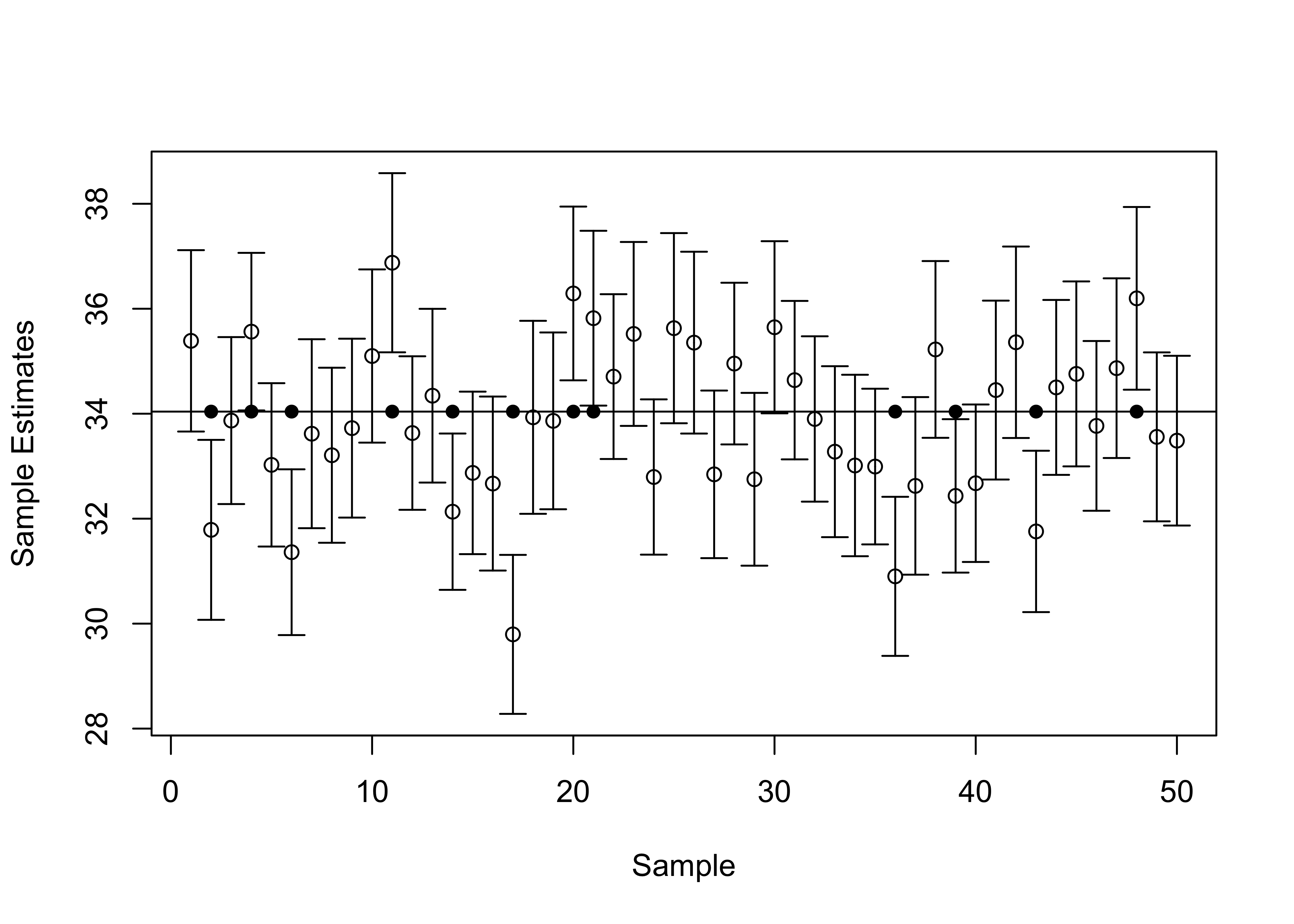
Figure 8.4: Fifty 68 Percent Confidence Intervals, n=100, mu=34.04
[Figure**** 8.4 ****about here]
Here you can see that most of the confidence intervals include \(\mu\) (the horizontal line at 34.04), but there are 12 confidence intervals that do not overlap with \(\mu\), identified with the solid dots on the horizontal line at the value of \(\mu\). This is consistent with our expectation that there is at least a .68 probability that any given confidence interval constructed using a z-score of 1 will overlap with \(\mu\).
In reality, while a 68% confidence interval works well for demonstration purposes, we usually demand a bit more certainty. The standard practice in the social sciences is to use a 95% confidence interval. All we have to do to find the lower- and upper-limits of a 95% confidence interval is find the critical value for z that will give us 42.5% of the area under the curve between the mean and the z-score, leaving .025 of the area under the curve at each of the tails of the distribution. You can use a standard z-distribution table to find the critical value of z, or you can ask R to do it for you, using the qnorm function:
#qnorm gives the z-score for a specified area on the distribution tail.
#Specifying "lower.tail=F" instructs R to find the upper tail area.
qnorm(.025, lower.tail = F)
[1] 1.959964The critical value for \(z_{.95} = 1.96\). So, now we can substitute this into the equation we used earlier for the 68% confidence interval to obtain the 95% confidence interval:
\[c.i._{.95}=32.71\pm 1.96*1.711\] \[c.i_{.95}=32.71\pm 3.35\]
#Estimate lower limit of confidence interval
LL_95=32.71-3.35
LL_95
[1] 29.36#Estimate upper limit of confidence interval
UL_95=32.71+3.35
UL_95[1] 36.06\[c.i_{.95}=29.36\quad\text{to}\quad36.06\]
Check this using the MeanCI command:
MeanCI(d2pty100, sd=17.11, conf.level = .95) mean lwr.ci upr.ci
32.7098 29.3563 36.0633 Now we can say that we are 95% confident that the interval between 29.36 and 36.06 includes the population mean. Technically, what we should say is that 95% of all confidence intervals based on z=1.96 include the value for \(\mu\), so we can be 95% certain that this confidence interval includes \(\mu\).
Sample Size and Confidence Limits
Note that the 95% confidence interval (almost 6.7 points) is wider than the 68% interval (about 3.4 points), because we are demanding a higher level of confidence. Suppose we want to narrow the width of the interval but we do not want to sacrifice the level of confidence. What can we do about this? The answer lies in the formula for the standard error:
\[S_{\bar{x}}=\frac{S}{\sqrt{n}}\]
There is only one thing in this formula that we can manipulate, the sample size. If we took another sample, we would get a very similar standard deviation, something around 17.11. However, we might be able to affect the sample size, and as the sample size increases, the standard error of the mean decreases, as does the width of the confidence interval (holding level of confidence constant).
Let’s look at this for a new, larger sample of 500 counties.
set.seed(251)
#draw a sample of d2pty20 from 500 counties
d2pty500<-sample(county20$d2pty20, 500)mean(d2pty500)[1] 33.24397sd(d2pty500)[1] 15.8867MeanSE(d2pty500)[1] 0.7104747Here, you can see that the mean (33.24) and standard deviation (15.89) are fairly close in value to those obtained from the smaller sample of 100 counties (32.71 and 17.11), but the standard error of the mean is much smaller (.71 compared to 1.71). This difference in standard error, produced by the larger sample size, results in a much narrower confidence interval, even though the level of confidence (95%) is the same:
MeanCI(d2pty500, sd=15.89, conf.level = .95) mean lwr.ci upr.ci
33.24397 31.85118 34.63677 The width of the confidence interval (31.85 to 34.64) is now 2.78 points, compared to 6.7 points for the 100-county sample.
Let’s take a closer look at how the width of the confidence interval responds to sample size, using data from the current example (Figure 8.5)
[Figure**** 8.5 ****about here]
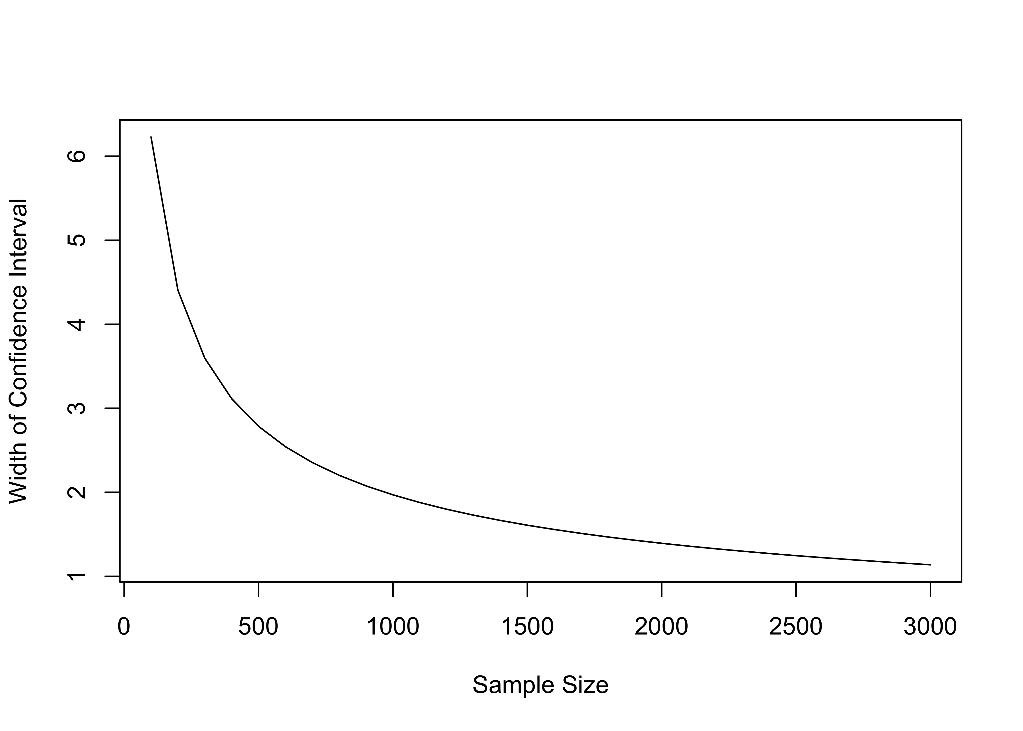
Figure 8.5: Width of a 95 Percent Confidence Interval at Different Sample Sizes (Std Dev.=15.89)
As you can see, as the sample size increases, the width of the confidence intervals decreases, but there are diminishing returns after a point. Moving from small samples of 100 or so to larger samples of 500 or so results in a steep drop in the width of the confidence interval; moving from 500 to 1000 results is a smaller reduction in width; and moving from 1000 to 2000 results in an even smaller reduction in the width of the confidence interval.
This pattern has important implications for real-world research. Depending on how a researcher is collecting their data, they may be limited by the very real costs associated with increasing the size of a sample. If conducting a public opinion poll, or recruiting experimental participants, for instance, each additional respondent costs money, and spending money on increasing the sample size inevitably means taking money away from some other part of the research enterprise.22
Proportions
Everything we have just seen regarding the distribution of sample means also applies to the distribution of sample proportions. It should, since a proportion is just the mean of a dichotomous variable scored 0 and 1. For example, with the same data used above, we can focus on a dichotomous variable that indicates whether Biden won (1) or lost (0) in each county. The mean of this variable across all counties is the proportion of counties won by Biden.
#Create dichotomous indicator for counties won by Biden
demwin<-as.numeric(county20$d2pty20 >50)
table(demwin)
demwin
0 1
2595 557 mean(demwin, na.rm=T)[1] 0.1767132Biden won 557 counties and lost 2595, for a winning proportion of .1767. This is the population value (\(P\)).
Again, we can take multiple samples from this population and none of the proportions calculated from them may match the value of \(P\) exactly, but most of them should be fairly close in value and the mean of the sample proportions should equal the population value over infinite sampling.
Let’s check this out for 500 samples of 50 counties each, stored in a new object, sample_prop500.
summary(sample_prop500) Min. 1st Qu. Median Mean 3rd Qu. Max.
0.0200 0.1400 0.1800 0.1742 0.2000 0.3400 Here we see that the mean of the sampling distribution (.1742) is, as expected, very close to the population proportion (.1767), and the distribution has very little skew. The density plots in Figure 8.6 show that the shape of the sampling distribution mimics the shape for the normal distribution fairly closely. This is all very similar to what we saw with the earlier analysis using the mean Democratic share of the two-party vote.
[Figure**** 8.6 ****about here]
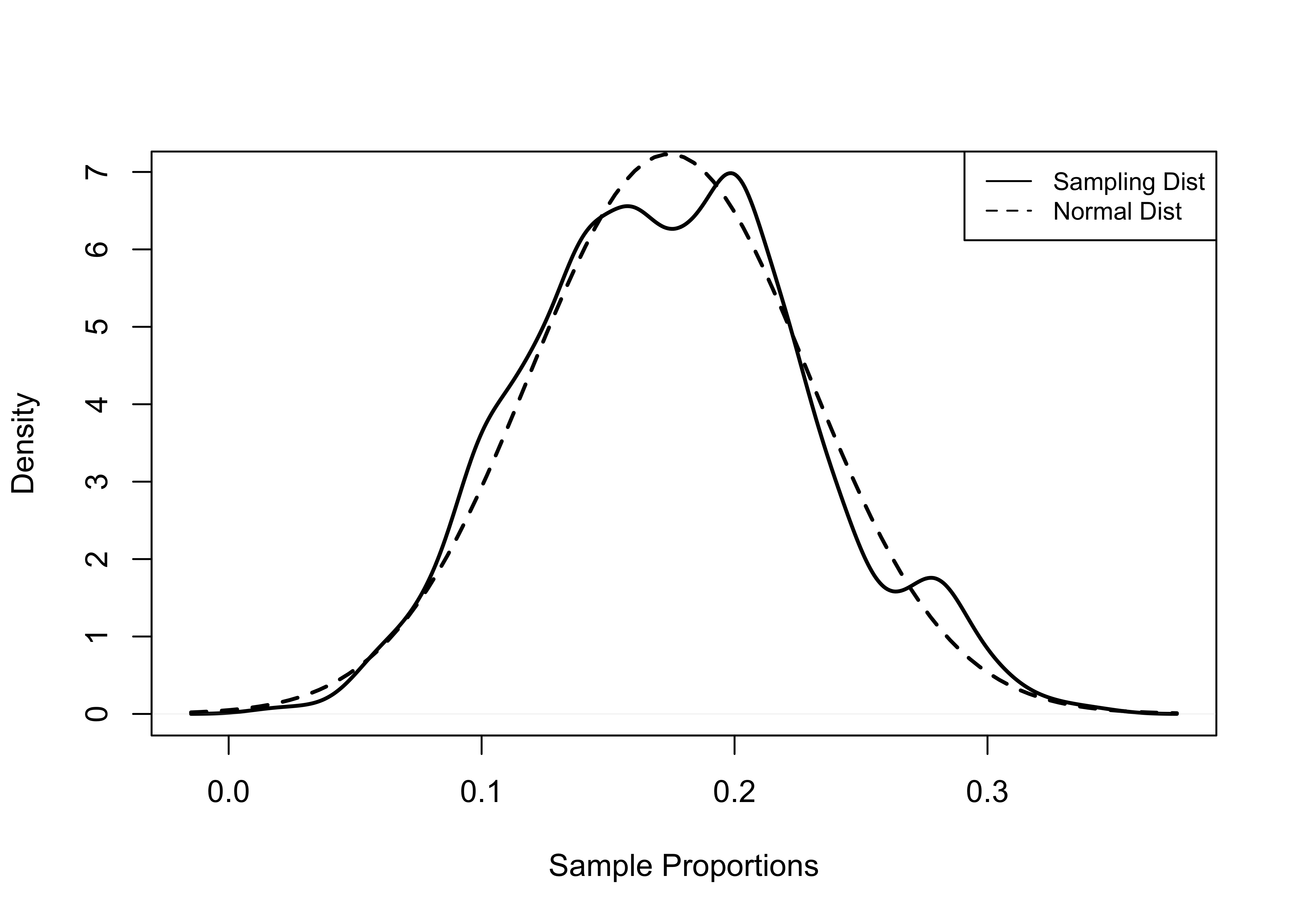
Figure 8.6: Normal and Sampling Distribution (Proportion), 500 Samples of 50 Counties
Everything we learned about confidence intervals around the mean also applies to sample estimates of the proportion. A 95% confidence interval for a sample proportion is:
\[c.i.{_.95}=p\pm z_{.95}*S_{p}\]
Where the standard error of the proportion is calculated the same as the standard error of the mean: the standard deviation divided by the square root of the sample size.
Let’s turn our attention to estimating a confidence interval for the proportion of counties won by Biden from a single sample with 300 observations (demwin300).
set.seed(251)
#Sample 300 counties for demwin
demwin300<-sample(demwin, 300)
mean(demwin300)
[1] 0.1533333sd(demwin300)[1] 0.3609105For the sample of 300 counties taken above, the mean is .153, which is quite a bit lower that the known population value of .1767, and the standard deviation is .3609. To calculate the a 95% confidence interval, we need to estimate the standard error.23
seprop300=.3609/sqrt(300)
seprop300
[1] 0.02083657We can now plug the standard error of the proportion into the confidence interval:
\[c.i._{.95}=.153\pm 1.96*.0208\] \[c.i._{.95}=.153\pm .041\]
#Estimate lower limit of confidence interval
LL_95=.153-.041
LL_95
[1] 0.112#Estimate upper limit of confidence interval
UL_95=.153+.041
UL_95[1] 0.194\[c.i.{_.95}=.112\quad\text{to}\quad.194\]
Check this with MeanCI:
MeanCI(demwin300, sd=.3609, conf.level = .95) mean lwr.ci upr.ci
0.1533333 0.1124944 0.1941723 The confidence interval is .082 points wide, meaning that we are 95% confident that the interval between .112 and .194 includes the population value for this variable. If you want to put this in terms of percentages, we are 95% certain that Biden won between 11.2% and 19.4% of counties.
The “\(\pm\)” part of the confidence interval might sound familiar to you from media reports of polling results. This figure is sometimes referred to as the margin of error. When you hear the results of a public opinion poll reported on television and the news reader adds language like “plus or minus 3.3 percentage points,” they are referring to the confidence interval (usually 95% confidence interval), except they tend to report percentage points rather than proportions.
So, for instance, in the example shown below, the Fox News poll taken between September 12-September 15, 2021, with a sample of 1002 respondents, reported President Biden’s approval rating at 50%, with a margin of error of \(\pm 3.0\).
If you do the math (go ahead, give it a shot!), based on \({p}=.50\) and \(n=1002\), this \(\pm3.0\) corresponds with the upper and lower limits of a 95% confidence interval ranging from .47 to .53. So we can say with a 95% level of confidence that at the time of the poll, President Biden’s approval rating was between .47 (47%) and .53 (53%), according to this Fox News Poll.
Next Steps
Now that you have learned about some of the important principles of statistical inference (sampling, sampling error, and confidence intervals), you have all the tools you need to learn about hypothesis testing, which is taken up in the next chapter. In fact, it is easy to illustrate how you could use one important tool–confidence intervals–to test certain types of hypotheses. For instance, using the results of Fox News poll reported above, if someone stated that they thought Biden’s approval rating was no higher than 45% at the time of the poll, you could tell them that you are 95% certain that they are wrong, since you have a 95% confidence interval for Biden’s approval rating that ranges from 47% to 53%, which means that the likelihood of it being 45% or lower is very small. Hypothesis testing gets a bit more complicated than this, but this example captures the spirit of it very well: we use sample data to test ideas about the values of population parameters. On to hypothesis testing!
Exercises
Concepts and Calculations
A group of students on a college campus are interested in how much students spend on books and supplies in a typical semester. They interview a random sample of 300 students and find that the average semester expenditure is $350 and the standard deviation is $78.
Are the results reported above from an empirical distribution or a sampling distribution? Explain your answer.
Calculate the standard error of the mean.
Construct and interpret a 95% confidence interval around the mean amount of money students spend on books and supplies per semester.
In the same survey used in question 1, students were asked if they were satisfied or dissatisfied with the university’s response to the COVID-19 pandemic. Among the 300 students, 55% reported being satisfied. The administration hailed this finding as evidence that a majority of students support the actions they’ve taken in reaction to the pandemic. What do you think of this claim? Of course, as a bright college student in the midst of learning about political data analysis, you know that 55% is just a point estimate and you really need to construct a 95% confidence interval around this sample estimate before concluding that more than half the students approve of the administration’s actions. So, let’s get to it. (Hint: this is a “proportion” problem)
Calculate the standard error of the proportion. What does this represent?
Construct and interpret a 95% confidence interval around the reported proportion of students who are satisfied with the administration’s actions.
Is the administration right in their claim that a majority of students support their actions related to the pandemic?
One of the data examples used in Chapter Four combined five survey questions on LGBTQ rights into a single index ranging from 0 to 6. The resulting index has a mean of 3.4, a standard deviation of 1.56, and a sample size of 7,816.
- Calculate the standard error of the mean and a 95% confidence interval for this variable.
- What is the standard error of the mean if you assume that the sample size is 1,000?
- What is the standard error of the mean if you assume that the sample size is 300?
- Discuss how the magnitude of change in sample size is related to changes in the standard error in this example.
- Calculate the standard error of the mean and a 95% confidence interval for this variable.
R Problems
For these problems, you should use load the county20large data set to analyze the distribution of internet access across U.S. counties, using county20large$internet. This variable measures the percent of households with broadband access from 2015 to 2019.
Describe the distribution of
county20large$internet, using a histogram and the mean, median, and skewness statistics. Note that since these 3142 counties represent the population of counties, the mean of this variable is the population value (\(\mu\)).Use the code provided below to create a new object named
web250that represents a sample of internet access in 250 counties, drawn fromcounty20large$internet.
set.seed(251)
web250<-sample(county20large$internet, 250)
Once you’ve generated your sample, describe the distribution of
web250using a histogram and the sample mean. How does this distribution compare to population values you produced in Question #1?Create a new object that represents a sample of internet access rates in 750 counties, drawn from
county20large$internet. Name this objectweb750. Describe the distribution ofweb750using a histogram and the sample mean. How does this distribution compare to population values you produced in question #1? Does it resemble the population more closely than the distribution ofweb250does? If so, in what ways?Use
MeanSEandMeanCIto produce the standard errors and 95% confidence intervals for bothweb250andweb750. Use words to interpret the substantive meaning of both confidence intervals. How are the confidence intervals and standard errors in these two samples different from each other? How do you explain these differences?
Presidential votes cast in Alaska are not tallied at the county level (officially, Alaska does not use counties), so this data set includes the forty electoral districts that Alaska uses, instead of counties.↩︎
You might look at this distribution and wonder how the average Biden share of the two-party vote could be roughly 34% when he captured 52% of the national two party vote. The answer, of course, is that Biden won where more people live while Trump tended to win in counties with many fewer voters. In fact, just over 94 million votes were cast in counties won by Biden, compared to just over 64 million votes in counties won by Trump.↩︎
Of course there reasons other than minimizing sampling error to favor large samples, such as providing larger sub-samples for relatively small groups within the population, or in anticipation of missing information on some of the things being measured.↩︎
Recall from Chapter 6, that you can calculate the standard deviation of a proportion based on the value of value of p: \(S=\sqrt{p*(1-p)}\) . This means that we can calculate the standard error of the proportion as:\(S=\frac{\sqrt{p*(1-p)}}{\sqrt{n}}\).↩︎