Chapter 12 Hypothesis Testing with Non-Numeric Variables (Crosstabs)
Getting Ready
This chapter, explores ways to analyze relationships between two variables when the dependent variable is non-numeric, either ordinal or nominal in nature. To follow along in R, you should load the anes20 data set and make sure to attach the libraries for the descr, dplyr, and Hmisc packages.
Crosstabs
ANOVA is a useful tool for examining relationships between variables, especially when the dependent variable is numeric. However, suppose we are interested in using data from the 2020 ANES survey to study how various independent variables are related to religiosity (dependent variable), measured as the importance of religion in one’s life. We can’t do this with ANOVA because it relies on differences in the average outcome of the dependent variable across categories of the independent variable, and the dependent variable in this case (importance of religion) is a three-category ordinal variable. Many of the variables that interest us—especially if we are using public opinion surveys—are measured at the nominal or ordinal level, so ANOVA is not an appropriate method in these cases.
Instead, we can use a crosstab (for cross-tabulation), also known as a contingency table (I use both “crosstab” and “contingency table” interchangeably to refer to this technique). A crosstab is nothing more than a joint frequency distribution that simultaneously displays the outcomes of two variables. You were introduced to crosstabs in Chapter 7, where one was used to demonstrate conditional probabilities.
Regional Differences in Religiosity
We begin the analysis of religiosity by examining regional differences in the importance of religion. Traditionally, the American South and parts of the Midwest are thought of as the “Bible Belt,” so we expect to see distinctive outcomes across the four broadly defined regions in the ANES data (anes20$V203003): Northeast, Midwest, South and West.
Before looking at a crosstab for region and religiosity, we need to collapse and reorder categories of religiosity from a five-category variable (anes20$V201433) that measures religious importance on a scale ranging from “1. Extremely Important” to “5. Not important at all” into a three-category variable that ranges from “Low” to “Moderate” to “High” (anes20$relig_import).
#Create religious importance variable
anes20$relig_imp<-anes20$V201433
#Recode Religious Importance to three categories
levels(anes20$relig_imp)<-c("High","High","Moderate", "Low","Low")
#Change order to Low-Moderate-High
anes20$relig_imp<-ordered(anes20$relig_imp, levels=c("Low",
                                                     "Moderate", "High"))
Now, let’s look at the table below, which illustrates the relationship between region (anes20$V203003) and religiosity (anes20$relig_imp). To review some of the basic elements of a crosstab covered earlier, this table contains outcome information for the independent and dependent variables. Each row represents a value of the dependent variable (religiosity) and each column a value of the independent variable (region). Each of the interior cells in the table represent the intersection of a given row and column, or the joint frequency of outcomes on the independent and dependent variables. At the bottom of each column and the end of each row, are the row and column totals, also known as the marginal frequencies. These totals are the category frequencies for the dependent and independent variables, and the overall sample size (bottom right corner) is restricted to the 8249 people who answered both survey questions.
#Get a crosstab, list the dependent variable first
crosstab(anes20$relig_imp, anes20$V203003,
         prop.c=T, #Add column percentages
         plot=F)
Cell Contents
|-------------------------|
| Count |
| Column Percent |
|-------------------------|
==========================================================================
SAMPLE: Census region
anes20$relig_imp 1. Northeast 2. Midwest 3. South 4. West Total
--------------------------------------------------------------------------
Low 549 649 811 782 2791
39.4% 32.6% 26.4% 43.5%
--------------------------------------------------------------------------
Moderate 320 385 548 343 1596
23.0% 19.3% 17.9% 19.1%
--------------------------------------------------------------------------
High 525 956 1710 671 3862
37.7% 48.0% 55.7% 37.4%
--------------------------------------------------------------------------
Total 1394 1990 3069 1796 8249
16.9% 24.1% 37.2% 21.8%
==========================================================================This crosstab includes two important pieces of information. The raw frequencies and the column percentages for each cell. The raw frequencies play a very important role in calculating a number of different summary statistics for the crosstab, but they are hard to interpret on their own because the column totals are not equal. For instance, 549 people from the Northeast attached a low level of importance to religion, which is fewer than the 649 people from the Midwest who are low on the religious importance scale. Does this mean that people from the Midwest are more likely to attach a low level of importance to religion than people from the Northeast? It’s hard to tell by the cell frequencies alone because the base, or the total number of people in each of the regional categories, is different for each column.
Instead of relying on raw frequencies, we need to standardize the frequencies by their base (the column totals). This gives us column proportions/percentages, which can be used to make judgments about the relative levels of religiosity across different regional groups. Column percentages adjust each cell to the same metric, making the cell contents comparable.
Now, it is easier to judge the relationship between these two variables. The percentages represent the percent within each column that reported each of the outcomes of the row variable. We can look within the rows and across the columns to assess how the likelihood of being in one of the religious importance categories is affected by being in one of the region categories.
Interpreting the Crosstab
Is there a relationship between region and level of religious importance? How can we tell? This depends on whether the column percentages change much from one column to the next as you scan within the row categories. If the column percents in the “Low” religious importance row are constant (do not change) across categories of region, this could be taken as evidence that region is not related to religiosity. If we see a pattern of no substantial changes in the column percentages within multiple categories of the dependent variable, then there is a strong indication that there is not a relationship between the two variables. But this is not the case in the table presented above. Instead, it seems that the outcomes of the dependent variable depend upon the outcomes of the independent variable.
The crosstab for region and religiosity shows what appear to be important regional differences in self-identified level of religiosity. The column percentages for the “Low” religious importance row range from a low of 26.4% for respondents from the South, to 32.6% for Midwesterners, to 39.4% for Northeastern respondents, to 43.5% for respondents from the West. The polar opposite of this pattern is found in the “High” religious importance row, with Midwestern (48%) and Southern (55.7%) respondents having the highest column percentages, and Northeastern (37.7%) and Western (37.4%) respondents having the lowest. Generally, this tells us that respondent level of religiosity varies across regions of the country. More specifically, this tells us that Midwestern and Southern respondents assign more importance to religion than do Northeastern and Western respondents.
It is easy to see why crosstabs are also referred to as contingency tables: because the outcome of the dependent variable is contingent upon the value of the independent variable. This should sound familiar to you, as the column percentages are giving the same information as conditional probabilities.
Mosaic Plots
One problem with reading crosstabs and column percentages is that there is a lot of information in the table and sometimes it can be difficult to process it all. Even in the simple table presented above, there are 12 different column percentages to process. You may recall that this was one of the limitations with frequency tables, especially for variables with several categories—the numbers themselves can be a bit difficult for some people to sort out. Just as bar plots and histograms can be useful tools to complement frequency tables, mosaic plots can be useful summary graphs for crosstabs (you can get the mosaic plot by adding plot=T to the crosstab function).
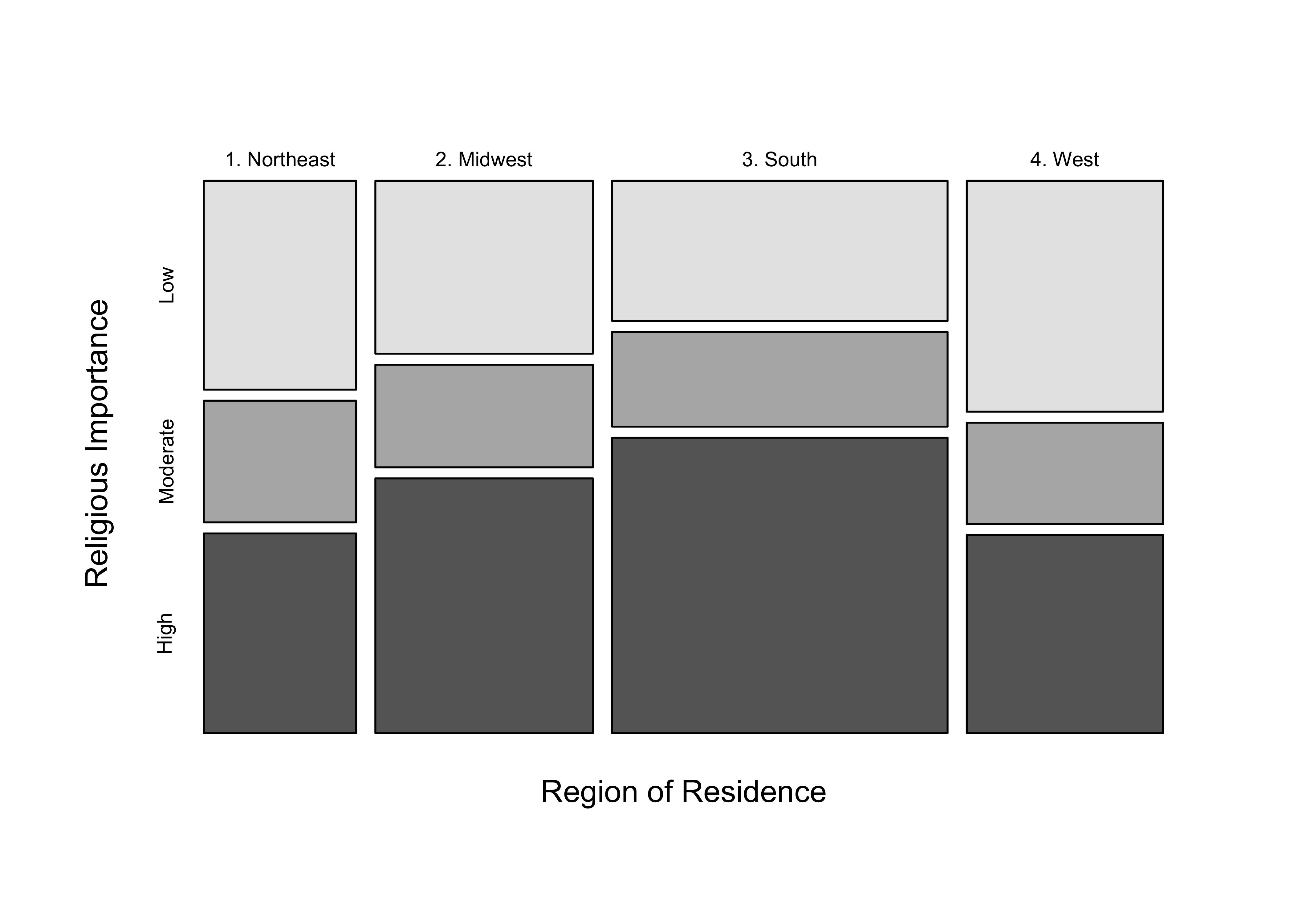
Figure 12.1: Example of a Mosiac Plot
[Figure** 12.1 **about here]
In the mosaic plot in Figure 12.1, the horizontal width of each column reflects the relative sample size for each category of the independent variable, and the vertical length of the differently shaded boxes within the columns reflects the magnitude of the column percentages. Usually, the best thing to do is focus on how the height of the differently shaded segments (boxes in each row) changes as you scan from left to right. For instance, the height of the light gray bars (low religious importance) is greatest for the Western and Northeastern columns, and the shortest for the Southern and Midwestern columns as you scan across regions, while the opposite pattern holds for the darkest column segments (high religious importance). These changes correspond to changes in the column percentages and reinforce the findings from the crosstab. Does the mosaic plot clarify things for you? If so, make sure to take advantage of its availability. If not, it’s worth checking in with your instructor for help making sense of this useful tool.
Sampling Error
It appears that there is a relationship between region and religiosity. However, since these data are from a sample, we do not know if we can infer that there is a relationship in the population. As you know by now, if we took another sample and used the same two variables, we would get a different table with somewhat different percentages in the cells. Presumably, a table from a second sample would look a lot like the table from the first sample, but there would be differences. The same would be true of any successive samples we might take. And, of course, if there is no relationship between these two variables in the population, some number of samples drawn from that population would still feature differences in the column percentages, perhaps of the magnitude found in our sample, just due to sampling error. What we need to figure out is if the relationship in the table produced by this sample is significantly different from what would be expected if there were no relationship between these two variables in the population.
Think about what this table would look like if there were no relationship between these two variables. In that case, we would expect to see fairly constant percentages as we look from across the columns. We don’t necessarily expect to see exactly the same percentages across the columns; after all, we should see some differences due to sampling error alone. However, the differences in column percentages would be rather small if there were no relationship between the two variables.
But what should we expect those column percentages to be? Since, for the overall sample, we find that about 34% of the cases are in the low importance row (2781 total in that row, divided by 8249 total sample size in the table), we should see about 34%, or very slight deviations from that in this row across the columns, if there is no relationship. And the same for the other column percentages within rows; they should be close to the row total percentages (19% for “Moderate”, 47% for “High”).
When evaluating a mosaic plot, if there is no relationship between the independent and dependent variables, the height of the shaded boxes within each row should not vary across columns. In the plot shown above, the height of the boxes does vary across columns, but more so in the first row and last row than in the middle row.
Hypothesis Testing with Crosstabs (Chi-square)
The crosstab shown above appears to deviate somewhat from what we would expect to see if there were no relationship between these two variables, but not dramatically. But what we need is a test of statistical significance that tells us if the differences that we observe across the columns are large enough that we can conclude that they did not occur due to sampling error; something like a t-test or an F-ratio. Fortunately, we have just that type of statistic available to us.
Chi-square (\(\chi^2\)) is a statistic that can be used to judge the statistical significance of a bivariate table; it compares the observed frequencies in the cells to the frequencies that would be expected if there were no relationship between the two variables. If the differences between the observed and expected outcomes are large, \(\chi^2\) should be relatively large; when the differences are rather small, \(\chi^2\) should be relatively small.
The process for using \(\chi^2\) as a test of statistical significance is the same as that which underlies the F-ratio and t-score: we calculate a \(\chi^2\) statistic and compare it to a critical value (CV) for \(\chi^2\). If \(\chi^2\) is greater than the critical value, then we can reject the null hypothesis; if \(\chi^2\) is less than the critical value, we fail to reject the null hypothesis and conclude that there is no relationship between the two variables (in the parlance of chi-square, we would say the two variables are “statistically independent”).
The null and alternative hypotheses for a \(\chi^2\) test are:
H0: No relationship. The two variables are statistically independent.
H1: There is a relationship. The two variables are not statistically independent
Note that H1 specifies a non-directional hypothesis, this is always the case with \(\chi^2\).
To test H0, we calculate the \(\chi^2\) statistic:
\[\chi^2=\sum{\frac{(O-E)^2}{E}}\]
Where:
O=observed frequency for each cell
E=expected frequency for each cell; that is, the frequency we expect if there is no relationship (H0 is true).
Chi-square is a table-level statistic that is based on summing information from each cell of the table. In essence, \(\chi^2\) reflects the extent to which the outcomes in each cell (the observed frequency) deviate from what we would expect to see in the cell if the null hypothesis were true (expected frequency). If the null hypothesis is true, we would expect to see very small differences between the observed and expected frequencies.
Raw frequencies (instead of column percentages) are used to calculate \(\chi^2\) because column percentages treat each column and each cell with equal weight, even though there are important differences in the relative contribution of the columns and cells to the overall sample size. For instance, the total number of cases in the “Northeast” column (1394) accounts for only 16.9% of total respondents in the table, so giving its column percentages the same weight as those for the “South” column, which has 37.2% of all cases, would over-represent the importance of the first column to the pattern in the table.
Let’s use the table of raw frequencies below to walk through the calculation of the chi-square contribution of upper-left cell in the table (Low, Northeast). The observed frequency (the frequency produced by the sample) in this cell is 549. From the discussion above, we know that for the sample overall, about 34% (actually 33.83%) of respondents are in the first row of the dependent variable, so we expect to find about 34% of all respondents from the northeast in this column. Because we are using raw frequencies instead of percentages, we need to calculate what 33.83% of the total number of observations in the first column is to get the expected frequency. There are 1394 respondents in this column, so the expected frequency for this cell is \(.3383*1394=471.59\).
#Crosstab with raw frequencies
crosstab(anes20$relig_imp, anes20$V203003, plot=F)
Cell Contents
|-------------------------|
| Count |
|-------------------------|
==========================================================================
SAMPLE: Census region
anes20$relig_imp 1. Northeast 2. Midwest 3. South 4. West Total
--------------------------------------------------------------------------
Low 549 649 811 782 2791
--------------------------------------------------------------------------
Moderate 320 385 548 343 1596
--------------------------------------------------------------------------
High 525 956 1710 671 3862
--------------------------------------------------------------------------
Total 1394 1990 3069 1796 8249
==========================================================================A shortcut for calculating expected frequency for any cell is : \[E_{c,r}=\frac{f_c*f_r}{n}\] where fc is the column total for a given cell, fr if the row total, and n is the total sample size. For the upper-left cell in the crosstab: \((1394*2791)/8249=471.65\), virtually the same as expected value using the first method of calculation. So, the observed frequency for upper-left cell of the table is 549, and the expected frequency is 471.65.
To estimate this cell’s contribution to the \(\chi^2\) statistic for the entire table:
\[\chi^2_c=\frac{(549-471.65)^2}{471.65}=\frac{77.37^2}{471.65}=\frac{5983.02}{471.65}=12.685\]
To get the value of \(\chi^2\) for the whole table we need to calculate the expected frequency for each cell, use that to estimate the cell contributions to the overall value of chi-square, and sum up all of the cell-specific values.
The table below shows the observed and expected frequencies (first two rows), as well as the cell contribution to overall \(\chi^2\) for each cell of the table (third row):
#Get expected frequencies and cell chi-square contributions
crosstab(anes20$relig_imp, anes20$V203003,
         expected=T, #Add expected frequency to each cell
         prop.chisq = T, #Total contribution of each cell
         plot=F)
Cell Contents
|-------------------------|
| Count |
| Expected Values |
| Chi-square contribution |
|-------------------------|
==========================================================================
SAMPLE: Census region
anes20$relig_imp 1. Northeast 2. Midwest 3. South 4. West Total
--------------------------------------------------------------------------
Low 549 649 811 782 2791
471.7 673.3 1038.4 607.7
12.685 0.877 49.790 50.015
--------------------------------------------------------------------------
Moderate 320 385 548 343 1596
269.7 385.0 593.8 347.5
9.378 0.000 3.530 0.058
--------------------------------------------------------------------------
High 525 956 1710 671 3862
652.6 931.7 1436.8 840.8
24.963 0.635 51.932 34.308
--------------------------------------------------------------------------
Total 1394 1990 3069 1796 8249
==========================================================================First, note that the overall contribution of the upper-left cell to the table \(\chi^2\) is 12.685, the same as the calculation we made above. As you can see, there are generally substantial differences between expected and observed frequencies, except for the second (Midwest) column, again indicating that there is not a lot of support for the null hypothesis. If we were to work through all of the calculations and sum up all of the individual cell contributions to \(\chi^2\), as below, we come up with \(\chi^2=238.171\).
#Sum the individual cell contributions to shi-square
12.685+.877+49.79+50.015+9.378+3.530+.058+24.963+.635+51.932+34.308
[1] 238.2So, what does this mean? Is this a relatively large value for \(\chi^2\)? This is not a t-score or F-ratio, so we should not judge the number based on those standards. But still, this seems like a pretty big number. Does this mean the relationship in the table is statistically significant?
One important thing to understand is that the value of \(\chi^2\) for any given table is a function of three things: the strength of the relationship, the sample size, and the size of the table. Of course, the strength of the relationship and the sample size both affect the level of significance for other statistical tests, such as the t-score and f-ratio. But it might not be immediately clear why the size of the table matters? Suppose we had two tables, a 2x2 table and a 4x4 table, and that the relationships in the two tables were of the same magnitude and the sample sizes also were the same. Odds are that the chi-square for the 4x4 table would be larger than the one for the 2x2 table, simply due to the fact that it has more cells (16 vs. 4). The chi-square statistic is calculated by summing all the individual cell contributions, four for the 2x2 table and sixteen for the 4x4 table. The more cells, the more individual cell contributions to the table chi-square value. Given equally strong relationships, and equal sample sizes, a larger table will tend to generate a larger chi-square. This means that we need to account for the size of the table before concluding whether the value of \(\chi^2\) is statistically significant. Similar to the t-score and F-ratio, we do this by calculating the degrees of freedom:
\[df_{\chi^2} = (r-1)(c-1)\].
Where r = number of rows and c = number of columns in the table. This is a way of taking into account the size of the table.
The df for the table above is (3-1 )( 4-1 )=6
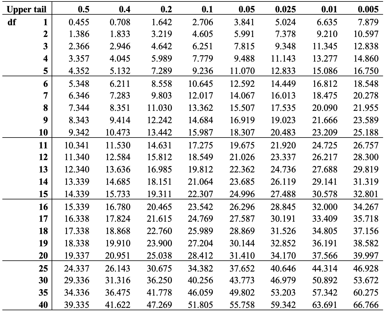
We can look up the critical value for \(\chi^2\) with 6 degrees of freedom, using the chi-square table below.32 The values across the top of the \(\chi^2\) distribution table are the desired levels of significance (area under the curve to the right of the specified critical value), usually .05, and the values down the first column are the degrees of freedom. To find the c.v. of \(\chi^2\) for this table, we need to look for the intersection of the column headed by .05 (the desired level of significance) and the row headed by 6 (the degrees of freedom). That value is 12.59.
[Table 12.1 about here]
Table 12.1: Chi-square Critical Values
We can also get the critical value for \(\chi^2\) from the qchisq function in R, which requires you to specify the preferred p-value (.05), the degrees of freedom (6) and the upper end of the distribution (lower.tail=F):
#Critical value of chi-square, p=.05, df=8
qchisq(.05, 6, lower.tail=F)
[1] 12.59This function confirms that the critical value for \(\chi^2\) is 12.59. Figure 12.2 illustrates location of chi-square value of 12.59 in a chi-square distribution when df=8. The area under the curve to the right of the critical value equals .05 of the total area under the curve, so for any obtained value of chi-square greater than 12.59, the p-value is less than .05 and the null hypothesis can be rejected. In the example used above, \(\chi^2=238.17\), a value far to the right of the critical value, so we reject the null hypothesis. Based on the evidence presented here, there is a relationship between region and the importance of religion in one’s life.
[Figure** 12.2 **about here]
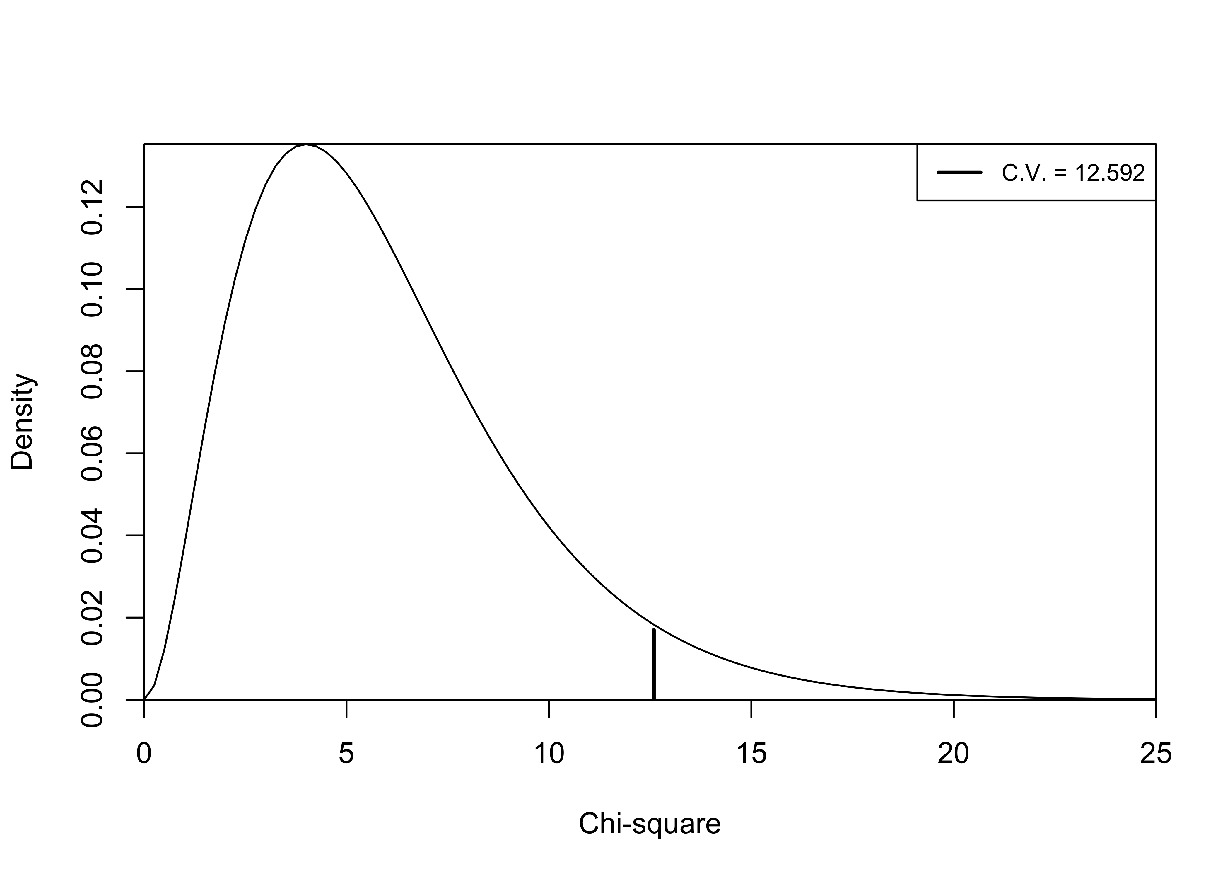
Figure 12.2: Chi-Square Distribution, df=6
You can get the value of \(\chi^2\), along with degrees of freedom and the p-value from R by adding chisq=T to the crosstab command. You can also get it from R by using the chisq.test function, as shown below.
#Get chi-square statistic from R
chisq.test(anes20$relig_imp, anes20$V203003)
    Pearson's Chi-squared test

data:  anes20$relig_imp and anes20$V203003
X-squared = 238, df = 6, p-value <2e-16
Here, we get confirmation of the value of \(\chi^2\) (238.17), and degrees of freedom (6). We also get a more precise report of the p-value (area on the tail of the distribution, beyond our chi-square value). In this case, we get scientific notation (p<2e-16), which tells us that p< .0000000000000002, a number far less than the cutoff point of .05. In cases like this, you can just report the p< .05.
Education and Religiosity
Let’s take a look at another example, using the same dependent variable, but switching to a different independent variable level of educational attainment. Of course the null and alternative hypotheses are:
H0: No relationship. Importance of religion and educational attainment are statistically independent
H1: There is a relationship. Importance of religion and educational attainment are not statistically independent.
The first step is to relabel (shorten) the categories for educational attainment so they fit better in the crosstab:
#create new education variable
anes20$educ<-ordered(anes20$V201511x)
#shorten the category labels for education
levels(anes20$educ)<-c("LT HS", "HS", "Some Coll", "4yr degr", "Grad degr")
Let’s take a look at the crosstab and mosaic plot for this pair of variables.
#Add "prop.c=T" to get column percentages
crosstab(anes20$relig_imp, anes20$educ,
         prop.c=T,
         chisq = T,
         xlab = "Educational Attainment",
         ylab= "Importance of religion")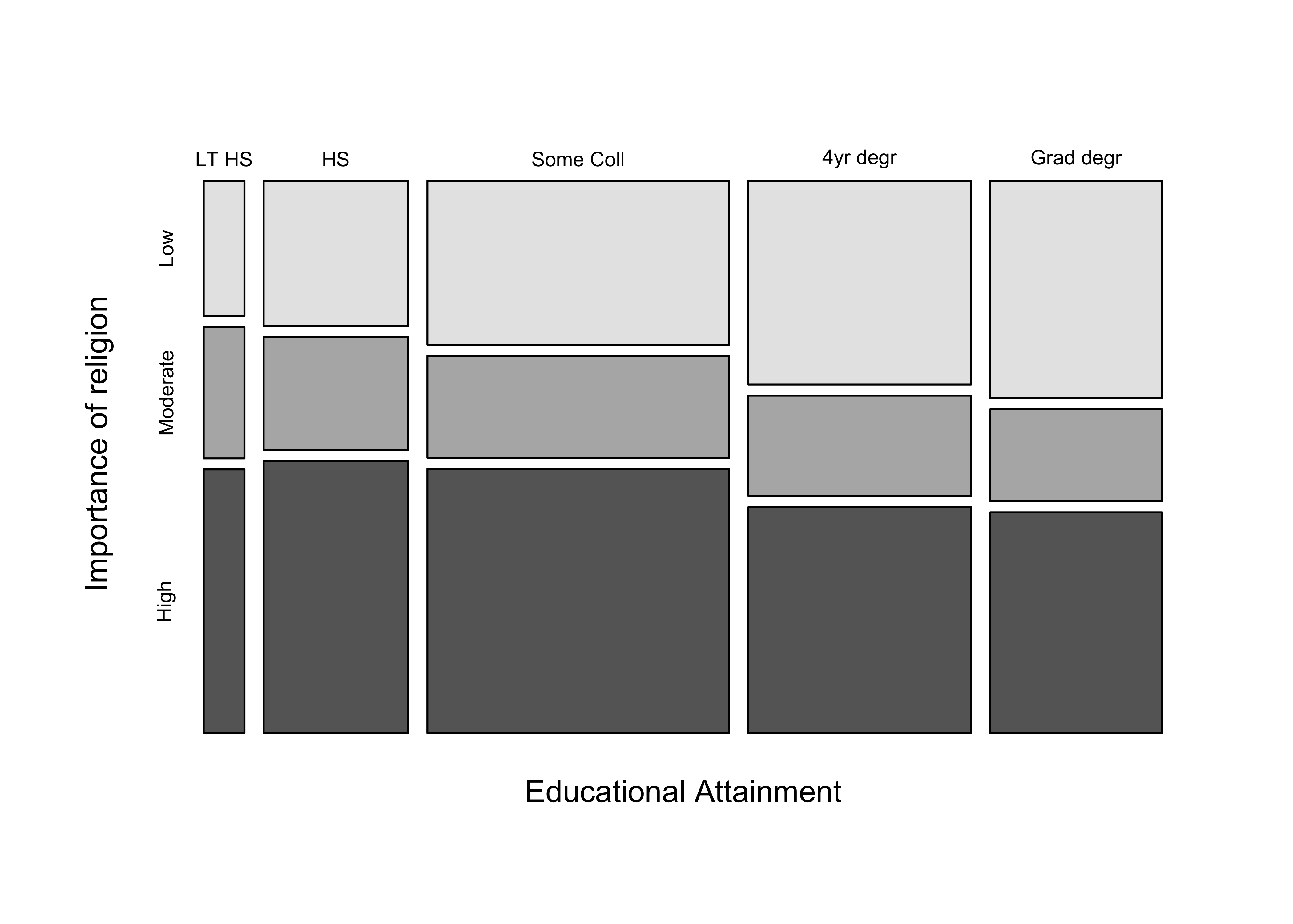
   Cell Contents
|-------------------------|
|                   Count |
|          Column Percent |
|-------------------------|

============================================================================
                    anes20$educ
anes20$relig_imp    LT HS      HS   Some Coll   4yr degr   Grad degr   Total
----------------------------------------------------------------------------
Low                   96     365         860        789         650    2760
                    25.5%   27.4%       30.9%      38.4%       41.0%
----------------------------------------------------------------------------
Moderate              93     284         535        389         275    1576
                    24.7%   21.3%       19.2%      18.9%       17.4%
----------------------------------------------------------------------------
High                 187     684        1387        875         660    3793
                    49.7%   51.3%       49.9%      42.6%       41.6%
----------------------------------------------------------------------------
Total                376    1333        2782       2053        1585    8129
                     4.6%   16.4%       34.2%      25.3%       19.5%
============================================================================

Statistics for All Table Factors

Pearson's Chi-squared test
------------------------------------------------------------
Chi^2 = 108.2      d.f. = 8      p <2e-16

        Minimum expected frequency: 72.9
Once again, the first step is to focus on any pattern you see in the column percentages. The crosstab shows that the percent in the “Low” row increases somewhat steadily from 25.5% to 41% as you move from the lowest to highest education groups. However, the changes in column percentages are not as large or as consistent in the “Moderate” and “High” religious importance rows. This pattern is confirmed, and perhaps clearer, in the mosaic plot, where the most noticeable changes in the height of the column boxes occur in the “Low” row. In comparison to the analysis of regional differences, the pattern here does not seem as strong. Nevertheless, based on the \({\chi}^2\) (108.23) and associated p-value (< .05), the pattern in this table is different enough from what you would expect if there were no relationship between these variables that we can confidently reject the null hypothesis.
Directional Patterns in Crosstabs
We have two different types of independent variables in the two examples used above. In the first crosstab, the independent variable was a nominal variable with each category representing a different region of the country, whereas in the second example the independent variable was ordered, with categories for educational attainment ranging from less than high school to post-graduate degree. In both cases, the dependent variable is ordered from low to high levels of importance attached to religion. The difference in level of measurement for the independent variables has implications for the types of statements we can make about the patterns in the tables. In both cases, we can discuss the fact that the column percentages vary from one column to the next, indicating that outcomes on the independent variable seem to affect outcomes on the dependent variable. We can go farther and also address the direction of the relationship between the education and religious importance because the measure of educational attainment has ordered categories. Generally, with ordered data we are interested not just in whether the column percentages change, but also in whether the relationship is positive or negative. Are high values on the independent variable generally associated with low or high values on the dependent variable? This question makes sense when the categories of the independent and dependent variables can be ordered.
The extent to which there is a positive or negative relationship depends on the pattern of the percentages in the table. Table-level statistics that are based on crosstabs, treat the cell in the upper-left corner of the table as the lowest-ranked category for both variables, regardless of how the categories are labeled. This is why it is usually a good idea to recode and relabel ordered variables so the substantive meaning of the first category can be thought of as “low” or “negative” in value on whatever the scale is.
When assessing directionality we want to know how moving across the columns from low to high outcomes of the independent variable changes the likelihood of outcomes being in low or high values of the dependent variable. If low values of the independent variable are generally associated with low values of the dependent variable, and high values with high values, then we are talking about a positive relationship. When low values of one variable are associated with high values of another, then the relationship is negative. Check out Figure 12.3, which provides generic illustrations of what positive and negative relationships might look like in a crosstab.
[Figure** 12.3**about here]
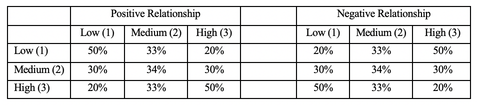
Figure 12.3: Demonstration of Positive and Negative Patterns in Crosstabs
On the left side of Figure 12.3 (positive relationships), the column percentages in the “Low” row drop as you move from the Low to High columns, and increase in the “High” row as you move from the Low to High column. So, Low outcomes tend to be associated with Low values of the independent variable, and High outcomes with High values of the independent variable. On the right side, (negative relationships), low outcomes tend to be associated with High values of the independent variable, and High outcomes with Low values of the independent variable.
Let’s reflect back on the crosstab between education and religious importance. Does the pattern in the table suggest a positive or negative relationship? Or is it hard to tell? Though it is not as clear as in the hypothetical the pattern in Figure 12.3, there is a negative pattern in the first crosstab: the likelihood of being in the “low religious importance” row increases across columns as you move from the lowest to highest levels of education, and there is a somewhat weaker tendency for the likelihood of being in the “high religious importance” row to decrease across columns as you move from the lowest to highest levels of education. High values on one variable tend to be associated with low values on the other, the hallmark of a negative relationship.
Age and Religious Importance
Let’s take a look at another example, one where directionality is more apparent. The crosstab below still uses importance of religion as the dependent variable but switches to a five-category variable for age as the independent variable. Both the table percentages and the mosaic plot show a much stronger pattern in the data than in either of the previous examples. The percent of respondents who assign a low level of importance to religions drops precipitously from 50.4% among the youngest respondents to just 19.4% among the oldest respondents. At the same time, the percent assigning a high level of importance to religions grows steadily across columns, from 30.7% in the youngest group to 63.1% in the oldest group. As you might expect, given the strength of this pattern, the chi-square statistic is quite large and the p-value is very close to zero. We can reject the null hypothesis. There is a relationship between these two variables.
#Collapse age into fewer categories
anes20$age5<-cut2(anes20$V201507x, c(30, 45, 61, 76, 100))
#Assign labels to levels
levels(anes20$age5)<-c("18-29", "30-44", "45-60","61-75"," 76+")
#Crosstab with mosaic plot and chi-square
crosstab(anes20$relig_imp, anes20$age5, prop.c=T,
         plot=T,chisq=T,
         xlab="Age",
         ylab="Religious Importance")
   Cell Contents
|-------------------------|
|                   Count |
|          Column Percent |
|-------------------------|

=================================================================
                    PRE: SUMMARY: Respondent age
anes20$relig_imp    18-29   30-44   45-60   61-75     76+   Total
-----------------------------------------------------------------
Low                  505     877     666     522     135    2705
                    50.4%   43.7%   32.3%   24.4%   19.4%
-----------------------------------------------------------------
Moderate             189     357     396     470     122    1534
                    18.9%   17.8%   19.2%   22.0%   17.5%
-----------------------------------------------------------------
High                 308     774    1003    1149     440    3674
                    30.7%   38.5%   48.6%   53.7%   63.1%
-----------------------------------------------------------------
Total               1002    2008    2065    2141     697    7913
                    12.7%   25.4%   26.1%   27.1%    8.8%
=================================================================

Statistics for All Table Factors

Pearson's Chi-squared test
------------------------------------------------------------
Chi^2 = 396.7      d.f. = 8      p <2e-16

        Minimum expected frequency: 135.1
The pattern is also clear in the mosaic plot, in which the height of the light gray boxes (representing low importance) shrinks steadily as age increases, while the height of the dark boxes (representing high importance) grows steadily as age increases.
We should recognize that both variables are measured on ordinal scales, so it is perfectly acceptable to evaluate the table contents for directionality. So what do you think? Is this a positive or negative relationship? Whether focusing on the percentages in the table or the size of the boxes in the mosaic plot, the pattern of the relationship stands out pretty clearly: the importance respondents assign to religion increases steadily as age increases. There is a positive relationship between age and importance of religion.
Limitations of Chi-Square
Like the t-score, z-score, and F-ratio, chi-square is a test statistic that can be used as a measure of statistical significance. Based on the value of chi-square, we can determine if an observed relationship between two variables is different enough from what would be expected under the null hypothesis that we can reject H0.
Like other tests of statistical significance, chi-square does not tell how strong the relationship is. As you can see from the three crosstabs examined in this chapter, all three relationships are statistically significant but there seems to be a lot of variation in the strength of the relationships. Of course, the other tests for statistical significance also don’t directly address the strength of the relationship between two variables. That is not their purpose, so it is not really a “problem” with measures of significance. The problem, though, is the tendency to treat statistically significant relationships as important without paying close attention to effect size. It does not hurt to emphasize an important point: statistical significance does not equal substantive importance or impact.
One other limitation of chi-square is that even though a directional hypothesis for the relationship between age (or education) and religious importance makes sense, chi-square does not test for directionality, it just tests to see if the observed outcomes are sufficiently different from the expected outcomes that we can reject the null hypothesis.
Next Steps
As you might have guessed from the last few paragraphs, we will move on from here to explore ways in which we can use measures of association to assess the strength and direction of relationships in crosstabs. Following this, the rest of the book focuses on estimating the strength and statistical significance of relationships between numeric variables. In some ways, everything in the first 13 chapters of this book establishes the foundation for exploring relationships between numeric variables. I think you will find these next few chapters particularly interesting and surprisingly easy to follow. Of course, that’s because you’ve laid a strong base with the work you’ve done throughout the rest of the book.
Exercises
Concepts and Calculations
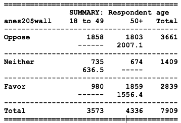
The table below shows the relationship between age (18 to 49, 50 plus) and support for building a wall on the U.S. border with Mexico.
State the null and alternative hypotheses for this table.
There are three cells missing the column percentages (Oppose/18-49, Neither/50+, and Favor/18-49). Calculate the missing column percentages.
After filling in the missing percentages, describe the relationship in the table. Does the relationship appear to be different from what you would expect if the null hypothesis were true? Explain yourself with specific references to the data.

The same two variables from Problem #1 are shown again in the table below. In this case, the cells show the observed (top) and expected (bottom) frequencies, with the exception of three cells.
Estimate the expected frequencies for the three cells in which they are missing.
By definition, what are expected frequencies? Not the formula, the substantive meaning of “expected.”
Estimate the degrees of freedom and critical value of \(\chi^2\) for this table
- Using the observed and expected values from the results in Problem #2, calculate the value of \(\chi^2\) for the table, compare it to the critical value, and decide if you should reject the null hypothesis.
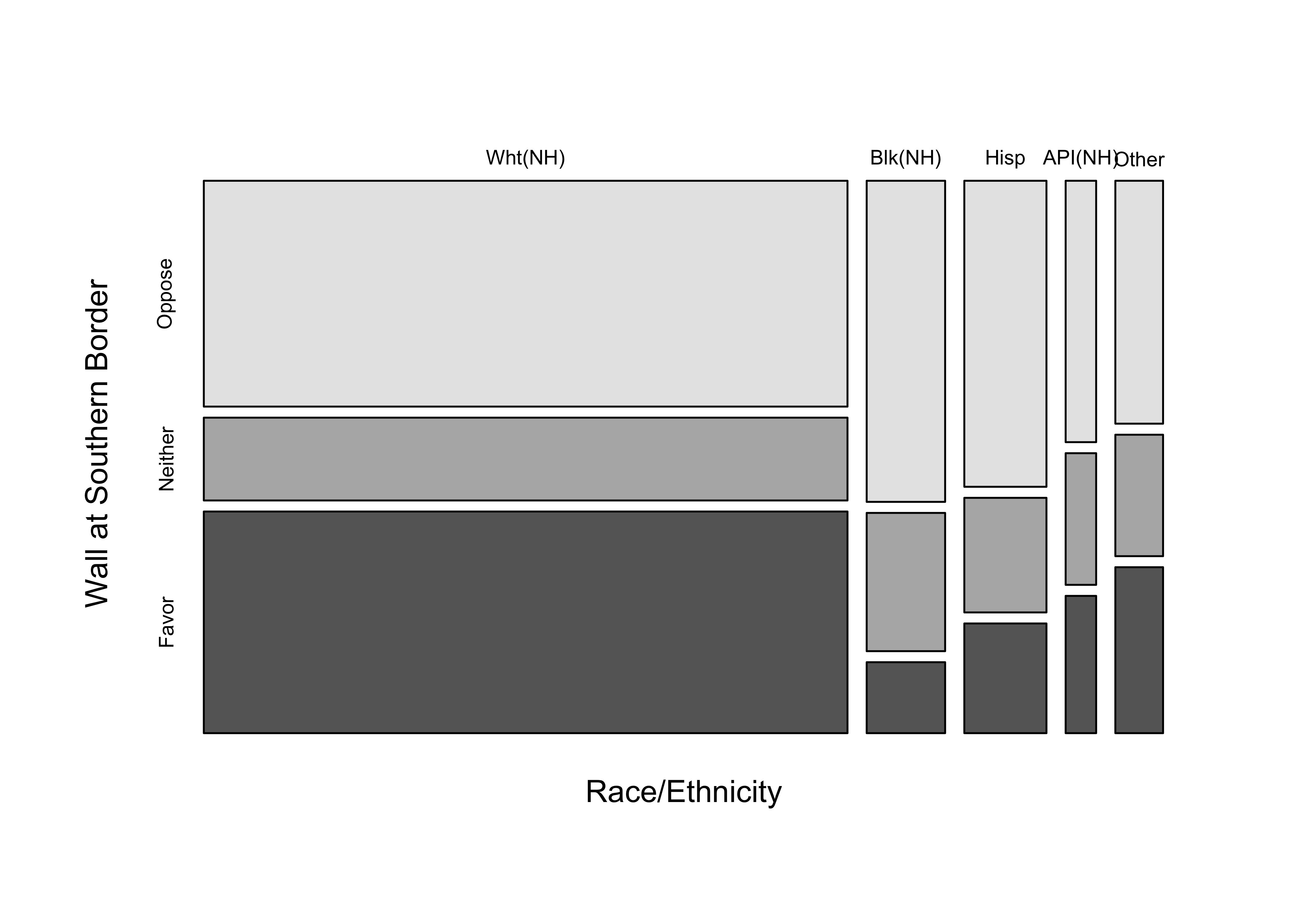
- The mosaic plot below illustrates the relationship between respondent race/ethnicity and support for building a wall at the U.S. border with Mexico. What does the mosaic plot tell you about both the distribution of the independent variable and the relationship between racial and ethnic identity and attitudes toward the border wall? Is this a directional or non-directional relationship?
- The table below illustrates the relationship between between marital status and support for a wall at the southern U.S. border. Describe the relationship, paying special attention to statistical significance, strength of relationship, and direction of relationship. Make sure to use column percentages to bolster your case.
   Cell Contents
|-------------------------|
|                   Count |
|          Column Percent |
|-------------------------|

======================================================
               anes20$marital
anes20$wall    Married   Never Married   Other   Total
------------------------------------------------------
Oppose           1795            1128     844    3767
                 41.6%           58.0%   43.5%
------------------------------------------------------
Neither           734             375     355    1464
                 17.0%           19.3%   18.3%
------------------------------------------------------
Favor            1781             443     742    2966
                 41.3%           22.8%   38.2%
------------------------------------------------------
Total            4310            1946    1941    8197
                 52.6%           23.7%   23.7%
======================================================

Statistics for All Table Factors

Pearson's Chi-squared test
------------------------------------------------------------
Chi^2 = 215.6      d.f. = 4      p <2e-16

        Minimum expected frequency: 346.7
R Problems
- I want to look at a crosstab that shows the relationship between religious importance (
relig_imp) and whether people support or oppose adoption by gay and lesbian couples (V201415). I’ve done something wrong and can’t get the command to work. What am I doing wrong? Correct the code and show the output. Hint: there are three errors.
crosstab(anes20$V201415~Anes20$relig_imp,
         prop.c = T,
         chisqu=T,
         plot=F)
For the remaining problems, use the following code, borrowed from Chapter 4, to create a three-category variable based on responses to the Democratic and Republican feeling thermometer ratings.
#Create net party feeling thermometer rating
anes20$netpty_ft<-(anes20$dempty_ft-anes20$reppty_ft)

#Collapse "netpty_ft"and assign the result to "anes20$netpty_ft.3"
anes20$netpty_ft.3<-ordered(cut2(anes20$netpty_ft, c(0,1)))

#Assign meaningful level names
levels(anes20$netpty_ft.3)<-c("Favor Reps", "Same", "Favor Dems")
Create a crosstab that shows the relationship between religious importance (
anes20$relig_imp) created earlier in this chapter, and the newly created net feeling thermometer rating,anes20$netpty_ft.3. In this case, religious importance is the independent variable and the net feeling thermometer rating is the dependent variable. Be sure to include column percentages, the chi-square statistic, and the mosaic plot. Using this information, describe the relationship between these two variables, paying attention to statistical significance and the strength and direction of the relationship. Comment on whether you find it easier to use the crosstab or the mosaic plot to evaluate the relationship. Explain.Repeat the analysis from Problem #1, but using
anes20$age5as the independent variable. Describe the relationship between these two variables, paying attention to statistical significance and the strength and direction of the relationship. Do you think the relationship in this table is stronger, weaker, or about the same as the relationship in the table from Question 1? Explain.
Alex Knorre provided sample code that I adapted to produce this table https://stackoverflow.com/questions/44198167.↩︎