Chapter 13 Measures of Association
Getting Ready
This chapter examines multiple ways to measure the strength of relationships between two variables in a contingency table. To follow along in R, you should load the anes20 data set, as well as the libraries for the DescTools and descr packages. You might also want to keep a calculator handy, or be ready to use R as a calculator.
Going Beyond Chi-squared
As discussed at the end of the previous chapter, chi-squared is a good measure of statistical significance, but it is not appropriate to use it to judge the strength or direction of a relationship. By “strength of a relationship” in crosstabs, we generally mean the extent to which values of the dependent variable are conditioned by (or depend upon) values of the independent variable. As a general rule, when chi-squared is not significant the outcomes of the dependent variable vary only slightly and randomly around their expected (null hypothesis) outcomes. If chi-squared is statistically significant, we know there is a relationship between the two variables but we don’t know the degree to which the outcomes on the dependent variable are conditioned by the values of the independent variables—only that they differ enough from the expected outcomes under the null hypothesis that we can conclude there is a real relationship between the two variables.
Of course, we can use the column percentages to try to get a general sense of how strong the relationship is, but it can be difficult to do so with any precision. Consider the following descriptions of column percentages from the three crosstabs we examined in Chapter ??.
Region and religiosity. The percent assigning a low level of importance to religion ranges from 26.4% for respondents in the South, to 32.6% for Midwesterners, to 39.4% for Northeastern respondents, to 43.5% for respondents from the West. The opposite pattern is found in the “High” religious importance row, with Midwestern (48%) and Southern (55.7%) respondents having the highest column percentages, and Northeastern (37.7%) and Western (37.4%) respondents having the lowest. There isn’t much of a regional pattern in the “Moderate” row.
Education and religiosity: The percent assigning low importance to religion increases steadily from 25.5% among those with less than a high school degree to 41% among those with a graduate degree, an increase of 15.5 percentage points. The percent assigning a moderate level of importance to religion declines by about 7 percentage points the lowest and highest level of education, and there is a similar drop off in the percent assigning high importance across levels of education.
Age and religiosity. The percent of respondents who assign a low level of importance to religion drops from 50.4% among the youngest respondents to just 19.4% among the oldest respondents. At the same time, the percent assigning a high level of importance to religion grows steadily across columns, from 30.7% in the youngest group to 63.1% in the oldest group. The percent assigning moderate importance to religion does not change much across age groups.
Describing the differences in column percentages like this is an important part of telling the story of the relationship between two variables, so we should always give them a close look and be comfortable discussing them. However, we should not rely on them alone, as they do not provide a clear, consistent, and standard basis for judging the strength of the relationship in the table. How strong are the relationships described above? We might have a sense that the region and age are more strongly related to religiosity than education is, based on the percentage differences, but we still can’t tell how much stronger, or even how strong any of the relationships are on their own. What we need is to be able to complement the discussion of column percentages with statistics that take into account the outcomes across the entire table and weight those outcomes according to their share of the overall sample.
Measures of Association for Crosstabs
Measures of association for crosstabs are statistics that summarize the strength of the relationship between two variables. They provide the same type of information we got from the measures of effect size examined in previous chapters (Cohen’s D and eta2 ), summarizing the extent to which differences in outcomes on the dependent variable are related to differences in outcomes on the independent variable.
Cramer’s V
One useful measure of association for crosstabs, especially if one of the variables is a nominal-level variable, is Cramer’s V. We begin with this measure because it is derived from chi-square. One of the many virtues of chi-square is that it is based on information from every cell of the table and uses cell frequencies rather than percentages, so each cell is weighted appropriately. Recall, though, that the “problem” with chi-square is that its size reflects not just the strength of the relationship but also the sample size and the size of the table. Cramer’s V discounts the value of chi-squared for both the sample size and the size of the table by incorporating them in the denominator of the formula:
\[\text{Cramer's V}=\sqrt{\frac{\chi^2}{N*min(r-1,c-1)}}\]
Here we take the square root of chi-square divided by the sample size times either the number of rows minus 1 or the number of columns minus 1, whichever is smaller.33
Interpreting Cramer’s V is relatively straightforward, as long as you understand that it is bounded by 0 and 1, where a value of zero means there is absolutely no relationship between the two variables, and a value of one means there is a perfect relationship between the two variables. Figure 13.1 illustrates these two extremes:
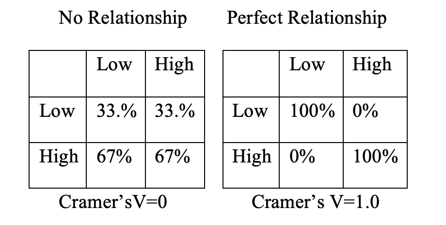
Figure 13.1: Hypothetical Outcomes for Cramer’s V
[Figure****** 13.1 ******about here]
In the table on the left, there is no change in the column percentages as you move across columns. We know from the discussion of chi-square in the last chapter, that this is exactly what statistical independence looks like–the row outcome does not depend upon column outcomes. In the table on the right, you can perfectly predict the outcome of the dependent variable based on levels of the independent variable.
[Table 13.1 about here]
Table 13.1 provides the \(\chi^2\) value, number or rows and columns, and the sample size for each of the three crosstabs reported in Chapter 12 and described earlier.
Table 13.1 Summary Statistics from Crosstabs in Chapter 12
| Independent Variable | \(\chi^2\) | Rows x Columns | Sample size |
|---|---|---|---|
| Region | 238.2 | 3x4 | 8249 |
| Education | 108.2 | 3x5 | 8129 |
| Age | 396.7 | 3x4 | 7913 |
Let’s use this information to calculate the Cramer’s V statistic for these relationships.
Region: \[V=\sqrt{\frac{238.2}{8249*2}}=.12\]
Education: \[V=\sqrt{\frac{108.2}{8129*2}}=.08\]
Age: \[V=\sqrt{\frac{396.7}{7913*2}}=.16\]
The Cramer’s V values reported above show that age has the greatest impact on religiosity, followed by region, and then education, and that all three relationships are relatively weak.
Are you surprised by the value of Cramer’s V (.16) for the impact of age on religiosity? The differences in the column percentages reported earlier were fairly large, so we might have expected that Cramer’s V would come in at a somewhat higher value. This highlights an inherent limitation of focusing on just a few differences in column percentages rather than taking in information from the entire table. In the specific case of this relationship, by focusing on the large differences in the Low and High religious importance rows, we ignored the tiny differences in the Moderate row. More to the point, it is difficult to process the outcomes in all twelve cells of the table and assign them appropriate weight by just “eyeballing’ the table. Again, column percentages are important–they tell us what it happening between the two variables–but focusing on them exclusively invariably provides an incomplete accounting of the relationship. Good measures of association such as Cramer’s V take into account information from all cells in a table and provide a more complete assessment of the relationship.
Getting Cramer’s V in R. The CramerV function is found in the DescTools package and can be used to get the values of Cramer’s V in R.
#V for region and religious importance:
CramerV(anes20$relig_imp, anes20$V203003)
[1] 0.12015#V for education and religious importance:
CramerV(anes20$relig_imp, anes20$educ)[1] 0.081592#V for age and religious importance:
CramerV(anes20$relig_imp, anes20$age5)[1] 0.15831These results confirm the earlier calculations.
Lambda
Another sometimes useful statistic for judging the strength of a relationship is lambda (\(\lambda\)). Lambda is referred to as a proportional reduction in error (PRE) statistic because it summarizes how much we can reduce the level of error from guessing, or predicting the outcome of the dependent variable by using information from an independent variable. The concept of proportional reduction in error plays an important role in many of the topics included in the last several chapters of this book.
The formula for lambda is:
\[Lambda (\lambda)=\frac{E_1-E_2}{E_1}\]
Where:
- E1 =error by guessing with no information on the independent variable.
- E2 =error by guessing with information about an independent variable.
Okay, so what does this mean? Let’s think about it in terms of the relationship between region and religious importance. The table below includes just the raw frequencies for these two variables:
#Cell frequencies for religious importance by region
crosstab(anes20$relig_imp, anes20$V203003,plot=F)
Cell Contents
|-------------------------|
| Count |
|-------------------------|
==========================================================================
SAMPLE: Census region
anes20$relig_imp 1. Northeast 2. Midwest 3. South 4. West Total
--------------------------------------------------------------------------
Low 549 649 811 782 2791
--------------------------------------------------------------------------
Moderate 320 385 548 343 1596
--------------------------------------------------------------------------
High 525 956 1710 671 3862
--------------------------------------------------------------------------
Total 1394 1990 3069 1796 8249
==========================================================================Now, suppose that you had to “guess,” or “predict” the value of the dependent variable for each of the 8249 respondents from this table. What would be your best guess? By “best guess” I mean which category would give the least overall error in guessing? As a rule, with ordinal or nominal dependent variables, it is best to guess the modal outcome if you want to minimize error in guessing (you may recall this from Chapter 4). In this case, that outcome is the “High” row, which has 3862 respondents. If you guess this, you will be correct 3862 times and wrong 4387 times. This seems like a lot of error, but no other guess can give you an error rate this low (go ahead, try).
From this, we get \(E_1=4387\).
E2 is the error we get when we are able to guess the value of the dependent variable based on the value of independent variable. Here’s how we get E2: we look within each column of the independent variable and choose the category of the dependent variable that will give us the least overall error for that column (the modal outcome within each column). For instance, for “Northeast” we would guess “Low” and we would be correct 549 times and wrong 845 times (make sure you understand how I got these numbers); for “Midwest” we would guess “High” and would be wrong 1034 times; for “South” we would guess “High” and be wrong 1359 times; and for “West” we could guess “Low” and be wrong 1014 times. Now that we have given our best guess within each category of the independent variable we can estimate E2, which is the sum of all of the errors from guessing when we have information from the independent variable:
\[E_2= 845+1034+1359+1014= 4252\]
Note that E2 (4252) is less than E1 (4387). This means that the independent variable reduced the error in guessing the outcome of the dependent variable by 135 (\(E_1 - E_2=135\)). On its own, it is difficult to tell if reducing error by 135 represents a lot or a little reduction in error. Because of this, we express reduction in error as a proportion of the original error:
\[Lambda (\lambda)=\frac{4387-4252}{4387}=\frac{135}{4387}=.031\] What this tells us is that knowing the region of residence for respondents in this table reduces the error in predicting the dependent variable by 3.1%.
Lambda ranges from 0 to 1, where 0 means that the independent variable does not account for (reduce) any error in predicting the dependent variable, and 1 means the independent variable accounts for all of the error in predicting the dependent variable. You might notice that this interpretation is very similar to the interpretation of eta2 in Chapter 11. That’s because both statistics are measuring the amount of error (variation) in the dependent variable that is explained by the independent variable. Lambda and eta2 are both proportional reduction in error (PRE) statistics.
One of the nice things about lambda, compared to Cramer’s V, is that it has a very intuitive meaning. Think about how we interpret Cramer’s V for the relationship between region and religious importance (.12). We know that .12 on a scale from 0 to 1 is rather low, but it is hard to ascribe more meaning to it than that. Now, contrast that with Lambda (.031), which also indicates a weak relationship but at the same time conveys an additional piece of information, that knowing the outcome of the independent variable leads to a 3.1% decrease in error when predicting the dependent variable.
Getting Lambda from R. The Lambda function in R can be used to calculate lambda for a pair of variables. Along with variable names (dependent, independent), you need to specify two additional pieces of information in the Lambda function: direction="row" means that we are predicting row outcomes, and conf.level =.95 adds a 95% confidence interval around lambda.
#For Region and Religious importance (dependent, independent)
Lambda(anes20$relig_imp, anes20$V203003,
       direction="row", conf.level =.95)
lambda lwr.ci upr.ci
0.0307727 0.0086624 0.0528831 Here, we get confirmation that the calculations for the region/religious importance table were correct (lambda = .03). Also, since the 95% confidence interval does not include 0 (barely!), we can reject the null hypothesis and conclude that there is a statistically significant but quite small reduction in error predicting religious importance with region.
We can also see the values of lambda for the other two tables: lambda is 0 for education and religious importance and .07 for age and religious importance.
#For Education and Religious importance
Lambda(anes20$relig_imp, anes20$educ,
       direction="row", conf.level =.95)
lambda lwr.ci upr.ci
0 0 0 #For Age and Religious importance
Lambda(anes20$relig_imp, anes20$age5,
direction="row", conf.level =.95) lambda lwr.ci upr.ci
0.070771 0.048647 0.092896 The finding for the relationship between education and religious importance points to one limitation of lambda: it can equal 0 even if there is a statistically significant relationship in the table. The problem is that the relationship is not strong enough to be a proportional reduction in error relationship, even if there is a significant pattern (according to chi-square) in the data. This happens most often when the relationship is weak and the distribution of the dependent variable heavily concentrated in the modal outcome. As a result, having information about the independent variable does not change guesses across columns, and the errors from guessing in E2 are the same as the error in E1, resulting in Lambda=0
Lambda and Cramer’s V are using different standards to evaluate the strength of relationship. Lambda focuses on whether using the independent variable leads to less error in guessing outcomes of the dependent variable. Cramer’s V, on the other hand, focuses on how different the pattern in the table is from what you would expect if there was no relationship.
Ordinal Measures of Association
Cramer’s V and Lambda measure the association between two variables by focusing on deviation from expected outcomes or reduction in error, respectively, two useful pieces of information. One drawback to these measures though is that they do not express information about the strength of a relationship from a directional perspective. Consider, for example, the impact of education and age on religious importance, as discussed above. In both cases, there are clear directional expectations based on the ordinal nature of both variables: religious importance should decrease as levels of education increase (negative relationship) and it should increase as age increases (positive relationship). The findings based on the column percentage reported earlier supported these expectations. One problem, however, is that the measures of association we’ve looked at so far are not designed to capture the extent to which the pattern in a crosstab follows a particular directional pattern. What we need, then, are measures of association that incorporate the idea of directionality into their calculations.
To demonstrate some of these ordinal measures of association, I use a somewhat simpler 3x3 crosstab that still focuses on religious importance as the dependent variable (the smaller table works better for demonstration). Here, I use anes20$ideol3, a three-category version of anes20$V201200, to look at how political ideology is related to religious importance. You might question whether political ideology is an ordinal variable. After all, none of the category labels carry the obvious hints, such as “Low” and “High”, or “Less than” and “Greater than.” Instead, as pointed out in Chapter 1, you can think of the categories of political ideology as growing more conservative (and less liberal) as you move from “Liberal” to “Moderate” to “Conservative”.
#Create three-category ideology variable
anes20$ideol3<-anes20$V201200
levels(anes20$ideol3)<-c("Liberal","Liberal","Liberal","Moderate",
                         "Conservative","Conservative",
                         "Conservative")
#Crosstab of religious importance by ideology
crosstab(anes20$relig_imp, anes20$ideol3,
         prop.c=T, chisq=T,
         plot=F)
Cell Contents
|-------------------------|
| Count |
| Column Percent |
|-------------------------|
=============================================================
PRE: 7pt scale liberal-conservative self-placement
anes20$relig_imp Liberal Moderate Conservative Total
-------------------------------------------------------------
Low 1410 570 489 2469
56.6% 31.5% 17.9%
-------------------------------------------------------------
Moderate 428 427 498 1353
17.2% 23.6% 18.2%
-------------------------------------------------------------
High 654 815 1750 3219
26.2% 45.0% 63.9%
-------------------------------------------------------------
Total 2492 1812 2737 7041
35.4% 25.7% 38.9%
=============================================================
Statistics for All Table Factors
Pearson's Chi-squared test
------------------------------------------------------------
Chi^2 = 997.01 d.f. = 4 p <2e-16
Minimum expected frequency: 348.19 CramerV(anes20$relig_imp, anes20$ideol3, conf.level = .95)Cramer V lwr.ci upr.ci
0.26608 0.24915 0.28221 Lambda(anes20$relig_imp, anes20$ideol3, direction="row", conf.level = .95) lambda lwr.ci upr.ci
0.19780 0.17694 0.21867 Here’s what I would say about this relationship based on what we’ve learned thus far. There is a positive relationship between political ideology and the importance people attach to religion. Looking from the Liberal column to the Conservative column, there is a steady decrease in the percent who attach low importance to religion and a steady increase in the percent who attach high importance to religion. Almost 57% of liberals are in the Low row, compared to only about 18% among conservatives; and only 26% of liberals are in the High row, compared to about 64% of conservatives. The p-value for chi-square is near 0, so we can reject the null hypothesis, the value of Cramer’s V (.27) suggests a weak to moderate relationship, and the value of lambda shows that ideology reduces the error in guessing religious importance by about 20%. Both of these measures of association indicate that ideology is more strongly related to religious importance than any of the other independent variables we’ve looked at so far (region, education, age).
There is nothing wrong with using lambda and Cramer’s V for this table, as long as you understand that they are not addressing the directionality in the data. For that, we need to use an ordinal measure of association, one that assesses the degree to which high values of the independent variable are related to high or low values of the dependent variable. In essence, these statistics focus on the ranking of categories and summarize how well we can predict the ordinal ranking of the dependent variable based on values of the independent variable. Ordinal-level measures of association range in value from -1 to +1, with 0 indicating no relationship, -1 indicating a perfect negative relationship, and + 1 indicating a perfect positive relationship.
Gamma
One example of an ordinal measure of association is gamma (\(\gamma\)). Very generally, what gamma does is calculate how much of the table follows a positive pattern and how much it follows a negative pattern, but using different terminology. More formally, Gamma is based on the number of similarly ranked and differently ranked pairs of observations in the contingency table. Similarly ranked pairs can be thought of as pairs or observations that follow a positive pattern, and differently ranked pairs are those that follow a negative pattern.
\[Gamma=\frac{N_{similar} - N_{different}}{N_{similar} + N_{different}}\] If you look at the parts of this equation, it is easy to see that gamma is a measure of the degree to which positive or negative pairs dominate the table. When positive (similarly ranked) pairs dominate, gamma will be positive; when negative (differently ranked) pairs dominate, gamma will be negative; and when there is no clear trend, gamma will be zero or near zero.
But how do we find these pairs? Let’s look at similarly ranked pairs in a generic 3x3 table first.
Figure 13.2: Similarly Ranked Pairs
[Figure** 13.2 **about here]
For each cell in the table in Figure 13.2, we multiply that cell’s number of observations times the sum of the observations that are found in all cells ranked higher in value on both the independent and dependent variables (below and to the right). We refer to these cells as “similarly ranked” because they have the same ranking on both the independent and dependent variables, relative to the cell of interest. These pairs of cells are highlighted in Figure 13.2.
For differently ranked pairs, we need to match each cell with cells that are inconsistently ranked on the independent and dependent variables (higher in value on one and lower in value on the other) . Because of this inconsistent ranking, we call these differently ranked pairs. These cells are below and to the left of the reference cell, as highlighted in Figure 13.3.
Figure 13.3: Differently Ranked Pairs
[Figure****** 13.3 ******about here]
Using this information to calculate gamma may seem a bit cumbersome—and it is—but it becomes clearer after working through it a few times. We’ll work through this once (I promise, just once) using the crosstab for ideology and religious importance. The raw frequencies for this crosstab are reproduced below.
Let’s start with the similarly ranked pairs. In the calculation below, I begin in the upper-left corner (Liberal/Low) and pair those 1410 respondents with all respondents in cells below and to the right (1410 x (427+498+815+1750)). Note that the four cells below and to the right are all higher in value on both the independent and dependent variables than the reference cell. Then I go to the Liberal/Moderate cell and match those 428 respondents with the two cells below and to the right (428 x (815+1750)). Next, I go to the Moderate/Low cell and match those 570 respondents with the two cells below and to the right (570 x (498+1750)), and finally, I go to the Moderate/Moderate cell and match those 427 respondents with respondents in the one cell below and to the right (427 X 1750).
#Calculate similarly ordered pairs
similar<-1410*(427+498+815+1750)+428*(815+1750)+
  570*(498+1750)+(427*1750)
similar
[1] 8047330This gives us 8,047,330 similarly ranked pairs. That seems like a big number, and it is, but we are really interested in how big it is relative to the number of differently ranked pairs.
   Cell Contents
|-------------------------|
|                   Count |
|-------------------------|

=============================================================
                    PRE: 7pt scale liberal-conservative self-placement
anes20$relig_imp    Liberal   Moderate   Conservative   Total
-------------------------------------------------------------
Low                    1410        570            489    2469
-------------------------------------------------------------
Moderate                428        427            498    1353
-------------------------------------------------------------
High                    654        815           1750    3219
-------------------------------------------------------------
Total                  2492       1812           2737    7041
=============================================================
To calculate differently ranked pairs, I begin in the upper-right corner (Conservative/Low) and pair those 489 respondents with respondents in all cells below and to the left (489 x (427 +428+654+815)). Note that the four cells below and to the left are all lower in value on the independent variable and higher in value on the dependent variable than the reference cell. Then, I match the 570 respondents in the Moderate/Low cell with all respondents in cells below and to the left (570 x (428+654)). Next, I match the 498 respondents in the Conservative/Moderate cell with all respondents in cells below and to the left (498 x (654+815)). And, finally, I match the 427 respondents in the Moderate/Moderate cell with all respondents in the one cell below and to the left (427x654).
#Calculate differently ordered pairs
different=489*(427+428+654+815)+570*(428+654)+
  498*(654+815)+427*654
different
[1] 2763996This gives us 2,763,996 differently ranked pairs. Again, this is a large number, but we now have a basis of comparison, the 8,047,330 similarly ranked pairs. Since there are more similarly ranked pairs, we know that there is a positive relationship in this table. Let’s plug these values into the gamma formula to get a more definitive sense of this relationship.
For this table,
\[\text{gamma}=\frac{8047330-2763996}{8047330+2763996}=\frac{5283334}{10811326}=.4887\] Now, let’s check this with the R function for gamma.
#Get Gamma from R
GoodmanKruskalGamma(anes20$relig_imp, anes20$ideol3, conf.level = .95)
gamma lwr.ci upr.ci
0.48869 0.46254 0.51483 Two things here: the value of gamma is the same as what we calculated on our own, and the 95% confidence interval around the point estimate for gamma does not include 0, so we can reject the null hypothesis (\(H_0: gamma=0\)). Further, we can interpret the value of gamma (.49) as meaning that we there is a moderate-to-strong, positive relationship between ideology and religious importance.
A Problem with Gamma
Gamma is a useful statistic from an instructional perspective in part because the logic of taking the balance of similar and different rankings to determine directionality is so intuitively clear. However, in practice, gamma does come with a bit of baggage. The main problem with gamma is that it tends to overstate the strength of relationships. For instance, in the example of the relationship between ideology and religious importance, the value of gamma far outstrips the values of Cramer’s V (.266) and lambda (.198). We don’t expect to get the same results, but when two measures of association suggest a somewhat modest relationship and another suggests a much stronger relationship, it is a bit hard to reconcile the difference. The reason gamma tends to produce stronger effects is because it focuses only on the diagonal pairs. In other words, gamma is calculated only on the basis of pairs of observations that follow clearly positive (similarly ranked) or negative (differently ranked) patterns. But we know that not all pairs of observations in a table follow these directional patterns. Many of the pairs of observations in the table are “tied” in value on one variable but have different values on the other variable, so they don’t follow a positive or negative pattern. If tied pairs were also taken into account, the denominator would be much larger and Gamma would be somewhat smaller.
The two tables in Figure 13.4 illustrate examples of tied pairs. In the first table, the shaded area represents the cells that are tied in their value of Y (Low) but have different values of x (low, medium, and high). In the second table, the highlighted cells are tied in their value of X (low) but differ in their value of Y (low, medium, high). And there are many more tied pairs throughout the tables. None of these pairs are included in the calculation of gamma, but they can constitute a substantial part of the table, especially if the directional pattern is weak. To the extent there are a lot of tied pairs in a given table, Gamma is likely to significantly overstate the magnitude of the relationship between X and Y because the denominator for Gamma is smaller than it should be if it is intended to represent the entire table.
[Figure****** 13.4 ******about here]
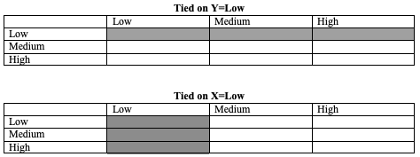
Figure 13.4: Tied Pairs in a Crosstab
Tau-b and Tau-c
There are many useful alternatives to Gamma. The ones I like to use are tau-b and tau-c, both of which maintain the focus on the number of similar and differently ranked pairs in the numerator but also take into account the number of tied pairs in the denominator, albeit in somewhat different ways.34 In practice, the primary difference between the two is that tau-b is appropriate for square tables (e.g., 3x3 or 4x4) while tau-c is appropriate for rectangular tables (e.g., 2x3 or 3x4). Like Gamma, Tau-b and Tau-c are bounded by -1 (perfect negative relationship) and +1 (perfect positive relationship), with 0 indicating no relationship.
The R functions for tau-b and tau-c are similar to the function for gamma. Although tau-b is the most appropriate measure of association for the relationship between ideology and religion (a square table), both statistics are reported below in order to demonstrate the commands:
#Get tau-b and tau-c for religious importanc by ideology
KendallTauB(anes20$relig_imp, anes20$ideol3, conf.level = .95)
tau_b lwr.ci upr.ci
0.33091 0.31151 0.35030 StuartTauC(anes20$relig_imp, anes20$ideol3, conf.level=0.95) tauc lwr.ci upr.ci
0.31971 0.30104 0.33839 The results for tau-b and tau-c are very close in magnitude (they usually are), both pointing to a moderate, positive relationship between ideology and religion. You should also note that the confidence interval does not include 0, so we can reject the null hypothesis (H0:tau-b/tau-c=0). You probably noticed that these values are somewhat stronger than those for Cramer’s V and lambda but somewhat weaker than the result obtained from gamma. In my experience, this is usually the case.
With the exception of gamma, because it tends to overstate the magnitude of relationships, you can use the Table 13.1 as a rough guide to how the measures of association discussed here are connected to judgments of effect size. Using this information in conjunction with the contents of a crosstab should enable you to provide a fair and substantive assessment of the relationship in the table. Always remember that the column percentages tell the story of how the variables are connected, but you still need a measure of association to summarize the strength and direction of the relationship. At the same time, the measure of association is not very useful on its own without referencing the contents of the table.
[Table 13.1 about here]
| Absolute Value | Effect Size |
|---|---|
| .05 | |
| .15 | Weak |
| .25 | |
| .35 | Moderate |
| .45 | |
| .55 | Strong |
| .65 | |
| .75 | Very Strong |
| .85 |
Let’s circle back to the other two ordinal independent variables we looked at earlier while focusing on Cramer’s V and Lambda, education and age. These were both 3x5 crosstabs, so we will look at values for Gamma and tau-c. Cramer’s V is also included here for the purpose of comparison.
#Get stats for religious importance by education
CramerV(anes20$relig_imp, anes20$educ, conf.level=0.95)
Cramer V lwr.ci upr.ci
0.081592 0.063227 0.094511 StuartTauC(anes20$relig_imp, anes20$educ, conf.level=0.95) tauc lwr.ci upr.ci
-0.088665 -0.107838 -0.069491 GoodmanKruskalGamma(anes20$relig_imp, anes20$educ, conf.level=0.95) gamma lwr.ci upr.ci
-0.12453 -0.15138 -0.09769 #Get stats for religious importance by age
CramerV(anes20$relig_imp, anes20$age5, conf.level=0.95)Cramer V lwr.ci upr.ci
0.15831 0.14126 0.17256 StuartTauC(anes20$relig_imp, anes20$age5, conf.level=0.95) tauc lwr.ci upr.ci
0.19269 0.17361 0.21177 GoodmanKruskalGamma(anes20$relig_imp, anes20$age5, conf.level=0.95) gamma lwr.ci upr.ci
0.26282 0.23718 0.28846 As you can see, the tau-c coefficients are close in value to the Cramer’s V coefficients, except now tau-c indicates the direct of the relationship. Also, as expected, the gamma coefficients are larger in value than the others, reflecting its focus on just the directional pairs in the tables.
Revisiting the Gender Gap in Abortion Attitudes
Back in Chapter 10, we looked at the gender gap in abortion attitudes, using t-tests for the sex-based differences in two different outcomes, the proportion who thought abortion should always be illegal and the proportion who thought abortion should be available as a matter of choice. Those tests found no significant gender-based difference for preferring that abortion be illegal and a significant but small difference in the proportion preferring that abortion be available as a matter of choice. With crosstabs, we can do better than just testing these two polar opposite positions by utilizing a wider range of preferences, as shown below.
#Create abortion attitude variable
anes20$abortion<-factor(anes20$V201336)
#Change levels to create four-category variable
levels(anes20$abortion)<-c("Illegal","Rape/Incest/Life",
                           "Additional Conditions","Choice",
                           "Additional Conditions")
#Create numeric indicator for sex
anes20$Rsex<-factor(anes20$V201600)
levels(anes20$Rsex)<-c("Male", "Female")
crosstab(anes20$abortion, anes20$Rsex, prop.c=T,
      chisq=T, plot=F)
Cell Contents
|-------------------------|
| Count |
| Column Percent |
|-------------------------|
===============================================
anes20$Rsex
anes20$abortion Male Female Total
-----------------------------------------------
Illegal 388 475 863
10.4% 10.7%
-----------------------------------------------
Rape/Incest/Life 929 978 1907
24.9% 22.1%
-----------------------------------------------
Additional Conditions 688 706 1394
18.5% 16.0%
-----------------------------------------------
Choice 1723 2263 3986
46.2% 51.2%
-----------------------------------------------
Total 3728 4422 8150
45.7% 54.3%
===============================================
Statistics for All Table Factors
Pearson's Chi-squared test
------------------------------------------------------------
Chi^2 = 24.499 d.f. = 3 p = 0.0000196
Minimum expected frequency: 394.76 Here, the dependent variable ranges from wanting abortion to be illegal in all circumstances, to allowing it only in cases of rape, incest, or threat to the life of the mother, to allowing it in additional circumstances, to allowing it generally as a matter of choice. These categories can be seen as ranging from most to least restrictive views on abortion. As expected, based on the analysis in Chapter 10, the differences between men and women on this issue are not very great. In fact, the greatest difference in column percentages is in the “Choice” row, where women are about five percentage points more likely than men to favor this position. This weak effect is also reflected in the measures of association reported below.
#Get Cramer's and Tau-c
CramerV(anes20$abortion, anes20$Rsex)
[1] 0.054827StuartTauC(anes20$abortion, anes20$Rsex, conf.level=0.95) tauc lwr.ci upr.ci
0.041292 0.018106 0.064479 This relationship provides another demonstration of the need to go beyond just reporting on statistically significance. Had we simply reported that chi-square is statistically significant, with a p-value of .0000196, we might have concluded that sex plays an important role in in shaping attitudes on abortion. However, by focusing some attention on the column percentages and measures of association, we can more accurately report that sex is related to how people answered this question but its impact is quite small.
When to Use Which Measure
A number of measures of association are available for describing the relationship between two variables in a contingency table. Not all measures of association are appropriate for all tables, however. To determine the appropriate measure of association, you need to know the level of measurement for your table.
For tables in which at least one variable is nominal, such as the table featuring region and religious importance, you must use non-directional measures of association. For these tables, Cramer’s V and lambda serve as excellent measures of association. You can certainly use both, or you may decide that you are more comfortable with one over the other and use it on its own. Just make sure that if you are using just one of these two statistics, you are not doing so because it makes the relationship look stronger.
For tables in which both variables are ordinal, you can choose between gamma, tau-b, and tau-c. My own preference is to rely on tau-b and tau-c, since they incorporate more information from the table than gamma does and, hence, provide a more realistic impression of the relationship in the table. If you use gamma, you should remember and acknowledge that it tends to overstate the magnitude of relationships because it focuses just on the positive and negative patterns in the table. You should also remember that tau-b is appropriate for square tables, as tau-c is for rectangular tables.
Next Steps
The next several chapters build on this and earlier chapters and turn to assessing relationships between numeric variables. In Chapter 14, we examine how to use scatter plots and correlations coefficients to assess relationships between numeric variables. The correlation coefficient is an interval-ratio version of the same type of measures of association you learned about in this chapter. Like other directional measures of association, it measures the extent to which the relationship between the independent and dependent variable follows a positive versus negative pattern, and provides a sense of both the direction and strength of the relationship. The remaining chapters focus on regression analysis, first examining how single variables influence a dependent variable, then how we can assess the impact of multiple independent variables on a single dependent variable. If you’ve been able to follow along so far, the remaining chapters won’t pose a problem for you.
Exercises
Concepts and Calculations
Identify the appropriate measures of association for each of the pairs of variables listed below.
Dependent Variable Independent Variable A. Presidential approval (five-categories, Strongly disapprove to Strongly Approve) Party Identification (Democrat, Independent, Republican) B. Presidential Approval Marital status (Married, Widowed, Divorced, Never Married, Other) C. Party Identification Region D. Evaluation of the economy (Negative, Mixed, Positive) Party Identification (Democrat, Independent, Republican) E. Republican Primary Preference (Trump, Haley, Christie, DeSantis, Other) Importance of Religion (Low, Moderate, High) The table below provides the raw frequencies for the relationship between respondent sex and political ideology in the 2020 ANES survey.
What percent of female respondents identify as Liberal?
What percent of male respondents identify as Liberal?
What about Conservatives? What percent of male and female respondents identify as Conservative?
Do the differences between male and female respondents seem substantial?
| Male | Female | Total | |
|---|---|---|---|
| Liberal | 1043 | 1443 | 2486 |
| Moderate | 812 | 984 | 1796 |
| Conservative | 1443 | 1283 | 2726 |
| Total | 3298 | 3710 | 7008 |
Chi-square=66.23
Calculate and interpret Cramer’s V for this table. Show your work.
Calculate and interpret Lambda for this table. Show your work.
Calculate and interpret Gamma for this table. Show your work.
If you were using tau-b or tau-c for this table, which would be most appropriate? Why?
R Problems
- In the wake of the Dobbs v. Jackson Supreme Court decision, which overturned the longstanding precedent from Roe v. Wade, it is interesting to consider who is most likely to be upset by the Court’s decision. You should examine how three different independent variables influence
anes20$upset_court, a slightly transformed version ofanes20$V201340. This variable measures responses to a question that asked respondents if they would be pleased or upset if the Supreme Court reduced abortion rights. The three independent variables you should use areanes20$V201600(sex of respondent),anes20$ptyID3(party identification), andanes20$age5(age of the respondent).
Copy and run the two code chunks below to create anes20$upset_court and anes20$age5.
#Create anes20$upset_court
anes20$upset_court<-anes20$V201340
levels(anes20$upset_court)<- c("Pleased", "Upset", "Neither")
anes20$upset_court<-ordered(anes20$upset_court,
                            levels=c("Upset", "Neither", "Pleased"))
#Collapse age into fewer categories
anes20$age5<-cut2(anes20$V201507x, c(30, 45, 61, 76))
#Assign label to levels
levels(anes20$age5)<-c("18-29", "30-44", "45-60","61-75"," 76+")Create a crosstab that shows the relationship between sex of respondent (
anes20$V201600)and reaction to potential changes in abortion rights(anes20$upset_court). Do not include the mosaic plots.Discuss the contents of the table focusing on strength and direction of the relationship (if direction is appropriate). This discussion should rely primarily on the column percentages. Think about this as telling whatever story there is to tell about how the variables are related.
Decide which measure(s) of association is most appropriate for summarizing the relationship in the table, run the commands for the measure(s) of association, and discuss the results. What do the results from the measure(s) of association tell you about the strength, direction, and statistical significance of the relationship?
Create a crosstab that shows the relationship between respondent party identification (
anes20$ptyID3) and reaction to potential changes in abortion rights(anes20$upset_court). Do not include the mosaic plots.Discuss the contents of the table focusing on strength and direction of the relationship (if direction is appropriate). This discussion should rely primarily on the column percentages. Think about this as telling whatever story there is to tell about how the variables are related.
Decide which measure(s) of association is most appropriate for summarizing the relationship in the table, run the commands for the measure(s) of association, and discuss the results. What do the results from the measure(s) of association tell you about the strength, direction, and statistical significance of the relationship?
Create a crosstab that shows the relationship between respondent age (
anes20$age5) and reaction to potential changes in abortion rights(anes20$upset_court). Do not include the mosaic plots.Discuss the contents of the table focusing on strength and direction of the relationship (if direction is appropriate). This discussion should rely primarily on the column percentages. Think about this as telling whatever story there is to tell about how the variables are related.
Decide which measure(s) of association is most appropriate for summarizing the relationship in the table, run the commands for the measure(s) of association, and discuss the results. What do the results from the measure(s) of association tell you about the strength, direction, and statistical significance of the relationship?
Thinking of the results from all three crosstabs, which independent variable seems to have the greatest impact on the dependent variable? What evidence leads you to this conclusion? Were you surprised by how weak or strong any of the relationships were? Explain.
Another popular measure of association for crosstabs based on chi-square is phi, which takes into account sample size but not table size. \[phi=\sqrt{\frac{\chi^2}{N}}\] I’m not adding phi to the discussion here because it is most appropriate for 2x2 tables, in which case it is equivalent to Cramer’s V.↩︎
If you are itching for another formula, this one shows how tau-b integrates tied pairs: \[\text{tau-b}=\frac{N_{similar} - N_{different}}{\sqrt{(N_{s}+N_{d}+N_{ty})((N_{s}+N_{d}+N_{tx}))}}\] where \(N_{ty}\) and \(N_{tx}\) are the number of tied pairs on y and x, respectively.↩︎