Chapter 5 Visualization
We first might want to show how the mean functions for a disease veary over time. First we plot the sample mean functinos over time:
##
## Attaching package: 'dplyr'
## The following object is masked from 'package:MASS':
##
## select## The following objects are masked from 'package:stats':
##
## filter, lag## The following objects are masked from 'package:base':
##
## intersect, setdiff, setequal, union##
## Attaching package: 'tidyr'## The following object is masked from 'package:reshape2':
##
## smiths# Define time points
time_points <- 1:100 # for example, if T was 100
# Create a data frame for plotting
plot_data <- data.frame(Time = time_points)
# Sample parameter values for one example of each function
plot_data$Linear_Trend <- linear_trend(plot_data$Time, slope = 0.1, intercept = 0)
plot_data$Logistic_Growth <- logistic_growth(plot_data$Time, carrying_capacity = 1, growth_rate = 0.1, t_mid = 50)
plot_data$Exponential_Decay <- exponential_decay(plot_data$Time, initial_value = 1, decay_rate = 0.05)
plot_data$Gaussian_Peak <- gaussian_peak(plot_data$Time, mean = 50, variance = 25)
plot_data$Sinusoidal_Pattern <- sinusoidal_pattern(plot_data$Time, amplitude = 1, period = 50, phase = 0)
# Convert to long format for ggplot2
plot_data_long <- pivot_longer(plot_data, cols = -Time, names_to = "Function", values_to = "Value")
# Plotting all mean functions
ggplot(plot_data_long, aes(x = Time, y = Value, color = Function)) +
geom_line() +
facet_wrap(~ Function, scales = "free_y", ncol = 1) +
labs(x = "Time", y = "Value", title = "Sample Mean Functions Over Time") +
theme_minimal() +
scale_color_brewer(palette = "Dark2") # Use a color palette that provides good contrast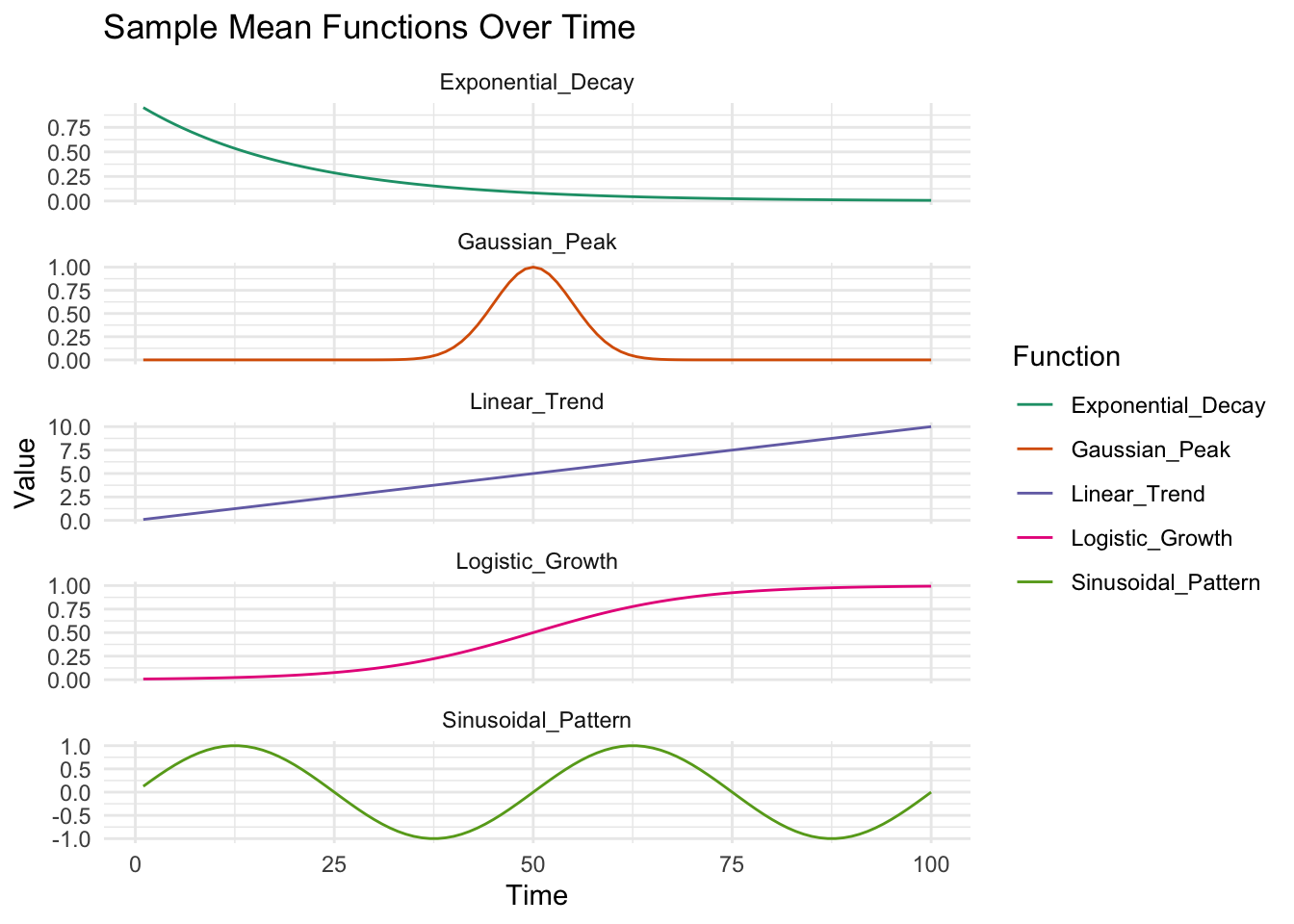
Now we select a sample pt, topic and disease.
library(tidyr)
library(reshape2)

ptid=sample(D,1)
topicd=sample(K,1)
randomd=sample(V,1)
#mean_functions_called[[topicd]][[randomd]]
#mu_vectors[[topicd]][[randomd]]

par(mfrow=c(2,2))
plot(mu_vectors[[topicd]][[randomd]],xlab="Time",ylab="Mu Vector K:V")
plot(eta[topicd,randomd,],xlab="Time",ylab="Eta (mu+noise) Vector K:V")
plot(eta_softmax[topicd,randomd,],xlab="Time",ylab="Norm Eta (mu+noise) Vector K:V")
plot(beta[ptid,topicd,randomd,],xlab="Time",ylab="Beta (Norm_warpt(mu+noise)) Vector K:V")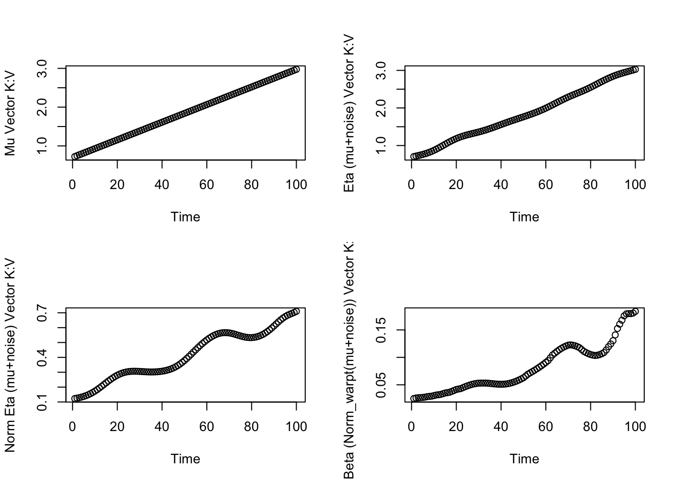
ptid=sample(D,1)
topicd=sample(K,1)
randomd=sample(V,1)

# mean_functions_called[[topicd]][[randomd]]
# mu_vectors[[topicd]][[randomd]]

par(mfrow=c(2,2))
plot(mu_vectors[[topicd]][[randomd]],xlab="Time",ylab="Mu Vector K:V")
plot(eta[topicd,randomd,],xlab="Time",ylab="Eta (mu+noise) Vector K:V")
plot(eta_softmax[topicd,randomd,],xlab="Time",ylab="Norm Eta (mu+noise) Vector K:V")
plot(beta[ptid,topicd,randomd,],xlab="Time",ylab="Beta (Norm_warpt(mu+noise)) Vector K:V")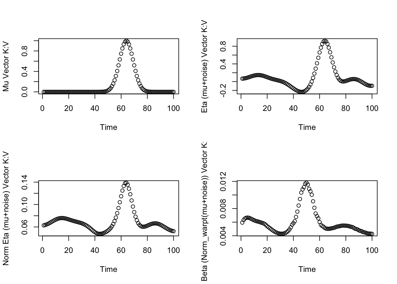
To show how the topic ‘responsibilities’ for a given disease vary over time:
eta_d1_df <- as.data.frame(t(eta_softmax[,1,]))
colnames(eta_d1_df) <- paste("Topic", 1:K, sep = "")
eta_d1_df$Time <- 1:nrow(eta_d1_df)

eta_d1_long <- melt(eta_d1_df, id.vars = "Time", variable.name = "Topic", value.name = "Proportion")

library(RColorBrewer)
color_count <- 50
colors <- colorRampPalette(brewer.pal(9, "Set1"))(color_count)

ggplot(eta_d1_long, aes(x = Time, y = Proportion, fill = Topic)) +
  geom_area(position = 'stack') +
  labs(x = "Time", y = "Topic Proportion", fill = "Topic") +scale_fill_aaas()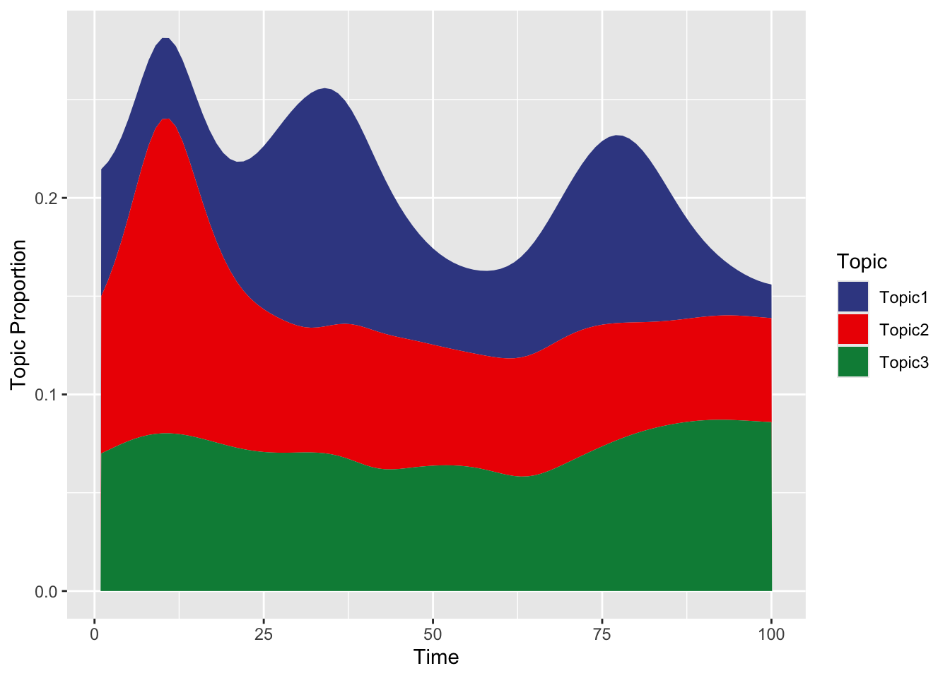
## $title
## [1] "Distribution of Topics for Disease 1 Over Time"
##
## attr(,"class")
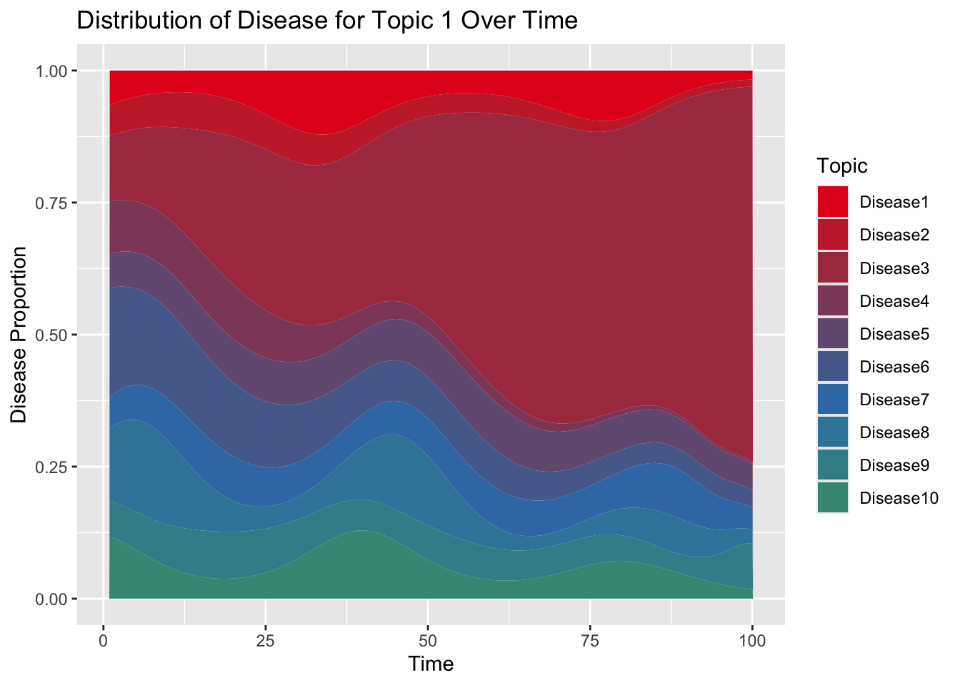
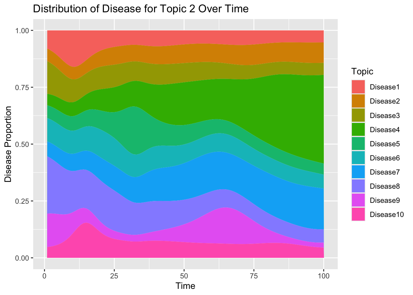
## [1] "labels"Now show that across time, disease probabilities are normalized for a given topic:
Let’s visualize how the disease trajectory now varies
Within the same topic
- Across individuals with different genetic ‘speed’.
library(plotly)
# Let's assume you want to visualize within the same topic (e.g., topic 1)
# and across individuals with different genetic 'speed' (e.g., person 1 to 5)
topic_idx <- sample(K,1)
person_indices <- c(which(rho[,topic_idx]>0.70&rho[,topic_idx]<0.9)[1],which(rho[,topic_idx]>0.9&rho[,topic_idx]<1.2)[1],which(rho[,topic_idx]>1.2&rho[,topic_idx]<1.5)[1])

disease_ids=sample(topic_specific_diseases[[topic_idx]],1)
#disease_ids=sample(which(disease_topic_matrix[,topic_idx]!=0),1)

# Extract data for the specified topic and persons
trajectory_data <- beta[person_indices, topic_idx, disease_ids, ]
dimnames(trajectory_data) <- list(Person = person_indices, TimePoint = 1:dim(beta)[4])

# Melt the data for ggplot2
trajectory_data_long <- melt(trajectory_data, varnames = c("Person", "TimePoint"), value.name = "Probability")

# Map 'Person' to their respective 'rho' values
trajectory_data_long$Rho <- rho[as.numeric(trajectory_data_long$Person), topic_idx]
trajectory_data_long$RhoCategory <- cut(trajectory_data_long$Rho,
                                        breaks = c(0, 0.9, 1.3, Inf),
                                        labels = c("low", "medium", "high"),
                                        right = FALSE)


library(ggsci)
print(rho[person_indices,topic_idx])
## [1] 0.7235774 1.1288510 1.2648923ggplot(trajectory_data_long, aes(x = TimePoint, y = Probability, group = Person, color = as.factor(RhoCategory))) +
geom_line(aes(col = as.factor(RhoCategory))) + # Linear model for trend lines
scale_color_npg() +
scale_fill_npg() +
labs(title = paste("Trajectories Within Topic", topic_idx, ", Disease", disease_ids, "Across Individuals"),
x = "Time Points", y = "Normalized Disease Probability", color = "Genetic Risk Category") +
theme_minimal() +
guides(color = guide_legend(title = "Genetic Risk Category"))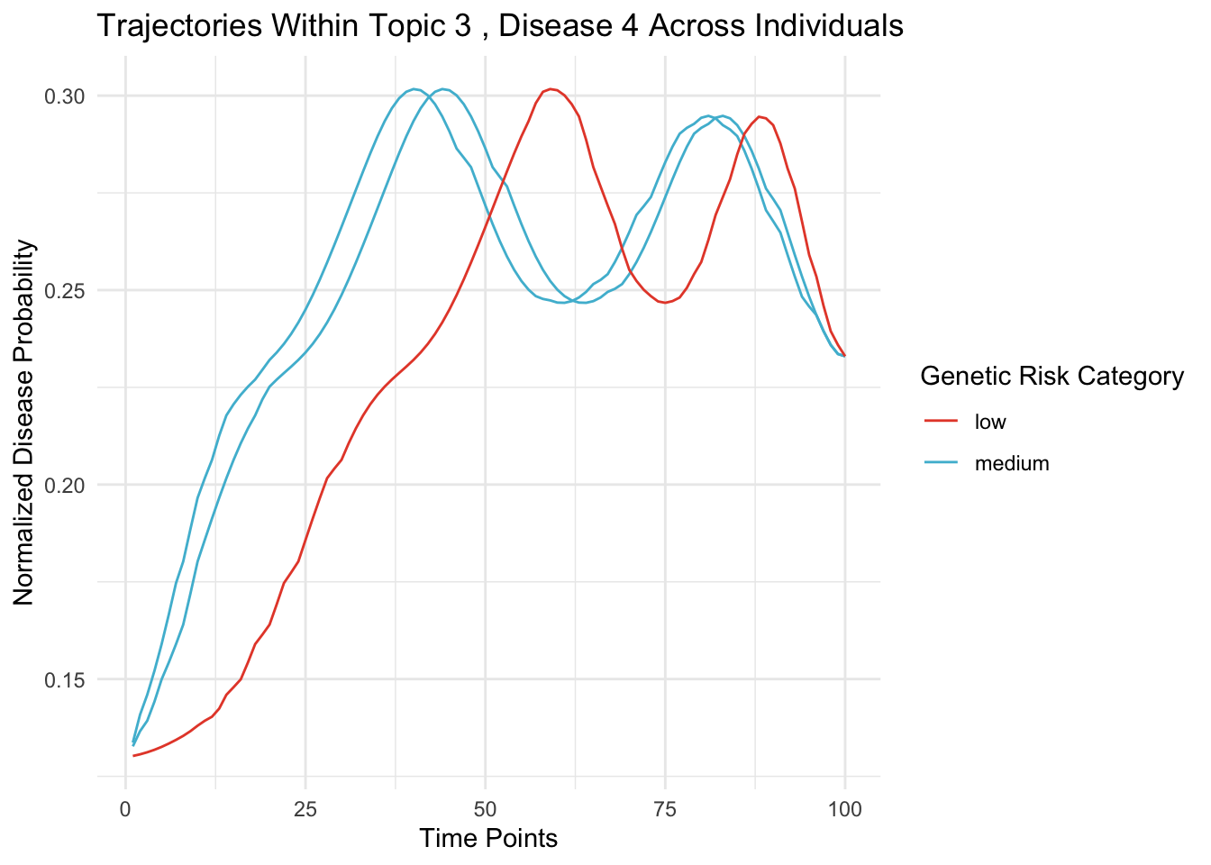
Between diseases
- Within a given topic and person
# Let's assume you want to visualize within the same topic (e.g., topic 1)
# and across individuals with different genetic 'speed' (e.g., person 1 to 5)
topic_idx_plot2 <- sample(K,1)
person=sample(which(rho[,topic_idx_plot2]>0.9),1)
disease_indices <- sample(V,10,replace = F)

# Extract data for the specified topic and persons
trajectory_data <- beta[person, topic_idx_plot2,disease_indices, ]

# Reshape data for ggplot2
trajectory_data_long <- reshape2::melt(trajectory_data)

# Create a ggplot for the trajectory
ggplot(trajectory_data_long, aes(x = Var2, y = value, group = as.factor(Var1))) +
  geom_line(aes(color = as.factor(Var1))) +
  labs(title = paste0("Disease Trajectories Within Topic ",topic_idx," Across Time for Pt. ",person),
       x = "Time Points", y = "Normalized Disease Probability",color="Disease") +
  theme_minimal()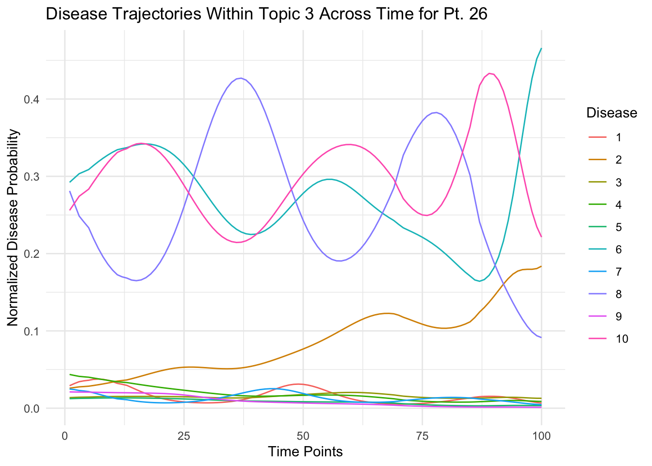
Between topics
- For a given person and disease over all topics
# Let's assume you want to visualize within the same topic (e.g., topic 1)
# and across individuals with different genetic 'speed' (e.g., person 1 to 5)
person_plot3=which.max(rowSums(rho))
topic_idx_plot3 <- 1:K
disease_indices_plot3 <- sample(V,1)

# Extract data for the specified topic and persons
trajectory_data <- beta[person_plot3, topic_idx_plot3,disease_indices_plot3, ]

# Reshape data for ggplot2
trajectory_data_long <- reshape2::melt(trajectory_data)

# Create a ggplot for the trajectory
ggplot(trajectory_data_long, aes(x = Var2, y = value, group = as.factor(Var1))) +
  geom_line(aes(color = as.factor(Var1))) +
  labs(title = paste("Disease",disease_indices,"Trajectories Across Topics, Across Time"),
       x = "Time Points", y = "Normalized Disease Probability",color="Topic") +
  theme_minimal()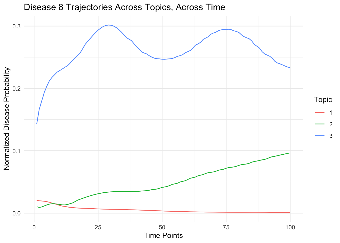
5.1 What do the topics look like?
# Calculate the covariance matrix
cov_matrix <- cor(t(eta[1,,]))

# Melt the covariance matrix for plotting
cov_melted <- melt(cov_matrix)

# Plot using ggplot2
ggplot(cov_melted, aes(x=Var1, y=Var2, fill=value)) +
  geom_tile() + # Use geom_tile for heatmap
  scale_fill_gradient2(low="blue", high="red", mid="white", midpoint=0, limit=c(min(cov_melted$value), max(cov_melted$value)), name="Covariance") +
  theme_minimal() + # A minimal theme
  theme(axis.text.x = element_text(angle = 45, hjust = 1), # Rotate x-axis labels for better readability
        axis.title = element_blank()) + # Remove axis titles for a cleaner look
  labs(title = paste0("Covariance between Diseases:Topic",1), fill = "Covariance")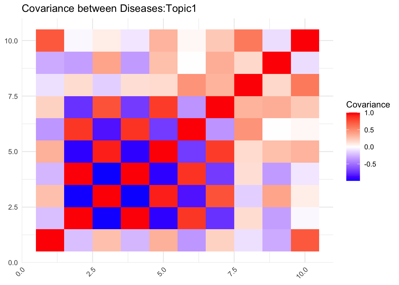
# Calculate the covariance matrix

cov_matrix <- cor(t(eta[2,,]))

# Melt the covariance matrix for plotting
cov_melted <- melt(cov_matrix)

# Plot using ggplot2
ggplot(cov_melted, aes(x=Var1, y=Var2, fill=value)) +
  geom_tile() + # Use geom_tile for heatmap
  scale_fill_gradient2(limit=c(min(cov_melted$value), max(cov_melted$value)), name="Covariance") +
  theme_minimal() + # A minimal theme
  theme(axis.text.x = element_text(angle = 45, hjust = 1), # Rotate x-axis labels for better readability
        axis.title = element_blank()) + # Remove axis titles for a cleaner look
  labs(title = paste0("Covariance between Diseases:Topic",2), fill = "Covariance")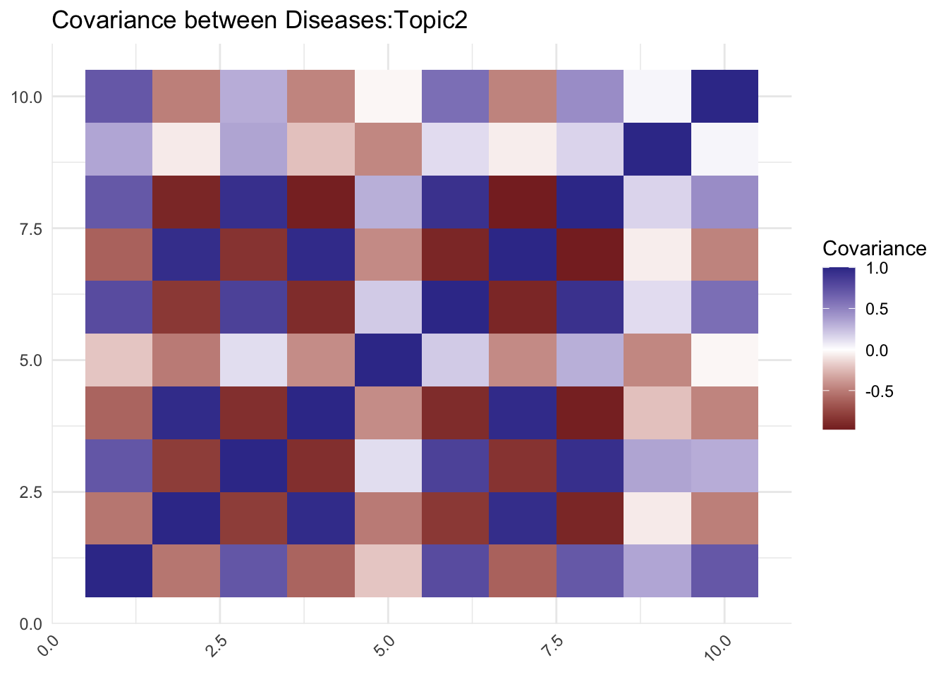
5.2 Plotting Topic specific
You can access normalized values for a specific person, topic, and time point as before.
For example, normalized values for person 1, topic 2, and time point 3:
person_idx <- sample(D,1)
topic_idx <- sample(K,1)

# for(i in 1:D){
# print(all.equal(colSums(beta[person_idx,topic_idx ,,]),rep(1,T)))
#
# }


plot(rowMeans(beta[person_idx,topic_idx,,]),pch=19)
points(topic_specific_diseases[[topic_idx]],rowMeans(beta[person_idx,topic_idx,topic_specific_diseases[[topic_idx]],]),col="red",pch=19)
5.3 topic specific: normalised array
Again show enrichment of topic specific disease in normalized array
# Calculate rowMeans across the 3rd dimension (Time) of eta

#s how that interpolation preserved relationship

pt_test=sample(D,1)

which(order(rowSums(beta[pt_test,1,,]),decreasing = T)%in%(topic_specific_diseases[[1]])==TRUE)
which(order(rowSums(beta[pt_test,2,,]),decreasing = T)%in%(topic_specific_diseases[[2]])==TRUE)
which(order(rowSums(beta[pt_test,3,,]),decreasing = T)%in%(topic_specific_diseases[[3]])==TRUE)


avg_prob <- apply(beta,c(2,3), mean)  # Result is a matrix of dimensions Topic x Disease

# Melt the average probability matrix
m <- melt(avg_prob)
names(m) <- c("Topic", "Disease", "AvgProb")

# Since directly using ifelse with list indexing won't work as expected, use a loop or apply function instead
m$Topic <- as.numeric(as.character(m$Topic))  # Ensure Topic is numeric for indexing

# Create a vector to store the specification of whether a disease is topic-specific
inspec <- vector("numeric", length = nrow(m))

# Populate the 'inspec' vector
for (i in 1:length(inspec)) {
  current_topic <- m$Topic[i]
  current_disease <- m$Disease[i]
  inspec[i] <- ifelse(current_disease %in% topic_specific_diseases[[current_topic]], 1, 0)
}

# Add the 'inspec' vector to the dataframe
m$inspec <- inspec

# Convert 'inspec' to a factor for coloring
m$inspec <- as.factor(m$inspec)

ggplot(m, aes(x = Disease, y = AvgProb, fill = inspec)) +
  geom_bar(stat = "identity", position = position_dodge()) +
  scale_fill_manual(values = c("0" = "blue", "1" = "red"),
                    name = "In Topic",
                    labels = c("0" = "Not Specific", "1" = "Topic Specific")) +
  labs(x = "Disease", y = "Average Probability", fill = "In Topic") +
  theme(axis.text.x = element_text(angle = 90, hjust = 1, vjust = 0.5)) +
  facet_wrap(~Topic, scales = "free_x")+theme_classic()


var(eta)
var(eta_tilde)
var(beta)