Chapter 12 Diagnoses
We can now sumamrise the diagnoses
diagnosis_count_array <- array(0, dim = c(D, T, V))
topic_count_array <- array(0, dim = c(D, T, K))
disease_in_topic_array=array(0, dim = c(D, T, V))

# Iterate over each patient
for (d in 1:D) {
  # Iterate over each time point
  for (t in 1:length(diags[[d]])) {
    # Check if there are any diagnoses at this time point
    if (!is.null(diags[[d]][[t]])) {
      # Iterate over each diagnosis for this patient at this time
      for (diag in diags[[d]][[t]]) {
        # Increment the count for this diagnosis
        # Ensure diag is an integer and valid index; adjust if necessary based on your diagnosis ID system
        diagnosis_count_array[d, t, diag] <- diagnosis_count_array[d, t, diag] + 1
        disease_in_topic_array[d, t, diag] <- diagnosis_count_array[d, t, diag] + 1
      }
    }
  }
}


# Iterate over each patient
for (d in 1:D) {
  # Iterate over each time point
  for (t in 1:length(diags[[d]])) {
    # Check if there are any diagnoses at this time point
    if (!is.null(diags[[d]][[t]])) {
      # Iterate over each diagnosis for this patient at this time
      for (topic in topics[[d]][[t]]) {
        # Increment the count for this diagnosis
        # Ensure diag is an integer and valid index; adjust if necessary based on your diagnosis ID system
        topic_count_array[d, t, topic] <- topic_count_array[d, t, topic] + 1

      }
    }
  }
}
Now let’s make some plots;
D <- dim(diagnosis_count_array)[1]  # Number of patients
T <- dim(diagnosis_count_array)[2]  # Number of time points (years)
V <- dim(diagnosis_count_array)[3]  # Total number of diagnoses

start_year=2
first_occurrences <- vector("list", D)
names(first_occurrences) <- paste0("Patient_", 1:D)

# Iterate through each patient and diagnosis to find the first occurrence
for (d in 1:D) {
  for (v in 1:V) {
    # Find the first time point (if any) this diagnosis occurs for patient d
    time_points <- which(diagnosis_count_array[d, , v] > 0)
    if (length(time_points) > 0) {
      first_occurrence_year <- start_year + time_points[1] - 1
      # Store this info
      first_occurrences[[d]] <- rbind(first_occurrences[[d]], cbind(DiagnosisID = v, Year = first_occurrence_year))
    }
  }
  # Convert each patient's data to a dataframe for easier handling later
  first_occurrences[[d]] <- as.data.frame(first_occurrences[[d]])
}

# At this point, `first_occurrences` is a list of dataframes, each containing the first occurrence years of diagnoses for each patient

# Filter for specific patients (if you're only interested in a subset)
specific_patients <- sample(D, size = 2)  # Example: Randomly selecting 2 patients
df_specific <- lapply(specific_patients, function(d) {
  data.frame(PatientID = d, first_occurrences[[d]])
})
df_specific <- do.call(rbind, df_specific)

# Convert DiagnosisID and PatientID back to factors if needed
df_specific$DiagnosisID <- factor(df_specific$DiagnosisID)
df_specific$PatientID <- factor(df_specific$PatientID)


ggplot(df_specific, aes(x = Year, y = DiagnosisID)) +
  geom_tile() +
  scale_fill_gradient(low = "white", high = "blue") +
  labs(title = "First Occurrence of Diagnoses Over Time",
       x = "Year", y = "Diagnosis ID") +
  facet_wrap(~PatientID, scales = "free_y") +
  theme_minimal()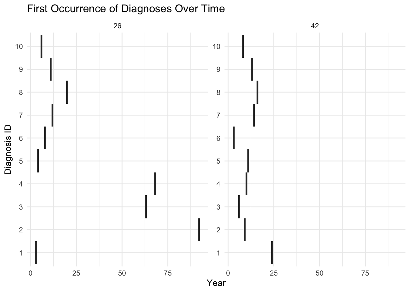
We can also plot total counts:
library(tidyr)
# Convert the 3D array to a long format data frame
df <- arrayInd(which(diagnosis_count_array >= 0), dim(diagnosis_count_array)) %>%
  as_tibble() %>%
  rename(PatientID = V1, TimePoint = V2, DiagnosisID = V3) %>%
  mutate(Year = start_year + TimePoint - 1,
         Count = apply(., 1, function(x) diagnosis_count_array[x[1], x[2], x[3]]))


# Filter out zero counts to reduce plot clutter

total_diagnoses_per_year <- df %>%
  group_by(PatientID, Year) %>%
  summarise(TotalDiagnoses = sum(Count))
## `summarise()` has grouped output by 'PatientID'. You can override using the `.groups`
## argument.## Loading required package: viridisLitepatients=sample(D,size = 2)
# Plotting
ggplot(total_diagnoses_per_year[total_diagnoses_per_year$PatientID%in%patients,], aes(x = Year, y = TotalDiagnoses, fill = as.factor(PatientID))) +
geom_bar(stat = "identity", position = "dodge") +
scale_fill_viridis(discrete = TRUE, option = "viridis", direction = -1) + # Using viridis
labs(title = "Total Number of Diagnoses per Year for Each Patient",
x = "Year", y = "Total Number of Diagnoses") +
facet_wrap(~PatientID, scales = "free_y", ncol = 4) + # Adjust ncol for layout
theme_minimal()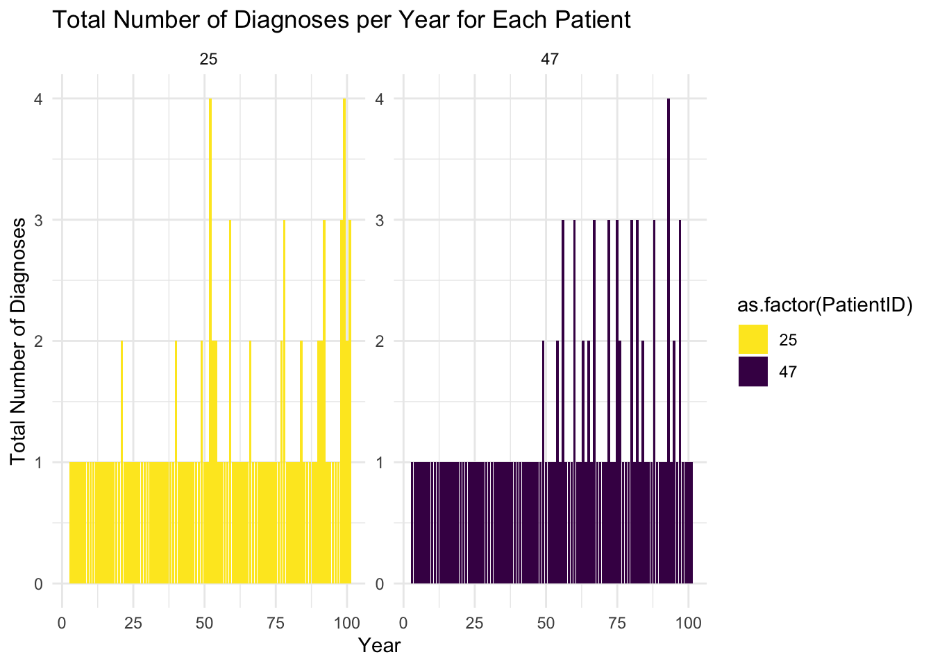
Show that most diseases are in topic:
library(ggplot2)
library(dplyr)
library(tidyr)

# Step 1: Aggregate Diagnoses
# Calculate the proportion of topic-specific diagnoses for each patient at each time interval
# Assuming disease_in_topic is a list of lists with TRUE/FALSE for topic-specific diagnoses
disease_proportion_df <- do.call(rbind, lapply(1:D, function(d) {
  do.call(rbind, lapply(2:length(disease_in_topic[[d]]), function(t) {
    data.frame(
      Patient = d,
      Time = t,
      TopicSpecific = sum(unlist(disease_in_topic[[d]][[t]]), na.rm = TRUE),
      TotalDiagnoses = length(disease_in_topic[[d]][[t]]),
      ProportionTopicSpecific = ifelse(length(disease_in_topic[[d]][[t]]) > 0,
                                       sum(unlist(disease_in_topic[[d]][[t]]), na.rm = TRUE) / length(disease_in_topic[[d]][[t]]),
                                       0)
    )
  }))
}))

# Step 2: Summarize Across Patients
# Calculate the average proportion of topic-specific diagnoses at each time point across all patients
summary_proportion_df <- disease_proportion_df %>%
  group_by(Time) %>%
  summarise(
    AvgPropTopicSpecific = mean(ProportionTopicSpecific, na.rm = TRUE),
    ProportionWithTopicSpecific = sum(TopicSpecific > 0, na.rm = TRUE) / n()
  )

# Step 3: Plot Summary
# Plot the average proportion of patients with topic-specific diagnoses over time
# Calculate proportions for bar chart
bar_chart_df <- disease_proportion_df %>%
  group_by(Time) %>%
  summarise(
    PropTopicSpecific = mean(ProportionTopicSpecific, na.rm = TRUE),
    PropNotTopicSpecific = mean(1 - ProportionTopicSpecific, na.rm = TRUE)
  ) %>%
  gather(key = "Type", value = "Proportion", -Time)

# Create the bar chart
ggplot(bar_chart_df, aes(x = Time, y = Proportion, fill = Type)) +
  geom_bar(stat = "identity") +
  scale_fill_manual(values = c("PropTopicSpecific" = "blue", "PropNotTopicSpecific" = "red")) +
  labs(title = "Proportion of Topic-Specific vs Non-Specific Diagnoses Over Time",
       x = "Time Interval", y = "Proportion") +
  theme_minimal()