Chapter 9 Visualization
Now we can plot the simulated theta for a given individual
- For the natural scale
gp_mean_array=gp_means_d
pt=sample(x = D,size = 1)
matplot(t(alpha_individual[pt,,]),ylab=paste0("Alpha Prenorm",pt))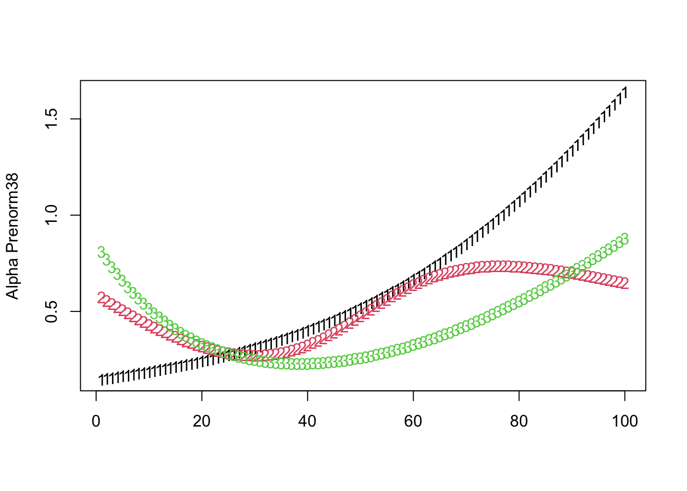
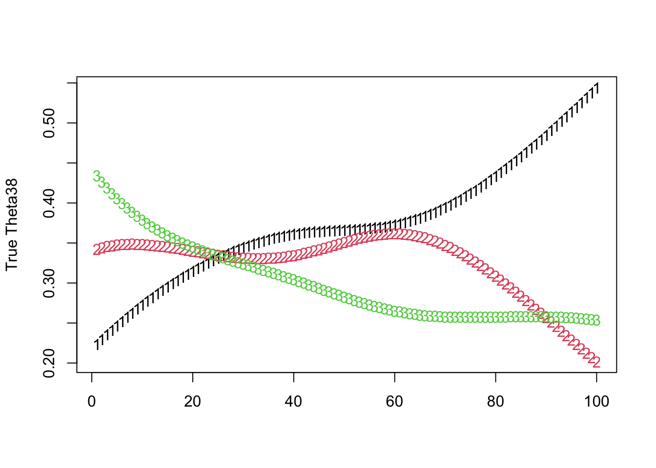
For the softmax true proprotions Theta:
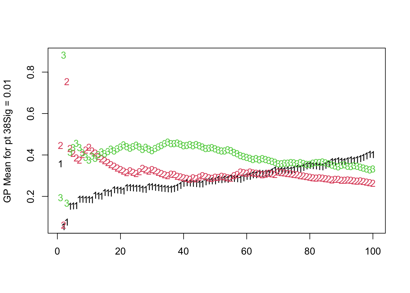
For the posterior means of the topic probabilities:

Now let’s make some ggplots;
theta_patient1 <- t(Theta[pt, , ])
# Convert to a data frame and reshape
theta_patient1_df <- as.data.frame(theta_patient1)
colnames(theta_patient1_df) <- paste("Topic", 1:K, sep = "")
theta_patient1_df$Time <- 1:nrow(theta_patient1_df)

theta_patient1_long <- melt(theta_patient1_df, id.vars = "Time", variable.name = "Topic", value.name = "Proportion")
ggplot(theta_patient1_long, aes(x = Time, y = Proportion, fill = Topic,col=Topic)) +
  #geom_line()+
  geom_area(position = 'stack') +
  labs(x = "Time", y = "Topic Proportion", fill = "Topic") +
  ggtitle(paste0("Distribution of True Topic Proportions for Patient ",pt," Over Time"))
theta_patient1 <- t(estimated_Theta[pt, , ])
# Convert to a data frame and reshape
theta_patient1_df <- as.data.frame(theta_patient1)
colnames(theta_patient1_df) <- paste("Topic", 1:K, sep = "")
theta_patient1_df$Time <- 1:nrow(theta_patient1_df)
theta_patient1_long <- melt(theta_patient1_df, id.vars = "Time", variable.name = "Topic", value.name = "Proportion")

ggplot(theta_patient1_long, aes(x = Time, y = Proportion, fill = Topic)) +
  #geom_line()+
  geom_area(position = 'stack') +
  labs(x = "Time", y = "Topic Proportion", fill = "Topic") +
  ggtitle(paste0("Estimated Topics for Patient ",pt," Over Time"))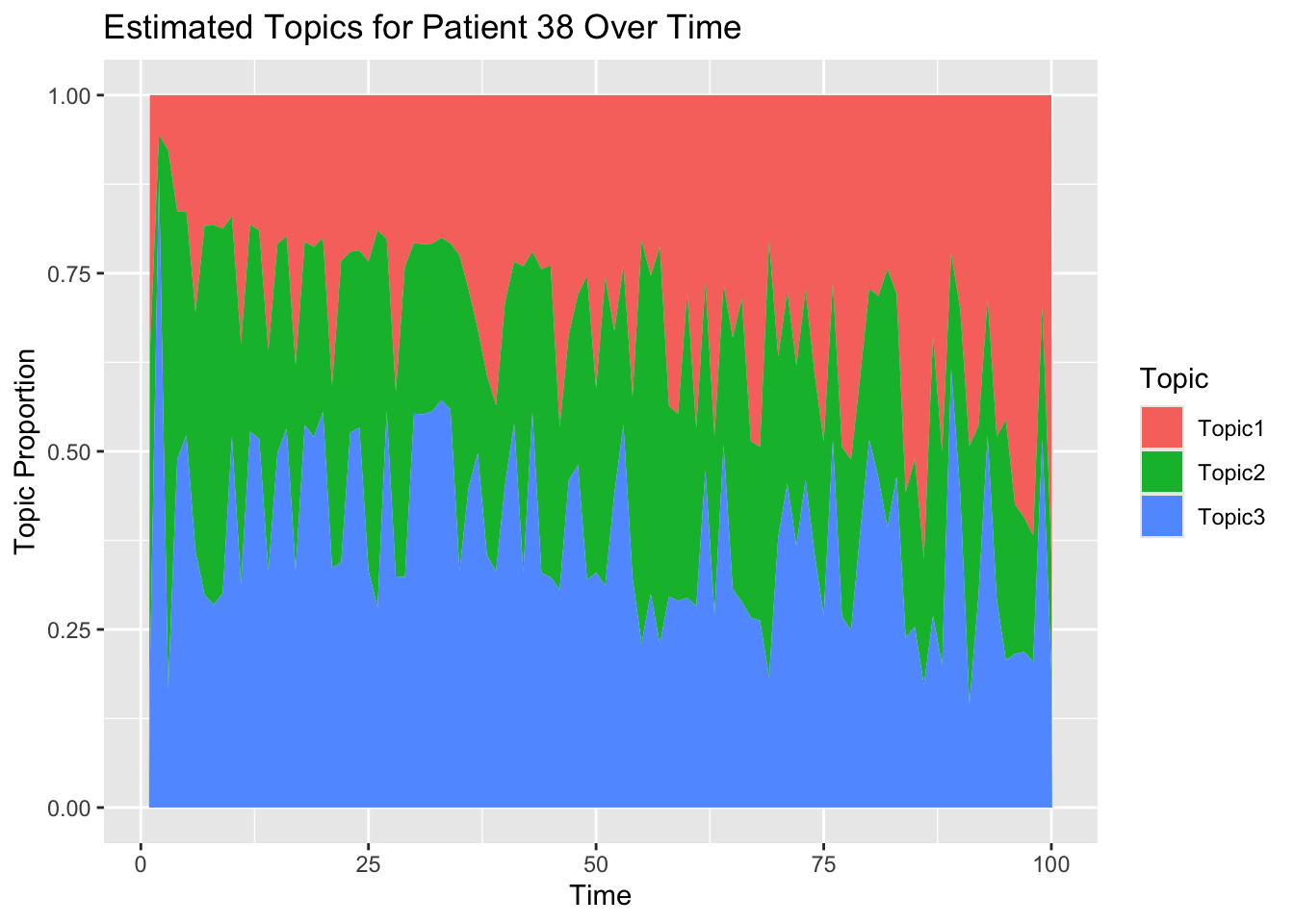
theta_patient1 <- t(gp_mean_array[pt, , ])

# Convert to a data frame and reshape
theta_patient1_df <- as.data.frame(theta_patient1)
colnames(theta_patient1_df) <- paste("Topic", 1:K, sep = "")
theta_patient1_df$Time <- 1:nrow(theta_patient1_df)
theta_patient1_long <- melt(theta_patient1_df, id.vars = "Time", variable.name = "Topic", value.name = "Proportion")
ggplot(theta_patient1_long, aes(x = Time, y = Proportion, fill = Topic,col=Topic)) +
  #geom_line()+
  geom_area(position = 'stack') +
  labs(x = "Time", y = "Topic Proportion", fill = "Topic") +
  ggtitle(paste0("GP Mean for Patient ",pt,"with Sigma ",sig,"Over Time"))
theta_patient1 <- t(sigma_array[pt, , ])

# Convert to a data frame and reshape
theta_patient1_df <- as.data.frame(theta_patient1)
colnames(theta_patient1_df) <- paste("Topic", 1:K, sep = "")
theta_patient1_df$Time <- 1:nrow(theta_patient1_df)
theta_patient1_long <- melt(theta_patient1_df, id.vars = "Time", variable.name = "Topic", value.name = "Proportion")
ggplot(theta_patient1_long, aes(x = Time, y = Proportion, fill = Topic,col=Topic)) +
  #geom_line()+
  geom_area(position = 'stack') +
  labs(x = "Time", y = "Sigma", fill = "Topic") +
  ggtitle(paste0("Sigma Patient ",pt,"with Sigma ",sig,"Over Time"))
9.1 plotting over all
# Convert arrays to data frames


Theta_long <- melt(Theta, varnames = c("Individual", "Topic", "Time"), value.name = "Proportion") %>%
  mutate(Type = "True")

estimated_Theta_long <- melt(estimated_Theta, varnames = c("Individual", "Topic", "Time"), value.name = "Proportion") %>%
  mutate(Type = "Estimated")

gp_mean_long= melt(gp_mean_array, varnames = c("Individual", "Topic", "Time"), value.name = "Proportion") %>%
  mutate(Type = "GPMean")

# Combine the data
combined_data <- rbind(Theta_long, estimated_Theta_long,gp_mean_long)

# Compute the average proportion for each topic at each time point
average_proportions <- combined_data %>%
  group_by(Type, Topic, Time) %>%
  summarise(Avg_Proportion = mean(Proportion), .groups = 'drop')


# Plotting directly from the long-format data
ggplot(average_proportions, aes(x = Time, y = Avg_Proportion, #fill = as.factor(Topic),
                                col = as.factor(Topic))) +
  geom_point()+
  #geom_bar(stat = "identity", position = "stack") +
  facet_wrap(~Type, scales = "free_y", nrow=1) +
  scale_x_continuous(breaks = seq(min(average_proportions$Time), max(average_proportions$Time), by = 10)) + # Adjust this line if necessary
  labs(title = "Average Topic Proportions Over Time", x = "Time Point", y = "Average Proportion", fill = "Topic",col="Topic") +
  theme_classic() +
  theme(axis.text.x = element_text(angle = 45, hjust = 1))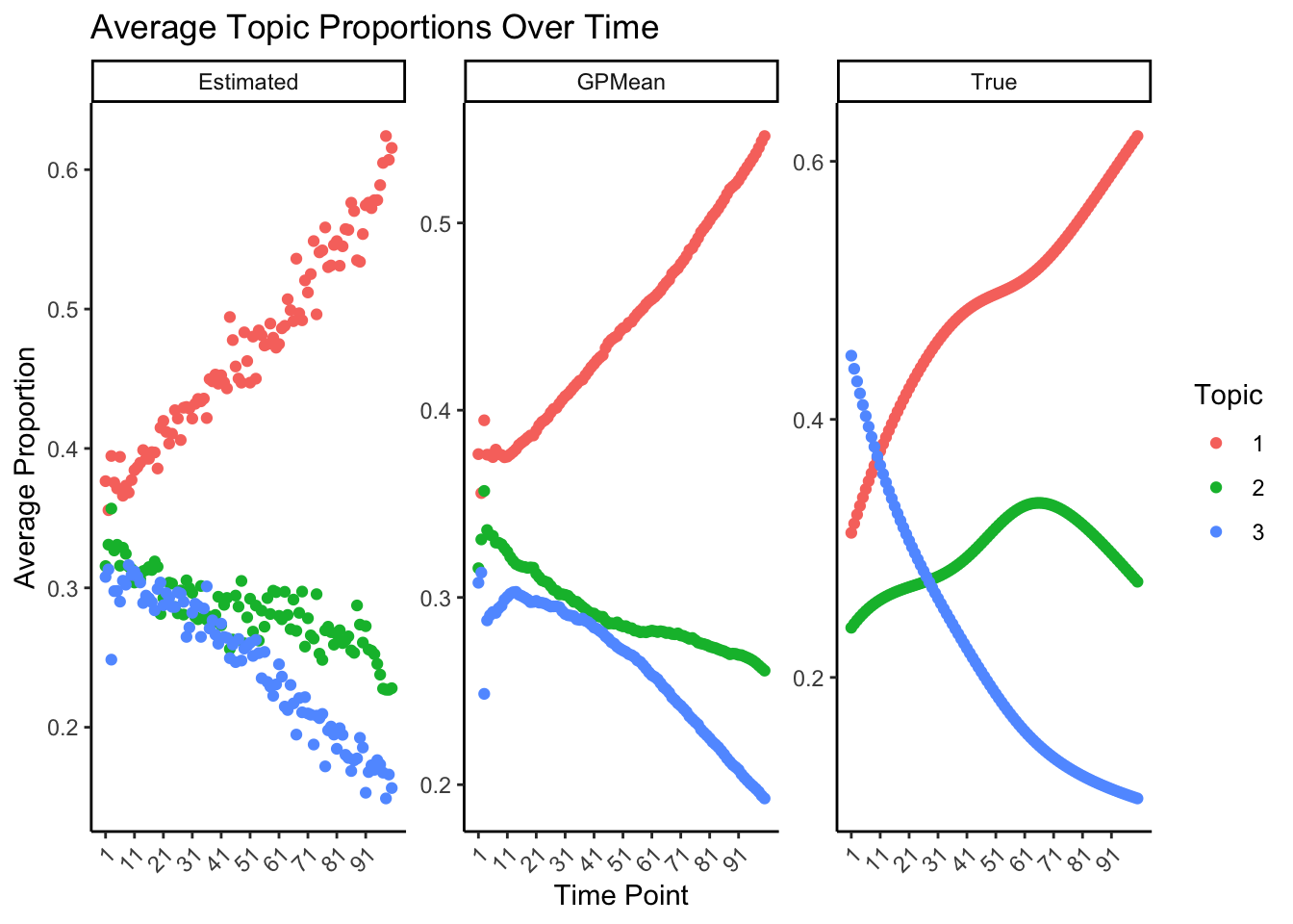
9.2 plot for all deviations
theta_deviation <- array(0,dim = c(K,T))
stupid_deviation <- array(0,dim = c(K,T))
prior_deviation <- array(0,dim = c(K,T))
for (k in 1:K) {
for (t in 2:T) {
theta_deviation[k,t] <- mean((estimated_Theta[, k,t ] - Theta[, k, t])^2)
stupid_deviation[k,t] <- mean((estimated_Theta[, k,t ] - rep(1/K,D))^2)
## here subtract first
prior_deviation[k,t] = mean((estimated_Theta[, k,t ] - Theta[, k, 1])^2)
}}
# Assuming the calculation loops are correctly populating the deviation arrays
# Combine your arrays into a single array for melting
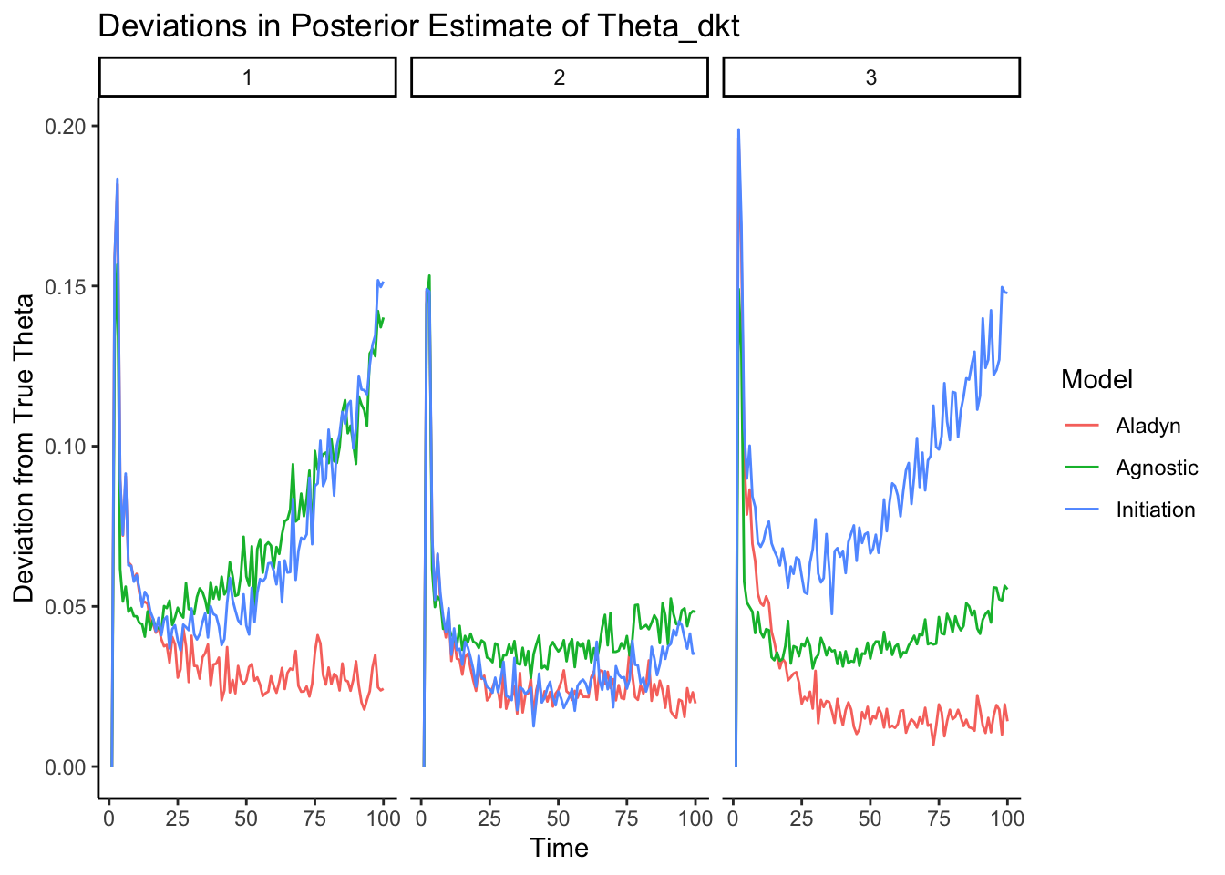
combined_array <- array(c(theta_deviation, stupid_deviation, prior_deviation), dim = c( K, T, 3))
# Correct variable names and melt the array
long_deviations <- melt(combined_array, varnames = c("Topic", "Time", "Model"))
# Correct the model names in your melted data
long_deviations$Model <- factor(long_deviations$Model, levels = 1:3, labels = c("Aladyn", "Agnostic", "Initiation"))
# Visualization
ggplot(long_deviations, aes(x = Time, y = value, color = Model, group = Model)) +
geom_line() +facet_wrap(~Topic)+
# Adjust ncol based on your dataset
labs(x = "Time", y = "Deviation from True Theta", color = "Model") +
ggtitle("Deviations in Posterior Estimate of Theta_dkt")+theme_classic()