Chapter 6 Topic Distribtuion
Let \(\theta_{d,t}\) represent the topic proportions for individual \(d\) at time \(t\), and \(w_{d,t}\) represent the new disease diagnoses observed for that individual at time \(t\). Let \(\gamma_d\) represent the genetic stickiness parameter for individual \(d\), which influences the rate at which their topic proportions change over time.
Given the new observations \(w_{d,t}\), we update \(\theta_{d,t}\) as follows:
The probability of \(\theta_{d,t}\) given \(w_{d,t}\), \(\eta_{t}\), and \(\gamma_d\) is expressed as:
Given:
- \(\theta_{d,t-1}\): The topic proportions for individual \(d\) at time \(t-1\).
- \(w_{d,t}\): The new disease diagnoses observed for individual \(d\) at time \(t\).
- \(\beta_{k,v,t}\): The probability of disease \(v\) in topic \(k\) at time \(t\), derived from the
normalized_array. - \(\gamma_d\): The genetic stickiness parameter for individual \(d\).
The update rule for \(\theta_{d,t}\), the topic proportions at time \(t\), is given by:
Compute the likelihood of observing the new diagnoses given each topic:
\[ \text{likelihood}_k = \prod_{v \in w_{d,t}} \beta_{k,v,t} \]
Update the topic proportions by multiplying the prior topic proportions by the likelihood and the genetic stickiness factor, then normalize:
\[ \text{unnormalized_posterior}_k = \theta_{d,t-1,k} \cdot \gamma_d \cdot \text{likelihood}_k \]
\[ \theta_{d,t,k} = \frac{\text{unnormalized_posterior}_k}{\sum_{k=1}^{K} \text{unnormalized_posterior}_k} \]
Where: - \(\theta_{d,t,k}\) is the updated proportion of topic \(k\) for individual \(d\) at time \(t\). - The normalization step ensures that the updated topic proportions sum to 1.
First we need to simulate a theta that changes with time. We will make it a function of genetics so that individuals with greater genetic ‘pull’ move less
6.1 Population shifts
library(reshape2)
library(dplyr)
library(ggplot2)


linear_trend <- function(time,
                         slope = 0.1,
                         intercept = 0) {
  return(slope * time + intercept)
}


logistic_growth <-
  function(t, carrying_capacity, growth_rate, t_mid) {
    carrying_capacity / (1 + exp(-growth_rate * (t - t_mid)))
  }


exponential_decay <- function(t, initial_value, decay_rate) {
  initial_value * exp(-decay_rate * t)
}

gaussian_peak <- function(t, mean, variance) {
  exp(-(t - mean) ^ 2 / (2 * variance))
}

polynomial_trend <- function(t, coefficients) {
  sum(sapply(1:length(coefficients), function(i)
    coefficients[i] * t ^ (i - 1)))
}

sinusoidal_pattern <- function(t, amplitude, period, phase) {
  amplitude * sin((2 * pi / period) * t + phase)
}

cov_function <- function(t1, t2, lengthscale, variance) {
  return(variance * exp(-0.5 * (t1 - t2) ^ 2 / lengthscale ^ 2))
}


time_points <- 1:T

# Create a list to hold the mu vectors for each topic
mu_vectors <- list()

# Assign a mean function to each topic based on expected behavior


mu_vectors[[1]] <-
  sapply(time_points,
         linear_trend,
         slope = 0.02,
         intercept = 0.5)
mu_vectors[[2]] <-
  sapply(
    time_points,
    logistic_growth,
    carrying_capacity = 1,
    growth_rate = 0.1,
    t_mid = T / 2
  )
mu_vectors[[3]] <-
  sapply(time_points,
         exponential_decay,
         initial_value = 1,
         decay_rate = 0.05)


genetic_predisposition <-
  matrix(MCMCpack::rdirichlet(D, alpha = c(1, 1, 1)), nrow = D, byrow = T)


predisposition_adjustment <-
  function(mu, predisposition_score, topic_effect_size) {
    # Apply the effect size to the predisposition score to get the adjustment
    adjustment <- predisposition_score * topic_effect_size

    # Adjust the population mean mu with the individual's predisposition adjustment
    adjusted_mu <- mu + adjustment

    return(adjusted_mu)
  }


mu_population = array(dim = c(K, T))
for (k in 1:K) {
  mu_population[k,] = mu_vectors[[k]]  # Each topic's population-level mean over time
}
6.2 Step 2: Generate individual-specific topic distributions
alpha_individual = array(dim = c(D, K, T))
adjusted_mu_individual = array(dim = c(D, K, T))


alpha_pop = array(dim = c(K, T))
## generate population Thetas to show population level trajectories

variance <- runif(n = K, min = 1, max = 2)
lengthscale <-
  runif(n = K, min = 95, max = 100) # Example lengthscale, could change more for some topics but it doesn't
effect_size_topic = runif(n = K)

cov_matrix_pops = list()

for (k in 1:K) {
  # Adjust the mean based on individual genetic predisposition
  mu_k <- mu_population[k, ]


  # Define the effect size (you might have different effect sizes for different topics)
  effect_size_k <- effect_size_topic[k]

  topic_variance = variance[k]
  topic_lengthscale = lengthscale[k]


  # Generate the covariance matrix using the individual's genetic factor
  cov_matrix_pop = matrix(0, nrow = T, ncol = T)

  for (i in 1:T) {
    for (j in 1:T) {
      cov_matrix_pop[i, j] = cov_function(i, j, lengthscale = topic_lengthscale, variance = topic_variance)
    }
  }


  cov_matrix_pops[[k]] = cov_matrix_pop


  alpha_pop[k, ] = mvrnorm(1, mu = mu_k, Sigma = cov_matrix_pop)


  for (d in 1:D) {
    # Get this individual's predisposition score for this topic
    predisposition_score_dk <- genetic_predisposition[d, k]
    # Adjust the population-level mean mu_k for this individual's predisposition
    adjusted_mu_k <-
      predisposition_adjustment(mu_k, predisposition_score_dk, effect_size_k)

    adjusted_mu_individual[d, k,] = adjusted_mu_k


    # Sample from the GP for this individual and topic
    alpha_individual[d, k, ] = mvrnorm(1, mu = adjusted_mu_k, Sigma = cov_matrix_pop)
  }
}
6.3 Step 3: Normalize the proportions for each individual across topics at each time point
Theta_individual = array(dim = c(D, K, T))
for (d in 1:D) {
for (t in 1:T) {
Theta_individual[d, , t] = softmax_normalize(alpha_individual[d, , t])
}
}
Theta_pop = array(dim = c(K, T))
for (t in 1:T) {
Theta_pop[, t] = softmax_normalize(alpha_pop[, t])
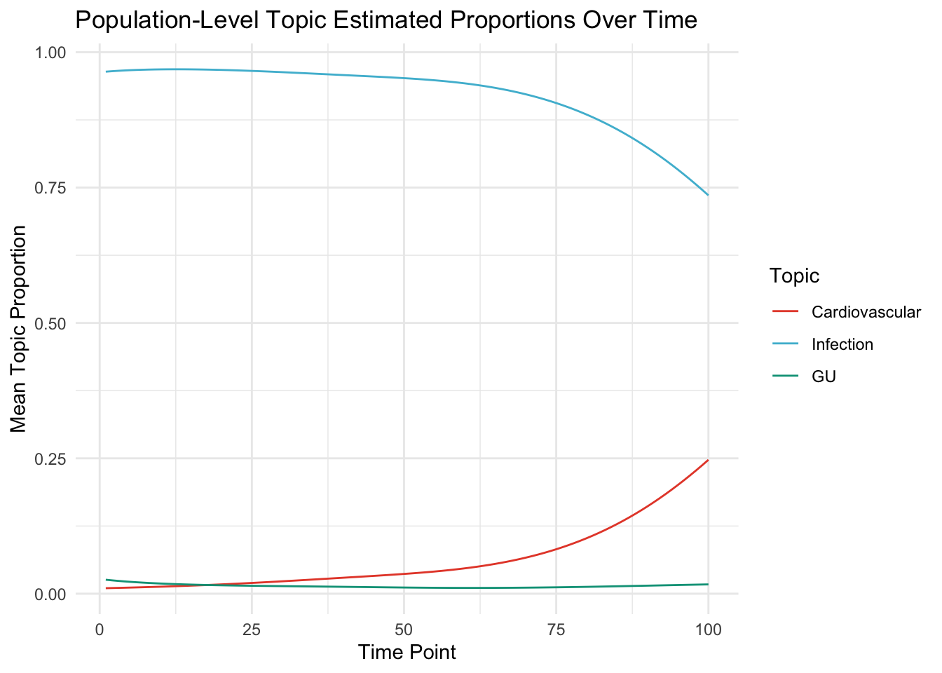
}6.3.1 now show for Population
Here we look at the mean level of the topic weight for each time period across population.
proportions_df = melt(Theta_pop)
names(proportions_df) <- c("Topic", "Time", "Proportion")

proportions_df$Topic = factor(
  proportions_df$Topic,
  levels = c(1, 2, 3),
  labels = c("Cardiovascular", "Infection", "GU")
)
tab = proportions_df %>% group_by(Time, Topic) %>% summarise(Proportion =
                                                               mean(Proportion))
## `summarise()` has grouped output by 'Time'. You can override using the
## `.groups` argument.# Plot
ggplot(tab, aes(x = Time, y = Proportion, col = as.factor(Topic))) +
geom_line() +
theme_minimal() +scale_color_npg()+
labs(
title = "Population-Level Topic Estimated Proportions Over Time",
x = "Time Point",
y = "Mean Topic Proportion",
color = "Topic"
)
6.4 Population Mean function
Here we show how this matches population means
– this will be more or less true depending on how fine the lengthscale is – if the vairance is small and lengthscale large, then the pattern will roughly approximate the man
softmax_population <- apply(mu_population, 2, softmax_normalize)

# Convert softmaxed population means to a data frame for plotting
population_probs_df <- as.data.frame(t(softmax_population))
population_probs_df$Time <- 1:T
population_probs_df <- melt(population_probs_df, id.vars = "Time")

# Automating topic assignment
population_probs_df$Topic <-
  as.numeric(gsub("V", "", population_probs_df$variable))


ggplot(population_probs_df,
       aes(
         x = Time,
         y = value,
         group = Topic,
         color = as.factor(Topic)
       )) +
  geom_line() +
  theme_minimal() +
  labs(title = "Population-Level Topic Means (softmax) Over Time",
       x = "Time Point",
       y = "Probability") +
  scale_color_npg()
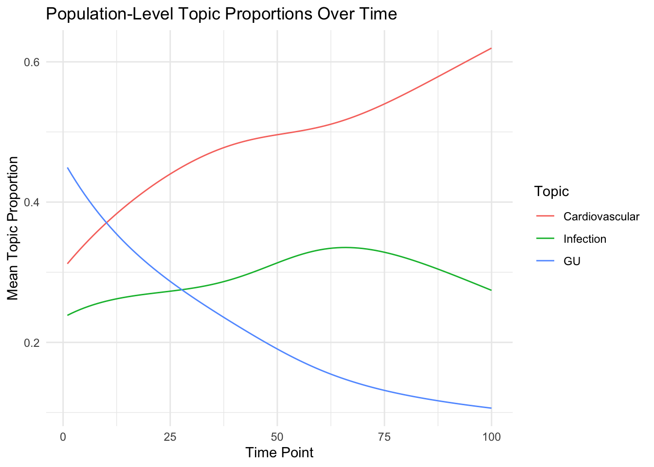
6.5 Population to Individual
Now show individual mimics pouplation level patterns:
We melt across individuals (i.e., theta after adjustment for individual genetifsc)
library(reshape2)
proportions_df = melt(Theta_individual)
names(proportions_df) <-
  c("Individual", "Topic", "Time", "Proportion")

proportions_df$Topic = factor(
  proportions_df$Topic,
  levels = c(1, 2, 3),
  labels = c("Cardiovascular", "Infection", "GU")
)
tab = proportions_df %>% group_by(Time, Topic) %>% summarise(Proportion =
                                                               mean(Proportion))
## `summarise()` has grouped output by 'Time'. You can override using the
## `.groups` argument.# Plot
ggplot(tab, aes(x = Time, y = Proportion, col = as.factor(Topic))) +
geom_line() +
theme_minimal() +
labs(
title = "Population-Level Topic Proportions Over Time",
x = "Time Point",
y = "Mean Topic Proportion",
color = "Topic"
)
6.6 Population versus Genetically Selected Individuals
Instead of considering the theta, we can look at individual genetic functions of the mean.
Plot the \(\mu\) for the population and compare with individuals
# Identify the individual with the highest genetic predisposition for each topic
high_rankers <-
  data.frame(t(apply(genetic_predisposition, 1, function(x) {
    top = which.max(x)

    return(list = c(topic = top, ratio = x[top] / sum(x[-top])))
  })))

top_individuals_per_topic = vector()
top_individuals_per_topic[1] = which(high_rankers[, 1] == 1 &
                                       high_rankers[, 2] > 2)[1]

top_individuals_per_topic[2] = which(high_rankers[, 1] == 2 &
                                       high_rankers[, 2] > 2)[1]

top_individuals_per_topic[3] = which(high_rankers[, 1] == 3 &
                                       high_rankers[, 2] > 2)[1]


top_individuals_info <- data.frame(
  Topic = factor(1:K),
  Individual = as.character(top_individuals_per_topic),
  GeneticPredispositionRatio = high_rankers[top_individuals_per_topic, "ratio"]
)


amt = array(NA, dim = c(D, K, T))
for (d in 1:D) {
  amt[d, , ] = apply(adjusted_mu_individual[d, , ], 2, softmax)
}

### but folks with high topic 3 could also have high topic 1... need to relfect population means


population_probs_df$Topic = as.factor(population_probs_df$Topic)
# Assuming D, K, T are defined; and Theta_individual is your D x K x T array
D <- dim(Theta_individual)[1]
K <- dim(Theta_individual)[2]
T <- dim(Theta_individual)[3]


# Let's create a comparison plot for a specific individual, for example, Individual 3

individual_number = top_individuals_per_topic


individual_probs_df <-
  melt(amt[individual_number, , , drop = FALSE], varnames = c("Individual", "Topic", "Time"))
individual_probs_df$Topic <- as.factor(individual_probs_df$Topic)
individual_probs_df$Individual <- as.factor(individual_number)

combined_df <- bind_rows(population_probs_df %>% mutate(Individual = "Population"),
                         individual_probs_df)

# Update the topic names in the dataframe
combined_df$Topic <-
  recode_factor(combined_df$Topic,
                `1` = "CVD",
                `2` = "GI",
                `3` = "Congenital")

# Update top_individuals_info to reflect the new topic names
top_individuals_info$Topic <- factor(
  top_individuals_info$Topic,
  levels = c(1, 2, 3),
  labels = c("CVD", "GI", "Congenital")
)

#Round the genetic predisposition ratios for display
top_individuals_info$GeneticPredispositionRatio <-
  round(top_individuals_info$GeneticPredispositionRatio, 2)


# Plot with annotations for genetic predisposition ratios
ggplot(combined_df,
       aes(
         x = Time,
         y = value,
         group = Individual,
         color = Individual
       )) +
  geom_line(aes(linetype = Topic)) +
  facet_wrap( ~ Topic, scales = "free_y", ncol = K) +
  geom_text(
    data = top_individuals_info,
    aes(
      x = Inf,
      y = Inf,
      label = paste(
        "Highest Ranking Individua is:",
        Individual,
        "\nRatio:",
        round(GeneticPredispositionRatio, 2)
      )
    ),
    position = position_nudge(y = -0.1),
    # Nudging text down a bit
    hjust = 1.1,
    vjust = 1.1,
    # Adjust text position
    check_overlap = TRUE,
    size = 3,
    inherit.aes = FALSE
  ) +
  theme_minimal() +
  labs(
    title = "Topic Probabilities for Individuals with Highest Genetic Predisposition vs Population",
    x = "Time Point",
    y = "Probability",
    color = "Individual",
    linetype = "Topic"
  ) +
  scale_color_npg() +
  theme(legend.position = "bottom", strip.text = element_text(size = 8)) +
  theme(plot.margin = margin(1, 1, 1, 1, "cm")) # Adjust plot margins