Chapter 1 Historical Perspective
A surrogate is a substitute for the real thing. In statistics, draws from predictive equations derived from a fitted model can act as a surrogate for the data-generating mechanism. If the fit is good – model flexible yet well-regularized, data rich enough and fitting scheme reliable – then such a surrogate can be quite valuable. Gathering data is expensive, and sometimes getting exactly the data you want is impossible or unethical. A surrogate could represent a much cheaper way to explore relationships, and entertain “what ifs?”. How do surrogates differ from ordinary statistical modeling? One superficial difference may be that surrogates favor faithful yet pragmatic reproduction of dynamics over other things statistical models are used for: interpretation, establishing causality, or identification. As you might imagine, that characterization oversimplifies.
The terminology came out of physics, applied math and engineering literatures, where the use of mathematical models leveraging numerical solvers has been commonplace for some time. As such models became more complex, requiring more resources to simulate/solve numerically, practitioners increasingly relied on meta-models built off of limited simulation campaigns. Often they recruited help from statisticians, or at least used setups resembling ones from stats. Data collected via expensive computer evaluations tuned flexible functional forms that could be used in lieu of further simulation. Sometimes the goal was to save money or computational resources; sometimes to cope with an inability to perform future runs (expired licenses, off-line or over-impacted supercomputers). Trained meta-models became known as surrogates or emulators, with those terms often used interchangeably. (A surrogate is designed to emulate the numerics coded in the solver.) The enterprise of design, running and fitting such meta-models became known as a computer experiment.
So a computer experiment is like an ordinary statistical experiment, except the data are generated by computer codes rather than physical or field observations, or surveys. Surrogate modeling is statistical modeling of computer experiments. Computer simulations are generally cheaper than physical observation, so the former could be entertained as an alternative or precursor to the latter. Although computer simulation can be just as expensive as field experimentation, computer modeling is regarded as easier because the experimental apparatus is better understood, and more aspects may be controlled. For example many numerical solvers are deterministic, whereas field observations are noisy or have measurement error. For a long time noise was the main occupant in the gulf between modeling and design considerations for surrogates, on the one hand, and more general statistical methodology on the other. But hold that thought for a moment.
Increasingly that gulf is narrowing, not so much because the nature of experimentation is changing (it is), but thanks to advances in machine learning. The canonical surrogate model, a fitted Gaussian process (GP) regression, which was borrowed for computer experiments from the geostatistics’ kriging literature of the 1960s, enjoys wide applicability in contexts where prediction is king. Machine learners exposed GPs as powerful predictors for all sorts of tasks, from regression to classification, active learning/sequential design, reinforcement learning and optimization, latent variable modeling, and so on. They also developed powerful libraries, lowering the bar to application by non-expert practitioners, especially in the information technology world. Facebook uses surrogates to tailor its web portal and apps to optimize engagement; Uber uses surrogates trained to traffic simulations to route pooled ride-shares in real-time, reducing travel and wait time.
Round about the same time, computer simulation as a means of scientific inquiry began to blossom. Mathematical biologists, economists and others had reached the limit of equilibrium-based mathematical modeling with cute closed-form solutions. They embraced simulation as a means of filling in the gap, just as physicists and engineers had decades earlier. Yet their simulations were subtly different. Instead of deterministic solvers based on finite elements, Navier–Stokes or Euler methods, they were building stochastic simulations, and agent-based models, to explore predator-prey (Lotka–Voltera) dynamics, spread of disease, management of inventory or patients in health insurance markets. Suddenly, and thanks to an explosion in computing capacity, software tools, and better primary school training in STEM subjects (all decades in the making), simulation was enjoying a renaissance. We’re just beginning to figure out how best to model these experiments, but one thing is for sure: the distinction between surrogate and statistical model is all but gone.
If there’s (real) field data, say on a historical epidemic, further experimentation may be almost entirely limited to the mathematical and computer modeling side. You can’t seed a real community with Ebola and watch what happens. Epidemic simulations, and surrogates built from a limited number of expensive runs where virtual agents interact and transmit infection, can be calibrated to a limited amount of physical data. Doing that right and getting something useful out of it depends crucially on surrogate methodology and design. Classical statistical methods offer little guidance. The notion of population is weak at best, and causation is taken as given. Mechanisms engineered into the simulation directly “cause” the outputs we observe as inputs change. Many classically statistical considerations take a back seat to having trustworthy and flexible prediction. That means not just capturing the essence of the simulated dynamics under study, but being hands-off in fitting while at the same time enabling rich diagnostics to help criticize that fit; understanding its sensitivity to inputs and other configurations; providing the ability to optimize and refine both automatically and with expert intervention. And it has to do all that while remaining computationally tractable. What good is a surrogate if it’s more work than the original simulation? Thrifty meta-modeling is essential.
This book is about those topics. It’s a statistics text in form but not really in substance. The target audience is both more modern and more diverse. Rarely is emphasis on properties of a statistic. We won’t test many hypotheses, but we’ll make decisions – lots of them. We’ll design experiments, but not in the classical sense. It’ll be more about active learning and optimization. We’ll work with likelihoods, but mostly as a means of fine-tuning. There will be no asymptopia. Pragmatism and limited resources are primary considerations. We’ll talk about big simulation but not big data. Uncertainty quantification (UQ) will play a huge role. We’ll visualize confidence and predictive intervals, but rarely will those point-wise summaries be the main quantity of interest. Instead, the goal is to funnel a corpus of uncertainty, to the extent that’s computationally tractable, through to a decision-making framework. Synthesizing multiple data sources, and combining multiple models/surrogates to enhance fidelity, will be a recurring theme – once we’re comfortable with the basics, of course.
Emphasis is on GPs, but we’ll start a little old school and finish by breaking outside of the GP box, with tangents and related methodology along the way. This chapter and the next are designed to set the stage for the rest of the book. Below is historical context from two perspectives. One perspective is so-called response surface methods (RSMs), a poster child from industrial statistics’ heyday, well before information technology became a dominant industry. Here surrogates are crude, but the literature is rich and methods are tried and tested in practice, especially in manufacturing. Careful experimental design, paired with a well understood model and humble expectations, can add a lot of value to scientific inquiry, process refinement, optimization, and more. These ideas are fleshed out in more detail in Chapter 3. Another perspective comes from engineering. Perhaps more modern, but also less familiar to most readers, our limited presentation of this viewpoint here is designed to whet the reader’s appetite for the rest of the book (i.e., except Chapter 3). Chapter 2 outlines four real-world problems that would be hard to address within a classical RSM framework. Modern GP surrogates are essential, although in some cases the typical setup oversimplifies. Fully worked solutions will require substantial buildup and will have to wait until the last few chapters of the book.
1.1 Response surface methodology
RSMs are a big deal to the Virginia Tech Statistics Department, my home. Papers and books by Ray Myers, his students and colleagues, form the bedrock of best statistical practice in design and modeling in industrial, engineering and physical sciences. Related fields of design of experiments, quality, reliability and productivity are also huge here (Geoff Vining, Bill Woodall, JP Morgan). All three authors of my favorite book on the subject, Response Surface Methodology (Myers, Montgomery, and Anderson–Cook 2016), are Hokies. Much of the development here and in Chapter 3 follows this highly accessible text, sporting fresh narrative and augmented with reproducible R examples. Box and Draper (2007)’s Response Surfaces, Mixtures, and Ridge Analyses is perhaps more widely known, in part because the authors are household names (in stats households). Methods described in these texts are in wide use in application areas ranging from materials science, manufacturing, applied chemistry, and climate science, to name just a few.
1.1.1 What is it?
Response surface methodology (RSM) is a collection of statistical and mathematical tools useful for developing, improving, and optimizing processes. Applications historically come from industry and manufacturing, focused on design, development, and formulation of new products and the improvement of existing products but also from (national) laboratory research, and with obvious military application. The overarching theme is a study of how input variables controlling a product or process potentially influence a response measuring performance or quality characteristics.
Consider the relationship between the response variable yield (\(y\)) in a chemical process and two process variables: reaction time (\(\xi_1\)) and reaction temperature (\(\xi_2\)). R code below synthesizes this setting for the benefit of illustration.
yield <- function(xi1, xi2)
 {
  xi1 <- 3*xi1 - 15
  xi2 <- xi2/50 - 13
  xi1 <- cos(0.5)*xi1 - sin(0.5)*xi2
  xi2 <- sin(0.5)*xi1 + cos(0.5)*xi2
  y <- exp(-xi1^2/80 - 0.5*(xi2 + 0.03*xi1^2 - 40*0.03)^2)
  return(100*y)
 }
Seasoned readers will recognize the form above as a variation on the so-called “banana function”. Figure 1.1 shows this yield response plotted in perspective as a surface above the time/temperature plane.
xi1 <- seq(1, 8, length=100)
xi2 <- seq(100, 1000, length=100)
g <- expand.grid(xi1, xi2)
y <- yield(g[,1], g[,2])
persp(xi1, xi2, matrix(y, ncol=length(xi2)), theta=45, phi=45,
  lwd=0.5, xlab="xi1 : time", ylab="xi2 : temperature",
  zlab="yield", expand=0.4)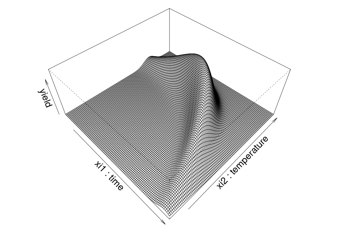
FIGURE 1.1: Banana yield example as a function of time and temperature.
Although perhaps not as pretty, it’s easier to see what’s going on in an image–contour plot. Figure 1.2 utilizes heat colors where white is hotter (higher) and red is cooler (lower).
cols <- heat.colors(128)
image(xi1, xi2, matrix(y, ncol=length(xi2)), col=cols,
  xlab="xi1 : time", ylab="xi2 : temperature")
contour(xi1, xi2, matrix(y, ncol=length(xi2)), nlevels=4, add=TRUE)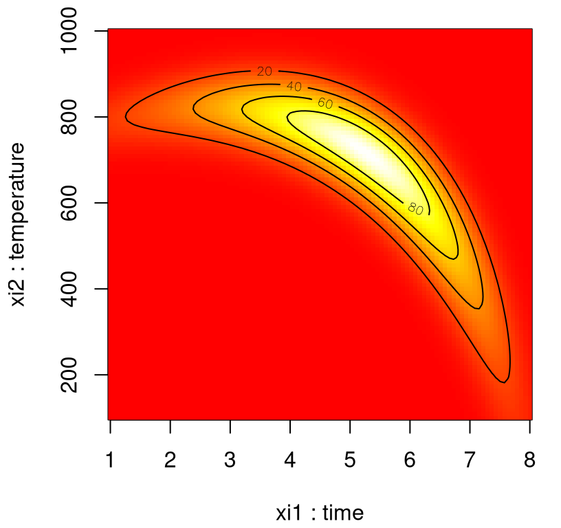
FIGURE 1.2: Alternative heat map view of banana yield.
By inspection, yield is optimized near \((\xi_1,\xi_2)=(5\;\mathrm{hr},750^\circ\mathrm{C})\). Unfortunately in practice, the true response surface is unknown. When yield evaluation is not as simple as a toy banana function, but a process requiring care to monitor, reconfigure and run, it’s far too expensive to observe over a dense grid. Moreover, measuring yield may be a noisy/inexact process.
That’s where stats comes in. RSMs consist of experimental strategies for exploring the space of the process (i.e., independent/input) variables (above \(\xi_1\) and \(\xi_2\)); for empirical statistical modeling targeted toward development of an appropriate approximating relationship between the response (yield) and process variables local to a study region of interest; and optimization methods for sequential refinement in search of the levels or values of process variables that produce desirable responses (e.g., that maximize yield or explain variation).
Suppose the true response surface is driven by an unknown physical mechanism, and that our observations are corrupted by noise. In that setting it can be helpful to fit an empirical model to output collected under different process configurations. Consider a response \(Y\) that depends on controllable input variables \(\xi_1, \xi_2, \dots, \xi_m\). Write
\[ \begin{aligned} Y &= f(\xi_1, \xi_2, \dots, \xi_m) + \varepsilon \\ \mathbb{E}\{Y\} = \eta &= f(\xi_1, \xi_2, \dots, \xi_m) \end{aligned} \]
where \(\varepsilon\) is treated as zero mean idiosyncratic noise possibly representing inherent variation, or the effect of other systems or variables not under our purview at this time. A simplifying assumption that \(\varepsilon \sim \mathcal{N}(0, \sigma^2)\) is typical. We seek estimates for \(f\) and \(\sigma^2\) from noisy observations \(Y\) at inputs \(\xi\).
Inputs \(\xi_1, \xi_2, \dots, \xi_m\) above are called natural variables because they’re expressed in their natural units of measurement, such as degrees Celsius (\(^\circ\mathrm{C}\)), pounds per square inch (psi), etc. We usually transform these to coded variables \(x_1, x_2, \dots, x_m\) to mitigate hassles and confusion that can arise when working with a multitude of scales of measurement. Transformations offering dimensionless inputs \(x_1, \dots, x_m\) in the unit cube, or scaled to have a mean of zero and standard deviation of one, are common choices. In that space the empirical model becomes
\[ \eta = f(x_1, x_2, \dots, x_m). \]
Working with coded inputs \(x\) will be implicit throughout this text except when extra code is introduced to explicitly map from natural coordinates. (Rarely will \(\xi_j\) notation feature beyond this point.)
1.1.2 Low-order polynomials
Learning about \(f\) is lots easier if we make some simplifying approximations. Appealing to Taylor’s theorem, a low-order polynomial in a small, localized region of the input (\(x\)) space is one way forward. Classical RSM focuses on disciplined application of local analysis and sequential refinement of “locality” through conservative extrapolation. It’s an inherently hands-on process.
A first-order model, or sometimes called a main effects model , makes sense in parts of the input space where it’s believed that there’s little curvature in \(f\).
\[ \begin{aligned} \eta &= \beta_0 + \beta_1 x_1 + \beta_2 x_2 \\ \mbox{for example } \quad &= 50 + 8 x_1 + 3 x_2 \end{aligned} \]
In practice, such a surface would be obtained by fitting a model to the outcome of a designed experiment. Hold that thought until Chapter 3; for now the goal is a high-level overview.
To help visualize, code below encapsulates that main effects model …
… and then evaluates it on a grid in a double-unit square centered at the origin. These coded units are chosen arbitrarily, although one can imagine deploying this approximating function nearby \(x^{(0)} = (0,0)\),
x1 <- x2 <- seq(-1, 1, length=100)
g <- expand.grid(x1, x2)
eta1 <- matrix(first.order(g[,1], g[,2]), ncol=length(x2))
Figure 1.3 shows the surface in perspective (left) and image–contour (right) plots, again with heat colors: white is hotter/higher, red is cooler/lower.
par(mfrow=c(1,2))
persp(x1, x2, eta1, theta=30, phi=30, zlab="eta", expand=0.75, lwd=0.25)
image(x1, x2, eta1, col=heat.colors(128))
contour(x1, x2, matrix(eta1, ncol=length(x2)), add=TRUE)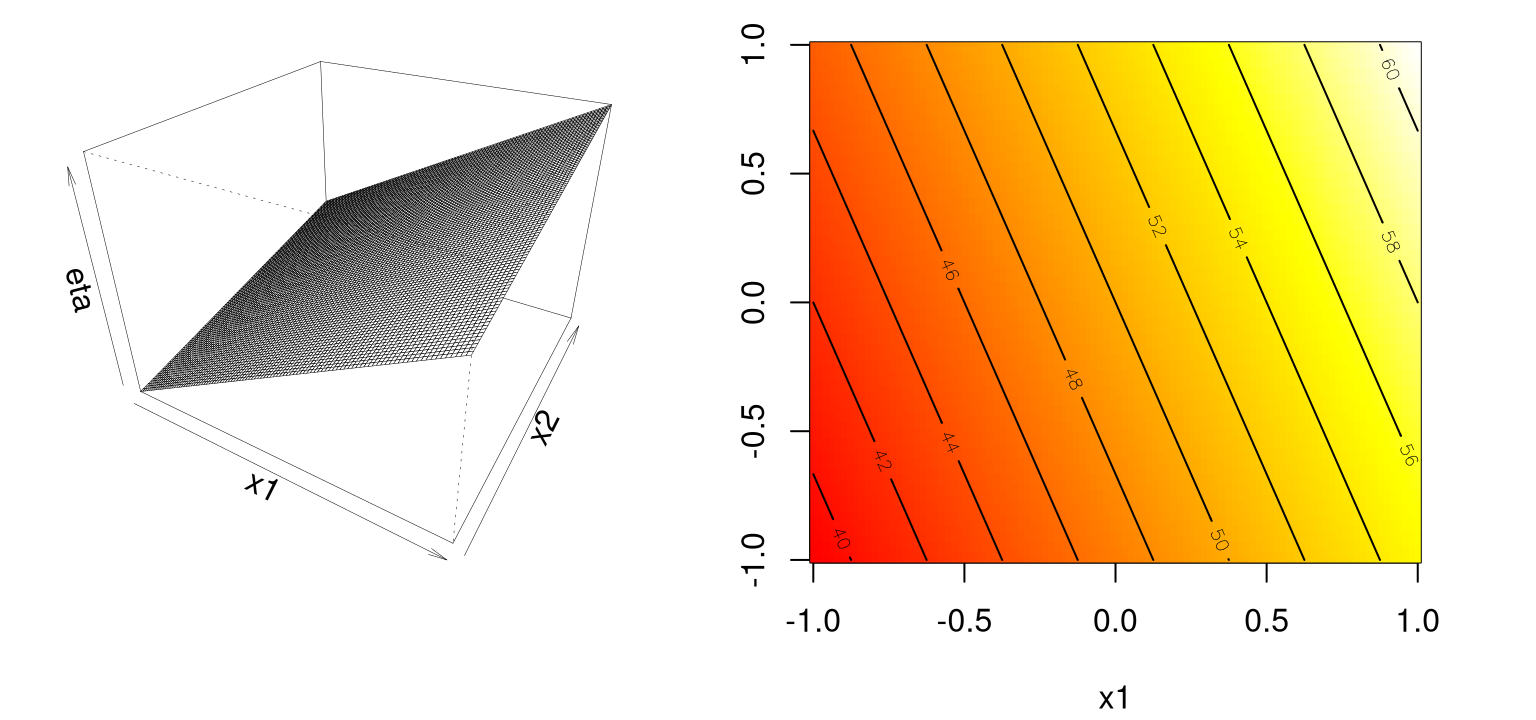
FIGURE 1.3: Example of a first-order response surface via perspective (left) and heat map (right).
Clearly the development here serves as a warm up. I presume that you, the keen reader, know that a first-order model in 2d traces out a plane in \(y \times (x_1, x_2)\) space. My aim with these passages is twofold. One is to introduce classical RSMs. But another, perhaps more important goal, is to introduce the style of Rmarkdown presentation adopted throughout the text. There’s a certain flow that (at least in my opinion) such presentation demands. This book’s style is quite distinct compared to textbooks of just ten years ago, even ones supported by code. Although my presentation here closely follows early chapters in Myers, Montgomery, and Anderson–Cook (2016), the R implementation and visualization here are novel, and are engineered for compatibility with the diverse topics which follow in later chapters.
Ok, enough digression. Back to RSMs. A simple first-order model would only be appropriate for the most trivial of response surfaces, even when applied in a highly localized part of the input space. Adding curvature is key to most applications. A first-order model with interactions induces a limited degree of curvature via different rates of change of \(y\) as \(x_1\) is varied for fixed \(x_2\), and vice versa.
\[ \begin{aligned} \eta &= \beta_0 + \beta_1 x_1 + \beta_2 x_2 + \beta_{12} x_1 x_2 \\ \mbox{for example } \quad &= 50 + 8 x_1 + 3 x_2 - 4 x_1 x_2 \end{aligned} \]
To help visualize, R code below facilitates evaluations for pairs \((x_1, x_2)\) …
… so that responses may be observed over a mesh in the same double-unit square.
Figure 1.4 shows those responses on the \(z\)-axis in a perspective plot (left), and as heat colors and contours (right).
par(mfrow=c(1,2))
persp(x1, x2, eta1i, theta=30, phi=30, zlab="eta", expand=0.75, lwd=0.25)
image(x1, x2, eta1i, col=heat.colors(128))
contour(x1, x2, matrix(eta1i, ncol=length(x2)), add=TRUE)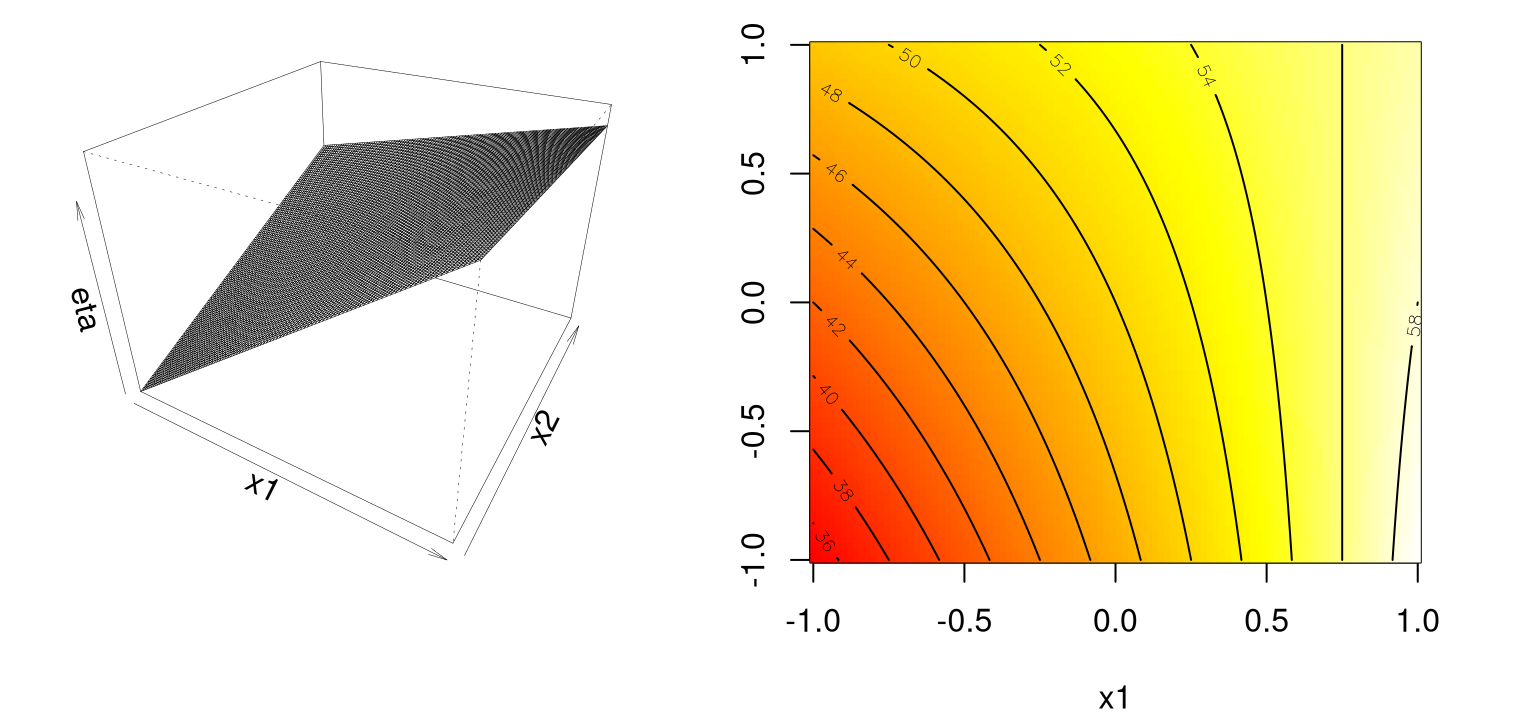
FIGURE 1.4: Example of a first-order response surface with interaction(s).
Observe that the mean response \(\eta\) is increasing marginally in both \(x_1\) and \(x_2\), or conditional on a fixed value of the other until \(x_1\) is 0.75 or so. Rate of increase slows as both coordinates grow simultaneously since the coefficient in front of the interaction term \(x_1 x_2\) is negative. Compared to the first-order model (without interactions), such a surface is far more useful locally. Least squares regressions – wait until §3.1.1 for details – often flag up significant interactions when fit to data collected on a design far from local optima.
A second-order model may be appropriate near local optima where \(f\) would have substantial curvature.
\[ \begin{aligned} \eta &= \beta_0 + \beta_1 x_1 + \beta_2 x_2 + \beta_{11} x_1^2 + \beta_{22} x_2^2 + \beta_{12} x_1 x_2 \\ \mbox{for example } \quad &= 50 + 8 x_1 + 3 x_2 - 7 x_1^2 - 3 x_{2}^2 - 4 x_1 x_2 \end{aligned} \] The code below implements this function …
… which is then evaluated on our grid for visualization.
Panels in Figure 1.5 show that this surface has a maximum near about \((0.6, 0.2)\).
par(mfrow=c(1,2))
persp(x1, x2, eta2sm, theta=30, phi=30, zlab="eta", expand=0.75, lwd=0.25)
image(x1, x2, eta2sm, col=heat.colors(128))
contour(x1, x2, eta2sm, add=TRUE)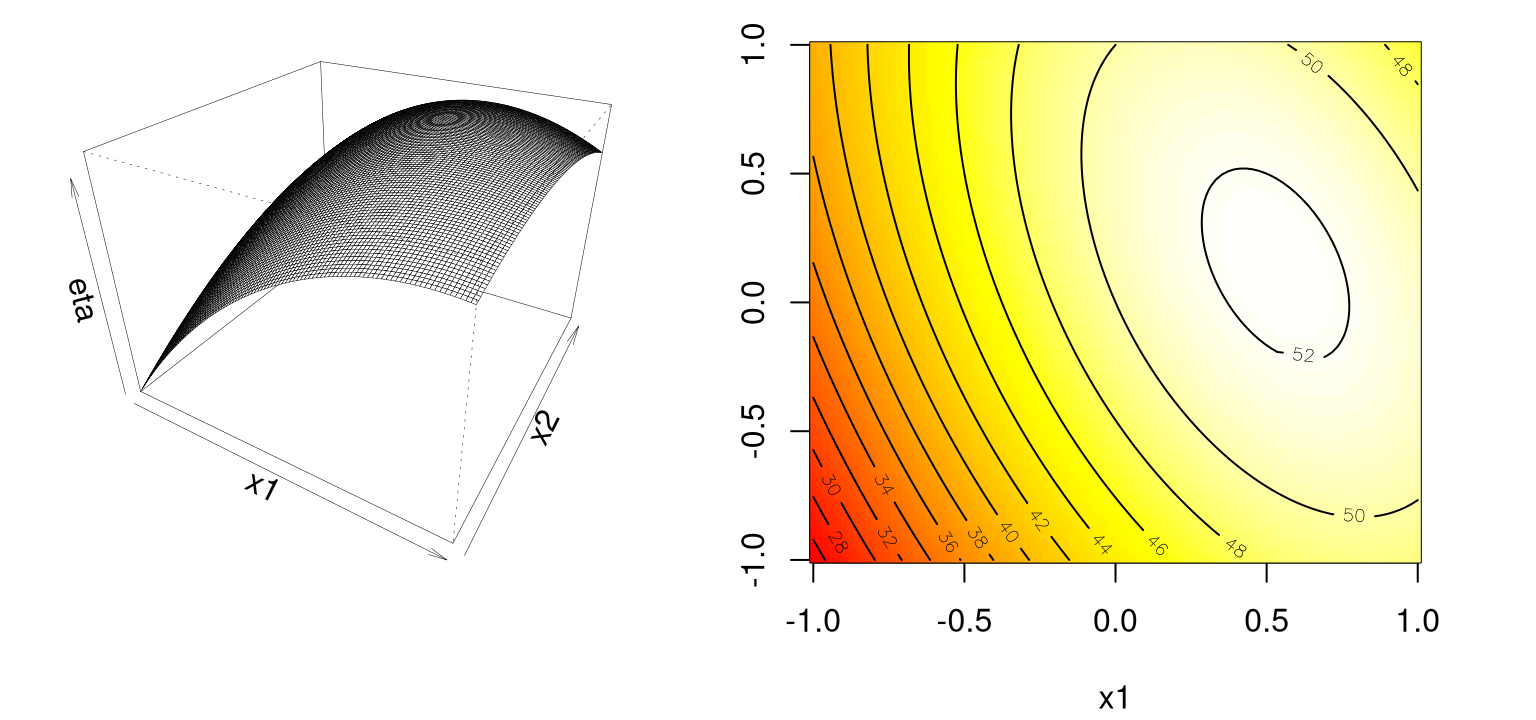
FIGURE 1.5: Second-order simple maximum surface.
Not all second-order models would have a single stationary point, which in RSM jargon is called a simple maximum. (In this “yield maximizing” setting we’re presuming that our response surface is concave down from a global viewpoint, even though local dynamics may be more nuanced). Coefficients in front of input terms, their interactions and quadratics, must be carefully selected to get a simple maximum. Exact criteria depend upon the eigenvalues of a certain matrix built from those coefficients, which we’ll talk more about in §3.2.1. Box and Draper (2007) provide a beautiful diagram categorizing all of the kinds of second-order surfaces one can encounter in an RSM analysis, where finding local maxima is the goal. An identical copy, with permission, appears in Myers, Montgomery, and Anderson–Cook (2016) too. Rather than duplicate those here, a third time, we shall continue with the theme of R-ification of that presentation.
An example set of coefficients describing what’s called a stationary ridge is provided by the R code below.
Let’s evaluate that on our grid …
… and then view the surface with our usual pair of panels in Figure 1.6.
par(mfrow=c(1,2))
persp(x1, x2, eta2sr, theta=30, phi=30, zlab="eta", expand=0.75, lwd=0.25)
image(x1, x2, eta2sr, col=heat.colors(128))
contour(x1, x2, eta2sr, add=TRUE)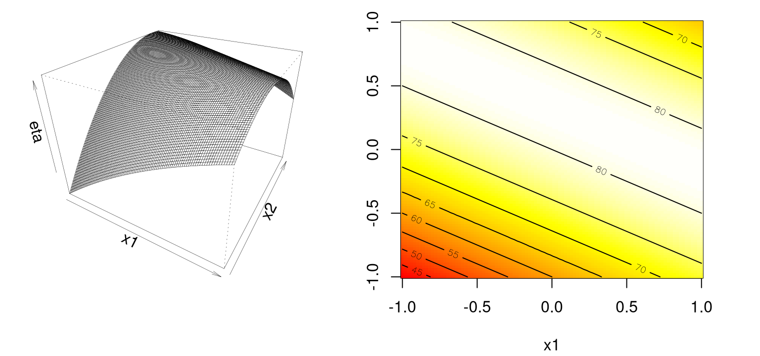
FIGURE 1.6: Example of a stationary ridge.
Observe how there’s a ridge – a whole line – of stationary points corresponding to maxima: a 1d submanifold of the 2d surface, if I may be permitted to use vocabulary I don’t fully understand. Assuming the approximation can be trusted, this situation means that the practitioner has some flexibility when it comes to optimizing, and can choose the precise setting of \((x_1, x_2)\) either arbitrarily or (more commonly) by consulting some tertiary criteria.
An example of a rising ridge is implemented by the R code below …
… and evaluated on our grid as follows.
Notice in Figure 1.7 how there’s a continuum of (local) stationary points along any line going through the 2d space, excepting one that lies directly on the ridge.
par(mfrow=c(1,2))
persp(x1, x2, eta2rr, theta=30, phi=30, zlab="eta", expand=0.75, lwd=0.25)
image(x1, x2, eta2rr, col=heat.colors(128))
contour(x1, x2, eta2rr, add=TRUE)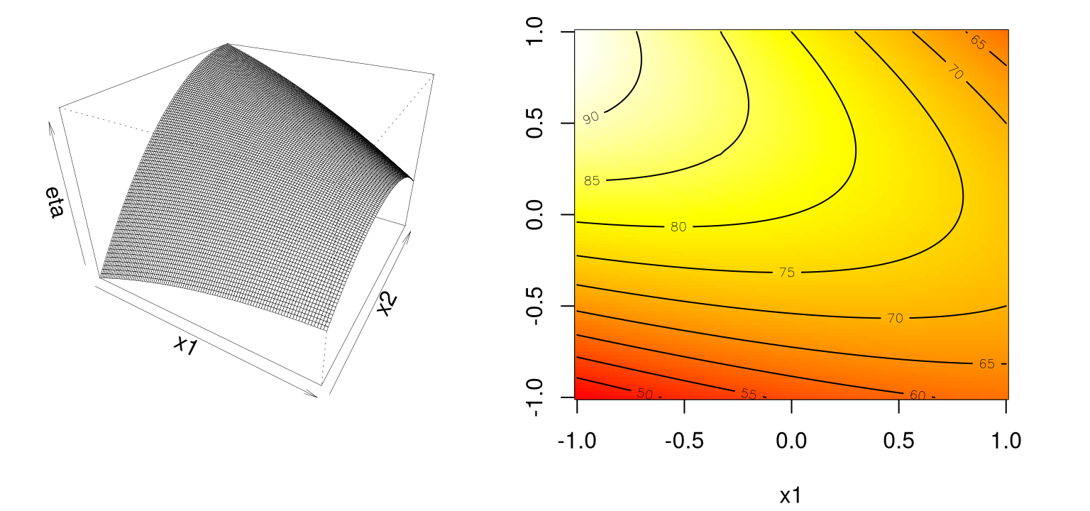
FIGURE 1.7: Example of a rising ridge.
In this case, the stationary point is remote to the study region. Although there’s comfort in learning that an estimated response will increase as you move along the axis of symmetry toward its stationary point, this situation indicates either a poor fit by the approximating second-order function, or that the study region is not yet precisely in the vicinity of a local optima – often both. The inversion of a rising ridge is a falling ridge, similarly indicating one is far from local optima, except that the response decreases as you move toward the stationary point. Finding a falling ridge system can be a back-to-the-drawing-board affair.
Finally, we can get what’s called a saddle or minimax system. In R …
… and …
Panels in Figure 1.8 show that the (single) stationary point is either a local maxima or minima, depending on your perspective.
par(mfrow=c(1,2))
persp(x1, x2, eta2s, theta=30, phi=30, zlab="eta", expand=0.75, lwd=0.25)
image(x1, x2, eta2s, col=heat.colors(128))
contour(x1, x2, eta2s, add=TRUE)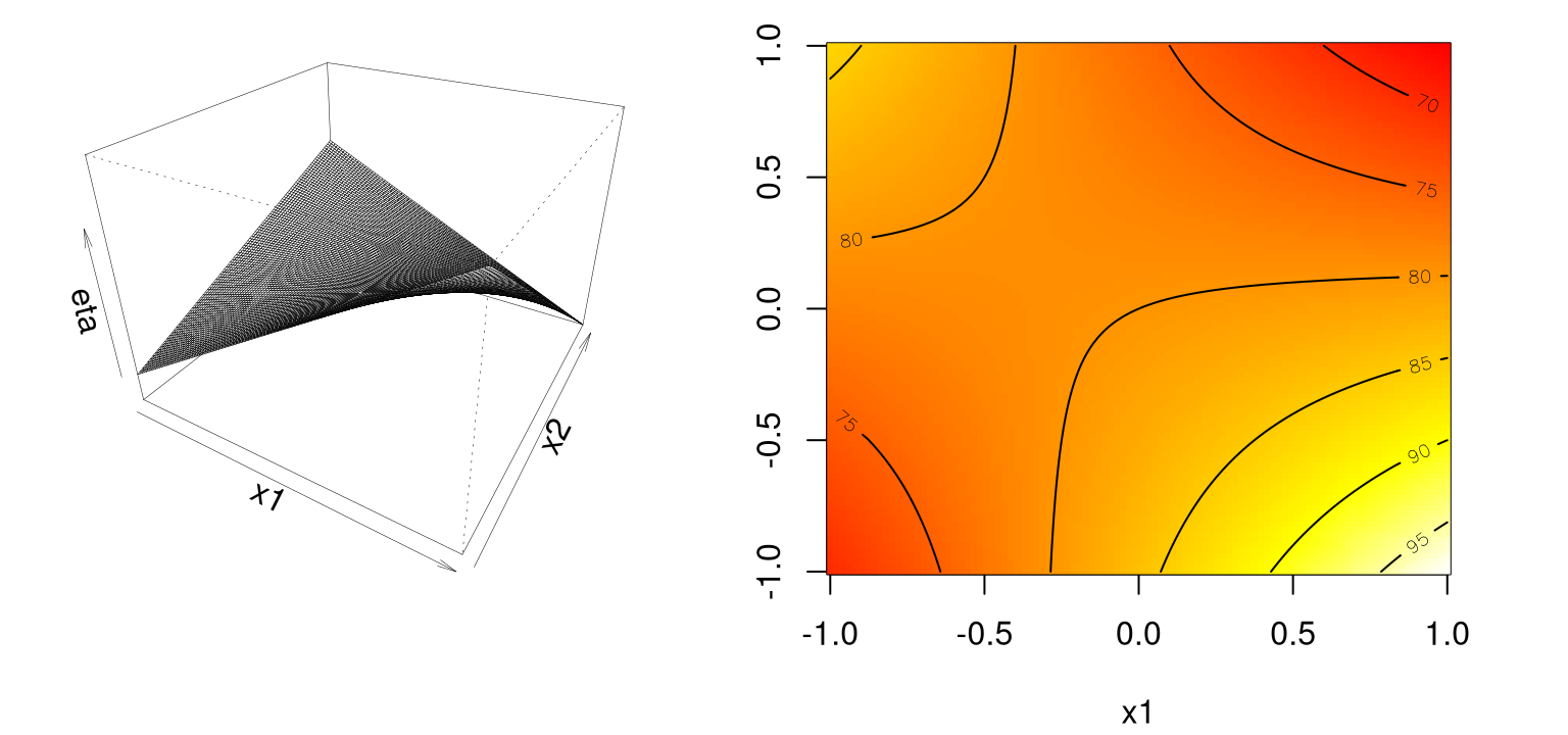
FIGURE 1.8: Example of a saddle or minimax system.
Likely further data collection, and/or outside expertise, is needed before determining a course of action in this situation. Finding a simple maximum, or stationary ridge, represents ideals in the spectrum of second-order approximating functions. But getting there can be a bit of a slog. Using models fitted from data means uncertainty due to noise, and therefore uncertainty in the type of fitted second-order model you’re dealing with. A ridge analysis [see §3.2.2] attempts to offer a principled approach to navigating uncertainties when one is seeking local maxima. The two-dimensional setting exemplified above is convenient for visualization, but rare in practice. Complications compound when studying the effect of more than two process variables.
1.1.3 General models, inference and sequential design
The general first-order model on \(m\) process variables \(x_1, \dots, x_m\) is
\[ \eta = \beta_0 + \beta_1 x_1 + \cdots + \beta_m x_m, \]
and the general second-order model thus
\[ \eta = \beta_0 + \sum_{j=1}^m \beta_j x_j + \sum_{j=1}^m \beta_{jj} x_j^2 + \sum_{j=2}^m \sum_{k=1}^j \beta_{kj} x_k x_j. \]
Inference from data is carried out by ordinary least squares (OLS). I won’t review OLS, or indeed any of the theory for linear modeling, although properties will be introduced as needed. For an excellent review including R examples, see Sheather (2009). However we’ll do plenty of fully implemented examples in Chapter 3. Throughout I shall be rather cavalier in my haphazard interchangeable use of OLS and maximum likelihood estimators (MLEs) in the typical Gaussian linear modeling setup, as the two are basically equivalent.
Besides serving to illustrate RSM methods in action, we shall see how important it is to organize the data collection phase of a response surface study carefully. A design is a choice of \(x\)’s where we plan to observe \(y\)’s, for the purpose of approximating \(f\). Analyses and designs need to be carefully matched. When using a first-order model, some designs are preferred over others. When using a second-order model to capture curvature, a different sort of design is appropriate. Design choices often contain features enabling modeling assumptions to be challenged, e.g., to check if initial impressions are supported by the data ultimately collected.
Although a substantial portion of this text will be devoted to design for GP surrogates, especially sequential design, design for classical RSMs will be rather more limited. There are designs which help with screening, to determine which variables matter so that subsequent experiments may be smaller and/or more focused. Then there are designs tailored to the form of model (first- or second-order, say) in the screened variables. And then there are more designs still. In our empirical examples we shall leverage off-the-shelf choices introduced at length in other texts (Myers, Montgomery, and Anderson–Cook 2016; Box and Draper 2007) with little discussion.
Usually RSM-based experimentation begins with a first-order model, possibly with interactions, under the presumption that the current process is operating far from optimal conditions. Based on data collected under designs appropriate for those models, the so-called method of steepest ascent deploys standard error and gradient calculations on fitted surfaces in order to a) determine where the data lie relative to optima (near or far, say); and b) to inch the “system” closer to such regimes. Eventually, if all goes well after several such carefully iterated refinements, second-order models are entertained on appropriate designs in order to zero-in on ideal operating conditions. Again this involves a careful analysis of the fitted surface – a ridge analysis, see §3.2.2 – with further refinement using gradients of, and standard errors associated with, the fitted surfaces, and so on. Once the practitioner is satisfied with the full arc of design(s), fit(s), and decision(s), a small experiment called a confirmation test may be performed to check if the predicted optimal settings are indeed realizable in practice.
That all seems sensible, and pretty straightforward as quantitative statistics-based analysis goes. Yet it can get complicated, especially when input dimensions are moderate in size. Design considerations are particularly nuanced, since the goal is to obtain reliable estimates of main effects, interaction and curvature while minimizing sampling effort/expense. Textbooks devote hundreds of pages to that subject (e.g., M. Morris 2010; C. Wu and Hamada 2011), which is in part why we’re not covering it. (Also, I’m by no means an expert.) Despite intuitive appeal, several downsides to this setup become apparent upon reflection, or after one’s first attempt to put the idea into practice. The compartmental nature of sequential decision making is inefficient. It’s not obvious how to re-use or update analysis from earlier phases, or couple with data from other sources/related experiments. In addition to being local in experiment-time, or equivalently limited in memory (to use math programming jargon), it’s local in experiment-space. Balance between exploration (maybe we’re barking up the wrong tree) and exploitation (let’s make things a little better) is modest at best. Interjection of expert knowledge is limited to hunches about relevant variables (i.e., the screening phase), where to initialize search, how to design the experiments. Yet at the same time classical RSMs rely heavily on constant scrutiny throughout stages of modeling and design and on the instincts of seasoned practitioners. Parallel analyses, conducted according to the same best intentions, rarely lead to the same designs, model fits and so on. Sometimes that means they lead to different conclusions, which can be cause for concern.
In spite of those criticisms, however, there was historically little impetus to revise the status quo. Classical RSM was comfortable in its skin, consistently led to improvements or compelling evidence that none can reasonably be expected. But then in the late 20th century came an explosive expansion in computational capability, and with it a means of addressing many of those downsides.
These days people are getting more out of smaller “field experiments” or “tests” and more out of their statistical models, designs and optimizations by coupling with mathematical models of the system(s) under study. And by mathematical model I don’t mean \(F=ma\), although that’s not a bad place to start pedagogically. Gone are the days where simple equations are regarded as sufficient to describe real-world systems. Physicists figured that out fifty years ago; industrial engineers followed suit. Biologists, social scientists, climate scientists and weather forecasters, have jumped on the bandwagon rather more recently. Systems of equations are required, solved over meshes (e.g., finite elements), or you might have stochastically interacting agents acting out predator–prey dynamics in habitat, an epidemic spreading through a population in a social network, citizens making choices about health care and insurance. Goals for those simulation experiments are as diverse as their underlying dynamics. Simple optimization is common. Or, one may wish to discover how a regulatory framework, or worst-case scenario manifests as emergent behavior from complicated interactions. Even economists and financial mathematicians, famously favoring equilibrium solutions (e.g., efficient markets), are starting to notice. An excellent popular science book called Forecast by Buchanan (2013) argues that this revolution is long overdue.
Solving systems of equations, or exploring the behavior of interacting agents, requires numerical analysis and that means computing. Statistics can be involved at various stages: choosing the mathematical model, solving by stochastic simulation (Monte Carlo), designing the computer experiment, smoothing over idiosyncrasies or noise, finding optimal conditions, or calibrating mathematical/computer models to data from field experiments. Classical RSMs are not well-suited to any of those tasks, primarily because they lack the fidelity required to model these data. Their intended application is too local. They’re also too hands-on. Once computers are involved, a natural inclination is to automate – to remove humans from the loop and set the computer running on the analysis in order to maximize computing throughput, or minimize idle time. New response surface methodology is needed.
1.2 Computer experiments
Mathematical models implemented in computer codes are now commonplace as a means of avoiding expensive field data collection. Codes can be computationally intensive, solving systems of differential equations, finite element analysis, Monte Carlo quadrature/approximation, individual/agent based models (I/ABM), and more. Highly nonlinear response surfaces, high signal-to-noise ratios (often deterministic evaluations) and global scope demands a new approach to design and modeling compared to a classical RSM setting. As computing power has grown, so too has simulation fidelity, adding depth in terms of both accuracy and faithfulness to the best understanding of the physical, biological, or social dynamics in play. Computing has fueled ambition for breadth as well. Expansion of configuration spaces and increasing input dimension yearn for ever-bigger designs. Advances in high performance computing (HPC) have facilitated distribution of solvers to an unprecedented degree, allowing thousands of runs where only tens could be done before. That’s helpful with big input spaces, but shifts the burden to big models and big training data which bring their own computational challenges.
Research questions include how to design computer experiments that spend on computation judiciously, and how to meta-model computer codes to save on simulation effort. Like with classical RSM, those two go hand in hand. The choice of surrogate model for the computer codes, if done right, can have a substantial effect on the optimal design of the experiment. Depending on your goal, whether descriptive or response-maximizing in nature, different model–design pairs may be preferred. Combining computer simulation, design, and modeling with field data from similar, real-world experiments leads to a new class of computer model calibration or tuning problems. There the goal is to learn how to tweak the computer model to best match physical dynamics observed (with noise) in the real world, and to build an understanding of any systematic biases between model and reality. And as ever with computers, the goal is to automate to the extent possible so that HPC can be deployed with minimal human intervention.
In light of the above, many regard computer experiments as distinct from RSM. I prefer to think of them as a modern extension. Although there’s clearly a need to break out of a local linear/quadratic modeling framework, and associated designs, many similar themes are in play. For some, the two literatures are converging, with self-proclaimed RSM researchers increasingly deploying GP models and other techniques from computer experiments. On the other hand, researchers accustomed to interpolating deterministic computer simulations are beginning to embrace stochastic simulation, thus leveraging designs resembling those for classical RSM. Replication for example, which would never feature in a deterministic setting, is a tried and true means of separating signal from noise. Traditional RSM is intended for situations in which a substantial proportion of variability in the data is just noise and the number of data values that can be acquired can sometimes be severely limited. Consequently, RSM is intended for a somewhat different class of problems, and is indeed well-suited for their purposes.
There are two very good texts on computer experiments and surrogate modeling. The Design and Analysis of Computer Experiments, by Santner, Williams, and Notz (2018) is the canonical reference in the statistics literature. Engineering Design via Surrogate Modeling by Forrester, Sobester, and Keane (2008) is perhaps more popular in engineering. Both are geared toward design. Santner et al. is more technical. My emphasis is a bit more on modeling and implementation, especially in contemporary big- and stochastic-simulation contexts. Whereas my style is more statistical, like Santner et al. the presentation is more implementation-oriented like Forrester, et al. (They provide extensive MATLAB® code; I use R.)
1.2.1 Aircraft wing weight example
To motivate expanding the RSM toolkit towards better meta-modeling and design for a computer-implemented mathematical model, let’s borrow an example from Forrester et al. Besides appropriating the example setting, not much about the narrative below resembles any other that I’m aware of. Although also presented as a warm-up, Forrester et al. utilize this example with a different pedagogical goal in mind.
The following equation has been used to help understand the weight of an unpainted light aircraft wing as a function of nine design and operational parameters.
\[\begin{equation} W = 0.036 S_{\mathrm{w}}^{0.758} W_{\mathrm{fw}}^{0.0035} \left(\frac{A}{\cos^2 \Lambda} \right)^{0.6} q^{0.006} \lambda^{0.04} \left( \frac{100 R_{\mathrm{tc}}}{\cos \Lambda} \right)^{-0.3} (N_{\mathrm{z}} W_{\mathrm{dg}})^{0.49} \tag{1.1} \end{equation}\]
Table 1.1 details each of the parameters and provides reasonable ranges on their natural scale. A baseline setting, coming from a Cessna C172 Skyhawk aircraft, is also provided.
| Symbol | Parameter | Baseline | Minimum | Maximum |
|---|---|---|---|---|
| \(S_{\mathrm{w}}\) | Wing area (ft\(^2\)) | 174 | 150 | 200 |
| \(W_{\mathrm{fw}}\) | Weight of fuel in wing (lb) | 252 | 220 | 300 |
| \(A\) | Aspect ratios | 7.52 | 6 | 10 |
| \(\Lambda\) | Quarter-chord sweep (deg) | 0 | -10 | 10 |
| \(q\) | Dynamic pressure at cruise (lb/ft\(^2\)) | 34 | 16 | 45 |
| \(\lambda\) | Taper ratio | 0.672 | 0.5 | 1 |
| \(R_{\mathrm{tc}}\) | Aerofoil thickness to chord ratio | 0.12 | 0.08 | 0.18 |
| \(N_{\mathrm{z}}\) | Ultimate load factor | 3.8 | 2.5 | 6 |
| \(W_{\mathrm{dg}}\) | Final design gross weight (lb) | 2000 | 1700 | 2500 |
I won’t go into any detail here about what each parameter measures, although for some (wing area and fuel weight) the effect on overall weight is obvious. It’s worth remarking that Eq. (1.1) is not really a computer simulation, although we’ll use it as one for the purposes of this illustration. Utilizing a true form, but treating it as unknown, is a helpful tool for synthesizing realistic settings in order to test methodology. That functional form was derived by “calibrating” known physical relationships to curves obtained from existing aircraft data (Raymer 2012). So in a sense it’s itself a surrogate for actual measurements of the weight of aircrafts. It was built via a mechanism not unlike one we’ll expound upon in more depth in a segment on computer model calibration in §8.1, albeit in a less parametric setting. Although we won’t presume to know that functional form in any of our analysis below, observe that the response is highly nonlinear in its inputs. Even when modeling the logarithm, which turns powers into slope coefficients and products into sums, the response would still be nonlinear owing to the trigonometric terms.
Considering the nonlinearity and high input dimension, simple linear and quadratic response surface approximations will likely be insufficient. Of course, that depends upon the application of interest. The most straightforward might simply be to understand input–output relationships. Given the global purview implied by that context, a fancier model is all but essential. For now, let’s concentrate on that setting to fix ideas. Another application might be optimization. There might be interest in minimizing weight, but probably not without some constraints. (We’ll need wings with nonzero area if the airplane is going to fly.) Let’s hold that thought until Chapter 7, where I’ll argue that global perspective, and thus flexible modeling, is essential in (constrained) optimization settings.
The R code below serves as a genuine computer implementation “solving” a mathematical model. It takes arguments coded in the unit cube. Defaults are used to encode baseline settings from Table 1.1, also mapped to coded units.
wingwt <- function(Sw=0.48, Wfw=0.4, A=0.38, L=0.5, q=0.62, l=0.344,
  Rtc=0.4, Nz=0.37, Wdg=0.38)
 {
  ## put coded inputs back on natural scale
  Sw <- Sw*(200 - 150) + 150
  Wfw <- Wfw*(300 - 220) + 220
  A <- A*(10 - 6) + 6
  L <- (L*(10 - (-10)) - 10) * pi/180
  q <- q*(45 - 16) + 16
  l <- l*(1 - 0.5) + 0.5
  Rtc <- Rtc*(0.18 - 0.08) + 0.08
  Nz <- Nz*(6 - 2.5) + 2.5
  Wdg <- Wdg*(2500 - 1700) + 1700

  ## calculation on natural scale
  W <- 0.036*Sw^0.758 * Wfw^0.0035 * (A/cos(L)^2)^0.6 * q^0.006
  W <- W * l^0.04 * (100*Rtc/cos(L))^(-0.3) * (Nz*Wdg)^(0.49)
  return(W)
 }
Compute time required by the wingwt “solver” is trivial, and approximation error is minuscule – essentially machine precision. Later we’ll imagine a more time consuming evaluation by mentally adding a Sys.sleep(3600) command to synthesize a one-hour execution time, say. For now, our presentation will utilize cheap simulations in order to perform a sensitivity analysis (see §8.2), exploring which variables matter and which work together to determine levels of the response.
Plotting in 2d is lots easier than 9d, so the code below makes a grid in the unit square to facilitate sliced visuals. (This is basically the same grid as we used earlier, except in \([0,1]^2\) rather than \([-1,1]^2\). The coding used to transform inputs from natural units is largely a matter of taste, so long as it’s easy to undo for reporting back on original scales.)
Now we can use the grid to, say, vary \(N_{\mathrm z}\) and \(A\), with other inputs fixed at their baseline values.
To help interpret outputs from experiments such as this one – to level the playing field when comparing outputs from other pairs of inputs – code below sets up a color palette that can be re-used from one experiment to the next.
Figure 1.9 shows the weight response as a function of \(N_{\mathrm z}\) and \(A\) with an image–contour plot. Slight curvature in the contours indicates an interaction between these two variables. Actually, this output range (180–320 approximately) nearly covers the entire span of outputs observed from settings of inputs in the full, 9d input space.
image(x, x, matrix(W.A.Nz, ncol=length(x)), col=cs, breaks=bs,
  xlab="A", ylab="Nz")
contour(x, x, matrix(W.A.Nz, ncol=length(x)), add=TRUE)
FIGURE 1.9: Wing weight over an interesting 2d slice.
Apparently an aircraft wing is heavier when aspect ratios \(A\) are high, and designed to cope with large \(g\)-forces (large \(N_{\mathrm z}\)), with a compounding effect. Perhaps this is because fighter jets cannot have efficient (light) glider-like wings. How about the same experiment for two other inputs, e.g., taper ratio \(\lambda\) and fuel weight \(W_{\mathrm{fw}}\)?
Figure 1.10 shows the resulting image–contour plot, utilizing the same color palette as in Figure 1.9 in order to emphasize a stark contrast.
image(x, x, matrix(W.l.Wfw,ncol=length(x)), col=cs, breaks=bs,
  xlab="l", ylab="Wfw")
contour(x,x, matrix(W.l.Wfw,ncol=length(x)), add=TRUE)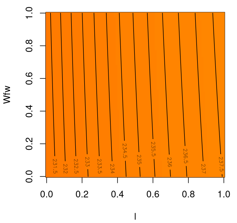
FIGURE 1.10: Wing weight over an ineffectual 2d slice.
Apparently, neither input has much effect on wing weight, with \(\lambda\) having a marginally greater effect, covering less than 4% of the span of weights observed in the \(A \times N_{\mathrm{z}}\) plane. There’s no interaction evident in \(\lambda \times W_{\mathrm{fw}}\).
Well that’s all fine and good. We’ve learned about two pairs of inputs, out of 36 total pairs. For each pair we evaluated wingwt 10,000 times. Doing the same for all pairs would require 360K evaluations, not a reasonable number with a real computer simulation that takes any non-trivial amount of time to evaluate. Even at just 1s per evaluation, presuming speedy but not instantaneous numerical simulation in a slightly more realistic setting, we’re talking \(> 100\) hours. Many solvers take minutes/hours/days to execute a single run. Even with great patience, or distributed evaluation in an HPC setting, we’d only really know about pairs. How about main effects or three-way interactions? A different strategy is needed.
1.2.2 Surrogate modeling and design
Many of the most effective strategies involve (meta-) modeling the computer model. The setting is as follows. Computer model \(f(x): \mathbb{R}^p \rightarrow \mathbb{R}\) is expensive to evaluate. For concreteness, take \(f\) to be wingwt from §1.2.1. To economize on expensive runs, avoiding a grid in each pair of coordinates say, the typical setup instead entails choosing a small design \(X_n = \{x_1, \dots, x_n\}\) of locations in the full \(m\)-dimensional space, where \(m=9\) for wingwt. Runs at those locations complete a set of \(n\) example evaluation pairs \((x_i, y_i)\), where \(y_i \sim f(x_i)\) for \(i=1,\dots, n\). If \(f\) is deterministic, as it is with wingwt, then we may instead write \(y_i = f(x_i)\). Collect the \(n\) data pairs as \(D_n = (X_n, Y_n)\), where \(X_n\) is an \(n \times m\) matrix and \(Y_n\) is an \(n\)-vector. Use these data to train a statistical (regression) model, producing an emulator \(\hat{f}_n \equiv \hat{f} \mid D_n\) whose predictive equations may be used as a surrogate \(\hat{f}_n(x')\) for \(f(x')\) at novel \(x'\) locations in the \(m\)-dimensional input space.
Often the terms surrogate and emulator are used interchangeably, as synonyms. Some refer to the fit \(\hat{f}_n\) as emulator and the evaluation of its predictive equations \(\hat{f}_n(x')\) as surrogate, as I have done above. Perhaps the reasoning behind that is that the suffix “or” on emulator makes it like estimator in the statistical jargon. An estimator holds the potential to provide estimates when trained on a sample from a population. We may study properties of an estimator/emulator through its sampling distribution, inherited from the data-generating mechanism imparted on the population by the model, or through its Bayesian posterior distribution. Only after providing an \(x'\) to the predictive equations, and extracting some particular summary statistic like the mean, do we actually have a surrogate \(\hat{f}(x')\) for \(f(x')\), serving as a substitute for a real simulation.
If that doesn’t make sense to you, then don’t worry about it. Emulator and surrogate are the same thing. I find myself increasingly trying to avoid emulator in verbal communication because it confuses folks who work with another sort of computer emulator, virtualizing a hardware architecture in software. In that context the emulator is actually more cumbersome, requiring more flops-per-instruction than the real thing. You could say that’s exactly the opposite of a key property of effective surrogate modeling, on which I’ll have more to say shortly. But old habits die hard. I will not make any substantive distinction in this book except as verbiage supporting the narrative – my chatty writing style – prefers.
The important thing is that a good surrogate does about what \(f\) would do, and quickly. At risk of slight redundancy given the discussion above, good meta-models for computer simulations (dropping \(n\) subscripts)
- provide a predictive distribution \(\hat{f}(x')\) whose mean can be used as a surrogate for \(f(x')\) at new \(x'\) locations and whose variance provides uncertainty estimates – intervals for \(f(x')\) – that have good coverage properties;
- may interpolate when computer model \(f\) is deterministic;
- can be used in any way \(f\) could have been used, qualified with appropriate uncertainty quantification (i.e., bullet #a mapped to the intended use, say to optimize);
- and finally, fitting \(\hat{f}\) and making predictions \(\hat{f}(x')\) should be much faster than working directly with \(f(x')\).
I’ll say bullet #d a third (maybe fourth?) time because it’s so important and often overlooked when discussing use of meta-models for computer simulation experiments. There’s no point in all this extra modeling and analysis if the surrogate is slower than the real thing. Much of the discussion in the literature focuses on #a–c because those points are more interesting mathematically. Computer experiments of old were small, so speed in training/evaluation were less serious concerns. These days, as experiments get big, computational thriftiness is beginning to get more (and much deserved) attention.
As ever in statistical modeling, choosing a design \(X_n\) is crucial to good performance, especially when data-gathering expense limits \(n\). It might be tempting to base designs \(X_n\) on a grid. But that won’t work in our 9-dimensional wingwt exercise, at least not at any reasonable resolution. Even having a modest ten grid elements per dimension would balloon into \(n= 10^9 \equiv\) 1-billion runs of the computer code! Space-filling designs were created to mimic the spread of grids, while sacrificing regularity in order to dramatically reduce size. Chapter 4 covers several options that could work well in this setting. As a bit of foreshadowing, and to have something concrete to work with so we can finish the wingwt example, consider a so-called Latin Hypercube sample (LHS, see §4.1). An LHS is a random design which is better than totally uniform (say via direct application of runif in R) because it limits potential for “clumps” of runs in the input space. Maximal spread cannot be guaranteed with LHSs, but they’re much easier to compute than maximin designs (§4.2) which maximize the minimum distance between design elements \(x_i\).
Let’s use a library routine to generate a \(n=1000\)-sized LHS for our wing weight example in 9d.
Figure 1.11 offers a projection of that design down into two dimensions, with red horizontal bars overlaid as a visual aid.
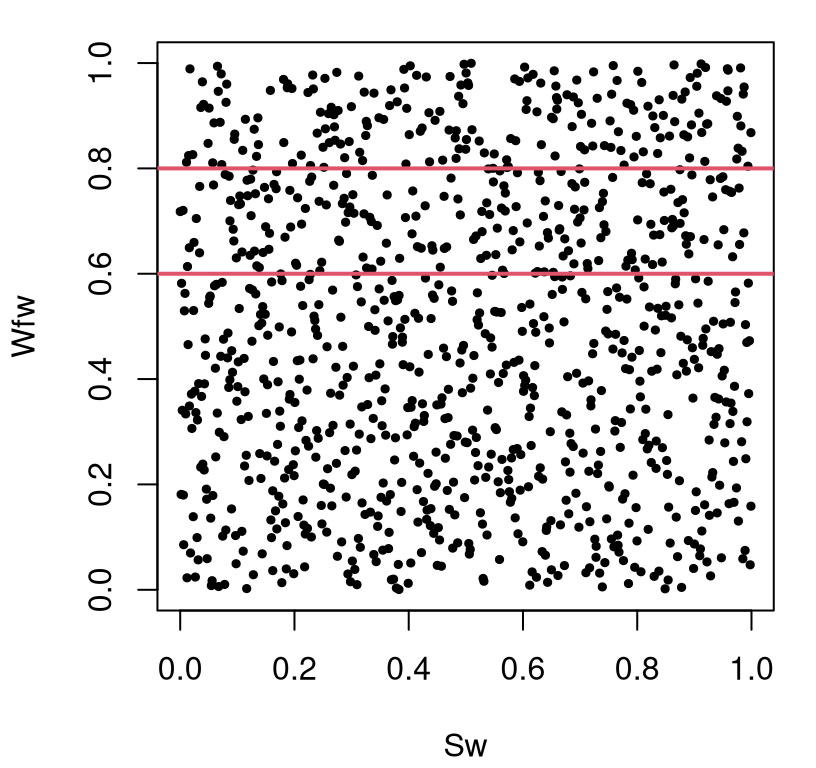
FIGURE 1.11: Projection of 9d LHS down to two dimensions with red bars demarking 20 percent of the spatial area.
Those horizontal lines, partitioning away one-fifth of the two-dimensional projection, help illustrate a nice property of LHS designs. Namely, an LHS guarantees marginals that are space-filling in a certain sense.
## [1] 0.2Twenty percent of the design resides in a (contiguous) region occupying 20% of the volume of the study region. A grid could offer the same guarantee, but without such diversity in settings along the margin. Projections of a grid down into lower dimensions creates replicates. Something similar happens under maximin designs, although to a lesser degree. Such properties, and other points of comparison and contrast are left to Chapter 4. For now, let’s take this design as given, as a decent choice, and feed it through our simulator.
Ok now, what to do with that? We have 1000 evaluations \(Y_n\) at design \(X_n\) in 9d. How can that data be used to learn about input–output dynamics? We need to fit a model. The simplest option is a linear regression. Although that approach wouldn’t exactly be the recommended course of action in a classical RSM setting, because the emphasis isn’t local and we didn’t utilize an RSM design, it’s easy to see how that enterprise (even done right) would be fraught with challenges, to put it mildly. Least squares doesn’t leverage the low/zero noise in these deterministic simulations, so this is really curve fitting as opposed to genuine regression. The relationship is obviously nonlinear and involves many interactions. A full second-order model could require up to 54 coefficients. Looking at Eq. (1.1) it might be wise to model \(\log Y_n\), but that’s cheating!
Just to see what might come up, let’s fit a parsimonious first-order model with interactions, cheating with the log response, using backward step-wise elimination with BIC. Other alternatives include AIC with k=2 below, or \(F\)-testing.
fit.lm <- lm(log(Y) ~ .^2, data=data.frame(Y,X))
fit.lmstep <- step(fit.lm, scope=formula(fit.lm), direction="backward",
  k=log(length(Y)), trace=0)
Although it’s difficult to precisely anticipate which variables would be selected in this Rmarkdown build, because the design \(X_n\) is random, typically about ten input coordinates are selected, mostly main effects and sometimes interactions.
## (Intercept)          Sw           A           q           l
##    5.082494    0.218895    0.303850   -0.008347    0.030107
##         Rtc          Nz         Wdg        q:Nz
##   -0.237330    0.407395    0.188314    0.022034
Although not guaranteed, again due to randomness in the design, it’s quite unlikely that the A:Nz interaction is chosen. Check to see if it appears in the list above. Yet we know that that interaction is present, as it’s one of the pairs we studied in §1.2.1. Since this approach is easy to dismiss on many grounds it’s not worth delving too deeply into potential remedies. Rather, let’s use it as an excuse to recommend something new.
Gaussian process (GP) models have percolated up the hierarchy for nonlinear nonparametric regression in many fields, especially when modeling real-valued input–output relationships believed to be smooth. Machine learning, spatial/geo-statistics, and computer experiments are prime examples. Actually GPs can be characterized as linear models, in a certain sense, so they’re not altogether new to the regression arsenal. However GPs privilege modeling through a covariance structure, rather than through the mean, which allows for more fine control over signal-versus-noise and for nonlinearities to manifest in a relative (i.e., velocity or differences) rather than absolute (position) sense. The details are left to Chapter 5. For now let’s borrow a library I like.
Fitting, for a certain class of GP models, can be performed with the code below.
A disadvantage to GPs is that inspecting estimated coefficients isn’t directly helpful for understanding. This is a well-known drawback of nonparametric methods. Still, much can be gleaned from the predictive distribution, which is what we would use as a surrogate for new evaluations under the fitted model. Code below sets up a predictive matrix XX comprised of baseline settings for seven of the inputs, combined with our \(100 \times 100\) grid in 2d to span combinations of the remaining two inputs: A and Nz.
baseline <- matrix(rep(as.numeric(formals(wingwt)), nrow(g)),
  ncol=9, byrow=TRUE)
XX <- data.frame(baseline)
names(XX) <- names(X)
XX$A <- g[,1]
XX$Nz <- g[,2]
That testing design can be fed into predictive equations derived for our fitted GP.
Figure 1.12 shows the resulting surface, which is visually identical to the one in Figure 1.9, based on 10K direct evaluations of wingwt.
image(x, x, matrix(p$mean, ncol=length(x)), col=cs, breaks=bs,
  xlab="A", ylab="Nz")
contour(x, x, matrix(p$mean, ncol=length(x)), add=TRUE)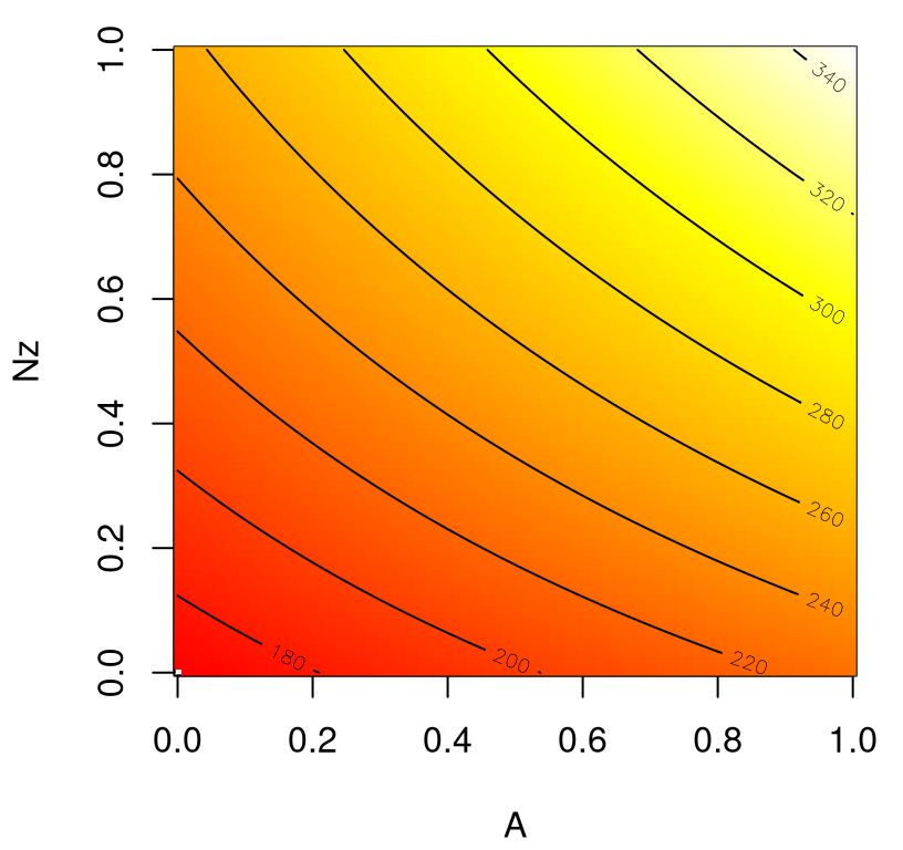
FIGURE 1.12: Surrogate for wing weight over an interesting 2d slice; compare to Figure 1.9.
What’s the point of this near-duplicate plot? Well, I think its pretty amazing that 1K evaluations in 9d, paired with a flexible surrogate, can do the work of 10K in 2d! We’ve not only reduced the number of evaluations required for a pairwise input analysis, but we have a framework in place that can provide similar surfaces for all other pairs without further wingwt evaluation.
What else can we do? We can use the surrogate, via predGPsep in this case, to do whatever wingwt could do! How about a sensitivity analysis via main effects (§8.2)? As one example, the code below reinitializes XX to baseline settings and then loops over each input coordinate replacing its configuration with the elements of a one-dimensional grid. Predictions are then made for all XX, with means and quantiles saved. The result is nine sets of three curves which can be plotted on a common axis, namely of coded units in \([0,1]\).
meq1 <- meq2 <- me <- matrix(NA, nrow=length(x), ncol=ncol(X))
for(i in 1:ncol(me)) {
  XX <- data.frame(baseline)[1:length(x),]
  XX[,i] <- x
  p <- predGPsep(fit.gp, XX, lite=TRUE)
  me[,i] <- p$mean
  meq1[,i] <- qt(0.05, p$df)*sqrt(p$s2) + p$mean
  meq2[,i] <- qt(0.95, p$df)*sqrt(p$s2) + p$mean
}
Figure 1.13 shows these nine sets of curves. On the scale of the responses, quantiles summarizing uncertainty are barely visible around their means. So it really looks like nine thick lines. Uncertainty in these surrogate evaluations is low despite being trained on a rather sparse design of just \(n=1000\) points in 9d. This is, in part, because the surrogate is interpolating deterministically observed data values.
matplot(x, me, type="l", lwd=2, lty=1, col=1:9, xlab="coded input")
matlines(x, meq1, type="l", lwd=2, lty=2, col=1:9)
matlines(x, meq2, type="l", lwd=2, lty=2, col=1:9)
legend("topleft", names(X)[1:5], lty=1, col=1:5, horiz=TRUE,
  bty="n", cex=0.5)
legend("bottomright", names(X)[6:9], lty=1, col=6:9, horiz=TRUE,
  bty="n", cex=0.5)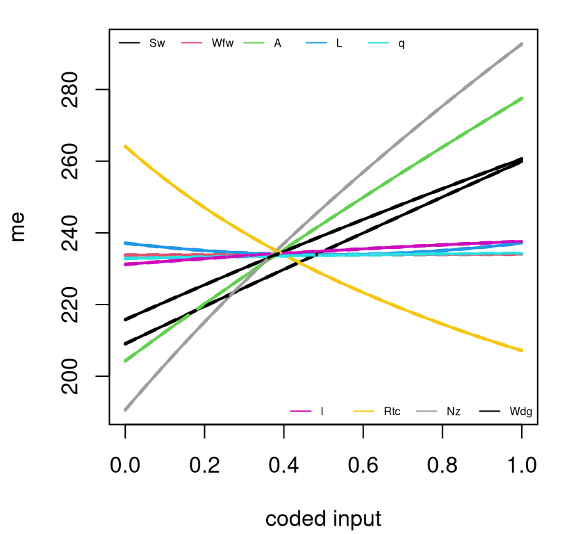
FIGURE 1.13: Main effects for the nine wing weight inputs.
Some would call that a main effects plot. Others might quibble that main effects must integrate over the other (in this case eight) coordinates, rather than fixing them at baseline values. See §8.2.2 for details. Both are correct – what you prefer to look at is always a matter of perspective. Regardless, many would agree that much can be gleaned from plots such as the one in Figure 1.13. For example, we see that \(W_{\mathrm{fw}}\), \(\Lambda\), \(q\), and \(\lambda\) barely matter, at least in terms of departure from baseline. Only \(R_{\mathrm{tc}}\) has a negative effect. Nonlinearities are slight in terms of main effects, as they were with pairwise interactions. It’s hard to visualize in higher dimension, but there are lots more tools to help here.
1.3 A road map
We’ll learn in detail about GPs and what they can and can’t do. They’ve revolutionized machine learning, spatial statistics, and computer simulation experiments. But they’re no panacea. They can be slow, which you may have noticed if you tried some of the examples above in your own R session. That’s because they can involve big-matrix calculations. Even though GPs are super flexible, particularly by comparison to ordinary linear models, sometimes they’re too rigid. They can over-smooth. Whether or not that’s a big deal depends on your application domain. As kriging in geostatistics (Matheron 1963), where input spaces are typically two-dimensional (longitude and latitude), these limitations are more easily hurdled. Low-dimensional input spaces emit several alternative formulations which are more convenient to work with both mathematically and computationally. §5.4.1 covers process convolutions which form the basis of many attractive alternatives in this setting.
When the computer experiments crowd caught on, and realized GPs were just as good in higher dimension, computer simulation efforts were relatively small by modern trends. Surrogate GP calculations were trivial – cubic \(n \times n\) matrix decompositions with \(n=30\)-odd runs is no big deal (MD Morris, Mitchell, and Ylvisaker 1993). Nobody worried about nonstationarity. With such a small amount of data there was already limited scope to learn a single, unified dynamic, let alone dynamics evolving in the input space. In the late 1990s, early 2000s, the machine learning community latched on but their data were really big, so they had to get creative. To circumvent big-matrix calculations they induced sparsity in the GP covariance structure, and leveraged sparse-matrix linear algebra libraries. Or they created designs \(X_n\) with special structure that allowed big-matrix calculations to be avoided all together. Several schemes revolving around partition-based regression via trees, Voronoi tessellations and nearest neighbors have taken hold, offering a divide-and-conquer approach which addresses computational and flexibility limitations in one fell swoop. This has paved the way for even thriftier approximations that retain many of the attractive features of GPs (non-linear, appropriate out-of-sample coverage) while sacrificing some of their beauty (e.g., smooth surfaces). When computer experiments started getting big too, around the late noughties (2000s), industrial and engineering scientists began to appropriate the best machine learning ideas for surrogate modeling. And that takes us to where we are today.
The goal for the remaining chapters of this book is to traverse that arc of methodology. We’ll start with classical RSM, and then transition to GPs and their contemporary application in several important contexts including optimization, sensitivity analysis and calibration, and finally finish up with high-powered variations designed to cope with simulation data and modeling fidelity at scale. Along the way we shall revisit themes that serve as important pillars supporting best practice in scientific discovery from data. Interplay between mathematical models, numerical approximation, simulation, computer experiments, and field data, will be core throughout. We’ll allude to the sometimes nebulous concept of uncertainty quantification, awkwardly positioned at the intersection of probabilistic and dynamical modeling. You’d think that stats would have a monopoly on quantifying uncertainty, but not all sources of uncertainty are statistical in nature (i.e., not all derive from sampling properties of observed data). Experimental design will play a key role in our developments, but not in the classical RSM sense. We’ll focus on appropriate designs for GP surrogate modeling, emphasizing sequential refinement and augmentation of data toward particular learning goals. This is what the machine learning community calls active learning or reinforcement learning.
To motivate, Chapter 2 overviews four challenging real-data/real-simulation examples benefiting from modern surrogate modeling methodology. These include rocket boosters, groundwater remediation, radiative shock hydrodynamics (nebulae formation) and satellite drag in low Earth orbit. Each is a little vignette illustrated through working examples, linked to data provided as supplementary material. At first the exposition is purely exploratory. The goal is to revisit these later, once appropriate methodology is in place.
Better than the real thing
If done right, a surrogate can be even better than the real thing: smoothing over noisy or chaotic behavior, furnishing a notion of derivative far more reliable than other numerical approximations for optimization, and more. Useful surrogates are not just the stuff of a dystopian future in science fiction. This monograph is a perfect example. That’s not to say I believe it’s the best book on these subjects, though I hope you’ll like it. Rather, the book is a surrogate for me delivering this material to you, in person and in the flesh. I get tired and cranky after a while. This book is in most ways, or as a teaching tool, better than actual me; i.e., better than the real thing. Plus it’s hard to loan me out to a keen graduate student.
What are the properties of a good surrogate? I gave you my list above in §1.2.2, but I hope you’ll gain enough experience with this book to come up with your own criteria. Should the surrogate do exactly what the computer simulation would do, only faster and with error-bars? Should a casual observer be able to tell the difference between the surrogate and the real thing? Are surrogates one-size-fits all, or is it sensible to build surrogates differently for different use cases? Politicians often use surrogates – community or business leaders, other politicians – as a means of appealing to disparate interest groups, especially at election time. By emphasizing certain aspects while downplaying or smoothing over others, a diverse set of statistical surrogate models can sometimes serve the same purpose: pandering to bias while greasing the wheels of (scientific) progress. Your reaction to such tactics, on ethical grounds, may at first be one of visceral disgust. Mine was too when I was starting out. But I’ve learned that the best statistical models, and the best surrogates, give scientists the power to focus, infer and explore simultaneously. Bias is all but unavoidable. Rarely is one approach sufficient for all purposes.
1.4 Homework exercises
These exercises are designed to foreshadow themes from later chapters in light of the overview provided here.
#1: Regression
The file wire.csv contains data relating the pull strength (pstren) of a wire bond (which we’ll treat as a response) to six characteristics which we shall treat as design variables: die height (dieh), post height (posth), loop height (looph), wire length (wlen), bond width on the die (diew), and bond width on the post (postw). (Derived from exercise 2.3 in Myers, Montgomery, and Anderson–Cook (2016) using data from Table E2.1.)
- Write code that converts natural variables in the file to coded variables in the unit hypercube. Also, normalize responses to have a mean of zero and a range of 1.
- Use model selection techniques to select a parsimonious linear model for the coded data including, potentially, second-order and interaction effects.
- Use the fitted model to make a prediction for pull strength, when the explanatory variables take on the values
c(6, 20, 30, 90, 2, 2), in the order above, with a full accounting of uncertainty. Make sure the predictive quantities are on the original scale of the data.
#2: Surrogates for sensitivity
Consider the so-called piston simulation function which was at one time a popular benchmark problem in the computer experiments literature. (That link, to Surjanovic and Bingham (2013)’s Virtual Library of Simulation Experiments (VLSE), provides references and further detail. VLSE is a great resource for test functions and computer simulation experiment data; there’s a page for the wing weight example as well.) Response \(C(x)\) is the cycle time, in seconds, of the circular motion of a piston within a gas-filled cylinder, the configuration of which is described by seven-dimensional input vector \(x = (M, S, V_0, k, P_0, T_a, T_0)\).
\[ \begin{aligned} C(x) = 2\pi \sqrt{\frac{M}{k + S^2 \frac{P_0 V_0}{T_0} \frac{T_a}{V^2}}}, \quad \mbox{where } \ \ V &= \frac{S}{2k} \left(\sqrt{A^2 + 4k \frac{P_0 V_0}{T_0} T_a} - A \right) \\ \ \ \mbox{and } \ \ A &= P_0 S + 19.62 M - \frac{k V_0}{S} \end{aligned} \]
Table 1.2 describes the input coordinates of \(x\), their ranges, and provides a baseline value derived from the middle of the specified range(s).
| Symbol | Parameter | Baseline | Minimum | Maximum |
|---|---|---|---|---|
| \(M\) | Piston weight (kg) | 45 | 30 | 60 |
| \(S\) | Piston surface area (m\(^2\)) | 0.0125 | 0.005 | 0.020 |
| \(V_0\) | Initial gas volume (m\(^2\)) | 0.006 | 0.002 | 0.010 |
| \(k\) | Spring coefficient (N\(/\)M) | 3000 | 1000 | 5000 |
| \(P_0\) | Atmospheric pressure (N\(/\)m\(^2\)) | 100000 | 90000 | 110000 |
| \(T_a\) | Ambient temperature (K) | 293 | 290 | 296 |
| \(T_0\) | Filling gas temperature (K) | 350 | 340 | 360 |
Explore \(C(x)\) with techniques similar to those used on the wing weight example (§1.2.1). Start with a space-filling (LHS) design in 7d and fit a GP surrogate to the responses. Use predictive equations to explore main effects and interactions between pairs of inputs. In your solution, rather than showing all \({7 \choose 2} = 21\) pairs, select one “interesting” and another “uninteresting” one and focus your presentation on those two. How do your surrogate predictions for those pairs compare to an exhaustive 2d grid-based evaluation and visualization of \(C(x)\)?
#3: Optimization
Consider two-dimensional functions \(f\) and \(c\), defined over \([0,1]^2\); \(f\) is a re-scaled version of the so-called Goldstein–Price function, and is defined in terms of auxiliary functions \(a\) and \(b\).
\[ \begin{aligned} f(x) &= \frac{\log \left[(1+a(x)) (30 + b(x)) \right] - 8.69}{2.43} \quad \mbox{with} \\ a(x) &= \left(4 x_1 + 4 x_2 - 3 \right)^2 \\ &\;\;\; \times \left[ 75 - 56 \left(x_1 + x_2 \right) + 3\left(4 x_1 - 2 \right)^2 + 6\left(4 x_1 - 2 \right)\left(4 x_2 - 2 \right) + 3\left(4 x_2 - 2 \right)^2 \right]\\ b(x) &= \left(8 x_1 - 12 x_2 +2 \right)^2 \\ &\;\;\; \times \left[-14 - 128 x_1 + 12\left(4 x_1 - 2 \right)^2 + 192 x_2 - 36\left(4 x_1 - 2 \right)\left(4 x_2 - 2 \right) + 27\left(4 x_2 - 2 \right)^2 \right] \end{aligned} \]
Separately, let a “constraint” function \(c\) be defined as
\[ c(x) = \frac{3}{2} - x_1 - 2x_2 - \frac{1}{2} \sin(2\pi(x_1^2 - 2x_2)). \]
- Evaluate \(f\) on a grid and make an image and/or image–contour plot of the surface.
- Use a library routine (e.g.,
optimin R) to find the global minimum. When optimizing, pretend you don’t know the form of the function; i.e., treat it as a “blackbox”. Initialize your search randomly and comment on the behavior over repeated random restarts. About how many evaluations does it take to find the local optimum in each initialization repeat; about how many to reliably find the global one across repeats? - Now, re-create your plot from #a with contours only (no image), and then add color to the plot indicating the region(s) where \(c(x) > 0\) and \(c(x) \leq 0\), respectively. To keep it simple, choose white for the latter, say.
- Use a library routine (e.g.,
nloptrin R) to solve the following constrained optimization problem: \(\min \, f(x)\) such that \(c(x) \leq 0\) and \(x \in [0,1]^2\). Initialize your search randomly and comment on the behavior over repeated random restarts. About how many evaluations does it take to find the local valid optimum in each initialization repeat; about how many to reliably find the global one across repeats?