7 Tableau
This module addresses:
–Downloading instructions for
Tableau
–Getting started tutorial with video
–Building a basic
COVID data chart with video and transcript
–Using filters and
calculations with video and transcript
–Tutorial on Tableau
calculations with video
–Proper formatting of a filter bar in
Tableau, video
Links to additional Tableau Tutorials
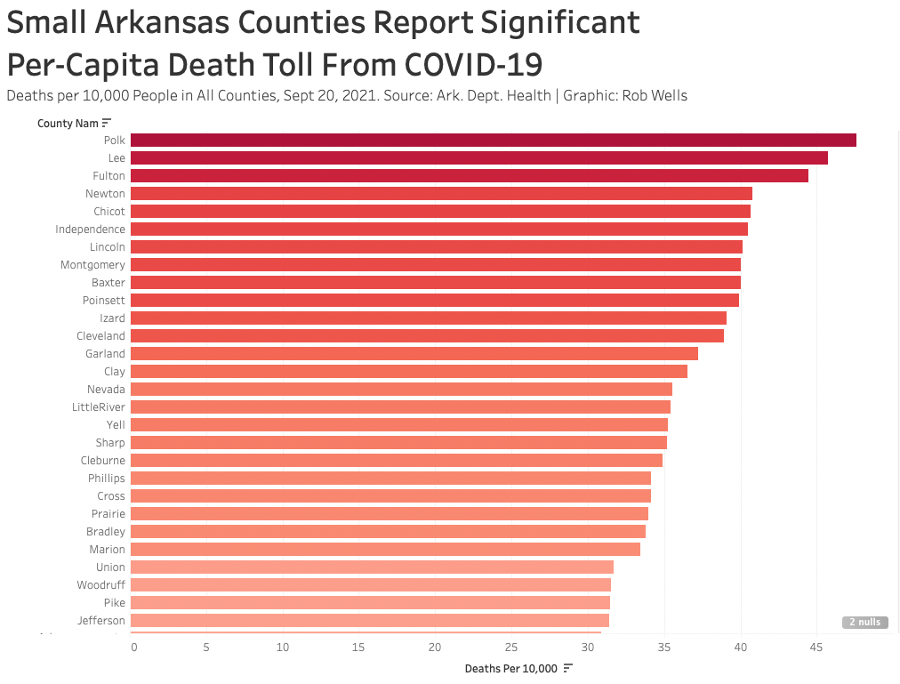
Build Your First Tableau Chart - Deaths by Counties
Build a basic Covid chart
Use the master file
Create a folder on your computer for the semester: Data_Spring21. Put all of your class assignments and data in that folder. Put master_file.csv in that folder
Tableau: Connect | To A File | Text file | master_file.csv
–this loads master_file.csv into Tableau
Data Interpreter (top left column, under “Files”)
Check the file formats.
–Are Words as ABC?
–Are the Numbers as #?New Worksheet. Click Sheet 1 (bottom left)
Drag county_nam to rows.
Drag deaths to columns. Check that measure is SUM
deaths to colors.
–Click colors. Green-Red diverging. Reverse colorsDrag total deaths to labels
Filter for a date in time
–Date to Filter. Individual date. Pick yesterday.Sort Descending. See toolbar, sorting icon, down arrow
Formatting.
–Headline: Click “Sheet 1.” Write a headline Your end product should look somewhat like the chart below:Export a jpg version of your chart
–Worksheet | Export | Image-
Engage in excessive self-congratulatory behavior.

This chart was filtered to show counties with deaths 25 and greater
Formatting a Graphic
Here are some common formatting errors on graphics:
--Round labels to whole numbers
--Format the Y axis in percent
--Caption not needed. Delete
--Delete legend. 
Click on image to expand
Filters and Calculations
Using Filters:
1) Drag County Nam to Filters, click OK
2) On the County Filter, click down arrow, show filter. It will appear
on the right column as a list of county names
3) On the right column, down arrow, select Multiple Dropdown
4) Edit Title and Type some instructions to your readers:
“Select Your County
A) Select All to clear
B) Select your county”
Add a calculation rate: Deaths Per 10,000
Duplicate Sheet
–Left Click on the tab, duplicate
–This copies your whole work to a new sheetCalculate a Deaths Per 10,000
–Click on Deaths - down arrow | Create | Calculated Field
–Name the Calculation “Deaths Per 10,000”
–Divide Total Deaths into Population:
–Add a Division Symbol after ([Deaths]/[Pop 5Yr Est 2018])*10000Drag Deaths Per 10,000 to Columns –Remove Deaths
–SortCheck your colors and labels.
–Drag Deaths Per 10,000 to Colors
–Drag Deaths Per 10,000 to labelsHeadline, Format Legends, Export jpg
Your graphic should look something like the image below.
Your Turn
Create calculated fields and make the following charts:
--Tested/population, percentage for the most recent five days.
--Active cases per 10,000 residents
--A stacked bar chart with Ever on a Vent and Ever Hospitalized
Post on a Google Doc, include link in your weekly memo.
More on Tableau, Basic Excel Skills: FBI Data
More Tableau and Excel skills training: FBI Data
Tableau Calculations
Introduction to calculations video
Intro to calculations, video, link 2
Tableau for Data Journalism Lecture Week 3: Data joining, blends and table calculations video
Introduction to Calculations Transcript
Showing Context – Total In Tableau
Create a Table Calculation:
This exercise uses 2018 student debt data for Arkansas
Import the data into a new Tableau workbook
Add a new column that divides graduate debt into enrollment
--In Measures Data Tab, Left Click on GRAD_DEBT_MDN, Create Calculated Field
--Put in this formula: sum[GRAD_DEBT_MDN]/[UGDS]
-–Rename This as: Grad Debt Per Capita Enrollment
--Drag INSTNM to Rows
--Grad Debt Per Capita Enrollment to Columns
--Format with a Title, add appropriate annotations.
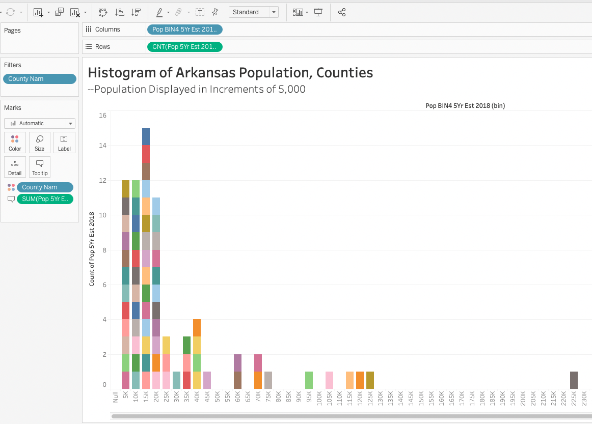
--Color the graphic, include labels.Build a Histogram
This is a detailed walk-through of how to add a cumulative distribution to a histogram in Tableau.
This process involves finding a median value, creating bins to reflect that value, creating a histogram.
Use the master file
-
We’ll use population. Determine the median value.
–Drag Pop 5Yr Est 2018 to Rows. Down arrow pill, switch from sum to median.
–Filter out state total. Drag County Nam to Filters, select all except Arkansas_all_counties.
–Filter for a single date. Mydate to Filter, select Oct 11 –Write down that value: 18,313
–We have 75 counties in Arkansas. That means half are below the population of 18,313.
–Knowing this, we want to have some detail on our graph that’s useful. We’ll select 5,000 as the size of the bins. It’s arbitrary but this helps you determine visualization. -
Create a binned calculation. In Data select Pop 5Yr Est 2018 | Create | Bins | In “Size of bins” write 5000
–Drag that new Pop 5Yr Est 2018(bin) into Columns
A distribution chart appears
Make sure Rows has Count: “CNT(Pop 5 Yr2018)”
- Drag county_nam to colors. Individual counties are colored –Drag Pop 5Yr Est 2018 to Tooltip. Population now is visible in Tooltip. –Edit tooltip, remove “Count of Pop 5Yr Est 2018:”
Your Turn
Dual Axis Graphic

A version of this chart was published on the ArkansasCovid Twitter feed
Dual Axis Step-By-Step Tutorial
Use this data source
Import data to Tableau
Drag "Sheet1" to data pane
Create a visualization: New Worksheet
Date to Columns
Expand Date: Click + until you get to Day
Delete Blue "Quarter" Pill
Active Cases Total to Rows
Confirmed Active Cases to Rows
Select Confirmed Active Cases "Green Pill"
    --down arrow: Dual Axis Chart

Change to Active Cases to Lines
Marks Card, select SUM(Active Cases) panel
Change Automatic to Line (down arrow from Automatic)

Change to Confirmed Cases to Circles
Marks Card, select SUM(Confirmed Cases) panel
Change Automatic to Circle (down arrow from Automatic)

Colors
Marks Card
SUM(Confirmed Cases)
Remove Active cases from color and drag Confirmed cases to color.
Change color to purple

Align the Y axes:
(You have to do this in Tableau Desktop)
Left click, synchronize axis
Your Turn: Dual Axis, Deaths and New Cases
Use this data source You’ll use the same spreadsheet but a different tab on the sheet.
In Menu, Select Data | New Data Source |  active_cases_jan_27.xlsx
Drag "countysnapshot" to data pane
Build a dual axis chart with Total Deaths and New Cases Today
Make the Deaths as Red Circles and the New Cases as Blue Columns
Visualize by Months
More information: See the Tableau Dual Axis chart tutorial
More documentation on dual axis
Your Turn:
Build a dual axis chart with the vaccine data: All_Doses_Received and All_Doses_Given
Chart Monthly Differences, COVID-19
Sheet 1:
–Mydate to Columns.
–Active Cases, Deaths, Positive to Rows
–Filter: County Nam to Filter: Select Arkansas_All_Counties
–Mydate to Filter: Individually select the last day of each month. March 31 2020, April 30, 2020 etc.
–New: Or create a calculated field from Mydate. Call it End of Month Date.
Copy the following formula for the calculation: DATEADD(‘day,’-1,DATEADD(‘month,’1,DATETRUNC(‘month,’[Mydate])))
Drag End of Month Date to Columns. Remove the Mydate
–New: On Columns, End of Month Date, click down arrow, select Day option so the date is Month/Day/Year
You now have three charts, aggregated by last days of the month.
A quick video on the process:
Save and Headline Your Graphic.
Export Filtered Values from Tableau, Create New Calculations
Left click on the chart. Select view data. You’ll see a monthly summary of the data: Year, Month, Active Cases, Deaths, Positive. 19 rows
Export all. creates a new mini spreadsheet
Open spreadsheet in Excel
copy underlying data into a new tab
Sort spreadsheet in descending order, Sept. 2021 as first value
Create three new columns: Active_Diff Deaths_Diff Positive_Diff
Active_Diff:
-subtract September 2021 from August 2021
–Check the math is correct
–copy formula down to October 2020.
–Copy formula over for Deaths_Diff, Positive_Diff
Save your work
Import new data back to Tableau
- Select new worksheet
- Menu Bar: Data | New Data Source
- Import your new calculations
- build a vialuzation
–Dates in Column (Year and Month)
–Positive Diff, Active Diff, Deaths_Diff in rows.
–Marks Card, change to bar charts.
You have three charts
Joins in Tableau
This exercise builds on the “Turning a PDF into a Spreadsheet” in the Excel chapter.
We are joining school data from the ADH Covid reports to the school population data and creating per-capita Covid calculations.
Download the school population data:
–Examine the data. Which field has the names of the schools?In Tableau, select a new sheet.
Add a new Data Source (Data | New Data Source)
Add the School_Districts_FY31_Districts_EnrollmentByRace.csv
- Join with the ADH School data.
Look in Upper Right on Data Source pane for “Connections.” Select “Add”
–Add your ADH school data “School_Report_10162021.xlsx”
–In the main data pane window, Double Click on “School_Districts_FY31_EnrollmentByRace.csv”
–Drag the ADH data to the data pane and a Join window appears.
–Select “inner join” on the two fields that have the school names. Select the names from a drop-down dialog box.
- Examine the results.
How could you maximize the number of matches? Look carefully at the columns you were trying to match.
–Describe your strategy to clean the data so the names will match.
More Tableau Materials on Next Page
7.1 Additional Tableau Tutorials
Dashboards and Embedding Tableau Public in WordPress
Bins and Groups
Tutorial on how to Create Bins
Other options besides bins: Use parameters to organize data.
Dashboards and Embedding Tableau Public in WordPress
Tableau to Visualize Census Data
Here’s a start:
We have a lot of data in this spreadsheet.
Let’s simplify things in Excel.
We will visualize just one column- Column J –:
“Percent; INCOME AND BENEFITS (IN 2016 INFLATION-ADJUSTED DOLLARS) – Total households – $15,000 to $24,999”
–Copy the “Edited Poverty” tab and rename it Min Wage Only
–Delete all of the columns except for the Percent; INCOME AND BENEFITS
(IN 2016 INFLATION-ADJUSTED DOLLARS) – Total households – $15,000 to
$24,999″
–Fix the column headings so it plays nice with Tableau.
-Delete the Row 1 “GEO.display-label…”
–Simplify your new column % Households – $15k-$25k
–Save, backup etc and open Tableau.
–Import your data
–Open new tab
–Geography to Columns. % Households $15k- $25k to rows
–Sort by largest-smallest
–Filter by Geography –drag Geography to Filter. -Filter to keep the
following:
>Arkansas,Benton,Carroll, Crawford, Madison, Sebastian, United States,
Washington
Formatting. This is the standard formatting you will apply to all of your charts in some fashion. We are simplifying and clearly marking the labels
–Drag to Label in Marks box:%Households $15k- $25k to rows
–Format Label to % – Format | Pane | Default | Numbers | Numbers:
Custom | 1 decimal. % as suffix.
–Format Y Axis to %. – Format | Axis | Scale | Numbers | Number:
Custom | no decimal, % as suffix.
–Color the bars. Drag to colors in Marks box: % Households $15k- $25k
to rows. Edit colors to blue – red scale, reverse colors so red =
highest.
–Label graph: Double Click on “Sheet 1” above the chart. Text box
emerges withSheet Name; Type in name of chart: -Minimum Wage
Households;Percentage of Households Earning $15,000-$24,999 in
2016;Source: U.S. Census
–Fix X axis labels (squished) . Drag the right chart out to expand the
visualization.
-Export image
–Worksheet | Export | Image
–Click off color legend option
–Title Minimum Wage Arkasas. Save as .jpeg
Tableau Download and License
Instructions for downloading Tableau Desktop
Click on the link above and select “Download Tableau Desktop.” On the form, enter your school email address for Business E-mail and enter the name of your school for Organization.
Activate with your product key: TCNN-D2B0-5220-2F5A-5D9C
The download is for your personal computer. You will need to free up hard drive space and have sufficient memory. In my experience, you need at least 15 gb free hard drive space and 4 gb ram – it will be slow but it will run with that. Already have a copy of Tableau Desktop installed? Update your license in the application: Help menu → Manage Product Keys
Are your students new to Tableau? Share our free Data Analytics for University Students guide to help them get started.
Students can continue using Tableau after the class is over by individually requesting their own one-year license through the Tableau for Students program here
Need help? Find answers to frequently asked questions are here
Build a histogram with % Female Households in Poverty
Easiest method: click on % Female Households in Poverty and choose the histogram from Show Me Find out where this is happening: drag Geography to the pane. Now hover your mouse over the blocks and you will see the counties. Duplicate the CNT(Profit) pill on Rows by Ctrl+drag the pill next to itself on the Rows shelf This gives you a new marks card – now you can create 2 different types of mark for a single data field. On the new marks card “CNT(Profit)(2),” change the mark type to a line Change the color as well, if desired Right click on the duplicated field on the Rows shelf and make it a dual axis Apply a Quick Table Calculation of Running Total to the duplicated field
If you find this histogram to be uninteresting, add a filter on Profit to ignore outliers Then right-click Profit(bin) dimension and Edit to make the bin size smaller, maybe 25.
Create a Reference Line for Poverty
Step 1 – Build the View Drag % Female Households – Children 5 Years to the Rows shelf. Drag Geography to the Columns shelf.
Step 2 – Create Parameters Right-click in the Data pane and then select Create Parameter Name the parameter “Arkansas Average.” Under Data Type, select Integer. Under Current Value, set to 55.8 Under Allowable values select All Click OK
Step 3: Create the calculated field Select Analysis Create Calculated Field Name the calculated field “Reference Line” In the formula field, enter the following formula: IF[% Female Households – Children 5 years younger]=[Arkansas Average] THEN [Arkansas Average] END Click OK
Step 4 – Use the calculated field as a Parameter Control Drag the “Reference Line”calculated field to Details. This is the box below Color in the Marks Card Click the arrow to change the measure from SUM to Minimum. In the view, right-click on the Y axis and select Add Reference Line. In theValue drop down menu, select Minimum(Reference Line). In the Label drop-down menu, select Value. Click OK.
Visualize the income distribution in a histogram % of Female Households – Children 5 Years and Younger. Drag to Columns Show me: Select Histogram Distribution of the poverty level.