2 Excel Bootcamp
Sections in this Module
- Excel Exercise: Filtering and Sorting ArkansasCovid Data
- Excel Tips
- Excel Exercise: Calculating Percentage Change with ArkansasCovid Data
- Background and Help
- Excel Exercises
- Pivot Tables

Excel Exercises: Filtering and Sorting ArkansasCovid Data
File: Save Page As | Comma-Separated Values
Note where you stored the file!
- Four corners test: Shift + Command + Right arrow
- Filter by Aug. 22
- Sort by “Full_Pct”
- Duplicate tab: Left click on tab, click “Create a copy” - rename FullVax
- Delete Columns D -> AD
- This leaves you with A-D - Unnamed, Date, County_Name, Full_Pct
- Save File as “Full Vax Test”
- Select columns B,C,D, copy, Create new tab, Paste. Rename tab Full Vax2
- Delete tabs vaccine_master, Full Vax Test, save file
- Sort Full_Pct: Select data, Sort Largest -> Smallest, “My List has headers”
- Delete tabs vaccine_master, Full Vax Test, save file
- Identify counties with highest vaccination rates. How many over 50%? Over 40%
___________________________________________________________________________
Calculating Percentage Change with ArkansasCovid Data
Percentage Fully Vaxxed
Copy vaccine_master to a new tab
Use Hide Columns: keep just Date, County_Name, County_Vax_Total, Fully_Vax, Population, Full_Pct
Calculation:=(H311/V311)*100
or =(Fully_Vax/Population)*100
|
| Percentage Change
| Filter for Aug 23 and July 22
| Sort by County Name
| New Column: Pct_Change_8_23_v_7_22
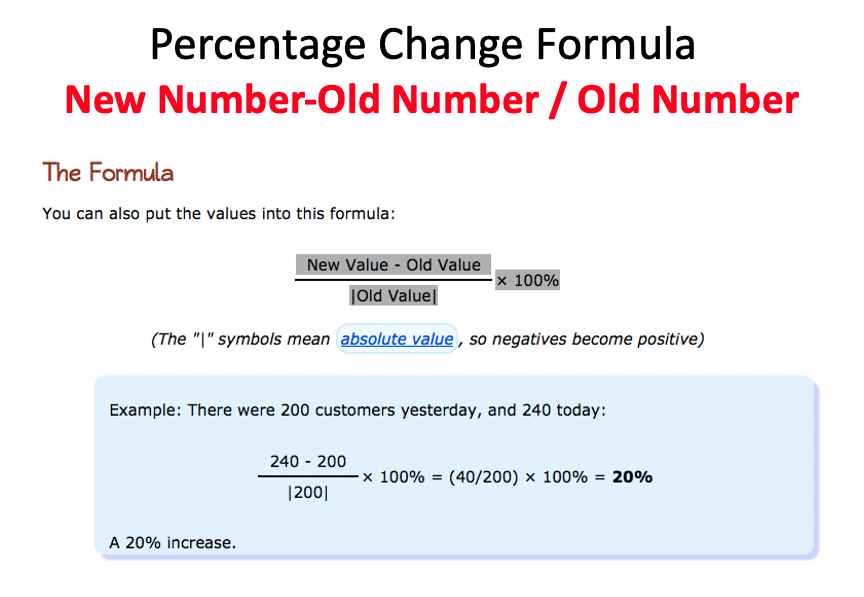
| Percentage Change Formula: =(C310-C311)/C311
| or =(County_Vax_Total for Aug 23 - County_Vax_Total for Jul 22)/County_Vax_Total for July 22
| Formula: (New Number-Old Number)/Old Number
| Filter to July 22, delete results in Pct_Change_8_23_v_7_22
Percentage Change, Option #2
Use Hide Columns: keep just Date, County_Name, County_Vax_Total, Fully_Vax, Population, Full_Pct
Filter for Aug 31
Sort by County Name, A-Z
Select the cells, copy, paste to a new tab, call it pct change
Do the same for July 31 and paste starting at pct change tab at cell G1
Fact Check! Make sure the counties line up. Arkansas is on Line 2. Pulaksi is Line 63. Yell is the last value at Line 78.
New Column Heading at M1: Pct_Change_8_31_v_7_31
Write a percentage change formula for Fully_Vax on Aug 31 vs July 31
Formula: (New Number-Old Number)/Old Number
Part 2: Flourish
Open Flourish, Column chart grouped, import your data
Sort in descending order
Write a headline
Work with colors
If you have a finished product, send the link to me in Teams chat
If it’s ready to go, I’ll tweet it out on ArkansasCovid.com
TIP: Windows Users: Keyboard Commands
Ctrl+Left/Right Arrow: Move to the farthest cell left or right in the row.
Ctrl+Up/Down Arrow: Move to the top or bottom cell in the column.
___________________________________________________________________________
School Data
I want to calculate the difference between the Aug 19 and Aug 16 school Covid reports to find the schools with a jump in active cases.
The lists don’t match up:
–88 entries for Aug 16
–125 for Aug 19
My solution was to identify the duplicate entries (schools with both 8/16 and 8/19 reports), eliminate the single entries and do the math.
Check the video below.
Here’s the spreadsheet from the exercise:: “CNTL” + click for a New Tab
    Next Steps
    Calculations: =sum =average
    Formatting
Excel Tips
Make Two Folders: Original. Working.
Duplicate Spreadsheet: Right Click | Duplicate
Data Dictionary: Who are you and  where did you come from
Copy sheets, Rename Tabs
Copying Formulas: The Black + Sign
Sorting
Story Ideas from Sorting Difference
Formatting Data in Dollars
Percentage Change
Part of Whole: Anchoring Values - i.e. $C$17
Excel Exercise: FBI Crime Data
Review Key Tips:
1. Make a copy
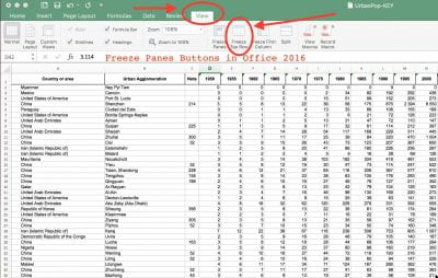
2. Freeze Panes
3. Four corners test
4. Check the math
Excel and the Black cross copy function
5. Sorting
6. Percentage Change:
(New Number-Old Number)/Old Number *100 and use % symbol
Background and Help
Excel Tricks Tutorial Video:
- Sarah Cohen on thinking about numbers
- Think in ratios – construct a ratio on the COVID beat
- Memorize common numbers on the beat
PIVOT TABLES
Here’s a short exercise:
Create a pivot table of counties and COVID-19 deaths. Use this data
--See "pivot_example" tab. Define, select data
--Data Menu | Summarize with Pivot Table
--Use Pivot Table builder:
    * County_Name to Row
    * Date to Column
    * Deaths to Value
--These steps spelled out in a video:
Population Spin
We hear politicians claiming Arkansas vaccination rate is greater than 50%. The fine print is this refers to the “eligible population” or people age 12 and older.
But everybody gets sick from COVID-19. How big of a group is this eligible population?
Fire up Excel. Download this data
https://www.cdc.gov/nchs/nvss/bridged_race/data_documentation.htm#vintage2019
We downloaded "pcen_v2019_y1019.sas7bdat.zip zip icon[SAS – 58 MB] (Released 7/9/2020)
Then carved out the Arkansas portion
Then matched the county FIPS data for county names
Then filtered for population age 12+ in all counties
Then summarized the file to provide total population and total by age 12+
Calculate the difference of the total population versus those 12 and older eligible for vaccines.
Calculate the percentage of the eligible vs total population.
Sum the total of people not eligble. How many people statewide are not eligible? Put that into context.
Compare these numbers to county vaccination rate data
Blend the county vaccination rate Full_Pct and Fully_Vax numbers with our population spreadsheet.
Be careful to line up the county names!
Calculate Total_Pop_Fully_Vaxxed.
Calculate the difference of Full_Pct and Total_Pop_Fully_Vaxxed. (Remember, this would
be represented in percentage points, not percents)
In Tableau create a dual axis graphic comparing the Full_Pct and Total_Pop_Fully_Vaxxed. Put the total ineligible population for vaccination in the tooltip.
Turning a PDF into a Spreadsheet
This step-by-step tutorial will show you how to turn a PDF of school covid data into a spreadsheet
Part 1: PDF -> Spreadsheet
Download the PDF from the ADH webpage (Mondays / Thursday afternoons): Select the Oct 14 report
Open with Adobe Acrobat Pro (this is the Adobe Suite version, not the free version), export into a spreadsheet
-
Process the data
– Select All
– Unmerge Cells
– Resize columns
– Delete Row 1
– Save the damned thing! -
Insert new date column
–Insert New Column A, call it date –Fill the entire column with the report date for all entries
-
Insert new type column
–Insert New Column B, call it type –Copy the category into the category. PUBLIC SCHOOLS in the type column for all public schools. PRIVATE SCHOOL for all private schools etc, COLLEGES/UNIVERSITY, “Totals among schools with less than 5 active cases” AND “Totals for all schools”
Save the damned thing!
Video documenting these steps:
Part 2: Clean data in Excel
Pro tip: Make a copy of your sheet as a backup and work from the copy. Always do this with data cleaning in case you get carried away.
Use the Excel filter feature to quickly eliminate rows without data that have repeated headers and miscellaneous footnotes. Delete extraneous material without data such as repeated rows with “Timeframe: 8/1/2021 - Present”
Video on data cleaning using filters:
Part 3: Calculation, Visualization
Create calculation of percentage of student cases to the total.
Import your data into Tableau, make a story with three panels:
–Visualize percentage of student cases to the total, top 20 schools
–Visualize cumulative total cases, top 20 schools
–Visualize active cases, schools with more than 10 active cases