4 Data Visualization
–Sept 18, 2021 ver.
Sections in this Module
- Principles of Data Visualization
- Cleveland McGill Scale
- Resources for Data Viz Options
- Color Choices
- Tips and Tricks
Hammering Out Early Data Graphics
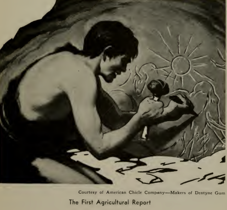
–Image: Brinton, W. C. (1939). Graphic Presentation. Brinton Associates.
Data Visualization
“Our limited brains are incapable of grasping reality in all its glorious complexity.”
What you design is never exactly what your audience ends up interpreting so reducing the chances for misinterpretation becomes crucial.
Cleveland McGill Scale
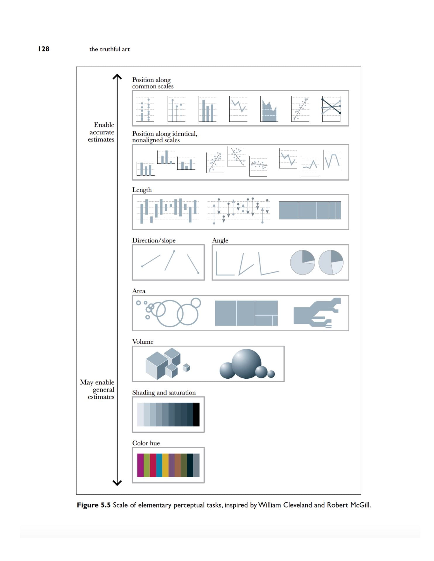
–Image: Cairo, A. (2016). The Truthful Art: Data, Charts, and Maps for Communication. New Riders.
How to Represent Your Data
–Video: Alberto Cairo, Knight Center for Journalism in the Americas, University of Texas
Notes on selecting, designing visualizations
--Simplicity is great
--5 second test: Does it make sense?
--Understand context of data
--Declutter your chart: borders, grids etc
--Focus readers on the core elements
--Form and function: What readers will do with our visualization
--Preattentive attributes: Color, size, position to draw reader's eye
--Be strategic with colors. Gradients.
–Inspired by Knaflic, Cole Nussbaumer. Storytelling With Data. Hoboken, N.J.: John Wiley & Sons, Inc., 2015.
Important Resources for Surveying the Data Visualization Options
Dataviz Catalog
FT Visual Vocabulary
Grammar of Graphics
Exercise:
Notes on visualization options
--The pie chart focuses the reader on large percentages, and encourages the reader to
  think of the total

 --The stacked bar plot provides the same information, but makes it easier to accurately
  determine at a glance how large each group is out of the whole.

--The bar chart splits the categories horizontally, and draws attention to how the
  family members are ordered. It encourages the reader to think about the distribution
  rather than disconnected categories, and gives a better sense of sense of scale.
Scale and Context
Exercise: Critique this graphic
Inspiration from Knaflic, Storytelling With Data
Graphics Comments from Jon Schleuss, Los Angeles Times
Colors: At the Times we really only have two or three colors: basic default, a highlight color and a negative color. Beware of using colors indiscriminately. Be aware of coloring a neighborhood in red - what are you saying?
Simplify and resist the desire to combine a lot of different data into the same chart. It can be a bit confusing to the reader, especially when things have the same values (percentages vs. percentages instead of percentages vs. hard counts).
Beware of implying a time series. When we sort data largest to smallest, we think of it as time passing if it’s a column chart (bars situated left to right). And that there’s a downward marching trend. Best to flip a lot of these on their side.
A Comment on Color Choices
A reader made an excellent point that the red shading of the active cases map was misleading since ‘red zone’ is a specific concept in the White House task force reports.
Our shading does not match the red zone definition of the task force report and most readers would expect that it would.
I swapped out the shading for blue-green until we figure out the calculations for active cases per capita on that White House task force scale.
It just goes to show you how color choices on graphics are major communication issues.
Reader Comment: BruceWard2
Have you considered using a standard for which counties are red? The map gives a false impression that Arkansas counties are not “red zones” for CoVID when they are.
Tips and Tricks
Build a Cover Image Using Canva or InDesign or Powerpoint
Rachell Sanchez-Smith used Canva for a simple animation.
Higher Resolution Graphics in Tableau
Higher Resolution Photos: at least 72 DPI. Practically, should be higher.
–500k or more is a safe bet
–Cropping reduces file size.
Guidance on Grainy Images