1 Introduction to Data Analysis
Sections in this Module:
–Basics of Data Analysis
–Numbers in the Newsroom
–Exercise: Rates and Ratios
–Weighted Averages
–AP Stylebook Entry on Data Journalism
Basics of Data Analysis
* Transparency: If our results are challenged, can we show exactly what we’ve done to defend it?
* Reliability: How sure are we that we got the right answer? That we’ve done everything correctly?
* Replicability: If we had to do it all again, would we get the same answer? If someone else did it, would they?
Thanks to Matt Waite, University of Nebraska
Data Analysis Checklist
— Review methodology with one or more other data people
— Check results to other available comparable data
— Ensure all record counts are consistent across stages
— Check averages
— Examine outputs to ensure logical consistency (do things that should add up to 100% add up to 100%?)
— Recheck all coding line by line if possible or in aggregate if not
— Re-read all programs/scripts
— Re-run entire analysis from scratch
— Check each number against analysis or source material prior to publication
— Recheck each number against analysis or source material on each draft
Thanks to Daniel Lathrop, Dallas Morning News
Readings on Data, Spin and Lies
Numbers in the Newsroom

Sarah Cohen, Math Diva
Sarah Cohen’s “Numbers in the Newsroom” is a classic in journalism numeracy. She is a Pulitzer-winning journalist at The Washington Post, a former Duke University professor, a data journalist at The New York Times., now a professor at Arizona State University. That’s why we read her book.
- Limit yourself to 8- 12 digits, including dates such as 2012, in a single paragraph.
–This allows us to stress the most important numbers
–Simplify your story using rates, ratios or percentages. “One in four” = ratio or rate. “Forty percent” = ratio or rate. 235 deaths per 100,000 is another.
Round off! Unless you’re dealing with really small numbers, decimal points may not be meaningful. “I’m a big fan of rounding,” Cohen said. To make a very small number more understandable, divide it into 1. For example, .0081 is the proportion of the U.S. population who die every year. 1/.0081 translates to 1 in every 124 Americans die each year.* If you have a story filled with numbers – and not people — it needs to be really, really short.
- Portion of whole – For example, at the time of the Million Man March in 1995, a turnout of 1 million black men would have represented 1/12th of all the black men in the country at the time.
- “Percents are Fractions. Fractions are percents”
–In the spirit of “memorizing numbers on your beat,” find three statistics about poverty in this dataset
Cohen Numbers in Newsroom - Common mistakes
Write a paragraph with at least two questions or observations.
Exercise: Rates and Ratios
Construct a ratio to illustrate poverty in Arkansas.
To construct a rate, determine your base or total amount. A crime rate would use population as a base.
Then figure your category. Violent crime you be a category.
(Crime / Population) = Crime Rate
Crime Rate x 1,000 = Crimes per 1,000 people
Round your number to a single decimal place i.e. 12.3
Example: In 2018, Baltimore had population of 605,436. That’s the base
There were 11,100 violent crimes in Baltimore. That’s the category.
(11,100 / 605,436) * 1,000 = 18 violent crimes per 1,000 people.
Construct a rate of the number of households earning $15,000 to $24,999 for the U.S., Arkansas, and the counties with the highest and lowest percentages in this category.
Low Income Household Rate:
–Base is total households.
–Category is number of households earning $15,000 to $24,999
–(Number households $15000-$24000 / Total Households) = Rate of Low Income Households
Weighted Averages
When calculating averages across a group of counties or school districts with varying population, use a weighted average. See the example below with the wide variance in population and active COVID-19 rates.
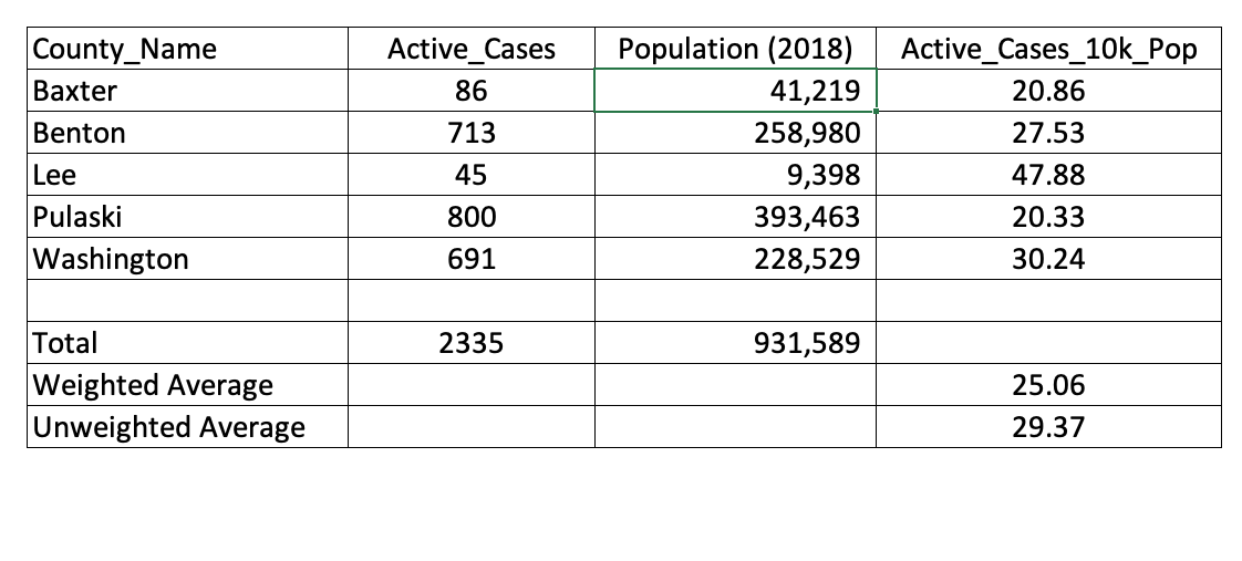
The high per-capita rate of tiny Lee County inflates the unweighted average: 29.37. That’s the simple average of the Active_Cases_10k_Pop column.
The weighted average factors in population and it is lower: 25.06.
(Total Active Cases (2,335) / Total Population (931,589)) * 10,000
Relative Risk
“Black applicants are denied mortgages at twice the rate of whites with similar incomes.”
If 20 smokers per thousand contract cancer, and yet non-smokers have a cancer rate of only 10 per thousand, the relative risk of smoking is 2.
“More than” or “less than” = compute difference between the smokers, an extra step
Background Reading: Excerpt from Numbers in the Newsroom: Rates and Ratios
AP Stylebook Entry on Data Journalism
Data sources used in stories should be vetted for integrity and validity. When evaluating a data set, consider the following questions:
–What is the original source for the data? How reliable is it? Can we get answers to questions about it?
– Is this the most current version of the data set? How often is the data updated? How many years of data have been collected?
–Why was the data collected? Was it for purposes of advocacy? Might that affect the data’s reliability or completeness? Does the data make intuitive sense? Are there anomalies (outliers, blank values, different types of data in the same field) that would invalidate the analysis?
–What rules and regulations affect the gathering (and interpretation) of the data?
–Is there an alternative source for comparison? Does the data for a parallel industry, organization or region look similar? If not, what could explain the discrepancy?
–Is there a data dictionary or record layout document for the data set? This document would describe the fields, the types of data they contain and details such as the meaning of codes in the data and how missing data is indicated. If the data collectors used a data entry form, is the form available to review? For example, if the data entry was performed by inspectors, is it possible to see the form they used to collect the data and any directions they received about how to enter the data?
Data and the results of analysis must be represented accurately in stories and visualizations. Any limitations of the data must also be conveyed. If one point in the analysis is drawn from a subset of the data or a different data set altogether, explain why this was done.
Use statistics that include a meaningful base for comparison (per capita, per dollar). Data should reflect the appropriate population for the topic: for example, use voting-age population as a base for stories on demographic voting patterns. Avoid percentage and percent change comparisons from a small base. Rankings should include raw numbers to provide a sense of relative importance.
When comparing dollar amounts across time, be sure to adjust for inflation. When using averages (that is, adding together a group of numbers and dividing the sum by the quantity of numbers in the group), be wary of extreme, outlier values that may unfairly skew the result. It may be better to use the median (the middle number among all the numbers being considered) if there is a large difference between the average (mean) and the median.
Correlations should not be treated as a causal relationship. Where possible, control for outside factors that may be affecting both variables in the correlation. Use round numbers where possible, particularly to avoid a false appearance of precision. Be clear about limitations of sample size in reporting on data sets. See the polls and surveys section for more specific guidance on margin of error.
Try not to include too many numbers in a single sentence or paragraph.