13 R Visualization with GGplot
Sections in this Module:
–GGplot in steps
–Adding Colors
–Formatting Labels
–Your turn
A cookbook for formatting decent graphics in ggplot
#Load libraries
#library(tidyverse)
#library(rio)


#Import data
Homeless2018 <- rio::import('https://github.com/profrobwells/HomelessSP2020/raw/master/Data/Homeless2018.csv')

glimpse(Homeless2018)
## Rows: 264
## Columns: 5
## $ V1 <int> 1, 2, 3, 4, 5, 6, 7, 8, 9, 10, 11, 12, 13, 1…
## $ district_name <chr> "GUY-PERKINS SCHOOL DISTRICT", "BRADFORD SCH…
## $ district_percent_homeless <dbl> 0.22686567, 0.20323326, 0.19642857, 0.186956…
## $ district_lea <int> 2304000, 7303000, 3544700, 1204000, 4501000,…
## $ district_bak <chr> "GUY-PERKINS", "BRADFORD", "FRIENDSHIPASPIRE…Make a small test file
test <- Homeless2018 %>%
  filter(district_percent_homeless > .18)
Basic graphic of four schools
ggplot(data=test) +
geom_col(mapping=aes(x=district_percent_homeless, y=district_bak)) 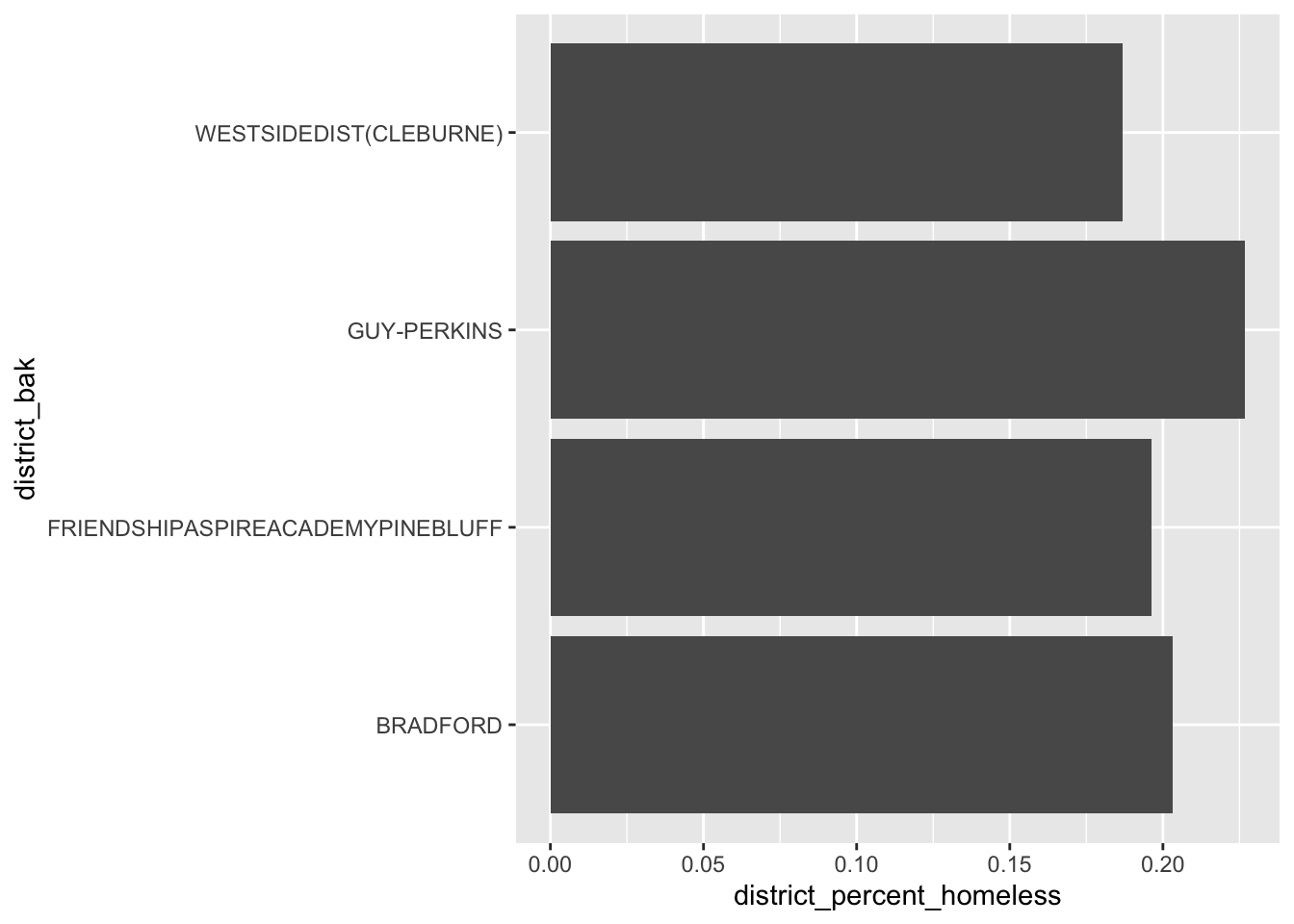
Basic graphic of four schools, colors
ggplot(data=test) +
  geom_col(mapping=aes(x=district_percent_homeless, y=district_bak,
fill = district_percent_homeless)) 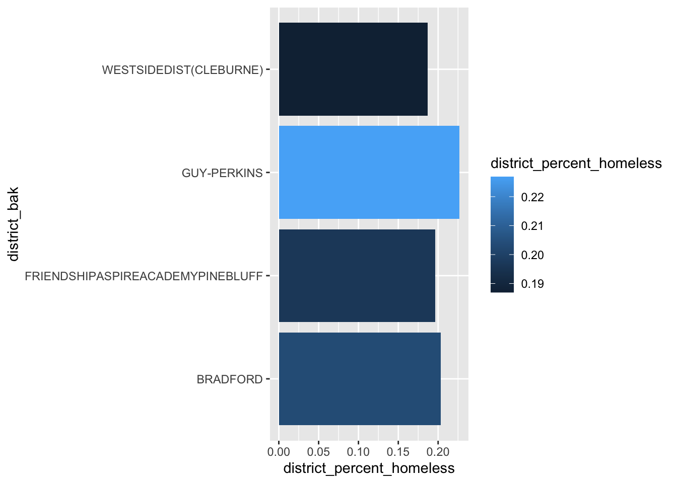
Basic graphic of four schools, colors, fix legend
ggplot(test,aes(x = district_percent_homeless, y = district_bak,
             fill = district_percent_homeless)) +
  geom_col(position = "dodge") +
  theme(legend.position = "none")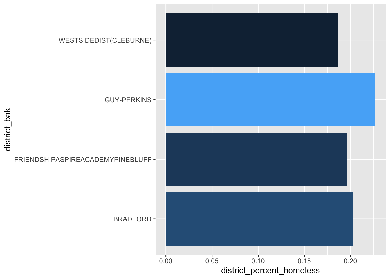
Basic graphic of four schools, colors, fix legend, add title
ggplot(test,aes(x = district_percent_homeless, y = district_bak,
             fill = district_percent_homeless)) +
  geom_col(position = "dodge") +
  theme(legend.position = "none") +
  #This is your title sequence
  labs(title = "Homeless Children in Arkansas, 2018",
       subtitle = "Districts with More Than 15% Homeless",
       caption = "Graphic by Rob Wells, 12-4-2021",
       y="Statewide Average: 3.6%. Source: Arkansas Dept of Education",
       x="")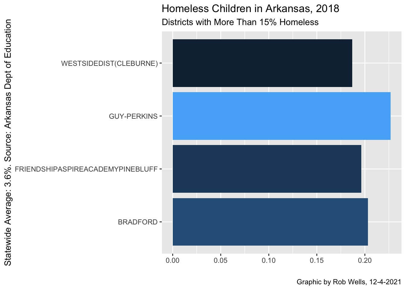
Basic graphic of four schools, colors, fix legend, add title, percents
ggplot(test,aes(x = district_percent_homeless, y = district_bak,
             fill = district_percent_homeless)) +
  geom_col(position = "dodge") +
  theme(legend.position = "none") +
  #format the x axis. sets the grid to maximum 30%
    scale_x_continuous(limits=c(0, .3),labels = scales::percent) +
  labs(title = "Homeless Children in Arkansas, 2018",
       subtitle = "Districts with More Than 15% Homeless",
       caption = "Graphic by Rob Wells, 12-4-2021",
       y="Statewide Average: 3.6%. Source: Arkansas Dept of Education",
       x="")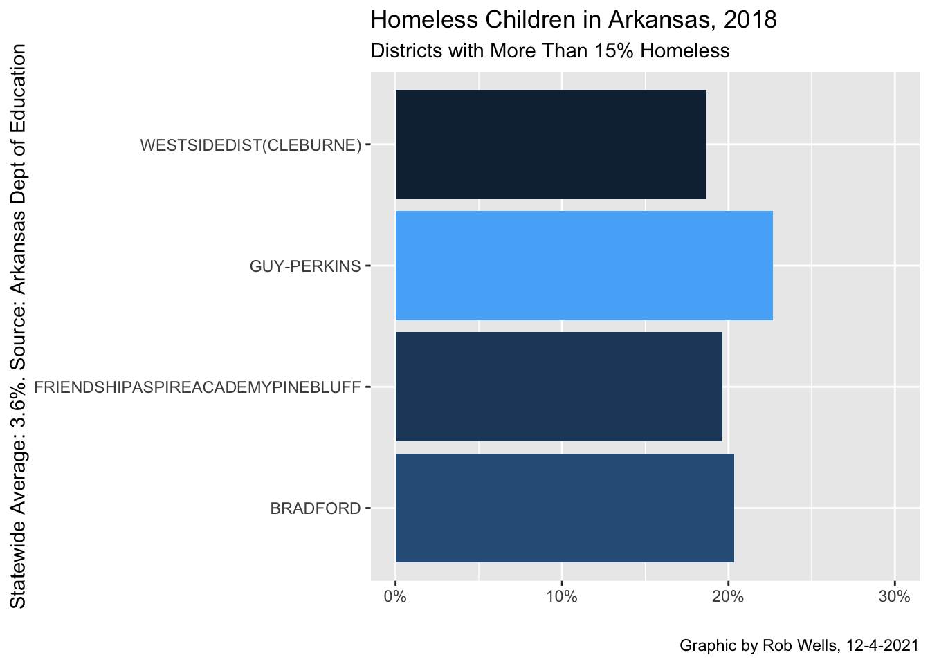
Basic graphic - labels
Homeless2018 %>%
  filter(district_percent_homeless > .15) %>%
  ggplot(aes(x = reorder(district_bak, district_percent_homeless),
             y = district_percent_homeless,
             fill = district_percent_homeless)) +
  geom_col(position = "dodge", show.legend = FALSE) +
  theme(axis.text.x = element_text(angle = 90, hjust = 1)) +
  #label formatting. Scales, into percentages. hjust moves to the grid
    geom_text(aes(label = scales::percent(district_percent_homeless)), position = position_stack(vjust = .5), hjust = -5., size = 2.5)  +
  #format the x axis. sets the grid to maximum 30%
    scale_y_continuous(limits=c(0, .3),labels = scales::percent) +
  coord_flip() +
  labs(title = "Homeless Children in Arkansas, 2018",
       subtitle = "Districts with More Than 15% Homeless",
       caption = "Graphic by Rob Wells, 4-26-2020",
       y="Statewide Average: 3.6%. Source: Arkansas Dept of Education",
       x="")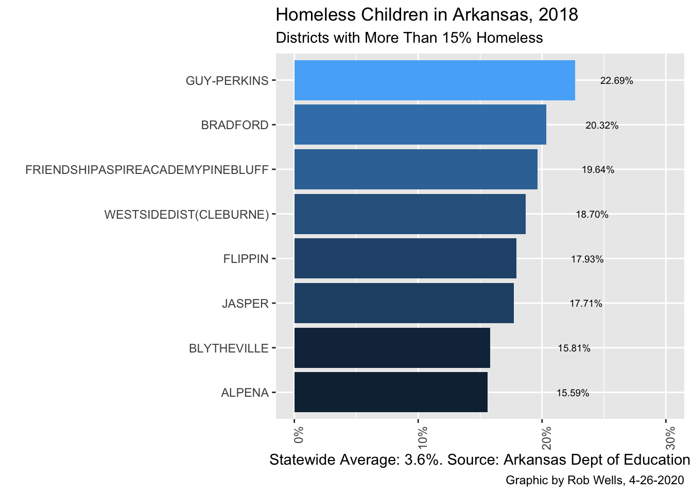
Export to high resolution file
ggsave("Test.png",device = "png",width=9,height=6, dpi=800)Make two plots, put on one chart
Check this for details on the ggplot library and options: https://cpb-us-e1.wpmucdn.com/wordpressua.uark.edu/dist/1/170/files/2018/10/ggplot2-cheatsheet-19yp3zd.pdf
Plot Benton, Springdale, Fayetteville
NWA <- Homeless2018 %>%
  filter(district_bak =="BENTONVILLE" | district_bak =="FAYETTEVILLE" | district_bak =="SPRINGDALE") %>%
  ggplot(aes(x = reorder(district_bak, district_percent_homeless),
             y = district_percent_homeless,
             fill = district_percent_homeless)) +
  geom_col(position = "dodge", show.legend = FALSE) +
  theme(axis.text.x = element_text(angle = 90, hjust = 1)) +
  #label formatting. Scales, into percentages. hjust moves to the grid
    geom_text(aes(label = scales::percent(district_percent_homeless)), position = position_stack(vjust = .7), hjust = -5., size = 2.5)  +
  #format the x axis. sets the grid to maximum 30%
    scale_y_continuous(limits=c(0, .03),labels = scales::percent) +
  coord_flip() +
  labs(title = "NWA Homeless Children, 2018",
       subtitle = "Statewide Average: 3.6%",
       caption = "Graphic by Rob Wells, 4-26-2020",
       y="Source: Arkansas Dept of Education",
       x="")
NWA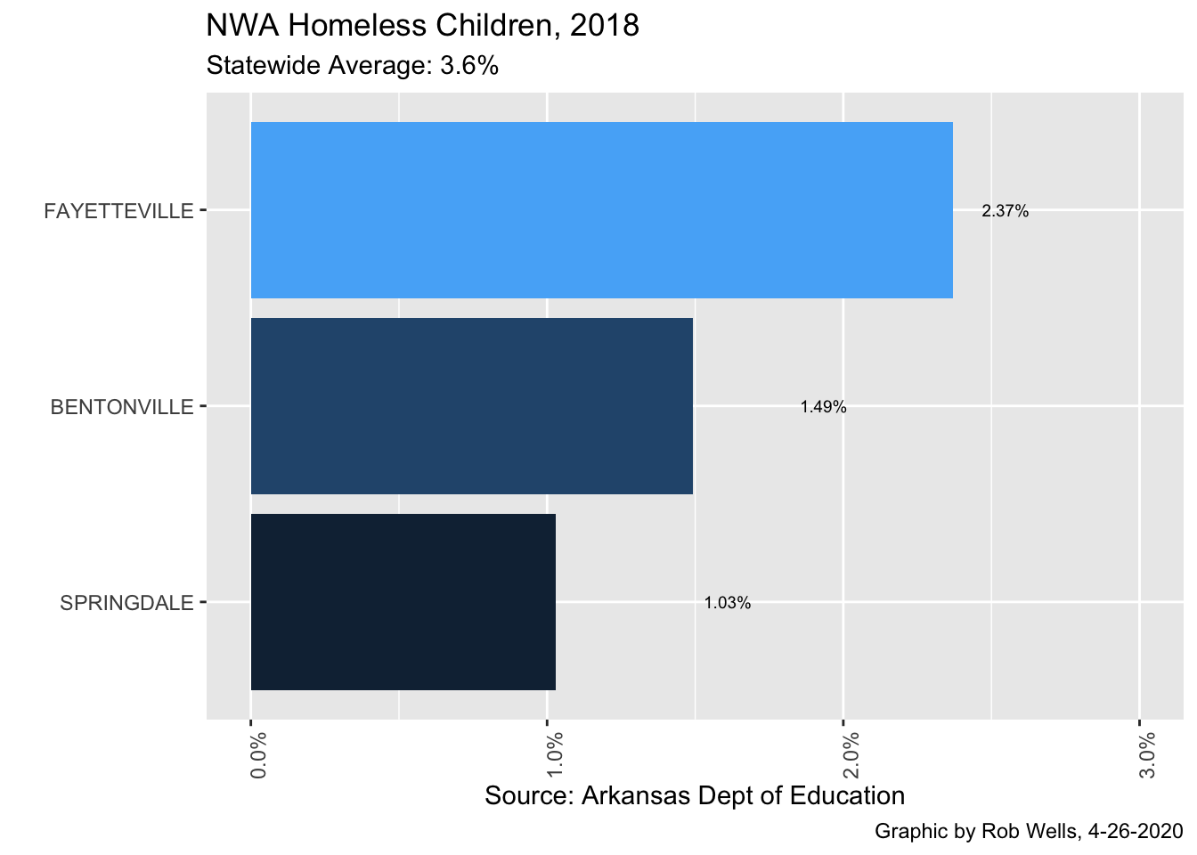
Your Turn!
Import the ArkansasCovid.com vaccine county daily file
1) Create a dataframe with the top five counties by fully vaccinated status

2) Remember to filter out non-county entries

3) Create a graphic with ggplot.