Chapter 9 When assumptions are not met: non-parametric alternatives
library(tidyverse)
library(knitr)
9.1 Introduction
Linear models do not apply to every data set. As discussed in Chapter 8, sometimes the assumptions of linear models are not met. One of the assumptions is linearity or additivity. Additivity requires that one unit change in variable \(X\) leads to the same amount of change in \(Y\), no matter what value \(X\) has. For bivariate relationships this leads to a linear shape. But sometimes you can only expect that \(Y\) will change in the same direction, but you don’t believe that this amount is the same for all values of \(X\). This is the case for example with an ordinal dependent variable. Suppose we wish to model the relationship between the age of a mother and an aggression score in her 7-year-old child. Suppose aggression is measured on a three-point ordinal scale: ‘not aggressive,’ ‘sometimes aggressive,’ ‘often aggressive.’ Since we do not know the quantitative differences between these three levels, there are many graphs we could draw for a given data set.
Suppose we have the data set given in Table 9.1. If we want to make a scatter plot, we could arbitrarily choose the values 1, 2, and 3 for the three categories, respectively. We would then get the plot in Figure 9.1. But since the aggression data are ordinal, we could also choose the arbitrary numeric values 0, 2, and 3, which would yield the plot in Figure 9.2.
| AgeMother | Aggression |
|---|---|
| 32 | Sometimes aggressive |
| 31 | Often aggressive |
| 32 | Often aggressive |
| 30 | Not aggressive |
| 31 | Sometimes aggressive |
| 30 | Sometimes aggressive |
| 31 | Not aggressive |
| 31 | Often aggressive |
| 31 | Not aggressive |
| 30 | Sometimes aggressive |
| 32 | Often aggressive |
| 32 | Often aggressive |
| 31 | Sometimes aggressive |
| 30 | Sometimes aggressive |
| 31 | Not aggressive |
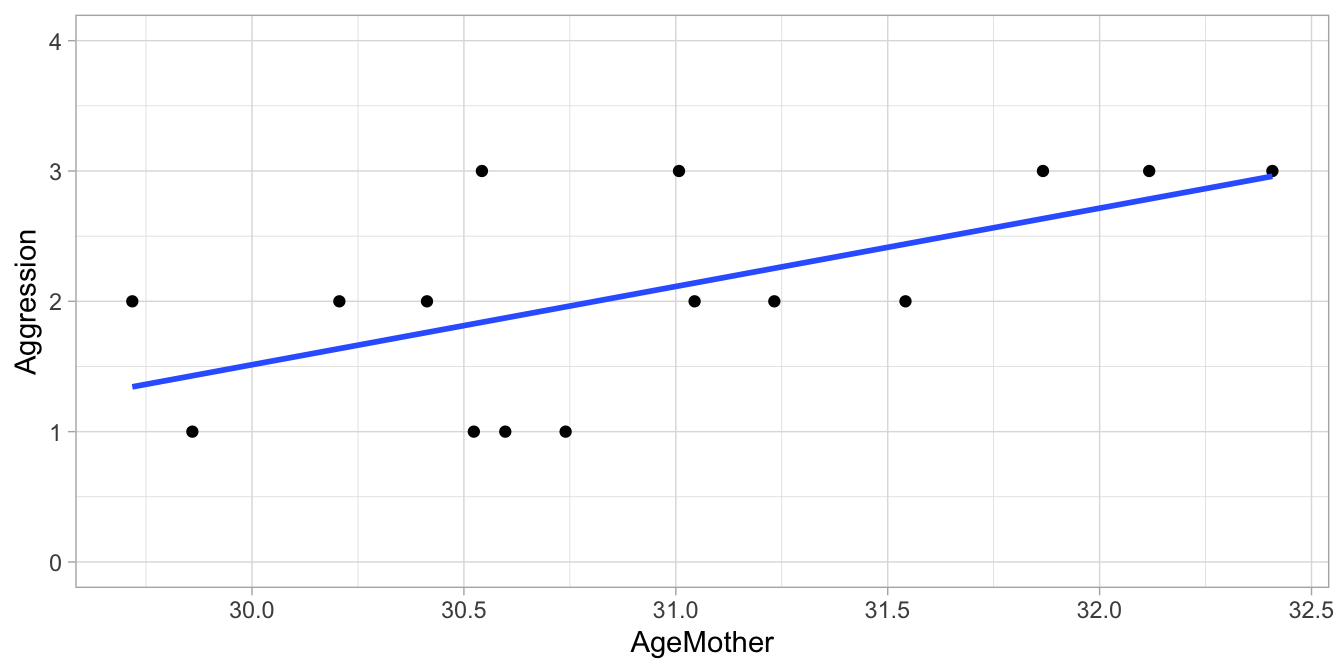
Figure 9.1: Regression of the child’s aggression score (1,2,3) on the mother’s age.
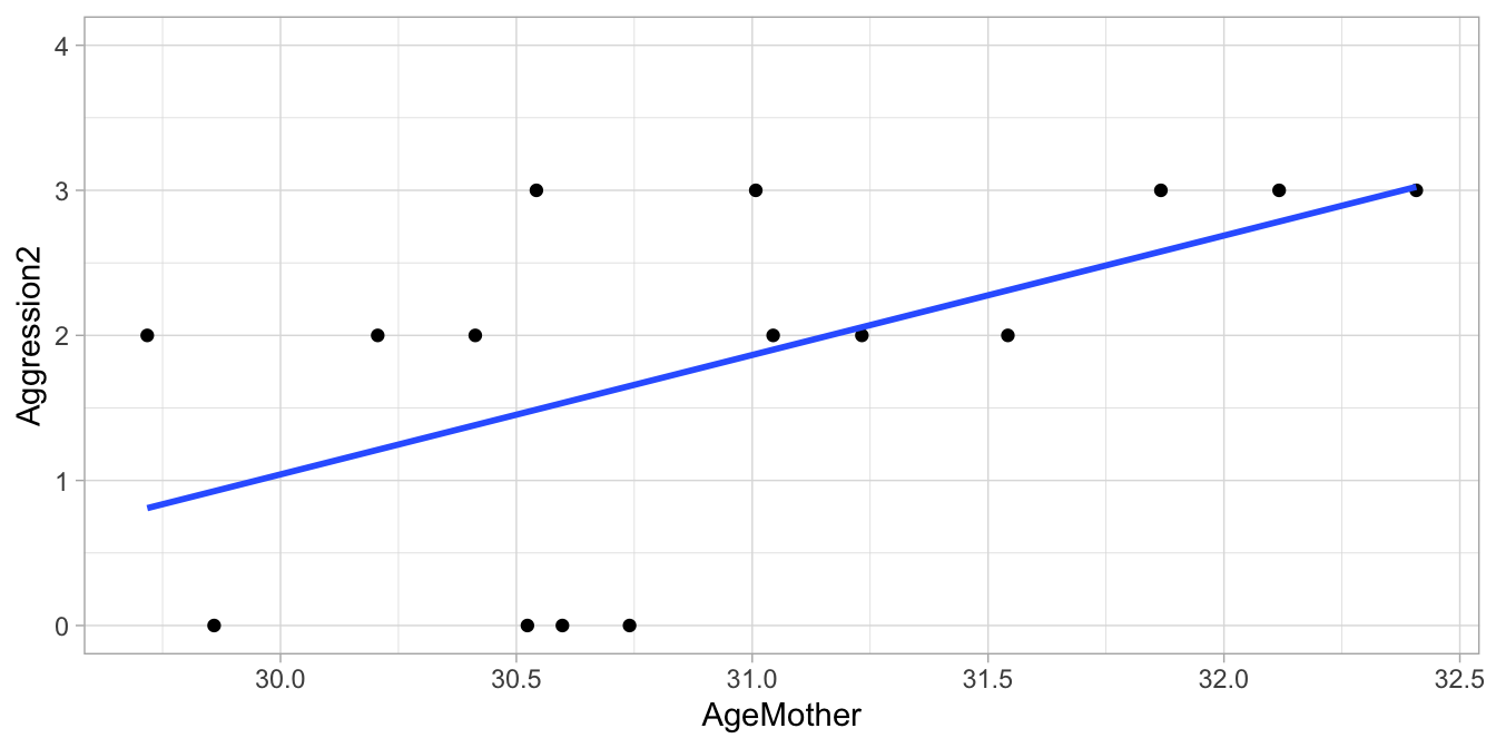
Figure 9.2: Regression of the child’s aggression score (0,2,3) on the mother’s age.
As you can see from the least squares regression lines in Figures 9.1 and 9.2, when we change the way in which we code the ordinal variable into a numeric one, we also see the best fitting regression line changing. This does not mean though, that ordinal data cannot be modelled linearly. Look at the example data in Table 9.2 where aggression is measured with a 7-point scale. Plotting these data in Figure 9.3 using the values 1 through 7, we see a nice linear relationship. So even when the values 1 thru 7 are arbitrarily chosen, a linear model can be a good model for a given data set with one or more ordinal variables. Whether the interpretation makes sense is however up to the researcher.
| AgeMother | Aggression |
|---|---|
| 35 | 6 |
| 32 | 4 |
| 35 | 6 |
| 36 | 5 |
| 33 | 3 |
| 30 | 1 |
| 32 | 4 |
| 32 | 2 |
| 34 | 4 |
| 30 | 2 |
| 32 | 3 |
| 31 | 2 |
| 32 | 3 |
| 31 | 3 |
| 38 | 7 |
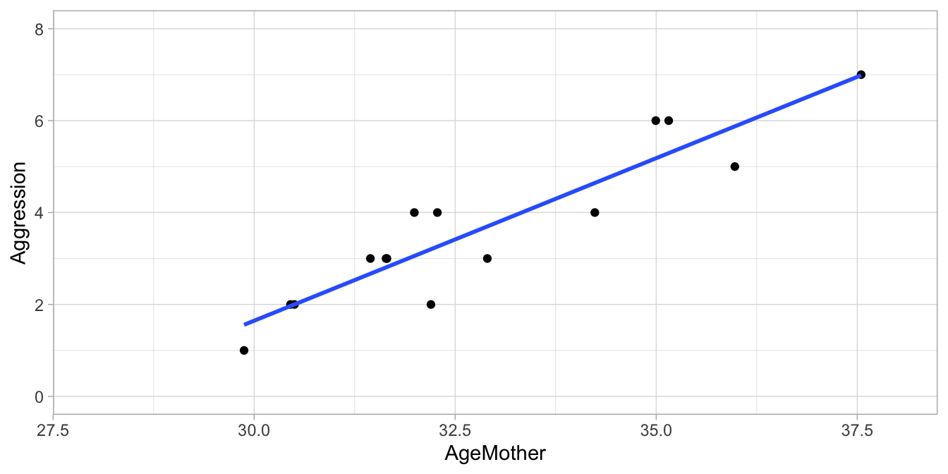
Figure 9.3: Regression of the child’s aggression 1 thru 7 Likert score on the mother’s age.
So with ordinal data, always check that your data indeed conform to a linear model, but realise at the same time that you’re assuming a quantitative and additive relationship between the variables that may or may not make sense. If you believe that a quantitative analysis is meaningless then you may consider a non-parametric analysis that we discuss in this chapter.
Another instance where we favour a non-parametric analysis over a linear model one, is when the assumption of normally distributed residuals is not tenable. For instance, look again at Figure 9.1 where we regressed aggression in the child on the age of its mother. Figure 9.4 shows a histogram of the residuals. Because of the limited number of possible values in the dependent variable (1, 2 and 3), the number of possible values for the residuals is also very restricted, which leads to a very discrete distribution. The histogram looks therefore far removed from a continuous symmetric, bell-shaped distribution, which is a violation of the normality assumption.
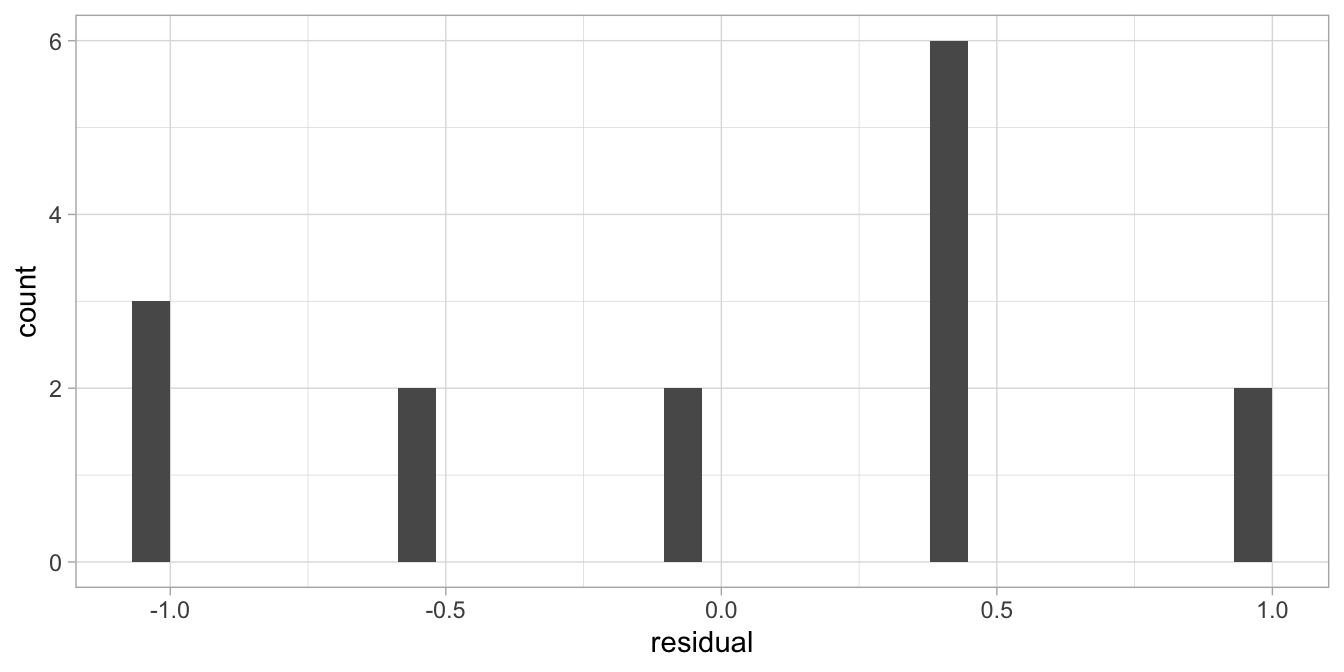
Figure 9.4: Histogram of the residuals after the regression of a child’s aggression score on the mother’s age.
Every time we see a distribution of residuals that is either very skew, or has very few different values, we should consider a non-parametric analysis. Note that the shape of the distribution of the residuals is directly related to what scale values we choose for the ordinal categories. By changing the values we change the regression line, and that directly affects the relative sizes of the residuals.
First, we will discuss a non-parametric alternative for two numeric variables. We will start with Spearman’s \(\rho\) (rho, pronouned ‘row’), also called Spearman’s rank-order correlation coefficient \(r_s\). Next we will discuss an alternative to \(r_s\), Kendall’s \(\tau\) (tau, pronounced ‘taw’). After that, we will discuss the combination of numeric and categorical variables, when comparing groups.
9.2 Spearman’s \(\rho\) (rho)
Suppose we have 10 students and we ask their teachers to rate them on their performance. One teacher rates them on geography and the other teacher rates them on history. We only ask them to give rankings: indicate the brightest student with a 1 and the dullest student with a 10. Then we might see the data set in Table 9.3. We see that student 9 is the brightest student in both geography and history, and student 7 is the dullest student in both subjects.
| student | rank.geography | rank.history |
|---|---|---|
| 1 | 5 | 4 |
| 2 | 4 | 5 |
| 3 | 6 | 7 |
| 4 | 7 | 8 |
| 5 | 8 | 6 |
| 6 | 9 | 9 |
| 7 | 10 | 10 |
| 8 | 2 | 3 |
| 9 | 1 | 1 |
| 10 | 3 | 2 |
Now we acknowledge the ordinal nature of the data by only having rankings: a person with rank 1 is brighter than a person with rank 2, but we do not how large the difference in brightness really is. Now we want to establish to what extent there is a relationship between rankings on geography and the rankings on history: the higher the ranking on geography, the higher the ranking on history?
By eye-balling the data, we see that the brightest student in geography is also the brightest student in history (rank 1). We also see that the dullest student in history is also the dullest student in geography (rank 10). Furthermore, we see relatively small differences between the rankings on the two subjects: high rankings on geography seem to go together with high rankings on history. Let’s look at these differences between rankings more closely by computing them, see Table 9.4.
| student | rank.geography | rank.history | difference |
|---|---|---|---|
| 1 | 5 | 4 | -1 |
| 2 | 4 | 5 | 1 |
| 3 | 6 | 7 | 1 |
| 4 | 7 | 8 | 1 |
| 5 | 8 | 6 | -2 |
| 6 | 9 | 9 | 0 |
| 7 | 10 | 10 | 0 |
| 8 | 2 | 3 | 1 |
| 9 | 1 | 1 | 0 |
| 10 | 3 | 2 | -1 |
So theoretically the difference could be as large as 9, but here we see a biggest difference of -2. When all differences are small, this says something about how the two rankings overlap: they are related. We could compute an average difference: the average difference is the sum of these differences, divided by 10, so we get 0. This is because we have both plus and minus values. It would be better to take the square of the differences, so that we would get positive values, see Table 9.5.
| rank.geography | rank.history | difference | squared.difference |
|---|---|---|---|
| 5 | 4 | -1 | 1 |
| 4 | 5 | 1 | 1 |
| 6 | 7 | 1 | 1 |
| 7 | 8 | 1 | 1 |
| 8 | 6 | -2 | 4 |
| 9 | 9 | 0 | 0 |
| 10 | 10 | 0 | 0 |
| 2 | 3 | 1 | 1 |
| 1 | 1 | 0 | 0 |
| 3 | 2 | -1 | 1 |
Now we can compute the average squared difference, which is equal to 10/10 = 1. Generally, the smaller this value, the closer the rankings of the two teachers are together, and the more correlation there is between the two subjects.
A clever mathematician like Spearman showed that is even better to use a somewhat different measure for a correlation between ranks. He showed that it is wiser to compute the following statistic, where \(d\) is the difference in rank and \(d^2\) is the squared difference (and \(n\) is sample size):
\[\begin{aligned} r_s = 1 - \frac{6 \sum d^2 }{n^3-n}\end{aligned}\]
because then you get a value between -1 and 1, just like a Pearson correlation, where a value close to 1 describes a high positive correlation (high rank on one variable goes together with a high rank on the other variable) and a value close to -1 describes a negative correlation (a high rank on one variable goes together with a low rank on the other variable). So in our case the sum of the squared differences is equal to 10, and \(n\) is the number of students, so we get:
\[\begin{aligned} r_s &= 1 - \frac{6 \times 10 }{10^3-10} \\ &= 1 - \frac{60}{990} \\ &= 0.94\end{aligned}\]
This is called the Spearman rank-order correlation coefficient \(r_s\), or
Spearman’s rho (the Greek letter \(\rho\)). It can be used for any two
variables of which at least one is ordinal. The trick is to convert the
scale values into ranks, and then apply the formula above. For instance,
if we have the variable Grade with the following values (C, B, D, A,
F), we convert them into rankings by saying the A is the highest value
(1), B is the second highest value (2), C is the third highest value
(3), D is the fourth highest value (4) and F is the fifth highest value
(5). So transformed into ranks we get (3, 2, 4, 1, 5). Similarly, we
could turn numeric variables into ranks. Table
9.6 shows how the variables grade, shoesize
and height are transformed into their respective ranked versions. Note
that the ranking is alphanumerically by default: the first alphanumeric
value gets rank 1. You could also do the ranking in the opposite
direction, if that makes more sense.
| student | grade | rank.grade | shoesize | rank.shoesize | height | rank.height |
|---|---|---|---|---|---|---|
| 1 | A | 1 | 6 | 1 | 2 | 1 |
| 2 | D | 4 | 8 | 3 | 2 | 2 |
| 3 | C | 3 | 9 | 4 | 2 | 4 |
| 4 | B | 2 | 7 | 2 | 2 | 3 |
9.3 Spearman’s rho in R
When we let R compute \(r_s\) for us, it automatically ranks the data for
us. Let’s look at the mpg data on 234 cars from the ggplot2 package
again. Suppose we want to treat the variables cyl (the number of
cylinders) and year (year of the model) as ordinal variables, and we
want to look whether the ranking on the cyl variable is related to the
ranking on the year variable. We use the function rcorr() from the
Hmisc package to compute Pearson’s rho:
library(Hmisc)
rcorr(mpg$cyl, mpg$year, type = "spearman")
## x y
## x 1.00 0.12
## y 0.12 1.00
##
## n= 234
##
##
## P
## x y
## x 0.0685
## y 0.0685In the output you will see a correlation matrix very similar the one for a Pearson correlation. Spearman’s rho is equal 0.12. You will also see whether the correlation is significantly different from 0, indicated by a \(p\)-value. If the \(p\)-value is very small, you may conclude that on the basis of these data, the correlation in the population is not equal to 0, ergo, in the population there is a relationship between the year a car was produced and the number of cylinders.
"We tested the null-hypothesis that the number of cylinders is not related to the year of the model. For that we used a Spearman correlation that quantifies the extent to which the ranking of the cars in terms of cylinders is related to the ranking of the cars in terms of year. Results showed that the null-hypothesis could not be rejected at an \(\alpha\) of 0.05, \(\rho(n = 234) = .12, p = .07\)."
9.4 Kendall’s rank-order correlation coefficient \(\tau\)
If you want to study the relationship between two variables, of which at least one is ordinal, you can either use Spearman’s \(r_s\) or Kendall’s \(\tau\) (tau, pronounced ‘taw’ as in ‘law’). However, if you have three variables, and you want to know whether there is a relationship between variables \(A\) and \(B\), over and above the effect of variable \(C\), you can use an extension of Kendall’s \(\tau\). Note that this is very similar to the idea of multiple regression: a coefficient for variable \(X_1\) in multiple regression with two predictors is the effect of \(X_1\) on \(Y\) over and above the effect of \(X_2\) on \(Y\). The logic of Kendall’s \(\tau\) is also based on rank orderings, but it involves a different computation. Let’s look at the student data again with the teachers’ rankings of ten students on two subjects in Table 9.7.
| student | rank.geography | rank.history |
|---|---|---|
| 9 | 1 | 1 |
| 8 | 2 | 3 |
| 10 | 3 | 2 |
| 2 | 4 | 5 |
| 1 | 5 | 4 |
| 3 | 6 | 7 |
| 4 | 7 | 8 |
| 5 | 8 | 6 |
| 6 | 9 | 9 |
| 7 | 10 | 10 |
From this table we see that the history teacher disagrees with the geography teacher that student 8 is brighter than student 10. She also disagrees with her colleague that student 1 is brighter than student 2. If we do this for all possible pairs of students, we can count the number of times that they agree and we can count the number of times they disagree. The total number of possible pairs is equal to \(10 \choose 2\) \(= n(n-1)/2 = 90/2= 45\) (see Chapter 3). This is a rather tedious job to do, but it can be made simpler if we reshuffle the data a bit. We put the students in a new order, such that the brightest student in geography comes first, and the dullest last. This also changes the order in the variable history. We then get the data in Table 9.7. We see that the geography teacher believes that student 9 outperforms all 9 other students. On this, the history teacher agrees, as she also ranks student 9 first. This gives us 9 agreements. Moving down the list, we see that the geography teacher believes student 8 outperforms 8 other students. However, we see that the history teacher believes student 8 only outperforms 7 other students. This results in 7 agreements and 1 disagreement. So now in total we have \(9+7=16\) agreements and 1 disagreements. If we go down the whole list in the same way, we will find that there are in total 41 agreements and 4 disagreements.
| student | rank.geography | rank.history | number |
|---|---|---|---|
| 9 | 1 | 1 | 9 |
| 8 | 2 | 3 | 7 |
| 10 | 3 | 2 | 7 |
| 2 | 4 | 5 | 5 |
| 1 | 5 | 4 | 5 |
| 3 | 6 | 7 | 3 |
| 4 | 7 | 8 | 2 |
| 5 | 8 | 6 | 2 |
| 6 | 9 | 9 | 1 |
| 7 | 10 | 10 | 0 |
The computation is rather tedious. There is a trick to do it faster. Now focus on Table 9.7 but start in the column of the history teacher. Start at the top row and count the number of rows beneath it with a rank higher than the rank in the first row. The rank in the first row is 1, and all other ranks beneath it are higher, so the number of ranks is 9. We plug that value in the last column in Table 9.8. Next we move to row 2. The rank is 3. We count the number of rows below row 2 with a rank higher than 3. Rank 2 is lower, so we are left with 7 rows and we again plug 7 in the last column of Table 9.8. Then we move on to row 3, with rank 2. There are 7 rows left, and all of them have a higher rank. So the number is 7. Then we move on to row 4. It has rank 5. Of the 6 rows below it, only 5 have a higher rank. Next, row 5 shows rank 4. Of the 5 rows below it, all 5 show a higher rank. Row 6 shows rank 7. Of the 4 rows below it, only 3 show a higher rank. Row 7 shows rank 8. Of the three rows below it, only 2 show a higher rank. Row 8 shows rank 6. Both rows below it show a higher rank. And row 9 shows rank 9, and the row below it shows a higher rank so that is 1. Finally, when we add up the values in the last column in Table 9.8, we find 41. This is the number of agreements. The number of disagreements can be found by reasoning that the total number of pairs equals the number of pairs that can be formed using a total number of 10 objects: \(10 \choose 2\) = \(10(10-1)/2 = 45\). In this case we have 45 possible pairs. Of these there are 41 agreements, so there must be \(45-41=4\) disagreements. We can then fill in the formula to compute Kendall’s \(\tau\):
\[\begin{aligned} \tau = \frac { agreements - disagreements }{total number of pairs} = \frac{37} {45} = 0.82 \end{aligned}\]
This \(\tau\)-statistic varies between -1 and 1 and can therefore be seen as a non-parametric analogue of a Pearson correlation. Here, the teachers more often agree than disagree, and therefore the correlation is positive. A negative correlation means that the teachers more often disagree than agree on the relative brightness of their students.
As said, the advantage of Kendall’s \(\tau\) over Spearman’s \(r_s\) is that Kendall’s \(\tau\) can be extended to cover the case that you wish to establish the strength of the relationships of two variables \(A\) and \(B\), over and above the relationship with \(C\). The next section shows how to do that in R.
9.5 Kendall’s \(\tau\) in R
Let’s again use the mpg data on 234 cars. We can compute Kendall’s
\(\tau\) for the variables cyl and year using the Kendall package:
library(Kendall)
Kendall(mpg$cyl, mpg$year)
## tau = 0.112, 2-sided pvalue =0.068798As said, Kendall’s \(\tau\) can also be used if you want to control for a
third variable (or even more variables). This can be done with the
ppcor package. Because this package has its own function select(),
you need to be explicit about which function from which package you want
to use. Here you want to use the select() function from the dplyr
package (part of the tidyverse suite of packages).
library(ppcor)
mpg %>%
  dplyr::select(cyl, year, cty) %>%
  pcor(method = "kendall")
## $estimate
## cyl year cty
## cyl 1.0000000 0.1642373 -0.7599993
## year 0.1642373 1.0000000 0.1210952
## cty -0.7599993 0.1210952 1.0000000
##
## $p.value
## cyl
## cyl 0.000000000000000000000000000000000000000000000000000000000000000000000000
## year 0.000189654827628346264994235736978112072392832487821578979492187500000000
## cty 0.000000000000000000000000000000000000000000000000000000000000000000770657
## year
## cyl 0.0001896548
## year 0.0000000000
## cty 0.0059236967
## cty
## cyl 0.000000000000000000000000000000000000000000000000000000000000000000770657
## year 0.005923696652933938683327497187747212592512369155883789062500000000000000
## cty 0.000000000000000000000000000000000000000000000000000000000000000000000000
##
## $statistic
## cyl year cty
## cyl 0.000000 3.732412 -17.271535
## year 3.732412 0.000000 2.751975
## cty -17.271535 2.751975 0.000000
##
## $n
## [1] 234
##
## $gp
## [1] 1
##
## $method
## [1] "kendall"In the output, we see that the Kendall correlation between cyl and
year, controlled for cty, equals 0.16, with an associated \(p\)-value
of 0.00019.
We can report this in the following way:
"The null-hypothesis was tested that there is no correlation between cyl and year, when one controls for cty. This was tested with a Kendall correlation coefficient. We found that the hypothesis of a Kendall correlation of 0 in the population of cars (controlling for cty) could be rejected, \(\tau(n = 234) = .16, p < .001\)."
9.6 Kruskal-Wallis test for group comparisons
Now that we have discussed relationships between ordinal and numeric variables, let’s have a look at the case where we also have categorical variables.
Suppose we have three groups of students that go on a field trip together: mathematicians, psychologists and engineers. Each can pick a rain coat, with five possible sizes: ‘extra small,’ ‘small,’ ‘medium,’ ‘large’ or ‘extra large.’ We want to know if preferred size is different in the three populations, so that teachers can be better prepared in the future. Now we have information about size, but this knowledge is not numeric: we do not know the difference in size between ‘medium’ and ‘large,’ only that ‘large’ is larger than ‘medium.’ We have ordinal data, so computing a mean is impossible here. Even if we would assign values like 1= ‘extra small,’ 2=‘small,’ 3= ‘medium,’ etcetera, the mean would be rather meaningless as these values are arbitrary. So instead of focussing on means, we can focus on medians: the middle values. For instance, the median value for our sample of mathematicians could be ‘medium,’ for our sample of psychologists ‘small,’ and for our sample of engineers ‘large.’ Our question might then be whether the median values in the three populations are really different.
This can be assessed using the Kruskal-Wallis test. Similar to Spearman’s \(r_s\) and Kendall’s \(\tau\), the data are transformed into ranks. This is done for all data at once, so for all students together.
For example, if we had the data in Table
9.9, we could transform the variable size
into ranks, from smallest to largest. Student 1 has size ‘extra small’
so he or she gets the rank 1. Next, both student 4 and student 6 have
size ‘small,’ so they should get ranks 2 and 3. However, because there
is no reason to prefer one student over the other, we give them both the
mean of ranks 2 and 3, so they both get the rank 2.5. Next in line is
student 3 with size ‘medium’ and (s)he gets rank 4. Next in line is
student 5 with size ‘large’ (rank 5) and last in line is student 2 with
size ‘extra large’ (rank 6).
| student | group | size | rank |
|---|---|---|---|
| 1 | math | extra small | 1.0 |
| 2 | math | extra large | 6.0 |
| 3 | psych | medium | 4.0 |
| 4 | psych | small | 2.5 |
| 5 | engineer | large | 5.0 |
| 6 | math | small | 2.5 |
Next, we could compute the average rank per group. The group with the
smallest sizes would have the lowest average rank, etcetera. Under the
null-hypothesis, if the distribution of size were the same in all three
groups, the average ranks would be about the same.
\(H_0\): All groups have the same average rank.
If the average rank is very different across groups, this is an
indication that size is not distributed equally among the three groups.
In order to have a proper statistical test for this null-hypothesis, a
rather complex formula is used to compute the so-called \(KW\)-statistic,
see Castellan & Siegel (1988), that you don’t need to know. The
distribution of this \(KW\)-statistic under the null-hypothesis is known,
so we know what extreme values are, and consequently can compute
\(p\)-values. This computation can be done in R.
9.7 Kruskal-Wallis test in R
Let’s look at the mpg data again. It contains data on cars from 7
different types. Suppose we want to know whether the different types
show differences in the distribution of city miles per gallon. Figure
9.5 shows a box
plot: it seems that indeed the distributions of cty are very different
for different car types. But these differences could be due to sampling:
maybe by accident, the pick-up trucks in this sample happened to have a
relatively low mileage, and that the differences in the population of
all cars are non-existing. To test this hypothesis, we can make it more
specific and we can use a Kruskal-Wallis test to test the
null-hypothesis that the average rank of cty is the same in all
groups.
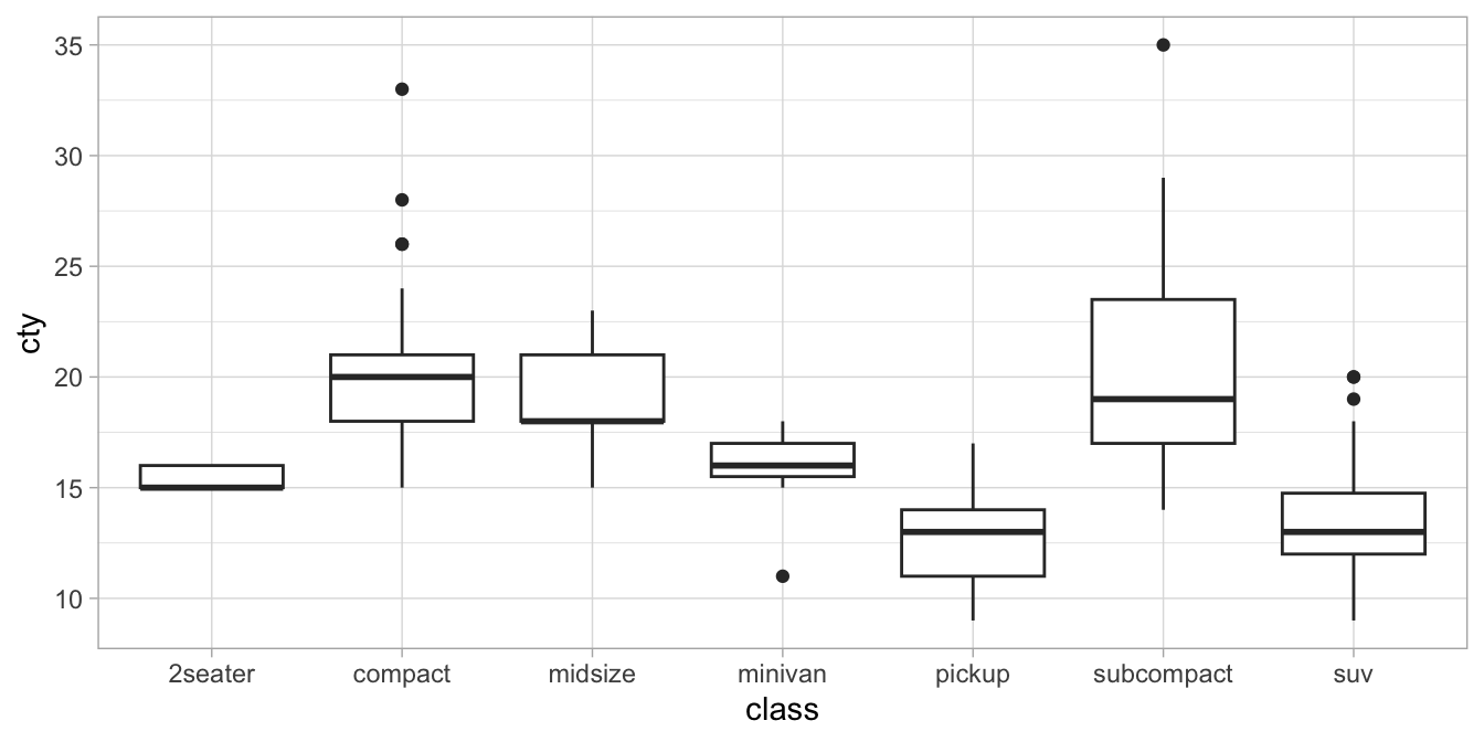
Figure 9.5: Distributions of city mileage (cty) as a function of car type (class).
We run the following R code:
mpg %>%
  kruskal.test(cty ~ class, data = .)
##
## Kruskal-Wallis rank sum test
##
## data: cty by class
## Kruskal-Wallis chi-squared = 149.53, df = 6, p-value <
## 0.00000000000000022mpg$cty %>% length()## [1] 234mpg$class %>% length()## [1] 234The output allows us to report the following:
"The null-hypothesis that city miles per gallon is distributed equally for all types of cars was tested using a Kruskal-Wallis test with an \(\alpha\) of 0.05. Results showed that the null-hypothesis could be rejected, \(\chi^2(6, N = 234) = 149.53\), \(p < .001\)."