Chapter 1 Variables, variation and co-variation
library(lmerTest)
library(tidyverse)
library(knitr)
library(broom)
1.1 A collapsible section with markdown
Click to expand!
1.1.1 Heading
- A numbered
- list
- With some
- Sub bullets
1.2 Units, variables, and the data matrix
Data is the plural of datum, and datum is the Latin translation of ‘given.’ That the world is round, is a given. That you are reading these lines, is a given, and that my dog’s name is Philip, is a given. Sometimes we have a bunch of given facts (data), for example the names of all students in a school, and their marks for a particular course. We could put these data in a table, like the one in Table 1.1. There we see information (‘facts’) about seven students. And of these seven students we know two things: their name and their grade. You see that the data are put in a matrix with seven (horizontal) rows and two (vertical) columns. Each row stands for one student, and each column stands for one property.
In data analysis, we nearly always put data in such a matrix format. In general, we put the objects of our study in rows, and their properties in columns. The objects of our study we call units, and the properties we call variables.
| name | grade |
|---|---|
| Mark Zimmerman | 5 |
| Daisy Doe | 8 |
| Mohammed Solmaz | 5 |
| Monique Gambin | 9 |
| Inga Svensson | 10 |
| Piet van der Keuken | 2 |
| Floor de Vries | 6 |
Let’s look at the first column in Table
1.1. We see
that it regards the variable name. We call the property name a
variable, because it varies across our units (the students): in this
case, every unit has a different value for the variable name. In sum,
a variable is a property of units that shows different values for
different units.
The second column represents the variable grade. Grade is here a
variable, because it takes different values for different students. Note
that both Mark Zimmerman and Mohammed Solmaz have the same value for
this variable.
What we see in Table 1.1 is called a data matrix: it is a matrix (a collection of rows and columns) that contains information on units (in the rows) in the form of variables (in the columns).
A unit is something we’d like to say something about. For example, I might want to say something about students and how they score on a course. In that case, students are my units of analysis.
If my interest is in schools, the data matrix in Table 1.2 might be useful, which shows a different row for each school with a couple of variables. Here again, we see a variable for grade on a course, but now averaged per school. In this case, school is my unit of analysis.
| school | number_students | grade_average | teacher |
|---|---|---|---|
| 1 | 5 | 6 | Alice Monroe |
| 2 | 8 | 6 | Daphne Stuart |
| 3 | 5 | 7 | Stephanie Morrison |
| 4 | 9 | 6 | Clark Davies |
| 5 | 10 | 6 | David Sanchez Gomez |
| 6 | 2 | 6 | Metin Demirci |
| 7 | 6 | 5 | Frederika Karlsson |
| 8 | 9 | 7 | Advika Agrawal |
1.3 Data matrices in R
In R, data matrices are called data frames. A data frame consists of
different vectors, one vector for each variable, and each vector
contains values. Each vector/variable is stored as a column in a data
frame. In the tidyverse version of R that we use in this book, we work
with a particular form of a data frame: a tibble. Below we see some R
code that creates a tibble: we first load the tidyverse package, then
we create the vectors studentID, course, grade, and shirtsize,
and then combine these 4 vectors into a tibble.
library(tidyverse)
studentID <- seq(4132211, 4132215)
course <- c("Chemistry", "Physics", "Math", "Math", "Chemistry")
grade <- c(4, 6, 3, 6, 8)
shirtsize <- c("medium", "small", "large", "medium", "small")
tibble(studentID, course, shirtsize, grade)
## # A tibble: 5 x 4
## studentID course shirtsize grade
## <int> <chr> <chr> <dbl>
## 1 4132211 Chemistry medium 4
## 2 4132212 Physics small 6
## 3 4132213 Math large 3
## 4 4132214 Math medium 6
## 5 4132215 Chemistry small 8From the output, you see that the tibble has dimensions \(5 \times 4\):
that means it has 5 rows (units) and 4 columns (variables). Under the
variable names, it can be seen how the data are stored. The variable
studentID is stored as a numeric variable, more specifically as an
integer (<int>). The course variable is stored as a character
variable (<chr>), because the values consist of text. The same is true
for shirtsize. The last variable, grade, is stored as <dbl> which
stands for ‘double.’ Whether a numeric variable is stored as integer or
double depends on the amount of computer memory that is allocated to a
variable. Double variables have a decimal part (e.g., 2.0), integers
don’t (e.g., 2).
1.4 Multiple observations: wide format and long format data matrices
In many instances, units of analysis are observed more than once. This means that we have more than one observation for the same variable for the same unit of analysis. Storing this information in the rows and columns of a data matrix can be done in two ways: using wide format or using long format. We first look at wide format, and then see that generally, long format is to be preferred.
Suppose we measure depression levels in four men four times during
cognitive behavioural therapy. Sometimes you see data presented in the
way of Table 1.3, where there are four separate variables for
depression level, one for each measurement: depression_1,
depression_2, depression_3, and depression_4.
| client | depression_1 | depression_2 | depression_3 | depression_4 |
|---|---|---|---|---|
| 1 | 5 | 6 | 9 | 3 |
| 2 | 9 | 5 | 8 | 7 |
| 3 | 9 | 0 | 9 | 3 |
| 4 | 9 | 2 | 8 | 6 |
This way of representing data on a variable that was measured more than once is called wide format. We call it wide because we simply add columns when we have more measurements, which increases the width of the data matrix. Each new observation of the same variable on the same unit of analysis leads to a new column in the data matrix.
Note that this is only one way of looking at this problem of measuring depression four times. Here, you can say that there are really four depression variables: there is depression measured at time point 1, there is depression measured at time point 2, and so on, and these four variables vary only across units of analysis. This way of thinking leads to a wide format representation.
An alternative way of looking at this problem of measuring depression four times, is that depression is really only one variable and that it varies across units of analysis (some people are more depressed than others) and that it also varies across time (at times you feel more depressed than at other times).
Therefore, instead of adding columns, we could simply stick to one
variable and only add rows. That way, the data matrix becomes longer,
which is the reason that we call that format long format. Table
1.4 shows
the same information from Table 1.3, but now in long format. Instead of four
different variables, we have only one variable for depression level, and
one extra variable time that indicates to which time point a
particular depression measure refers to. Thus, both Tables
1.3 and
1.4 tell us
that the second depression measure for client number 3 was 0.
| client | time | depression |
|---|---|---|
| 1 | 1 | 5 |
| 1 | 2 | 6 |
| 1 | 3 | 9 |
| 1 | 4 | 3 |
| 2 | 1 | 9 |
| 2 | 2 | 5 |
| 2 | 3 | 8 |
| 2 | 4 | 7 |
| 3 | 1 | 9 |
| 3 | 2 | 0 |
| 3 | 3 | 9 |
| 3 | 4 | 3 |
| 4 | 1 | 9 |
| 4 | 2 | 2 |
| 4 | 3 | 8 |
| 4 | 4 | 6 |
Now let’s look at a slightly more complex example, where the advantage of long format becomes clear. Suppose the depression measures were taken on different days for different clients. Client 1 was measured on Monday, Tuesday, Wednesday and Thursday, while client 2 was measured on Thursday, Friday, Saturday and Sunday. If we would put that information into a wide format table, it would look like Figure 1.5, with missing values for measures on Monday thru Wednesday for client 2, and missing values for measures on Friday thru Sunday for patient 1.
| client | Monday | Tuesday | Wednesday | Thursday | Friday | Saturday | Sunday |
|---|---|---|---|---|---|---|---|
| 1 | 5 | 6 | 9 | 3 | NA | NA | NA |
| 2 | NA | NA | NA | 9 | 5 | 8 | 7 |
Table 1.6 shows the same data in long format. The data frame is considerably smaller. Imagine that we would also have weather data for the days these patients were measured: whether it was cloudy or sunny, whether it rained or not, and what the maximum temperature was. In long format, storing that information is easy, see Table 1.7. Try and see if you can think of a way to store that information in a wide table!
| client | depression | day |
|---|---|---|
| 1 | 5 | Monday |
| 1 | 6 | Tuesday |
| 1 | 9 | Wednesday |
| 1 | 3 | Thursday |
| 2 | 9 | Thursday |
| 2 | 5 | Friday |
| 2 | 8 | Saturday |
| 2 | 7 | Sunday |
| client | depression | day | maxtemp | rain |
|---|---|---|---|---|
| 1 | 5 | Monday | 23 | rain |
| 1 | 6 | Tuesday | 24 | no rain |
| 1 | 9 | Wednesday | 23 | rain |
| 1 | 3 | Thursday | 25 | no rain |
| 2 | 9 | Thursday | 25 | no rain |
| 2 | 5 | Friday | 22 | no rain |
| 2 | 8 | Saturday | 21 | rain |
| 2 | 7 | Sunday | 22 | no rain |
Thus, storing data in long format is often more efficient in terms of storage of information. Another reason for preferring long format over wide format is the most practical one for data analysis: when analysing data using linear models, software packages require your data to be in long format. In this book, all the analyses with linear models require your data to be in long format. However, we will also come across some analyses apart from linear models that require your data to be in wide format. If your data happen to be in the wrong format, rearrange your data first. Of course you should never do this by hand as this will lead to typing errors and would take too much time. Statistical software packages have helpful tools for rearranging your data from wide format to long format, and vice versa.
1.5 Wide and long format in R
Making a data matrix longer or wider can be done with the functions
pivot_longer() and pivot_wider(), respectively. These functions are
part of the tidyr package, and available when you load the tidyverse
collection of packages.
library(tidyverse)1.5.1 From wide to long
The relig_income dataset stores counts based on a survey which (among
other things) asked people about their religion and annual income:
relig_income## # A tibble: 18 x 11
## religion `<$10k` `$10-20k` `$20-30k` `$30-40k` `$40-50k` `$50-75k` `$75-100k`
## <chr> <dbl> <dbl> <dbl> <dbl> <dbl> <dbl> <dbl>
## 1 Agnostic 27 34 60 81 76 137 122
## 2 Atheist 12 27 37 52 35 70 73
## 3 Buddhist 27 21 30 34 33 58 62
## 4 Catholic 418 617 732 670 638 1116 949
## 5 Don’t k… 15 14 15 11 10 35 21
## 6 Evangel… 575 869 1064 982 881 1486 949
## 7 Hindu 1 9 7 9 11 34 47
## 8 Histori… 228 244 236 238 197 223 131
## 9 Jehovah… 20 27 24 24 21 30 15
## 10 Jewish 19 19 25 25 30 95 69
## 11 Mainlin… 289 495 619 655 651 1107 939
## 12 Mormon 29 40 48 51 56 112 85
## 13 Muslim 6 7 9 10 9 23 16
## 14 Orthodox 13 17 23 32 32 47 38
## 15 Other C… 9 7 11 13 13 14 18
## 16 Other F… 20 33 40 46 49 63 46
## 17 Other W… 5 2 3 4 2 7 3
## 18 Unaffil… 217 299 374 365 341 528 407
## # … with 3 more variables: $100-150k <dbl>, >150k <dbl>,
## # Don't know/refused <dbl>This dataset contains three variables:
religion, stored in the rows,income, spread across the column names, andcount, stored in the cell values.
To put the values that we see in the columns into one single column, we
use pivot_longer():
relig_income %>%
  pivot_longer(cols = -religion, # columns that need to be restructured
               names_to = "income", # name of new variable with old column names
               values_to = "count") # name of new variable with values
## # A tibble: 180 x 3
## religion income count
## <chr> <chr> <dbl>
## 1 Agnostic <$10k 27
## 2 Agnostic $10-20k 34
## 3 Agnostic $20-30k 60
## 4 Agnostic $30-40k 81
## 5 Agnostic $40-50k 76
## 6 Agnostic $50-75k 137
## 7 Agnostic $75-100k 122
## 8 Agnostic $100-150k 109
## 9 Agnostic >150k 84
## 10 Agnostic Don't know/refused 96
## # … with 170 more rowsThe
colsargument describes which columns need to be reshaped. In this case, it is every column except religion.The
names_toargument gives the name of the variable that will be created using the column names, i.e. income.The
values_toargument gives the name of the variable that will be created from the data stored in the cells, i.e. count.
1.5.2 From long to wide
The us_rent_income dataset contains information about median income
and rent for each state in the US for 2017 (from the American Community
Survey, retrieved with the tidycensus package).
us_rent_income## # A tibble: 104 x 5
## GEOID NAME variable estimate moe
## <chr> <chr> <chr> <dbl> <dbl>
## 1 01 Alabama income 24476 136
## 2 01 Alabama rent 747 3
## 3 02 Alaska income 32940 508
## 4 02 Alaska rent 1200 13
## 5 04 Arizona income 27517 148
## 6 04 Arizona rent 972 4
## 7 05 Arkansas income 23789 165
## 8 05 Arkansas rent 709 5
## 9 06 California income 29454 109
## 10 06 California rent 1358 3
## # … with 94 more rowsHere both estimate and moe are variables (column names), so we can
supply them to the function argument values_from() to make new
variables:
us_rent_income %>%
  pivot_wider(names_from = variable,
              values_from = c(estimate, moe))
## # A tibble: 52 x 6
## GEOID NAME estimate_income estimate_rent moe_income moe_rent
## <chr> <chr> <dbl> <dbl> <dbl> <dbl>
## 1 01 Alabama 24476 747 136 3
## 2 02 Alaska 32940 1200 508 13
## 3 04 Arizona 27517 972 148 4
## 4 05 Arkansas 23789 709 165 5
## 5 06 California 29454 1358 109 3
## 6 08 Colorado 32401 1125 109 5
## 7 09 Connecticut 35326 1123 195 5
## 8 10 Delaware 31560 1076 247 10
## 9 11 District of Columbia 43198 1424 681 17
## 10 12 Florida 25952 1077 70 3
## # … with 42 more rowsThe
names_fromargument gives the name of the variable that will be used for the new column names, i.e.variableThe
values_fromargument gives the name(s) of the variable(s) that store the value that you wish to see spread out across several columns. Here we have two such variables, i.e.moeandestimate
For more examples, see the vignette on pivoting.
vignette(pivot)1.6 Measurement level
Data analysis is about variables and the relationships among them. In
essence, data analysis is about describing how different values in one
variable go together with different values in one or more other
variables (co-variation). For example, if we have the variable age
with values ‘young’ and ‘old,’ and the variable happiness with values
‘happy’ and ‘unhappy,’ we’d like to know whether ‘happy’ mostly comes
together with either ‘young’ or ‘old.’ Therefore, data analysis is about
variation and co-variation in variables.
Linear models are important tools when describing co-varying variables. When we want to use linear models, we need to distinguish between different kinds of variables. One important distinction is about the measurement level of the variable: numeric, ordinal or categorical.
1.6.1 Numeric variables
Numeric variables have values that describe a measurable quantity as a number, like ‘how many’ or ‘how much.’ A numeric variable can be a count variable, for instance the number of children in a classroom. A count variable can only consist of discrete, natural, positive numbers: 0, 1, 2, 3, etcetera. But a numeric variable can also be a continuous variable. Continuous variables can take any value from the set of real numbers, for instance values like -200.765, -9.78, -2, 0.001, 4, and 7.8. The number of decimals can be as large as the instrument of measurement allows. Examples of continuous variables include height, time, age, blood pressure and temperature. Note that in all these examples, quantities (age, height, temperature) are expressed as the number of a particular measurement unit (years, inches, degrees).
Whether a numeric variable is a count variable or a continuous variable, it is always expressing a quantity, and therefore numeric variables can be called quantitative variables.
For numeric variables, there is a further distinction between interval variables and ratio variables. The distinction is rather technical. The difference between interval and ratio variables is that for ratio variables, the ratio between two measurement values is meaningful, and for interval variables it is not. An example of a ratio variable is height. You could measure height in two persons where one measures 1 meter and the other measures 2 meters. It is then meaningful to say that the second person is twice as tall as the first person. This is meaningful, because had we chosen a different measurement unit, the ratio would be the same. For instance, suppose we express the heights of the two persons in inches, we would get 39.37 and 78.74 inches respectively. The ratio remains 2: namely 78.74/39.37. The same ratio would hold for measurements in feet, miles, millimetres or even light years. Thus, whatever the unit of measurement you use, the ratio of height for these individuals would always be 2. Therefore, if we have a variable that measures height in meters, we are dealing with a ratio variable.
Now let’s look at an example of an interval variable. Suppose we measure the temperature in two classrooms: one is 10 degrees Celsius and the other is 20 degrees Celsius. The ratio of these two temperatures is \(20/10=2\), but does that ratio convey meaningful information? Could we state for example that the second classroom is twice as warm as the first classroom? The answer is no, and the reason is simple: had we expressed temperature in Fahrenheit, we would have gotten a very different ratio. Temperatures of 10 and 20 degrees Celsius correspond to 50 and 68 degrees Fahrenheit, respectively. These Fahrenheit temperatures have a ratio of 68/50=1.36. Based on the Fahrenheit metric, the second classroom would now be 1.36 times warmer than the first classroom. We therefore say that the ratio does not have a meaningful interpretation, since the ratio depends on the metric system that you use (Fahrenheit or Celsius). It would be strange to say that there is twice more warmth in classroom B than in classroom A, but only if you measure temperature in Celsius, not when you measure it in Fahrenheit!
The reason why the ratios depend on the metric system, is because both the Celsius and Fahrenheit metrics have arbitrary zero-points. In the Celsius metric, 0 degrees does not mean that there is no warmth, nor is that implied in the Fahrenheit metric. In both metrics, a value of 0 is still warmer than a value of -1.
Contrasting this to the example of height: a height of 0 is indeed the absence of height, as you would not even be able to see a person with a height of 0, whatever metric you would use. Thus, the difference between ratio and interval variables is that ratio variables have a meaningful zero point where zero indicates the absence of the quantity that is being measured. This meaningful zero-point makes it possible to make meaningful statements about ratios (e.g., 4 is twice as much as 2) which gives ratio variables their name.
What ratio and interval variables have in common is that they are both numeric variables, expressing quantities in terms of units of measurements. This implies that the distance between 1 and 2 is the same as the distances between 3 and 4, 4 and 5, etcetera. This distinguishes them from ordinal variables.
1.6.2 Ordinal variables
Ordinal variables are also about quantities. However, the important difference with numeric variables is that ordinal variables are not measured in units. An example would be a variable that would quantify size, by stating whether a T-shirt is small, medium or large. Yes, there is a quantity here, size, but there is no unit to state exactly how much of that quantity is present in that T-shirt.
Even though ordinal variables are not measured in specific units, you can still have a meaningful order in the values of the variable. For instance, we know that a large T-shirt is larger than a medium T-shirt, and a medium T-shirt is larger than a small T-shirt.
Similar for age, we could code a number of people as young, middle-aged or old, but on the basis of such a variable we could not state by how much two individuals differ in age. As opposed to numeric variables that are often continuous, ordinal variables are usually discrete: there isn’t an infinite number of levels of the variable. If we have sizes small, medium and large, there are no meaningful other values in between these values.
Ordinal variables often involve subjective measurements. One example would be having people rank five films by preference from one to five. A different example would be having people assess pain: "On a scale from 1 to 10, how bad is the pain?"
Ordinal variables often look numeric. For example, you may have large, medium and small T-shirts, but these values may end up in your data matrix as ‘3,’ ‘2’ and ‘1,’ respectively. However, note that with a truly numeric variable there should be a unit of measurement involved (3 of what? 2 of what?), and that numeric implies that the distance between 3 and 2 is equal to the distance between 2 and 1. Here you would not have that information: you only know that a large T-shirt (coded as ‘3’) is larger than a medium T-shirt (coded as ‘2’), but how large that difference is, and whether that difference is that same as the difference between a medium T-shirt (‘2’) is larger than a small T-shirt (‘1’), you do not know. Therefore, even though we see numbers in our data matrix, the variable is called an ordinal variable.
1.6.3 Categorical variables
Categorical variables are not about quantity at all. Categorical
variables are about quality. They have values that describe ‘what
type’ or ‘which category’ a unit of belongs to. For example, a school
could either be publicly funded or not, or a person could either have
the Swedish nationality or not. A variable that indicates such a
dichotomy between publicly funded ‘yes’ or ‘no,’ or Swedish nationality
‘yes’ or ‘no,’ is called a dichotomous variable, and is a subtype of a
categorical variable. The other subtype of a categorical variable is a
nominal variable. Nominal comes from the Latin nomen, which means
name. When you name the nationality of a person, you have a nominal
variable. Table 1.8 shows an example of both a dichotomous variable
(Swedish) that always has only two different values, and a nominal
variable (Nationality), that can have as many different values as you
want (usually more than two).
| ID | Swedish | Nationality |
|---|---|---|
| 1 | Yes | Swedish |
| 2 | Yes | Swedish |
| 3 | No | Angolan |
| 4 | No | Norwegian |
| 5 | Yes | Swedish |
| 6 | Yes | Swedish |
| 7 | No | Danish |
| 8 | No | Unknown |
Another example of a nominal variable could be the answer to the question: "name the colours of a number of pencils". Nothing quantitative could be stated about a bunch of pencils that are only assessed regarding their colour. In addition, there is usually no logical order in the values of such variables, something that we do see with ordinal variables.
1.6.4 Treatment of variables in data analysis
For data analysis with linear models, you have to decide for each variable whether you want to treat it as numeric or as categorical.1 The easiest choice is for numeric variables: numeric variables should always be treated as numeric.
Categorical data should always be treated as categorical. However, the
problem with categorical variables is that they often look like
numeric variables. For example, take the categorical variable country.
In your data file, this variable could be coded with strings like
"Netherlands", "Belgium", "Luxembourg", etc. But the variable
could also be coded with numbers: 1, 2 and 3. In a codebook that belongs
to a data file, it could be stated that 1 stands for "Netherlands", 2
for "Belgium", and 3 for "Luxembourg" (these are the value labels),
but still in your data matrix your variable would look numeric. You then
have to make sure that, even though the variable looks numeric, it
should be interpreted as a categorical variable and therefore be
treated like a categorical variable.
The most difficult problem involves ordinal variables: in linear models you can either treat them as numeric variables or as categorical variables. The choice is usually based on common sense and whether the results are meaningful. For instance, if you have an ordinal variable with 7 levels, like a Likert scale, the variable is often coded with numbers 1 through 7, with value labels 1="completely disagree", 2="mostly disagree", 3="somewhat disagree", 4="ambivalent", 5="somewhat agree", 6="mostly agree", and 7="completely agree". In this example, you could choose to treat this variable as a categorical variable, recognising that this is not a numeric variable as there is no measurement unit. However, if you feel this is awkward, you could choose to treat the variable as numeric, but be aware that this implies that you feel that the difference between 1 and 2 is the same as the difference between 2 and 3. In general, with ordinal data like Likert scales or sizes like, Small, Medium and Large, one generally chooses to use categorical treatment for low numbers of categories, say 3 or 4 categories, and numerical treatment for variables with many categories, say 5 or more. However, this should not be used as a rule of thumb: first think about the meaning of your variable and the objective of your data analysis project, and only then take the most reasonable choice. Often, you can start with numerical treatment, and if the analysis shows peculiar results2, you can choose categorical treatment in secondary analyses.
In the coming chapters, we will come back to the important distinction between categorical and numerical treatment (mostly in Chapter 6). For now, remember that numeric variables are always treated as numeric variables, categorical variables are always treated as categorical variables (even when they appear numeric), and that for ordinal variables you have to think before you act.
1.7 Measurement level in R
In a previous section we saw the creation of a data frame. Let’s store
the resulting data frame as an object called course_results.
studentID <- seq(4132211, 4132215)
course <- c("Chemistry", "Physics", "Math", "Math", "Chemistry")
grade <- c(4, 6, 3, 6, 8)
shirtsize <- c("medium", "small", "large", "medium", "small")
course_results <- tibble(studentID, course, shirtsize, grade)
course_results
## # A tibble: 5 x 4
## studentID course shirtsize grade
## <int> <chr> <chr> <dbl>
## 1 4132211 Chemistry medium 4
## 2 4132212 Physics small 6
## 3 4132213 Math large 3
## 4 4132214 Math medium 6
## 5 4132215 Chemistry small 8We see that the variable studentID is stored as integer. That means
that the values are stored as numeric values. However, the values are
quite meaningless, they are only used to identify persons. If we want to
treat this variable as a categorical variable in data analysis, it is
necessary to change this variable into a factor variable. We can do this
by typing:
course_results$studentID <-
  course_results$studentID %>%
  factor()
When we look at this variable after the transformation, we see that this new categorical variable has 5 different categories (levels).
course_results$studentID## [1] 4132211 4132212 4132213 4132214 4132215
## Levels: 4132211 4132212 4132213 4132214 4132215When we look at the variable course, we see that it is stored as a
character variable. If we want R to treat it as a categorical variable
in data analysis, we can also transform this variable into a factor
variable. We could use the same code as above, or we could use the
function mutate().
course_results <- course_results %>%
  mutate(course = factor(course))
The shirtsize variable is stored as character, but we tell R that this
is an ordinal variable. For this we need to turn it into a factor
variable, indicating that there is an order in the values, where small
is the lowest quantity, and large the highest quantity.
course_results <- course_results %>%
  mutate(shirtsize = factor(shirtsize,
                            levels = c("small", "medium", "large"),
                            ordered = TRUE)
  )
course_results$shirtsize
## [1] medium small large medium small
## Levels: small < medium < largeThe last variable grade is stored as double. Variables of this type
will be treated as numeric in data analyses. If we’re fine with that for
this variable, we leave it as it is. If we want the variable to be
treated as ordinal, then we need the same type of factor transformation
as for shirtsize. For now, we leave it as it is. The resulting data
frame then looks like this:
course_results## # A tibble: 5 x 4
## studentID course shirtsize grade
## <fct> <fct> <ord> <dbl>
## 1 4132211 Chemistry medium 4
## 2 4132212 Physics small 6
## 3 4132213 Math large 3
## 4 4132214 Math medium 6
## 5 4132215 Chemistry small 8Now both studentID and course are stored as factors and will be
treated as categorical. Variable shirtsize is stored as an ordinal
factor and will be treated accordingly. Variable grade is still stored
as double and will therefore be treated as numeric.
1.8 Frequency tables, frequency plots and histograms
Variables have different values. For example, age is a (numeric, ratio) variable: lots of people have different ages. Suppose we have an imaginary town with 1000 children. For each age measured in years, we can count the number of children who have that particular age. The results of the counting are in Table 1.9. The number of observed children with a certain age, say 8 years, is called the frequency of age 8. The table is therefore called a frequency table. Generally in a frequency table, values that are not observed are omitted (i.e., the frequency of children with age 16 is 0).
| age | frequency | proportion | cum_frequency | cum_proportion |
|---|---|---|---|---|
| 0 | 2 | 0.002 | 2 | 0.002 |
| 1 | 7 | 0.007 | 9 | 0.009 |
| 2 | 20 | 0.020 | 29 | 0.029 |
| 3 | 50 | 0.050 | 79 | 0.079 |
| 4 | 105 | 0.105 | 184 | 0.184 |
| 5 | 113 | 0.113 | 297 | 0.297 |
| 6 | 159 | 0.159 | 456 | 0.456 |
| 7 | 150 | 0.150 | 606 | 0.606 |
| 8 | 124 | 0.124 | 730 | 0.730 |
| 9 | 108 | 0.108 | 838 | 0.838 |
| 10 | 70 | 0.070 | 908 | 0.908 |
| 11 | 34 | 0.034 | 942 | 0.942 |
| 12 | 32 | 0.032 | 974 | 0.974 |
| 13 | 14 | 0.014 | 988 | 0.988 |
| 14 | 9 | 0.009 | 997 | 0.997 |
| 15 | 2 | 0.002 | 999 | 0.999 |
| 17 | 1 | 0.001 | 1000 | 1.000 |
The data in the frequency table can also be represented using a frequency plot. Figure 1.1 gives the same information, not in a table but in a graphical way. On the horizontal axis we see several possible values for age in years, and on the vertical axis we see the number of children (the count) that were observed for each particular age. Both the frequency table and the frequency plot tell us something about the distribution of age in this imaginary town with 1000 children. For example, both tell us that the oldest child is 17 years old.
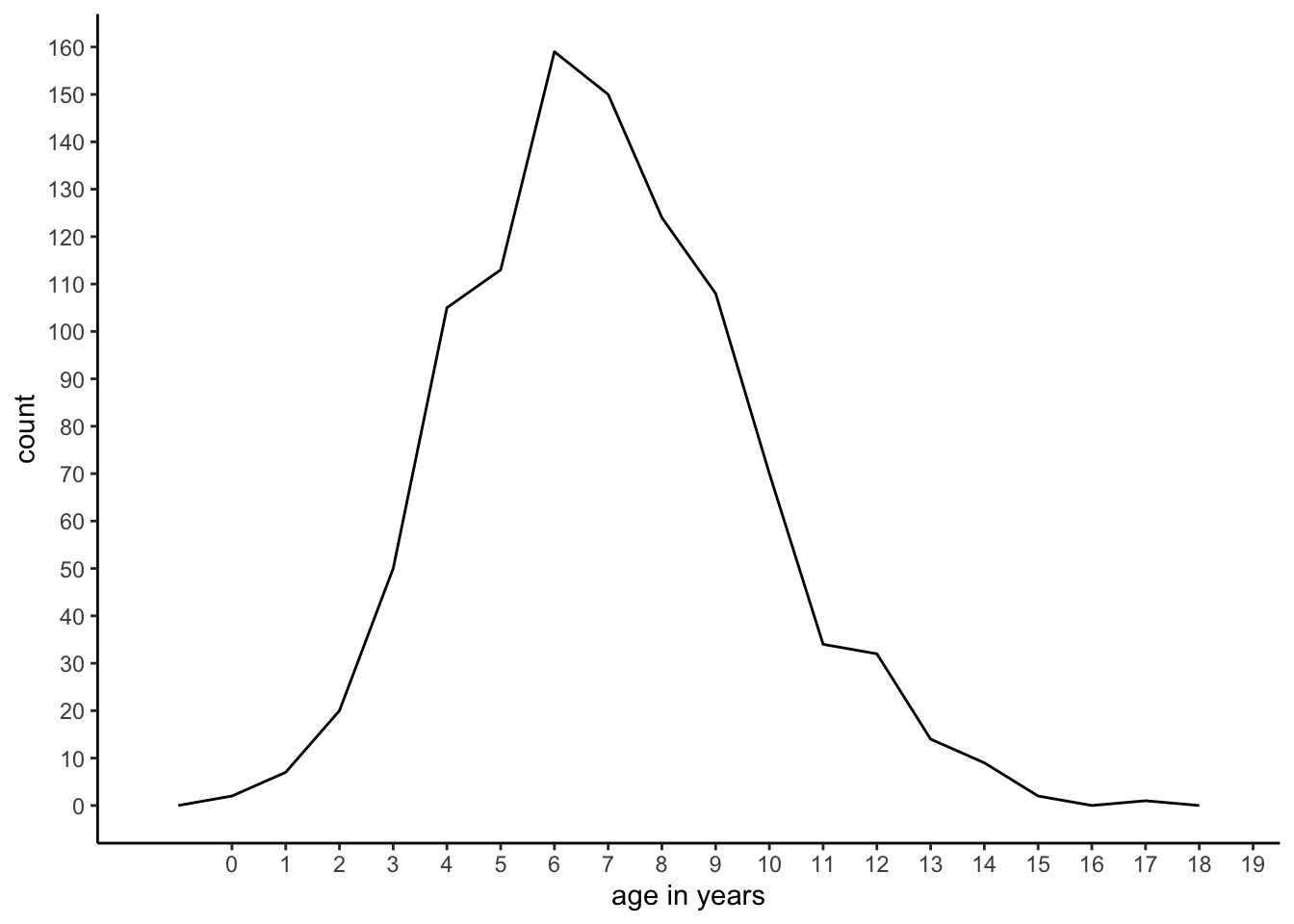
Figure 1.1: A frequency plot.
Furthermore, we see that there are quite a lot of children with ages between 5 and 8, but not so many children with ages below 3 or above 14. The advantage of the table over the graph is that we can get the exact number of children of a particular age very easily. But on the other hand, the graph makes it easier to get a quick idea about the shape of the distribution, which is hard to make out from the table.
Instead of frequency plots, one often sees histograms. Histograms contain the same information as frequency plots, except that groups of values are taken together. Such a group of values is called a bin. Figure 1.2 shows the same age data, but uses only 9 bins: for the first bin, we take values of age 0 and 1 together, for the second bin we take ages 2 and 3 together, etcetera, until we take ages 16 and 17 together for the last bin. For each bin, we compute how often we observe the ages in that bin.
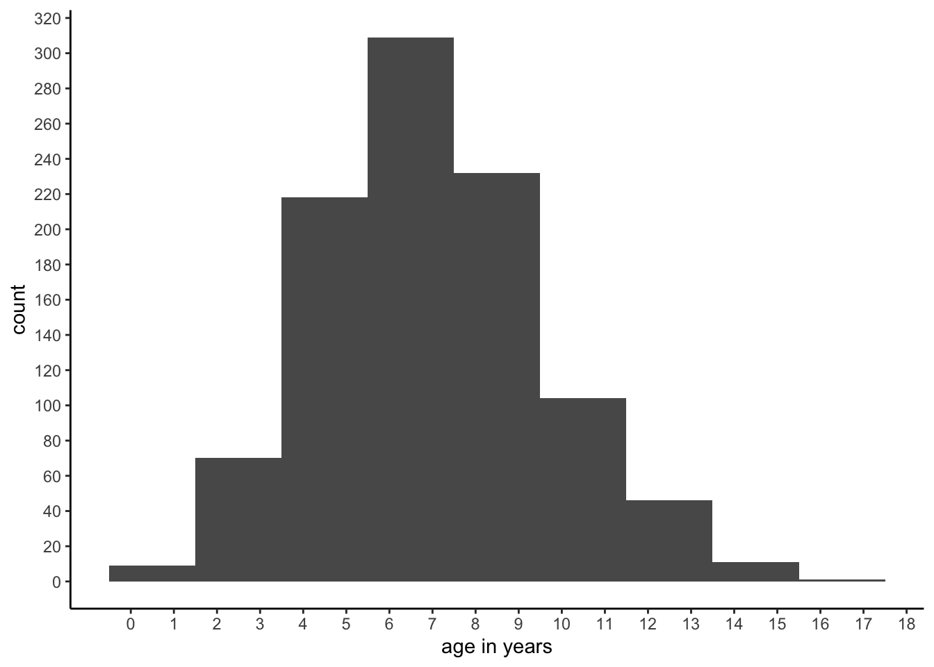
Figure 1.2: A histogram.
Histograms are very convenient for continuous data, for instance if we have values like 3.473, 2.154, etcetera. Or, more generally, for variables with values that have very low frequencies. Suppose that we had measured age not in years but in days. Then we could have had a data set of 1000 children where each and every child had a unique value for age. In that case, the length of the frequency table would be 1000 rows (each value observed only once) and the frequency plot would be very flat. By using age measured in years, what we have actually done is putting all children with an age less than 365 days into the first bin (age 0 years) and the children with an age of at least 365 but less than 730 days into the second bin (age 1 year). And so on. Thus, if you happen to have data with many many values with very low frequencies, consider binning the data, and using a histogram to visualise the distribution of your numeric variable.
1.9 Frequencies, proportions and cumulative frequencies and proportions
When we have the frequency for each observed age, we can calculate the relative frequency or proportion of children that have that particular age. For example, when we look again at the frequencies in Table 1.9 we see that there are two children who have age 0. Given that there are in total 1000 children, we know that the proportion of people with age 0 equals \(\frac{2}{1000}=0.002\). Thus, the proportion is calculated by taking the frequency and dividing it by the total number.
We can also compute cumulative frequencies. You get cumulative frequencies by accumulating (summing) frequencies. For instance, the cumulative frequency for the age of 3, is the frequency for age 3 plus all frequencies for younger ages. Thus, the cumulative frequency of age 3 equals 50 + 20 (for age 2) + 7 (for age 1) + 2 (for age 0) = 79. The cumulative frequencies for all ages are presented in Table 1.9.
We can also compute cumulative proportions: if we take for each age the proportion of people who have that age or less, we get the fifth column in Table 1.9. For example, for age 2, we see that there are 20 children with an age of 2. This corresponds to a proportion of 0.020 of all children. Furthermore, there are 9 children who have an even younger age. The proportion of children with an age of 1 equals 0.007, and the proportion of children with an age of 0 equals 0.002. Therefore, the proportion of all children with an age of 2 or less equals \(0.020+0.007+0.002=0.029\), which is called the cumulative proportion for the age of 2.
1.10 Frequencies and proportions in R
The mtcars data set contains information about a number of cars: miles
per gallon (mpg), number of cylinders (cyl), etcetera.
mtcars## mpg cyl disp hp drat wt qsec vs am gear carb
## Mazda RX4 21.0 6 160.0 110 3.90 2.620 16.46 0 1 4 4
## Mazda RX4 Wag 21.0 6 160.0 110 3.90 2.875 17.02 0 1 4 4
## Datsun 710 22.8 4 108.0 93 3.85 2.320 18.61 1 1 4 1
## Hornet 4 Drive 21.4 6 258.0 110 3.08 3.215 19.44 1 0 3 1
## Hornet Sportabout 18.7 8 360.0 175 3.15 3.440 17.02 0 0 3 2
## Valiant 18.1 6 225.0 105 2.76 3.460 20.22 1 0 3 1
## Duster 360 14.3 8 360.0 245 3.21 3.570 15.84 0 0 3 4
## Merc 240D 24.4 4 146.7 62 3.69 3.190 20.00 1 0 4 2
## Merc 230 22.8 4 140.8 95 3.92 3.150 22.90 1 0 4 2
## Merc 280 19.2 6 167.6 123 3.92 3.440 18.30 1 0 4 4
## Merc 280C 17.8 6 167.6 123 3.92 3.440 18.90 1 0 4 4
## Merc 450SE 16.4 8 275.8 180 3.07 4.070 17.40 0 0 3 3
## Merc 450SL 17.3 8 275.8 180 3.07 3.730 17.60 0 0 3 3
## Merc 450SLC 15.2 8 275.8 180 3.07 3.780 18.00 0 0 3 3
## Cadillac Fleetwood 10.4 8 472.0 205 2.93 5.250 17.98 0 0 3 4
## Lincoln Continental 10.4 8 460.0 215 3.00 5.424 17.82 0 0 3 4
## Chrysler Imperial 14.7 8 440.0 230 3.23 5.345 17.42 0 0 3 4
## Fiat 128 32.4 4 78.7 66 4.08 2.200 19.47 1 1 4 1
## Honda Civic 30.4 4 75.7 52 4.93 1.615 18.52 1 1 4 2
## Toyota Corolla 33.9 4 71.1 65 4.22 1.835 19.90 1 1 4 1
## Toyota Corona 21.5 4 120.1 97 3.70 2.465 20.01 1 0 3 1
## Dodge Challenger 15.5 8 318.0 150 2.76 3.520 16.87 0 0 3 2
## AMC Javelin 15.2 8 304.0 150 3.15 3.435 17.30 0 0 3 2
## Camaro Z28 13.3 8 350.0 245 3.73 3.840 15.41 0 0 3 4
## Pontiac Firebird 19.2 8 400.0 175 3.08 3.845 17.05 0 0 3 2
## Fiat X1-9 27.3 4 79.0 66 4.08 1.935 18.90 1 1 4 1
## Porsche 914-2 26.0 4 120.3 91 4.43 2.140 16.70 0 1 5 2
## Lotus Europa 30.4 4 95.1 113 3.77 1.513 16.90 1 1 5 2
## Ford Pantera L 15.8 8 351.0 264 4.22 3.170 14.50 0 1 5 4
## Ferrari Dino 19.7 6 145.0 175 3.62 2.770 15.50 0 1 5 6
## Maserati Bora 15.0 8 301.0 335 3.54 3.570 14.60 0 1 5 8
## Volvo 142E 21.4 4 121.0 109 4.11 2.780 18.60 1 1 4 2The object is a data frame. We can turn it into a tibble as follows:
mtcars <- mtcars %>% as_tibble()The function as_tibble() is available when you load the tidyverse
package. From now on, we assume that you load the tidyverse package at
the start of every R session.
If we want to know how many cars belong to which category of number of
cylinders, we can use the function count():
mtcars %>%
  count(cyl)
## # A tibble: 3 x 2
## cyl n
## <dbl> <int>
## 1 4 11
## 2 6 7
## 3 8 14The new variable n is the frequency. We see that the value 4 occurs 11
times, the value 6 occurs 7 times and the value 8 occurs 14 times. Thus,
in this data set there are 11 cars with 4 cylinders, 7 cars with 6
cylinders, and 14 cars with 8 cylinders.
We obtain proportions when we divide the frequencies by the total number
of cars (the sum of all the values in the n variable):
mtcars %>%
  count(cyl) %>%
  mutate(proportion = n/sum(n))
## # A tibble: 3 x 3
## cyl n proportion
## <dbl> <int> <dbl>
## 1 4 11 0.344
## 2 6 7 0.219
## 3 8 14 0.438Cumulative frequencies and cumulative proportions can be obtained using
the cumsum() function:
mtcars %>%
  count(cyl) %>%
  mutate(proportion = n/sum(n)) %>%
  mutate(cumfreq = cumsum(n),
         cumprop = cumsum(proportion))
## # A tibble: 3 x 5
## cyl n proportion cumfreq cumprop
## <dbl> <int> <dbl> <int> <dbl>
## 1 4 11 0.344 11 0.344
## 2 6 7 0.219 18 0.562
## 3 8 14 0.438 32 1A frequency plot can be made using ggplot combined with geom_line():
mtcars %>%
  count(cyl) %>%
  mutate(proportion = n/sum(n)) %>%
  ggplot(aes(x = cyl, y = n)) +
  geom_line()
A histogram of the mpg variable can be made using geom_histogram():
mtcars %>%
  ggplot(aes(x = mpg)) +
  geom_histogram(breaks = seq(5, 40, 5))
It is wise to play around with the number of bins that you’d like to make, or with the boundaries of the bins. Here we choose boundaries \(5, 10, 15, \dots, 40\).
1.11 Quartiles, quantiles and percentiles
Suppose we want to split the group of 1000 children into 4 equally-sized subgroups, with the 25% youngest children in the first group, the 25% oldest children in the last group, and the remaining 50% of the children in two equally sized middle groups. What ages should we then use to divide the groups? First, we can order the 1000 children on the basis of their age: the youngest first, and the oldest last. We could then use the concept of quartiles (from quarter, a fourth) to divide the group in four. In order to break up all ages into 4 subgroups, we need 3 points to make the division, and these three points are called quartiles. The first quartile is the value below which 25% of the observations fall, the second quartile is the value below which 50% of the observations fall, and the third quartile is the value below which 75% of the observations fall.3
Let’s first look at a smaller but similar problem. For example, suppose your observed values are 10, 5, 6, 21, 11, 1, 7, 9. You first order them from low to high so that you obtain 1, 5, 6, 7, 9, 10, 11, 21. You have 8 values, so the first 25% of your values are the first two. The highest value of these two equals 5, and this we define as our first quartile.4 We find the second quartile by looking at the values of the first 50% of the observations, so 4 values. The first 4 values are 1, 5, 6, and 7. The last of these is 7, so that is our second quartile. The first 75% of the observations are 1, 5 ,6 ,7 , 9, and 10. The value last in line is 10, so our fourth quartile is 10.
The quartiles as defined here can also be found graphically, using cumulative proportions. Figure 1.3 shows for each observed value the cumulative proportion. It also shows where the cumulative proportions are equal to 0.25, 0.50 and 0.75. We see that the 0.25 line intersects the other line at the value of 5. This is the first quartile. The 0.50 line intersects the other line at a value of 7, and the 0.75 line intersects at a value of 10. The three percentiles are therefore 5, 7 and 10.
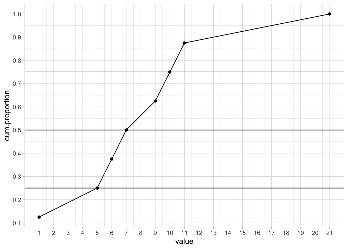
Figure 1.3: Cumulative proportions.
If you have a large data set, the graphical way is far easier than doing it by hand. If we plot the cumulative proportions for the ages of the 1000 children, we obtain Figure 1.4.
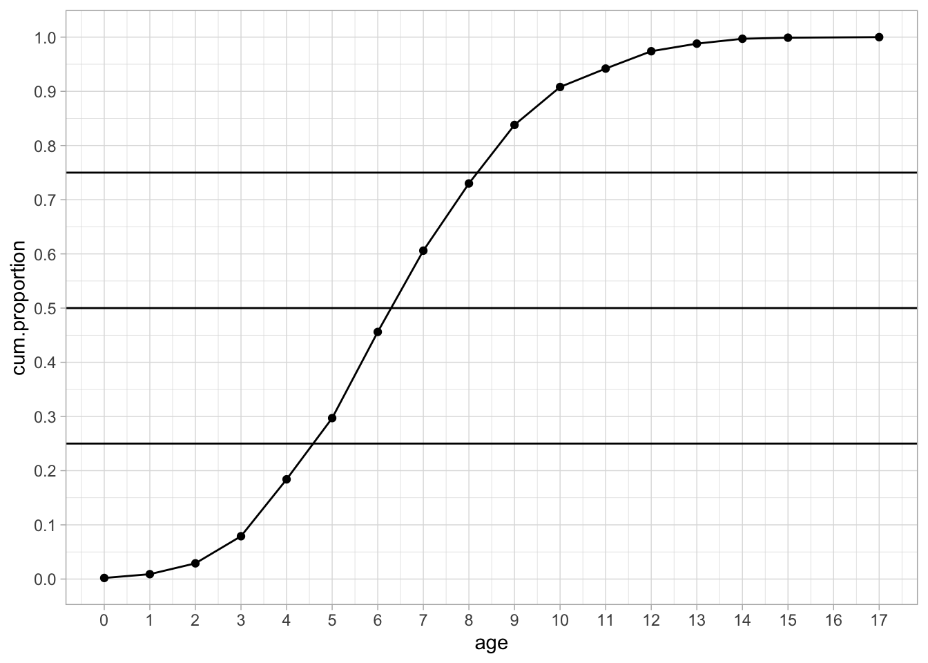
Figure 1.4: Cumulative proportions.
We see a nice S-shaped curve. We also see that the three horizontal quartile lines no longer intersect the curve at specific values, so what do we do? By eye-balling we can find that the first quartile is somewhere between 4 and 5. But which value should we give to the quartile? If we look at the cumulative proportion for an age of 4, we see that its value is slightly below the 0.25 point. Thus, the proportion of children with age 4 or younger is lower than 0.25. This means that the child that happens to be the 250th cannot be 4 years old. If we look at the cumulative proportion of age 5, we see that its value is slightly above 0.25. This means that the proportion of children that is 5 years old or younger is slightly more than 0.25. Therefore, of the the total of 1000 children, the 250th child must have age 5. Thus, by definition, the first quantile is 5. The second quartile is somewhere between 6 an 7, so by using the same reasoning as for the first quartile we know that 50% of the youngest children is 7 years old or younger. The third quartile is somewhere between 8 and 9 and this tells us that the youngest 75% of the children is age 9 or younger. Thus, we can call 5, 7 and 9 our three quartiles.
Alternatively, we could also use the frequency table (Table 1.9). First, if we want to have 25% of the children that are the youngest, and we know that we have 1000 children in total, we should have \(0.25 \times 1000=250\) children in the first group. So if were to put all the children in a row, ordered from youngest to oldest, we want to know the age of the 250th child.
In order to find the age of this 250th child, and we look at Table 1.9, we see that 29.7% of the children have an age of 5 or less (297 children), and 18.4% of the children have an age of 4 or less (184 children). This tells us that, since 250 comes after 184, the 250th child must be older than 4, and because 250 comes before 297, it must be younger than or equal to 5, hence the child is 5 years old.
Furthermore, if we want to find a cut-off age for the oldest 25%, we see from the table, that 83.8% of the children (838 children) have an age of 9 or less, and 73.0% of the children (730) have an age of 8 or less. Therefore, the age of the 750th child (when ordered from youngest to oldest) must be 9.
What we just did for quartiles, (i.e. 0.25, 0.50, 0.75) we can do for any proportion between 0 and 1. We then no longer call them quartiles, but quantiles. A quantile is the value below which a given proportion of observations in a group of observations fall. From this table it is easy to see that a proportion of 0.606 of the children have an age of 7 or less. Thus, the 0.606 quantile is 7. One often also sees percentiles. Percentiles are very much like quantiles, except that they refer to percentages rather than proportions. Thus, the 20th percentile is the same as the 0.20 quantile. And the 0.81 quantile is the same as the 81st percentile.
The reason that quartiles, quantiles and percentiles are important is that they are very short ways of saying something about a distribution. Remember that the best way to represent a distribution is either a frequency table or a frequency plot. However, since they can take up quite a lot of space sometimes, one needs other ways to briefly summarise a distribution. Saying that "the third quartile is 454" is a condensed way of saying that "75% of the values is either 454 or lower". In the next sections, we look at other ways of summarising information about distributions.
Another way in which quantiles and percentiles are used is to say something about individuals, relative to a group. Suppose a student has done a test and she comes home saying she scored in the 76th percentile of her class. What does that mean? Well, you don’t know her score exactly, but you do know that of her classmates, 76 percent had the same score or lower. That means she did pretty well, compared to the others, since only 24 percent had a higher score.
1.12 Quantiles in R
Obtaining quartiles, quantiles and percentiles can be done with the
quantile() function:
quantile(mtcars$mpg,
         probs = c(0.25, 0.50, 0.75, 0.90))
## 25% 50% 75% 90%
## 15.425 19.200 22.800 30.0901.13 Measures of central tendency
The mean, the median and the mode are three different measures that say something about the central tendency of a distribution. If you have a series of values: around which value do they tend to cluster?
1.13.1 The mean
Suppose we have the values 1, 2 and 3, then we compute the mean by first adding these numbers and then divide them by the number of values we have. In this case we have three values, so the mean is equal to \((1 + 2 + 3)/3 = 2\). In statistical formulas, the mean of a variable is indicated by a bar above that variable. So if our values of variable \(Y\) are 1, 2 and 3, then we denote the mean by \(\bar{Y}\) (pronounced as ‘y-bar’). When taking the sum of a set of values, statistical formulas show the summation sign \(\Sigma\) (the Greek letter sigma). So we often see the following formula for the mean of a set of \(n\) values for variable \(Y\)5:
\[\bar{Y} = \frac{\Sigma_{i=1}^n Y_i}{n}\]
In words, in order to compute \(\bar{Y}\), we take every value for variable \(Y\) from \(i=1\) to \(i=n\) and sum them, and the result is divided by \(n\). Suppose we have variable \(Y\) with the values 6, -3, and 21, then the mean of \(Y\) equals:
\[\bar{Y} = \frac { \Sigma_{i} Y_i} {n} = \frac{Y_1 + Y_2 + Y_3}{n} = \frac{6 + (-3) + 21}{3} = \frac{24}{3} = 8\]
1.13.2 The median
The mean is only one of the measures of central tendency. An alternative measure of central tendency is the median. The median is nothing but the middle value of an ordered series. Suppose we have the values 45, 567, and 23. Then what value lies in the middle when ordered? Let’s first order them from small to large to get a better look. We then get 23, 45 and 567. Then it’s easy to see that the value in the middle is 45.
Suppose we have the values 45, 45, 45, 65, and 23. What is the middle value when ordered? We first order them again and see what value is in the middle: 23, 45, 45, 45 and 65. Obviously now 45 is the median. You can also see that half of the values is equal or smaller than this value, and half of the values is equal or larger than this value. The median therefore is the same as the second quartile.
What if we have two values in the middle? Suppose we have the values 46, 56, 45 and 34. If we order them we get 34, 45, 46 and 56. Now there are two values in the middle: 45 and 46. In that case, we take the mean of these two middle values, so the median is 45.5.
When do you use a median and when do you use a mean? For numeric variables that have a more or less symmetric distribution (i.e., a frequency plot that is more or less symmetric), the mean is most often used. Actually, for distributions that are more or less symmetric the mean and median are very similar. For numeric variables that do not have a symmetric distribution, it is usually more informative to use the median. An example of such a situation is income. Figure 1.5 shows a typical distribution of yearly income. The distribution is highly asymmetric, it is severely skewed to the right. The bulk of the values are between 20,000 and 40,000, with only a very few extreme values on the high end. Even though there are only a few people with a very high income, the few high values have a huge effect on the mean.
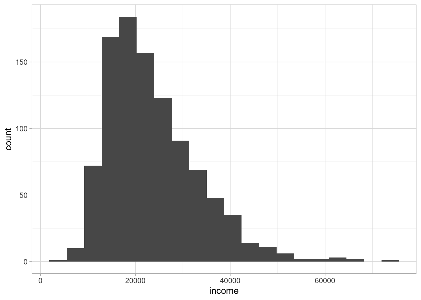
Figure 1.5: Distribution of yearly income.
The mean of the distribution turns out to be 23604. The largest value in the distribution is an income of 75051. Imagine what would happen to the mean and the median if we would change only this one value, that is, the highest observed income. Which would be most affected, do you think: the mean or the median?
Well, if we would change this value into 85051, you see an immediate impact on the mean: the mean is then 23614. This means that the mean is very sensitive to extreme values. One single change in a data set can have a huge effect on the mean. The median on the other hand is much more stable. The median remains unaffected by changes in the extremes. This because it only looks at the middle value. The middle value is unaffected by a change in the extreme values, as long as the order of the values remains the same and the middle value remains the same.
This can be seen even more clearly by looking at the example in Table 1.10. There we have three values, X1, X2 and X3, for which we compute both the mean and the median. First, suppose we have the values 4, 5, and 8 (like in the first row of Table 1.10). Obviously, the median is 5. Next, instead of 4, 5 and 8, we could have values 4, 5 and 80, or 4, 5 and 800, or 4, 5 and 8000. Regardless, the middle value of this series remains 5. In contrast, the mean would be very much affected by having either an 8, an 80, an 800 or an 8000 in the series. In sum: the median is a more stable measure of central tendency than the mean.
| X1 | X2 | X3 | median | mean |
|---|---|---|---|---|
| 4 | 5 | 8 | 5 | 6 |
| 4 | 5 | 80 | 5 | 30 |
| 4 | 5 | 800 | 5 | 270 |
| 4 | 5 | 8000 | 5 | 2670 |
1.13.3 The mode
A third measure of central tendency is the mode. The mode is defined as the value that we see most frequently in a series of values. For example, if we have the series 4, 7, 5, 5, 6, 6, 6, 4, then the value observed most often is 6 (three times). Modes are easily inferred from frequency tables: the value with the largest frequency is the mode. They are also easily inferred from frequency plots: the value on the horizontal axis for which we see the highest count (on the vertical axis).
The mode can also be determined for categorical variables. If we have the observed values ‘Dutch,’ ‘Danish,’ ‘Dutch,’ and ‘Chinese,’ the mode is ‘Dutch’ because that is the value that is observed most often.
If we look back at the distribution in Figure 1.5, we see that the peak of the distribution is around the value of 19,000. However, whether this is the mode, we cannot say. Because income is a more or less continuous variable, every value observed in the Figure occurs only once: there is no value of income with a frequency more than 1. So technically, there is no mode. However, if we split the values into 20 bins, like we did for the histogram in Figure 1.5, we see that the fifth bin has the highest frequency. In this bin there are values between 17000 and 21000, so our mode could be around there. If we really want a specific value, we could decide to take the average value in the fifth bin. There are many other statistical tricks to find a value for the mode, where technically there is none. The point is that for the mode, we’re looking for the value or the range of values that are most frequent. Graphically, it is the value under the peak of the distribution. Similar to the median, the mode is also quite stable: it is not affected by extreme values and is therefore to be preferred over the mean in the case of asymmetric distributions.
1.14 Relationship between measures of tendency and measurement level
There is a close relationship between measures of tendency and measurement level. For numeric variables, all three measures of tendency are meaningful. Suppose you have the numeric variable age measured in years, with the values 56, 68, 68, 99 and 100. Then it is meaningful to say that the average age is 78.2 years, that the median age is 68 years, and that the mode is 68 years.
For ordinal variables, it is quite different. Suppose you have 5 T-shirts, with the following sizes: M, S, M, L, XL. Then what is the average size? There are no numeric values here to put in the algebraic formula. But we can determine the median: if we order the values from small to large we get the set S, M, M, L, XL and we see that the middle value is M. So M is our median in this case.6 The other meaningful measure of tendency for ordinal variables is the mode.
For categorical variables, both the mean and the median are pointless to report. Suppose we have the nominal variable Study Programme with observed values "Medicine", "Engineering", "Engineering", "Mathematics", and "Biology". It would be impossible to derive a numerical mean, nor would it be possible to determine the middle value to determine the median, as there is no logical or natural order.7 It is meaningful though to report a mode. It would be meaningful to state that the study programme mentioned most often in the news is "Psychology", or that the most popular study programme in India is "Engineering". Thus, for categorical variables, both dichotomous and nominal variables, only the mode is a meaningful measure of central tendency.
As stated earlier, the appearance of a variable in a data matrix can be quite misleading. Categorical variables and ordinal variables can often look like numeric variables, which makes it very tempting to compute means and medians where they are completely meaningless. Take a look at Table 1.11. It is entirely possible to compute the average University, Size, or Programme, but it would be utterly senseless to report these values.
| University | Size | Programme |
|---|---|---|
| 1 | 1 | 2 |
| 2 | 3 | 2 |
| 3 | 2 | 3 |
| 4 | 2 | 3 |
| 5 | 3 | 4 |
| 6 | 2 | 1 |
It is entirely possible to compute the median University, Size, or Programme, but it is only meaningful to report the median for the variable Size, as Size is an ordinal variable. Reporting that the median size is equal to 2 is saying that about half of the study programmes is of medium size or small, and about half of the study programmes is of medium size or large.
It is entirely possible to compute the mode for the variables University, Size, or Programme, and it is always meaningful to report them. It is meaningful to say that in your data there is no University that is observed more than others. It is meaningful to report that most study programmes are of medium size, and that most study programmes are study programme number 2 (don’t forget to look up and write down which study programme that actually is!).
1.15 Measures of central tendency in R
The mean and median for numeric variables can be obtained as follows:
mtcars %>%
  summarise(mean_cyl = mean(cyl),
            median_cyl = median(cyl))
## # A tibble: 1 x 2
## mean_cyl median_cyl
## <dbl> <dbl>
## 1 6.19 6R does not have an in-built function to calculate modes. So we create
our own function getmode(). This function takes a vector as input and
gives the mode value as output.
getmode <- function(variable){
  unique_values <- unique(variable)
  unique_values[
    match(variable, unique_values) %>%
      tabulate() %>%
      which.max()
    ]
}

mtcars %>%
  summarise(mode_cyl = getmode(cyl))
## # A tibble: 1 x 1
## mode_cyl
## <dbl>
## 1 81.16 Measures of variation
Above we saw that we can summarise distributions by measures of central tendency. Here we discuss how we can summarise distributions of numeric variables by a measure that describes their variation. Variables show variation, by definition, but how much variation do they actually show?
Suppose we measure the height of 3 children, and their heights (in cms) are 120, 120 and 120. There is no variation in height: all heights are the same. There are no differences. Then the average height is 120, the median height is 120, and the mode is 120. The variation is 0: non-existing, absent.
Now suppose their heights are 120, 120, 135. Now there are differences: one child is taller than the other two, who have the same height. There is some variation now. We know how to quantify the mean, which is 125, we know how to quantify the median, which is 120, and we know how to quantify the mode, which is also 120. But how do we quantify the variation? Is there a lot of variation, or just a little, and how do we measure it?
1.16.1 Range and interquartile range
One thing you could think of is measuring the distance or difference between the lowest value and the highest value. We call this the range. The lowest value is 120, and the highest value is 135, so the range of the data is equal to \(135-120=15\). As another example, suppose we have the values 20, 20, 21, 20, 19, 20 and 454. Then the range is equal to \(454-19=435\). That’s a large range, for a series of values that for the most part hardly differ from each other.
Instead of measuring the distance from the lowest to the highest value, we could also measure the distance between the first and the third quartile: how much does the third quartile deviate from the first quartile? This distance or deviation is called the interquartile range (IQR) or the interquartile distance. Suppose that we have a large number of systolic blood pressure measurements, where 25% are 120 or lower, and 75% are 147 or lower, then the interquartile range is equal to \(147-120=27\).
Thus, we can measure variation using the range or the interquartile range. A third measure for variation is variance, and variance is based on the sum of squares.
1.16.2 Sum of squares
What we call a sum of squares is actually a sum of squared deviations. But deviations from what? We could for instance be interested in how much the values 120, 120, 135 vary around the mean of these values. The mean of these three values equals 125. The first value differs \(120-125= -5\), the second value also differs \(120-125= -5\), and the third value differs \(135-125= 10\).
Whenever we look at deviations from the mean, some deviations are positive and some deviations will be negative (except when there is no variation). If we want to measure variation, it should not matter whether deviations are positive or negative: any deviation should add to the total variation in a positive way. Moreover, if we would add up all deviations from the mean, we would always end up with 0, as you can see in our example. Adding up -5, -5 and +10 would lead to a sum of 0. This would mean no variation. However, as you can see, there is variation. So that is why we would better make all deviations positive, and this can be done by taking the square of the deviations, since a negative number squared is always positive. So for our three values 120, 120 and 135, we get the deviations -5, -5 and +10, and if we square these deviations, we get 25, 25 and 100. If we add these three squares, we obtain the sum 150. This is a sum of squared differences, or sum of squares.
In most cases, the sum of squares (SS) refers to the sum of squared deviations from the mean. In brief, suppose you have \(n\) values of a variable \(Y\), you first take the mean of those values (this is \(\bar{Y}\)), you subtract this mean from each of these \(n\) values (\(Y_i-\bar{Y}\)), then you take the squares of these deviations, \((Y_i-\bar{Y})^2\), and then add them up (take the sum of these squared deviations, \(\Sigma (Y_i-\bar{Y})^2\). In formula form, this process looks like:
\[SS = \Sigma_i^n (Y_i-\bar{Y})^2\]
As an example, suppose you have the values 10, 11 and 12, then the mean is 11. Then the deviations from the mean are -1, 0 and +1. If you square them you get \((-1)^2=1\), \(0^2=0\) and \((+1)^2=1\), and if you sum these three values, you get \(SS=1+0+1=2\). In formula form:
\[\begin{aligned} SS &= (Y_1-\bar{Y})^2 + (Y_2-\bar{Y})^2 +(Y_3-\bar{Y})^2 \nonumber\\ &= (10-11)^2 + (11-11)^2 +(12-11)^2 \nonumber\\ &= (-1)^2 + 0^2 + 1^2=2 \nonumber \end{aligned}\]
Now let’s use some values that are more different from each other, but with the same mean. Suppose you have the values 9, 11 and 13. The average value is still 11, but the deviations from the mean are larger. The deviations from 11 are -2, 0 and +2. Taking the squares, you get \((-2)^2=4\), \(0^2=0\) and \((+2)^2=4\) and if you add them you get \(SS=4+0+4=8\).
\[\begin{aligned} SS &= (Y_1-\bar{Y})^2 + (Y_2-\bar{Y})^2 +(Y_3-\bar{Y})^2 \notag\\ &= (9-11)^2 + (11-11)^2 +(13-11)^2 \notag\\ &= (-2)^2 + 0^2 + 2^2=8 \notag\end{aligned}\]
Thus, the more the values differ from each other, the larger the deviations from the mean. And the larger the deviations from the mean, the larger the sum of squares. The sum of squares is therefore a nice measure of how much values differ from each other.
1.16.3 Variance and standard deviation
The sum of squares can be seen as a measure of total variation: all (squared) deviations from a certain value are added up. This means that the more data values you have, the larger the sum of squares. Often-times, you are not interested in the total variation, but you’re interested in the average variation. Suppose we have the values 10, 11 and 24. The mean is then \(45/3=15\). We have two values that are smaller than the mean and one value that is larger than the mean, so two negative deviations and one positive deviation. Squaring them makes them all positive. The squared deviations are 25, 16, and 81. The third value has a huge squared deviation (81) compared to the other two values. If we take the average squared deviation, we get \((25+16+81)/3 \approx 40.67\). So the average squared deviation is equal to 40.67. This value is called the variance. So the variance of a bunch of values is nothing but the \(SS\) divided by the number of values, \(n\). The variance is the average squared deviation from the mean. The symbol used for the variance is usually \(\sigma^2\) (pronounced as ‘sigma squared’).8
\[\mathrm{Var}(Y) = \frac{SS}{n}= \frac{\Sigma_i (Y_i-\bar{Y})^2}{n}\]
As an example, suppose you have the values 10, 11 and 12, then the average value is 11. Then the deviations are -1, 0 and 1. If you square them you get \((-1)^2=1\), \(0^2=0\) and \(1^2=1\), and if you add these three values, you get \(SS=1+0+1=2\). If you divide this by 3, you get the variance: \(\frac{2}{3}\). Put differently, if the squared deviations are 1, 0 and 1, then the average squared deviation (i.e., the variance) is \(\frac{1+0+1}{3}=\frac{2}{3}\).
As another example, suppose you have the values 8, 10, 10 and 12, then the average value is 10. Then the deviations from 10 are -2, 0, 0 and +2. Taking the squares, you get 4, 0, 0 and 4 and if you add them you get \(SS=8\). To get the variance, you divide this by 4: \(8/4=2\). Put differently, if the squared deviations are 4, 0, 0 and 4, then the average squared deviation (i.e., the variance) is \(\frac{4+0+0+4}{4}=2\).
Often we also see another measure of variation: the standard deviation. The standard deviation is the square root of the variance and is therefore denoted as \(\sigma\):
\[\sigma = \sqrt{\sigma^2}= \sqrt{\mathrm{Var}(Y)}=\sqrt{ \frac{\Sigma_i (Y_i-\bar{Y})^2}{n}}\]
The standard deviation is often used to indicate how deviant a particular value is from the rest of the values. Take for instance an IQ score of 105. Is that a high IQ score or a low IQ score? Well, if someone tells you that the average person has an IQ score of 100, you know that a score of 105 is above average. However, still you do not know whether it is much higher than average, or just slightly higher than average. Suppose I tell you that the standard deviation of IQ scores is 15, then you know that a score of 105 is a third of a standard deviation above the mean. Therefore, in order to know how deviant a particular value is relative to a the rest of the values, one needs both a measure of central tendency and a measure of variation. In psychological testing, IQ testing for instance, one usually uses the mean and the standard deviation to express someone’s score as the number of standard deviations above or below the average score. This process of counting the number of standard deviations is called standardisation. If we go back to the IQ score of 105, and if we want to standardise the score in terms of standard deviations from the mean, we saw that a score of 105 was a third of a standard deviation above the mean, so \(+\frac{1}{3}\). As another example, suppose the mean is 100 and we observe an IQ score of 80, we see that we are 20 points below the average of 100. This is equal to \(20/15=4/3\) standard deviations below the average, so our standardised measure equals \(-4/3\) (note the negative sign: it indicates we are below the mean). In general, a standardised score can be computed by subtracting the mean and dividing the result by the standard deviation. A standardised score for a particular value of \(Y\), \(Y = y\), is usually denoted by the \(z\)-score:
\[z = \frac{y - \bar{Y}}{\sigma}\]
1.17 Variance, standard deviation, and standardisation in R
The functions var() and sd() calculate the variance and standard
deviation for a variable, respectively.
mtcars %>%
  summarise(var_mpg = var(mpg),
            std_mpg = sd(mpg))
## # A tibble: 1 x 2
## var_mpg std_mpg
## <dbl> <dbl>
## 1 36.3 6.03However, these functions use the formulas \(\frac{\Sigma_i (Y_i-\bar{Y})^2}{n-1}\) and \(\sqrt{\frac{\Sigma_i (Y_i-\bar{Y})^2}{n-1}}\), respectively. We will discuss this further in Chapter 2. If you want to use the formula \(\frac{\Sigma_i (Y_i-\bar{Y})^2}{n}\), you need to write your own function that computes the sum of squares (SS) and divides by n:
var_n <- function(variable){
  SS <- (variable - mean(variable))**2 %>%
    sum()
  return(SS/length(variable)) # dividing by n
}

mtcars %>%
  summarise(var_mpg = var_n(mpg),
            std_mpg = sqrt(var_n(mpg))) # taking the square root
## # A tibble: 1 x 2
## var_mpg std_mpg
## <dbl> <dbl>
## 1 35.2 5.93Note that you get different results. For large data sets (large n), the differences will be negligible.
Standardised measures can be obtained using the scale() function:
mtcars %>%
  mutate(z_mpg = scale(mpg)) %>%
  select(mpg, z_mpg)
## # A tibble: 32 x 2
## mpg z_mpg[,1]
## <dbl> <dbl>
## 1 21 0.151
## 2 21 0.151
## 3 22.8 0.450
## 4 21.4 0.217
## 5 18.7 -0.231
## 6 18.1 -0.330
## 7 14.3 -0.961
## 8 24.4 0.715
## 9 22.8 0.450
## 10 19.2 -0.148
## # … with 22 more rows1.18 Density plots
Earlier in this chapter we saw that when we have a number of values for a numeric variable, frequency tables and frequency plots fully describe all values of the variable that are observed. A histogram is a helpful tool to visualise the distribution of a variable when there are so many different values that a frequency table would be too long and a frequency plot would become too cluttered.
A histogram can then be used to give a quick graphical overview of the
distribution. The bin width is usually chosen rather arbitrarily. Figure
1.6 shows a histogram of one million values of a numeric variable, say
yearly wage for an administrative clerk. Figure
1.7 shows a histogram for the exact same data, but now using a much smaller
bin size. You see that when you have a lot of values, a million in this
case, you can choose a very small bin size, and in some cases this can
result in a very clear shape of the distribution.
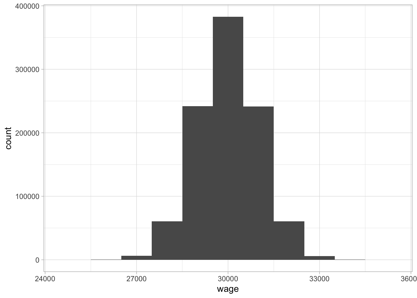
Figure 1.6: A histogram of wages with bin size 1000.
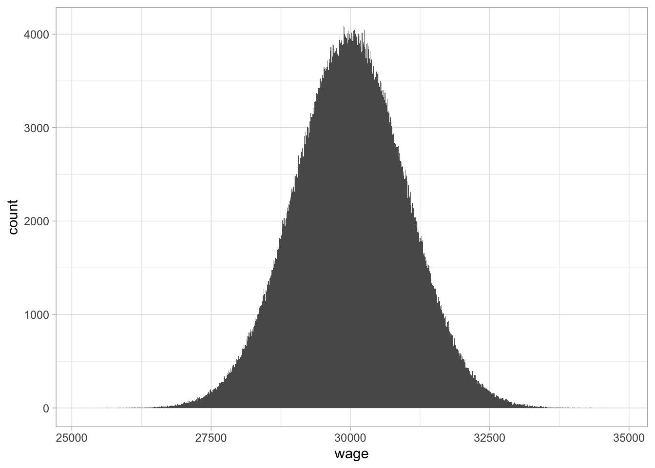
Figure 1.7: A histogram with bin size 10.
The shape of the distribution that we discern in Figure 1.7 can be represented by a density plot. Density plots are an elegant representation of how the frequency of certain values are distributed across a continuum. They are particularly suited for large amounts of non-discrete (continuous) values, typically more than 1000. Figure 1.8 shows a density plot of the one million wages. They more or less ‘smooth’ the histogram: drawing a smooth line connecting the dots of the histogram in Figure 1.7 while looking through your eyelashes. On the vertical axis, we no longer see ‘count’ or ‘frequency,’ but ‘density.’ The quantity density is defined such that the area under the curve equals 1. Density plots are particularly suited for large data sets, where one is no longer interested in the particular counts, but more interested in relative frequencies: how often are certain values observed, relative to other values. From this density plot, it is very clear that, relatively speaking, there are more values around 30,000 than around 27,500 or 32,500.
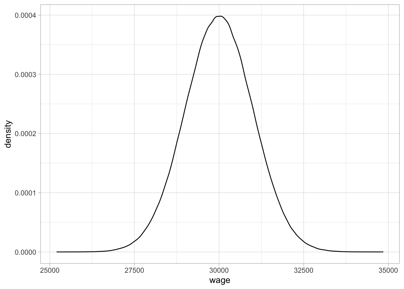
Figure 1.8: A density plot of the wage variable.
1.19 Density plots in R
Density plots can be obtained using geom_density():
mtcars %>%
  ggplot(aes(x = mpg)) +
  geom_density()
1.20 The normal distribution
Sometimes distributions of observed variables bear close resemblance to theoretical distributions. For instance, Figure 1.8 bears close resemblance to the theoretical normal distribution with mean 30,000 and standard deviation 1000. This theoretical shape can be described with the mathematical function
\[f(x) = \frac{1}{\sqrt{2 \pi 1000^2}} e^{ { -\frac{(x - 30000)^2}{2 \times 1000^2} } }\]
which you are allowed to forget immediately. It is only to illustrate that distributions observed in the wild (empirical distributions) sometimes resemble mathematical functions (theoretical distributions).
The density function of that distribution is plotted in Figure 1.9. Because of its bell-shaped form, the normal distribution is sometimes informally called ‘the bell curve.’ The histogram in Figure 1.8 and the normal density function in Figure 1.9 look so similar, they are practically indistinguishable.
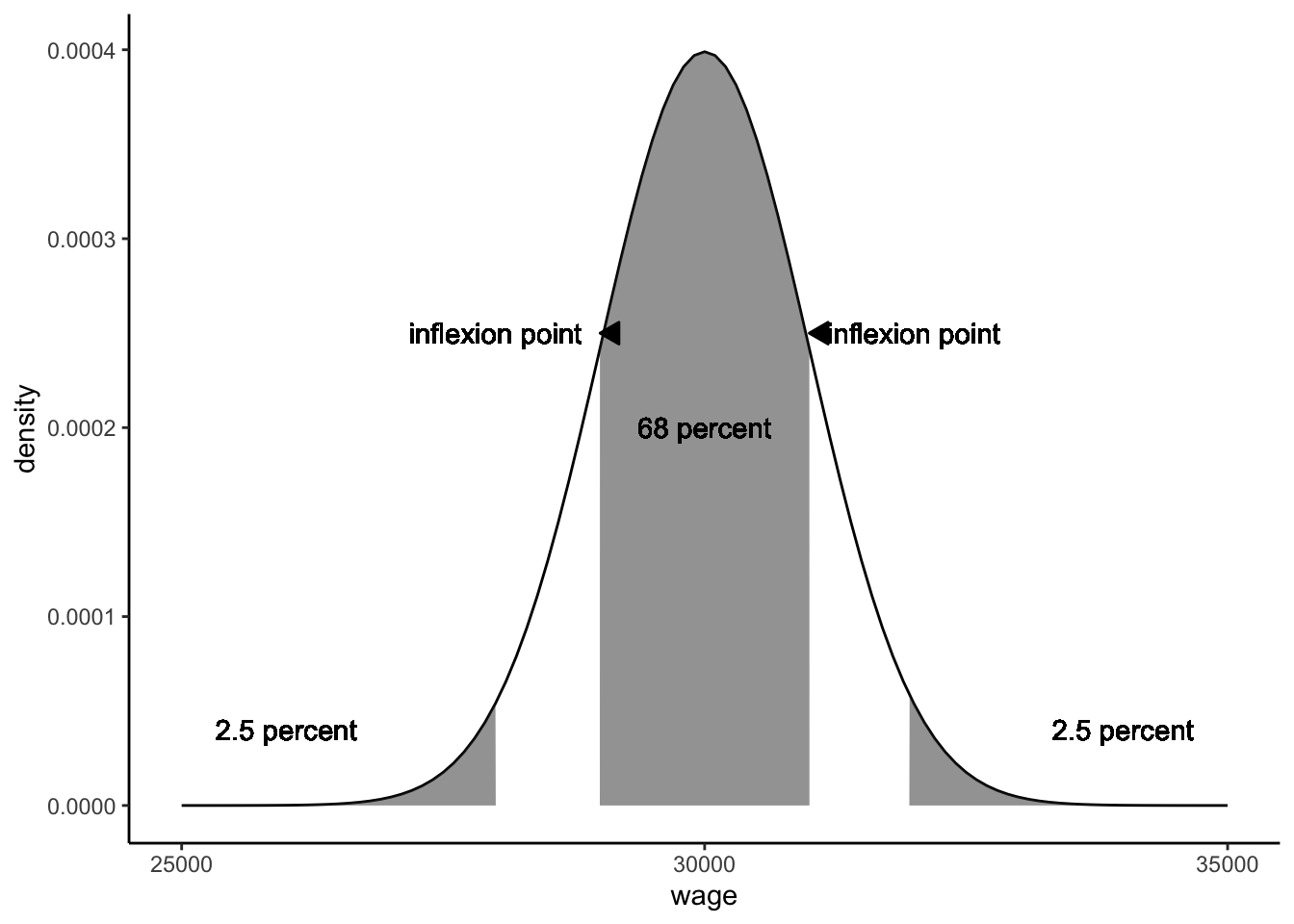
Figure 1.9: The theoretical normal distribution with mean 30,000 and standard deviation 1000.
Mathematicians have discovered many interesting things about the normal distribution. If the distribution of a variable closely resembles the normal distribution, you can infer many things. One thing we know about the normal distribution is that the mean, mode and median are always the same. Another thing we know from theory is that the inflexion points9 are one standard deviation away from the mean. Figure 1.9 shows the two inflexion points. From theory we also know that if a variable has a normal distribution, 68% of the observed values lies between these two inflexion points. We also know that 5% of the observed values lie more than 1.96 standard deviations away from the mean (2.5% on both sides, see Figure 1.9). Theorists have constructed tables that make it easy to see what proportion of values lies more than \(1, 1.1, 1.2 \dots, 3.8, 3.9, \dots\) standard deviations away from the mean. These tables are easy to find online or in books, and these are fully integrated into statistical software like SPSS and R. Because all these percentages are known for the number of standard deviations, it is easier to talk about the standard normal distribution.
In such tables online or in books, you find information only about this standard normal distribution. The standard normal distribution is a normal distribution where all values have been standardised (see Section 1.16.3. When values have been standardised, they automatically have a mean of 0 and a standard deviation of 1. As we saw in Section 1.16.3, such standardised values are obtained if you subtract the mean score from each value, and divide the result by the standard deviation. A standardised value is usually denoted as a \(z\)-score. Thus in formula form, a value \(Y=y\) is standardised by using the following equation:
\[z = \frac{y - \bar{Y}}{\sigma}\]
Table 1.12 shows an example set of values for \(Y\) that are standardised. The mean of the \(Y\)-values turns out to be 10.38, and the standard deviation 4.77. By subtracting the mean, we ensure that the average \(z\)-score becomes 0, and by subsequently dividing by the standard deviation, we make sure that the standard deviation of the \(z\)-scores becomes 1.
| Y | mean | Y_minus_mean | Z |
|---|---|---|---|
| 7.2 | 10.4 | -3.2 | -0.7 |
| 8.8 | 10.4 | -1.5 | -0.3 |
| 17.8 | 10.4 | 7.4 | 1.6 |
| 10.4 | 10.4 | 0.0 | 0.0 |
| 10.6 | 10.4 | 0.3 | 0.1 |
| 18.6 | 10.4 | 8.2 | 1.7 |
| 12.3 | 10.4 | 1.9 | 0.4 |
| 3.7 | 10.4 | -6.7 | -1.4 |
| 6.6 | 10.4 | -3.8 | -0.8 |
| 7.8 | 10.4 | -2.6 | -0.5 |
This standardisation makes it much easier to look up certain facts about the normal distribution. For instance, if we go back to the normally distributed wage values, we see that the average is 30,000, and the standard deviation is 1,000. Thus, if we take all wages, subtract 30,000 and divide by 1,000, we get standardised wages with mean 0 and standard deviation 1. The result is shown in Figure 1.10. We know that the inflexion points lie at one standard deviation below and above the mean. The mean is 30,000, and the standard deviation equals 1,000, so the inflexion points are at \(30000-1000=29000\) and \(30000+1000=31000\). Thus we know that 68% of the wages are between 29,000 and 31,000.
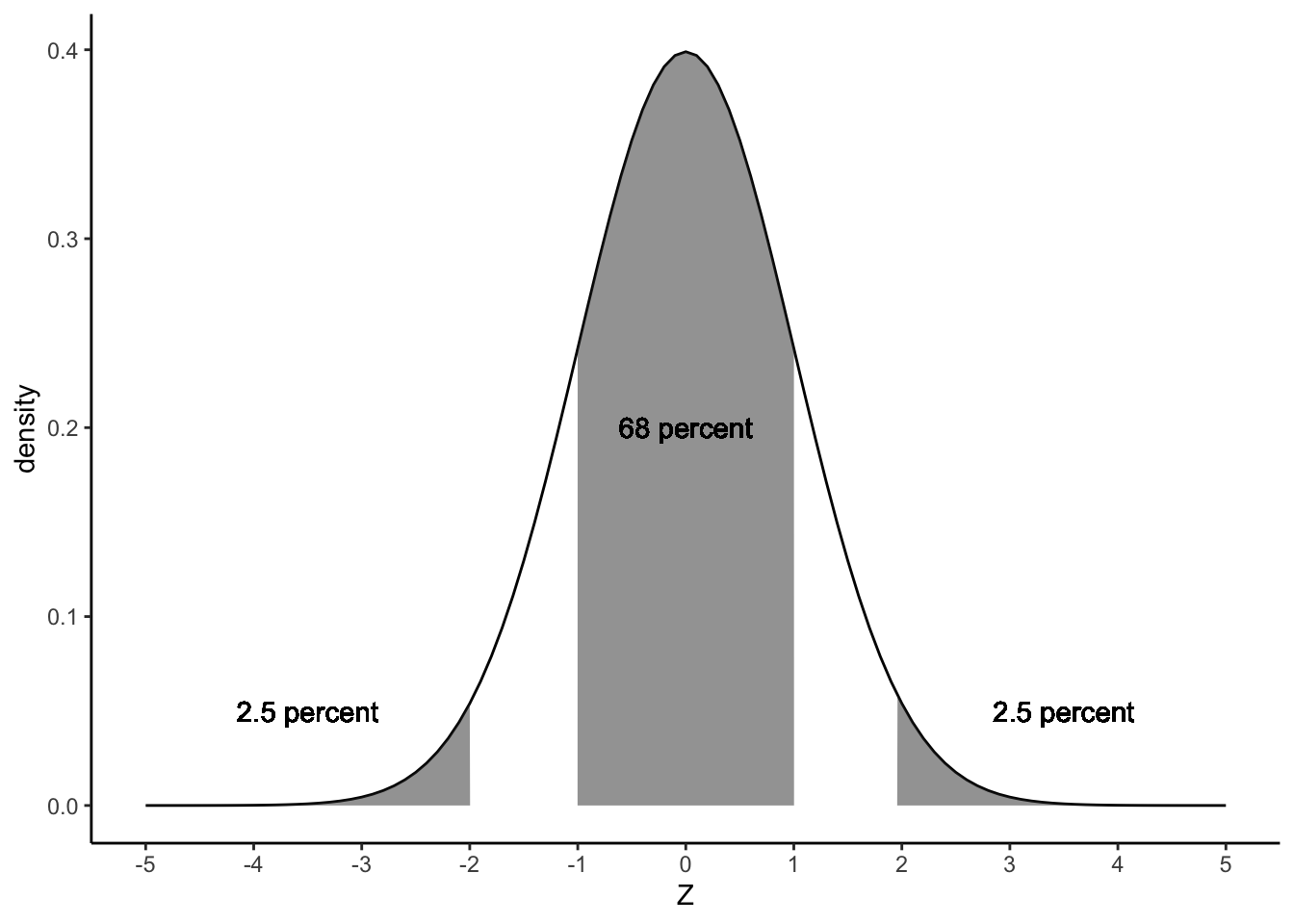
Figure 1.10: The standard normal distribution.
How do we know that 68% of the observations lie between the two inflexion points? Similar to proportions and cumulative proportions, we can plot the cumulative normal distribution. Figure 1.11 shows the cumulative proportions curve for the normal distribution. Note that we no longer see dots because the variable \(Z\) is continuous.
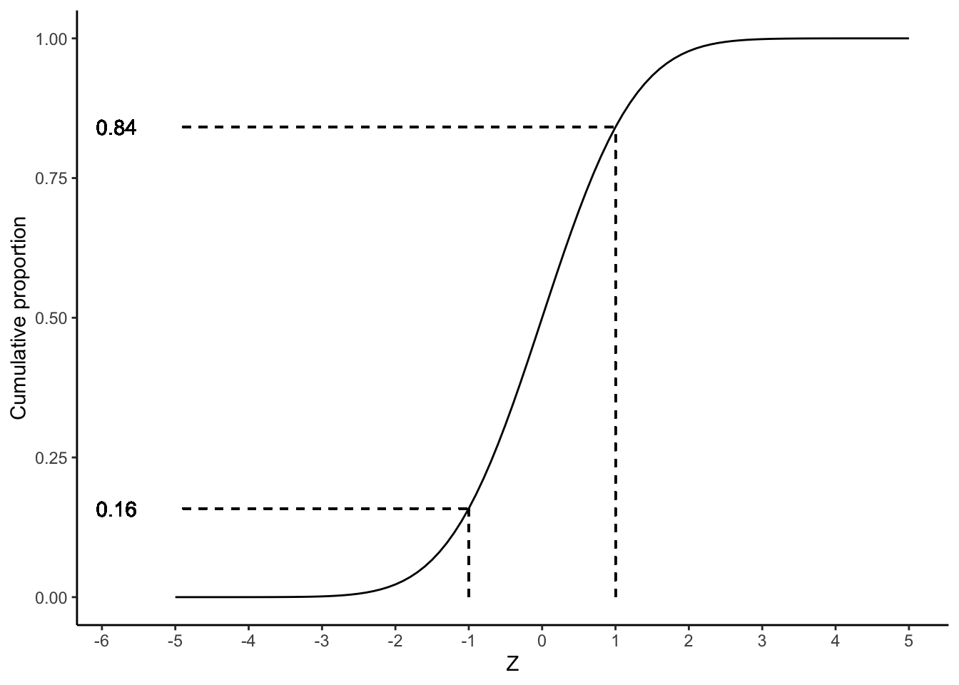
Figure 1.11: The cumulative standard normal distribution.
We know that the two inflexion points lie one standard deviation below and above the mean. Thus, if we look at a \(z\)-value of 1, we see that the cumulative probability equals about 0.84. This means that 84% of the \(z\)-values are lower than 1. If we look at a \(z\)-value of -1, we see that the cumulative probability equals about 0.16. This means that 16% of the \(z\)-values are lower than -1. Therefore, if we want to know what percentage of the \(z\)-values lie between -1 and 1, we can calculate this by subtracting 0.16 from 0.84, which equals 0.68, which corresponds to 68%.
All quantiles for the standard normal distribution can be looked up online10 or in the Appendix 2, but also using R. Table 1.13 gives a short list of quantiles. From this table, you see that 1% of the \(z\)-values is lower than -2.33, and that 25% of the \(z\)-values is lower than -0.67. We also see that half of all the \(z\)-values is lower than 0.00 and that 10% of the \(z\)-values is larger than 1.28, and that the 1% largest values are higher than 2.33.
| Z | cum_proportion |
|---|---|
| -2.33 | 0.01 |
| -1.28 | 0.10 |
| -0.67 | 0.25 |
| 0.00 | 0.50 |
| 0.67 | 0.75 |
| 1.28 | 0.90 |
| 2.33 | 0.99 |
Although tables are readily found online, it’s helpful to memorise the so-called 68 – 95 – 99.7 rule, also called the empirical rule. It says that 68% of normally distributed values are at most 1 standard deviation away from the mean, 95% of the values are at most 2 standard deviations away (more precisely, 1.96), and 99.7% of the values are at most 3 standard deviations away. In other words, 68% of standardised values are between -1 and +1, 95% of standardised values are between -2 and +2 (-1.96 and +1.96), and 99.7% of standardised values are between -3 and +3.
Thus, if we return to our wages with mean 30,000 and standard deviation 1,000, we know from Table 1.13 that 99% of the wages are below 30000 + 2.33 times the standard deviation = \(30000 + 2.33 \times 1000=32330\).
Returning back to the IQ example of Section 1.16.3. Suppose we have IQ scores that are normally distributed with a mean of 100 and a standard deviation of 15. What IQ score would be the 90th percentile? From Table 1.13 we see that the 90th percentile is a \(z\)-value of 1.28. Thus, the 90th percentile for our IQ scores lies 1.28 standard deviations above the mean (above because the \(z\)-value is positive). The mean is 100 so we have to look at 1.28 standard deviations above that. The standard deviation equals 15, so we have to look at an IQ score of \(100 + 1.28 \times 15\), which equals 119.2. This tells us that 90% of the IQ scores are equal to or lower than 119.2.
As a last example, suppose we have a personality test that measures extraversion. If we know that test scores are normally distributed with a mean of 18 and a standard deviation of 2, what would be the 0.10 quantile? From Table 1.13 we see that the 0.10 quantile is a \(z\)-value of -1.28. This tells us that the 0.10 quantile for the personality scores lies at 1.28 standard deviations below the mean. The mean is 18, so the 0.10 quantile for the personality scores lies at 1.28 standard deviations below 18. The standard deviation is 2, so this amounts to \(18-1.28 \times 2= 15.44\). This tells us that 10% of the scores on this test are 15.44 or lower.
Such handy tables are also available for other theoretical distributions. Theoretical distributions are at the core of many data analysis techniques, including linear models. In this book, apart from the normal distribution, we will also encounter other theoretical distributions: the \(t\)-distribution (Chapter 2), the \(F\)-distribution (Chapter 6), the chi-square distribution (Chapters 2, 9, 12, 13 and 14) and the Poisson distribution (14).
1.21 Obtaining quantiles of the normal distribution using R
Quantiles of a normal distribution with a certain mean and standard
deviation (sd) can be obtained using the qnorm() function:
qnorm(c(0.05, 0.50, 0.95), mean = 100, sd = 15)## [1] 75.3272 100.0000 124.6728This means that if you have a normal distribution with mean 100 and standard deviation 15, 5% of the values are 75.3272 or less, 50% of the values are 100 or less, and 95% of the values are 124.6728 or less.
If you want to know the cumulative proportion for a certain value of a
variable that is normally distributed, you can use pnorm():
pnorm(-1, mean = 0, sd = 1)## [1] 0.1586553So 15.86% of the values from a standard normal distribution (mean 0, standard deviation 1), are -1 or less.
1.22 Visualising numeric variables: the box plot
We started this chapter with variables that can be stored in a data matrix. With a variable with a large number of values on a large number of units of analysis, it is hard to get a an intuitive feel for the data. Making a frequency table is one way of summarising a variable, computing measures of central tendency and variation is another way. Visualisation is probably the best way of getting a quick and dirty feel for the information contained in a large data matrix. Earlier in this chapter we came across frequency plots, histograms, and density plots to visualise the distribution of a single variable. A fourth plot for a single variable that we discuss in this book is the box plot.
A box plot gives a quick overview of the distribution of a numeric variable in terms of its quartiles. Figure 1.12 gives an example of a box plot of (part of) the wage data. The white box represents the interquartile range. The top of the white box equals the third quartile, and the bottom of the white box equals the first quartile. Therefore, we know that half of the workers have a wage between 29,400 and 30,800 The horizontal black line within the white box represents the second quartile (the median), so half of the workers earn less than 30,100.
Figure 1.12: A box plot of the wages earned by a sample of 150 administrative clerks.
A box plot also shows whiskers: two vertical lines sprouting from the white box. There are several ways to draw these two whiskers. One way is to draw the top whisker to the largest value (the maximum) and the bottom whisker to the smallest value (the minimum). Another way, used in Figure 1.12, is to have the upper whisker extend from the third quartile to the observed value equal to at most 1.5 times the interquartile range away from the median, and the lower whisker extend from the first quartile to the value at most 1.5 times the interquartile range below the median (the interquartile range is of course the height of the white box). The dots are outlying values, or simply called outliers: values that are even further away from the median. This is displayed in Figure 1.12. There you see first and third quartiles of 29,400 and 30,800, respectively, so an interquartile range (IQR) of \(30800-29400=1400\). Multiplying this IQR by 1.5 we get \(1.5 \times 1400= 2100\). The whiskers therefore extend to \(29400-2100=27300\) and \(30800+2100=32900\).
Thus, the box plot is a quick way of visualising in what range the middle half of the values are (the range in the white box), where most of the values are (the range of the white box plus the whiskers), and where the extreme values are (the outliers, individually plotted as dots). Note that the white box always contains 50% of the values. The whiskers are only extensions of the box by a factor of 1.5. In many cases you see that they contain most of the values, but sometimes they miss a lot of values. You will see that when you notice a lot of outliers.
1.23 Box plots in R
A box plot can be made using geom_boxplot():
mtcars %>%
  ggplot(aes(x = "", y = mpg)) +
  geom_boxplot() +
  xlab("")
1.24 Visualising categorical variables
The histogram, the density plot and the box plot can be used for numeric variables, but also for ordinal variables that you’d like to treat numerically. For categorical variables and ordinal variables that can’t be treated numerically, we need other types of plots.
For example, suppose we are in a lecture hall with 456 students and we count the number of Dutch, German, Belgian, Indian, Chinese and Indonesian students. We could summarise the results in a frequency table (see Table 1.14), but a bar chart shows the distribution in a more dramatic way, see Figure 1.13.
| nationality | n |
|---|---|
| Chinese | 10 |
| Dutch | 145 |
| German | 284 |
| Indian | 7 |
| Indonesian | 10 |
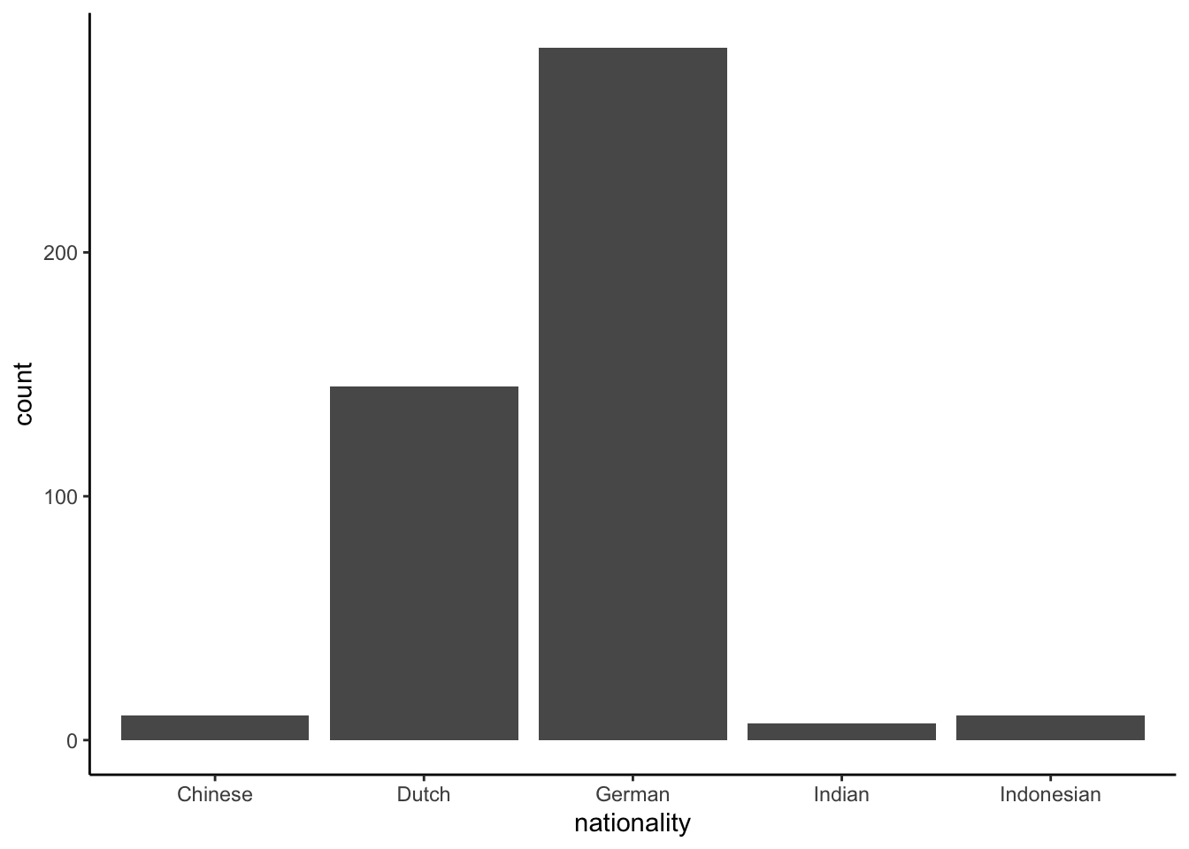
Figure 1.13: A bar chart of the observed nationalities in a lecture hall.
Sometimes, counts of values of a categorical variable are displayed as a pie chart, see Figure 1.14. Pie charts are however best avoided. First, because compared to bar charts, they show no information about the actual counts; you only observe relative sizes of the counts. Second, it is very hard to see from a pie chart what the exact proportions are. For example, from the bar chart in Figure 1.13 it is easily seen that the ratio German students to Dutch students is about 2 to 1. Research shows that this ratio cannot be read with the same precision from the pie chart in Figure 1.14. In sum, pie charts are best replaced by bar charts.
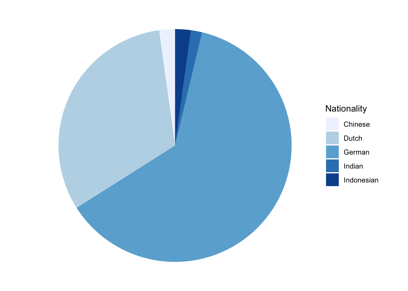
Figure 1.14: A pie chart of nationalities.
Ordinal variables are often visualised using bar charts. Figure 1.15 shows the variation of the answers to a Likert questionnaire item, where Nairobi inhabitants are asked "To what degree do you agree with the statement that the climate in Iceland is agreeable?". With ordinal variables, make sure that the labels are in the natural order.
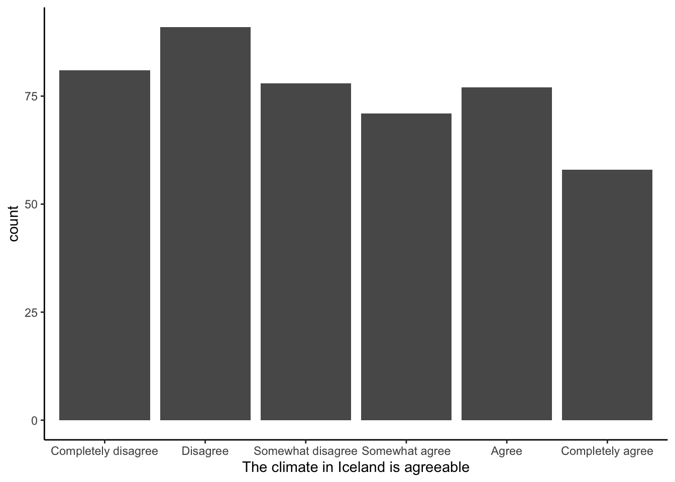
Figure 1.15: Opinions on the climate in Iceland.
1.25 Visualising categorical and ordinal variables in R
If a categorical variable is stored as numeric, turn it into a factor
first. Then R will treat it as categorical. A bar plot with the
frequencies on the \(y\)-axis can be made with geom_bar():
mtcars %>%
  mutate(cyl = factor(cyl, ordered = TRUE)) %>%
  ggplot(aes(x = cyl)) +
  geom_bar()
If you really want a pie chart, then do:
mtcars %>%
  count(cyl) %>%
  mutate(proportion = n/sum(n)) %>%
  ggplot(aes(x = "",
             y = proportion,
             fill = factor(cyl))) +
  geom_col(width = 1) +
  coord_polar(theta = "y") +
  xlab("") +
  ylab("") +
  theme_void() +
  scale_fill_brewer(palette = "Blues") +
  labs(fill = "Cylinders")
1.26 Visualising co-varying variables
1.26.1 Categorical by categorical: cross-table
Variables are properties that vary: from person to person, or from
location to location, or from time to time, or from object to object.
Sometimes when you have two variables, you see that they co-vary: when
one variable changes, the other variable changes too. For example,
suppose I have 20 pencils. These pencils may vary in colour: twelve of
them are red, and eight of them are blue. Therefore, colour is a
variable with values "red" and "blue". The twenty pencils also vary
in length: four are unused and therefore still long, and sixteen of them
have been used many times so that they are short. Therefore, length is
also a variable, with values "long" and "short". Note that these
variables have been measured using the same pencils. In theory I could
have long blue pencils, long red pencils, short blue pencils and short
red pencils. Let’s look at the pencils that I have: for each combination
of length and colour, I count the number of pencils. The result I
put in Table 1.15.
| blue | red | |
|---|---|---|
| long | 4 | 0 |
| short | 8 | 8 |
Such a table is called a cross-table. For every combination of two variables, I see the number of objects (units of analysis) that have that combination. From the table we see that there is not a single pencil that is both red and long (count is 0). At the same time you see that all long pencils are blue. A cross-table is therefore a nice way to show how two variables co-vary. From this particular table for instance, you can easily see that once you know that a pencil is long, you automatically know it is blue.
Cross-tables are a nice visualisation of how two categorical variables co-vary. But what if one of the two variables is not a categorical variable?
1.26.2 Categorical by numerical: box plot
Suppose instead of determining length by values "short" and "long", we could measure the exact length of the pencils in centimetres. The results are displayed in Table 1.16. We see that the table is much larger than Table 1.15. We also see quite a few cells with zeros. In most cases, for every particular combination of length and colour we only see a count of 1 pencil. In general, you see that when one of the variables is numeric, the cross-table becomes very large and in addition it becomes sparse, that is, with many zeros. With such a large and sparse table, it is hard to get a quick impression of how two variables co-vary.
| blue | red | |
|---|---|---|
| 2 | 0 | 1 |
| 2.7 | 1 | 0 |
| 3.3 | 1 | 0 |
| 3.4 | 0 | 1 |
| 3.5 | 0 | 1 |
| 3.6 | 1 | 0 |
| 4.1 | 1 | 1 |
| 4.4 | 1 | 1 |
| 4.5 | 1 | 1 |
| 4.7 | 0 | 1 |
| 5.2 | 1 | 0 |
| 5.7 | 1 | 0 |
| 5.8 | 0 | 1 |
| 9 | 4 | 0 |
The alternative for two variables where one is categorical and the other one is numeric, is to create a box plot. Figure 1.16 shows a box plot of the pencil data. A box plot gives a quick overview of the distribution of the pencils: one distribution of the blue pencils, and one distribution of the red pencils. Let’s have a look at the distribution of the blue pencils on the left side of the plot. The white box represents the interquartile range (IQR), so that we know that half of the blue pencils have a length between 4 and 9. The horizontal black line within the white box represents the median (the middle value), so half of the blue pencils are smaller than 4.85. The vertical lines are called whiskers. These typically indicate where the data points are that lie at most 1.5 times the IQR away from the median. For the blue pencils, we see no whisker on top of the white box. That means that there are no data points that lie more than 1.5 times the IQR above the median of 4.85 (here the IQR equals 5.03). We see a whisker on the bottom of the white box, to the lowest observed value of 2.7. This value is less than 1.5 times \(5.03 = 7.545\) away from the median of 4.85 so it is included in the whisker. It is the lowest observed value for the blue pencils so the whisker ends there.
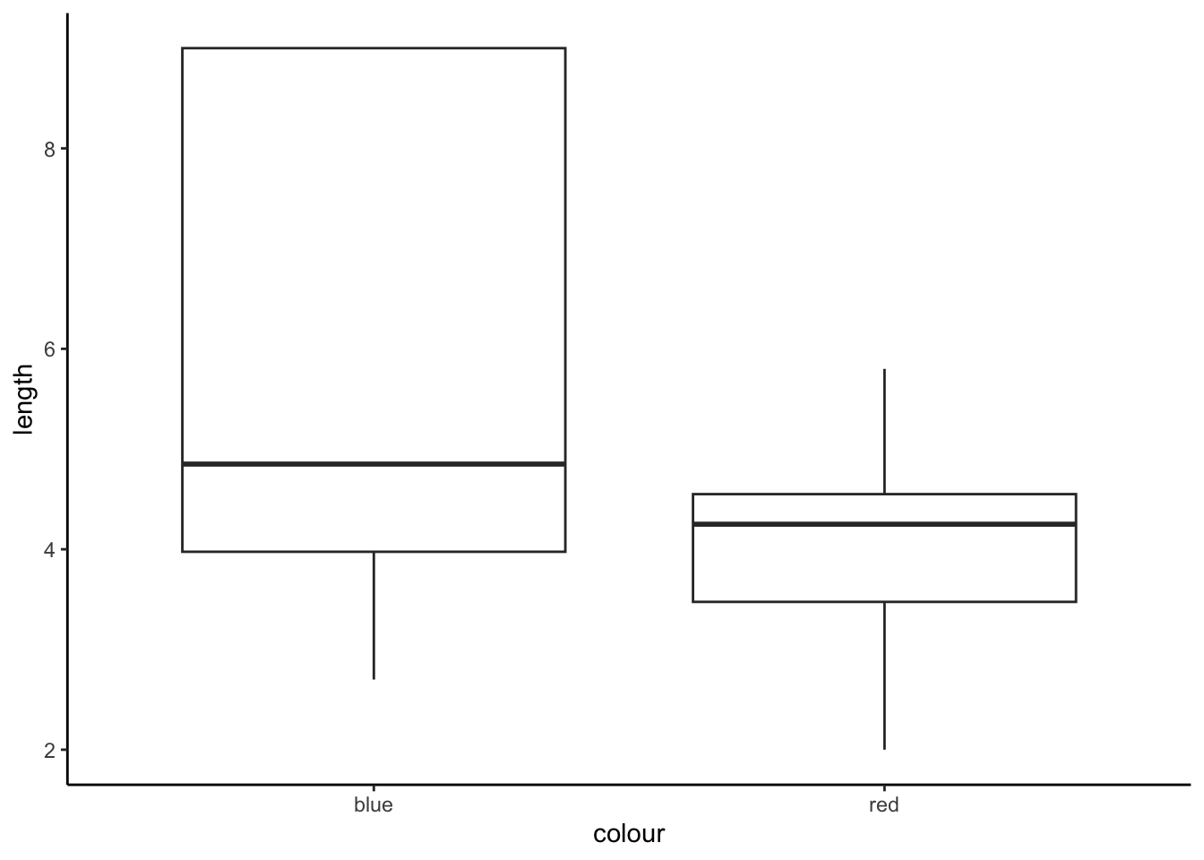
Figure 1.16: A box plot of the pencil data.
From a box plot like this it is easy to spot differences in the
distribution of a quantitative measure for different levels of a
qualitative measure. From Figure 1.16 we easily spot that the red pencils
(varying between 2 and 6 cm) tend to be shorter than the blue pencils
(varying between 3 and 9 cm). Thus, in these pencils, length and
colour tend to co-vary: red pencils are often short and blue pencils
are often long.
1.26.3 Numeric by numeric: scatter plot
Suppose we also measure the weight of my pencils in grams. Table 1.17 shows the cross-tabulation of length and weight. This is a very sparse table (i.e., with lots of zeros),
which makes it very hard to see any systematic co-variation in weight
and length. Figure 1.17 shows a box plot of weight and length.
Also this plot seems a bit strange, because for every observed weight
value under 4 grams, there is only one observation, so that only the
median can be plotted.
| 3.3 | 3.4 | 3.5 | 3.6 | 3.7 | 4 | |
|---|---|---|---|---|---|---|
| 2 | 1 | 0 | 0 | 0 | 0 | 0 |
| 2.7 | 0 | 1 | 0 | 0 | 0 | 0 |
| 3.3 | 0 | 1 | 0 | 0 | 0 | 0 |
| 3.4 | 0 | 1 | 0 | 0 | 0 | 0 |
| 3.5 | 0 | 0 | 1 | 0 | 0 | 0 |
| 3.6 | 0 | 0 | 1 | 0 | 0 | 0 |
| 4.1 | 0 | 0 | 2 | 0 | 0 | 0 |
| 4.4 | 0 | 0 | 2 | 0 | 0 | 0 |
| 4.5 | 0 | 0 | 2 | 0 | 0 | 0 |
| 4.7 | 0 | 0 | 0 | 1 | 0 | 0 |
| 5.2 | 0 | 0 | 0 | 1 | 0 | 0 |
| 5.7 | 0 | 0 | 0 | 0 | 1 | 0 |
| 5.8 | 0 | 0 | 0 | 0 | 1 | 0 |
| 9 | 0 | 0 | 0 | 0 | 0 | 4 |
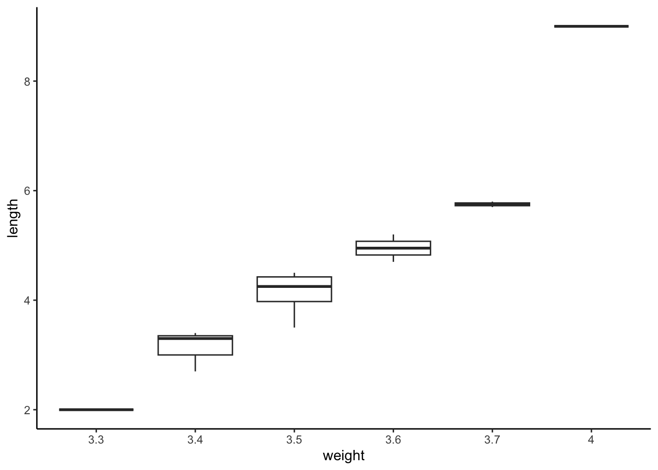
Figure 1.17: A box plot of the pencil data.
Therefore, in cases where we have two numeric variables, we generally
use a scatter plot. Figure 1.18 shows a scatter plot of weight by length.
Now, the relationship between weight and length is easily
understood: it appears there is a linear relationship between weight
and length. For every increase in weight, there is also an increase
in length. The relationship is called linear because we could
summarise the relationship by drawing a straight line through the dots.
This line is shown in Figure 1.19.
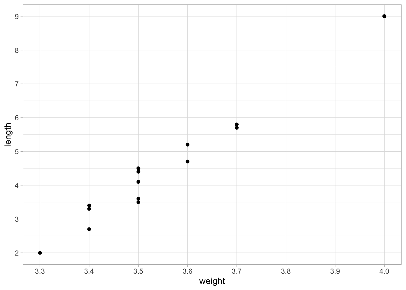
Figure 1.18: A scatter plot of length and weight.
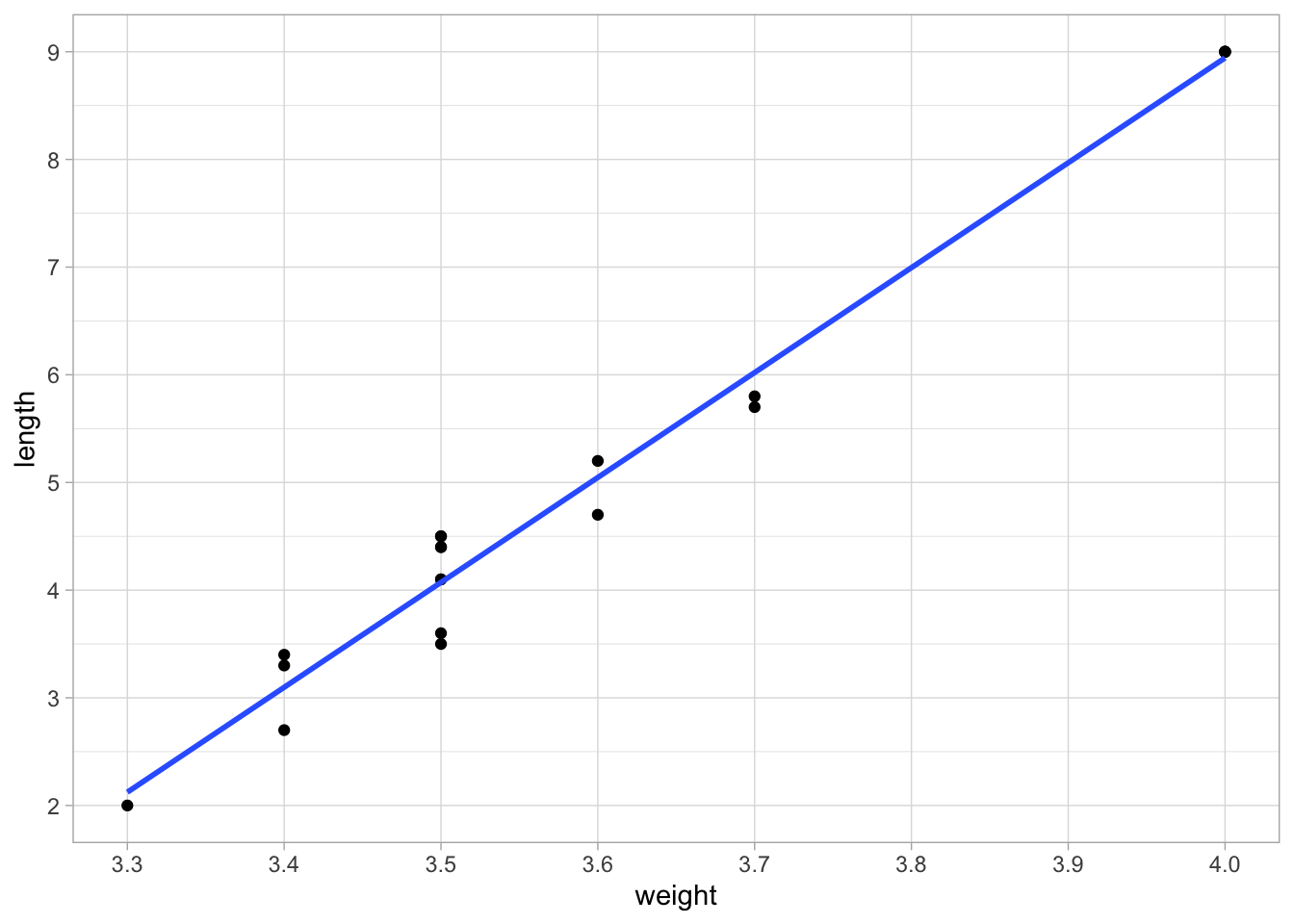
Figure 1.19: A scatter plot of length and weight, with a straight line that summarises the relationship.
You see that by visualising two variables, important patterns may emerge that you can easily overlook when only looking at the values. Cross-tables, box plots and scatter plots are powerful tools to find regularities but also oddities in your data that you’d otherwise miss. Some such patterns can be summarised by straight lines, as we see in Figure 1.19. The remainder of this book focuses on how we can use straight lines to summarise data, but also how to make predictions for data that we have not seen yet.
1.27 Visualising two variables using R
A scatter plot for two numeric variables can be made using
geom_point():
mtcars %>%
  ggplot(aes(x = wt, y = mpg)) +
  geom_point()
A box plot for one categorical and one numeric variable can be made
using geom_boxplot():
mtcars %>%
  mutate(cyl = factor(cyl)) %>%
  ggplot(aes(x = cyl, y = mpg)) +
  geom_boxplot()
A cross table for two categorical variables can be made using table():
table(mtcars$cyl, mtcars$gear)##
## 3 4 5
## 4 1 8 2
## 6 2 4 1
## 8 12 0 2Note that the number of cylinders (first-named variable) is in the rows (here 4, 6 and 8 cylinders), and the number of gears (second-named variable) is in the columns (3, 4, and 5 gears).
The package janitor has functions that help you make prettier tables. A very basic table with cylinders in the rows and gears in the columns is made using tabyl:
# install.packages("janitor") # only run when not installed earlier
library(janitor)
mtcars %>%
  tabyl(cyl, gear)
## cyl 3 4 5
## 4 1 8 2
## 6 2 4 1
## 8 12 0 21.28 Overview of the book
Chapter 2 will introduce the problem of inference: if you only have a small selection of data points, what can they tell us about the rest of the data? We will use the example of a mean computed using a small number of numerical data points and try to figure out what the mean is likely to be if we would have all the data points. Chapter 3 discusses the same problem but then for a proportion.
Chapter 4 will show how we can use a straight line to summarise the relationship between two numeric variables (simple regression), where one variable is the outcome variable, and the other variable is a predictor variable, that predicts the value on the outcome variable. Such a straight line is a simple form of a linear model. We also describe how we can use straight lines (linear models) to summarise relationships between one outcome variable and more than two numeric predictor variables (multiple regression). In Chapter 5 we will discuss how you can draw conclusions about linear models for data that you have not seen. For example, in the previous section we described the relationship between weight and length of twenty pencils. The question that you may have is whether this linear relationship also holds for all pencils of the same make, that is, whether the same linear model holds for both the observed twenty pencils and the total collection of pencils.
In Chapter 6 we will show how we can use straight lines to summarise relationships with predictor variables that we want to treat as categorical.
Chapter 8 discusses when it is appropriate to use linear models to summarise your data, and when it is not. It introduces methods that enable you to decide whether to trust a linear model or not. Chapter 9 then discusses alternative methods that you can use when linear models are not appropriate.
Chapter 10 focuses on moderation: how one predictor variable can affect the effect that a second predictor variable has on the outcome variable.
Chapter 7 shows how you can make elaborate statements about differences between groups of observations, in case one of the predictor variables is a categorical variable.
Chapters ?? and 11 show how to deal with variables that are measured more than once in the same unit of analysis (the same participant, the same pencil, the same school, etc.). For example, you may measure the weight of a pencil before and after you have made a drawing with it. Models that we use for such data are called linear mixed models. Similar to linear models, linear mixed models are not always appropriate for some data sets. Therefore, Chapter 12 discusses alternative methods to study variables that are repeatedly measured in the same research unit.
Chapters 13 and 14 discuss generalised linear models. These are models where the outcome variable is not numeric and continuous. Chapter 13 discusses a method that is appropriate when the outcome variable has only two values, say "yes" and "no", or "pass" and "fail". Chapter 14 discusses a method that can be used when the outcome variable is a count variable and therefore discrete, for example the number of children in a classroom, or the number of harvested zucchini from one plant.
Chapter 15 discusses relatively new statistical methodology that is needed when you have a lot of variables. In such cases, traditional inferential data analysis as discussed in the previous chapters often fails.
See for example www.normaltable.com or www.mathsisfun.com/data/standard-normal-distribution-table.html.↩︎
For instance, you may find that the assumptions of your linear model are not met, see Chapter 8.↩︎
The fourth quartile would be the value below which all values are, so that would be the largest value in the row (the age of the last child in the row).↩︎
Note that we could also choose to use 6, because 1 and 5 are lower than 6. Don’t worry, the method that we show here to compute quartiles is only one way of doing it. In your life, you might stumble upon alternative ways to determine quartiles. These are just arbitrary agreements made by human beings. They can result in different outcomes when you have small data sets, but usually not when you have large data sets.↩︎
Variables are symbolised by capitals, e.g., \(Y\). Specific values of a variable are indicated in lowercase, e.g., \(y\).↩︎
However, suppose that our collection of T-shirts had the following sizes: S, M, L, L. Then there would be no single middle value in we would have to average the M and L values, which would be impossible!↩︎
Unless you see one? But then it would not be a categorical value but an ordinal variable.↩︎
Online you will often find the formula \(\frac{\Sigma_i (Y_i-\bar{Y})^2}{n-1}\). The difference is that here we are talking about the definition of the variance of an observed variable \(Y\), and that elsewhere one talks about trying to figure out what the variance might be of all values of \(Y\) when we only see a small portion of the values of \(Y\). When we use all values of \(Y\), we talk about the population variance, denoted by \(\sigma^2\). When we only see a small part of the values of \(Y\), we talk about a sample of \(Y\)-values. We will come back to the distinction between population variance and sample variance and why they differ in Chapter @ref(#chap:mean).↩︎
The inflexion point is where concave turns into convex, and vice versa. Mathematically, the inflexion point can be found by equating the second derivative of a function to 0.↩︎
See for example www.normaltable.com or www.mathsisfun.com/data/standard-normal-distribution-table.html↩︎