Chapter 10 Moderation: testing interaction effects
library(tidyverse)
library(knitr)
library(broom)
10.1 Interaction with one numeric and one dichotomous variable
Suppose there is a linear relationship between age (in years) and vocabulary (the number of words one knows): the older you get, the more words you know. Suppose we have the following linear regression equation for this relationship:
\[\begin{aligned} \widehat{\texttt{vocab}} = 205 + 500 \times \texttt{age} \end{aligned}\]
According to this equation, the expected number of words for a newborn
baby (age = 0) equals 205. This may sound silly, but suppose this
model is a very good prediction model for vocabulary size in children
between 2 and 5 years of age. Then this equation tells us that the
expected increase in vocabulary size is 500 words per year.
This model is meant for everybody in the Netherlands. But suppose that one researcher expects that the increase in words is much faster in children from high socio-economic status (SES) families than in children from low SES families. He believes that vocabulary will be larger in higher SES children than in low SES children. In other words, he expects an effect of SES, over and above the effect of age:
\[\begin{aligned} \widehat{\texttt{vocab}} = b_0 + b_1 \times \texttt{age} + b_2 \times \texttt{SES}\end{aligned}\]
This main effect of SES is yet unknown and denoted by \(b_2\). Note
that this linear equation is an example of multiple regression.
Let’s use some numerical example. Suppose age is coded in years, and SES is dummy coded, with a 1 for high SES and a 0 for low SES. Let \(b_2\), the effect of SES over and above age, be 10. Then we can write out the linear equation for low SES and high SES separately.
\[\begin{aligned} low SES: \widehat{\texttt{vocab}} &= 200 + 500 \times \texttt{age} + 10 \times 0 \\ &= 200 + 500 \times \texttt{age} \\ high SES: \widehat{\texttt{vocab}} &= 200 + 500 \times \texttt{age} + 10 \times 1 \\ &= (200+10) + 500 \times \texttt{age} \\ &= 210 + 500 \times \texttt{age}\end{aligned}\]
Figure 10.1 depicts the two regression lines for the high and low SES children separately. We see that the effect of SES involves a change in the intercept: the intercept equals 200 for low SES children and the intercept for high SES children equals \(210\). The difference in intercept is indicated by the coefficient for SES. Note that the two regression lines are parallel: for every age, the difference between the two lines is equal to 10. For every age therefore, the predicted number of words is 10 words more for high SES children than for low SES children.
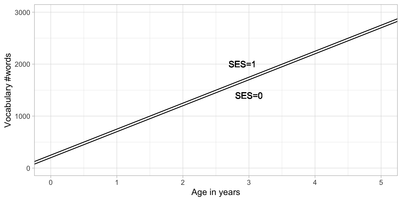
Figure 10.1: Two regression lines: one for low SES children and one for high SES children.
So far, this is an example of multiple regression that we already saw in
Chapter 4.
But suppose that such a model does not describe the data that we
actually have, or does not make the right predictions based on on our
theories. Suppose our researcher also expects that the yearly increase
in vocabulary is a bit lower than 500 words in low SES families, and a
little bit higher than 500 words in high SES families. In other words,
he believes that SES might moderate (affect or change) the slope
coefficient for age. Let’s call the slope coefficient in this case
\(b_1\). In the above equation this slope parameter is equal to 500, but
let’s now let itself have a linear relationship with SES:
\[\begin{aligned} b_1 = a + b_3 \times \texttt{SES}\end{aligned}\]
In words: the slope coefficient for the regression of vocab on age,
is itself linearly related to SES: we predict the slope on the basis
of SES. We model that by including a slope \(b_3\), but also an
intercept \(a\). Now we have two linear equations for the relationship
between vocab, age and SES:
\[\begin{aligned} \widehat{\texttt{vocab}} &= b_0 + b_1 \times \texttt{age} + b_2 \times \texttt{SES} \\ b_1 &= a + b_3 \times \texttt{SES}\end{aligned}\]
We can rewrite this by plugging the second equation into the first one (substitution):
\[\begin{aligned} \widehat{\texttt{vocab}} = b_0 + (a + b_3 \times \texttt{SES}) \times \texttt{age} + b_2 \times \texttt{SES} \end{aligned}\]
Multiplying this out gets us:
\[\begin{aligned} \widehat{\texttt{vocab}} = b_0 + a \times \texttt{age} + b_3 \times \texttt{SES} \times \texttt{age} + b_2 \times \texttt{SES}\end{aligned}\]
If we rearrange the terms a bit, we get:
\[\begin{aligned} \widehat{\texttt{vocab}} = b_0 + a \times \texttt{age} + b_2 \times \texttt{SES} + b_3 \times \texttt{SES} \times \texttt{age}\end{aligned}\]
Now this very much looks like a regression equation with one intercept
and three slope coefficients: one for age (\(a\)), one for SES
(\(b_2\)) and one for \(\texttt{SES} \times \texttt{age}\) (\(b_3\)).
We might want to change the label \(a\) into \(b_1\) to get a more familiar looking form:
\[\begin{aligned} \widehat{\texttt{vocab}} = b_0 + b_1\times \texttt{age} + b_2 \times \texttt{SES} + b_3 \times \texttt{SES} \times \texttt{age}\end{aligned}\]
So the first slope coefficient is the increase in vocabulary for every
year that age increases (\(b_1\)), the second slope coefficient is the
increase in vocabulary for an increase of 1 on the SES variable
(\(b_2\)), and the third slope coefficient is the increase in vocabulary
for every increase of 1 on the product of SES and age (\(b_3\)).
What does this mean exactly?
Suppose we find the following parameter values for the regression equation:
\[\begin{aligned} \widehat{\texttt{vocab}} = 200 + 450 \times \texttt{age} + 125 \times \texttt{SES} + 100 \times \texttt{SES} \times \texttt{age} \end{aligned}\]
If we code low SES children as SES = 0, and high SES children as
SES = 1, we can write the above equation into two regression
equations, one for low SES children (SES = 0) and one for high SES
children (SES = 1):
\[\begin{aligned} low SES: \widehat{\texttt{vocab}} &= 200 + 450 \times \texttt{age} \nonumber \\ high SES: \widehat{\texttt{vocab}} &= 200 + 450 \times \texttt{age} + 125 + 100 \times \texttt{age} \nonumber\\ &= (200 + 125) + (450 + 100) \times \texttt{age} \nonumber\\ &= 325 + 550 \times \texttt{age} \nonumber\end{aligned}\]
Then for low SES children, the intercept is 200 and the regression slope for age is 450, so they learn 450 words per year. For high SES children, we see the same intercept of 200, with an extra 125 (this is the main effect of SES). So effectively their intercept is now 325. For the regression slope, we now have \(450 \times \texttt{age}+ 100 \times \texttt{age}\) which is of course equal to \(550 \times \texttt{age}\). So we see that the high SES group has both a different intercept, and a different slope: the increase in vocabulary is 550 per year: somewhat steeper than in low SES children. So yes, the researcher was right: vocabulary increase per year is faster in high SES children than in low SES children.
These two different regression lines are depicted in Figure 10.2. It can be clearly seen that the lines have two different intercepts and two different slopes. That they have two different slopes can be seen from the fact that the lines are not parallel. One has a slope of 450 words per year and the other has a slope of 550 words per year. This difference in slope of 100 is exactly the size of the slope coefficient pertaining to the product \(\texttt{SES} \times \texttt{age}\), \(b_3\). Thus, the interpretation of the regression coefficient for a product of two variables is that it represents the difference in slope.
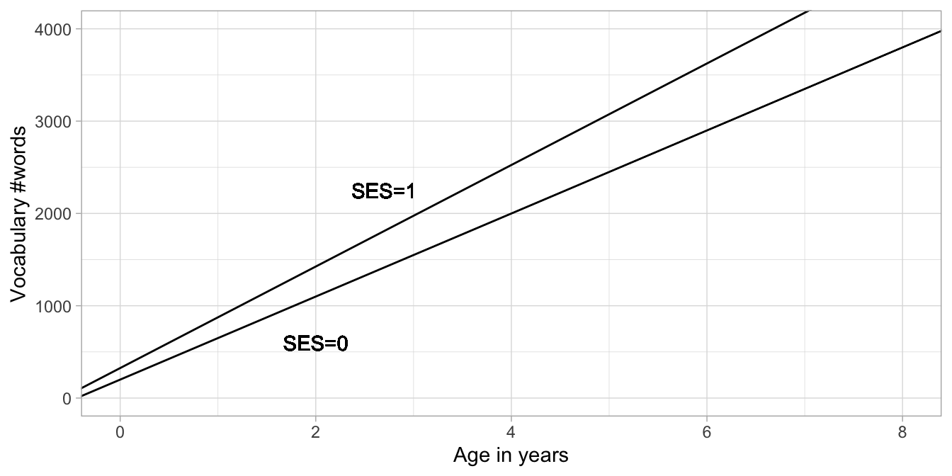
Figure 10.2: Two regression lines for the relationship between age and vocab, one for low SES children (SES = 0) and one for high SES children (SES = 1).
The observation that the slope coefficient is different for different
groups is called an interaction effect, or interaction for short.
Other words for this phenomenon are modification and moderation. In
this case, SES is called the modifier variable: it modifies the
relationship between age on vocabulary. Note however that you could
also interpret age as the modifier variable: the effect of SES is
larger for older children than for younger children. In the plot you see
that the difference between vocabulary for high and low SES children of
age 6 is larger than it is for children of age 2.
10.2 Interaction effect with a dummy variable in R
Let’s look at some example output for an R data set where we have a
categorical variable that is not dummy-coded yet. The data set is on
chicks and their weight during the first days of their lives. Weight is
measured in grams. The chicks were given one of four different diets.
Here we use only the data from chicks on two different diets 1 and 2. We
select only the Diet 1 and 2 data. We store the Diet 1 and 2 data under
the name chick_data. When we have a quick look at the data with
glimpse(), we see that Diet is a factor (<fct>).
chick_data <- ChickWeight %>%
  filter(Diet == 1 | Diet == 2)

chick_data %>%
    glimpse()
## Rows: 340
## Columns: 4
## $ weight <dbl> 42, 51, 59, 64, 76, 93, 106, 125, 149, 171, 199, 205, 40, 49, 5…
## $ Time <dbl> 0, 2, 4, 6, 8, 10, 12, 14, 16, 18, 20, 21, 0, 2, 4, 6, 8, 10, 1…
## $ Chick <ord> 1, 1, 1, 1, 1, 1, 1, 1, 1, 1, 1, 1, 2, 2, 2, 2, 2, 2, 2, 2, 2, …
## $ Diet <fct> 1, 1, 1, 1, 1, 1, 1, 1, 1, 1, 1, 1, 1, 1, 1, 1, 1, 1, 1, 1, 1, …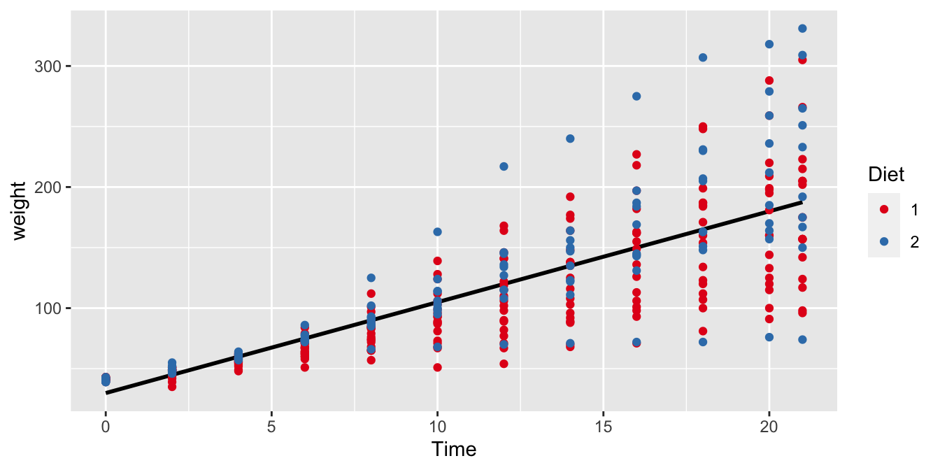
Figure 10.3: The relationship between Time and weight in all chicks with either Diet 1 or Diet 2.
The general regression of weight on Time is shown in Figure
10.3. This regression line for the entire
sample of chicks has a slope of around 8 grams per day. Now we want to
know whether this slope is the same for chicks in the Diet 1 and Diet 2
groups, in other words, do chicks grow as fast with Diet 1 as with Diet
2? We might expect that Diet moderates the effect of Time on
weight. We use the following code to study this
\(\texttt{Diet} \times \texttt{Time}\) interaction effect, by having R
automatically create a dummy variable for the factor Diet. In the
model we specify that we want a main effect of Time, a main effect of
Diet, and an interaction effect of Time by Diet:
out <- chick_data %>%
  lm(weight ~ Time + Diet + Time:Diet, data = .)
out %>%
  tidy(conf.int = TRUE)
## # A tibble: 4 x 7
## term estimate std.error statistic p.value conf.low conf.high
## <chr> <dbl> <dbl> <dbl> <dbl> <dbl> <dbl>
## 1 (Intercept) 30.9 4.50 6.88 2.95e-11 22.1 39.8
## 2 Time 6.84 0.361 19.0 4.89e-55 6.13 7.55
## 3 Diet2 -2.30 7.69 -0.299 7.65e- 1 -17.4 12.8
## 4 Time:Diet2 1.77 0.605 2.92 3.73e- 3 0.577 2.96In the regression table, we see the effect of the numeric Time
variable, which has a slope of 6.84. For every increase of 1 in Time,
there is a corresponding expected increase of 6.84 grams in weight.
Next, we see that R created a dummy variable Diet2. That means this
dummy codes 1 for Diet 2 and 0 for Diet 1. From the output we see that
if a chick gets Diet 2, its weight is -2.3 grams heavier (that means,
Diet 2 results in a lower weight).
Next, R created a dummy variable Time:Diet2, by multiplying the
variables Time and Diet2. Results show that this interaction effect
is 1.77.
These results can be plugged into the following regression equation:
\[\begin{aligned} \widehat{\texttt{weight}} = 30.93 + 6.84 \times \texttt{Time} -2.3 \times \texttt{Diet2} + 1.77 \times \texttt{Time} \times \texttt{Diet2} \end{aligned}\]
If we fill in 1s for the Diet2 dummy variable, we get the equation for
chicks with Diet 2:
\[\begin{aligned} \widehat{\texttt{weight}} &= 30.93 + 6.84 \times \texttt{Time} -2.3 \times 1 + 1.77 \times \texttt{Time} \times 1 \nonumber \\ &= 28.63 + 8.61 \times \texttt{Time} \end{aligned}\]
If we fill in 0s for the Diet2 dummy variable, we get the equation for
chicks with Diet 1:
\[\begin{aligned} \widehat{\texttt{weight}} = 30.93 + 6.84 \times \texttt{Time} \end{aligned}\]
When comparing these two regression lines for chicks with Diet 1 and
Diet 2, we see that the slope for Time is 1.77 steeper for Diet 2
chicks than for Diet 1 chicks. In this particular random sample of
chicks, the chicks on Diet 1 grow 6.84 grams per day (on average), but
chicks on Diet 2 grow \(6.84+1.77= 8.61\) grams per day (on average).
We visualised these results in Figure 10.4. There we see two regression lines: one for the red data points (chicks on Diet 1) and one for the blue data points (chicks on Diet 2). These two regression lines are the same as those regression lines we found when filling in either 1s and 0s in the general linear model. Note that the lines are not parallel, like in Chapter 6. Each regression line is the least squares regression line for the subsample of chicks on a particular diet.
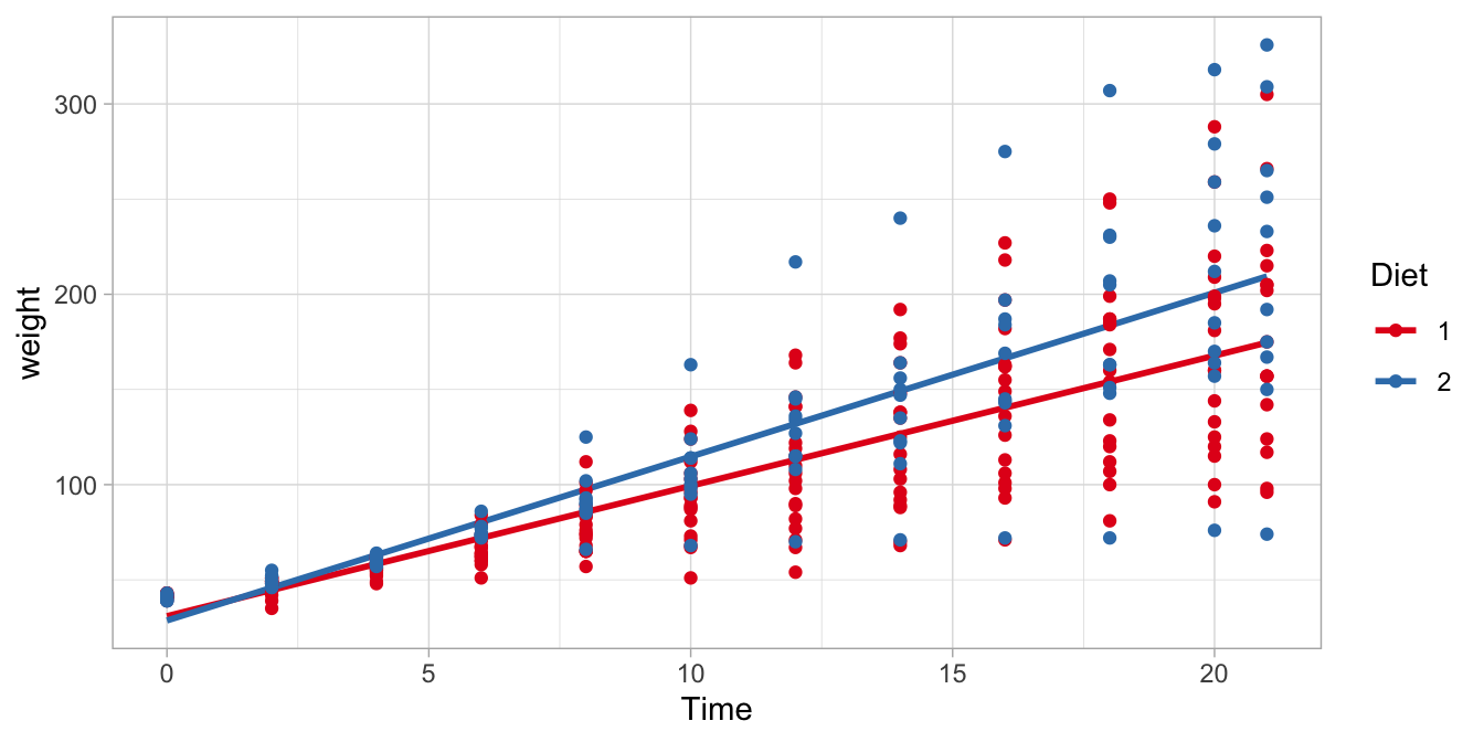
Figure 10.4: The relationship between Time and weight in chicks, separately for Diet 1 and Diet 2.
We see that the difference in slope is 1.77 grams per day. This is what we observe in this particular sample of chicks. However, what does that tell us about the difference in slope for chicks in general, that is, the population of all chicks? For that, we need to look at the confidence interval. In the regression table above, we also see the 95% confidence intervals for all model parameters. The 95% confidence interval for the \(\texttt{Time} \times \text{Diet2}\) interaction effect is (0.58, 2.96). That means that plausible values for this interaction effect are those values between 0.58 and 2.96.
It is also possible to do null-hypothesis testing for interaction effects. One could test whether this difference of 1.77 is possible if the value in the entire population of chicks equals 0? In other words, is the value of 1.77 significantly different from 0?
The null-hypothesis is
\[H_0: \beta_{\texttt{Time} \times \texttt{Diet2}} = 0\]
The regression table shows that the null-hypothesis for the interaction effect has a \(t\)-value of \(t=2.92\), with a \(p\)-value of \(3.73 \times 10^{-3} = 0.00373\). For research reports one always also reports the degrees of freedom for a statistical test. The (residual) degrees of freedom can be found in R by typing
out$df.residual## [1] 336We can report that
"we reject the null-hypothesis and conclude that there is evidence that the \(\texttt{Time} \times \texttt{Diet2}\) interaction effect is not 0, \(t(336)= 2.92, p = .004\)."
Summarising, in this section, we established that Diet moderates the
effect of Time on weight: we found a significant diet by time
interaction effect. The difference in growth rate is 1.77 grams per day,
with a 95% confidence interval from 0.58 to 2.96. In more natural
English: diet has an effect on the growth rate in chicks.
In this section we discussed the situation that regression slopes might be different in two groups: the regression slope might be steeper in one group than in the other group. So suppose that we had a numerical predictor \(X\) for a numerical dependent variable \(Y\), we said that a particular dummy variable \(Z\) moderated the effect of \(X\) on \(Y\). This moderation was quantified by an interaction effect. So suppose we have the following linear equation:
\[\begin{aligned} Y = b_0 + b_1 \times X + b_2 \times Z + b_3 \times X \times Z + e \nonumber\end{aligned}\]
Then, we call \(b_0\) the intercept, \(b_1\) the main effect of \(X\), \(b_2\) the main effect of \(Z\), and \(b_3\) the interaction effect of \(X\) and \(Z\) (alternatively, the \(X\) by \(Z\) interaction effect).
10.3 Interaction effects with a categorical variable in R
In the previous section, we looked at the difference in slopes between
two groups. But what we can do for two groups, we can do for multiple
groups. The data set on chicks contains data on chicks with 4 different
diets. When we perform the same analysis using all data in
ChickWeight, we obtain the regression table
out <- ChickWeight %>%
  lm(weight ~ Time + Diet + Time:Diet, data = .)
out %>%
  tidy(conf.int = TRUE)
## # A tibble: 8 x 7
## term estimate std.error statistic p.value conf.low conf.high
## <chr> <dbl> <dbl> <dbl> <dbl> <dbl> <dbl>
## 1 (Intercept) 30.9 4.25 7.28 1.09e-12 22.6 39.3
## 2 Time 6.84 0.341 20.1 3.31e-68 6.17 7.51
## 3 Diet2 -2.30 7.27 -0.316 7.52e- 1 -16.6 12.0
## 4 Diet3 -12.7 7.27 -1.74 8.15e- 2 -27.0 1.59
## 5 Diet4 -0.139 7.29 -0.0191 9.85e- 1 -14.5 14.2
## 6 Time:Diet2 1.77 0.572 3.09 2.09e- 3 0.645 2.89
## 7 Time:Diet3 4.58 0.572 8.01 6.33e-15 3.46 5.70
## 8 Time:Diet4 2.87 0.578 4.97 8.92e- 7 1.74 4.01The regression table for four diets is substantially larger than for two
diets. It contains one slope parameter for the numeric variable Time,
three different slopes for the factor variable Diet and three
different interaction effects for the Time by Diet interaction.
The full linear model equation is
\[\begin{aligned} \widehat{\texttt{weight}} = 30.93 + 6.84 \times \texttt{Time} -2.3 \times \texttt{Diet2} -12.68 \times \texttt{Diet3} -0.14 \times \texttt{Diet4} \nonumber\\ + 1.77 \times \texttt{Time} \times \texttt{Diet2} + 4.58 \times \texttt{Time} \times \texttt{Diet3} + 2.87 \times \texttt{Time} \times \texttt{Diet4} \nonumber \end{aligned}\]
You see that R created dummy variables for Diet 2, Diet 3 and Diet 4. We
can use this equation to construct a separate linear model for the Diet
1 data. Chicks with Diet 1 have 0s for the dummy variables Diet2,
Diet3 and Diet4. If we fill in these 0s, we obtain
\[\widehat{\texttt{weight}} = 30.93 + 6.84 \times \texttt{Time}\]
For the chicks on Diet 2, we have 1s for the dummy variable Diet2 and
0s for the other dummy variables. Hence we have
\[\begin{aligned} \widehat{\texttt{weight}} &= 30.93 + 6.84 \times \texttt{Time} -2.3 \times 1 + 1.77 \times \texttt{Time} \times 1 \nonumber\\ &= 30.93 + 6.84 \times \texttt{Time} -2.3 + 1.77 \times \texttt{Time} \nonumber \\ &= (30.93 -2.3) + (6.84 + 1.77) \times \texttt{Time} \nonumber\\ &= 28.63 + 8.61 \times \texttt{Time}\nonumber \end{aligned}\]
Here we see exactly the same equation for Diet 2 as in the previous section where we only analysed two diet groups. The difference between the two slopes in the Diet 1 and Diet 2 groups is again 1.77. The only difference for this interaction effect is the standard error, and therefore the confidence interval is also slightly different. We will come back to this issue in Chapter 7.
For the chicks on Diet 3, we have 1s for the dummy variable Diet3 and
0s for the other dummy variables. The regression equation is then
\[\begin{aligned} \widehat{\texttt{weight}} &= 30.93 + 6.84 \times \texttt{Time} -12.68 \times 1 + 4.58 \times \texttt{Time} \times 1 \nonumber\\ &= (30.93 -12.68) + (6.84 + 4.58) \times \texttt{Time} \nonumber\\ &= 18.25 + 11.42 \times \texttt{Time}\nonumber \end{aligned}\]
We see that the intercept is again different than for the Diet 1 chicks.
We also see that the slope is different: it is now 4.58 steeper than for
the Diet 1 chicks. This difference in slopes is exactly equal to the
Time by Diet3 interaction effect. This is also what we saw in the
Diet 2 group. Therefore, we can say that an interaction effect for a
specific diet group says something about how much steeper the slope is
in that group, compared to the reference group. The reference group is
the group for which all the dummy variables are 0. Here, that is the
Diet 1 group.
Based on that knowledge, we can expect that the slope in the Diet 4
group is equal to the slope in the reference group (6.84) plus the
Time by Diet4 interaction effect, 2.87, so 9.71.
We can do the same for the intercept in the Diet 4 group. The intercept
is equal to the intercept in the reference group (30.93) plus the main
effect of the Diet4 dummy variable, -0.14, which is 30.79.
The linear equation is then for the Diet 4 chicks:
\[\widehat{\texttt{weight}} = 30.79 + 9.71 \times \texttt{Time}\]
The four regression lines are displayed in Figure 10.5. The steepest regression line is the one for the Diet 3 chicks: they are the fastest growing chicks. The slowest growing chicks are those on Diet 1. The confidence intervals in the regression table tell us that the difference between the growth rate with Diet 4 compared to Diet 1 is somewhere between 1.74 and 4.01 grams per day.
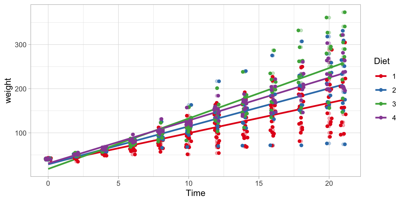
Figure 10.5: Four different regression lines for the four different diet groups.
Suppose we want to test the null hypothesis that all four slopes are the
same. This implies that the Time by Diet interaction effects are all
equal to 0. We can test this null hypothesis
\[H_0: \beta_{\texttt{Time} \times \texttt{Diet2}} = \beta_{\texttt{Time} \times \texttt{Diet2}} = \beta_{\texttt{Time} \times \texttt{Diet4}} = 0\]
by running an ANOVA. That is, we apply the anova() function to the
results of an lm() analysis:
out_anova <- out %>%
  anova()
out_anova %>%
  tidy()
## # A tibble: 4 x 6
## term df sumsq meansq statistic p.value
## <chr> <int> <dbl> <dbl> <dbl> <dbl>
## 1 Time 1 2042344. 2042344. 1760. 2.11e-176
## 2 Diet 3 129876. 43292. 37.3 5.07e- 22
## 3 Time:Diet 3 80804. 26935. 23.2 3.47e- 14
## 4 Residuals 570 661532. 1161. NA NAIn the output we see a Time by Diet interaction effect with 3
degrees of freedom. That term refers to the null-hypothesis that all
three interaction effects are equal to 0. The \(F\)-statistic associated
with that null-hypothesis equals 23.2. The residual degrees of freedom
equals 570, so that we can report:
"The slopes for the four different diets were significantly different from each other, \(F(3,570) = 23.2, MSE = 26935, p < .001\)."
10.4 Interaction between two dichotomous variables in R
In the previous section we discussed the situation that regression slopes might be different in two four groups. In Chapter 6 we learned that we could also look at slopes for dummy variables. The slope is then equal to the difference in group means, that is, the slope is the increase in the group mean of one group compared to the reference group.
Now we discuss the situation where we have two dummy variables, and want to do inference on their interaction. Does one dummy variable moderate the effect of the other dummy variable?
Let’s have a look at a data set on penguins. It can be found in the
palmerpenguins package.
# install.packages("palmerpenguins")
library(palmerpenguins)
penguins %>%
  str ()
## tibble [344 × 8] (S3: tbl_df/tbl/data.frame)
## $ species : Factor w/ 3 levels "Adelie","Chinstrap",..: 1 1 1 1 1 1 1 1 1 1 ...
## $ island : Factor w/ 3 levels "Biscoe","Dream",..: 3 3 3 3 3 3 3 3 3 3 ...
## $ bill_length_mm : num [1:344] 39.1 39.5 40.3 NA 36.7 39.3 38.9 39.2 34.1 42 ...
## $ bill_depth_mm : num [1:344] 18.7 17.4 18 NA 19.3 20.6 17.8 19.6 18.1 20.2 ...
## $ flipper_length_mm: int [1:344] 181 186 195 NA 193 190 181 195 193 190 ...
## $ body_mass_g : int [1:344] 3750 3800 3250 NA 3450 3650 3625 4675 3475 4250 ...
## $ sex : Factor w/ 2 levels "female","male": 2 1 1 NA 1 2 1 2 NA NA ...
## $ year : int [1:344] 2007 2007 2007 2007 2007 2007 2007 2007 2007 2007 ...We see there is a species factor with three levels, and a sex factor
with two levels. Let’s select only the Adelie and Chinstrap species.
penguin_data <- penguins %>%
  filter(species %in% c("Adelie", "Chinstrap"))
Suppose that we are interested in differences in flipper length across
species. We then could run a linear model, with flipper_length_mm as
the dependent variable, and species as independent variable.
out <- penguin_data %>%
  lm(flipper_length_mm ~ species, data = .)
out %>%
  tidy(conf.int = TRUE)
## # A tibble: 2 x 7
## term estimate std.error statistic p.value conf.low conf.high
## <chr> <dbl> <dbl> <dbl> <dbl> <dbl> <dbl>
## 1 (Intercept) 190. 0.548 347. 8.31e-300 189. 191.
## 2 speciesChinstrap 5.87 0.983 5.97 9.38e- 9 3.93 7.81The output shows that in this sample, the Chinstrap penguins have on average larger flippers than Adelie penguins. The confidence intervals tell us that this difference in flipper length is somewhere between 6.17 and 7.51. But suppose that this is not what we want to know. The real question might be whether this difference is different for male and female penguins. Maybe there is a larger difference in flipper length in females than in males?
This difference or change in the effect of one independent variable
(species) as a function of another independent variable (sex) should
remind us of moderation: maybe sex moderates the effect of species on
flipper length.
In order to study such moderation, we have to analyse the sex by
species interaction effect. By now you should know how to do that in
R:
out <- penguin_data %>%
  lm(flipper_length_mm ~ species + sex + species:sex, data = .)
out %>%
  tidy(conf.int = TRUE)
## # A tibble: 4 x 7
## term estimate std.error statistic p.value conf.low conf.high
## <chr> <dbl> <dbl> <dbl> <dbl> <dbl> <dbl>
## 1 (Intercept) 188. 0.707 266. 2.15e-267 186. 189.
## 2 speciesChinstrap 3.94 1.25 3.14 1.92e- 3 1.47 6.41
## 3 sexmale 4.62 1.00 4.62 6.76e- 6 2.65 6.59
## 4 speciesChinstrap:se… 3.56 1.77 2.01 4.60e- 2 0.0638 7.06In the output we see an intercept of 31. Next, we see an effect of a
dummy variable, coding 1s for Chinstrap penguins (speciesChinstrap).
We also see an effect of a dummy variable coding 1s for male penguins
(sexmale). Then, we see an interaction effect of these two dummy
effects. That means that this dummy variable codes 1s for the specific
combination of Chinstrap penguins that are male
(speciesChinstrap:sexmale).
\[\begin{aligned} \widehat{\texttt{flipperlength}} = 31 + 6.84 \times \texttt{speciesChinstrap} + \nonumber\\ -2.3 \times \texttt{sexmale} + -12.68 \times \texttt{speciesChinstrap} \times \texttt{sexmale} \nonumber\end{aligned}\]
From this we can make the following predictions. The predicted flipper length for female Adelie penguins is
\[31 + 6.84 \times 0 + -2.3 \times 0 + -12.68 \times 0 \times 0 = 31\]
The predicted flipper length for male Adelie penguins is
\[\begin{aligned} 31 + 6.84 \times 0 + -2.3 \times 1 + -12.68 \times 0 \times 1 \nonumber\\ = 31 + -2.3 = 28.7 \nonumber\end{aligned}\]
The predicted flipper length for female Chinstrap penguins is
\[\begin{aligned} 31 + 6.84 \times 1 + -2.3 \times 0 + -12.68 \times 0 \times 0 \nonumber\\ = 31 + 6.84 = 37.84\nonumber \end{aligned}\]
and the predicted flipper length for male Chinstrap penguins is
\[\begin{aligned} 31 &+ 6.84 \times 1 + -2.3 \times 1 + -12.68 \times 1 \times 1 \nonumber\\ &= 31 + 6.84 + -2.3 + -12.68 \nonumber\\ &= 22.86 \nonumber \end{aligned}\]
These predicted flipper lengths for each male/species combination are
actually the group means. It is generally best to plot these means with
a means and errors plot. For that we first need to compute means by R.
With left_join() we add these means to the data set. These
diamond-shaped means (shape = 18) are plotted with intervals that are
twice (mult = 2) the standard error of those means
(geom = "errorbar").
left_join(penguin_data, # adding group means to the data set
          penguin_data %>%
            group_by(species, sex) %>%
            summarise(mean = mean(flipper_length_mm))
          ) %>%
  ggplot(aes(x = sex, y = flipper_length_mm, colour = species)) +
  geom_jitter(position = position_jitterdodge(), # the raw data
              shape = 1,
              alpha = 0.6) +
  geom_point(aes(y = mean),    # the groups means
             position = position_jitterdodge(jitter.width = 0),
             shape = 18,
             size = 5) +
  stat_summary(fun.data = mean_se,  # computing errorbars
               fun.args = list(mult = 2),
               geom = "errorbar",
               width = 0.2,
               position = position_jitterdodge(jitter.width = 0),
               size = 1) +
scale_color_brewer(palette = "Set1") 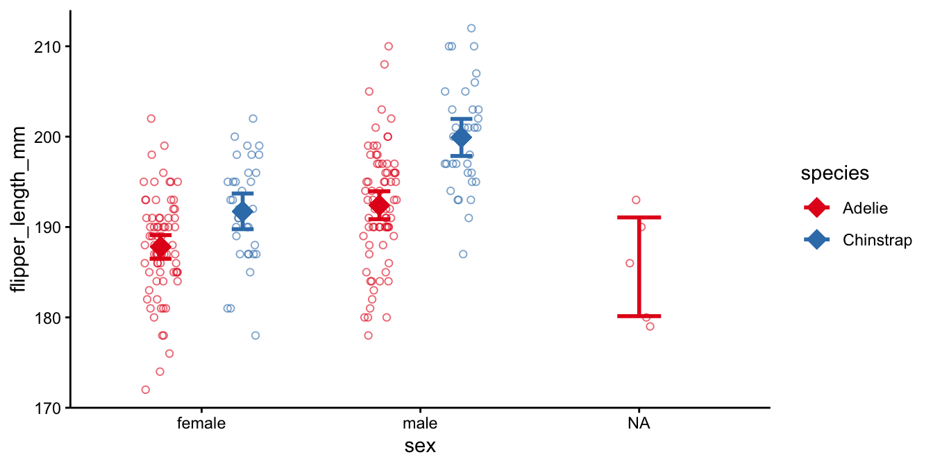
This plot shows also the data on penguins with unknown sex (sex = NA).
If we leave these out, we get
left_join(penguin_data, # adding group means to the data set
          penguin_data %>%
            group_by(species, sex) %>%
            summarise(mean = mean(flipper_length_mm))
          ) %>%
  filter(!is.na(sex)) %>%
  ggplot(aes(x = sex, y = flipper_length_mm, colour = species)) +
  geom_jitter(position = position_jitterdodge(), # the raw data
              shape = 1,
              alpha = 0.6) +
  geom_point(aes(y = mean),    # the groups means
             position = position_jitterdodge(jitter.width = 0),
             shape = 18,
             size = 5) +
  stat_summary(fun.data = mean_se,  # computing errorbars
               fun.args = list(mult = 2),
               geom = "errorbar",
               width = 0.2,
               position = position_jitterdodge(jitter.width = 0),
               size = 1) +
scale_color_brewer(palette = "Set1") 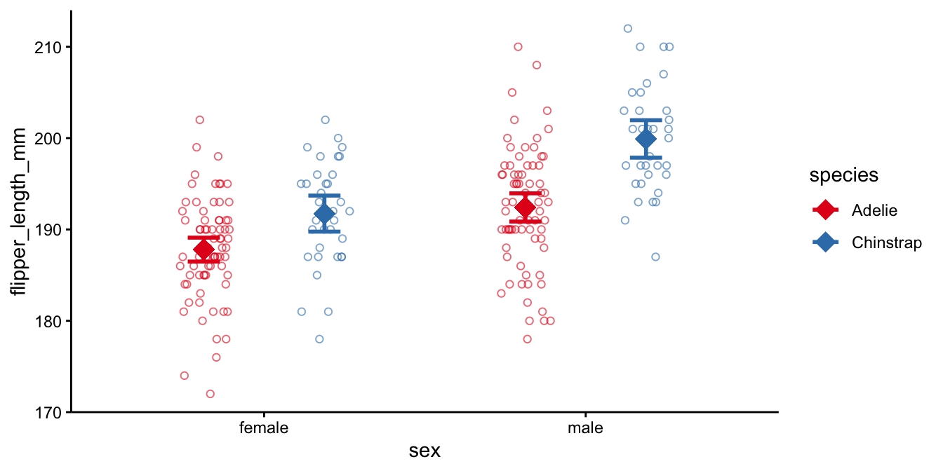
Comparing the Adelie and the Chinstrap data, we see that for both males and females, the Adelie penguins have smaller flippers than the Chinstrap penguins. Comparing males and females, we see that the males have generally larger flippers than females. More interestingly in relation to this chapter, the means in the males are farther apart than the means in the females. Thus, in males the effect of species is larger than in females. This is the interaction effect, and this difference in the difference in means is equal to -12.68 in this data set. With a confidence level of 95% we can say that the moderating effect of sex on the effect of species is probably somewhere between -26.95 and 1.59 mm in the population of all penguins.
10.5 Moderation involving two numeric variables in R
In all previous examples, we saw at least one categorical variable. We saw that for different levels of a dummy variable, the slope of another variable varied. We also saw that for different levels of a dummy variable, the effect of another dummy variable varied. In this section, we look at how the slope of a numeric variable can vary, as a function of the level of another numeric variable.
As an example data set, we look at the mpg data frame, available in
the ggplot2 package. It contains data on 234 cars. Let’s analyse the
dependent variable cty (city miles per gallon) as a function of the
numeric variables cyl (number of cylinders) and displ (engine
displacement). First we plot the relationship between engine
displacement and city miles per gallon. We use colours, based on the
number of cylinders. We see that there is in general a negative slope:
the higher the displacement value, the lower the city miles per gallon.
mpg %>%
  ggplot(aes(x = displ, y = cty)) +
  geom_point(aes(colour = cyl)) +
  geom_smooth(method = "lm", se = F)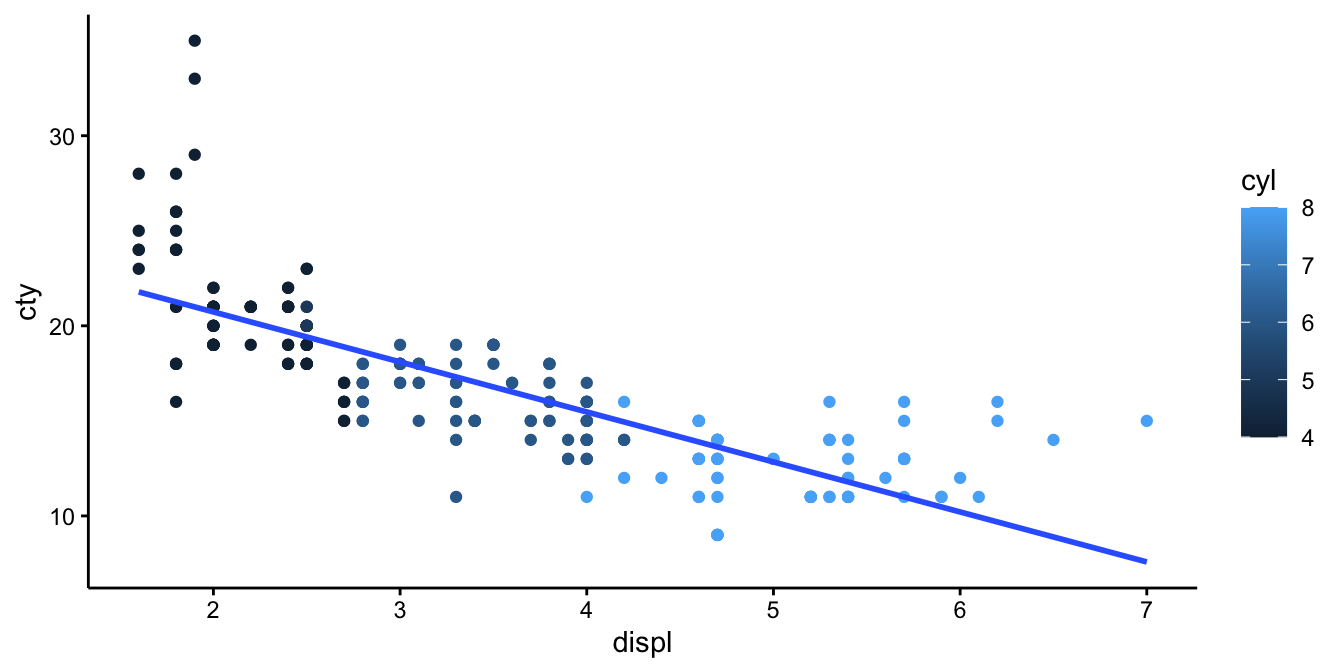
When we run separate linear models for the different number of cylinders, we get
mpg %>%
  ggplot(aes(x = displ, y = cty, colour = cyl, group = cyl)) +
  geom_point() +
  geom_smooth(method = "lm", se = F)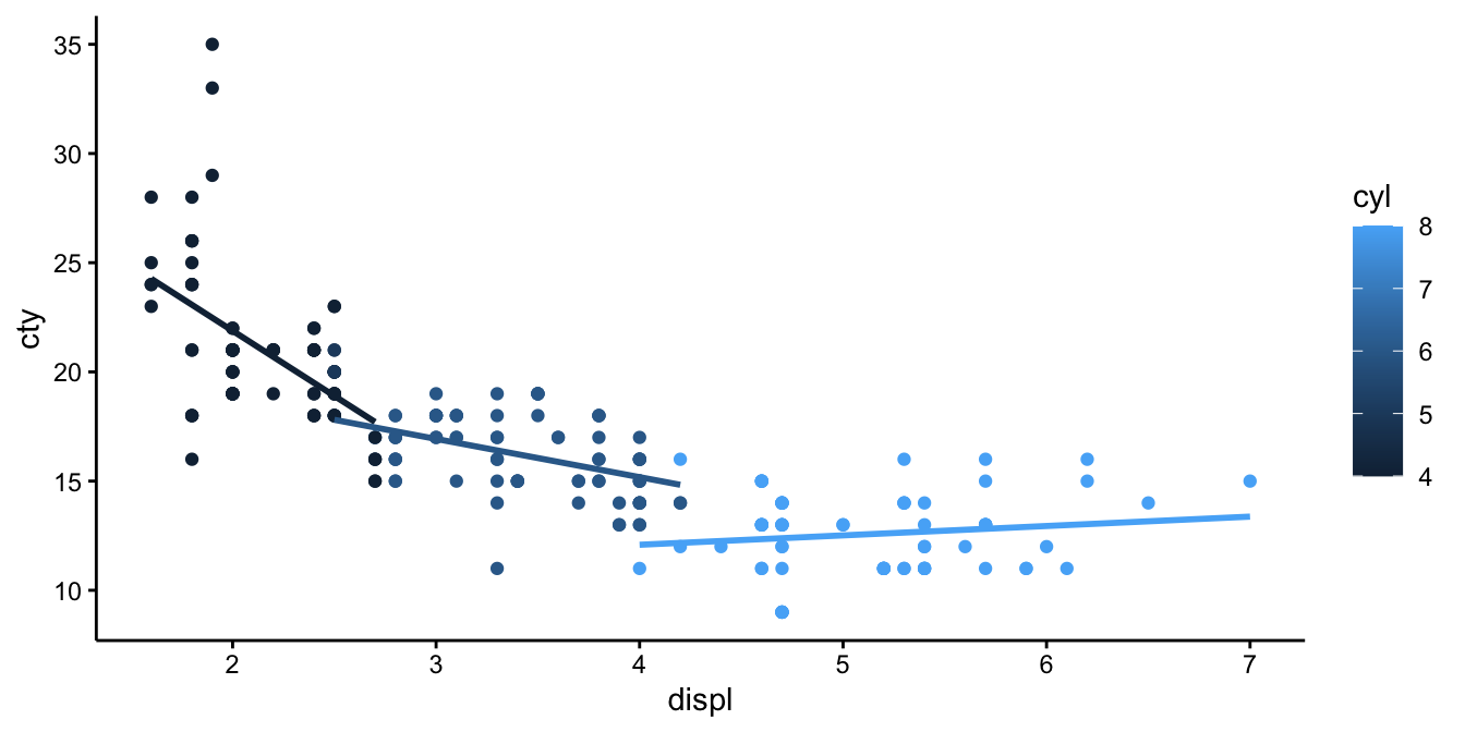
We see that the slope is different, depending on the number of cylinders: the more cylinders, the less negative is the slope: very negative for cars with low number of cylinders, and slightly positive for cars with high number of cilinders. In other words, the slope increases in value with increasing number of cylinders. If we want to quantify this interaction effect, we need to run a linear model with an interaction effect.
out <- mpg %>%
  lm(cty ~ displ + cyl + displ:cyl, data = .)
out %>%
  tidy()
## # A tibble: 4 x 5
## term estimate std.error statistic p.value
## <chr> <dbl> <dbl> <dbl> <dbl>
## 1 (Intercept) 38.6 2.03 19.0 3.69e-49
## 2 displ -5.29 0.825 -6.40 8.45e-10
## 3 cyl -2.70 0.376 -7.20 8.73e-12
## 4 displ:cyl 0.559 0.104 5.38 1.85e- 7We see that the displ by cyl interaction effect is 0.559. It means
that the slope of displ changes by 0.559 for every unit increase in
cyl.
For example, when we look at the predicted city miles per gallon with
cyl = 2, we get the following model equation:
\[\begin{aligned} \widehat{\texttt{cty}} &= 0.6 -5.285\times \texttt{displ} -2.704 \texttt{cyl} + 0.559 \times \texttt{displ} \times \texttt{cyl} \nonumber\\ \widehat{\texttt{cty}} &= 0.6 -5.285 \times \texttt{displ} -2.704 \times 2 + 0.559 \times \texttt{displ} \times 2 \nonumber\\ \widehat{\texttt{cty}} &= 0.6 -5.285 \times \texttt{displ} -5.408 + 1.118 \times \texttt{displ} \nonumber\\ \widehat{\texttt{cty}} &= (0.6 -5.408) + (1.118-5.285) \times \texttt{displ} \nonumber\\ \widehat{\texttt{cty}} &= -4.808 -4.167 \times \texttt{displ}\nonumber\end{aligned}\]
If we increase the number of cylinders from 2 to 3, we obtain the equation:
\[\begin{aligned} \widehat{\texttt{cty}} &= 0.6 -5.285 \times \texttt{displ} -2.704 \times 3 + 0.559 \times \texttt{displ} \times 3 \nonumber\\ \widehat{\texttt{cty}} &= -7.512 -3.608 \times \texttt{displ}\nonumber\end{aligned}\]
We see a different intercept and a different slope. The difference in the slope between 3 and 2 cylinders equals 0.559, which is exactly the interaction effect. If you do the same exercise with 4 and 5 cylinders, or 6 and 7 cylinders, you will always see this difference again. This parameter for the interaction effect just says that the best prediction for the change in slope when increasing the number of cylinders with 1, is 0.559. We can plot the predictions from this model in the following way:
library(modelr)
mpg %>%
  add_predictions(out) %>%
  ggplot(aes(x = displ, y = cty, colour = cyl)) +
  geom_point() +
  geom_line(aes(y = pred, group = cyl))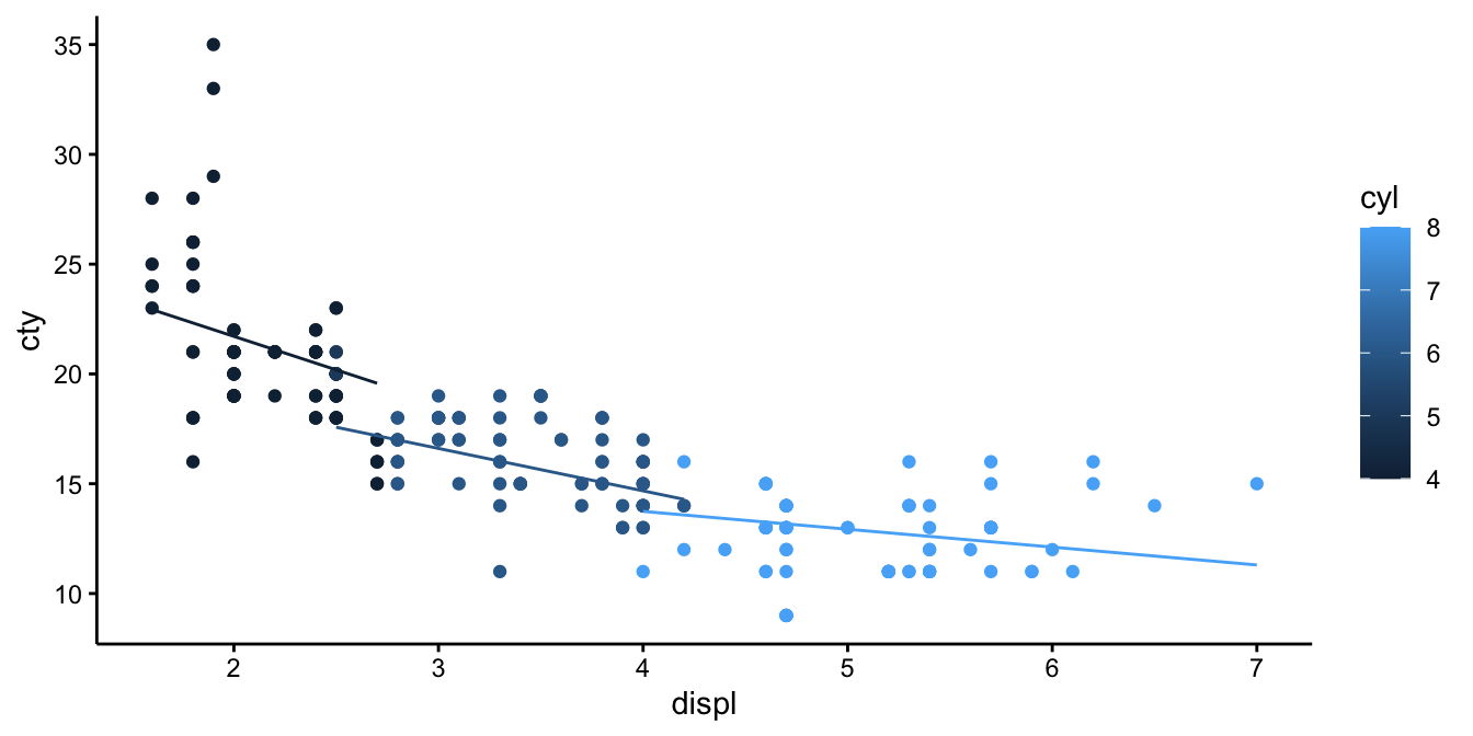
If we compare these predicted regression lines with those in the previous figure
mpg %>%
  add_predictions(out) %>%
  ggplot(aes(x = displ, y = cty, group = cyl)) +
  geom_point() +
  geom_line(aes(y = pred), colour = "black") +
  geom_smooth(method = "lm", se = F)
we see that they are a little bit different. That is because in the
model we treat cyl as numeric: for every increase of 1 in cyl, the
slope changes by a fixed amount. When you treat cyl as categorical,
then you estimate the slope separately for all different levels. You
would then see multiple parameters for the interaction effect:
out <- mpg %>%
  mutate(cyl = factor(cyl)) %>%
  lm(cty ~ displ + cyl + displ:cyl, data = .)
out %>%
  tidy()
## # A tibble: 8 x 5
## term estimate std.error statistic p.value
## <chr> <dbl> <dbl> <dbl> <dbl>
## 1 (Intercept) 33.8 1.70 19.9 1.50e-51
## 2 displ -5.96 0.785 -7.60 7.94e-13
## 3 cyl5 1.60 1.17 1.37 1.72e- 1
## 4 cyl6 -11.6 2.50 -4.65 5.52e- 6
## 5 cyl8 -23.4 2.89 -8.11 3.12e-14
## 6 displ:cyl5 NA NA NA NA
## 7 displ:cyl6 4.21 0.948 4.44 1.38e- 5
## 8 displ:cyl8 6.39 0.906 7.06 2.05e-11When cyl is turned into a factor, you see that cars with 4 cylinders
are taken as the reference category, and there are effects of having 5,
6, or 8 cylinders. We see the same for the interaction effects: there is
a reference category with 4 cylinders, where the slope of displ equals
-5.96. Cars with 6 and 8 cylinders have different slopes: the one for 6
cylinders is 5.96 + 4.21 and the one for 8 cylinders is 5.96 + 6.39. The
slope for cars with 5 cylinders can’t be separately estimated because
there is no variation in displ in the mpg data set.
You see that you get different results, depending on whether you treat a variable as numeric or as categorical. Treated as numeric, you end up with a simpler model with fewer parameters, and therefore a larger number of degrees of freedom. What to choose depends on the research question and the amount of data. In general, a model should be not too complex when you have relatively few data points. Whether the model is appropriate for your data can be checked by looking at the residuals and checking the assumptions.