Chapter 7 Lab 5 - 09/11/2021
In this lecture we will learn
- how to use R to simulate data (pseudo-random) for any Normal distribution
- how to write an R-function
- how to use R to simulate random samples from other distributions, i.e. Log Normal and T-student.
- how to compute and plot the empirical cumulative distribution function (ecdf).
- how to depict the normal probability plot, the half normal plot and more in general the quantile-quantile (QQ) plot.
- Finally, we will use the Box-Cox transformation to reduce the skewness of a distribution.
7.1 Random number generation from the Normal distribution
An example of random generation is given by the random experiment that consists in tossing a coin four times (T=tail, H=head). One possible outcome is {T, H, H, T, T}, while {H, H, H, T, H} is another possible random sequence. All the random sequence of Head and Tail are simulated from the distribution which assigns probability 0.5 to Head and probability 0.5 to Tail. We will proceed similarly by simulating values from the Normal distribution. In this case the task is more complex and we resort to a specific R function named rnorm (r... stands for random).
For example for simulating randomly 4 numbers from the Normal distribution with mean 10 and standard deviation 1, we use the following code:
rnorm(4, mean=10, sd=1)## [1] 12.456622 9.508053 10.751547 9.815652This code returns 4 different number every time you run it. In order to get the same data, for reproducibility purposes, it is necessary to set the seed (i.e. to set the starting point of the algorithm which generates the random numbers). To do this the set.seed function is used; it takes as input an integer positive number (456 in the following example):
set.seed(456)
x = rnorm(4, mean=10, sd=1)
x
## [1] 8.656479 10.621776 10.800875 8.611108The 4 numbers are saved in an object named x. By setting the seed we are able to reproduce always the same sequence of random numbers (which is the same for all of us).
We now simulate 1000 values from the same distribution, we will visualize the first simulated data with the command head, and plot the empirical distribution by using the histogram and overlapping to it the KDE:
set.seed(456)
x = rnorm(1000, mean=10, sd=1)
head(x)
## [1] 8.656479 10.621776 10.800875 8.611108 9.285643 9.675939par(mfrow=c(1,2))
hist(x,freq=F)
lines(density(x),col="red")
qqnorm(x,datax=T)
qqline(x,col="red",datax=T)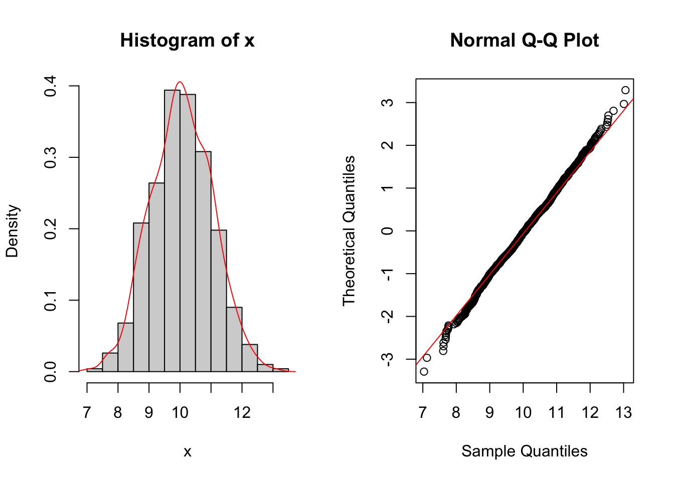 The plot represent the well-known bell-shaped distribution of the Normal model. Moreover the Normal probability plot shows how the theoretical quantile and the empirical quantile lies on a straight line
7.2 R functions
A function is a set of commands grouped together to perform a specific task. R has a many in-built functions, actually we are using such functions. Nevertheless, and the user can create their own functions.
In R, a function is an object so the R interpreter is able to pass control to the function, along with arguments that may be necessary for the function to accomplish the actions.
Function Definition An R function is created by using the keyword function. The basic syntax of an R function definition is as follows −
function_name <- function(arg_1, arg_2, ...) {
   Function body
   return(...)
}
Function Components The different parts of a function are
- Function Name This is the actual name of the function.
- Arguments An argument is a placeholder. When a function is invoked, you pass a value to the argument.
- Function Body The function body contains a collection of statements that defines what the function does.
- Return Value The return value of a function. This is the output of the function
R has many in-built functions which can be directly called in the program without defining them first. We can also create and use our own functions referred as user defined functions.
7.2.1 Our first function
As an example we will build a fuction that compute the population standard deviation \[ \sigma_{pop}=\sqrt{\frac{1}{n}\sum_{i=1}^{n}(y_i-\bar{y})^2}=\sqrt{\frac{n-1}{n}}\sigma \]
sd_pop <- function(y){
        n <- length(y)
        output <- sqrt( (n-1)/n )*sd(y)
        return(output)
}
Observe how to define our function, we have also used the built-in function sd().
Let’s try our function od a simulated datatset of observation from a standard normal
y =rnorm(100)
sd(y) ##
## [1] 0.9809858sd_pop(y)## [1] 0.97606867.3 Log Normal distribution
Let \(X\) be a Normal random variable with parameters \(\mu\) (mean) and \(\sigma^2\) (variance). The exponential transformation of \(X\) gives rise to a new random variable \(Y=e^{X}\) which is known as Log Normal. Its probability density function (pdf) is \[ f_Y(y)=\frac{1}{y\sigma\sqrt{2\pi}}e^{-\frac{(\ln(y)-\mu)^2}{2\sigma^2}} \] for \(y>0\) (and it’s 0 elsewhere). Note that the pdf depends on two parameters, \(\mu\) and \(\sigma\) known as log mean and log standard deviation. They are inherited from the Normal distribution \(X\) but have a different meaning.
It is possible to demonstrate empirically the relationship between the Normal and Log Normal distribution by means of the following steps:
- simulate 5 numbers from the normal distribution with mean \(\mu=4\) and standard deviation \(\sigma= 0.5\), as described in Section 7.1:
set.seed(66)
x = rnorm(5, mean=4, sd=0.5)
x
## [1] 5.161987 4.108489 4.209096 3.904504 3.842581- Apply the exponential transformation to the values in \(x\):
exp(x)## [1] 174.51092 60.85467 67.29570 49.62544 46.64570- Check that the transformed values are the same that can be obtained by using the
rlnormfunction in R, which is the function for simulating values from the Log Normal distribution with parameters \(\mu\) and \(\sigma\) (denoted bymeanlogandsdlogin therlnormfunction, see?rlnorm):
set.seed(66)
y = rlnorm(5, meanlog=4, sdlog=0.5)
y
## [1] 174.51092 60.85467 67.29570 49.62544 46.64570Note that the values in exp(x) and y coincide.
Let’s now simulate 1000 values from the Log Normal distribution with parameters \(\mu=0.1\) and \(\sigma=0.5\):
set.seed(66)
y = rlnorm(1000, meanlog=0.1, sdlog=0.5)
head(y)
## [1] 3.5324346 1.2318148 1.3621936 1.0045137 0.9441982 0.7993718It is possible to represent graphically the distribution of the simulated values:
hist(y, freq=F, ylim=c(0,1))
lines(density(y))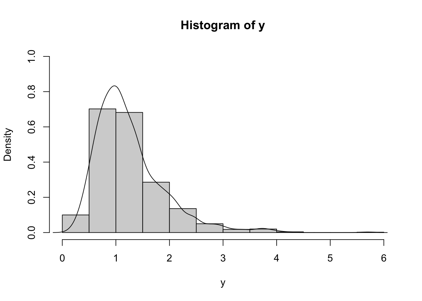
It is clear that the distribution is right skewness and has a long right tail. This is confirmed by the fact that the mean is bigger than the median (remember that the median is a robust index while the mean is influenced by extreme values):
summary(y)## Min. 1st Qu. Median Mean 3rd Qu. Max.
## 0.1913 0.8111 1.1060 1.2574 1.5288 5.7015Also, the skewness index
mean((y-mean(y))^3)/sd_pop(y)^3## [1] 1.634816is strongly bigger than zero, as expected.
Note we have used the population standard deviation to compute the skewness.
It is worth to note that the sample (empirical) mean
mean(y)## [1] 1.25742is close to the expected (theoretical) mean of the Log Normal distribution given by \[ E(Y)=e^{\mu+\frac{\sigma^2}{2}} \]
exp(0.1+0.5^2/2)## [1] 1.252323The two values are not exactly equal because the empirical mean is subject to sampling variability. Generally speaking the empirical mean gets closer to the expected theoretical mean when the sample size gets larger.
The idea of computing a theoretical mean by simulating many observations from a distribution and then calculate the empirical mean is the first brick of a very powerful mathematical tools called Monte Carlo Integration methods.
7.3.1 Normal probability plot
The normal probability plot is a graphical tool to study the normality of a distribution. It is based on the comparison between the sample (empirical) quantiles (usually represented on the x-axis) and the quantiles of a standard Normal distribution (usually represented on the y-axis). If the normality assumption is met, the sample quantiles are approximately equal to the Normal quantiles and the points in the plot are linearly distributed. If the normality assumpation is not compatible with the data, 4 possible cases can occur, as displayed in Figure 7.1.
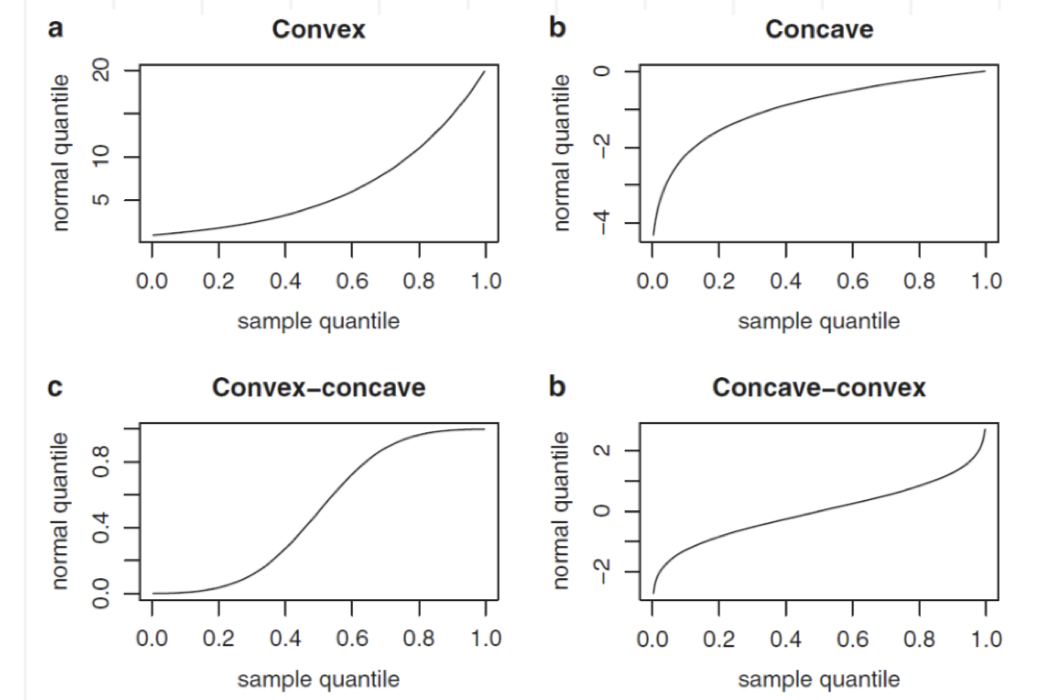
Figure 7.1: Patterns of the normal probability plots in case of non normality: a = left skewness, b = right skewness, c = heavier tails, d = lighter tails
In R the function for producing the normal probability plot is qqnorm:
qqnorm(y)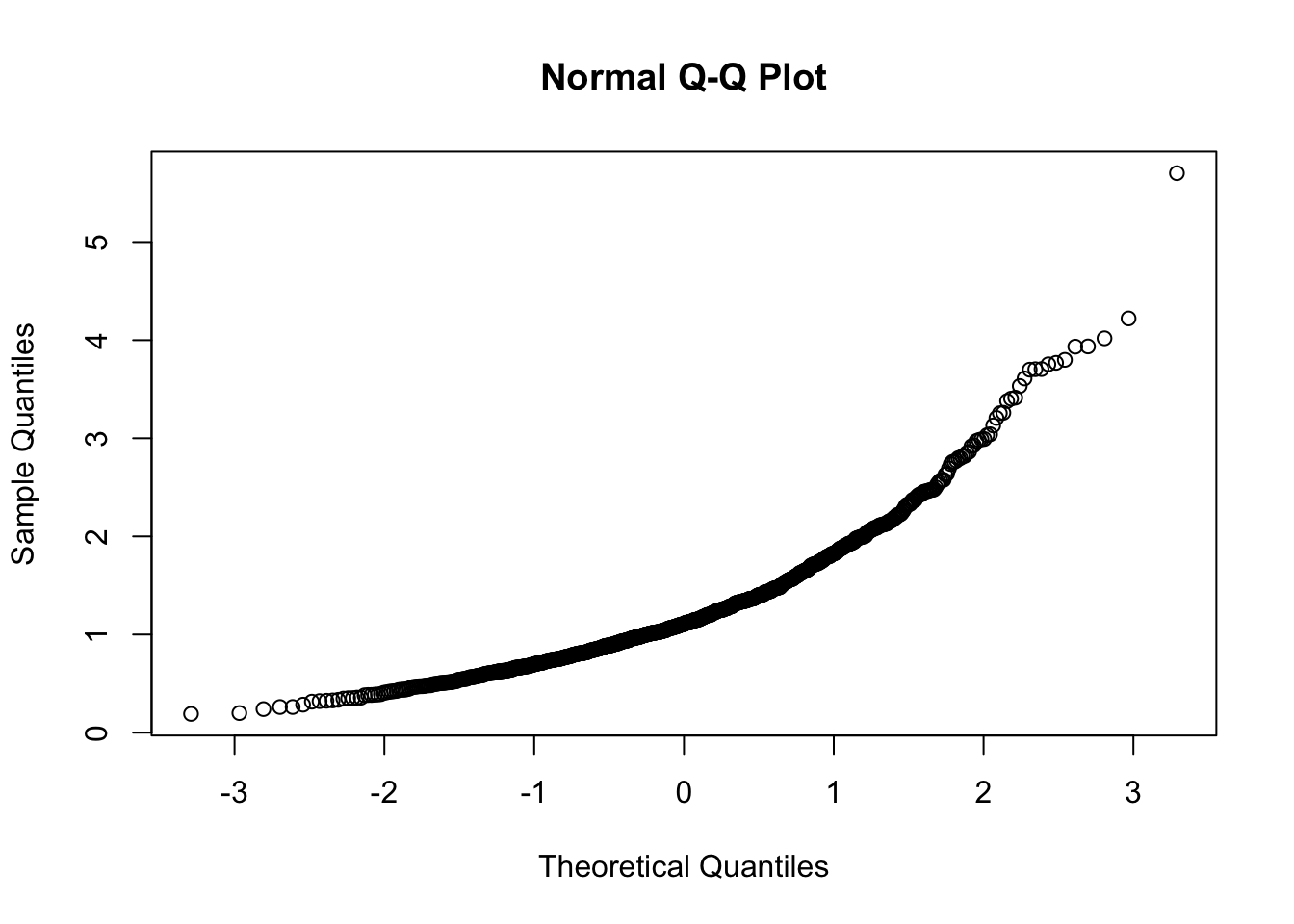 Note that this plot, differently from what reported in Figure 7.1, reports on the x-axis the theoretical Normal quantiles. So pay attention to what you have on the axes, otherwise your comments coulb be completely wrong, as shown in Figure 7.2 😄.
Figure 7.2: Check the axes!
In order to exchange the axes, it is possible to use the datax option of the qqnorm function, as follows. Moreover, it is also useful to include a reference straight line by using qqline.
qqnorm(y, datax=T)
qqline(y, datax=T)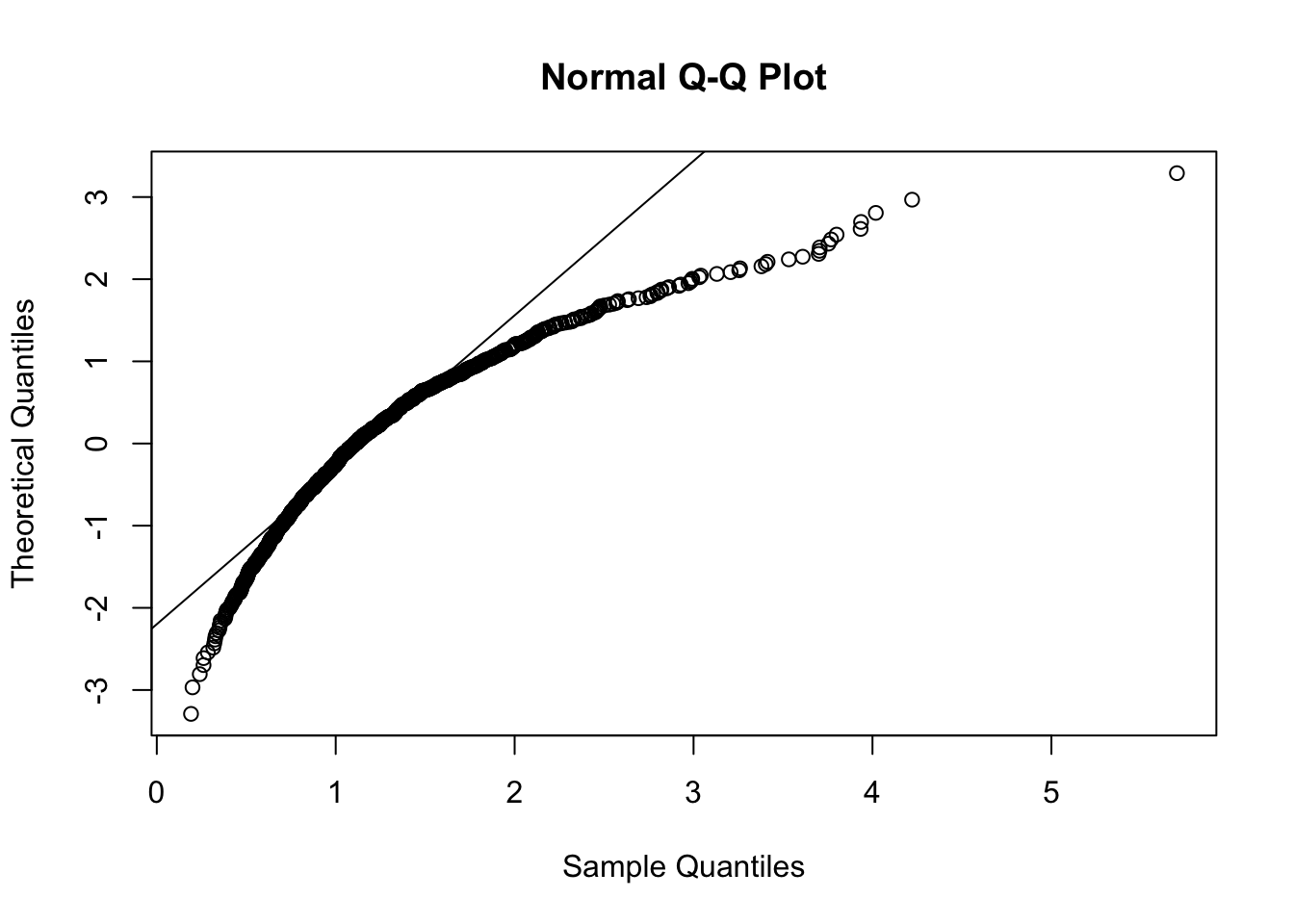
Figure 7.3: Normal probability plot for the data in the y vector
The reference straight line goes through the pair of first quartiles and the pair of third quartiles. Moreover, the sample quantiles are given by the ordered data \(y_{(i)}\) (for \(i=1,\ldots, n\)), while the theoretical quantiles are given by the \(\Phi^{-1}\left(\frac{i-0.5}{n}\right)\) (for \(i=1,\ldots, n\)), where \(\Phi^{-1}\) is the inverse of the cumulative distribution function of the Normal distribution (i.e. the quantile function the Normal distribution).
7.4 Data transformation
We will try to solve the asymmetry problem of the y data by using the Box-Cox power transformation defined by the following formula:
\[
y^{(\alpha)}=\frac{y^\alpha-1}{\alpha} \tag{7.1}
\]
for \(y>0\) and \(\alpha\in\mathbb R\). The particular case of \(\alpha=0\) corresponds to the logarithmic transformation, i.e. \(y^{(0)}=\log(y)\). In R the function for implementing the Box-Cox transformation is called bcPower and it is included in the car package (link). The latter is an extension of the standard base release of R and can be downloaded from the CRAN (see Section 2.1).
library(car)## Loading required package: carData##
## Attaching package: 'car'## The following object is masked from 'package:fBasics':
##
## densityPlotOnce the car package is loaded, we are ready to use the function bcPower contained in the package. This function needs two inputs: the data and the power constant which is named \(\alpha\) in Eq.(7.1) and lambda by the bcPower. For example with
y2 = bcPower(y, lambda=1.5)we define a new vector y2 of the transformed y data by using the Box-Cox equation with \(\alpha=1.5\). Obviously the lengths of y and y2 coincide. We can plot the distribution of the transformed data by using, for example, the histogram:
hist(y2)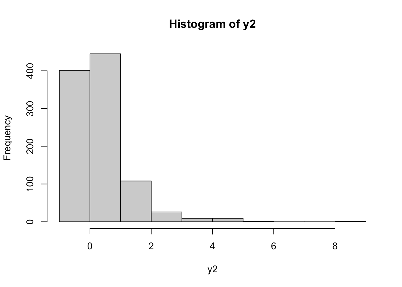 It can be observed that the distribution is still right skewed. Let’s try with another value of \(\alpha\) (remember that \(\alpha\) can be any real number):
y2 = bcPower(y, lambda=-1.5)
hist(y2)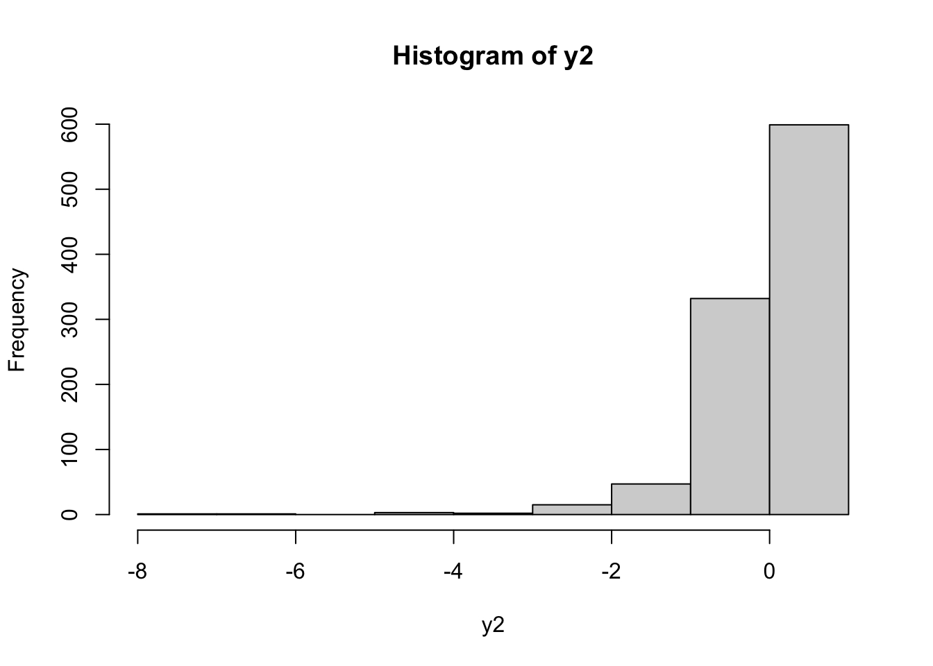 In this case the transformed distribution is left skewness. To find the best value of \(\alpha\) (in order to get simmetry) it is possible to use the
 powerTransform included in the car package (see ?powerTransform for more details):
powerTransform(y)## Estimated transformation parameter
## y
## 0.04165664The value given as output represents the best value of \(\alpha\) for the Box-Cox transformation formula. In order to use this value directly in the bcPower function, I suggest to proceed as follows: save the output of powerTransform in a new object and then extract from it the required value by using $lambda:
bestpower = powerTransform(y)
bestpower$lambda
## y
## 0.04165664y2=bcPower(y, lambda=bestpower$lambda)
hist(y2)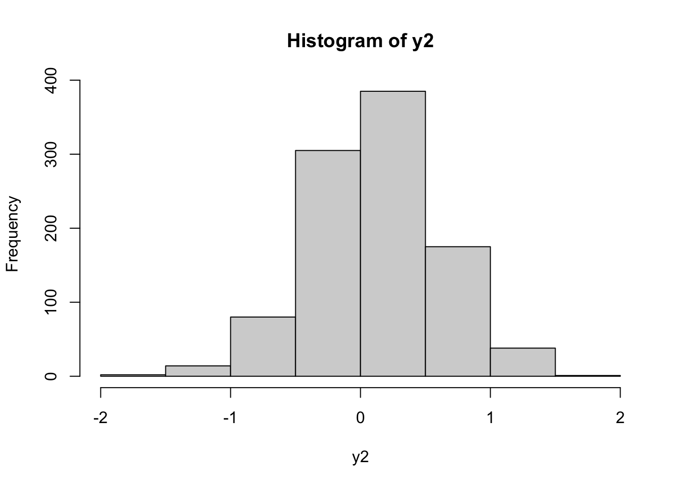
From the histogram the distribution looks symmetric. Let’s check the normality by using the normal probability plot:
qqnorm(y2,datax=T)
qqline(y2,datax=T)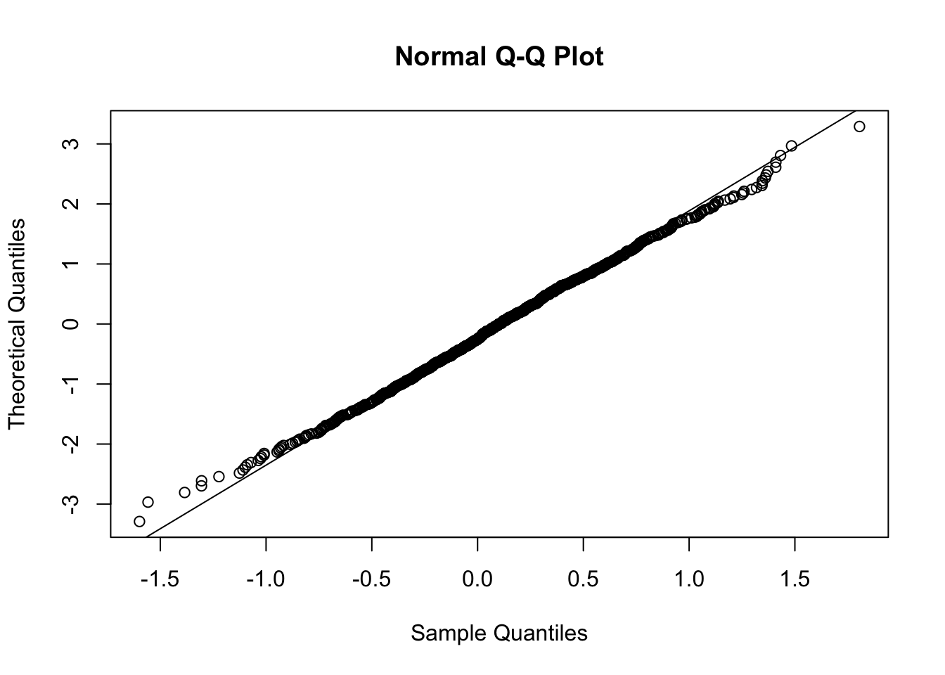
In this case almost all the points are aligned along the reference straight line. We observe some deviations from linearity in the extreme left and right tails. Also the skewness index is pretty close to zero:
mean((y2-mean(y2))^3) / sd_pop(y2)^3## [1] 0.001728687.4.1 Half-Normal plot
The half-Normal plot is used to detect extreme values (outliers). The reference model is \(|Z|\) which is the absolute value of a standard Normal distribution (in this case we are not interested in the sign of the values this is why we take the absolute value).
The function to produce the half-normal plot in R is called halfnorm and belongs to the faraway package (link). To install and load the package we proceed as described in Section 6.2.3.1:
library(faraway)##
## Attaching package: 'faraway'## The following objects are masked from 'package:car':
##
## logit, vifhalfnorm(y)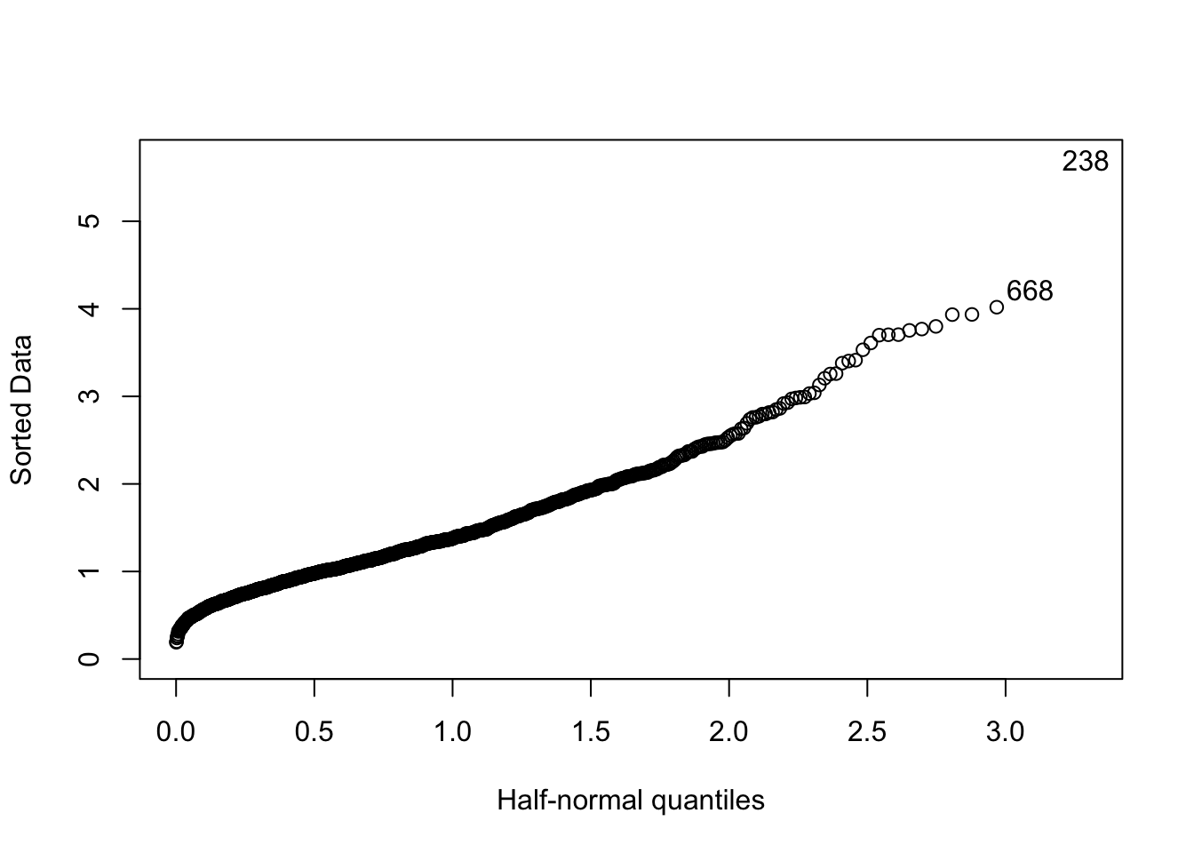 On the x-axis of the quantiles of the half-Normal distribution \(|Z|\) are reported (given by \(\Phi^{-1}\left(\frac{n+i}{2n+1}\right))\) where \(i=1,\ldots,n\)). On the y-axis instead the ordered sample data in absolute value are used. In the plot the observations with index 205 and 238 are considered extreme with respect to the half-Normal distribution; the corresponding values can be retrieved as follows:
y[238]## [1] 5.701549y[668]## [1] 4.221412Note that the option nlab of the halfnorm function can be used to choose how many extreme values you want to label (default is 2).
7.5 Generating random samples from other distributions
Here is a list of the functions that will generate a random sample from other common distributions: runif, rpois, rmvnorm, rnbinom, rbinom, rbeta, rchisq, rexp, rgamma, rlogis, rstab, rt, rgeom, rhyper, rwilcox, rweibull. Each function has its own set of parameter arguments. For example, the rt function is the random number generator for the t-student distribution and it has two parameters the ncp (non central parameter or location \(\mu\)) and the df (degrees of freedom \(\nu\)). The rchisq function is the random number generator for the chi-square distribution and it has just one parameter, the degrees of freedom.
7.5.1 Example 1
Let’s try to sample \(n=1000\) value from a t-student with \(\nu=3\) degrees of freedom \(\mu=2\) and \(\sigma=0.5\)
Observe that if \(X\sim\text{t-student}(\nu,0,1)\) and we let \(Y=\mu+\sigma X\), then \(Y\sim\text{t-student}(\nu,\mu,\sigma)\)
sigma=0.5
mu=2

set.seed(456)
x = rt(1000, df=3) ## Sample from a standard t-student

y= sigma*x+mu

head(y)
## [1] 1.372383 2.463351 1.673346 2.252502 1.661250 2.331407par(mfrow=c(1,2))
hist(y,freq=F)
lines(density(y),col="red")
qqnorm(x,datax=T)
qqline(x,col="red",datax=T)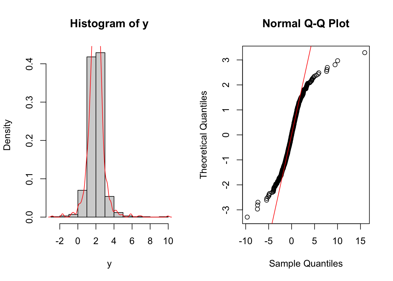
It is clear that the data we have generated have both, the left and right, tails much heavier than the one of a Normal distribution.
We could depict a QQplot, we observe that since \(\mu\) and \(\sigma\) are a locatation and scale parameter, we don’t need to specify them when building such a plot.
n <- length(y)
pp <- ((1:n)-0.5)/n

plot(sort(y),qt(pp,df=3))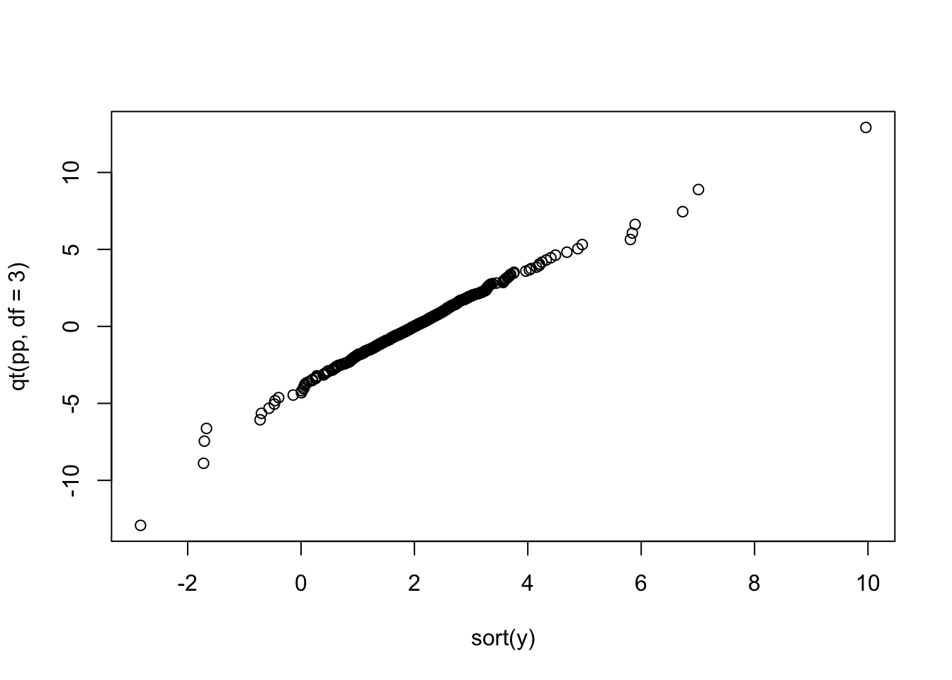
To better interpret the data, we would like to add a line going through the first and the third quantiles (empirical vs theoretical). To this end we will proceed as follows:
- We compute the first and third sample quartile we call them \(Q_1\) and \(Q_2\) rispectively
- We compute the first and third theoretical quartile (under the assumpiton of a t-student with 3 df), we denote them as \(TQ_1\) and \(TQ_2\)
- We compute the slope and the intercept of the line as follows \[ \hat{m}=\frac{TQ_1-TQ_2}{Q1-Q2} \quad \quad \hat{q}=TQ_3-\hat{m}Q_3\]
- We add the line using the command
abline
#A.
Q1<- quantile(y,prob=0.25)
Q3<- quantile(y,prob=0.75)

## B.
TQ1<- qt(0.25,df=3)
TQ3<- qt(0.75,df=3)

#C.
slope <- (TQ3-TQ1)/(Q3-Q1)
intercept <- TQ3-slope*Q3

#D.
plot(sort(y),qt(pp,df=3))
abline(intercept,slope,col="red")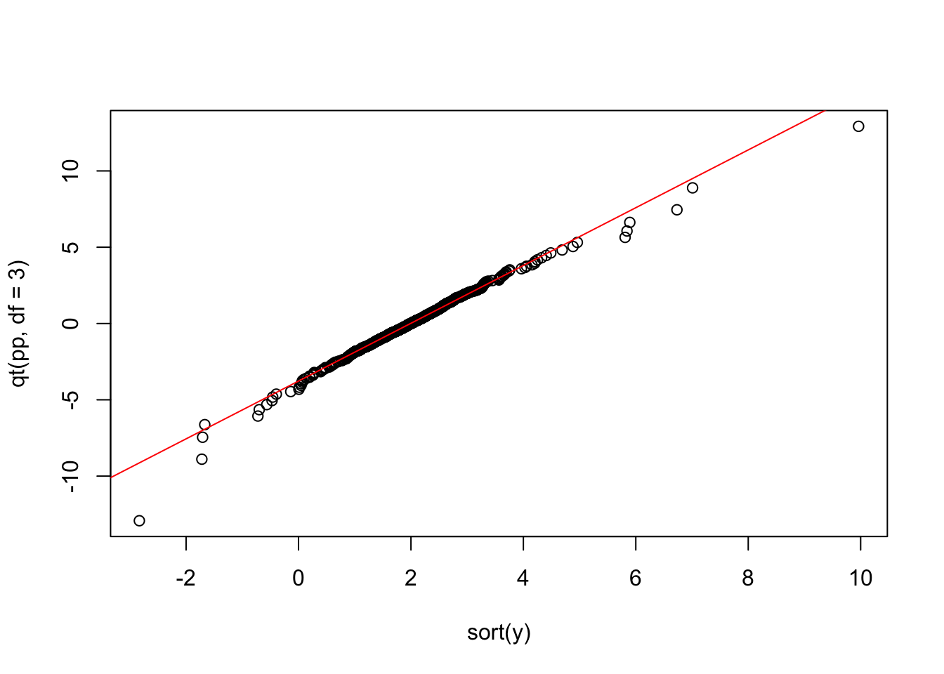
7.6 Exercises lab 5
7.6.1 Exercise 1
Import in R the data available in the GDAXI.csv file. The data refer to the DAX index which is computed considering 30 major German companies trading on the Frankfurt Stock Exchange.
Plot the time series of
Adj.Closeprices (with dates on the x-axis). Do you think the price time series is stationary in time?Compute the DAX gross returns and plot the obtained time series. Do you think the return time series is stationary in time?
Use the histogram to study the gross returns. Add to the histogram the KDE lines for three different bandwidth values (the default one, 1/10 of the default one and 10 times the default one). Comment the effect of changing the bandwidth parameter.
Plot the empirical cumulative density function (ECDF) of the gross returns distribution.
- Evaluate the ECDF for \(x=0.98\) and \(x=1.02\). What’s the meaning of the output you get? Add these values in the ECDF plot.
Study the normality of the DAX gross returns using a plot. What can you conclude? Comment the results.
Study the presence of outliers through a half-Normal plot. Which are the two most extreme values? For which days do they occur?
7.6.2 Exercise 2
Suppose that the log-returns \(X\) of a certain title are distributed as a Normal random variable with mean 0.005 and variance 0.1.
Simulate 1000 log-returns from \(X\) (use the value 789 as seed) and represent them through a boxplot. Comment the graph.
Given the vector of log-returns compute – through the proper mathematical transformation – the corresponding vector of gross-returns. Represent through a histogram + KDE the gross-returns distribution. Considering the adopted transformation and the distribution assumed for \(X\), which is the distribution that can be assumed for the gross-returns?
Evaluate the skewness for the gross-returns. What can you conclude about symmetry?
Produce the normal probabilty plot for the gross-returns sample. What can you conclude about normality?
7.6.3 Exercise 3
Simulate 1000 values from a Chi-square random variable with 5 degrees of freedom (use the value 543 as seed ) using the following code (see here for more details about this random variable):
Represent graphically the distribution of the simulated values
simdatachisqwith a histogram to which the KDE (Kernel density estimation) line is also added .Evaluate the sample estimate of the skewness index. Given the value obtained and the graph obtained in the previous point what can you conclude?
Represent the distribution of
simdatachisqvalues with a normal probability plot. What can be observed?Use the Box-Cox transformation to try to improve your data distribution.
Represent the distribution of the transformed data with a normal probability plot. What can be observed?
7.6.4 Exercise 4
Consider the following random variables:
- \(X_1\sim Normal(\mu=10, \sigma=1)\)
- \(X_2\sim Normal(\mu=10, \sigma=2)\)
- \(X_2\sim Normal(\mu=10, \sigma=0.5)\)
- Simulate 1000 values from \(X_1\) (seed=1), from \(X_2\) (seed=2) and from \(X_3\) (seed=3).
- Plot in the same chart the 3 KDEs (set
xlimandylimaccordingly). Comment the plot.
- Plot in the same chart the 3 ECDFs. Add to the plot a constant line for the theoretical median and for the probability equal to 0.5. Comment the plot.
Consider the following random variables:
- \(X_4\sim Normal(\mu=-10, \sigma=1)\)
- \(X_5\sim Normal(\mu=0, \sigma=1)\)
- \(X_6\sim Normal(\mu=10, \sigma=1)\)
- Simulate 1000 values from \(X_4\) (seed=4), from \(X_5\) (seed=5) and from \(X_6\) (seed=6).
- Plot in the same chart the 3 KDEs (set
xlimandylimaccordingly). Comment the plot.
- Plot in the same chart the 3 ECDFs. Add to the plot a constant line for the theoretical median and for the probability equal to 0.5. Comment the plot (set properly
xlim).