7 Explainable AI
As demonstrated in Session 4, ensemble models (and in many applications deep learning models as well) increase model performance drastically. A large downside, however, is the trade-off between reduced model interpretability and increased model complexity. Remember that a very nice graphical overview like a decision tree is not possible for a random forest of 1000 trees? This is a large downside to ensemble methods. Managers want to know what they are basing their decisions on. This issue is even further enlarged by recent regulations which make explainable machine learning methods mandatory by law (e.g., credit scoring and default prediction).
To overcome this black-box issue, researchers came up with a number of methods to explain how the various features influence the model. A general question is ‘Which are the most important drivers of our model?’. To answer this question, feature importances were introduced. These feature importances indicate how important each unique feature is for the model’s predictive performance. We will be using the random forest model created in Session 4 for this.
setwd("C:\\Users\\matbogae\\OneDrive - UGent\\PPA22\\PredictiveAnalytics\\Book_2022\\data codeBook_2022")

load("randomForestSession4.Rdata")
load("TrainValTest.Rdata")
load("XGBSession4.Rdata")
7.1 Feature importance
Some algorithms have specific ways of calculating these importances. For example, random forest uses the decrease in Gini as a measure of importance in our model, as after all this decrease in impurity is what we are trying to optimize. When we have hundreds of trees, each variable will be used numerous times as a splitting criterion. The average decrease caused by splits on the variable can then be used as an estimate of importance. Because this method is inherently linked to the random forest algorithm, did the authors of the randomForest package also include a function to automatically calculate these importances.
if (!require("pacman")) install.packages("pacman")
require("pacman", character.only = TRUE, quietly = TRUE)

p_load(randomForest)

randomForest::importance(rFmodel, type = 2)
## MeanDecreaseGini
## TotalDiscount 23.43498369
## TotalPrice 25.64158626
## TotalCredit 12.87933281
## PaymentType_DD 0.02843186
## PaymentStatus_Not.Paid 0.50086927
## Frequency 15.11395560
## Recency 24.28758256varImpPlot(rFmodel, type = 2)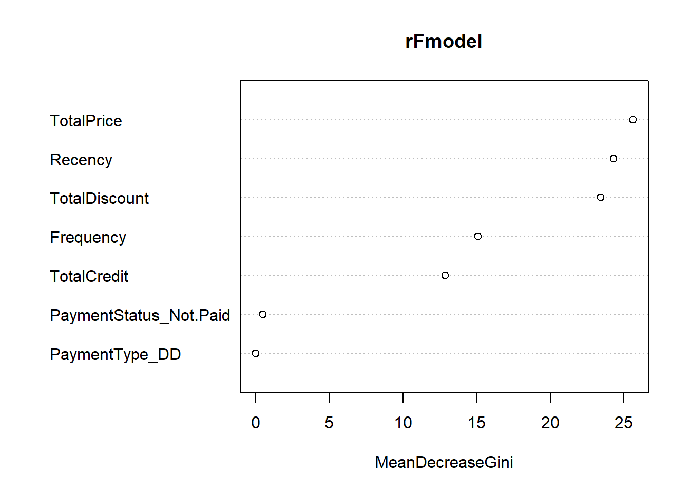
We clearly observe the importance of the traditional RFM variables. The total amount of discount received is however the single most important variable.
Remember that during the estimation of a random forest, there is always a part of the data used as validation for tree construction, as the bootstrap sample is very unlikely to include all unique observations. These out-of-bag (OOB) instances can be used to estimate the accuracy of the model. By permuting each predictor variable, one can see how this affects (decreases) the accuracy on the OOB data.
randomForest::importance(rFmodel, type = 1) #change to type = 1## MeanDecreaseAccuracy
## TotalDiscount 2.497947
## TotalPrice 2.139902
## TotalCredit 3.084465
## PaymentType_DD 0.000000
## PaymentStatus_Not.Paid 0.000000
## Frequency 2.138397
## Recency 3.174698varImpPlot(rFmodel, type = 1)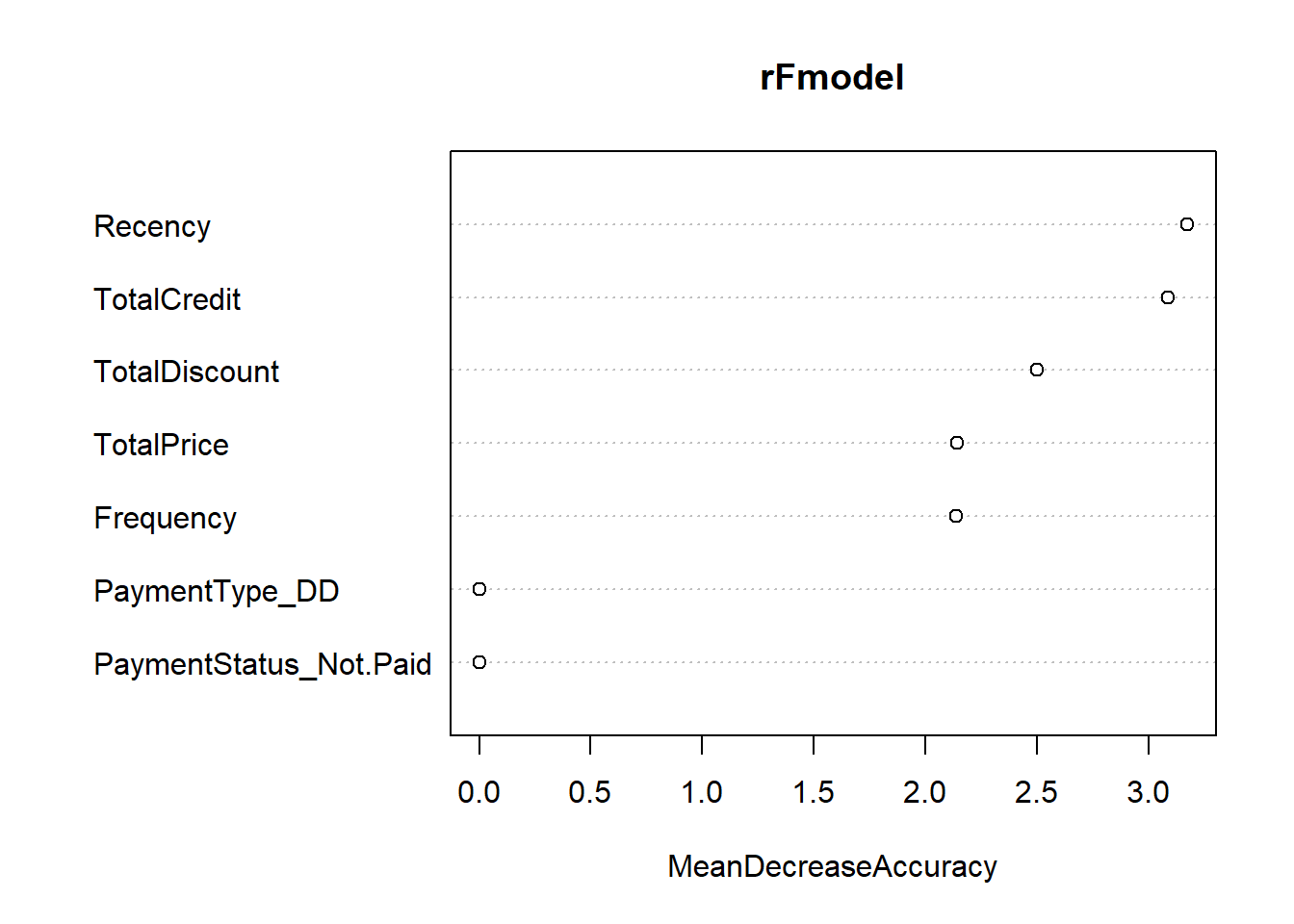
We observe how the recency variable has now gained the first ranking in terms of variable importance. This is actually also more in line with what we would expect. The over-estimation of TotalDiscount’s importance based on the Gini decrease outlines a typical problem with this method, using pure permutation-based feature importances (i.e., the ones that use a traditional performance measure) tend to give more reliable estimates. Of course, not all methods involve OOB samples. You can ,however, do the same when using the training or test set.
The iml (interpretable machine learning) package provides such a built-in function which calculates the feature importance (with 90% confidence bands) based on a number of possible performance measures. It is both possible to use a pre-defined metric with a character input ('ce','f1','logLoss','mae','mse','rmse','mape','mdae','msle','percent_bias','rae','rmsle','rse','rrse','smape') as well providing a self-defined metric which takes the functional form function(actual,predicted). If you use this predefined function, you can also use the Metrics package to add you own function. We also use the revalue function from plyr as the iml package has difficulties with factor levels called ‘0’ and ‘1’. Since the output of a permutation-based feature importance score is stochastic, make sure to put the number of permutations (n.repetitions) sufficiently large to have stable and reliable estimates.
p_load(iml, partykit, plyr, tidyverse)

# Join into one table
iml_df <- BasetableTRAINbig

# change the churn levels
iml_df <- iml_df %>%
    mutate(churn = revalue(yTRAINbig, c(`0` = "nonchurn", `1` = "churn")))

rf_iml <- randomForest(churn ~ ., data = iml_df, ntree = 500)

# Make new predictor class
x_pred <- Predictor$new(model = rf_iml, data = iml_df[, 1:7],
    y = iml_df$churn, type = "prob")
# Perform feature importance
x_imp <- FeatureImp$new(x_pred, loss = "ce", n.repetitions = 10)
plot(x_imp)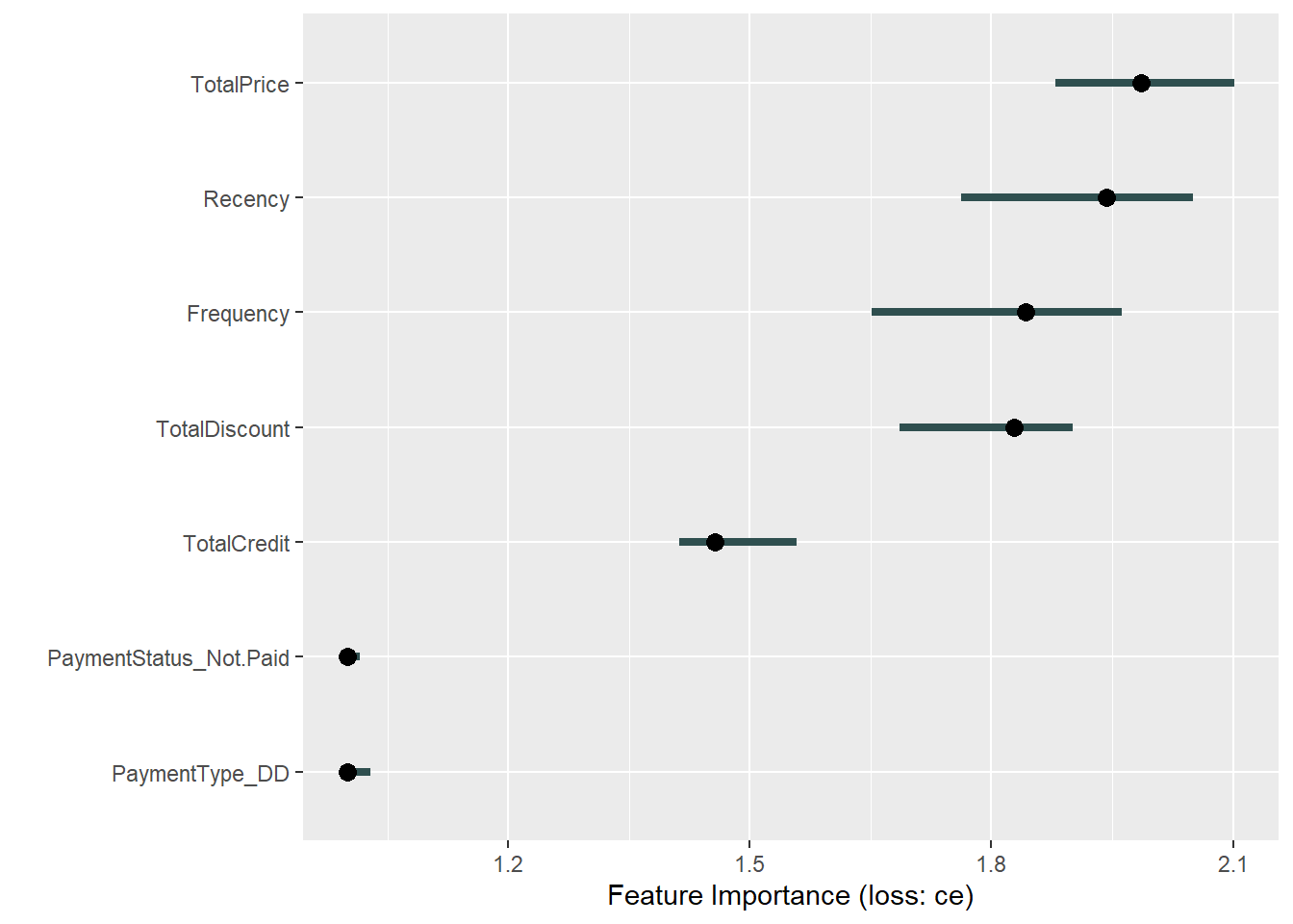
We observe the TotalPrice variable to be the most important variable. However, the wide confidence bands tell us that we should give special attention to the other four/five top variables. The payment variables are clearly of lesser influence.
The big advantage of this method, is the fact that it can be applied to virtually any classifier which uses the standard data.frame input. Be careful, however, as the different packages all have different input requirements. Sometimes you may not have to refactor, while other times you will have to make new unseen changes. This trial-and-error work is typical for a data scientist and quite similar to what you will have already experienced during the preprocessing phase.
One special case we will be discussing is XGBoost. As the package requires it’s own unique data input, it is incompatible with the iml package. Luckily, the xgboost package already has many interpretation functionalities implemented. Always have a good look at the help function to see what these functions are doing!
p_load(xgboost)
importance_matrix <- xgb.importance(colnames(BasetableTRAINbig),
    model = xgb)
xgb.plot.importance(importance_matrix, rel_to_first = TRUE, xlab = "Relative importance")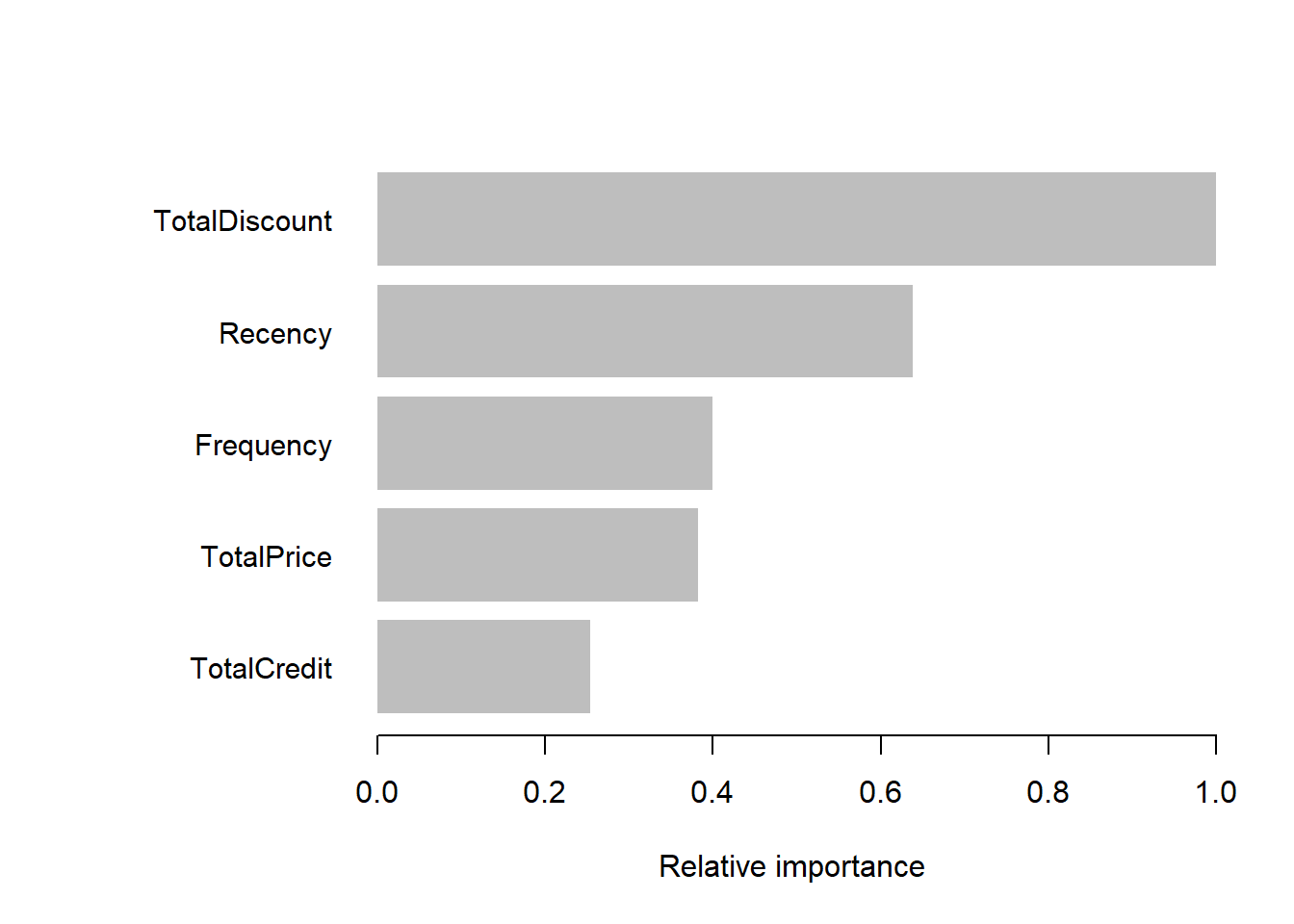
p_load(Ckmeans.1d.dp)
xgb.ggplot.importance(importance_matrix, rel_to_first = TRUE,
    xlab = "Relative importance")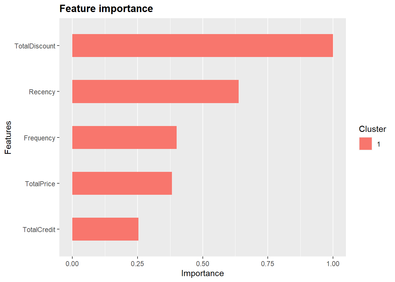
TotalDiscount is ranked on top. While the other four variables (notice how the payment variables receive zero importance in the xgboost model) are also of great importance.
While knowing which variables are the most important, it is also useful to know how these variables influence the dependent variable. We know that discounts influence churn behaviour, but do they influence it negatively, as we expected and, if so, does the relationship keep on decreasing?
7.2 PDP and ICE
To know this, we want to have insights into the nature of the relationship as fitted by the model. A plot is a useful tool of visualizing such relationships. The iml package provides two useful functionalities to do so: the partial dependence plots (PDP) and individual conditional expectation (ICE) curves. The FeatureEffect class in the package enables us to plot them both.
# Use x_pred object from above for partial dependence plot
# and ice curves
eff <- FeatureEffect$new(x_pred, feature = "Recency", method = "pdp")
plot(eff)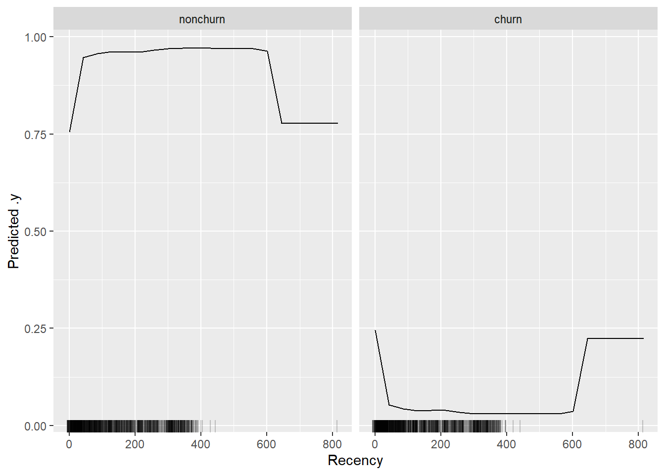
eff <- FeatureEffect$new(x_pred, feature = "TotalDiscount", method = "pdp")
plot(eff)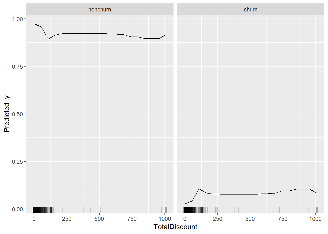
We observe a clear monotonic increase in the first part of the TotalDiscount curve (until approx TotalDiscount = 120). This means that more discounts translate to more likely churn behaviour! The total amount of discount may be indicative of compensations made by the firm towards their customers. These compensations could be not sufficient to overcome unpleasant customer experiences. Afterwards, the curve heavily flattens out, but this can also be contributed to the less observations in that range (as measured by the ticks at the bottom of the curve). This plot made us not only realize how we can identify potential churners, but also gave business insights into what might be going wrong: did we compensate dissatisfied customers?, Do we need to try other compensations besides financial since they do not really work? Can other methods be more effective and less costly?
The PDP shows the average effect of the variable. How you generally see the predictions to change according to the model. This is of course not always the case, due to interactions with other features. To visualize this more clearly, you can also add ICE curves, which show the curves for individual observations. The PDP is still displayed as the thick yellow line. As you can see for a several customer we notice first a downward trend followed by a stagnation, howevcer for most customers see the effect an increase follwed by a stagnation, which explains why the average curves favors this relationship.
eff <- FeatureEffect$new(x_pred, feature = "TotalDiscount", method = "pdp+ice")
plot(eff)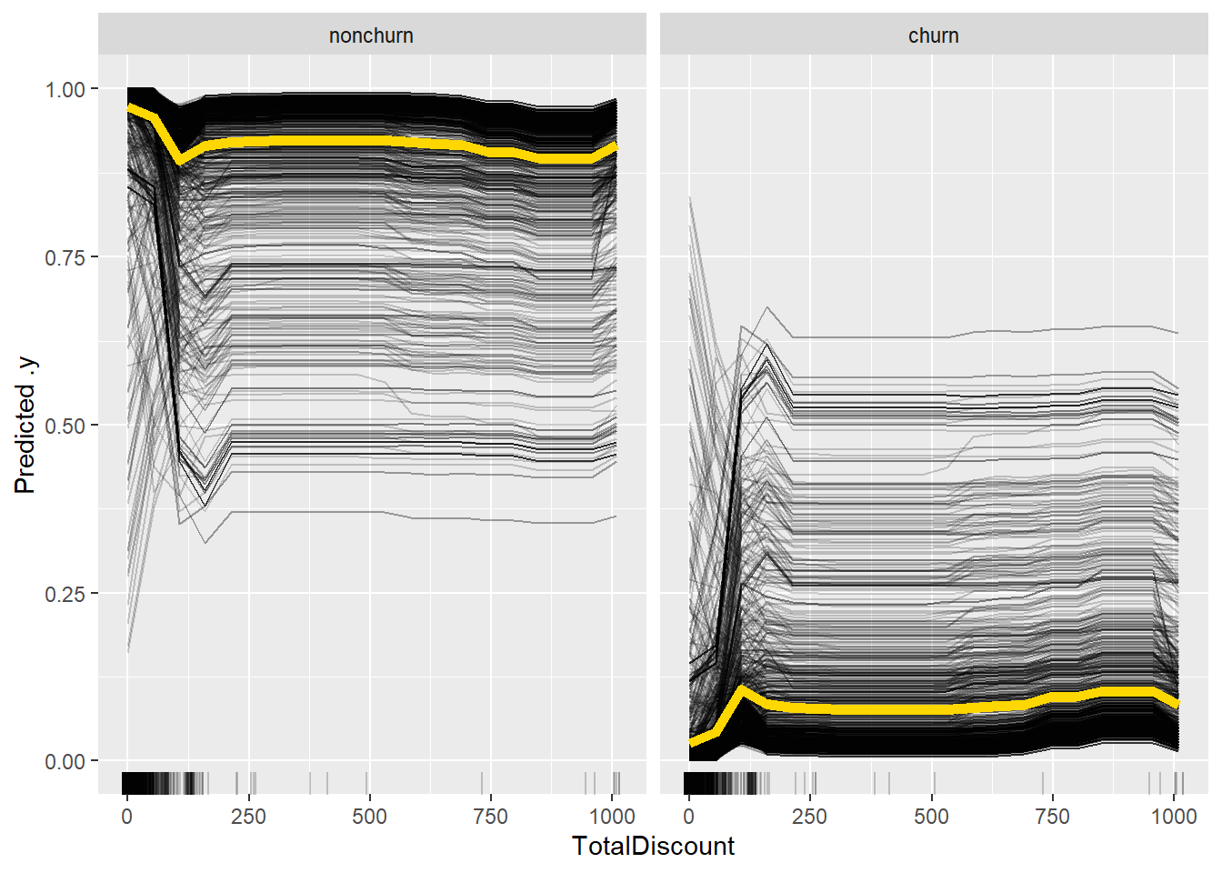
7.3 LIME
While the above methods already give a good idea about which variables affect our model and how, they are still not 100% fit for explaining individual predictions. The LIME framework tries to overcome this. The framework builds a white-box model based on the predictions of the black-box model. This white-box model can then explain the predictions. Typical examples are logistic regression and decision trees. Our beloved iml package once again implements both for us: TreeSurrogate creates a local surrogate decision tree, while LocalModel fits a logistic regression on the predictions.
tree_sur <- TreeSurrogate$new(x_pred)

# Plot the resulting leaf nodes
plot(tree_sur)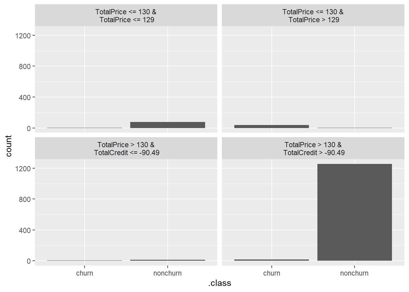
The fitted decision tree splits the data into four large end nodes. However, the only pane that makes sense is the bottom right pane. When customer have paid a high price and they have a small credit line, they are likely to stay at your company. All other panes are not that clearcut and this actually tempers the validity of our surrogate model. This is also a good example of how expert knowledge (in this case you don’t have to be an extreme expert) can aid in identifying issues with models when XAI tools are being applied.
# Extract the results
dat <- tree_sur$results
head(dat)
## TotalDiscount TotalPrice TotalCredit
## 1 22.79579 114.40 0.00
## 2 0.00000 972.00 0.00
## 3 0.00000 951.00 0.00
## 4 0.00000 957.69 -14.31
## 5 72.00000 144.00 0.00
## 6 0.00000 861.22 -17.78
## PaymentType_DD PaymentStatus_Not.Paid Frequency
## 1 0 0 4
## 2 0 0 4
## 3 0 0 5
## 4 0 0 4
## 5 0 0 1
## 6 0 0 5
## Recency .node
## 1 295 3
## 2 64 7
## 3 341 7
## 4 39 7
## 5 39 7
## 6 94 7
## .path
## 1 TotalPrice <= 130 &\n TotalPrice <= 129
## 2 TotalPrice > 130 &\n TotalCredit > -90.49
## 3 TotalPrice > 130 &\n TotalCredit > -90.49
## 4 TotalPrice > 130 &\n TotalCredit > -90.49
## 5 TotalPrice > 130 &\n TotalCredit > -90.49
## 6 TotalPrice > 130 &\n TotalCredit > -90.49
## .y.hat.nonchurn .y.hat.churn
## 1 1.000 0.000
## 2 1.000 0.000
## 3 1.000 0.000
## 4 0.862 0.138
## 5 0.530 0.470
## 6 0.504 0.496
## .y.hat.tree.nonchurn .y.hat.tree.churn
## 1 0.914321 0.08567901
## 2 0.975840 0.02416000
## 3 0.975840 0.02416000
## 4 0.975840 0.02416000
## 5 0.975840 0.02416000
## 6 0.975840 0.02416000We notice a discrepancy between between true value and prediction of our tree, which further highlights the issues with our surrogate model. Let us try increasing the complexity of our local surrogate model by allowing to create deeper trees (default maxdepth = 2).
tree_sur <- TreeSurrogate$new(x_pred, maxdepth = 4)

# Plot the resulting leaf nodes
plot(tree_sur)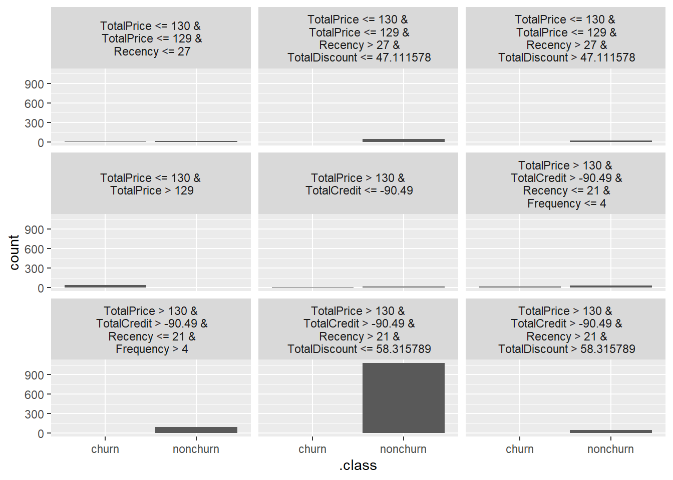
This gives some more insights, however mainly for nonchurners, for churners the insights are rather limited. This shows a huge downside of LIME, namely their sensitivity to the accuracy of the surrogate model. The decision tree has the advantage of modeling nonmonotonic relationships, but the various can groups can become hard to track when maxdepth is becoming too high. Luckily for us, LIME also allows you to model a linear/logistic regression model which can be better in this situation.
By using LR the relationship can explained by coefficients. Let’s check out how this works exactly and how it can be used for individual explanations. As we saw that five features were highly influenceable, we set the number of used features (k) equal to 5. The LocalModel can take just one instance at a time as input to explain. We will use the first observation in the test set.
lime <- LocalModel$new(x_pred, x.interest = BasetableTEST[1,
    ], k = 5)
## Warning: from glmnet Fortran code (error code
## -68); Convergence for 68th lambda value not
## reached after maxit=100000 iterations; solutions
## for larger lambdas returnedlime## Interpretation method: LocalModel
##
##
## Analysed predictor:
## Prediction task: unknown
##
##
## Analysed data:
## Sampling from data.frame with 1415 rows and 7 columns.
##
## Head of results:
## beta x.recoded effect x.original
## 1 -0.001567426 0.00 0.0000000 0
## 2 0.007885419 -12.95 -0.1021162 -12.95
## 3 0.606118346 0.00 0.0000000 0
## 4 0.483342888 4.00 1.9333716 4
## 5 0.002716930 145.00 0.3939549 145
## 6 0.001567426 0.00 0.0000000 0
## feature feature.value
## 1 TotalDiscount TotalDiscount=0
## 2 TotalCredit TotalCredit=-12.95
## 3 PaymentStatus_Not.Paid PaymentStatus_Not.Paid=0
## 4 Frequency Frequency=4
## 5 Recency Recency=145
## 6 TotalDiscount TotalDiscount=0
## .class
## 1 nonchurn
## 2 nonchurn
## 3 nonchurn
## 4 nonchurn
## 5 nonchurn
## 6 churnFrequency and Recency (which rather surprisingly was picked up by the model) have a positive effect on churn probability, while TotalCredit has a negative effect and the Payementstatus and TotalDiscount have almost no effect.
plot(lime)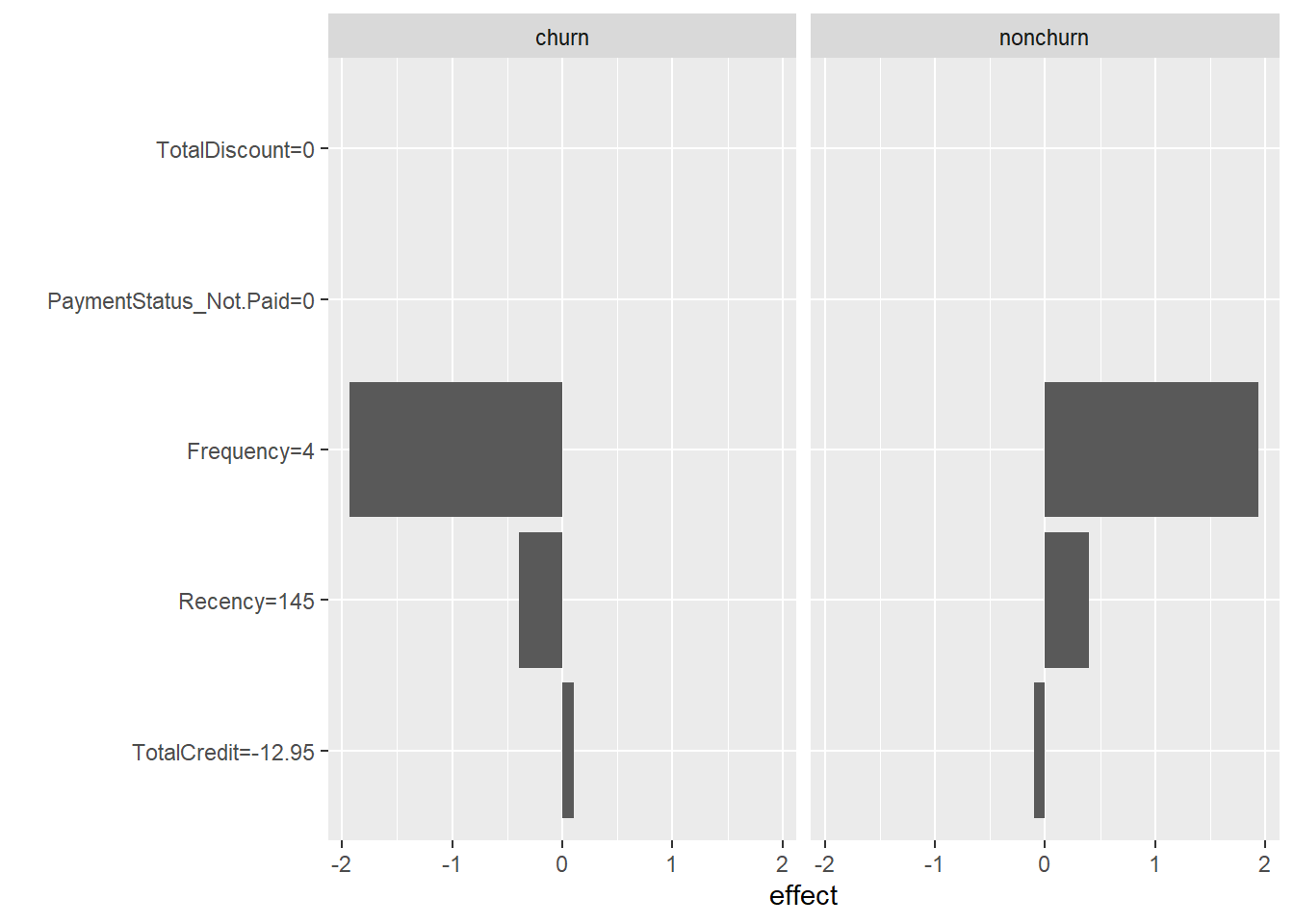
7.4 Shapley values
Another framework which can be used for individual prediction explanations are Shapley values. The framework resulting in those Shapley values thinks of features as players in a cooperative game. The value of a feature is then equal to its (average) contribution across all coalitions (unique data points). Simply said: it is the ‘general deviation’ from what you would expect from an average observation.
The iml package also provides a class for this framework: Shapley. The individual Shapley value of a predicted observation is how much this feature contributes to the deviation from the average prediction across the various features. Its syntax shows great similarity to LocalModel. The main difference is that we don’t have to set the number of features, as Shapley values are distributed across all features. This has the advantage that you can’t make incorrect assumptions about k, while Shapley values is also the only framework which has a sound theoretical backening.
shapley <- Shapley$new(x_pred, x.interest = BasetableTEST[1,
    ])
shapley
## Interpretation method: Shapley
## Predicted value: 1.000000, Average prediction: 0.948749 (diff = 0.051251) Predicted value: 0.000000, Average prediction: 0.051251 (diff = -0.051251)
##
## Analysed predictor:
## Prediction task: unknown
##
##
## Analysed data:
## Sampling from data.frame with 1415 rows and 7 columns.
##
## Head of results:
## feature class phi
## 1 TotalDiscount nonchurn 0.00470
## 2 TotalPrice nonchurn 0.01316
## 3 TotalCredit nonchurn 0.00848
## 4 PaymentType_DD nonchurn 0.00000
## 5 PaymentStatus_Not.Paid nonchurn 0.00000
## 6 Frequency nonchurn 0.00592
## phi.var feature.value
## 1 0.0004990202 TotalDiscount=0
## 2 0.0031000549 TotalPrice=959.05
## 3 0.0064946360 TotalCredit=-12.95
## 4 0.0000000000 PaymentType_DD=0
## 5 0.0000000000 PaymentStatus_Not.Paid=0
## 6 0.0019281552 Frequency=4plot(shapley)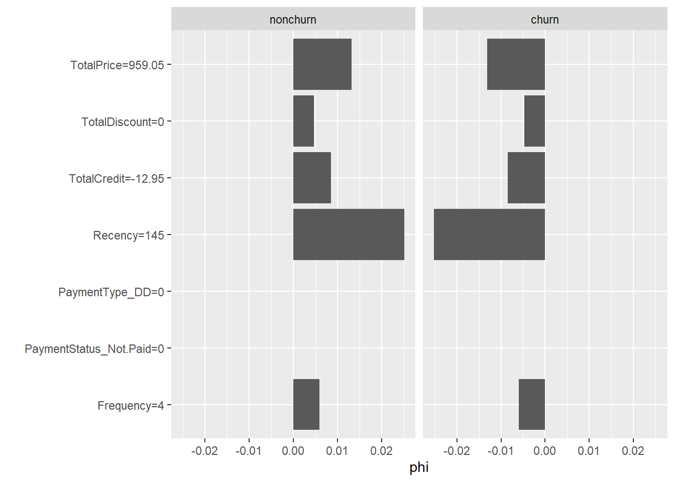
7.5 SHAP
You can clearly observe how both LIME and Shapley values can be very useful in explaining a model’s single predictions. This led to the creation of SHAP, which combines the strengths of both. SHAP basically builds a local surrogate model based on the Shapley values. This leads to a flexible fitting, which allowed for the creation of several diagnostic tools, all built around the same principle (note how we have been picking parts from different methodologies up until now).
Unfortunately, most SHAP implementations are not yet nicely developed in R. While Python has the nice shap library, which allows for the use of SHAP with a high level of abstraction, we do not observe something similar in R. A first useful attempt is the shapper package. It is actually a wrapper around the shap library in Python. To make this work, you however need to work with virtual environments, in order to make R know where to look for the corresponding Python code. This task is rather difficult and generally leads to issues with package dependencies.
To avoid these issues, we regard the shapper package as out of scope of this course. Another good package -and more native to R- is the fastshap packages, however it is still under active development. This makes the package prone to errors, which is why we also do not show you this package.
To let you have an understanding of the SHAP methodology nonetheless, we will be discussing the SHAPforxgboost package. The creators of the xgboost algorithm (and package) automatically built in SHAP values. This allows for the easy usage of the methodology of SHAP when the xgboost algorithm is used. This proves rather useful as the xgboost algorithm is likely to be the (or close to the) top performer.
p_load(SHAPforxgboost)
shap_values <- shap.values(xgb_model = xgb, X_train = as.matrix(BasetableTRAIN))
shap_values$mean_shap_score
## Recency TotalDiscount
## 0.6706929 0.6330155
## Frequency TotalPrice
## 0.3053244 0.2965370
## TotalCredit PaymentType_DD
## 0.2059751 0.0000000
## PaymentStatus_Not.Paid
## 0.0000000The mean SHAP score can be used as a means of variable importances. We get Recency and TotalDiscount at the top, followed by Frequency and TotalPrice. If we compare this with previous methods, this is a general trend. It is exactly this kind of behavior that we want, with outcomes being independent of the used method!
The SHAPforxgboost package is not only very easy to use, it is actually also much faster than many other solutions involving SHAP.
Visualizations are also relatively quick. In a summary plot, we can easily observe how features influence the predictions. The largest impacts are clearly made by the Recency and TotalDiscount variables. With the TotalDiscount variable having a positive relationship to churn (low variable values (yellow) leading to reduced predictions) while Recency has a negative relationship (high variable values (blue/purple) leading to reduced predictions). Note that this relationship of Recency might seem counterintuitive, however this has to do with the nature of the problem. A newspaper works with a yearly subscription, hence moderate to high values of Recency could be 1 year and after 1 year people renew their subscription. People who end their subscription will maybe open one a few month ago, but not renew in the next period. Again, it can be useful to use some expert knowledge here to get more insights.
When looking at the Frequency variable, the interpretation makes more sense. High values of frequency have a negative impact on the predicted churn probability, whereas a low frequency leads to higher churn chances. Note that for TotalCredit the interpretation is more tricky, since a negative value means that you have a higher credit line.
shap_prepare <- shap.prep(xgb_model = xgb, X_train = as.matrix(BasetableTRAIN))
shap.plot.summary(shap_prepare)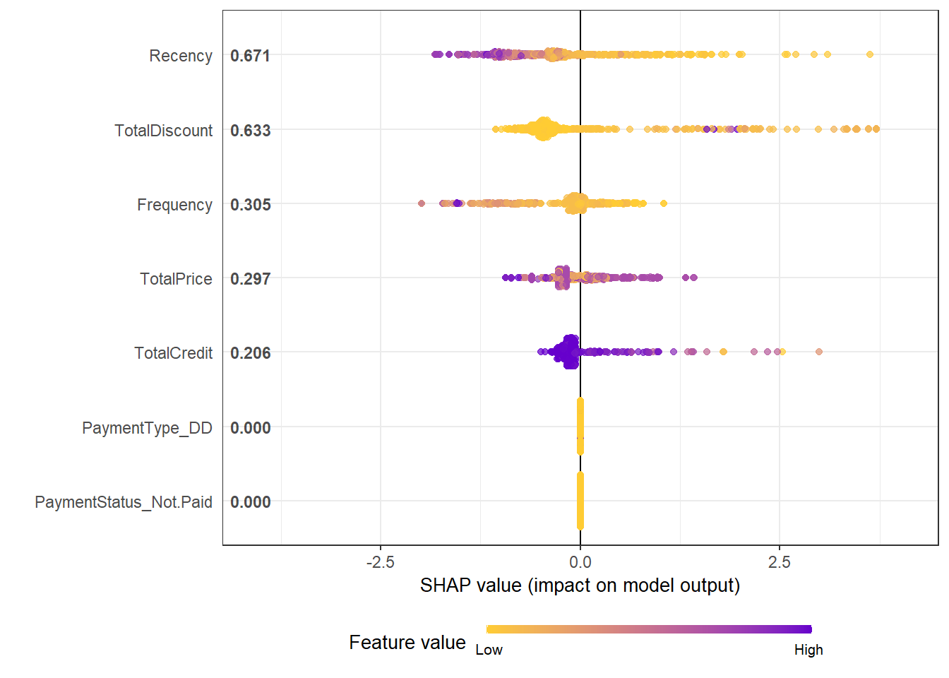
A similar remark can be made about the dependence plots.
plot(shap.plot.dependence(data_long = shap_prepare, x = "Recency"))## `geom_smooth()` using formula 'y ~ x'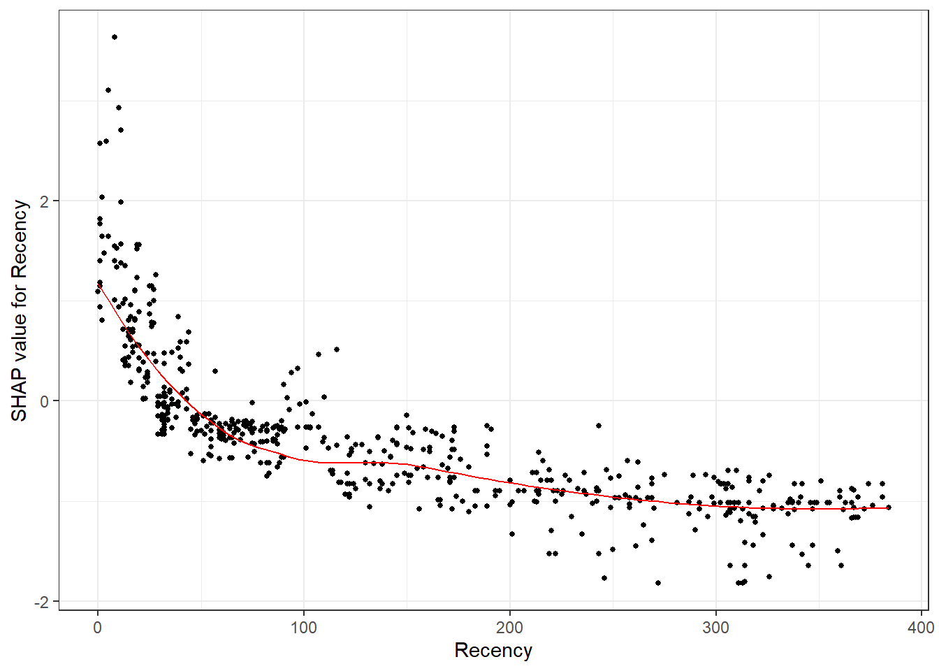
plot(shap.plot.dependence(data_long = shap_prepare, x = "TotalDiscount"))## `geom_smooth()` using formula 'y ~ x'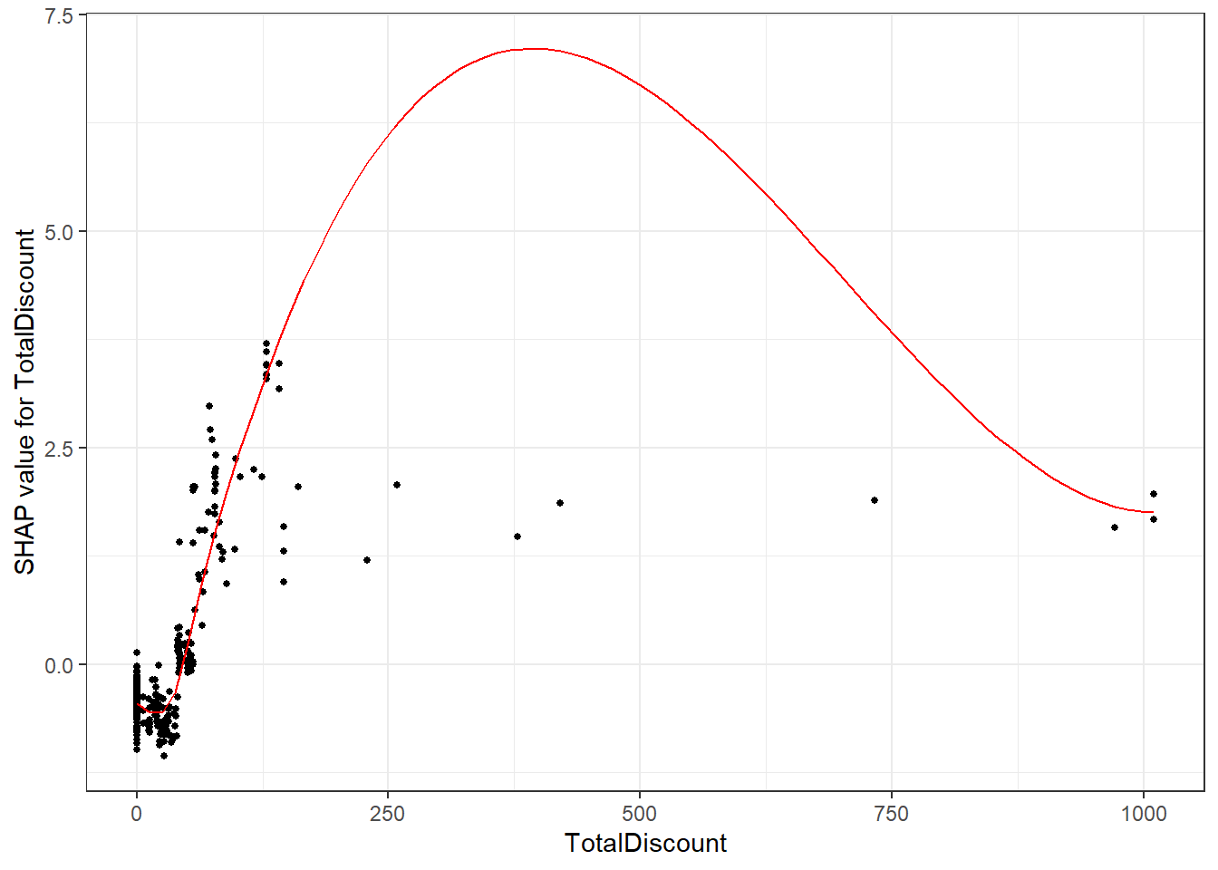
We observe a similar pattern as the ones observed in the PDPs and ICE curves (the downwards slope of high TotalDiscount values is a clear case of overfitting to those data points).
The added advantage is the possibility to visualize interactions:
plot(shap.plot.dependence(data_long = shap_prepare, x = "TotalDiscount",
    y = "Recency", color_feature = "Recency"))
## `geom_smooth()` using formula 'y ~ x'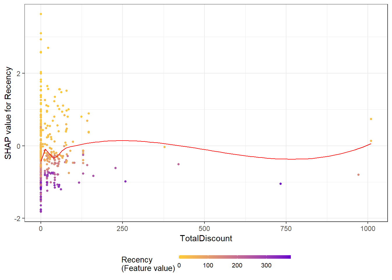
This plot would argue the effect of Recency as being larger than the one of total discount when not considering the outliers. For Recency, you can clearly see here that around the 300 days the influence on churn is negative, this can be seen as a confirmation of our theory above.
SHAP also allows for understandable explanations per observation. The force plot is perhaps the most known concept, where you explain the individual prediction with the predictor values acting as forces on the probability (pushing up or down).
# Prepare data into correct format
plot_data <- shap.prep.stack.data(shap_contrib = shap_values$shap_score)
## All the features will be used.shap.plot.force_plot(plot_data)## Data has N = 707 | zoom in length is 70 at location 424.2.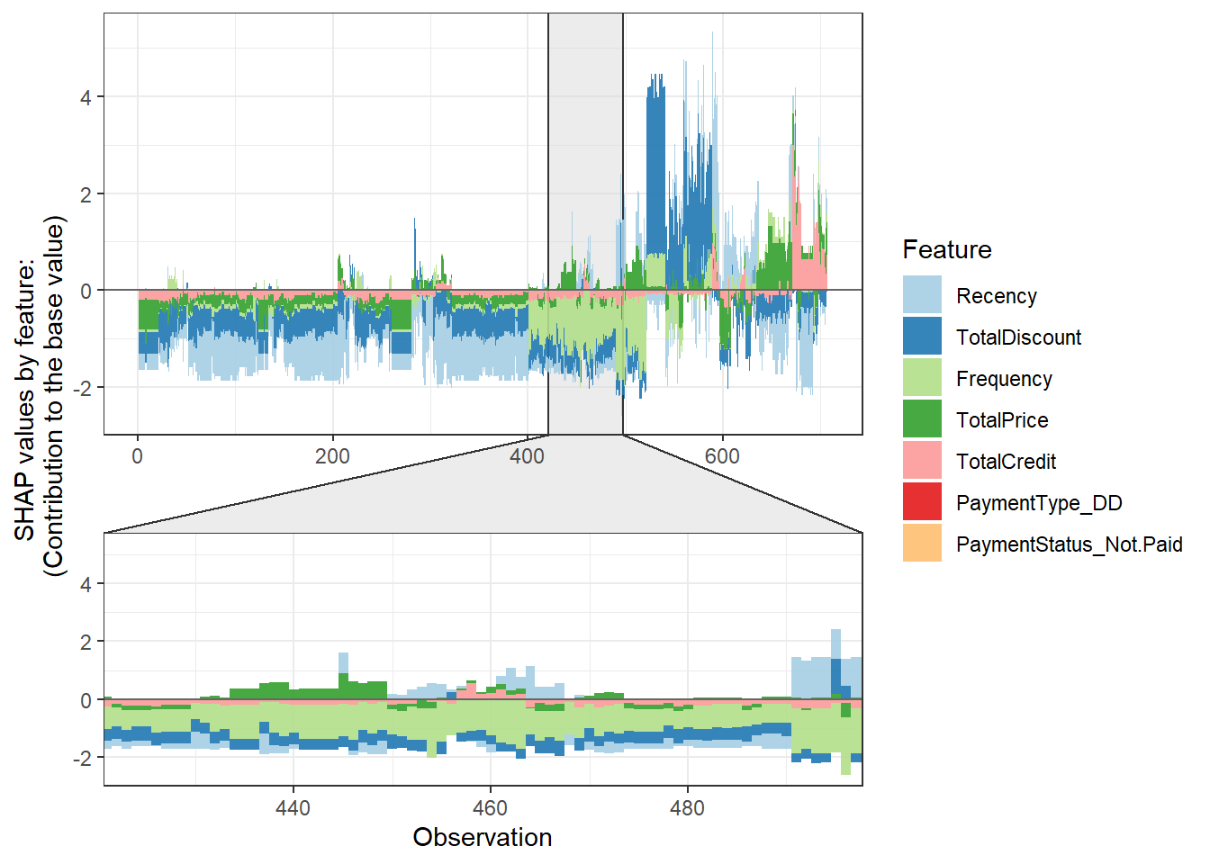
The observed plotting style is clearly a bit different, but we still observe how the various individual features contribute to the predicted probabilities. However, all the analyses pointed to the payment variables having little to no impact. How do we adapt this in our code? By the top_n argument. This sets how many variables to visualize in the plot, in our case this is 5 (7-2).
plot_data <- shap.prep.stack.data(shap_contrib = shap_values$shap_score,
    top_n = 5)
## The SHAP values of the Rest 2 features were summed into variable 'rest_variables'.shap.plot.force_plot(plot_data)## Data has N = 707 | zoom in length is 70 at location 424.2.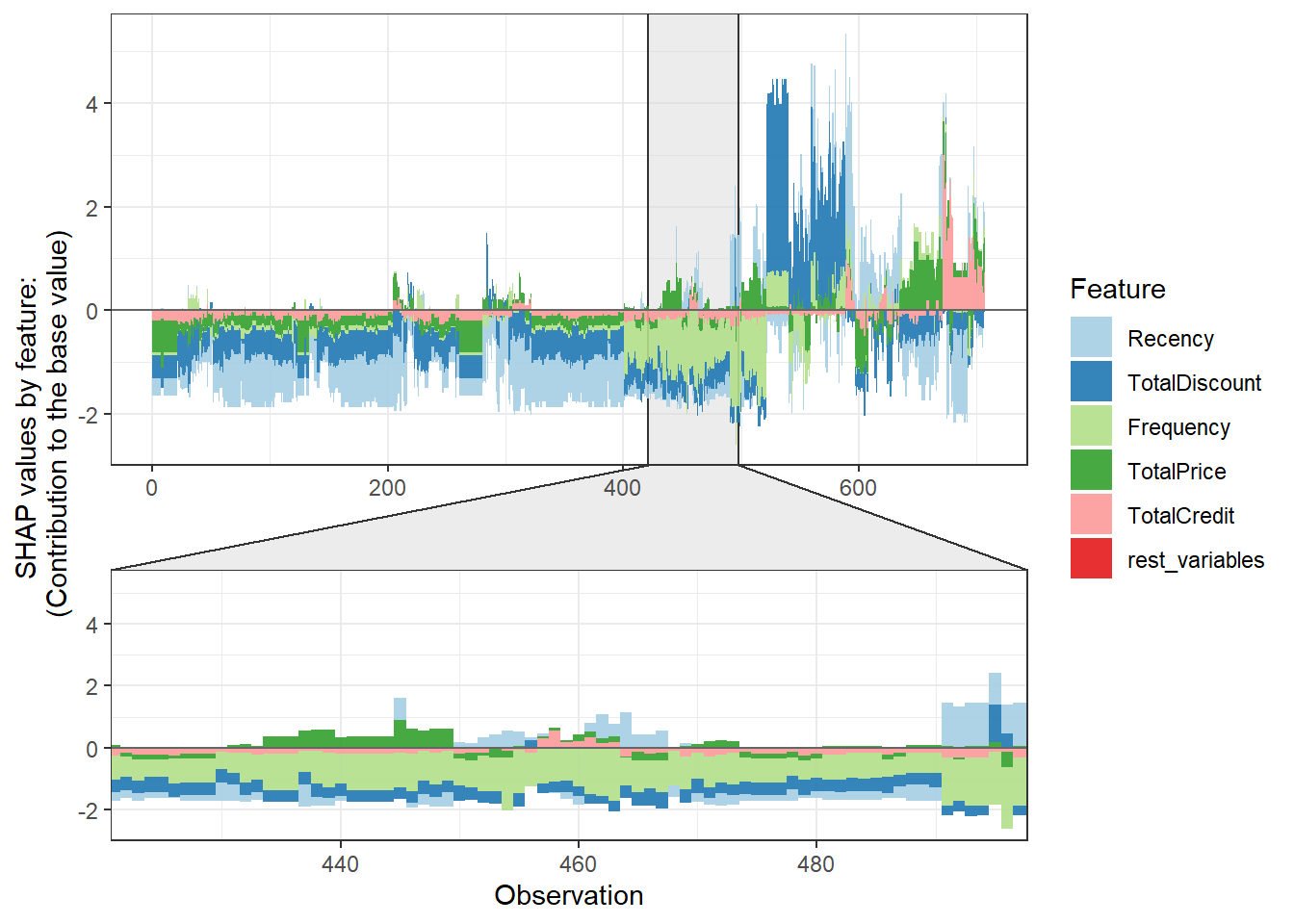
How do we get individual explanations then? By subsetting! We can clearly observe how Recency and TotalDiscount had a positive effect on the probability of churn, while the other variables had a negative effect. Observation 513 scores low on both Recency and TotalDiscount, which is in line with the observed positive relationships above.
plot_data[513, ]## ID Recency TotalDiscount Frequency
## 1: 541 1.147243 -0.2721461 -1.071955
## TotalPrice TotalCredit rest_variables group
## 1: 0.9093845 -0.1211484 0 4
## sorted_id
## 1: 513shap.plot.force_plot(plot_data[513, ])## Data has N = 1 | zoom in length is 50 at location 0.6.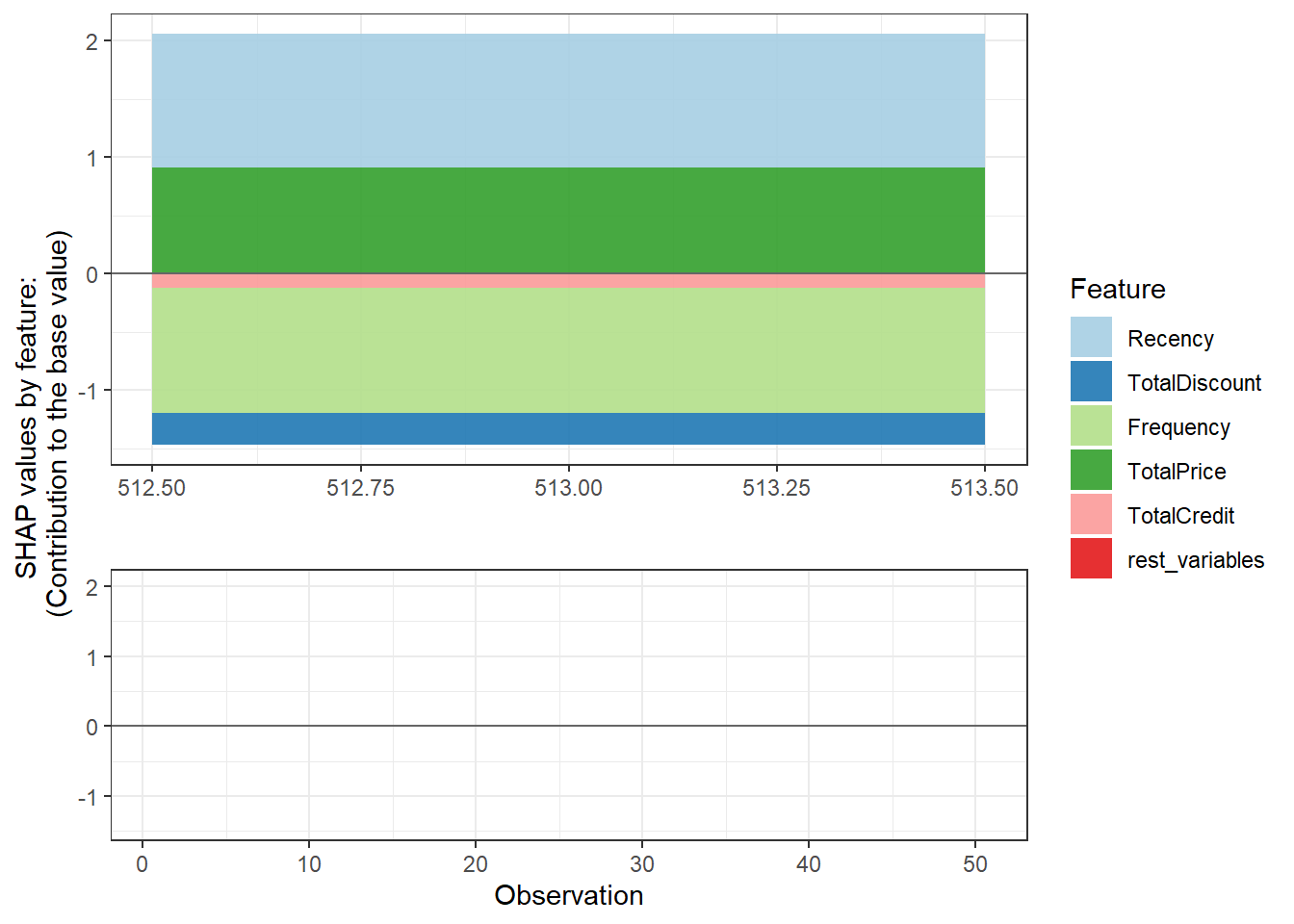
Another interesting feature of the package is the n_groups argument, this automatically clusters predictions based on the SHAP explanations. This allows you to easily interpret your predictions per group. When looking at the overall force plot, I would say there are 5 types of predictions (just look at the switches in pattern), so let us try this out.
plot_data <- shap.prep.stack.data(shap_contrib = shap_values$shap_score,
    top_n = 5, n_groups = 5)
## The SHAP values of the Rest 2 features were summed into variable 'rest_variables'.shap.plot.force_plot_bygroup(plot_data)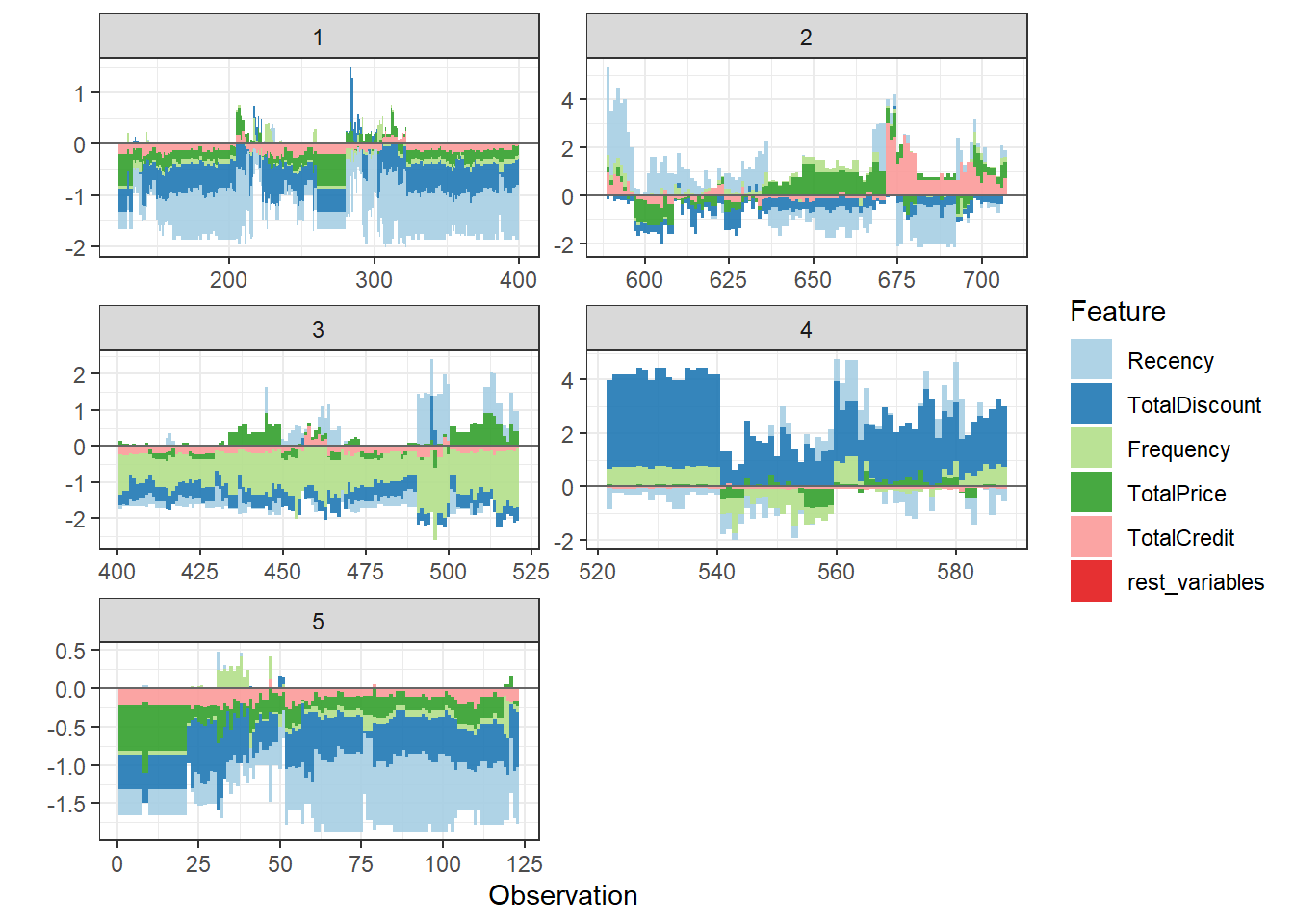
We have 5 clusters. Cluster 1 are customers we expect to stay due to good ‘signs’ on all indicators. Cluster 2 are the customer we are uncertain off, while customers cluster 3 is also expected to remain royal, but mainly due to their score on frequency. Cluster 4 is the ‘problematic’ cluster with probably churners, this due to their TotalDiscount and Frequency values. Cluster 5 is quite similar to cluster 1, but we are less certain of their loyalty (look at y-axis).