6 Two Factor Classification with a Single Continuous Feature
In this Chapter we will go through some fundamentals of Exploratory Data Analysis (EDA) process of with two single continuous example features: Age and rand_Age. In Section 6.0.1 we define a new feature rand_Age as by randomly sampling from the Age distribution.
We will review the main assumptions of:
And discuss how these statistical analyses can be used to detect statistically significant differences between groups and the role they play in Two Factor Classification between our two primary groups: patient’s with and without diabetes. We will also showcase some supportive graphics to accompany each of these statistical analysis.
Our EDA will show that while rand_Age and Age originate from the same distribution, that distribution is not the same across members with diabetes.
In section Section 6.7 We will review the Logistic Regression classification model. Along with associated correspondence between coefficients of the logistic regression and the the so called Odds Ratio. We will also review the Wald test in Section 6.7.2.
In Section 6.8 we will use R to train a logistic regression to predicting Diabetes one with feature Age. We will perform an in-depth review of the glm logistic regression model outputs in Section 6.8.1 and showcase how to utilize a model object to predict on unseen data in Section (probability-scoring-test-data-with-logit-age-model).
As a first example of a Model Evaluation Metric the Receiver Operating Characteristic (ROC) Curve in Section 6.10 is created by plotting the true positive rate (TPR) against the false positive rate (FPR) at various threshold settings.
In Section 6.11 we use the model object and the training data to obtain a threshold estimate and define predicted classes. This will lead us to review the Confusion Matrix in Section 6.12 and a variety of Model Evaluation Metrics including: Accuracy, Precision, Recall, Sensitivity, Specificity, Positive Predictive Value (PPV), Negative Predicted Value (NPV), f1-statistic, and others we will showcase in Section 6.13.
We will demonstrate that the difference between features distributions is what enables predictive models like logistic regression to effectively perform in two factor classification prediction tasks. While the p-value from the Wald statistic, is often used as an indication of feature importance within a logistic regression setting; the principals we will discuss over these next few Chapters of the EDA process will often be highly effective in determining feature selection for use in a variety of more sophisticated predictive modeling tasks going forward.
We will train a second logistic regression model with the rand_Age feature in Section 6.14.
Lastly, will again utilize the Confusion Matrix and a variety of Model Evaluation Metrics to measure model performance and develop an intuition by comparing and contrasting:
- ROC Curves - Section 6.16
- Precision-Recall Curves - Section 6.17
- Gain Curves - Section 6.18
- Lift Curves - Section 6.19
- Model Evaluation Metrics Graphs - Section 6.20
between our two logistic regression model examples.
Our goal primary goal with this chapter will be to compare and contrast these the logistic regression models and connect them back to our EDA analysis of the features to develop a functional working framework of the process that spans EDA and has impact on feature creation and selection selection, following this all the way down the line to feature impact (or lack thereof) on model performance.
\(~\)
\(~\)
First, we will load our dataset from section 3.15:
A_DATA <- readRDS('C:/Users/jkyle/Documents/GitHub/Jeff_Data_Wrangling/Week_2/DATA/A_DATA.RDS')

library('tidyverse')
#> -- Attaching packages --------------------------------------- tidyverse 1.3.1 --
#> v ggplot2 3.3.3     v purrr   0.3.4
#> v tibble  3.1.2     v dplyr   1.0.6
#> v tidyr   1.1.3     v stringr 1.4.0
#> v readr   1.4.0     v forcats 0.5.1
#> -- Conflicts ------------------------------------------ tidyverse_conflicts() --
#> x dplyr::filter() masks stats::filter()
#> x dplyr::lag()    masks stats::lag()

A_DATA %>%
  glimpse()
#> Rows: 101,316
#> Columns: 6
#> $ SEQN            <dbl> 1, 2, 3, 4, 5, 6, 7, 8, 9, 10, 11, 12, 13, 14, 15, 16,~
#> $ yr_range        <chr> "1999-2000", "1999-2000", "1999-2000", "1999-2000", "1~
#> $ Age             <dbl> 2, 77, 10, 1, 49, 19, 59, 13, 11, 43, 15, 37, 70, 81, ~
#> $ Gender          <chr> "Female", "Male", "Female", "Male", "Male", "Female", ~
#> $ DIABETES        <dbl> 0, 0, 0, 0, 0, 0, 0, 0, 0, 0, 0, 0, 1, 0, 0, 0, 0, 0, ~
#> $ AGE_AT_DIAG_DM2 <dbl> NA, NA, NA, NA, NA, NA, NA, NA, NA, NA, NA, NA, 67, NA~
6.0.1 Add noise
As a comparison, we are going to add a feature rand_Age to the data-set. rand_Age will be sampled from the Age column in the A_DATA dataframe with replacement.
set.seed(8576309)

A_DATA$rand_Age <- sample(A_DATA$Age,
                          size = nrow(A_DATA),
                          replace = TRUE)

A_DATA %>%
  glimpse()
#> Rows: 101,316
#> Columns: 7
#> $ SEQN            <dbl> 1, 2, 3, 4, 5, 6, 7, 8, 9, 10, 11, 12, 13, 14, 15, 16,~
#> $ yr_range        <chr> "1999-2000", "1999-2000", "1999-2000", "1999-2000", "1~
#> $ Age             <dbl> 2, 77, 10, 1, 49, 19, 59, 13, 11, 43, 15, 37, 70, 81, ~
#> $ Gender          <chr> "Female", "Male", "Female", "Male", "Male", "Female", ~
#> $ DIABETES        <dbl> 0, 0, 0, 0, 0, 0, 0, 0, 0, 0, 0, 0, 1, 0, 0, 0, 0, 0, ~
#> $ AGE_AT_DIAG_DM2 <dbl> NA, NA, NA, NA, NA, NA, NA, NA, NA, NA, NA, NA, 67, NA~
#> $ rand_Age        <dbl> 18, 43, 57, 60, 7, 61, 8, 76, 0, 5, 57, 59, 32, 23, 45~
Above rand_Age is defined by randomly selecting values from Age; we will show that while rand_Age and Age originate from the same distribution, that distribution is not the same across members with diabetes:
\(~\)
\(~\)
6.0.2 dplyr statistics
A_DATA %>%
  group_by(DIABETES) %>%
  summarise(mean_age = mean(Age, na.rm = TRUE),
            sd_age = sd(Age, na.rm = TRUE),
            mean_rand_Age = mean(rand_Age, na.rm=TRUE),
            sd_rand_Age = sd(rand_Age, na.rm=TRUE))
#> # A tibble: 3 x 5
#>   DIABETES mean_age sd_age mean_rand_Age sd_rand_Age
#>      <dbl>    <dbl>  <dbl>         <dbl>       <dbl>
#> 1        0     30.0   23.6          31.3        25.0
#> 2        1     61.5   14.8          31.2        25.0
#> 3       NA     12.0   24.5          30.9        24.7
We notice that the mean_age of the diabetics appears to be twice as much as the mean_rand_Age.
We can perform some statistical analyses to confirm these two means are in-fact different, in this chapter we will review:
The t-test may be used to test the hypothesis that two normalish sample distributions have the same mean.
The Kolmogorov–Smirnov or ks-test may be used to test the hypothesis that two sample distributions were drawn from the same continuous distribution.
Lastly, Analysis of Variance (ANOVA) also may be used to test if two or more normalish distributions have the same mean.
\(~\)
\(~\)
6.1 t-test
The t-test is two-sample statistical test which tests the null hypothesis that two normal distributions have the same mean.
\[H_O: \mu_1 = \mu_2 \]
where \(\mu_i\) are the distribution means.
The \(t\)-statistic is defined by:
\[ t = \frac{\mu_1 - \mu_2}{\sqrt{S^{2}_{X_1}+S^{2}_{X_2}}}\] where \(S^{2}_{X_i}\) is the standard error, for a given sample standard deviation.
Once the t value and degrees of freedom are determined, a p-value can be found using a table of values from a t-distribution.
If the calculated p-value is below the threshold chosen for statistical significance (usually at the 0.05, 0.10, or 0.01 level), then the null hypothesis is rejected in favor of the alternative hypothesis, the means are different.
\(~\)
Now we will use the t-test on Age between groups of DIABETES. First we can extract lists of Ages for each type of DIABETES:
DM2.Age <- (A_DATA %>%
  filter(DIABETES == 1))$Age

Non_DM2.Age <- (A_DATA %>%
  filter(DIABETES == 0))$Age

Miss_DM2.Age <- (A_DATA %>%
  filter(is.na(DIABETES)))$Age
Let’s compare the mean ages between the Diabetic and non-Diabetic populations with the t-test:
t_test.Age.Non_Dm2.DM2 <- t.test(Non_DM2.Age, DM2.Age,
                                 alternative = 'two.sided',
                                 conf.level = 0.95)
Here’s a look at the output
t_test.Age.Non_Dm2.DM2
#>
#>  Welch Two Sample t-test
#>
#> data:  Non_DM2.Age and DM2.Age
#> t = -160.7, df = 9709.2, p-value < 2.2e-16
#> alternative hypothesis: true difference in means is not equal to 0
#> 95 percent confidence interval:
#>  -31.86977 -31.10167
#> sample estimates:
#> mean of x mean of y
#>  30.04079  61.52652
The output displays that the means are: 30.0407933, 61.5265168 and the p-value is 0
Let’s review the structure of the t.test output:
str(t_test.Age.Non_Dm2.DM2)
#> List of 10
#>  $ statistic  : Named num -161
#>   ..- attr(*, "names")= chr "t"
#>  $ parameter  : Named num 9709
#>   ..- attr(*, "names")= chr "df"
#>  $ p.value    : num 0
#>  $ conf.int   : num [1:2] -31.9 -31.1
#>   ..- attr(*, "conf.level")= num 0.95
#>  $ estimate   : Named num [1:2] 30 61.5
#>   ..- attr(*, "names")= chr [1:2] "mean of x" "mean of y"
#>  $ null.value : Named num 0
#>   ..- attr(*, "names")= chr "difference in means"
#>  $ stderr     : num 0.196
#>  $ alternative: chr "two.sided"
#>  $ method     : chr "Welch Two Sample t-test"
#>  $ data.name  : chr "Non_DM2.Age and DM2.Age"
#>  - attr(*, "class")= chr "htest"
We see that the default return is a list of 10 items including:
- statistic
- parameter
- p-value
- confidence interval
- estimate
- null.value
- stderr
- alternative
- method
- data names
\(~\)
\(~\)
6.2 broom
We can tidy-up the results if we utilize the broom package. Recall that broom::tidy tells R to look in the broom package for the tidy function. The tidy function in the broom library converts many base R outputs to tibbles:
broom::tidy(t_test.Age.Non_Dm2.DM2) %>%
  glimpse()
#> Rows: 1
#> Columns: 10
#> $ estimate    <dbl> -31.48572
#> $ estimate1   <dbl> 30.04079
#> $ estimate2   <dbl> 61.52652
#> $ statistic   <dbl> -160.704
#> $ p.value     <dbl> 0
#> $ parameter   <dbl> 9709.249
#> $ conf.low    <dbl> -31.86977
#> $ conf.high   <dbl> -31.10167
#> $ method      <chr> "Welch Two Sample t-test"
#> $ alternative <chr> "two.sided"
We see that broom::tidy has transformed our list output from the t-test and made it a tibble, since it has now become a tibble we can use any other dplyr function:
library('broom')

tibble_t_test.Age.Non_Dm2.DM2 <- tidy(t_test.Age.Non_Dm2.DM2) %>%
  mutate(dist_1 = "Non_DM2.Age") %>%
  mutate(dist_2 = "DM2.Age")
Above, we add variables to help us remember where the data came from, so the tibble has been transformed to:
tibble_t_test.Age.Non_Dm2.DM2 %>%
  glimpse()
#> Rows: 1
#> Columns: 12
#> $ estimate    <dbl> -31.48572
#> $ estimate1   <dbl> 30.04079
#> $ estimate2   <dbl> 61.52652
#> $ statistic   <dbl> -160.704
#> $ p.value     <dbl> 0
#> $ parameter   <dbl> 9709.249
#> $ conf.low    <dbl> -31.86977
#> $ conf.high   <dbl> -31.10167
#> $ method      <chr> "Welch Two Sample t-test"
#> $ alternative <chr> "two.sided"
#> $ dist_1      <chr> "Non_DM2.Age"
#> $ dist_2      <chr> "DM2.Age"
Review the p-value of the t-test between two sample distributions.
Null and alternative hypotheses
- The null-hypothesis for the t-test is that the two population means are equal.
- The alternative hypothesis for the t-test is that the two population means are not equal.
If the p-value is
- greater than .05 then we accept the null-hypothesis - we are 95% certain that the two samples have the same mean.
- less than .05 then we reject the null-hypothesis - we are not 95% certain that the two samples have the same mean.
Since the p-value is t_test.Age.Non_Dm2.DM2$p.value = 0 < .05 we reject the null-hypothesis of the t-test.
The sample mean ages of the Diabetic population is statistically significantly different from the sample mean ages of the non-Diabetic population.
A box pot or density plot can go along well with a t-test analysis:
A_DATA %>%
  filter(!is.na(DIABETES)) %>%
  ggplot(aes(x = DIABETES, y=Age, fill=as.factor(DIABETES))) +
  geom_boxplot() +
  coord_flip() +
  labs(title = "Box Plot of Age by Diabetic Status",
       caption = paste0("t-test p-value = ", round(tibble_t_test.Age.Non_Dm2.DM2$p.value,4) ))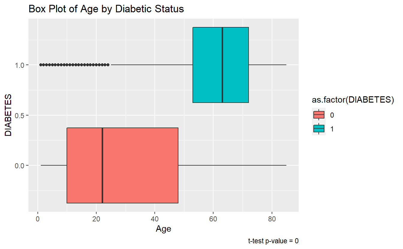
\(~\)
\(~\)
6.3 ks-test
The two-sample Kolmogorov-Smirnov Test or ks-test will test the null-hypothesis that the two samples were drawn from the same continuous distribution.
The alternative hypothesis is that the samples were not drawn from the same continuous distribution. The ks-test can be called in a similar fashion to the t.test in section 6.1. Additionally, while the default output type of ks.test is a list again the tidy function in the broom library can be used to convert to a tibble.
tibble_ks.test.Age.Non_DM2.DM2 <- ks.test(Non_DM2.Age, DM2.Age, alternative = 'two.sided') %>%
  broom::tidy()
#> Warning in ks.test(Non_DM2.Age, DM2.Age, alternative = "two.sided"): p-value
#> will be approximate in the presence of ties

tibble_ks.test.Age.Non_DM2.DM2
#> # A tibble: 1 x 4
#>   statistic p.value method                             alternative
#>       <dbl>   <dbl> <chr>                              <chr>
#> 1     0.599       0 Two-sample Kolmogorov-Smirnov test two-sided
Since the p.value is less than .05 we accept the alternative hypothesis, that the Age of Members with Diabetes was not drawn from the same distribution as Age of Members with-out Diabetes.
We can see the difference between the distributions, most clearly by the density plot:
A_DATA %>%
  filter(!is.na(DIABETES))%>%
  mutate(DIABETES_factor = as.factor(DIABETES)) %>%
  ggplot(aes(x=Age, fill=DIABETES_factor)) +
  geom_density() +
  labs(title = "Density Plot - non-missing Diabetic status by Age",
       caption = paste0("ks-test p-value :" , round(tibble_ks.test.Age.Non_DM2.DM2$p.value,4)))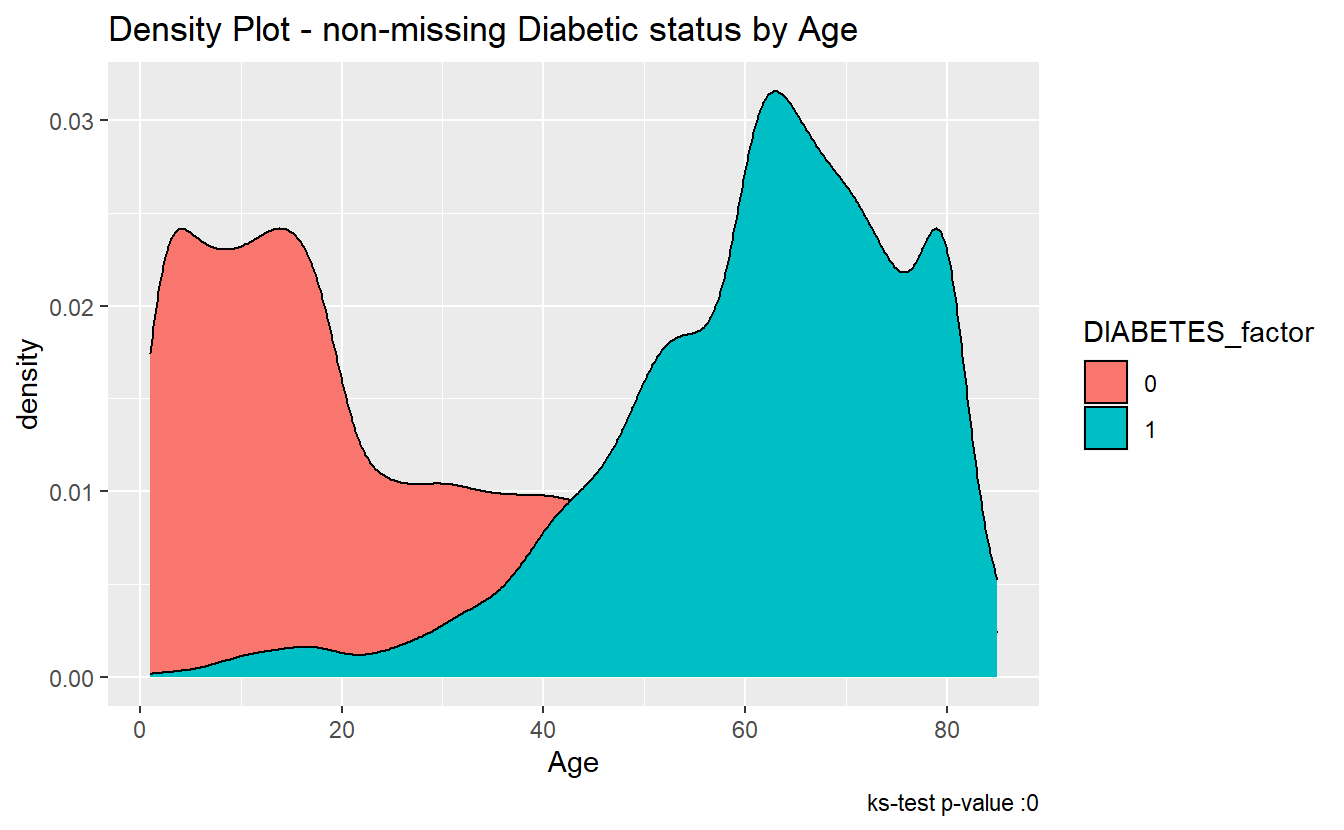
The ks-statistic quantifies a distance between the empirical distribution functions (ECDF) of the two samples. And this is the plot of the two ECDFs:
A_DATA %>%
  filter(!is.na(DIABETES))%>%
  mutate(DIABETES_factor = as.factor(DIABETES)) %>%
  ggplot(aes(x=Age, color=DIABETES_factor)) +
  stat_ecdf() +
  labs(title = "K-S Test: Age - Diabetics Vs non-Diabetics",
       caption = paste0("ks-test p-value :" , round(tibble_ks.test.Age.Non_DM2.DM2$p.value,4)))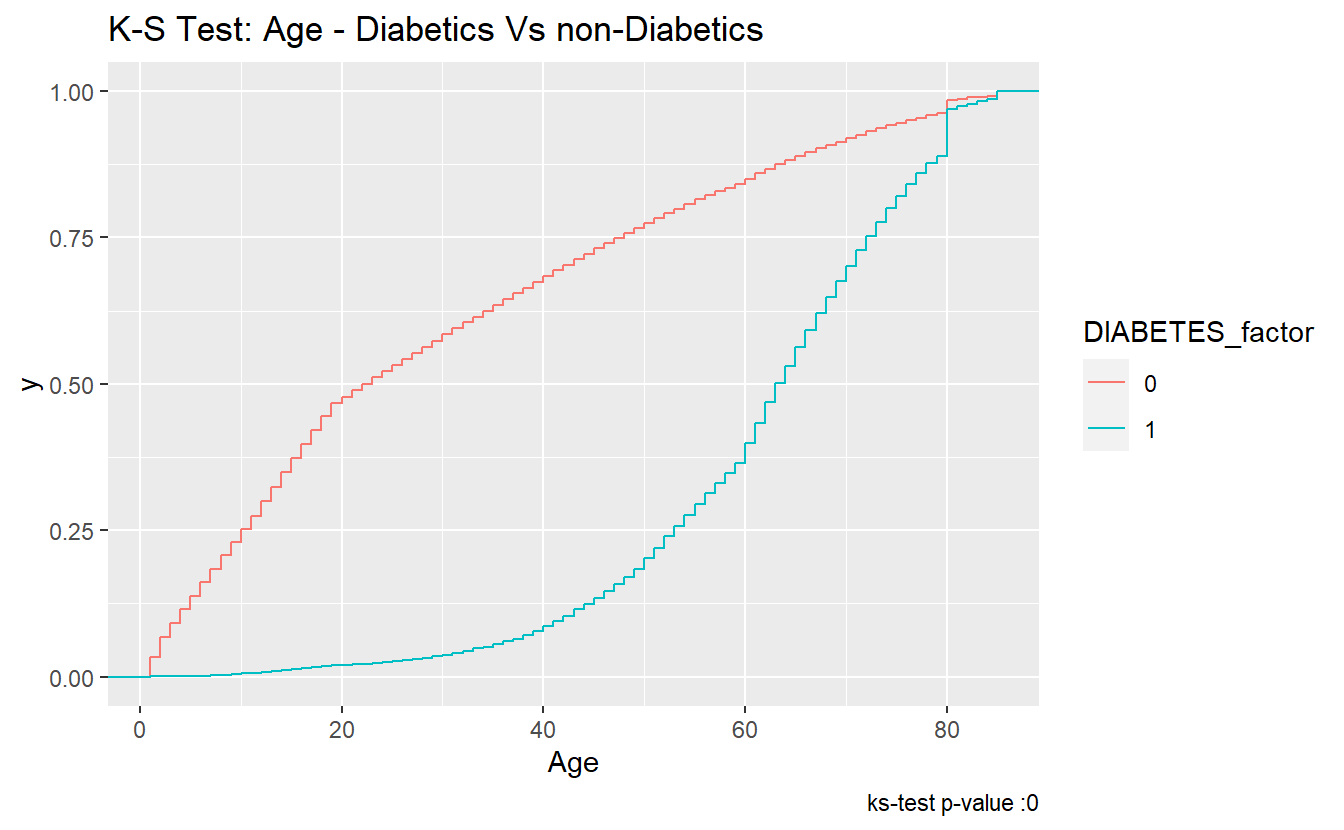
\(~\)
\(~\)
6.4 rand_Age
As we did with Age above, we can extract lists of rand_Ages for each type of DIABETES:
DM2.rand_Age <- (A_DATA %>%
  filter(DIABETES == 1))$rand_Age

Non_DM2.rand_Age <- (A_DATA %>%
  filter(DIABETES == 0))$rand_Age

Miss_DM2.rand_Age <- (A_DATA %>%
  filter(is.na(DIABETES)))$rand_Age
6.4.1 t.test
Let’s compare the mean rand_Ages between the Diabetic and non-Diabetic populations:
t_test.rand_Age.Non_Dm2.DM2 <- t.test(Non_DM2.rand_Age, DM2.rand_Age,
                                 alternative = 'two.sided',
                                 conf.level = 0.95)
t_test.rand_Age.Non_Dm2.DM2
#>
#>  Welch Two Sample t-test
#>
#> data:  Non_DM2.rand_Age and DM2.rand_Age
#> t = 0.094855, df = 7878.6, p-value = 0.9244
#> alternative hypothesis: true difference in means is not equal to 0
#> 95 percent confidence interval:
#>  -0.5874002  0.6471383
#> sample estimates:
#> mean of x mean of y
#>  31.25243  31.22257
tibble_t_test.rand_Age.Non_Dm2.DM2 <- broom::tidy(t_test.rand_Age.Non_Dm2.DM2) %>%
mutate(dist_1 = "Non_DM2.rand_Age") %>%
mutate(dist_2 = "DM2.rand_Age")
tibble_t_test.rand_Age.Non_Dm2.DM2 %>%
glimpse()
#> Rows: 1
#> Columns: 12
#> $ estimate <dbl> 0.02986907
#> $ estimate1 <dbl> 31.25243
#> $ estimate2 <dbl> 31.22257
#> $ statistic <dbl> 0.09485536
#> $ p.value <dbl> 0.9244321
#> $ parameter <dbl> 7878.617
#> $ conf.low <dbl> -0.5874002
#> $ conf.high <dbl> 0.6471383
#> $ method <chr> "Welch Two Sample t-test"
#> $ alternative <chr> "two.sided"
#> $ dist_1 <chr> "Non_DM2.rand_Age"
#> $ dist_2 <chr> "DM2.rand_Age"Note that each of tibble_t_test.Age.Non_Dm2.DM2 and tibble_t_test.rand_Age.Non_Dm2.DM2 are each one row, if we want to combine these into a single dataset we can do that with the bind_rows function:
bind_rows(tibble_t_test.Age.Non_Dm2.DM2,
          tibble_t_test.rand_Age.Non_Dm2.DM2) %>%
  select(dist_1, dist_2, p.value, estimate1, estimate2, conf.low, estimate, conf.high)
#> # A tibble: 2 x 8
#>   dist_1       dist_2    p.value estimate1 estimate2 conf.low estimate conf.high
#>   <chr>        <chr>       <dbl>     <dbl>     <dbl>    <dbl>    <dbl>     <dbl>
#> 1 Non_DM2.Age  DM2.Age     0          30.0      61.5  -31.9   -31.5      -31.1
#> 2 Non_DM2.ran~ DM2.rand~   0.924      31.3      31.2   -0.587   0.0299     0.647
The story here is different, since tibble_t_test.rand_Age.Non_Dm2.DM2$p.value = 0.9244321 is greater than .05 we accept the null-hypothesis and assume the sample mean of rand_Age is the same for both the Diabetic and non-Diabetic populations.
A_DATA %>%
  filter(!is.na(DIABETES)) %>%
  mutate(DIABETES_factor = as.factor(DIABETES)) %>%
  ggplot(aes(x= rand_Age, fill=DIABETES_factor)) +
  geom_boxplot() +
  labs(title = "Box Plot - Diabetic status by rand_Age",
caption = paste0("t-test p-value = ", round(tibble_t_test.rand_Age.Non_Dm2.DM2$p.value,40) )) 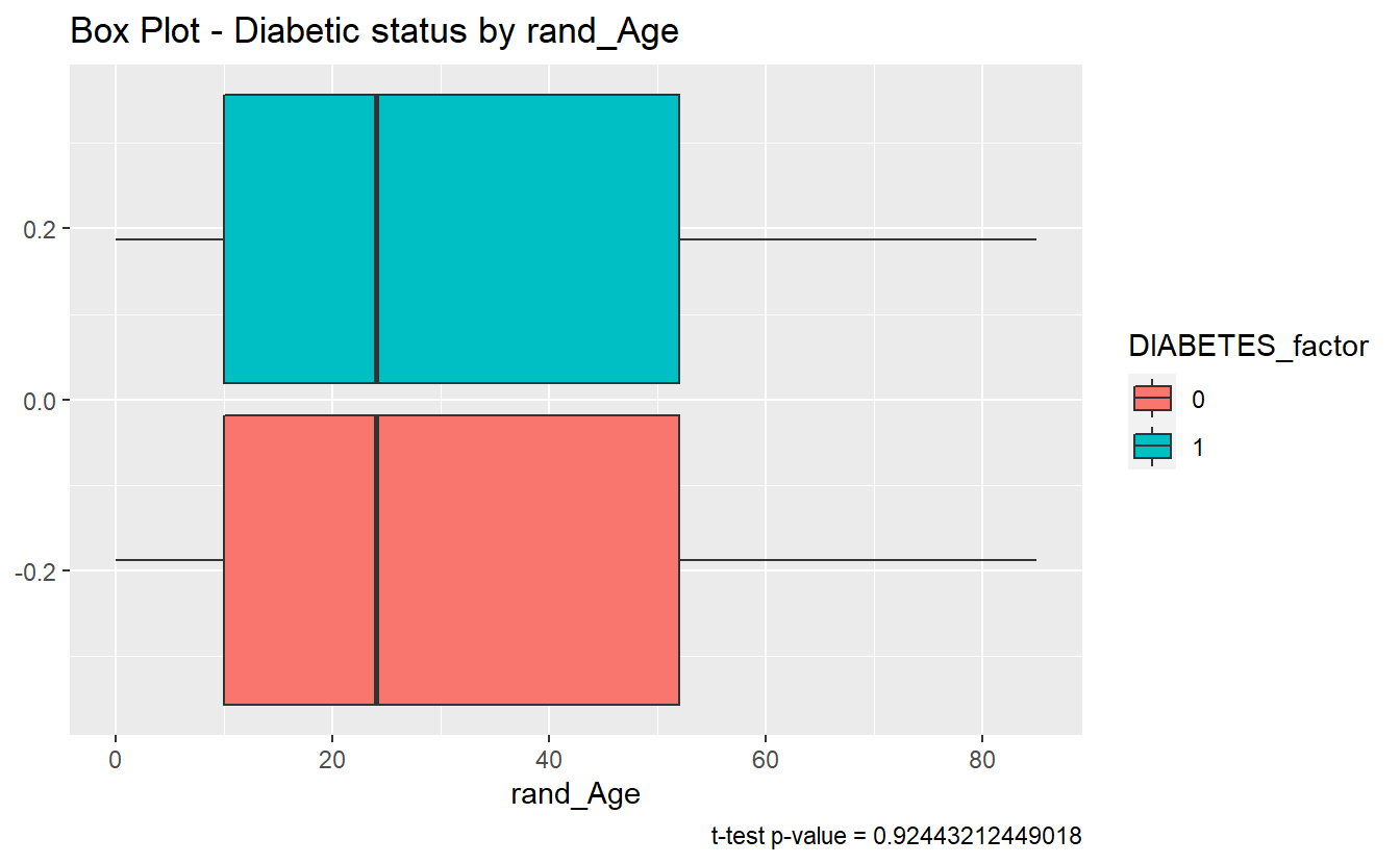
6.4.2 ks.test
We can review the ks.test test for rand_Age:
tibble_ks_test.rand_Age.non_DM2.DM2 <- ks.test(Non_DM2.rand_Age, DM2.rand_Age, alternative = 'two.sided') %>%
  broom::tidy()
#> Warning in ks.test(Non_DM2.rand_Age, DM2.rand_Age, alternative = "two.sided"):
#> p-value will be approximate in the presence of ties

tibble_ks_test.rand_Age.non_DM2.DM2
#> # A tibble: 1 x 4
#>   statistic p.value method                             alternative
#>       <dbl>   <dbl> <chr>                              <chr>
#> 1   0.00563   0.988 Two-sample Kolmogorov-Smirnov test two-sided
Furthermore, since the p.value of the ks.test is 0.9881447 we accept the null-hypothesis; and assume the distributions of rand_Age of both the diabetics and non-diabetics were sampled from the same continuous distribution
We can see in the density plot the distributions are not much different:
A_DATA %>%
  filter(!is.na(DIABETES))%>%
  mutate(DIABETES_factor = as.factor(DIABETES)) %>%
  ggplot(aes(x=rand_Age, fill=DIABETES_factor)) +
  geom_density() +
  labs(title = "Density Plot - rand_Age by Diabetes",
       caption = paste0('ks-test p-value : ' , round(tibble_ks_test.rand_Age.non_DM2.DM2$p.value,4)))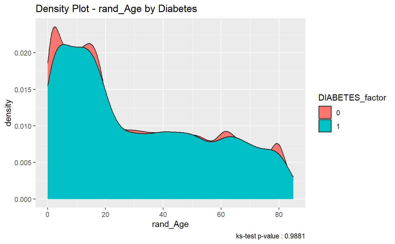
And here two ECDFs are almost on top of each other:
A_DATA %>%
  filter(!is.na(DIABETES))%>%
  mutate(DIABETES_factor = as.factor(DIABETES)) %>%
  ggplot(aes(x=rand_Age, color=DIABETES_factor)) +
  stat_ecdf() +
  labs(title = "K-S Test: rand_Age - Diabetics Vs non-Diabetics",
       caption = paste0("ks-test p-value :" , round(tibble_ks_test.rand_Age.non_DM2.DM2$p.value,4)))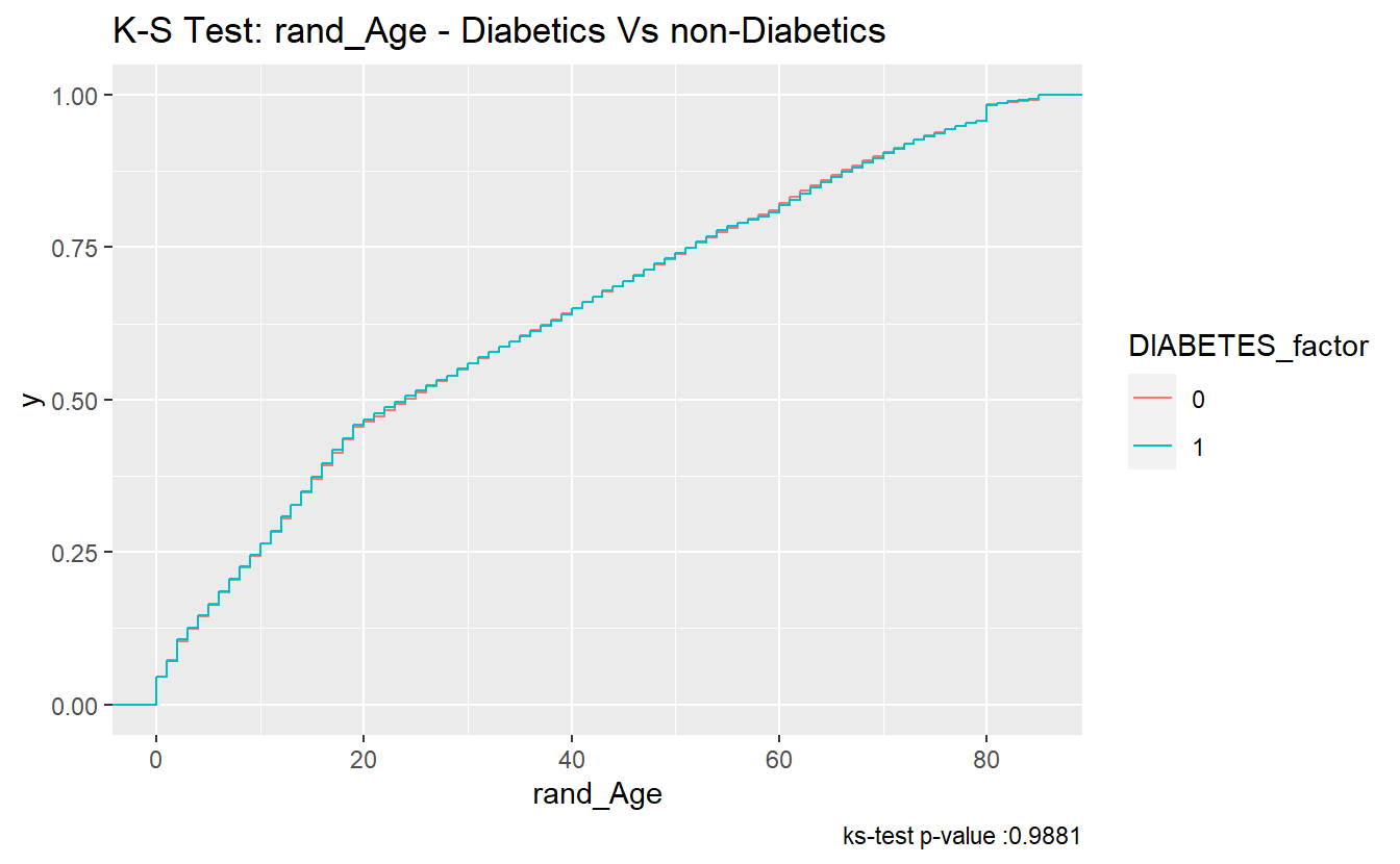
6.4.3 Discussion Question
For distributions
xandyis it possible that:
t.test(x,y)$p.value > .05 & ks.test(x,y)$p.value < .05?- What about for
t.test(x,y)$p.value < .05 & ks.test(x,y)$p.value > .05?
\(~\)
\(~\)
6.4.3.1 Compare “Missing” Diabetic class among Age and rand_Age
6.4.3.1.1 Histograms
Histograms can sometimes be helpful in getting started:
hist_plot_1 <- A_DATA %>%
  mutate(DIABETES_factor = as.factor(DIABETES)) %>%
  ggplot(aes(x=Age, fill=DIABETES_factor)) +
  geom_histogram(alpha=0.6, position = 'identity' , binwidth = 5 ) +
  labs(title = "Histogram - Diabetic status by Age")

hist_plot_1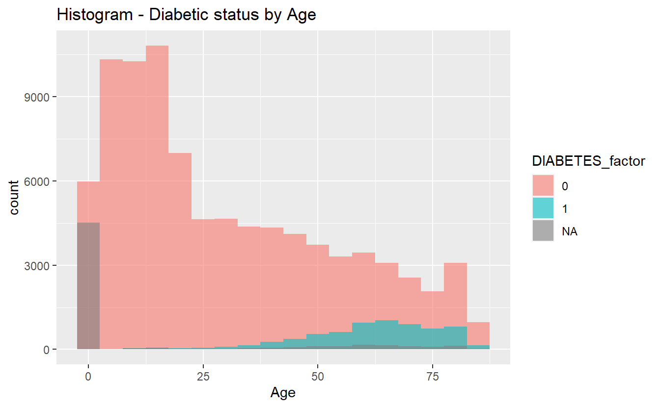
plotly::ggplotly(hist_plot_1)We will once again review t-test analysis:
6.4.3.1.2 t-test
tibble_t_test.Age.Non_Dm2.Miss_DM2 <- broom::tidy(t.test( Miss_DM2.Age, Non_DM2.Age)) %>%
  mutate(dist_1 = "Miss_DM2.Age") %>%
  mutate(dist_2 = "Non_DM2.Age")
tibble_t_test.Age.Dm2.Miss_DM2 <- broom::tidy(t.test(DM2.Age, Miss_DM2.Age)) %>%
mutate(dist_1 = "DM2.Age") %>%
mutate(dist_2 = "Miss_DM2.Age")tibble_ttests <- bind_rows(tibble_t_test.Age.Non_Dm2.DM2,
tibble_t_test.Age.Non_Dm2.Miss_DM2,
tibble_t_test.Age.Dm2.Miss_DM2)
tibble_ttests %>%
select(dist_1, dist_2, p.value, estimate1, estimate2, conf.low, estimate, conf.high)
#> # A tibble: 3 x 8
#> dist_1 dist_2 p.value estimate1 estimate2 conf.low estimate conf.high
#> <chr> <chr> <dbl> <dbl> <dbl> <dbl> <dbl> <dbl>
#> 1 Non_DM2.Age DM2.Age 0 30.0 61.5 -31.9 -31.5 -31.1
#> 2 Miss_DM2.A~ Non_DM2.A~ 0 12.0 30.0 -18.7 -18.1 -17.4
#> 3 DM2.Age Miss_DM2.~ 0 61.5 12.0 48.8 49.5 50.36.4.3.1.2.1 box-plots
We can see the difference between each of the three Age means at once we can make the plots interactive if we utilize plotly::ggplotly, a good supporting plot to go along with the above table might be the box-plot:
box_plot_1 <- A_DATA %>%
  mutate(DIABETES_factor = as.factor(DIABETES)) %>%
  ggplot(aes(x=DIABETES_factor, y=Age , fill=DIABETES_factor)) +
  geom_boxplot() +
  coord_flip() +
  labs(title = "Box Plot - Diabetic status by Age")

box_plot_1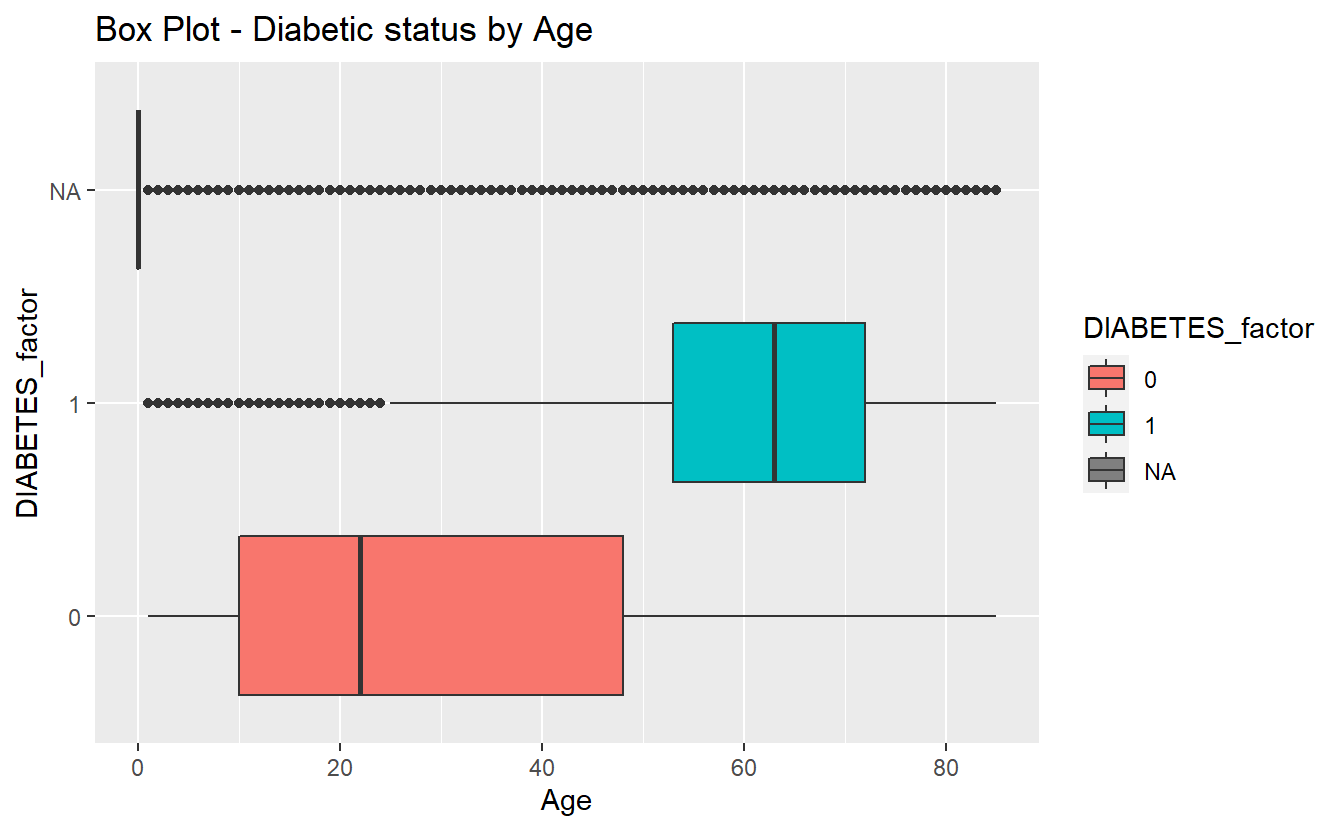
plotly::ggplotly(box_plot_1)6.4.3.1.3 ks-test
tibble_ks_test.Age.Non_Dm2.DM2 <- ks.test(Non_DM2.Age, DM2.Age, alternative = 'two.sided') %>%
  broom::tidy() %>%
  mutate(dist_1 = "Non_DM2.Age") %>%
  mutate(dist_2 = "DM2.Age")
#> Warning in ks.test(Non_DM2.Age, DM2.Age, alternative = "two.sided"): p-value
#> will be approximate in the presence of ties

tibble_ks_test.Age.Non_Dm2.Miss_DM2 <- ks.test( Miss_DM2.Age, Non_DM2.Age , alternative = 'two.sided') %>%
  broom::tidy() %>%
  mutate(dist_1 = "Miss_DM2.Age") %>%
  mutate(dist_2 = "Non_DM2.Age")
#> Warning in ks.test(Miss_DM2.Age, Non_DM2.Age, alternative = "two.sided"): p-
#> value will be approximate in the presence of ties

tibble_ks_test.Age.Dm2.Miss_DM2 <- ks.test(DM2.Age, Miss_DM2.Age , alternative = 'two.sided') %>%
  broom::tidy() %>%
  mutate(dist_1 = "DM2.Age") %>%
  mutate(dist_2 = "Miss_DM2.Age")
#> Warning in ks.test(DM2.Age, Miss_DM2.Age, alternative = "two.sided"): p-value
#> will be approximate in the presence of ties
tibble_ks.tests <- bind_rows(tibble_ks_test.Age.Non_Dm2.DM2,
tibble_ks_test.Age.Non_Dm2.Miss_DM2,
tibble_ks_test.Age.Dm2.Miss_DM2)
tibble_ks.tests %>%
select(dist_1, dist_2, p.value)
#> # A tibble: 3 x 3
#> dist_1 dist_2 p.value
#> <chr> <chr> <dbl>
#> 1 Non_DM2.Age DM2.Age 0
#> 2 Miss_DM2.Age Non_DM2.Age 0
#> 3 DM2.Age Miss_DM2.Age 06.4.3.1.3.1 density plots
Density plots are a great option to accompany a ks-test.
density_plot_1 <- A_DATA %>%
  mutate(DIABETES_factor = as.factor(DIABETES)) %>%
  ggplot(aes(x=Age, fill=DIABETES_factor)) +
  geom_density() +
  labs(title = "Density Plot - Age by Diabetic status")

density_plot_1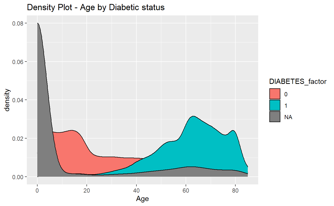
plotly::ggplotly(density_plot_1)\(~\)
\(~\)
6.5 Non-missing Data
We can use Amelia::missmap to get a sense for how much of our data is missing:
Amelia::missmap(as.data.frame(A_DATA))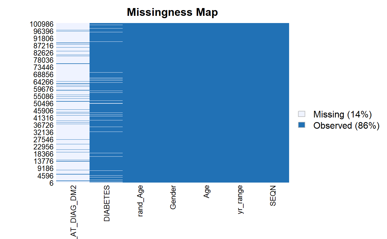
For some analyses and models we need to remove missing data to prevent errors from R, for the reminder of this chapter, we will work with only the records that have non-missing values for SEQN, DIABETES, Age, and rand_Age:
A_DATA.no_miss <- A_DATA %>%
  select(SEQN, DIABETES, Age, rand_Age) %>%
  mutate(DIABETES_factor = as.factor(DIABETES)) %>%
  mutate(DIABETES_factor = fct_relevel(DIABETES_factor, c('0','1') ) ) %>%
  na.omit()
Notice now there are no missing values:
Amelia::missmap(as.data.frame(A_DATA.no_miss))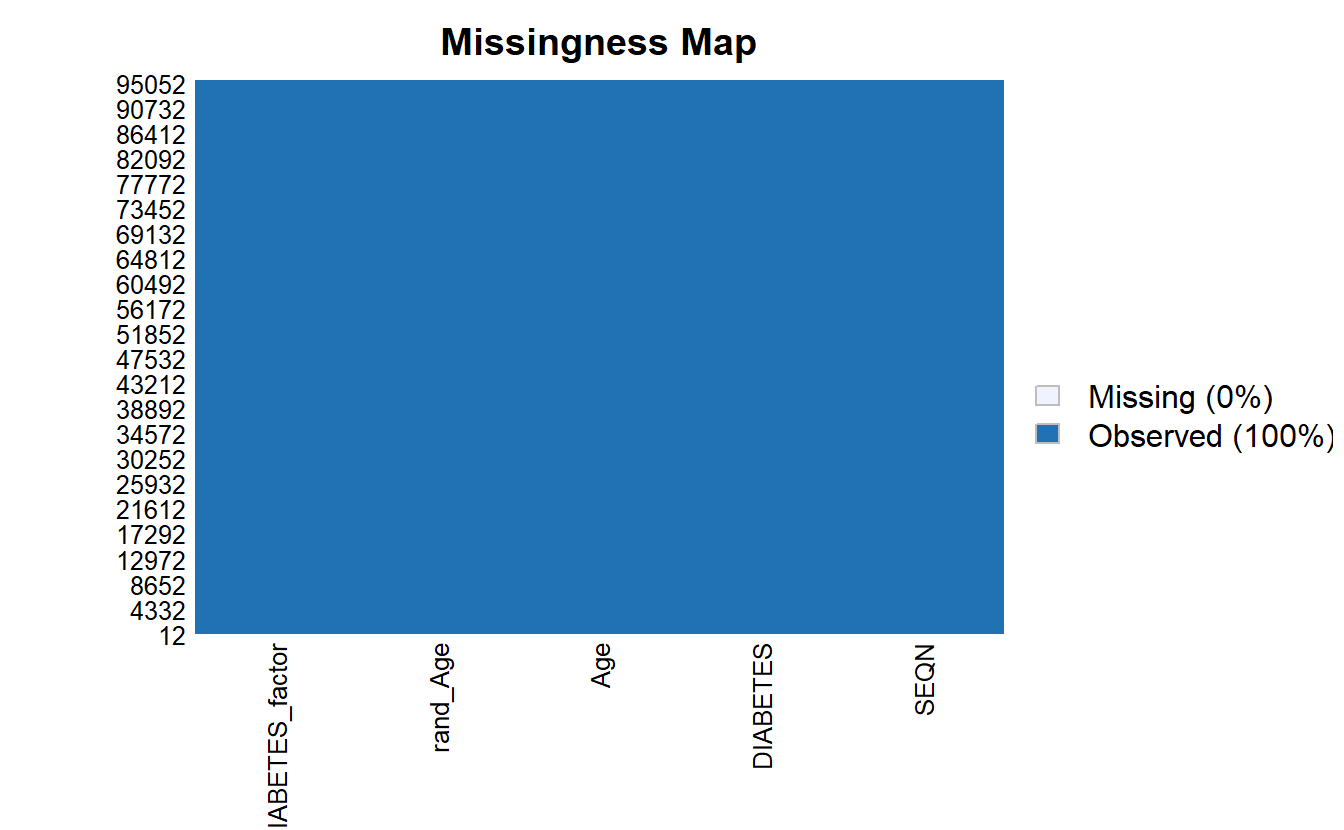
\(~\)
\(~\)
6.6 ANOVA Review
Much like the t-test, Analysis of Variance (ANOVA) is used to determine whether there are any statistically significant differences between the means of two or more independent (unrelated) groups.
ANOVA compares the means between two or more groups you that are interested in and determines whether any of the means of those groups are statistically significantly different from each other. Specifically, ANOVA tests the null hypothesis:
\[H_0 : \mu_1 = \mu_2 = \mu_2 = \cdots = \mu_f\]
where \(\mu_i =\) are the group means and \(f =\) number of groups.
If, however, the one-way ANOVA returns a statistically significant result (\(<.05\) normally), we accept the alternative hypothesis, which is that there are at least two group means that are statistically significantly different from each other.
res.aov <- aov(DIABETES ~ Age,
               data = A_DATA.no_miss)

res.aov.sum <- summary(res.aov)
res.aov.sum
#>                Df Sum Sq Mean Sq F value Pr(>F)
#> Age             1    691   691.2   11729 <2e-16 ***
#> Residuals   95545   5631     0.1
#> ---
#> Signif. codes:  0 '***' 0.001 '**' 0.01 '*' 0.05 '.' 0.1 ' ' 1
Since this p-value is 0 \(<.05\) we accept the alternative hypothesis, there is a statistically significantly difference between the two Age groups, just as we found when we performed the t-test.
When we perform ANOVA for rand_Age on the data-set we find:
aov(DIABETES ~ rand_Age,
    data = A_DATA.no_miss) %>%
  broom::tidy()
#> # A tibble: 2 x 6
#>   term         df       sumsq   meansq statistic p.value
#>   <chr>     <dbl>       <dbl>    <dbl>     <dbl>   <dbl>
#> 1 rand_Age      1    0.000599 0.000599   0.00905   0.924
#> 2 Residuals 95545 6322.       0.0662    NA        NA
and, yes, broom::tidy also transformed our ANOVA output into a tibble
this p-value for ANOVA with rand_Age is 0.9241969, NA \(>.05\); therefore, we accept the null hypothesis that the two group means are approximately the same, and, again; this matches with what we found when we performed the t-test.
\(~\)
\(~\)
6.6.1 Split Data
To test different models it is standard practice to split your data into a training set and a testing set, where:
- the training set will be used to train the model and
- the testing set or hold-out set will be used to evaluate model performance.
While, we could also compute model evaluation metrics on the training set, the results will be overly-optimistic as the training set was used to train the model.
In this example, we will sample 60% of the non-missing data’s member-ids without replacement:
set.seed(123)
sample.SEQN <- sample(A_DATA.no_miss$SEQN,
                      size = nrow(A_DATA.no_miss)*.6,
                      replace = FALSE)

# we can check that we got approximately 60% of the data:

length(sample.SEQN)/nrow(A_DATA.no_miss)
#> [1] 0.5999979
Recall that the set.seed is there to ensure we get the same training and test set from run to run. We can always randomize if we use set.seed(NULL) or set.seed(Sys.time())
The training set will consist of those 57328 the 60% we chose at random:
A_DATA.train <- A_DATA.no_miss %>%
  filter(SEQN %in% sample.SEQN)
And the testing set will consist of the remaining 40% of members not in sample.SEQN:
A_DATA.test <- A_DATA.no_miss %>%
  filter(!(SEQN %in% sample.SEQN))
\(~\)
\(~\)
6.7 Logistic Regression
Let’s suppose our data-set contains a binary column \(y\), where \(y\) has two possible values: 1 and 0. Logistic Regression assumes a linear relationship between the features or predictor variables and the log-odds (also called logit) of a binary event.
This linear relationship can be written in the following mathematical form:
\[ \ell = \ln \left( \frac{p}{1-p} \right) = \beta_0 + \beta_1x_1 + \beta_2x_2 + \cdots + \beta_kx_k \]
Where \(\ell\) is the log-odds, \(\ln()\) is the natural logarithm, and \(\beta_i\) are coefficients for the features (\(x_i\)) of the model. We can solve the above equation for \(p\):
\[\frac{p}{1-p} = e^{\beta_0 + \beta_1x_1 + \beta_2x_2 + \cdots + \beta_kx_k}\]
\[ p = (1-p)(e^{\beta_0 + \beta_1x_1 + \beta_2x_2 + \cdots + \beta_kx_k}) \]
\[ p = e^{\beta_0 + \beta_1x_1 + \beta_2x_2 + \cdots + \beta_kx_k} - p \cdot e^{\beta_0 + \beta_1x_1 + \beta_2x_2 + \cdots + \beta_kx_k}\]
\[ p + p \cdot e^{\beta_0 + \beta_1x_1 + \beta_2x_2 + \cdots + \beta_kx_k} = e^{\beta_0 + \beta_1x_1 + \beta_2x_2 + \cdots + \beta_kx_k}\]
\[ p(1 + e^{\beta_0 + \beta_1x_1 + \beta_2x_2 + \cdots + \beta_kx_k}) = e^{\beta_0 + \beta_1x_1 + \beta_2x_2 + \cdots + \beta_kx_k} \]
\[ p = \frac{e^{\beta_0 + \beta_1x_1 + \beta_2x_2 + \cdots + \beta_kx_k}}{1 + e^{\beta_0 + \beta_1x_1 + \beta_2x_2 + \cdots + \beta_kx_k}} \]
\[ p = \frac{1}{1+e^{-(\beta_0 + \beta_1x_1 + \beta_2x_2 + \cdots + \beta_kx_k)}} \]
The above formula shows that once \(\beta_i\) are known, we can easily compute either the log-odds that \(y=1\) for a given observation, or the probability that \(y=1\) for a given observation.
6.7.1 Odds Ratio
The odds of the dependent variable equaling a case (\(y=1\)), given some linear combination the features \(x_i\) is equivalent to the exponential function of the linear regression expression.
\[odds = e^{\beta_0 + \beta_1x_1 + \beta_2x_2 + \cdots + \beta_kx_k}\]
This illustrates how the logit serves as a link function between the probability and the linear regression expression.
For a continuous independent variable the odds ratio can be defined as:
\[OddsRatio = \frac{odds(x_j+1)}{odds(x_j)} \]
Since we know what the odds are we can compute this as:
\[OddsRatio = \frac{e^{\beta_0 + \beta_1x_1 + \cdots + \beta_j(x_j+1) + \cdots + \beta_kx_k}}{e^{\beta_0 + \beta_1x_1 + \cdots + \beta_j(x_j) + \cdots + \beta_kx_k}}\]
\[OddsRatio = \frac{e^{\beta_0}\cdot e^{\beta_1x_1}\cdots e^{\beta_j(x_j+1)}\cdots e^{\beta_kx_k}}{e^{\beta_0}\cdot e^{\beta_1x_1}\cdots e^{\beta_j(x_j)}\cdots e^{\beta_kx_k}} \]
\[OddsRatio = \frac{e^{\beta_j(x_j+1)}}{e^{\beta_jx_j}}\]
\[OddsRatio = e^{\beta_j}\]
This exponential relationship provides an interpretation for the coefficents \(\beta_j\):
For every 1-unit increase in \(x_j\), the odds multiply by \(e^{\beta_j}\).
6.7.2 Wald test
The Wald statistic is used to assess the significance of coefficients.
The Wald statistic is the ratio of the square of the regression coefficient to the square of the standard error of the coefficient; it is asymptotically distributed as a \(\chi^2\) distribution:
\[ W_i = \frac{\beta_i}{SE_{\beta_i}^2} \]
\(~\)
\(~\)
6.8 Train logistic regression with Age feature
In this example we will use the glm (General Linear Model) function, to train a logistic regression. A typical call to glm might include:
glm(formula,
    data,
    intercept = TRUE,
    family = "#TODO" ,
    ...)
Where:
formula- an object of class “formula” EX (y ~ m*x + b,y ~ a + c + m*g + x^2)data- dataframeintercept- should an intercept be fit?TRUE/FALSE…-glmhas many other options see?glmfor othersfamily- a description of the error distribution and link function to be used in the model. Forglmthis can be a character string naming a family function, a family function or the result of a call to a family function. Family objects provide a convenient way to specify the details of the models used by functions such asglm. Options include:binomial(link = "logit")- the
binomialfamily also accepts thelinks(as names):logit,probit,cauchit, (corresponding to logistic, normal and Cauchy CDFs respectively)logandcloglog(complementary log-log);
- the
gaussian(link = "identity")- the
gaussianfamily also accepts the links:identity,log, andinverse
- the
Gamma(link = "inverse")- the
Gammafamily the linksinverse,identity, andlog
- the
inverse.gaussian(link = "1/mu^2")- the inverse Gaussian family the links
"1/mu^2",inverse,identity, andlog.
- the inverse Gaussian family the links
poisson(link = "log")- the poisson family the links log, identity, and sqrt; and the inverse
quasi(link = "identity", variance = "constant")quasibinomial(link = "logit")quasipoisson(link = "log")- And the
quasifamily accepts the linkslogit,probit,cloglog,identity,inverse,log,1/mu^2andsqrt, and the functionpowercan be used to create a power link function.
- And the
Below we fit our Logistic Regression with glm
toc <- Sys.time()

logit.DM2.Age <- glm(DIABETES ~ Age,
                     data = A_DATA.train,
                     family = "binomial")

tic <- Sys.time()

cat("Logistic Regression with 1 feature Age \n")
#> Logistic Regression with 1 feature Age
cat(paste0("Dataset has ", nrow(A_DATA.train), " rows \n"))
#> Dataset has 57328 rows
cat(paste0("trained in ", round(tic - toc, 4) , " seconds \n"))
#> trained in 0.7021 seconds
\(~\)
\(~\)
6.8.1 Logistic Regression Model Outputs
When we call the model we get a subset of output including:
the call to
glmincluding the formulaCoefficients Table
- Estimate for coefficients (\(\beta_j\))
Degrees of Freedom; Residual
Null Deviance
Residual Deviance / AIC
logit.DM2.Age
#>
#> Call:  glm(formula = DIABETES ~ Age, family = "binomial", data = A_DATA.train)
#>
#> Coefficients:
#> (Intercept)          Age
#>    -5.22504      0.05707
#>
#> Degrees of Freedom: 57327 Total (i.e. Null);  57326 Residual
#> Null Deviance:       29700
#> Residual Deviance: 23350     AIC: 23350
When we call summary on model object we often get some different out-put, in the case of glm:
summary(logit.DM2.Age)
#>
#> Call:
#> glm(formula = DIABETES ~ Age, family = "binomial", data = A_DATA.train)
#>
#> Deviance Residuals:
#>     Min       1Q   Median       3Q      Max
#> -1.0233  -0.3683  -0.1777  -0.1301   3.1990
#>
#> Coefficients:
#>               Estimate Std. Error z value Pr(>|z|)
#> (Intercept) -5.2250430  0.0534194  -97.81   <2e-16 ***
#> Age          0.0570724  0.0008558   66.69   <2e-16 ***
#> ---
#> Signif. codes:  0 '***' 0.001 '**' 0.01 '*' 0.05 '.' 0.1 ' ' 1
#>
#> (Dispersion parameter for binomial family taken to be 1)
#>
#>     Null deviance: 29698  on 57327  degrees of freedom
#> Residual deviance: 23350  on 57326  degrees of freedom
#> AIC: 23354
#>
#> Number of Fisher Scoring iterations: 6
We get the following
the call to
glmincluding the formulaDeviance Residuals
Coefficients Table
Estimate for coefficients (\(\beta_j\))
Standard Error
z-value
p-value
Significance Level
Null Deviance
Residual Deviance
Akaike Information Criterion (AIC)
While this is all quite a lot of information, however, I find that the broom package does a much better job at collecting relevant information and parsing it out for review:
\(~\)
\(~\)
6.8.1.1 Coefficients
As a default you could use
coef(logit.DM2.Age)
#> (Intercept)         Age
#> -5.22504305  0.05707239
In other words,
equatiomatic::extract_eq(logit.DM2.Age)\[ \log\left[ \frac { P( \operatorname{DIABETES} = \operatorname{1} ) }{ 1 - P( \operatorname{DIABETES} = \operatorname{1} ) } \right] = \alpha + \beta_{1}(\operatorname{Age}) \]
equatiomatic::extract_eq(logit.DM2.Age, use_coefs = TRUE)\[ \log\left[ \frac { \widehat{P( \operatorname{DIABETES} = \operatorname{1} )} }{ 1 - \widehat{P( \operatorname{DIABETES} = \operatorname{1} )} } \right] = -5.23 + 0.06(\operatorname{Age}) \]
however, if we use broom::tidy then the results will be a tibble, and we can easily add information such as the odds-ratio:
logit.DM2.Age.Coeff <- logit.DM2.Age %>%
  broom::tidy() %>%
  mutate(model = "Age") %>%
  mutate(odds_ratio = if_else(term != '(Intercept)',
                              exp(estimate),
                              as.double(NA)))
We can use the kable function from the knitr package to print out a table for review
logit.DM2.Age.Coeff %>%
knitr::kable()| term | estimate | std.error | statistic | p.value | model | odds_ratio |
|---|---|---|---|---|---|---|
| (Intercept) | -5.2250430 | 0.0534194 | -97.81167 | 0 | Age | NA |
| Age | 0.0570724 | 0.0008558 | 66.68565 | 0 | Age | 1.058732 |
library(knitr)Going back to our interpretation of the Odds Ratio, for every 1 unit increase in Age our odds of getting Diabetes increases by about 5.8732448%
\(~\)
\(~\)
6.8.1.2 Training Errors
Measures such as AIC, BIC, and Adjusted R2 are normally thought of training error estimates so you could group those into a table if you wanted. The broom::glance function will provide a table of training errors but if you want Adjusted R2 you will have to compute it yourself:
adj_r2 <- rsq::rsq(logit.DM2.Age)
adj_r2
#> [1] 0.1024638
Then after glance converts the model training errors into a tibble we can use a mutate to add the additional column then we can print it for review:
logit.DM2.Age %>%
broom::glance() %>%
  mutate(adj_r2 = adj_r2) %>%
kable()| null.deviance | df.null | logLik | AIC | BIC | deviance | df.residual | nobs | adj_r2 |
|---|---|---|---|---|---|---|---|---|
| 29698.41 | 57327 | -11674.89 | 23353.78 | 23371.69 | 23349.78 | 57326 | 57328 | 0.1024638 |
\(~\)
\(~\)
6.8.1.2.1 Plots
These are default return plots for glm
6.8.1.2.1.1 Residuals Vs Fitted
plot(logit.DM2.Age,1)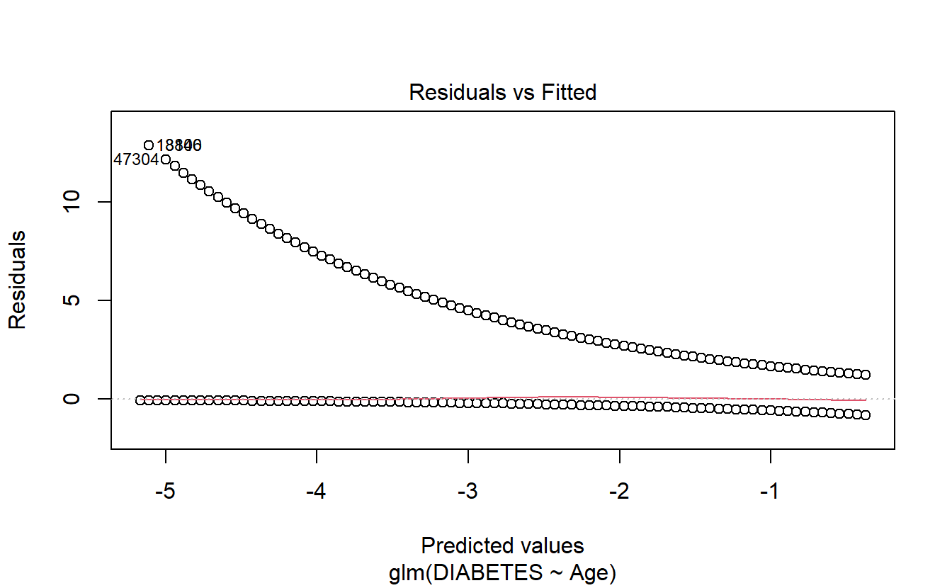
6.8.1.2.1.2 Q-Q Plot
plot(logit.DM2.Age,2)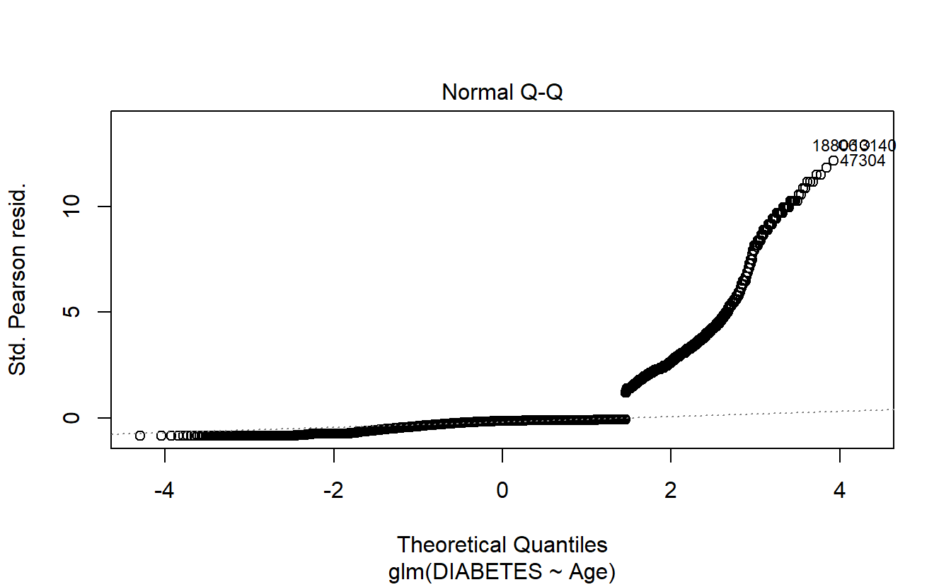
6.8.1.2.1.3 Scale-Location
plot(logit.DM2.Age,3)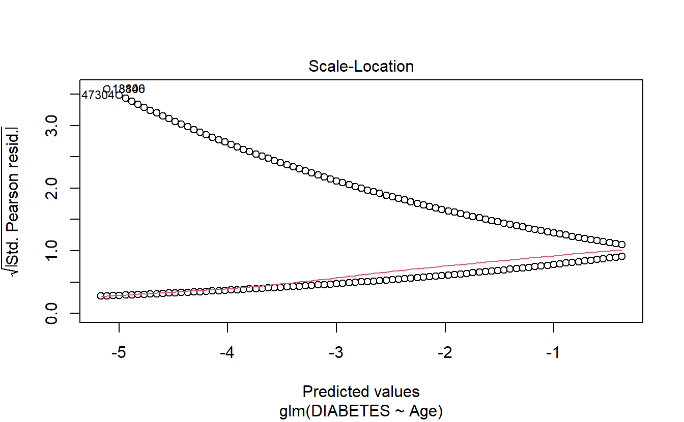
6.8.1.2.1.4 Cook’s distance
plot(logit.DM2.Age,4)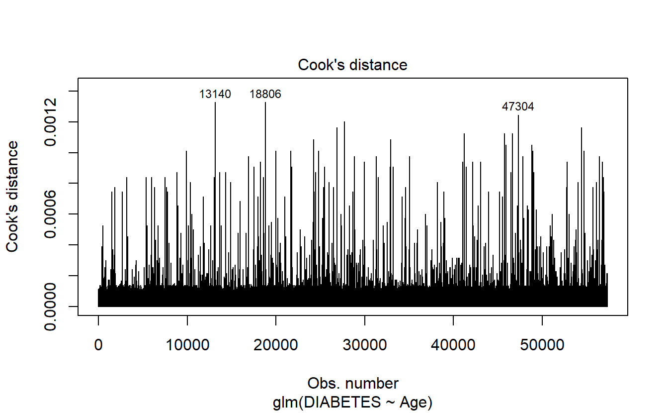
6.8.1.2.1.5 Leverage
plot(logit.DM2.Age,5)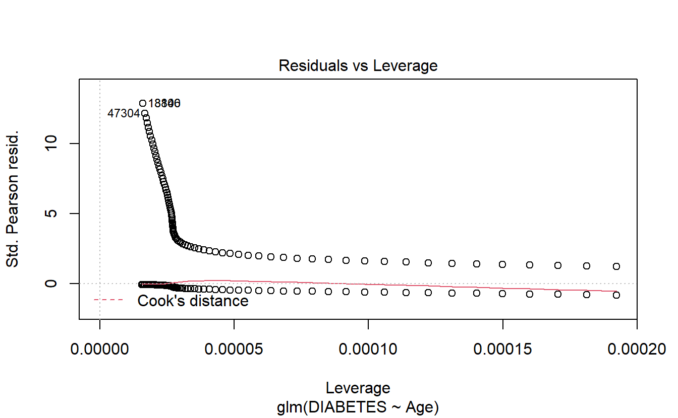
6.8.1.2.1.6 Cooks’s Vs Leverage
plot(logit.DM2.Age,6)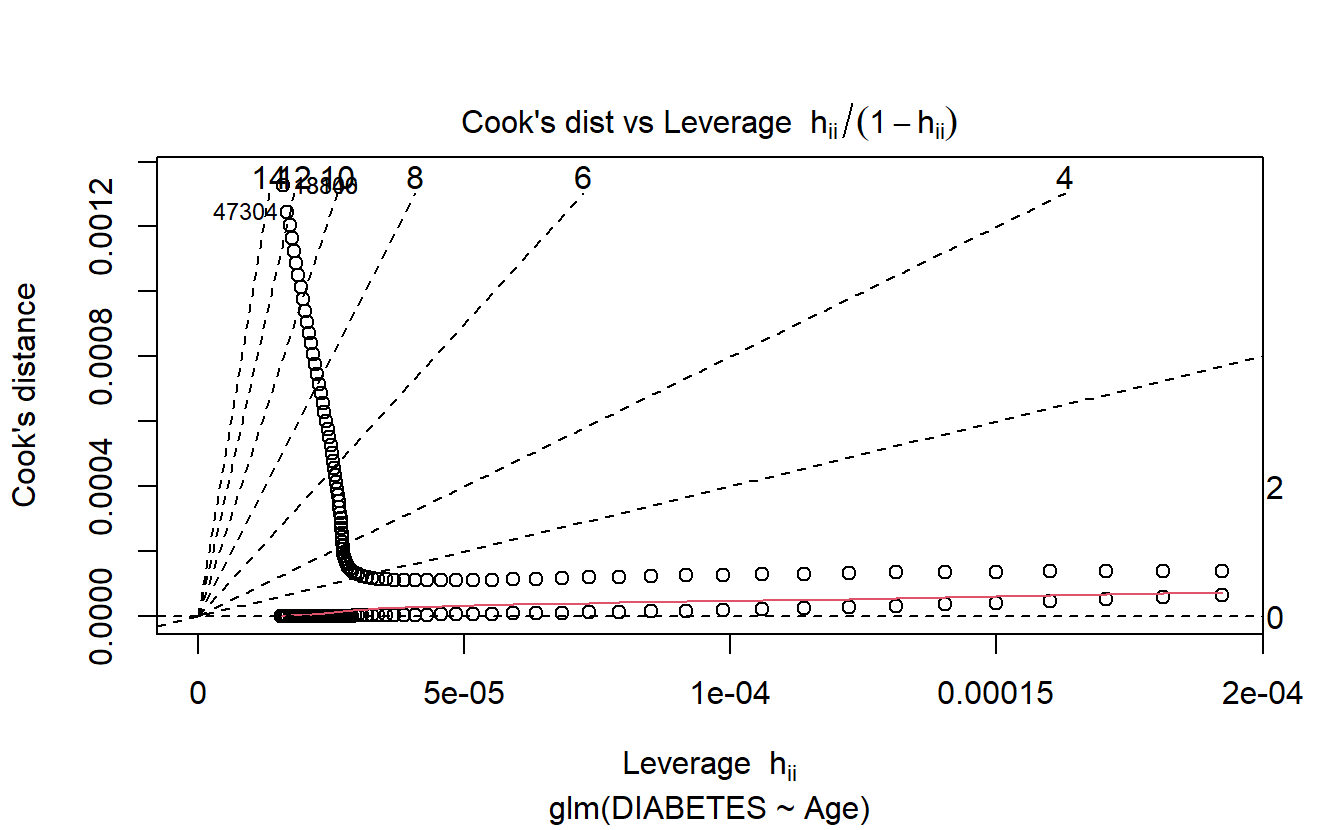
\(~\)
\(~\)
6.9 Probability scoring Test Data with logit Age model
A_DATA.test.scored.DM2_Age <- A_DATA.test %>%
  mutate(model = "logit_DM2_Age")

A_DATA.test.scored.DM2_Age$probs <- predict(logit.DM2.Age,
                                            A_DATA.test.scored.DM2_Age,
                                            "response")

A_DATA.test.scored.DM2_Age %>%
  glimpse()
#> Rows: 38,219
#> Columns: 7
#> $ SEQN            <dbl> 3, 4, 9, 11, 13, 14, 20, 25, 26, 27, 28, 29, 31, 39, 4~
#> $ DIABETES        <dbl> 0, 0, 0, 0, 1, 0, 0, 0, 0, 0, 0, 1, 0, 0, 0, 0, 0, 0, ~
#> $ Age             <dbl> 10, 1, 11, 15, 70, 81, 23, 42, 14, 18, 18, 62, 15, 7, ~
#> $ rand_Age        <dbl> 57, 60, 0, 57, 32, 23, 64, 31, 80, 65, 47, 72, 3, 2, 6~
#> $ DIABETES_factor <fct> 0, 0, 0, 0, 1, 0, 0, 0, 0, 0, 0, 1, 0, 0, 0, 0, 0, 0, ~
#> $ model           <chr> "logit_DM2_Age", "logit_DM2_Age", "logit_DM2_Age", "lo~
#> $ probs           <dbl> 0.009430610, 0.005663854, 0.009978965, 0.012506058, 0.~
\(~\)
\(~\)
6.10 Receiver Operating Characteristic Curve
The ROC curve is created by plotting the true positive rate (TPR) against the false positive rate (FPR) at various threshold settings.
The true-positive rate is also known as sensitivity, recall or probability of detection.
The false-positive rate is also known as probability of false alarm and can be calculated as \((1 − specificity)\).
library('yardstick')NOTICE the following information that we get when we load the yardstick package:
For binary classification, the first factor level is assumed to be the event. Use the argument
event_level = "second"to alter this as needed.
Recall that our levels for DIABETES_factor are:
levels(A_DATA.no_miss$DIABETES_factor)
#> [1] "0" "1"
In other words, currently our event-level is the second option, 1!
Note that the return of roc_curve is a tibble containing: .threshold , specificity, sensitivity:
A_DATA.test.scored.DM2_Age %>%
  roc_curve(truth= DIABETES_factor, probs, event_level = "second")
#> # A tibble: 87 x 3
#>   .threshold specificity sensitivity
#>        <dbl>       <dbl>       <dbl>
#> 1 -Inf            0            1
#> 2    0.00566      0            1
#> 3    0.00599      0.0338       1.00
#> 4    0.00634      0.0675       0.999
#> 5    0.00671      0.0896       0.999
#> 6    0.00711      0.114        0.999
#> # ... with 81 more rows
The Area Under the ROC Curve or c-statistic or AUC is the area under the the ROC curve can also be computed.
AUC.DM2_Age <- A_DATA.test.scored.DM2_Age %>%
  roc_auc(truth = DIABETES_factor, probs, event_level = "second")

AUC.DM2_Age
#> # A tibble: 1 x 3
#>   .metric .estimator .estimate
#>   <chr>   <chr>          <dbl>
#> 1 roc_auc binary         0.843
in this case our AUC is 0.8427198. Notice that the return to roc_auc is a tibble with columns: .metric .estimator and .estimate.
We could graph the ROC curve using ggplot2:
A_DATA.test.scored.DM2_Age %>%
  roc_curve(truth = DIABETES_factor, probs, event_level = "second") %>%
  mutate(FPR = 1-specificity) %>%
  mutate(TPR = sensitivity) %>%
  ggplot(aes(x=FPR, y=TPR, color=.threshold)) +
  geom_point() +
  scale_colour_gradientn(colours=rainbow(4)) +
  geom_abline(slope = 1) +
  labs(title = "ROC Curve " ,
       subtitle = 'test set scored on logistic regression with Age feature',
       caption = paste0("AUC : ", round(AUC.DM2_Age$.estimate,3)))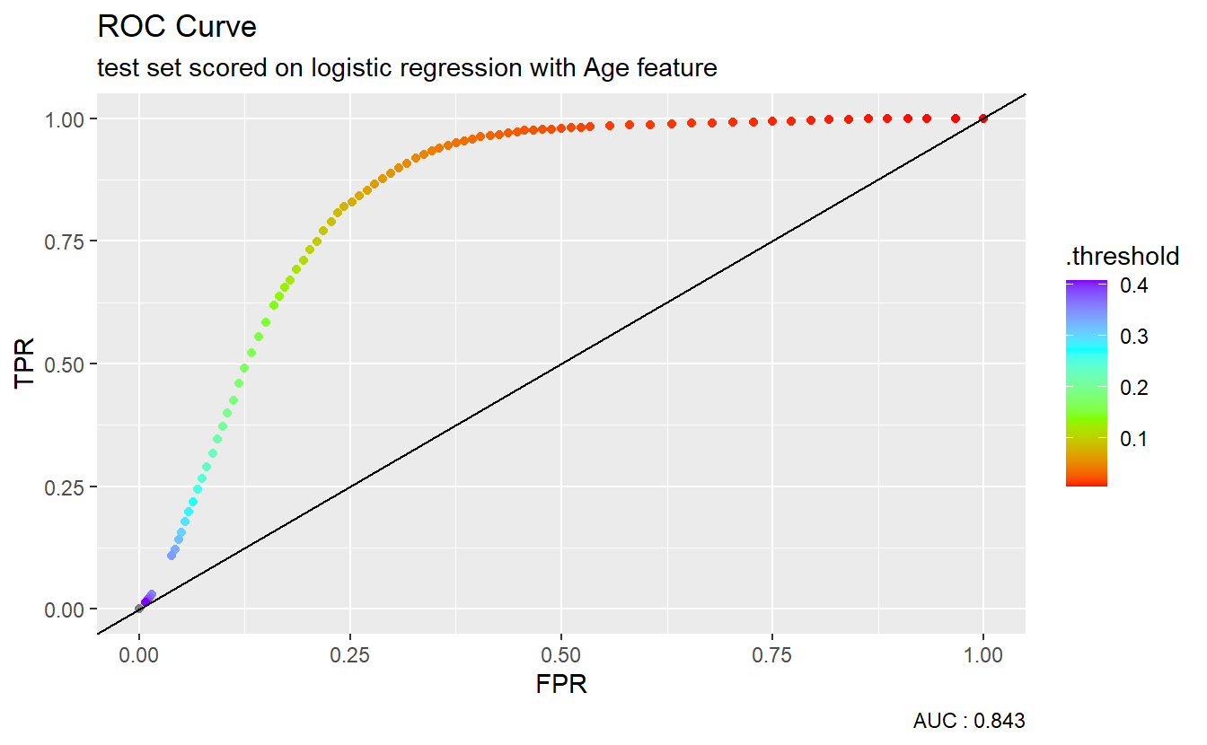
However, many metrics within the yardstick package can call to a pre-specified autoplot function so a call to an ROC curve can be as easy as:
A_DATA.test.scored.DM2_Age %>%
  roc_curve(truth = DIABETES_factor, probs, event_level = "second") %>%
  autoplot() +
  labs(title = "ROC Curve " ,
       subtitle = 'test set scored on logistic regression with Age feature',
       caption = paste0("AUC : ", round(AUC.DM2_Age$.estimate,3)))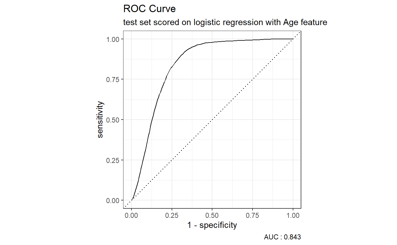
The dotted diagonal line above represents the ROC curve of a “Coin-flip” model, in general the higher AUCs are indicative of better performing models.
\(~\)
\(~\)
6.11 Setting a Threshold
We will set our threshold to be the mean probability of Diabetes population in the training set:
A_DATA.train.scored <- A_DATA.train


A_DATA.train.scored$probs <- predict(logit.DM2.Age,
                                     A_DATA.train,
                                     "response")
A_DATA.train.scored %>%
ggplot(aes(x=Age,y=probs, color=DIABETES_factor)) +
geom_point() +
geom_line()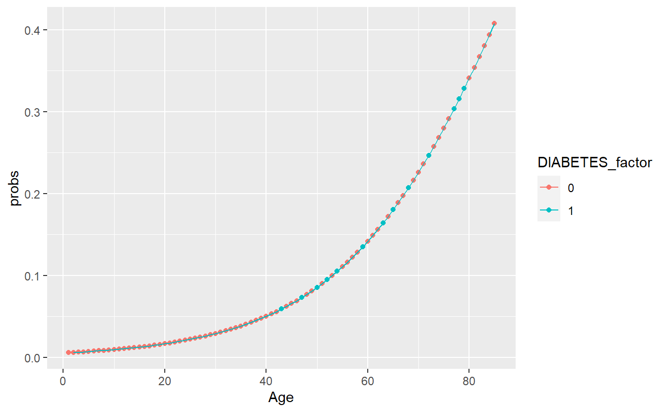
DM2_Age.prob_sum <- A_DATA.train.scored %>%
  group_by(DIABETES_factor) %>%
  summarise(min_prob = min(probs),
            mean_prob = mean(probs),
            max_prob = max(probs))

threshold_value <- (DM2_Age.prob_sum %>% filter(DIABETES_factor == 1))$mean_prob

DM2_Age.prob_sum
#> # A tibble: 2 x 4
#>   DIABETES_factor min_prob mean_prob max_prob
#>   <fct>              <dbl>     <dbl>    <dbl>
#> 1 0                0.00566    0.0636    0.408
#> 2 1                0.00599    0.182     0.408
In the scoring set, if the probability is greater than our threshold of 0.1815463 then we will predict a label of 1 otherwise 0:
A_DATA.test.scored.DM2_Age <- A_DATA.test.scored.DM2_Age %>%
  mutate(pred = if_else(probs > threshold_value, 1, 0)) %>%
  mutate(pred_factor = as.factor(pred)) %>%
  mutate(pred_factor = fct_relevel(pred_factor, c('0','1') )) %>%
  mutate(correct_guess = if_else(pred_factor == DIABETES_factor,TRUE,FALSE))
A_DATA.test.scored.DM2_Age %>%
ggplot(aes(x=Age , y=probs, color=correct_guess)) +
geom_point() +
geom_hline(yintercept = threshold_value) +
facet_wrap(DIABETES_factor ~ .)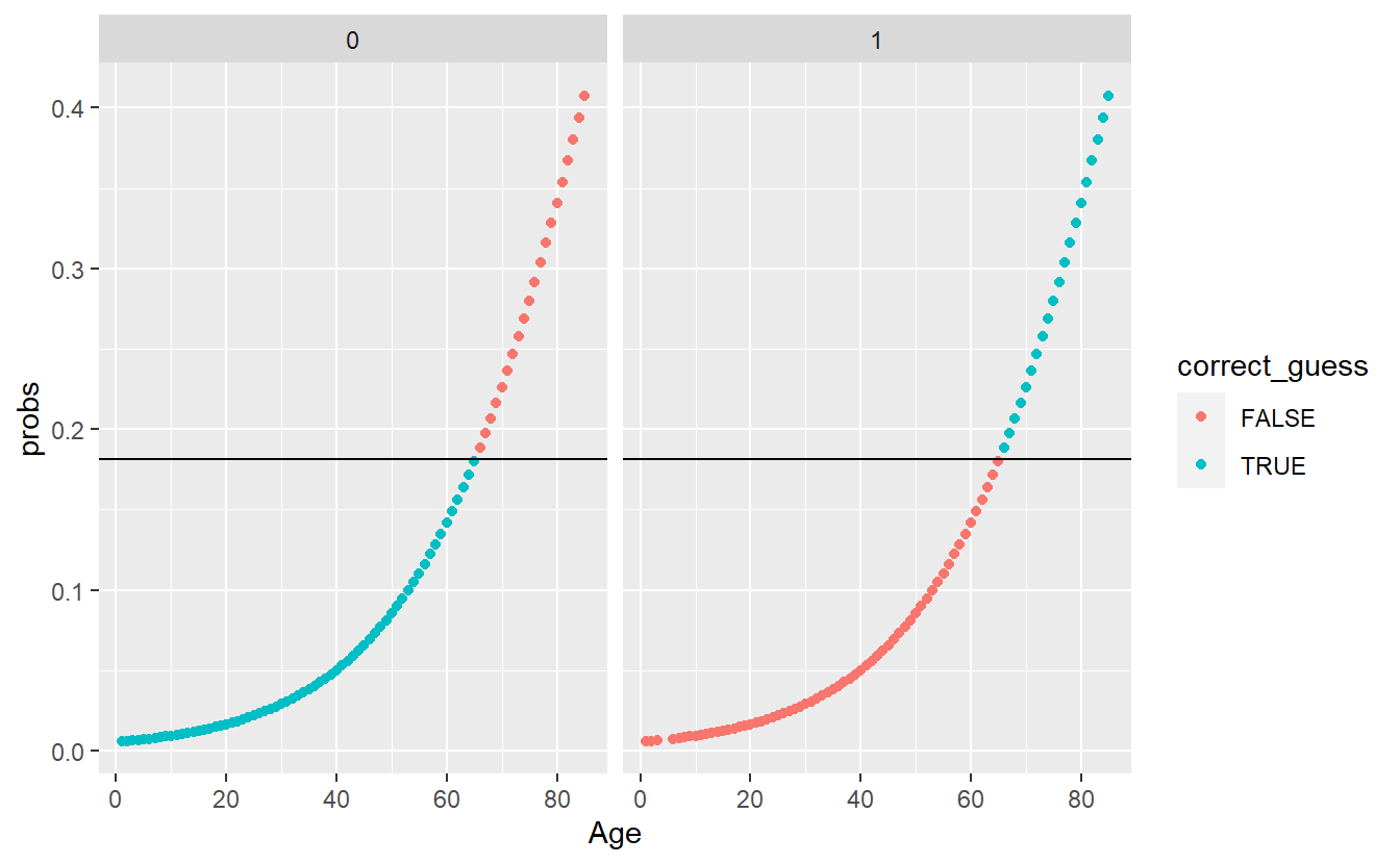
To further evaluate the above we will make use of a confusion matrix.
\(~\)
\(~\)
6.12 Confusion Matrix
A confusion matrix is a table consisting of counts of predicted versus actual classes:

conf_mat.Age <- A_DATA.test.scored.DM2_Age %>%
  conf_mat(truth = DIABETES_factor, pred_factor)

conf_mat.Age
#>           Truth
#> Prediction     0     1
#>          0 31569  1535
#>          1  3976  1139
Above we see that we have:
TP <- conf_mat.Age$table[2,2]
TN <- conf_mat.Age$table[1,1]
FP <- conf_mat.Age$table[2,1]
FN <- conf_mat.Age$table[1,2]- True Positives : 1139
- True Negatives : 31569
- False Positive / False Alarm: 3976
- False Negative : 1535
so we could fill in this confusion matrix:
| True | Condition | |||||
|---|---|---|---|---|---|---|
| Total Population | Condition Positive | Condition Negative | Prevalence | Accuracy
|
Balanced Accuracy
|
|
| Predicted | Predicted Positive | True Positive
|
False Positive
|
PPV, Precision
|
FDR | |
| Condition | Predicted Negative | False Negative
|
True Negative
|
FOR | NPV | |
TPR, Recall
|
FPR | LR_P | DOR | MCC | ||
| FNR | TNR
|
LR_N | F1
|
There are a few autoplots associated with the confusion matrix worth noting. A heatmap plot:
conf_mat.Age %>%
  autoplot('heatmap')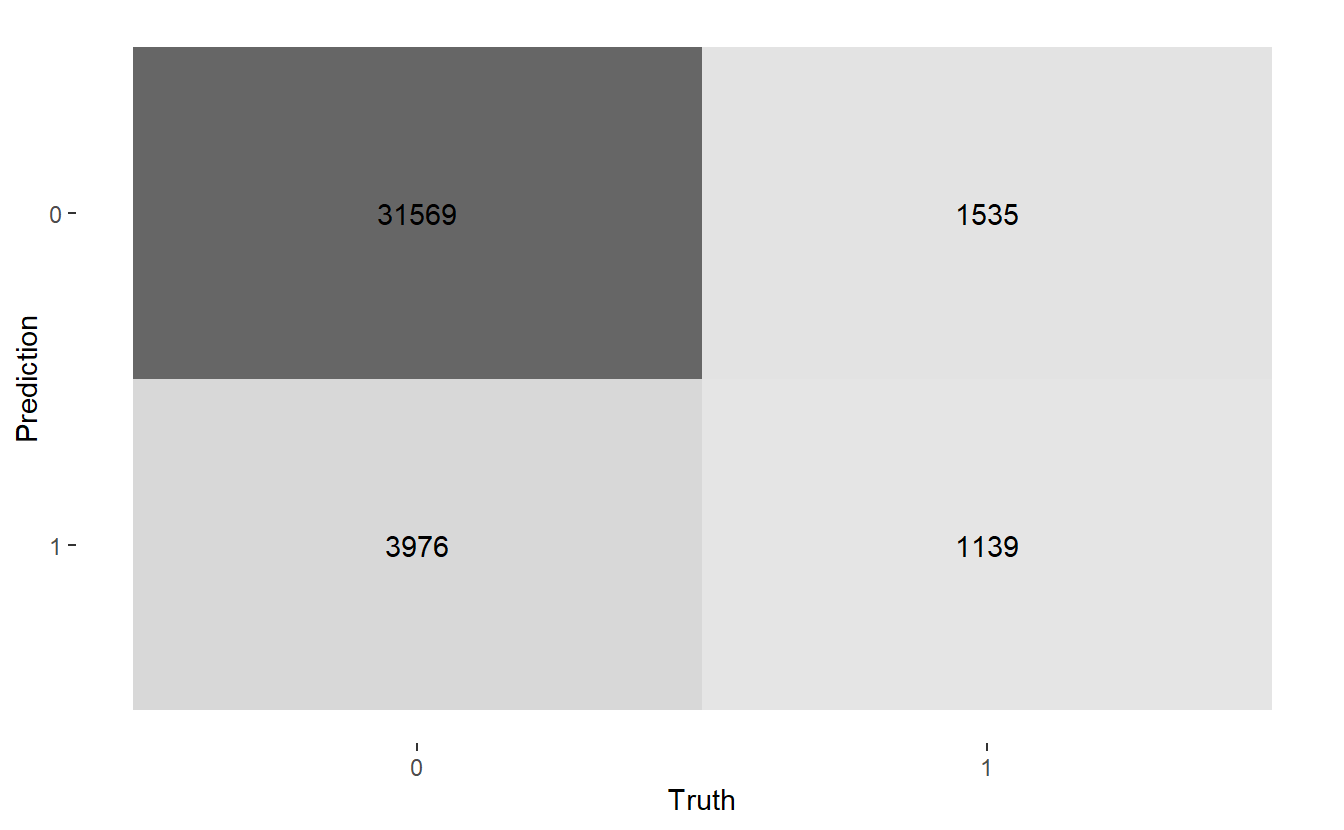
And a mosaic plot:
conf_mat.Age %>%
  autoplot('mosaic')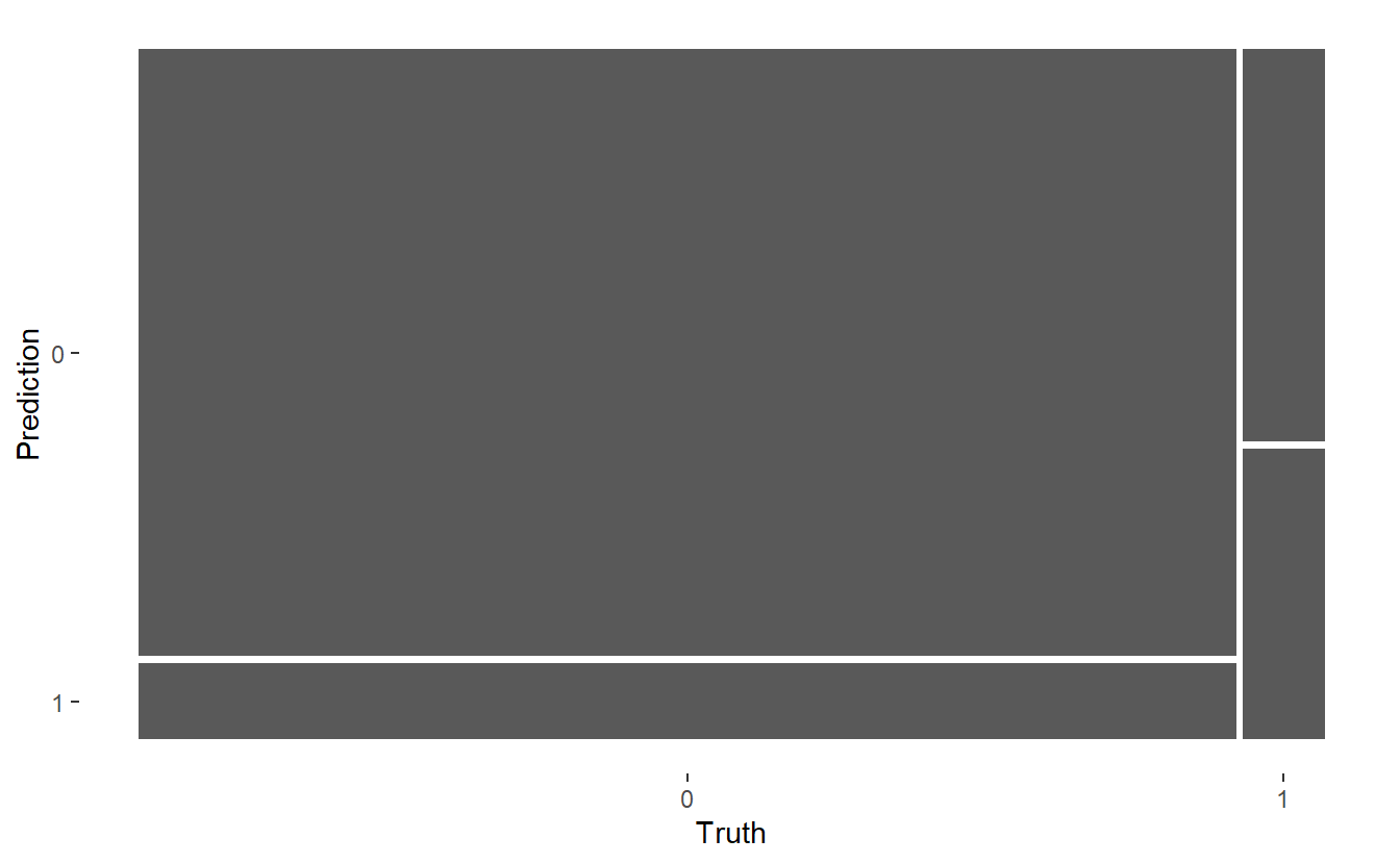
\(~\)
\(~\)
6.13 Model Evaluation Metrics
From a review of the various Model Evaluation Metrics formula we can code corresponding model metrics of interest for this confusion matrix:
accuracy <- (TP + TN)/(TP + TN + FP + FN)

Prevalence <- (TP + FN)/(TP + TN + FP + FN)

#TPR = Recall, Sensitivity
TPR <- TP/(TP+FN)

#Specificity
TNR <- TN/(TN+FP)

Precision <- TP/(TP+FP)
Recall <- TP/(TP+FN)

bal_accuracy <- (TPR + TNR)/2

f1 <- 2*((Precision*Recall)/(Precision+Recall))

tibble(TPR, Recall, TNR, Precision, accuracy , Prevalence ,  bal_accuracy, f1)
#> # A tibble: 1 x 8
#>     TPR Recall   TNR Precision accuracy Prevalence bal_accuracy    f1
#>   <dbl>  <dbl> <dbl>     <dbl>    <dbl>      <dbl>        <dbl> <dbl>
#> 1 0.426  0.426 0.888     0.223    0.856     0.0700        0.657 0.292
The summary function however, can assist us and easily compute a number standard of model evaluation metrics from an associated confusion matrix:
conf_mat.Age %>%
  summary(event_level = "second") %>%
kable()| .metric | .estimator | .estimate |
|---|---|---|
| accuracy | binary | 0.8558047 |
| kap | binary | 0.2208680 |
| sens | binary | 0.4259536 |
| spec | binary | 0.8881418 |
| ppv | binary | 0.2226784 |
| npv | binary | 0.9536310 |
| mcc | binary | 0.2353252 |
| j_index | binary | 0.3140954 |
| bal_accuracy | binary | 0.6570477 |
| detection_prevalence | binary | 0.1338340 |
| precision | binary | 0.2226784 |
| recall | binary | 0.4259536 |
| f_meas | binary | 0.2924637 |
\(~\)
\(~\)
6.14 Train logistic regression with the Random Age feature
logit.DM2.rand_Age <- glm(DIABETES ~ rand_Age,
                     data= A_DATA.train,
                     family = 'binomial')
\(~\)
\(~\)
6.14.1 Review Model Outputs
Let’s briefly review some of the main outputs of logistic regression again.
6.14.1.1 Training Errors
logit.DM2.rand_Age %>%
  glance() %>%
kable()| null.deviance | df.null | logLik | AIC | BIC | deviance | df.residual | nobs |
|---|---|---|---|---|---|---|---|
| 29698.41 | 57327 | -14849.19 | 29702.39 | 29720.3 | 29698.39 | 57326 | 57328 |
6.14.1.2 Coefficent Table
logit.DM2.rand_Age.Coeff <- logit.DM2.rand_Age %>%
  broom::tidy() %>%
  mutate(model = 'rand_Age') %>%
  mutate(odds_ratio = if_else(term != '(Intercept)',
                              exp(estimate),
                              as.double(NA)))

logit.DM2.rand_Age.Coeff %>%
knitr::kable()| term | estimate | std.error | statistic | p.value | model | odds_ratio |
|---|---|---|---|---|---|---|
| (Intercept) | -2.5581241 | 0.0259185 | -98.698915 | 0.0000000 | rand_Age | NA |
| rand_Age | 0.0001011 | 0.0006476 | 0.156162 | 0.8759053 | rand_Age | 1.000101 |
In other words,
equatiomatic::extract_eq(logit.DM2.rand_Age)\[ \log\left[ \frac { P( \operatorname{DIABETES} = \operatorname{1} ) }{ 1 - P( \operatorname{DIABETES} = \operatorname{1} ) } \right] = \alpha + \beta_{1}(\operatorname{rand\_Age}) \]
equatiomatic::extract_eq(logit.DM2.rand_Age, use_coefs = TRUE)\[ \log\left[ \frac { \widehat{P( \operatorname{DIABETES} = \operatorname{1} )} }{ 1 - \widehat{P( \operatorname{DIABETES} = \operatorname{1} )} } \right] = -2.56 + 0(\operatorname{rand\_Age}) \]
6.14.1.3 Logistic Regression Plots
If we call plot on a glm model object then only 4 plots are returned:
- Residuals Vs Fitted
- Normal Q-Q
- Scale-Location
- Residuals Vs Leverage
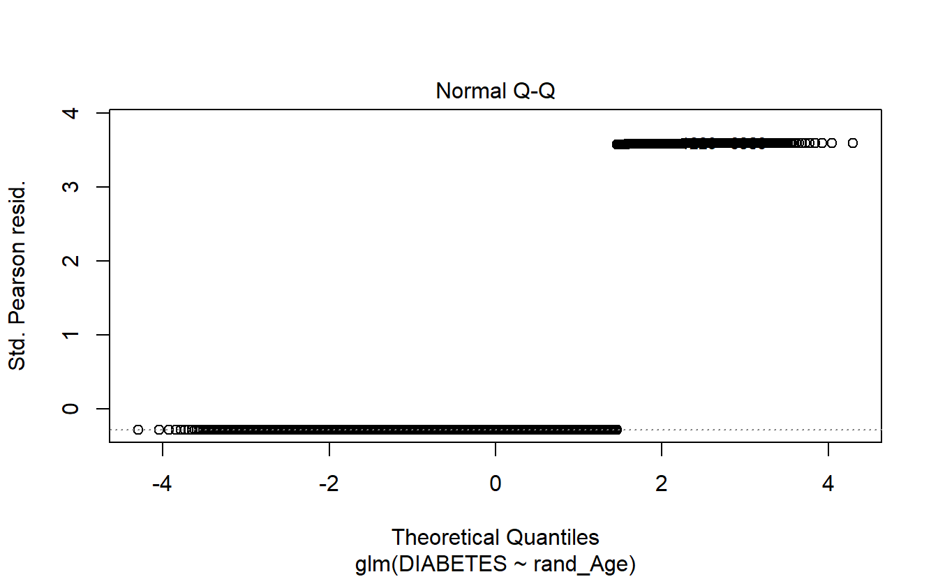
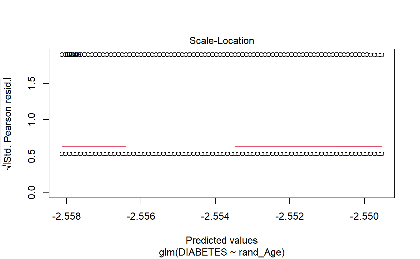
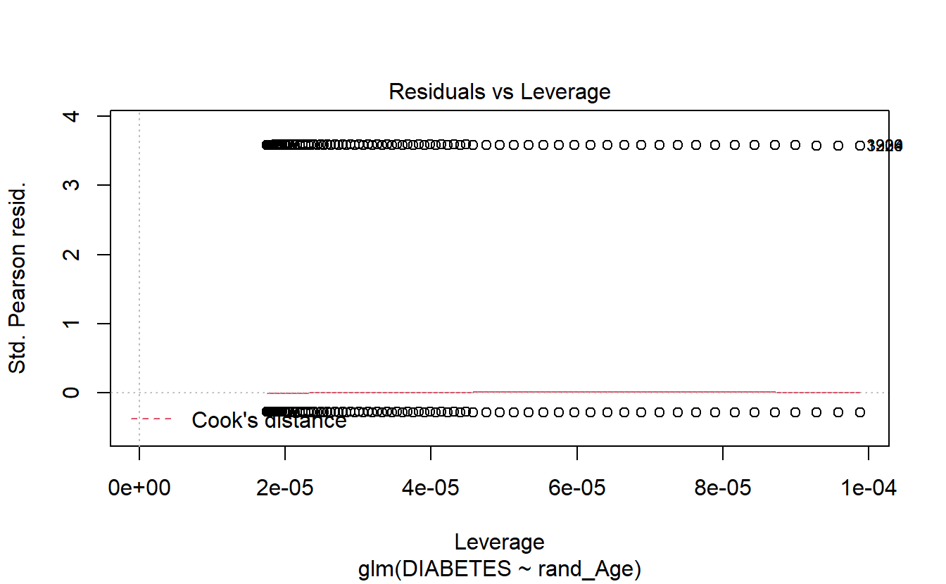
plot(logit.DM2.rand_Age)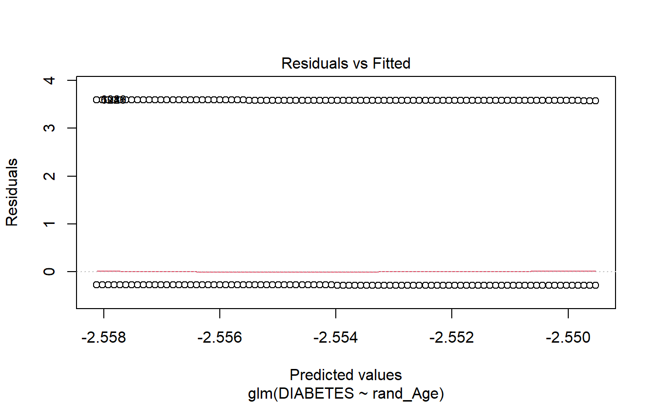
\(~\)
\(~\)
6.14.2 Setting a Threshold
A_DATA.train.scored <- A_DATA.train

A_DATA.train.scored$probs <- predict(logit.DM2.rand_Age,
                                     A_DATA.train.scored,
                                     "response")

DM2_rand_Age.prob_sum <-A_DATA.train.scored %>%
  group_by(DIABETES_factor) %>%
  summarise(min_prob = min(probs),
            mean_prob = mean(probs),
            max_prob = max(probs))

threshold_value_query <- DM2_rand_Age.prob_sum %>%
  filter(DIABETES_factor == 1)

threshold_value <- threshold_value_query$mean_prob
\(~\)
\(~\)
6.14.3 Scoring Test Data
A_DATA.test.scored.DM2_rand_Age <- A_DATA.test %>%
  mutate(model = "logit_DM2_rand_Age")

A_DATA.test.scored.DM2_rand_Age$probs <- predict(logit.DM2.rand_Age,
                                                 A_DATA.test.scored.DM2_rand_Age,
                                                 "response")

A_DATA.test.scored.DM2_rand_Age <- A_DATA.test.scored.DM2_rand_Age %>%
  mutate(pred = if_else(probs > threshold_value, 1, 0)) %>%
  mutate(pred_factor = as.factor(pred))  %>%
  mutate(pred_factor = fct_relevel(pred_factor,c('0','1')))
\(~\)
\(~\)
6.14.4 Review ROC Cuvre
AUC.DM2_rand_Age <- (A_DATA.test.scored.DM2_rand_Age %>%
  roc_auc(truth = DIABETES_factor, probs, event_level = "second"))$.estimate
A_DATA.test.scored.DM2_rand_Age %>%
roc_curve(truth = DIABETES_factor, probs) %>%
autoplot() +
labs(title = "ROC Curve " ,
subtitle = 'test set scored on logistic regression with rand_Age feature',
caption = paste0("AUC : ", round(AUC.DM2_rand_Age,3)))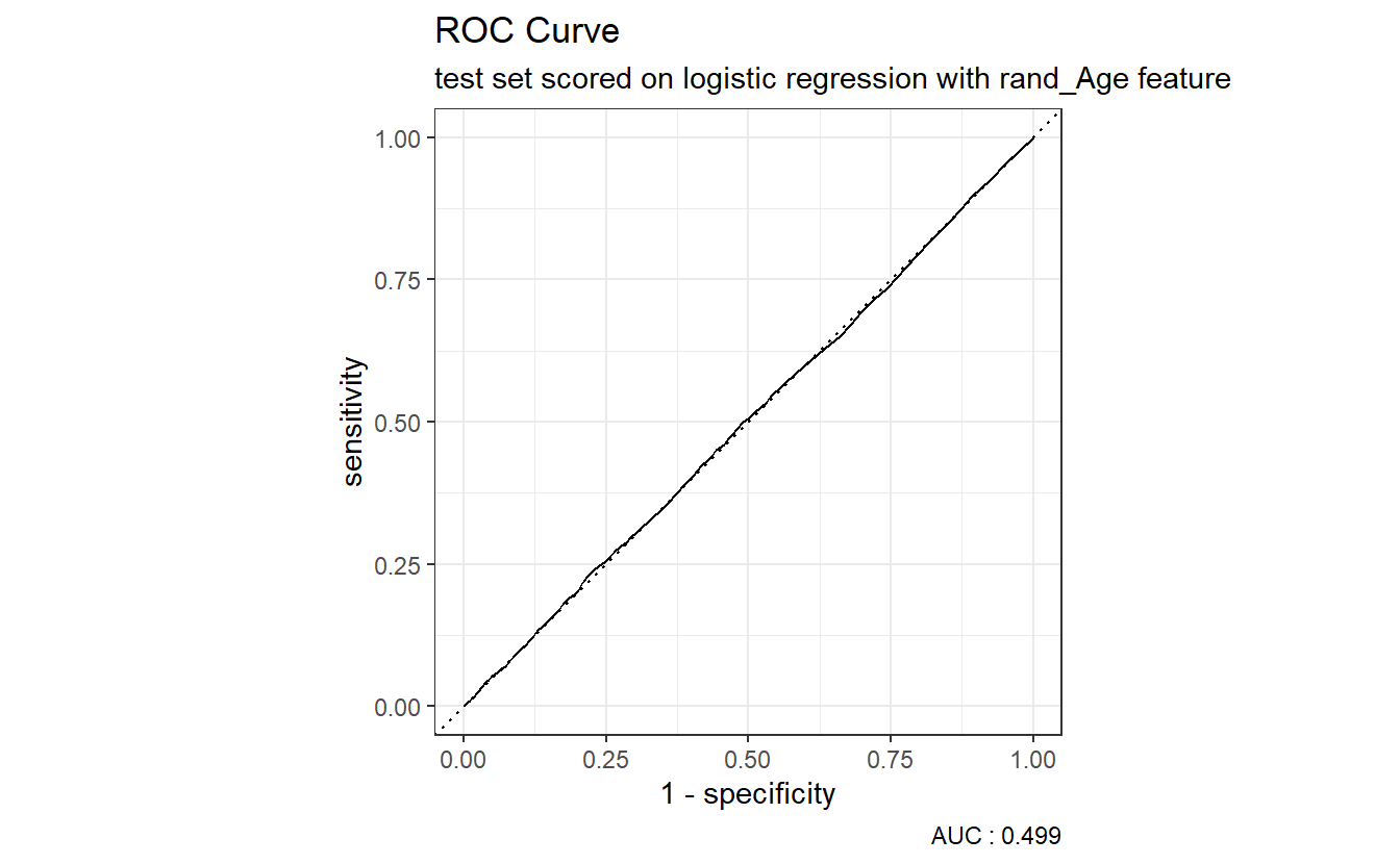
Above we see that our logistic regression model with the rand_Age feature performs about as well as the coin-flip model.
\(~\)
\(~\)
6.14.5 Confusion Matrix
A_DATA.test.scored.DM2_rand_Age %>%
  conf_mat(truth = DIABETES_factor, pred_factor)
#>           Truth
#> Prediction     0     1
#>          0 20192  1530
#>          1 15353  1144
6.14.5.1 Model Metrics
A_DATA.test.scored.DM2_rand_Age %>%
  conf_mat(pred_factor, truth = DIABETES_factor) %>%
  summary(event_level = "second")
#> # A tibble: 13 x 3
#>   .metric  .estimator .estimate
#>   <chr>    <chr>          <dbl>
#> 1 accuracy binary       0.558
#> 2 kap      binary      -0.00121
#> 3 sens     binary       0.428
#> 4 spec     binary       0.568
#> 5 ppv      binary       0.0693
#> 6 npv      binary       0.930
#> # ... with 7 more rows
\(~\)
\(~\)
6.15 Comparing Age to rand_Age models
Note that
nrow(A_DATA.test.scored.DM2_Age)
#> [1] 38219
compare_models <- bind_rows(A_DATA.test.scored.DM2_Age,
A_DATA.test.scored.DM2_rand_Age) and
nrow(compare_models) == 2* nrow(A_DATA.test.scored.DM2_rand_Age)
#> [1] TRUE
This is because compare_models comprises of two dataframes we stacked ontop of each other, one containing each of the results of scoring the test set under model logit.DM2.rand_Age and logit.DM2.Age with the bind_rows funciton.
This new dataset contains the scored results of both models on the test set, and a column model that specifies which model the result came from.
compare_models %>%
  glimpse()
#> Rows: 76,438
#> Columns: 10
#> $ SEQN            <dbl> 3, 4, 9, 11, 13, 14, 20, 25, 26, 27, 28, 29, 31, 39, 4~
#> $ DIABETES        <dbl> 0, 0, 0, 0, 1, 0, 0, 0, 0, 0, 0, 1, 0, 0, 0, 0, 0, 0, ~
#> $ Age             <dbl> 10, 1, 11, 15, 70, 81, 23, 42, 14, 18, 18, 62, 15, 7, ~
#> $ rand_Age        <dbl> 57, 60, 0, 57, 32, 23, 64, 31, 80, 65, 47, 72, 3, 2, 6~
#> $ DIABETES_factor <fct> 0, 0, 0, 0, 1, 0, 0, 0, 0, 0, 0, 1, 0, 0, 0, 0, 0, 0, ~
#> $ model           <chr> "logit_DM2_Age", "logit_DM2_Age", "logit_DM2_Age", "lo~
#> $ probs           <dbl> 0.009430610, 0.005663854, 0.009978965, 0.012506058, 0.~
#> $ pred            <dbl> 0, 0, 0, 0, 1, 1, 0, 0, 0, 0, 0, 0, 0, 0, 0, 0, 0, 0, ~
#> $ pred_factor     <fct> 0, 0, 0, 0, 1, 1, 0, 0, 0, 0, 0, 0, 0, 0, 0, 0, 0, 0, ~
#> $ correct_guess   <lgl> TRUE, TRUE, TRUE, TRUE, TRUE, FALSE, TRUE, TRUE, TRUE,~
\(~\)
\(~\)
6.16 ROC Curves
Recall that the return to roc_auc will be a tibble with columns: .metric .estimator and .estimate.
The data-set compare_models that we have set-up can be used with the rest of the tidy verse, and the yardstick package. The key now is that our analysis is grouped by the two models:
Model_AUCs <- compare_models %>%
  group_by(model) %>%
  roc_auc(truth = DIABETES_factor, probs, event_level = "second") %>%
  select(model, .estimate) %>%
  rename(AUC_estimate = .estimate) %>%
  mutate(model_AUC = paste0(model, " AUC : ", round(AUC_estimate,4)))

Model_AUCs
#> # A tibble: 2 x 3
#>   model              AUC_estimate model_AUC
#>   <chr>                     <dbl> <chr>
#> 1 logit_DM2_Age             0.843 logit_DM2_Age AUC : 0.8427
#> 2 logit_DM2_rand_Age        0.499 logit_DM2_rand_Age AUC : 0.4989
Notice in the above computation that the Model_AUCs returned was a tibble we used that to create a new column model_AUC where we made some nice text that will display in the graph below:
compare_models %>%
  left_join(Model_AUCs) %>%
  group_by(model_AUC) %>%
  roc_curve(truth = DIABETES_factor, probs, event_level = "second") %>%
  autoplot()
#> Joining, by = "model"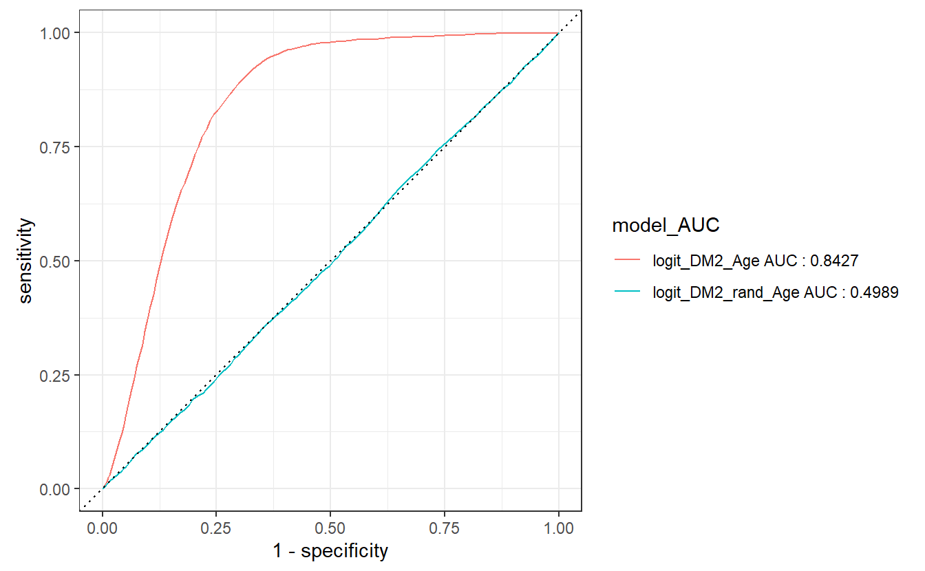
The join occurs, because model is in both tibbles, we then group by model_AUC which will be the new default display by autoplot to match our ROC graphs.
\(~\)
\(~\)
6.17 Precision-Recall curves
Precision is a ratio of the number of true positives divided by the sum of the true positives and false positives. It describes how good a model is at predicting the positive class. Precision is referred to as the positive predictive value or PPV.
Recall is calculated as the ratio of the number of true positives divided by the sum of the true positives and the false negatives. Recall is the same as sensitivity.
A precision-recall curve is a plot of the precision (y-axis) and the recall (x-axis) for different thresholds, much like the ROC curve.
Model_PRAUC <- compare_models %>%
  group_by(model) %>%
  pr_auc(truth = DIABETES_factor, probs, event_level = "second") %>%
  select(model, .estimate) %>%
  rename(pr_estimate = .estimate) %>%
  mutate(Model_PRAUC
         = paste0(model, " PR_AUC : ", round(pr_estimate,4)))

Model_PRAUC
#> # A tibble: 2 x 3
#>   model              pr_estimate Model_PRAUC
#>   <chr>                    <dbl> <chr>
#> 1 logit_DM2_Age           0.205  logit_DM2_Age PR_AUC : 0.2046
#> 2 logit_DM2_rand_Age      0.0730 logit_DM2_rand_Age PR_AUC : 0.073
Notice how similar this computation is to the ROC above.
compare_models %>%
  left_join(Model_PRAUC) %>%
  group_by(Model_PRAUC) %>%
  pr_curve(truth = DIABETES_factor, probs, event_level = "second") %>%
  autoplot()
#> Joining, by = "model"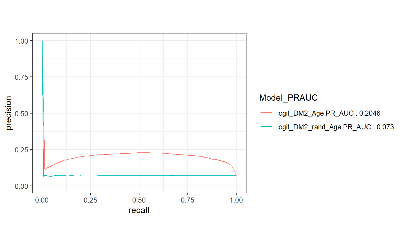
\(~\)
\(~\)
6.18 Gain Curves
The gain curve below for instance showcases that we can review the top 25% of probabilities within the Age model and we will find 75% of the diabetic population.
compare_models %>%
  group_by(model) %>%
  gain_curve(truth = DIABETES_factor, probs, event_level = "second") %>%
  autoplot()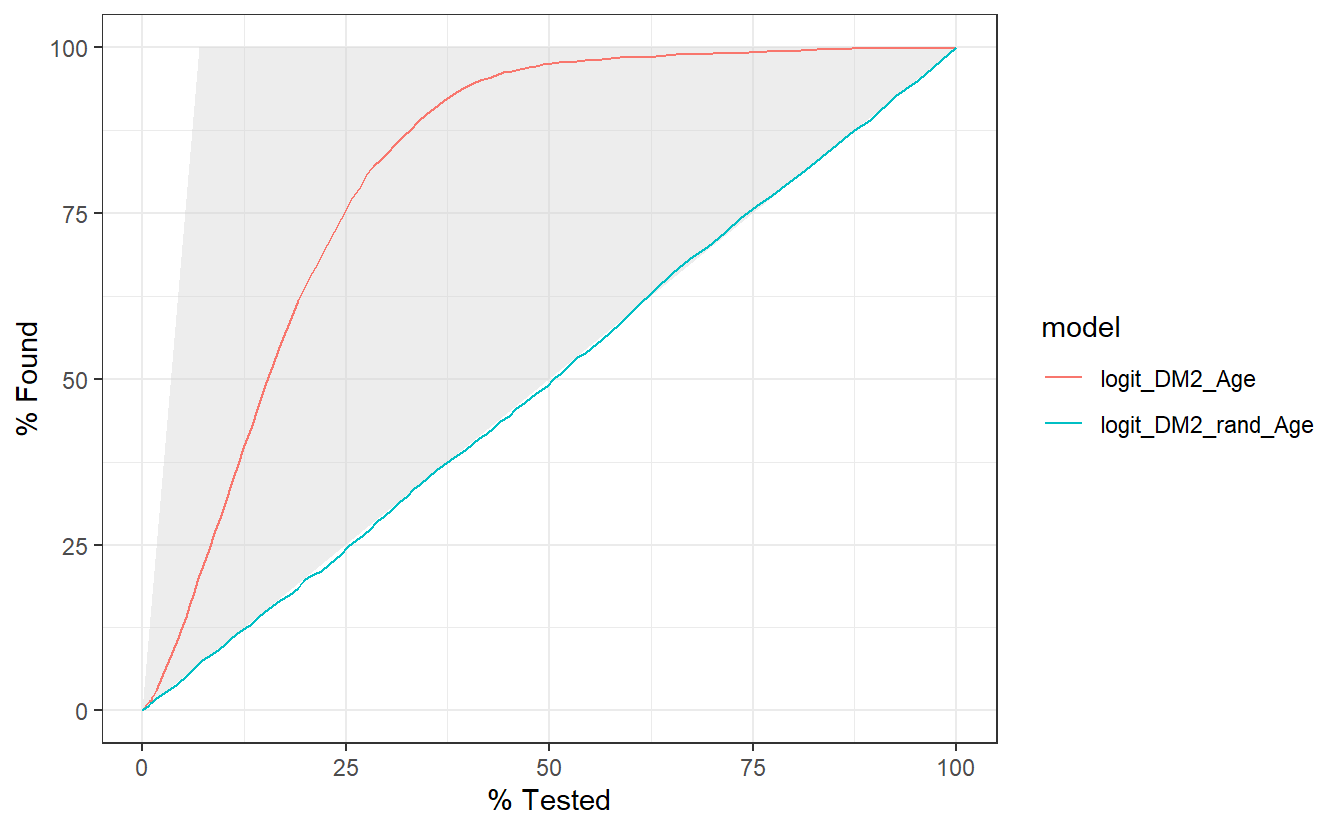
\(~\)
\(~\)
6.19 Lift Curves
Similarly, this lift curve showcases that a review the top 25% of probabilities within the Age model and we will find 3 times more diabetics than searching at random:
compare_models %>%
  group_by(model) %>%
  lift_curve(truth = DIABETES_factor, probs, event_level = "second") %>%
  autoplot()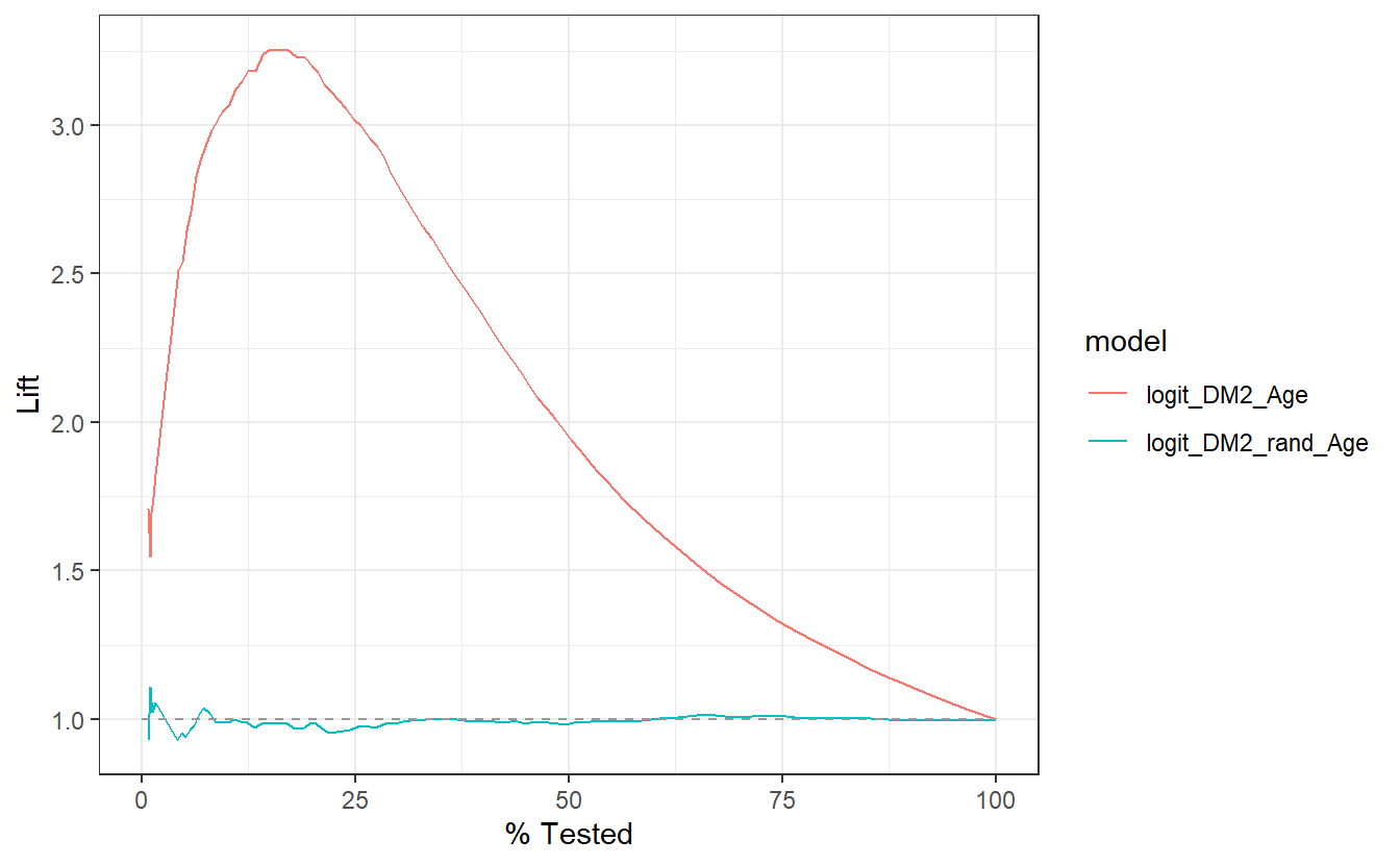
Of additional note, a review the top 25% of probabilities within the rand_Age model performs slightly worse than selecting at random.
\(~\)
\(~\)
6.20 Model Evaluation Metrics Graphs
Lastly, we might want to compare the various model metrics:
compare_models %>%
  group_by(model) %>%
  conf_mat(truth = DIABETES_factor, pred_factor) %>%
  mutate(sum_conf_mat = map(conf_mat,summary, event_level = "second")) %>%
  unnest(sum_conf_mat) %>%
  select(model, .metric, .estimate) %>%
  ggplot(aes(x = model, y = .estimate, fill = model)) +
  geom_bar(stat='identity', position = 'dodge') +
  facet_wrap(.metric ~ .)
Some details on various steps, first have a look at this output:
compare_models %>%
  group_by(model) %>%
  conf_mat(truth = DIABETES_factor, pred_factor)
#> # A tibble: 2 x 2
#>   model              conf_mat
#>   <chr>              <list>
#> 1 logit_DM2_Age      <conf_mat>
#> 2 logit_DM2_rand_Age <conf_mat>
Note that the default return here is a tibble with columns: model which is from our group_by above and a calumn called conf_mat from the conf_mat function which is a list of <S3: conf_mat>.
Next we look at:
compare_models %>%
  group_by(model) %>%
  conf_mat(truth = DIABETES_factor, pred_factor) %>%
  mutate(sum_conf_mat = map(conf_mat,summary, event_level = "second"))
#> # A tibble: 2 x 3
#>   model              conf_mat   sum_conf_mat
#>   <chr>              <list>     <list>
#> 1 logit_DM2_Age      <conf_mat> <tibble [13 x 3]>
#> 2 logit_DM2_rand_Age <conf_mat> <tibble [13 x 3]>
Above sum_conf_mat is defined by map which is from the purrr library; map will always returns a list. A typical call looks like map(.x, .f, ...) where:
.x- A list or atomic vector (conf_mat- column).f- A function (summary)...- Additional arguments passed on to the mapped function- In this case we need to pass in the option
event_level='second'into the function.f = summary
- In this case we need to pass in the option
We see that sum_conf_mat is a list of tibbles.
Now apply the next layer, the unnest(sum_conf_mat) layer:
compare_models %>%
  group_by(model) %>%
  conf_mat(truth = DIABETES_factor, pred_factor) %>%
  mutate(sum_conf_mat = map(conf_mat,summary, event_level = "second")) %>%
  unnest(sum_conf_mat)
#> # A tibble: 26 x 5
#>   model         conf_mat   .metric  .estimator .estimate
#>   <chr>         <list>     <chr>    <chr>          <dbl>
#> 1 logit_DM2_Age <conf_mat> accuracy binary         0.856
#> 2 logit_DM2_Age <conf_mat> kap      binary         0.221
#> 3 logit_DM2_Age <conf_mat> sens     binary         0.426
#> 4 logit_DM2_Age <conf_mat> spec     binary         0.888
#> 5 logit_DM2_Age <conf_mat> ppv      binary         0.223
#> 6 logit_DM2_Age <conf_mat> npv      binary         0.954
#> # ... with 20 more rows
Above unnest(sum_conf_mat) extracted all the .metrics & .estimates from the application of summary in the definition of sum_conf_mat
Then we just select the columns we want to plot:
compare_models %>%
  group_by(model) %>%
  conf_mat(truth = DIABETES_factor, pred_factor) %>%
  mutate(sum_conf_mat = map(conf_mat,summary, event_level = "second")) %>%
  unnest(sum_conf_mat) %>%
  select(model, .metric, .estimate)
#> # A tibble: 26 x 3
#>   model         .metric  .estimate
#>   <chr>         <chr>        <dbl>
#> 1 logit_DM2_Age accuracy     0.856
#> 2 logit_DM2_Age kap          0.221
#> 3 logit_DM2_Age sens         0.426
#> 4 logit_DM2_Age spec         0.888
#> 5 logit_DM2_Age ppv          0.223
#> 6 logit_DM2_Age npv          0.954
#> # ... with 20 more rows
From there we add in a ggplot + geom_bar:
compare_models %>%
  group_by(model) %>%
  conf_mat(truth = DIABETES_factor, pred_factor) %>%
  mutate(sum_conf_mat = map(conf_mat,summary, event_level = "second")) %>%
  unnest(sum_conf_mat) %>%
  select(model, .metric, .estimate) %>%
  ggplot(aes(x = model, y = .estimate, fill = model)) +
  geom_bar(stat='identity', position = 'dodge')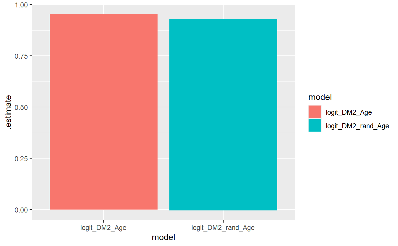
And we finally add on the facet_wrap,
compare_models %>%
  group_by(model) %>%
  conf_mat(truth = DIABETES_factor, pred_factor) %>%
  mutate(sum_conf_mat = map(conf_mat,summary, event_level = "second")) %>%
  unnest(sum_conf_mat) %>%
  select(model, .metric, .estimate) %>%
  ggplot(aes(x = model, y = .estimate, fill = model)) +
  geom_bar(stat='identity', position = 'dodge') +
  facet_wrap(.metric ~ . )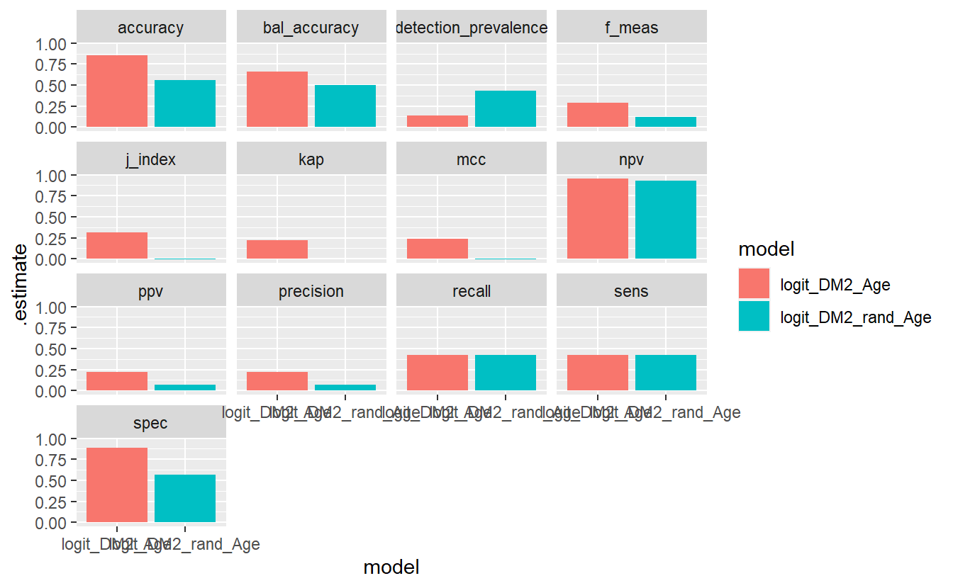
\(~\)
\(~\)
6.21 Question:
What are the expected relationshiped between the
p.values from the t, ks, ANOVA, and Wald statistical tests on an analytic dataset?