Graphical Analysis
Data Analytics Module
Lecturer: Hans van der Zwan
Handout 01
Topic: graphical data analysis/ visualization
Literature
Rumsey D. J. (2010). Statistical Essentials for Dummies. Hoboken: Wiley Publishing.
Ismay C. & Kim A. Y. (2019). ModernDive. Statistical Inference for Data Science. https://moderndive.com.
Preparation for class
- Watch: https://www.youtube.com/watch?v=hZxnzfnt5v8 (6 min), types of Data: Nominal, Ordinal, Interval/Ratio, SLC (Statistical Learning Centre)
- Watch: https://www.youtube.com/watch?v=DAU0qqh_I-A (14 min), basics of constructing charts in MS Excel
- Watch: https://www.youtube.com/watch?v=y3A0lUkpAko (6 min), introduction to inferential statistics (SLC)
- Read Ismay & Kim (2019), chapter 3 (skip the parts about coding in R)
For more background, read Rumsey (2010), CH1, CH2 en CH3
1.1 Data types
Variables can be divided into two groups: categorical en numerical variables. Categorical variables can be subdivided in nominal and ordinal variables.
Numerical variables are often subdivided in discrete and continuous variables.
1.2 Graphing data
The first step in data analysis, after data collection and data cleaning, is exploring the data using graphs and summary statistics. The kind of graph that is applicable depends on the data type of the variables to be plotted.
1.2.1 Univariate analysis
If the analysis concerns one single variable, it is a so called univariate analysis. If the relationship between two variables is involved, it is a bivariate analysis. With more than two variables, it is a multivariate analysis.
1.2.1.1 Univariate categorical data
For a univariate categorical analysis the most common plots are bar plots. Many studies make use of pie diagrams, although they are not recommended by many specialists in the field.
E.g. the note on the help page for R states:
Pie charts are a very bad way of displaying information. The eye is good at judging linear measures and bad at judging relative areas. A bar chart or dot chart is a preferable way of displaying this type of data.
Cleveland (1985), page 264: “Data that can be shown by pie charts always can be shown by a dot chart. This means that judgements of position along a common scale can be made instead of the less accurate angle judgements.” This statement is based on the empirical investigations of Cleveland and McGill as well as investigations by perceptual psychologists.
Example: houses sold London, January 2019
Figure 1
Number of houses sold by category in London January 2019
ggplot(london_jan19, aes(x = TYPE)) +
  geom_bar(fill = 'royalblue') +
  xlab(NULL) +
  theme_minimal()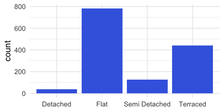
Note. Data retrieved from http://landregistry.data.gov.uk/app/ppd/.1
In many cases it is a good idea to reorder the bars from highest to lowest (or the other way around).
Figure 2
Number of houses sold by category in London January 2019
london_jan19 %>%
  group_by(TYPE) %>%
  summarize(COUNT = n()) %>%

  ggplot(aes(x = reorder(x=TYPE, X = -COUNT), y = COUNT)) +
  geom_bar(fill = 'royalblue', stat = "identity") +
  xlab(NULL) +
  theme_minimal()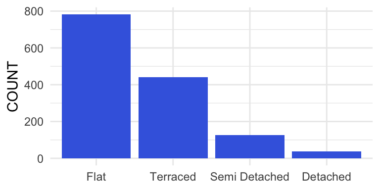
Note. Data retrieved from http://landregistry.data.gov.uk/app/ppd/.
1.2.1.2 Univariate numerical data
Histograms are usefull graphs to explore a numerical variable.
Example: histogram selling prices properties sold in London
Figure 3
Prices properties sold in London in 2018
library(scales)
ppd_london2018 <- read_csv("Datafiles/ppd_london2018.csv")  %>%
  filter(TYPE != "O") %>%
  filter(PRICE < quantile(PRICE, .99))

histo <- ggplot(ppd_london2018, aes(x=PRICE)) +
  geom_histogram(fill = 'royalblue',
                 binwidth = 50000) +
  xlim(0, max(ppd_london2018$PRICE)) +
  xlab("PRICE (GBP)") +
  scale_x_continuous(labels = comma) +
  theme_minimal() +
  theme(plot.caption = element_text(hjust = 0))

histo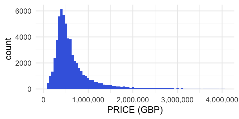
For explanation about creating histograms in MS Excel 2016, watch this video.
EXERCISE 1.1 to 1.3
Another possibility to plot one numerical variable is by using a box plot, also called box and whisker plot. These are especially usefull to compare the distribution of a variable within different groups; see section @ref(boxplot) for an example.
A boxplot is based on the so called five number summary of the data:
- Minimum
- First Quartile
- Median (Second Quartile)
- Third Quartile
- Maximum
They are also used to direct attention to outliers in the distribution.
Click here for an explanation about boxplots.
Example: tuition fees US universities 2014
Figure 4
Tuiton fees 4-year public sector programmes at US universities in 2014-15
tuition <- read.xlsx("Datafiles/CATClists2014-1.xlsx",
                     sheet = "Tuition")

tuition %>%
  filter(Sector == 1) %>%
  select(tuition = `2014-15.Tuition.and.fees`) %>%
  ggplot(aes(x="", y = tuition)) +
    geom_boxplot(outlier.size = .5) +
  xlab(NULL) +
  ylab("US dollars") +
  theme_minimal() +
  coord_flip()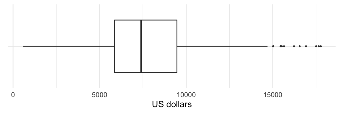
Note. Data comes from this source.
1.3 Bivariate analysis
1.3.1 Two categorical variables
1.3.1.1 Stacked and side-by-side bar plots
Example: master students at Dutch Universities of applied Sciences
Figure 5
Students enrolled in Dutch higher education in the academic year 2018-19
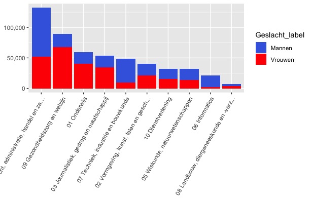
Note. Data source https://opendata.cbs.nl/statline, table ID 83538NED.
1.3.1.2 Heatmaps
Example: number of properties sold per type and per district
Figure 6
Heatmap properties sold in London, January 2019
london_jan19 <- read.xlsx("Datafiles/HP_LONDON_JAN19.xlsx")
heatmap <- london_jan19 %>%
  group_by(TYPE, DISTRICT) %>%
  summarize(COUNT = n()) %>%
  ggplot(aes(x = TYPE, y = DISTRICT)) +
  geom_tile(aes(fill = COUNT)) +
  scale_fill_continuous(low = "#ffe6ff", high = "#800080") +
  theme(panel.grid.major = element_blank(),
        panel.background = element_blank(),
        title = element_blank(),
        plot.caption = element_text(hjust = 0, size = 10))

heatmap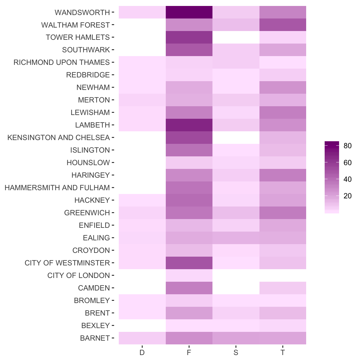
Note. Data source: http://landregistry.data.gov.uk".
1.3.2 One categorical and one numerical variable
Boxplots are usefull graphs to compare the distribution of a variable between groups. Some examples below.
Figure 7
Prices houses for sale in three Dutch cities
hfs <- read.xlsx("Datafiles/20191104forsale_ams_dh_rot.xlsx")
hfs %>% filter(PRICE <= 1000000) %>%
  ggplot(aes(x = CITY, y = PRICE)) +
  geom_boxplot(fill = 'royalblue', outlier.color = "royalblue", outlier.size = .5) +
  ylab("EURO") +
  ylim(0, 1000000) +
  theme_minimal() +
theme(axis.text.x = element_text(angle=0, hjust = .5), axis.title.x = element_blank()) 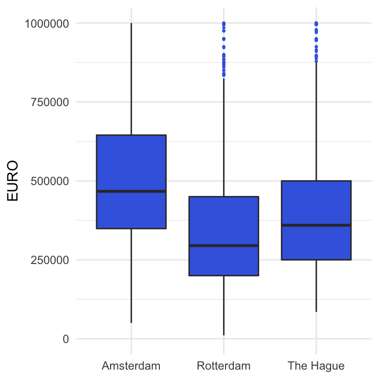
Note. This graphs relates to houses for sale with an asking price below 1 mln euro, on November 4, 2019, Source: www.jaap.nl.
Figure 9
Tuition fees for different programmes at US universities in the academic year 2014-2015
tuition <- read.xlsx("Datafiles/CATClists2014-1.xlsx",
                      sheet = 'Tuition')
tuition %>% ggplot(aes(x = Sector.name, y = `2014-15.Tuition.and.fees`)) +
  geom_boxplot(fill = 'royalblue', outlier.color = "royalblue", outlier.size = .5) +
  ylab("USD") +
  theme_minimal() +
theme(axis.text.x = element_text(angle=60, hjust = 1), axis.title.x = element_blank()) 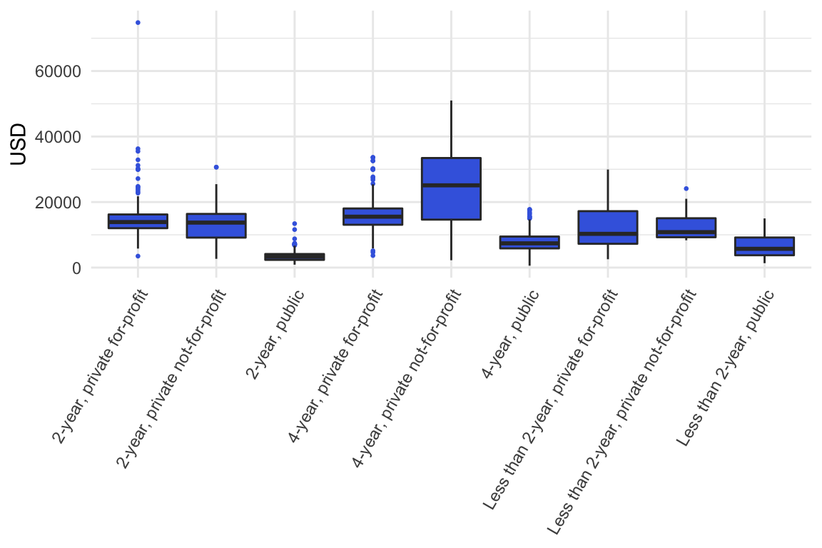
Note. Data retrieved from this website.
For more examples how boxplots are used to compare groups, google images on ‘boxplot’.
Exercise 1.4 and 1.5
Another way to compare groups: side-by-side histograms. This is not that simple in MS Excel.
Figure 8
Tuition fees US universities per category in 2014-2015
tuition <- read.xlsx("Datafiles/CATClists2014-1.xlsx",
                      sheet = 'Tuition')
tuition %>% ggplot(aes(x = `2014-15.Tuition.and.fees`)) +
  geom_histogram(fill = 'royalblue', breaks = seq(0, 80000, 2500)) +
  facet_grid(Sector~., scales = 'free')  +
  theme_minimal()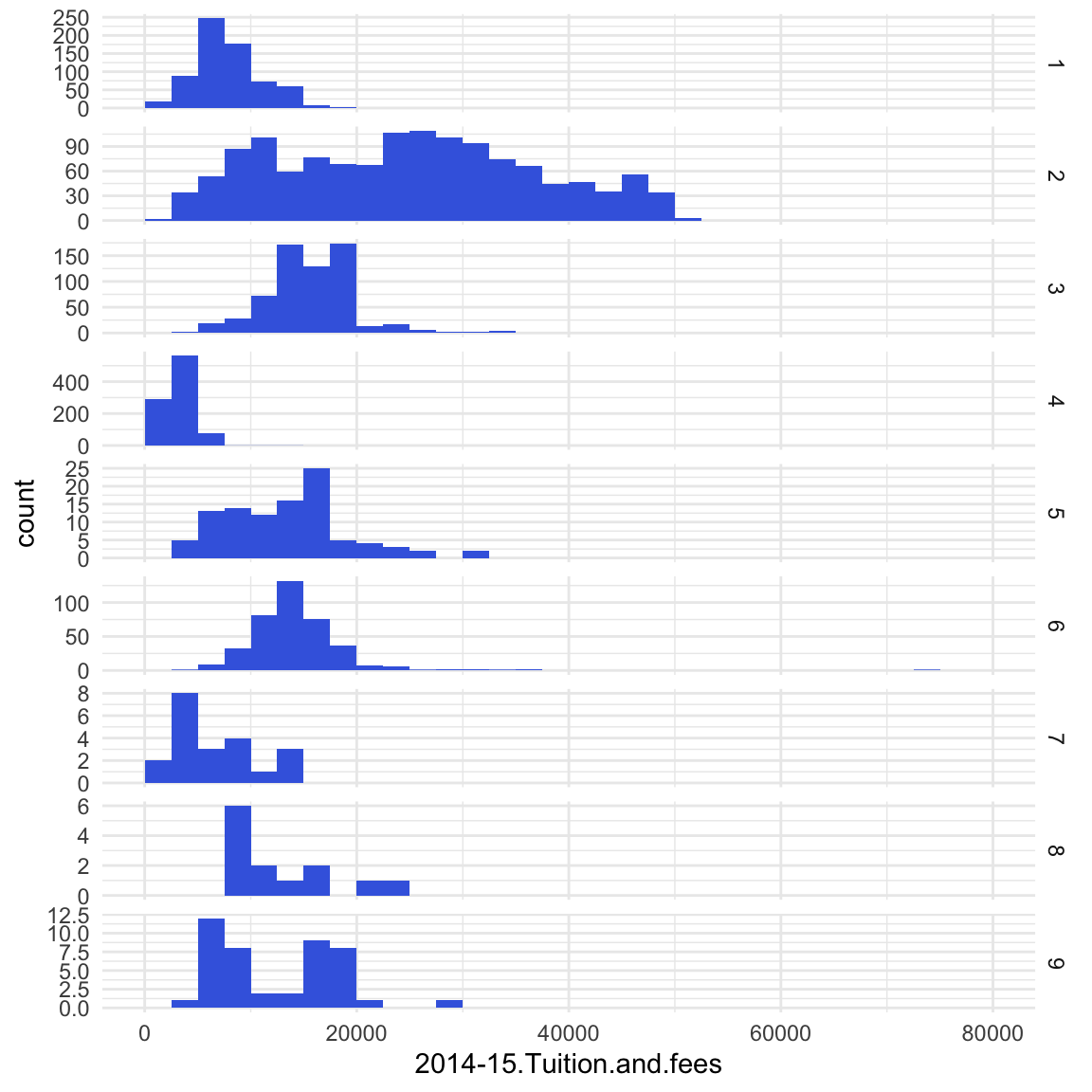
Note. Categories: 1 = 4-year, public; 2 = 4-year, private not-for-profit; 3 = 4-year, private for-profit; 4 = 2-year, public; 5 = 2-year, private not-for-profit; 6 = 2-year, private for-profit; 7 = Less than 2-year, public; 8 = Less than 2-year, private not-for-profit; 9 = Less than 2-year, private for-profit. The spread in the 4-year, private not-for-profit program fees is by far the highest. Data retrieved from this website.
1.3.3 Two numerical variables
To visualize the relationship between two numerical variables the most appropriate graph is a scatter plot. If there is a clear distinction between the independent (explanatory) and the dependent (response) variable, it is common to plot the independent variable on the x-axis and the dependent on the y-axis.
Example scatterplot
Figure 9
Relation between AREA in m^2 and RENT in euro per month for rooms for rent in Amsterdam, Rotterdam and The Hague
roomsforrent <- read.xlsx("Datafiles/RoomsForRentNeth.xlsx")
roomsforrent %>%
  ggplot(aes(x= AREA, y = RENT)) +
  geom_point(color = 'blue', size = .5) +
  ylim(0, round(max(roomsforrent$RENT), -2)) +
  theme_minimal()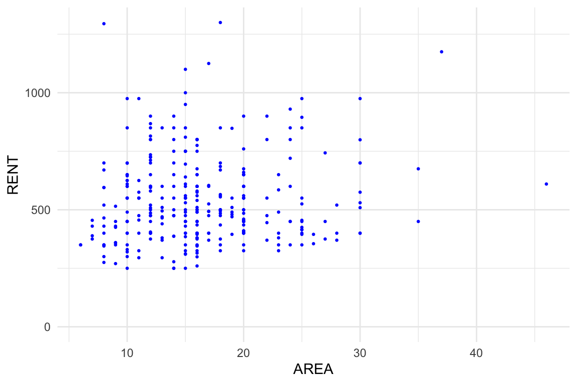
Note. Data sampled from https://directwonen.nl/ on April 24, 2018. There doesn’t seem te be a relationship between AREA and RENT.
Exercise 1.6
1.3.4 Time series
A time series is a series of data points listed in time order. Most commonly, a time series is a sequence taken at successive equally spaced points in time. A line graph is commonly used to find patterns, e.g. seasonal influences and trends over time, in the data.
Example: number of passengers departed from Amsterdam Schiphol airport over time
Figure 10
Passengers departed from Amsterdam Schiphol airport per quarter
df <- read.xlsx("Datafiles/cbs_airport_figures.xlsx")
schiphol_pass_vert_kwartaal <-
  df %>%
  filter(str_sub(Perioden, 5, 6) == "KW",
         Luchthavens_label == "Amsterdam Airport Schiphol") %>%
  select(
    PERIOD = Perioden,
    PASSENGERS_DEPARTED= TotaalVertrokkenPassagiers_18,
    PASSAGIERS_ARRIVED = TotaalAangekomenPassagiers_15) %>%
  mutate(PERIOD = str_replace(PERIOD, "KW", " Q"),
         YEAR = as.numeric(str_sub(PERIOD, 1, 4)))


schiphol_pass_vert_kwartaal %>%
  ggplot(aes(x = PERIOD, y = PASSENGERS_DEPARTED)) +
  geom_line(aes(group = 1), size = .2, col = "blue") +
  geom_point(col = "blue", size = 0.5) +
  theme_light() +
  theme(axis.text.x = element_text(angle = 90)) +
  scale_x_discrete(breaks =
                     schiphol_pass_vert_kwartaal$PERIOD[seq(1,nrow(schiphol_pass_vert_kwartaal), by = 4)],
                   labels = 1999:max(schiphol_pass_vert_kwartaal$YEAR)) +
  scale_y_continuous(labels = comma) +
xlab(NULL) 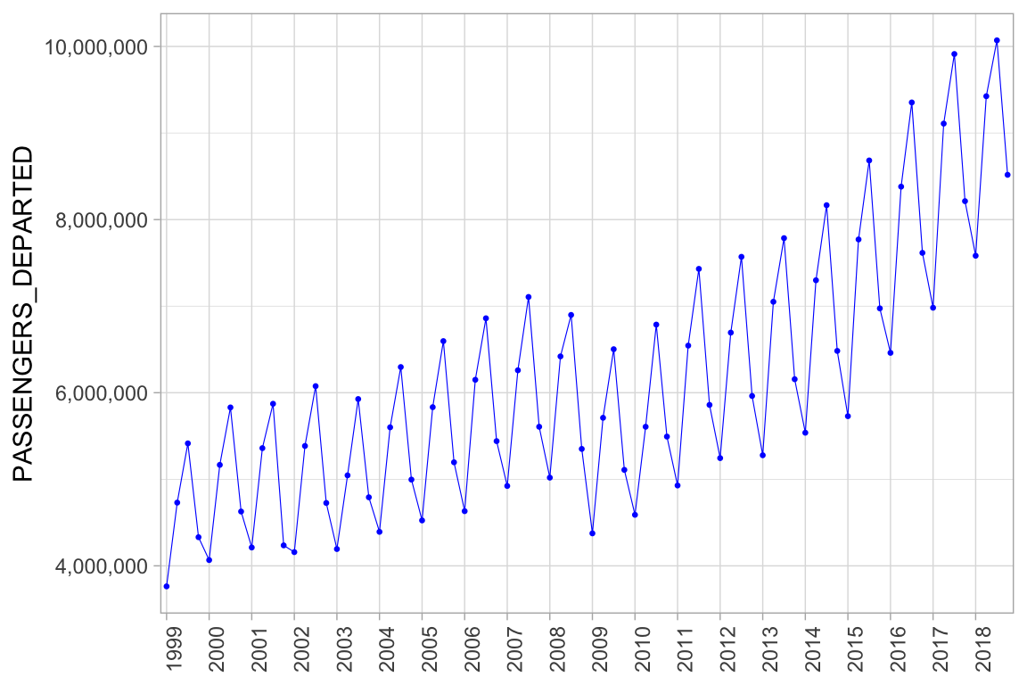
Note. The financial crisis that started in 2007/2008 seems to have caused a trend break.
Exercise 1.7
1.4 Graphs in a scientific report
The APA website with guidelines for scientific reports states: “The most important principle to follow when creating a figure is to present information in a way that is easy for readers to understand. Provide sufficient information in the figure itself so that readers do not need to read the text to understand it.” For correct layout, see the examples on the APA website.
In this lecture data from properties sold in England and Wales are used. These data have been retrieved from http://landregistry.data.gov.uk/app/ppd/; this website contains HM Land Registry data © Crown copyright and database right 2019. This data is licensed under the Open Government Licence v3.0.↩