Chapter 7 Network Analysis
In this chapter, we will cover concepts and procedures related to network analysis in R. “Networks enable the visualization of complex, multidimensional data as well as provide diverse statistical indices for interpreting the resultant graphs” (Jones et al., 2018). Put otherwise, network analysis is a collection of techniques that visualize and estimate relationships among agents in a social context. Furthermore, network analysis is used “to analyze the social structures that emerge from the recurrence of these relations” where “[the] basic assumption is that better explanations of social phenomena are yielded by analysis of the relations among entities” (Science Direct; Linked Below).
Networks are made up of nodes (i.e., individual actors, people, or things within the network) and the ties, edges, or links (i.e., relationships or interactions) that connect them. The extent to which nodes are connected lends to interpretations of the measured social context.
“By comparison with most other branches of quantitative social science, network analysts have given limited attention to statistical issues. Most techniques and measures examine the structure of specific data sets without addressing sampling variation, measurement error, or other uncertainties. Such issues are complex because of the dependencies inherent in network data, but they are now receiving increased study. The most widely investigated approach to the statistical analysis of networks stresses the detection of formal regularities in local relational structure.
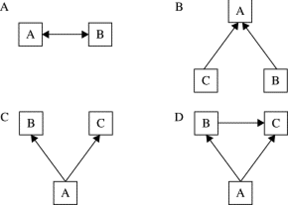
The figure above illustrates some of the relational structures commonly found in analyses of social networks.
A: Demonstrates a relationship of reciprocity/mutuality.
B: Demonstrates a directed relationship with a common target.
C: Relationships emerge from a common source.
D: Transitive direct relationships with indirect influences.
Another type is homophily, which is present, for example, when same-sex friendships are more common than between-sex friendships. This involves an interaction between a property of units and the presence of relationships” (Peter V. Marsden, in Encyclopedia of Social Measurement, 2005). This sort of model might reflect the tendency of people to seek out those that are similar to themselves.
7.0.0.1 Measures of Centrality
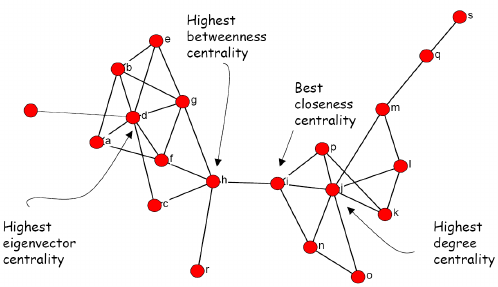
Measures of centrality provide quantitative context regarding the importance of a node within a network. There are four measures of centrality that we will cover.
Degree Centrality: The degree of a node is the number of other nodes that single node is connected to. Important nodes tend to have more connections to other nodes. Highly connected nodes are interpreted to have high degree centrality.
Eigenvector Centrality: The extent to which adjacent nodes are connected themselves also indicate importance (e.g., Important nodes increase the importance of other nodes).
Closeness centrality: Closeness centrality measures how many steps are required to access every other node from a given node. In other words, important nodes have easy access to other nodes given multiple connections.
Betweenness Centrality: This ranks the nodes based on the flow of
connections through the network. Importance is demonstrated through high
frequency of connection with multiple other nodes. Nodes with high
levels of betweenness tend to serve as a bridge for multiple sets of
other important nodes.
See this
link
for a set of journals and books that cover the topic.
Also, examine this (paid) online tool for text-based network analysis: https://www.infranodus.com
7.1 Zacharies Karate Club Case Study
We will be working with a dataset called Zacharies Karate Club, a
seminal dataset in network analysis literature. First we need to install
the relevant packages. Today we will need a package called igraph, a
package useful for creating, analyzing, and visualizing networks. If you
do not have the packages already, install the tidyverse, igraph,
ggnetwork, and intergraph. igraph helps us perform network
analysis. ggnetwork and intergraph are both packages used for
plotting networks in the ggplot framework.
# Load the libraries
library(tidyverse)
library(igraph)
library(ggnetwork)
library(intergraph)
Zachary’s Karate Club Background
Taken from wikipedia: “A social network of a karate club was studied by Wayne W. Zachary for a period of three years from 1970 to 1972. The network captures 34 members of a karate club, documenting pairwise links between members who interacted outside the club. During the study a conflict arose between the administrator”John A” and instructor “Mr. Hi” (pseudonyms), which led to the split of the club into two. Half of the members formed a new club around Mr. Hi; members from the other group found a new instructor or gave up karate. Based on network analysis Zachary correctly predicted each member’s decision except member #9, who went with Mr. Hi instead of John A.” In this case study, we will try to infer/predict the group splits with network analysis techniques.
7.1.0.1 Load Data and Extract Model Features
Now it’s time to extract the relevant information that we need from the dataset. We need the associations between members (edges), the groupings after the split of the network, and the labels of the nodes.
# Load and view the data
members <- read_csv("Zacharies_Karate_Club.csv")
edges <- read_csv("Zacharies_Karate_Club_edges.csv")

# Extract information for nodes
nodes <- members$node

# Extract information on edges
edges <- as.vector(rbind(edges$From, edges$To))
Extract the groups and labels of the vertices and store them in vectors. Make sure that the labels are called as characters and not factors using the “str()” function, as igraph requires character data to cast labels.
7.1.0.2 Creating Networks From Data
Now that we have extracted the relevant data that we need, let’s construct a network of Zachary’s Karate club.
# Create our network
# Note that this will automatically enumerate the nodes (eg. 1, 2, 3, ...)
G <- make_empty_graph(n = length(nodes), directed = F) %>%
  add_edges(edges)
We can also create vertex attributes. Let’s make a vertex attribute for each group (Mr. Hi and John A).
# Create a vertex attribute
  G <- G %>%
  igraph::set.vertex.attribute('group', index = V(G), value = groups)
Create a vertex attribute for node label. Call the attribute ‘label’.
7.1.0.3 Visualizing Networks with baseR
Now visualize the network by running the plot function on our network ‘G’.
# Plot igraph object
plot(G)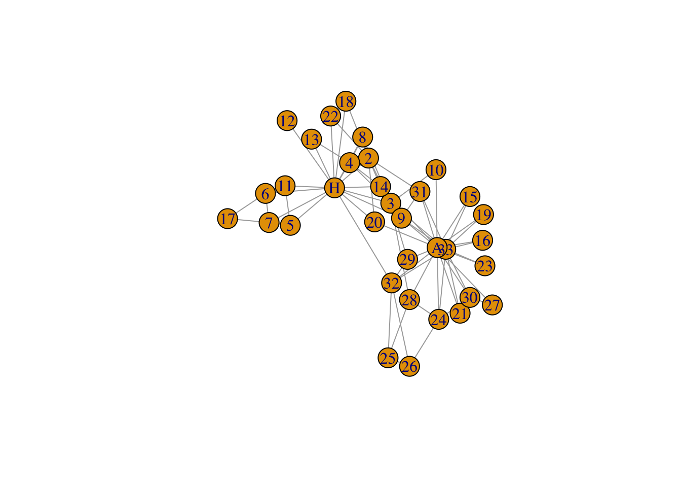
Let’s change some of the plot aesthetics. We can change the vertex colors, edge colors, vertex sizes, etc. Play around with the arguments for plotting a network.
# Edit baseR plot aesthetics
plot(G, vertex.color="green",  # Changes node color
     edge.color = 'black',     # Changes edge color
     vertex.size = 10,         # Changes vertex size
     vertex.shape = 'circle',  # Changes vertex shape
     asp = 0,                  # Spread out nodes
     layout = layout_in_circle)# Format nodes in a circle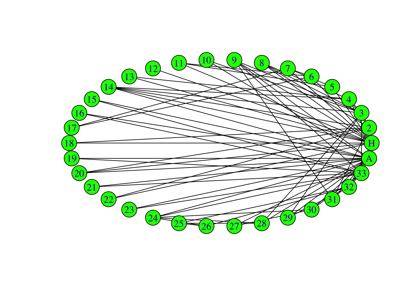
We can also change the color of our vertices according to group.
plot(G, vertex.color = groups, # Changes node color
     edge.color = 'black',     # Changes edge color
     vertex.size = 10,         # Changes vertex size
     vertex.shape = 'square',  # Changes vertex shape
     asp = 0)                  # Spread out node)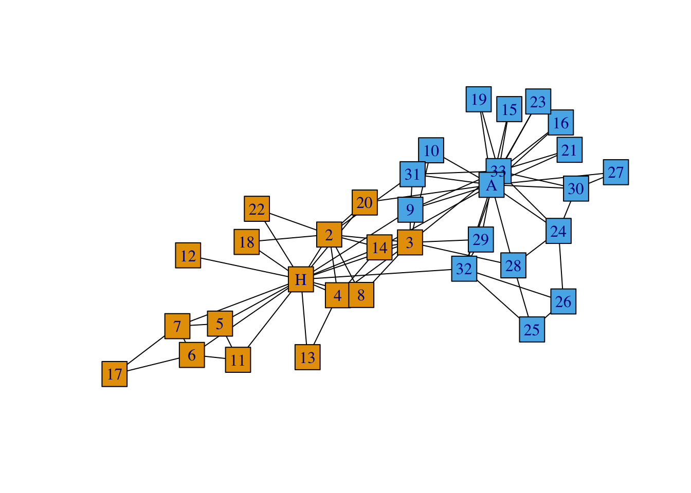
7.1.0.4 Visualizing Networks with ggnetwork
You can also use ggplot to visualize igraph objects.
# Plot igraph object with ggplot
ggplot(G, aes(x = x, y = y, xend = xend, yend = yend)) +
  geom_edges() +
  geom_nodes()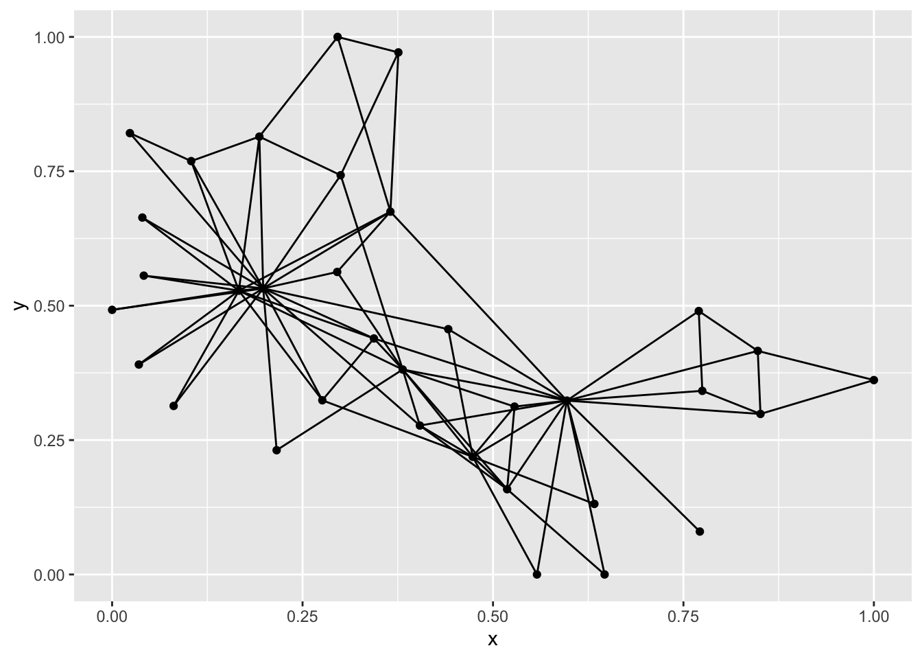
Let’s see if we can make our the ggplot version look better.
# Plot igraph object with ggplot
ggplot(G, aes(x = x, y = y, xend = xend, yend = yend)) +
  geom_edges(color = 'grey', size = 1, linetype = 'dashed') + # Alter edge attributes
  geom_nodes(size = 10, color = 'red', shape = 'square') +    # Alter node attributes
  geom_nodetext(label = people, fontface = "bold") +          # Add text to nodes
  theme_blank()                                               # Remove grid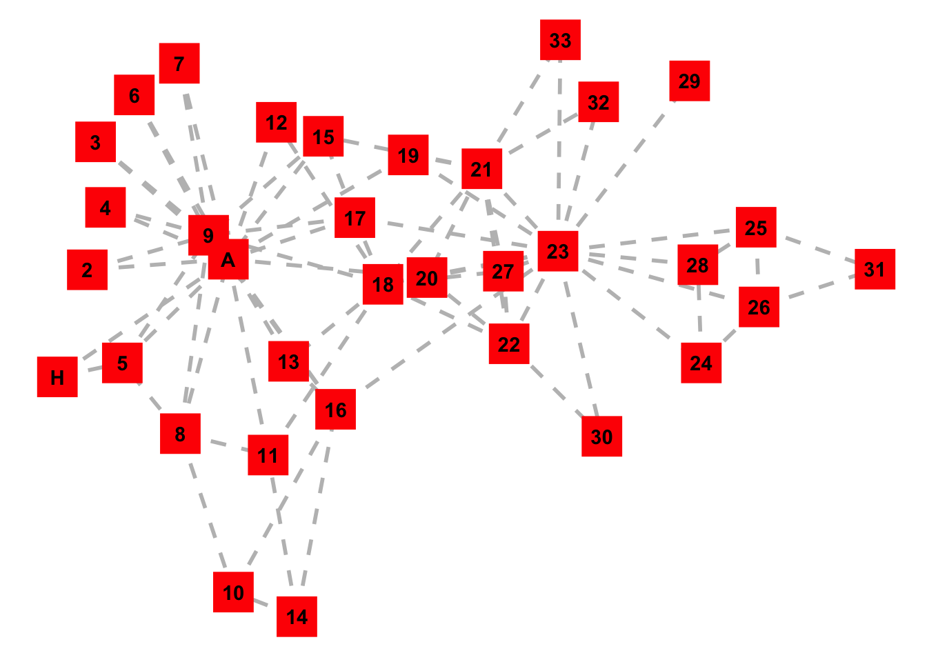
Using ggnetwork and ggplot, color or shape the nodes by karate group. Also make some other plot aesthetic changes to your liking.
7.1.0.5 Measuring Centrality
# Compute the degree centrality for our graph G.
degr_cent <- centr_degree(G, mode = 'all')
degr_cent <- degr_cent$res

# Compute the eigenvector centrality of our network
eign_cent <- eigen_centrality(G)
eign_cent <- eign_cent$vector

# Compute the closeness centraility
clos_cent <- igraph::closeness(G)

# Compute betweeness centrality
betw_cent <- igraph::betweenness(G)
Finally, Let’s put all of the centrality measures in one table so that we can compare the outputs.
# Create data frame storing all of the measures of centrality
data <- data.frame(vertex = nodes,
                   label = people,
                   degree = degr_cent,
                   eigen = eign_cent,
                   closeness = clos_cent,
                   betweeness = betw_cent)

# Order the data by degree centrality
data <- data %>% arrange(desc(degree))

# View the head of the data frame
head(data)
## vertex label degree eigen closeness betweeness
## 1 34 A 17 1.0000000 0.01666667 160.551587
## 2 1 H 16 0.9521324 0.01724138 231.071429
## 3 33 33 12 0.8266589 0.01562500 76.690476
## 4 3 3 10 0.8495542 0.01694915 75.850794
## 5 2 2 9 0.7123351 0.01470588 28.478571
## 6 4 4 6 0.5656143 0.01408451 6.288095It makes sense that the most connected members of the network are indeed
John A. and Mr. Hi. We can view the centrality measures from the
perspective of the graph. Here, we add the object degr_cent to the
vertex size to display the nodes via their degree centrality using
baseR.
# Plot ZKC with igraph
plot(G,                            # Plot igraph object
     vertex.color = groups,        # Change vertex colors
     edge.color = 'black',         # Change edge color
     vertex.size = 10+degr_cent,   # Change node size
     vertex.shape = 'circle',      # Specify node shape
     asp = 0,                      # Spreads out nodes
     layout=layout_with_lgl)       # Specify layout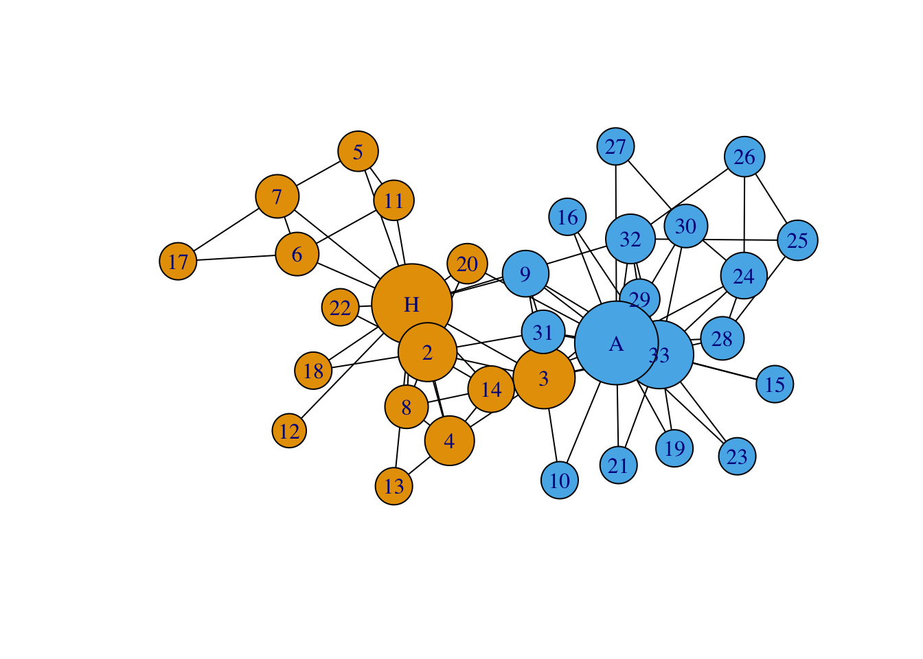
tkplot(G,
       vertex.color = groups,
       edge.color = 'black',
       vertex.label.color = 'white',
       vertex.size = 10+degr_cent)
## [1] 1Now, using the tidyverse! Change the code below to make a graph of our
network where node sizes are scaled by the degree centrality.
ggplot(G, aes(x = x, y = y, xend = xend, yend = yend)) +      # Do not change
  geom_edges(color = 'grey', size = 1, linetype = 'dashed') + # Alter edge attributes
  geom_nodes(aes(color = as.factor(group)),
             size = 10,
             shape = 'circle') +                              # Alter node attributes
  geom_nodetext(label = people, fontface = "bold") +          # Add text to nodes
  theme_blank() +                                             # Remove grid
  scale_color_discrete(name = 'Group',                        # Edit legend
                       label= c('Mr. Hi','John A.'))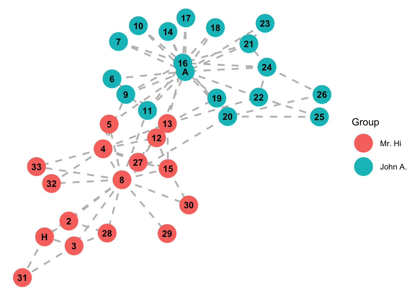
#Answer: add degr_cent to size under the "geom_nodes" layer.7.1.0.6 Modularity
Modularity is a measure that describes the extent to which community structure is present within a network when the groups are labeled. A modularity score close to 1 indicates the presence of strong community structure in the network. In other words, nodes in the same group are more likely to be connected than nodes in different groups. A modularity score close to -1 indicates the opposite of community structure. In other words, nodes in different groups are more likely to be connected than nodes in the same group. A modularity score close to 0 indicates that no community structure (or anti-community structure) is present in the network.
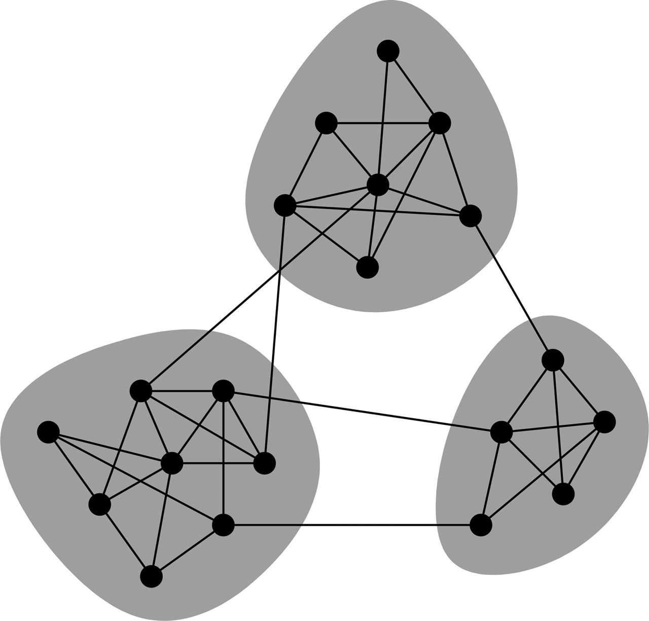
Compute the modularity of the Zacharies Karate Club network using the modularity() function.
## [1] 0.3714661Higher modularity scores are better, however, modularity should not be used alone to assess the presence of communities in network. Rather, multiple measures should be used to provide an argument for community in a network.
7.2 Community Detection
Suppose we no longer have the group labels, but we want to infer the existence of groups in our network. This process is known as community detection. There are many different ways to infer the existence of groups in a network.
7.2.0.1 Via Modularity Maximization
The goal here is to find the groupings of nodes that lead to the highest possible modularity score.
# Find communites using the modularity maximization algorithm
mod_groups <- cluster_fast_greedy(G)
mod_groups <- mod_groups$membership

# Plot the computed modularity groupings
par(mfrow=c(1,2))
plot(G, vertex.color = mod_groups, # Changes node color
     edge.color = 'black',     # Changes edge color
     vertex.size = 20,         # Changes vertex size
     vertex.shape = 'circle',  # Changes vertex shape
     asp = 0,
     layout = layout_in_circle,
     main = 'Algorithm')

# Plot the actual modularity groupings
plot(G, vertex.color = groups, # Changes node color
     edge.color = 'black',     # Changes edge color
     vertex.size = 20,         # Changes vertex size
     vertex.shape = 'circle',  # Changes vertex shape
     asp = 0,
     layout = layout_in_circle,
     main = 'Actual')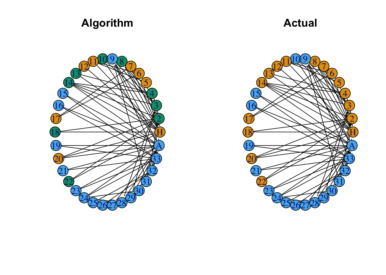
It turns out that the modularity maximization algorithm finds 3 communities within the Zacharies Karate Club network. But, if we merge those two groups into two, only one node is incorrectly grouped. Let’s try another community detection algorithm.
7.2.0.2 Via Edge Betweenness
Edge betweenness community structure detection is based on the following assumption; that edges connecting separate groupings have high edge betweenness as all the shortest paths from one module to another must traverse through them. Practically this means that if we gradually remove the edge with the highest edge betweenness score, our network will separate into communities.
# Find communites using the edge betweeness algorithm
btw_groups <- cluster_edge_betweenness(G)
btw_groups <- btw_groups$membership

# Plot the computed betweeness groupings
par(mfrow=c(1,2))
plot(G, vertex.color = btw_groups, # Changes node color
     edge.color = 'black',     # Changes edge color
     vertex.size = 20,         # Changes vertex size
     vertex.shape = 'circle',  # Changes vertex shape
     asp = 0,
     layout = layout_in_circle,
     main = 'Algorithm')

# Plot the actual modularity groupings
plot(G, vertex.color = groups, # Changes node color
     edge.color = 'black',     # Changes edge color
     vertex.size = 20,         # Changes vertex size
     vertex.shape = 'circle',  # Changes vertex shape
     asp = 0,
     layout = layout_in_circle,
     main = 'Actual')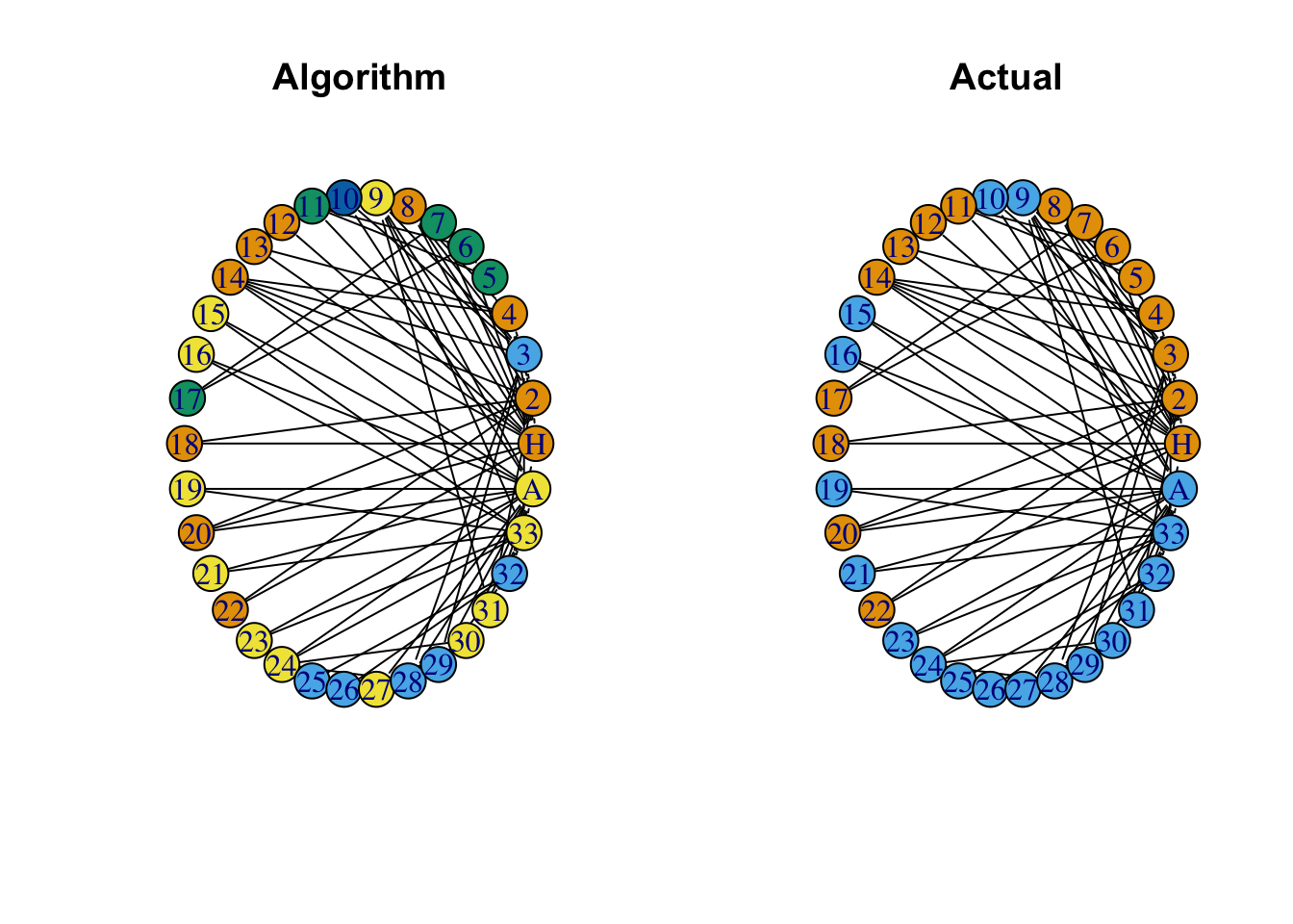
7.3 Network Simulation
Say you want to model a new network with no data. it’s possible to simulate a network to find out if it is actually interesting, or random. If you are familiar with hypothesis testing, we can view these random networks as our “null models”. We assume that our null model is true until there is enough evidence to suggest that our null model does not describe the real-life network. If our null-model is a good fit, then we have achieved a good representation of our network. If we don’t have a good fit, then there is likely additional structure in the network that is unaccounted for.
Our Question: How can we explain the group structure of our network? Is it random or can we explain it via the degree sequence?
7.3.0.1 Random Network Generation
Erdos-Renyi random networks in R require that we specify a number of nodes \(n\), and an edge construction probability \(p\). Essentially, for every pair of nodes, we flip a biased coin with the probability of “heads” being \(p\). If we get a “heads”, then we draw an edge between that pair of nodes. This process simulates the social connections rather than plotting them from a dataset.
# Simulate an erdos-renyi random network and display the result
ER <- sample_gnp(n = length(nodes), p = .15, directed = FALSE, loops = FALSE)

# Plot the erdos-renyi random network
ggplot(ER, aes(x = x, y = y, xend = xend, yend = yend)) +
  geom_edges(color = 'black', size = 0) +
  geom_nodes(color = 'purple',
             size = 10,
             shape = 'circle') +
theme_blank() 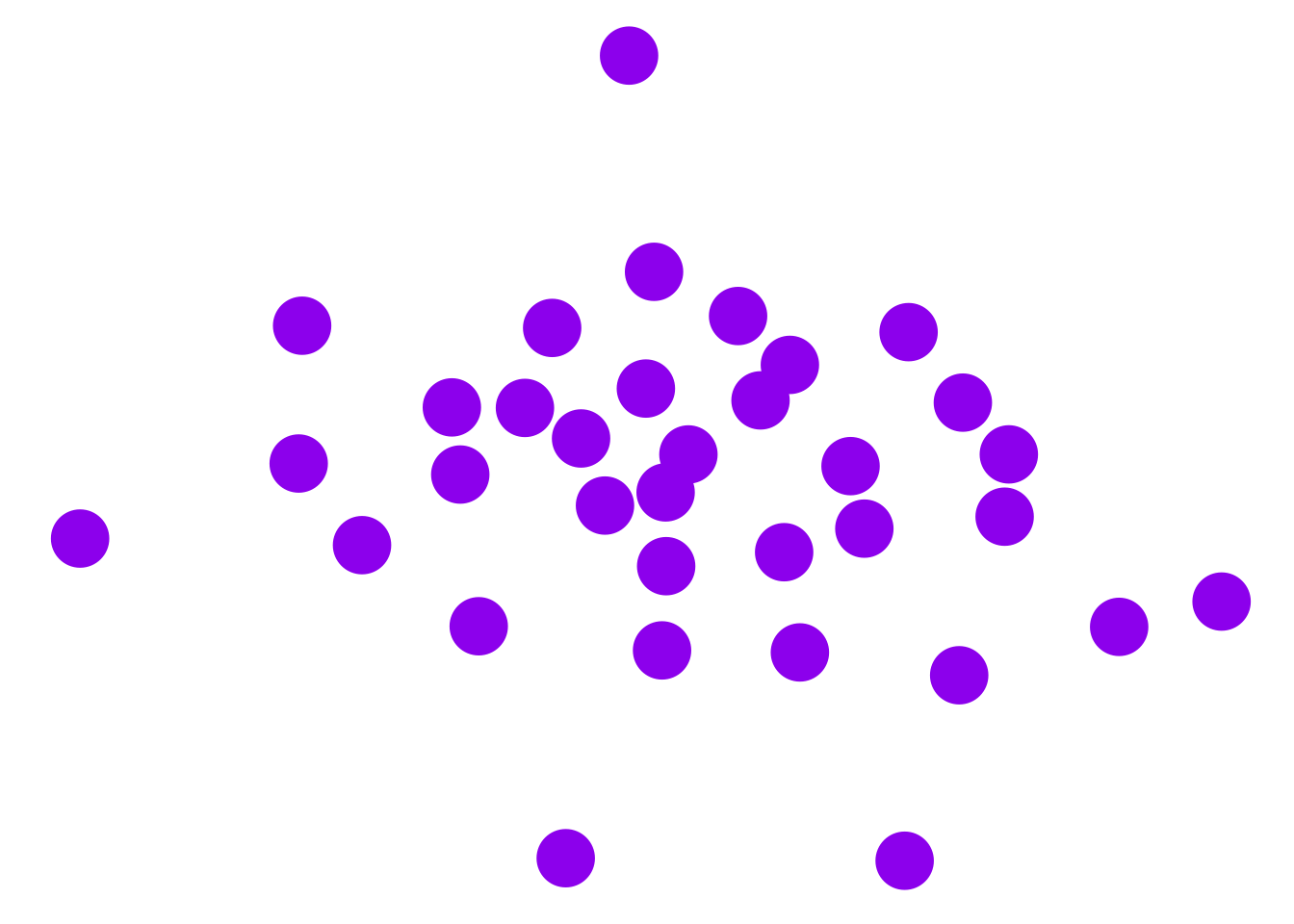
Is this Erdos-Renyi random network a good representative model of the Zacharies Karate Club Network? Let’s construct the Erdos-Renyi random network that is most similar to our network.
We can map in parameters in the Erdo-Renyi random graph by specifying the number of nodes and the edge connection probability p. Considering the Zacharies Karate Club Network, we want to use 34 nodes in our graph. If we change the number of nodes, then we lose the ability to compare our network with the theoretical model. We can estimate a probability value for the simulated network using the mean of degr_cent over the length of the nodes - 1 from the ZKC network.
# Estimate parameter p for ZCC
pval <- mean(degr_cent)/(length(nodes)-1)

# Simulate an erdos-renyi random network and display the result
ER <- sample_gnp(n = length(nodes),
                 p = pval,
                 directed = FALSE,
                 loops = FALSE)

# Plot the erdos-renyi random network
ggplot(ER, aes(x = x, y = y, xend = xend, yend = yend)) +
  geom_edges(color = 'black', size = 1) +
  geom_nodes(color = 'purple',
             size = 10,
             shape = 'circle') +
  geom_nodetext(label = people, fontface = "bold") +
theme_blank() 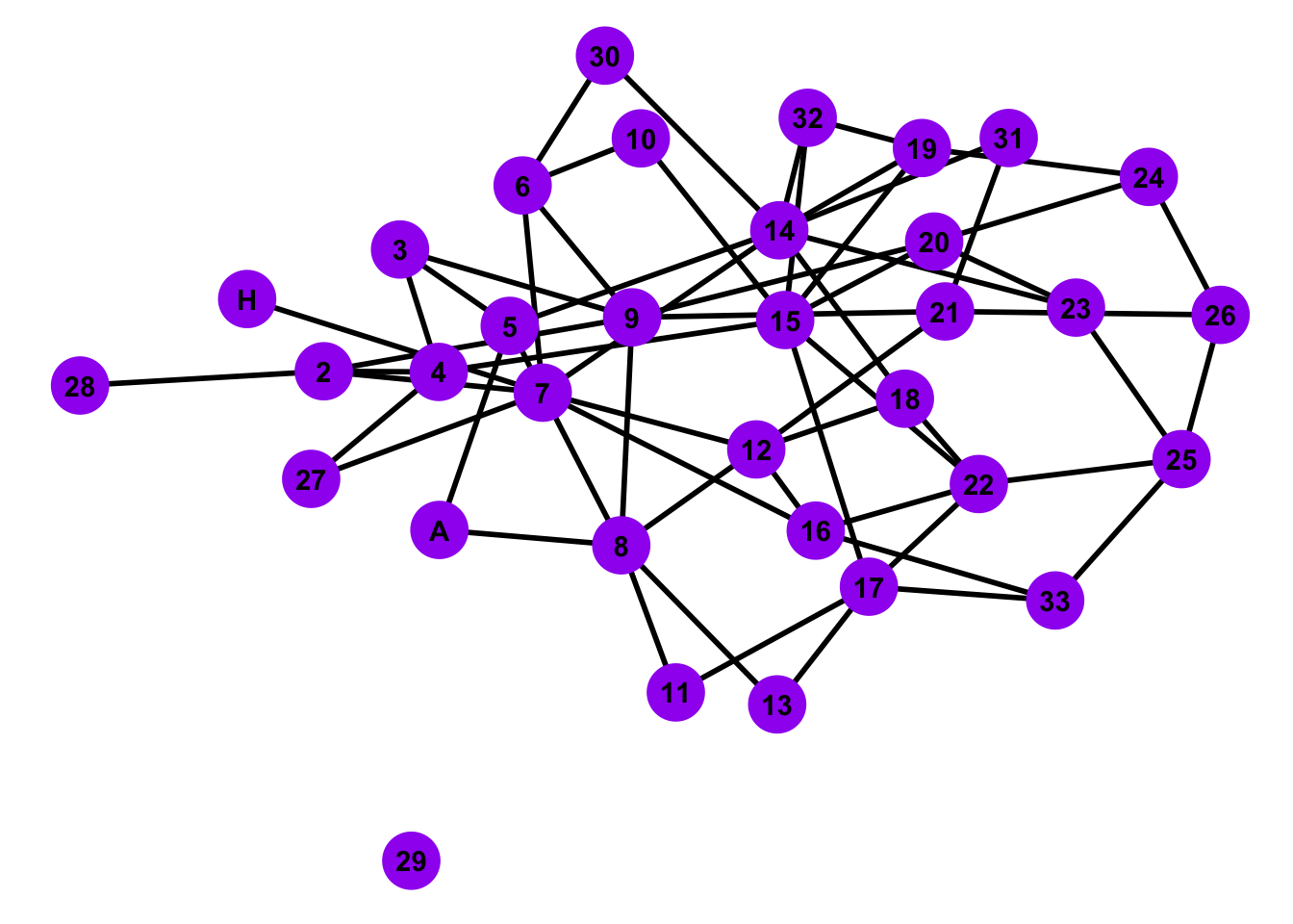
Let’s check out the degree distribution for our random graph and the actual ZCC graph.
# Compute degree centrality of ER Model
degr_ER <- centr_degree(ER, mode = 'all')$res

# Construct data frame for centrality
centr_compar <- data.frame(Nodes = nodes,
                           ZKC = degr_cent,
                           ER = degr_ER)

# Reformat data frame to tidy
centr_compar <- centr_compar %>%
  gather(key = 'Graph', value = 'Centrality', ZKC, ER)

# Create a bar plot of degree distributions
ggplot(data = centr_compar, aes(x = Centrality, fill = Graph)) +
  geom_bar(alpha = .5, position = 'identity') +
  ggtitle('Comparison of ZKC to ER random graph instance')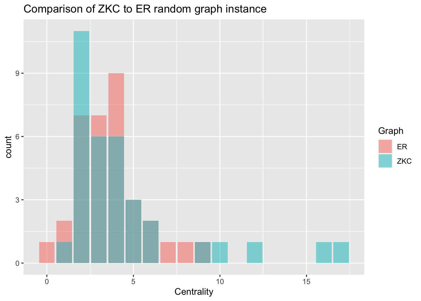
7.3.0.2 Configuration Model
For this kind of random-graph model, we specify the exact degree sequence of all the nodes. We then construct a random graph that has the exact degree sequence as the one given.
# Simulate a configuration model
# Note: The method simple.no.multiple prevents self loops and multiple edges
config <- sample_degseq(degr_cent, method = "simple.no.multiple")

# Plot the configuration model
ggplot(config, aes(x = x, y = y, xend = xend, yend = yend)) +
  geom_edges(color = 'black', size = 1) +
  geom_nodes(color = 'purple',
             size = 10,
             shape = 'circle') +
  geom_nodetext(label = people, fontface = "bold") +
theme_blank() 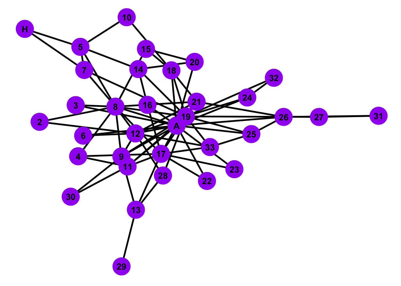
Is the configuration model random network a good representative model of the Zachary’s Karate Club Network?
Let’s see if the configuration model captures the group structure of the model. We are going to perform a permutation test in which we generate 1000 different configuration models (with the same degree sequence as ZKC), and then estimate how the actual value of the ZKC modularity lines up with the distribution of configuration model modularities.
# Initialize vector to store values
sims <- 1000
mod_vals <- rep(0,sims)

# Loop through simulations
for (i in c(1:sims))
{
  # Simulate a configuration model
  config <- sample_degseq(degr_cent, method = "simple.no.multiple")

  # Compute the modularity of the network w/ respect to ZKC groups
  mod_score <- modularity(config, groups)

  # Store the modularity value in our vector
  mod_vals[i] <- mod_score

}
Now let’s plot a histogram of these values, with a vertical line
representing the modularity of ZKC network that we computed earlier.
This value is stored in the object ZCCmod.
# Plot a histogram modularity values
ggplot(data = as.data.frame(mod_vals), aes(x = mod_vals)) +
  geom_histogram(bins = 10, color = 'black', fill = 'blue') +
  geom_vline(xintercept = ZCCmod, color = 'purple')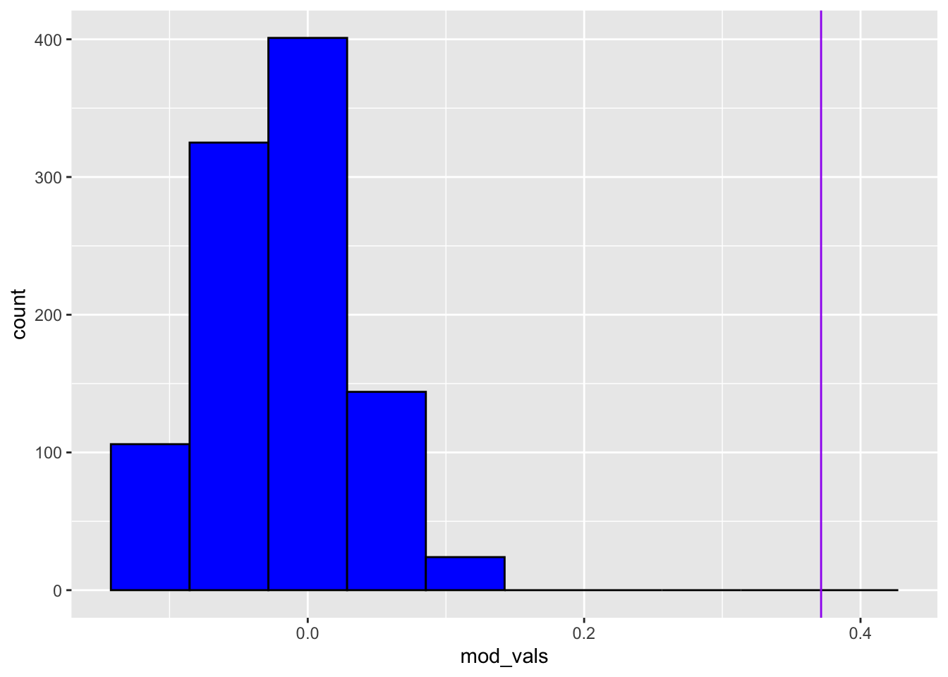
We can see from the above that our computed modularity is extremely improbable. No simulations had a modularity that was as high as the one in ZKC. This tells us that the particular degree sequence of ZKC does not capture the community structure. Put otherwise, the configuration model does a bad job reflecting the community structure captured in the ZKC dataset.
7.3.0.3 Stochastic Block Model
Stochastic Block models are similar to the Erdos-Renyi random network but provide the additional ability to specify additional parameters. The stochastic block model adds a group structure into the random graph model. We can specify the group sizes and the edge construction probability for within group and between group modeling
# Construct the edge probability matrix and block sizes
pref.matrix = matrix(c(.5, .05, .05, .5), nrow = 2, ncol = 2)
block.sizes = c(18,34-18)

# Simulate a stochastic block model
mySBM <- sample_sbm(n = length(nodes), pref.matrix, block.sizes, directed = FALSE, loops = FALSE)

# Plot the SBM
ggplot(mySBM, aes(x = x, y = y, xend = xend, yend = yend)) +
  geom_edges(color = 'black', size = .5) +
  geom_nodes(color = 'purple',
             size = 10,
             shape = 'circle') +
  geom_nodetext(label = people, fontface = "bold") +
theme_blank() 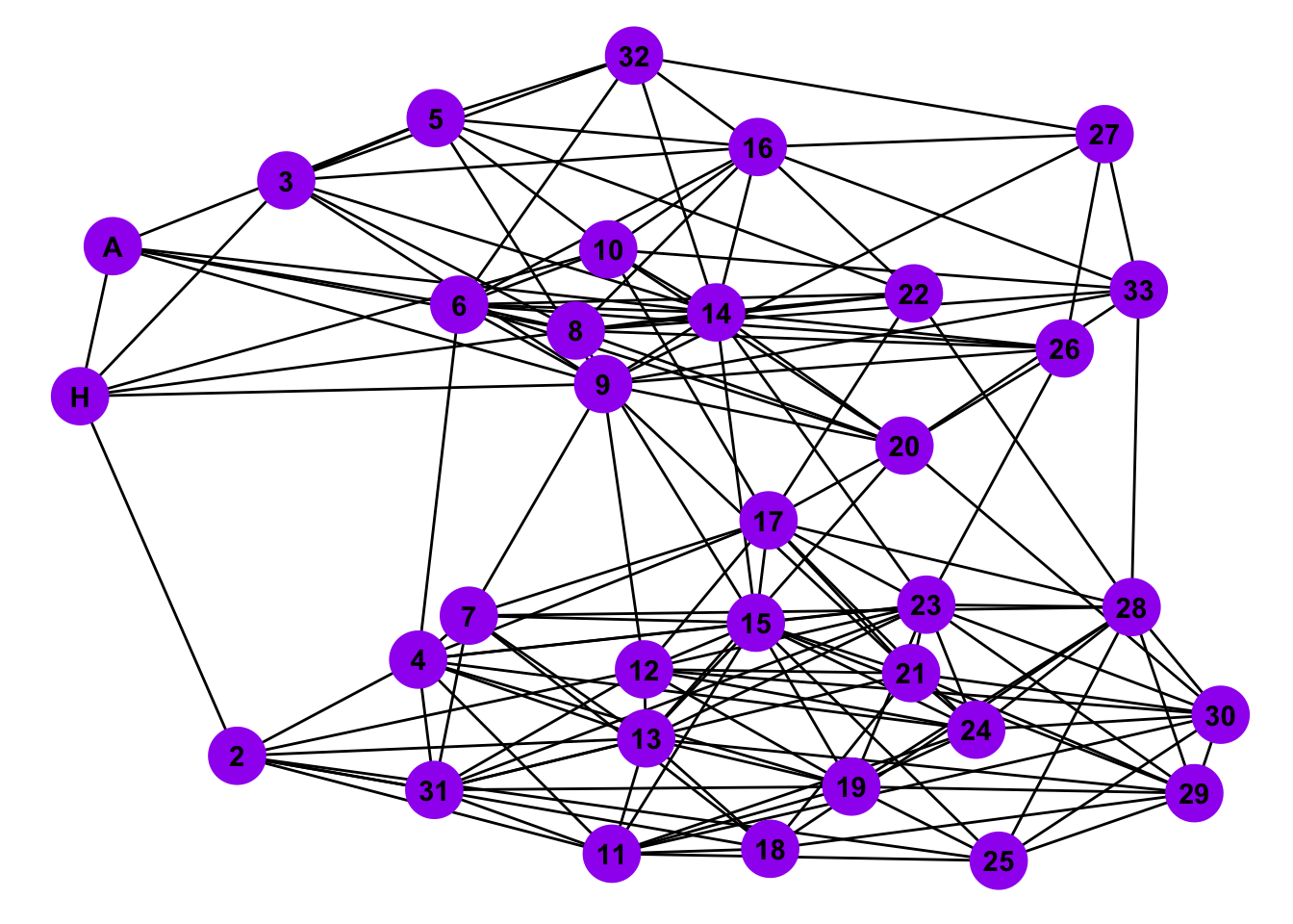
Is the stochastic block model a good representative model of the Zacharies Karate Club Network?
# Compute degree centrality of Stochastic Block Model
degr_SBM <- centr_degree(mySBM, mode = 'all')$res

# Construct data frame for centrality
centr_compar <- data.frame(Nodes = nodes,
                           ZKC = degr_cent,
                           SBM = degr_SBM)

# Reformat data frame to tidy
centr_compar <- centr_compar %>%
  gather(key = 'Graph', value = 'Centrality', ZKC, SBM)

# Create a bar plot of degree distributions
ggplot(data = centr_compar, aes(x = Centrality, fill = Graph)) +
  geom_bar(alpha = .5, position = 'identity') +
  ggtitle('Comparison of ZKC to SBM random graph instance')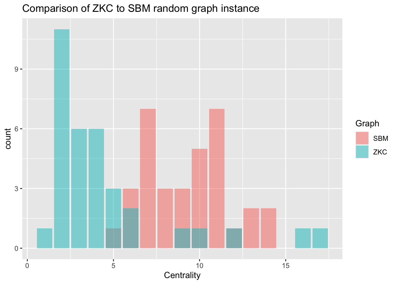
7.4 Advanced Case Study
See this link (https://www.frontiersin.org/articles/10.3389/fpsyg.2018.01742/) to access a paper by Jones, Mair, & McNally (2018), all professors at Harvard University in the Department of Psychology who discuss visualizing psychological networks in R.
See this link (https://www.frontiersin.org/articles/10.3389/fpsyg.2018.01742/full#supplementary-material) to access all supplementary material, including the relevant datasets needed for the code below.
Read the paper and run the code alongside the narrative to get the most out of this case study. For a brief overview of the paper see this abstract:
“Networks have emerged as a popular method for studying mental disorders. Psychopathology networks consist of aspects (e.g., symptoms) of mental disorders (nodes) and the connections between those aspects (edges). Unfortunately, the visual presentation of networks can occasionally be misleading. For instance, researchers may be tempted to conclude that nodes that appear close together are highly related, and that nodes that are far apart are less related. Yet this is not always the case. In networks plotted with force-directed algorithms, the most popular approach, the spatial arrangement of nodes is not easily interpretable. However, other plotting approaches can render node positioning interpretable. We provide a brief tutorial on several methods including multidimensional scaling, principal components plotting, and eigenmodel networks. We compare the strengths and weaknesses of each method, noting how to properly interpret each type of plotting approach.”
## Package installations are included here for convenience
#install.packages("MPsychoR")
#install.packages("qgraph")
#install.packages("smacof")
#install.packages("wordcloud")
#install.packages("psych")
#install.packages("eigenmodel")
#install.packages("networktools")

## Note: The following R code is identical to code found in the manuscript

library("MPsychoR")
data(Rogers)
dim(Rogers)

data(Rogers_Adolescent)
dim(Rogers_Adolescent)

colnames(Rogers) <- colnames(Rogers_Adolescent) <- 1:26

library("qgraph")
adult_zeroorder <- cor(Rogers)
qgraph(adult_zeroorder, layout="spring",
       groups = list(Depression = 1:16, "OCD" = 17:26),
       color = c("lightblue", "lightsalmon"))

adult_zeroorder <- cor(Rogers)

library("smacof")
dissimilarity_adult <- sim2diss(adult_zeroorder)

adult_MDS <- mds(dissimilarity_adult)
head(round(adult_MDS$conf, 2)) # top of configuration matrix

adult_MDS_ordinal <- mds(dissimilarity_adult, type="ordinal")
plot(adult_MDS_ordinal, plot.type = "Shepard", main="Ordinal")
text(1.1,0.3, paste("Stress =", round(adult_MDS_ordinal$stress,2)))

adult_MDS_ratio <- mds(dissimilarity_adult, type="ratio")
plot(adult_MDS_ratio, plot.type = "Shepard", main="Ratio")
text(1.1,0.3, paste("Stress =", round(adult_MDS_ratio$stress,2)))

adult_MDS_interval <- mds(dissimilarity_adult, type="interval")
plot(adult_MDS_interval, plot.type = "Shepard", main="Interval")
text(1.1,0.3, paste("Stress =", round(adult_MDS_interval$stress,2)))

adult_MDS_mspline <- mds(dissimilarity_adult, type="mspline")
plot(adult_MDS_mspline, plot.type = "Shepard", main="Spline")
text(1.1,0.3, paste("Stress =", round(adult_MDS_mspline$stress,2)))

adult_MDS_mspline$stress

qgraph(adult_zeroorder, layout=adult_MDS_mspline$conf,
       groups = list(Depression = 1:16, "OCD" = 17:26),
       color = c("lightblue", "lightsalmon"), vsize=4)
text(-1,-1, paste("Stress=", round(adult_MDS_mspline$stress,2)))

library("wordcloud")
qgraph(adult_zeroorder, layout=adult_MDS_mspline$conf,
       groups = list(Depression = 1:16, "OCD" = 17:26),
       color = c("lightblue", "lightsalmon"),
       vsize=0, rescale=FALSE, labels=FALSE)
points(adult_MDS_mspline$conf, pch=16)
textplot(adult_MDS_mspline$conf[,1]+.03,
         adult_MDS_mspline$conf[,2]+.03,
         colnames(adult_zeroorder),
         new=F)

adult_glasso <- EBICglasso(cor(Rogers), n=408)
qgraph(adult_glasso, layout=adult_MDS_mspline$conf,
       groups = list(Depression = 1:16, "OCD" = 17:26),
       color = c("lightblue", "lightsalmon"), vsize=4)
text(-1,-1, paste("Stress=", round(adult_MDS_mspline$stress,2)))

adolescent_zeroorder <- cor(Rogers_Adolescent)
dissimilarity_adolescent <- sim2diss(adolescent_zeroorder)
adolescent_MDS <- mds(dissimilarity_adolescent, type="mspline")

fit_procrustes <- Procrustes(adult_MDS_mspline$conf, adolescent_MDS$conf)

adolescent_glasso <- EBICglasso(cor(Rogers_Adolescent), n=87, gamma=0)

qgraph(adult_glasso, layout=fit_procrustes$X, groups = list(Depression = 1:16, "OCD" = 17:26),
       color = c("lightblue", "lightsalmon"), title= "Adults, n=408", vsize=4)
text(-1,-1, paste("Stress=", round(adult_MDS_mspline$stress,2)))
qgraph(adolescent_glasso, layout=fit_procrustes$Yhat,
       groups = list(Depression = 1:16, "OCD" = 17:26),
       color = c("lightblue", "lightsalmon"), title="Adolescents, n=87", vsize=4)
text(-1,-1, paste("Stress=", round(adolescent_MDS$stress,2)))

round(fit_procrustes$congcoef, 3)

library("psych")
PCA_adult <- principal(cor(Rogers), nfactors = 2)
qgraph(adult_glasso, layout=PCA_adult$loadings, groups = list(Depression = 1:16, "OCD" = 17:26),
       color = c("lightblue", "lightsalmon"), title= "Adults, n=408", layoutOffset=c(.3,.1), vsize=4)

text(1.5,-.8, paste("% var=", round(sum(PCA_adult$values[1:2]/length(PCA_adult$values)),2)))
title(xlab="Component 1", ylab= "Component 2")

library("eigenmodel")

diag(adult_glasso) <- NA   ## the function needs NA diagonals
p <- 2                      ## 2-dimensional solution
fitEM <- eigenmodel_mcmc(Y = adult_glasso, R = p, S = 1000, burn = 200, seed = 123)
EVD <- eigen(fitEM$ULU_postmean)
evecs <- EVD$vec[, 1:p]      ## eigenvectors (coordinates)

qgraph(adult_glasso, layout=evecs, groups = list(Depression = 1:16, "OCD" = 17:26),
       color = c("lightblue", "lightsalmon"), title= "Adults, n=408", vsize=4)
title(xlab="Dimension 1", ylab= "Dimension 2")

library("networktools")
adult_glasso <- EBICglasso(cor(Rogers), n=408)
adult_qgraph <- qgraph(adult_glasso)
MDSnet(adult_qgraph, MDSadj=cor(Rogers))
PCAnet(adult_qgraph, cormat = cor(Rogers))
EIGENnet(adult_qgraph)
7.5 Datasets for Network Analysis
There is a package called “igraphdata” that contains many network datasets. Additionally, there are several more datasets at “The Colorado Index of Complex Networks (ICON)”. Here is the link: https://icon.colorado.edu/#!/
7.6 Review
In this chapter we introduced network analysis concepts and methods. To make sure you understand this material, there is a practice assessment to go along with this chapter at https://jayholster1.shinyapps.io/NetworksinRAssessment/
7.7 References
Bojanowski, M. (2015). intergraph: Coercion routines for network data objects. R package version 2.0-2. http://mbojan.github.io/intergraph
Csardi, G., Nepusz, T. (2006). “The igraph software package for complex network research.” InterJournal, Complex Systems, 1695. <https://igraph.org>.
Paranyushkin, D. (2019). InfraNodus: Generating insight using text network analysis. In The World Wide Web Conference (WWW ’19). Association for Computing Machinery, New York, NY, USA, 3584–3589. https://doi.org/10.1145/3308558.3314123
Payton, J. J., Mair, P., & McNally, R. J. (2018). Visualizing psychological networks: A tutorial in R. Frontiers in Psychology, 9(1), https://doi.org/10.3389/fpsyg.2018.01742
Tyner, S., Briatte, F., & Hofmann, H. (2017). Network Visualization
with ggplot2, The R Journal
9(1): 27–59. https://briatte.github.io/ggnetwork/
Wickham, H., Averick, M., Bryan, J., Chang, W., McGowan, L.D., François, R., Grolemund, G., Hayes, A., Henry, L., Hester, J., Kuhn, M., Pedersen, T.L., Miller, E., Bache, S.M., Müller, K., Ooms, J., Robinson, D., Seidel, D.P., Spinu, V., Takahashi, K., Vaughan, D., Wilke, C., Woo, K., & Yutani, H. (2019). Welcome to the tidyverse. Journal of Open Source Software, 4(43), 1686. https://doi.org/10.21105/joss.01686.
7.7.1 R Short Course Series
Video lectures of each guidebook chapter can be found at https://osf.io/6jb9t/. For this chapter, find the follow the folder path Network Analysis in R -> AY 2021-2022 Spring and access the video files, r markdown documents, and other materials for each short course.
7.7.2 Acknowledgements
This guidebook was created with support from the Center for Research Data and Digital Scholarship and the Laboratory for Interdisciplinary Statistical Analaysis at the University of Colorado Boulder, as well as the U.S. Agency for International Development under cooperative agreement #7200AA18CA00022. Individuals who contributed to materials related to this project include Jacob Holster, Eric Vance, Michael Ramsey, Nicholas Varberg, and Nickoal Eichmann-Kalwara.