Chapter 3 Data Visualization
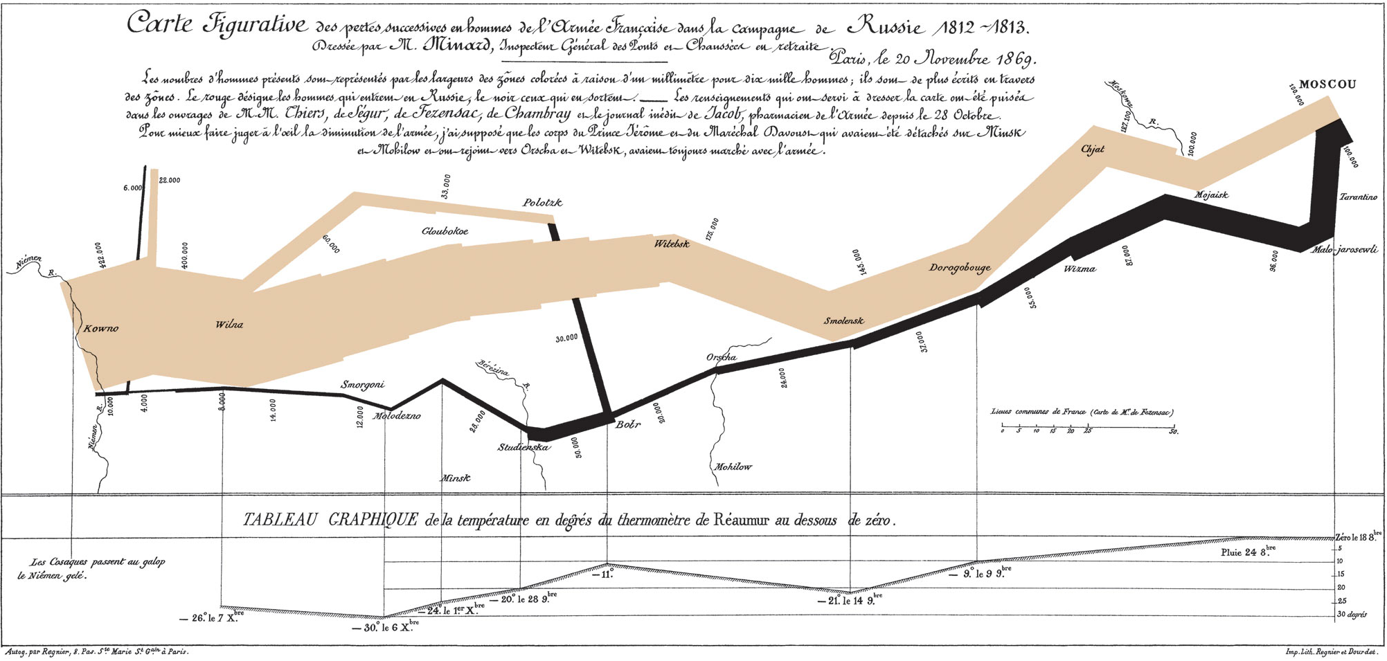
Charles Minard’s Napolean’s Disastrous Russia Campaign of 1812
3.1 Overview
Socrates once argued that explanations for phenomena should be teleological. Teleological thinkers tend to place the purpose, or function, of at the center of any explanation—asking not what things are, but what things do. Data visualizations are most often the representation of found or collected data. They are often presented through the use of figures (e.g., charts, conceptual maps, scatter plots) in two-dimensional space.
The answer to “what does data visualization do” says a great deal more about both the value of effective data visualization and the capabilities of R to support that goal. High quality data visualizations, created in R or not, tend to both answer a research question and tell a story. For instance, Charles Minard visualized Napoleon’s troop movements to and from Moscow in the war of 1812. This chart displays the geography, temperature, as well as the number and direction French troops were moving. More importantly, the visualization demonstrates a significant loss of life—over 300,000 troops would not make the journey back home (as signified by the width of the black line).
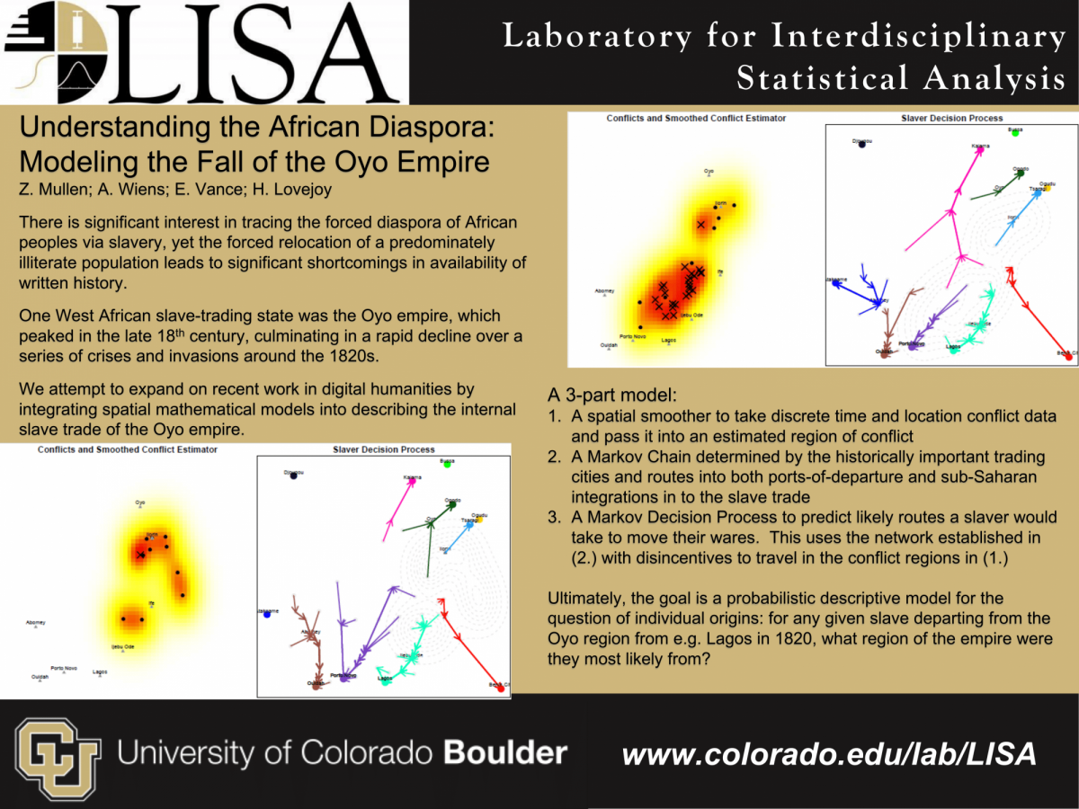
Or see the slide below which includes a visualization of forced relocation of African peoples in the 19th century (more details on the slide).
Or the example below which uses qualitative data to illustrate trending google searches in 2021.
In this chapter you will become familiar with several data visualization
techniques in R, with special attention paid to the qplot and ggplot
libraries.
3.1.1 Common Data Visualizations
The R programming language is popular among statisticians, quantitative
researchers, and data scientists. As such, data visualization packages
in R tend to best support the creation of statistical displays. These
displays might provide insight, if not answers, to research questions.
All examples in this section are created using the ggstatsplot
library, which provides support for creating robust visualizations with
minimal code. Additionally, the ggstatsplot follows most conventions
that are used in ggplot2, which will be covered in depth later in this
chapter.
3.1.1.1 Scatter Plots
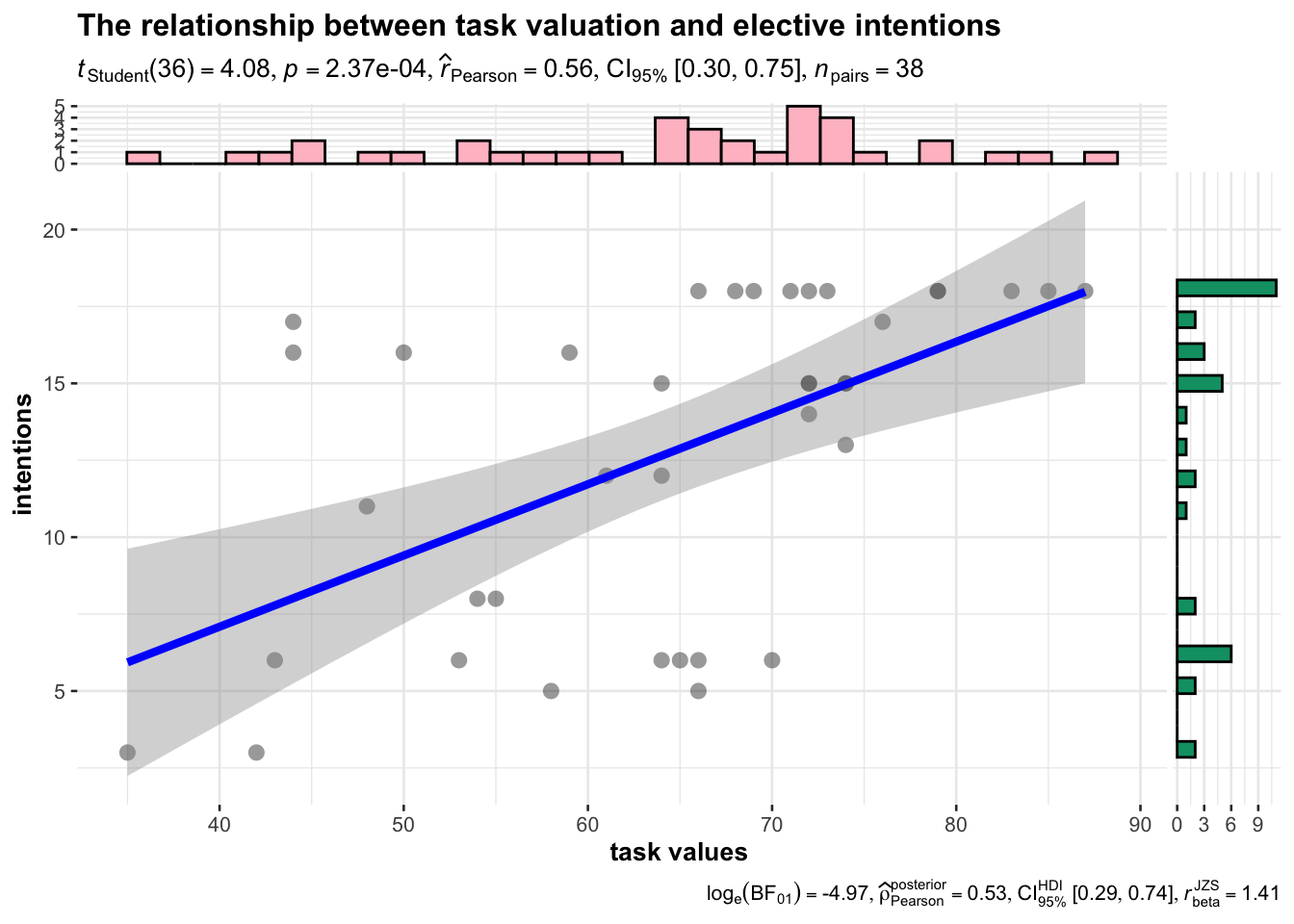
Many statistical visualizations are axis-based. For instance, scatter plots use the x and y axis to pinpoint the exact measurement of similar cases across two variables. A scatter plot can demonstrate the extent to which variables are correlated, or whether relationships are linear. Observations—rows in datasets—are plotted on the x and y axis simultaneously. Patterns can sometimes be visible when multiple data points are plotted together. The plot below includes a line of best fit, a visualization of a 95% confidence interval, and violin plots for the distributions of values on the x and y axis. More specifically, the plot indicates a moderate, positive, and significant relationship between task values (e.g., interest in a task) and elective intentions for the surveyed instrumental adolescents.
library(tidyverse)
library(ggstatsplot)

data <- read_csv('musicclassintentions.csv')

ggscatterstats(
  data = data,
  x = values,
  y = intentions,
  marginal.type = "violin",
  xlab = "task values",
  ylab = "intentions",
  title = "The relationship between task valuation and elective intentions",
  xfill = "pink",
  yfill = "#009E73"
)
3.1.1.2 Histograms
At times, the y-axis only represents the count, and sometimes density, of single variables. You might use a bar chart or histogram to display univariate descriptive statistics. The underlying purpose of this visualization is simple. It answers the question, “how many students in the sample come from each school?” The fill argument answers a second question, “how many students are in seventh- or eighth-grade within each school?”
ggplot(data = data, aes(x = School, fill = Level)) +
  geom_histogram(stat = "count") +
  ggtitle("Count of Instrumental Students Grouped by School and Grade Level") +
  xlab("School")
## Warning: Ignoring unknown parameters: binwidth, bins, pad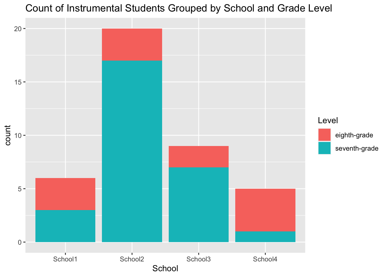
3.1.1.3 Violin Plots
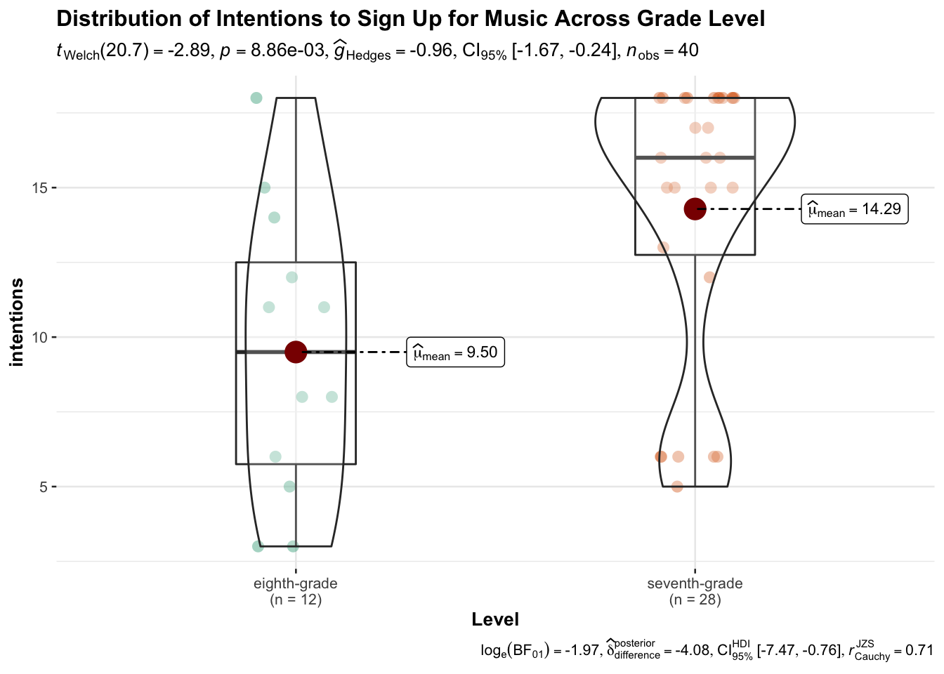
Violin plots can contextualize group differences found in data analysis. You may recall this example from Chapter 1. The red dot represents the mean of each group, and the gray horizontal line represents each median. These plots demonstrate that there is a statistical and practical significant difference in how seventh- and eighth-grade band and orchestra students in a United States sample are considering future elective music studies. The plot also indicates a potential ceiling effect for seventh-grade students, as many responded with the highest possible score. There are several other plots that tend to be utilized for illustrating group differences.
ggbetweenstats(
  data = data,
  x = Level,
  y = intentions,
  title = "Distribution of Intentions to Sign Up for Music Across Grade Level"
)
3.1.2 Visualization as the Research Process
Data visualization lends itself as responsive to demands of the research processes. For instance, you might assess the normality of variables with a histogram, or you might visualize the strength and direction of a correlation with a scatter plot. Visualizations can answer or contribute to the answers of research questions.
To exemplify this concept, we are going to start with data collected on Bechdel test. The Bechdel test measured the representation of women in 1,794 fictional films released between 1971 and 2013. Films that pass the Bechdel test would feature at least two women who talk to each other about something other than a man. Roughly half of films pass the test. The dataset also includes financial information, including the domestic and international earnings. The inclusion of these social and financial variables allows for some consideration of bias in the film industry.
3.1.3 Getting to Know the Packages
The Bechdel dataset is called from the fivethirtyeight package. If you
do not have the packages already, install and call the tidyverse,
fivethirtyeight, and ggpubr packages.
As discussed in the first chapter, the tidyverse installation contains
multiple R packages for the purpose of data wrangling, analysis, and
visualization. Descriptions of the attendant packages are listed in the
table below.
| pac kage | purpose |
|---|---|
ggpl ot2 |
data visualization (e.g., histogram, scatter plot) |
ti dyr |
produces tables where rows are observation |
re adr |
imports data from working directory |
pu rrr |
mapping functions across multiple variables |
tib ble |
allows tables to keep column names with no row names, includes and displays data type in output |
stri ngr |
tools for string manipulation and identification (e.g., “text data”) |
forc ats |
considers whether data are factors and creates a specific data type in the tibble |
dp lyr |
tools for data manipulation (e.g., changing column names, subsetting data) |
ggpubr includes tools for creating publishable plots, making it easy
to annotate and arrange multiple plots. Install any packages that you
need, and then load each library.
3.2 Plotting in R
Now that you have loaded the fivethirtyeight package, load the bechdel
dataset. Here it is assigned to the object bech_data Then examine the
dataset using the View() and str() functions. You might also use the
psych::describe()function for quick descriptive analysis of any
quantitative data, including skewness and kurtosis value, which are
metrics of the normality of data distributions. Statistical concepts
will be introduced in further detail in the next chapter.
## tibble [1,794 × 15] (S3: tbl_df/tbl/data.frame)
##  $ year         : int [1:1794] 2013 2012 2013 2013 2013 2013 2013 2013 2013 2013 ...
##  $ imdb         : chr [1:1794] "tt1711425" "tt1343727" "tt2024544" "tt1272878" ...
##  $ title        : chr [1:1794] "21 & Over" "Dredd 3D" "12 Years a Slave" "2 Guns" ...
##  $ test         : chr [1:1794] "notalk" "ok-disagree" "notalk-disagree" "notalk" ...
##  $ clean_test   : Ord.factor w/ 5 levels "nowomen"<"notalk"<..: 2 5 2 2 3 3 2 5 5 2 ...
##  $ binary       : chr [1:1794] "FAIL" "PASS" "FAIL" "FAIL" ...
##  $ budget       : int [1:1794] 13000000 45000000 20000000 61000000 40000000 225000000 92000000 12000000 13000000 130000000 ...
##  $ domgross     : num [1:1794] 25682380 13414714 53107035 75612460 95020213 ...
##  $ intgross     : num [1:1794] 4.22e+07 4.09e+07 1.59e+08 1.32e+08 9.50e+07 ...
##  $ code         : chr [1:1794] "2013FAIL" "2012PASS" "2013FAIL" "2013FAIL" ...
##  $ budget_2013  : int [1:1794] 13000000 45658735 20000000 61000000 40000000 225000000 92000000 12000000 13000000 130000000 ...
##  $ domgross_2013: num [1:1794] 25682380 13611086 53107035 75612460 95020213 ...
##  $ intgross_2013: num [1:1794] 4.22e+07 4.15e+07 1.59e+08 1.32e+08 9.50e+07 ...
##  $ period_code  : int [1:1794] 1 1 1 1 1 1 1 1 1 1 ...
##  $ decade_code  : int [1:1794] 1 1 1 1 1 1 1 1 1 1 ...
## # A tibble: 1,794 × 15
## year imdb title test clean_test binary budget domgross intgross code
## <int> <chr> <chr> <chr> <ord> <chr> <int> <dbl> <dbl> <chr>
## 1 2013 tt1711425 21 & … nota… notalk FAIL 1.3 e7 25682380 4.22e7 2013…
## 2 2012 tt1343727 Dredd… ok-d… ok PASS 4.5 e7 13414714 4.09e7 2012…
## 3 2013 tt2024544 12 Ye… nota… notalk FAIL 2 e7 53107035 1.59e8 2013…
## 4 2013 tt1272878 2 Guns nota… notalk FAIL 6.1 e7 75612460 1.32e8 2013…
## 5 2013 tt0453562 42 men men FAIL 4 e7 95020213 9.50e7 2013…
## 6 2013 tt1335975 47 Ro… men men FAIL 2.25e8 38362475 1.46e8 2013…
## 7 2013 tt1606378 A Goo… nota… notalk FAIL 9.2 e7 67349198 3.04e8 2013…
## 8 2013 tt2194499 About… ok-d… ok PASS 1.2 e7 15323921 8.73e7 2013…
## 9 2013 tt1814621 Admis… ok ok PASS 1.3 e7 18007317 1.80e7 2013…
## 10 2013 tt1815862 After… nota… notalk FAIL 1.3 e8 60522097 2.44e8 2013…
## # … with 1,784 more rows, and 5 more variables: budget_2013 <int>,
## # domgross_2013 <dbl>, intgross_2013 <dbl>, period_code <int>,
## # decade_code <int>## vars n mean sd median trimmed
## year 1 1794 2002.55 8.98 2005.0 2003.88
## imdb* 2 1794 897.50 518.03 897.5 897.50
## title* 3 1794 883.82 510.14 885.5 883.69
## test* 4 1794 6.65 2.62 7.0 6.89
## clean_test* 5 1794 3.53 1.48 4.0 3.64
## binary* 6 1794 1.45 0.50 1.0 1.43
## budget 7 1794 44826462.61 48186026.12 28000000.0 35815614.85
## domgross 8 1777 69132048.28 80367309.51 42194060.0 53837590.51
## intgross 9 1783 150385700.05 210335267.83 76482461.0 106338373.03
## code* 10 1794 63.57 17.95 68.0 66.22
## budget_2013 11 1794 55464608.45 54918635.60 36995786.0 46262685.87
## domgross_2013 12 1776 95174783.58 125965348.89 55993640.5 70822783.23
## intgross_2013 13 1783 197837984.97 283507948.20 96239640.0 138312058.71
## period_code 14 1615 2.42 1.19 2.0 2.33
## decade_code 15 1615 1.94 0.69 2.0 1.92
## mad min max range skew kurtosis se
## year 7.41 1970 2013 43 -1.27 1.34 0.21
## imdb* 664.95 1 1794 1793 0.00 -1.20 12.23
## title* 656.05 1 1768 1767 0.00 -1.21 12.04
## test* 2.97 1 10 9 -0.52 -0.93 0.06
## clean_test* 1.48 1 5 4 -0.27 -1.56 0.03
## binary* 0.00 1 2 1 0.21 -1.96 0.01
## budget 30393300.00 7000 425000000 424993000 2.04 5.56 1137653.20
## domgross 47480054.47 0 760507625 760507625 2.45 8.95 1906495.20
## intgross 91800310.28 828 2783918982 2783918154 3.54 22.95 4981228.08
## code* 14.83 1 85 84 -1.26 1.27 0.42
## budget_2013 38745808.79 8632 461435929 461427297 1.73 3.95 1296607.47
## domgross_2013 62679691.17 899 1771682790 1771681891 3.96 28.95 2989025.45
## intgross_2013 115351802.68 899 3171930973 3171930074 3.71 23.23 6714127.24
## period_code 1.48 1 5 4 0.47 -0.76 0.03
## decade_code 0.00 1 3 2 0.08 -0.90 0.02To create pragmatic visualizations of financial data, it will be useful to rescale the columns such that the values are displayed in millions of dollars, rather than dollars, which would eliminate multiple zeros on the display. To achieve this, use mathematical operators (e.g., data$column/20) on the columns of interest, and call back the edited columns to their original names. Make sure you do not run this chunk more than once. Consider to yourself, what would happen if these objects were assigned twice?
bech_data$budget <- bech_data$budget/1000000
bech_data$domgross <- bech_data$domgross/1000000
bech_data$intgross <- bech_data$intgross/1000000
3.2.1 Quick Plots
Now that we are more familiar with our data, it is sometimes useful to quickly visualize data using qplots. The ‘q’ stands for quick, whereas ggplot is more flexible and customize-able.
There are four key arguments to consider when creating a qplot. These
are data, where you define your dataset, x and y, where you define which
variables will map onto the x and y axes, and geom, which dictates the
geometry or type of your plot. Geom options include point, line,
smooth, dotplot, boxplot, violin, histogram, and density.
qplot(data = "data_frame", x = "x_variable", y = "y_variable", geom = "whatever_plot_you_want")Boxplots are a focal point in these exercises. Boxplots are like violin plots in that they display the distribution of data. The key difference is that boxplots include displays of a few descriptive statistics, where violin plots are derived from each individual data point.
The following code will produce a set of boxplots describing the
distributions of movie budgets disaggregated by year. R treats column
data, such as the year column, as a single vector. Set the year column
as a factor within the x argument using the as.factor() function. What
does the second plot tell you that the first one fails to communicate?
p <- qplot(data = bech_data, x = year, y= domgross, geom = 'boxplot')
p1 <- qplot(data = bech_data, x = as.factor(year), y= domgross, geom = 'boxplot')
ggarrange(p, p1)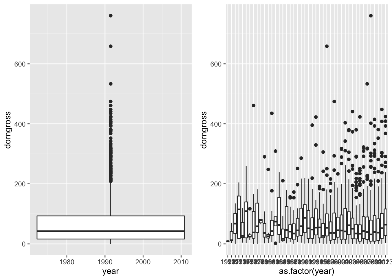
The data were also categorized into five period codes to provide time-based groups. Let’s group the domestic gross values by period codes to compare the distributions of film’s earnings over time. Also, here is a chance to directly compare visualization of descriptive data using boxplots and violin plots.
p2 <- qplot(data = bech_data, x = period_code, y = domgross, group = period_code, geom = 'boxplot')
p3 <- qplot(data = bech_data, x = period_code, y = domgross, group = period_code, geom = 'violin')
ggarrange(p2, p3)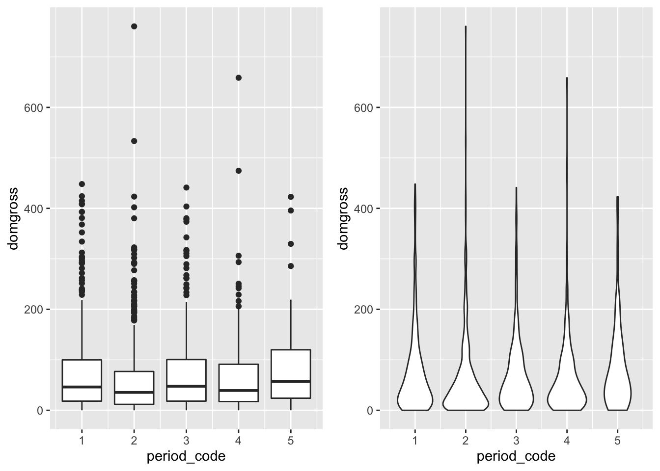
If you are not sure which plot you need to use, you might rely on qplot’s assumptions. If you include both x and y arguments, qplot will assume you want a scatterplot. If only the x variable is provided, a histogram is assumed. If only the y variable is provided, a scatter plot will be created where the x axis will represent each individual case in a sequence. Additionally, you can add multiple geoms using a vector of geoms instead of a single geom argument (e.g., line four in this code chunk).
qplot(x = domgross, y = intgross, data = bech_data) #scatterplot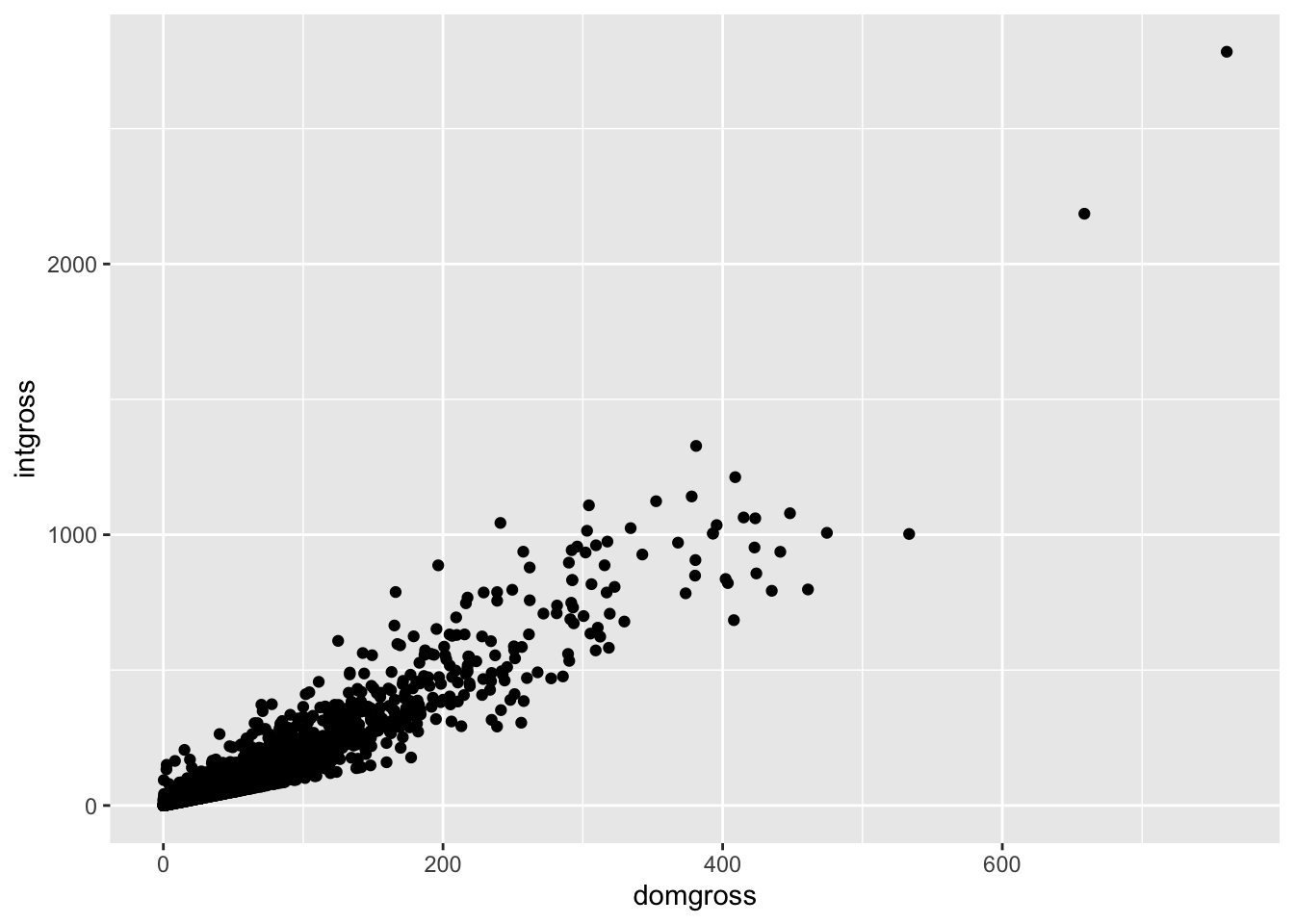
qplot(x = domgross, data = bech_data) #histogram
qplot(y = domgross, data = bech_data) #casewise univariate scatterplot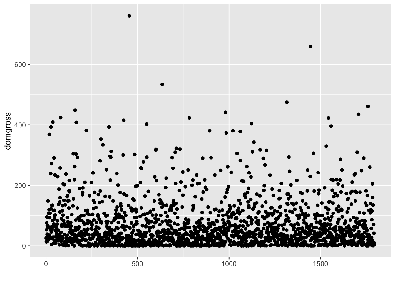
qplot(as.factor(period_code), domgross, data = bech_data, geom = c("boxplot", "jitter"))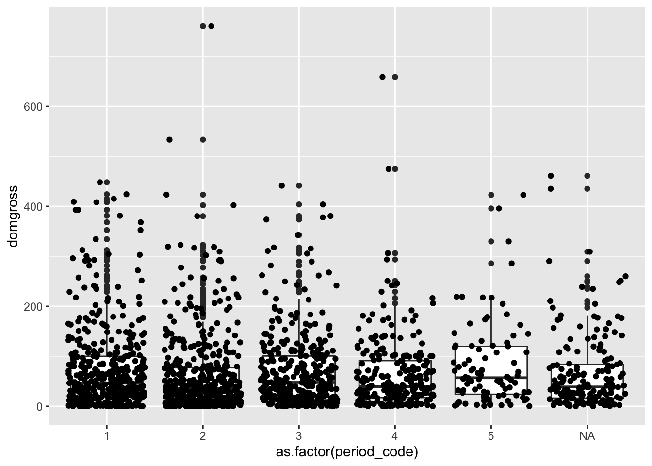
3.2.2 Plotting with ggplot
Onto ggplot. We have much more flexibility within the ggplot
framework, mostly due to a focus on additive layers. To start, make the
same violin plot for the Bechdel data period codes using ggplot. The
qplot code is commented out below. The aes() function suggests
aesthetic considerations to the plotting function in the context of the
data that are loaded in. The geom is added as an additional layer, and
itself is a function rather than an argument.
#qplot(data = bech_data, x = period_code, y = domgross, group = period_code, geom = 'violin')
ggplot(data = bech_data, aes(x = period_code, y = domgross, group = period_code)) +
  geom_violin()
Using ggplot, we can dive deep into histograms and density plots. With
ggplot, these particular visualizations are most effective when they
provide insight at a glance for the distributions of data across several
groups. To start, let’s create a histogram of the domestic gross
revenue. Like before, we only need an x variable for histograms.
ggplot(data = bech_data, aes(x = domgross)) +
  geom_histogram()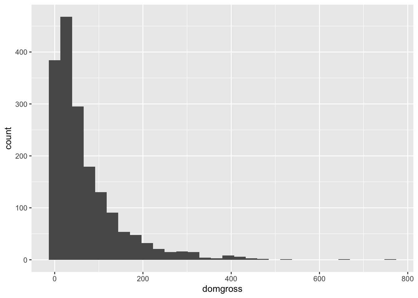
3.2.2.1 Using Layers
Now let’s add some bells and whistles using ggplot’s layers-based coding to make this visualization more readable and appealing. Remember the plus sign creates a new layer which culminates in the final plot.
There are several considerations for this plot which can be used to
customize other data. The fill argument within the aes() function
indicates that cases should be filled in based on their pass/fail
status, which was represented by the binary variable. The alpha
argument in geom_histogram() function adjusts the opacity of the
filled colors. ggtitle adds the title, and the xlab() and ylab()
functions create labels on each axis. The labs() function creates a
legend title, seen at the bottom right of the figure. Lastly, the
facet_wrap() function creates multiple plots based on the status of a
called variable, which is in this case the binary pass/fail variable.
Try running each line of this code chunk independently, adding on a layer each time to see how this code creates the final product.
ggplot(data = bech_data, aes(x = domgross, fill = binary)) +
  geom_histogram(alpha = 0.8, colour = 'grey') +
  ggtitle("Distribution of Movies in FiveThirtyEight Bechdel Dataset") +
  xlab('Domestic Gross in Millions') +
  ylab('Density') +
  labs(fill = 'Bechdel Test') +
  facet_wrap(~ binary)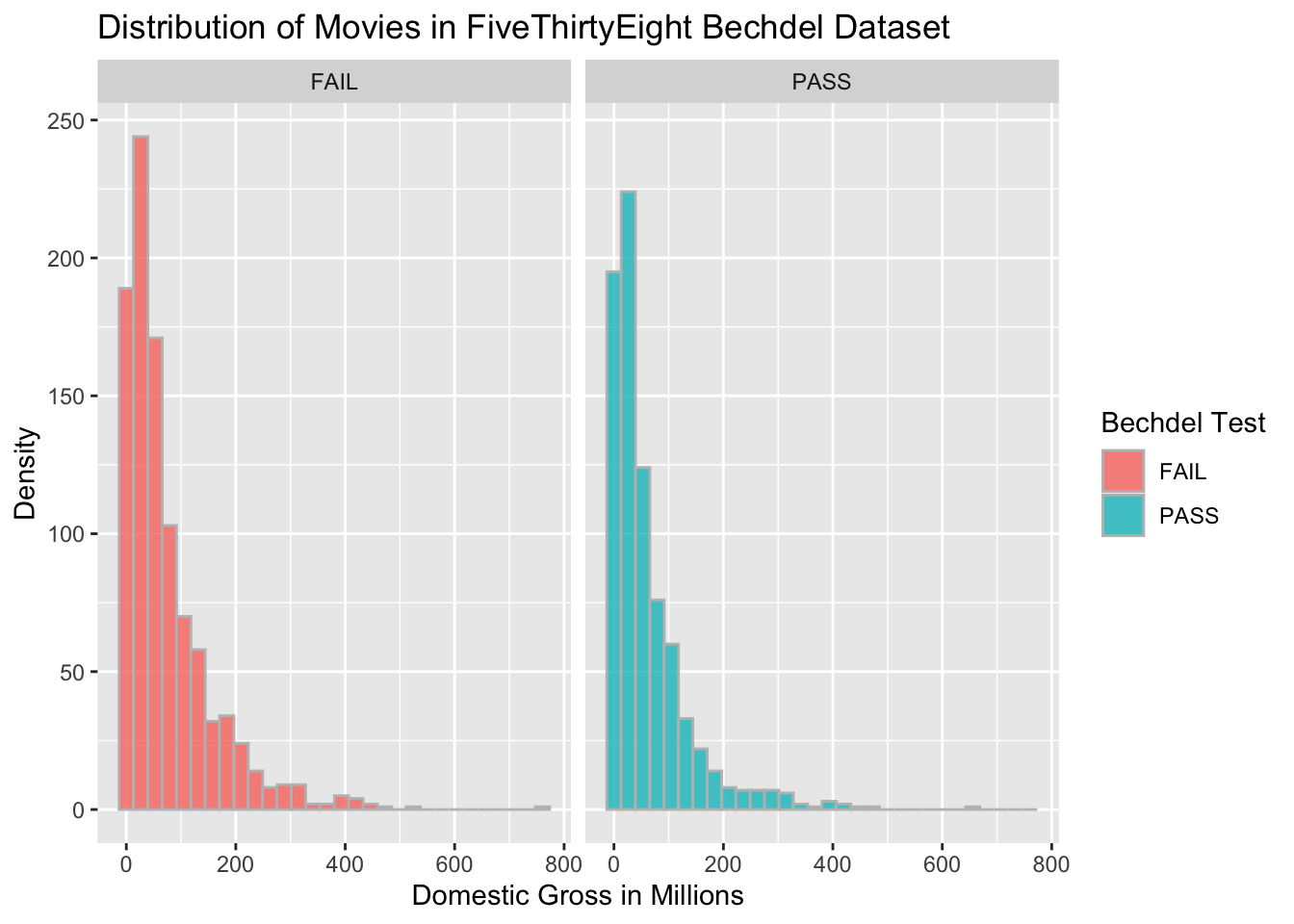
You can specify the color (outline) and fill color of plots. You can
also assign ggplots to objects. The ggpubr function ggarrange()
allows you to easily present multiple plots in the same output.
color <- ggplot(data = bech_data, aes(x = domgross, y = ..density..)) +
  geom_histogram(color = 'blue') +
  ggtitle("Outlining the histogram") +
  xlab("Domestic Gross Revenue")

fill <- ggplot(data = bech_data, aes(x = domgross, y = ..density..)) +
  geom_histogram(fill = 'green') +
  ggtitle("Filling the histogram") +
  xlab("Domestic Gross Revenue")

ggarrange(color, fill)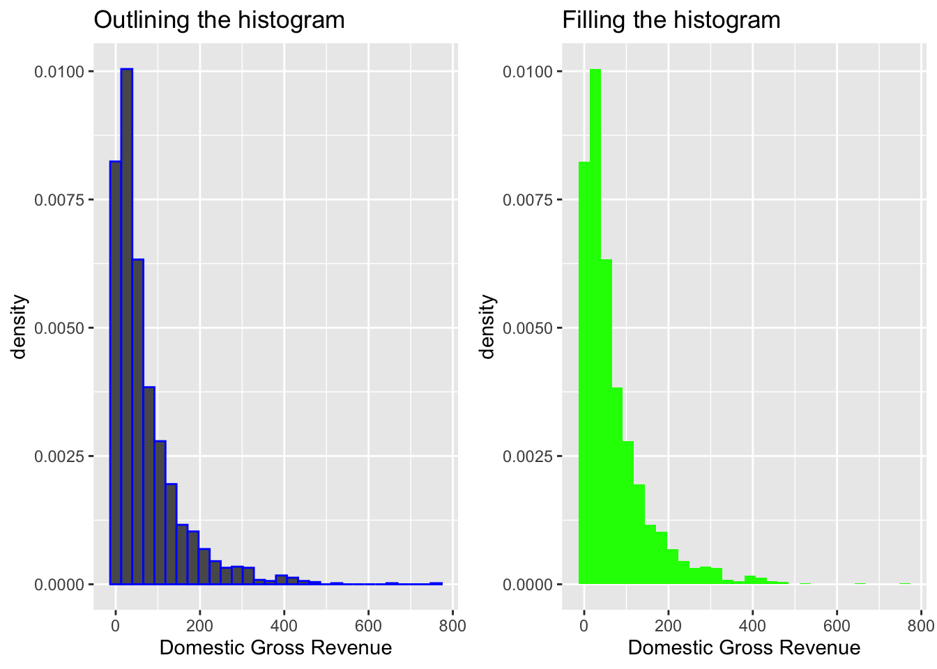
You can also vary the number of bins in each histogram. Run the
following chunk to see the implications of the bin argument. The more
bins there are, the more specific the visualization.
# Vary the number of bins per histogram
bin60 <- ggplot(data = bech_data, aes(x = domgross, y = ..density..)) +
  geom_histogram(bins = 60) +
  ggtitle("60 bins") +
  xlab("Domestic Gross Revenue")
bin30 <- ggplot(data = bech_data, aes(x = domgross, y = ..density..)) +
  geom_histogram(bins = 30) +
  ggtitle("30 bins") +
  xlab("Domestic Gross Revenue")
bin15 <- ggplot(data = bech_data, aes(x = domgross, y = ..density..)) +
  geom_histogram(bins = 15) +
  ggtitle("15 bins") +
  xlab("Domestic Gross Revenue")

ggarrange(bin60, bin30, bin15, ncol = 3)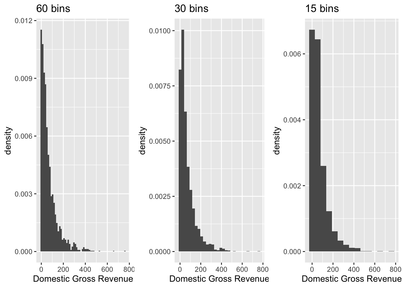
The density plot is a variation of the histogram, where values in
columns are smoothed to be equally distributed allowing for the overall
distribution of the data to become easy to assess. You can use
geom_density() to add a density plot on top of a histogram.
# Add a density plot
ggplot(data = bech_data, aes(x = domgross, y = ..density..)) +
  geom_histogram(bins = 60, color = 'grey', fill = 'blue') +
  ggtitle("Distibution of Domestic Gross Revenue for Movies") +
  xlab("Domestic Gross Revenue") +
  geom_density(alpha = .4, fill = 'grey') +
  facet_wrap(~ binary)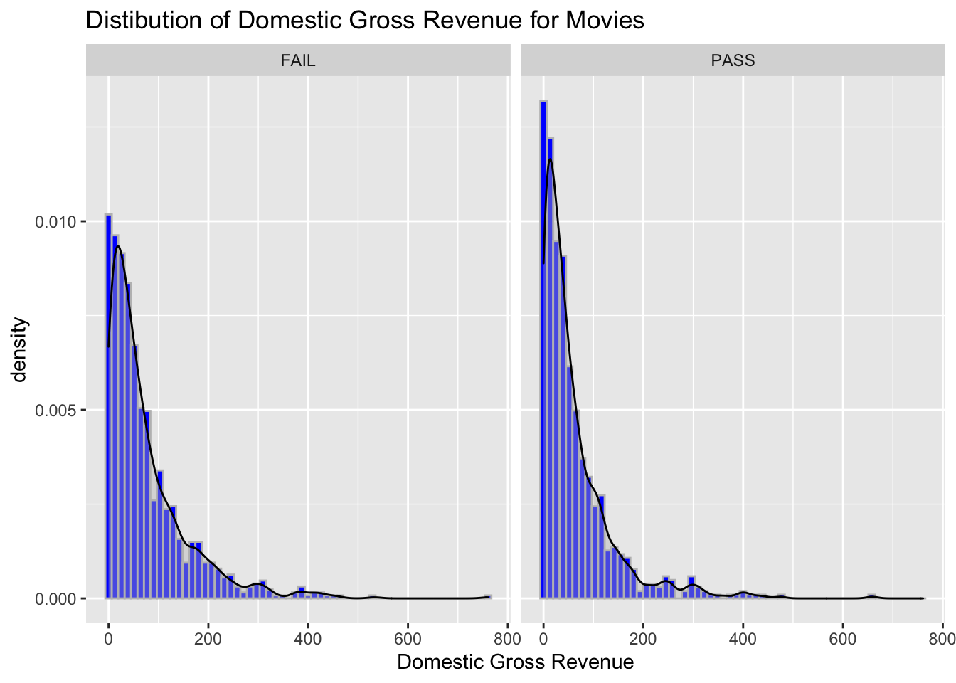
You can also create histograms to compare multiple groups within a
single plot. Try switching the color argument with the fill argument,
keeping the object binary in place. See if you can apply what you have
learned so far to improve the appeal of the plot.
ggplot(data = bech_data, aes(x = domgross, y = ..density.., color = binary)) +
  geom_histogram(position = "identity", bins = 60, alpha = .5) +
  ggtitle("Distibution of Domestic Gross Revenue for Movies") +
  xlab("Domestic Gross Revenue") +
  geom_density(alpha = .4)
The function scale_color_discrete() also allows you to change the
legend title.
# Change legend title
ggplot(data = bech_data, aes(x = domgross, y = ..density.., color = binary)) +
  geom_histogram(position = "identity", bins = 60, alpha = .5) +
  ggtitle("Distibution of Domestic Gross Revenue for Movies") +
  xlab("Domestic Gross Revenue") +
  geom_density(alpha = .4) +
  scale_color_discrete(name = "Test")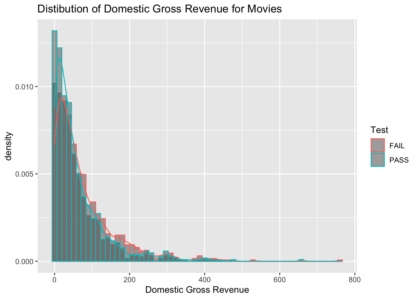
Use ggsave() and set the desired filename, size, dpi, and other
parameters for saving your plot.
# Save your plot
ggplot(data = bech_data, aes(x = domgross, y = ..density.., color = binary)) +
  geom_histogram(position = "identity", bins = 60, alpha = .5) +
  ggtitle("Distibution of Domestic Gross Revenue for Movies") +
  xlab("Domestic Gross Revenue") +
  geom_density(alpha = .4) +
  scale_color_discrete(name = "Test")
ggsave("Hist_Dens.png", width = 5, height = 5)3.2.2.2 Other Useful Functions and Arguments
Let’s create some more box plots and violin plots using the period code
column. As these plots are used to compare distributions of data, they
are especially useful for comparing different groups of continuous data.
You can use the mutate() function to set period_code as a factor, as
to make your ggplot coding simpler and cleaner. In this iteration, let’s
set try a notched box plot, which emphasize the median with notches.
bech_data <- bech_data %>% mutate(period_code = as.factor(period_code))

ggplot(data = bech_data, aes(x = as.factor(period_code), y = domgross)) +
  geom_boxplot(notch = T)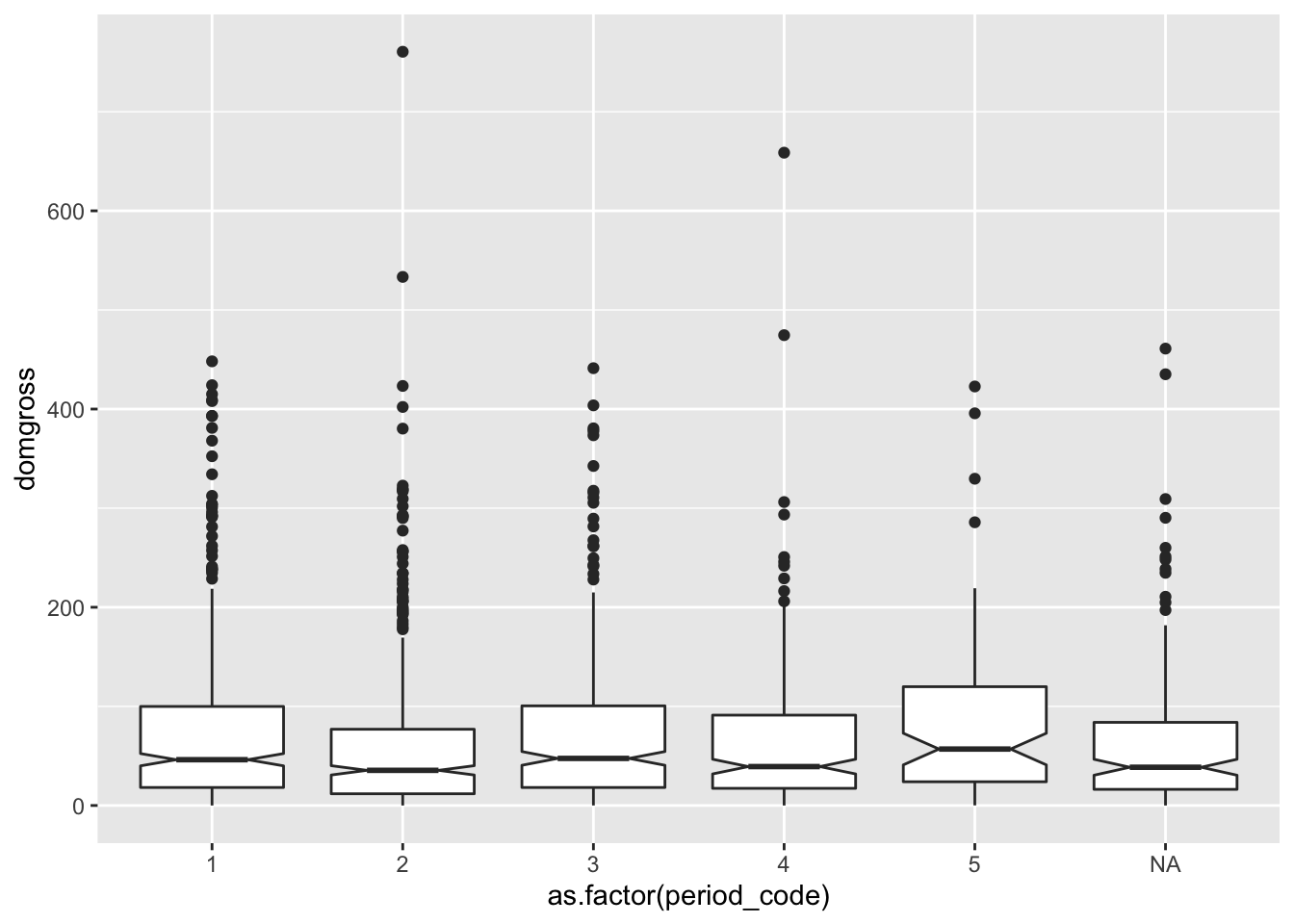
You can add a dot to represent the mean domestic revenue for each group
of movies using
stat_summary(fun.y = mean, geom = "point", color = "anycolor")
ggplot(data = bech_data, aes(x = period_code, y = domgross)) +
  geom_boxplot(notch = T) +
  stat_summary(fun.y = mean, geom = "point", color = 'red')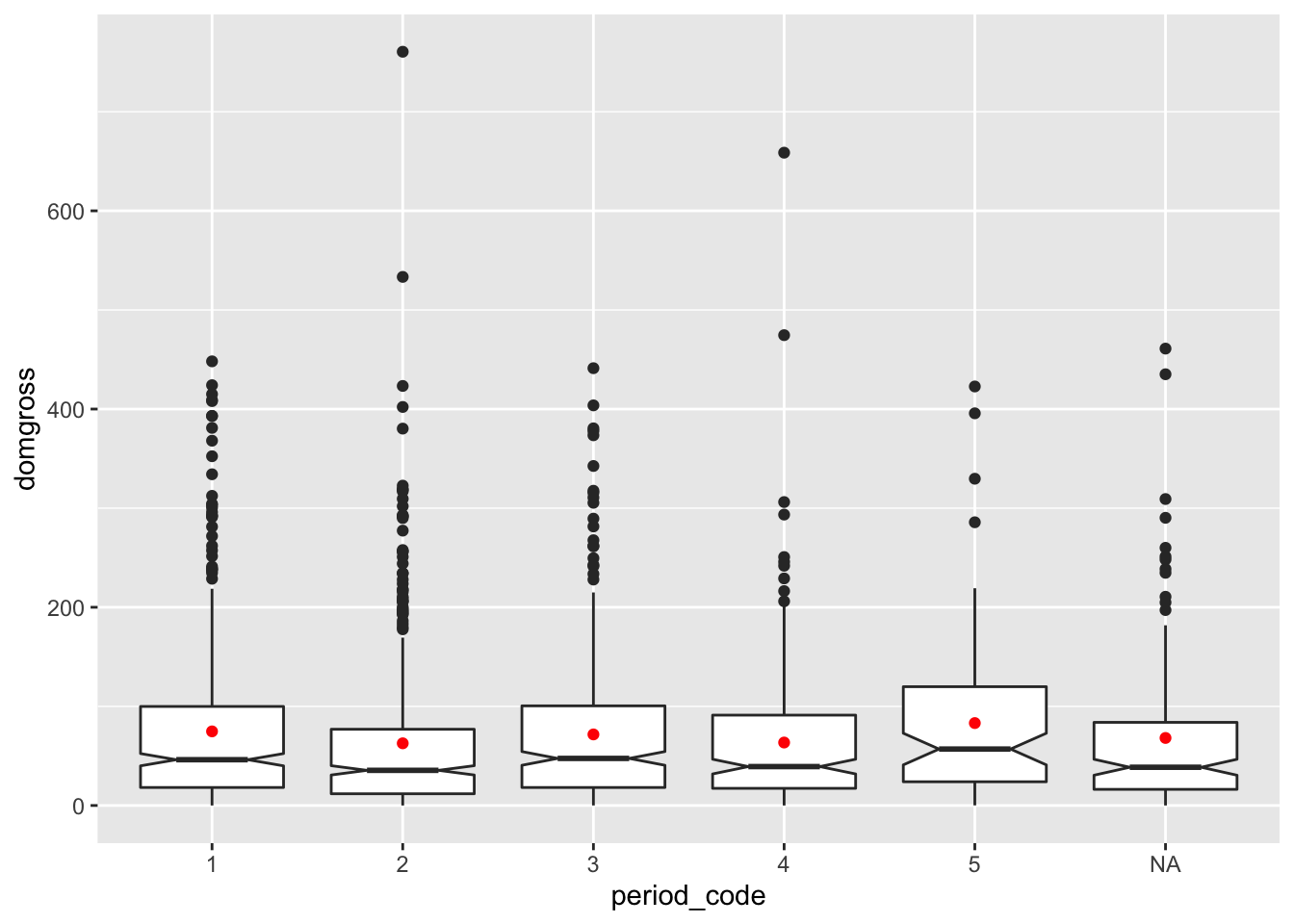
Assign period_code to the argument color to assign each period code a
unique color.
ggplot(data = bech_data, aes(x = period_code, y= domgross, color = period_code)) +
  geom_boxplot(notch = T) +
stat_summary(fun.y=mean, geom="point", color = 'red') 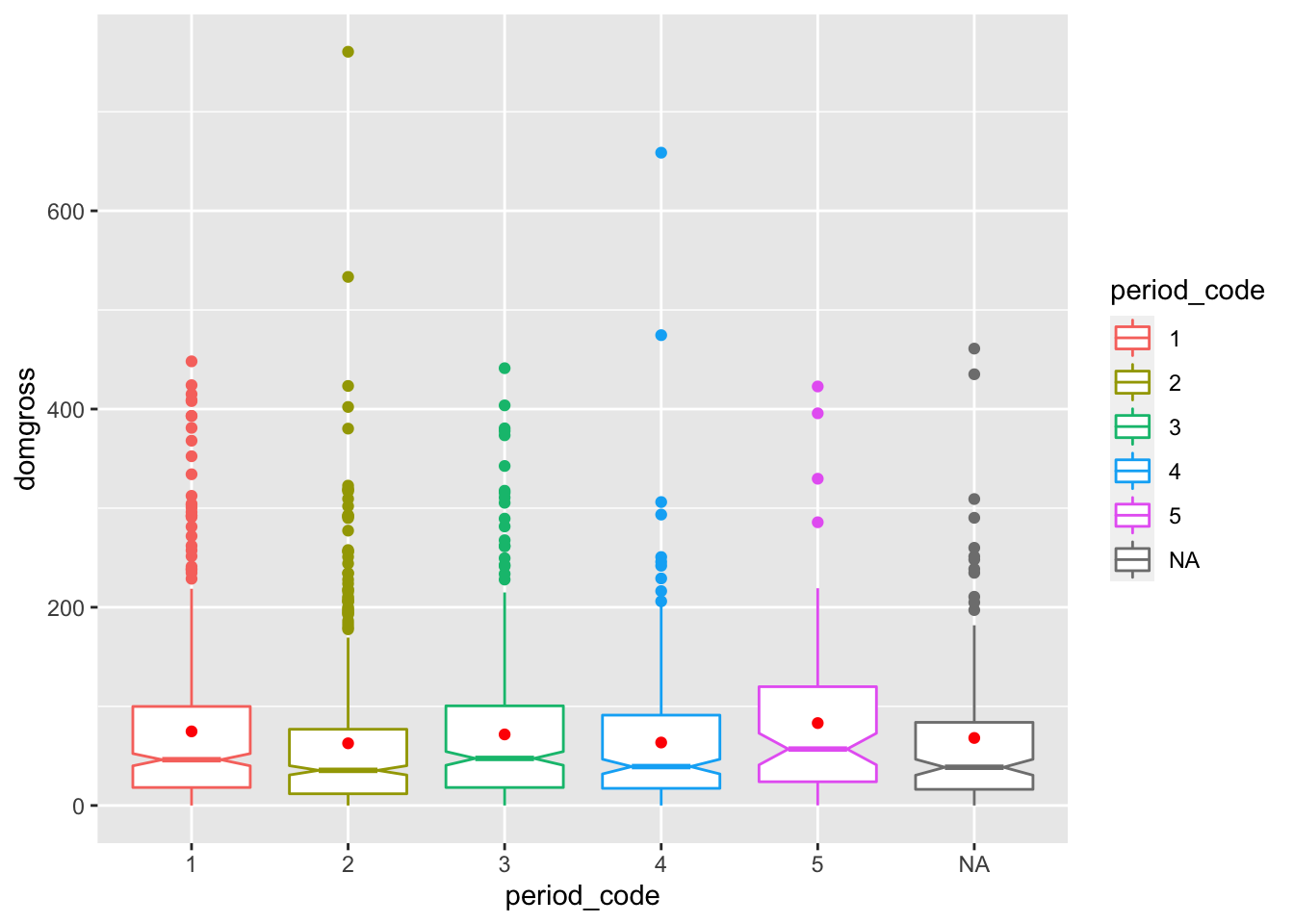
You can create make group comparisons using box plots. Use the aes()
function to specify the group using the color or fill argument, and
the variables of interest using the x and y arguments. Instead of
outlining this boxplot in color, fill the boxplot in color. Add a legend
title. Use the layer “scale_fill_discrete” when “fill” is used in the
aes. Use the layer “scale_color_discrete” when “color” is used in the
aes.
ggplot(data = bech_data, aes(x = period_code, y = domgross, color = binary)) +
  geom_boxplot(notch = TRUE) +
stat_summary(fun.y=mean, geom="point", color = 'red') 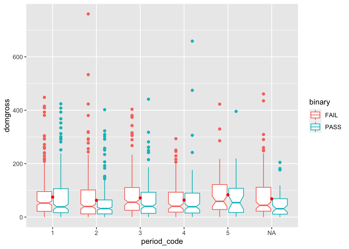
You can change the size, shape, and color of points in your scatter plot.
ggplot(data = bech_data, aes(x = domgross, y = intgross)) +
  geom_point(size = 10, shape = 7, color = 'blue')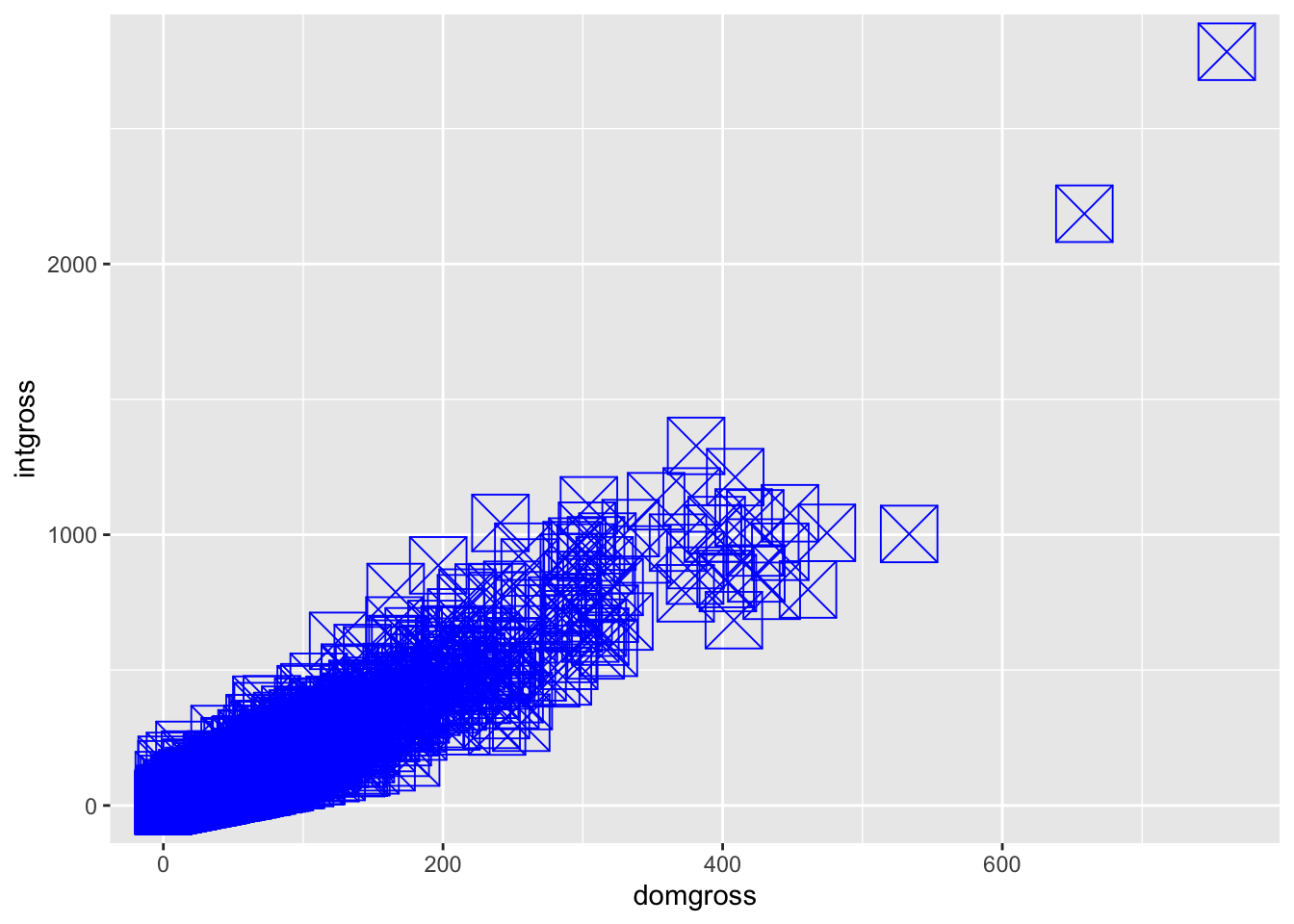
To label the points that represent top five movies based on
international gross revenue, first arrange the international gross
revenue column in descending order, using the slice() function to
limit the dataframe to the top five movies. Then, add an addition
geom_point() layer calling the topfive data, as shown below. nudge_x
and nudge_y allow you to move the labels in reference to the
datapoint.
topfive <- bech_data %>%
  arrange(desc(intgross)) %>%
  slice(1:5)

ggplot(data = bech_data, aes(x = domgross, y = intgross)) +
  geom_point() +
  geom_point(data = topfive, aes(x = domgross, y = intgross), color = 'red') +
  geom_text(data = topfive, label = topfive$title, nudge_x = 200, nudge_y = 200)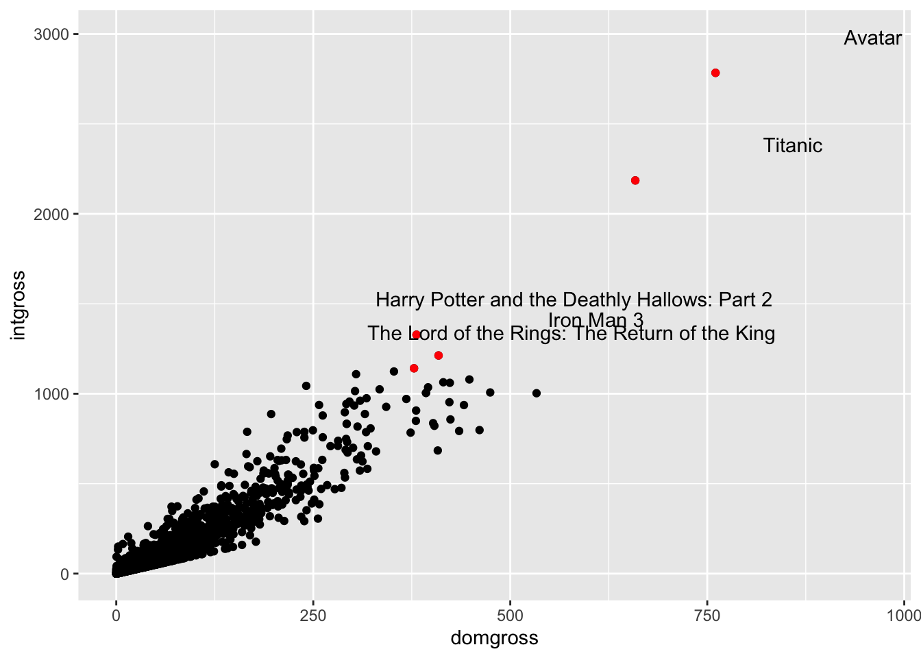
Add a regression line to any scatter plot with
geom_smooth(method = 'lm')
ggplot(data = bech_data, aes(x = domgross, y = intgross)) +
  geom_point() +
  geom_smooth(method = 'lm')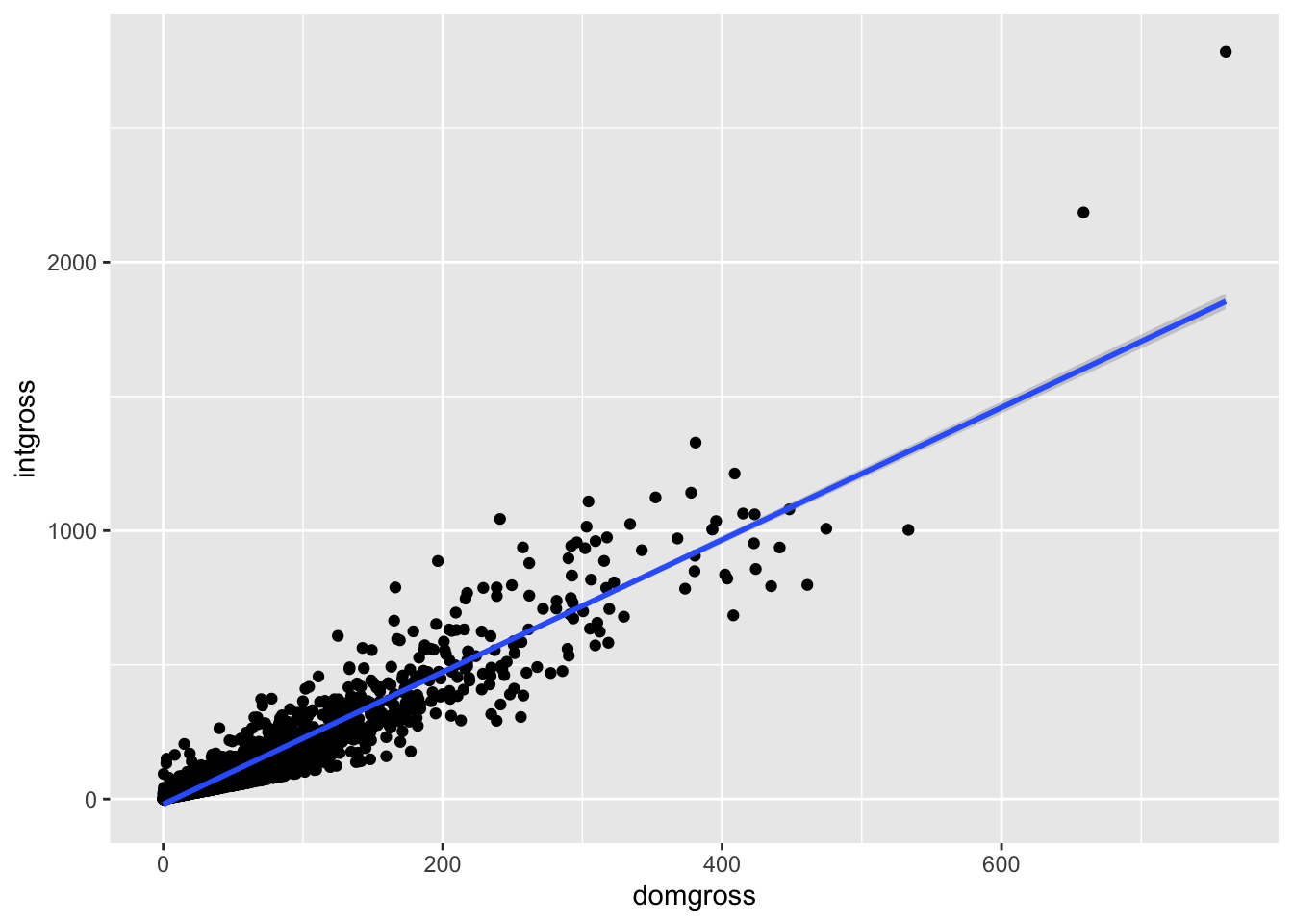
You can also display scatter plots by groups, distinguished by color or shape, as seen below. See if you can add a regression line to one of these plots.
# Scatter plot by group
plot1 <- ggplot(data = bech_data, aes(x = domgross, y = intgross, color = binary)) +
  geom_point()

plot2 <- ggplot(data = bech_data, aes(x = domgross, y = intgross, shape = binary)) +
  geom_point()

plot3 <- ggarrange(plot1, plot2, ncol=2)

annotate_figure(plot3,
  top = text_grob("Difference Between Two Plots", color = "red", face = "bold", size = 14),
  bottom = text_grob("Data source: \n Bechdel data set", color = "blue", hjust = 1, x = 1, face = "italic", size = 10),
  left = text_grob("Figure arranged using ggpubr", color = "blue", rot = 90), fig.lab = "Figure 1", fig.lab.face = "bold")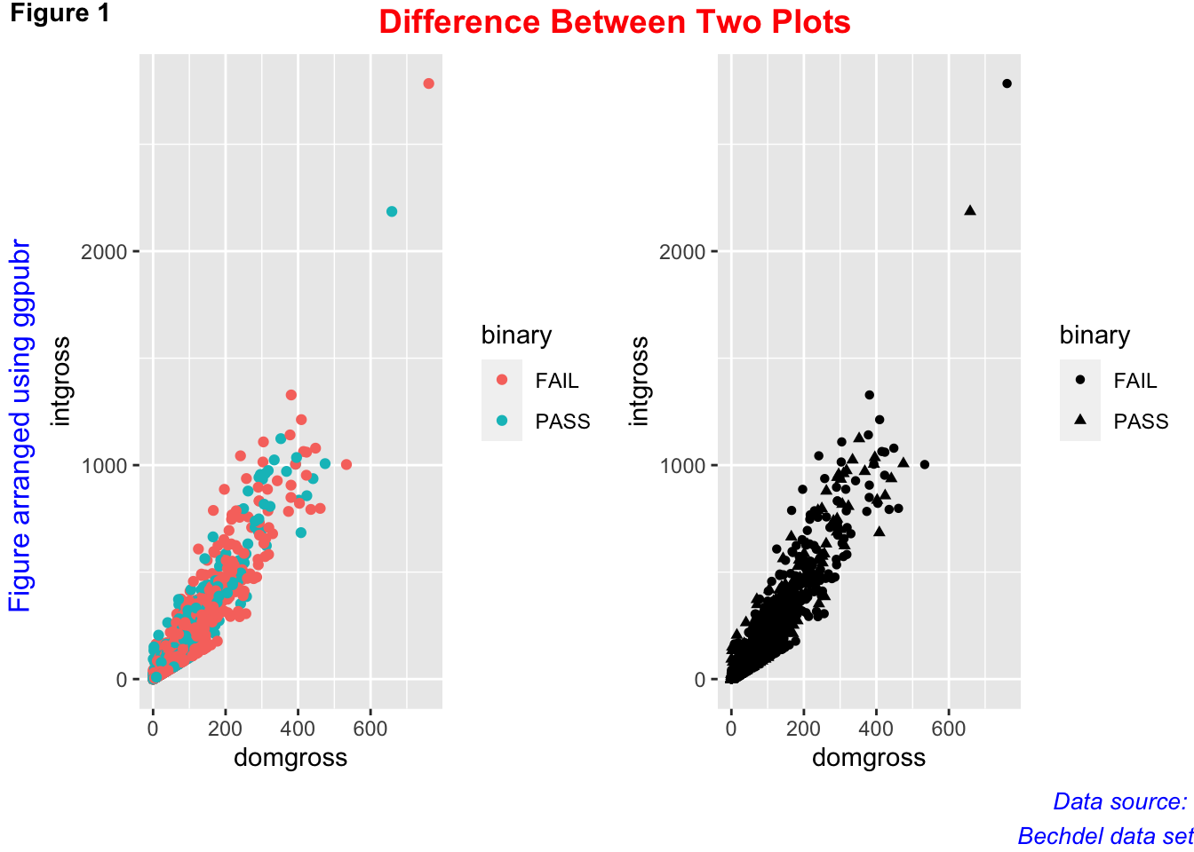
You can also add rugs, or lines across the x-axis that are tied to
single points of data, to the plot using geom_rug()
# Add rugs to scatter plot
ggplot(data = bech_data, aes(x = domgross, y = intgross, color = binary)) +
  geom_point() +
  geom_rug()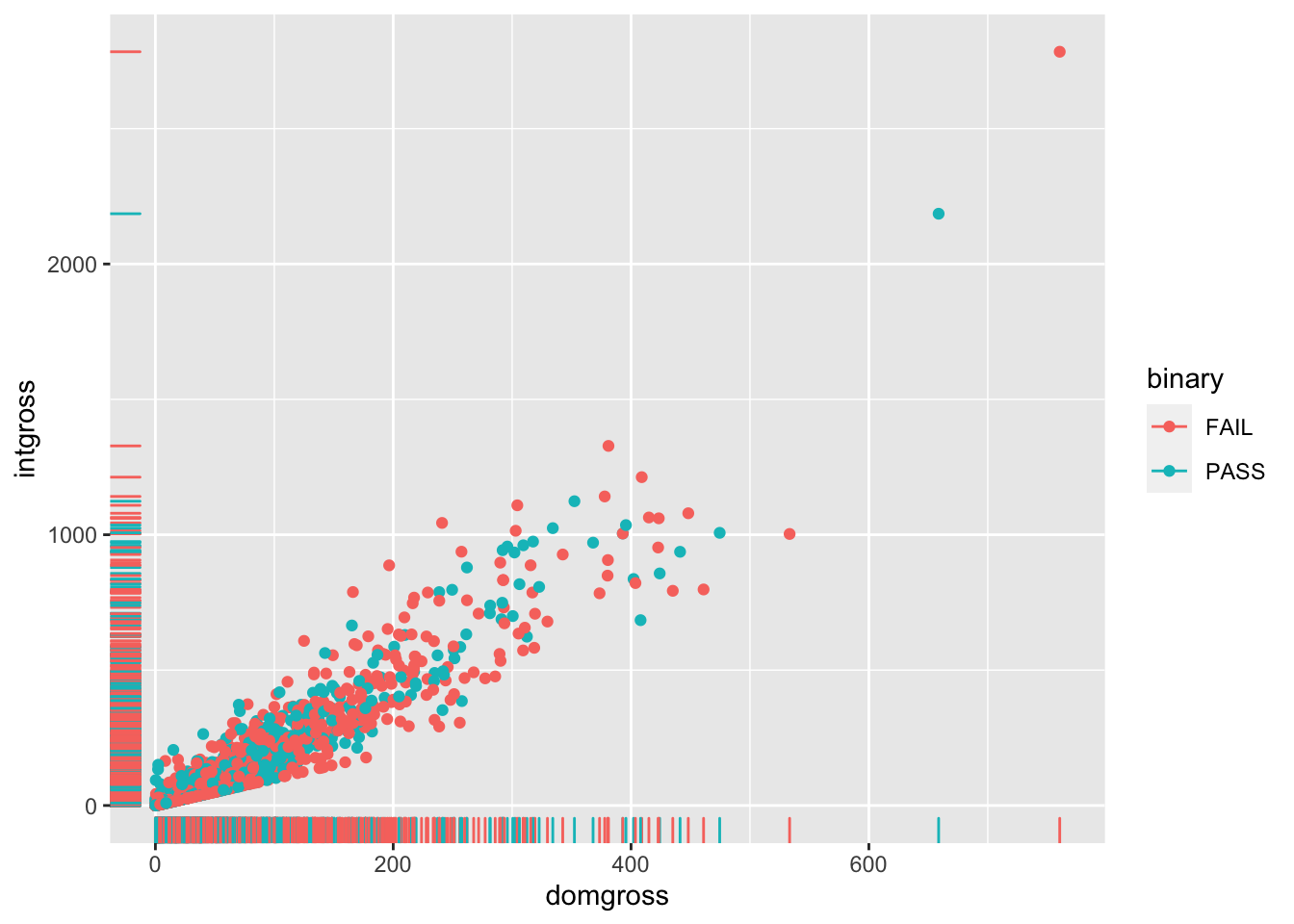
ggedit() allows you to create plots with an interface for editing
aspects of each layer.
#install.packages('ggedit')
library(ggedit)
p <- ggplot(data = bech_data, aes(x = domgross, y = intgross, color = binary)) + geom_point()
ggedit(p)
3.3 Case Study
This case study was derived from a real-life data visualization problem. The resulting visualizations were eventually published in an academic journal. This case study does not exemplify how to make the “right” choices for data visualization, but is written to demonstrate how data visualizations can drive and change a research process. With this in mind, it is beneficial for the R user to be consistently interpreting their findings visually.
A researcher was conducting a content analysis where they found 10 themes in a text-based corpus. The researcher has quantified the number of topics across fourteen years (1958-1972), and needed to find an effective way to present this information for potential publication.
If you are following along in R, install the necessary packages for this case study.
#install.packages('gifski')
#install.packages('gganimate')
#install.packages('transformr')
#install.packages('janitor')
#install.packages('stringr')
#install.packages('forcats')
#install.packages('lubridate')
#install.packages('ggrepel')
Then load the libraries and dataset. This dataset is available at https://osf.io/6jb9t/ under the Data Visualization folder. The dataset includes three columns—a topic name designation, a year between 1958 and 1972, and the number of times that topic occurred in that year.
library(stringr)
library(gganimate)
library(gifski)
library(transformr)
library(janitor)
library(lubridate)
library(ggrepel)

global <- read_csv("globalperyear.csv")
The researcher had a meeting with coauthors, where it was decided to
change the names of six of the ten topics. The grepl package function,
str_replace_all() was used to update each instance of the incorrect
topic labels in the appropriate column.
global$global_topics <- str_replace_all(global$global_topics, 'Themes', 'Development')
global$global_topics <- str_replace_all(global$global_topics, 'Stories in music', 'Philosophy')
global$global_topics <- str_replace_all(global$global_topics, 'Musical choices', 'Orchestration')
global$global_topics <- str_replace_all(global$global_topics, 'Musical heritage', 'Heritage')
global$global_topics <- str_replace_all(global$global_topics, 'Young people in music history.', 'Young People')
global$global_topics <- str_replace_all(global$global_topics, 'The show', 'The Show')
Since the visualization presenting the counts of topics over time, the researcher tries a line graph to display the topics.
ggplot(global, aes(x = year, y = count, color = global_topics)) +
  geom_line() +
  labs(
    title = paste("Global Topics")
  )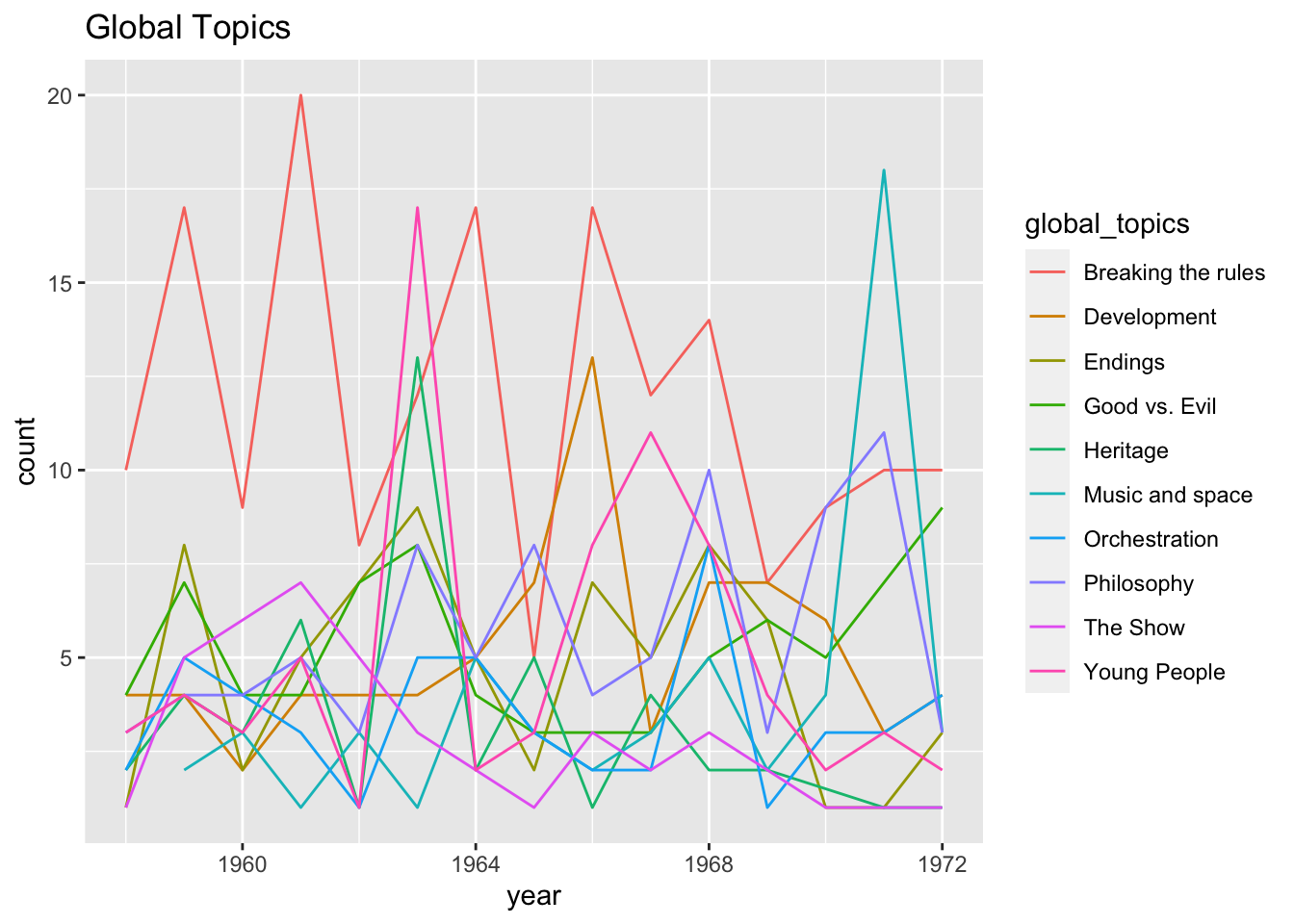
This plot was chaotic and difficult to read, so the researcher tried the
geom_smooth() function as an additional layer. Set the se argument to
FALSE to avoid extra noise in the plot. FYI, the se argument, when
true, plots the standard error of each smoothed distribution, which in
this case tended to be quite large.
ggplot(global, aes(x = year, y = count, color = global_topics)) +
  geom_smooth(se = FALSE) +
  labs(title = paste("Global Topics")
  )
## `geom_smooth()` using method = 'loess' and formula 'y ~ x'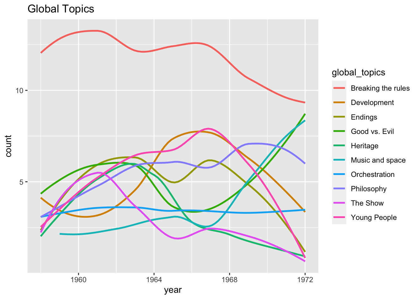
This output was still a bit chaotic, so the researcher decided to present ten small plots in one figure instead of one large plot. A new dataset needs to be created for each small plot, which is done using the filter() function.
rules <- global %>%
  filter(global_topics == "Breaking the rules")
development <- global %>%
  filter(global_topics == "Development")
show <- global %>%
  filter(global_topics == "The Show")
space <- global %>%
  filter(global_topics == "Music and space")
philosophy <- global %>%
  filter(global_topics == "Philosophy")
goodvsevil <- global %>%
  filter(global_topics == "Good vs. Evil")
endings <- global %>%
  filter(global_topics == "Endings")
heritage <- global %>%
  filter(global_topics == "Heritage")
young <- global %>%
  filter(global_topics == "Young People")
Orchestration <- global %>%
  filter(global_topics == "Orchestration")
Ten small plots were created, each calling the unique datasets. The
coord_cartesian() layer was also added. This function sets a limit to
the x and y-axes (in this case the limit was 0, 20). This layer allowed
for the plots to be framed without additional white space.
rulesplot <- ggplot(rules, aes(x = year, y = count)) +
  geom_smooth(aes(), se = TRUE) +
  coord_cartesian(ylim = c(0, 20)) +
  labs(
    title = paste("Breaking the Rules")
  )

developmentplot <- ggplot(development, aes(x = year, y = count)) +
  geom_smooth(aes(), se = TRUE) +
  coord_cartesian(ylim = c(0, 20)) +
  labs(
    title = paste("Development")
  )

showplot <- ggplot(show, aes(x = year, y = count)) +
  geom_smooth(aes(), se = TRUE) +
  coord_cartesian(ylim = c(0, 20)) +
  labs(
    title = paste("The Show")
  )

spaceplot <- ggplot(space, aes(x = year, y = count)) +
  geom_smooth(aes(), se = TRUE) +
  coord_cartesian(ylim = c(0, 20)) +
  labs(
    title = paste("Music and Space")
  )

philosophyplot <- ggplot(philosophy, aes(x = year, y = count)) +
  geom_smooth(aes(), se = TRUE) +
  coord_cartesian(ylim = c(0, 20)) +
  labs(
    title = paste("Philosophy")
  )

goodvsevilplot <- ggplot(goodvsevil, aes(x = year, y = count)) +
  geom_smooth(aes(), se = TRUE) +
  coord_cartesian(ylim = c(0, 20)) +
  labs(
    title = paste("Good vs. Evil")
  )

endingsplot <- ggplot(endings, aes(x = year, y = count)) +
  geom_smooth(aes(), se = TRUE) +
  coord_cartesian(ylim = c(0, 20)) +
  labs(
    title = paste("Endings")
  )

heritageplot <- ggplot(heritage, aes(x = year, y = count)) +
  geom_smooth(aes(), se = TRUE) +
  coord_cartesian(ylim = c(0, 20)) +
  labs(
    title = paste("Heritage")
  )

youngplot <- ggplot(young, aes(x = year, y = count)) +
  geom_smooth(aes(), se = TRUE) +
  coord_cartesian(ylim = c(0, 20)) +
  labs(
    title = paste("Young People")
  )

orchestrationplot <- ggplot(Orchestration, aes(x = year, y = count)) +
  geom_smooth(aes(), se = TRUE) +
  coord_cartesian(ylim = c(0, 20)) +
  labs(
    title = paste("Orchestration")
  )
Then, the researcher used the ggarrange() function to display each of
the plots together at once.
ggarrange(developmentplot, goodvsevilplot, orchestrationplot, youngplot, rulesplot, showplot, endingsplot, heritageplot, philosophyplot, spaceplot)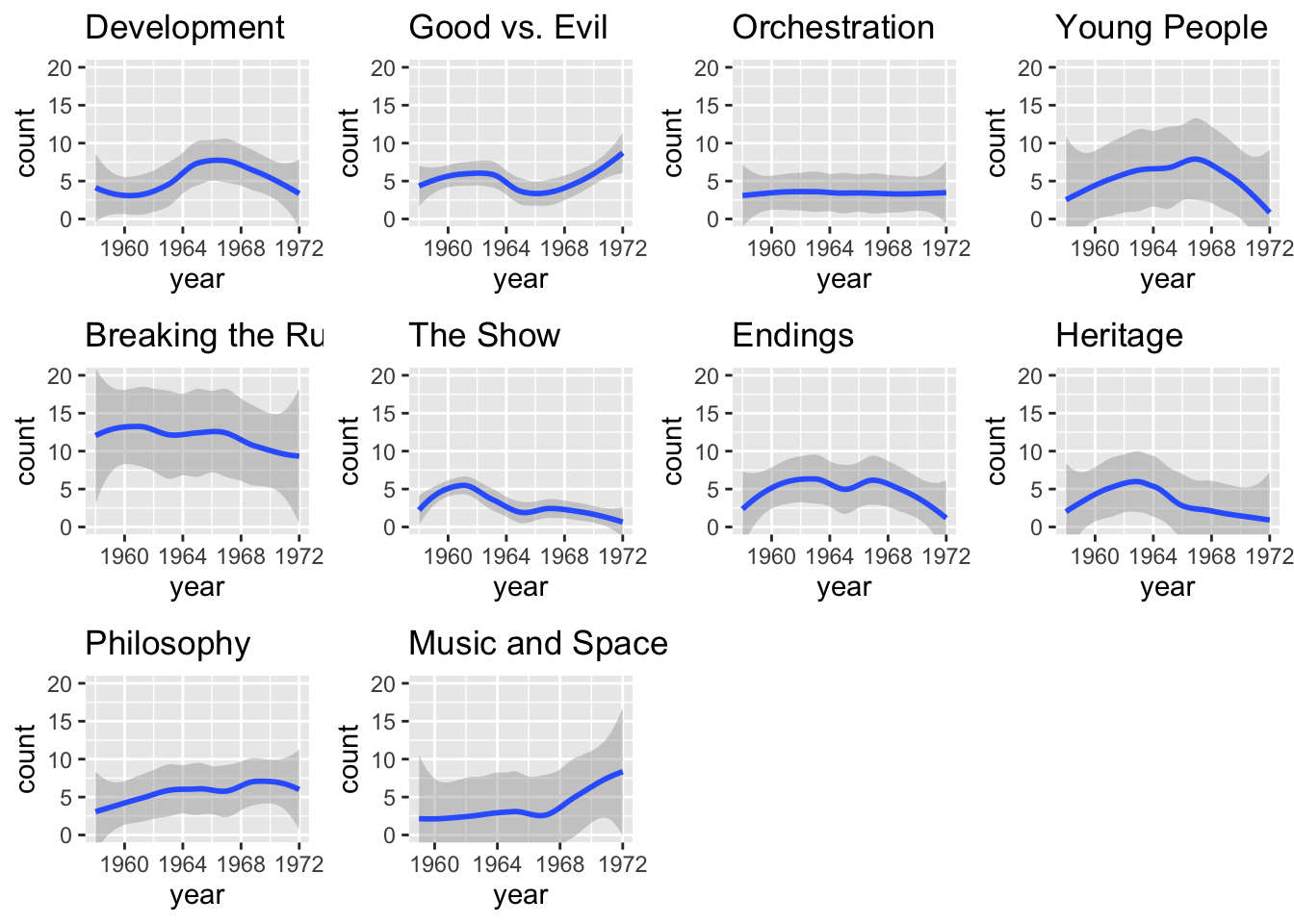
There was an opportunity to publish a digital file that includes animated data along with the manuscript. The researcher then used the following code to create an animated gif using the same dataset. The last two lines of code are commented out as they would not render in this document, but you can try it for yourself with the same code.
#install.packages('plotly')
library(plotly)
##
## Attaching package: 'plotly'## The following object is masked from 'package:sentimentr':
##
## highlight## The following object is masked from 'package:ggplot2':
##
## last_plot## The following object is masked from 'package:stats':
##
## filter## The following object is masked from 'package:graphics':
##
## layoutp <- global %>%
arrange(count) %>%
mutate(topics = factor(global_topics, levels=c("The Show", "Young People", "Music and space", "Philosophy", "Good vs. Evil", "Development", "Endings", "Heritage", "Breaking the rules", "Orchestration"))) %>%
ggplot(global, mapping = aes(x = topics, y = count)) +
geom_histogram(stat = 'identity', aes(fill = topics)) +
coord_flip() +
labs(title = 'Year: {frame_time}',
x = 'Global Categories',
y = "Category Mentions",
caption="Global Categories: Trends Over Time") +
transition_time(year) +
ease_aes('linear')
#animate(p, nframes = 600, fps = 24, width = 600, height = 400, end_pause = 30)
#p3.4 Review
In this chapter we reviewed some common data visualizations and practices for creating several visualizations in R. For more examples, check out ggplot’s gallery for fantastic and inspiring visualizations at this link: [<https://exts.ggplot2.tidyverse.org/gallery>](https://exts.ggplot2.tidyverse.org/gallery/). To make sure you understand this material, there is a practice assessment to go along with this chapter at https://jayholster.shinyapps.io/DataVisualizationAssessment/
3.5 References
Firke, S. (2021) janitor. https://cran.r-project.org/web/packages/janitor/index.html
Grolemund, G., & Wickham, H. (2011). Dates and times made easy with lubridate. Journal of Statistical Software, 40(3), 1–25. https://www.jstatsoft.org/v40/i03/.
Holster, J. D. (2022) Music’s Monarch Speaks: A Content Analysis of Leonard Bernstein’s Young People’s Concerts, Qualitative Research in Music Education, 4(1), 62–104. https://vpa.uncg.edu/wp-content/uploads/2022/02/QRME-v4-i1-R2.pdf
Iturbide, M., Bedia, S., Herrera, J., Baño-Medina, J. Fernández, M.D., Frías, R. Manzanas, D., San-Martín, E., Cimadevilla, A.S., Cofiño, A.S., & Gutiérrez, J.M (2019) The R-based climate4R open framework for reproducible climate data access and post-processing. Environmental Modelling & Software, 111, 42-54. https://[doi.org](https://%5Bdoi.org){.uri} /10.1016/j.envsoft.2018.09.009
Kassambara, A., (2020). ggpubr. https://cran.r-project.org/web/packages/ggpubr/index.html
Kim A.Y., Ismay C., & Chunn, J. (2018). “The fivethirtyeight R Package: ‘Tame Data’ Principles for Introductory Statistics and Data Science Courses.” Technology Innovations in Statistics Education, 11. <https://escholarship.org/uc/item/0rx1231m>
Lyttle I (2021). vembedr: Embed Video in HTML. R package version 0.1.5, https://github.com/ijlyttle/vembedr.
Mindard, C. J. (1869). Napolean’s disastrous Russian campaign of 1812. https://www.masswerk.at/minard/
Mullen, Z., Wiens, A., Vance, E., & Lovejoy, H. (n.d.) Understanding the African diaspora: Modeling the fall of the Oyo empire. https://www.colorado.edu/lab/lisa/
Patil, I. (2021). Visualizations with statistical details: The ‘ggstatsplot’ approach. Journal of Open Source Software, 6(61), 3167. [https://doi.org/[10.21105/joss.03167](https://doi.org/[10.21105/joss.03167)](https://doi.org/%5B10.21105/joss.03167){.uri}
Revelle, W. (2017) psych: Procedures for Personality and Psychological Research, Northwestern University, Evanston, Illinois, USA, <https://CRAN.R-project.org/package=psych> Version = 1.7.8.
Ooms, J. (2022). gifski. https://cran.r-project.org/web/packages/gifski/index.html
Pederson, T. L. (2020). gganimate. https://cran.r-project.org/web/packages/gganimate/gganimate.pdf
Sievert, C. (2020). Interactive Web-Based Data Visualization with R, plotly, and shiny. Chapman and Hall/CRC. ISBN 9781138331457, <https://plotly-r.com>.
Sidi, J. (2020). ggedit. https://cran.rstudio.com/web/packages/ggedit/index.html
Wickham, H., Averick, M., Bryan, J., Chang, W., McGowan, L.D., François, R., Grolemund, G., Hayes, A., Henry, L., Hester, J., Kuhn, M., Pedersen, T.L., Miller, E., Bache, S.M., Müller, K., Ooms, J., Robinson, D., Seidel, D.P., Spinu, V., Takahashi, K., Vaughan, D., Wilke, C., Woo, K., & Yutani, H. (2019). Welcome to the tidyverse. Journal of Open Source Software, 4(43), 1686. https://doi.org/10.21105/joss.01686.
3.5.1 R Short Course Series
Video lectures of each guidebook chapter can be found at https://osf.io/6jb9t/. For this chapter, find the follow the folder path Data visualization in R -> AY 2021-2022 Spring and access the video files, r markdown documents, and other materials for each short course.
3.5.2 Acknowledgements
This guidebook was created with support from the Center for Research Data and Digital Scholarship and the Laboratory for Interdisciplinary Statistical Analaysis at the University of Colorado Boulder, as well as the U.S. Agency for International Development under cooperative agreement #7200AA18CA00022. Individuals who contributed to materials related to this project include Jacob Holster, Eric Vance, Michael Ramsey, Nicholas Varberg, and Nickoal Eichmann-Kalwara.