Chapter 7 Summarising and plotting the data
You may want to summarise the data to obtain numerical summaries. Try the following code. I’ve “commented out” some code. This means that I can see other options that I can use, but these are not run. If you’d like to try the commented out code, simply remove the hash (or comments) “#” signs.
summary(Nurses)## Nurse_ID Hours_Mon Hours_Tues Hours_Total
## Min. : 1.00 Min. :2.00 Min. :4 Min. :6.00
## 1st Qu.: 5.50 1st Qu.:2.75 1st Qu.:4 1st Qu.:6.75
## Median :14.00 Median :3.50 Median :4 Median :7.50
## Mean :23.75 Mean :3.50 Mean :4 Mean :7.50
## 3rd Qu.:32.25 3rd Qu.:4.25 3rd Qu.:4 3rd Qu.:8.25
## Max. :66.00 Max. :5.00 Max. :4 Max. :9.00ggplot(Nurses,mapping=aes(x=Nurse_ID,y=Hours_Total))+
geom_bar(stat="identity")+ggtitle("Add your title here")+
theme(text = element_text(size = 40)) 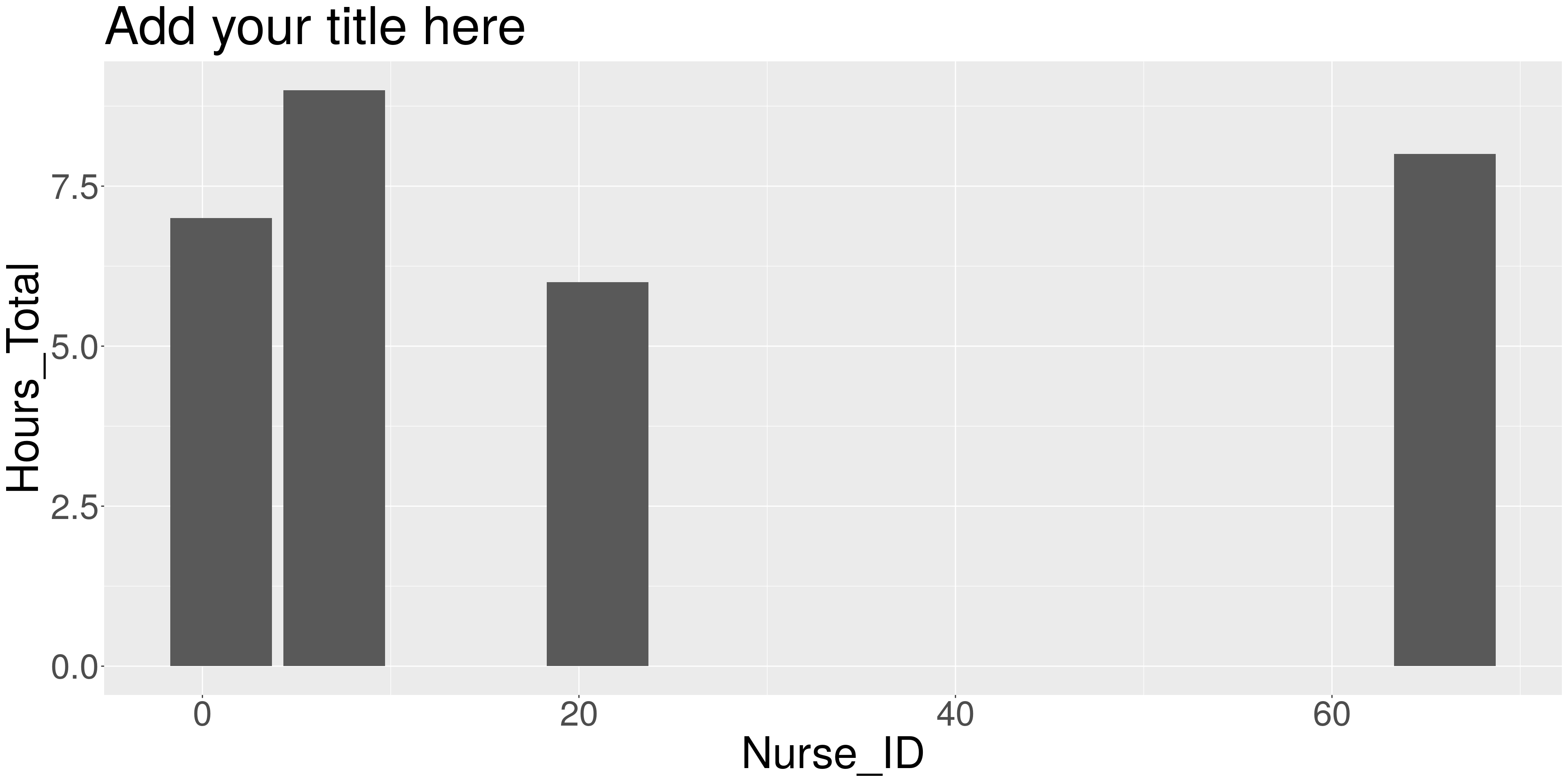
#+ theme(axis.title=element_text(size=60,face="bold"))