Chapter 20 FAQs
20.1 How do I convert my survey scores into percentages?
In the example below we have to arrays of data. One provides the survey score for
each of 12 Haggises for burrowing activity, and the other is the score for the use of
taxis by these individuals.
Since the scores have different denominators, it is advisable the the scores be converted into percentages before comparing the two variables.
burrowing <- c(2,3,4,1,3,4,3,5,3,2,3,4)
taxi_use <- c(9,9,8,6,9,4,3,2,8,9,8,7)
burrow_perc <- 100*(burrowing/5)
taxi_use_perc<-100*(taxi_use/10)
20.2 How do I test my data for Normality?
Testing for Normality of a variable can be described as testing to see if the data follows the Normal distribution. The most commonly used way to assess this is by visual inspection, either by plotting a Histogram (from the data) or by plotting a Q-Q plot (or Quantile-Quantile plot). The formal methods commonly used are the Shapiro-Wilk test and the Kolmogorov-Smirnov test.
20.2.1 Visual methods
When the data is plotted as a histogram, Normality is assessed by inspecting the shape of the histogram. Typically, if the histogram exhibits a bell-shape, the data is assumed to be Normal. The shape of the histogram can also indicate whether the distribution is skewed. For the Q-Q plot, Normality is assumed if the points on the plot follow (approximately) the diagonal line. In this case, the Q-Q plot is a scatterplot of the quantiles from the data plotted against theoretical, Normally distributed quantiles.
Try the following code to test the Haggis data (from the section on T-tests) for Normality.
library(ggplot2)
ba <- data.frame(c(before,after))
ba$timeframe <- c(rep("before",length(before)),rep("after",length(after)))
colnames(ba)<-c("number","timeframe")


# Histogram


ggplot(ba, aes(x = number)) + facet_wrap(. ~timeframe,ncol=1)+
  geom_histogram(binwidth=1,aes(fill = ..count..)) +
  scale_x_continuous(name = "Percentage of limpers per household")  +
  scale_y_continuous(name = "Count") +
  ggtitle("Percentage of limpers per Haggis household",
          subtitle="before and after physiotherapy")+
  theme(text = element_text(size=40))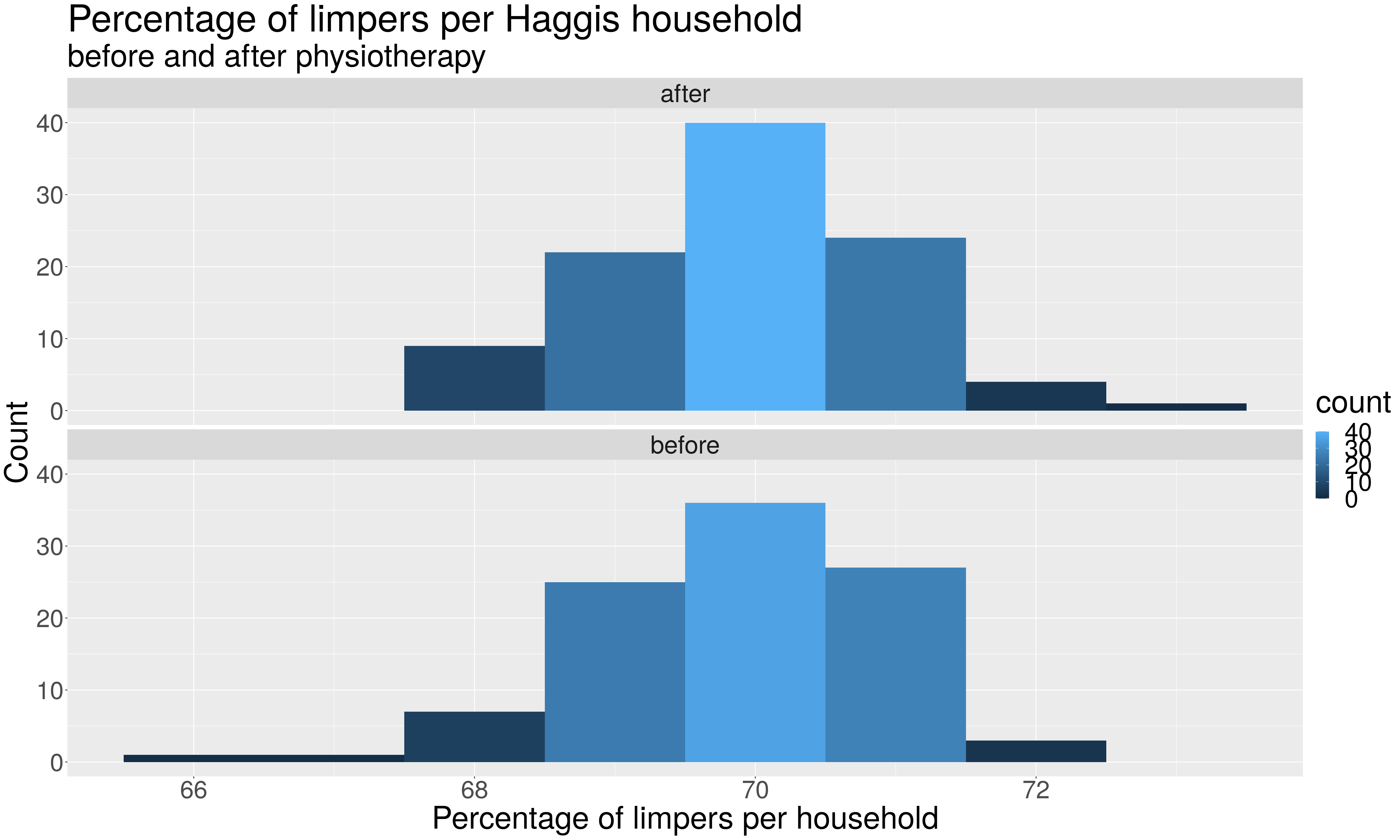
# Q-Q plot

qqnorm(before,cex=4,pch=18,cex.main=3,cex.axis=3,cex.lab=2)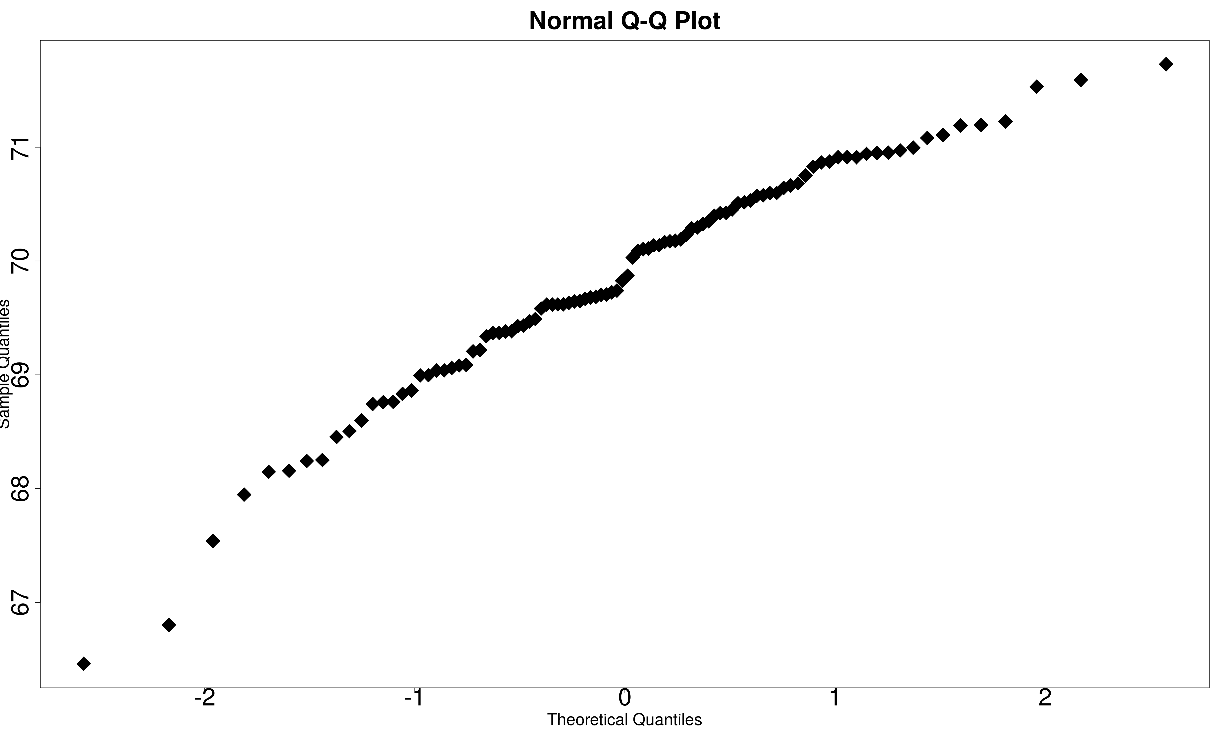
qqnorm(after,cex=4,pch=18,cex.main=3,cex.axis=3,cex.lab=2)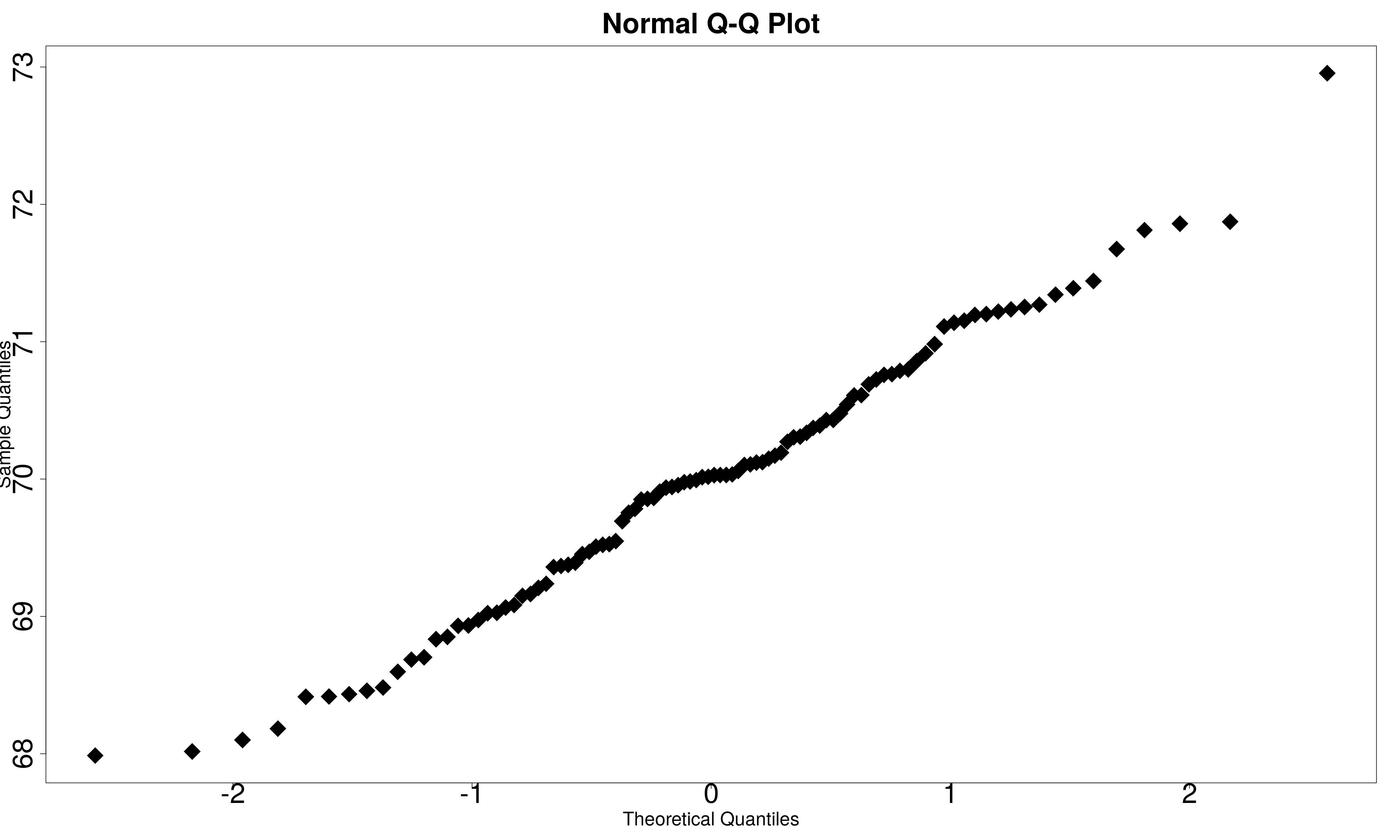
20.2.2 Formal methods
For both of the abovementioned formal methods, a p-value greater than 0.05 indicates that the data is Normally distributed.
Try the following code to test the Haggis data for Normality.
# Shapiro-Wilk test

shapiro.test(before)
##
## Shapiro-Wilk normality test
##
## data: before
## W = 0.96498, p-value = 0.009255# Kolgomorov test
ks.test(after, 'pnorm')##
## One-sample Kolmogorov-Smirnov test
##
## data: after
## D = 1, p-value < 2.2e-16
## alternative hypothesis: two-sided20.3 How do I conduct multiple correlation tests?
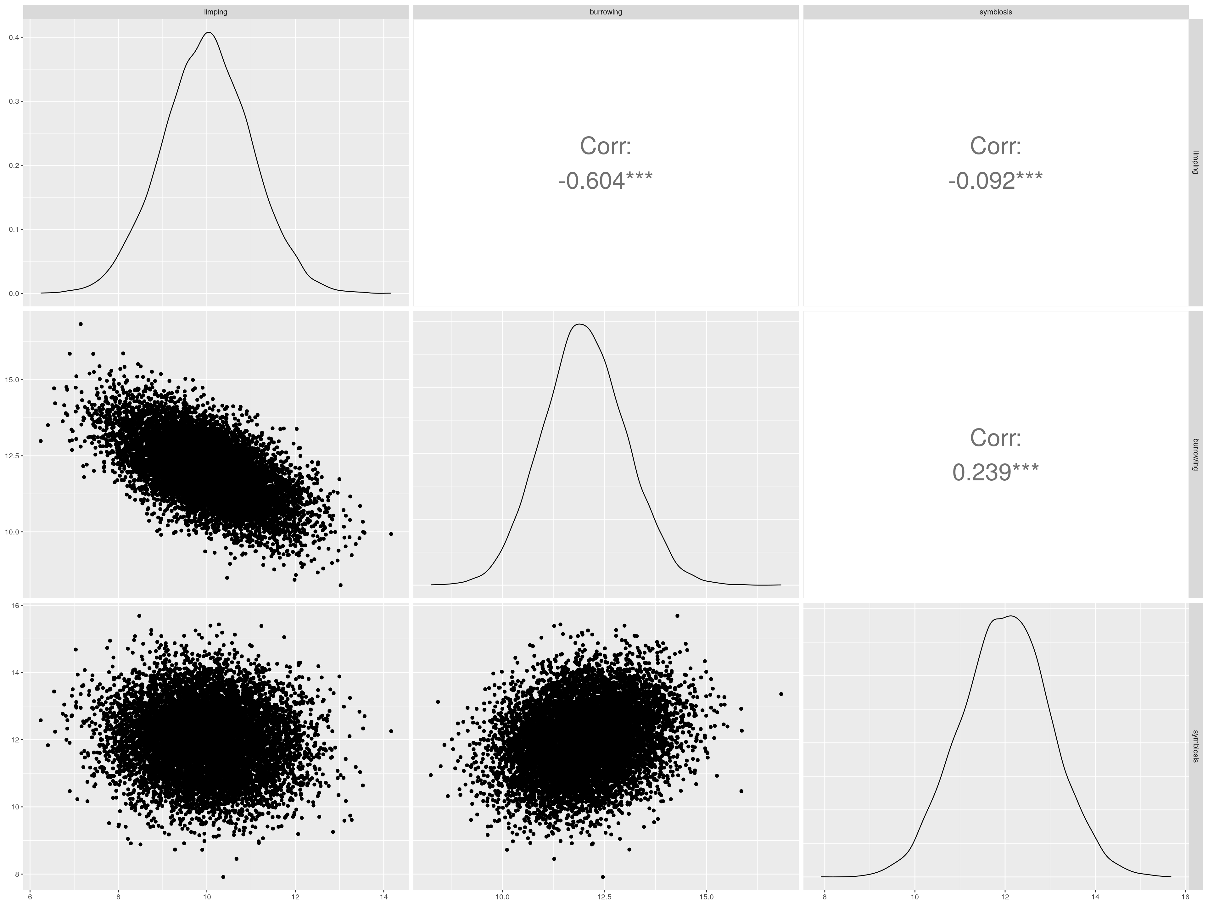
For this topic, we’ve created some data to illustrate the method. The data will represent three variables obtained from a survey of 1000 individuals. Lets imagine that the researcher at hand is interested in assessing the correlation between the variables as an exploratory exercise. Lets give the variables the names: “limping”, “burrowing”,“symbiosis”. I guess you’ve figured out that I like the Haggis data example - the variables above refer to limping score, burrowing activity, and symbiotic activity (engaging for mutual benefit with other species/genera) for each of 1000 Haggises.
First we’ll inspect the names of the variables in the dataset We’ll then visualize the correlations, then print out the matrix of correlations (correlation matrix).
names(dataf)## [1] "limping" "burrowing" "symbiosis"ggpairs(
dataf,
upper = list(
continuous = wrap("cor", size = 10, alignPercent = 1)
)
)
Mat <-cor(dataf)
corrplot(Mat, method="circle")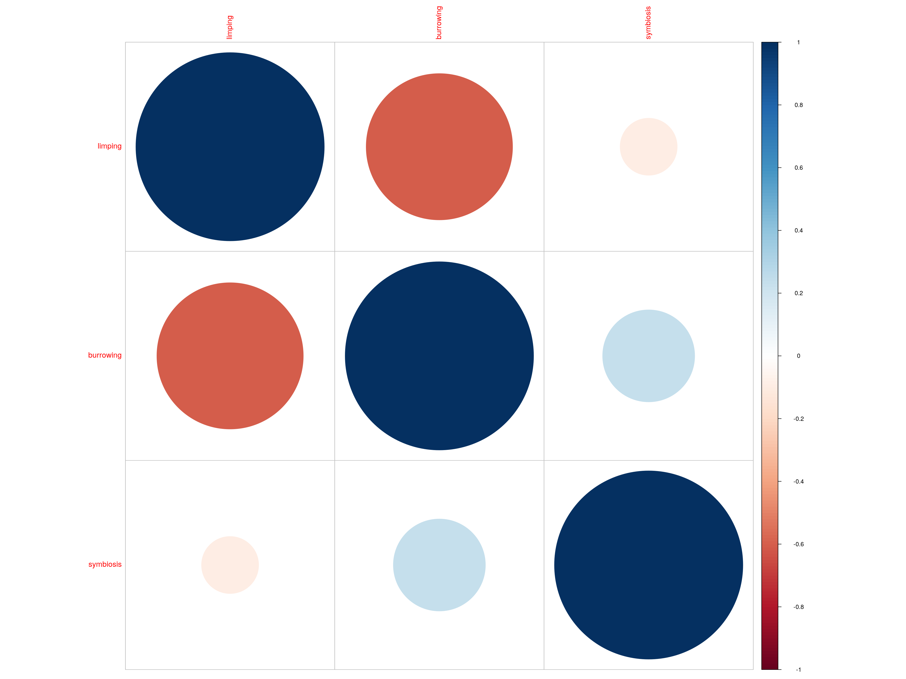
Mat## limping burrowing symbiosis
## limping 1.00000000 -0.6039400 -0.09197149
## burrowing -0.60393996 1.0000000 0.23888882
## symbiosis -0.09197149 0.2388888 1.0000000020.4 How do I deal with missing data?
One common approach to this is data imputation. There are various methods available including replacing an NA in a given variable with the mean value (or median,or mode) observed for that variable. There are formal approaches to characterize the missingness and it is worth examining the data to see if there are any patterns in missingness. More information will be provided here using the chocolate biscuit case study.