Chapter 11 Measures of variation
11.0.1 Range
This measure of variation is commonly used, and many consider to be the most basic method. If \(x_{1}\) and \(x_{2}\) are the maximum and minimum values in a dataset, then the range is obtained by subtracting \(x_{2}\) from \(x_{1}\).
11.0.2 Variance and Standard deviation
The variance is obtained by finding the arithmetic mean of the set of \((d_{i})^{2}\), \(i=1:n\), where \(d_{i}\) is denoted as the difference between \(x_{i}\) and the mean. The standard deviation is obtained by taking the square root of the variance.
11.0.2.0.1 Population variance
It is important to note that when calculating the population variance \(\sigma^{2}\), the number of data points \(n\) is used as the denominator as in the following formula: \[ \sigma^{2} = \frac{\sum_{i=1}^{n} (d_{i})^{2}}{n} \] where \(d_{i}\) is expressed as: \[ d_{i} = \frac{x_{i}-\mu}{1}\] and \(\mu\) represents the population mean.
11.0.2.0.2 Sample variance
When calculating the sample variance (where the dataset in question represents data sampled from the population), the following equation is used: \[ s^{2} = \frac{\sum_{i=1}^{n-1} (d_{i})^{2}}{n-1} \]where \(d_{i}\) is expressed as: \[ d_{i} = x_{i}-\bar{x}\] and \(\bar{x}\) represents the sample mean.
In the fictional chocolate biscuit example, the sample variance obtained for a sample of biscuits in a given shipment would be calculated differently from the variance calculated if every biscuit in that shipment was evaluated.
11.0.3 Quartiles
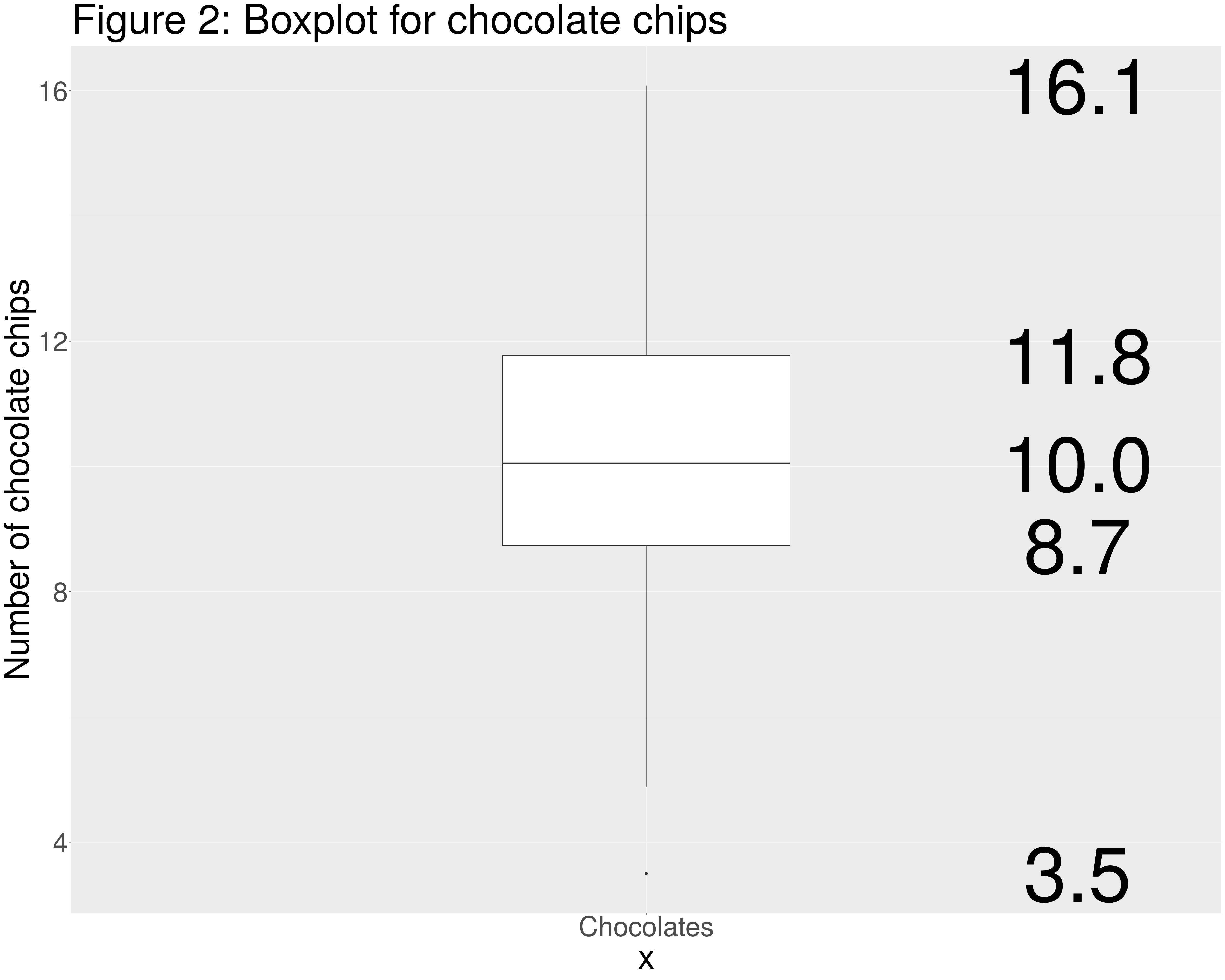
If the data points are ordered from the lowest to the highest value, the lower quartile, \(Q_{1}\) denotes the data point below which 25% of the data lies. The second quartile, \(Q_{2}\), which is also the median, refers to 50% of the data, and the third quartile,\(Q_{3}\), 75%. The interquartile range, calculated by subtracting \(Q_{3}\) from \(Q_{1}\) is another useful measure of the spread of the data.
In Figure 2 the three quartiles associated with the data on chocolate chips in the biscuit sample before the policy. Figure 2 is a boxplot which is one way in which the distribution of data can be presented. The plot is associated with five numbers. From top to bottom these are: the maximum observed value, the third quartile, the second quartile, the first quartile and the minimum observed value.
thebiscuits = read.csv("cookie_second_recipe.csv")
before = thebiscuits[which(thebiscuits$timeframe=="2017 - before no eating policy"),]
p<-ggplot(before, aes(y=chocolate_chips,x="Chocolates")) +
geom_boxplot(width=0.3)+
theme(text = element_text(size=50))+
ylab("Number of chocolate chips")+
ggtitle("Figure 2: Boxplot for chocolate chips")+
stat_summary(geom="text", fun.y=quantile,
aes(label=sprintf("%1.1f", ..y..)),
position=position_nudge(x=0.45), size=40)
p