Chapter 6 Climate Change Uncertainties
6.1 Definition of uncertainty
Uncertainty is any departure from complete deterministic knowledge of the relevant system (based on Walker et al., 2003).
Uncertanties in climate change can be categorized differently. For example by types (sources) or by levels (the difficulty to describe them).
6.2 Why taking uncertainty into account?
This research explained in the video (30 min.) shows that people do make better decisions based on uncertainty information.
Source: Susan Joslyn, University of Washington. From Workshop on Communicating Uncertainty to Users of Weather Forecasts, held in Whistler, BC Canada, May 2015.
The main reasons why it’s important to assess and communicate about uncertainties:
- Necessary for impact and risk analysis
- In many cases, decision-makers can achieve superior outcomes when they take uncertainties into account (to distinguish situations that do and do not require precautionary action)
- Communicating uncertainty enhances credibility, makes climate information more trustworthy
6.3 Types of uncertainty and how to deal with them
There are many types or sources of uncertainties. The following types will be explained in the coming sheets:
- Natural variability
- Measuring errors
- Inhomogeneities
- Uncertainties in statistics due to due to limited data
- Biases
- Imperfect knowledge about the development of the climate system
- Imperfect knowledge about the socio-economic future
6.3.1 Natural variability
Natural variablity (day-to-day variation, year-to-year variation, and decade to decade variation) is the temporal variation of the atmosphere–ocean system around a mean state due to natural internal processes within the climate system.
- Examples of internal variability: the different position of high and low pressure areas, differences in air circulation, resulting in day-to-day variations in temperature or rainfall
- Examples of variations in natural forcings: solar intensity, volcanic eruptions
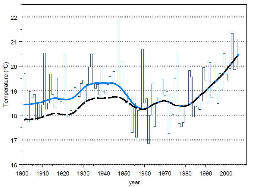
Three natural causes of global temperature variations (Source: De Bosatlas van het klimaat, 2011, The Netherlands): El Niño/La Niña, volcanos and amount of radiation:
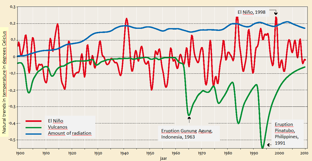
natural-variability
6.3.2 Model Bias
Differences in statistics of the observations for the reference period and the climate model simulation for the same period we call biases.
The figure gives a schematic representation of climate model biases. There is a systematic difference between the observed probability distribution and the modelled distribution. The bias can be corrected for using the differences. It shows also that the bias can be different for median values and extremes. See also .
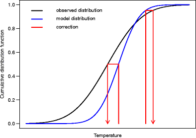
model-bias
Source: Source: Maraun, D. Curr Clim Change Rep (2016) 2: 211. Link.
6.3.3 Inhomogenieties
Inhomogeneities are apparant changes in climate in long-term time series for reasons such as relocations of stations and/or instruments, slow or abrupt changes in the environment and changes in instruments and measurement practices.
The figure shows the monthly mean surface air temperatures on Wutaishan (China), with a step change in January 1998 caused by station relocation:
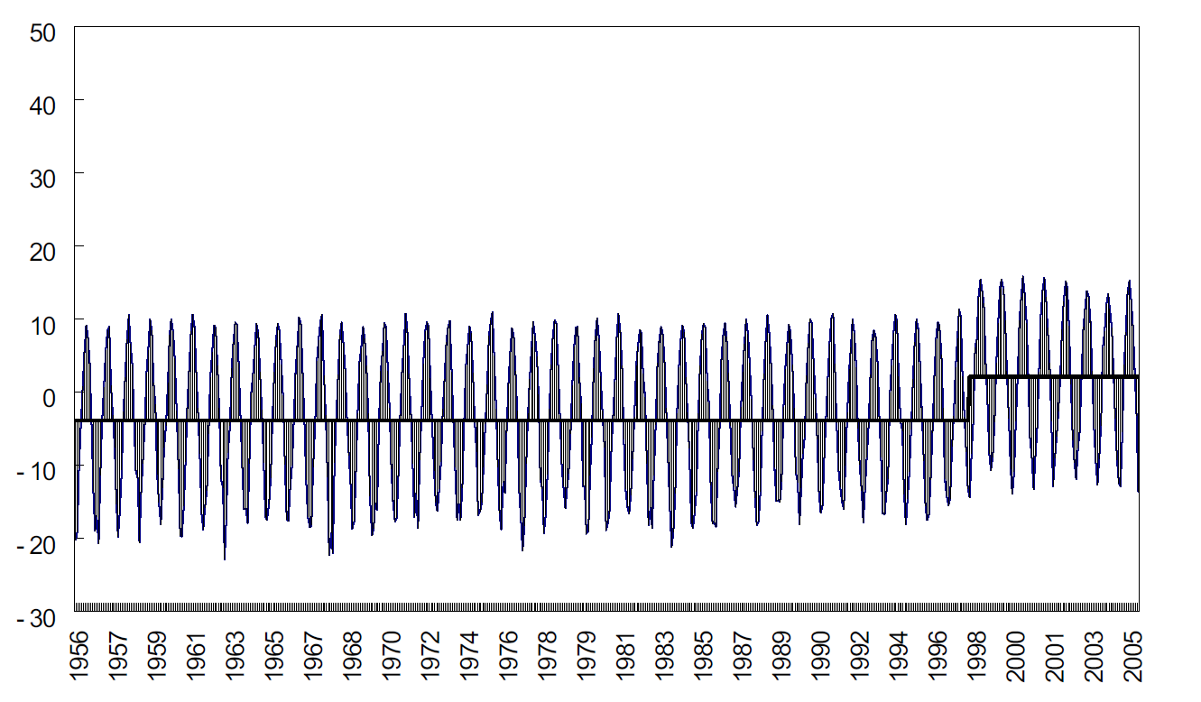
inhomogenieties
Source: Qingxiang Li, National Meteorological Center, CMA, Beijing, China,. Link.
Dealing with inhomogenieties: To anticipate on a change of instrument or location, parallel measurements are generally undertaken. However, if not possible, homogenization is then mostly done by calculating statistical corrections from mutual comparisons of stations.
Figure: Parallel measurements in De Bilt in the Netherlands in September 1950 anticipating a screen change from pagoda (1) to Stevenson (2).
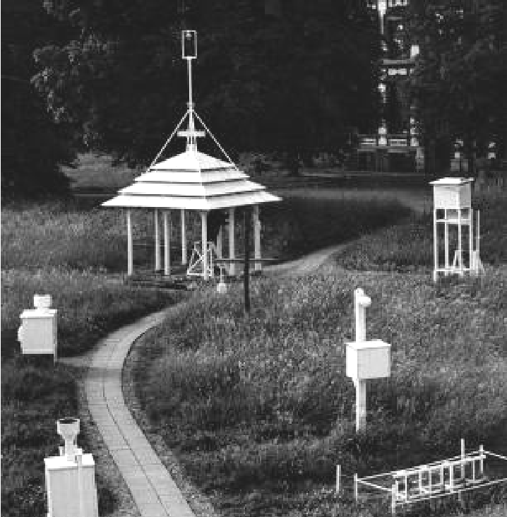
pagoda
Figure: Mean maximum temperature in the summer for De Bilt. The dashed line gives the trend line after correction for the inhomogeneities in 1950 and 1951.
de-bilt-inhomo
Source both figures: KNMI. Link.
Homogenization and trends: Homogenization can have an influence on the trend, shown in the figures below.
Figure: The trend in annual mean minimum temperature in the period from 1961 to 2010 of the homogenized series.
trend-annual-mean
Figure: The differences in trend between the original series and the homogenized series.
trend-homo
Source: ECA&D, Antonello Angelo Squintu et al., 2018. Link.
6.3.4 Uncertainties in statistics due to limited data
Sometimes called ‘sampling uncertainty’, regularly this is indicated with a 95% band.
The figure shows that the further back in time, the broader the uncertainty band. This is caused by the fewer measurements during that period.
limited-data
Source: Berkeley Earth Group, 2012. Link.
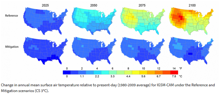
6.3.5 Model Uncertainty
Describing the future climate, model and scenario uncertainty are important additional uncertainties. Model uncertainty is the imperfect knowledge about the climate system, quantified with the help of a large number of climate models that simulate the future climate for the same emission scenario.
Figure: Reference scenario: a business-as-usual scenario with unconstrained emissions (RCP 8.5)
reference-scenario
Source link (EPA).
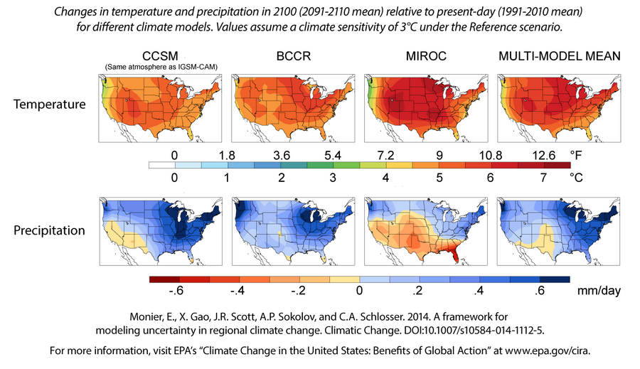
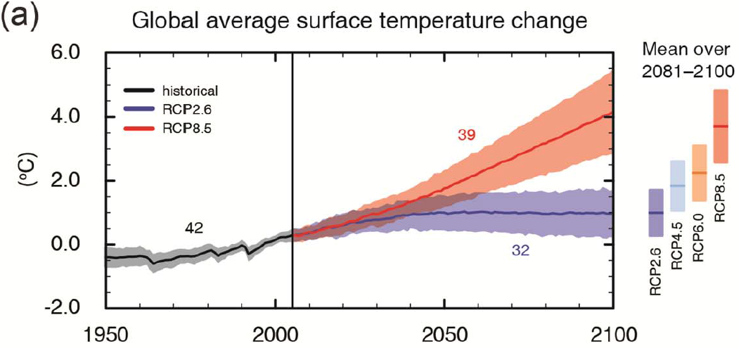
6.3.6 Scenario uncertainty
Scenario uncertainty is the imperfect knowledge about the socio-economic and technological developments in the future, resulting in different emissions causing the emission of greenhouse gasses. This uncertainty is quantified by comparing the (average) impact of the various emission scenarios or Representative Concentration Pathways (RCP) on the future climate. Model and scenario uncertainties can be reduced by doing more research to better understand the systems. Using higher resolutions is one of the approaches to better simulate the climate system. See also the lesson on Data Resourches & Climate Models.
Figure with Reference scenario: a business-as-usual scenario with unconstrained emissions; Mitigation scenario: a stringent stabilization scenario with high emissions reductions:
scenario-uncertainty
Source link (EPA).
6.4 Levels of uncertainty
Levels indicate how difficult it is to describe uncertainty. Level 1-5 are in between complete certainty (left from level 1) and total ignorance (right from level 5). Level 4 and 5 are often referred to as “deep uncertainty”, in which:
- We can not quantify nor use probabilities
- We know there could be surprises
- We know neither the mechanisms, functional relationships nor statistical properties
- We do not agree on or do not know the (future) valuation of the outcomes
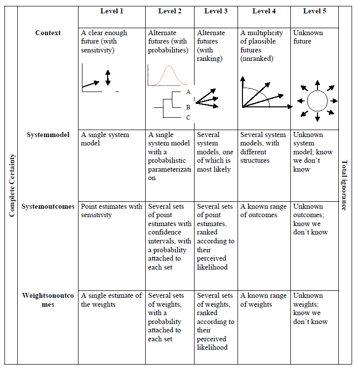
levels-of-uncertainty
Source: Walker W.E., Lempert R.J., Kwakkel J.H. (2013) Deep Uncertainty. In: Gass S.I., Fu M.C. (eds) Encyclopedia of Operations Research and Management Science. Springer, Boston, MA. Link.
6.5 Communicating uncertainties
6.5.1 Perception
Scientific facts do not necessarily convince people. Instead, beliefs are shaped by the social groups people consider themselves to be a part of. Those groups are based, for example, on political or religious affiliation, occupation or sexuality. If people are confronted with scientific evidence that seems to attack their group’s values, they’re likely to become defensive. They may consider the evidence they’ve encountered to be flawed, and strengthen their conviction in their prior beliefs.
Dr. Katharine Hayhoe pleads for starting your climate communication with making a real connection with your public: start to look at what value you share. Don’t start throwing facts…. Watch her movie:
6.5.2 Framing
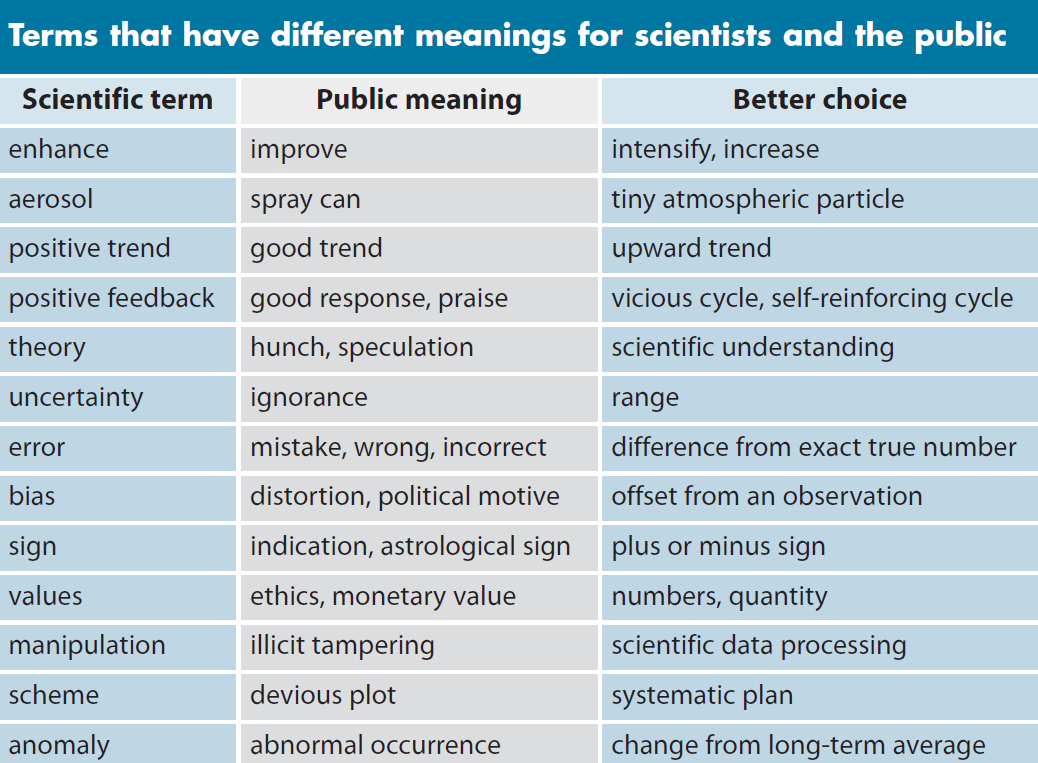
Instead of bombarding people with piles of evidence, science communicators can focus more on how they present it. The problem isn’t that people haven’t been given enough facts. It’s that they haven’t been given facts in the right ways. Researchers often refer to this packaging as framing: setting the issue within the appropriate context to achieve the desired interpretation. An example: for the general public it’s better to use the word ‘range’ instead of ‘uncertainty’, which could be interpreted as ‘ignorance’. Source: Rose Hendricks. Link.
Figure: Communicating the science of climate change.
communicating-cc
Source: Somerville, R.C. and Hassol, S. J., 2011. Communicating the science of climate. Phys. Today 64(10), 24. DOI: 10.1063/PT.3.1296
6.5.3 Do’s for effective communication
Dahlstrom (2014) summarizes recommendations for effective climate change communication:
- Close the distance. Climate change is often seen as a distant problem, both physically and temporal, and invisible. Closing the distance and making climate change visible by showing local climate change impacts can be effective. - Provide an action perspective. Otherwise the public can feel paralyzed, especially with rather disastrous depiction of climate change.
Moser (2014, 2017) argues:
- Focus shift to adaptation (‘preparedness’ for climate change) instead of only mitigation of climate change. Climate change has become more ‘real’, local and tangible the last decades, and this could be used more in climate change communication, though empirical research is needed to support this claim.
6.5.4 The Uncertainty Handbook
The Uncertainty Handbook
Contains 12 principles for smarter communication about climate change uncertainties:
- Manage your audience’s expectations
- Start with what you know, not what you don’t know
- Be clear about the scientific consensus
- Shift from ‘uncertainty’ to ‘risk’
- Be clear what type of uncertainty you are talking about
- Understand what is driving people’s views about climate change
- The most important question for climate impacts is ‘when’, not ‘if’
- Communicate through images and stories
- Highlight the ‘positives’ of uncertainty
- Communicate effectively about climate impacts
Source: The Uncertainty Handbook, Climate Outreach and University of Bristol, authored by Dr Adam Corner, Professor Stephan Lewandowsky, Dr Mary Philips and Olga Roberts, 2016.
6.5.5 Storytelling
Jones & Anderson Crow (2017) propose to use stories for science communication. With stories, one can communicate scientific knowledge that fits into the cultural values and world views of the receiver (Jones & Song, 2014). Also, research indicates that using stories to communicate science can offer increased comprehension, interest and engagement compared to traditional “logical-scientific”, or just factual communication (Dahlstrom, 2014).
In this TED Talk Judith Black explains how to use storytelling for climate change communication (16.35 min).
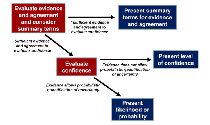
6.5.6 Confidence and uncertainty
In the IPCC, likelihood or probability is only assigned if confidence is high enough. Confidence is the degree of agreement of the authors in the correctness of a result.
This schematic illustrates the process for evaluating and communicating the degree of certainty in key findings that is outlined in the Guidance Note for Lead Authors of the IPCC Fifth Assessment Report on Consistent Treatment of Uncertainties (Mastrandrea et al. 2010):
ipcc-confidence
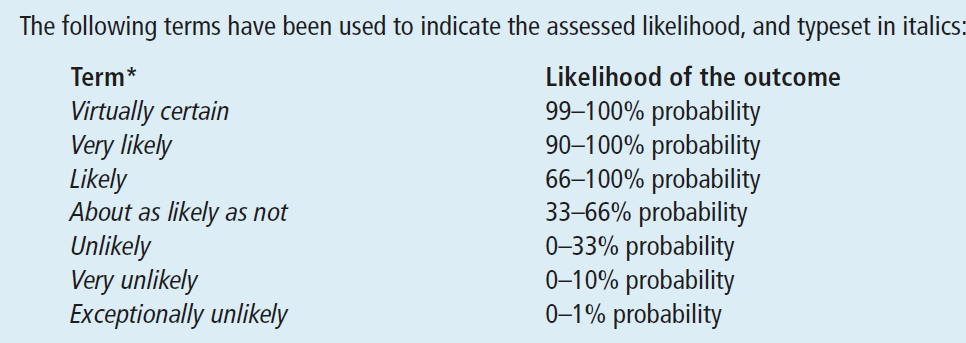
6.5.7 Standardized lexicons of uncertainty
David V. Budescu, 2016: Some types of uncertainties can be communicated as precise values (e.g., there is a 0.5 chance), as ranges (e.g., the probability is between 0.3 and 0.6, or the probability is at least 0.75), as phrases (e.g., it is not very likely), or by combining some of these modalities.
People, overwhelmingly, prefer to communicate uncertainty by using verbal terms because they are perceived to be more natural and intuitive. Most people tend to avoid the use of precise numerical values because they can imply a false sense of precision. Research also shows that people’s interpretations of probability phrases vary greatly (see Wallsten & Budescu, 1995).
Therefore often “standardized lexicons of uncertainty” are developed such as the example from IPCC below (source pdf link):
lexicons
6.5.8 Suggestions to improve the IPCC likelihood statements
6.6 Example of likelihood statement IPCC:
David V. Budescu (2016) tested the public’s understanding of the IPCC likelihood statements.
In all the samples the public interprets the probabilistic statements in the IPCC reports as less extreme – much closer to 50% - than intended by the IPCC authors. He gives the following recommendations to improve the effectiveness of communication:
- Change the thresholds defining the bounds of the categories to reflect the general public’s intuitive interpretation and exclude overlapping categories.
- Probabilistic terms should always be accompanied by a range of numerical values.
- In case of high confidence, authors should be allowed to narrow the range. For example, if by default Likely is mapped into the 60% - 85% range, authors should have the option to use a narrower range (for example, Likely (65% -75%), if the data warrant such determination.
6.7 Visulalisation of uncertainties
6.7.1 Focus on the main message
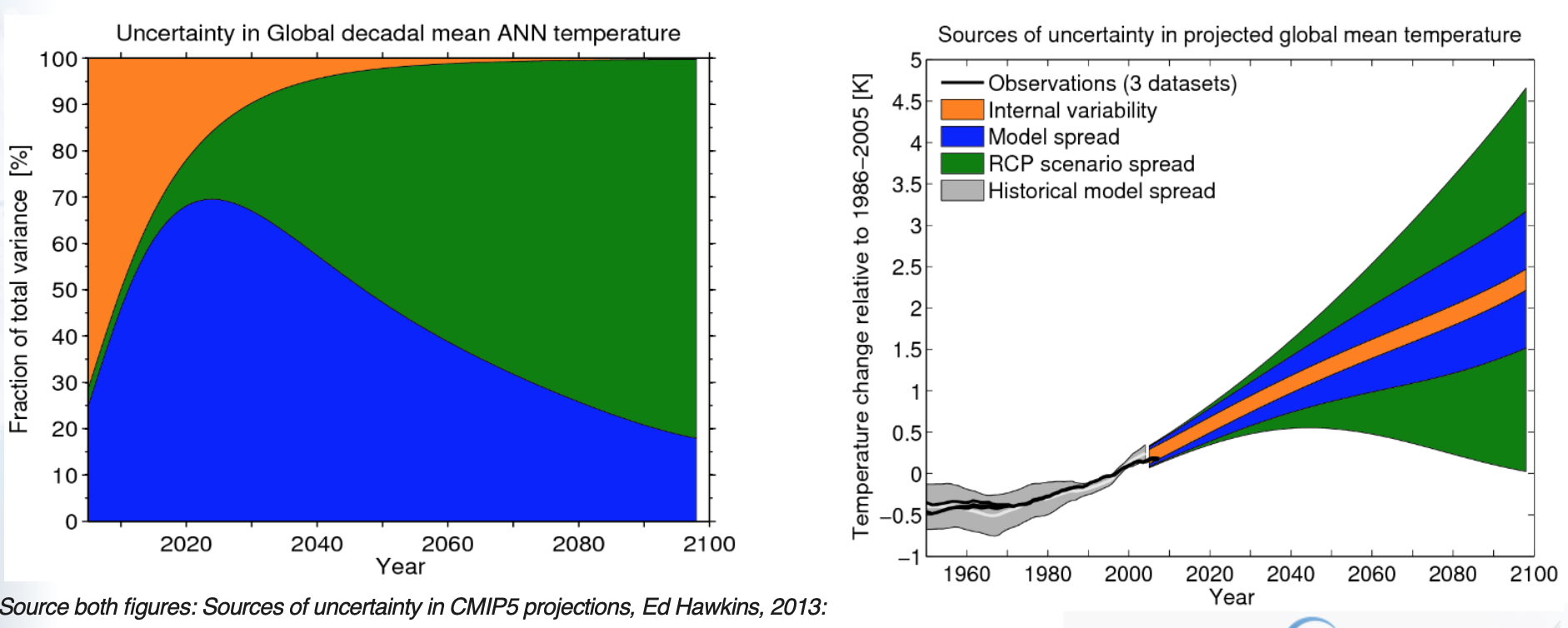
The first figure below is a rather difficult one to interprete. More or less the same information is shown in the second figure, but presented in another way: the sources of uncertainty in global decadal temperature projections are expressed as a ‘plume’ with the relative contribution to the total uncertainty coloured appropriately. The shaded regions represent 90% confidence intervals. In the second figure it’s clear at a glance that in 2100 uncertainty is mostly caused by RCP scenario uncertainty (the green band is broadest):
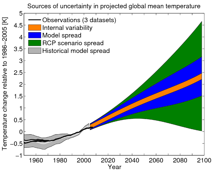
main-message-2
Source: Sources of uncertainty in CMIP5 projections, Ed Hawkins, 2013: link.
6.7.2 Distortion of the message
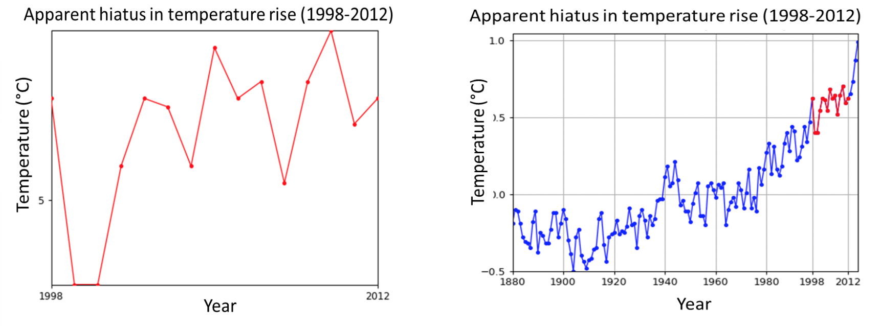
The left graph, however, could easily be interpreted wrongly. One could conclude that model uncertainty will increase until around 2025 and than decreases. However, as the right figure shows, this is not the case. Presenting the right graph together with the left graph will help giving the right context, showing that the three types of uncertainty are increasing over time.
distortion-message
6.7.3 Show long time series, talking about long term trends
Natural variablity can be falsely interpreted as a trend, if a short time serie is presented. In the left figure it seems that there is no upward trend in temperature. People are referring to this period from 1998 to 2013 as the ‘hiatus’, the period in which temperature rise apparently slowed down. However, looking at the right figure with the long time series the upward trend is very clear. Natural variability played a crucial role in the slowed rate in this short period (besides distribution of heat among others in the oceans).
long-time-series
6.7.4 Quantify natural variability
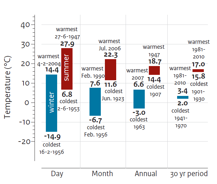
The longer the period of averaging, the smaller the influence of natural variations on the avarage is. However, even averages over 30 years will still show natural variability (the last column in the figure gives an example of 30 year natural variation for temperature minima and maxima). For precipitation and wind, in particular, natural variations in the 30-year average climate may be more substantial when compared to human-induced climate change in the near future.
When natural variation is large it’s more difficult to detect human induced climate change.
Figure: Natural variation in temperature observed at De Bilt (Netherlands) since 1901 on different time scales.
quantify-variability
6.7.5 Choose the period for describing natural variability
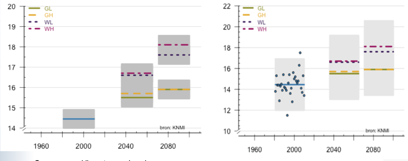
The timescale for describing the natural variations can influence the message. The two graphs below give both information about past (in blue) and future (in four colours) temperatures. In the left figure the natural variability (in grey) is described using a time scale of 30 year, in the right graph the natural variability is descibed using a time scale of one year. The left figure can be more relevant for researchers, since it may give insight in whether there are significant changes. For the general public the right graph might be more helpful because extreme individual years can help to put future changes into context.
The extreme high autumn temperatures in 2006 (blue outlier point) are remembered: those temperatures occured in the current climate, however in the future higher extremes can be expected. The left graph could give the impression that natural variation is smaller than it in reality is.
Figures: Maximum temperature in autumn in de Bilt for past (in blue) and for KNMI’14 scenarios (in four colours). Left: natural variability (in grey) for a time scale of 30 years; Right: natural variability (in grey) for a time scale of 1 year.
period-variability
6.7.6 Probability density function
A probability density function (PDF) describes the likelihood of e.g. certain temperatures (see left figure). As with any bell curve, those events that fall near the center (events occurring in a mid-range temperature state) are most likely, and events that occur in lower and upper temperature extremes have smaller probability. These graph’s are widely used by researchers, however are difficult to interpret by the general public. Translating the PDF, giving only maximum and minimum frequencies and changes in the frequencies in the future, such as the right figure can then be a better way to present probabilities.
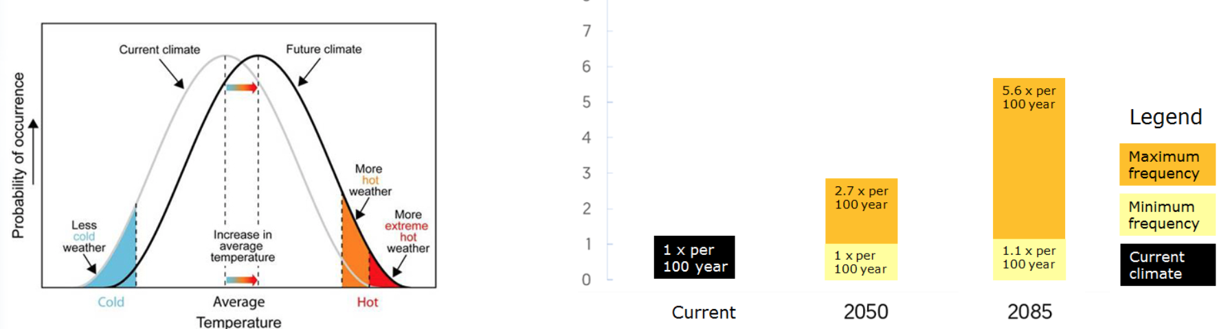
pdfs
6.7.7 Effect of uneven number of scenarios
Both graphs below show the past and future temperature development according to the IPCC projections; left from the fourth assessment report of the IPCC (2007) and right from the fifth assessment report form the IPCC (2014).
Be aware that people tend to interprete a middle projection (such as A1B in the left figure) as the most likely. However, no likelihood can be attributed to the projections. Giving an even number of projections, such as in the right figure, forces users to think of the most relevant projection for their specific study.
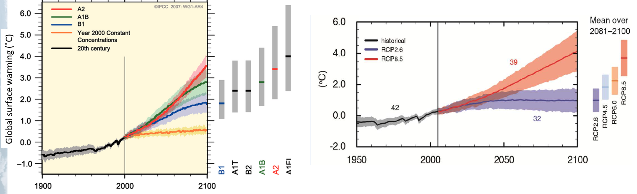
uneven-scenarios
6.7.8 Combine weather and climate information
Information on (extreme) weather can help bridging the gap between climate change (seems to be far away) and real live (the experienced weather). The “weather and climate plume” in the figure shows at a glance:
- the weather prediction for the coming 15 days (the black line with grey band). The broader the grey band, the more uncertain the prediction.
- what is normal for the time of the year (the thin red and blue straight lines are the normal maximum and minimum temperature for the time of the year).
- measured extremes: the highest (red dotted line) and lowest (blue dotted line) temperatures ever measured.
- an indication of the “normal” weather around 2050 (the red and blue band present the normal temperatures for the future, according to the Dutch climate scenarios). If the prediction is very extreme, red or blue points are given (in this example 3 red points). In a pop-up text box the extreme is put in perspective: how often it occurs and how much warmer that extreme could become in future.
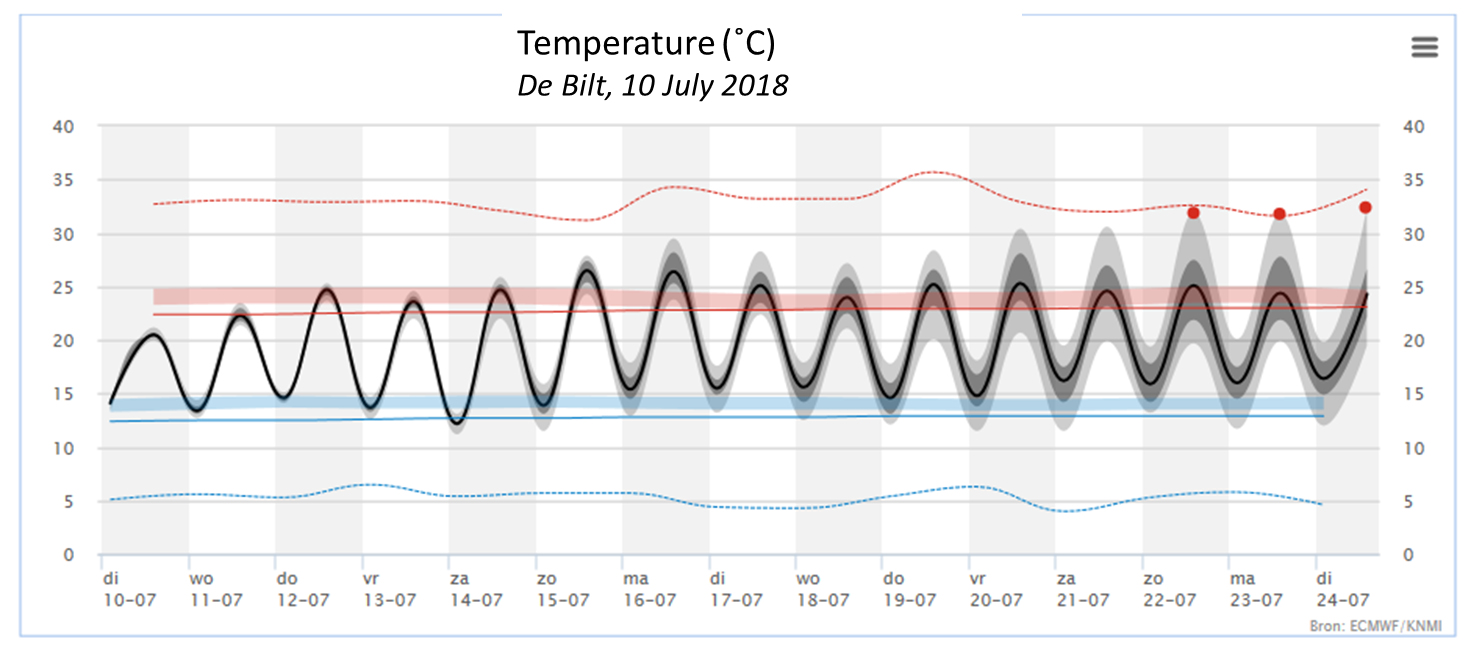
weather-plume
6.7.9 Don’t present just one scenario
Giving just one scenario would give a biased picture of the future since no information about uncertainty is given. Leaving out the middle figure it would give the suggestion that summers would become drier, although there is a possibility that summer rainfail would slightly increase.
Figure below: Left the summer precipation in the current climate (224 mm), in the middle for around 2050, according to the WL scenario (+1,4%), and right according to the WH scenario (-13%).
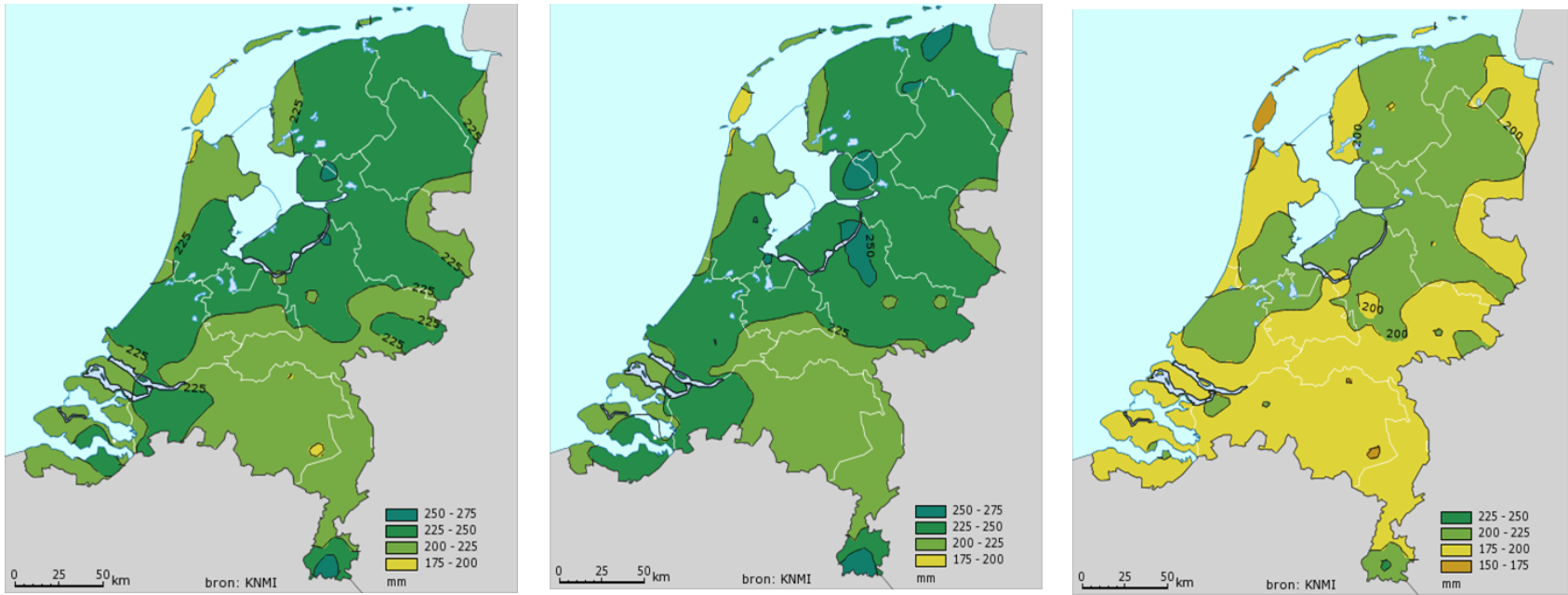
multiple-scenarios