7.1 Visualising birthweight
Recalling practical 9, we can get a histogram and a summary table of the birthweight variable.
#--- Get summary statistics
describe(bab9$bweight)
## vars n mean sd median trimmed mad min max range skew kurtosis se
## X1 1 641 3129 653 3200 3182 519 630 4650 4020 -0.96 1.78 25.8#--- Plot birthweight
bab9 %>% ggplot(aes(x = bweight)) + geom_histogram()## `stat_bin()` using `bins = 30`. Pick better value with `binwidth`.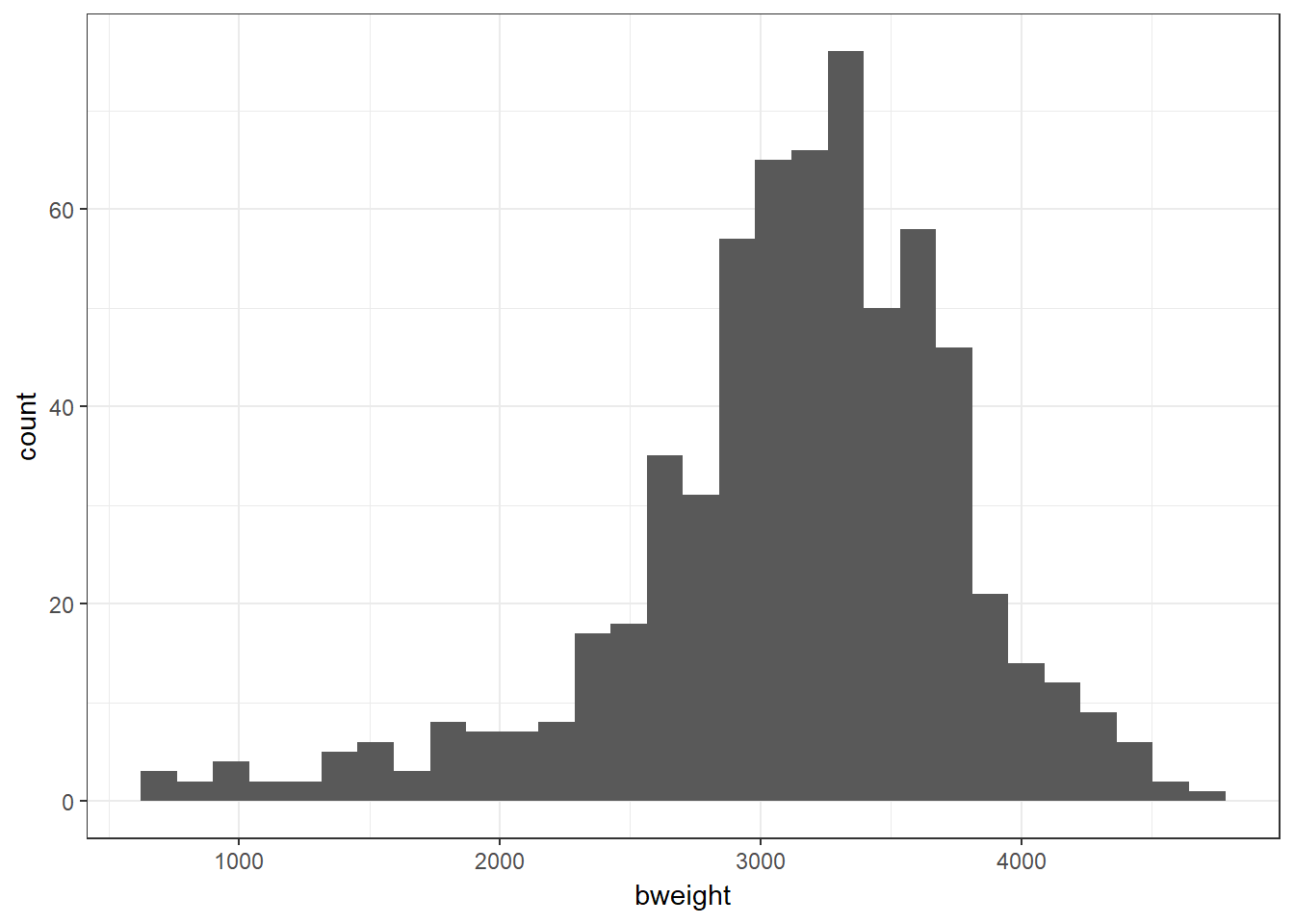
We wish to see how the mean birthweight changes with gestational age, measured on a continuous scale (gestwks). For a preliminary analysis you could categorise the values of the explanatory variable (gestational age) and use the methods previously learnt for comparing two (or more) means. However, this is not the only way to analyse two continuous variables (nor is it the best).
We start by examining the correlation between birthweight and gestational age visually with a scatter plot.
Unpacking this code, we pipe the dataset into ggplot() and specify the aes(thetics) statement, placing gestational weeks on the x axis and birthweight on the y axis. This time we use the extra argument of geom_point() to specify that e want a scatter plot. The exposure (explanatory; independent) variable goes on the x axis, and the outcome (response; dependent) variable on the y.
bab9 %>% ggplot(aes(x = gestwks, y = bweight)) + geom_point()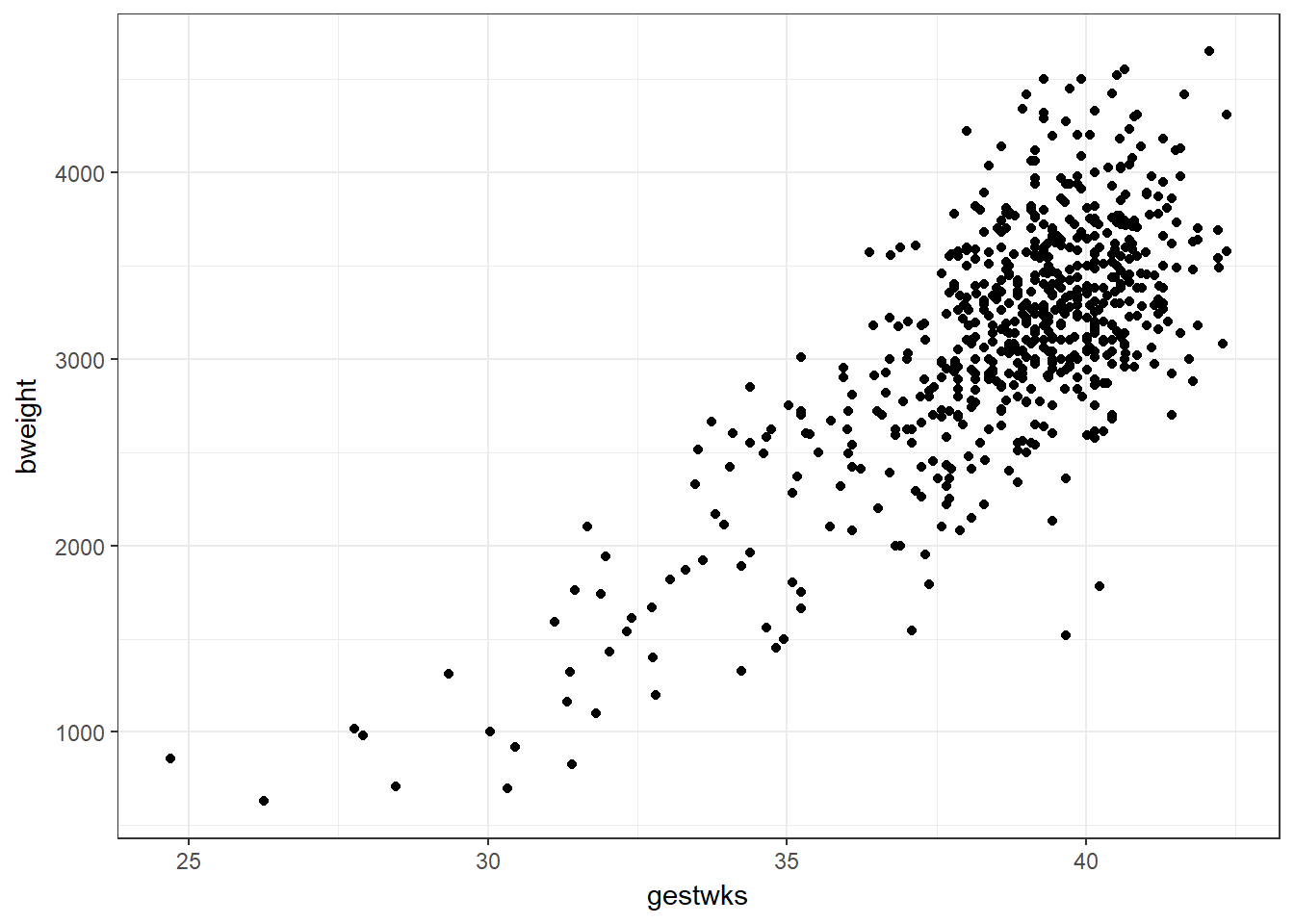
Exercise 16.1: Do you think that a straight line through the points adequately captures the relationship between these two variables?