7.2 Extending the visualisation with ggplot2
We can extend the graphing functionality in R quite easily within the ggplot framework. Let’s say we want to add more information to this plot. We add a shape to represent gender, and change the color to represent presence of hypertension. We scale the size of the point by maternal age. We also add a straight line through the data, a title, and labels. The code to do this is presented step by step in comments. Uncomment each line to see how each component changes the graph. Uncomment a chunk of code by highlighting it and pressing Ctrl-Shift-C
#--- Add shape
# bab9 %>% ggplot(aes(x = gestwks, y = bweight)) +
#   geom_point(aes(shape = sex))

#--- Add colour
# bab9 %>% ggplot(aes(x = gestwks, y = bweight)) +
#   geom_point(aes(color = ht, shape = sex))

#--- Add size and a transparency argument
# bab9 %>% ggplot(aes(x = gestwks, y = bweight)) +
#   geom_point(aes(color = ht, shape = sex, size = matage), alpha = 0.5)

#--- Add a line through the data
# bab9 %>% ggplot(aes(x = gestwks, y = bweight)) +
#   geom_point(aes(color = ht, shape = sex, size = matage), alpha = 0.5) +
#   geom_smooth(method = lm, se = F, color = "black") # lm = linear model; se = F turns off CIs
#
# #--- Add a title and axis labels
# bab9 %>% ggplot(aes(x = gestwks, y = bweight)) +
#   geom_point(aes(color = ht, shape = sex, size = matage), alpha = 0.5) +
#   geom_smooth(method = lm, se = F, color = "black") +
#     labs(title = "Birthweight from Gestational Weeks",
#             x = "Gestational Age (weeks)",
#             y = "Birthweight (g)")

#--- Add labels to the legend
bab9 %>% ggplot(aes(x = gestwks, y = bweight)) +
  geom_point(aes(color = ht, shape = sex, size = matage), alpha = 0.5) +
  geom_smooth(method = lm, se = F, color = "black") +
  scale_colour_discrete(
    name = "Hypertension",
    breaks = c("no", "yes"),
    labels = c("Not Hypertensive", "Hypertensive")) +
  scale_shape_discrete(
    name = "Sex",
    breaks = c("male", "female"),
    labels = c("Male", "Female")) +
  scale_size_continuous(
    name = "Maternal Age",
    breaks = c(25, 30, 35, 40),
    labels = c("25", "30", "35", "40"),
    range = c(1, 4)) + # range determines the relative size of the bubbles
  labs(title = "Birthweight from Gestational Weeks",
         x = "Gestational Age (weeks)",
         y = "Birthweight (g)")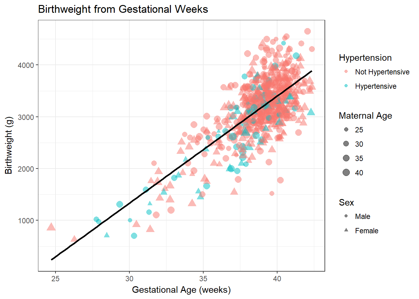
It seems clear that a straight line seems to represent the relationship between the two variables well. This linear relationship can be represented as \(Y = A + B \cdot X\). \(Y\) is the expected value of the outcome variable. \(A\) is the intercept (or constant), the value that \(Y\) takes when \(X = 0\). \(B\) is the expected increase in \(Y\) per unit change in \(X\). In our case, \(A\) thus represents the mean birthweight when gestational age is zero, and \(B\) represents the change in mean expected birthweight per additional week of gestation age.
In this example you may wonder what the intercept really means. The birthweight for zero gestational age has no real meaning. It is simply a mathematical extrapolation of the regression line to the point to where it crosses the Y axis. To make intercepts interpretable, it is sometimes preferable to center variables by subtracting the mean value of \(X\) from each individual \(X_i\) such that \(X = 0\) at the mean value of \(X\).