3.3 A ggplot2 Tangent
Below is code to produce a much nicer looking plot of the birthweight variable using the ggplot2 package in the tidyverse. While the code seems more complicated, in the long run, for producing nicer graphs, the ggplot2 functionalities are essential.
#--- Plot birthweight (nicely!)
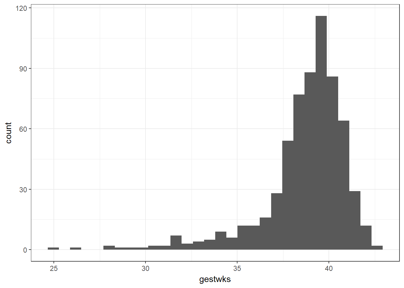
bab9 %>% ggplot(aes(x = bweight)) + geom_histogram()
#--- Same plot without a pipe:
# ggplot(data = bab9, aes(x = bweight)) + geom_histogram()
Let’s unpack this code: we first indicate that we’re using the bab9 dataset. We pipe that dataset into the first argument of the ggplot function. We then specify what elements of the data we wish to extract with the aes() command, short for aesthetics. In this case, we tell R we’d like bweight on the x axis. We then use geom_histogram() to specify we’d like a histogram (as opposed to say, a density curve, which we could get with geom_density()).
Stata includes an option to overlay a normal curve on the plot - we have to do this manually in R. This requires some more involved code.
The magrittr packages offers some alternative pipes. In particular, it offers the %$% pipe. This pipe takes the argument on the left and affixes it to the left of each of the arguments on the right, with a dollar sign in between. This saves on typing the dataset name every time you wish to access a variable.
We then create the ggplot using the same aes() argument as before to specify what we want on the x-axis. This time, we add an extra argument to geom_histogram() to say on the y-axis we would like to see some kind of density. We use the double dots around the word density to tell R that it shouldn’t look for an object in the environment that we’ve already specified called “density” - we should instead calculate it from some density function. We provide that function with the stat_function() argument - the fun argument specifies which probability distribution we should use for the density (‘dnorm’ is the normal curve) and the args argument takes a list of the parameters we need to specify this particular normal curve (the mean and sd that we calculated above).
Note that this introduces the concepts of plots as having multiple distinct layers - the first thing we do is construct the base layer with the histogram, then we add the normal curve on top with another segment of code by concatenating the two chunks with a plus sign.
R helpfully gives us a small warning as to the width of the bins of the continuous variable we have used, which does not affect the code, but flags that we may wish to look at other bin sizes to better visualise the data.
#--- Add normal curve
library(magrittr)
## Warning: package 'magrittr' was built under R version 3.5.3##
## Attaching package: 'magrittr'## The following object is masked from 'package:purrr':
##
## set_names## The following object is masked from 'package:tidyr':
##
## extractmeanbw <- bab9 %$% mean(bweight)
sdbw <- bab9 %$% sd(bweight)
#--- Same code, no pipe:
# meanbw <- mean(bab9$bweight)
bab9 %>% ggplot(aes(x = bweight)) +
geom_histogram(aes(y = ..density..)) +
stat_function(fun = dnorm, args = list(mean = meanbw, sd = sdbw))## `stat_bin()` using `bins = 30`. Pick better value with `binwidth`.