5 Descriptive Statistics for Financial Data
Updated: February 3, 2022
Copyright © Eric Zivot 2015, 2016, 2020, 2021
In this chapter we use graphical and numerical descriptive statistics to study the distribution and dependence properties of daily and monthly asset returns on a number of representative assets. The purpose of this chapter is to introduce the techniques of exploratory data analysis for financial time series and to document a set of stylized facts for monthly and daily asset returns that will be used in later chapters to motivate probability models for asset returns.
This chapter is organized as follows. Section 5.1 introduces the example data and reviews graphical and numerical descriptive statistics for univariate data. Graphical descriptive statistics include time plots, histograms, QQ-plots and boxplots. Numerical statistics are the sample statistics associated with the analagous characteristics of univariate distributions. For the example data, it is shown that monthly returns are approximately normally distributed but that daily returns have much fatter tails than the normal distribution. Section 5.2 covers univariate time series descriptive statistics including sample autocovariances, autocorrelations and the sample autocorrelation function. For the example data, it is shown that daily and monthly asset returns are uncorrelated but that daily returns exhibit a nonlinear time dependence related to time varying volatility. Section 5.3 presents bivariate descriptive statistics including scatterplots, sample covariance and correlation, and sample cross-lag covariances and correlations. Section 5.5 concludes with a summary of some stylized facts for monthly and daily returns.
The R packages used in this chapter are corrplot, IntroCompFinR, PerformanceAnalytics, sn, tseries, zoo and xts. Make sure these packages are installed and loaded before running the R examples in the chapter.
suppressPackageStartupMessages(library(corrplot))
suppressPackageStartupMessages(library(IntroCompFinR))
suppressPackageStartupMessages(library(methods))
suppressPackageStartupMessages(library(PerformanceAnalytics))
suppressPackageStartupMessages(library(sn))
suppressPackageStartupMessages(library(xts))
options(digits=3)
5.1 Univariate Descriptive Statistics
Let \(\{R_{t}\}\) denote a univariate time series of asset returns (simple or continuously compounded). Throughout this chapter we will assume that \(\{R_{t}\}\) is a covariance stationary and ergodic stochastic process such that: \[\begin{align*} E[R_{t}] & =\mu\textrm{ independent of }t,\\ \mathrm{var}(R_{t}) & =\sigma^{2}\textrm{ independent of }t,\\ \mathrm{cov}(R_{t},R_{t-j}) & =\gamma_{j}\textrm{ independent of }t,\\ \mathrm{corr}(R_{t},R_{t-j}) & =\gamma_{j}/\sigma^{2}=\rho_{j}\textrm{ independent of }t. \end{align*}\] In addition, we will assume that each \(R_{t}\) is identically distributed with unknown pdf \(f_{R}(r)\).
An observed sample of size \(T\) of historical asset returns \(\{r_{t}\}_{t=1}^{T}\) is assumed to be a realization from the stochastic process \(\{R_{t}\}\) for \(t=1,\ldots,T.\) That is, \[ \{r_{t}\}_{t=1}^{T}=\{R_{1}=r_{1},\ldots,R_{T}=r_{T}\} \] The goal of exploratory data analysis (eda) is to use the observed sample \(\{r_{t}\}_{t=1}^{T}\) to learn about the unknown pdf \(f_{R}(r)\) as well as the time dependence properties of \(\{R_{t}\}\).
5.1.1 Example data
We illustrate the descriptive statistical analysis of financial data
using daily and monthly adjusted closing prices on Microsoft stock
(ticker symbol msft) and the S&P 500 index (ticker symbol
^gspc) over the period January 2, 1998 and May
31, 2012.20
These data are obtained from (finance.yahoo.com) and are available
in the R package IntroCompFinR. We first use the daily and
monthly data to illustrate descriptive statistical analysis and to
establish a number of stylized facts about the distribution and time
dependence in daily and monthly returns.
Daily adjusted closing price data on Microsoft and the S&P 500 index
over the period January 4, 1993 through December 31, 2014 are available
in the IntroCompFinR package as the xts objects
msftDailyPrices and sp500DailyPrices, respectively.
We restrict the sample period to January 2, 1998 and May 31, 2012 using:
smpl = "1998-01::2012-05"
msftDailyPrices = msftDailyPrices[smpl]
sp500DailyPrices = sp500DailyPrices[smpl]
End-of-month prices are extracted from the daily prices using the
xts function to.monthly():
msftMonthlyPrices = to.monthly(msftDailyPrices, OHLC=FALSE)
sp500MonthlyPrices = to.monthly(sp500DailyPrices, OHLC=FALSE)
It will also be convenient to create a merged xts object
containing both the Microsoft and S&P 500 index prices:
msftSp500DailyPrices = merge(msftDailyPrices, sp500DailyPrices)
msftSp500MonthlyPrices = merge(msftMonthlyPrices, sp500MonthlyPrices)
We create xts objects containing simple returns using
the PerformanceAnalytics function Return.calculate() (and remove the first NA
value with na.omit()):
msftMonthlyRetS = na.omit(Return.calculate(msftMonthlyPrices,
                                           method="simple"))
msftDailyRetS = na.omit(Return.calculate(msftDailyPrices,
                                         method="simple"))
sp500MonthlyRetS = na.omit(Return.calculate(sp500MonthlyPrices,
                                            method="simple"))
sp500DailyRetS = na.omit(Return.calculate(sp500DailyPrices,
                                          method="simple"))
msftSp500MonthlyRetS = na.omit(Return.calculate(msftSp500MonthlyPrices,
                                                method="simple"))
msftSp500DailyRetS = na.omit(Return.calculate(msftSp500DailyPrices,
                                              method="simple"))
We also create xts objects containing monthly continuously
compounded (cc) returns:
msftMonthlyRetC = log(1 + msftMonthlyRetS)
sp500MonthlyRetC = log(1 + sp500MonthlyRetS)
msftSp500MonthlyRetC = merge(msftMonthlyRetC, sp500MonthlyRetC)
\(\blacksquare\)
5.1.2 Time plots
A natural graphical descriptive statistic for time series data is a time plot. This is simply a line plot with the time series data on the y-axis and the time index on the x-axis. Time plots are useful for quickly visualizing many features of the time series data.
A two-panel plot showing the monthly prices is given in Figure 5.1,
and is created using the plot method for xts objects:
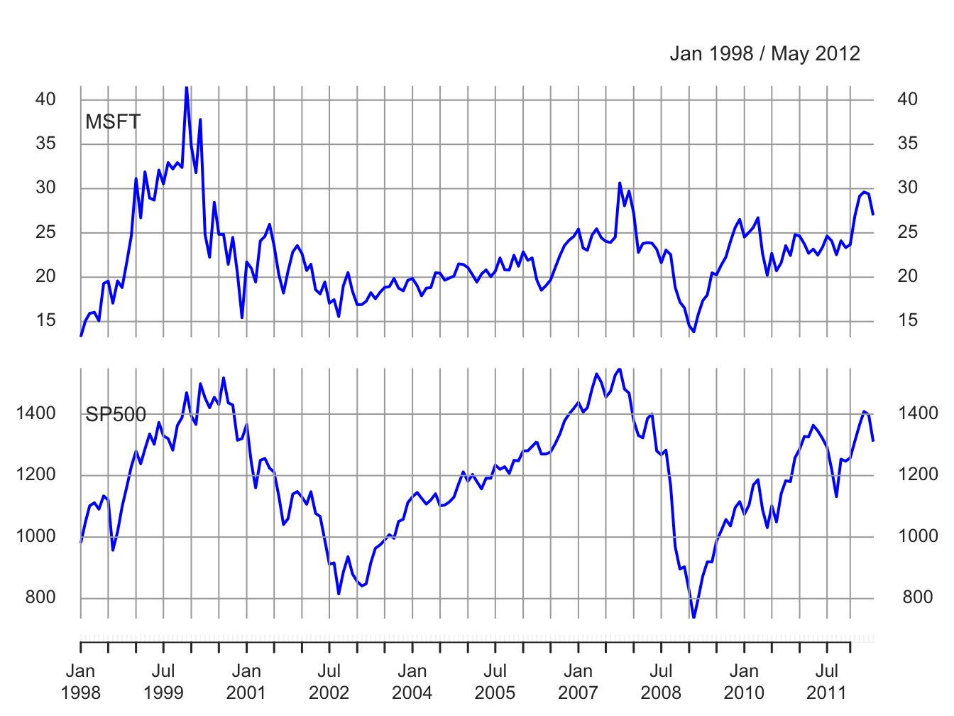
Figure 5.1: End-of-month closing prices on Microsoft stock and the S&P 500 index.
The prices exhibit random walk like behavior (no tendency to revert to a time independent mean) and appear to be non-stationary. Both prices show two large boom-bust periods associated with the dot-com period of the late 1990s and the run-up to the financial crisis of 2008. Notice the strong common trend behavior of the two price series.
A time plot for the monthly simple returns is created using:
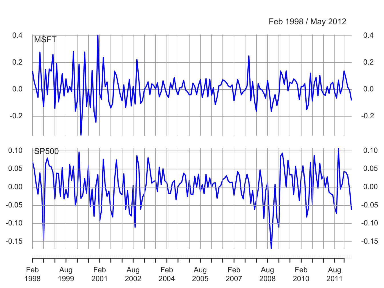
Figure 5.2: Monthly simple returns on Microsoft stock and the S&P 500 index.
and is given in Figure 5.2. In contrast to prices, returns show clear mean-reverting behavior and the common monthly mean values look to be very close to zero. Hence, the common mean value assumption of covariance stationarity looks to be satisfied. However, the volatility (i.e., fluctuation of returns about the mean) of both series appears to change over time. Both series show higher volatility over the periods 1998 - 2003 and 2008 - 2012 than over the period 2003 - 2008. This is an indication of possible non-stationarity in volatility.21 Also, the coincidence of high and low volatility periods across assets suggests a common driver to the time varying behavior of volatility. There does not appear to be any visual evidence of systematic time dependence in the returns. Later on we will see that the estimated autocorrelations are very close to zero. The returns for Microsoft and the S&P 500 tend to go up and down together suggesting a positive correlation.
\(\blacksquare\)
In Figure 5.2, the volatility of the returns on Microsoft and the S&P 500 looks to be similar but this is illusory. The y-axis scale for Microsoft is much larger than the scale for the S&P 500 index and so the volatility of Microsoft returns is actually much larger than the volatility of the S&P 500 returns. Figure 5.3 shows both returns series on the same time plot created using:
plot(msftSp500MonthlyRetS, main="", multi.panel=FALSE, lwd=2,
     col=c("red", "blue"), lty=c("dashed", "solid"),
     legend.loc = "topright")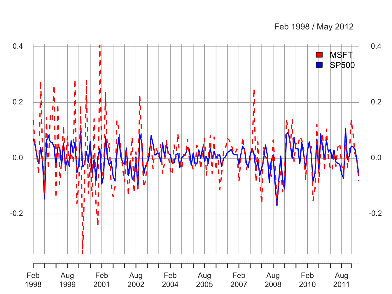
Figure 5.3: Monthly simple returns for Microsoft and S&P 500 index on the same graph.
Now the higher volatility of Microsoft returns, especially before 2003, is clearly visible. However, after 2008 the volatilities of the two series look quite similar. In general, the lower volatility of the S&P 500 index represents risk reduction due to holding a large diversified portfolio.
\(\blacksquare\)
Figure 5.4 compares the simple and continuously compounded (cc) monthly returns for Microsoft created using:
retDiff = msftMonthlyRetS - msftMonthlyRetC
dataToPlot = merge(msftMonthlyRetS, msftMonthlyRetC, retDiff)
colnames(dataToPlot) = c("Simple", "cc", "Diff")
plot(dataToPlot, multi.panel=TRUE, yaxis.same=FALSE, main="",
         lwd=2, col=c("black", "blue", "red"))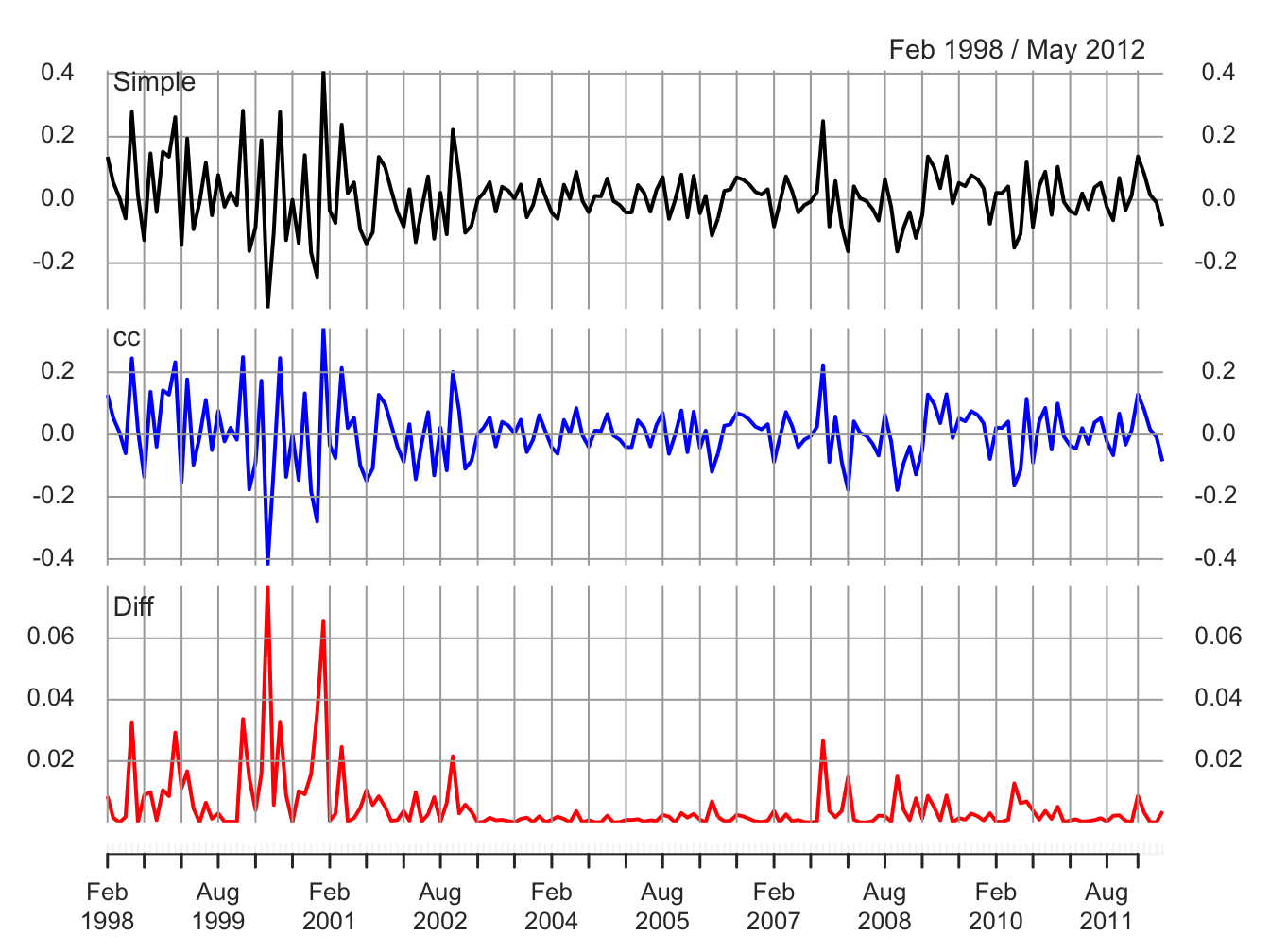
Figure 5.4: Monthly simple and cc returns on Microsoft. Top panel: simple returns; middle panel: cc returns; bottom panel: difference between simple and cc returns.
The top panel shows the simple returns, the middle panel shows the cc returns, and the bottom panel shows the difference between the simple and cc returns. Qualitatively, the simple and cc returns look almost identical. The main differences occur when the simple returns are large in absolute value (e.g., mid 2000, early 2001 and early 2008). In this case the difference between the simple and cc returns can be fairly large (e.g., as large as 0.08 in mid 2000). When the simple return is large and positive, the cc return is not quite as large; when the simple return is large and negative, the cc return is a larger negative number.
\(\blacksquare\)
Figure 5.5 shows the daily simple returns on Microsoft and the S&P 500 index created with:
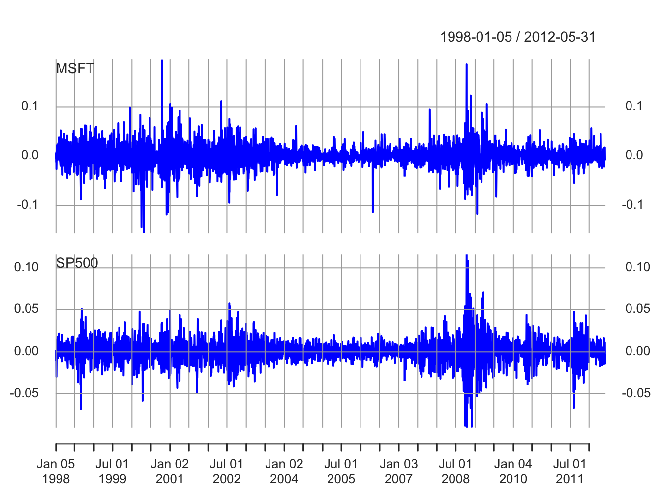
Figure 5.5: Daily returns on Microsoft and the S&P 500 index.
Compared with the monthly returns, the daily returns are closer to zero and the magnitude of the fluctuations (volatility) is smaller. However, the clustering of periods of high and low volatility is more pronounced in the daily returns. As with the monthly returns, the volatility of the daily returns on Microsoft is larger than the volatility of the S&P 500 returns. Also, the daily returns show some large and small “spikes” that represent unusually large (in absolute value) daily movements (e.g., Microsoft up 20% in one day and down 15% on another day). The monthly returns do not exhibit such extreme movements relative to typical volatility.
\(\blacksquare\)
5.1.3 Descriptive statistics for the distribution of returns
In this section, we consider graphical and numerical descriptive statistics for the unknown marginal pdf, \(f_{R}(r)\), of returns. Recall, we assume that the observed sample \(\{r_{t}\}_{t=1}^{T}\) is a realization from a covariance stationary and ergodic time series \(\{R_{t}\}\) where each \(R_{t}\) is a continuous random variable with common pdf \(f_{R}(r)\). The goal is to use \(\{r_{t}\}_{t=1}^{T}\) to describe properties of \(f_{R}(r)\).
We study returns and not prices because prices are random walk non-stationary. Sample descriptive statistics are only meaningful for covariance stationary and ergodic time series.
5.1.3.1 Histograms
A histogram of returns is a graphical summary used to describe the general shape of the unknown pdf \(f_{R}(r).\) It is constructed as follows. Order returns from smallest to largest. Divide the range of observed values into \(N\) equally sized bins. Show the number or fraction of observations in each bin using a bar chart.
Figure 5.6 shows the histograms of
the daily and monthly returns on Microsoft stock and the S&P 500
index created using the R function hist():
par(mfrow=c(2,2))
hist(msftMonthlyRetS, main="", col="cornflowerblue")
hist(msftDailyRetS, main="", col="cornflowerblue")
hist(sp500MonthlyRetS, main="", col="cornflowerblue")
hist(sp500DailyRetS, main="", col="cornflowerblue")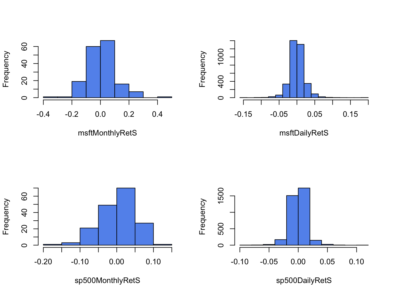
Figure 5.6: Histograms of monthly continuously compounded returns on Microsoft stock and S&P 500 index.
All histograms have a bell-shape like the normal distribution. The histograms of daily returns are centered around zero and those for the monthly return are centered around values slightly larger than zero. The bulk of the daily (monthly) returns for Microsoft and the S&P 500 are between -5% and 5% (-20% and 20%) and -3% and 3% (-10% and 10%), respectively. The histogram for the S&P 500 monthly returns is slightly skewed left (long left tail) due to more large negative returns than large positive returns whereas the histograms for the other returns are roughly symmetric.
When comparing two or more return distributions, it is useful to use the same bins for each histogram. Figure 5.7 shows the histograms for Microsoft and S&P 500 returns using the same 15 bins, created with the R code:
msftHist = hist(msftMonthlyRetS, plot=FALSE, breaks=15)
par(mfrow=c(2,2))
hist(msftMonthlyRetS, main="", col="cornflowerblue")
hist(msftDailyRetS, main="", col="cornflowerblue",
     breaks=msftHist$breaks)
hist(sp500MonthlyRetS, main="", col="cornflowerblue",
     breaks=msftHist$breaks)
hist(sp500DailyRetS, main="", col="cornflowerblue",
     breaks=msftHist$breaks)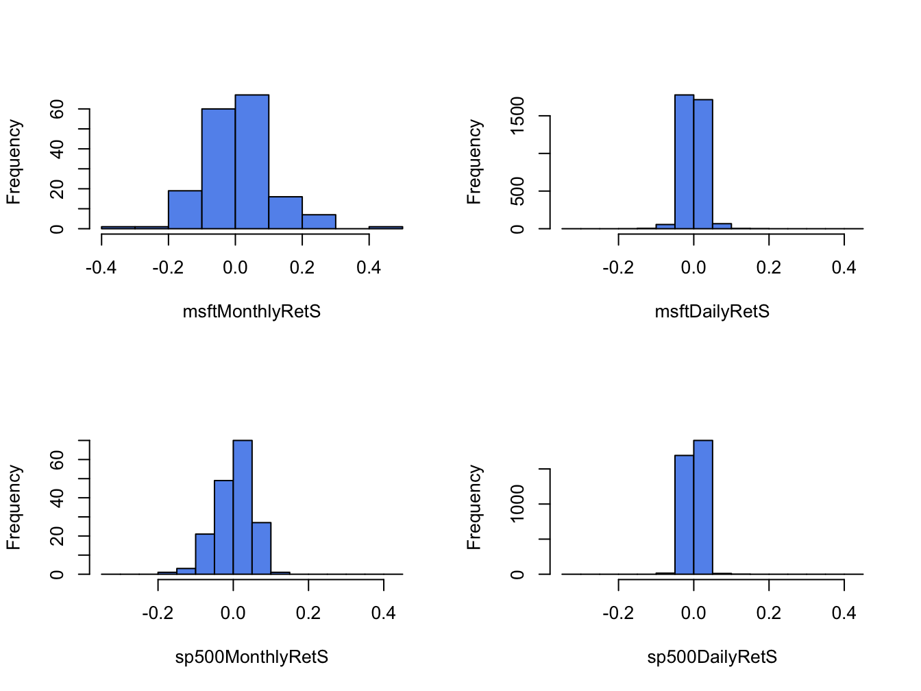
Figure 5.7: Histograms for Microsoft and S&P 500 returns using the same bins.
Using the same bins for all histograms allows us to see more clearly that the distribution of monthly returns is more spread out than the distributions for daily returns, and that the distribution of S&P 500 returns is more tightly concentrated around zero than the distribution of Microsoft returns.
\(\blacksquare\)
The shape of the histogram for Microsoft returns suggests that a normal distribution might be a good candidate for the unknown distribution of Microsoft returns. To investigate this conjecture, we simulate random returns from a normal distribution with mean and standard deviation calibrated to the Microsoft daily and monthly returns using:
set.seed(123)
gwnDaily = rnorm(length(msftDailyRetS),
                 mean=mean(msftDailyRetS), sd=sd(msftDailyRetS))
gwnDaily = xts(gwnDaily, index(msftDailyRetS))
gwnMonthly = rnorm(length(msftMonthlyRetS),
                   mean=mean(msftMonthlyRetS), sd=sd(msftMonthlyRetS))
gwnMonthly = xts(gwnMonthly, index(msftMonthlyRetS))
Figure 5.8 shows the Microsoft monthly returns together with the simulated normal returns created using:
par(mfrow=c(2,2))
plot.zoo(msftMonthlyRetS, main="Monthly Returns on MSFT",
         lwd=2, col="blue", ylim=c(-0.4, 0.4), ylab="Returns")
abline(h=0)
plot.zoo(gwnMonthly, main="Simulated Normal Returns",
         lwd=2, col="blue", ylim=c(-0.4, 0.4), ylab="Returns")
abline(h=0)
hist(msftMonthlyRetS, main="", col="cornflowerblue",
     xlab="returns")
hist(gwnMonthly, main="", col="cornflowerblue",
     xlab="returns", breaks=msftHist$breaks)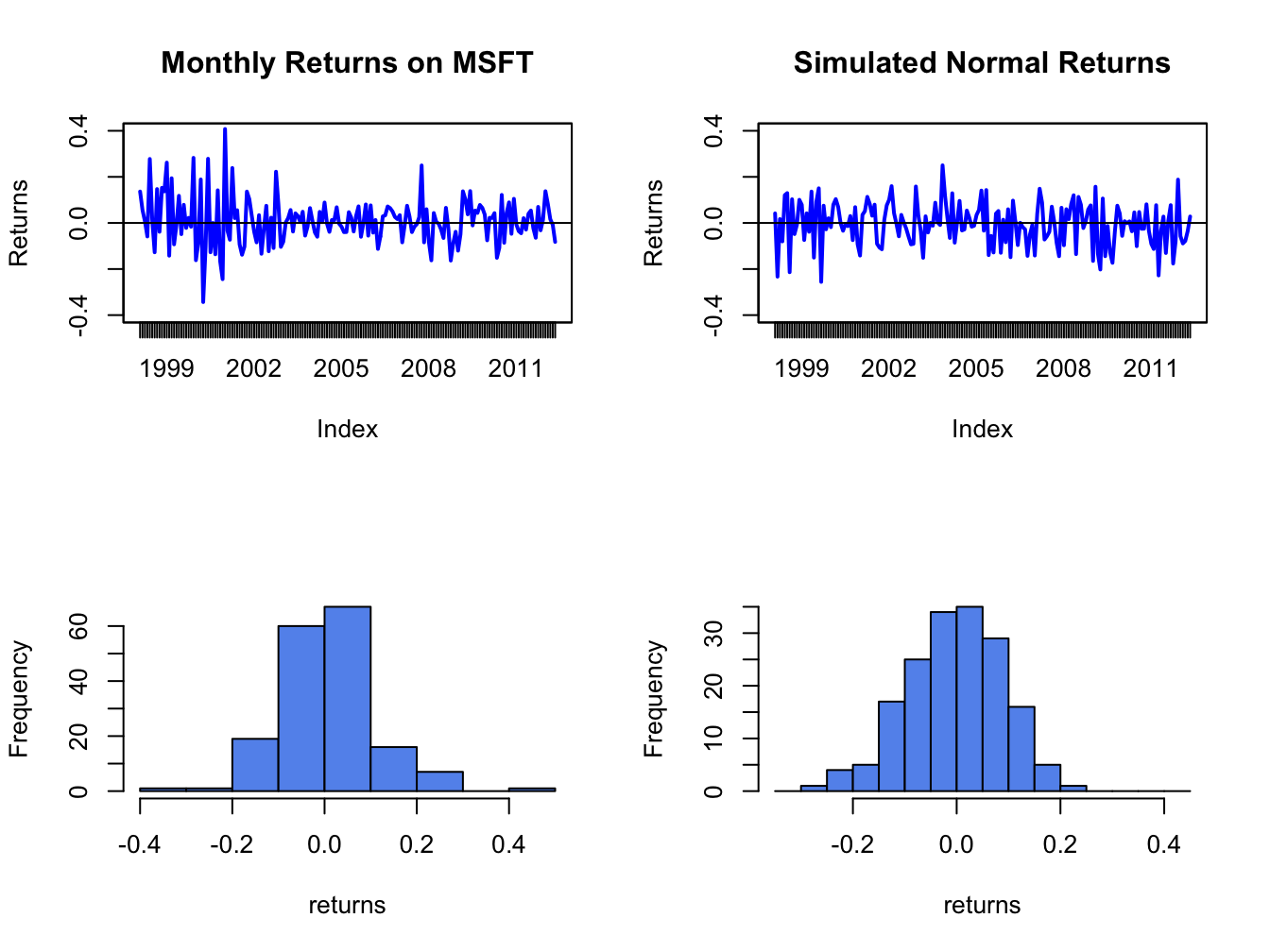
Figure 5.8: Comparison of Microsoft monthly returns with simulated normal returns with the same mean and standard deviation as the Microsoft returns.
msftDailyHist = hist(msftDailyRetS, plot=FALSE, breaks=15)
par(mfrow=c(2,2))
plot.zoo(msftDailyRetS, main="Monthly Returns on MSFT",
     lwd=2, col="blue", ylim=c(-0.15, 0.15), ylab="Returns")
abline(h=0)
plot.zoo(gwnDaily, main="Simulated Normal Returns",
     lwd=2, col="blue", ylim=c(-0.15, 0.15), ylab="Returns")
abline(h=0)
hist(msftDailyRetS, main="", col="cornflowerblue",
     xlab="returns")
hist(gwnDaily, main="", col="cornflowerblue",
     xlab="returns", breaks=msftDailyHist$breaks)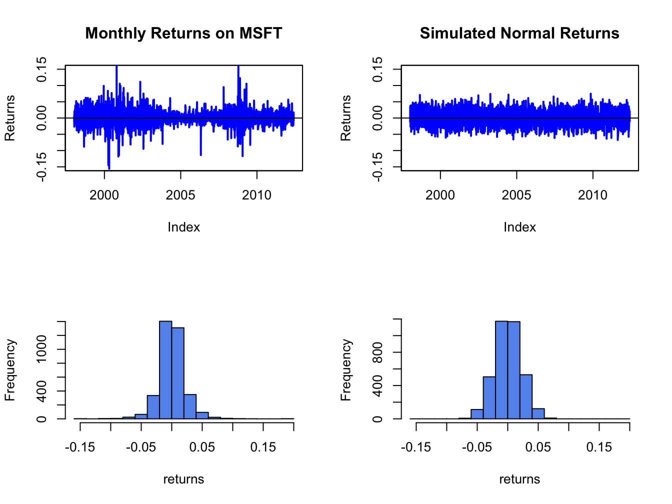
Figure 5.9: Comparison of Microsoft daily returns with simulated normal returns with the same mean and standard deviation as the Microsoft returns.
The simulated normal returns shares many of the same features as the Microsoft returns: both fluctuate randomly about zero. However, there are some important differences. In particular, the volatility of Microsoft returns appears to change over time (large before 2003, small between 2003 and 2008, and large again after 2008) whereas the simulated returns has constant volatility. Additionally, the distribution of Microsoft returns has fatter tails (more extreme large and small returns) than the simulated normal returns. Apart from these features, the simulated normal returns look remarkably like the Microsoft monthly returns.
Figure 5.9 shows the Microsoft daily returns together with the simulated normal returns. The daily returns look much less like GWN than the monthly returns. Here the constant volatility of simulated GWN does not match the volatility patterns of the Microsoft daily returns, and the tails of the histogram for the Microsoft returns are “fatter” than the tails of the GWN histogram.
\(\blacksquare\)
5.1.3.2 Smoothed histogram
Histograms give a good visual representation of the data distribution.
The shape of the histogram, however, depends on the number of bins
used. With a small number of bins, the histogram often appears blocky
and fine details of the distribution are not revealed. With a large
number of bins, the histogram might have many bins with very few observations.
The hist() function in R smartly chooses the number of bins
so that the resulting histogram typically looks good.
The main drawback of the histogram as a descriptive statistic for the
underlying pdf of the data is that it is discontinuous. If it is believed
that the underlying pdf is continuous, it is desirable to have a continuous
graphical summary of the pdf. The smoothed histogram achieves
this goal. Given a sample of data \(\{x_{t}\}_{t=1}^{T}\) the R function
density() computes a smoothed estimate of the underlying
pdf at each point \(x\) in the bins of the histogram using the formula:
\[
\hat{f}_{X}(x)=\frac{1}{Tb}\sum_{t=1}^{T}k\left(\frac{x-x_{t}}{b}\right),
\]
where \(k(\cdot)\) is a continuous smoothing function (typically a
standard normal distribution) and \(b\) is a bandwidth (or bin-width)
parameter that determines the width of the bin around \(x\) in which
the smoothing takes place. The resulting pdf estimate \(\hat{f}_{X}(x)\)
is a two-sided weighted average of the histogram values around \(x\).
Figure 5.10 shows the histogram of Microsoft returns overlaid with the smoothed histogram created using:
par(mfrow=c(1,1))
MSFT.density = density(msftMonthlyRetS)
hist(msftMonthlyRetS, main="", xlab="Microsoft Monthly Returns",
     col="cornflowerblue", probability=TRUE, ylim=c(0,5.5))
points(MSFT.density,type="l", col="orange", lwd=2)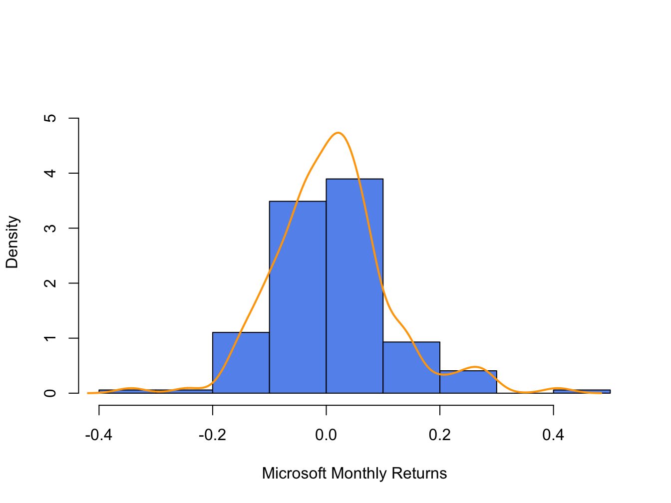
Figure 5.10: Histogram and smoothed density estimate for the monthly returns on Microsoft.
In Figure 5.10, the histogram is normalized (using the argument ), so that its total area is equal to one. The smoothed density estimate transforms the blocky shape of the histogram into a smooth continuous graph.
\(\blacksquare\)
5.1.3.3 Empirical CDF
Recall, the CDF of a random variable \(X\) is the function \(F_{X}(x)=\Pr(X\leq x).\) The empirical CDF of a data sample \(\{x_{t}\}_{t=1}^{T}\) is the function that counts the fraction of observations less than or equal to \(x\): \[\begin{align} \hat{F}_{X}(x) & =\frac{1}{T}(\#x_{i}\leq x)\tag{5.1}\\ & =\frac{\textrm{number of }x_{i}\textrm{ values }\leq x}{\textrm{sample size}}\nonumber \end{align}\]
Computing the empirical CDF of Microsoft monthly returns at a given point, say \(R=0\), is a straightforward calculation in R:
## [1] 0.471Here, the expression msftMonthlyRetS <= 0 creates
a logical vector the same length as msftMonthlyRetS that
is equal to TRUE when returns are less than or equal to 0
and FALSE when returns are greater than zero. Then Fhat.0
is equal to the fraction of TRUE values (returns less than
or equal to zero) in the data, which gives (5.1)
evaluated at zero. The R function ecdf() can be used to compute
and plot (5.1) for all of the observed returns.
For example, Figure 5.11 shows the empirical CDF
for Microsoft monthly returns computed using:
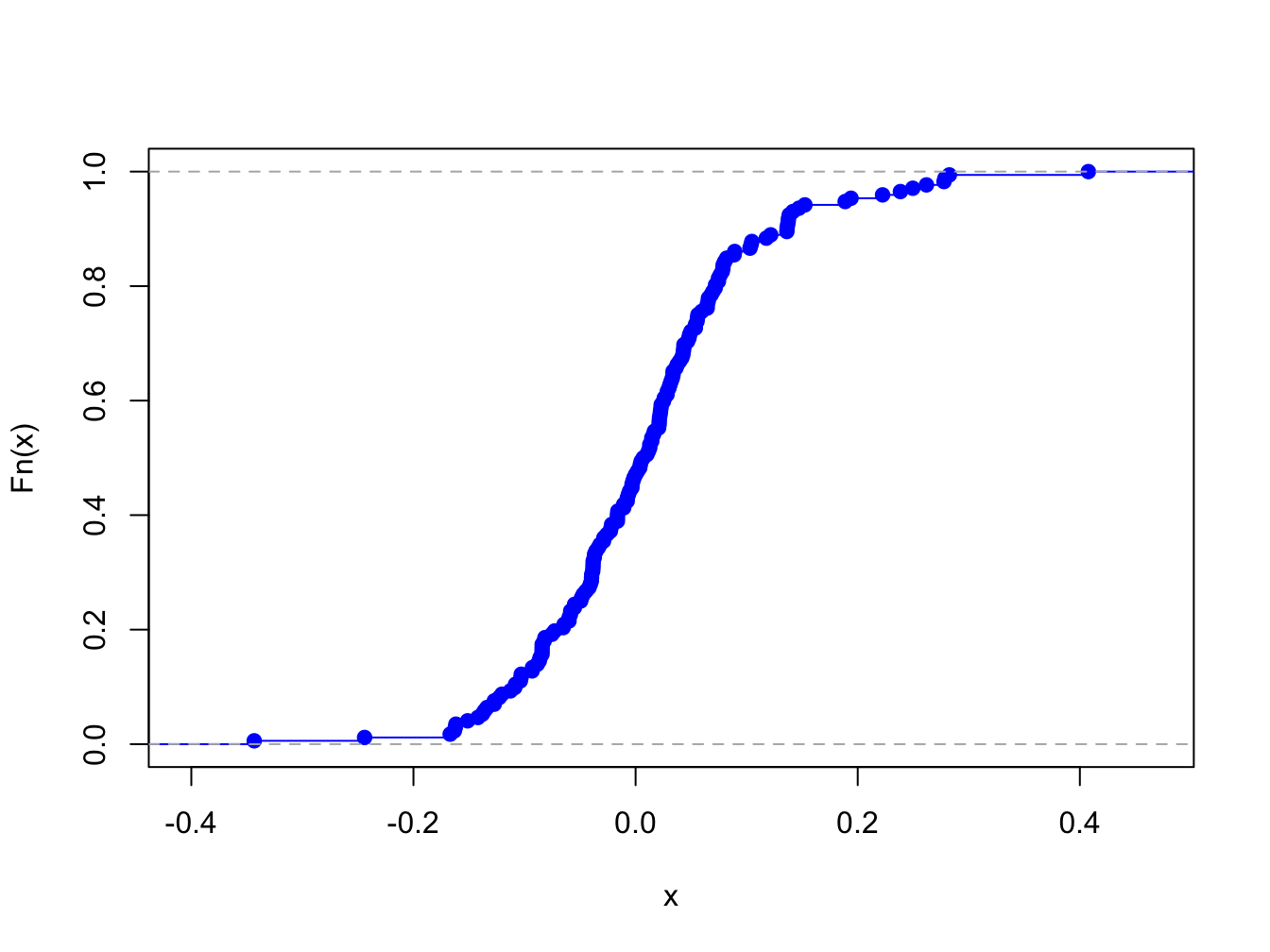
Figure 5.11: Empirical CDF of monthly returns on Microsoft
The “S” shape of the empirical CDF of Microsoft monthly returns is due to the symmetric shape of the histogram of monthly returns.
5.1.3.4 Empirical quantiles/percentiles
Recall, for \(\alpha\in(0,1)\) the \(\alpha\times100\%\) quantile of the distribution of a continuous random variable \(X\) with CDF \(F_{X}\) is the point \(q_{\alpha}^{X}\) such that \(F_{X}(q_{\alpha}^{X})=\Pr(X\leq q_{\alpha}^{X})=\alpha\). Accordingly, the \(\alpha\times100\%\) empirical quantile (or \(100\times\alpha^{\textrm{th}}\) percentile) of a data sample \(\{x_{t}\}_{t=1}^{T}\) is the data value \(\hat{q}_{\alpha}\) such that \(\alpha\cdot100\%\) of the data are less than or equal to \(\hat{q}_{\alpha}\).
Empirical quantiles can be easily determined by ordering the data from smallest to largest giving the ordered sample (also known as order statistics): \[ x_{(1)}<x_{(2)}<\cdots<x_{(T)}. \] The empirical quantile \(\hat{q}_{\alpha}\) is the order statistic closest to \(\alpha\times T\).22
The empirical quartiles are the empirical quantiles for \(\alpha=0.25,0.5\) and \(0.75,\) respectively. The second empirical quartile \(\hat{q}_{.50}\) is called the sample median and is the data point such that half of the data is less than or equal to its value. The interquartile range (IQR) is the difference between the 3rd and 1st quartile: \[ \mathrm{IQR}=\hat{q}_{.75}-\hat{q}_{.25}, \] and shows the size of the middle of the data distribution.
The R function quantile() computes empirical quantiles for
a single data series. By default, quantile() returns the
empirical quartiles as well as the minimum and maximum values:
##          MSFT    SP500
## 0%   -0.34339 -0.16942
## 25%  -0.04883 -0.02094
## 50%   0.00854  0.00809
## 75%   0.05698  0.03532
## 100%  0.40765  0.10772
In the above code, the R function apply() is used to compute the empirical quantiles on each column of the xts object msftSp500MonthlyRetS. The syntax for apply() is:
## function (X, MARGIN, FUN, ...)
## NULL
where X is a multi-column data object, MARGIN specifies looping over rows (MARGIN=1) or columns (MARGIN=2), FUN specifies the R function to be applied,
and ... represents any optional arguments to be passed to FUN.
Here we see that the lower (upper) quartiles of the Microsoft monthly returns are smaller (larger) than the respective quartiles for the S&P 500 index.
To compute quantiles for a specified \(\alpha\) use the probs
argument. For example, to compute the 1% and 5% quantiles of the
monthly returns use:
##      MSFT   SP500
## 1% -0.189 -0.1204
## 5% -0.137 -0.0818
Historically, there is a \(1\%\) chance of losing more than \(19\%\) (\(12\%\)) on Microsoft (S&P 500) in a given month, and a \(5\%\) chance of losing more than \(14\%\) (\(8\%\)) on Microsoft (S&P 500) in a given month.
To compute the median and IQR values for monthly returns use the R
functions median() and IQR(), respectively:
med = apply(msftSp500MonthlyRetS, 2, median)
iqr = apply(msftSp500MonthlyRetS, 2, IQR)
rbind(med, iqr)
## MSFT SP500
## med 0.00854 0.00809
## iqr 0.10581 0.05626The median returns are similar (about 0.8% per month) but the IQR for Microsoft is about twice as large as the IQR for the S&P 500 index.
\(\blacksquare\)
5.1.3.5 Historical/Empirical VaR
Recall, the \(\alpha\times100\%\) value-at-risk (VaR) of an investment of \(\$W\) is \(\mathrm{VaR}_{\alpha}=-\$W\times q_{\alpha}^{R}\), where \(q_{\alpha}^{R}\) is the \(\alpha\times100\%\) quantile of the probability distribution of the investment simple rate of return \(R\) (recall, we multiply by \(-1\) to represent loss as a positive number). The \(\alpha\times100\%\) historical VaR (sometimes called empirical VaR or Historical Simulation VaR) of an investment of \(\$W\) is defined as: \[ \mathrm{VaR}_{\alpha}^{HS}=-\$W\times\hat{q}_{\alpha}^{R}, \] where \(\hat{q}_{\alpha}^{R}\) is the empirical \(\alpha\) quantile of a sample of simple returns \(\{R_{t}\}_{t=1}^{T}\). For a sample of continuously compounded returns \(\{r_{t}\}_{t=1}^{T}\) with empirical \(\alpha\) quantile \(\hat{q}_{\alpha}^{r}\), \[ \mathrm{VaR}_{\alpha}^{HS}=-\$W\times\left(\exp(\hat{q}_{\alpha}^{r})-1\right). \]
Historical VaR is based on the distribution of the observed returns and not on any assumed distribution for returns (e.g., the normal distribution or the log-normal distribution).
Consider investing \(W=\$100,000\) in Microsoft and the S&P 500 over a month. The 1% and 5% historical VaR values for these investments based on the historical samples of monthly returns are:
W = 100000
msftQuantiles = quantile(msftMonthlyRetS, probs=c(0.01, 0.05))
sp500Quantiles = quantile(sp500MonthlyRetS, probs=c(0.01, 0.05))
msftVaR = -W*msftQuantiles
sp500VaR = -W*sp500Quantiles
cbind(msftVaR, sp500VaR)
## msftVaR sp500VaR
## 1% 18929 12040
## 5% 13694 8184Based on the empirical distribution of the monthly returns, a $100,000 monthly investment in Microsoft will lose $13694 or more with 5% probability and will lose $18928 or more with 1% probability. The corresponding values for the S&P 500 are $8183 and $12039, respectively. The historical VaR values for the S&P 500 are considerably smaller than those for Microsoft. In this sense, investing in Microsoft is riskier than investing in the S&P 500 index.
\(\blacksquare\)
5.1.4 QQ-plots
Often it is of interest to see if a given data sample could be viewed as a random sample from a specified probability distribution. One easy and effective way to do this is to compare the empirical quantiles of a data sample to the quantiles from a reference probability distribution. If the quantiles match up, then this provides strong evidence that the reference distribution is appropriate for describing the distribution of the observed data. If the quantiles do not match up, then the observed differences between the empirical quantiles and the reference quantiles can be used to determine a more appropriate reference distribution. It is common to use the normal distribution as the reference distribution, but any distribution can in principle be used.
The quantile-quantile plot (QQ-plot) gives a graphical comparison of the empirical quantiles of a data sample to those from a specified reference distribution. The QQ-plot is an xy-plot with the reference distribution quantiles on the x-axis and the empirical quantiles on the y-axis. If the quantiles exactly match up then the QQ-plot is a straight line. If the quantiles do not match up, then the shape of the QQ-plot indicates which features of the data are not captured by the reference distribution.
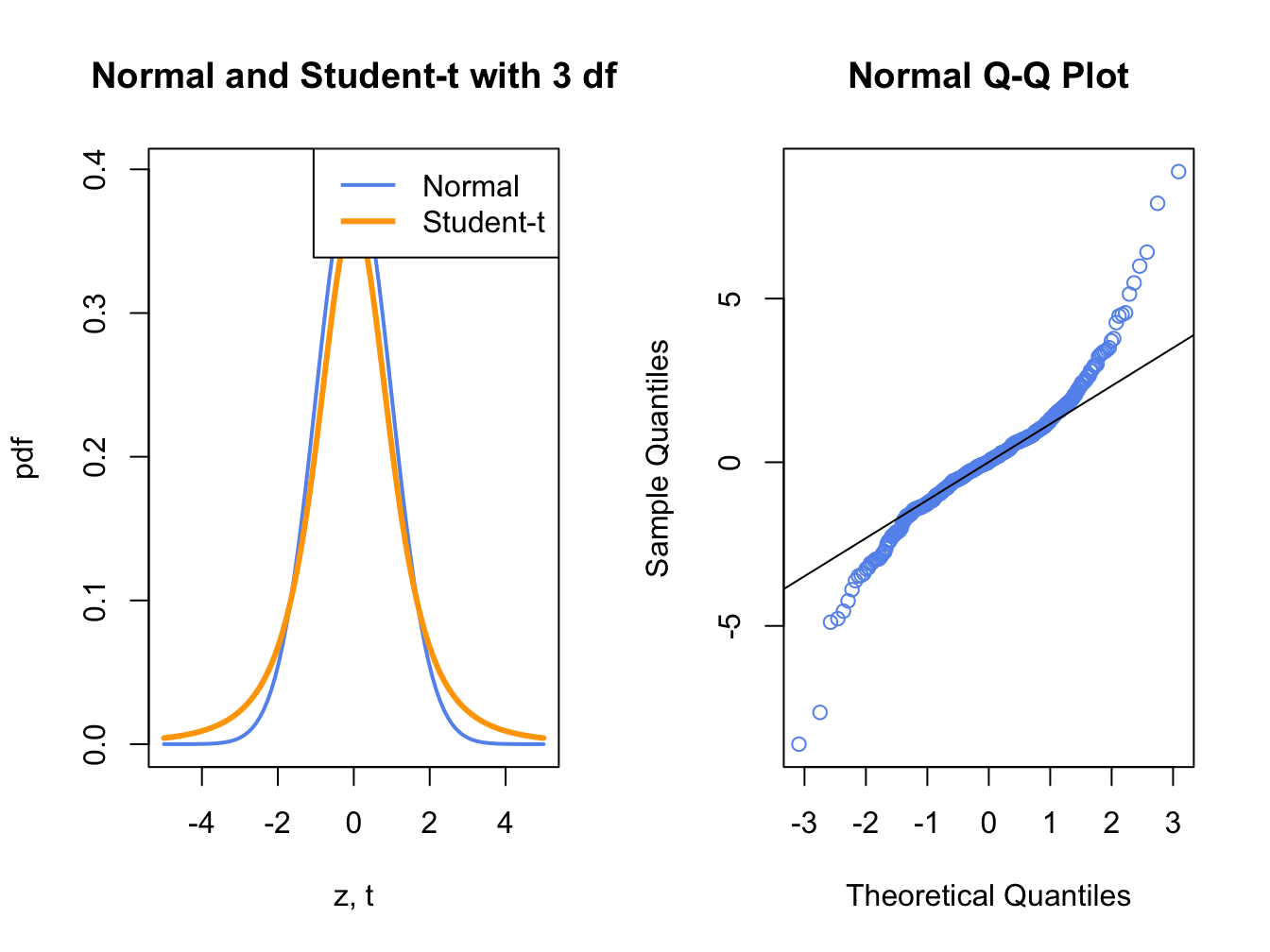
Figure 5.12: Normal QQ-Plot for Fat-tailed Data
Figure 5.12 shows a normal QQ-plot for data simulated from a Student’s t distribution with 3 degrees-of-freedom which has fatter tails than the normal distribution. Notice how the normal QQ-plot deviates from the straight line for both large and small quantiles of the normal distribution. This S-shape tells us that both extremely small and extremely large empirical quantiles (on the vertical axis) are larger (in absolute value) than the corresponding theoretical quantiles of the normal distribution.
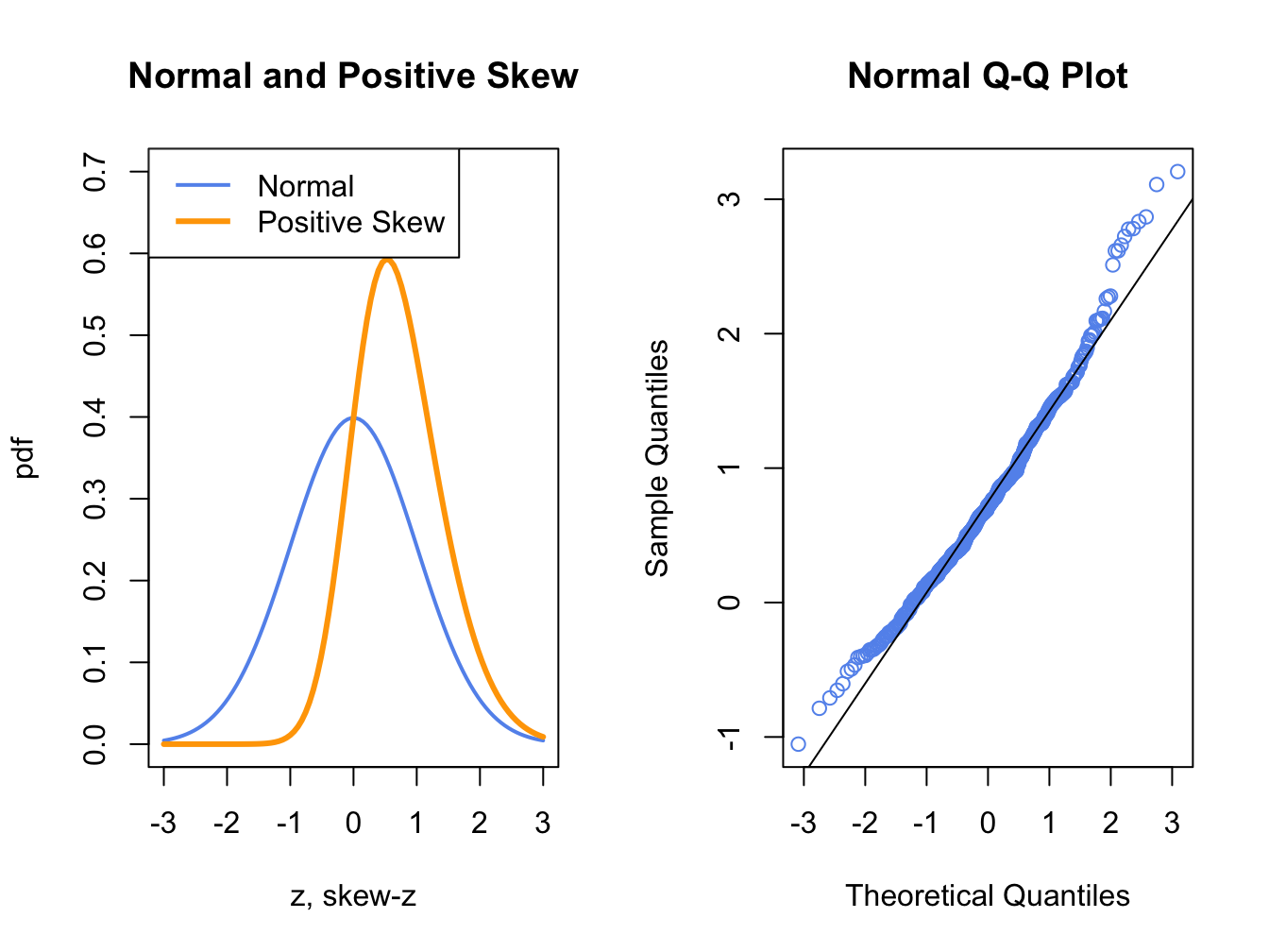
Figure 5.13: Normal QQ-Plot for Positively Skewed Data
Figure 5.13 shows a normal QQ-plot for data simulated from a distribution with positive skewness which has more density in the right tail than in the left tail. Here the normal QQ-plot has a convex shape relative to the straight line indicating that the lower (upper) empirical quantiles are closer to (farther from) zero than the corresponding theoretical quantiles of the normal distribution.
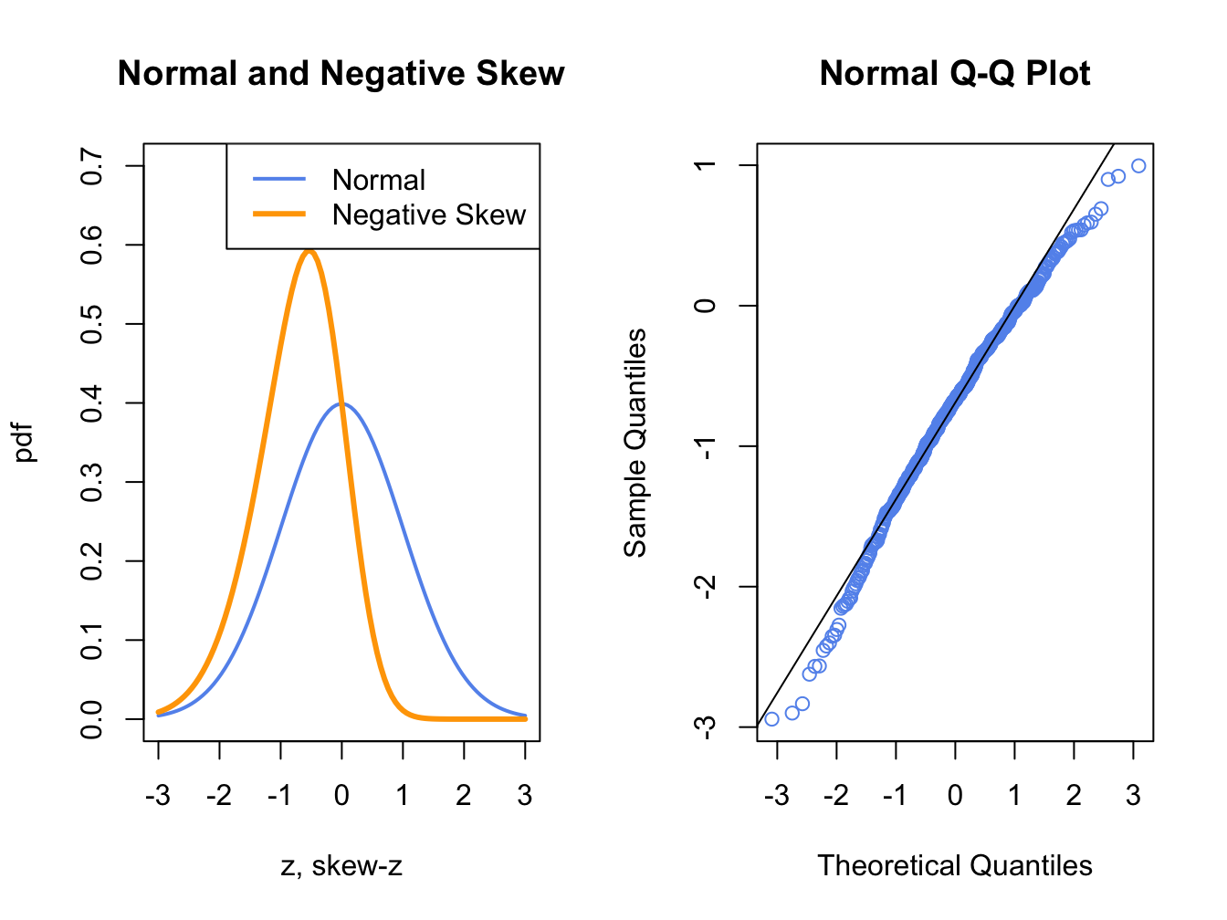
Figure 5.14: Normal QQ-Plot for Negatively Skewed Data
Figure 5.14 shows a normal QQ-plot for data simulated from a distribution with negative skewness which has more density in the left tail than in the right tail. Here the normal QQ-plot has a concave shape relative to the straight line indicating that the lower (upper) empirical quantiles are farther from (closer to) zero than the corresponding theoretical quantiles of the normal distribution.
The R function qqnorm() creates a QQ-plot for a data sample
using the normal distribution as the reference distribution. Figure
5.15 shows normal QQ-plots for the simulated GWN
data, Microsoft returns and S&P 500 returns.
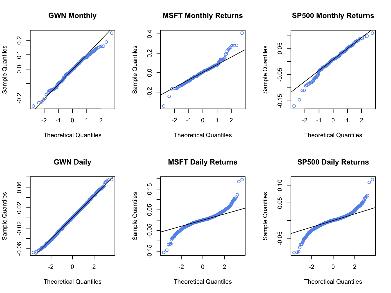
Figure 5.15: Normal QQ-plots for GWN, Microsoft returns and S&P 500 returns.
The normal QQ-plot for the simulated GWN data is very close to a straight
line, as it should be since the data are simulated from a normal
distribution.23
The qqline() function draws a straight line through the points
to help determine if the quantiles match up. The normal QQ-plots for
the Microsoft and S&P 500 monthly returns are linear in the middle
of the distribution but deviate from linearity in the tails of the
distribution. In the normal QQ-plot for Microsoft monthly returns,
the theoretical normal quantiles on the x-axis are too small in both
the left and right tails because the points fall below the straight
line in the left tail and fall above the straight line in the right
tail. Hence, the normal distribution does not match the empirical
distribution of Microsoft monthly returns in the extreme tails of
the distribution. In other words, the Microsoft returns have fatter tails than the normal distribution. For the S&P 500 monthly returns,
the theoretical normal quantiles are too small only for the left tail
of the empirical distribution of returns (points fall below the straight
line in the left tail only). This reflects the long left tail (negative
skewness) of the empirical distribution of S&P 500 returns. The normal
QQ-plots for the daily returns on Microsoft and the S&P 500 index
both exhibit a pronounced tilted S-shape with extreme departures from
linearity in the left and right tails of the distributions. The daily
returns clearly have much fatter tails than the normal distribution.
\(\blacksquare\)
The function qqPlot() from the car package or the
function chart.QQPlot() from the PerformanceAnalytics
package can be used to create a QQ-plot against any reference distribution
that has a corresponding quantile function implemented in R. For example,
a QQ-plot for the Microsoft returns using a Student’s t reference
distribution with 5 degrees of freedom can be created using:
## Loading required package: carData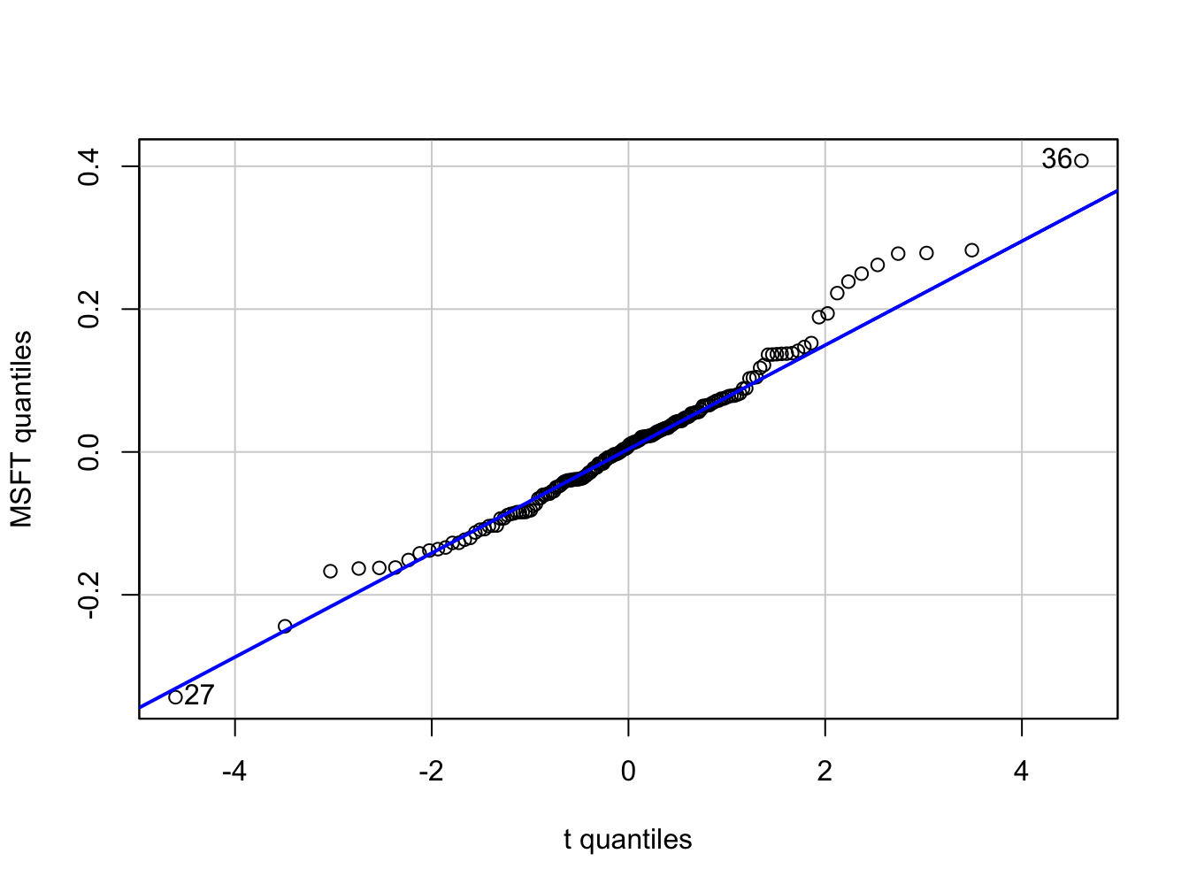
Figure 5.16: QQ-plot of Microsoft returns using Student’s t distribution with 5 degrees of freedom as the reference distribution.
## [1] 36 27In the function qqPlot(), the argument distribution= "t"
specifies that the quantiles are to be computed using the R function
qt().24 Figure 5.16 shows the resulting graph. Here,
with a reference distribution with fatter tails than the normal distribution
the QQ-plot for Microsoft returns is closer to a straight line. This
indicates that the Student’s t distribution with 5 degrees of freedom
is a better reference distribution for Microsoft returns than the
normal distribution.
\(\blacksquare\)
5.1.5 Shape Characteristics of the Empirical Distribution
Recall, for a random variable \(X\) the measures of center, spread, asymmetry and tail thickness of the pdf are: \[\begin{align*} \textrm{center} & :\mu_{X}=E[X],\\ \text{spread} & :\sigma_{X}^{2}=\mathrm{var}(X)=E[(X-\mu_{X})^{2}],\\ \text{spread} & :\sigma_{X}=\sqrt{\mathrm{var}(X)}\\ \text{asymmetry} & :\mathrm{skew}_{X}=E[(X-\mu_{X})^{3}]/\sigma^{3},\\ \text{tail thickness} & :\mathrm{kurt}_{X}=E[(X-\mu_{X})^{4}]/\sigma^{4}. \end{align*}\] The corresponding shape measures for the empirical distribution (e.g., as measured by the histogram) of a data sample \(\{x_{t}\}_{t=1}^{T}\) are the sample statistics:25 \[\begin{align} \hat{\mu}_{x} & =\bar{x}=\frac{1}{T}\sum_{t=1}^{T}x_{t},\tag{5.2}\\ \hat{\sigma}_{x}^{2} & =s_{x}^{2}=\frac{1}{T-1}\sum_{t=1}^{T}(x_{t}-\bar{x})^{2},\tag{5.3}\\ \hat{\sigma}_{x} & =\sqrt{\hat{\sigma}_{x}^{2}},\tag{5.4}\\ \widehat{\mathrm{skew}}_{x} & =\frac{\frac{1}{T-1}\sum_{t=1}^{T}(x_{t}-\bar{x})^{3}}{s_{x}^{3}},\tag{5.5}\\ \widehat{\mathrm{kurt}}_{x} & =\frac{\frac{1}{T-1}\sum_{t=1}^{T}(x_{t}-\bar{x})^{4}}{s_{x}^{4}}.\tag{5.6} \end{align}\] The sample mean, \(\hat{\mu}_{X}\), measures the center of the histogram; the sample standard deviation, \(\hat{\sigma}_{x}\), measures the spread of the data about the mean in the same units as the data; the sample skewness, \(\widehat{\mathrm{skew}}_{x}\), measures the asymmetry of the histogram; the sample kurtosis, \(\widehat{\mathrm{kurt}}_{x}\), measures the tail-thickness of the histogram. The sample excess kurtosis, defined as the sample kurtosis minus 3: \[\begin{equation} \widehat{\mathrm{ekurt}}_{x}=\widehat{\mathrm{kurt}}_{x}-3,\tag{5.7} \end{equation}\] measures the tail thickness of the data sample relative to that of a normal distribution.
Notice that the divisor in (5.3)-(5.6) is \(T-1\) and not \(T\). This is called a degrees-of-freedom correction. In computing the sample variance, skewness and kurtosis, one degree-of-freedom in the sample is used up in the computation of the sample mean so that there are effectively only \(T-1\) observations available to compute the statistics.26
The R functions for computing (5.2) - (5.6)
are mean(), var() and sd(), respectively.
There are no functions for computing (5.5) and
(5.6) in base R. The functions skewness()
and kurtosis() in the PerformanceAnalytics package
compute the sample skewness (5.5) and the sample excess kurtosis
(5.7), respectively.27
The sample statistics for the Microsoft and S&P 500 monthly returns
are computed using:
statsMonthly = rbind(apply(msftSp500MonthlyRetS, 2, mean),
                     apply(msftSp500MonthlyRetS, 2, var),
                     apply(msftSp500MonthlyRetS, 2, sd),
                     apply(msftSp500MonthlyRetS, 2, skewness),
                     apply(msftSp500MonthlyRetS, 2, kurtosis))
rownames(statsMonthly) = c("Mean", "Variance", "Std Dev",
                           "Skewness",  "Excess Kurtosis")
round(statsMonthly, digits=4)
## MSFT SP500
## Mean 0.0092 0.0028
## Variance 0.0103 0.0023
## Std Dev 0.1015 0.0478
## Skewness 0.4853 -0.5631
## Excess Kurtosis 1.9148 0.6545The mean and standard deviation for Microsoft monthly returns are 0.9% and 10%, respectively. Annualized, these values are approximately 10.8% (.009 \(\times12\)) and 34.6% (.10 \(\times\) \(\sqrt{12}\)), respectively. The corresponding monthly and annualized values for S&P 500 returns are .3% and 4.7%, and 4.8% and 16.6%, respectively. Microsoft has a higher mean and volatility than S&P 500. The lower volatility for the S&P 500 reflects risk reduction due to diversification (holding many assets in a portfolio). The sample skewness for Microsoft, 0.485, is slightly positive and reflects the approximate symmetry in the histogram in Figure 5.6. The skewness for S&P 500, however, is moderately negative at -0.563 which reflects the somewhat long left tail of the histogram in Figure 5.6. The sample excess kurtosis values for Microsoft and S&P 500 are 1.915 and 0.654, respectively, and indicate that the tails of the histograms are slightly fatter than the tails of a normal distribution.
The sample statistics for the daily returns are:
statsDaily = rbind(apply(msftSp500DailyRetS, 2, mean),
                   apply(msftSp500DailyRetS, 2, var),
                   apply(msftSp500DailyRetS, 2, sd),
                   apply(msftSp500DailyRetS, 2, skewness),
                   apply(msftSp500DailyRetS, 2, kurtosis))
rownames(statsDaily) = rownames(statsMonthly)
round(statsDaily, digits=4)
## MSFT SP500
## Mean 0.0005 0.0002
## Variance 0.0005 0.0002
## Std Dev 0.0217 0.0135
## Skewness 0.2506 0.0012
## Excess Kurtosis 7.3915 6.9971For a daily horizon, the sample mean for both series is zero (to three decimals). As with the monthly returns, the sample standard deviation for Microsoft, 2.2%, is about twice as big as the sample standard deviation for the S&P 500 index, 1.4%. Neither daily return series exhibits much skewness, but the excess kurtosis values are much larger than the corresponding monthly values indicating that the daily returns have much fatter tails and are more non-normally distributed than the monthly return series.
The daily simple returns are very close to the daily cc returns so the square-root-of-time rule (with 20 trading days within the month) can be applied to the sample mean and standard deviation of the simple returns:
##    MSFT   SP500
## 0.00933 0.00345## MSFT SP500
## 0.0971 0.0603Comparing these values to the corresponding monthly sample statistics shows that the square-root-of-time-rule applied to the daily mean and standard deviation gives results that are fairly close to the actual monthly mean and standard deviation.
\(\blacksquare\)
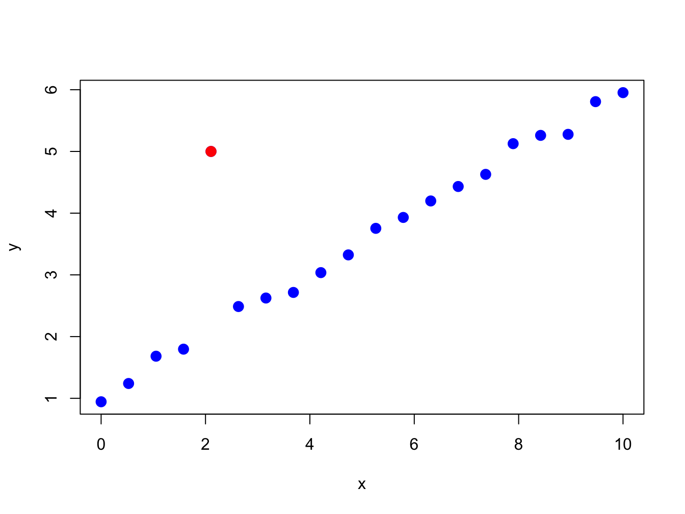
Figure 5.17: Illustration of an “outlier” in a data sample.
5.1.6 Outliers
Figure 5.17 nicely illustrates the concept of an outlier in a data sample. All of the points are following a nice systematic relationship except one - the red dot “outlier”. Outliers can be thought of in two ways. First, an outlier can be the result of a data entry error. In this view, the outlier is not a valid observation and should be removed from the data sample. Second, an outlier can be a valid data point whose behavior is seemingly unlike the other data points. In this view, the outlier provides important information and should not be removed from the data sample. For financial market data, outliers are typically extremely large or small values that could be the result of a data entry error (e.g. price entered as 10 instead of 100) or a valid outcome associated with some unexpected bad or good news. Outliers are problematic for data analysis because they can greatly influence the value of certain sample statistics.
| Statistic | GWN | GWN with Outlier | %\(\Delta\) |
|---|---|---|---|
| Mean | -0.0054 | -0.0072 | 32% |
| Variance | 0.0086 | 0.0101 | 16% |
| Std. Deviation | 0.0929 | 0.1003 | 8% |
| Skewness | -0.2101 | -1.0034 | 378% |
| Kurtosis | 2.7635 | 7.1530 | 159% |
| Median | -0.0002 | -0.0002 | 0% |
| IQR | 0.1390 | 0.1390 | 0% |
To illustrate the impact of outliers on sample statistics, the simulated monthly GWN data is polluted by a single large negative outlier:
Figure 5.18 shows the resulting data. Visually, the outlier is much smaller than a typical negative observation and creates a pronounced asymmetry in the histogram. Table 5.1 compares the sample statistics (5.2) - (5.6) of the unpolluted and polluted data. All of the sample statistics are influenced by the single outlier with the skewness and kurtosis being influenced the most. The mean decreases by 32% and the variance and standard deviation increase by 16% and 8%, respectively. The skewness changes by 378% and the kurtosis by 159%. Table 5.1 also shows the median and the IQR, which are quantile-based statistics for the center and spread, respectively. Notice that these statistics are unaffected by the outlier.
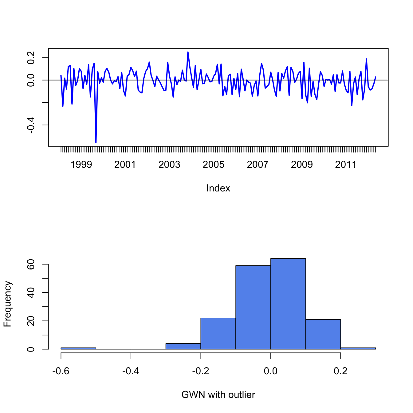
Figure 5.18: Monthly GWN data polluted by a single outlier.
\(\blacksquare\)
The previous example shows that the common sample statistics (5.2) - (5.6) based on the sample average and deviations from the sample average can be greatly influenced by a single outlier, whereas quantile-based sample statistics are not. Sample statistics that are not greatly influenced by a single outlier are called (outlier) robust statistics.
5.1.6.1 Defining outliers
A commonly used rule-of-thumb defines an outlier as an observation that is beyond the sample mean plus or minus three times the sample standard deviation. The intuition for this rule comes from the fact that if \(X\sim N(\mu,\sigma^{2})\) then \(\Pr(\mu-3\sigma\leq X\leq\mu+3\sigma)\approx0.99\). While the intuition for this definition is clear, the practical implementation of the rule using the sample mean, \(\hat{\mu}\), and sample standard deviation, \(\hat{\sigma}\), is problematic because these statistics can be heavily influenced by the presence of one or more outliers (as illustrated in the previous sub-section). In particular, both \(\hat{\mu}\) and \(\hat{\sigma}\) become larger (in absolute value) when there are outliers and this may cause the rule-of-thumb rule to miss identifying an outlier or to identify a non-outlier as an outlier. That is, the rule-of-thumb outlier detection rule is not robust to outliers!
A natural fix to the above outlier detection rule-of-thumb is to use outlier robust statistics, such as the median and the IQR, instead of the mean and standard deviation. To this end, a commonly used definition of a moderate outlier in the right tail of the distribution (value above the median) is a data point \(x\) such that: \[\begin{equation} \hat{q}_{.75}+1.5\cdot\mathrm{IQR}<x<\hat{q}_{.75}+3\cdot\mathrm{IQR}.\tag{5.8} \end{equation}\] To understand this rule, recall that the IQR is where the middle 50% of the data lies. If the data were normally distributed then \(\hat{q}_{.75}\approx\hat{\mu}+0.67\times\hat{\sigma}\) and \(\mathrm{IQR}\approx1.34\times\hat{\sigma}\). Then (5.8) is approximately: \[ \hat{\mu}+2.67\times\hat{\sigma}<x<\hat{\mu}+4.67\times\hat{\sigma} \] Similarly, a moderate outlier in the left tail of the distribution (value below the median) is a data point such that, \[ \hat{q}_{.25}-3\cdot IQR<x<\hat{q}_{.25}-1.5\cdot\mathrm{IQR}. \] Extreme outliers are those observations \(x\) even further out in the tails of the distribution and are defined using: \[\begin{align*} x & >\hat{q}_{.75}+3\cdot\mathrm{IQR},\\ x & <\hat{q}_{.25}-3\cdot\mathrm{IQR}. \end{align*}\] For example, with normally distributed data an extreme outlier would be an observation that is more than \(4.67\) standard deviations above the mean.
5.1.7 Box plots
A boxplot of a data series describes the distribution using outlier robust statistics. The basic boxplot is illustrated in Figure 5.19. The middle of the distribution is shown by a rectangular box whose top and bottom sides are approximately the first and third quartiles, \(\hat{q}_{.25}\) and \(\hat{q}_{.75},\) respectively. The line roughly in the middle of the box is the sample median, \(\hat{q}_{.5}.\) The top whisker is a horizontal line that represents either the largest data value or \(\hat{q}_{.75}+1.5\cdot IQR\), whichever is smaller. Similarly, the bottom whisker is located at either the smallest data value or \(\hat{q}_{.25}-1.5\cdot IQR,\) whichever is closer to \(\hat{q}_{.25}\). Data values above the top whisker and below the bottom whisker are displayed as circles and represent extreme observations. If a data distribution is symmetric then the median is in the center of the box and the top and bottom whiskers are approximately the same distance from the box. Fat tailed distributions will have observations above and below the whiskers.
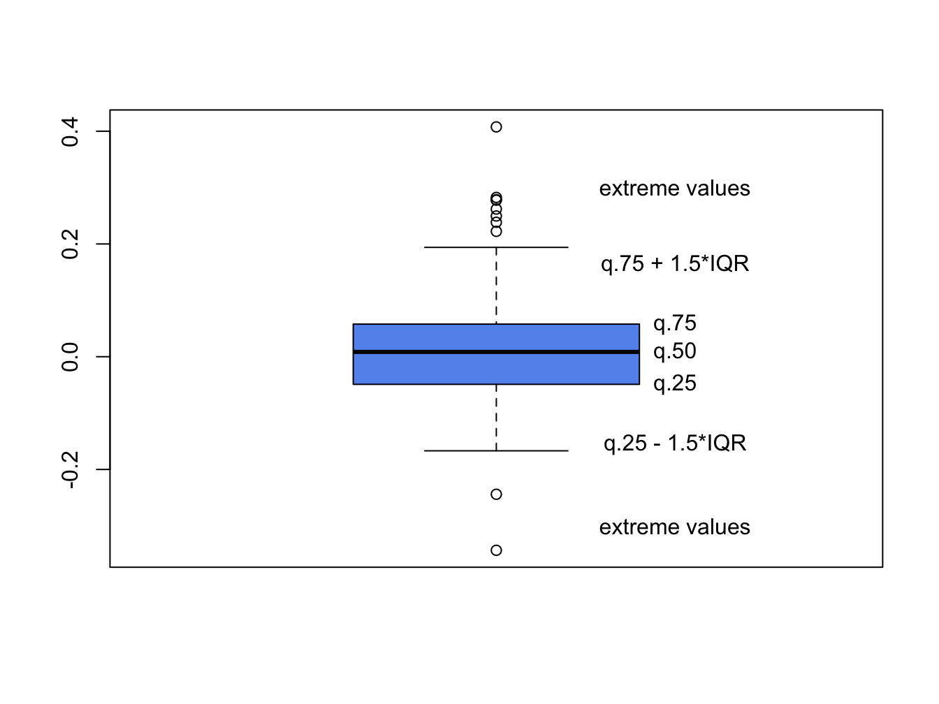
Figure 5.19: Boxplot of return distribution.
Boxplots are a great tool for visualizing the return distribution of one or more assets. Figure 5.20 shows the boxplots of the monthly continuously compounded and simple returns on Microsoft and the S&P 500 index computed using:28
dataToPlot = merge(msftMonthlyRetS, msftMonthlyRetC,
                   sp500MonthlyRetS, sp500MonthlyRetC)
colnames(dataToPlot) = c("msftRetS", "msftRetC",
                         "sp500RetS", "sp500RetC")
boxplot(coredata(dataToPlot), main="Simple vs. CC Monthly Returns",
        col="cornflowerblue")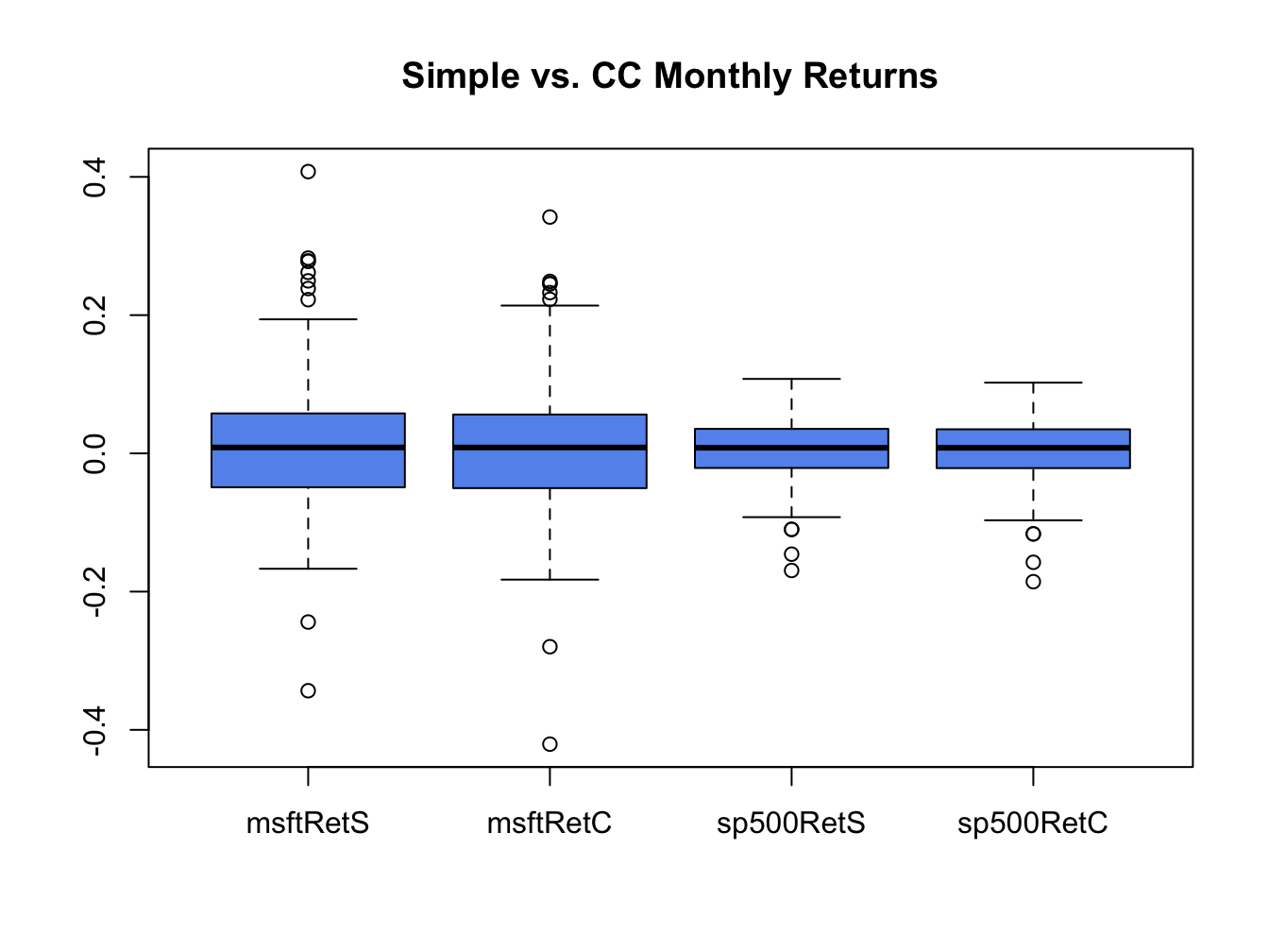
Figure 5.20: Boxplots of the continuously compounded and simple monthly returns on Microsoft stock and the S&P 500 index.
The Microsoft returns have both positive and negative outliers whereas the S&P 500 index returns only have negative outliers. The boxplots also clearly show that the distributions of the continuously compounded and simple returns are very similar except for the extreme tails of the distributions.
\(\blacksquare\)
5.2 Time Series Descriptive Statistics
In this section, we consider graphical and numerical descriptive statistics for summarizing the linear time dependence in a time series.
5.2.1 Sample Autocovariances and Autocorrelations
For a covariance stationary time series process \(\{X_{t}\}\), the autocovariances \(\gamma_{j}=\mathrm{cov}(X_{t},X_{t-j})\) and autocorrelations \(\rho_{j}=\mathrm{cov}(X_{t},X_{t-j})/\sqrt{\mathrm{var}(X_{t})\mathrm{var}(X_{t-j})}=\gamma_{j}/\sigma^{2}\) describe the linear time dependencies in the process. For a sample of data \(\{x_{t}\}_{t=1}^{T}\), the linear time dependencies are captured by the sample autocovariances and sample autocorrelations: \[\begin{align*} \hat{\gamma}_{j} & =\frac{1}{T-1}\sum_{t=j+1}^{T}(x_{t}-\bar{x})(x_{t-j}-\bar{x}),~j=1,2,\ldots,T-J+1,\\ \hat{\rho}_{j} & =\frac{\hat{\gamma}_{j}}{\hat{\sigma}^{2}},~j=1,2,\ldots,T-J+1, \end{align*}\] where \(\hat{\sigma}^{2}\) is the sample variance (5.3). The sample autocorrelation function (SACF) is a plot of \(\hat{\rho}_{j}\) vs. \(j\), and gives a graphical view of the linear time dependencies in the observed data.
The R function acf() computes and plots the sample autocorrelations
\(\hat{\rho}_{j}\) of a time series for a specified number of lags.
For example, to compute \(\hat{\rho}_{j}\) for \(j=1,\ldots,5\) for
the monthly and daily returns on Microsoft use:
##
## Autocorrelations of series 'coredata(msftMonthlyRetS)', by lag
##
##      0      1      2      3      4      5
## 1.000 -0.193 -0.114 0.193 -0.139 -0.023##
## Autocorrelations of series 'coredata(msftDailyRetS)', by lag
##
## 0 1 2 3 4 5
## 1.000 -0.044 -0.018 -0.010 -0.042 0.018None of these sample autocorrelations are very big and indicate lack of linear time dependence in the monthly and daily returns.
Sample autocorrelations can also be visualized using the function
acf(). Figure 5.21 shows the SACF for the
monthly and daily returns on Microsoft and the S&P 500 created using:
par(mfrow=c(2,2))
acf(coredata(msftMonthlyRetS), main="msftMonthlyRetS", lwd=2)
acf(coredata(sp500MonthlyRetS), main="sp500MonthlyRetS", lwd=2)
acf(coredata(msftDailyRetS), main="msftDailyRetS", lwd=2)
acf(coredata(sp500DailyRetS), main="sp500DailyRetS", lwd=2)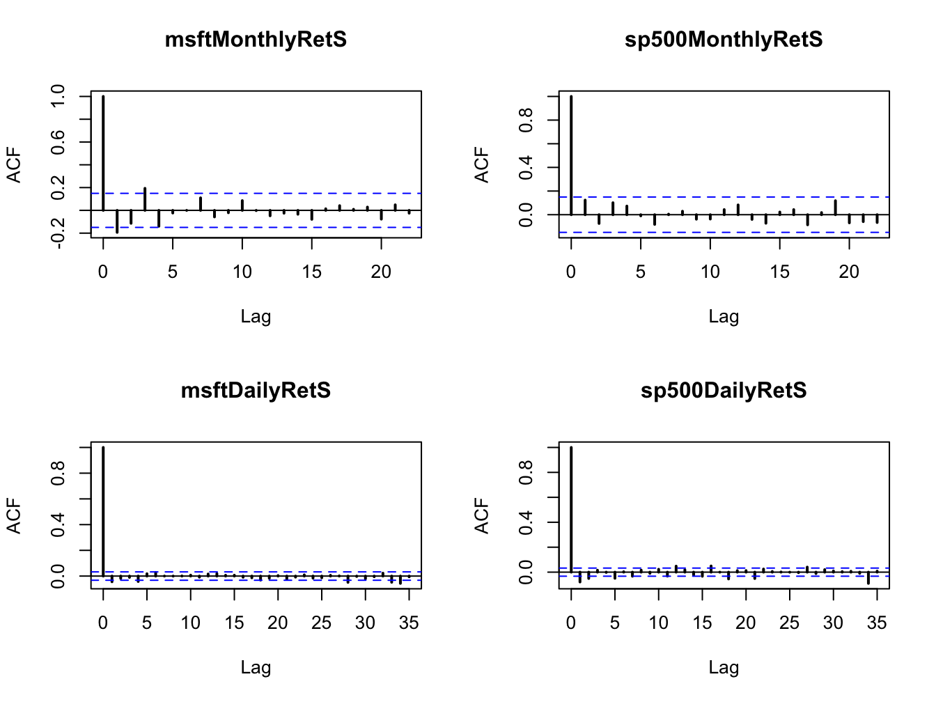
Figure 5.21: SACFs for the monthly and daily returns on Microsoft and the S&P 500 index.
None of the series show strong evidence for linear time dependence. The monthly returns have slightly larger sample autocorrelations at low lags than the daily returns. The dotted lines on the SACF plots are 5% critical values for testing the null hypothesis that the true autocorrelations \(\rho_{j}\) are equal to zero (see chapter 9). If \(\hat{\rho}_{j}\) crosses the dotted line then the null hypothesis that \(\rho_{j}=0\) can be rejected at the 5% significance level.
\(\blacksquare\)
5.2.2 Time dependence in volatility
The daily and monthly returns of Microsoft and the S&P 500 index do not exhibit much evidence for linear time dependence. Their returns are essentially uncorrelated over time. However, the lack of autocorrelation does not mean that returns are independent over time. There can be nonlinear time dependence. Indeed, there is strong evidence for a particular type of nonlinear time dependence in the daily returns of Microsoft and the S&P 500 index that is related to time varying volatility. This nonlinear time dependence, however, is less pronounced in the monthly returns.
Let \(y_{t}\sim\mathrm{GWN}(0,\sigma^{2})\). Then \(y_{t}\) is, by construction, independent over time. This implies that any function of \(y_{t}\) is also independent over time. To illustrate, Figure 5.22 shows \(y_{t}\), \(y_{t}^{2}\) and \(|y_{t}|\) together with their SACFs where \(y_{t}\sim \mathrm{GWN}(0,1)\) for \(t=1,\ldots,500\). Notice that all of the sample autocorrelations are essentially zero which confirms the lack of linear time dependence in \(y_{t}\), \(y_{t}^{2}\) and \(|y_{t}|\).
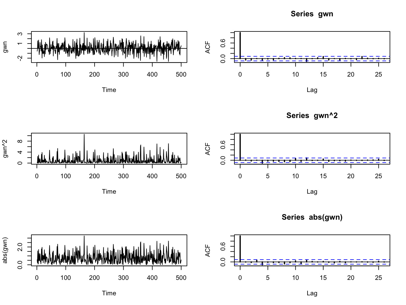
Figure 5.22: The left panel (top to bottom) shows \(y_{t}\), \(y_{t}^{2}\) and \(|y_{t}|\) where \(y_{t}\) is similar to GWN(0,1) for \(t=1,...,500.\) The right panel shows the corresponding SACFs.
\(\blacksquare\)
5.2.2.1 Nonlinear time dependence in asset returns
Figures 5.5 and 5.2 show that the daily and monthly returns on Microsoft and the S&P 500 index appear to exhibit periods of volatility clustering. That is, high periods of volatility tend to be followed by periods of high volatility and periods of low volatility appear to be followed by periods of low volatility. In other words, the volatility of the returns appears to exhibit some time dependence. This time dependence in volatility causes linear time dependence in the absolute value and squared value of returns.
To illustrate nonlinear time dependence in asset returns, Figure 5.23 shows the daily returns, absolute returns and squared returns for the S&P 500 index. Notice how the absolute and squared returns are large (small) when the daily returns are more (less) volatile. Figure 5.24 shows the SACFs for the absolute and squared daily and monthly returns. There is clear evidence of time dependence in the daily absolute and squared returns while there is some evidence of time dependence in the monthly absolute and squared returns. Since the absolute and squared daily returns reflect the volatility of the daily returns, the SACFs show a strong positive linear time dependence in daily return volatility.
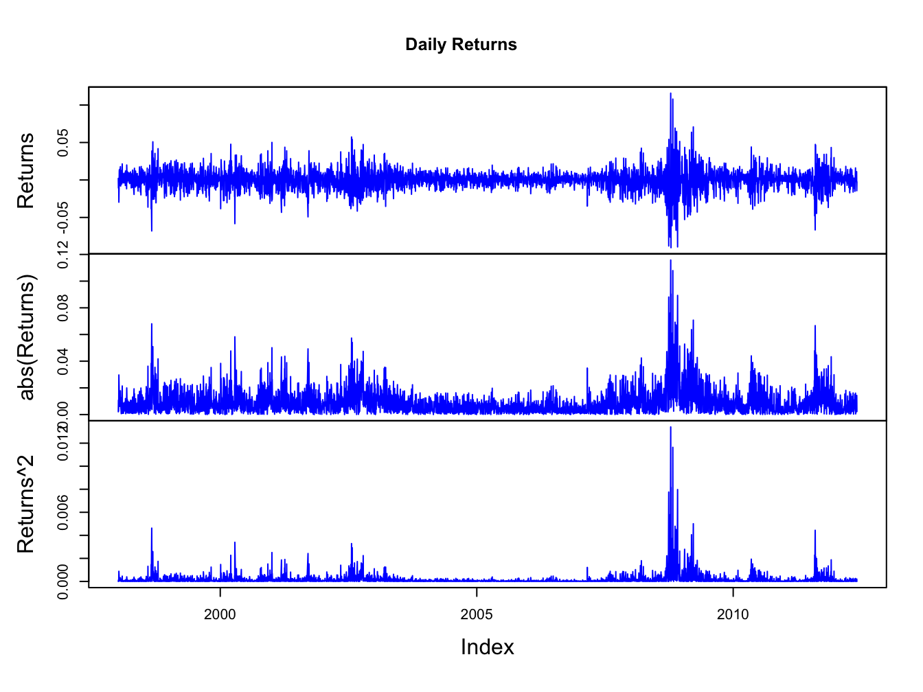
Figure 5.23: Daily returns, absolute returns, and squared returns on the S&P 500 index.
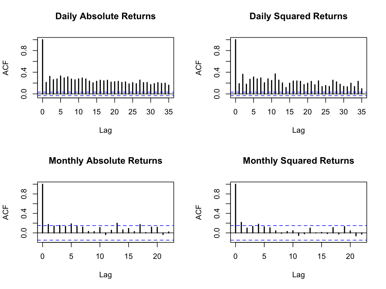
Figure 5.24: SACFs of daily and monthly absolute and squared returns on the S&P 500 index.
\(\blacksquare\)
5.3 Bivariate Descriptive
In this section, we consider graphical and numerical descriptive statistics for summarizing two or more data series.
5.3.1 Scatterplots
The contemporaneous dependence properties between two data series \(\{x_{t}\}_{t=1}^{T}\) and \(\{y_{t}\}_{t=1}^{T}\) can be displayed graphically in a scatterplot, which is simply an xy-plot of the bivariate data.
Figure 5.25 shows the scatterplots between the Microsoft and S&P 500 monthly and daily returns created using:
par(mfrow=c(1,2))
plot(coredata(sp500MonthlyRetS),coredata(msftMonthlyRetS),
     main="Monthly returns", xlab="S&P500", ylab="MSFT", lwd=2,
     pch=16, cex=1.25, col="blue")
abline(v=mean(sp500MonthlyRetS))
abline(h=mean(msftMonthlyRetS))
plot(coredata(sp500DailyRetS),coredata(msftDailyRetS),
     main="Daily returns", xlab="S&P500", ylab="MSFT", lwd=2,
     pch=16, cex=1.25, col="blue")
abline(v=mean(sp500DailyRetS))
abline(h=mean(msftDailyRetS))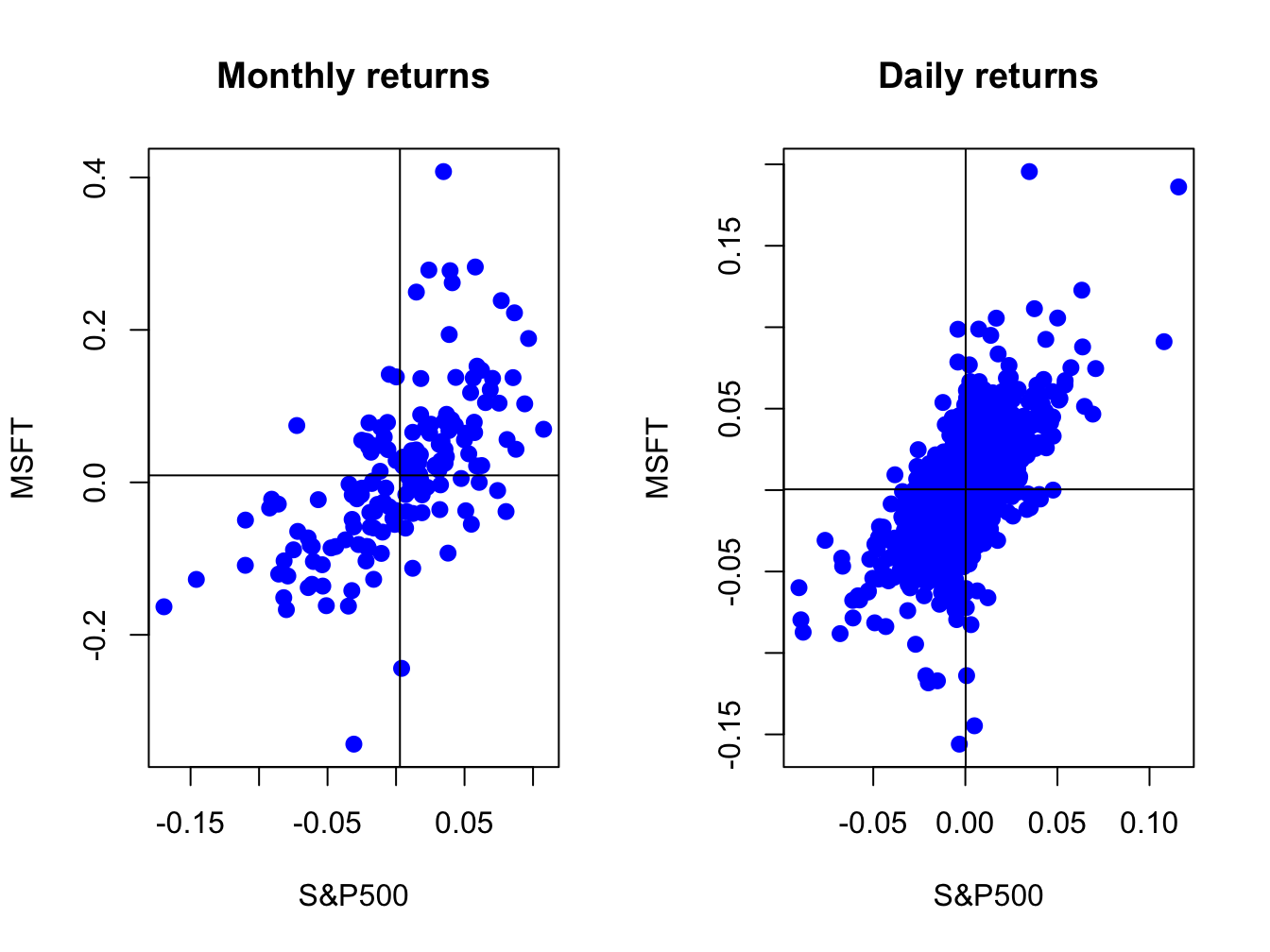
Figure 5.25: Scatterplot of Monthly returns on Microsoft and the S&P 500 index.
The S&P 500 returns are put on the x-axis and the Microsoft returns on the y-axis because the “market”, as proxied by the S&P 500, is often thought as an independent variable driving individual asset returns. The upward sloping orientation of the scatterplots indicate a positive linear dependence between Microsoft and S&P 500 returns at both the monthly and daily frequencies.
\(\blacksquare\)
pairs() plots
all pair-wise scatterplots in a single plot. For example, to plot
all pair-wise scatterplots for the GWN, Microsoft returns and S&P
500 returns use:
dataToPlot = merge(gwnMonthly,msftMonthlyRetS,sp500MonthlyRetS)
pairs(coredata(dataToPlot), col="blue", pch=16, cex=1.25, cex.axis=1.25)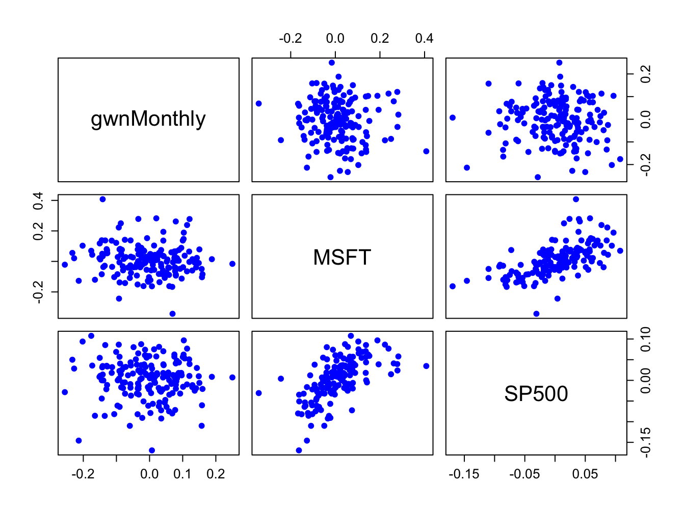
Figure 5.26: Pair-wise scatterplots between simulated GWN, Microsoft returns and S&P 500 returns.
The top row of Figure 5.26 shows the scatterplots between the pairs (MSFT, GWN) and (SP500, GWN), the second row shows the scatterplots between the pairs (GWN, MSFT) and (SP500, MSFT), the third row shows the scatterplots between the pairs (GWN, SP500) and (MSFT, SP500). The plots in the lower triangle are the same as the plots in the upper triangle except the axes are reversed.
\(\blacksquare\)
5.3.2 Sample covariance and correlation
For two random variables \(X\) and \(Y,\) the direction of linear dependence is captured by the covariance, \(\sigma_{XY}=E[(X-\mu_{X})(Y-\mu_{Y})],\) and the direction and strength of linear dependence is captured by the correlation, \(\rho_{XY}=\sigma_{XY}/\sigma_{X}\sigma_{Y}.\) For two data series \(\{x_{t}\}_{t=1}^{T}\) and \(\{y_{t}\}_{t=1}^{T},\) the sample covariance, \[\begin{equation} \hat{\sigma}_{xy}=\frac{1}{T-1}\sum_{t=1}^{T}(x_{t}-\bar{x})(y_{t}-\bar{y}),\tag{5.9} \end{equation}\] measures the direction of linear dependence, and the sample correlation, \[\begin{equation} \hat{\rho}_{xy}=\frac{\hat{\sigma}_{xy}}{\hat{\sigma}_{x}\hat{\sigma}_{x}},\tag{5.10} \end{equation}\] measures the direction and strength of linear dependence. In (5.10), \(\hat{\sigma}_{x}\) and \(\hat{\sigma}_{y}\) are the sample standard deviations of \(\{x_{t}\}_{t=1}^{T}\) and \(\{y_{t}\}_{t=1}^{T},\) respectively, defined by (5.4).
When more than two data series are being analyzed, it is often convenient to compute all pair-wise covariances and correlations at once using matrix algebra. Recall, for a vector of \(N\) random variables \(\mathbf{X}=(X_{1},\ldots,X_{N})^{\prime}\) with mean vector \(\mu=(\mu_{1},\ldots,\mu_{N})^{\prime}\) the \(N\times N\) variance-covariance matrix is defined as: \[ \Sigma=\mathrm{var}(\mathbf{X})=\mathrm{cov}(\mathbf{X})=E[(\mathbf{X}-\mu)(\mathbf{X}-\mu)^{\prime}]=\left(\begin{array}{cccc} \sigma_{1}^{2} & \sigma_{12} & \cdots & \sigma_{1N}\\ \sigma_{12} & \sigma_{2}^{2} & \cdots & \sigma_{2N}\\ \vdots & \vdots & \ddots & \vdots\\ \sigma_{1N} & \sigma_{2N} & \cdots & \sigma_{N}^{2} \end{array}\right). \] For \(N\) data series \(\{x_{t}\}_{t=1}^{T},\) where \(x_{t}=(x_{1t},\ldots,x_{Nt})^{\prime},\) the sample covariance matrix is computed using: \[\begin{equation} \hat{\Sigma}=\frac{1}{T-1}\sum_{t=1}^{T}(\mathbf{x}_{t}-\hat{\mu})(\mathbf{x}_{t}-\hat{\mu})^{\prime}=\left(\begin{array}{cccc} \hat{\sigma}_{1}^{2} & \hat{\sigma}_{12} & \cdots & \hat{\sigma}_{1N}\\ \hat{\sigma}_{12} & \hat{\sigma}_{2}^{2} & \cdots & \hat{\sigma}_{2N}\\ \vdots & \vdots & \ddots & \vdots\\ \hat{\sigma}_{1N} & \hat{\sigma}_{2N} & \cdots & \hat{\sigma}_{N}^{2} \end{array}\right),\tag{5.11} \end{equation}\] where \(\hat{\mu}\) is the \(N\times1\) sample mean vector. Define the \(N\times N\) diagonal matrix: \[\begin{equation} \mathbf{\hat{D}}=\left(\begin{array}{cccc} \hat{\sigma}_{1} & 0 & \cdots & 0\\ 0 & \hat{\sigma}_{2} & \cdots & 0\\ \vdots & \vdots & \ddots & \vdots\\ 0 & 0 & \cdots & \hat{\sigma}_{N} \end{array}\right).\tag{5.12} \end{equation}\] Then the \(N\times N\) sample correlation matrix \(\mathbf{\hat{C}}\) is computed as: \[\begin{equation} \mathbf{\hat{C}}=\mathbf{\hat{D}}^{-1}\hat{\Sigma}\mathbf{\hat{D}}^{-1}=\left(\begin{array}{cccc} 1 & \hat{\rho}_{12} & \cdots & \hat{\rho}_{1N}\\ \hat{\rho}_{12} & 1 & \cdots & \hat{\rho}_{2N}\\ \vdots & \vdots & \ddots & \vdots\\ \hat{\rho}_{1N} & \hat{\rho}_{2N} & \cdots & 1 \end{array}\right).\tag{5.13} \end{equation}\]
The scatterplots of Microsoft and S&P 500 returns in Figure 5.25
suggest positive linear relationships in the data. We can confirm
this by computing the sample covariance and correlation using the
R functions cov() and cor(). For the monthly returns,
we have
##          MSFT
## SP500 0.00298## MSFT
## SP500 0.614Indeed, the sample covariance is positive and the sample correlation shows a moderately strong linear relationship. For the daily returns we have
##           MSFT
## SP500 0.000196## MSFT
## SP500 0.671Here, the daily sample covariance is about twenty times smaller than the monthly covariance (recall the square-root-of time rule), but the daily sample correlation is similar to the monthly sample correlation.
When passed a matrix of data, the cov() and cor()
functions can also be used to compute the sample covariance and correlation
matrices \(\hat{\Sigma}\) and \(\mathbf{\hat{C}}\), respectively.
For example,
##          MSFT   SP500
## MSFT  0.01030 0.00298
## SP500 0.00298 0.00228## MSFT SP500
## MSFT 1.000 0.614
## SP500 0.614 1.000The function cov2cor() transforms a sample covariance matrix
to a sample correlation matrix using (5.13):
##        MSFT SP500
## MSFT  1.000 0.614
## SP500 0.614 1.000\(\blacksquare\)
The R package corrplot contains functions for visualizing
correlation matrices. This is particularly useful for summarizing
the linear dependencies among many data series. For example, Figure
5.27 shows the correlation plot from the corrplot
function corrplot.mixed() created using:
dataToPlot = merge(gwnMonthly, msftMonthlyRetS, sp500MonthlyRetS)
cor.mat = cor(dataToPlot)
corrplot.mixed(cor.mat, lower="number", upper="ellipse")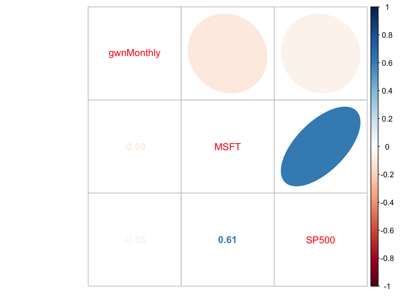
Figure 5.27: Correlation plot created with corrplot().
The color scheme shows the magnitudes of the correlations (blue for positive and red for negative) and the orientation of the ellipses show the magnitude and direction of the linear associations.
\(\blacksquare\)
5.3.3 Sample cross-lag covariances and correlations
The dynamic interactions between two observed time series \(\{x_{t}\}_{t=1}^{T}\)and \(\{y_{t}\}_{t=1}^{T}\) can be measured using the sample cross-lag covariances and correlations
\[\begin{align*} \hat{\gamma}_{xy}^{k} & =\widehat{cov}(X_{t},Y_{t-k}),\\ \hat{\rho}_{xy}^{k} & =\widehat{corr}(X_{t},Y_{t-k})=\frac{\hat{\gamma}_{xy}^{k}}{\sqrt{\hat{\sigma}_{x}^{2}\hat{\sigma}_{y}^{2}}}. \end{align*}\] When more than two data series are being analyzed, all pairwise cross-lag sample covariances and sample correlations can be computed at once using matrix algebra. For a time series of \(N\) data series \(\{\mathbf{x}_{t}\}_{t=1}^{T},\) where \(\mathbf{x}_{t}=(x_{1t},\ldots,x_{Nt})^{\prime},\) the sample lag \(k\) cross-lag covariance and correlation matrices are computed using: \[\begin{eqnarray} \hat{\Gamma}_{k} & = & \frac{1}{T-1}\sum_{t=k+1}^{T}(\mathbf{x}_{t}-\hat{\mu})(\mathbf{x}_{t-k}-\hat{\mu})^{\prime},\tag{5.14}\\ \hat{\mathbf{C}}_{k} & = & \hat{\mathbf{D}}^{-1}\hat{\Gamma}_{k}\hat{\mathbf{D}}^{-1},\tag{5.15} \end{eqnarray}\] where \(\hat{\mathbf{D}}\) is defined in (5.12).
Consider computing the cross-lag covariance and correlation matrices
(5.14) and (5.15) for \(k=0,1,\ldots,5\)
between Microsoft and S&P 500 monthly returns. These matrices may
be computed using the R function acf() as follows:
Ghat = acf(coredata(msftSp500MonthlyRetS), type="covariance",
           lag.max=5, plot=FALSE)
Chat = acf(coredata(msftSp500MonthlyRetS), type="correlation",
           lag.max=5, plot=FALSE)
names(Ghat)
## [1] "acf" "type" "n.used" "lag" "series" "snames"Here, Ghat and Chat are objects of class "acf"
for which there are print and plot methods. The acf components
of Ghat and Chat are 3-dimensional arrays containing
the cross lag matrices (5.14) and (5.15),
respectively. For example, to extract \(\hat{\mathbf{C}}_{0}\) and
\(\hat{\mathbf{C}}_{1}\) use:
##       [,1]  [,2]
## [1,] 1.000 0.614
## [2,] 0.614 1.000## [,1] [,2]
## [1,] -0.1931 -0.0135
## [2,] -0.0307 0.1232The print method shows the sample autocorrelations of each variable as well as the pairwise cross-lag correlations:
##
## Autocorrelations of series 'coredata(msftSp500MonthlyRetS)', by lag
##
## , , MSFT
##
##  MSFT        SP500
##   1.000 ( 0)  0.614 ( 0)
##  -0.193 ( 1) -0.031 (-1)
##  -0.114 ( 2) -0.070 (-2)
##   0.193 ( 3)  0.137 (-3)
##  -0.139 ( 4) -0.030 (-4)
##  -0.023 ( 5)  0.032 (-5)
##
## , , SP500
##
##  MSFT        SP500
##   0.614 ( 0)  1.000 ( 0)
##  -0.014 ( 1)  0.123 ( 1)
##  -0.043 ( 2) -0.074 ( 2)
##   0.112 ( 3)  0.101 ( 3)
##  -0.105 ( 4)  0.073 ( 4)
##  -0.055 ( 5) -0.010 ( 5)
These values can also be visualized using the plot method:
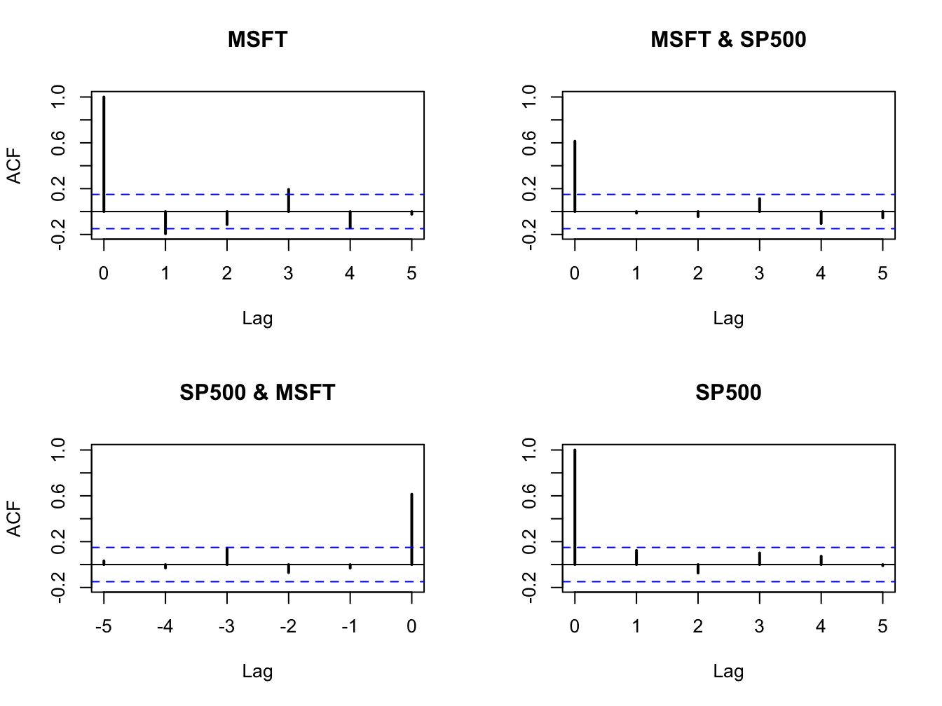
Figure 5.28: Sample cross-lag correlations between Microsoft and S&P 500 returns.
Figure 5.28 shows the resulting four-panel plot. The top-left and bottom-right (diagonal) panels give the SACFs for Microsoft and S&P 500 returns. The top-right plot gives the cross-lag correlations \(\hat{\rho}_{msft,sp500}^{k}\) for \(k=0,1,\ldots,5\) and the bottom-left panel gives the cross-lag correlations \(\hat{\rho}_{sp500,msft}^{k}\) for \(k=0,1,\ldots,5\). The plots show no evidence of any dynamic feedback between the return series.
\(\blacksquare\)
5.4 Rolling descriptive statistics
The assumption that asset returns are covariance stationary implies that the asset return means (\(\mu_i\)), variances (\(\sigma_i^2\)), covariances (\(\sigma_{ij}\)), and correlations (\(\rho_{ij}\)) are constant over time for all assets \(i\) and \(j\). Essentially, this means that the economic environment remains constant over time. Clearly, this is a strong assumption and we have seen evidence in the graphical descriptive statistics that this assumption might be suspect. For example, we have seen that the volatility of asset returns appears to change over time. In this section, we introduce rolling descriptive statistics to further investigate the appropriateness of the covariance stationary assumption of asset returns.
A commonly used technique to investigate whether certain asset return characteristics are constant over time is to compute sample descriptive statistics over rolling sub-sample windows of fixed length. To illustrate, suppose one is interested in determining if the expected return parameter of an asset return \(\mu\) is constant over time. Assume returns are observed over a sample of size \(T\). An informal way to do this is to compute estimates of \(\mu\) over rolling windows of length \(n<T\):
\[\begin{align*} \hat{\mu}_{t}(n) & =\frac{1}{n}\sum_{k=0}^{n-1}r_{t-k}=\frac{1}{n}(r_{t}+r_{t-1}+\cdots+r_{t-n+1}), \end{align*}\]
for \(t=n,\ldots,T\). Here \(\hat{\mu}_{n}(n)\) is the sample mean of the returns \(\{r_{t}\}_{t=1}^{n}\) over the first sub-sample window of size \(n\). Then \(\hat{\mu}_{n+1}(n)\) is the sample mean of the returns \(\{r_{t}\}_{t=2}^{n+1}\) over the second sub-sample window of size \(n\). Continuing in this fashion we roll the sample window forward one observation at a time and compute \(\hat{\mu}_{t}(n)\) until we arrive at the last sub-sample window of size \(n\). The end result is \(T-n+1\) rolling estimates \(\left\{\hat{\mu}_{n}(n),\,\hat{\mu}_{n+1}(n),\ldots,\hat{\mu}_{T}(n)\right\}\).
If returns are covariance stationary then \(\mu\) is constant over time and we would expect that \(\hat{\mu}_{n}(n)\approx\hat{\mu}_{n+1}(n)\approx\cdots\approx\hat{\mu}_{T}(n)\). That is, the estimates of \(\mu\) over each rolling window should be similar. We would not expect them to be exactly equal due to sampling uncertainty but they should not be drastically different. In contrast, if returns are not covariance stationary due to time variation in \(\mu\) then we would expect to see meaningful time variation in the rolling estimates \(\left\{\hat{\mu}_{n}(n),\,\hat{\mu}_{n+1}(n),\ldots,\hat{\mu}_{T}(n)\right\}\).
A natural way to see the time variation in \(\{\hat{\mu}_{t}(n)\}_{t=n}^T\) is to make a time series plot of these rolling estimates as illustrated in the next example.
Consider computing rolling estimates of \(\mu\) for Microsoft, Starbucks
and the S&P 500 index returns. You can easily do this using the zoo
function rollapply(), which applies a user-specified function
to a time series over rolling windows of fixed size. The arguments
to rollapply() are:
## function (data, width, FUN, ..., by = 1, by.column = TRUE, fill = if (na.pad) NA,
##     na.pad = FALSE, partial = FALSE, align = c("center", "left",
##         "right"), coredata = TRUE)
## NULL
where data is either a "zoo" or "xts" object, width is the window width, FUN is the R
function to be applied over the rolling windows, ... are any optional arguments to be supplied to FUN, by
specifies how many observations to increment the rolling windows, by.column specifies if FUN is to be applied to each
column of data or to be applied to all columns of data, and align specifies the location of the time index in the window. The function returns an “xts/zoo” object containing the rolling estimates.
For example, to compute 24-month rolling estimates of \(\mu\) for Microsoft, S&P 500 index, and simulated GWN data (that matches the mean and volatility of Microsoft returns), incremented by one month with the time index aligned to the end of the window use:
roll.data = merge(msftMonthlyRetS,sp500MonthlyRetS,gwnMonthly)
colnames(roll.data) = c("MSFT", "SP500", "GWN")
roll.muhat = rollapply(roll.data, width=24, by=1, by.column=TRUE,
                       FUN=mean, align="right")
class(roll.muhat)
## [1] "xts" "zoo"The object roll.muhat is an “xts” object with three columns giving the rolling mean estimates for the GWN data, Microsoft, and the S&P 500 index. The first 23 months of data are NA as we need at least 24 months of data to compute the first rolling estimates:
##          MSFT SP500 GWN
## Feb 1998   NA    NA  NA
## Mar 1998   NA    NA  NA
## Apr 1998   NA    NA  NA
The first rolling estimates are for the 24-months just prior to January, 2000 and the last rolling estimates are for the 24-months just prior to May 2012.
##            MSFT  SP500       GWN
## Jan 2000 0.0487 0.0161 -1.68e-03
## Feb 2000 0.0394 0.0124 -9.85e-05
## Mar 2000 0.0450 0.0143 1.39e-02## MSFT SP500 GWN
## Mar 2012 0.00869 0.00894 -0.0307
## Apr 2012 0.00661 0.00801 -0.0324
## May 2012 0.00948 0.00882 -0.0298The rolling means are shown in Figure 5.29 created using:
plot(roll.muhat, main="", multi.panel=FALSE, lwd=2,
     col=c("black", "red", "green"), lty=c("solid", "solid", "solid"),
     major.ticks="years", grid.ticks.on="years",
     legend.loc = "topright")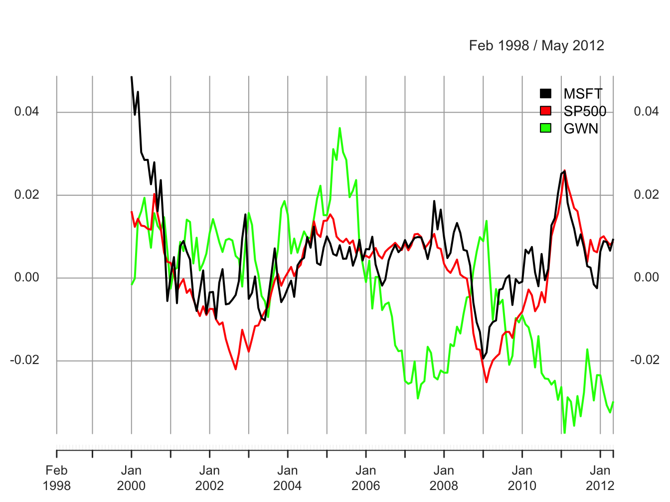
Figure 5.29: 24-month rolling estimates of \(\mu\)
All of the rolling estimates show time variation over the sample, including the simulated GWN returns which have a constant mean by construction. The ranges of the rolling estimates are:
##        MSFT   SP500     GWN
## Min -0.0194 -0.0251 -0.0376
## Max  0.0487  0.0260  0.0362
Interestingly, the rolling estimates for Microsoft and the S&P 500 index exhibit a similar pattern of time variation. The estimates start positive at the end of the dot-com boom, decrease from 2000 to mid 2002 (Microsoft and the S&P 500 index become negative), increase from 2003 to 2006 during the booming economy, fall sharply during the financial crisis period 2007 to 2009, and increase from 2009 to 2011, and decrease afterward. The Microsoft and S&P 500 estimates follow each other very closely due to their moderately strong positive correlation of 0.614. Somewhat surprisingly, the rolling means for the simulated GWN data also show substantial time variation over the sample. Since the true mean of the simulated GWN data is constant, the variation observed in the rolling means represents sampling uncertainty due to the small sample sizes of the rolling means. The magnitude of the variation in the rolling mean estimates for the GWN data should make us pause in concluding there is substantial change in the mean estimates of Microsoft (and possibly the S&P 500). However, the fact that the rolling estimates for Microsoft and the S&P 500 index behave as expected during the booms and busts strongly suggests that the underlying mean values for these assets are not constant over the full sample.
\(\blacksquare\)
To investigate time variation in return volatility, we can compute rolling estimates of \(\sigma^{2}\) and \(\sigma\) over fixed windows of size \(n<T\): \[\begin{align*} \hat{\sigma}_{t}^{2}(n) & =\frac{1}{n-1}\sum_{k=0}^{n-1}(r_{t-k}-\hat{\mu}_{t}(n))^{2},\\ \hat{\sigma}_{t}(n) & =\sqrt{\hat{\sigma}_{t}^{2}(n)}. \end{align*}\] If return volatility is constant over time, then we would expect that \(\hat{\sigma}_{n}(n)\approx\hat{\sigma}_{n+1}(n)\approx\cdots\approx\hat{\sigma}_{T}(n)\). That is, the estimates of \(\sigma\) over each rolling window should be similar. In contrast, if volatility is not constant over time then we would expect to see meaningful time variation in the rolling estimates \(\left\{\hat{\sigma}_{n}(n),\,\hat{\sigma}_{n+1}(n),\ldots,\hat{\sigma}_{T}(n)\right\}\).
To compute and plot 24-month rolling estimates of \(\sigma\) for Microsoft, S&P 500 index, and GWN returns incremented by one month with the time index aligned to the beginning of the window use:
The rolling estimates are illustrated in Figure 5.30.
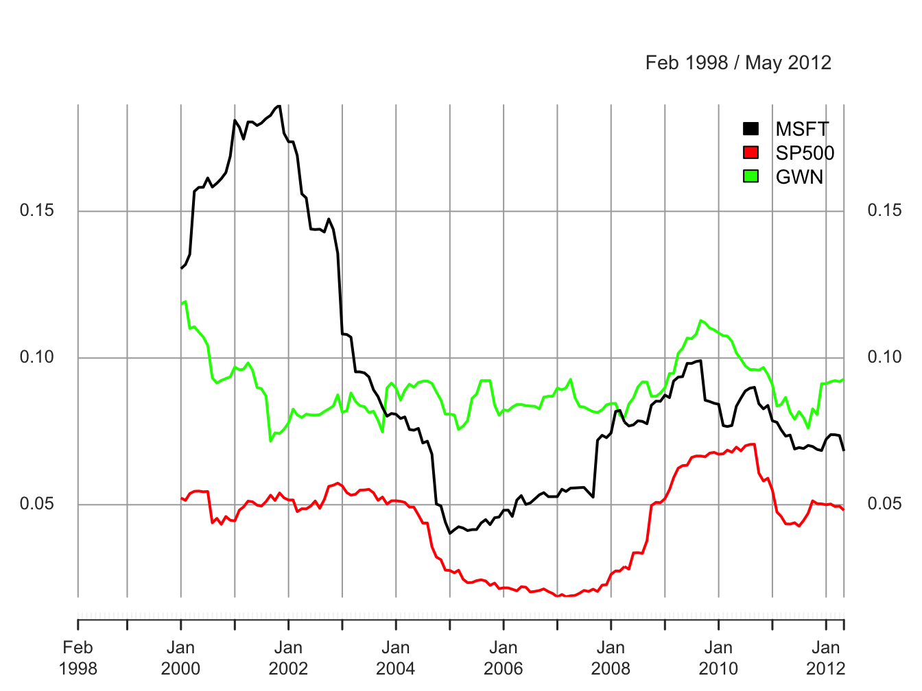
Figure 5.30: 24-month rolling estimates of \(\sigma\).
The rolling volatilities for Microsoft and the S&P 500 index show a similar pattern of time variation over the sample but the Microsoft volatilities are considerably more variable:
##       MSFT  SP500    GWN
## Min 0.0402 0.0186 0.0716
## Max 0.1863 0.0706 0.1192
The rolling volatilities for Microsoft peak at about \(18\%\) per month at the end of the dot-com boom, fall sharply to about \(4\%\) per month at the beginning of 2005, then level off until the beginning of the financial crisis, and increase during the financial crisis to about \(10\%\) per month and fall slightly afterward. The S&P 500 volatilities have a similar pattern as the Microsoft volatilities but their movements are not as extreme. In contrast, the rolling volatilities of the GWN series are fairly stable bouncing between \(7\%\) and \(12\%\). The time variation exhibited by the rolling volatilities of Microsoft and the S&P 500 index places additional doubt on the covariance stationarity assumption for returns.
\(\blacksquare\)
To investigate time variation in the correlation between two asset returns, \(\rho_{ij}\), one can compute the rolling covariances and correlations over fixed windows of size \(n<T\): \[\begin{align*} \hat{\sigma}_{ij,t}(n) & =\frac{1}{n-1}\sum_{k=0}^{n-1}(r_{i,t-k}-\hat{\mu}_{i}(n))(r_{j,t-k}-\hat{\mu}_{j}(n)),\\ \hat{\rho}_{ij,t}(n) & =\frac{\hat{\sigma}_{ij,t}(n)}{\hat{\sigma}_{i,t}(n)\hat{\sigma}_{j,t}(n)}. \end{align*}\]
A function to compute the pair-wise sample correlations between Microsoft, Starbucks and the S&P 500 index is
rhohat = function(x) {
   corhat = cor(x)
   corhat.vals = corhat[lower.tri(corhat)]
   names(corhat.vals) = c("MSFT.SP500", "MSFT.GWN", "SP500.GWN")
   corhat.vals
}
Using the function rhohat(), 24-month rolling estimates of
\(\rho_{ij}\) for Microsoft, Starbucks and the S&P 500 index incremented
by one month with the time index aligned to the beginning of the window
can be computed using
roll.rhohat = rollapply(roll.data, width=24, FUN=rhohat,
   by=1, by.column=FALSE, align="right")
head(na.omit(roll.rhohat),n=3)
## MSFT.SP500 MSFT.GWN SP500.GWN
## Jan 2000 0.638 0.392 0.278
## Feb 2000 0.637 0.345 0.244
## Mar 2000 0.663 0.415 0.377Notice that by.column=FALSE in the call to rollapply().
This is necessary as the function rhohat() operates on all
columns of the data object roll.data. The rolling estimates
are illustrated in Figure 5.31.
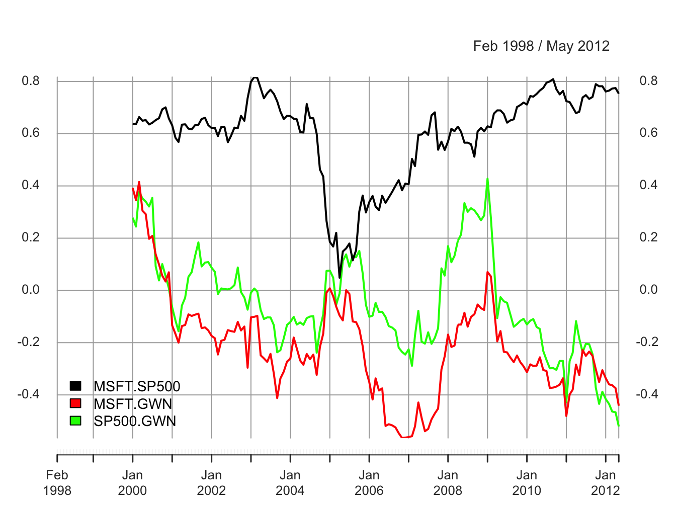
Figure 5.31: 24-month rolling estimates of \(\rho_{ij}\) for Microsoft, Starbucks and the S&P 500 index.
The ranges of the rolling correlations are:
##     MSFT.SP500 MSFT.GWN SP500.GWN
## Min     0.0487   -0.565    -0.521
## Max     0.8169    0.415     0.428
The rolling correlations between Microsoft and the S&P 500 index show an interesting pattern. They start moderately high, around 0.6, then plunge to about 0.05 in early 2005, and then gradually pick back up to about 0.8 at the end of the sample. The rolling correlations are highest during the financial crisis periods and lowest during the calm periods. Interestingly, the rolling correlations between the GWN series and Microsoft, and the GWN series and the S&P 500 index fluctuate somewhat randomly between -0.5 and 0.5 and show no particular pattern. There is compelling evidence that the correlation between Microsoft and the S&P 500 index is not constant over time.
\(\blacksquare\)
It must be kept in mind that the rolling descriptive statistics are informal diagnostics for evaluating the assumption of covariance stationarity. As we have seen, there is considerably sampling variability in the rolling statistics due to the small window size which can make it difficult to untangle statistical noise from true changes in the underlying parameters. In Chapter 9 we will consider formal statistical tests for constant parameters that can give better evidence for or against the assumption of covariance stationarity.
5.4.1 Practical issues associated with rolling estimates
To be completed
- Discuss choice of window width. Small window widths tend to produce choppy estimates with a lot of estimation error. Large window widths produce smooth estimates with less estimation error
- Discuss choice of increment. For a given window width, the roll-by increment determines the number of overlapping returns in each window. Number of overlapping returns is \(n-incr\) where \(n\) is the window width and \(incr\) is the roll-by increment. Incrementing the window by 1 gives the largest number of over lapping returns. If \(incr\geq n\) then the rolling windows are non-overlapping.
- A large positive or negative return in a window can greatly influence the estimate and cause a drop-off effect as the window rolls past the large observation.
5.5 Stylized facts for daily and monthly asset returns
A stylized fact is something that is generally true but not always. From the data analysis of the daily and monthly returns on Microsoft and the S&P 500 index we observe a number of stylized facts that tend to be true for other individual assets and portfolios of assets. For monthly data we observe the following stylized facts:
- M1. Prices appear to be random walk non-stationary and returns appear to be mostly covariance stationary. There is evidence that return volatility changes over time.
- M2. Returns appear to be approximately normally distributed. There is some negative skewness and excess kurtosis.
- M3. Assets that have high average returns tend to have high standard deviations (volatilities) and vice-versa. This is the no free lunch principle.
- M4. Returns on individual assets (stocks) have higher standard deviations than returns on diversified portfolios of assets (stocks).
- M5. Returns on different assets tend to be positively correlated. It is unusual for returns on different assets to be negatively correlated.
- M6. Returns are approximately uncorrelated over time. That is, there is little evidence of linear time dependence in asset returns. 7. M7. Returns do not exhibit dynamic feedback. That is, there are no strong lead-lag effects between pairs of returns.
- M8 There is some informal evidence of non-constant volatilities and correlations, particularly during financial crisis periods.
Daily returns have some features in common with monthly returns and some not. The common features are M1 and M3-M7 above. The stylized facts that are specific to daily returns are:
- D2. Returns are not normally distributed. Empirical distributions have much fatter tails than the normal distribution (excess kurtosis).
- D7. Returns are not independent over time. Absolute and squared returns are positively auto correlated and the correlation dies out very slowly. Volatility appears to be auto correlated and, hence, predictable.
These stylized facts of daily and monthly asset returns are the main features of returns that models of assets returns should capture. A good model is one that can explain many stylized facts of the data. A bad model does not capture important stylized facts.
5.6 Further Reading: Descriptive Statistics
(Fama 1976) is the first book that provides a comprehensive descriptive statistical analysis of asset returns. Much of the material in this chapter, and this book, is motivated by Fama’s book. Several recent textbooks discuss exploratory data analysis of finance time series. This discussion in this chapter is similar to that presented in (Carmona 2014), (Jondeau, Poon, and Rockinger 2007), (Ruppert and Matteson 2015), (Tsay 2010), (Tsay 2014), and (Zivot 2016).
Mention books by Carol Alexander
Mention R packages for descriptive statistics: dataExplorer,
5.7 Problems: Descriptive Statistics
autoplot()
- Downloading data and return calculations.
- Use the tseries function
get.hist.quote()to download from Yahoo! the monthly adjusted closing prices on VBLTX, FMAGX and SBUX over the period 1998-01-01 through 2009-12-31. Download these prices as"zoo"objects. - Use the PerformanceAnalytics function
Return.calculate()to compute continuously compounded monthly returns and remove the first NA observation.
- Use the tseries function
- Univariate graphical analysis.
- Make time plots of the return data using the zoo function
plot.zoo(). Comment on any relationships between the returns suggested by the plots. Pay particular attention to the behavior of returns toward the end of 2008 at the beginning of the financial crisis. - Make a equity curve/cumulative return plot (future of $1 invested in each asset) and comment. Which assets gave the best and worst future values over the investment horizon?
- For each return series, use the IntroCompFinR function
fourPanelPlot()to make a four-panel plot containing a histogram, boxplot, normal QQ-plot, and SACF plot. Do the return series look normally distributed? Briefly compare the return distributions. Do you see any evidence of time dependence in the returns?
- Make time plots of the return data using the zoo function
- Univariate numerical summary statistics and historical VaR.
- Compute numerical descriptive statistics for all assets using the R functions
summary(),mean(),var(),stdev(), and the PerformanceAnalytics functionsskewness()andkurtosis(). Compare and contrast the descriptive statistics for the three assets. Which asset appears to be the riskiest asset? - Using the mean monthly return for each asset, compute an estimate of the annual continuously compounded return (i.e., recall the relationship between the expected monthly cc return and the expected annual cc return). Convert this annual continuously compounded return into a simple annual return. Are there any surprises?
- Using the estimate of the monthly return standard deviation for each asset, compute an estimate of the annual return standard deviation. Briefly comment on the magnitude of the annual standard deviations.
- For each asset compute the empirical 1% and 5% quantiles of the cc returns. Using these quantiles compute the 1% and 5% historical (monthly) VaR values based on an initial $100,000 investment. Which asset has the highest and lowest VaR values? Are you surprised?
- Compute numerical descriptive statistics for all assets using the R functions
- Bivariate graphical analysis and numerical summary statistics
- Use the R
pairs()function to create all pair-wise scatterplots of returns Comment on the direction and strength of the linear relationships in these plots. - Use the corrplot functions
corrplot()andcorrplot.mixed()to plot the correlation matrix of the returns on the three assets. - Use the R functions
var(),cov(), andcor()to compute the sample covariance matrix and sample correlation matrix of the returns. Comment on the direction and strength of the linear relationships suggested by the values of the covariances and correlations.
- Use the R
VangardPrices and
the daily prices for AMZN are in the IntroCompFinR object
.
- Compute simple monthly returns on AMZN and VFINX and plot these returns together in a single plot. Do the monthly returns from the two assets look like realizations from a covariance stationary stochastic process? Why or why not?
- Compare and contrast the return characteristics of the two assets. In addition, comment on any common features, if any, of the two return series.
- Plot the cumulative simple returns (equity curve) for each fund, which represents the growth of $1 invested in each fund over the sample period, and plot these returns in the same graph. Which fund performed better over the sample?
- Using the IntroCompFinR function
fourPanelPlot(), create descriptive statistics plots for each asset. In addition, compute Based on statistics, do the returns on VFINX and AMZN look normally distributed? Is there any evidence of linear time dependence? Briefly justify your answer. - Which asset appears to be riskier? Briefly justify your answer.
Exercise 5.6 (Descriptive statistics for weekly data) * Create weekly time series for MSFT, SP500
Repeat graphical and numerical descriptive statistics
Deduce stylized facts for weekly data
Exercise 5.8
library(IntroCompFinR)
library(corrplot)
library(PerformanceAnalytics)
library(xts)
options(digits = 3)
Sys.setenv(TZ="UTC")
Loading data and computing returns
Load the daily price data from IntroCompFinR, and create monthly returns over the period Jan 1998 through Dec 2014:
data(amznDailyPrices, baDailyPrices, costDailyPrices, jwnDailyPrices, sbuxDailyPrices)
fiveStocks = merge(amznDailyPrices, baDailyPrices, costDailyPrices, jwnDailyPrices, sbuxDailyPrices)
fiveStocks = to.monthly(fiveStocks, OHLC=FALSE)
## Warning in to.period(x, "months", indexAt = indexAt, name =
## name, ...): missing values removed from dataLet’s look at the data
##          AMZN   BA COST  JWN SBUX
## Jan 1998 4.92 34.0 17.4  9.4 4.24
## Feb 1998 6.42 38.9 19.6 10.6 4.59
## Mar 1998 7.13 37.4 21.4 11.8 5.25## AMZN BA COST JWN SBUX
## Oct 2014 305 123 128 72 75.0
## Nov 2014 339 134 137 76 80.9
## Dec 2014 310 129 137 79 81.8Next, let’s compute monthly simple returns using the PerformanceAnalytics function Return.Calculate()
##            AMZN      BA   COST    JWN   SBUX
## Feb 1998 0.3049  0.1425 0.1267 0.1298 0.0825
## Mar 1998 0.1106 -0.0393 0.0920 0.1121 0.1438
## Apr 1998 0.0729 -0.0396 0.0468 0.0262 0.0629
We removed the missing January return using the function na.omit().
Part I: Univariate Graphical Analysis
Make time plots of the return data using the zoo function
plot.zoo(). Comment on any relationships between the returns suggested by the plots.Make a cumulative return plot (equity curve) showing the future value of $1 invested in each asset. Which assets gave the best and worst future values over the investment horizon? Hint: you can use the
cumprod()function or the PerformanceAnalytics functionchart.CumReturns().For each return series, make a four panel plot containing a histogram, boxplot, normal QQ-plot and SACF. Do the return series look normally distributed? Is there any evidence of time dependence? Briefly compare the return distributions. Hint: the
fourPanelPlot()function only works on one asset at a time. So call the function for each asset. For example,fourPanelPlot(fiveStocksRet[, "AMZN])
Part II: Univariate Numerical Summaries
Compute numerical descriptive statistics for all assets using the R functions
mean(),var(),stdev(), and the PerformanceAnalytics functionsskewness()andkurtosis(). Compare and contrast the descriptive statistics for the five assets. Which asset appears to be the riskiest asset?Using the monthly mean return for each asset, compute an estimate of the mean annual return. Hint: use the square root of time rule for cc returns. (The square root of time rule is exact for continuously compounded returns but can be applied as an approximation to simple returns.)
Using the monthly return standard deviation for each asset, compute an estimate of the annual return standard deviation. Hint: use the square root of time rule for cc returns. (The square root of time rule is exact for continuously compounded returns but can be applied as an approximation to simple returns.)
Part III: Historical VaR
- For each asset compute the empirical \(1\%\) and \(5\%\) quantiles of the returns. Using these quantiles compute the \(1\%\) and \(5\%\) historical (monthly) VaR values based on an initial $100,000 investment. Which asset has the highest and lowest VaR values? Are you surprised?
Part IV. Bivariate Graphical Analysis
Use the
pairs()function to create all pair-wise scatter plots of returns. Comment on the direction and strength of the linear relationships in these plots.Use the corrplot function
corrplot.mixed()to plot the correlation matrix of the returns on the five assets. Comment on what you see.
Part V. Bivariate Numerical Summary Statistics
Use the R functions cov(), and cor() to compute the sample covariance matrix and sample correlation matrix of the returns. Comment on the direction and strength of the linear relationships suggested by the values of the covariances and correlations.
Part VI. Stylized Facts
- Based on your analysis of the five Northwest stocks, what stylized facts do you see?
5.8 Solutions to Selected Problems
5.8.1 Exercise 5.8
Load packages and set options:
suppressPackageStartupMessages(library(IntroCompFinR))
suppressPackageStartupMessages(library(corrplot))
suppressPackageStartupMessages(library(PerformanceAnalytics))
suppressPackageStartupMessages(library(xts))
suppressPackageStartupMessages(library(knitr))
options(digits = 3)
Sys.setenv(TZ="UTC")
Load the daily price data from IntroCompFinR, and create monthly returns over the period Jan 1998 through Dec 2014:
data(amznDailyPrices, baDailyPrices, costDailyPrices, jwnDailyPrices, sbuxDailyPrices)
fiveStocks = merge(amznDailyPrices, baDailyPrices, costDailyPrices, jwnDailyPrices, sbuxDailyPrices)
fiveStocks = to.monthly(fiveStocks, OHLC=FALSE)
## Warning in to.period(x, "months", indexAt = indexAt, name =
## name, ...): missing values removed from dataLet’s look at the data
##          AMZN   BA COST  JWN SBUX
## Jan 1998 4.92 34.0 17.4  9.4 4.24
## Feb 1998 6.42 38.9 19.6 10.6 4.59
## Mar 1998 7.13 37.4 21.4 11.8 5.25## AMZN BA COST JWN SBUX
## Oct 2014 305 123 128 72 75.0
## Nov 2014 339 134 137 76 80.9
## Dec 2014 310 129 137 79 81.8Next, let’s compute monthly simple returns using the PerformanceAnalytics function Return.Calculate()
##            AMZN      BA   COST    JWN   SBUX
## Feb 1998 0.3049  0.1425 0.1267 0.1298 0.0825
## Mar 1998 0.1106 -0.0393 0.0920 0.1121 0.1438
## Apr 1998 0.0729 -0.0396 0.0468 0.0262 0.0629
We removed the missing January return using the function na.omit().
Part I: Univariate Graphical Analysis:
- Make time plots of the return data using the zoo function
plot.zoo(). Comment on any relationships between the returns suggested by the plots.
Here we will use a panel function to put horizontal lines at zero for each panel:
Next, use plot.zoo() to create a multi-panel plot of returns
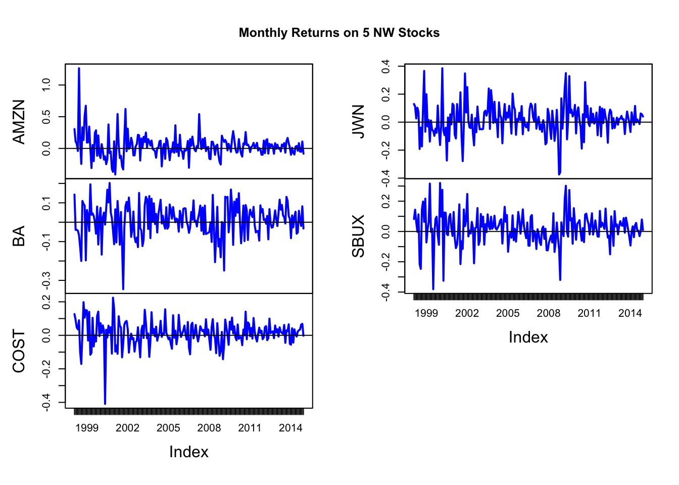
Returns all fluctuate around a mean of about zero and appear to be covariance stationary. AMZN has high volatility early in the sample and low volatility toward the end. Returns on JWN and SBUX look to move quite closely together.
plot.zoo(fiveStocksRet, main="Monthly Returns on 5 NW Stocks",
         plot.type = "single",lwd=2, col=1:5)
legend(x="topright", legend = colnames(fiveStocksRet), lty="solid", col=1:5, lwd=2)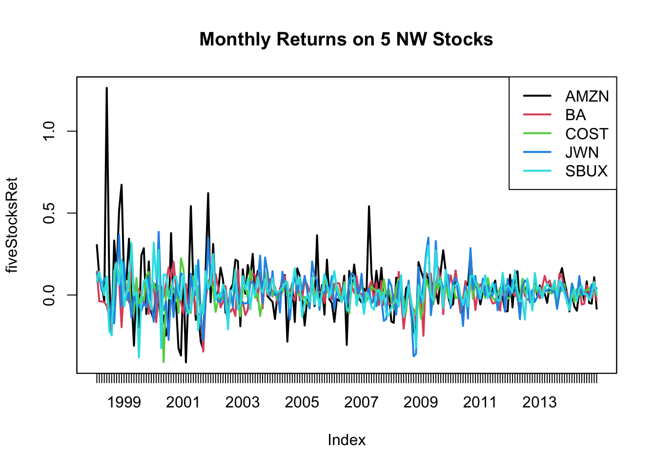
Plotting all stocks together shows that all returns seem to move somewhat together. AMZN seems to have the highest volatility and BN and COST seem to have the lowest volatility.
- Make a cumulative return plot (equity curve) showing the future value of $1 invested in each asset. Which assets gave the best and worst future values over the investment horizon? Hint: you can use the
cumprod()function or the PerformanceAnalytics functionchart.CumReturns().
equityCurves = cumprod(1 + fiveStocksRet)
plot.zoo(equityCurves, plot.type="single", ylab="Cumulative Returns",col=1:5, lwd=2)
legend(x="topleft", legend=colnames(equityCurves),col=1:5, lwd=2)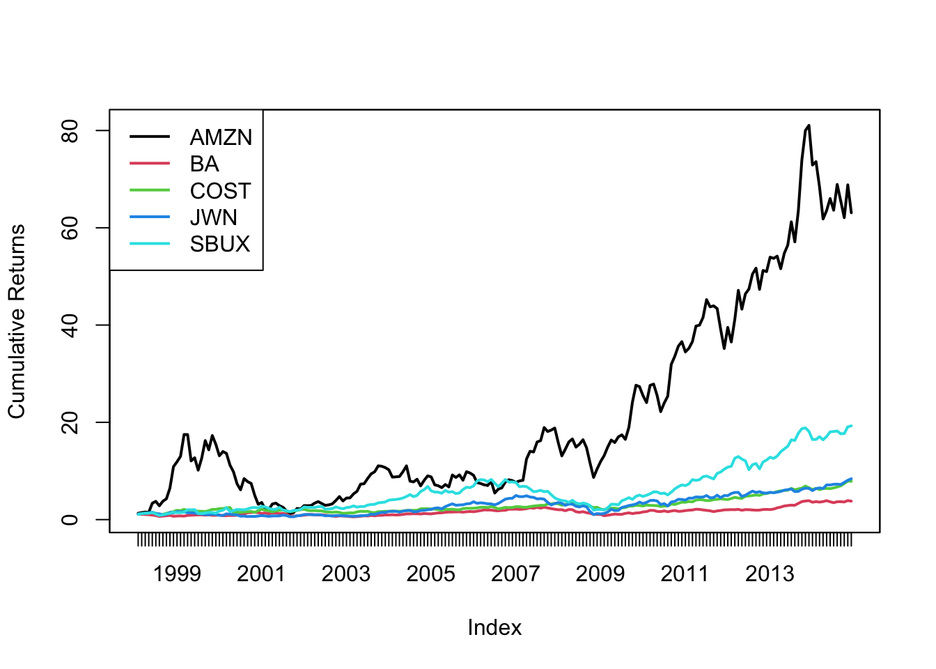 Clearly, AMZN is the best investment. $1 grows to about $65 over the investment horizon. SBUX is 2nd, where $1 grows to about $20. The worst is BA.
- For each return series, make a four panel plot containing a histogram, boxplot, normal QQ-plot and SACF. Do the return series look normally distributed? Is there any evidence of time dependence? Briefly compare the return distributions. Hint: the
fourPanelPlot()function only works on one asset at a time. So call the function for each asset. For example,fourPanelPlot(fiveStocksRet[, "AMZN])
AMZN:
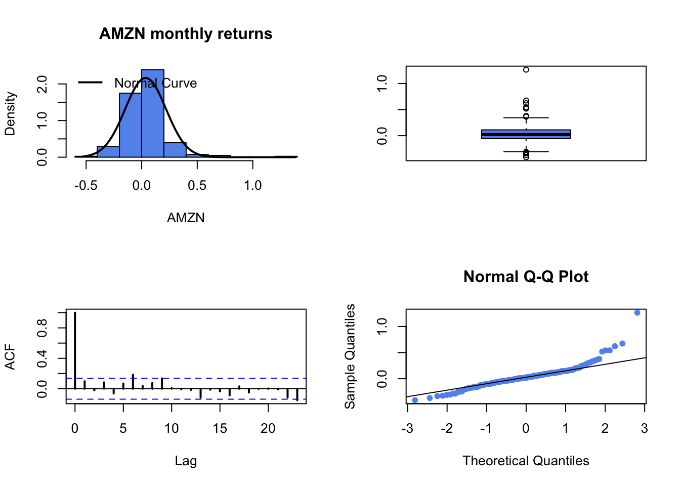 AMZN histogram is a bit asymmetric, showing a right skewness. This is reflected in the both the boxplot and the normal QQ-plot. The monthly returns do not show time dependence. A normal distribution is not great for AMZN.
BA:
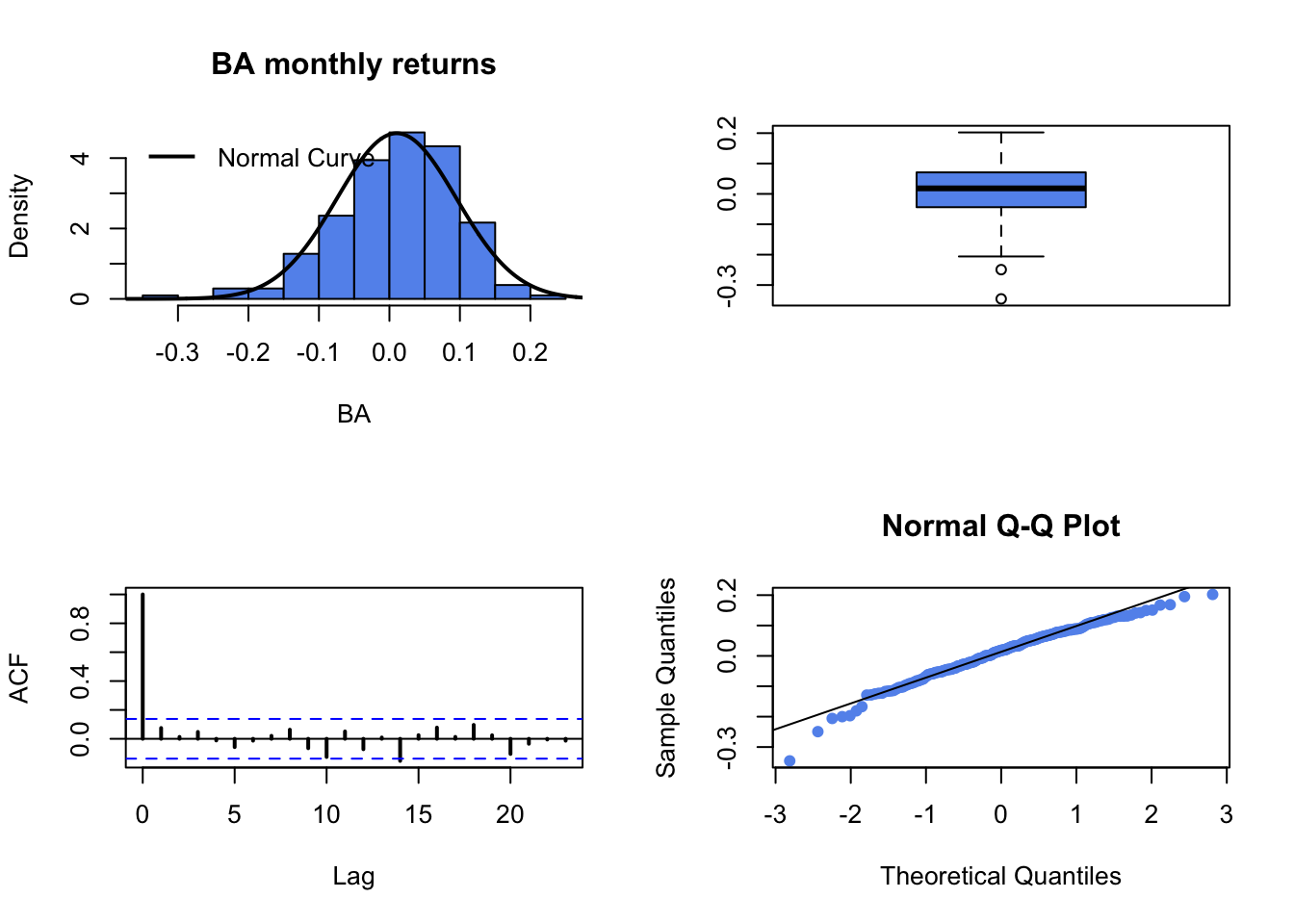
BA histogram, boxplot and normal QQ-plot indicate that a normal distribution is not bad. No time dependence from SACF.
COST:
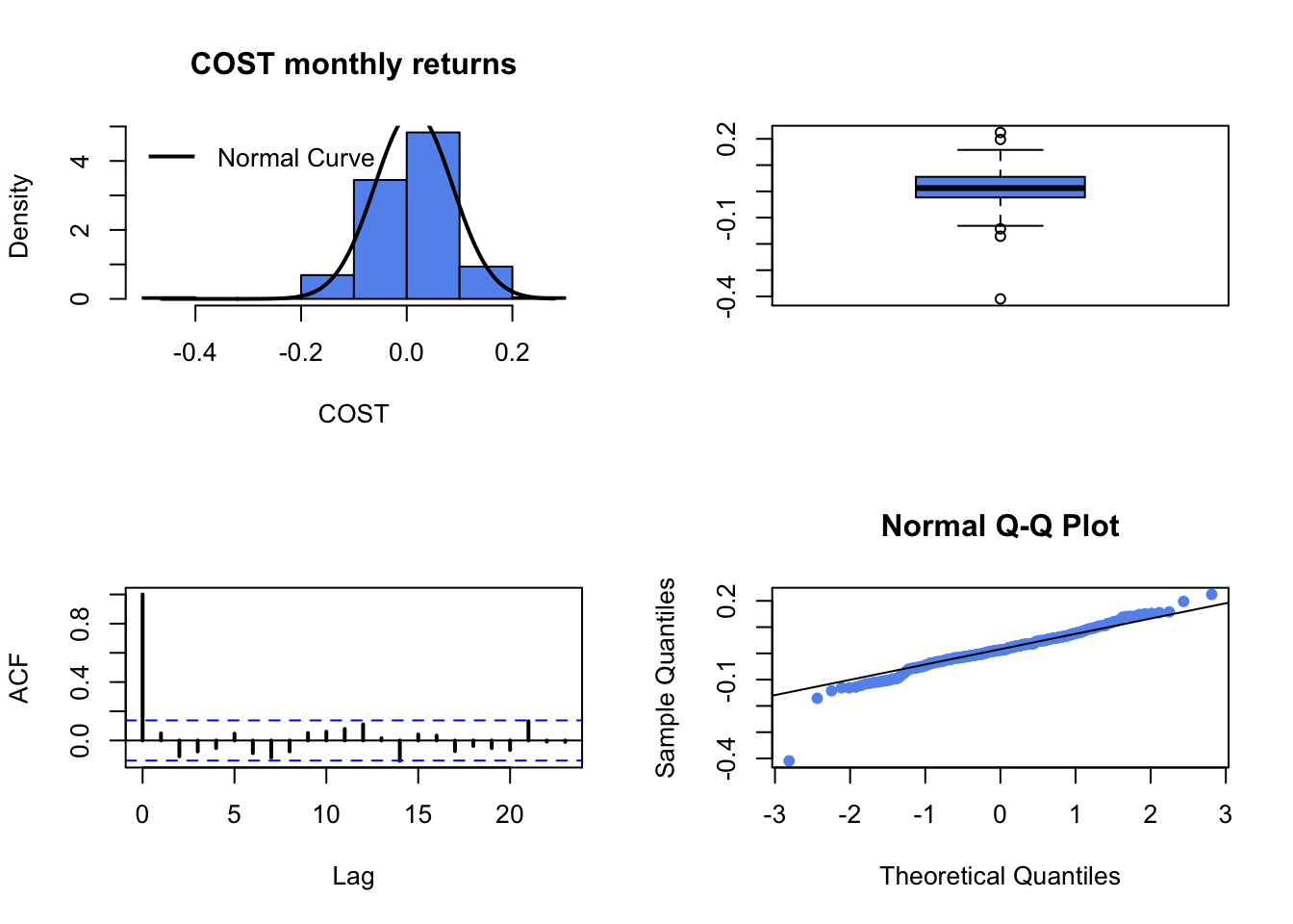
COST histogram, boxplot and normal QQ-plot indicate that a normal distribution is not bad except for one large negative observation. No time dependence from SACF.
JWN:
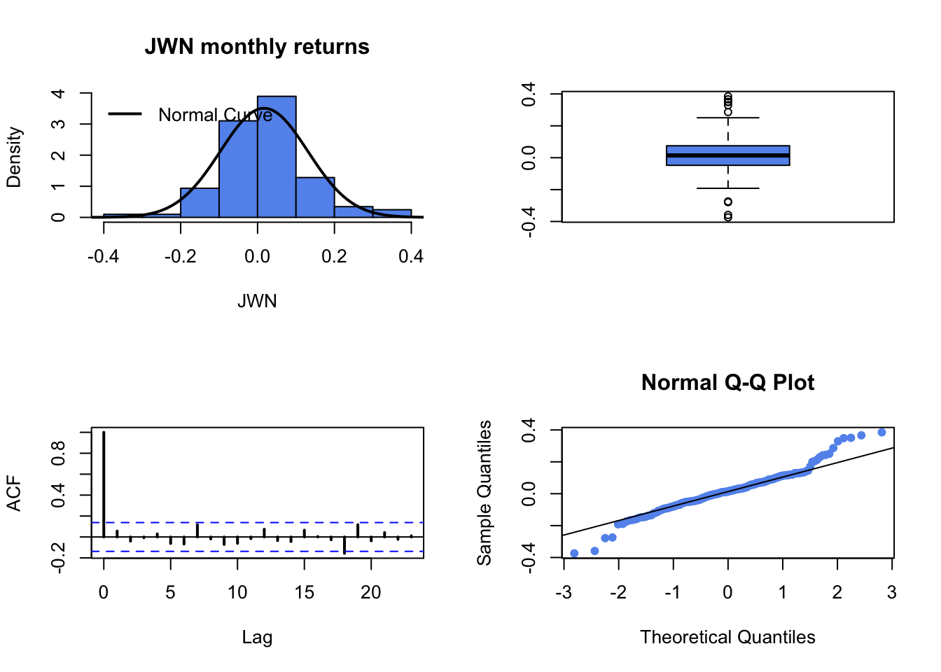
JWN histogram, boxplot and Normal QQ-plot inidate a nice symmetric distribution. Boxplot and QQ-plot show somewhat fat tails.
SBUX:

SBUX histogram, boxplot and Normal QQ-plot inidate a nice symmetric distribution. Boxplot and QQ-plot show somewhat fat tails.
It is also informative to look at the boxplot with all 5 returns:
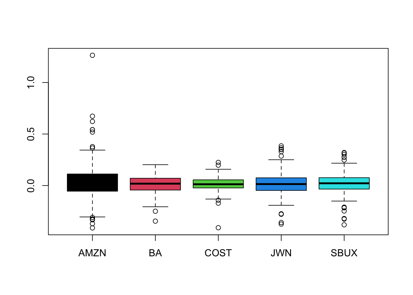
Here we see that distribution for AMZN has the largest spread and the largest positive outliers. COST has the smallest spread.
Part II: Univariate Numerical Summaries
- Compute numerical descriptive statistics for all assets using the R functions
mean(),var(),stdev(), and the PerformanceAnalytics functionsskewness()andkurtosis().
muhat.vals = colMeans(fiveStocksRet)
sd.vals = apply(fiveStocksRet, 2, sd)
skew.vals = apply(fiveStocksRet, 2, skewness)
ekurt.vals = apply(fiveStocksRet, 2, kurtosis)
stats.mat = rbind(muhat.vals,
                  sd.vals,
                  skew.vals,
                  ekurt.vals)
rownames(stats.mat) = c("Mean", "Std Dev", "Skewness",
                        "Excess Kurtosis")
stats.mat
## AMZN BA COST JWN SBUX
## Mean 0.0354 0.0103 0.0130 0.017 0.0201
## Std Dev 0.1845 0.0848 0.0734 0.114 0.1031
## Skewness 1.8421 -0.6375 -0.8488 0.167 -0.3198
## Excess Kurtosis 10.0085 1.0912 4.8161 1.912 2.1383Compare and contrast the descriptive statistics for the five assets. Which asset appears to be the riskiest asset?
plot(sd.vals, muhat.vals, ylab="mean", xlab="volatilty",
     pch=16, col=1:5, cex=1.5, ylim=c(0, 0.04), xlim=c(0, 0.2))
text(sd.vals, muhat.vals, labels=colnames(fiveStocksRet), pos=4)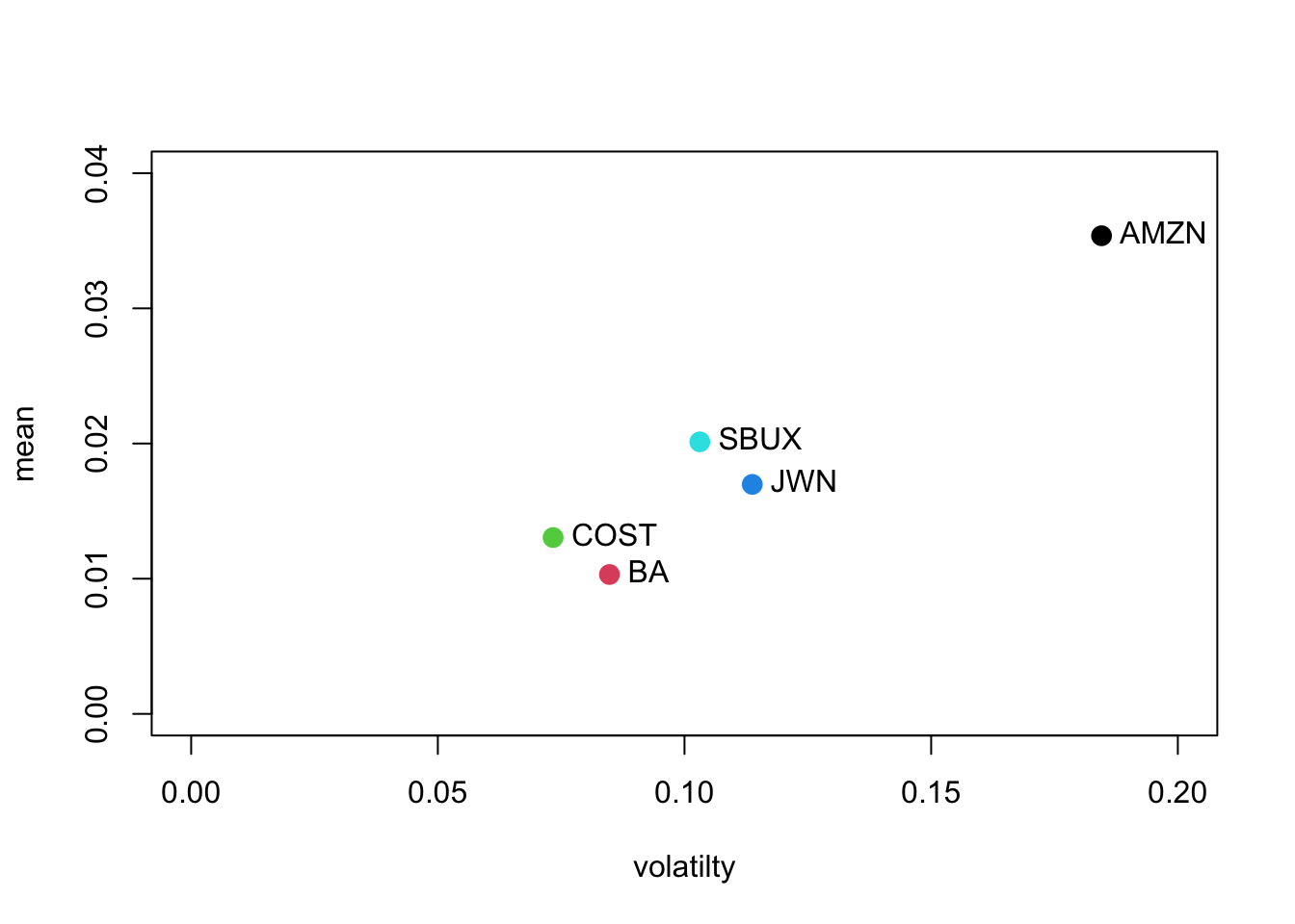
AMZN has the highest mean and volatility. The mean-volatility pairs are similar for BA and COST and for SBUX and JWN. COST has the lowest volatility and BA has the lowest mean.
AMZN’s return distribution is positively skewed whereas the other assets are negatively skewed. AMZN and COST have large excess kurtosis (AMZN is huge), while the others only have moderate excess kurtosis. All distributions have fatter tails than the normal distribution.
- Using the monthly mean return for each asset, compute an estimate of the mean annual return. Hint: use the square root of time rule for cc returns.
##  AMZN    BA  COST   JWN  SBUX
## 0.424 0.124 0.157 0.204 0.241
AMZN’s mean annual is a whopping 42.4%. Both JWN and SBUX have mean annual returns around 20%, and BA and COST are around 13%.
- Using the monthly return standard deviation for each asset, compute an estimate of the annual return standard deviation. Hint: use the square root of time rule for cc returns.
##  AMZN    BA  COST   JWN  SBUX
## 0.639 0.294 0.254 0.394 0.357
AMZN’s annual volatility is also huge at 64%!. The other stocks have volatilities between 25% and 40%.
Part III: Historical VaR
- For each asset compute the empirical \(1\%\) and \(5\%\) quantiles of the returns. Using these quantiles compute the \(1\%\) and \(5\%\) historical (monthly) VaR values based on an initial $100,000 investment. Which asset has the highest and lowest VaR values? Are you surprised?
##      AMZN     BA   COST    JWN   SBUX
## 1% -0.332 -0.206 -0.142 -0.278 -0.319
## 5% -0.241 -0.123 -0.109 -0.151 -0.125
Clearly, AMZN has the largest (in absolute value) lower quantiles. With 5% probability you could lose 24% or more in any given month. COST has the smallest lower quantiles. With With 5% probability you could lose 11% or more in any given month.
For an initial $100,000 investment, the \(1\%\) and \(5\%\) historical (monthly) VaR values are
##      AMZN     BA   COST    JWN   SBUX
## 1% -33209 -20580 -14224 -27848 -31873
## 5% -24146 -12305 -10890 -15073 -12472
AMZN has the largest VaR values, and COST has the lowest. With 5% probability you could lose $24,000 in any month with AMZN and $10,890 in any month with COST.
Part IV. Bivariate Graphical Analysis
- Use the
pairs()function to create all pair-wise scatterplots of returns. Comment on the direction and strength of the linear relationships in these plots.
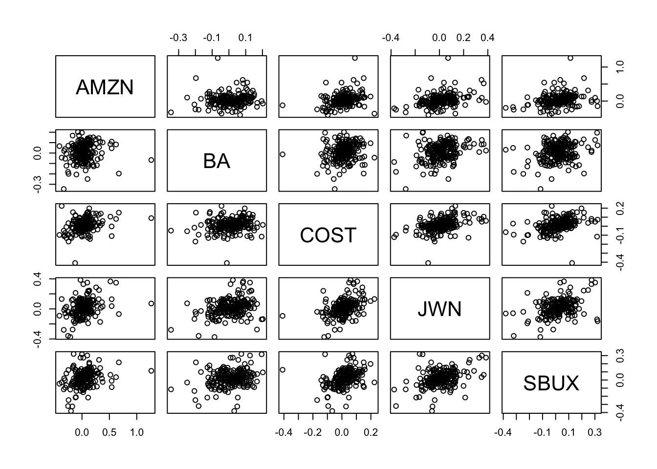
All of the scatterplots have a slight upward tilt indicating positive covariance and moderate to small positive correlations.
- Use the corrplot function
corrplot.mixed()to plot the correlation matrix of the returns on the five assets. Comment on what you see.
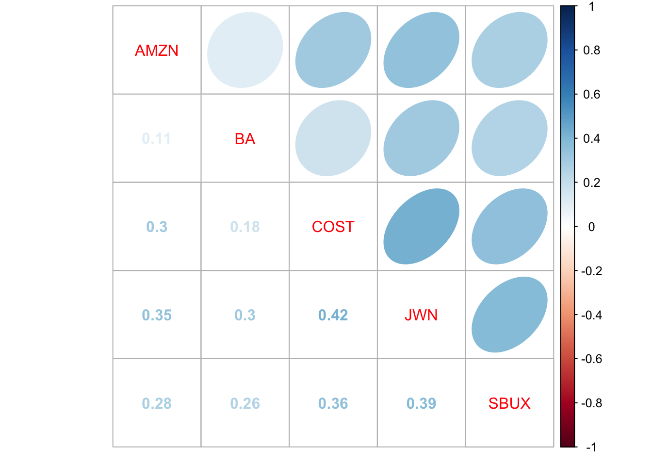
The corrplot shows the correlation matrix visually. The darker the numbers and ellipses, the more positive is the correlation. Here, we see that COST and JWN have the largest correlation at 0.42 and AMZN and BA have the weakest at 0.11.
V. Bivariate Numerical Summary Statistics
Use the R functions cov(), and cor() to compute the sample covariance matrix and sample correlation matrix of the returns. Comment on the direction and strength of the linear relationships suggested by the values of the covariances and correlations.
##         AMZN      BA    COST     JWN    SBUX
## AMZN 0.03405 0.00165 0.00411 0.00731 0.00530
## BA   0.00165 0.00719 0.00111 0.00293 0.00223
## COST 0.00411 0.00111 0.00538 0.00352 0.00270
## JWN  0.00731 0.00293 0.00352 0.01294 0.00455
## SBUX 0.00530 0.00223 0.00270 0.00455 0.01063
All covariances are positive
##       AMZN    BA  COST   JWN  SBUX
## AMZN 1.000 0.106 0.303 0.348 0.278
## BA   0.106 1.000 0.178 0.304 0.255
## COST 0.303 0.178 1.000 0.422 0.357
## JWN  0.348 0.304 0.422 1.000 0.388
## SBUX 0.278 0.255 0.357 0.388 1.000
All correlation are between 0 and 0.5. COST and JWN have the largest correlation at 0.422
- Stylized Facts
- Based on your analysis of the five Northwest stocks, what stylized facts do you see?
Asset returns have mostly symmetric distributions with fatter tails than the normal distribution. Normal distribution assumption is not very well supported in the data
Asset return are uncorrelated over time
References
Carmona, R. 2014. Statistical Analysis of Financial Data in R, Second Edition. New York: Springer.
Fama, E. F. 1976. Foundations of Finance. New York: Basic Books.
Jondeau, E., S.-H. Poon, and M. Rockinger. 2007. Financial Modeling Under Non-Gaussian Distributions. New York: Springer.
Ruppert, D., and D. S. Matteson. 2015. Statistics and Data Analysis for Financial Engineering with R Examples. New York: Springer.
Tsay, R. 2010. Analysis of Financial Time Serie. Wiley.
Tsay, R. 2014. An Introduction to Analysis of Financial Time Series. Wiley.
Zivot, E. 2016. Modeling Financial Time Series with R. New York: Springer.
An adjusted closing price is adjusted for dividend payments and stock splits. Any dividend payment received between closing dates are added to the close price. If a stock split occurs between the closing dates then the all past prices are divided by the split ratio. The ticker symbol
^gspcrefers to the actual S&P 500 index, which is not a tradeable security. There are several mutual funds (e.g., Vanguard’s S&P 500 fund with ticker VFINF) and exchange traded funds (e.g., State Street’s SPDR S&P 500 ETF with ticker SPY) which track the S&P 500 index that are investable.↩︎The returns can still be covariance stationary and exhibit time varying conditional volatility. This is explored in chapter 10.↩︎
There is no unique way to determine the empirical quantile from a sample of size \(N\) for all values of \(\alpha\). The R function
quantile()can compute empirical quantile using one of seven different definitions.↩︎Even with data simulated from a normal distribution, the empirical quantiles in the extreme left and right tails can deviate a bit from the straight line due to estimation error. For this reason, small deviations from linearity in the tails should be ignored.↩︎
The
coredata()function is used to extract the data as a"numeric"object becauseqqPlot()does not work correctly with"zoo"orxtsobjects.↩︎Values with hats,
"^", denote sample estimates of the corresponding population quantity. For example, the sample mean \(\hat{\mu}_{x}\) is the sample estimate of the population expected value \(\mu_{X}\).↩︎If there is only one observation in the sample then it is impossible to create a measure of spread in the sample. You need at least two observations to measure deviations from the sample average. Hence the effective sample size for computing the sample variance is \(T-1\).↩︎
Similar functions are available in the moments package.↩︎
The
coredata()function is used to extract the data from the zoo object becauseboxplot()doesn’t like"xts"or"zoo"objects.↩︎