Chapter 7 Choropleth Maps
7.1 World Maps
The package rnaturalearthcan handle several levels of resolution for geographic data. If you want to make your maps sharper - though a bit heavier for older machines - you can use the scale = "medium" or try scale = "large". For the former, you should also install the package rnaturalearthdata.
Above, we are creating an object called world and getting country shapes with the command ne_countries(). One of the columns in this new data frame is called geometry which is of class sfc_MULTIPOLYGON, sfc. The package sf and its command sf::geom_sf() will use the geometry vector draw our map based on sets of coordinates.
Our world data frame also contains other columns with country-level information such as the country name, regional classification and even income levels.
## [1] "South Asia"                 "Sub-Saharan Africa"
## [3] "Europe & Central Asia"      "Middle East & North Africa"
## [5] "Latin America & Caribbean"  "Antarctica"
## [7] "East Asia & Pacific" "North America"## [1] "5. Low income" "3. Upper middle income"
## [3] "4. Lower middle income" "2. High income: nonOECD"
## [5] "1. High income: OECD"To draw our first map, we use the familiar ggplot2 syntax. Notice that we do not provide x or y aes() parameters since the these exist already in the geometry vector recognized by geom_sf(). Like in any other ggplot, we have an x and a y axis, though in this case the correspond to longitude and latitude. Knowing this, we can use other ggplot2 commands to make our map more complex. Below we draw a horizontal line where the yintercept is at the equator.
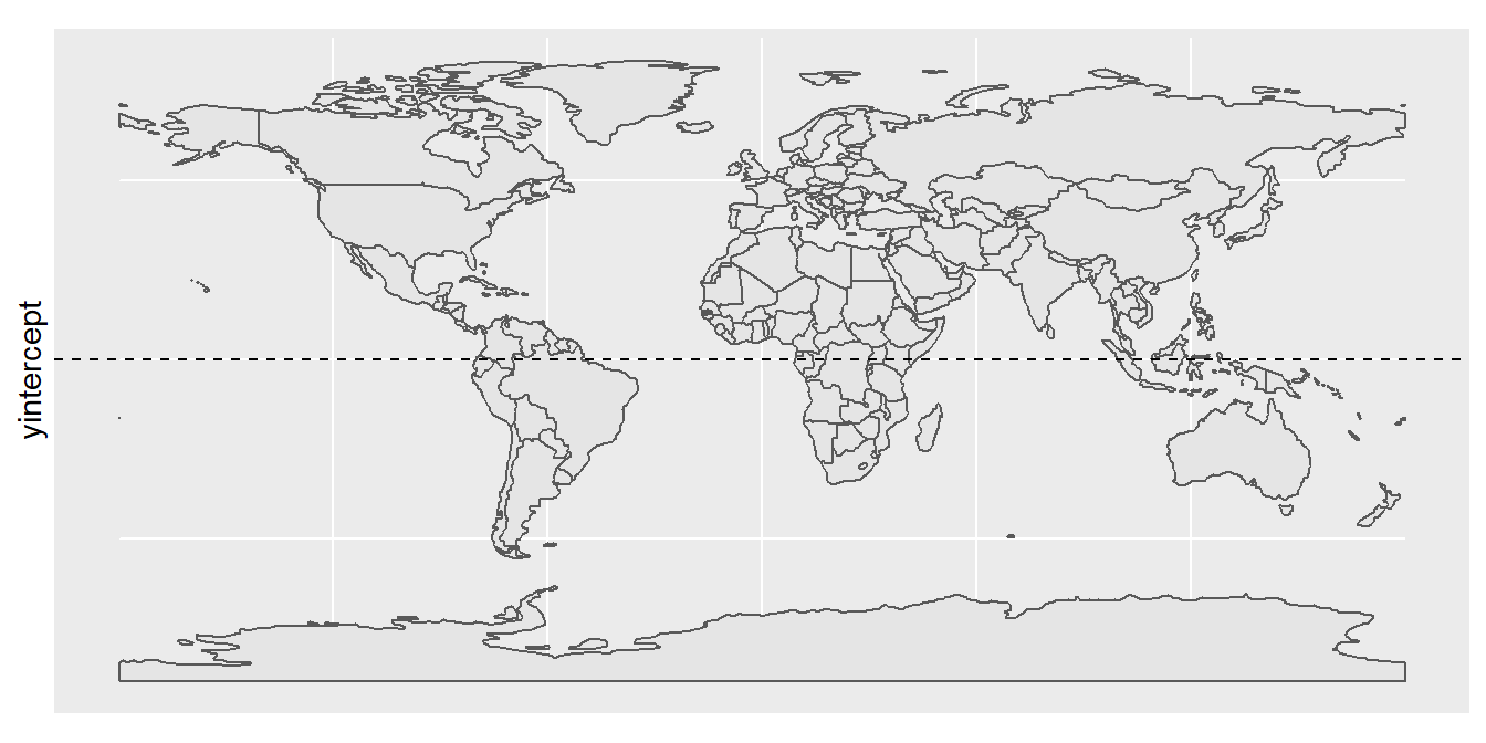
Figure 7.1: Our first sf() map
world %>%
  mutate(income_grp = factor(income_grp, ordered = T)) %>%
  ggplot() +
  geom_sf(aes(fill = income_grp)) +
  theme_void() +
  theme(legend.position = "top") +
  labs(fill = "Income Group:") +
  guides(fill=guide_legend(nrow=2, byrow=TRUE))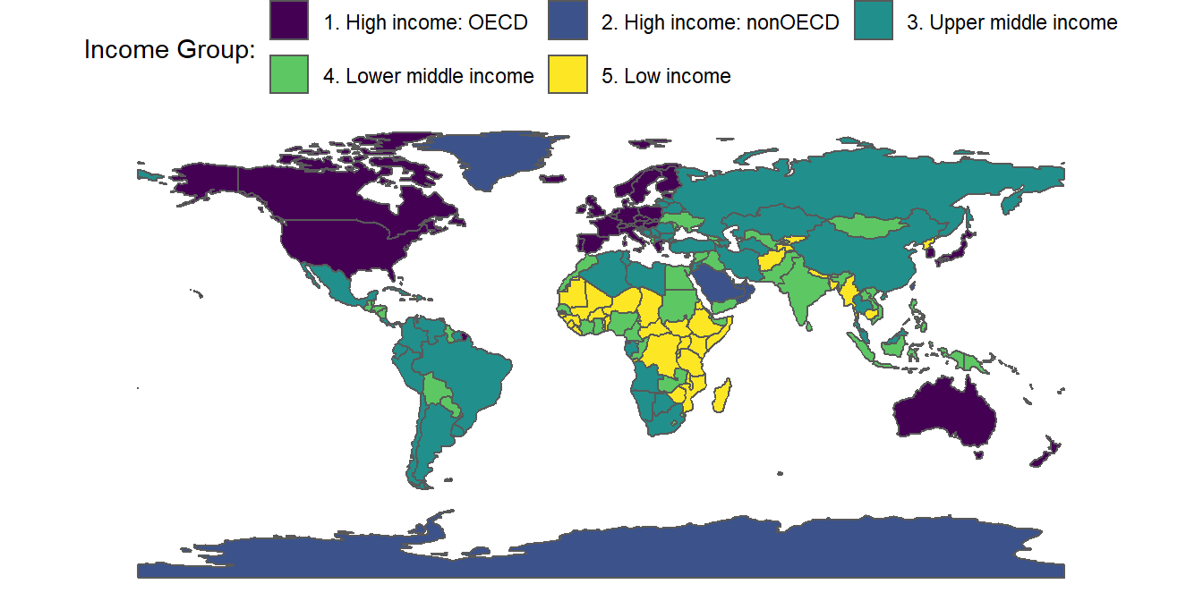
Figure 7.2: Our first choropleth map
world %>%
  ggplot() +
  geom_sf(fill = NA) +
  coord_sf( # Zoom-in/out
    # Longitude
    xlim = c(-85, -35),
    # Latitude
    ylim = c(10, -55)) +
  theme_void()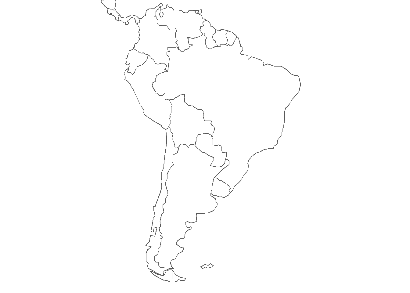
Figure 7.3: Zooming-In on South America
We can add labels to our maps using the geom_label() or the ggrepel::geom_label_repel() commands to display the country names found in the vector world$admin. The label requires that we define x and y coordinates, which we can get from the centroid of each country’s polygon. We obtain a rough estimate with the command st_coordinates(st_centroid(world$geometry)). We can also use a high-contrast color-scale to make our choropleth maps more engaging. This is done by the command scale_fill_viridis_c() in the pipeline below.
world %>%
  cbind(st_coordinates(st_centroid(world$geometry))) %>%
  filter(admin %in% c("Venezuela","Colombia","Guyana","Suriname",
                      "Ecuador","Peru","Chile","Argentina","Brazil",
                      "Paraguay","Uruguay","Bolivia")) %>%
  mutate(pop_est = pop_est / 1000000) %>%
  ggplot() +
  geom_sf(data = world, fill = "gray70", color = NA) +
  geom_sf(aes(fill = pop_est)) +
  scale_fill_viridis_c() +
  coord_sf(
    xlim = c(-85, -35),
    ylim = c(10, -55)) +
  ggrepel::geom_label_repel(aes(X, Y, label = admin),
             size = 3,
             fontface = "bold") +
  labs(fill = "Pop. Est. \n Millions:") +
  theme_void() +
  theme(plot.background = element_rect(fill = "aliceblue", color = NA))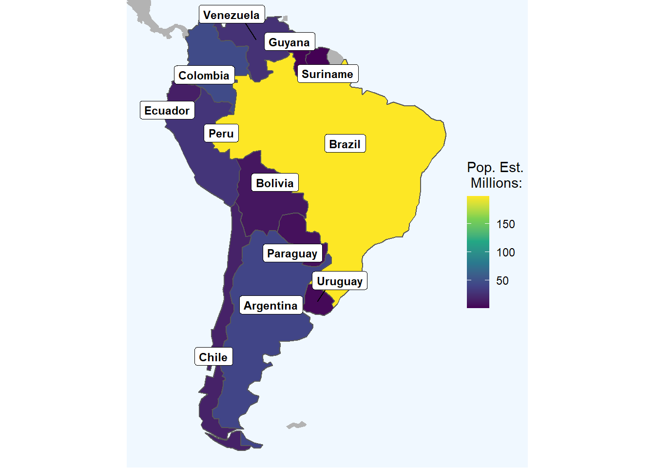
Figure 7.4: Zooming-In on South America
7.2 Country Maps
spain_communities = st_read("data/ESP_adm/ESP_adm1.shp") %>%
  st_transform(4326) %>%
  st_as_sf()


spain_communities <- cbind(spain_communities,
                           st_coordinates(st_centroid(spain_communities$geometry)))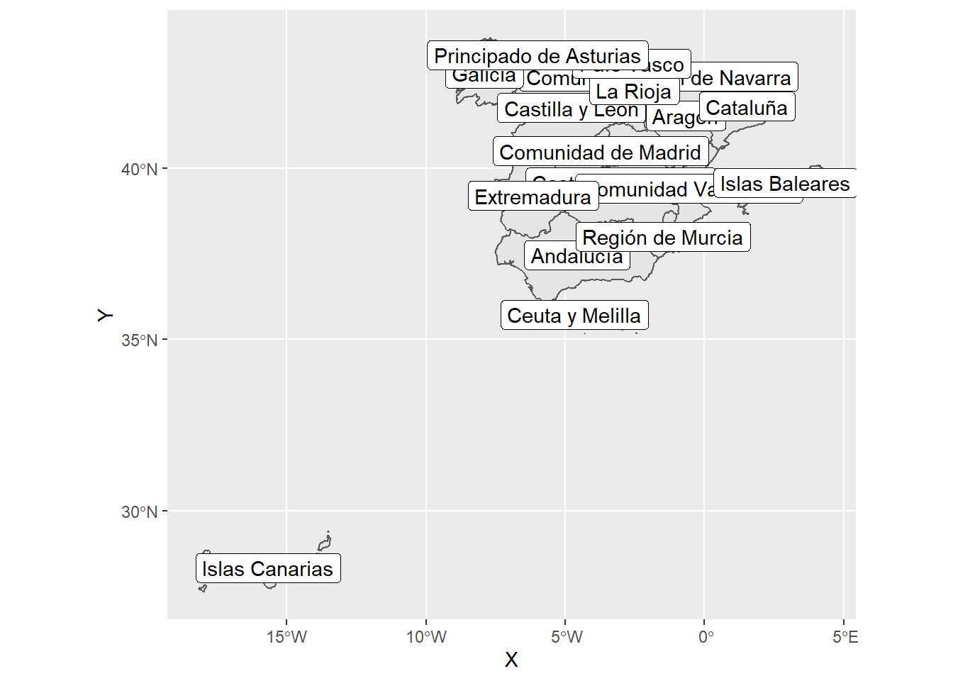
# At the level of Provinces
spain_provinces = st_read("data/ESP_adm/ESP_adm2.shp") %>%
  st_transform(4326) %>%
  st_as_sf()
## Reading layer `ESP_adm2' from data source `C:\Users\alhdz\Documents\IBEI\Data Visualization\data_viz_ir\data\ESP_adm\ESP_adm2.shp' using driver `ESRI Shapefile'
## Simple feature collection with 52 features and 11 fields
## Geometry type: MULTIPOLYGON
## Dimension: XY
## Bounding box: xmin: -20 ymin: 30 xmax: 4 ymax: 40
## Geodetic CRS: WGS 84# The Municipalities of Catalonia
cat_municiaplities = st_read("data/ESP_adm/ESP_adm4.shp") %>%
st_transform(4326) %>%
st_as_sf() %>%
filter(NAME_1 == "Cataluña")## Reading layer `ESP_adm4' from data source `C:\Users\alhdz\Documents\IBEI\Data Visualization\data_viz_ir\data\ESP_adm\ESP_adm4.shp' using driver `ESRI Shapefile'
## Simple feature collection with 8302 features and 14 fields
## Geometry type: MULTIPOLYGON
## Dimension: XY
## Bounding box: xmin: -20 ymin: 30 xmax: 4 ymax: 40
## Geodetic CRS: WGS 84spain_provinces %>%
filter(NAME_1 == "Cataluña") %>%
ggplot() +
geom_sf(aes(fill = NAME_2),
color = "black",
size = 1) +
geom_sf(data = cat_municiaplities,
fill = NA) +
geom_sf(data = filter(cat_municiaplities, NAME_4 == "Barcelona"),
fill = "black",
color = "white") +
labs(fill = "Province") +
theme_void()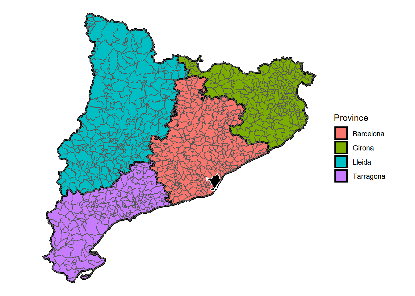
7.3 Scraping and Maping
In Chapter 5, we went over the basics of webscraping. Here we use the same principles to obtain population data for spanish municipalities from the internet and then use them to make a map.
library(rvest)

# Some Data Collection
cat_pop <- read_html("https://en.wikipedia.org/wiki/Municipalities_of_Catalonia") %>%
  html_table() %>%
  simplify() %>%
  first()

# Some Data Cleaning
cat_pop <- cat_pop %>%
  select(Municipality, `Population(2014)[3]`) %>%
  rename(NAME_4 = Municipality,
         Population = `Population(2014)[3]`) %>%
  mutate(Population = str_remove_all(Population, "[:punct:]"),
         Population = as.numeric(Population))

# Merging Data
cat_municiaplities = left_join(cat_municiaplities, cat_pop)
# A Choropleth Map
cat_municiaplities %>%
ggplot() +
geom_sf(aes(fill = Population)) +
scale_fill_viridis_c(option = "plasma", # try "magma"
trans = "log", # try "sqrt"
breaks=c(min(cat_municiaplities$Population, na.rm = T),
median(cat_municiaplities$Population, na.rm = T),
mean(cat_municiaplities$Population, na.rm = T),
max(cat_municiaplities$Population, na.rm = T)),
labels=c(sprintf("Min: %s",min(cat_municiaplities$Population, na.rm = T)),
sprintf("Median: %s", median(cat_municiaplities$Population, na.rm = T)),
sprintf("Mean: %s", mean(cat_municiaplities$Population, na.rm = T) %>%
round(digits = 0)),
sprintf("Max: %s", max(cat_municiaplities$Population, na.rm = T)))
) +
labs(fill = "Population: \n",
caption = "Source: Wikipedia") +
theme_void() +
theme(legend.position = "bottom",
legend.key.width= unit(1, "in"), # imperial metrics
legend.key.height = unit(.3, "cm"), # or normal
plot.background = element_rect(fill = "white", color = NA))
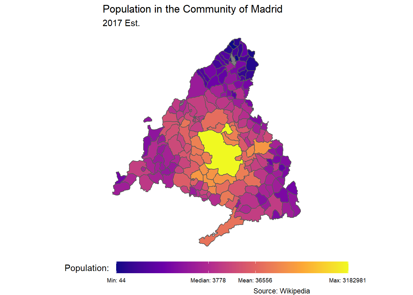
7.4 Challenge
This link has data on the municipalities of the Community of Madrid. Can you make a population map like the one below?