Chapter 2 The Grammar of Graphics
2.1 The tidyverse Package
Throughout this course, we will be using tidy data principles1 to create several types of visualizations. The main package we will use is the tidyverse, which includes several useful tools for data wrangling, analysis and visualization. The first step then is to install the package! You can do this from the packages vignette in explorer pane in RStudio, or by writing install.packages("tidyverse") into the console pane.
Once the package has been installed, the next step will be to load the library so that we can start using it! Simply write the command below in a script the editor pane and click run, or directly in the console pane and press enter.
library(tidyverse)After loading the tidyverse package from the library, we will get access to two very important functions which we will be using extensively. The first is the the command ggplot() which will allow us to make plots based on the grammar of graphics. The second is the pipe operator or %>%, which translates loosely to the phrase “and then”, and which we will use to put several commands and functions together in a pipeline.2
2.2 The ggplot2 Package
The ggplot2 package is installed and loaded alongside the tidyverse package, though it can also be called on separately. This is a very powerful tool to make print-quality graphs and all sorts of visual outputs. To do this, it draws on the grammar of graphics, which is a concept developed by Leland Wilkinson (Wilkinson 2005). The main idea behind this complex book is that plots can be divided into several elements, each with a specific role to play. ggplot2 has 7 such elements:
- Data
- Aesthetics
- Layers
- Scales
- Coordinates
- Facets
- Themes
Throughout this chapter, we will focus on the first three (Data, Aesthetics, Layers) which are the minimum requirements to make a basic plot. The element data tells R which vector(s) from your environment are going to be used to draw the plot. The aesthetics element determines which variable(s) will be used and in what capacity. The layers element tells R which type of geometry you wish to draw and in which order.
df %>%
  ggplot(aes(x=var1,y=var2))+
  geom_point()
In the example above, we are telling R that there is an object df in our environment which has at least two vectors (columns), one called var1 and another var2. We are also telling it that we want var1 to be our x axis and var2 to be our y axis, we define this inside the aes() command either globally for the plot (i.e. inside the ggplot() command) or specifically for a layer (i.e. inside geom_point()). Finally, we are telling R that we want to make a scatter plot by defining the layer geom_point(). Notice that after the ggplot() command and until the end of the graph, we use a \(+\) sign.
2.3 Example
To make our first ggplot plot, we will use the mtcars data set as an example.
data("mtcars")The cars data set has 32 observations and 11 variables. Once the data has been loaded, let’s use the pipe operator to do some cleaning. In the code below, we are creating a new object called df - a common way of naming data frames - and filling it with the mtcars data with some modifications. We are asking R to a) take the mtcars data, b) and then %>% select four variables, c) and then %>% give them new name. This pipeline is saved into the new object df.
df <- mtcars %>%
  select(cyl, mpg, hp, am) %>%
  rename(cylinders=cyl,
         mileage=mpg,
         horsepower=hp,
         transmission=am)
With this df stored in our environment, we can start making plots. Let’s begin with a histogram that shows the distribution of mileage across the 32 variables in our data set. For this we will use geom_histogram.
df %>% #Our Data
  ggplot(aes(x= mileage))+ #Our Aesthetics
  geom_histogram() #Our Layer
## `stat_bin()` using `bins = 30`. Pick better value with `binwidth`.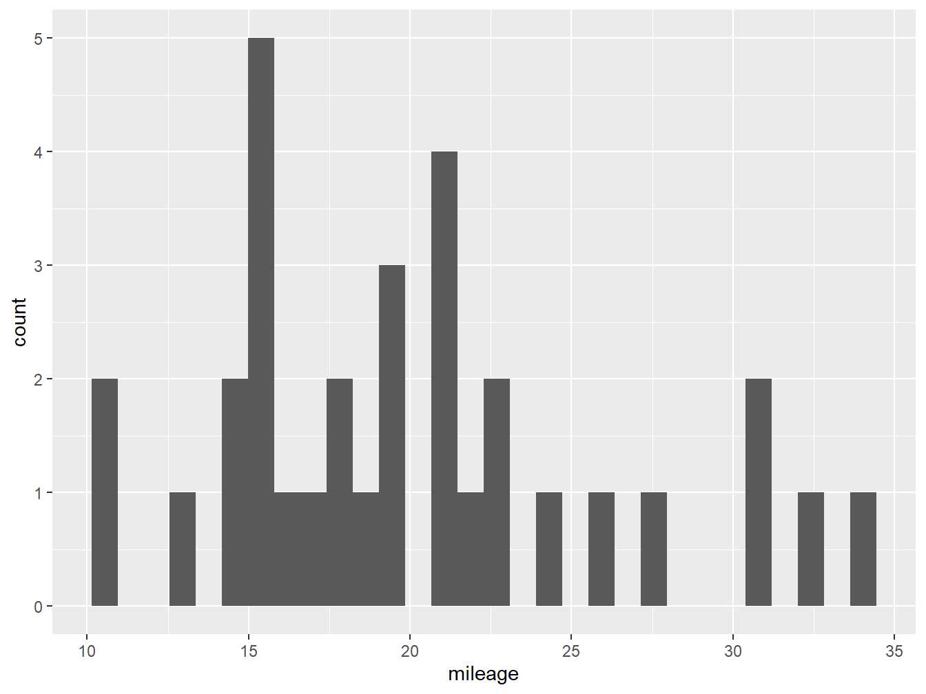
Figure 2.1: A histogram with default settings
Figure 2.1 shows us our very first ggplot, which shows the number of observations at each of the binned levels. From this plot we know that most cars in our data set do around 15 miles per gallon. However, it is not very nice looking! We can improve this by adding more parameters.
You might notice that below the code R is giving us a warning: stat_bin() using bins = 30. Pick better value with binwidth. Here the software is hinting that we might want to change the number of bars (bins) or their width (binwidth) in our plot to make it more informative.3 In figure 2.2 we change the number of bins to 5 inside our geom_histogram layer, and also declare the color of the column fill (darkgray) and the outline (black).
df %>%
  ggplot(aes(x= mileage))+
geom_histogram(bins = 5, fill="darkgray", color="black") 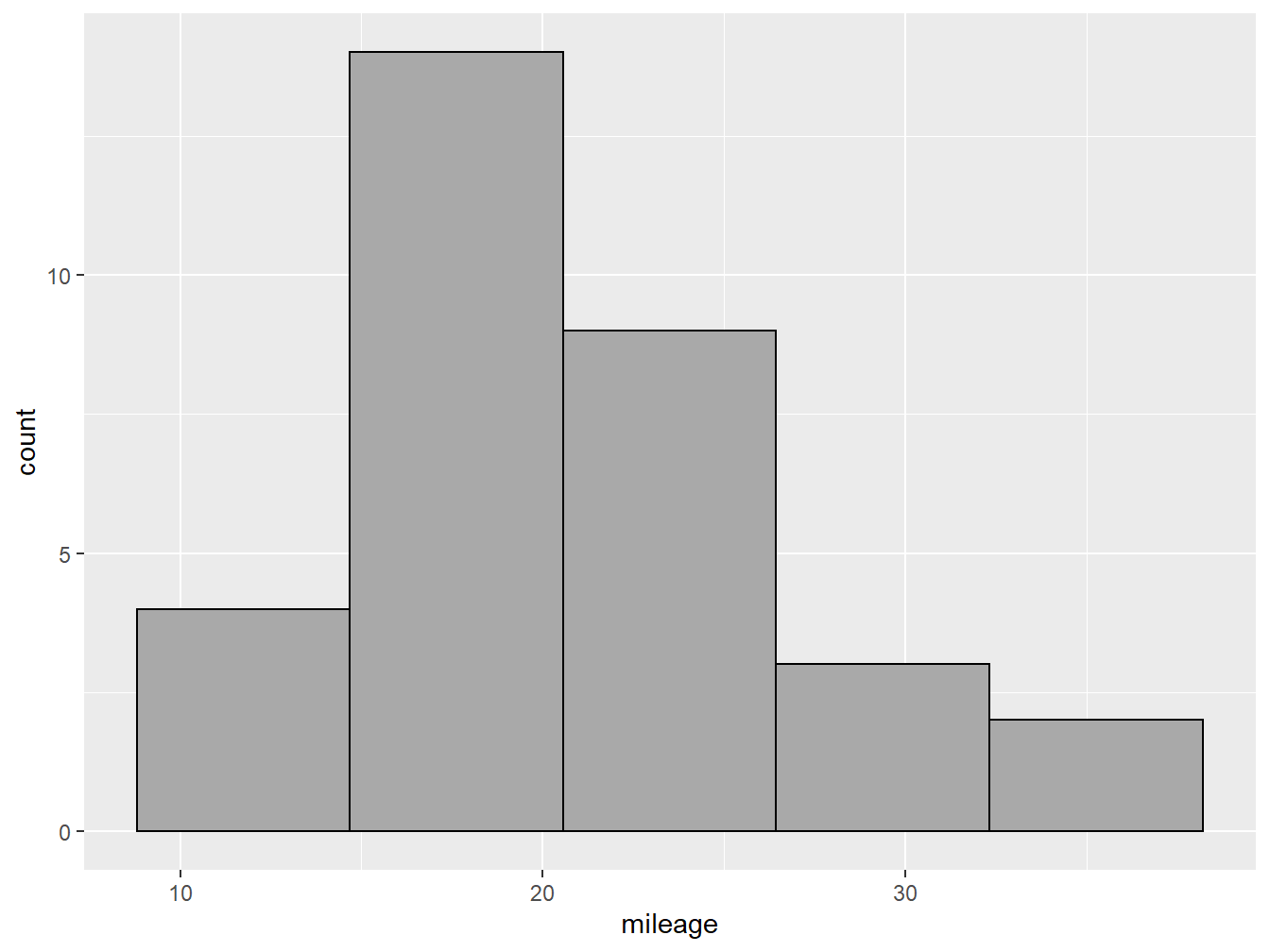
Figure 2.2: A nicer looking histogram
2.4 Choosing the Right Plot
There are many geoms available in the ggplot2 package and the many other packages that interact with it. The choice of which one to use largely depends on two questions: a) what are you trying to communicate?, and b) what type of variable(s) do you want to show?
Figure 2.3: Some plot options based on variables types
Figure 2.3 shows some of the possible plot choices based on the type of variables that you are working with. This is by no means a comprehensive menu of plotting options. For more geoms and when to use them, check out from Data to Viz.