Chapter 1 Principles of Data Visualization
Despite the inherent subjectivity of beauty, there are several recurring patterns and characteristics of the things we find beautiful. Symmetry, proportions (e.g. the golden ratio \(1:1.618\)) are among these recurring patterns. One of the goals -though often implicit- of data visualization is making beautiful things.
Subjectivity notwithstanding, there are some techniques and principles that we can follow in order to make our visualizations more beautiful and effective. This chapter outlines a few principles of data visualization, this is by no means an exhaustive list but rather meant as the starting point for your own list of things to keep in mind when designing visuals.
1.1 Data Ethics
The first thing we want to avoid when making visualizations is to avoid misrepresentation. There are numerous ways in which visuals can be -mistakenly or purposefully- distorted, leading to messages that are different or opposite of what the data is telling us. The underlying causes behind distorted visual messages are numerous: user-induced, designer-induced, (un)intentionally, cognitive biases, social differences and emotional connotations (Zinovyev 2010). Here, we focus on some practical guidelines to avoid these issues.
1.1.1 Include the Baseline
Omitting baseline values (typically 0) can mislead the audience into thinking that patterns are greater (or smaller) than they really are (see figure 1.1).
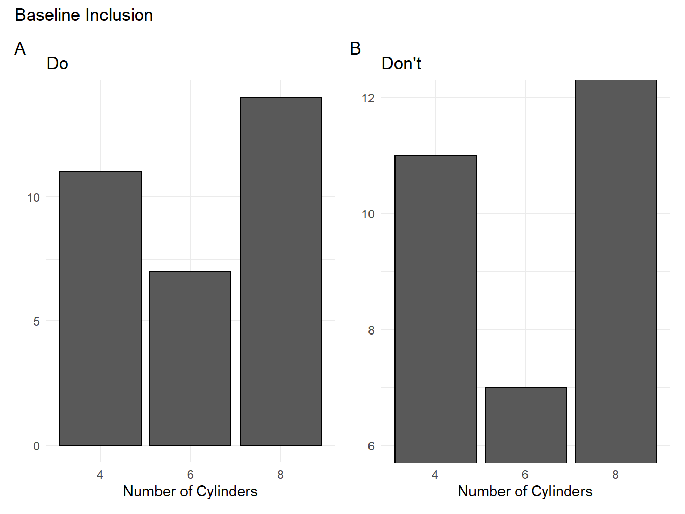
Figure 1.1: Two color schemes compared
1.1.2 Consider the Audience
Your audience will have different levels of technical expertise or familiarity with the subject, so keep this in mind! Avoid going against conventions within your field.
1.1.3 Avoid Cherry-picking
This is a common way of attempting to deceive audiences into thinking a trend exists (or not). If you need to drop values or observations, make sure this is mentioned and justified.
1.2 Inclusive Colors
In a study on flag colors, (Zhang et al. 2018) found that red was not only the most recurrent in the 192 flags considered, but also “often attached with an aggressive connotation.” Notably, this color was less present in the flags of international collaborative organizations. As any painter or political can surely attest to, color is not neutral but evokes numerous sentiments and ideas in people.
The symbolic and psychological importance of color intersects with both practical and inclusiveness concerns when we take our target audience into consideration. Colorblindness is a good example of this given how widespread it is. It is thus important to keep this in mind when selecting which colors to include in our plots in order to maximize their effectiveness.
Okabe and Ito (Okabe and Ito 2002) offer 3(+1) principles of Universal Color Design:
- Choose color schemes that can be easily identified by people with all types of color vision, in consideration with the actual lighting conditions and usage environment.
- Use not only different colors but also a combination of different shapes, positions, line types and coloring patterns, to ensure that information is conveyed to all users including those who cannot distinguish differences in color.
- Clearly state color names where users are expected to use color names in communication.
- Moreover, aim for visually friendly and beautiful designs.
There are many ways you can select color schemes when producing plots with R. We will be using (mostly) the ggplot2 package which is described in greater detail in Chapter 2. For now, let’s think of colors options in a palette which consists of several hexadecimal color codes (e.g. #000000 is black) put together into an array. In the example below, 15 colorblind-friendly (based on this) and distinguishable colors are combined into a vector, which is then stored in the object called cb_palette.1
cb_palette <- c("#000000","#004949","#009292","#ff6db6","#ffb6db",
         "#490092","#006ddb","#b66dff","#6db6ff","#b6dbff",
         "#920000","#924900","#db6d00","#24ff24","#ffff6d")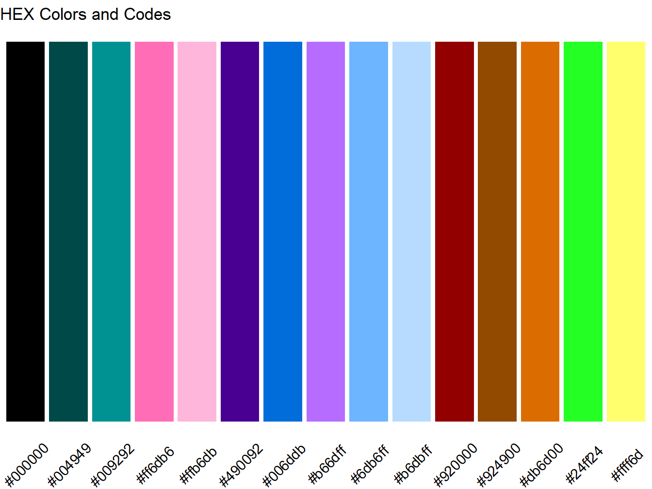
Figure 1.2: Colorblind Palette and Web Color Codes
Both plots in figure 1.3 tell the same story: in our data set there are more cars with 8 cylinders, and those tend to have more automatic transmissions.2 The difference is that plot A uses the default colors in the ggplot2 package, whereas plot B uses our custom cb_palette. Notice that since there are only two categories shown (i.e., manual and automatic), only the first two colors of our array are shown: gray "#999999" and orange "#E69F00".3
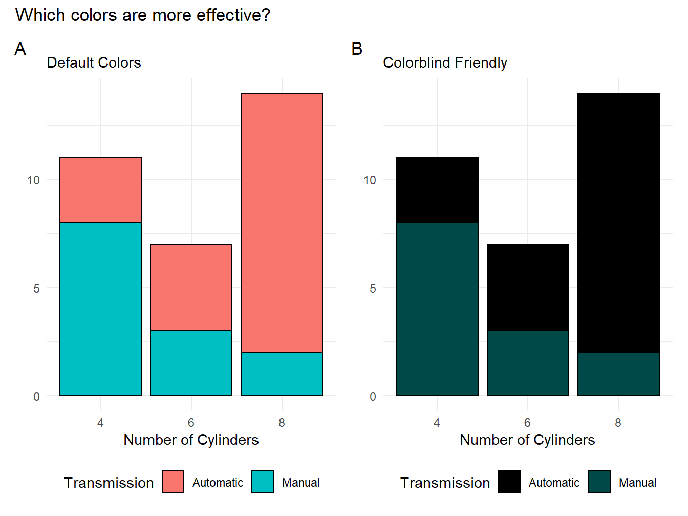
Figure 1.3: Two color schemes compared
1.3 Less is more
Throughout this course, we will cover many ways of adding labels, colors, axes, and backgrounds to plots. You might thus be tempted to use as many of them as you can fit into a graph. However, it is important to keep in mind that the main goal of visualization is effective communication. Many times, additional elements do not serve to clarify but rather to obfuscate the point that our data is trying to make. A key principle is thus to keep a high data-to-ink ratio, in other words: less is more. To this effect, avoid the following unnecessary plot elements:
- Redundant borders
- Redundant labels
- Too many hues
- Distracting backgrounds
- Effects (3D, shadows, texture)
Figure 1.4 is an example of a plot that ignores this principle. It has many redundant elements such as colors, patterns, labels, and backgrounds that do not tell us anything about the data. By contrast, figure 1.5 offers clearer picture.
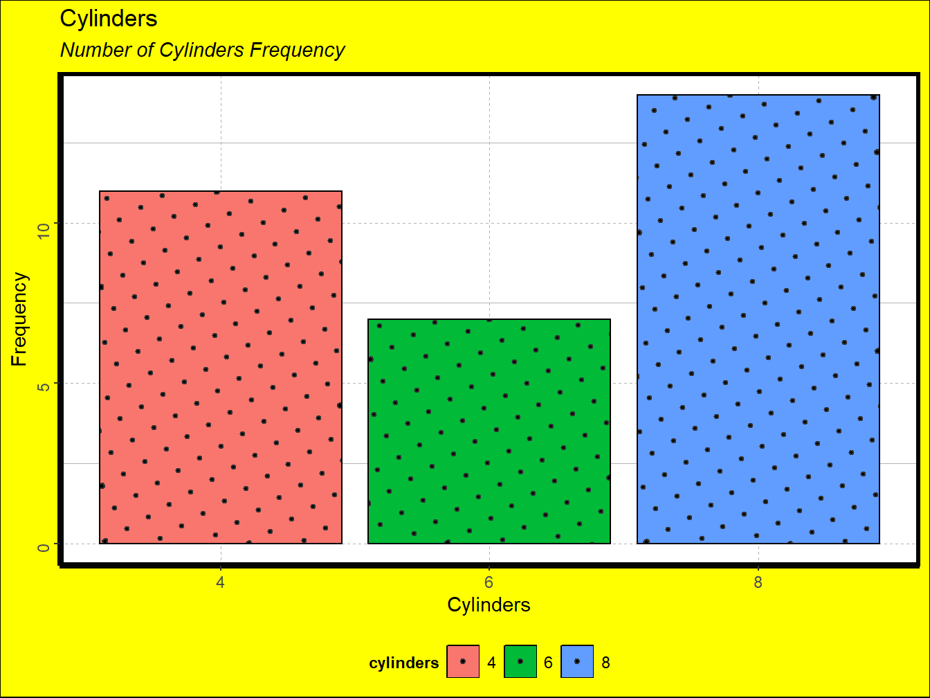
Figure 1.4: A Noisy Plot
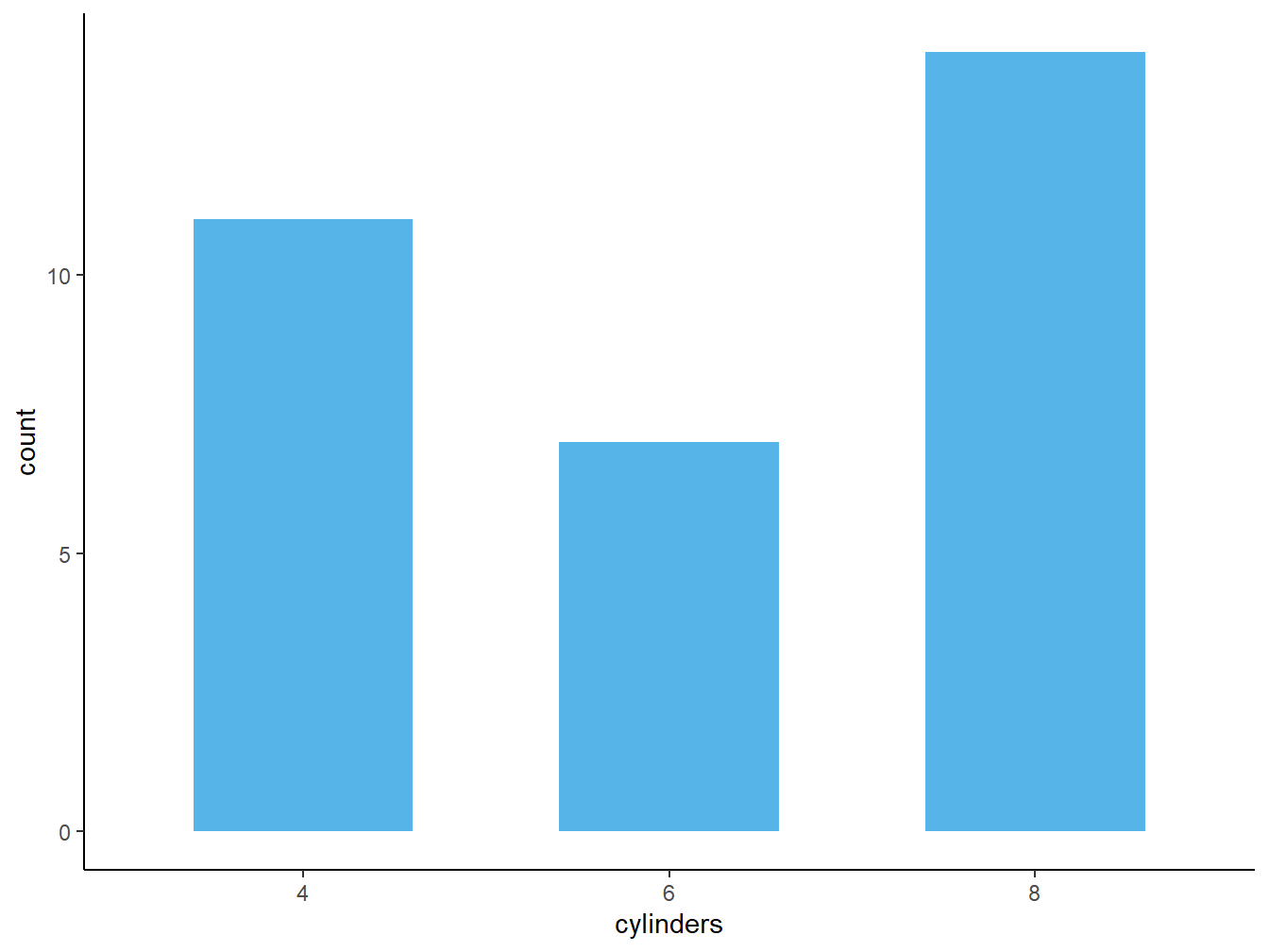
Figure 1.5: A Clean Plot
Nowadays, most of the plots you will produce will pass through a printer. However, reducing noise remains important to prevent distracting our audiences with unnecessary information. This principle is particularly important in the age of Big Data.