Data Visualization for International Relations
2022-11-07
Introduction
In an experiment conducted by researchers from University College London (Mcmanus and Gesiak 2014), 277 participants were asked to look at several pairs of paintings: one of the pairs was an original by abstract painter Piet Mondrian, and the other was fake version that closely resembled it.1 The participants where asked:
When looking at the pictures you should decide overall which you thinks looks better, in that it looks nicer, it looks better organised, or it looks better balanced.
The results suggested that people could identify the originals with some degree of accuracy (\(\mu\) 54.7%, SE .40). In other words, reliably better than chance! The experiment aimed to compare two methods in Empirical Aesthetics: the method of choice and the method of production. This choice experiment “implies people know something about what makes a real Mondrian.” In other words, we have an intuition of proportion and beauty.
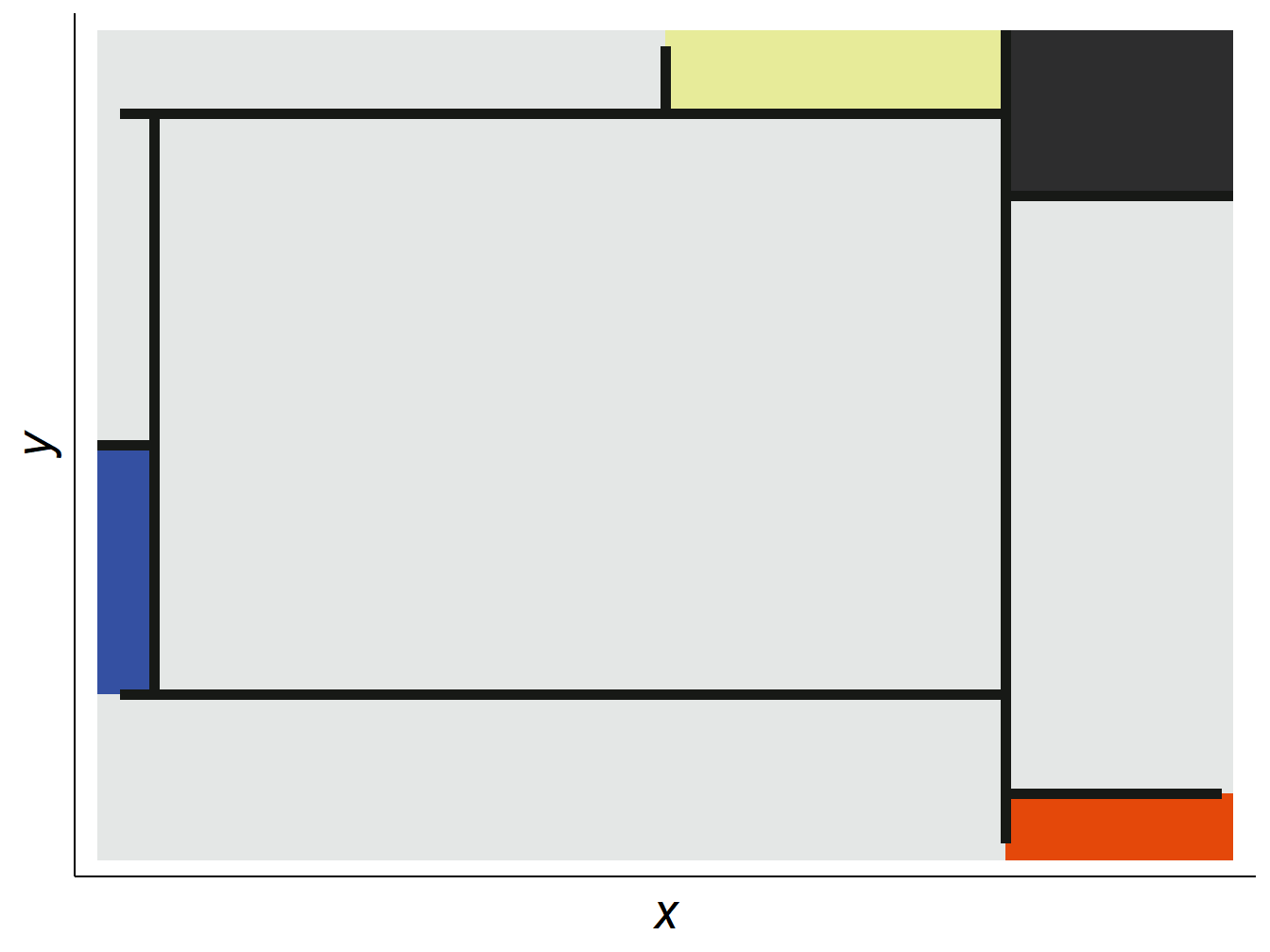
Figure 0.1: An attempt at a Mondrian using ggplot2
Why Visualize?
Data visualization plays numerous roles in the social sciences, from summarizing large amounts of information in a small space, to supporting claims about patterns and relationships among a vast array of indicators of human behavior.
Zinovyev (Zinovyev 2010) identifies four types of visualizations in political science:
- Statistical graphics and infographics with extensive use of color, form, size, shape and style to superimpose many quantitative variables in the same chart or diagram
- Geographical information systems (GIS) to visualize geographically-linked data
- Graph visualization or network maps for representing relations between objects
- Projection of multidimensional data on low-dimensional screens with further visualization, data cartography
Throughout this book, we will cover examples of from all of these types of visuals.
About this Book
If you are in the Data Visualization course at IBEI, you will need it. If you are not, it might be useful anyway!
To keep things as simple as possible, the book follows this syntax:
packagesare placed inside a shaded box (e.g.ggplot2),- common
functions()are also inside a shaded box, and followed by parentheses (e.g.mutate()fromtidyverseorclass()from base R), - less common
functions()are the same, but the package is explicitly called::(e.g.reshape2::melt()), - short R commands (e.g.
%in%), are also shaded, non-R commands are in bold (e.g. Ctrl + p), - the common pipe operator
%>%will be used when possible in the code2 (i.e., we will mostly use thetidyversesyntax over base R).
Prerequisites
You are not expected to have any familiarity with R at the beginning of the course, though some knowledge of statistics will be very helpful. We will cover the basics of working with R and RStudio during the first few sessions. Some tutorial videos on the basics of working with RStudio are available here. Similarly, you may also consult the following open-source books on R:3
- R Cookbook (Long and Teetor 2019)
- R for Data Science (Grolemund and Wickham 2016)
- R Graphics Cookbook (Chang 2018)
- Efficient R Programming (Gillespie and Lovelace 2016)
- Hands-on Programming with R (Grolemund 2014)
- Fundamentals of Data Visualization (Wilke 2019)
- Text Mining with R (Silge and Robinson 2017)
- An Introduction to R (Venables, Smith, and R Core Team 2021)
- R Markdown: The Definitive Guide (Xie, Allaire, and Grolemund 2018)
- R Markdown Cookbook (Xie, Dervieux, and Riederer 2020)
Acknowledgements
I would like to thank the 2020-21 IBEI MA cohort, as their suffering throughout the first iteration of this course was instrumental in the development of this e-book.
Contact
This book is in open review. If you have any questions, comments or suggestions; please contact me by email.
License

Data Visualization for International Relations by Alfredo Hernandez Sanchez is licensed under a Creative Commons Attribution-NonCommercial-ShareAlike 4.0 International License.
Based on a work at https://github.com/alhdzsz/data_viz_ir.