5.2 Components
A wide variety of components can be included in a dashboard layout, including:
Interactive JavaScript data visualizations based on HTML widgets.
R graphical output including base, lattice, and grid graphics.
Tabular data (with optional sorting, filtering, and paging).
Value boxes for highlighting important summary data.
Gauges for displaying values on a meter within a specified range.
Text annotations of various kinds.
A navigation bar to provide more links related to the dashboard.
The first three components work in most R Markdown documents regardless of output formats. Only the latter four are specific to dashboards, and we briefly introduce them in this section.
5.2.1 Value boxes
Sometimes you want to include one or more simple values within a dashboard. You can use the valueBox() function in the flexdashboard package to display single values along with a title and an optional icon. For example, here are three side-by-side sections, each displaying a single value (see Figure 5.4 for the output):
---
title: "Dashboard Value Boxes"
output:
  flexdashboard::flex_dashboard:
    orientation: rows
---

```{r setup, include=FALSE}
library(flexdashboard)
# these computing functions are only toy examples
computeArticles = function(...) return(45)
computeComments = function(...) return(126)
computeSpam = function(...) return(15)
```

### Articles per Day

```{r}
articles = computeArticles()
valueBox(articles, icon = "fa-pencil")
```

### Comments per Day

```{r}
comments = computeComments()
valueBox(comments, icon = "fa-comments")
```

### Spam per Day

```{r}
spam = computeSpam()
valueBox(
  spam, icon = "fa-trash",
  color = ifelse(spam > 10, "warning", "primary")
)
```
FIGURE 5.4: Three value boxes side by side on a dashboard.
The valueBox() function is called to emit a value and specify an icon.
The third code chunk (“Spam per Day”) makes the background color of the value box dynamic using the color parameter. Available colors include "primary", "info", "success", "warning", and "danger" (the default is "primary"). You can also specify any valid CSS color (e.g., "#ffffff", "rgb(100, 100, 100)", etc.).
5.2.2 Gauges
Gauges display values on a meter within a specified range. For example, here is a set of three gauges (see Figure 5.5 for the output):
---
title: "Dashboard Gauges"
output:
  flexdashboard::flex_dashboard:
    orientation: rows
---

```{r setup, include=FALSE}
library(flexdashboard)
```

### Contact Rate

```{r}
gauge(91, min = 0, max = 100, symbol = '%', gaugeSectors(
  success = c(80, 100), warning = c(40, 79), danger = c(0, 39)
))
```

### Average Rating

```{r}
gauge(37.4, min = 0, max = 50, gaugeSectors(
  success = c(41, 50), warning = c(21, 40), danger = c(0, 20)
))
```

### Cancellations

```{r}
gauge(7, min = 0, max = 10, gaugeSectors(
  success = c(0, 2), warning = c(3, 6), danger = c(7, 10)
))
```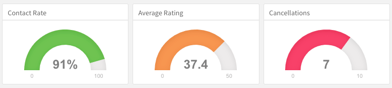
FIGURE 5.5: Three gauges side by side on a dashboard.
There are a few things to note about this example:
The
gauge()function is used to output a gauge. It has three required arguments:value,min, andmax(these can be any numeric values).You can specify an optional
symbolto be displayed alongside the value (in the example “%” is used to denote a percentage).You can specify a set of custom color “sectors” using the
gaugeSectors()function. By default, the current theme’s “success” color (typically green) is used for the gauge color. Thesectorsoption enables you to specify a set of three value ranges (success,warning, anddanger), which cause the gauge’s color to change based on its value.
5.2.3 Text annotations
If you need to include additional narrative or explanation within your dashboard, you can do so in the following ways:
You can include content at the top of the page before dashboard sections are introduced.
You can define dashboard sections that do not include a chart but rather include arbitrary content (text, images, and equations, etc.).
For example, the following dashboard includes some content at the top and a dashboard section that contains only text (see Figure 5.6 for the output):
---
title: "Text Annotations"
output:
  flexdashboard::flex_dashboard:
    orientation: rows
---

Monthly deaths from bronchitis, emphysema and asthma in the
UK, 1974–1979 (Source: P. J. Diggle, 1990, Time Series: A
Biostatistical Introduction. Oxford, table A.3)

```{r setup, include=FALSE}
library(dygraphs)
```

Row {data-height=600}
-------------------------------------

### All Lung Deaths

```{r}
dygraph(ldeaths)
```

Row {data-height=400}
-------------------------------------

### Male Deaths

```{r}
dygraph(mdeaths)
```

> Monthly deaths from lung disease in the UK, 1974–1979

### About dygraphs

This example makes use of the dygraphs R package. The dygraphs
package provides rich facilities for charting time-series data
in R. You can use dygraphs at the R console, within R Markdown
documents, and within Shiny applications.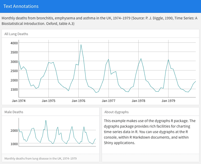
FIGURE 5.6: Text annotations on a dashboard.
Each component within a dashboard includes optional title and notes sections. The title is simply the text after the third-level (###) section heading. The notes are any text prefaced with > after the code chunk that yields the component’s output (see the second component of the above example).
You can exclude the title entirely by applying the .no-title attribute to a section heading.